


Typography Infographics: 12 Inspiring Examples & Techniques
An infographic is a form of visual content that is visually engaging, memorable, and easy to understand. And the data behind why they work is more compelling than most people realize.
We've gathered 30+ crucial infographic statistics that clearly show the importance of infographics in any content strategy. These statistics demonstrate how infographics help make content memorable, empower readers to be more productive, and maximize the chances that your content is both seen and shared.
Whether you're a marketer trying to justify the investment, an educator looking to improve learning outcomes, or an entrepreneur building a brand from scratch, the research here will show you exactly why leading businesses and creators are doubling down on visual content.
The most cutting-edge work in marketing, education, and communication all point in the same direction: infographics work, and the numbers prove it.
Before you continue, watch this quick video on what to know before creating an infographic. It will show you what actually separates effective infographics from ineffective ones.
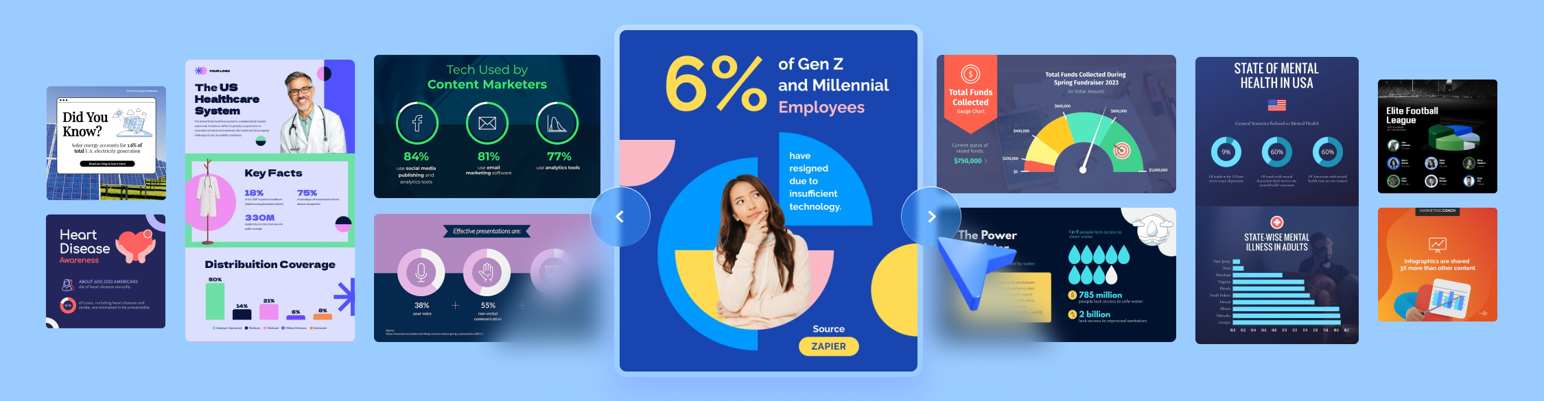
Could we get more meta than an infographic about infographics? To learn more about these statistics, read on, but you can catch a glimpse of why infographics are so powerful below.
Made with Visme Infographic Maker
Embed this infographic on your site:
Before getting into marketing performance and engagement metrics, it helps to understand why the different types of infographics work at a more fundamental level. The short answer comes down to how the brain is built.

Researchers at the University of Rochester found that half of the human brain is dedicated to processing visual information. That's a significant share of our cognitive architecture committed entirely to making sense of what we see.
When you present information visually, you're working with the brain's natural strengths rather than competing against them. Text asks the brain to decode symbols, interpret language and construct meaning.
Visuals hand that meaning over directly. Infographics perform well not because they look good, but because they speak the language the brain already prefers.
This finding aligns with research from the Massachusetts Institute of Technology, where scientists discovered that an area of the brain previously thought to process only simple visual information also handles complex images, including optical illusions.
As Professor Mriganka Sur of MIT's Department of Brain and Cognitive Sciences put it: "Because half of the human brain is devoted directly or indirectly to vision, understanding the process of vision provides clues to understanding fundamental operations in the brain."
Infographics perform well not because they look good, but because they speak the language the brain already prefers.
Key takeaway: The brain is built to process visual information efficiently, and infographics are designed to leverage that. Every infographic design decision you make, from color to layout to icon choice, is either working with that wiring or against it.

Compared to plain text, the brain can process infographics up to 60x quicker. That wiring also explains why we process visuals so much faster than text.
Your audience can grasp the core message of a well-designed infographic almost instantly, before they've even committed to reading it. In an environment where people decide in seconds whether to keep scrolling, that speed matters enormously.
A text paragraph that makes a strong point after three sentences has already lost a significant portion of the readers who never made it that far. An infographic conveys the point before the decision to leave is made.
Key takeaway: Speed of comprehension is a competitive advantage that compounds across every channel you publish. An infographic posted on social media communicates before the scroll. An infographic in an email gets the message across before the reader decides whether to keep reading. An infographic on a landing page reduces the cognitive load of a decision. Sixty times faster is the reason your audience engages with visual content in situations where they'd bounce from text.
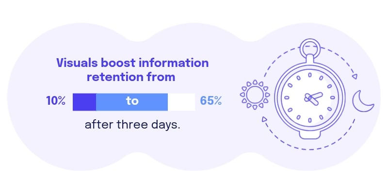
When people hear information, they're likely to remember only 10% of it three days later. Pair that same information with a relevant image, and retention climbs to 65%.
That's a 55-percentage-point difference, achieved not from a complete content overhaul but from adding a visual layer to a message you're already sending.
For any brand trying to build awareness, reinforce product knowledge, or communicate a complex message, that gap between 10% and 65% represents the difference between content that sticks and content that disappears.
Key takeaway: The retention gap between text-only and visual content is so large that it should inform every format decision you make. Blog posts, email campaigns, presentations, social content, and internal reports all benefit from visual layers. This stat makes the strongest possible case for treating visuals as a core communication tool rather than a supplementary one.
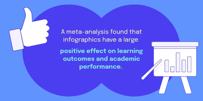
A meta-analysis of multiple studies on the use of infographics in education found a large positive effect on student learning outcomes.
What's interesting is that the impact grew the longer infographics were used: programs that incorporated infographics consistently over four to five weeks saw the strongest results. This tells us that infographics are more effective when used consistently as part of instruction rather than as a one-off event.
Key takeaway: The case for infographics in employee training, onboarding, and education is backed by rigorous academic evidence, not just marketing intuition. For businesses investing in employee learning or customer education, adding infographics to instructional or training materials produces measurable improvements in how much people actually absorb and retain. And the data suggest that consistency matters: the brands and educators who weave infographics throughout their content rather than using them sporadically see significantly stronger results over time.

Researchers found that people following directions with text and illustrations do 323% better than people following directions without illustrations. That's a dramatic performance gap driven entirely by the presence of a visual alongside the instruction.
When your audience is trying to complete a task, follow a process, or set something up, the stakes of clarity are high. Misunderstood instructions mean wasted time, repeated attempts, frustration, and in a business context, lost customers or damaged trust.
Key takeaway: If you have instructional content that's currently text-only, adding visual walkthroughs is one of the highest-leverage improvements you can make. The performance improvement applies to user manuals, how-to guides, product setup documentation, onboarding flows, customer support content, and internal process documentation. Infographics make it easy to support your best ideas with the type of visual design your readers need to take action. A tool like Visme can help you scale great design and produce high-quality visuals to keep up with the competition.
Infographics are great, but the real game-changer is knowing what results they actually bring.
Here's the scoop from the research on how they affect understanding and productivity.

Color is one of the most powerful levers in infographic design. Studies show an 82% increase in readers' attention spans and recall when color is used in visuals.

A separate education study found that learners who encountered a message in color were 39% more likely to remember it than those who saw the same message in black and white. These aren't subtle differences.
An 82% increase in attention and a 39% boost in retention represent outcomes that most marketers spend significant budgets trying to achieve through other means.
Key takeaway: Color in an infographic is more than a decorative tool. It's a memory tool, an attention signal, and an organizational system all at once. If you make an infographic with monochrome or minimal color variation, you're leaving behind measurable recall and attention advantages. The next time you're designing a visual, treat color decisions with the same strategic weight as copy decisions.

Researchers found a 39% reduction in time spent finding crucial information when visuals, color, and charts were incorporated into a document.
That efficiency means everything, especially when your audience is busy or scanning for a specific insight within a larger body of content.
Most readers aren't reading your content from start to finish. They're scanning for the one thing relevant to them.
Great design anticipates that behavior and makes the information findable before the reader gives up and leaves.
Key takeaway: A 39% reduction in information-finding time translates directly into better user experience, higher engagement, and a more favorable impression of your brand. Think about how your most important reports, guides, and long-form content are structured. If the key insights are buried in paragraphs, visual structure and color coding are the most immediate fixes available.

A related study showed a 70% decrease in data-finding time when color was used to organize information. A report that might take ten minutes to scan for a specific figure takes three minutes when color and visual structure do the organizing work.
For any content that asks your audience to find, understand or act on data, that's an advantage worth building into your design process from the start rather than as an afterthought.
Key takeaway: When you're presenting data-heavy content like research reports, dashboards, or comparative analyses, color-coding, along with beautiful infographic icons and layout, removes the friction that causes readers to disengage. Seventy percent faster data-finding also has real operational implications for internal teams that rely on visual documentation to make quick decisions.

One study found a 78% increase in learning and retention when visuals were used to present information. This makes infographics especially valuable for training content, educational programs, and customer onboarding, where the goal is for information to actually stick.
Delivery without retention is one of the most common failures in content marketing and corporate training alike. You can communicate the right information and still leave your audience no better equipped than before if the format doesn't support retention.
Key takeaway: If you're currently using text-heavy training materials, slide decks with minimal visuals, or dense onboarding documents, switching to infographic-driven content is one of the most direct improvements you can make to actual learning outcomes.

In one study, readers were 30% more likely to pay faster when visuals were incorporated into billing and financial communications.
Colorful, clearly organized visuals create a sense of urgency and reduce the cognitive effort required to act, making it easier for your audience to complete a purchase, submit a form or respond to a deadline.
Visual clarity removes the friction between understanding and action, and reduced friction consistently translates into faster decisions.
Key takeaway: Reducing the cognitive load of a decision is one of the most reliable ways to increase speed and conversion rates. A 30% improvement in payment speed from billing communications alone represents a real cash flow impact for businesses. But the principle extends far beyond invoices. Any moment in your customer journey where you're asking someone to act, whether that's signing up, upgrading, purchasing or completing a step, benefits from clear visual communication.
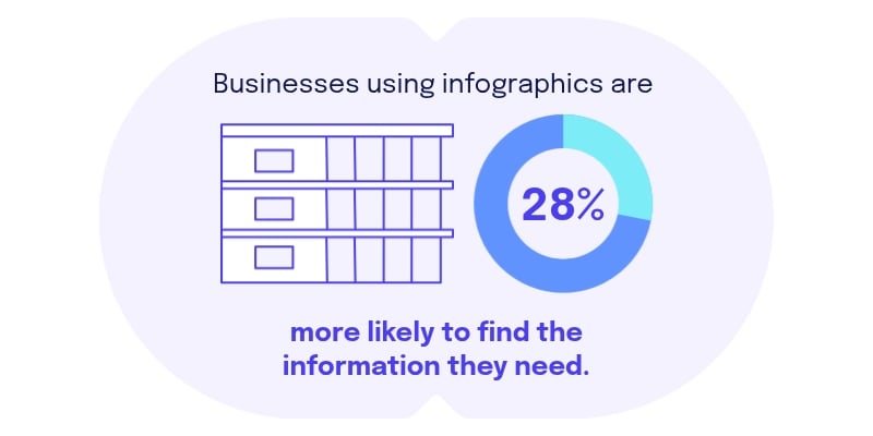
At the organizational level, companies that use infographics and data visualizations are 28% more likely to find the information they need for important projects.
A clear visual presentation helps external audiences understand your content. It also improves internal communication and speeds up decision-making. If your internal documentation is still primarily text-based, this statistic makes a compelling case for bringing visual thinking into your operational processes as well.
Key takeaway: Teams that use data visualization for internal reporting, project planning, and knowledge sharing make better decisions faster than those working from text-heavy documents. The 28% improvement in information access compounds over time: faster access means quicker decisions, fewer bottlenecks, and less time wasted in meetings trying to interpret data that should have been clear from the start.

A 28% more likely examined what happened when a secondary hospital began using infographics to share healthcare-associated infection surveillance data with nursing staff.
The results were striking. Staff reported that infographics simplified complex data, made key findings more accessible, and fostered stronger team engagement around the information.
Three consistent themes emerged: greater data awareness, more confident use of the visuals, and deeper team involvement in acting on the findings. The researchers concluded that infographics are effective for improving the communication of clinical data and supporting better decision-making in infection prevention.
Key takeaway: If infographics can improve decision-making in a clinical environment where the stakes are patient health, the argument for using them in marketing, business communications, and organizational reporting becomes very difficult to dismiss. For any organization dealing with complex data that needs to be understood and acted on by a team, this research is a direct endorsement of visual communication as an operational tool, not just a creative one.
The question of whether infographics work has been settled.
However, the more interesting question now is who's using them, how often, and where the gaps worth paying attention to are.
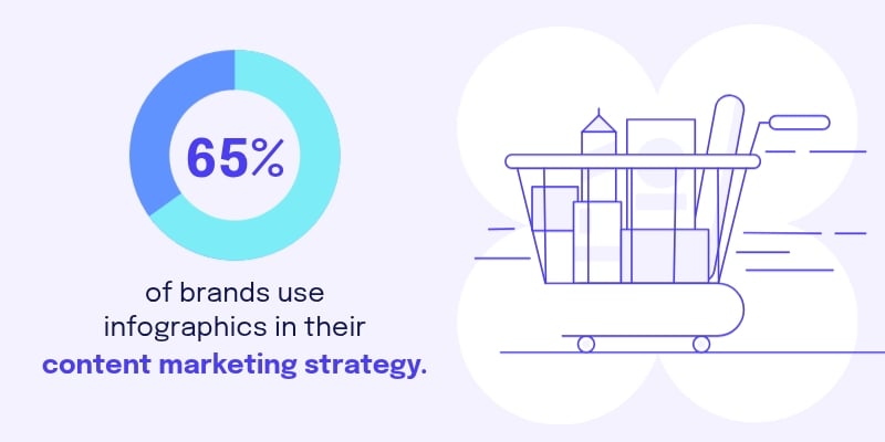
About 65% of brands have incorporated infographics into their content marketing strategies. That widespread adoption reflects how mainstream visual communication has become for everything from product launches to thought leadership content to investor relations.
Infographics have crossed the threshold from emerging trend to standard practice, and the brands driving that adoption are doing so because the performance data justifies the investment.
Key takeaway: When nearly two-thirds of brands are using infographics, the question is no longer whether to add them to your strategy. It’s about applying infographic best practices so it’s good enough to stand out from the 65% who already do. What separates the brands that get results is the quality of the visual thinking behind their content and the consistency with which they publish it.
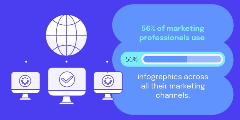
Up to 56% of marketing professionals use infographics across all of their marketing activities, spanning multiple channels and campaign types.
A single well-designed infographic can move from a blog post to an email newsletter to a LinkedIn post to a sales deck without being rebuilt from scratch. This cross-channel portability is what separates infographics from most other content formats, which are typically designed for one context and difficult to repurpose effectively.
Key takeaway: Instead of creating separate assets for each platform, one strong infographic can anchor your entire campaign across email, social, web, and sales. That efficiency is especially valuable for smaller teams managing large content calendars. Build one infographic well and you've effectively created content for five different channels simultaneously.
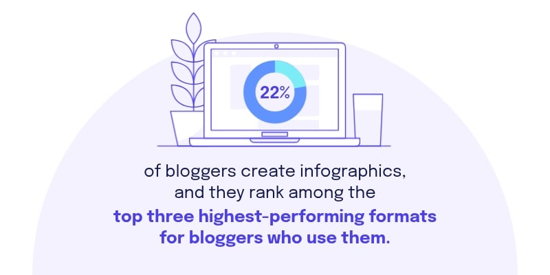
Among bloggers, 22% include infographics in their content mix. That figure sits alongside roundups and original research as one of the lower-adoption formats.
But according to data from the Content Marketing Institute, infographics rank among the top three formats that produce the strongest results for bloggers who use them, alongside roundups and original research.
Key takeaway: Most of your competitors don't use infographics regularly. But those who are making the most of it are seeing outsized results. Adding infographics to your content mix when most publishers in your space are still relying on text-heavy articles positions you to capture attention and backlinks that others are leaving behind.
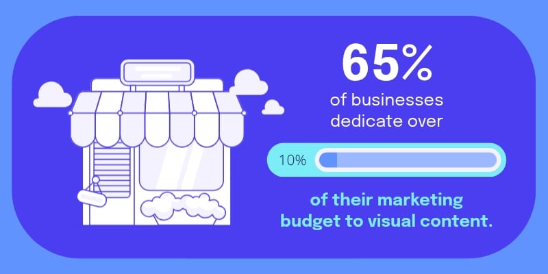
About 65% of businesses allocate over 10% of their marketing budgets to visual content.
That's a meaningful share that signals strategic intent rather than casual experimentation. The brands that have crossed the 10% threshold have deliberately invested in visual communication as a core part of their approach to reaching and engaging their audiences. And they’ve obviously crossed this threshold because the returns justify it.
Key takeaway: If your visual content budget is below the 10% mark, you're working with fewer resources than the majority of brands you're competing with for the same audience's attention. That doesn't mean you can't create effective infographics on a smaller budget, especially with the right tools, but it does mean that scaling your visual content investment is likely one of the highest-impact changes available to you.
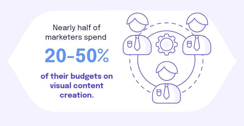
Nearly half of marketers (45.71%) invest between 20 and 50% of their budgets specifically on visual content creation.
Where does that money go? 56.2% of marketers say most of their visual content budget goes toward tools and software for producing it. The infrastructure for creating great visual content is being treated as a business asset, not a line item to minimize.
Key takeaway: The biggest share of visual content spend is going into the tools that make consistent creation sustainable at scale. This is an important signal: the brands producing visual content at volume aren't hiring more designers or outsourcing everything. They're investing in platforms that let their existing teams create professional-quality visuals without bottlenecks. If visual content production is slow or inconsistent for your team, the solution is more likely a better tool than a larger headcount.
Beyond what infographics do for comprehension and learning, there's a practical marketing question: do they move the needle on the metrics your business actually cares about? Traffic, links, leads, conversions.
Here's what the data says:
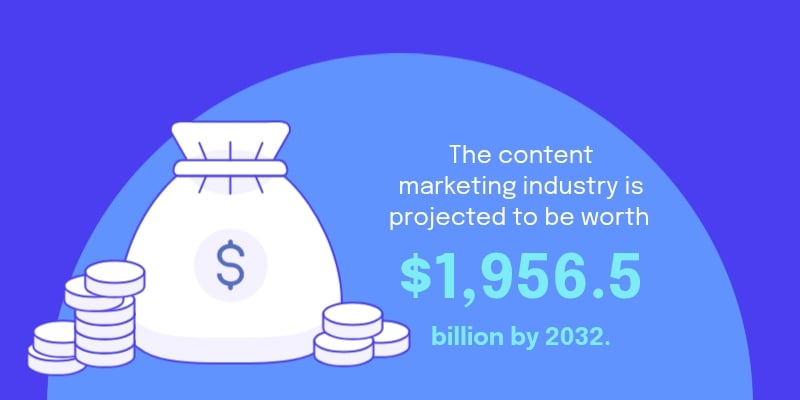
The content marketing industry, which includes visual formats like infographics as a core pillar, is projected to be worth approximately $1956.5 billion in 2032. That’s nearly a $2 trillion market.
The scale of this figure reflects how completely content has become the primary medium through which brands build relationships, earn trust and drive purchasing decisions.
Key takeaway: A $1.9 trillion industry is one that has moved well beyond experimentation. Brands that prioritize visual content are operating in the growth lane of that market. The question for any content team is whether your current investment in infographics and visual communication is proportional to the role visual content now plays in how buyers make decisions.
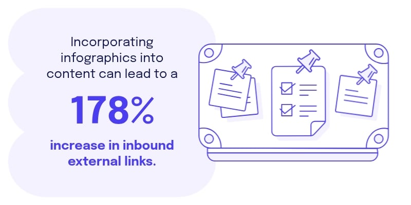
Adding infographics to blog posts and articles can increase inbound external links by 178%. An infographic presenting original data or a useful visual framework becomes a linkable asset. Other writers and publishers reference it because it's easier to cite a well-organized visual than to recreate the same explanation themselves.
Each backlink builds domain authority and drives referral traffic, and a single infographic can continue to deliver value for months or years after publication.
Key takeaway: Most link-building strategies require ongoing outreach, relationship-building, and effort. Infographics earn links passively when they are useful and easy to reference. And brands that produce data-rich or visually distinctive infographics consistently accumulate link equity.
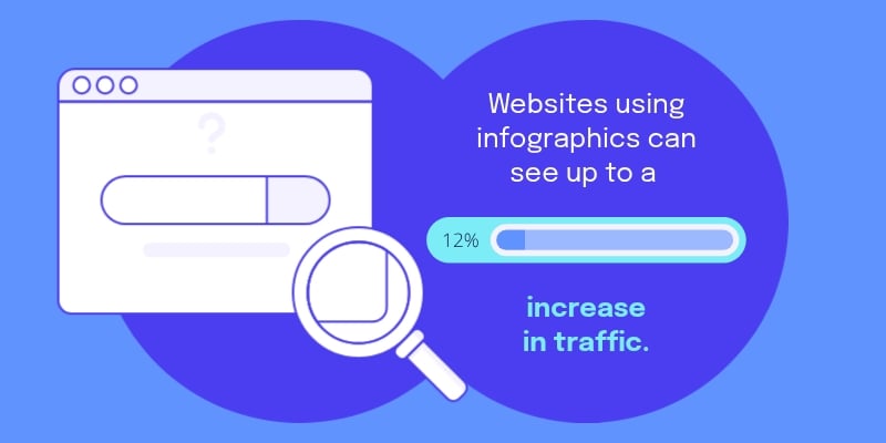
Websites that use infographics consistently see up to a 12% increase in traffic compared to those that rely on text-based content alone. That lift comes from a few compounding factors:
Infographics are more likely to be shared on social media, earn backlinks, and keep visitors on the page longer. When you embed visuals in articles and optimize them properly, you improve time on page and referral traffic in ways that build on each other over time.
Key takeaway: A 12% traffic increase is the kind of consistent, compounding gain that adds up meaningfully over the course of a year. It comes not from a single spike but from the accumulation of more shares, more backlinks, more referral visits, and better search performance from improved time on page.
12% increase in traffic is one of the most reliable indicators of where audience interest is actually heading, and for infographics, that trajectory is steep.
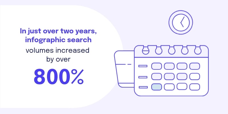
An 800% jump in search volume over two years is the growth that gets marketers' attention. It means audiences aren't just passively consuming infographics when they appear in a feed. They're going to look for them.
That kind of demand-side growth is rare. Most content formats are pushed by creators and platforms. Infographics are increasingly being pulled by the people they're designed for.
Key takeaway: When search volume for a content format grows 800% in two years, there's a discoverability opportunity attached to it. Brands publishing well-optimized infographics are showing up for an audience that's already looking. That's a much easier conversion than trying to stop someone mid-scroll.
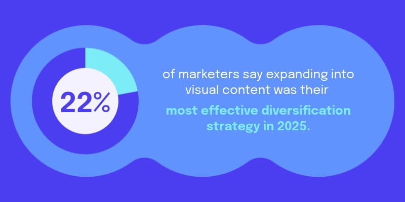
According to the HubSpot State of Marketing Report for 2026, 22% of marketers said that moving from text-based to visual and audio content was the single most effective diversification strategy for their brand in 2025.
For nearly one in four marketing teams, that one shift toward visual formats made the biggest measurable difference to their overall performance across the year.
Key takeaway: Diversification strategies are plentiful and most produce incremental results. Visual content is one of the few moves that showed up as a game-changer. If your content is still mostly text, this is a direct signal from peers who've already made the switch.
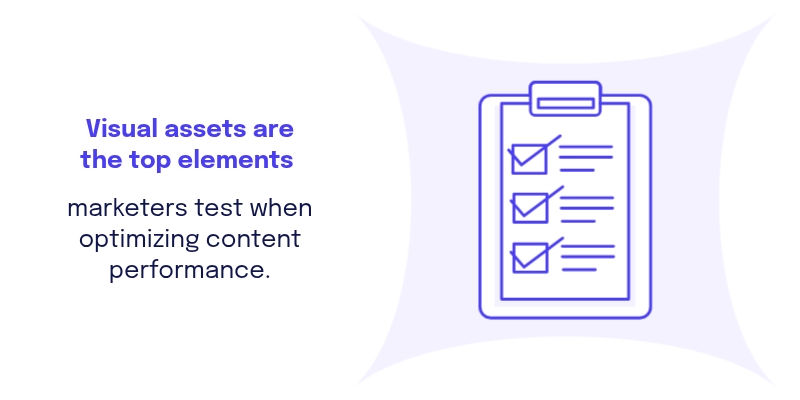
When marketers optimize their content for better performance, visual assets are the first thing they test, ahead of copy, targeting, and offers. Images, color choices, and video thumbnails consistently show the most immediate impact on whether an audience engages or keeps scrolling. What gets tested first is usually what has the highest impact and the most variability.
Key takeaway: If you're running A/B tests and not starting with your visuals, you're likely beginning in the wrong place. The reason marketers test visual assets first is that they deliver the fastest signal about what's resonating with an audience. A visual change can double engagement overnight in a way that a copy tweak rarely does. For teams with limited testing bandwidth, this finding is a practical prioritization guide: get your visuals right before you optimize anything else.
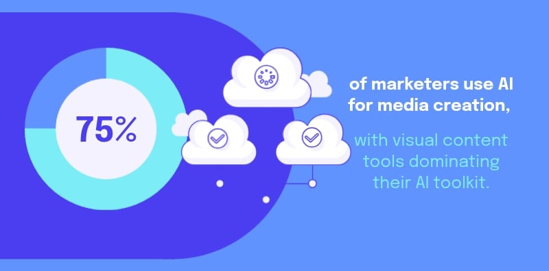
Nearly 75% of marketers now use AI for media creation, including images and video, making it one of the five most common AI applications in marketing today.
The most widely used AI tools are visual: smart image editing features (45%), video and animation generators (44%), AI video and audio editors (42%), and image or design tools (40%). The tools marketers are reaching for most are those that help them create and refine visual content faster and at a higher quality.
AI is removing the two main barriers to visual content at scale: the time required to produce it and the design skill required to produce it well. The brands adopting visual AI tools now are building a production capacity that their competitors will find very difficult to match without making the same investment.
Key takeaway: What this data shows is that the visual content advantage is no longer limited to teams with large design budgets. Teams with the right tools and the right strategy can now produce professional-quality infographics and visual content at a volume and speed that simply wasn't possible a few years ago.
For B2C brands, the HubSpot State of Marketing Report found that the three channels delivering the best ROI were email marketing, paid social media content, and content marketing, in that order.
Infographics serve all three simultaneously. They work as standalone visuals in email campaigns, drive strong engagement as social posts, and function as high-value content assets that earn traffic and links over time.
Key takeaway: One well-designed infographic can do meaningful work across your three highest-ROI channels at the same time. That kind of multi-channel leverage is rare in content marketing, where most formats are optimized for one context and struggle in others. The ROI case for investing in infographic quality is strengthened significantly when you account for all the channels it can serve simultaneously.
Static infographics are powerful. Interactive infographics amplify that power by putting your audience in the driver's seat
They let your audience explore data on their own terms, filtering, clicking, and adjusting as they go. This shifts your audience's experience from passive consumption to active engagement.
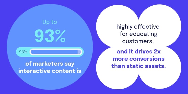
Research shows that interactive content drives twice the conversions of static assets and attracts twice as much engagement.
And 93% of marketers say it's highly effective for educating customers. Take a format like infographics, which are already 30 times more likely to be read than text articles, add interactivity to it, and the performance gap between your content and everyone else's grows considerably wider.
Key takeaway: The jump from static to interactive content is one of the highest-leverage upgrades available in visual content marketing. Twice the conversions and twice the engagement represent outcomes that most campaigns work very hard to achieve through targeting, optimization and spend. An interactive infographic encourages engagement by having users participate rather than just observe. For brands looking to increase content performance without simply increasing their ad budget, creating immersive interactive experiences is one of the most compelling options on the table.

Up to 37% of content creators say they'd like to automatically transform their infographics into presentations, videos, and interactive ebooks. That demand reflects where creators see their audiences heading, toward formats where they can participate rather than only read.
An infographic that becomes a clickable or interactive data visualization, a microsite, or a short-form video represents a fundamentally more powerful content experience.
Key takeaway: The smartest use of a strong infographic is to extend its life across formats. A single well-designed visual asset repurposed into an interactive presentation, video, one-pager, and social post multiplies your reach without multiplying your production effort. The 37% of creators who want this capability are responding to a real audience need: people want to explore, interact, and participate. Interactive content platforms like Visme, which make it easy to extend a static infographic into multiple formats, give content teams a significant advantage in production and distribution.
All the comprehension and learning benefits in the world matter little if your content isn't getting read, shared, and clicked. Here's where infographics prove their value as an engagement tool.
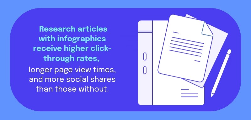
A review published in Sage Journals examined graphical abstracts and infographics across scientific research and found that articles featuring visual summaries consistently outperform those without them across every tracked engagement metric: click-through rates, page view times, and social media shares.
The authors noticed a noticeable change in how science is communicated, leaning more towards fun and interactive visual experiences. This shift is all about making research easier to understand and more engaging for a wider audience.
Key takeaway: Academic publishing is one of the most text-heavy and traditionally conservative communication environments. The fact that infographics are producing significant, measurable improvements in that context suggests their ceiling in marketing—where visual content is already expected and welcomed—is considerably higher. The research also signals where the format is heading: toward more interactive and immersive experiences that go beyond static visuals.
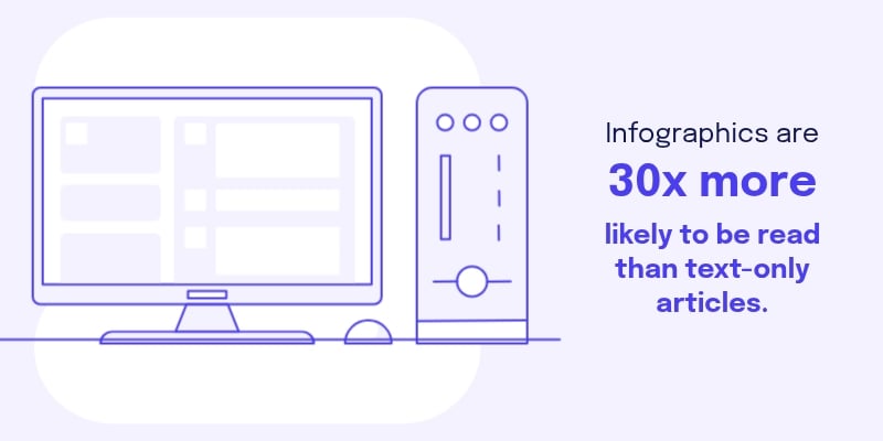
Infographics are 30 times more likely to be read than text-only articles. That statistic should reframe how you think about format decisions. The quality of your writing matters. The depth of your research matters. But presenting that work in a format people are 30 times less likely to engage with means starting at a significant disadvantage before anyone has read a word.
Key takeaway: Presenting your content as an infographic dramatically increases the likelihood that it gets read. All the other optimization efforts you invest in — the headline, the structure, the calls to action — can only work if your audience gets far enough to encounter them.
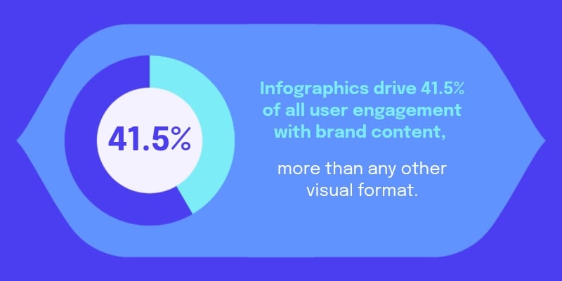
When measured across all branded visual content, infographics come out on top.
They account for 41.5% of all user engagement with brand content, more than any other single visual format. No other format in the visual content category comes close to that share of attention. That's a dominant position in a crowded field that includes video, photography, illustrations, and branded graphics.
Key takeaway: If your content budget is split evenly across visual formats, the engagement data suggests reallocating toward infographics would produce better overall returns.
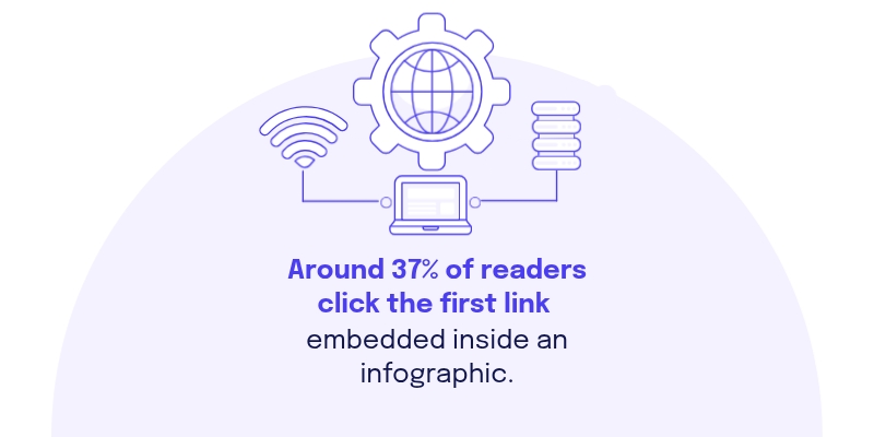
Approximately 37% of people click on the first link embedded within an infographic. That's a remarkably high click-through rate, driven by the trust and intent that readers bring to visual content they've already chosen to engage with. Strategically placing a call to action, a product link, or a next-step resource inside your infographic is a real conversion opportunity.
Key takeaway: Every infographic you publish should have a deliberate first link, and that link deserves as much strategic thought as your headline. With more than a third of engaged readers clicking it, the placement and destination of your embedded link are among the highest-impact decisions in your entire infographic.

In a study, researchers found 80% higher readership rates when content used charts, graphs, color design, and images. Good design principles help readers prioritize what's important, move through information more efficiently, and leave with a clearer understanding of the message you were making.
Key takeaway: More readers per piece means more value from every hour your team spends creating content. An 80% improvement in readership rates, applied across your entire content library, has a compounding effect on brand awareness, search performance, and audience growth. The practical implication is straightforward: if you have strong content that isn't performing, adding visual design elements is one of the first interventions worth trying. In many cases, the quality of the content is already there. What's missing is the visual layer that makes people want to engage with it.
Got questions about infographics and how to use the data behind them? Here are direct answers to the most-asked questions.
No, infographics are not outdated. Usage and performance data from 2024 to 2025 show the opposite: 65% of brands now include infographics in their content strategy, 67% of B2B marketers are actively creating them, and infographics drive up to 650% more engagement than plain text.
The format has evolved alongside social media and AI creation tools, but its core advantage, turning complex information into something people can understand and remember quickly, remains as relevant as ever.
A statistical infographic is a visual that presents data, numbers, or research findings in a graphic format designed for quick comprehension.
Rather than listing statistics in a table or paragraph, a statistical infographic uses charts, icons, color, and layout to make the numbers easy to read, compare, and remember. They are commonly used in marketing reports, research summaries, press releases, and social media content to make data more accessible and shareable.
To present statistics effectively in an infographic, lead with the most important number and use size, color, or placement to signal its importance. Use charts, icons, or illustrations to represent each data point visually rather than listing numbers in text.
Group related statistics together, keep labels short, and use color consistently to help readers distinguish between categories. Add brief context beneath each figure to explain why it matters, and close with a clear takeaway or call to action so readers know what to do with the information.
Some of the most cited infographic statistics include:
Across comprehension, engagement, traffic, and retention, infographics consistently outperform text-only formats.
Yes, infographics are highly relevant in 2026.
According to the HubSpot State of Marketing Report for 2026, visual content is one of the top investment priorities for marketing teams. 74% of marketers use infographics for social media communication, and infographics remain among the top-performing content formats for both bloggers and B2B marketers.
As AI tools make infographic production faster and more accessible, output is increasing rather than declining, and the performance advantages of the format remain firmly intact.
It's your turn. Now that you've seen what the data says about infographics, the next step is putting it to work.
Visme’s unified content creation platform is built for exactly this. Whether you're designing your first infographic or scaling up to publish multiple visual assets every week, Visme gives you everything you need to create professional, engaging, and interactive infographics without needing a design background.
Choose from hundreds of customizable infographic templates designed around real use cases. Then, pull in your own data, apply your brand colors, fonts and other visual assets, and add interactive elements like clickable links, animated charts, and embedded video to elevate your reader’s experience.
The same platform also lets you repurpose your infographics across formats. Turn it into a presentation, export it as a social media graphic, embed it in a blog post, or share it as an interactive web page.
The statistics in this article make a strong case for investing in infographics. Visme makes that investment accessible, fast, and sustainable for any team. Start creating your next infographic with Visme
Design visual brand experiences for your business whether you are a seasoned designer or a total novice.
Try Visme for free


![How to Make an Interactive Infographic [+Templates]](https://visme.co/blog/wp-content/uploads/2023/11/How-to-Make-an-Interactive-Infographic-Quick-Guide-8-Customizable-Templates-Thumbnail.jpg)


