


Typography Infographics: 12 Inspiring Examples & Techniques

Marketing and communication teams need infographics that explain things fast and are easy to share.
The problem is, most people who need them aren't designers and don't know where to start.
Infographics package data, text and graphics into a single visual that distills your message into scannable chunks without overwhelming your audience. And you don't need a design background to create a great one.
In this guide, we'll show you how to create amazing infographics without professional design training. You'll learn which layouts work for different content types, how to balance text with visuals for contrast, build a logical flow, choose the right font pairings and avoid the most common design pitfalls along the way.
We've also rounded up the five highest-rated infographic makers available online right now, so you can hit the ground running.
But if you’re short on time or prefer watching instead of reading, check out this video to learn the dos and don’ts of designing engaging, animated infographics.
Simply put, an infographic is a visual representation of information. Their typical purpose is to transform a text- or data-heavy document (or blog post) into a visual format that’s quick to scan and easy to grasp.
Infographics work well as communication tools because they're faster to process than long blocks of text or large spreadsheets. Plus, they’re easy to share digitally through blog posts, email, social media and landing pages.
Common uses for infographics include explaining processes, comparing options, showcasing statistics, mapping timelines or simplifying technical concepts to an interested audience.
If you’re wondering if Infographics are still relevant, Ryan Robinson from RighBlogger has something to say about that:
“While infographics may have peaked in popularity a decade ago, they still have a significant role to play in content marketing today, especially on visual-centric platforms like Pinterest. Sharing your infographics on Pinterest can drive traffic back to your blog and expand your post to new audiences.”
Here’s a quick rundown on how to make an infographic. For a detailed walkthrough with templates and step-by-step instructions, see our complete guide onHow to Make an Infographic.
Start with clarity on what you're communicating and who needs to see it. Nail down your core message and the single takeaway you want readers to remember.
Once you know what your infographic is about, collect the data that supports it. Pull statistics from credible sources, fact-check every claim and keep your citations organized.
Pick a layout that matches your content type and find a template that aligns with that choice. The final structure should guide readers through your information in a visual and cognitive flow.
When designing, choose two fonts that pair well, limit your palette to two or three colors and use charts or icons to replace text blocks wherever possible. Make sure to leave white/empty spaces so elements can breathe.
Share the finished infographic with your audience in the format that best supports your communication goals. Visme offers many options.
If you want your infographic designs to generate shares, build links and bring people to your website, here are the 12 tips you need to follow.
The first tip you need to know when making an infographic that works is to fully plan out your design from head to toe.
This helps ensure you:
As Maddie Mack, from Lemonly shares,
“When it comes to infographics, follow the straight and narrow path. By that, I mean your infographic should get straight to the point by covering a narrow topic.”
Planning an infographic design involves nine easy-to-follow steps:
Following these will make sure your infographic content is relevant to your audience, goals and business and help you get the most out of your designs.

Once you’re ready with the first step, it’s time to choose the right layout for your design.
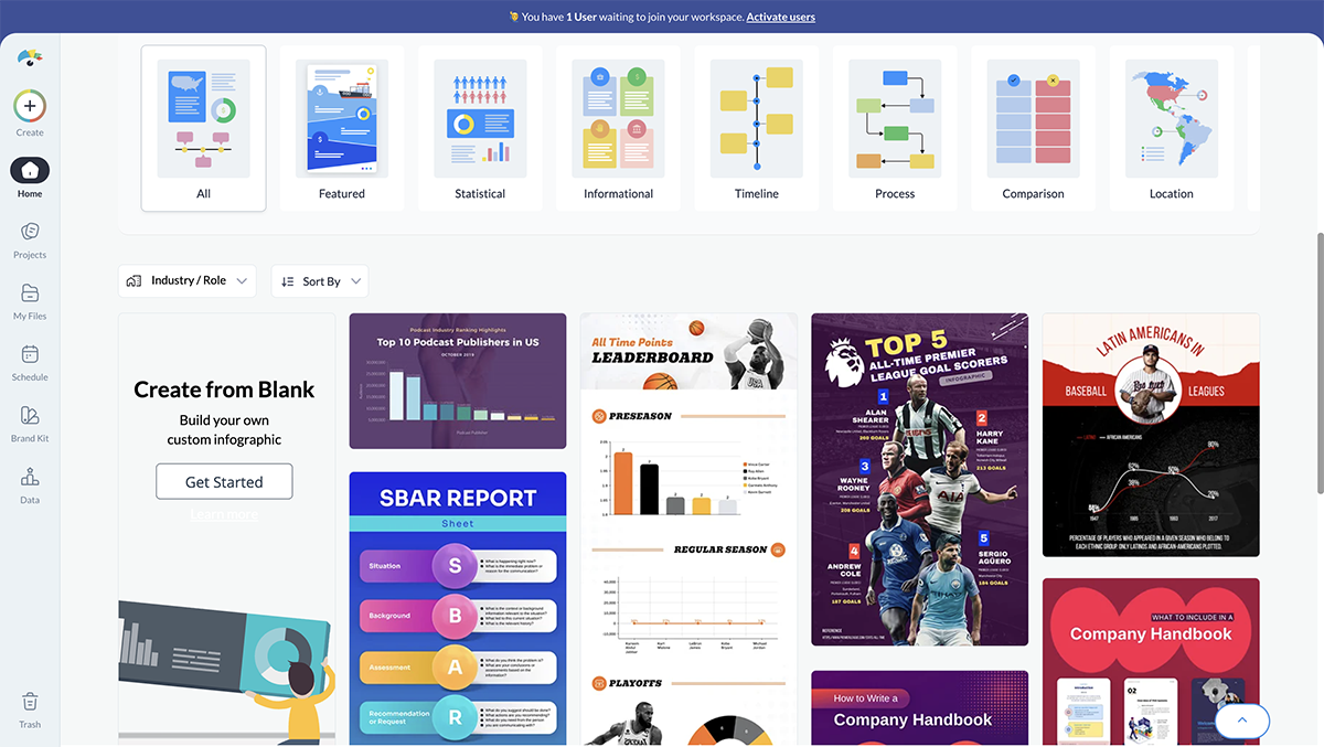
There are various infographic layouts to choose from, each helping you to convey information in different ways.
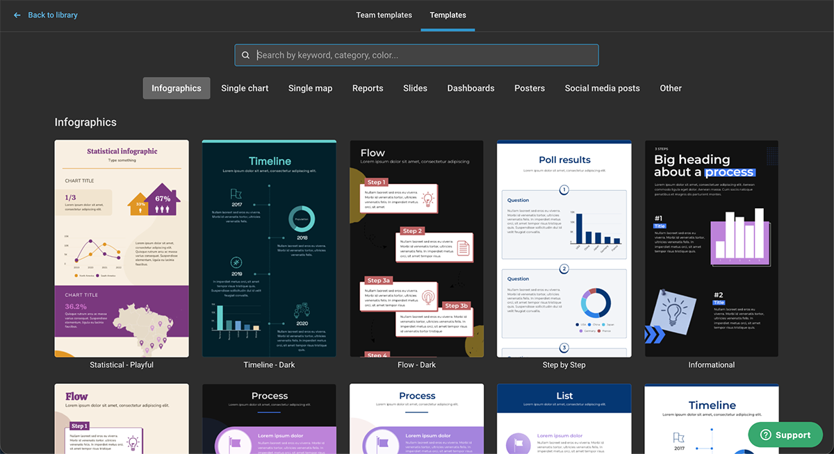
Take a look at these layout examples to get an idea of what your infographic design could look like depending on the kind of information you’re planning to share.

You can easily find a template that fits your design in Visme's infographic template library.
Research shows that 61% of consumers say infographics help them retain information better than other content formats. Your headline will determine whether they stop scrolling long enough to be interested in your information.
Our favorite formula for crafting a compelling infographic header is: Number + Adjective + Noun + Keyword + Promise.

So, for example, in an infographic showcasing 8 Surprising Tips for Lead Generation That Will Exponentially Increase Conversions, the headline has:
Easy enough, right? Try to put this formula into play within your next infographic headline.
There are so many different types of charts, graphs and data widgets that you can add to your infographic. And with Visme, you can make all your data visualizations interactive and engaging.
There are dozens of data visualizations to choose from:
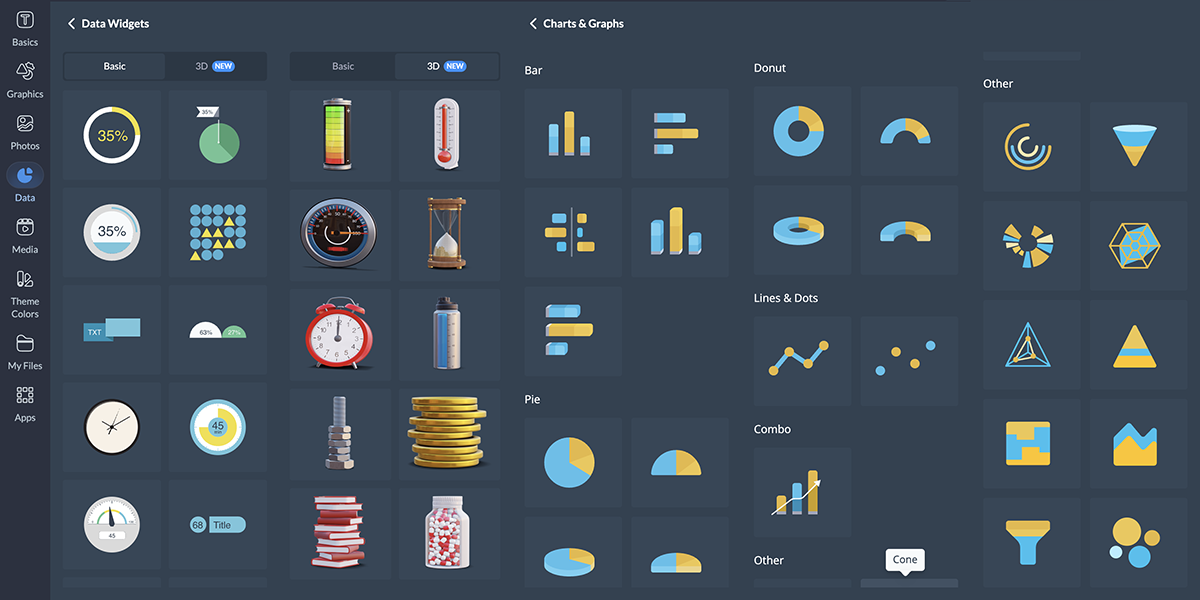
But how do you know which chart to use when? Let’s take a look at which one works for what purpose and how interactivity will make it even better.
Here’s what Alejandra Mariscalez, Design Manager at Visme, has to say about this technique:
"I think one of the most important things to clarify with interactive infographics and anything related to interactivity is that it has to be engaging. Some people confuse interactivity with simple animations or special effects and forget about the most important part which is having the user interact with elements within the design in order to convey/uncover a special message."
We’ve put together a guide on creating charts and when to use each one to help you out, but we’ll summarize quickly below.

You can easily combine multiple types of graphs and charts all into a single infographic by strategically placing them around your design. And since infographic dimensions are typically longer, you have plenty of space to do this.
Here’s what Alejandra Mariscalez, Design Manager at Visme has to say about this:
Design Manager at Visme
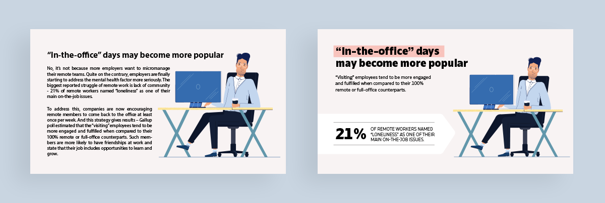
Regardless of the topic of your infographic, the main goal of good infographic design is to maintain a solid balance between the text and the visuals throughout.
Here’s a great example of that in practice:
Sign up. It's free.Want to create your own beautiful infographics?
It’s easy to see which of these two infographic blocks is more eye-catching and therefore, a more effective infographic design.
In the first example, there’s too much text, making it tough to read. On the right, the hierarchy is better and the content is easier to grasp quickly.
The best way to achieve this balance is to cut your text down to the essentials, as we see in the second example.
Then, adding decorative elements to your text, like a background color or a call-out, is the perfect way to offset the layout and pull the composition together.
Information design agency Ferdio’s Notebook on Infographics warns against a common mistake: '
"So much to say, so little space? For fear of leaving out important information, you run the risk of cramping too much information into too little space. But the risk is that the more you add, the more difficult it will be for your audience to digest and to remember your key message."
On the flip side, Alejandra emphasizes that having too little content can also be a negative, so watch out for going too far.
Design Manager at Visme
When creating an infographic, you’ve got a whole world of design elements at your fingertips. And Visme’s extensive library offers everything you need to make your infographic visually stunning.
You'll find icons to symbolize concepts, shapes and lines to create structure and flow and text frames to organize your content.
But that's just the beginning.
You can add depth with 3D elements, bring emotion with 3D characters and illustrations and create movement with animated graphics.
Designers looking to create custom 3D assets from existing images can also use Hyper3D AI 3D model generator to quickly transform visual concepts into detailed 3D models for presentations, infographics, and interactive content.
You just need to determine what kind of design you’re going for and make sure your elements match.
For example, if you choose to use icons in your infographic, you need to stick with the same style throughout. It doesn’t matter if you want to add isometric illustrations, icons, or 3D elements to your infographic; make sure the style, size and color are consistent throughout the project.
I asked Hylie Zhan, Graphic Designer at Visme, about the common design mistakes she sees non-designers make, and here are the major ones she pointed out.
Your next challenge is to tackle a color palette that makes sense for your infographic. Keep this in mind:
Take a look at the infographic below to learn about the meanings and positive and negative connotations of colors.

Choosing an infographic color scheme requires understanding your audience, your topic, your brand and the basics of color to ensure you’re choosing the best colors for your design.
Now it’s time to focus on fonts. Ideally, you need two fonts. That’s why they’re called a font pairing.
Make it easy on yourself and use the fonts from your brand guidelines. But, if you want to explore other typography options, choose a bold serif or sans serif font for headers and an easy-to-read sans serif font for the infographic copy.
Here are a few tried-and-true font pairings that will work well in nearly any infographic typography combination.

Your infographic needs a cohesive visual flow so it's easy to read and understand, while also looking like it makes sense at a glance. Without it, your viewers could be left confused and unimpressed.
Use numbers, lines, arrows, visual text styles and other design elements to help you build the flow from the heading, through the copy and down to the sources and call to action.
Check out the infographic below. The design provides a clear direction of where a viewer’s eyes should go first, second, third and so on.

Another important factor for your infographic to perform well is visual contrast. Your chosen colors, fonts and design elements must pair well together while also creating enough contrast against their background to feel separate.
In the example below, the left side uses a blue color scheme in a variety of very similar shades. There is hardly any contrast. On the right, we added a light background to contrast with the blue and pink, making the illustrations and text stand out.

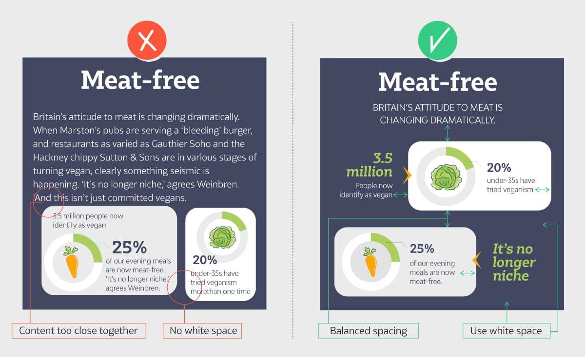
One major rule in graphic design is ensuring your design elements are clutter-free. This can be achieved by incorporating white/empty space. This technique helps elements “breathe” and be easily identifiable from each other.
Design Manager at Visme
Take a look at the two examples below. There’s a definite don’t on the right as we see small margins and design elements nearly touching each other.
By contrast, the left keeps equal margins between elements and plenty of white space around the design. This makes for a balanced infographic design that your viewers will flock to.
The last tip is to ALWAYS cite your sources.
Whether it’s research you conducted yourself, statistics from a trusted website or data from your own blog post, you want to include where the information came from.
Always fact-check the sources you’ve gathered outside your organization. This helps ensure your infographic is a credible source of information.
Since infographics are a powerful SEO tactic for your marketing strategy, people need to feel comfortable sharing your content.
Ferdio also emphasizes this responsibility:
"Your audience must rely on your information and trust that it is credible. Trustworthiness and authority should be present in your sources, your data, your visualizations and your design. Treat your data and sources with respect. Don't be cocky, frivolous or too simplistic, as it will make your data visualization lose authority and trustworthiness."
Take a look at the infographic footer example below to see how it's done:

This helps ensure your infographic is a credible source of information and that you’re fact checking everything you’ve compiled.
Infographics are a smart tactic in any SEO and marketing strategy, so ensuring people feel comfortable sharing your content by adding sources is essential.
Want more infographic design ideas? Check out this video:
This infographic design guide would be incomplete without discussing the tools needed to create them.
I’ve compiled a list of the current top infographic makers, and tested each one to see what they can do.
Here’s a quick breakdown of our testing methodology:
Check our comparison chart for a quick look:
| Software | Key Features | Best for | Pricing | G2 Rating |
| Visme | 1,000+ ready-to-use templates, 30+ types of charts and graphs, interactive data visualization, editable design assets, AI design generator, AI image generator, 3D character creator, real-time collaboration, brand kit features, third-party integrations | Businesses, educators and teams | Free;Paid from $12.25/ month | 4.5/5 |
| Canva | Massive template library includes both in-house and third-party designs, AI-powered Magic Studio, brand kit, real-time collaboration, third-party apps. | Small business owners, marketers and teams | Free; Paid from $15/month | 4.7/5 |
| Venngage | Extensive library of templates and design elements, smart data import, brand kit management, AI design assistant | Marketers, professionals and data analysts | Free; Paid from $10/month | 4.7/5 |
| Piktochart | Built-in templates, animation toolkit, AI infographic generator, smart resize tool | Educators, nonprofits and small businesses | Free; Paid from $14/month | 4.4/5 |
| Infogram | Data visualization tools, smart template library, team collaboration capabilities, interactive features, multi-format publishing | Data analysts, marketers and teams | Free; Paid from $19/month | 4.7/5 |

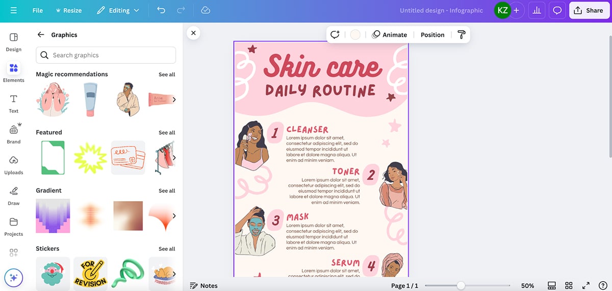
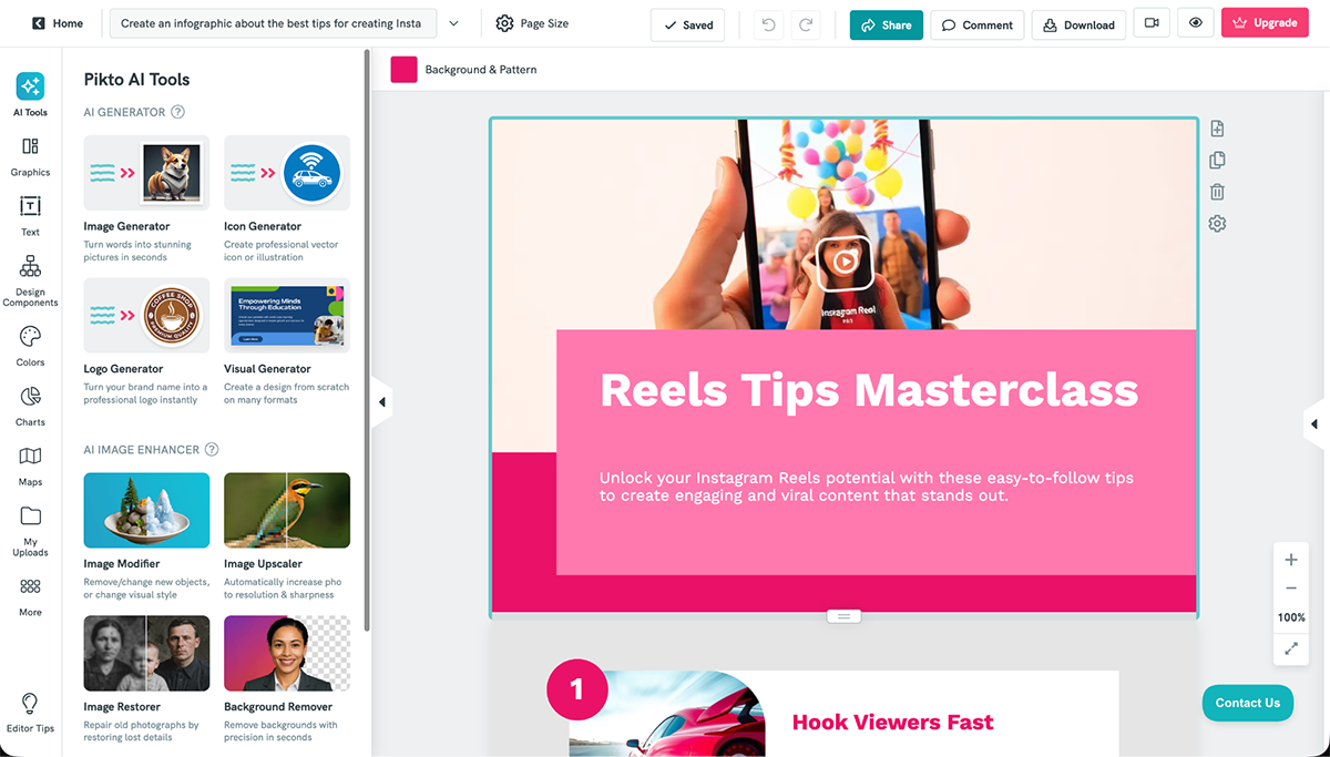
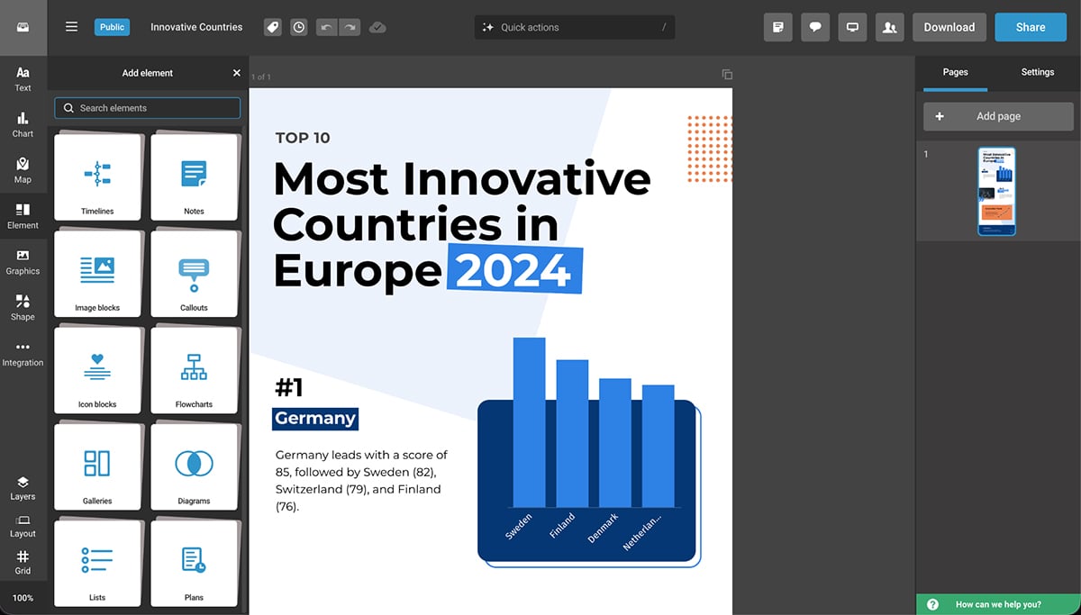
Visme is a super easy-to-use infographic maker thanks to its extensive template library, millions of design assets, AI-powered editing capabilities and design flexibility and control.
Plus, aside from the typical vertical infographics, you can also make video infographics to add to newsletters, infographic presentations or Instagram infographics to share on social media.
Getting started is simple:
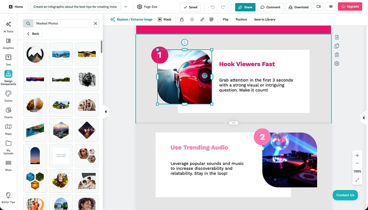
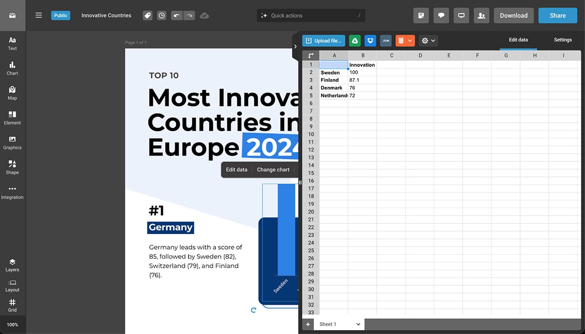
There’s something that Visme’s infographic editor has that I have always found extremely useful. It’s the individual block editor with a draggable vertical bar. Let me show you how it works. I’ll use our B2B Case Study Infographic as an example.
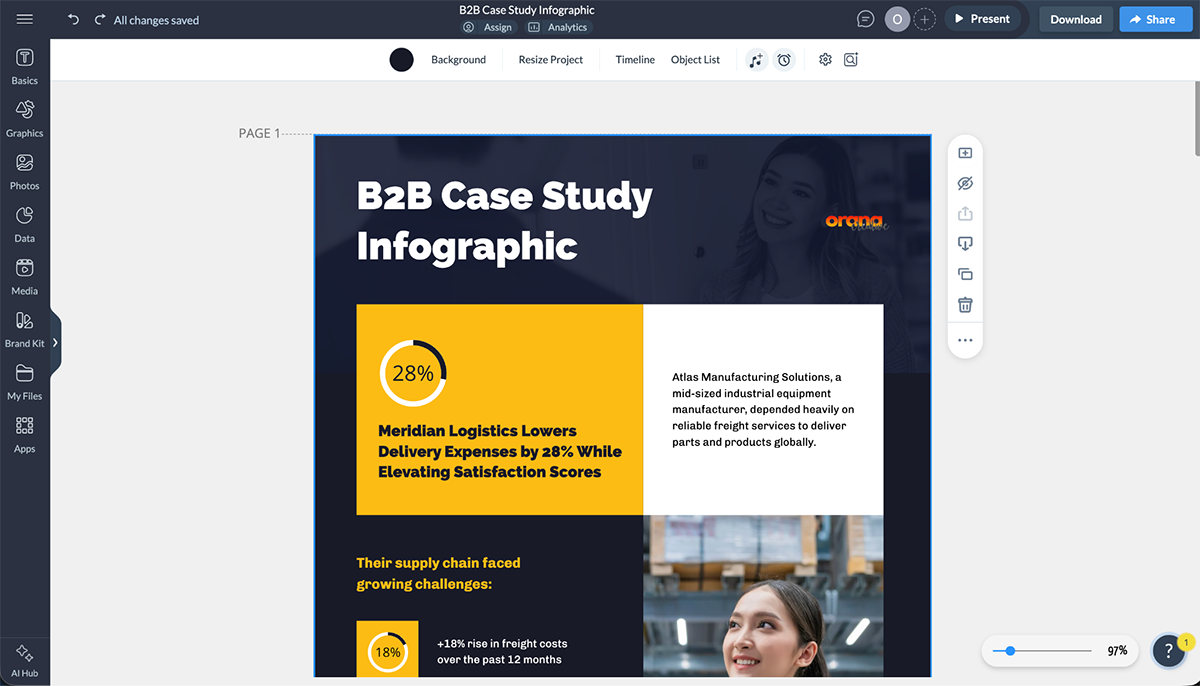
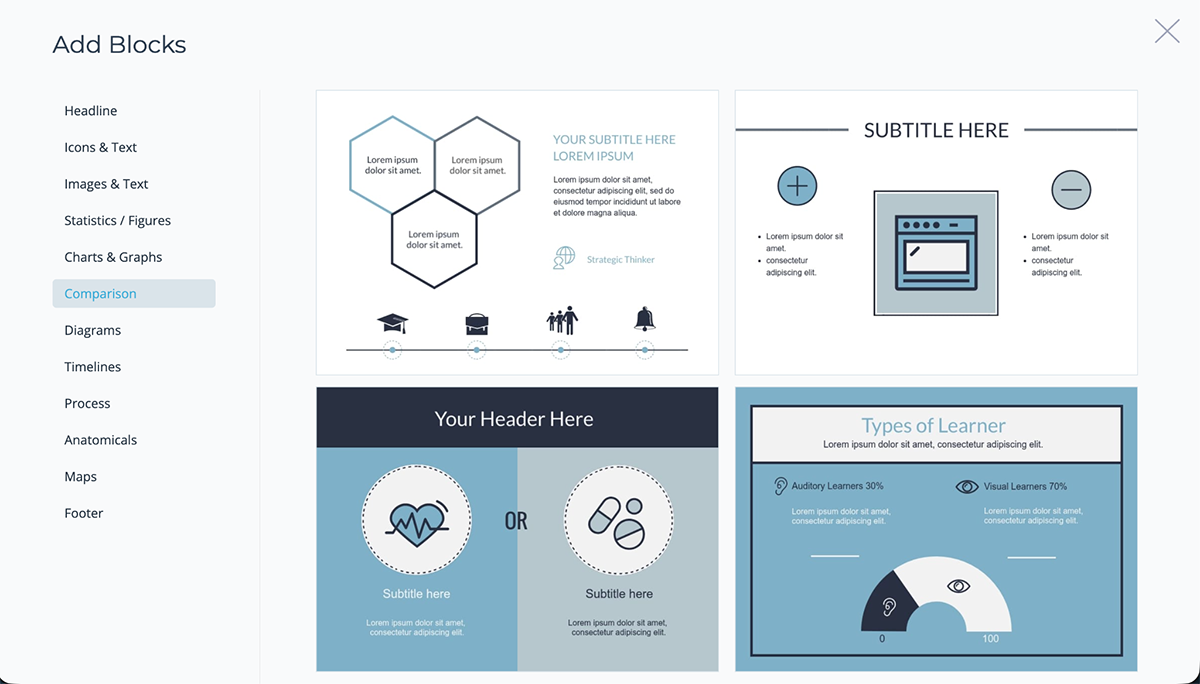
By creating your infographic with content blocks, you can edit each block's content individually without having to move all the elements to fit new elements. And the last content block has an option to add a new block, which can be either a blank block or a template block. There are tons of options to choose from like:
Visme’s free, basic account has everything you need to get started with any type of visual content, not just infographics. But to download your designs

Canva is a popular online design tool. The platform has thousands of templates in different styles and for various industries. Their editor has a built-in asset library, a drag-and-drop interface, AI capabilities, solid animation features and plenty of third-party apps to support your workflow.
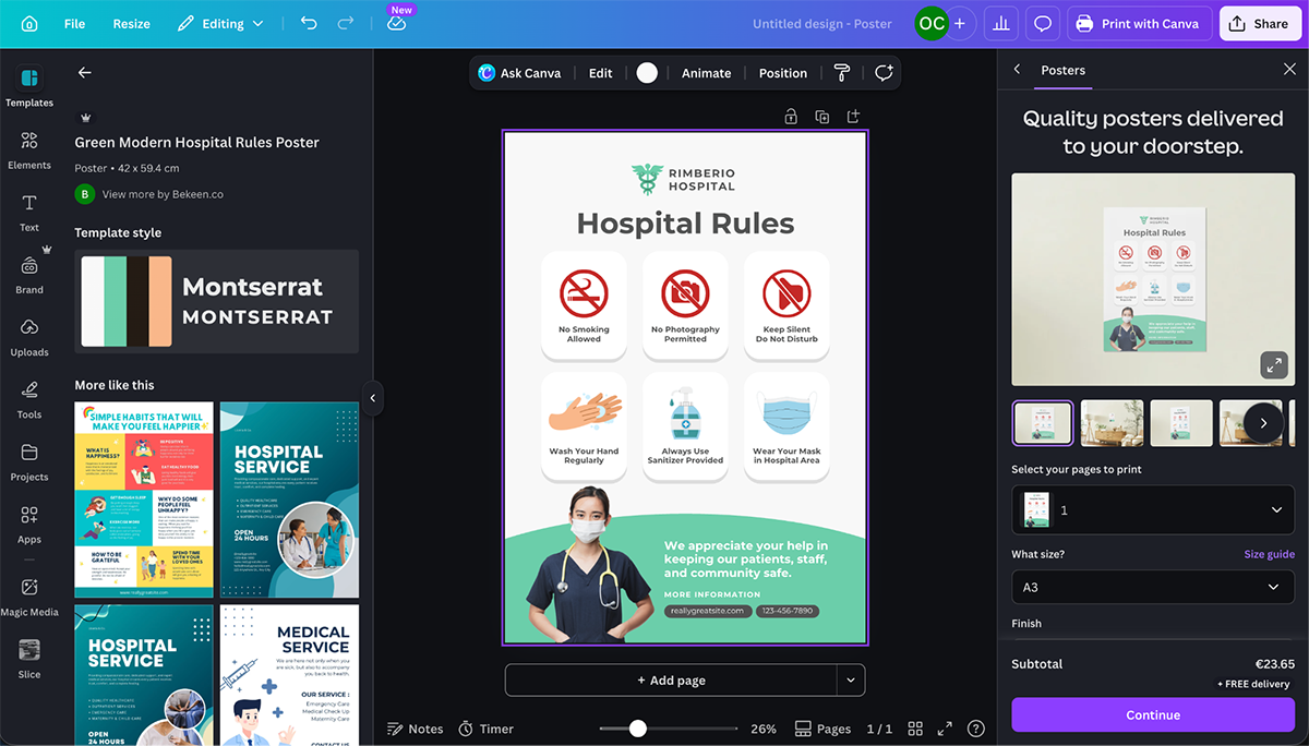
Even though there are plenty of tools to help with infographic creation, getting there isn’t as straightforward as it is in Visme and other tools. For starters, infographics aren’t one of the suggested content types when you open the dashboard. You have to search for them in either the templates directory or the Create New landing.
When you finally find what’s available, it’s a pleasant surprise. Not only can you create a vertical, digital infographic, you can also create printable infographic posters, infographic presentations and unlimited infographic whiteboards.
All with available templates. For the printable infographics, Canva offers a printing service you can organize from within the editor.
Once you’re done editing, download your infographic for offline use, or share it with your audience using a public view link, embed it on your blog or QR code.
You can get started with Canva for free, but you won’t have access to the premium features, which are a lot. Paid plans are definitely worth it.

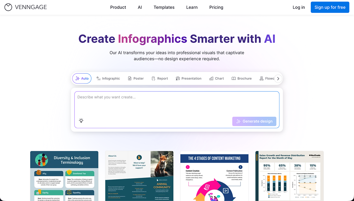
Next up is Venngage, a long-time contender in the infographic design space. Unlike other tools, Venngage’s front-and-center offer is infographics. They do offer other content types, but infographics are their main product.
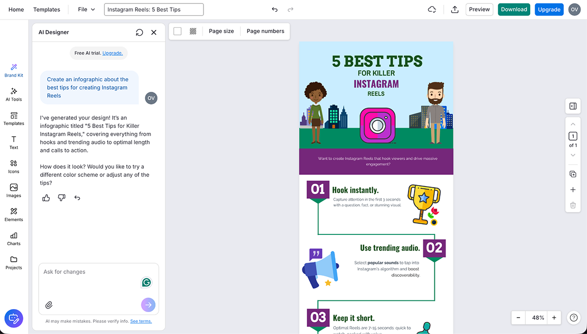
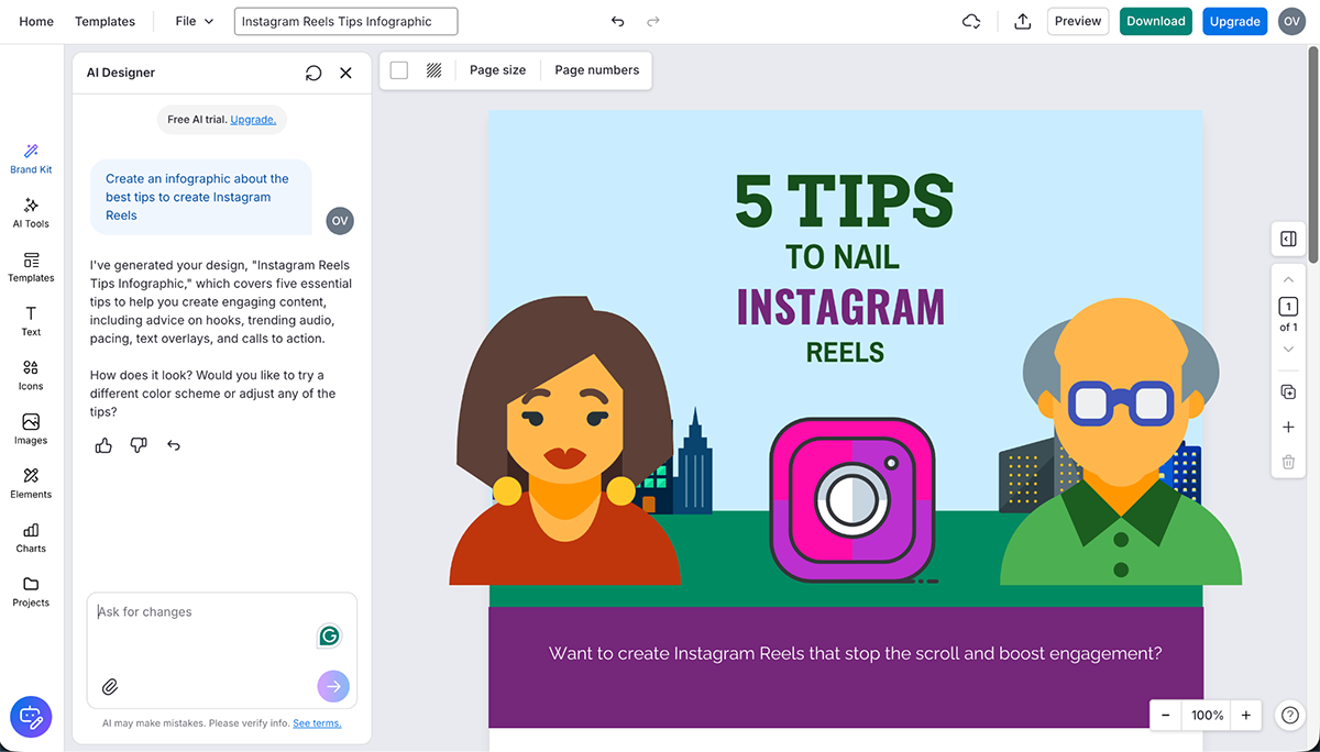
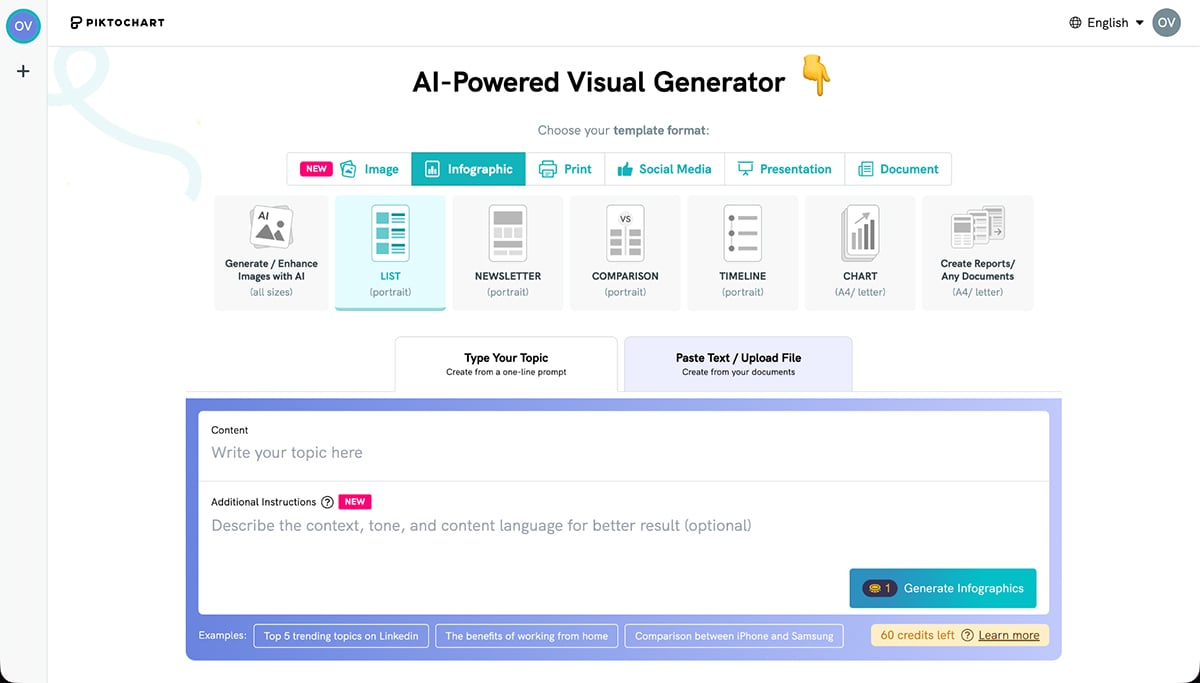
Like many tools in 2026, Venngage has incorporated AI into its systems. So, when you arrive at the Venngage site, you’re greeted with their AI Design Maker. To test it out, I asked it to create an infographic about the best tips to create Instagram Reels.
The results were ok, nothing outstanding. I tried the prompt twice, and the results were similar, but neither was better than the other. Definitely not ready to use in either case. Each generation created a different title and body content as well.
The good thing is that everything is customizable using Venngage's icons, illustrations, graphics and data visualizations. You can also use their AI to request design edits, but your results will always be better if you edit it manually.
Venngage has a free plan with plenty of free templates and assets, but you won't be able to share or download your project. The paid plans include:

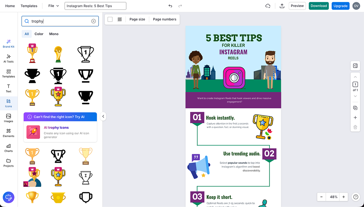
Piktochart is another design tool heavy on infographic making. They have also added an AI builder to their offerings. It seems more advanced than Venngage’s. I tested it out with the same prompt.
“Create an infographic about tips to make Instagram Reels”
The results were quite streamlined, with less reliance on icons for the section headers. Layout alignment and balance were also better with Piktochart than Venngage. To edit the results, you have all of the Pikto AI Tools plus all the elements available in the editor.
I tested changing the framed image that Piktochart suggested with the generation and found that there are lots of framed images that look great in designs like these. When you have the framed image selected, you can change the frame shape or apply several edits to the image itself, such as background removal and upscaling.
Piktochart has a free plan but only offers 2 PNG downloads. You do have access to all the templates and most of the features, but for actually creating something worthwhile, you’ll need a paid plan.

Last on the list is Infogram, an infographic design tool that focuses mostly on data visualization. Their pitch is that with Infogram, you can turn your data into interactive stories, which can also be infographics.
To create an infographic with Infogram, you can either start from scratch or choose a template. When building from scratch, there are content block options like with Visme, but you can’t have several blocks in one infographic, only one.
The tool and editor are simple enough to use, but there are some unfortunate things that happen when you open sidebars and popups. If it covers part of what you’re working on, you can’t move it over to see it. The pop-up for adding your data is particularly big and covers half of the design.
But what really caught my eye was Infogram’s data widgets. There are plenty of options to choose from like Tornado diagrams, Sunburst, Stream area, Sankey and Alluvial. You can change their colors, add legends or animate the data widgets to make the infographic more engaging.
If you’re using the free version of Infogram, you can share your project via a link, embed on your website or directly to your socials. But to download your projects in JPG, PNG, PDF, GIF and MP4 formats, you'll have to become a paid member.
Infogram offers a free plan with complete access to interactive charts and other visual elements in the editor. For AI features and no watermark, you’ll need a paid plan.
For detailed info on how much infographics cost, check out this article: Infographic Cost: How Much Is It & How to Save
An infographic design is a visual representation of any kind of information, data or knowledge. It combines different types of charts and graphs and other elements like text, images and diagrams to provide a summary of a complex topic.
While most infographics have one-page designs (for impact and shareability), they can vary in length when needed.
Your infographic design is considered good as long as it communicates your message without overwhelming the reader. This can be done through eye-catching visuals, consistent colors and styling, minimal text, relevant charts and icons and logical information flow.
The five core elements of an infographic are:
Yes, but with limitations. ChatGPT’s GPT-4o can generate infographic-style images directly in chat with improved text rendering compared to earlier versions. For best results, use very specific instructions including exact text in quotation marks, font details, colors and placement. The generation will be a flat image, not an editable file.
For polished, brand-aligned infographics with precise control over layout and typography, dedicated design tools like Visme, Canva or Piktochart work better.
That said, you can use ChatGPT to brainstorm ideas, outline your infographic structure, draft copy, suggest data points to include, or write headlines. Then paste that content into a proper design tool where you control the visuals.
The seven main infographic types are:
These are the seven steps you must follow to create an infographic:
This guide walked you through the elements that make infographics work. We showed you how to plan your infographic so it serves a clear goal and how to create flow so readers move through your content with clarity.
We also covered the top five infographic makers available right now, ranked by features, ease of use and value. One of which is Visme, which you can try out straight away.
Are you ready to create your first infographic or speed up production for your team? Discover Visme's infogrpahic maker and choose from hundreds of templates designed for non-designers just like you.
Design visual brand experiences for your business whether you are a seasoned designer or a total novice.
Try Visme for free


![How to Make an Interactive Infographic [+Templates]](https://visme.co/blog/wp-content/uploads/2023/11/How-to-Make-an-Interactive-Infographic-Quick-Guide-8-Customizable-Templates-Thumbnail.jpg)


