Healthcare Data Visualization: How to Turn Data into Impactful Stories

When writing a report or article or designing an infographic or presentation, you might have some numbers to include. And while you could write a paragraph about them, it’s more compelling to create a chart to show your information off.
This is because reading numbers and trying to visualize their meaning in your head is a much different experience than watching a chart visualize their meaning right before your eyes.
However, you don’t want to go overboard and start using charts when it doesn’t fully make sense, or when another visual — like icons, illustrations or stock photos — could better convey your point.
Knowing when to create a chart is just as important as knowing how, so let’s dive into that point of discussion first.
There are always going to be instances where you’ll have data and statistics that you want to share no matter what you’re creating. Showcasing this data within a chart provides a much better way for your audience to understand your argument.
You can use different types of charts to add a visual element to your words and numbers. There are numerical charts as well as organizational charts that help you visualize thoughts and ideas.
If you want to provide a visual aid to help illustrate your content, a numerical or organizational chart can be an optimal way to do this.
While many writers and content creators tend to lean towards the use of stock photos within their content, there is a whole other world of visual elements to explore in their place. Try adding one of the charts we discuss in this article to your next piece of content.
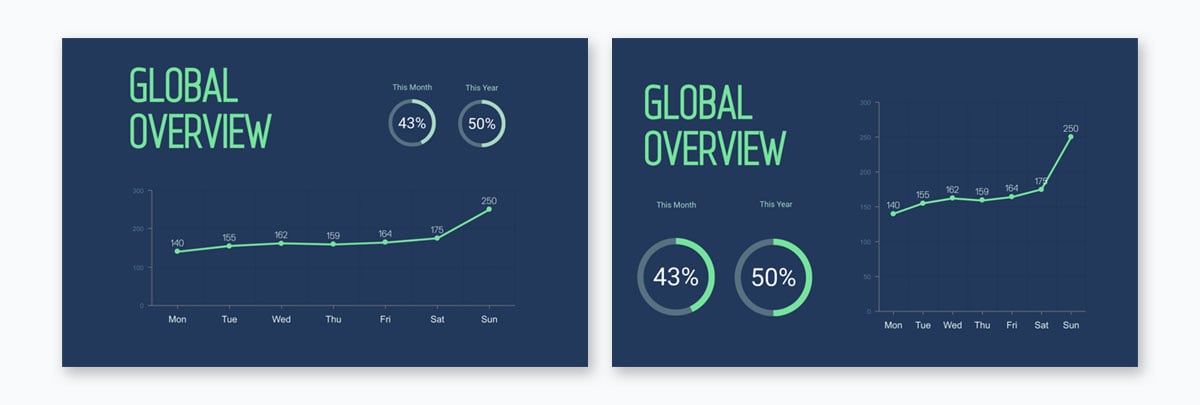
Here’s an example of including your content in a paragraph versus in a chart. You can easily tell which one is more comprehensive right off the bat.

We’ve put together an easy six-step process to help you determine which type of chart will best fit your information and then create a chart right in Visme to download or embed in your blog post or webpage.
First things first, which type of chart makes the most sense for your information?
Do you have data and statistics to input into a numerical chart or do you want to use a graphic organizer or organizational chart to visualize your content?
There are several types of numerical charts that can be created right in Visme just by starting with a template and inputting your data in the Graph Engine.
Visme also offers a number of charts and data widgets outside of the Graph Engine as well, as you can see below.

The Graph Engine is the first option within Visme’s data tab, and it opens up a spreadsheet and about 16 different chart and graph options.

Let’s dive into each of the numerical chart types you can create right within Visme’s Graph Engine.
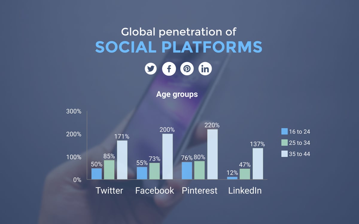
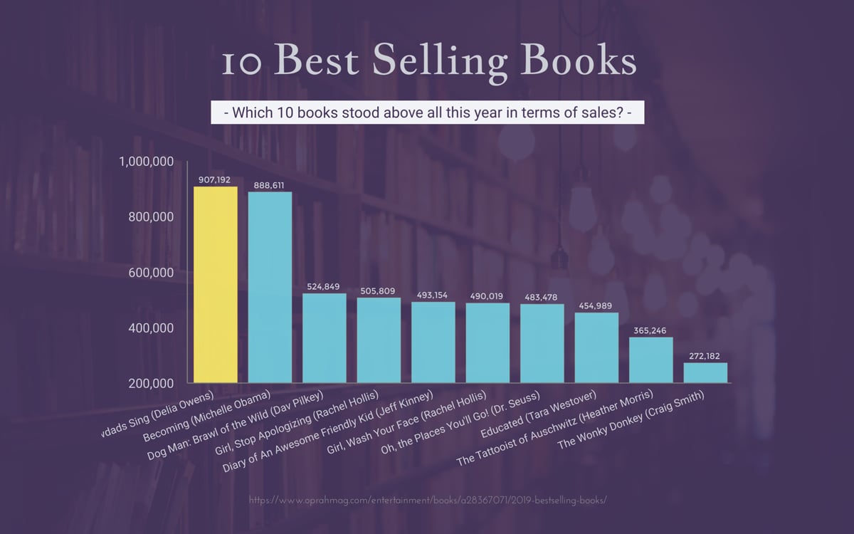
Bar Charts
A bar chart can be either vertical or horizontal, and is used to display various frequencies or amounts of data across different categories.
So for example, the bar chart template below — available right inside Visme — is comparing the largest companies in 2019, based on their revenue.

You can also include clumps of data in your bar charts, like in this template below.
Notice how there are four different categories at the bottom, each with three different data snippets.
Bar charts tend to be extremely versatile and can help to visualize all kinds of data and information to help you see at a glance which variables have the highest amounts or frequencies and which have the lowest.
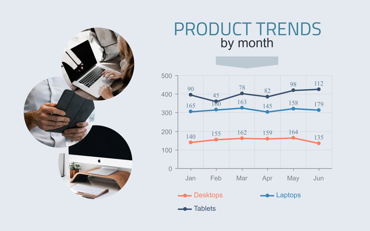
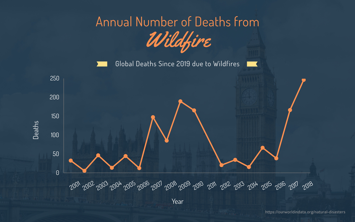
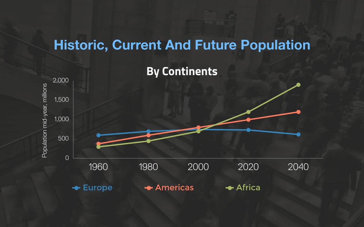
Line Charts
A line chart is another common data visualization that allows you to demonstrate changes in value over a set of specific intervals, usually segments of time.
The line chart template below shows off the trend of three different products month-over-month.
A line chart can also be used to showcase trend data, like the amount of times a certain keyword or buzz word has been searched on Google and other search engines.

Line charts are best used to show off trends, typically over time, although they don’t have to be limited to that kind of data.
Try a line chart the next time you’re trying to determine whether something has a positive or negative trend so that you and your audience can tell just by glancing at your chart.
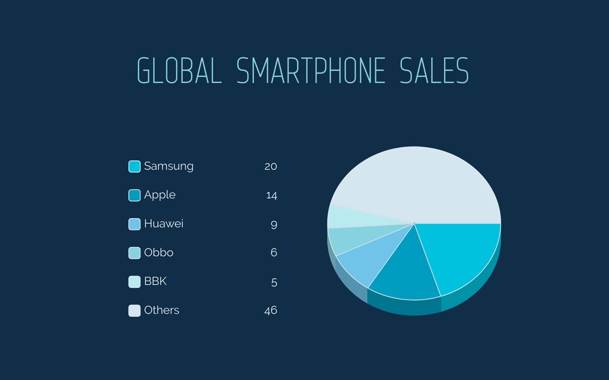
Pie Charts
A pie chart is used to show pieces of a whole, most commonly when portraying percentages, as those are always going to be pieces of 100%.
One great way for us to demonstrate how a pie chart should be used is with this template below, dividing up how smartphone owner’s spend time on their phones throughout the day.
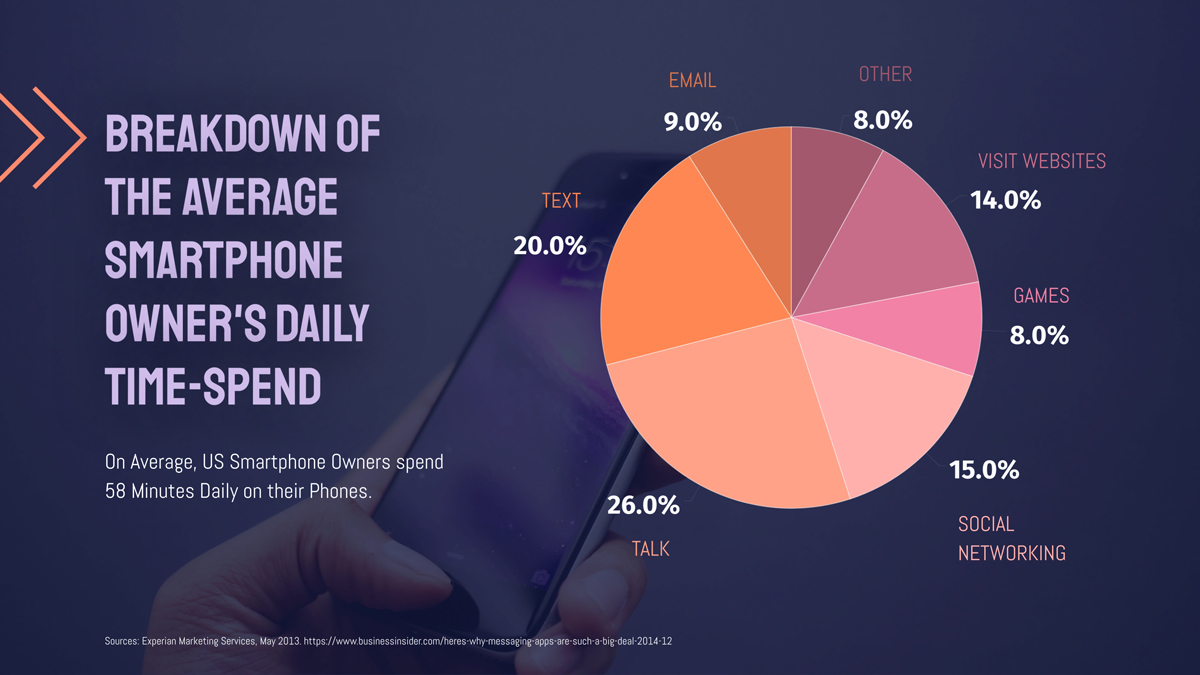
Pie charts are also great for presenting demographic information as well.

If you’re trying to portray parts of a whole or visualize different percentages, a pie chart will be the perfect chart type for you to choose.
Radar Charts
Also known as a spider chart, web chart or polar chart, a radar chart is a good method for visually comparing different things in a similar category, like features on different smartphones, the tastes of different beers, or areas of a gymnast’s performance.
Take a look at this example comparing the varying tastes of two different beers.
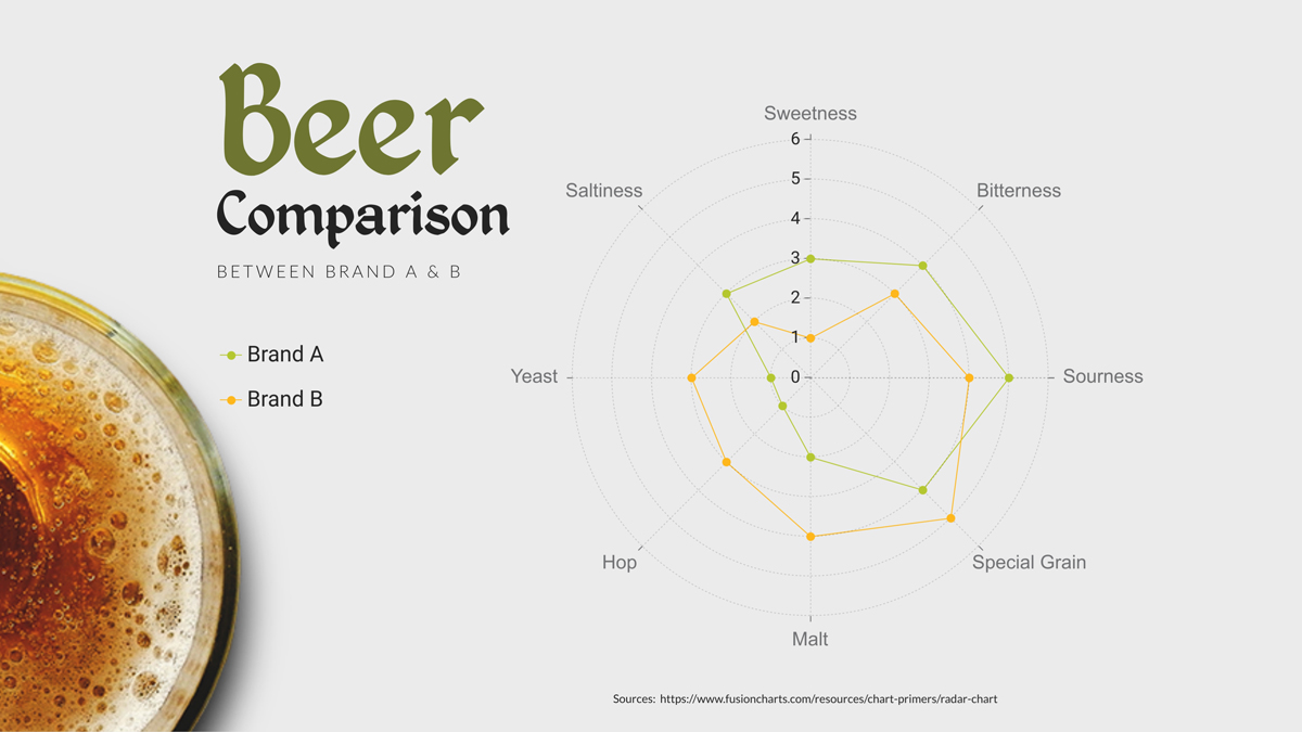
A radar chart can also be a great way to visualize performance, like in a gymnast’s routine or an employee’s performance during their annual review.
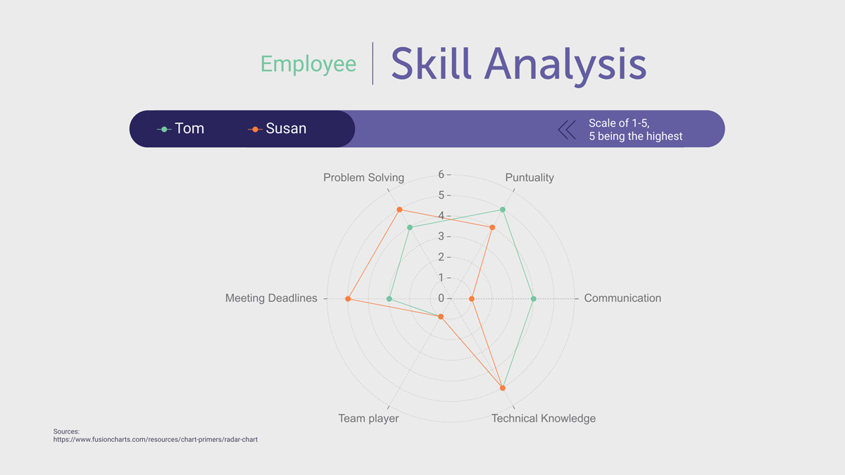
You can include just one variable to showcase a single employee or single brand, or you can compare by including multiple variables.
You can include an outline only of your points, or use a translucent color to make the comparisons more obvious. You don’t want to use opaque colors that cover up other variables in your chart.
Bubble Charts
A bubble chart is a type of chart that uses circular markers to display data in three dimensions. It's great for visualizing data that has a lot of variables, as it can show relationships between three variables at once.
For example, you can use this bubble chart template to compare the revenue from different regions or the sales performance of different products.
Pictograms
A pictogram or array is more of a visual representation of numbers than an exact chart, but these are perfect for showcasing numbers.
Pictograms tend to use icons or graphics in place of numbers to help give an at-a-glance idea of how many people, things, etc., are in a data set.
Take a look at this example of a pictogram that highlights the happiness level of employees by using different types of emoticons as the icons.
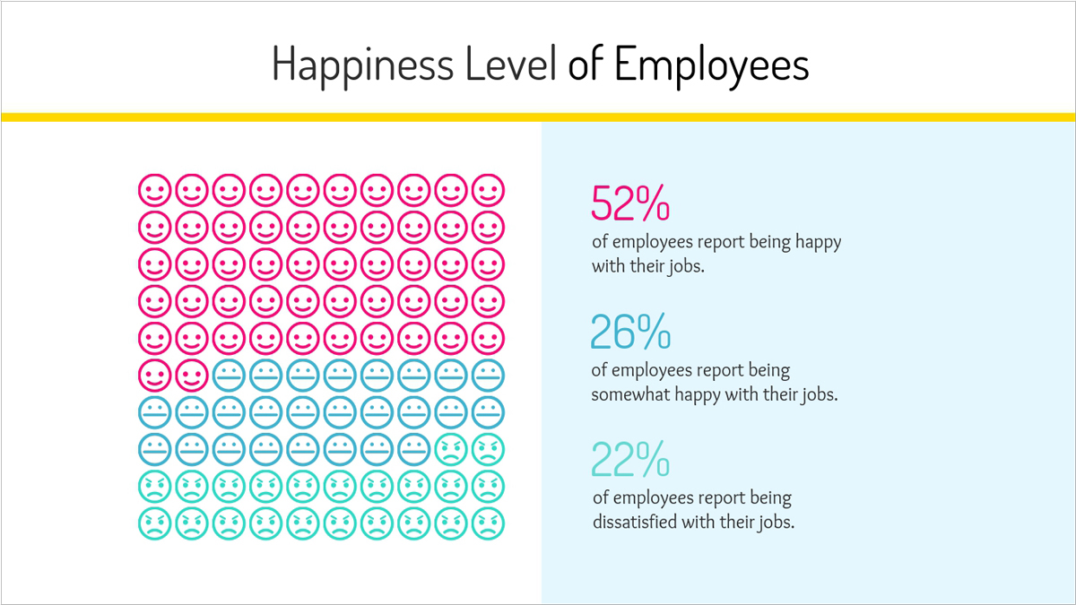
While this example includes one icon for each percentage, you can also add a key or legend letting viewers know that one icon equals 10 or so people or percentage points.
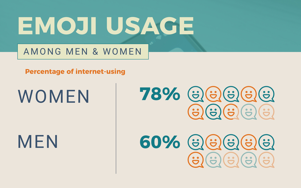
Another great example is showcasing emoji usages among men and women, like in the example below.
There are so many different ways to utilize pictograms when you’re trying to visualize numbers in a graphic. Pictograms are a common type of visualization to see inside of infographics.
Not every chart you create is going to be a numerical chart. There are so many reasons to organize your content as well in order to make it even easier to digest.
Let’s dive into a few common types of organizational charts and graphic organizers that can help you demonstrate your ideas in an even clearer manner.
Flowcharts
A flowchart is an organizational chart that guides the viewer through processes, steps and more, and they’re incredibly versatile.
In fact, you can create custom flowcharts right inside Visme with whatever types of lines, bubbles and fonts you choose.
You can create flowcharts on personal processes, like in the example below available as a customizable template.

You can also create a flowchart to help you determine if it’s time to make a next step in your business, like redesigning your website.

This is a great way to organize different steps, processes or create a yes/no chart to share alongside your content.
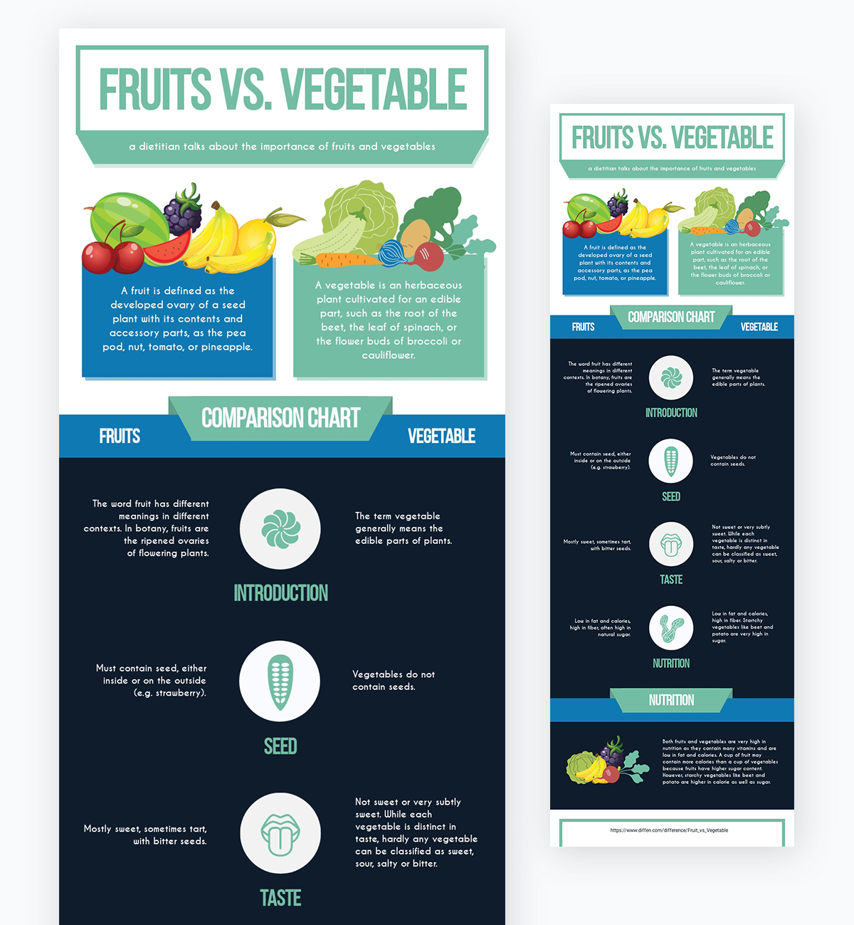
Comparison Charts
A comparison chart is the perfect way to visually compare two or more things, whether it’s a product, a feature, a company or other comparison.
Take this example of a comparison chart of fruits versus vegetables and how to classify them.
Another example of a comparison chart use is for weighing the pro’s and con’s of something, like solo versus couple traveling. This comparison chart template below is available for customization in Visme.
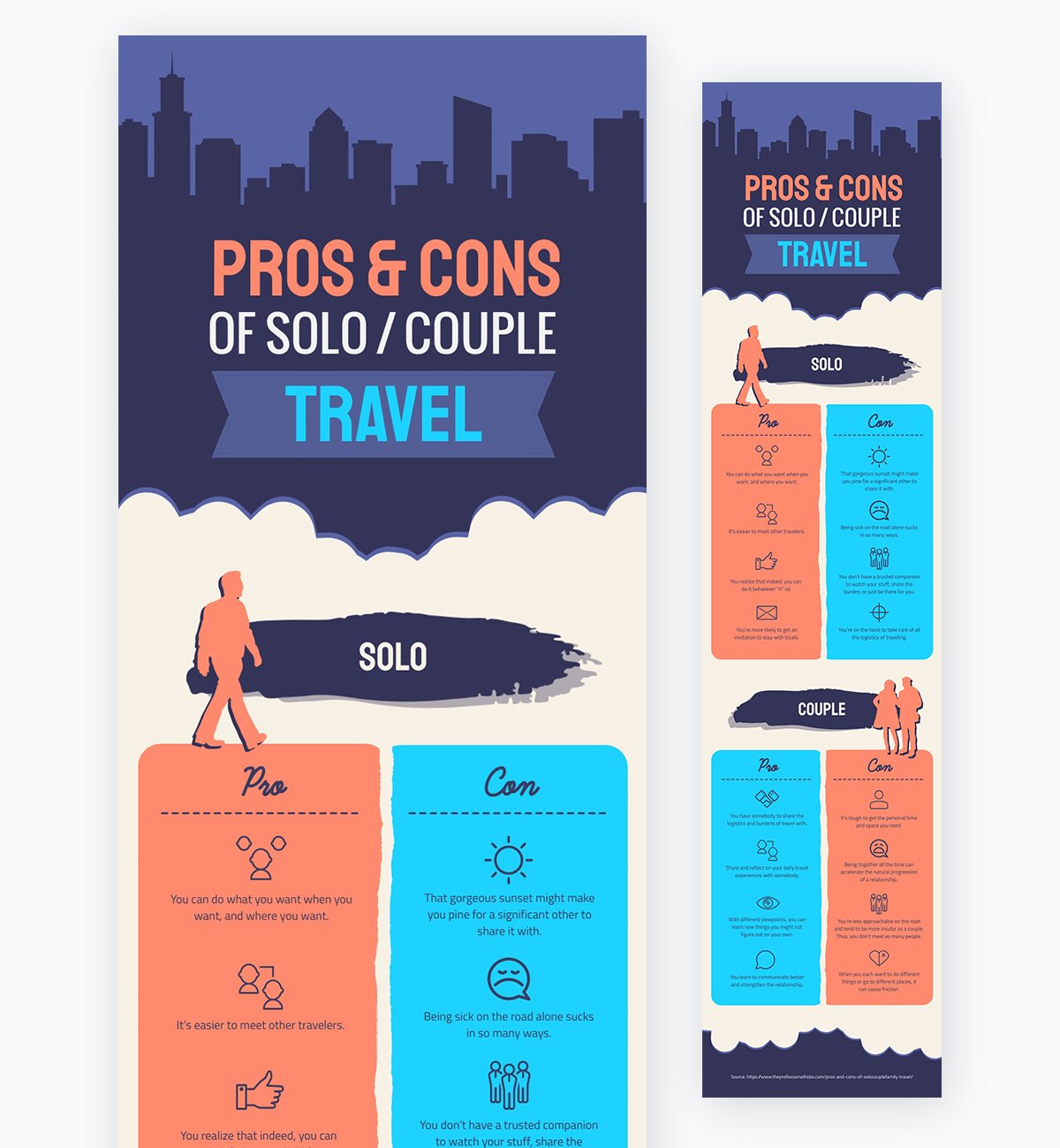
These types of charts are perfect for showing side-by-side comparisons of two or more items, and can be very visually appealing along the way.
Hierarchy Charts
Hierarchy charts are a type of organizational chart that depicts how things flow from top to bottom. There are several different ways to visualize this, whether it’s a type of flow chart, a funnel chart, a pyramid chart and more.
We have several different types of hierarchy charts available in Visme, from visualizing a team’s hierarchy to showcasing a sales funnel.
This is a great example of how a hierarchy chart can work to demonstrate the team on a project or in a department of a company so that everyone knows who’s in charge of who.

But hierarchy charts can be used for even more than that, like in this template example below that covers the SEO hierarchy of need from most important to least important.

Organize concepts from top to bottom, smallest to largest and most important to least important with a hierarchy chart.
Venn Diagrams
A Venn diagram is another way to compare and contrast different concepts and ideas. You can have two different circles in your Venn diagram, three, four and even more.
Let’s dive into a couple of different Venn diagram examples that you can edit and customize right inside Visme.
The below template is a basic two-circle Venn diagram that allows you to compare and contrast two ideas.

You can insert any ideas into the above template, like milk versus juice, advertising versus marketing and more.
The below Venn diagram helps to organize even more complicated ideas, like what to mix with your coffee to make different types of drinks.

There are so many different ways to create and customize Venn diagrams to help compare, contrast and mix ideas.
Once you understand the different chart types available to you and how your data or information can fit inside of them, it’s easier to determine your chart type. After choosing your numerical or organizational chart, you can move onto step two.
As I’ve mentioned throughout this article, we have a ton of different customizable templates available in Visme for you to create and edit your charts.
You can browse through Visme’s selection of chart templates to find an option that looks like it can easily fit your information.
Starting with a template can help get the bare bones of your project ready before you even begin on your design, cutting your project time down exponentially.
Every single one of Visme’s templates are fully customizable, which means you can find one that has the necessary chart elements and then plug in your own data, change colors and fonts, add in different icons and photos, and more!
Once you’ve chosen a template and have found yourself in the Visme editor, it’s time to gather your information to plug into your new design.
Whether you’re using a numerical chart to showcase data and statistics or a graphic organizer chart to visualize words and information, having everything you need to input all in one place can make your life much easier.
Your next step is to add your data or content right into your design! This is extremely simple with Visme.
If you’re creating a numerical chart, simply plug your data into the Graph Engine and watch it come to line within your chart.
And if you’re working on an organizational chart like a flow chart or a Venn diagram instead, simply use the text editor to add in your content and drag it around where you want it to live within your graphic organizer.

Now if there is a hard part when it comes to creating a chart, this is the hard part. But only because there are certain rules to adhere to when creating a visually appealing design.
Plus, you have so many different design elements to choose from when creating your chart in Visme, but we like to think that’s a good problem to have.
Let’s dive into a few of the ground rules when it comes to chart design.
Pie charts are great for representing parts of a whole, but they’re not great for eyeballing specific numbers. This is why you want to keep your parts of a whole to a minimum, including no more than 7 different variables in a single pie chart.
Take a look at how including just a handful of data snippets makes the percentages in this pie chart easy to see at a glance.
Including too many variables causes each piece of the pie to get smaller and smaller, until you’re not sure which slice is worth more than the next.
When it comes to designing a bar chart, you can have your data all over the place, with the tallest bars sticking up every which way.
Or you can create a cohesive and organized chart design, placing your data in decreasing order from left to right, like in the example below.
Keep in mind that not all chart types can be organized like this. If creating a chart to determine frequency or correlation, like in the case of a histogram or scatter plot, your results are dependent on where they land on each axis.
But in the case of a bar chart or pie chart where the order of your data snippets doesn’t matter, be sure to organize it to improve the overall look and feel of your design.
While 3D chart design can create a cool effect, and is useful in some cases, more often than not it actually distorts the look of your data.
This is most common in 3D pie charts, when the angle and dimension of the chart can make some pieces of the pie seem like they are larger than they actually are.

As I said, there are still some cases when 3D chart design makes sense, which is why we give all Visme users the freedom to determine for themselves which version they need.
However, in modern design, it’s a good rule of thumb to always go with flat design over 3D, no matter what you’re creating.
A legend or key lets your users know which pieces of data are visible in your chart. However, some of this information might be obvious based on the chart title and other elements, making the need for a legend obsolete.
Take a look at this line chart for example. Since there’s only one variable that we’re tracking, including a legend to let viewers know what the line stands for would be redundant, and would only clutter up your design.
Use a legend in your chart design only when necessary to tell the different variables apart. You can easily toggle this on and off in Visme’s Graph Engine.
Grid view in a chart keeps the lines for each point on each axis, and can make it easier to see the chart’s measurements more precisely.
Take a look at this example below with grid view on.

While grid view is helpful in instances where bars or data points are close together, and you need a little help visualizing their differences, they can clutter up designs with more obvious jumps in value.
As a good rule of thumb, keep grid view off in each of your chart designs unless absolutely necessary to properly read your data.
Don’t let your lines or bars blend together, creating an unclear and dull chart. This is especially important in line charts, when you need to differentiate each variable clearly from the others.
These three lines are all differently shaded bright colors, allowing them each to pop, and letting the viewer clearly find each variable’s data points.
If you want to highlight a specific value to bring even more attention to that variable over the rest, you can also give a single variable a contrasting color so your audience pays more attention to it.
Just be sure that when you’re color coding your variables, you’re always using contrasting colors that allow them to pop against each other.
Another great way to color code your chart is by including your brand colors. You can easily add these into your chart if you’ve put together your brand kit in Visme.
Simply pop in the hex codes for your brand colors, upload your brand fonts and get ready to fully brand each of your creations with just a couple of clicks.
Your brand colors and fonts will appear at the top of the color and font pickers, making it easy for you to find and select branded options.
Font pairing is an art of its own. Make your life easier, and stick with one font but two different weights within your chart design.
Use the bolded version of a font in your chart title and axis labels, but the regular or light version in your legend and data labels. In an organizational chart, use bold for headings and subheadings and regular or light for your body content.
This helps to create a minimalistic, clean look surrounding your chart so that your data is the focal point. After all, the entire point of your chart is to show off the visual information.
In Visme, you can easily drag the corner of your chart around to make it larger, smaller, thinner, thicker and more.
As you play around with this, pay attention to what it makes your data look like. As you expand the width of your chart, your data will be spread further out, and as you condense the width of your chart, your data will be closer together.
If you create a chart that’s the full width of your design, whether it’s a report, infographic, presentation or other content type, and you’re noticing that it’s difficult to tell the trends or data points apart, try playing with the size.
Make your chart half or three-quarters the width of the page to see if it makes the differences in your data more obvious.
Because your axis points will adjust as your chart size adjusts, this won’t manipulate your data. It can just make it easier to read.
You don’t have to leave all of the design to your chart itself. Add in various graphics, icons, photos and more that can tell an even more engaging story.
For example, if you’re creating a pie chart all about how a group of people take their coffee, place the chart inside of a coffee cup.
If you’re creating a comparison chart comparing different products or features, include icons that help to visually represent what those products and features are, like in the template example below.

Or consider using icons for your legend or key instead of text to add an extra layer of design to your piece of content.
Don’t let your chart just sit there and be a stagnant piece of data visualization. With Visme, you’re given all sorts of animation and interactivity options to help bring your information to life.
If you embed your charts onto a webpage or send the link to a live Visme to your colleagues or customers, your viewer will be able to see each separate piece of data in your chart spring to life in one of our automatic animation options.
A live chart also allows you to add interactivity options, like giving your user the ability to hover over each data point to see its exact value.
Allowing your user to interact with the data in your chart creates an entirely new dimension that you can’t replicate with other chart makers.
Now that you’ve completed your design and added some animation to really grab your audience, it’s time for the final step – actually putting your chart in front of your viewer.
With Visme, you have three different options when it comes to sharing your chart.
You can download it in one of five different formats including JPG, PNG, PDF, PPT and HTML5. The last two give you the ability to share charts offline in presentations and other content types.
You can generate a public or private shareable link that opens a live Visme with all of your animation and interactivity available right in your creation.
If you choose to publish it and create a public link, you also get access to all sorts of analytics to track its performance.
Or you can grab an HTML embed code to paste right inside a blog article or webpage that will embed an interactive chart right on your website for your viewers to play with.
Ready to create your own chart right inside Visme? Give the Graph Engine a go and start visualizing your data and information with your own chart.
Get started with a template, plug in your information and dive into your design. Share all of your creations with us on social media by tagging #MyVisme!
Design visual brand experiences for your business whether you are a seasoned designer or a total novice.
Try Visme for free