


Typography Infographics: 12 Inspiring Examples & Techniques

There’s no debate about the positive effects of using infographics in your marketing strategies. From small businesses to multinational corporations, all visual, digital and content marketing strategies can benefit from an infographic here and there.
But how do you choose the right infographic dimensions for your design?
When you hear the term “infographic,” what’s the first visual that pops into your mind? I bet it’s a long, vertical infographic. It might even be so long that you have to scroll to see the entire piece of content.
Infographics have made a huge splash on social media thanks to their ubiquitous vertical shape. It’s no surprise that it’s the first image in your head right now.
I’m here to burst that bubble and expand your infographic horizons in all directions.
Before we start, here’s a quick video on how you make engaging infographics in minutes!
Now let’s bust the first myth of infographic dimensions: Your infographics don’t always have to be vertical!
They can be horizontal, square, digital, printed, super small or as big as a billboard. Not all infographics include a lot of information; some are micro-infographics with minimal information. And those come in all sizes, too!
If you were looking for a way to up your infographic game, you’ve come to the right place! This guide will help you choose the right infographic dimensions for your design.
Let’s get started.
Made with Visme Infographic Maker
If there’s one thing we could say about choosing the right infographic dimensions, it's to trust your gut and design for your audience.
These are the two factors you should consider when designing for your audience:
As you’ll see throughout this article, there are many different infographic dimensions. They are all valid. But what’s really important is where the infographic will be published and who will be consuming it.
There’s no better time to consider your target audience than when choosing the right infographic dimensions.
Let’s say your audience is mostly on social media. But which social media platform in particular?
Take a note from what Ben Travis, Senior Product Manager at Typeform, recommends in this article:
“Tailor for your audience. You can get recommended dimensions or sizes from anyone, but to make a good infographic – no, a great infographic! – You need to know your audience. Ask yourself how your audience will look at the data visualization (e.g. will they use a mobile publishing format like AMP, Instant Articles, or Apple News) and what they’ll be looking for. “
The second thing to consider when selecting the perfect dimensions for your infographic is how much content you have to include. Regardless of the size of your infographic, it should never be cluttered.
When you have a list of 10 items to visualize on an infographic, a vertical infographic might be the best choice. But if you manage to minimize the text and go super visual, why not go for a square instead?
Take a look at the infographic below. This is an example from our article on how to create clutter-free infographics. It shows how using icons can cut down on text content and even make things look better.
The example below could have easily been a long infographic in list form, but if the content is condensed, it works great as a square!
If you’re posting video or animated infographics on platforms like TikTok or YouTube, then you should go for full-screen vertical infographics. Since most users consume content on their phones and scroll quickly, a vertical layout feels native and captures attention quickly.
Alright, so you want to know exactly what dimensions to use? Before we get into that, you need to know about aspect ratio.
Why? Because it directly affects your infographic layout.
Most social media channels allow sharing graphics in different dimensions as long as they have the correct aspect ratio.
But what is aspect ratio?
Basically, it’s the relative measurement of the width and height of a graphic, screen (like your smartphone or TV), print, photo, video and so on.
Aspect ratio is not only for creating infographics or social media graphics. It’s actually a measurement for film and screens. You’ve probably seen aspect ratios in your Netflix or YouTube player settings.
An old-school style television has a 4:3 aspect ratio, an HD flat screen has a 16:9 aspect ratio. If you still print photos, you’ve seen the aspect ratio choices the shop offers for the size and resolution of your prints.
But back to infographic dimensions. Look at the image below to see how the different aspect ratios look. Since you can technically create an infographic in any shape or size, your best bet is to stick to the aspect ratio when you aren’t sure.

First off, let’s talk about the vertical infographics everyone knows and loves. Where do we usually see these types of infographics?
When it comes to infographic dimensions for a vertical infographic, there’s really no limit to its height. But what you need to consider is where the infographic will be published. This will determine how long your infographic should be.
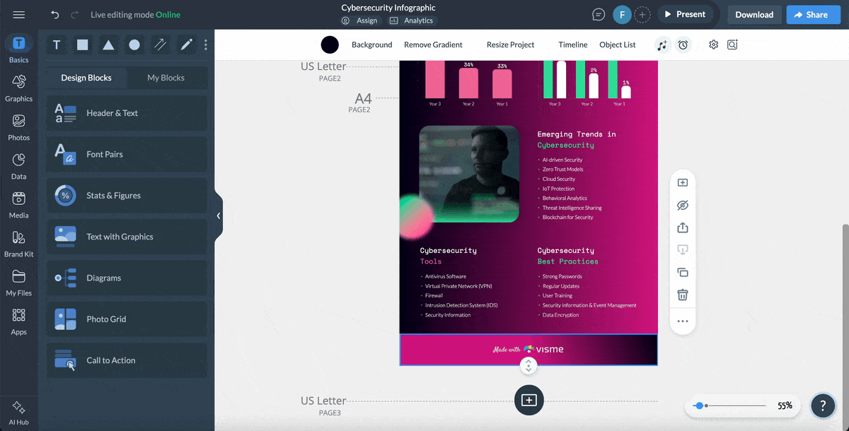
If you didn’t already know, the Visme infographic maker has a draggable height bar. We know how it is – you never know how long that infographic is going to be until you’re actually creating it!
That’s especially true about infographics for blog posts or scrolling infographics.
Below are some vertical infographic examples:
Up until 2019, when you posted an infographic on Pinterest, it would show at full length in the feeds and results pages.
The team at Pinterest loved all those long and super long infographics, but they were also worried about how they randomly changed the layout and made things look untidy.
Their solution was to set a maximum height for displaying results. You can still share super long infographics on Pinterest, but now they’ll show only the top portion of your infographic unless they’re clicked on.
Therefore, if you want your infographics on Pinterest to work for you, you have two choices:
The most versatile dimension for an infographic shared on Pinterest is 1000 x 1500px. This measurement has a 2:3 aspect ratio. You can make yours a little bigger if you want a higher resolution for a photo-based design. As long as it's 2:3, it’ll be fine.
The flowchart infographic below is the exact measurement for a vertical infographic that looks great on Pinterest.

Infographics that are a bit longer or double the height of a 2:3 infographic are great for blog posts. A good aspect ratio for these dimensions is anything between 1:2 and 1.3.
In fact, Pinterest will also show an infographic without cropping if it has a 1:2.1 ratio. That’s only a bit longer than 2:3.
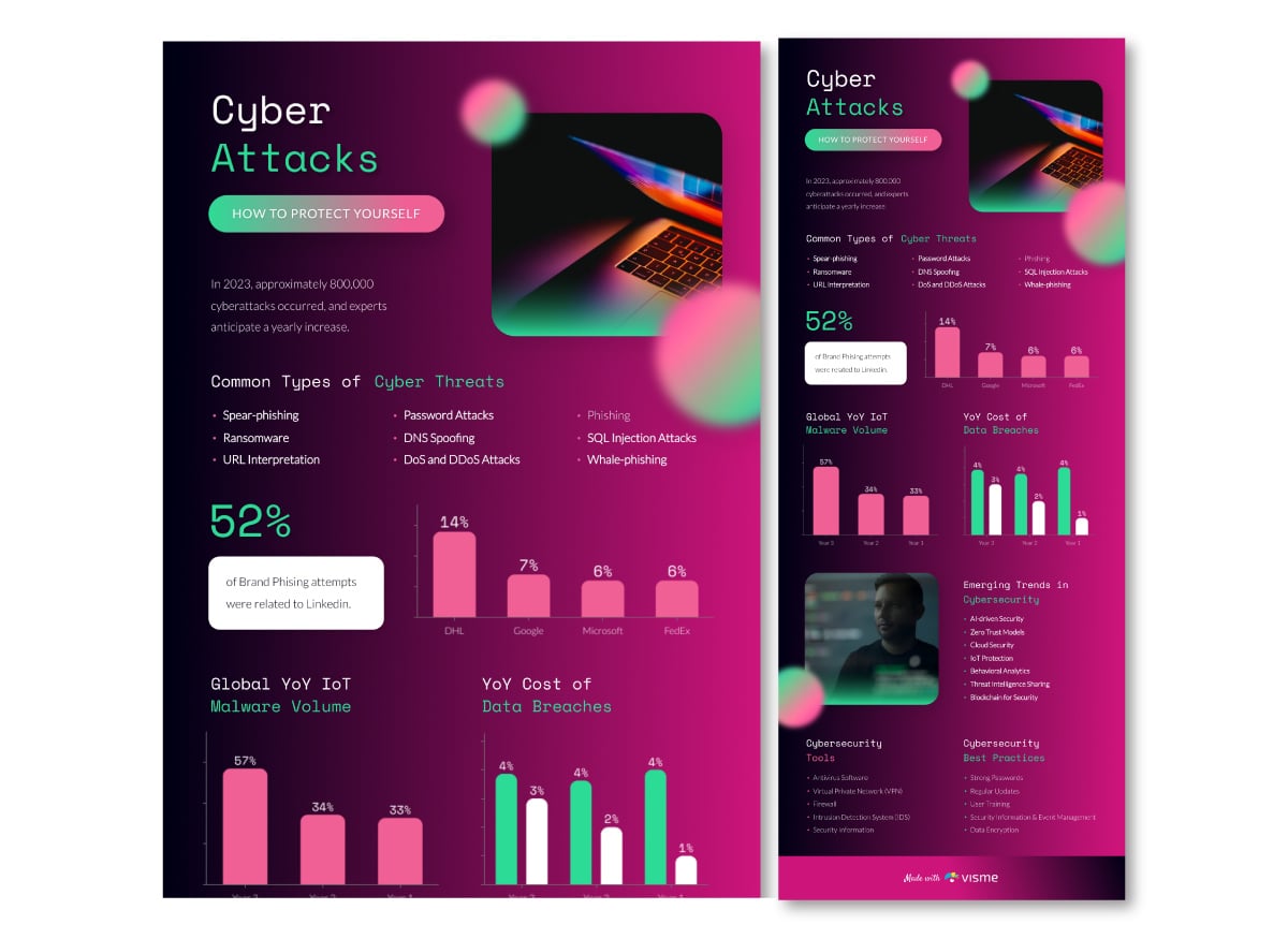
The infographic below is 800 x 1790. This looks great in a blog but will get a bit cut off on Pinterest. That’s why the header is so prominent! So people will want to click on it and see the full design.

This one is 800 x 3220. This will also look good in a blog post. When your infographics are this long, you should add an anchor link right before it. Invite the reader to jump over the infographic if they only want to read the content of the post.
What about those infographics that go on and on? Those are okay for blog posts, too, but you have to add an anchor link before them. An infographic with super long infographics at high resolution will also make your blog post load slower.
We recommend you add a lower-quality version in the blog post and invite readers to click on the image to see the full-scale version.
The infographic below is 800 x 6025. This one is a bit too big to fit in this blog post. We published it in an article called What is Coronavirus? Open that blog post up to take a look at how we present it.

Then we have this other infographic about Covid-19 which we created for an article about Coronavirus prevention. It’s super long! This one measures 800 x 13645!
Last but not least is the full-width scrolling infographic. These are usually long or super long, but they're also wide and high resolution. Infographics with these dimensions are not your regular run-of-the-mill creations.
Technically, you could say they are a web page with a purpose. To inform someone of something while creating an immersive experience.
The dimension for a full-width scrolling infographic is usually at least 1920px wide with no height limit. 1920px is a standard resolution.
These infographics are not usually responsive, meaning they'll pretty much always look better on a desktop than on a mobile device.
Some of these infographics are sometimes 2200 px wide or more. It really depends on the resolution quality of the elements used.
To create an infographic like the one above with Visme, follow these steps:
Want to make it look even more polished (and avoid common layout mistakes)? Read this step-by-step guide to learn more about creating the perfect infographic design.
Now that we’ve looked at all the possibilities of vertical infographics, it’s time to get horizontal. No, not a nap! Horizontal infographics!
Did you ever consider that an infographic could be horizontal? They can be created in a number of different ways.
For example:
All the possibilities above are attainable with horizontal infographic dimensions.
But what size exactly? Once again, that depends on where you'll be sharing it. To be safe, you could stick to the standard presentation size. Our presentation templates are 735x1135 px.
Our favorite way of using horizontal infographics is to create one long infographic that can be cut up into parts. Then each piece can be used inside your blog, as a slideshow or as individual social media posts.
For example, the ones in this article about using images legally. The trick is to use blocks of the same size. With Visme, you can create an infographic like this and then download it both ways:
Then, you open a blank presentation canvas and upload the blocks of your infographic. One on each page. Download it as a presentation or video. Now you’ve got one infographic with many ways of using it!

There’s another way of using horizontal infographic dimensions. It’s to simply create one infographic in a horizontal layout.
The example below is a horizontal infographic with interactive features. This style of infographic fits well in a blog or web page. The interactive quality just adds more value to it.
You could even print horizontal infographics as postcards. Then send them to your client base with a handwritten message in the back. If the infographic is useful and designed well, they might even stick it to their corkboard or fridge.
The best social media platforms for horizontal infographics are Facebook, Twitter, LinkedIn and even SlideShare.
Instagram is the best platform for square infographics. You may think that this is a bit weird. Why would you share infographics on Instagram?
But you’d be surprised!
Take a look at this Instagram account, for example: it’s all square infographics.
We mentioned square infographics in an article about infographic fatigue a couple of years back. They were only just becoming mainstream then. Now they are just as common as vertical infographics and are only growing in popularity.
Why? Well, first of all, they are super easy to share!
Square infographics don’t need to be stand-alone graphics. Just how infographics with horizontal dimensions can be turned into slideshows and videos, square infographics can be posted as social media carousels. On Instagram mainly, but also on Facebook and LinkedIn.
The square infographic below is essentially a pictogram having a bit of fun!

Generally, when sharing infographics on social media, it’s best to keep them smaller. As Travis puts it,
“Choose a smaller size if you’re going to share on social media. Short attention spans mean that people want data snacks, not a data dinner.”
Last but not least is the micro-infographic. This type of infographic isn’t ruled by dimensions but by content. The idea is that it only shows a snippet of information.
As you can see in the examples below, micro-infographics can be designed in any dimension! These also work great as social media carousels, slideshows, and video presentations! Simply add a title slide and you’re good to go!


When creating an infographic in Visme, you can choose any dimensions you like or resize an existing infographic to suit your needs.
Here’s how to adjust the height of an infographic block:
Take a look at how the draggable height bar works in Visme.
You can also use this alternative design process
Pro Tip: While you’re resizing, both the block’s individual height and the infographic’s total height will be displayed in pixels, as a reference.
Follow these steps to change the layout or width of your infographic:
Note: Height size is disabled in Canvas Size because it shows the total height of the infographic. To adjust the total height of your infographic, you’ll need to do this individually with each block.
A good size for an infographic depends on the platform where it will be used. But here’s a guide to choosing the right dimensions:
Yes, an infographic can be A4 size. Graphic design tools like Visme support A4 sizing.
Think mobile first: Make sure your infographic layout is easy to read on smaller screens with clear typography and enough spacing.
Design for the subject: Match your fonts, visuals and color palette to the topic.
Consistency is key: Stick to a cohesive layout, font pairings and visual style throughout.
Clearly map out the story: Structure your content so it flows logically from start to finish.
More visuals, less text: Use icons, charts and graphics to communicate faster and keep text concise.
Yes, an infographic can be A3 size. Tools like Visme and Canva support A3 sizing.
An infographic doesn’t have a fixed format. The format you choose depends on the goal, the content, and where the infographic will be shared.
The size of the infographic you design with Canva will depend on the platform you’re using it for. But here’s what Canva recommends:
The best AI to create infographics depends on your needs but tools like Visme, Canva, PiktoChart and Adobe Firefly have AI features that’ll help you create infographics.
Throughout this article, you’ve seen how to choose the best infographic dimensions for your designs. Now it’s your turn to start creating.
And guess what? When it comes to design, Visme removes all the hassle. It offers dozens of infographic templates that are professionally designed so you can get started easily.
With AI-powered tools, you can quickly generate ideas, refine your infographic content and generate visuals for your infographic. You can also access a rich library of data visualization widgets, workflow and built-in collaboration features, interactivity features and more.
If you’re ready, sign up and start creating beautiful, professional infographics today.
Design visual brand experiences for your business whether you are a seasoned designer or a total novice.
Try Visme for free


![How to Make an Interactive Infographic [+Templates]](https://visme.co/blog/wp-content/uploads/2023/11/How-to-Make-an-Interactive-Infographic-Quick-Guide-8-Customizable-Templates-Thumbnail.jpg)


