


Typography Infographics: 12 Inspiring Examples & Techniques


Here's a list of 20 comparison infographic templates and comparison charts you can edit and use right away for awesome comparison infographic designs.
Some of the templates and comparison charts you’ll find inside are:
Choose the ones that you’re interested in using the navigation below and start editing your template with Visme's infographic maker. You can also take a look at our extensive collection of infographic templates to find more design options.
Here’s a short selection of 8 easy-to-edit infographic templates you can edit, share and download with Visme. View more templates below:


Template #1: Product Comparison Infographic
Template #2: Personality Comparison Infographic
Template #3: SaaS Comparison Infographic
Template #4: Marketing Comparison Infographic
Template #5: Healthy Food Comparison Infographic
Template #6: Bank Account Comparison Infographic
Template #7: Business Comparison Infographic
Template #8: Design Comparison Infographic
Template #9: Science Comparison Infographic
Template #10: Finance Comparison Infographic
Template #11: Travel Comparison Infographic
Template #12: Health Insurance Comparison Infographic
Template #13: App Usage Comparison Infographic
Template #14: Sales Comparison Infographic
Template #15: Mobile Software Comparison Infographic
Template #16: Competitive Analysis Infographic
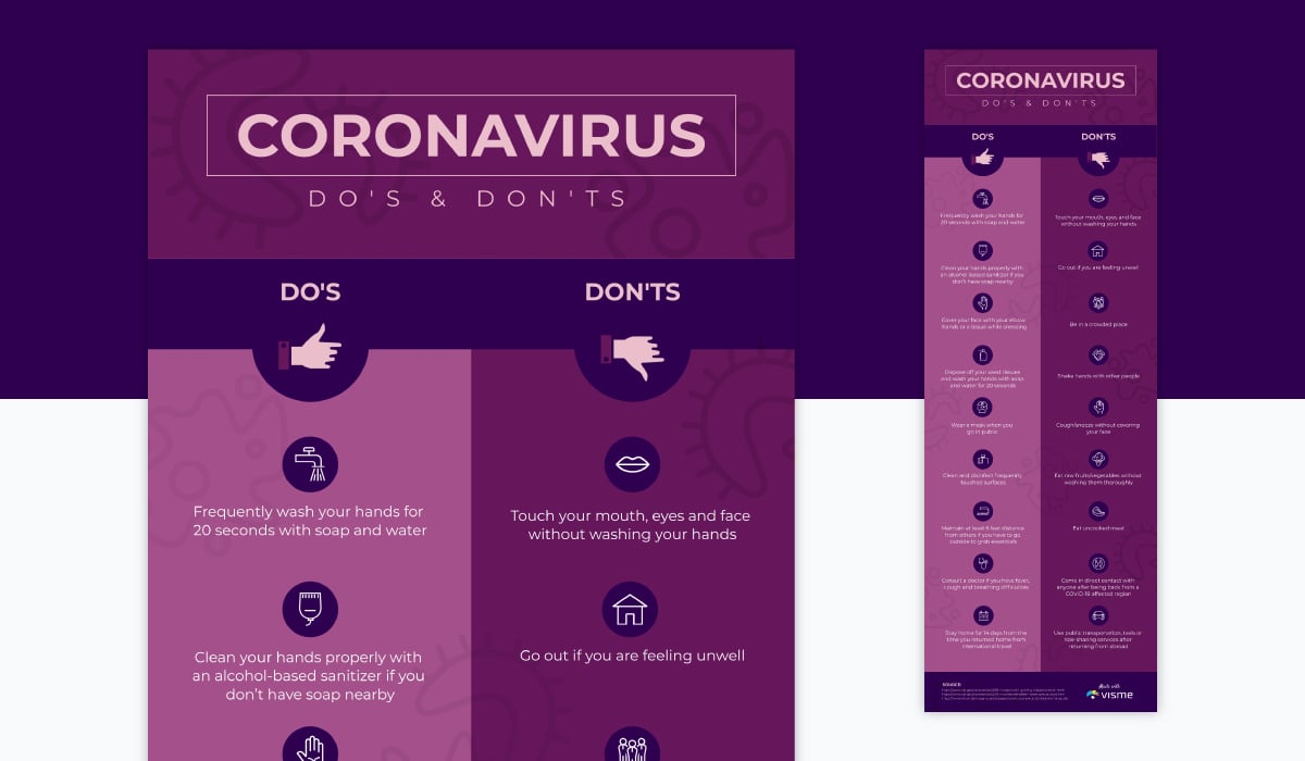
Template #17: Coronavirus Dos and Don’ts Infographic
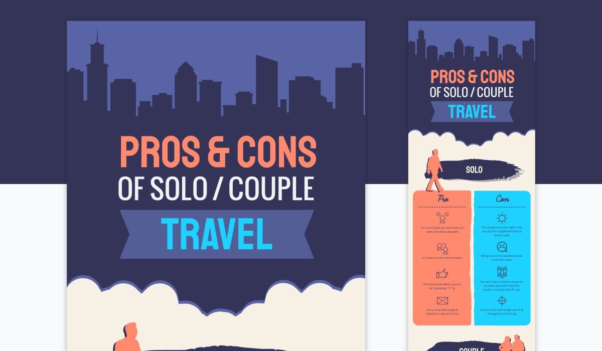
Template #18: Pros and Cons Comparison Infographic
Template #19: Digital Business Comparison Infographic
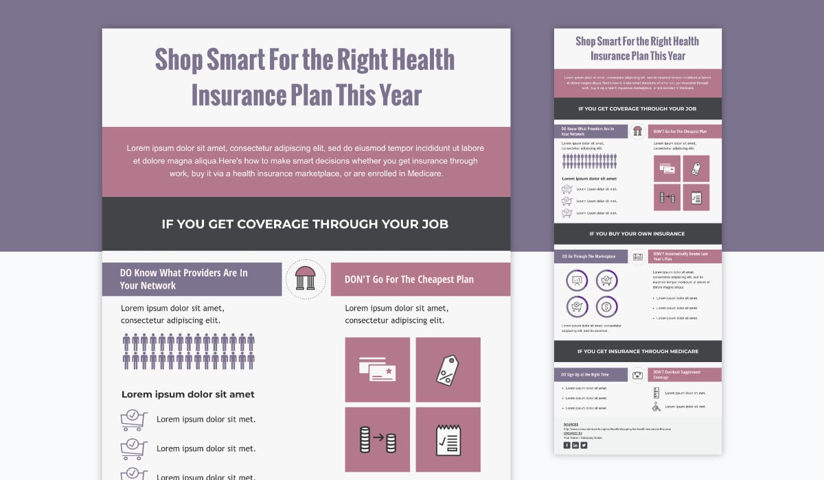
Template #20: Insurance Plans Comparison Infographic
Placing competing products side by side, as seen in the template below, can help viewers quickly decide which product or service is right for them. Here, comparable data is aligned, such as pricing with pricing and ratings with ratings.
This infographic can be used to compare several different types of products, such as one laptop with another laptop, one tablet with another or one smartphone with another.

The template below is ideal for comparing human characteristics and personality traits as it comes with two graphics that are silhouettes of people.
Some ideas for using this comparison infographic template include comparing managers with leaders, Millennials with Gen-Z and even men with women.

If you're looking to compare software, you need to have a comparison infographic template with an eye-catching design and enough data points to fit in all the cool features.
The template below offers all of that with relevant icons for each data point. You can add more by copying and pasting the elements, or simply delete what you want to remove.

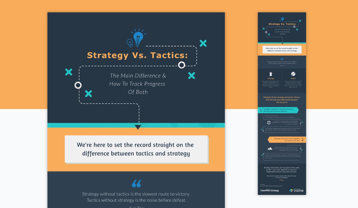
This strategy vs. tactics infographic is ideal for comparing marketing or business-related ideas and concepts, especially with the modern, informative design.
This template is great for publishing as part of your blog post, such as for summarizing the rest of the content or to add a visual element to make the content fun and interesting.
You can use an infographic to compare two different types of food.
In the template below, you can see a comparison between fruits and vegetables. Also, comparable data points have been used, such as taste with taste and nutrition with nutrition.

If you’re looking for a comparison chart in table format to compare not just two services or products but several of them, you can use the template below.

If you're looking for a clean, minimalist and professional-looking template to compare business-related ideas and topics, the template below might be a good fit.

Compare the dos and don'ts of design with this bright and colorful comparison template. Show your audience the difference between good and bad colors, typography and layouts.

This professional comparison infographic with a neutral color scheme and a spacious layout is great for comparing technology and science topics.

If you’re looking for a finance-related design theme with cool, professional colors, then you might find this comparison infographic template useful.
There’s enough space to compare four different characteristics, although you can easily copy each of the different design elements to create a fifth or sixth data point.

Just like the personality comparison infographic above, this infographic is great for comparing characteristics and people-related topics as it comes with silhouette graphics.
This infographic template has a clean and minimalist design, and creatively uses bar graphs to draw a comparison between two different health insurance plans.

Besides the side-by-side infographic format, you can also compare figures and numbers by placing charts next to each other, like in the example below.

Comparison infographics can also be used to compare two different sales techniques, such as personal selling and sales promotion, as seen in the template below.

Let the good ol' iPhone vs. Android debate continue with this mobile software comparison infographic template. This template has a clean layout with icons, and shapes to hold your content.

Conducting a competitive analysis is an important part of any brand audit or marketing plan. Understand your competition better by visualizing the information in the form of a comparison chart, such as the one in the template below.

With the dark cloud of the current pandemic still looming over our heads, medical professionals, health content creators and even businesses would find this template especially relevant.
Stick this list of dos and don'ts in your office, shop or anywhere you'd like the public to observe proper safety rules. You can also customize this template to list other kinds of dos and don'ts, such as for workplace dressing or school/university rules.
Compare advantages and disadvantages of any topic, idea, item, person or place with this pros and cons comparison infographic template.

Illustrate a comparison between two different types of professions using this modern comparison infographic template with a corporate look and feel.

Sometimes, you need to compare more than just two options, and that too in detail. This comparison infographic template is perfect for that purpose.
Comparison infographics are perhaps one of the most effective visual content types for comparing two ideas, people, places or things.
When making a comparison infographic, there are several basic design principles you can apply to drive your message home. Here's a step-by-step tutorial on how to create one:
Before you start creating your comparison infographic, you need to know why you're making one in the first place.
Understanding your goal can help you choose the right template to begin with, create the optimal layout for your message and organize all your information in an appealing way.
A comparison infographic can be used to compare any of the following:
These are just some of the ways you can use comparison infographics to get your point across in a crystal clear way.
Once you've defined your goal and have a good understanding of what you want to compare, it's time to choose the perfect comparison infographic template.

Make sure you choose a layout that best fits your content.
Even if you don't find an exact match, you should find something that's closest to your idea or comparison type so you have a head start, and then customize it until it's perfect for your content.
Thankfully, customizing your infographic in Visme's drag-and-drop editor is as easy as it gets. More on that below.
Once you've clicked on your chosen template and opened it inside the Visme editor, you can now fully make it your own.
The first step is to replace the placeholder content with your own.

You can also easily replace the icons with any of the free options available. Type in your keyword in the search bar, and choose from line, flat, isometric and multi-color icon styles.
If you want to add your own data into a graph, simply edit the settings and either upload data manually, import from an Excel file or connect a Google sheet. Add charts, graphs, Venn diagrams and other data visualization types to breakdown all your complex data.
The next step is to customize the look and feel of your infographic. Change colors with a single click using one of the preset color themes that come built-in with the editor.

Or use the color picker to choose your own colors. You can also change the fonts using the ones inside Visme, or upload your own brand fonts.
Other customization options include adding millions of free stock photos and videos, the ability to add music and interactivity, animated illustrations, icons and characters, and more.
Here are some more best practices for creating a comparison infographic:
When you're done designing your comparison infographic, it's time to share it with the world. In Visme, you have several options to do that.
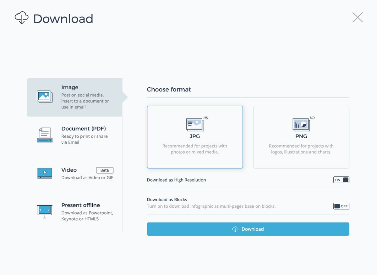
First, you can choose to download your infographic in multiple offline formats, such as JPG, PNG, GIF, PDF and even HTML5.
You can also skip downloading your graphic, and simply publish it online to generate a shareable URL. Set it to private if you'd like, or share it publicly.
Another way to share your comparison infographic is to generate an embed code to use on your website or within an email.
Creating a comparison infographic is easy enough if you start with the right template.
Starting with a template can help you save hours of your time by giving you a ready-to-go layout that you just need to add your own content into.
Browse our collection of infographic templates to find one that fits your content goals. You can find templates for dos and dont's, product comparisons, pricing, pros and cons and more.
Sign up for a free Visme account and take it for a test drive!
Design visual brand experiences for your business whether you are a seasoned designer or a total novice.
Try Visme for free


![How to Make an Interactive Infographic [+Templates]](https://visme.co/blog/wp-content/uploads/2023/11/How-to-Make-an-Interactive-Infographic-Quick-Guide-8-Customizable-Templates-Thumbnail.jpg)


