
Healthcare Data Visualization: How to Turn Data into Impactful Stories

Graphs are a great way to visualize data and display numbers and statistics. In fact, they're essential to help your audience understand your points or key findings.
They can help you visualize growth in a sales report, showcase demographics in a pitch deck or share industry statistics in an infographic.
But with so many popular types of charts and graphs, including line graphs, bar graphs, pie charts, bubble charts, scatter plots, and histograms, how do you know the best options for your industry, project, or data?
Whether you're a data analyst, sales manager or business expert, picking the right chart or graph doesn't have to be complicated. To help make your choice easier, we've compiled a list of 44 types of graphs and charts, many of which can be made right in Visme.
Find your industry below and check out the graph options available, then click the button below each template to start inputting your data and customizing it for your project.
And, if you’re short on time, this ultimate video guide on data visualization is just what you need.
The main difference between graphs and charts is their focus. Graphs highlight numerical relationships and trends by plotting data points on axes (like in line graphs or scatter plots). Charts, on the other hand, visually represent data in various ways, including non-numerical relationships (like pie charts or organizational charts). In simple terms, charts are broader and include all types of graphs.
If you’re still concerned whether you should use a chart or a graph consider using's Kenneth Giblin’s advice:
Senior Data Analyst & Policy Officer
Line charts, or line graphs, are powerful visual tools that illustrate trends in data over a period of time or a particular correlation. For example, one axis of the graph might represent a variable value, while the other axis often displays a timeline.
Each value is plotted on the chart, then the points are connected to display a trend over the compared time span. Multiple trends can be compared by plotting lines of various colors.
For example, the interest of digital marketing over time can be visually shown with ease through the use of a line graph. Simply plot each number of searches along the timeline to view the trend.
“With great power comes great responsibility, so while there is the technical capacity to put many lines onto a single line chart, it is a good idea to be judicious in the amount of data that you plot. A good rule of thumb is to limit yourself to five or fewer lines, lest the plot end up looking like an unreadable tangle. However, if the lines are well-separated, you can still plot all of the values you wish to track.” -Mike Yi, Senior Software Engineer at Atlassian
The simplest and most straightforward way to compare various categories is the classic bar graph. The universally-recognized graph features a series of bars of varying lengths.
One axis of a bar graph features the categories being compared, while the other axis represents the value of each. The length of each bar is proportionate to the numerical value or percentage that it represents.
For example, in the template below, each social media platform is represented by a bar. With just one quick glance, audiences can learn exactly which social media platform has the highest and lowest usage during the allotted time frame.
Bar graphs work great for visually presenting nearly any type of data, but they hold particular power in the marketing industry. The graphs are ideal for comparing any sort of numeric value, including group sizes, inventories, ratings and survey responses.
If you like this chart but you want to make it your own, you can easily customize your charts with your personal or company brand. You can use the AI-powered Brand Wizard: simply input your URL, and the wizard will create a brand kit of your colors, logos, and fonts, which you can easily access in any Visme project.
Alternatively, you can add them manually. The upside to the wizard is that it also provides templates that match your brand, making it faster to find a chart that aligns with your brand.
“Don’t be scared of white space! Allow the insights to have room to breathe and tell that story hidden in the spreadsheet's columns and rows. We mentioned it already, but it's crucial so it permits a repeat: make sure every element you have included on your chart has a purpose.” -Leenke De Donder - Data Visualization Designer at Datylon.
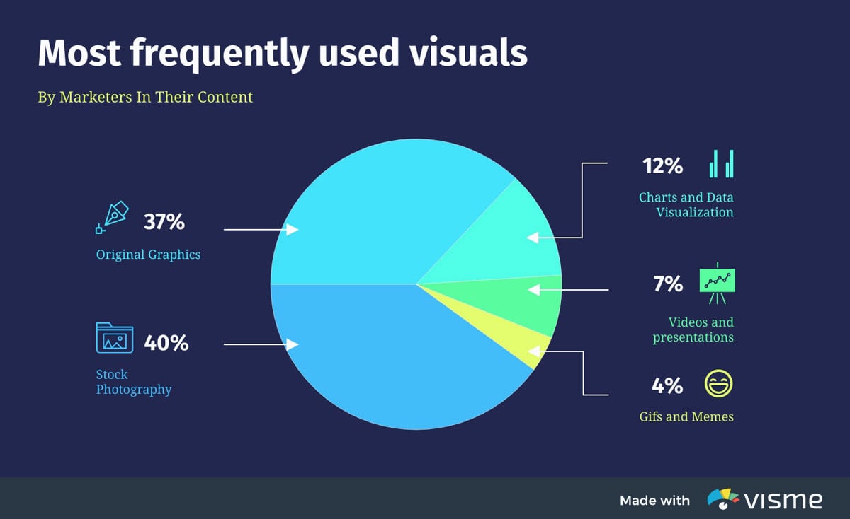
Pie charts are the simplest and most efficient visual tool for comparing parts of a whole. For example, a pie chart can quickly and effectively compare various budget allocations, population segments or market-research question responses.
Marketing content designers frequently rely on pie charts to compare the size of market segments. For example, a simple pie graph can clearly illustrate how the most popular mobile-phone manufacturers compare based on the sizes of their user-bases.
Audiences are able to quickly understand that stock photography is the most-used visual in marketing, with original graphics – like those that can be created with Visme – coming in as a close second. The beauty of using Visme is that you can create animated charts to engage your audience and make complex information digestible.
“Adding too much information to a single chart eliminates the advantages of processing data visually; we have to read every element one by one! Try changing chart types, removing or splitting up data points, simplifying colors or positions, etc.” - Kaiser Fung, Ruining the Cake with Too Much Icing and Cole Nussbaumer, Death to Pie Charts.
Basic line, bar and pie charts are excellent tools for comparing one or two variables in a few categories, but what happens when you need to compare multiple variables or multiple categories at the same time?
What if all those variables aren’t numeric even? A mosaic – or Mekko – chart plot might be the better choice.
Perhaps a production analyst wants to compare the amount of furniture produced, analyze the production percentages for multiple best-selling types of furniture, review their year-over-year growth of sales to decide how to allocate their production budget effectively.
A mosaic chart would allow said analysts to illustrate all the variables in a clear and straightforward manner.
In the above example, one axis of the chart represents the categories being compared – Tables, chairs, sofas, beds, bedroom sets, the year over year review – while the other axis lists various percentages.
The size and color of each cross-section of the chart corresponds with the market segment it represents, as depicted in the chart's legend.
“When creating Mekko charts include outlines for each rectangle, to make it easy to differentiate between the different values…and add additional information to your chart that might help the audience understand your message. It can be arrows, text, or even lines, as in the case of this line that shows the average revenue for the industry.” - Paul Moss, Founder at Analyst Academy.

Market segments are often divided based on age and gender, and a population pyramid is an ideal visual representation of the two groups.
The graph classically takes on the shape of a pyramid when a population is healthy and growing -- the largest groups are the youngest, and each gender dwindles somewhat equally as the population ages, leaving the smallest groups at the top of the graph.
A population pyramid that veers away from its classic shape might indicate an irregularity in a population during a particular period, such as a famine or an economic boom that led to an increase in deaths or births.
Of course, population pyramids aren’t always used to compare populations by age, and therefore don’t always take on the graph’s namesake shape.
A marketer, for example, might use the design to compare a population by income, weight or IQ, in which the smallest groups will often be at both the top and bottom. Regardless, the graph clearly depicts population trends, while it compares the sizes of two related groups.
"When creating charts, avoid using too many colors in the chart because it can be distracting to people who are viewing the information. Also make sure to simplify information when adding charts, get straight to the point without overwhelming your reader with data information." - Hyile, Graphic Designer, Visme.

When a statistician needs to visually compare three or more quantitative variables, he or she might choose to use a radar chart, also known as a spider or star chart.
The chart usually consists of a series of radii, each representing a different category, that splay out from a center point like spokes.
The length of each “spoke” is proportionate to the value being compared. For each category, the spokes are then connected with a line of a designated pattern or color, forming a star-like shape with points equal to the number of categories.
The result is a graphic representation that can reveal trends and compare categories all at the same time.
With Visme, you can not only easily populate your charts with pre-existing data from your Google Sheets, but also ensure that when values change in your Google Sheet, your Visme chart will be updated whenever the project is refreshed. This not only helps keep your charts up to date but also allows seamless design collaboration between team members in or outside of Visme.
Having too many variables creates too many axes and can also make the chart hard to read and complicated. So it's good practice to keep Radar Charts simple and limit the number of variables used. - Severino Ribecca, Designer and Data Visualization Consultant.
One of the most vital of all financial graphs, stock charts help investors track the markets to determine profits and loss, as well as make buying and selling decisions.
While a variety of graphs are used to represent market changes, the most common is likely the basic line graph turned histogram.
The lines simply tracks changes in a particular stock’s or overall market’s value over a period of time. Multiple stocks can be tracked and compared at the same time by transforming the line graph into a stacked area chart or simply using multiple lines of various colors.
Whether you need to create stock charts for potential shareholders or whip up a quick visualization for your team, you can add hotspots or link documents to your charts to add additional reports. This lets you share more information at once rather than sending long emails or cluttering your chart design.
This is just one of the many all-in-one approaches Visme provides that most data visualization tools fail to offer. Not only does it allow you to create professionally designed charts or graphs with little to no design experience, but it expands its use case to help you work more efficiently.
But don’t take our word for it, see what MacKenzie Stonis, Economic Research Analyst at Greater Memphis Chamber had to say:
Economic Research Analyst
I personally had experience with similar applications before Visme and found their tools weren’t as user-friendly as Visme, and their tools didn’t handle data very well. They didn’t provide the solution I really wanted.
MacKenzie Stonis
Oftentimes in business – as well as other industries – a process must be diagrammed. A flow chart allows a process to be sequenced step-by-step, from beginning to end, for the purpose of analyzing, designing, documenting or managing it.
These flow charts can even feature multiple beginnings and ends, with countless pathways and journeys in between.
While a simple flow chart can certainly document a basic process from A to B to C, the diagrams are more frequently used to illustrate more complex sequences with multiple decisions or conditions along the way.
Each time a condition is met, the chart diagrams the various options, then the path continues following each choice.
There are different types of flowcharts used for organizational charts, training materials, customer onboarding, planning and execution, dichotomous key, as well as SOPs, and more.
So, whether you plan to share your flowcharts internally or externally, Visme allows you to publish and share them as live links. This means that viewers can review your charts like a website. And if you make any edits to your chart, simply refresh the page, and the changes are updated instantly.
"When you’re creating flow charts for processes, you’ll need to test it to ensure that it can hold up in real-life situations. Flow charts not only need to be informative but they need to be great to work with visually as well. Once you’ve designed it, test it! " -Alex, Head of Design at Visme.

Gantt charts are special types of bar graphs used to diagram projects and schedules. The use of colored bars of varying lengths reflect not only a project’s start and end dates, but also important events, tasks, milestones and their timeframes.
Modern Gantt charts can also illustrate activities’ dependency relationships.
If Team 3’s completion of task C, for example, is dependent upon the prior completion of task B by Team 2, the chart can not only reflect that relationship but also the scheduled dates and deadlines for each. Easily create beautiful Gantt charts to visualize your project schedule and streamline project management with Visme's Gantt Chart Maker.
“When you’re creating a Gantt chart, determine how long each task will take to complete. Be realistic, and consider any potential delays. Include buffer time in your schedule to accommodate unexpected delays and ensure the project remains on track.” Eddie Meardon Senior Content Designer at Atlassian.

Also commonly known as a process-behavior chart, a control chart helps determine if a data set falls within a mean or predetermined control range.
Frequently used in quality control processes, a typical control chart consists of points plotted on two axes, representing sample measurements.
The mean of each point is calculated, and a center line across the graph at the mean value. Then, a standard deviation from the mean is calculated using each sample.
Finally, upper and lower control limits are determined and diagrammed to reflect the points at which deviation is beyond the expected standard.

Waterfall is one of the most commonly used data visualization techniques used in business. This chart is particularly useful in accounting and qualitative analysis; waterfall charts illustrate how an initial value is affected positively and negatively by various factors.
For example, a waterfall chart could clearly and efficiently communicate how an opening balance changes month by month over the course of a year.
Because they often appear as though bars are floating throughout the graph, waterfall charts are sometimes referred to as floating bricks or Mario charts.
If your team uses a wide range of tools to gather data for charts like these, keep in mind that Visme offers a more integrated approach for all your data visualization needs. Integrate with apps like Tableau, Salesforce, Hubspot and Google Analytics and so much more.
“Waterfall charts have been typically used to track important values such as net profit or cash flow over time. However, they can also be applied in other settings such as sales, inventory, and education management to track and understand the effects of negative and positive values on cumulative performance.” -Claudia Buckley, a Certified Microsoft Office Expert & Business Skills Instructor at GoSkills.
Similar in appearance to a flow chart, a hierarchical diagram, also known as an organizational chart or an organigram, illustrates the structure of an organization, as well as the relationships within it.
A typical company organigram, for example, lists the CEO at the top, followed by presidents, vice presidents, managers and so on.
An organizational chart can illustrate the chain of command from any employee all the way to the top. Hierarchy diagrams are similarly used to represent pedigrees, scientific classifications, demographics and any data set with a similar breakdown.
Take the above diagram as an example, where a project team is organized in an organizational hierarchy chart so that everyone knows who their supervisor is in a project.
Remember that if you’re using this for organizational purposes, it has to be updated regularly. To assist with this, you can add dynamic fields in Visme, for top positions in your hierarchy diagrams.
With dynamic fields, you can instantly update names, positions, or business information across all projects with just one click. This significantly cuts down on the time that would otherwise be spent manually editing your chart.
Also known as a scattergram, the graph consists of two axes, each representing a set of data. For example, one axis might represent the percentage of profits , while the second axis displays the total budget in millions.
For each budget and profit made is represented by a dot and plotted onto the graph. Once multiple dots are plotted, trends can be spotted and samples can be compared. The chart ultimately states that higher the budget the greater the possibility of increased profits.
A bubble chart is another variation of scatter plots. While both of them visualize relationships between two variables, a bubble chart adds an extra dimension by incorporating the size of the bubbles to represent a third variable.

Sometimes a statistician will need to compare more data sets than can be represented by a single graph. What if, for example, a graph needs to compare not only miles driven and gallons used, but also the number of gears and cylinders contained in each vehicle sample?
A trellis plot, also called a lattice graph or plot, can display and compare all of those variables. While the above example uses a series of scatter charts, trellis plots commonly feature series of bar or line graphs, as well.

Mathematicians, engineers and statisticians often need to determine the value of an equation by graphing its result. The graph of a function is the set of all points whose coordinates satisfy the equation.
Therefore, the function of an equation with variables of x and y would be drawn on a graph with an x and y axis. Likewise, an equation that also included a variable of z would need to be drawn on a three-dimensional graph with a third axis.
Function graphs of common shapes are visually associated with their corresponding algebraic formulas.

A binary decision is a choice between two alternatives, so a binary-decision diagram illustrates the path from one decision to another.
In computer science, binary decisions make up the Boolean data type, in which two values are associated with different actions within a process flow.
Outside of computer science, a binary-decision diagram can still be used to illustrate any process by which actions are based on a decision between two values, whether those conditions be yes or no, true or false, 1 or 0 or any other opposing choices.
Ultimately, the path taken will diagram how the process flowed, from beginning to end.

Just as its name implies, a circuit diagram is a visual representation of an electrical circuit. Using simple shapes and images, the diagram illustrates the components and interconnections of a circuit, from start to finish.
While the pathways and connections are accurate, the diagram does not necessarily represent a proportionate spatial construction of the circuit. In computer science, circuit diagrams are useful in depicting data related to both hardware and software.
The graphics not only visualize the pathways of a circuit in the literal sense, but they are also closely related to the aforementioned binary-decision diagram -- both are used to diagram programming process flows.


Possibly the most self-explanatory of data visualizations, a timeline tracks data over a time period. Significant dates and events are highlighted at the point at which they appear on a chronological scale. Timelines can be used alone or in conjunction with other visualizations.
This History of Vincent Van Gogh timeline infographic is a great example of how you can create a timeline chart right in Visme.
Condensing historical timelines can be tough , especially when you have to cram a lot of facts or events into a bit-sized timeline. The last thing you want to do is overwhelm your reader. To do the heavy lifting for you use Visme’s AI Writer. This tool can help you to summarize your lengthy historical details and present them in a timeline bullet points.
Plus, use it to proofread or revise your changes or additional writing so that it's grammatically correct and ready to be shared with the world.

A form of hierarchical diagram, a genealogical tree illustrates the structure of a family. It can either begin with an ancestor, then diagram his or her descendants, their siblings, marriages and children, and so on.
A pedigree chart, on the other hand, begins with an individual and charts their ancestry, from parents to grandparents, and continues up.
A type of multi-level pie chart, a sunburst chart is used to illustrate hierarchical data using concentric circles. Each ring of the “sunburst” represents a level in the hierarchy, with the root node represented by the center circle, and the hierarchy moving outward.
While a sunburst chart can be used to illustrate a familiar or company hierarchy, it can also break data down by time periods, creating a historical hierarchy.
Various branches of an organization can be represented by designated hues, with different levels often taking on varying shades of the same color family. Rings can also be divided further to represent multiple divisions within the same organizational level.
In fact, a traditional, complex color wheel, such as that used by paint stores, is another form of sunburst chart.

If a timeline is a form of graph, then it only makes sense that historians often employ it in displaying other data. By plotting immigration levels against a timeline, the resulting histogram illustrates population trends over a century or longer with a basic line graph.

Stacked area charts are frequently used to diagram changes of multiple variables across time. Multiple lines can be drawn, for example, to track the population changes of various states across time.
The area below each line can be colored a different hue to represent the state it signifies, resulting in a graph that clearly represents population trends, while at the same time displaying each state’s data in order from least to most populous.

When studying groups of people, it’s common to compare multiple variables at once. After all, it’s enormously more useful to examine racial backgrounds, ages and gender in addition to total population.
A stacked bar graph combines elements of the traditional bar graph and the pie graph to communicate totals, trends and proportions in a single illustration.
Rather than simply illustrating changes in global population over time with a traditional column bar graph, a stacked bar graph can also represent the racial makeup of the population during each year and how those proportions have changed during the same period.

When presenting data with three variables, a designer might try and create a three-dimensional bar graph, but adding an additional axis can sometimes appear cluttered and unclear, especially in printed form.
Instead, additional variables can be presented in a trellis – or lattice – format.
By combining a series of bar graphs in a modular design, additional sets of data can be easily compared. For example, a single bar graph could illustrate the political breakdown of Poland’s national elections over a period of five years.
But a trellis bar graph could depict the same data set for 16 European nations.

Stacked area charts are ideal for comparing values that would normally require multiple line graphs. Each line represents a different category, and the area below each line is generally shaded a designated color so each data set can be easily compared.
For example, an area chart with one axis that represents a numeric value, and another axis that serves as a timeline, data for various categories over time can be tracked and compared with a single graphic.
All too often a designer finds him or herself with more sets of data than can be presented in a single standard graph. Fortunately, in the case of a pie chart, multiple layers of data can be presented without the need for multiple images or a trellis design.
A multi-level pie chart, for example, consists of tiers, with each layer representing a separate set of data, and can be the perfect solution.
So while it would take three traditional pie graphs to illustrate the various sources of recorded words for three different decades, a multi-level pie graph can not only take the place of all three, but it also offers a clearer visual comparison of each year’s results.

The classic Venn diagram, also known as a logic diagram, illustrates all possible logical relationships between a designated collection of sets.
For example, the overlap of two or more circles – in this case there are three – visually represents the similarities and differences between the social, economical and environmental areas of sustainable development.
The more circles used, the more logical conclusions that can be represented by their overlap. The combined set of all data in the diagram is known as the union, while the areas that overlap are called intersections.
A Venn diagram in which the relative size and area of each shape is proportional to the size of the group it represents is known as an area-proportional or scaled Venn diagram.

Scattergrams, also known as scatter plots, are graphs that show the relationship between two or more variables. The plots use mathematical coordinates to represent two variables of a data set.
Data is displayed in a scattergram as a collection of points, each representing the value variables plotted on the horizontal and vertical axes. If points are color-coded, an additional variable can be represented in a single chart.
By plotting certain data sets, scientists can discover trends of which they might not otherwise be aware. For example, a scattergram might allow a doctor to plot patients’ resting heart rates against their body-mass index figures.
The resulting graph reveals that a higher heart rate correlates with a higher BMI.

Trellis graphs allow scientists to examine complex, multi-variable data sets, comparing a greater deal of information at once.
While a single line graph can illustrate monthly UFO sightings in Tennessee over an 18-year period, a trellis line graph will display the same data for all 50 states in a single graphic.
A trellis line graph is based on the same principle as its simpler counterpart, plotting trends in a dataset consisting of two variables – numbers of UFO sightings and dates – through use of connecting points on two axes.
But by combining multiple line graphs in a modular format, an additional variable – location – is represented.

You might be wondering what type of graph is this? Well, sometimes a basic graph doesn’t display enough information to draw the necessary conclusion. A Pareto chart combines a bar graph with a line graph to illustrate not only categories’ individual values, but also the cumulative total of the entire set.
Pareto charts are designed to highlight the most important of a set of factors.
In a Pareto chart that tracks the type and frequency of food defects, the bars illustrate each type of defects’ total occurrences – as reported on one of the charts’ axes – while the line charts the cumulative frequency of all categories, from most to least prevalent.
The result is a graph that clearly reflects the most common food defects and what percentage of the whole each represents.

A radar chart, also commonly referred to as a spider chart or a star chart, displays data sets consisting of three or more variables on a two-dimensional graphic. Each variable’s quantitative value is reflected across an axis that usually starts in the chart’s center point.
As each item’s variables are charted, a line connects the points on each axis, forming an irregular polygon that may or may not resemble a star or spider web.
Multiple data sets can be compared on a single radar graph by representing each with a different color, identified by labels or in an accompanying key.
A radar chart can, for example, clearly compare and illustrate the costs and outcomes of various medical procedures as they relate to multiple conditions – all in a single graphic.
Plotting planetary conditions on a basic two-axis graph can pose a problem. The Earth, after all, is a sphere. Instead, data can be plotted on a three-axis field using variables of x, y and z. The resulting plot, if completed, will take the form of a sphere.
A spherical plot can, for example, reveal global temperature or rainfall trends by assigning each value range with a particular color, then plotting the data with points of the corresponding hue.

Just as medical symptoms are rarely isolated, neither is the analysis of biometric data. After all, rarely does one statistic paint the entire medical picture.
Line graphs can reflect multiple data sets with lines of varying patterns or color. For example, a multi-line graph can illustrate changes in life expectancies of not just the population in general, but for each gender and multiple racial backgrounds.

Stacked bar graphs aren’t useful only in illustrating parts of of a whole. They can also be used to display additional variables.
While a basic bar graph could represent what portion of a population is classified as overweight over a designated time period, a stacked bar graph can also track how much of the total is obese.

Following the proper process is probably more important in medicine than in any other field. After all, if the surgeon forgets a step, you might very well bleed to death while you sleep.
Flow charts are frequently used by hospitals, clinics and other medical facilities to ensure proper procedures are uniformly followed. There are different types of graphs that can be used but these are the most commonly used.

In a pictogram, or pictograph, images and symbols are used to illustrate data. For example, a basic pictogram might use an image of the sun to signify each fair-weather day in a month and a rain cloud to symbolize each stormy day.
Because images are known to hold more emotional power than raw data, pictograms are often used to present medical data.
An illustration that shades five of 20 person symbols to represent a 20-percent death rate carries a more powerful message, for example, than a bar, line or pie that illustrates the same data.

Medical diagrams are often used to illustrate anatomy, treatments or disease pathology in order to explain treatments for patients and others without an extensive biomedical background.
While medical diagrams are considered a combination of science and art, they can be just as technical as any other quantitative graph. And no matter how detailed the drawing, anatomical diagrams are designed to clearly and efficiently present data.
And just as with a complex contour diagram, the diagrams focus on key information, even if it was selected from voluminous amounts of medical or scientific data.

Just as in the cases of multi-level pie graphs, stacked bar graphs and trellis plots, multi-pie graphs paint a more detailed portrait of the data set it illustrates.
While a single pie chart can display what portion of the total population has a particular condition, a multi-pie graph can break those statistics down to illustrate not only the portion of men and the portion of women, but also how the two groups compare.
It can be difficult to graphically represent medical data sets that consist of hundreds -- or more -- patients, as is the case in most medical studies.
But a scatter plot allows for the representation of each subject, plotted on the graph according to the variables on the chart’s two axes.
The pattern formed by the plotted dots can clearly determine trends in the data. By analyzing a scatter plot, for example, a researcher could easily identify a correlation between longer life expectancy and higher household income.
Contour plots allow for the analysis of three variables in a two-dimensional format. Instead of plotting data along two main axes, the graph also presents a third value that is based on shading or color.
Just as a topographical map plots longitude, latitude and elevation in a two-dimensional design, a contour graph illustrates values of x, y and z.
With a contour graph, for example, a climatologist can not only plot ocean’s salinity on different dates, but its salinity at various depths on those dates.
A type of contour graph, a heat map specifically charts varying temperatures at different geographical points. While the graph’s two axes are a map’s latitude and longitude, the third variable – temperature – is represented by a spectrum of color.
There are different types of graphs you can use to show the varying temperatures on a global scale, such as bar graphs or line graphics. However, most people find heatmaps more effective and quicker to read than bars or line graphs.
That being said, while heat maps are most commonly used to illustrate weather, they can also represent web traffic, user engagement or behavior, financial indicators, and almost any other three-dimensional data.

By combining a line graph with a scatter plot, meteorologists and other statisticians can illustrate the relationship between two data sets.
For example, the high and low temperatures of each day in a month can be displayed in a scatter plot, then a line graph can be added to plot the historic average high and low temperatures over the same period.
The resulting combination graph clearly displays how the temperature range each day compares to the historic average, and it even indicates how those measurements trend over the examined time period.
Technology now allows statisticians to display multi-dimensional data sets in true form. Three-dimensional graphs created with specialized software reflect the relationship between three variables plotted across three axes.
A meteorologist can, for example, graph the wind field of a hurricane.

By definition, a histogram is a special type of vertical bar graph that presents numeric data and its frequency distribution.
As its name suggests, the distribution is often illustrated across time, but the data could also be plotted based on any chronological scale, such as temperature, elevation or monetary value.
While histograms are typically a form of bar graph, the concept can also be applied to line graphs and other designs relying on plotting two axes.
Now that we've walked through the different charts and graphs used for data visualization, you have a better idea of how to select one based on your industry or needs.
Choose charts and graphs based on your data type and how you want to convey your findings without making the data overly complicated for your audience. For example, use line graphs for trends over time, bar graphs for comparing categories, pie charts for proportions, and scatter plots for correlations.
The five basic types of charts or graphs you should be using are:
There are numerous types of graphs, but commonly used ones include line graphs, bar graphs, pie charts, scatter plots, histograms, area charts, bubble charts, and radar charts. Each graph type serves different purposes depending on the data and analysis required.
The three most common types of graphs used for data visualization are:
Now that we've walked through the different charts and graphs used for data visualization, you have a better idea of how to select one based on your industry or needs.
Now it's time to take the next step: create your own.
Visme goes beyond simply being a data visualization tool with over 30+ design widgets and a wide variety of data visualization templates. It's an intuitive platform that allows you to plan, strategize, and translate statistics and figures into stunning and meaningful visuals.
You can seamlessly create reports, projects, presentations, visual content, and more, all while saving on cost, empowering your team with the power of design, and streamlining your content creation process.
Interested to see what Visme can do for you and your team? Request a demo or give Visme a free test run today and begin experiencing all that you can accomplish.
Design visual brand experiences for your business whether you are a seasoned designer or a total novice.
Try Visme for free