


Healthcare Data Visualization: How to Turn Data into Impactful Stories


If you're looking for an effective way to visualize relationships between different groups or concepts, Venn diagrams are an excellent tool to consider.
These diagrams use overlapping circles to portray what makes a group of things common and different. It can simplify your thought process, help you communicate your ideas and solve problems more effectively.
Whether you're a student, teacher, or professional, there are plenty of situations where you might need a Venn diagram to help you organize and present information. But if you don't want to spend hours creating one from scratch, using a Venn diagram template is the best way to go.
In this article, we'll explore 28 different Venn diagram templates that you can use for a variety of purposes, from brainstorming and problem-solving to data analysis and presentation design.
So, let's dive in and explore some of the most useful and creative Venn diagram templates available!
Here's a short selection of 8 easy-to-edit Venn diagram templates you can edit, share and download with Visme. View 20 more templates below:


A Venn diagram is an illustration that uses overlapping circles to show the relationship (commonalities and differences) between two or more sets of items.
This diagram was popularized by John Venn in the 1880s and is commonly used for problem-solving in various fields such as mathematics, statistics, logic, computer science and business.
This type of data visualization tool is particularly useful in analyzing and visualizing data that involves multiple categories or attributes.
Visme offers a Venn diagram maker to help you create all types of Venn diagrams, from two circles to more complex compositions. Here's how to create a Venn diagram template in Visme.
1. Log into your Visme dashboard and click Create to start a new project.
2. Type Venn diagram in the search bar and choose a template that works for your data.
3. Fill in the information and customize the colors, fonts and shapes. Choose from over a million stock photos, icons, illustrations, animated graphics and more to make your design unique. Feel free to add interactive elements like popups and rollover effects that allow your viewers to interact with your design to learn more information.
4. With one click, insert the Venn diagram into your presentation, infographic or any other design.
5. Share your Venn diagram on social media, or as a live URL or download the graphic as a PDF or image file.
Are you thinking about including social media in your marketing strategy? Or, have you already done it and are wondering if you're generating enough ROI? Even though social media is a great way to reach a wider audience, it requires a strategic approach.
Therefore, when using social media as an opportunity to get the word out about your business, you want to ensure that you are using all the resources wisely so that you don’t end up on the wrong side of it.
Use this social networking Venn diagram template to summarize your social media data and present it in a visually appealing manner. You can also use it for educational purposes, such as in your digital marketing, online courses, presentations and webinars.
Natural Environment, Economy and Society are the three pillars of sustainable development. This sustainable development Venn diagram template has been developed by our designers to represent the three pillars and their interconnectedness.
The diagram presents the idea that sustainable development can be achieved if economic development is conducted to protect the environment while supporting the community and individual well-being.
Use this Venn diagram template to help others learn about sustainable choices by adding the diagram to your articles, blog posts, social media posts, emails and many others.
Additionally, here are the sustainable development goals set by United Nations that you can follow as a business to do good for the world.
With the inclusion of social media in marketing strategies, brand voice has become more important than ever as a way to stand out from the competition. Being consistent and recognizable is one of the critical aspects of branding and marketing. And brand voice helps you with that.
Your brand awareness will succeed when the audience can identify your brand only by your content before seeing who posted it. Thus, making it a critical aspect behind every message that appears in your social media posts, blog, landing pages and others.
Choose the most relevant words that represent the attitude and values of your brand and use this Venn diagram template to stay consistent with your branding.
When it comes to Venn diagrams, the first thing that perhaps comes to mind is a circle. However, it’s time to think outside the typical circle that is used to create a Venn diagram.
This uniquely shaped Venn diagram template will let you showcase your creative side and represent the data in a unique way that still gets your point across.
Use this creative Venn diagram template to differentiate between two different things. In this instance, the difference between drawing and painting has been represented.
The Content Distribution Venn Diagram Template is an ideal marketing tool for entrepreneurs, marketers and businesses. It illustrates the relationship between the key elements of successful content distribution efforts.
The Venn diagram typically consists of three circles that represent Owned media, Earned media, and Paid media. The intersection of these circles shows how channels or platforms overlap in terms of content distribution. Use it to decide on the most effective distribution strategy for your content.
Use our intuitive editing tools to edit the template according to your taste. Moreover, Visme lets you replace the background image with a visual that communicates your specific message exactly.
YouTube is the largest video platform, and there's so much that goes into building a successful YouTube channel. This makes it the perfect example for use in a large and complex Venn diagram.
This editable venn diagram template is a valuable central data source for information that marketers and social media experts can learn from. The YouTube-themed background image and beautiful color combo give this template an elegant touch.

Probably the most common type of Venn diagram, as well as the simplest, this template is best used to compare two subjects. You’ve probably seen it in countless presentations and classrooms. Done right, however, it’s an effective tool.
This Venn diagram is relatively easy to use—choose your two focuses and put them in their respective circles on either side, give a list of their traits, and then place their common traits in the middle.
To keep your visual from feeling lazy, make sure you think about typography and what would best support your words. Try adding a background or playing with different visual styles.
A good example is the Venn diagram at the top of this page. It’s simple, but professional looking. The colors and text work well together, with white lines that help define the middle section. Sometimes, simple is better.

For a slightly more creative two-circle Venn diagram with a more environmental feel, try using the “raindrop” template. Essentially, instead of using two circles, you would use two raindrop-like shapes connected at their larger ends.
Since this is largely a style change, you can use any information you’d also use for a two-circle diagram. However, because of the environmental theme, this sort might be better used to represent such elements as how sustainability and energy consumption relate, or other similar topics. Experiment with different shapes that relate to your subject and see which works best.

Slightly more advanced than the two-circle, but just as common, this Venn diagram lets you visualize the relationship between three subjects rather than just two.
This free editable Venn diagram is a relatively good example. It uses overlapping circles to remind readers that meaningful work not only pays well, but makes you passionate and comes naturally to you.
When editing this template, make sure you remember to not only visualize how the three different subjects interact with their counterparts individually, but how they all come together as well -- something to keep in mind for all of the more advanced templates.

If you want an interesting take on a three-subject Venn diagram, then the triangle template provides a great example. Much like the three-circle, this template includes three shapes that interlock — only this time, they create a triangle instead of an amorphous shape.
The three “sides” of the triangle contain the individual subjects, with each corner representing how those subjects interact. The triangle’s center can feature how they all interact together, or can simply be empty. The sides can be created out of ovals, rectangles, or any option you’d prefer.
This diagram on the guidance profession is a good example of a three-set Venn diagram, with text inside the circles to help further explain each component or specialization and the center being the “sweet spot” where everything meets.
The three circles with transparency emphasize how each subject connects and help make the areas where the circles overlap more distinct.
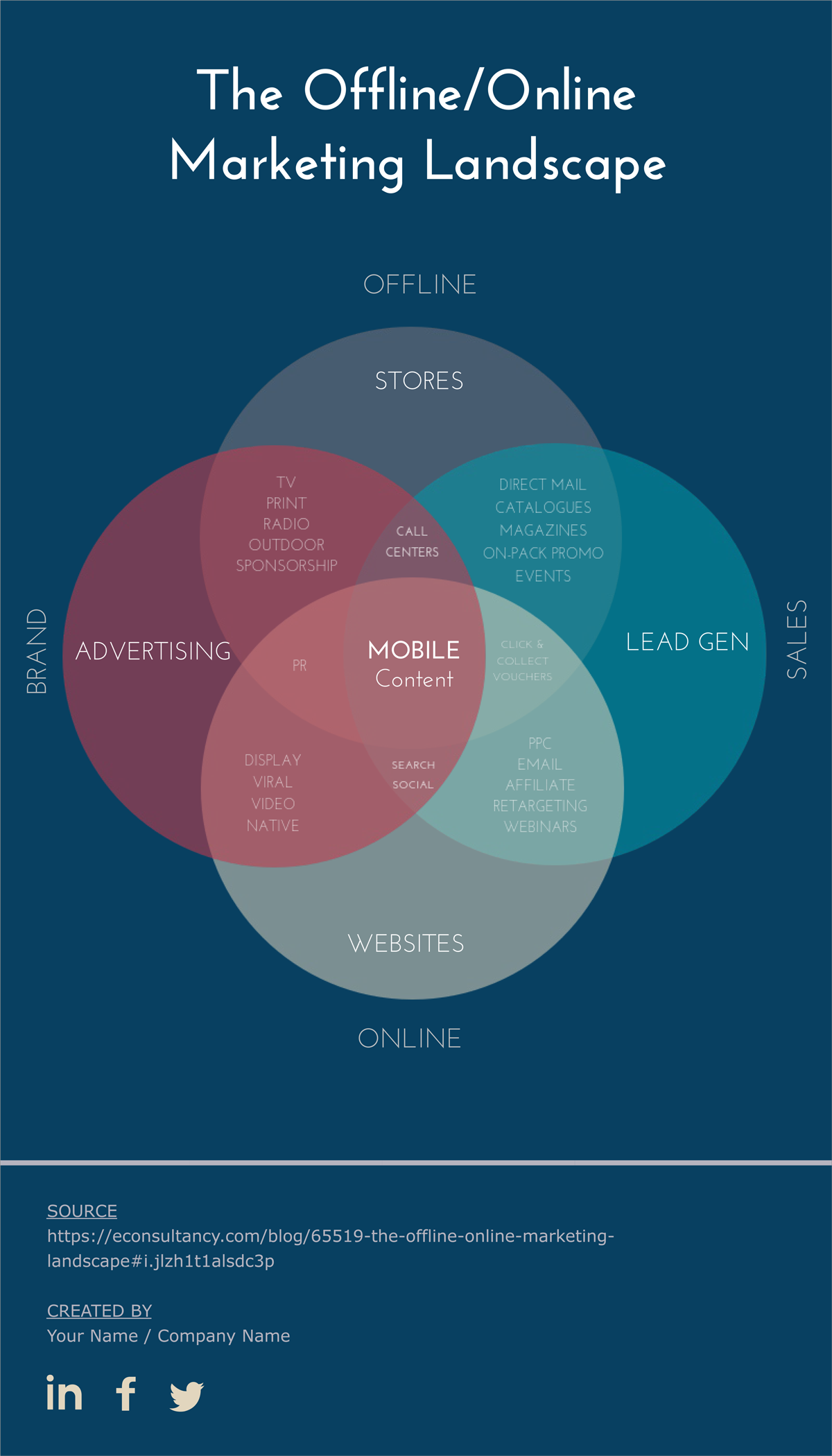
A bit more complex, this example can use four circles or ovals to compare its four different parts.
Take this example on the marketing landscape. Each circle represents a different aspect of marketing, with the interconnecting parts representing what format uses each aspect.

A variation of the four-subject template, this particular example can be used to give some added flair to your visuals.
The diamond/rectangle template involves overlapping—you guessed it—diamonds or rectangles instead of circles, allowing for a different look and an easy trail for the eye to follow.
These creative Venn diagram templates can also be relatively complex. Take, for example, this diamond Venn diagram on dog breeds. The diagram lists a different trait for each rectangle, and then inside lists dog breeds with those traits, or combinations thereof. The multiple connections through these diamonds allows for a variety of different examples to be shown, and the blended colors and straight lines help move the eye.
This type of Venn diagram is tricky yet interesting. Eight different, interconnected ovals are linked to a central topic. This allows you to see how eight types of marketing strategies work and interact with each other to drive substantial business growth. The labeling system makes the interactions easier to track.
Customize this template and make it easy to follow. For example, color code each oval, with different colors so viewers can understand the difference between each concept.

This five-subject Venn diagram is great for any sports fan, using rings to create an image styled like the Olympics’ symbol.
Each ring, of course, represents a different subject, and where they cross each other shows how the subjects interact. While much easier to follow than the “star” example, it also allows for less interaction, so make sure you have each subject where it’ll be most effective.
This can be best used to show how certain concepts interact with others. For example, you can show how two elements in a story’s plot relate to each other, and how another, separate element relates to just one, and so on.

If you want a bit of a different approach to a Venn diagram, the multi-layered template might be the way to go. In this template, you start with a large outer circle, and then nest smaller circles inside. The outer circle usually contains a single subject, and the nested circles, rather than containing subjects on their own, show how each new addition changes the original.
Check out this cylinder Venn diagram. It looks at the relationships of various British Islands with each other. Each circle represents a different area; some are contained within others, and others appear as separate entities.

If you want something that stands out, this type of Venn diagram could work really well. It's different from other, circle Venn diagrams, and comes with an eye-catching color scheme.
You can use this template to speed up your decision making process. Or, use it as part of your documents, presentations, courses or webinars for educational purposes.

This template’s main interest is in how a variety of subjects interacts with a single one, but it does so in a very interesting way: the circles connected to the subject rise along the edge of the largest, growing bigger as they do so.
This can be a great way to show the importance of each subject’s interaction with the main one, with the smallest being the least important, and the largest being the most. It can also be used to show the complexity or amount of the different subjects that interact with the focus.

Similar to the “arcing” template, this one uses different-sized circles to get a point across; unlike the former, this template shows how they all interact.
Much like the arcing Venn diagram, this can show the importance or relative size of the different subjects.
This is a particularly good example, focused on social media platforms. The center circle (social branding) interacts with several others outside it, all of which list social media sites that work best for the given combinations.
Icons grab attention so what better way to show how subjects interact than by combining them with text? This template often uses few words, instead letting the images do the speaking.
For example, this one uses black icons in each circle to represent each item. Rather than clutter the diagram with text, it provides a detailed breakdown of what each item stands for.

Only one style not working for you? Try mixing several different styles to get the effect you want. For example, you could combine a two circle and a multi-layered, showing how the multiple effects of one grouping seep over into another subject.
A great example is by Elizabeth Tobey, who combines nested and alternate sizes into a complex, multi-faceted visual.
These tend to be very complex, so make sure your viewers can follow the information being presented.

Euler diagrams are similar to Venn diagrams, in that they illustrate two or more subjects, but different in one key feature: there is at least one subject that doesn’t overlap with another. These can be very useful to show just how different two subjects are.

Euler diagrams can be used alone (such as having two circles close together, but not overlapping) or combined with Venn diagrams (such as having two circles overlapping, and one placed further away, as in the previous example). Test them out and see if using one such diagram might work well for your project.

How well do you know your users? Not only do you need to understand what triggers them, but also find ways to design for persuasion. The more you understand your users, the more likely you will design and offer services and products that work best for them.
This user breakdown Venn diagram helps you visualize your number of registered users, new customers, inactive users, active users, repeat buyers and loyal users. The complementary color scheme, extraordinary font combinations and other design elements in the diagram help you creatively represent your user data.
So, use this Venn diagram whenever you and your team conduct user research to save a lot of time and effort.
Crowdfunding is an increasingly popular method for raising money for any small business.
It’s one of the most accessible ways of financing a new idea or product. However, launching a successful crowdfunding campaign is more difficult than you think. This makes it a perfect example to use in a Venn diagram.
Use this Venn diagram template to understand how to run a successful crowdfunding campaign. The interconnected circles in this diagram help you understand the most and the least important aspects of all the elements.

This Venn diagram template is a great way to understand how medical, fitness and well-being influence our balance of life. It’s a clear concept of how our physical, mental and emotional health cross over to determine our spiritual well-being.
Edit this Venn diagram template to explain complex topics easily and creatively.

Like the social networking Venn diagram, this social media management Venn diagram plays a crucial role in your social media marketing strategy. As a marketer, you already know that though social media is an important marketing tool, only a social presence is not enough to market your business on social media successfully.
This Venn diagram template shows the most important aspects of social media marketing, such as promotion, curation, listening, customer care and others that drive engagement. However, you can use this template to illustrate relationships between different other topics.
Highlight the various proportions depicted using the circles in this template and visually present points in which different aspects of a topic or item overlap.
The ultimate goal of market communication is to increase sales of your company’s products and services. Therefore, in this Venn diagram template, the client is the focal point. It also helps you explain what other things you need to win more deals with your clients.
This type of Venn diagram is your opportunity to visualize how the three different topics interact with their counterparts individually and how they all come together to provide the result.
Edit this Venn diagram template and change the color combination, icons, fonts and more to align it with your brand guidelines.
Watch the video below to learn how to customize your charts and graphs in Visme.
These are just a few ways you can modify a Venn diagram template to display relationships between concepts. If you're looking for an easy way to create a Venn diagram, you can use Visme's online Venn diagram maker to create one for free.
Simply choose your favorite template, edit the text, customize colors and fonts, and you're good to go. You can also add or remove circles to create your own, unique Venn diagram.
The best part of using Visme is that you get access to an extensive range of data visualization tools, including maps, charts, graphs and much more.
Below, we've addressed some of your most common questions about Venn diagrams and how to use them to illustrate simple and complex relationships.
A Venn diagram can be used in any field of study to visually represent relationships between concepts. Each set of elements is represented as a circle or other shape and the overlapping regions are used to depict what two or more concepts have in common.
Venn diagrams make relationships between data easier to understand by representing them graphically. They can be used to identify similarities and differences between objects, and applied to various fields, including education and market analysis.
A Venn diagram usually has two or three circles, but some have four or more. Venn diagrams can be extremely complex, or extremely simple, depending on the need.
The middle area of a Venn diagram where two or more circles overlap is called the intersection.
A Venn diagram consists of sets, such as ovals and circles, that overlap to create an intersection. The factors of each set are labelled within the circle (or any other shape.)
Visme is an easy-to-use online Venn diagram maker with dozens of ready-made Venn diagram templates that you can customize in minutes.
Design visual brand experiences for your business whether you are a seasoned designer or a total novice.
Try Visme for free