The Best Beautiful.ai Alternatives to Create AI-Powered Presentations

A solid idea or vision can get you in the room with investors.
But your pitch deck structure is what brings clarity, holds attention and earns their confidence.
According to DocSend’s recent study, investors now spend less than two minutes reviewing a pitch deck, and most of that time is spent scanning a few key slides.
Miss those, and your pitch may never get a second look.
A well-structured VC pitch deck helps investors quickly grasp the problem you're solving, how your solution works, how big the opportunity is and why your team is built to win.
So how do you figure out which slides to include, how much detail is too much, and what investors care about? This is where founders hit the wall.
To help you avoid that, I’ve analyzed dozens of successful pitch decks across industries, funding stages and formats to identify what works and what doesn’t. This guide is built on those insights.
I’ll walk you through the essential slides every winning pitch deck should have, explain what each slide should cover, show real-life examples, and give you practical tips on how to design each one using Visme’s drag-and-drop tools and pre-built templates.
New to creating pitch decks? Watch this quick video tutorial to learn how to build a pitch deck that gets investors excited about your company.
Here’s a short selection of 8 easy-to-edit pitch deck templates you can edit, share and download with Visme. View more templates below:


No matter which option you choose, start by creating a pitch deck outline in a collaborative whiteboard tool or text document. You can also use a paper notebook if that’s your jam.
Before you start creating your pitch deck presentation, you need to draft out your pitch deck outline.
The text that goes into these slides is just enough to get the message across. It must strike a balance between a pitch deck that can be seen and processed on its own, or as a support for in-person pitching.
Remember that you don’t want to fill slides with text and make your potential investors suffer the dreaded "death by PowerPoint".
To understand what investors actually care about, we asked Sandy Kory, Founder and General Partner at HorizonVC, a seed-stage, software-focused VC firm.
“There are many different formats that can work,” he shared. “But there are a few key things to keep in mind. First, don’t make your deck too short or too long—10 to 15 slides is usually a good length. Second, make sure your deck answers the right questions: Why is your team the right one to win in this market? What shift or change in the market has created the opportunity? And what real progress have you made so far toward achieving your startup’s goals?”
With those principles in mind, below is an easy-to-copy outline to get you started.
Let’s take a look at what each slide is about and what to include in it. For each type of slide, we have also included a template that you can customize for your own pitch deck.
But first, let’s get you inspired to make your slides look amazing. The video below offers dozens of slide design tips and ideas to help you make the best pitch decks possible.
The title slide is the first thing anyone will see on your VC pitch deck. It has two purposes:
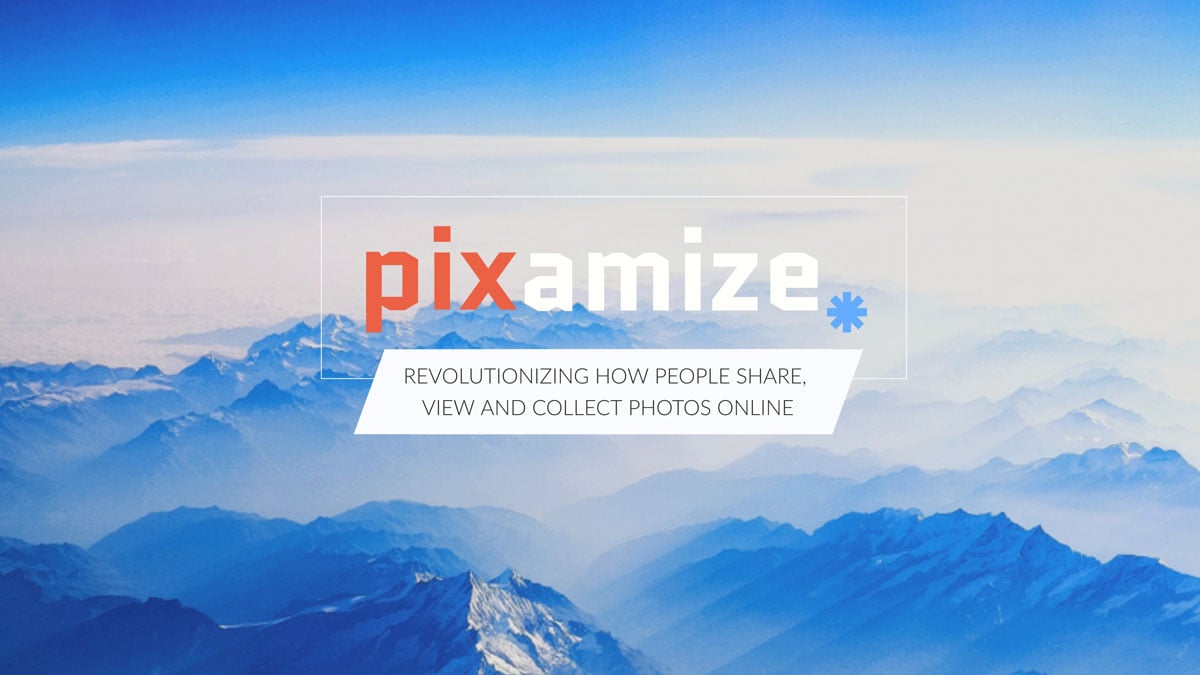
On the first slide of the Pixamize pitch deck below, notice the logo and the descriptive sentence. Both of these are set up in the center of the slide over a background in the brand colors.
As you can see, it’s short, sweet and to the point. Visualize this slide so your brand shines through and makes a great first impression.
 Branding Tip: Make all your slides fit together in terms of style, color, fonts, and feel. Your brand must shine through every single slide in a way that makes them feel united and with an even visual flow. You can achieve this by using one of our templates or by taking advantage of Visme's Brand Kit feature.
The agenda slide isn’t mandatory. But trust me, it’s a super helpful compass, especially when you’re pitching in longer or more formal meetings.
It gives your audience a clear roadmap of what’s coming. Plus, it helps you stay on track and transition smoothly from one idea to the next.
You don’t need to overthink it. A horizontal timeline, icons with labels or even a clean, numbered list will suffice.
Just keep it short, sharp, and strategic; 7-10 points is the sweet spot. Anything more and you risk overwhelming your audience before you hit slide 5.
To make your agenda look polished, use Visme’s icons or animated transitions for a natural flow.
You can even hyperlink each TOC item to the corresponding slide so you can easily jump back and forth during your delivery without breaking stride.
For example, the Y Combinator Pitch Deck Template uses a two-column layout with numbered yellow icons. This format is simple, visually engaging, and easy to follow.

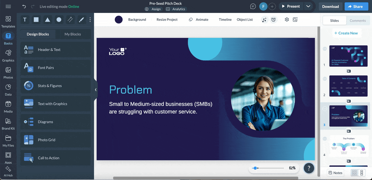
In contrast, this Preseed Pitch Deck Template opts for a sleeker grid-style layout, which is perfect if you want a modern and minimalist table of contents format.

And if you’re building the pitch with your team, Visme’s collaboration tools make the process a breeze. You can invite your team to view, comment and edit the slides in real time or asynchronously. Better yet, you can assign specific slides to teammates, set deadlines, and track their progress with our workflow management tool.
Every business must solve a problem for its target market. But not every business offers the same solution.
It’s important that your audience immediately understands what gap or frustration your product addresses.
But don't just stop there; spell out the problem clearly, then show how your solution adds genuine value in ways that others don’t. This part usually takes up one or two slides: one to define the problem and another to showcase your solution (backed up by some proof if you have it).
As someone who’s built and pitched a real-world solution, Farzad Rashidi, Lead Innovator at Respona, notes:
“Clearly stating the problem and how your solution addresses it is essential. Y Combinator emphasizes that the specifics of how the problem impacts real-world people or businesses are valuable. At Respona, we made sure our problem statement was as concrete and relatable as possible to ensure investors understood the real need for our solution.”
You don’t necessarily have to put these slides right next to each other, either. Infact, many founders prefer to spread them out to make a stronger case.
For example, the slides below from Visme’s Traveler Connect pitch deck template are not presented in sequence. They are actually quite a few slides apart. The problem is laid out on slide 4, followed by proof to support it. The solution is then presented on slide 12.

This staggered approach works well when you need to establish context first. Just ensure that your narrative flows smoothly.
When visualizing the problem, lean into storytelling. Bring in a relatable customer struggle, drop a surprising stat, or share a quick story to create empathy. For the solution, keep it simple. Don’t get bogged down in technical details. Pair a product screenshot with a brief, benefit-driven description or a straightforward diagram of how it works.
To generate ideas or sharpen your message, consider using Visme’s AI Writer. Just input your main points, and you’ll get a polished draft in no time.
Having a great product isn’t enough. You’ve probably heard that more times than you can count but it’s the truth.
Investors want to know there’s serious demand, room to grow and a clear path to scale. Your market opportunity slide is where you prove this.
It should answer one big question: How big can this get and how much of it can you own?
In this slide (or set of slides), you'll want to define your Total Addressable Market (TAM), Serviceable Available Market (SAM) and Serviceable Obtainable Market (SOM).
If you're early-stage and don’t have those numbers fleshed out yet, you can also paint a positive picture using data points such as industry trends, projected growth or emerging niche segments.
This is the perfect time to use Visme’s data visualization tools. A well-designed pie chart, layered area graph, or segmented bar chart will instantly make your market breakdown easier to grasp and much more persuasive.
Take this Preseed Pitch Deck Template, for example. It uses radial bars to showcase:

To elevate your pitch deck, embed interactive charts so viewers can:
You can also use map visualizations to show geographic potential or heat maps to indicate where demand is surging. Add short captions or callouts to guide your audience through what matters most. Don't forget to cite your sources; nothing builds credibility like grounded, verifiable data.
Not sure how to frame your market story? Let Visme’s AI Pitch Deck tool help you map it out. It uses your inputs, like industry and product type, to recommend the right slides and structure to make your case compelling.
Every investor knows there’s competition out there. Your job is to show how you stand out from the crowd.
On your competitor slide, make it clear where your brand fits in the mix. Point out what makes your approach, product, or strategy different and better than the rest. Be honest and specific, and most importantly, be strategic in your approach. This slide doesn’t have to be packed with text.
In fact, it’s more powerful when you visualize the comparison. You can take the traditional route with a quadrant chart or try a comparison table that lists features versus competitors. What’s important is choosing a style for this slide that proves you know the space and have a unique edge.
The competitive analysis slide below uses the second approach. The table showcases how the brand stacks up against competitors across seven key features.

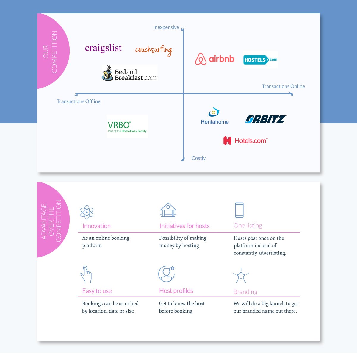
This Airbnb-inspired pitch deck takes a different approach. I love how it maps out competitors in a quadrant using their logos, with axes labeled by price (inexpensive vs. costly) and transaction type (online vs. offline). The next slide emphasizes their competitive edge with cool icons and text laid out in a grid.
Product demos make all the difference in pitch events.
Just think back to when Elon Musk unveiled Tesla's dual Motor and Autopilot feature. He didn’t just gloss over the list of what it could do. He showed a live demo of a Tesla driving itself on the highway.
Those are the kinds of aha moments that turn curiosity into conviction. And that’s exactly what your demo slide should do.
If your product is visual or interactive, don’t just bore your audience with a block of text. Create a short demo video (under 60 seconds), a looping GIF, or a series of annotated screenshots with Visme to walk your audience through the experience.
Visme also allows you to incorporate videos into your slides in multiple ways:
Keep it simple, high-level, and focused on the “aha” moment. Even if your product doesn’t require a demo, you can still use a flowchart or a simple step-by-step breakdown to show how it works, just like the pitch deck example below.
Building your deck in Visme? You can embed your demo video directly into the slide for a seamless viewing experience. Another option is to add interactive elements such as hotspots or buttons that let viewers click through features or flows when viewing the deck online.
For more inspiration, read our guide on how to create an interactive product presentation that drives results.
This is the “show me the proof” moment in your pitch.
Up to this point, you’ve been building belief. Now it’s time to back it up with results.
If you’ve launched, your traction slide should show momentum: revenue to date, user growth, retention numbers, customer wins, waitlist size, or media mentions.
Whatever data you choose to show, make it concrete and visual. Follow that with your revenue model slide. How do you make money? Is it through subscriptions, transaction fees, licensing, advertising, or a hybrid approach?
But if you haven’t started making money yet, that’s totally okay. Traction doesn't always mean cash in hand. You can show there’s a buzz around what you're doing.
For instance, mention the size of your waitlist, a surge in early signups, or positive feedback from beta users.
If you’ve run pilot programs or gotten letters of intent (LOIs) from potential partners, that’s great too. Look at metrics like repeat logins, usage time or product shares.
As someone who’s been in the pitch room, Farzad Rashidi, Lead Innovator at Respona shares this advice:
“Show off your traction with clear and meaningful numbers. Y Combinator suggests that even if your growth curve isn’t perfectly smooth, adding context to your metrics can make them compelling. For Respona, our steady user growth and engagement metrics were key points that demonstrated our momentum.”
Other good early signals include social media followings, community engagement, media mentions, or recognition from awards and competitions. If your startup is building an audience or getting noticed, it means you're doing something right. Throw in some testimonials from beta users or screenshots of enthusiastic feedback to add a personal touch!
Investors should view this slide and instantly understand how the dollars flow in and scale over time.
Use Visme’s data visualization tools and widgets to turn your key metrics into punchy visuals. For example, you can use line graphs to visualize MRR growth, stacked bars for user segments, or icon-based stats for quick hits (e.g., “10K+ monthly active users”).
The slide below is an example of how data can be visualized in a simple and concise format.

This traction slide uses a combination of six different metrics, such as number of users onboarded, number of paying customers, Monthly Recurring Revenue (MRR), Customer Acquisition Cost (CAC), Customer Lifetime Value (LTV) and Net Promoter Score (NPS).
Investors need the inside scoop on your business operations to see if it's worth investing in.
Your business model slide should give them a clear snapshot of how you operate and how you make money. Think of it as the engine behind everything you’ve pitched so far.
Use this slide (or two) to break down the core aspects of your business process: Who are your customers? How often do they pay and for what? If you have multiple revenue streams, show how they connect. If you operate in a marketplace, SaaS or hybrid model, simplify it so anyone, regardless of technical background, can understand it in 15 seconds or less.
You don’t need dense paragraphs to explain your business model. A flowchart, tiered diagram, or visual breakdown using icons and arrows is often the best way to go.
The key is showing the relationship between value creation and value capture: how you deliver something meaningful to customers and how that translates into revenue.
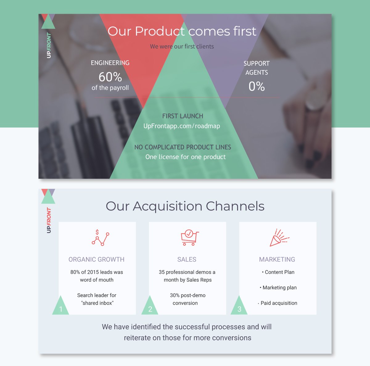
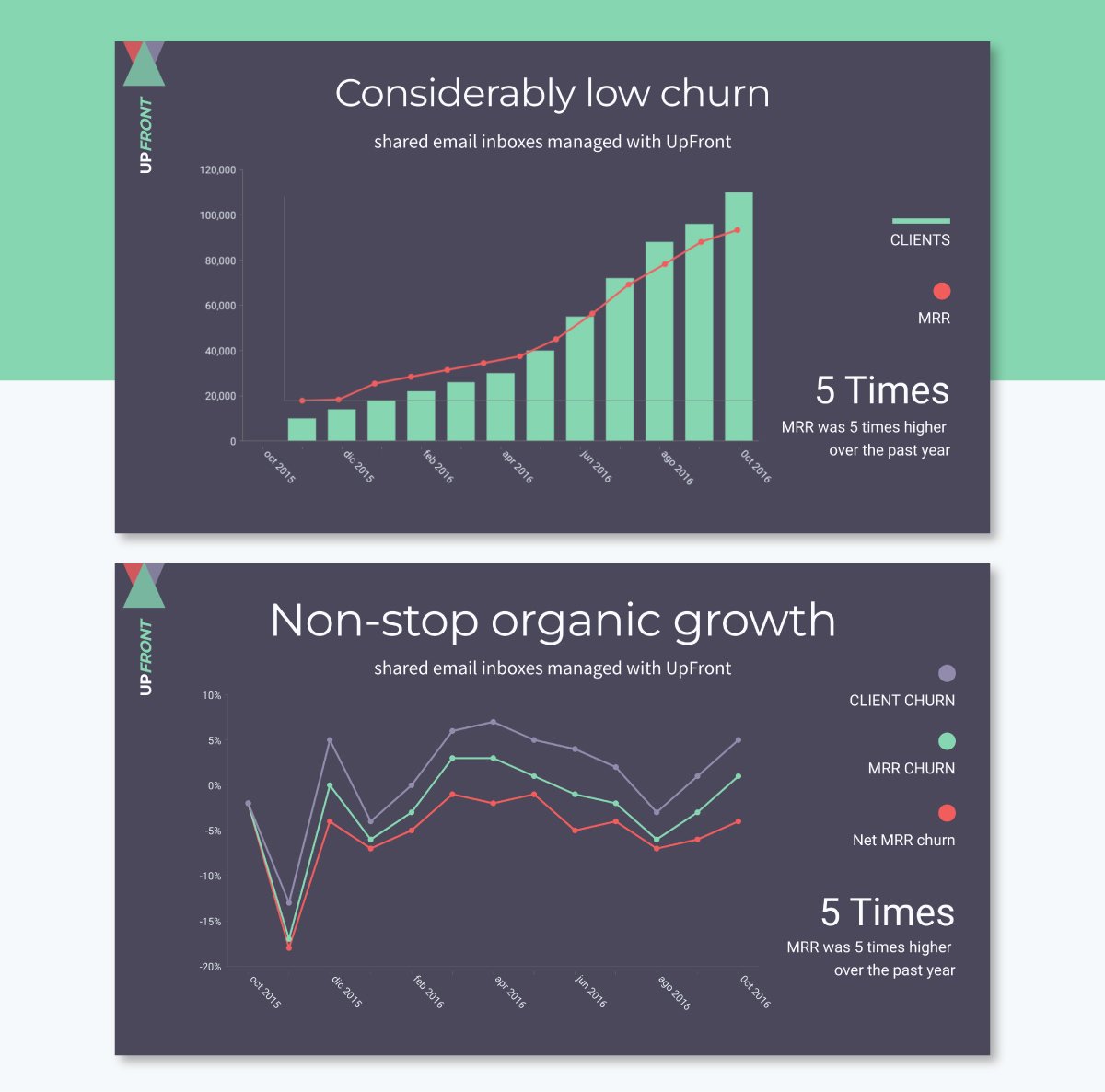
These slides from Visme’s UpFront pitch deck template below showcase two important parts of the brand’s business model. The first slide delivers the brand’s origins and purpose and the second slide visualizes how their business model has grown so far.
You’ve shown that there’s a real problem, a big opportunity, and a strong product.
Now it’s time to answer the million-dollar question: How are you going to reach your customers?
Your Go-To-Market (GTM) strategy slide should lay out your plan to attract, acquire, and retain customers, starting from launch and scaling from there.
It’s super important to show you’ve thought through your channels, tactics and timeline.
Start by outlining your initial target audience and where they live: online and offline. Are you going direct-to-consumer via paid ads and influencer campaigns? Partnering with resellers? Selling through a sales team? Leaning on content or community? Be specific. Show which channels you’ll focus on and why.
A good structure for this slide includes:
To make this visually appealing, avoid just listing everything out. Instead, think about using a horizontal timeline, channel icons with brief captions, or a funnel diagram that shows how traffic turns into paying customers.
If you’re using Visme, you can create this layout easily with icons, flowcharts, and even some animated transitions to keep things engaging.
If you need to show more than one approach (like B2C and B2B), consider using tab-style visuals or an interactive slide so viewers can explore both GTM plans in one place.
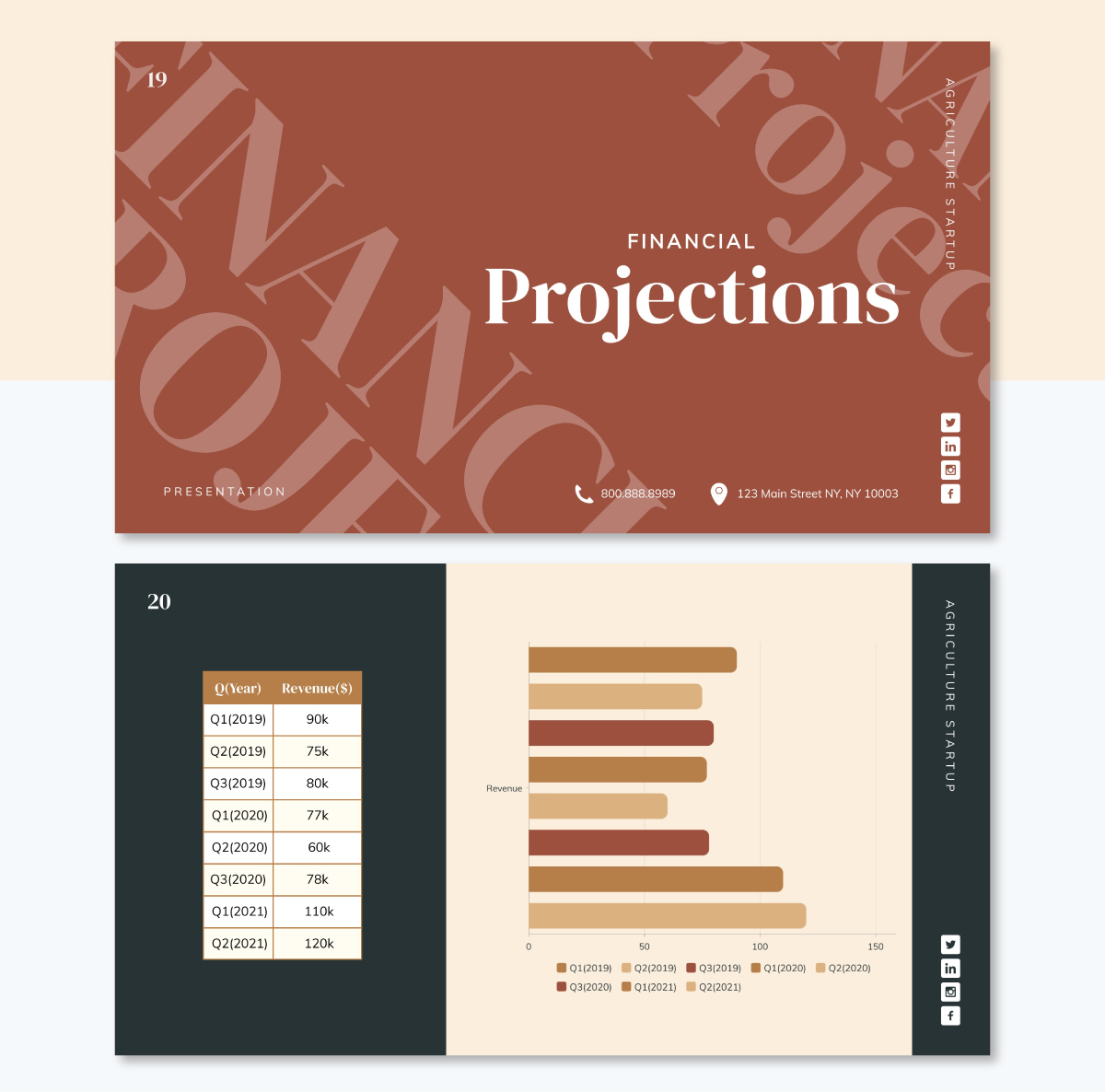
Shortly after displaying your goals and dreams for the future, its time to present your business’s financial projection. On this slide is where your data analysis shines. Use the right type of chart with a visually appealing design to showcase the data.
Outline your projected financial performance over the next 3 to 5 years. Focus on key metrics investors care about, like revenue, gross margin, operating expenses, EBITDA, and burn rate. If you're early-stage, it’s okay to lead with assumptions; just make sure they’re reasonable and backed by logic.
Before creating your financial projection charts, sketch some ideas on your presentation outline. If you have a large dataset, import it into the Visme Graph Maker and customize it until it looks great. You can adjust labels, color codes and even add animations.
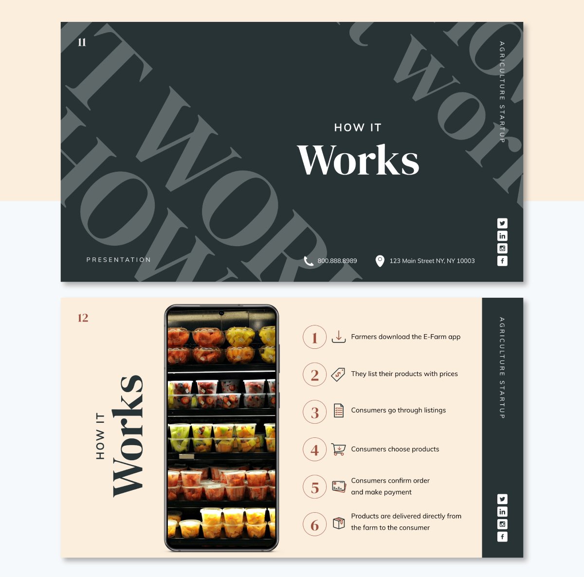
Take the Agriculture Startup Pitch Deck, for example. It breaks down the revenue projections into quarters across three. On the right, there’s a single, elegant chart to visualize revenue growth over time. That’s what you want: projections that tell a story and inspire confidence.
The financial projections in this deck reflect assumptions of low churn and continuous organic growth—two critical levers for driving predictable revenue and scaling efficiently.
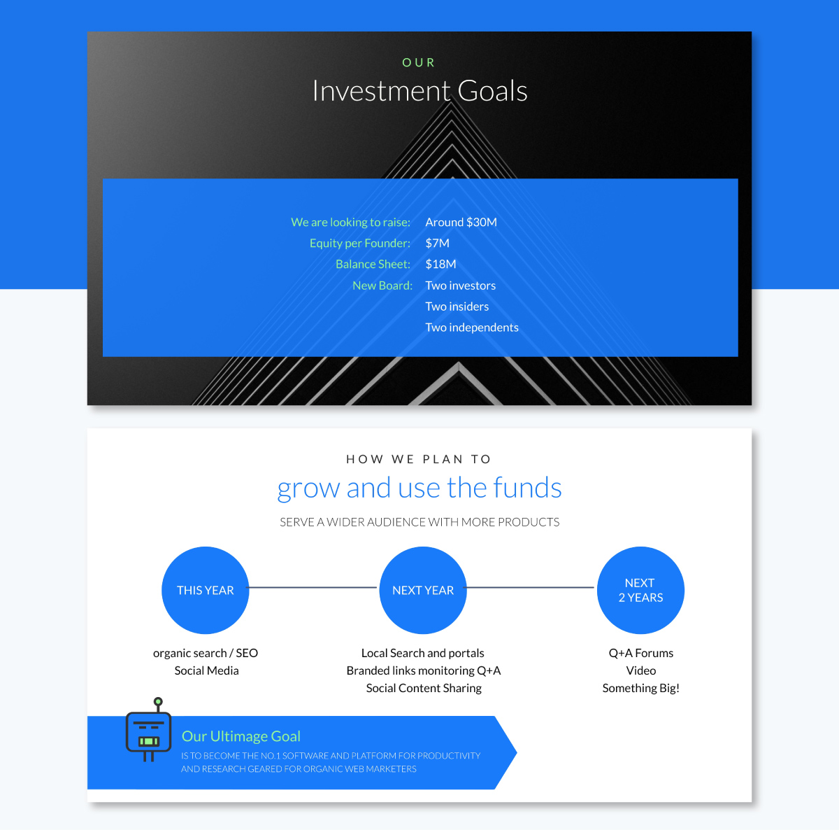
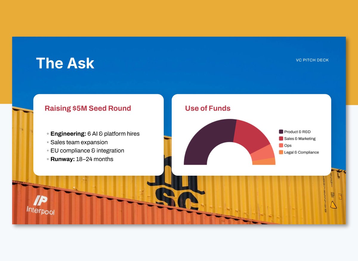
Every pitch eventually gets to the point where you have to make your ask, and this is it.
Your Financial Ask/Use of Funds slide should clearly state how much capital you’re raising and exactly how you plan to spend it.
Start with the total amount you’re raising, then break it down by category. Are you putting most of it into product development? Marketing? Hiring a sales team? Launching in new markets? Group the expenses into 4–5 key buckets and visualize them with a pie chart or horizontal bar graph.
This slide from the ToughSEO Pitch Deck Template is a great example. It keeps things simple: a clear ask, a high-level breakdown, and a brief note on what investors receive in return (in their case, board seats). You don’t need to squeeze in every detail. Just list the major items so it’s clear where most of the money is going.
Use Visme’s data visualization tools to build a branded chart that's consistent with the rest of your deck. You can even add short tooltips or hover effects if you’re sharing your pitch online and want to include a little more context without clutter.
A few quick tips for this slide:
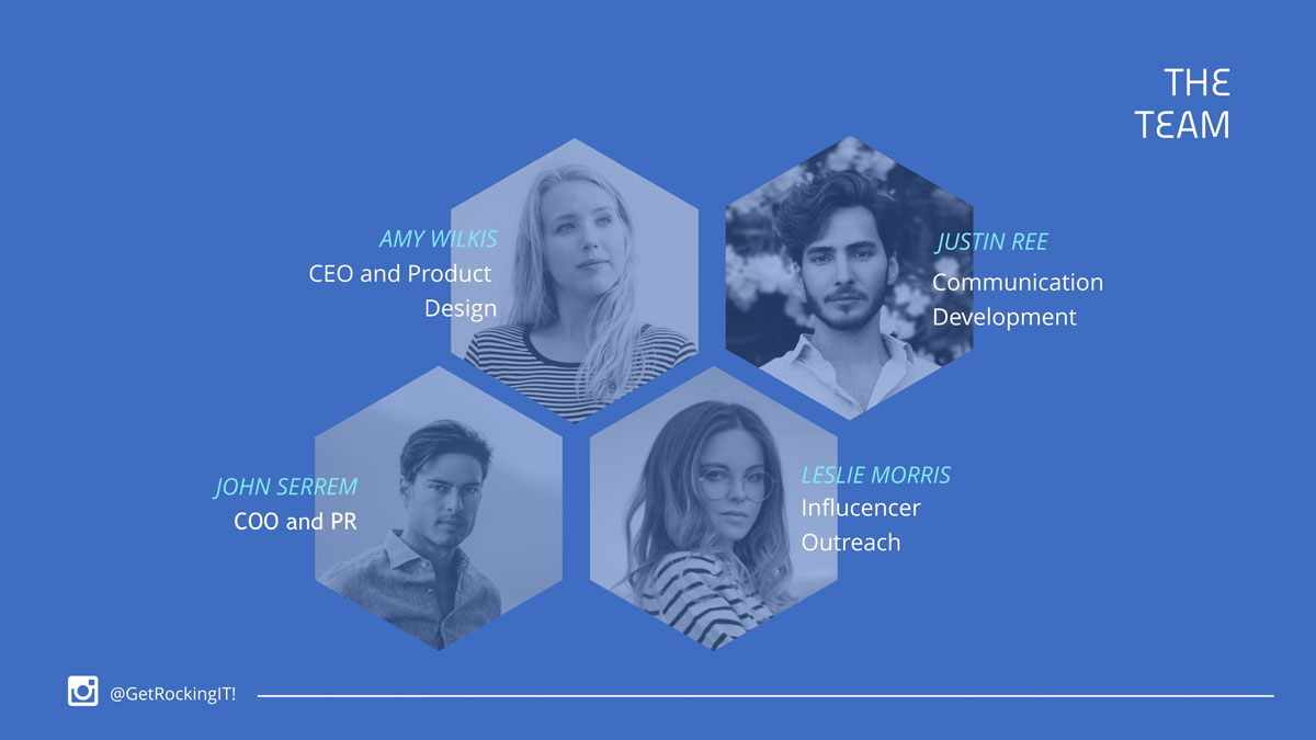
Every great pitch ends with the people behind the vision. Your team slide is your chance to show investors that your business is in capable hands.
This slide should shine a spotlight on your core leadership team, including founders, key hires, and anyone critical to execution.
Use headshots, short bios, and 1–2 lines about each person’s background, such as past wins, domain expertise or notable companies they’ve worked at. For a consistent look, the photos should match in style, backgrounds, lighting and crop ratios.
If your photos need a little finessing, Visme’s AI editing tool can help you quickly enhance lighting, remove distractions, and apply consistent filters so your slide looks polished.
You can also elevate your team slide by hyperlinking each photo or name to their LinkedIn profile or portfolio. That way, investors can dig deeper to learn more about each member of your team.
Circle, square or hexagon-shaped photo frames will give your slide deck a structured, polished look.
For example, the RockinIt Pitch Deck Template has a unique interlocking hexagon layout and a cohesive blue overlay.
Looking for inspiration for your business presentation layout? Check out these 50+ Meet Our Team Templates for Your Presentations to find a structure that fits your pitch.
You’ve told your story, shared your vision and backed it up with strategy and numbers. Now it’s time to wrap things up on a strong, memorable note.
Share a warm thank-you message along with your contact details: name, email, phone number, and website. If you’re active on LinkedIn or Twitter/X, include those handles too. If you’re pitching as a team, group your contact info or designate a point person for follow-up.
This is also a great spot to include a short, bold call to action like:
Design-wise, keep it clean. Use plenty of white space, a strong visual or background image, and your logo. You can also drop in a QR code that links to your full data room, product site, or Calendly link for easy scheduling.
Once your team signs off on the design, hit “Publish” to share an online version of your deck with clickable links, embedded videos, and smooth transitions.
Prefer offline sharing? Visme lets you download your deck in PDF, PPTX or image formats so you're covered in any setting.
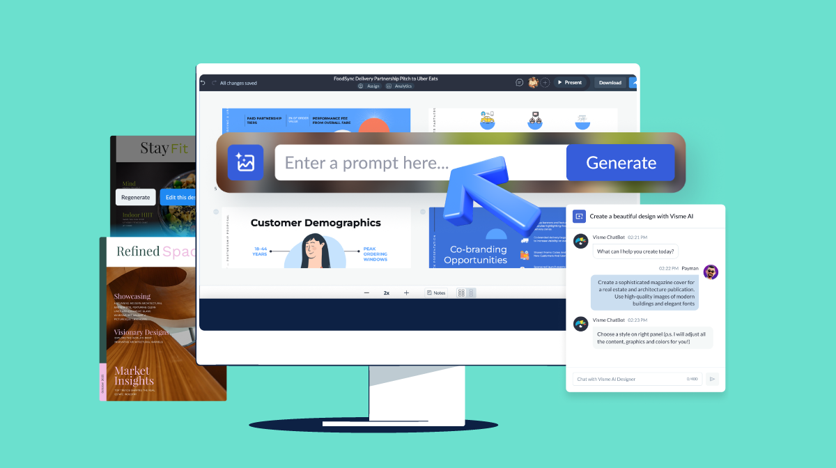
AI tools like Visme can help you generate a professional pitch deck in minutes. But the real magic starts with the right prompt.
A stellar prompt guides the AI to build slides that reflect your vision, match your brand style, and hit the right notes with investors.
Below, I’ve shared six detailed prompts you can plug into your AI tool. These prompts are helpful for pitching pre-seed or Series A, building in AI, climate tech or something in between.
Drop them into Visme’s AI pitch deck generator, select your design, tweak the details and you’ll have a solid deck ready to pitch.
"I'm a [stage] founder preparing a [#-slide] pitch deck to raise a [$X] [round type] for my [product description]. Generate a clean, minimalist deck that includes:
Design style: modern with plenty of whitespace. Leave placeholders for screenshots, metrics, and testimonials."
"I'm a pre-seed founder preparing a 10-slide pitch deck to raise a $500K round for my AI-powered productivity tool for remote teams. Generate a clean, minimalist deck that includes:
"I'm the [title] of a [sector] SaaS company raising a [$X] [round type]. We've reached [traction metrics]. Build a professional pitch deck that includes:
Tone: data-driven and investor-ready.
Design style: clean, branded, with editable charts and placeholders."
"I'm the CEO of a SaaS company in the HR tech space raising a $10M Series A. We've reached $1.2M ARR and have 80+ enterprise clients. Build a professional pitch deck that includes:
"I'm a mission-driven founder building a [climate tech solution]. I'm raising a [$X] [round type] targeting [investor type]. Generate a pitch deck with focus on:
Design style: earthy, clean visuals with space for charts and logos. Tone: inspiring, credible, and climate-conscious."
"I'm a mission-driven founder building a carbon capture startup. I'm raising a $3M seed round targeting impact investors and climate-focused VCs. Generate a pitch deck with focus on:
"I'm the founder of a [AI product type] startup raising a [$X] [round type]. Build a deck with a bold, tech-forward design that includes:
Design: futuristic (dark or gradient theme). Leave placeholders for dashboards, charts, and logos."
"I'm the founder of a generative AI platform for marketing teams raising a $5M Seed+ round. Build a deck with a bold, tech-forward design that includes:
"I'm a [demographic] founder building a [product type] for [target audience]. I'm raising a [$X] round targeting [investor type]. Create a warm and empathetic deck that includes:
Design: soft colors, round fonts, visual storytelling elements. Leave room for screenshots and testimonials."
"I'm a female founder building a mobile app to help women track hormonal health. I'm raising a $750K seed round targeting angel investors and femtech accelerators. Create a warm and empathetic deck that includes:
"I'm the founder of a [deep tech category] startup. We’re raising a [$X] round to fund [next milestone]. Generate a technical, credible pitch deck that includes:
Design: professional and precise with diagram placeholders and minimal animations."
"I'm the founder of a neurotech startup building brain-computer interfaces for medical diagnostics. We’re raising a $6M Series A to complete FDA Phase 1 trials and expand R&D.Generate a technical, credible pitch deck that includes:
A presentation is a broader term for any visual tool that helps you share information with an audience. It can cover a wide range of topics or take different forms, such as training your team, presenting quarterly results or sharing your vacation photos.
A pitch deck is a specific type of presentation designed to convince investors, partners, or stakeholders to support your business idea, startup or product. It typically follows a clear format that outlines the problems, solutions, business models and required funding.
To sum it up: all pitch decks are presentations, but not all presentations are pitch decks.
Not exactly. A pitch deck is a visual storytelling tool used to generate interest and spark a conversation, typically during a meeting or pitch event. A proposal is a more detailed, written document that outlines specific plans, deliverables, timelines, and costs. It is typically submitted after initial interest is confirmed.
Essentially, you pitch to get attention; you submit a proposal to provide more details, address objections and close the deal.
The 10-20-30 rule for pitch decks is a guideline created by Guy Kawasaki to help entrepreneurs create effective presentations. The rule suggests that a pitch deck should have 10 slides, last no longer than 20 minutes, and use a font size of at least 30 points.
This rule applies to any presentation aimed at reaching an agreement, such as raising capital, making a sale, or forming a partnership. It forces you to focus on what matters most and makes your message memorable.
The first page is the Title Slide. It typically includes your company name, logo, tagline (or one-liner), and your contact details. It sets the tone, gives your audience context, and makes a strong first impression.
Your pitch deck structure is the backbone of your investor pitch.
Jumping straight into visuals without a clear outline is like building a house without a blueprint. Even the best-designed slides can fall flat if they’re missing the flow and clarity investors expect.
Visme makes it easy to take your pitch deck outline and turn it into a polished, persuasive presentation. With customizable templates, drag-and-drop design tools, and built-in data visualization, you can bring your ideas to life without professional design experience. You can even collaborate with your co-founders or advisors in real time.
Ready to turn your outline into a deck that gets results? Create your free Visme account today.
Design visual brand experiences for your business whether you are a seasoned designer or a total novice.
Try Visme for free