


The Best Interactive Sales Presentation Software to Close More Deals

The most successful and memorable presentations have one thing in common.
They all tell a story.
No matter how many facts or charts need to be presented, incorporating stories into a presentation will keep your audience focused and intrigued.
Using stories to support data is a well-known technique in all aspects of public speaking, from motivational talks to in-company sales pitches.
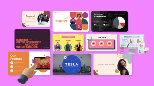
Here’s a short selection of 8 easy-to-edit modern presentation templates you can edit, share and download with Visme. View more templates below:


In this guide, we will look at 7 ways to structure your presentations using storytelling techniques to keep your audience engaged until the very end.
Look closely at each one to see which fits your presentation’s purpose best!
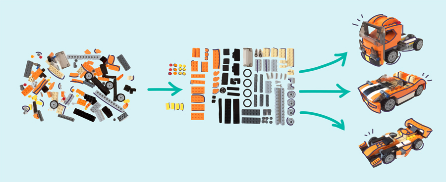
Is it easier to separate the correct pieces before you start building? Or is it better to search in a big bucket with mixed parts for every new piece you need?
We’re pretty sure you will pick the first option. In the beginning, it might seem like this option would take longer, but the opposite is true.
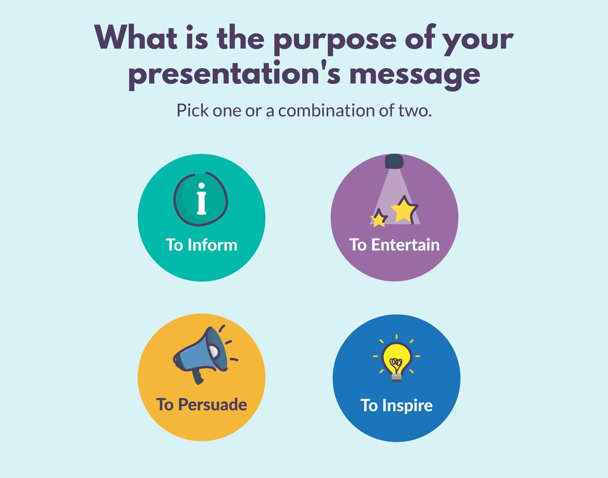
The first step to a successful presentation structure is to brainstorm your ideas and combine them into a rough draft. But first, consider the message you want to relay to your audience.
What is the message you want to convey with your presentation?
A good starting point is to decide if it will be informative, entertaining, inspiring or persuasive.
In a business setting, you might want your presentation to do two of these things: inform and persuade. If you are a mindset coach for companies, then you might want to entertain and inspire.
The main message should be easy to grasp from the title on your first slide. Think of an appropriate way to word what you want to give your audience in one or two sentences. This can of course be changed later, but having a preliminary title will help get your ideas in order for what comes next.
Once you know which direction your presentation will take, it’s time to jot all your ideas down on paper to create a presentation outline and rough draft of all the points you will cover.
Now that the brainstorming and rough draft are out of the way, it’s time to start structuring your presentation. This is when we introduce the storytelling aspect into the equation.
All the information you have gathered and organized in your rough draft now needs some attitude to really get your message across.
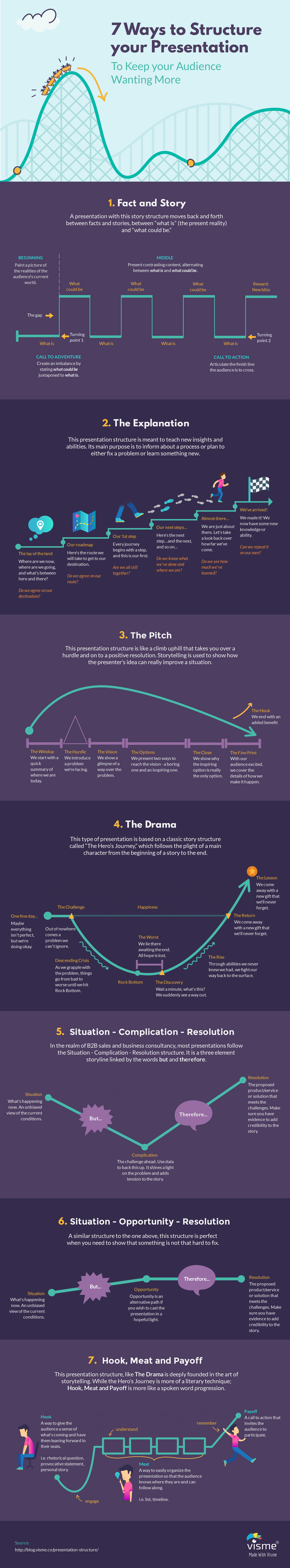
We are going to look at 7 different styles of storytelling structures that work great for presentations. They all have a different style of delivery and cadence. Choosing one for your presentation will depend on your message and who your audience is.
Embed on your site:
The first structure we will look at is Fact and Story. The premise is that the presentation moves back and forth between facts and stories.
Presentation guru Nancy Duarte wrote about this presentation structure in her book "Resonate." She suggests that mixing storytelling with the relay of facts can help your audience stay interested until the end of your presentation.
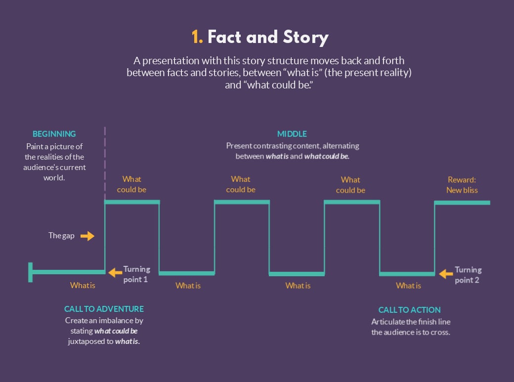
According to Duarte, this type of structure should start off with an initial setting of the present reality: the “what is.” From there, an invitation to adventure is presented and the first instance of “what could be” is told as a story to illustrate how the initials facts can be improved.
This comparison of presenting the facts as what they are at the present moment with stories that show how things could be improved is what keeps your audience interested and waiting for more.
The conclusion should end at a high point, considerably higher than where it began. The audience should feel like they learned something and, at the same time, inspired to change.
This structure maintains a level of suspense and excitement, perfect for presentations that need to inspire AND inform.
This TED talk by David McCandless about the The Beauty of Data Visualization is a perfect example of the Fact and Story structure. He presents a collection of data visualizations which he created himself, along with a story of why he chose each particular set of data.
The topics he chose were extremely relevant to our present day and the audience related to all of them. The personal stories added to the intrigue and the audience left feeling like data visualizations are not only beautiful but also quite important.
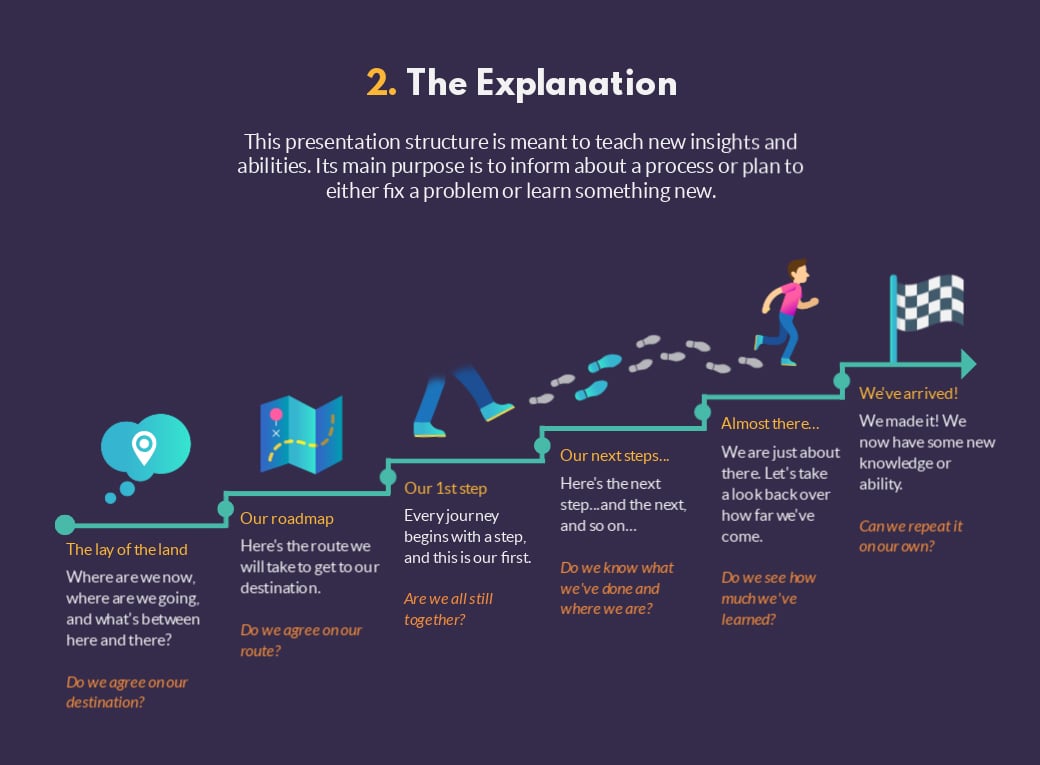
According to Gavin McMahon, co-founder of fassforward Consulting Group, the presentation structured labeled as The Explanation is meant to teach new insights and abilities.
Its main purpose is to inform about a process or plan to either fix a problem or learn something new. A good way to incorporate storytelling into the structure is to show the progression of the facts along with the progression of a story.
The presentation progresses in an upward motion following these steps:
The Explanation structure can be used for presentations by consultants that want to teach new ways of doing things inside a company or department. It could also perfectly fit in a sales meeting where a presenter can explain their process of a masterful sales plan.
This TED talk by Amy Cuddy about how your body language shapes who you are is a great example of an Explanation structure. She tells us about her experiment on power poses and how they can affect the outcome of a difficult situation.
The presentation starts off with a discussion on the natural animal and human condition of power and ends with a personal invitation to change your life with a 2-minute practice of power posing.
If you are a lover of the show "Grey’s Anatomy," this is the idea behind the power pose that the neurosurgeons do before a big procedure.
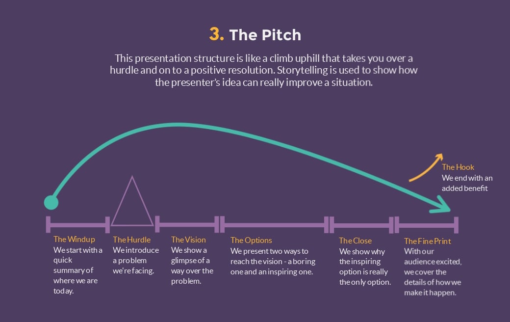
As you know, a pitch in the business sense is when a presenter uses the power of a presentation or speech to convince the audience of something he/she believes will improve a system or solve a problem, according to Gavin McMahon, co-founder of fassforward Consulting Group.
The Pitch presentation structure is like a climb uphill that takes you over a hurdle and on to a positive resolution.
It shows how the presenter’s idea can really improve a situation. By using a real and relatable story, the pitch makes more sense and feels more important.
Use The Pitch presentation structure when you want to convince someone that your idea is the best for their problem. This structure also works when a new startup is looking for new funding or sponsorship opportunities.
This TED talk by Enric Sala about how to turn the high seas into the world’s largest natural reserve is a great example of a Pitch structure. He starts off with a story of how a group of fishermen revived an area of the ocean by stopping all the fishing there and turning it into a natural reserve.
Ten years later, that piece of ocean makes more money from scuba diving tourism than it ever did from fishing. He continues to talk about the same problem at a larger scale, the diminishing supply of fish and the destruction of the oceans.
His pitch to solve the impending problem is to turn the high seas into a natural reserve. He finishes by telling the audience that the plan is being pitched to the UN and that every individual can help their country abide by the new agreement if it goes through.
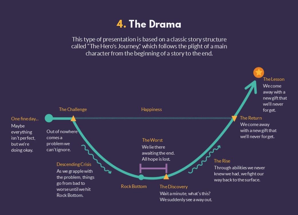
There is a well-known structure in literature called “The Hero’s Journey” which follows the plight of a main character from the beginning of a story to the end and leaves the reader feeling like they've learned a lesson they will never forget.
This type of presentation structure, The Drama, has a strong storytelling aspect. This is often used to tell the story of an influential company from founding days, through trials and tribulations, and then finishes with an inspiring show of success.
Another perfect presentation for The Drama structure is an inspiring personal story.
These are the steps of a Drama style presentation structure:
This TED talk by Adam Driver about his journey from Marine to actor is the perfect example of The Drama structure.
He begins the story by telling the audience about what his life was like before he joined the Marines and what drove him to do it.
He tells how the Marines became his family, and closest friends. Then, right before deploying to Iraq or Afghanistan, he had an accident that separated him from the Marines for good.
He continues to explain how he went on to become an actor, followed by the creation of his project to unify theater with military service.
His talk ends with an example of the theater pieces he coordinates to be presented at military camps. Listeners are left with their hearts full of a newfound hope for humanity.
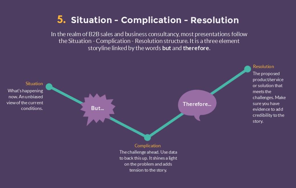
According to Gavin McMahon, co-founder of fassforward Consulting Group, most presentations in the realm of B2B sales and business consultancy follow the Situation - Complication - Resolution structure. It is a three-element storyline linked by the words but and therefore.
The starting point is The Situation, where current conditions are shown in an unbiased and transparent way. The situation connects to the next step through the word but.
A simple example: Our home decor company is selling pretty well this month, but…
This is when The Complication is presented.
In the above example, it could look something like this:
Our home decor company is selling pretty well this month, but … we have been spending too much on international shipping.
When presenting The Complication, use facts to prove it. Present it as the challenge that needs to be overcome. The Complication is a low point, but from a low point we can only go up.
The final destination is The Resolution, which is connected to The Complication with the word, therefore.
Our home decor company is selling pretty well this month, but we have been spending too much on international shipping. Therefore, we need to start using a new company that has a better price range and great service.
Back up all of your information with real facts and proof.
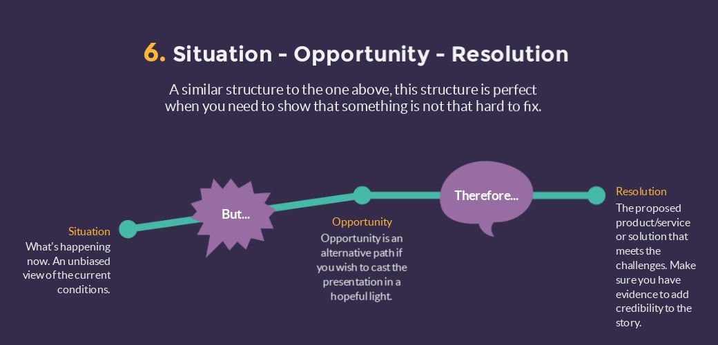
A similar structure to the one above, the Situation - Opportunity - Resolution replaces Complication with Opportunity. This three-part structure is also joined by the words but and therefore.
The difference is that instead of the movement going down and then up, it goes slightly up and then levels out.
This structure is perfect when you need to show that something is not that hard to fix; that the problem might not be so big after all and that the solution is easy to grasp.
A presentation that follows this structure could turn out to be quite short, if only the facts are presented, but that would leave the audience feeling like “is that it?” Adding an interesting story to help the audience relate makes the overall presentation more effective.
This TED talk by Adam Galinsky about how to speak up for yourself is a perfect example of the Situation - Opportunity - Resolution presentation structure. He starts off by saying: “Speaking up is hard,” and instantly everyone in the audience can relate.
He gives a few personal stories about times when he should have spoken up and others when he shouldn’t. He gives contextual proof and explanations about how sometimes we feel powerless, other times powerful, and how this affects if we speak up or not.
His solution to the problem is not a huge effort but rather a personal mindset change. The presentation ends with an inspiring quote by the speaker’s father which leaves the audience feeling like they will know exactly when it’s the perfect time to speak up, or not.
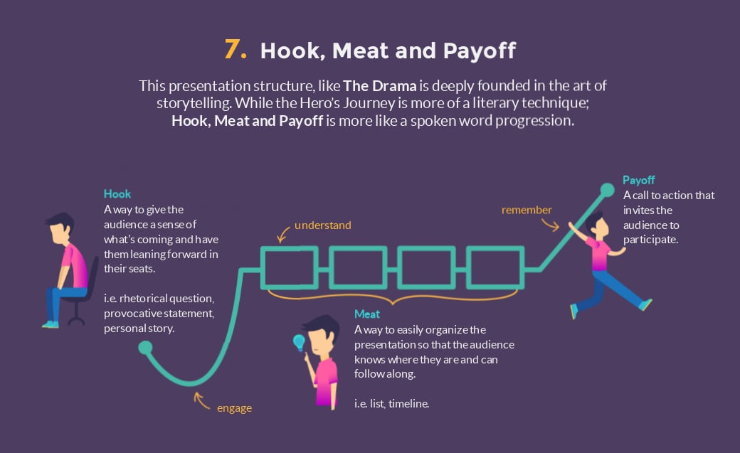
This presentation structure, like The Drama, is deeply founded in the art of storytelling. While the Hero’s Journey is more of a literary technique, Hook, Meat and Payoff is more like a spoken-word progression. This is perfect for presentation an executive presentation to major stakeholders.
The idea is that with the Hook, the presenter gives the audience a sense of place and time, plus a situation that will put them at the edge of their seats, wanting more.
The Meat is the middle section and usually the longest part of the presentation where the story progresses and all the information is relayed in an interesting and inviting way.
The Payoff is the inspiring conclusion that circles back to the beginning and leaves the audience feeling inspired.
It's like when you come out of the movie theater: You feel better about yourself and the world around you, as if you've learned something important that will make your life a little better.
This TED talk by Jill Bolte Taylor about her stroke of insight is a perfect example of a Hook, Meat and Payoff presentation structure.
One of the most famous TED talks of all time, this presentation starts with her personal story of the time she suffered a brain hemorrhage and stroke.
She is a neuroanatomist; she studies brains for a living. Her experience of having a stroke is one of the deepest stories you'll ever hear about the union between science and spirituality.
Her presentation hook, a real human brain which she shows to the audience, very much grabs your attention. The meat of the talk is also entertaining and interesting; she has the audience laughing and crying right along with her.
In the end, she recounts the moment when she felt her body die and then woke up feeling like she was a different person. She had lost all capacities with the stroke, and it took her eight years to learn to talk and walk again.
The Payoff is her invitation to everyone to feel like they have Nirvana at their fingertips, that being conscious of the world around us is not an impossible task.
Now that we've looked at the seven different ways that you can structure your presentation with storytelling techniques, it’s time to make a storyboard.
A storyboard is what film makers use to set up the structure of their movie before filming it. It is created with the help of the screenplay, following the flow of the story. Each rectangle in the storyboard is a scene in the film.
Presenters use this process of storyboarding to set up their presentations because it really helps with productivity. A storyboard is essentially a visual draft of your presentation.
(A note for the “un-artistic”: Don’t worry about things looking amazing right now! Uneven squiggles and weird shapes work the same way as perfect squares. The designed and finished look will come later when you set it all up in the Visme editor.)
As you add the story aspect to your presentation, make sure you don’t get too wordy and try using visuals instead of too much text. Use one or two sentences at most for each slide.
The best way to make a storyboard is with index cards, using each card as a slide. You can add things or easily take them away before you even start to design the final draft.
If it makes things easier, you can take a look at some presentation templates in Visme to see how we've created different slides. This might visually inspire the cards in your storyboard.
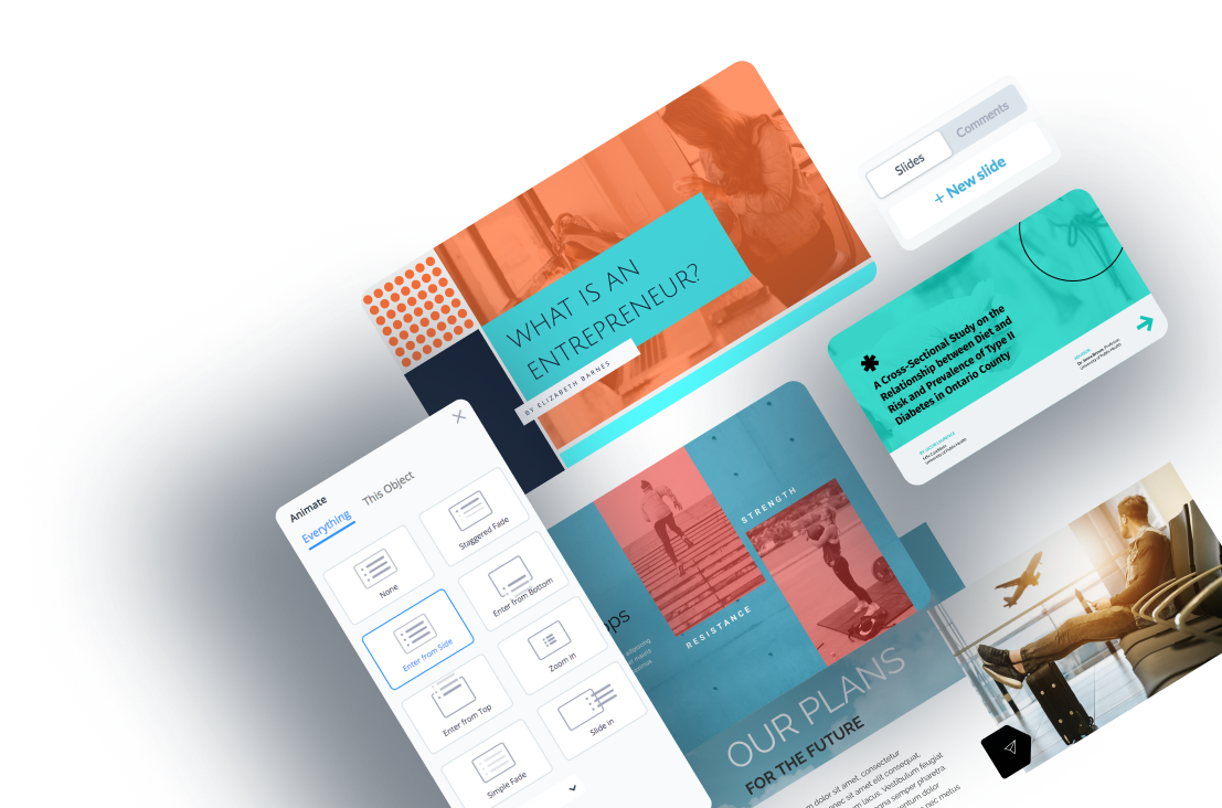
You are now ready to move on to the final step: building your presentation with Visme. Okay, you can create it with whichever presentation software you like, but we think you'll conclude Visme is one of the best choices out there.
Promotions aside, it’s time to bring it all to life.
First, open a new presentation canvas, then choose a template or start from scratch. When you start from a blank canvas in Visme, you can add pre-built slides one by one from the slide library.
Create your slides by following the storyboard. For an added bonus, you can use animations, videos and audio to make your presentation unique.

Record your own audio and voiceovers within Visme
If your presentation is meant to be seen on its own, online or sent as a scrollable PDF, there might need to be more text than on a visual presentation which accompanies a speech. You can try animating the text so it's not just a big block of words.
Using audio also helps, but if the viewer has their computer on mute, they might miss it. Make sure your first slide gives the instruction to turn up the volume.
If your visual presentation is going to be used as a backdrop for a speech, you can forgo some of the text and make it more visual.
Remember to rehearse your speech along with the slides so it all flows seamlessly. TED speakers suggest you rehearse a spoken presentation at least 10 times until it flows naturally.
If you need more help with your presentation design, don't forget to grab our free e-book below.
Design visual brand experiences for your business whether you are a seasoned designer or a total novice.
Try Visme for free