


The Best Interactive Sales Presentation Software to Close More Deals

A good presentation doesn’t just rely on presentation design. There’s your public speaking, the ability to connect with your audience and how well you understand your topic.
However, that doesn’t mean that presentation design isn’t important. Everything goes hand-in-hand when creating a presentation that will keep your audience engaged and talking about your topic for days to come.
Ready to design a presentation that knocks the audience’s socks off? We’ve put together a beginner’s guide to help you understand the types of presentations, beginner design tips and more.
You'll find some incredible presentation templates to help you get the ball rolling on your design. You can customize them however you want, and the best part is you don't have to be a design pro to make them pop!
In this video, we've put together our top 13 presentation design tips to help you wow your audience and create the most epic slide deck they've ever seen.
Here's a short selection of 8 presentation design guidelines you can use when you edit, share and download your content with Visme. View them below:


A presentation is so much more than a simple stack of slides with text and images on it; or at least, it should be. Especially since creative, colorful visuals are so much more memorable than simple text on a screen.
Presentation design is important because with it, you can envelop your ideas, narrative, visuals, data and statistics all into one place and tell a compelling story that leads your audience to the conclusion you want them to reach.
When you create a presentation with proper design, you then have the opportunity to share your point of view, grow your business and get your audience to see your vision and hear you loud and clear.
The sad truth is that many people dread going to presentation meetings because of the long, visually lacking and non-stimulating slideshow designs.
Although what someone has to say during their presentation might be crucial to the business or even life-changing, a listener might lose all interest simply due to the poor design of the presentation.
With proper presentation design, you can tell your story clearly, inspire your audience to take your next steps and have them engaged with what you’re saying all the way through.
Don’t miss a massive business opportunity just because of poor presentation design.
If you have an upcoming presentation but you don’t have the skillset of a professional designer, don’t worry. Just because you aren’t a designer doesn’t mean you can’t have a professional presentation like one.
With a tool like Visme, you can access professionally designed templates that will act as a guide for you to create your next inspiring presentation. Get started today for free.
There are a variety of different types of presentations and reasons that you would need one. Let’s cover the most common types so you know what to expect and when you might want to consider putting together your own presentation.
There are a lot of reasons you might need to create a presentation for school – giving a book report, presenting an idea, sharing a hypothesis and study results, etc.
Additionally, teachers have to give presentations all the time, and are always looking for ways to create more engaging slides that keep students interested.
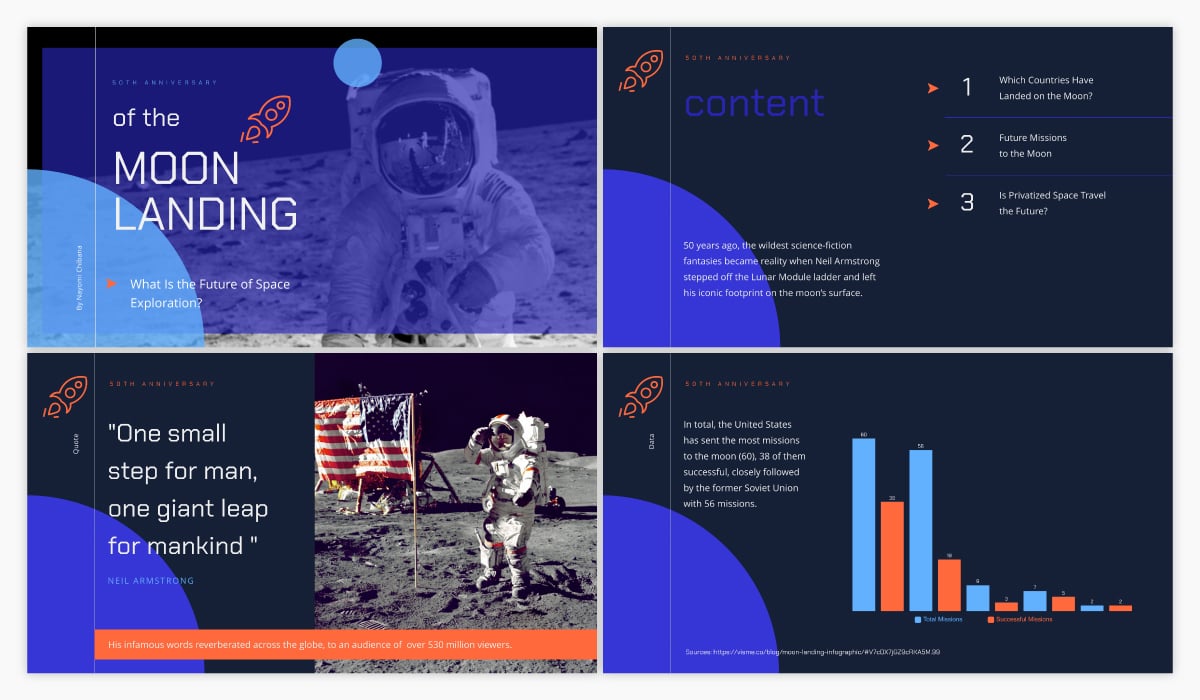
To help ensure your presentation is stunning, try using an educational presentation template like the one below.
This is an incredibly important type of presentation for startups and small businesses. Trying to get funding for your business idea? You’re going to need to create an investor pitch deck.
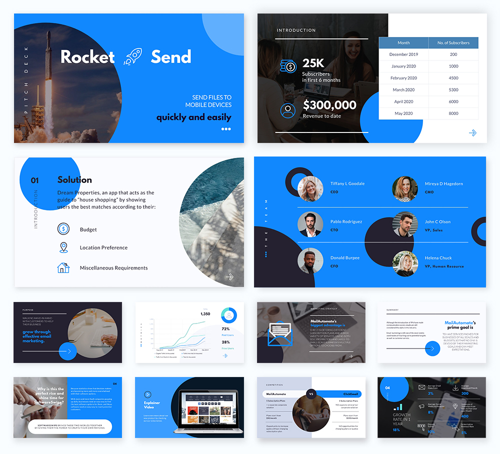
At Visme, we’ve actually put together the quintessential pitch deck theme with a variety of different slide ideas to help you craft the ideal, completely professional pitch.
Webinars are popular online presentations used for lead magnets and generating new sales and sign-ups. These tend to be informational presentations that lead to a sales pitch towards the end.
Here’s a great webinar presentation template you can use to get started with your own.
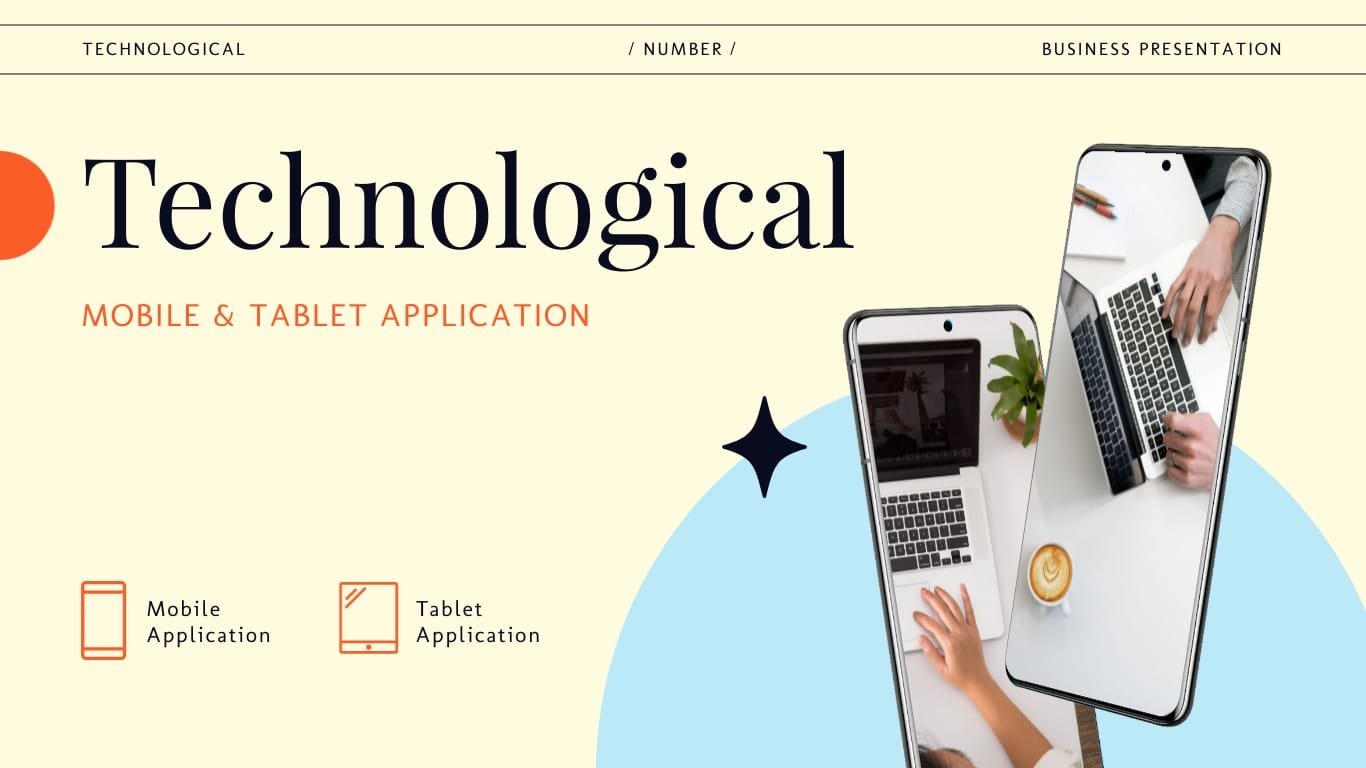
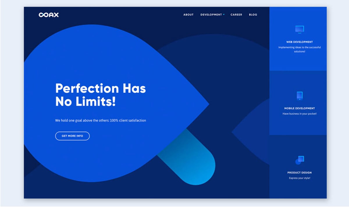
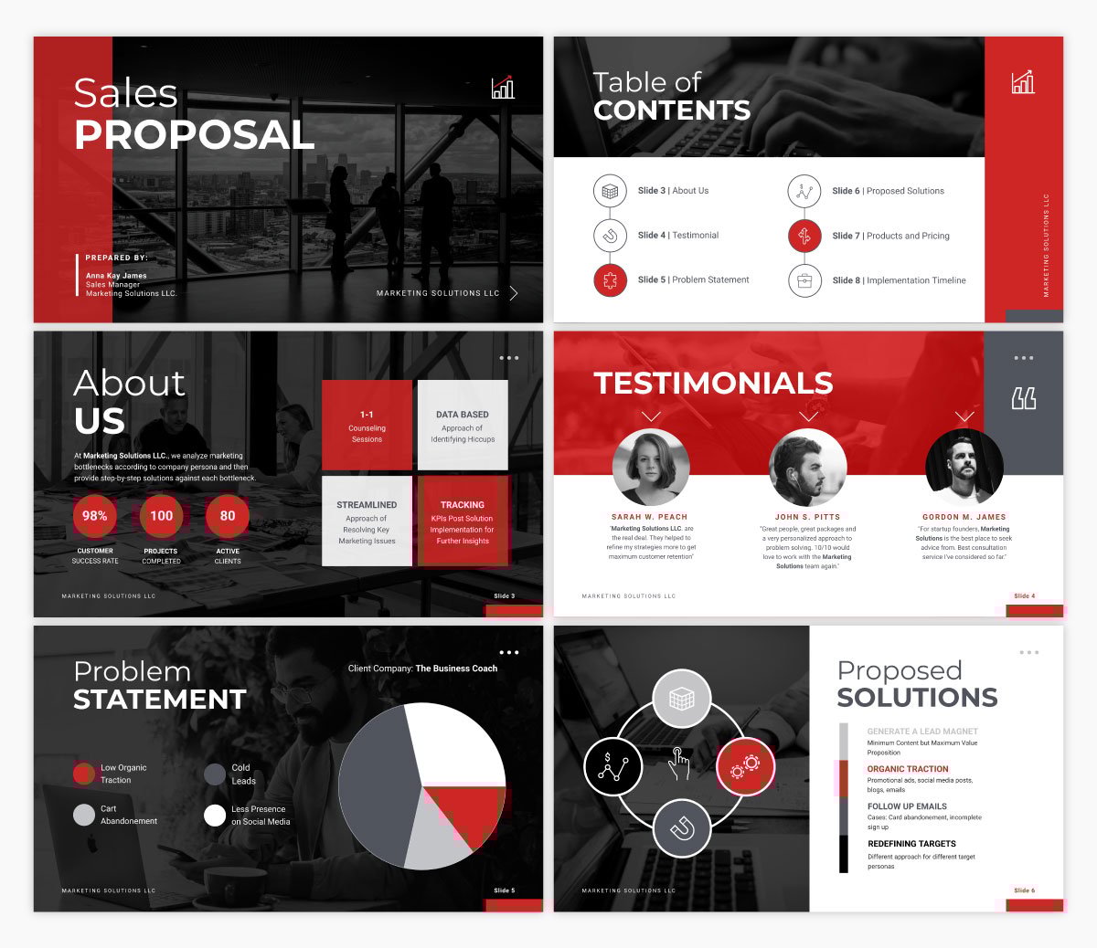
A sales presentation or sales pitch deck is a type of presentation you might need to give if you’re pitching a product or service to a potential customer or client.
These often share your company’s unique selling propositions, pricing information, testimonials and the like.
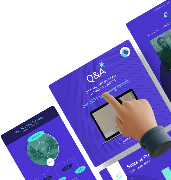
Here’s an interactive sales presentation template you can use to get started.
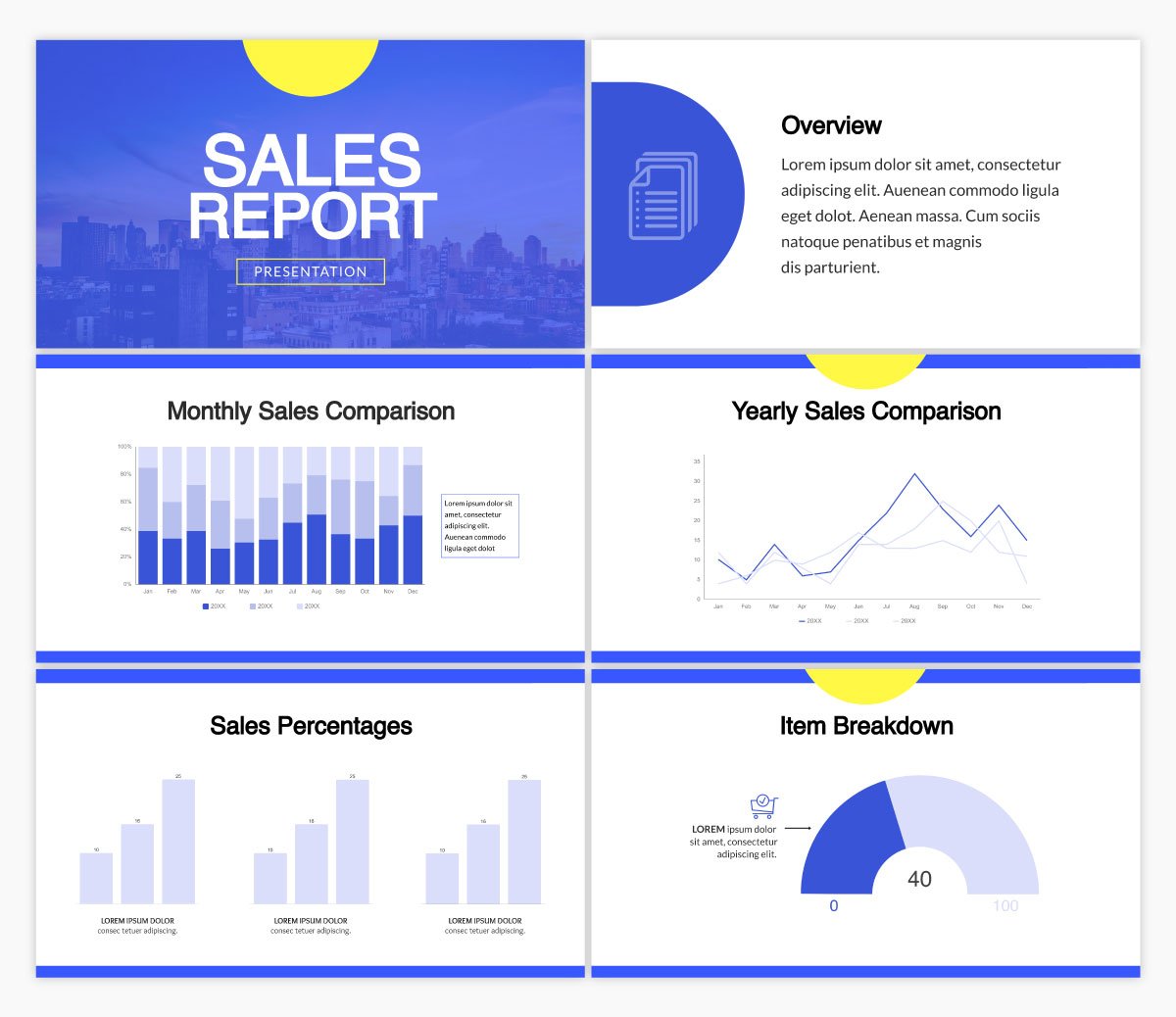
Oftentimes, you’ll be asked to present a report based on sales and marketing performance, website data, revenue or some other data that your team or supervisors want to learn more about.
This can come in many different forms, like a business report document or even an infographic, but many people also love to give simple report presentations.
Utilize a template like the one below to set the stage for your report data.
A keynote presentation is more like a speech that is given in front of a larger audience. Think TED Talks and keynote speakers at conferences and events. While most of the speech is done by the presenter, slides are still helpful for keeping the audience engaged and on track.
A keynote presentation can use a template like the one below, that’s bright and includes only the main points from the presentation. If you need more inspirations or templates, check out our guide on real-life keynote presentations examples.
Are you ready to master presentation design? We’ve got 12 easy-to-follow tips to help you create a slide deck that keeps your audience’s attention and has every audience member handing on to every word.
For other tips to help you create and deliver the best presentation possible, become a certified presenter with our free online course.
Let’s dig in.
Sign up. It's free.Ready to create your own presentation in minutes?
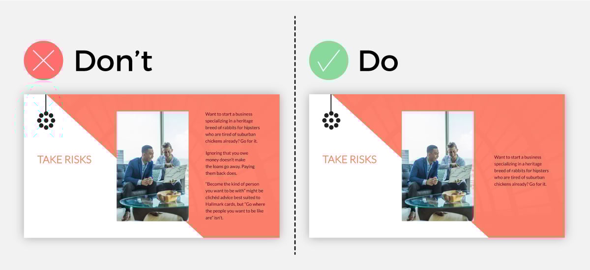
An effective presentation isn’t filled with copy. You won’t be reading straight off your slides, so you want to include only your main points and must-know information on your slides. Your speech fills in the rest.
Not only does this help make your presentation as a whole much more engaging, but it also improves your presentation design.
Take a look at the example below. The minimal text option looks way better than the slide with paragraphs of copy.
Our next tip focuses on your presentation’s typography and color scheme. While it may be exciting to use as many different fonts and colors as possible, design best practices dictate that you should only utilize two or three total.
Your fonts and colors should have jobs, as well.
Choose one font for your headers and another for your body copy. You might work in a third accent font as well.
Your color choices should be similar. Use one or two main colors throughout, then throw in an accent color for good measure. Make sure your colors work well together and help convey the right message.
Not sure why this is so important? Let’s show you an example of what we mean.
The slide on the left has too much going on. With all of those fonts and colors, it looks cluttered, and it’s hard to pay attention to the actual concept the slide is trying to convey.
But on the right, we see a nice mixture of three fonts and three colors, pulling the entire slide design together.
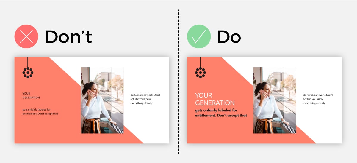
One big thing to remember when adding text to your next presentation is visual hierarchy. Essentially, this means that the order someone reads something on your slide should be obvious, based on font size, color or weight.
Take a look at this example below. On the right, it’s easy to read and makes sense. On the left, the visual hierarchy is all out of whack, leaving the reader confused.
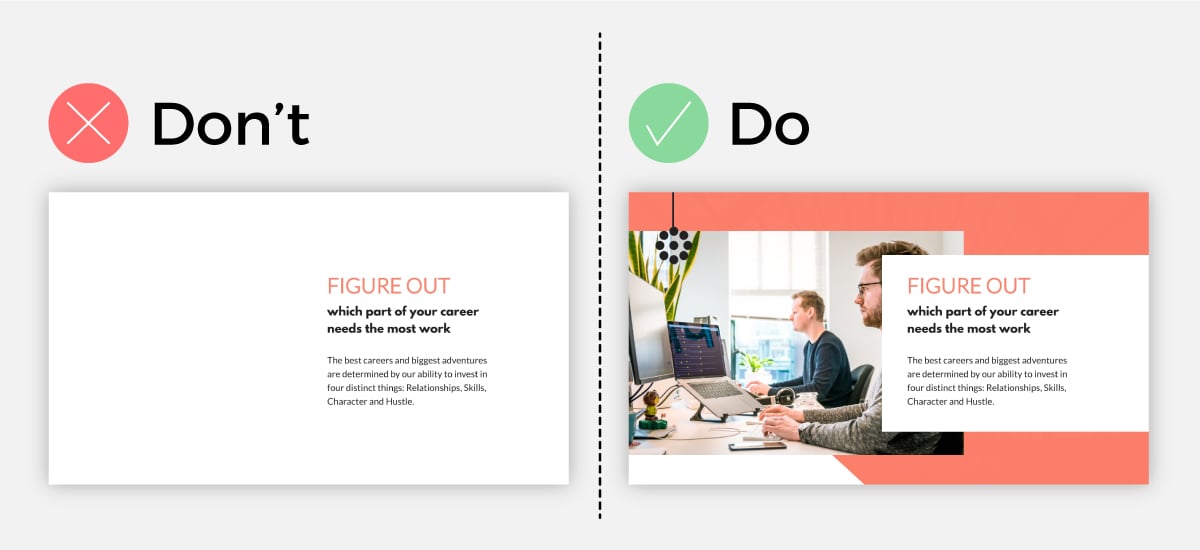
An engaging presentation takes advantage of visual elements. Think stock photos, icons, illustrations, videos, even charts and graphs. All of those can level up your Visme or PowerPoint presentation design.
You want to make sure that your visuals perfectly represent the words on your slides as well. Or, if you have no words on the slide, make sure they perfectly represent the words that you’re saying in your speech.
Visuals should always add to your presentation, rather than take away. But you also want to make sure that each of your slides has some kind of visual representation so you’re not sharing boring words on a slide, like in the example below.
The left slide is dull and boring. Sure, we can read what it says, but do we want to? On the other hand, the slide on the right is engaging, incorporating a high-quality image that visualizes the words on the slide.
When learning how to create your first presentation using Microsoft PowerPoint way back in elementary school, one of the typical PowerPoint design tips was to use bullet points for each slide’s main points.
Don’t do that.
Any good presentation design tutorial these days will tell you that you should stay away from bullet points as best you can. They’re boring and outdated and there are better ways to showcase your content.
Take a look at the examples below. The left slide is already putting you to sleep. As we can see on the right, the bullet points aren’t necessary.
It’s more engaging and conversational when the list is laid out in paragraph form, and it doesn’t look like the traditional PowerPoint template that we’ve all come to dread.
Our next tip for creating a memorable presentation is to only use one single animation style throughout the entire slideshow.
With a presentation tool like Visme, you can easily access custom animation capabilities that make your design elements seem like they’re floating on the slide. However, you don’t want to throw too many different animation styles into a single slide or presentation.
This can overwhelm your viewer and take attention away from your value proposition and the story you’re trying to tell.
Instead, find one animation style that works and stick with it throughout your presentation.
Using shapes, bright fonts, characters pointing to your copy and similar elements is a great way to highlight your key information on each side.
Not only does this help keep attention on the page, but it makes your design even easier. Take a look at the example below.
Adding the pink rectangle around the page content helps to highlight the point you’re trying to make and allow your audience to more easily understand your message.
Another important presentation design tip is to incorporate data visualization when showcasing numbers and statistics in your slides.
This can be anything from a bar graph or pie chart visualizing different data in a chart or graph all the way to a percentage radial or a pictogram visualizing basic numbers.
Take a look at this example below. Look at how much more engaging the slide with the data widget is. Using design elements like these make both complex and simple numbers and statistics easier to understand and remember.
Our next tip involves your slide design. This goes back to your fonts and colors as well as other design elements like icon styles, lines, shapes and more.
Each slide throughout your presentation should have a similar look and feel. You want to keep the design cohesive so that it’s obvious to your audience that your slides go together and you’re still talking about the same topic.
Take a look at the example below. On the right, we see a stunning, cohesive presentation design; on the left, we see a smorgasbord of colors, fonts and design elements that make no sense whatsoever.
You want your presentation to look like the example on the right.
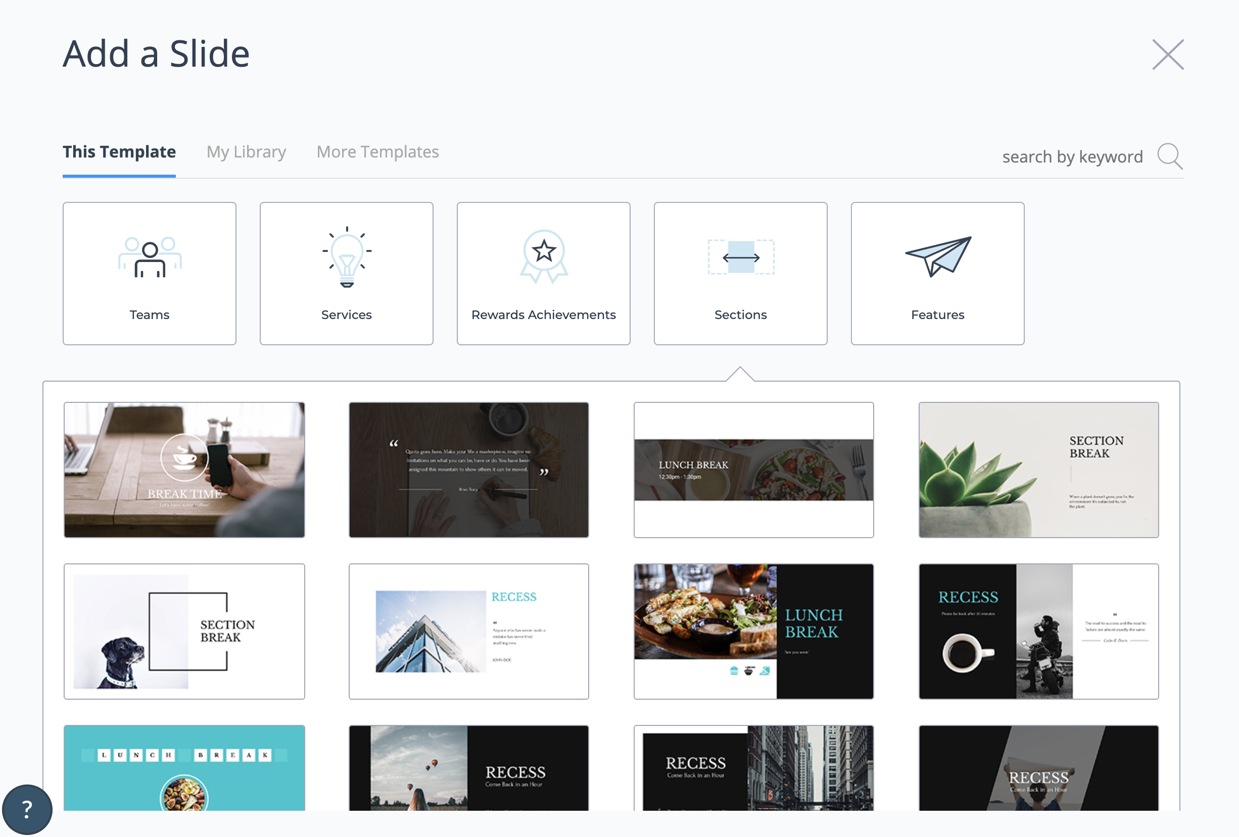
Another pro tip is to break up the different sections of your presentation with section header slides. These can be anything from a blank slide with only a background photo, include a quote, share your new section’s title and more.
Take a look at the variety of section break slides we offer alongside our Modern presentation theme below.
Your transition is how one slide exits off the screen and the next slide appears. While tools like Visme and PowerPoint offer a variety of transition options, it’s important to remember that simple is best.
With that being said, you only want to utilize one transition style throughout. Find a favorite or at least one you like for this presentation. If you have a few favorites, switch between them for each presentation you give.
When creating a clean, crisp and clear slide design, you’ll want to center all your text and visuals around one single takeaway or idea.
If you crowd your slide with multiple main ideas, things look messy and unorganized, thus giving your presentation a poor design.
As you can see in our example below, when there are multiple main ideas and lots of crowded text, your slide will be immediately overwhelming and you’ll lose your crowd almost immediately.
But on the other hand, when you have a single takeaway with a few points to go along with your main idea, your slide is easily digestible and looks sleek.
If your presentation is on the longer spectrum, then it’s good to keep your slides moving and changing constantly as to not bore your crowd.
To enhance your presentation design, you need to ensure that each slide has a focal point; a place where the eye is immediately drawn to.
Typically, you want this focal point to be on your main idea. This way, your audience will immediately be guided to what you have to say next and what they can expect.
One way you can manipulate and direct the eye to go where you want it to is by adjusting the size, color and weight of your font, as you can see in our example.
To highlight your main point or the driving force of your statement, you can change the color of a single word or adjust the font weight to bold.
This will bring your idea to the forefront of your slide design, thus making it your focal point and emphasizing your main idea.
The opposite of this idea stands true as well. If you have less important ideas that you need to have on your slide to jog your memory, you can use a lighter font-weight or complementary color to the background to make it stand out less.
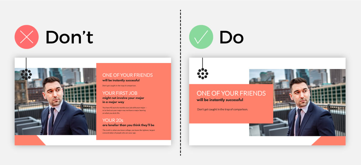
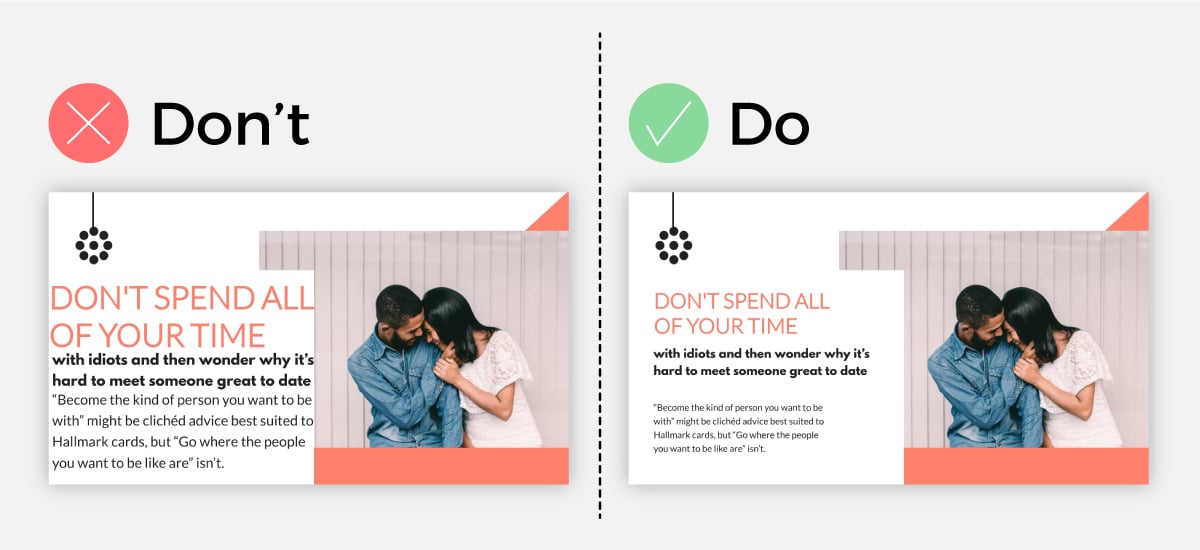
The main rule for having a visually appealing presentation design is to keep things simple. This means that the less text you have on the slide, the better.
Your slide should highlight only your main idea, as we mentioned in a previous point, a few supportive statements and visual elements.
Thus, you should not have your presentation notes written plainly on the slide for all to see. This will make your slide look and feel chaotic for your audience.
If you are worried that you’ll forget your main idea or supporting arguments, then you can use a presentation presenter like Visme that keeps your presentation notes separate.
This way, you can still rest assured that all the information you need to convey for each slide is stored carefully away and you can quickly access it, without overcrowding your slide and forfeiting beautiful slide design.
No one likes presentations that are limited to just a few slides, therefore obliging them to stare at the same slide for 10 minutes.
To keep up a pleasant presentation design and pace, and to keep things visually interesting, you can create slides that are dedicated solely to an impactful quote or a crucial question that supports your entire presentation scope.
So while you may be tempted to add all the answers to your question and supportive data to your slide, it may be best to keep things simple and let your statement do just that; make a statement.
If you have a video to share with your audience, don’t just boringly add the link to it to your slide; embed the video right within your presentation.
This will bring your slide to life and will make things easier for you as a presenter, so you don’t have to leave your presentation and do the awkward dance of loading your video.
You can use a presentation tool like Visme to help you create beautiful slides and embed your videos right into them.
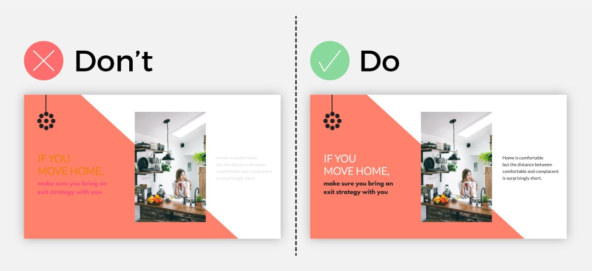
Negative space, or white space, is your best friend when it comes to making a visually appealing presentation slide.
While many times overlooked or seen as a design inconvenience, you can use extra space to actually make your design look ten times better.
Let me show you an example.
As you can see, by simply decreasing the size of the design elements and without changing anything else, we were able to achieve a more minimal and professional-looking slide.
Make sure that you maintain the same amount of space between elements to create design cohesiveness.
One common mistake we see in presentation design is the failure to use color contrast to make your text pop.
Many times, the text gets lost or mixed in with the background because of complementary color usage.
While staying within the grounds of a color palette is a great idea, you want to make sure that you use contrasting backgrounds and font colors in order to get your text to stand out to the reader.
As you can see in our example, when the text has a complementary color to the background, it’s hard to read. But when the text has a contrasting color, it’s appealing to the eye and is easy for the reader to see.
You can use a design tool like Visme to find professionally chosen, complementary-yet-contrasting color palettes to use for your presentation design.
Why use a plain background when you can use shapes, photos, textures and more?
If you want to bring some depth to your slide and really get your text and visuals to stand out, you can use high-resolution images or shapes as a background.
As you can see in our example, when you use a simple one-color background, it looks much plainer than if you were to add more to your background.
Do choose a background that matches your slide design, though. If you pick a busy design, you risk overwhelming your viewer and losing their attention.
So make sure you choose a “calm” design if you have a lot of texts and visuals and a more bold design if you have less text and visuals to display.
Want a presentation design tip that will never go out of style? Start with a template rather than trying to create your own slide deck from scratch!
With a presentation software like Visme, you can start with a stunning presentation template that has been professionally designed by our team of graphic designers.
Browse our presentation template library below.
Sometimes you just need a little inspiration to kick off your presentation design.
If you want to create a show-stopping and attention-grabbing presentation, then it’s good to know what presentation design trends are in right now.
Here are 5 of the hottest presentation design trends that are popular amongst presenters.
One popular presentation design trend right now is to create your entire presentation in black and white and then to add a single pop of color to each slide.
Take the presentation below.
By using a black and white color palette and using a bold choice of color, you can bring attention where it is needed and create a strong focal point for your viewer.
It’s up to you to decide where, how often and how much color you will use per slide.
Sometimes you only need to add in a tiny colored shape to bring attention to your slide, and other times you may want to add in two to three large colored visuals to your slide. The choice is completely up to you.
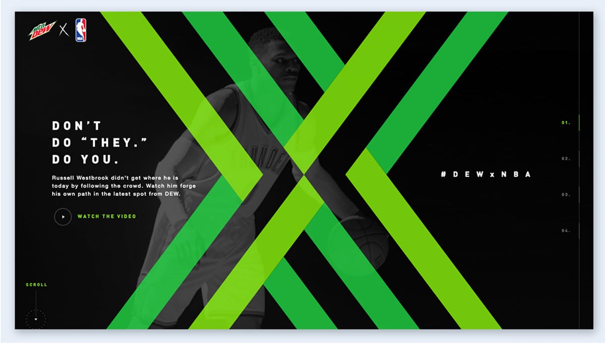
You heard it here first, bold and contrasting neon colors are the way of the future for presentation design.
This design trend is great for product presentation and pitch decks, but not only. You can use this technique to spice up any presentation that you’re worried could be potentially lacking in the speech department.
Because using neon colors is so unexpected, you can use this technique to grab your viewer’s attention and keep them wanting to see more.
The trick is to not use an overwhelming amount of different neon colors, but instead to choose one or two and use them as accents against a contrasting background.
Monochrome color palettes that are used in presentation design are always seen as sleek and professional.
A monochrome color palette is a single color displayed in different strengths, for example, lighter or darker variants of the color blue.
One way to use the monochrome color palette technique is to use the darkest color for the background and the lighter variants of the color for the text, visuals and graphic design elements.
You can also try it the other way around and use the lightest colors for the background and the darkest ones in the foreground.
Play around with the monochromatic design until you find the perfect fit for your slide.
If you haven’t noticed already, many companies have been transitioning from a minimal design approach to using isometric illustrations for their branding.
If you want to have a professional-looking presentation design and make a statement to your team, you can use isometric illustrations to achieve that.
Because isometric illustration design is so versatile, what you choose to present while using this design technique is equally as versatile.
Isometric illustrations will work perfectly for any type of presentation, from product presentations and corporate presentations to technical presentations and monthly reports.
And finally, a design trend that will likely never go out of style is simple minimalism.
Just because it’s simple doesn’t mean it isn’t complex. Minimalism has always been show-stopping and that is because of the rule “Less is more.”
For each slide, a good rule of thumb is to convey just enough information for the reader to understand what’s going on and use a neutral color palette.
Showcase your most important ideas in bold, use modern fonts and your minimal slideshow will have your audience captivated immediately.
If you’re still hungry to find more presentation design trends, then no worries. We have an entire list of 100+ creative presentation ideas and design trends that we created just for you to draw inspiration from.
Ready to put some of these presentation design tips into action? At Visme, we have hundreds of presentation templates to help you get started. Take a look at these 15 presentation templates for various use cases below.
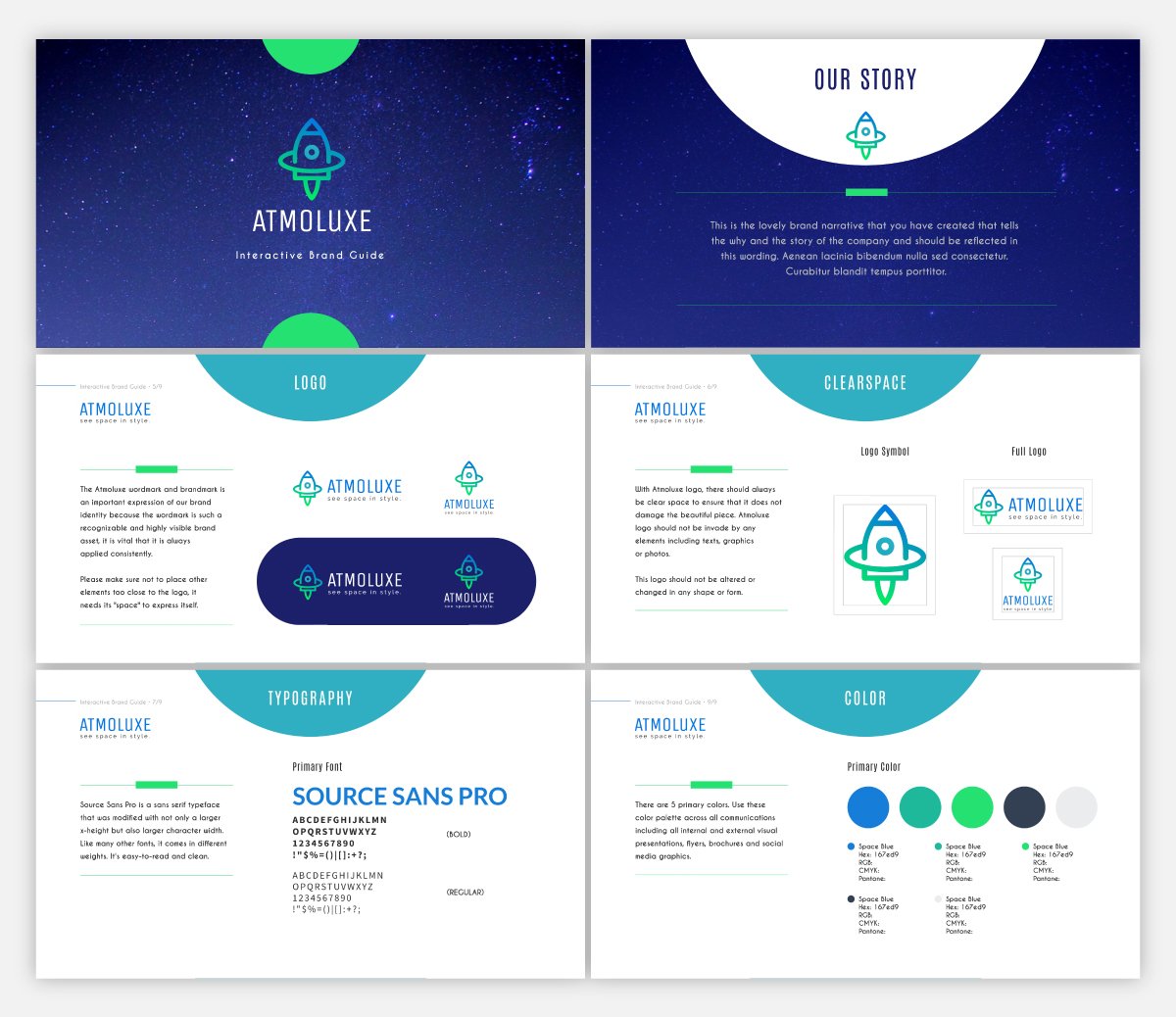
If you have brand guidelines created for your business, one great way to share them with your team and stakeholders is to put together a custom presentation showing off your style guide.
This presentation template makes it easy to display your font combinations and color palette for your brand. And if you’re just starting out or looking to rebrand, you can even design a logo in Visme.
Our Dynamic Field feature makes your presentation design quick and painless. You can create dynamic fields and change their values across your projects and presentations with a single click.
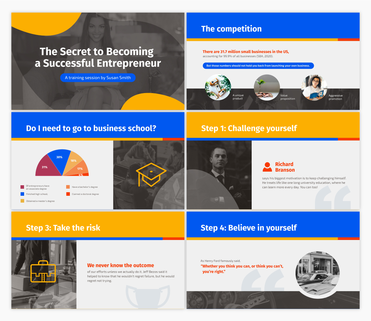
New businesses who are looking to secure funding for their startup need a clean and eye-catching pitch deck design for pitching investors.
Using a theme like the one above gives you access to a variety of different startup stories for you to choose from when creating your presentation and highlighting the most important aspects of your business.
Made in partnership with FounderSuite, this pitch deck presentation template is perfect for your next investor pitch.
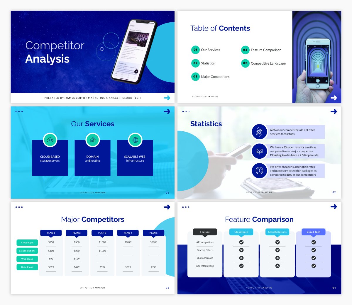
If you’re going to have a successful business, you need to have a firm understanding of who your competition is and what they bring to the table. This will be essential in marketing, for your sales team and just as a general understanding for your company.
This competitor analysis presentation template comes with built-in interactive features to help you get a good understanding of who your competitors are and what potential threats they pose.
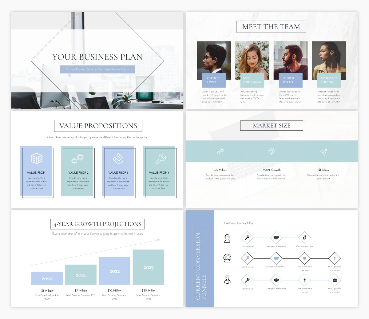
Another essential business presentation is your business plan. This template offers the exact presentation structure you need to build out your business plan. All you need to do is replace the placeholder text with your own!
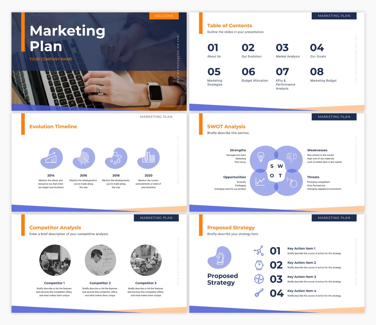
And any good marketing team needs a thorough marketing plan. This presentation template is similar to our business plan presentation template in that we’ve laid out the entire presentation outline for you. All you need to do is input your own strategy.
One great form of lead generation is hosting a webinar. This webinar template allows you to insert all of the information and sales pitch you want to share with your webinar attendees, all in a stunning, cohesive design.
Simply insert your own info, then brand the design so it matches your company’s fonts, colors and other style guide elements.
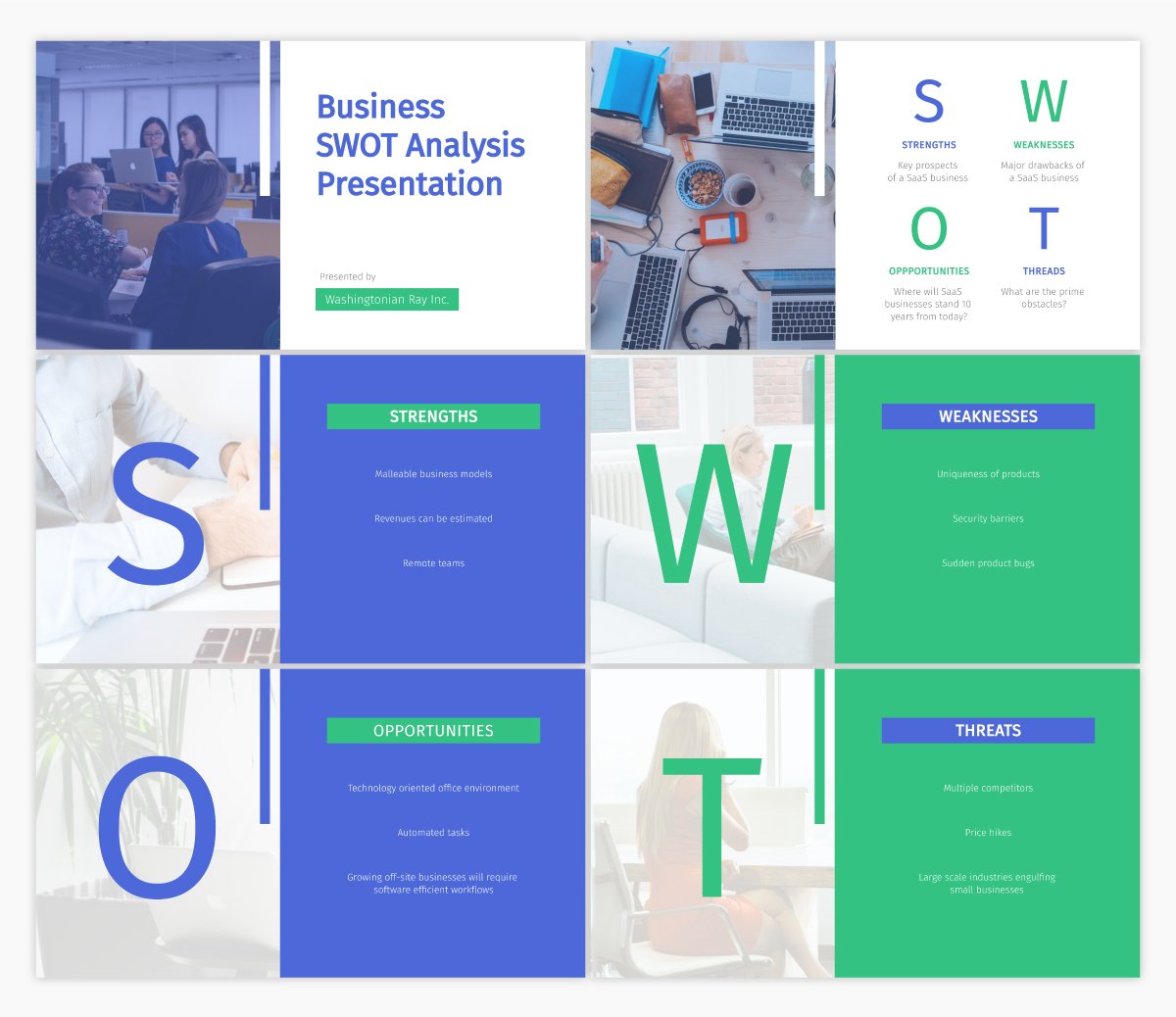
Have you ever conducted a SWOT analysis for your business? It covers the strengths, weaknesses, opportunities and threats that your company faces.
Putting together a SWOT analysis is a great idea when starting a business or adjusting your marketing plan, and this template dedicated to laying out each section is the perfect place to start.
Are you going to be a keynote speaker at an upcoming event? You should only be focusing on creating stellar content that will wow your audience, rather than how to create your design. Use a template like this to make sure your design is eye-catching no matter what.
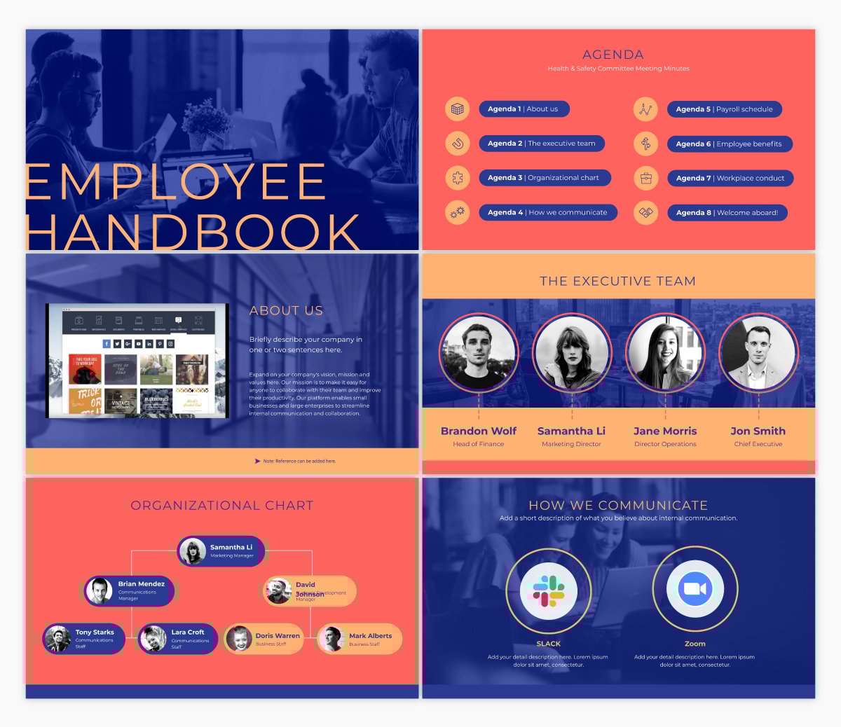
If your business is bringing on new employees, you’ll likely need to put together an employee handbook to make sure everyone understands your company’s mission and the overall guidelines for working with your business.
An interactive presentation template like this one is a great starting point for creating and distributing your own employee handbook.
Not only can you insert helpful information within this presentation, but you can also link back to resources on your intranet or website and simply share the digital version of this presentation via a private or password protected link.
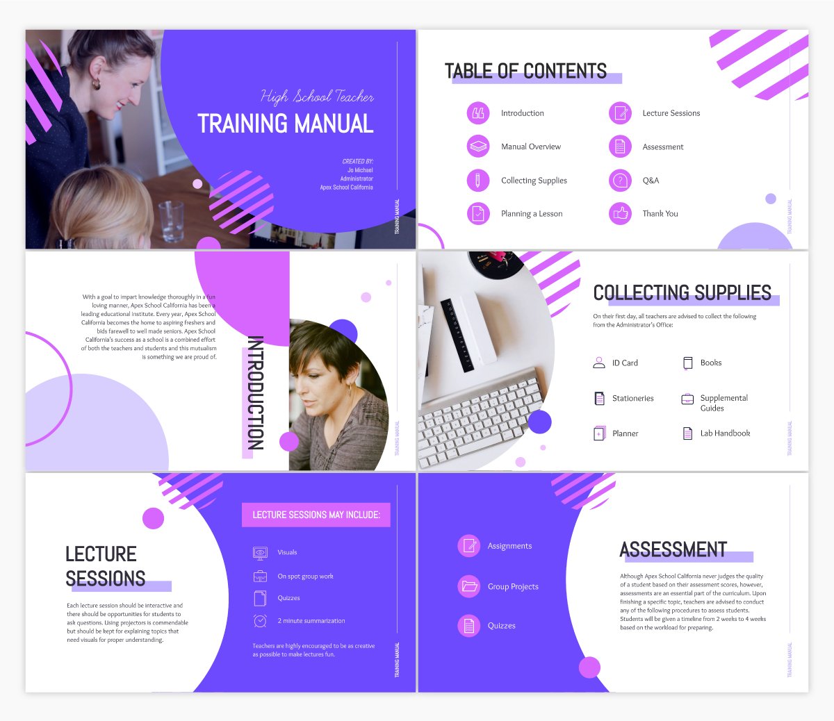
In a similar vein, it can also be helpful to create a training manual for the different roles and departments that your company hires for.
Training manuals like this help new employees start off on the right foot, understanding exactly what’s expected of them in their role and day-to-day tasks. Customize this template with your own training information to share with new team members.
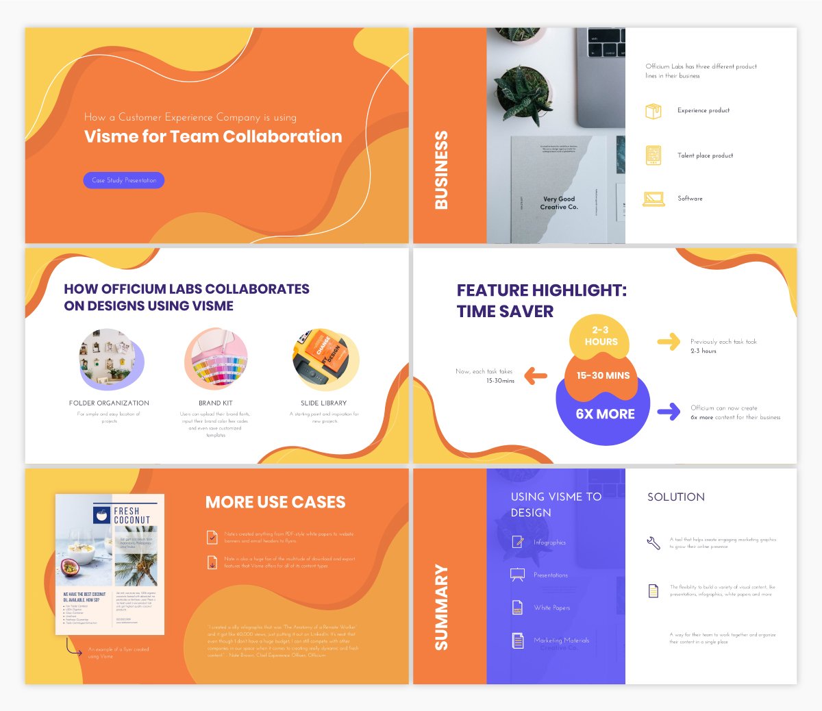
Another great use case for your next presentation is to share a case study. Showcase how your customers are using your tool and highlight success stories that could drive potential customers to sign up for your product or service.
Regardless of who your audience is, presentations are the perfect format for sharing information. Create an informational presentation to embed in a blog post or share on SlideShare. Present important information to your team. Create presentations to share useful information at conferences and events.
There are so many different reasons you might need to create an informational presentation, and this template is the perfect fit.
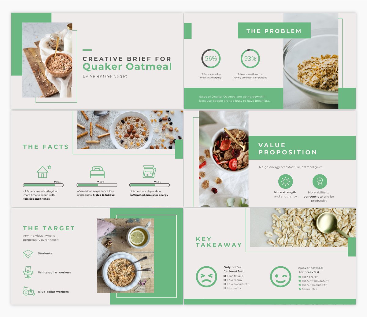
When working with a freelancer, contractor or designer, sometimes you’ll need to present a creative brief so everyone working on the project knows exactly what the outcome is supposed to be.
Using an interactive presentation template like the one above is a great idea for conveying the information in an engaging way that will be easy to remember.
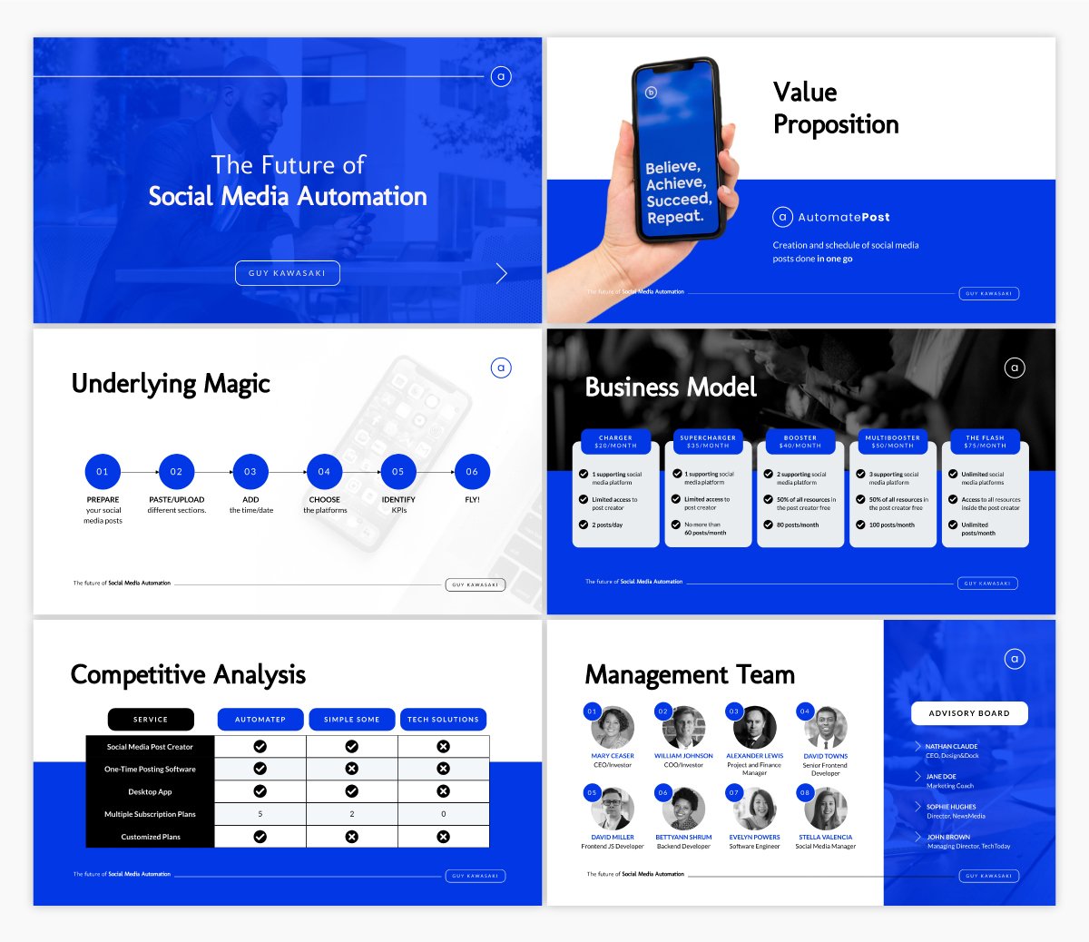
Guy Kawasaki coined the 10-20-30 rule when it comes to presentations. 10 slides, 20 minute presentation, with fonts no smaller than 30pt. This is a popular presentation layout.
If that’s what you’re looking for, this presentation template is exactly what you need.
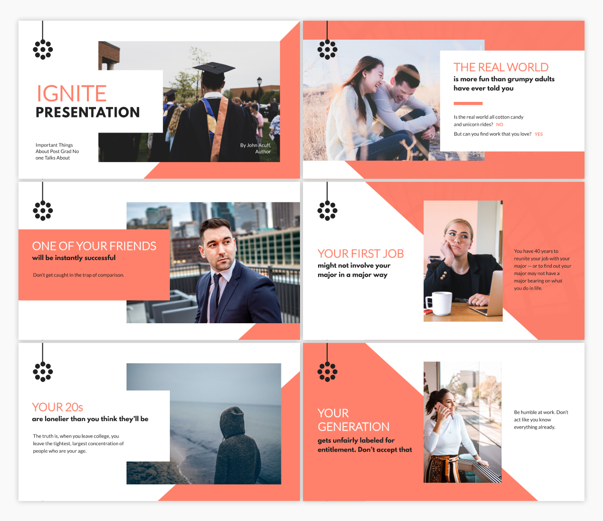
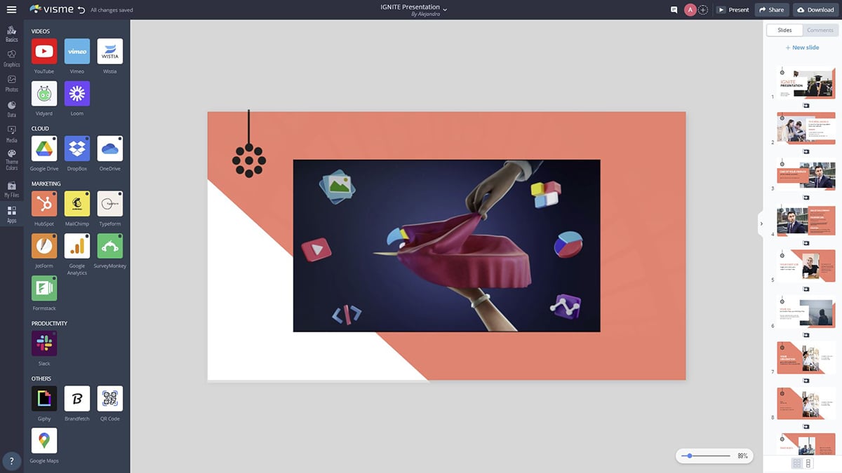
Ignite is a special type of presentation. Speakers give a 5-minute presentation on their topic alongside 20 slides that auto-advance every 15 seconds.
This means you can’t have too much text on any given slide, as you need to keep the tempo of the presentation.
If you’re planning to give an Ignite presentation, this template offers up the perfect starting point for ensuring you’re not using too much text.
Ready to get started designing your own presentation? Give Visme’s presentation software a try and create the best presentation design you’ve ever made. We can’t wait to see what you come up with!
Design visual brand experiences for your business whether you are a seasoned designer or a total novice.
Try Visme for free