


The Best Beautiful.ai Alternatives to Create AI-Powered Presentations

Gone are the days when static product presentations were enough to hold your audience’s attention. Today’s consumers crave engaging, hands-on experiences that put them in the driver’s seat.
No matter the size of your business, you can leverage this shift to accelerate revenue.
When prospects get a hands-on feel for your product’s value through interactive presentations, powerful things happen. Instead of lengthy evaluations, they experience the “aha moments” faster—those precise moments where they realize the product’s value or ROI.
The numbers back this up: interactive content sees 52% more engagement than static content, with buyers spending an average of 13 minutes on interactive content compared to 8.5 minutes on non-interactive materials.
So, what does this mean for your business’s bottom line? Deeper engagement translates directly to shorter sales cycles and buyers who arrive at purchase decisions quicker with conviction.
In this guide, I share everything you need to know about interactive product presentations, including several examples, a step-by-step creation process, plus the best tools to help bring your vision to life.
Before we continue, watch this video below to learn how to create interactive presentations that engage your audience. It comes packed with 15 proven ideas to make your product presentation slides that stand out.
An interactive product presentation is a dynamic content type that uses embedded videos, clickable buttons, dynamic hotspots, popups, and guided tours to help your viewers explore features, customize options and experience your product’s (or service’s) value firsthand.
Unlike traditional slide decks, interactive product presentations put your audience in the driver’s seat. They can actively participate in the experience rather than passively consume information.
Aside from physical products, they're also useful for showcasing services or explaining how SaaS tools work.
Technically, they're called presentations, but actually, they can exist in several other formats. Some variations include scrolling landing pages or infographics, digital PDF documents and touchscreens in event activations and museums.
You can use them as part of your interactive content marketing strategy.
Or integrate them into product launches, sales enablement materials and onboarding experiences to create more immersive customer journeys.
These presentations aren't just engaging; they mirror the real-world buying experience.
“It’s like test-driving a car. You wouldn’t buy it without driving it first, right? It’s the same for software. A great interactive presentation should give someone that taste of the product—through embedded videos, guided tours, mockups, or shareable tools—so they can play around, send it to team members, and feel like they’re already part of the experience. That’s what would’ve gotten me to buy, at least.” - Olya Zaplatynska, Product Marketing Manager at Visme
Here’s an interactive product presentation template from our gallery that you can use for your own project.
Made with Visme Presentation Maker
The fundamental difference between static and interactive product presentations lies in the audience’s engagement and the information delivery methods you use.
Let’s define each one and lay out the pros and cons.
In a static product presentation, you organize the information in a linear and predetermined flow, without providing the option to jump to sections of interest or engaging videos that offer detailed information. Long story short, a “regular” presentation.
A static presentation is a presenter-controlled experience. That’s why they are best suited to be a visual aid for a live or virtual presentation.
Here’s a static presentation example from our presentation template gallery.

An interactive presentation pulls the audience in with engaging content and clickable sections they can interact with and make choices. Some can even be audience-controlled, like product demos and walkthroughs, thanks to navigable menus and flow options.
As the creator, you can add different levels of interactivity, from hyperlinks and videos to non-linear exploratory pathways and content that changes when your audience hovers or clicks on it.
Take a look at this interactive presentation created with Visme. It comes packed with various interactive elements that will not only captivate your audience but also make the information easily accessible.
Made with Visme Presentation Maker
Interactive product presentations are excellent in multiple business scenarios.
Here are some interactive product presentation topics to give you an idea. Plus, I’ve shared an actionable tip for each one.
You’re probably wondering, what is an example of an interactive presentation?
Well, to illustrate the vast design possibilities, I’ve gathered some of the best interactive product presentation examples in various styles and use cases.
Let’s dig in.
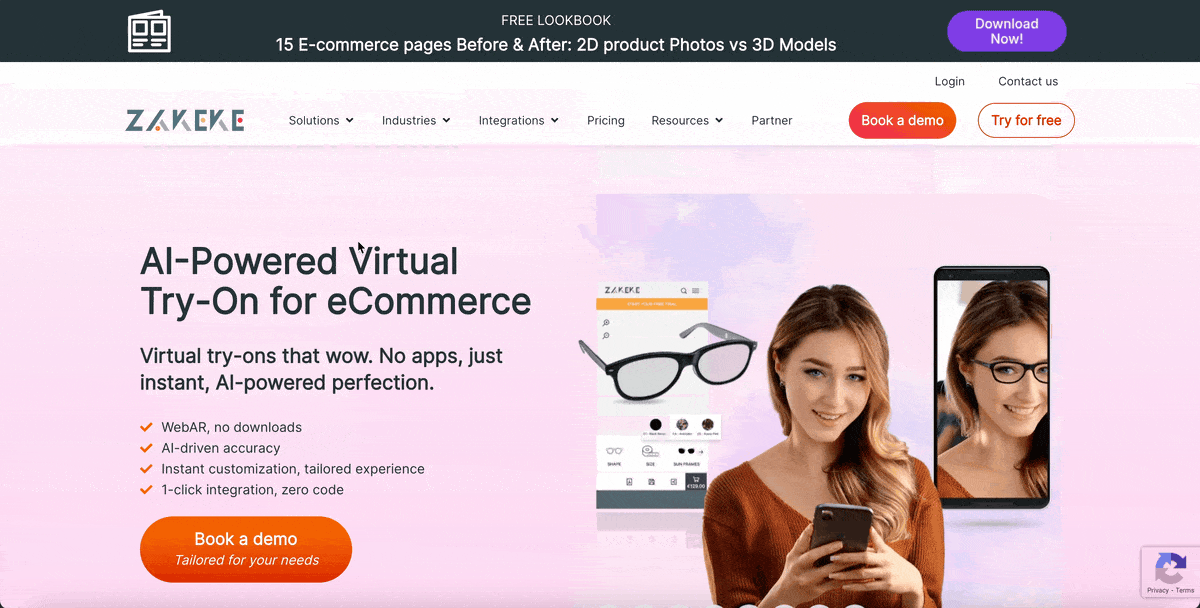
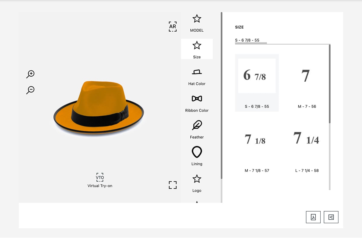
Interactive presentations have the potential to be immersive experiences. In the case of Zakeke’s virtual try-on tool, it’s an interactive tool that allows shoppers to try on apparel products virtually. On top of that, users can also change the model or color of the garment to determine which one they prefer.
Using WebAR (Augmented Reality), ecommerce stores on Shopify, WooCommerce, Etsy and Wix can integrate with Zekeke to optimize their selling experience. Likewise, brick-and-mortar stores can incorporate the tool by offering a QR code for shoppers to scan with their phone.
The video below explains how the Virtual Try-On works to create interactive experiences for the shopper.
And this is what the Virtual Try-on tool looks like when it’s set up and ready to use.
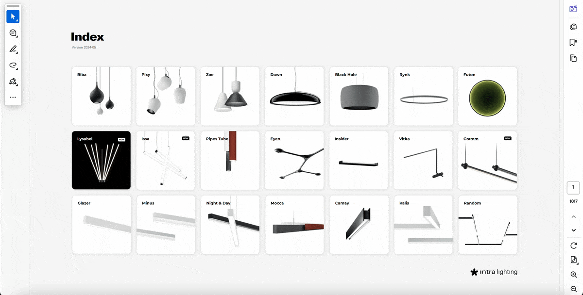
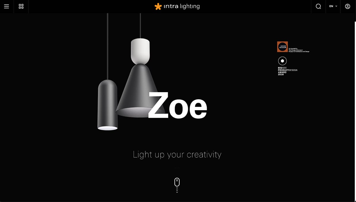
Interactive presentations can also be set up like catalog documents or scrolling landing pages. In this case, Intra-Lighting uses both. This is a really positive approach because it offers options for potential buyers to discover and explore products, however they wish.
On their website, shoppers can explore products on dedicated pages with videos, swipe galleries and configurators for customized visualizations.
The same products are also set up in an interactive product catalog that the visitor can download. With the catalog, you can navigate and discover products without an online connection.
This is the digital PDF catalog. Take a look around and see how it works.
Interactive digital documents like this one are relatively easy to make, especially with Visme.
And here’s the website where shoppers can navigate and discover all of the Intra-Lighting products.
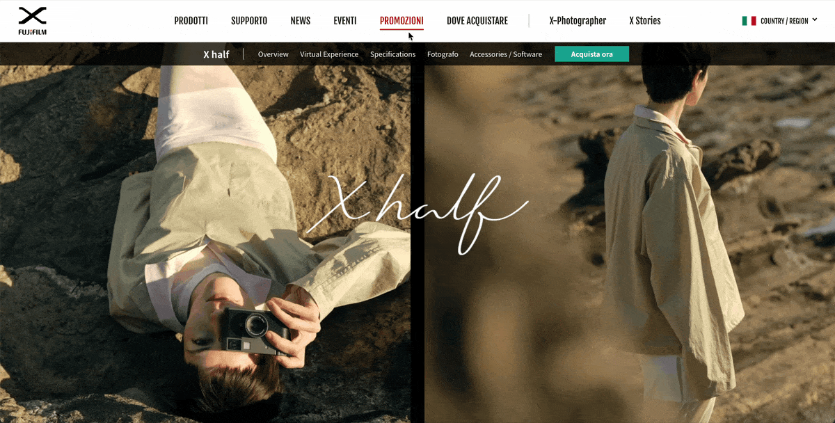
The landing page for Fujifilm’s X Half Camera is an interactive and animated scrolling page with several videos, swipeable and autoplay photo galleries, plus links to further documentation.
But what really shines in this example is the virtual experience.
In this section, you can take a hands-on tour of the camera and its most important features.
The tooltips guide you through the basic functionalities like turning on and off, taking photos, viewing photos and using the flash. The menu on the right highlights what point you are in the experience, helping you navigate to the feature you’re most interested in.
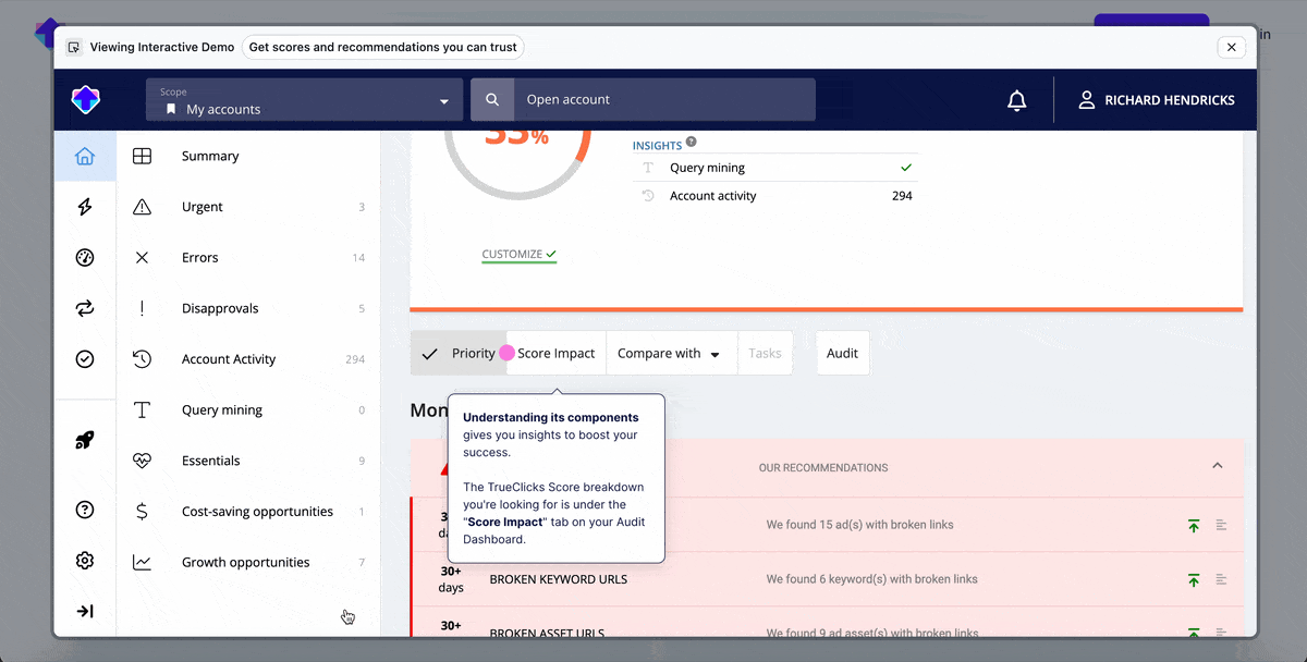
TrueClicks is a pay-per-click management tool that helps paid search teams audit, monitor and optimize their strategies.
One thing I appreciate from TrueClicks is their product demo library. Without the need to sign up or give them your email, you can explore their features with interactive product presentations for specific use cases.
For example, this one is about managing a budget. The tour guides you through all the dashboard features using engaging copy that even includes emojis. But, the tour doesn’t just show you what you can do; it also teaches you how to do it. At the end of the tour, you’re invited to either sign up for the platform or book a demo.
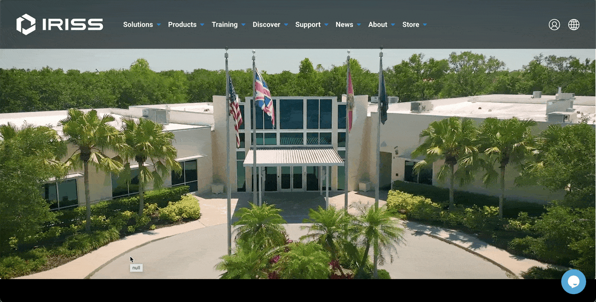
The last example is special because it’s all made with Visme. IRSS, a safety solutions company, created a virtual experience center to guide visitors through their company’s products and offerings.
This presentation starts with a video and a hotspot over the door to the IRSS office. At the bottom of the screen is a small label that says “Click hotspots to explore.” Once you enter, you’re welcomed into a lobby with several hotspot options.
Each one directs you to a different section of the experience where you can keep discovering more content as you progress. Scenes include images, text, videos and more nested interactive presentations.
Visit their website to experience the full design. Here’s a short GIF that shows you just a snippet of the magic they’ve created.
Lee Murray from IRSS loves Visme and how much better it works than other tools he tried.,
“Most platforms make creating an interactive piece painful. With Visme, I can build that kind of content into one seamless experience without any headaches.”
Creating a successful interactive product presentation requires strategic planning and execution.
Here’s a step-by-step to help you get started on the right foot.
Before diving into the actual design, first establish clear goals for your presentation. Do you want to tease viewers and generate leads for a product launch, close sales by showcasing product benefits or train employees about product features?
After answering these questions, create user personas for your target audience and map out their specific pain points, environmental constraints and needs. For each persona, define success metrics: lead generation targets, completion goals or conversion rate benchmarks.
This analysis will guide your content design and interactivity decisions. For example, if a key persona struggles with time constraints, this might inspire you to create short video content and quick-start interactive paths that respect their busy schedule. Understanding specific user limitations ensures every design choice serves a real need rather than adding unnecessary complexity.
Olya Zaplatynska, Product Marketing Manager at Visme, explains why data gives you an edge.
“Creating a good interactive product presentation starts with data. You really need to understand your customer: who they are, what they’re trying to achieve with your product, and how they use it. That knowledge helps you decide which parts of the product to highlight. It’s not just about having solid product knowledge; it’s also about having the right tracking in place so you know where your customers are finding value and where they’re dropping off.”
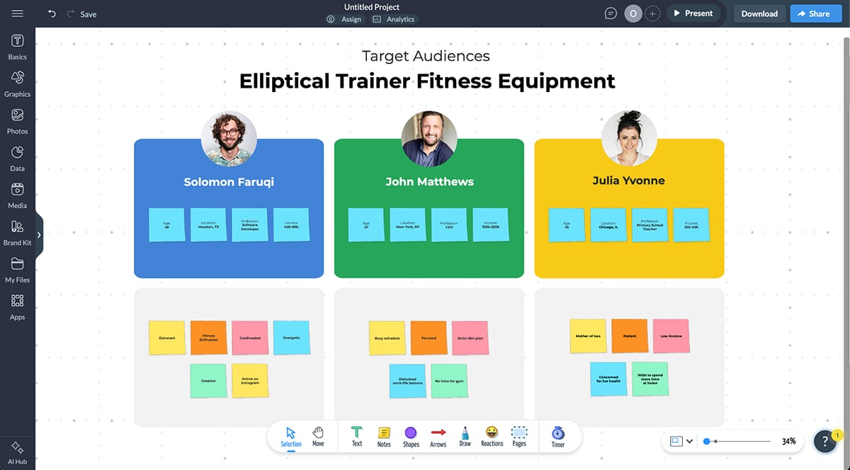
Visme’s whiteboard will help you brainstorm all this information collaboratively with your team. Work together to effectively pinpoint what you want to achieve with the interactive product presentation and who you’re creating it for.
Pro Tip: Don’t reinvent the wheel and save time on the user persona process. Open up one of our easy-to-customize user persona whiteboard templates and use the sticky notes to fill in the content.
Here’s one with three users and plenty of sticky notes to define their characteristics. Edit and arrange the stickies to align with your analysis and objective.
Collect all necessary data, including product specifications, benefits, use cases, testimonials and supporting media. Copy all written content into the whiteboard using text boxes and don’t forget to write descriptive titles for each one. You don’t want to make it hard on yourself later when you need to find what you’re looking for.
Upload all images and photos to your media library and then add them to your whiteboard. Organize it all by content type so it’s easy to find later.
Once you have all the content in one place, start creating the structure. In a text outline format or storyboard layout, place the content for each slide or section into identifiable blocks.
Pro Tip: If you have already created a user persona whiteboard, add a second page for your presentation content. Keeping it all in one space streamlines your workflow and helps tie your message back to the audience’s real needs.
And that’s the point: designing a presentation that speaks to what your customer actually cares about.
“When you know the aha moments and the drop-off points for a specific customer segment, you’re in a much better position to tailor the presentation to what actually leads to conversions. That’s the key: understanding the segment, understanding what moves the needle for them, and then showcasing that in the presentation.” — Olya Zaplatynska, Product Marketing Manager at Visme
Unlike static presentations, interactive ones require more detailed organization of content. For a slide with an embedded video, it’s simple enough to just mention the video, but for a slide with popups or interchangeable content, you’ll need to be more specific.
For complex interactivity, consider using a tabbed outline or incorporating visual elements like diagrams and flowcharts.
For example, if your interactive presentation includes custom navigation that allows viewers to jump to specific areas, visualize it all with user journey diagramming. Use one shape per slide and arrows to connect variations and create different possible flows.
Note down where you’ll add clickable hotspots, navigable menus or embedded videos. Visme offers all these options and more. You’ll find a full list later in the article.
Getting visual during brainstorming and structuring makes it easier to design the final slides later.

Pro Tip: Select interactive features that enhance the content rather than just doing it for the sake of it. Only add it to genuinely improve comprehension, retention or conversion likelihood.
For instance, if you need to visualize data and want to make it more engaging, use Visme’s data visualization tools, which have integrated interactivity features. Firstly, they can be animated. But beyond that, you can also add hotspots that highlight valuable information about the data when clicked or hovered upon.
According to Olya Zaplatynska, interactivity can create real moments of clarity and connection in a product presentation.
“Personally, I love being able to try out a product, like really get a feel for it. With physical products, you sometimes get a sample or a goodie bag at an event. But for software or enterprise tools, the barrier to entry can be higher. So the goal should be to recreate that trial experience without forcing people to sign up or commit. That could be a clickable demo, an interactive Visme presentation, or even a mockup that lets users experience the product’s value before they ever log in.”
Interactive elements like these make your presentation not only more dynamic but also more effective at nudging leads toward conversion, especially when they reflect real user behavior and product value.
All presentations, even interactive ones, need a narrative structure to fully capture the viewer’s attention. Using your structured outline, storyboard or flowchart, start finalizing the content that will go on the slides. To optimize this text, incorporate storytelling techniques that guide your viewers through your content from start to finish.
Because, as Katie Deloso shared with Hotjar:
"Your goal should be to grab and hold people’s attention by creating an emotional response. You want your audience to see themselves as the hero of your product story, understand how they’ll overcome their most pressing challenge, and imagine a better future thanks to your product."
Basic storytelling techniques include creating tension by presenting problems or pain points, building interest through discovery and providing resolution through specific benefits. This is a proven problem-solution arc that helps viewers get to know your product through association and connection.
You can also use other techniques I shared in this article about storytelling structures.
Connect with your viewers through storytelling at every stage of their journey through your content, even when you share about how your product compares to others similar to it.
In that case, Ben Ratje, entrepreneur, author and trainer, suggests you do the following:
Pro Tip: If you’re using Visme during your process, use our AI Writer to help you craft content that follows a storytelling arc while also aligning with your user persona analysis and product benefits.“Don't put the competition down. Instead, say something like 'Yes, they're also a good choice, and here's how we are different.' Don't use the word 'but,' use 'and' - and here's how we are different and why you might find us better. Don't put the competition down; it will just hurt you."
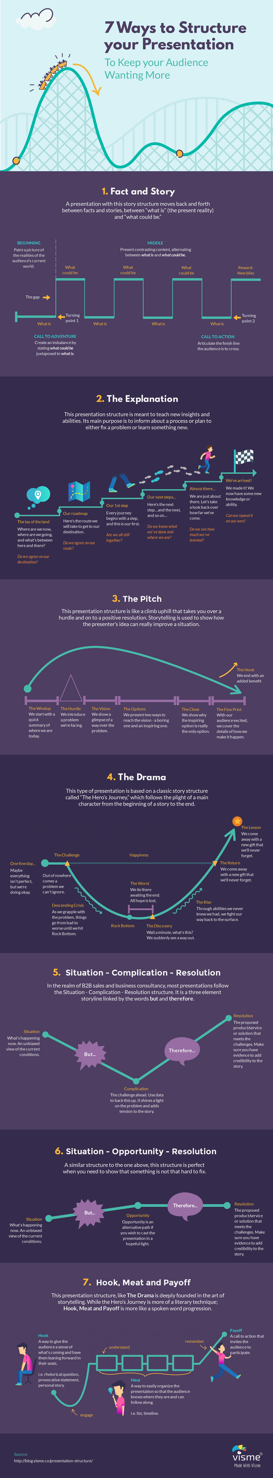
This infographic lists all the major storytelling arcs you can use for your interactive presentation. They’re all suggestions from Nancy Duarte, an expert presentation designer.
At this point, you’re primed to start building the presentation itself. The structure is laid out, the written content is ready and you’ve got a bunch of images and videos to use in the design. If you haven’t yet, choose your content creation tool to get started.
If you were working on the previous steps with a whiteboard and the platform also offers a presentation creation editor (like Visme does), open another window for that. If you have a two-screen setup, open the whiteboard in one and the editor in the other.
Start building from a template or from scratch, that’ll depend on how much time you have on hand. If you have some design experience, don’t discount templates, though; designers use them too!
Transfer the content from the whiteboard (or your desktop and documents) and place it in your canvas. Go in order to avoid confusion and having to double back to fix issues.
As you design, be intentional about your visual choices. Choose the right fonts, color schemes, icons, and animations that complement your message and keep the experience cohesive.
If you're not sure where to start, check out our guide to the 26 Best Fonts for Presentations in 2025 to find modern, legible typefaces that can instantly elevate your slides.
Pro Tip: If you feel that you need more imagery than what you already have or if you don’t have any at all, use the AI Image Generator to help you create the perfect visuals. Maintain consistency in the output style by including the same visual description in the prompt.Specifically, what I mean is to use snippets like “create a realistic photograph…”, “create a colorful flat illustration…”, and so on for every prompt.
Once you have an almost-perfect version of your interactive presentation, conduct user testing with people who match your target audience and user persona.
Visme offers a collaborative feedback feature that allows you to invite testers to the workspace and add them to the project. Set up permissions so they can leave comments but not change the design.
During the testing and while analyzing comments, observe where they get confused, what they skip and what captures their attention most effectively.
User testing reveals the gap between intended and actual user behavior. Interactive flows that might seem intuitive to you may confuse real users, while overlooked elements might become the most engaging aspects of your presentation.
According to Jakob Nielsen, a usability pioneer who co-founded Nielsen Norman Group, you only need five testers and several small tests instead of something too complicated.
“Some people think that usability is very costly and complex and that user tests should be reserved for the rare web design project with a huge budget and a lavish time schedule. Not true. Elaborate usability tests are a waste of resources. The best results come from testing no more than 5 users and running as many small tests as you can afford.”
After testing, use the answers to refine your interactive presentation to better align with your objective.
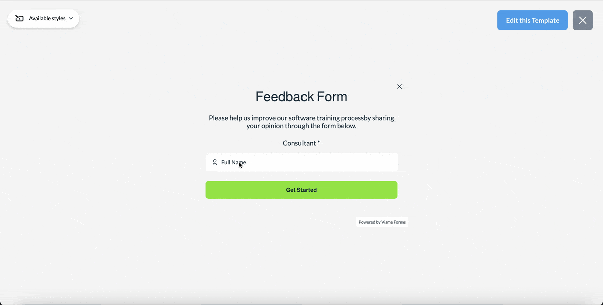
Pro Tip: Use a Visme feedback form to help with the testing procedures. Create a visually rich form full of questions about the user’s experience with your interactive presentation. Include images of the slides for the relevant questions so the user knows exactly what you’re referencing.Below is one of our form templates, specifically designed for gathering feedback about a software training procedure.
Connect your interactive presentation to your broader ecosystem, whether that’s sales and marketing, education platforms, customer support systems or training programs.
Regarding interactive presentations made with Visme, you have several sharing options:
There are numerous interactive presentation tools available online to help you create interactive product presentations for various use cases. I’m sharing five options after trying them out to see what they’re capable of.
To test each tool, I started a free trial or created a free subscription. Depending on what they offered, I created an interactive presentation to test out the editor, features and integrations.
Before we dive into each of these tools, here's a visual breakdown of their features, pricing and ratings.
| Tool | Best For | Interactive Features | Template Options | Pricing Plan | G2 Rating |
| Visme | Marketing managers, content creators, small business owners, and educators or trainers. | Hotspots, hover effects, clickable menus, animations, interactive data visualization, AI-powered features, embeddable forms. | Thousands of templates across numerous business categories. | Free plan with limitations. Paid plans start at $12.25/month. | 4.5/5 |
| Storylane | B2B SaaS teams creating self-guided product demos for sales, onboarding, or demand gen. | Clickable walkthroughs, auto-generated hotspots, AI annotations, personalization tokens, optional voiceovers and avatars. | No traditional templates; demos are created by capturing live product flows. | Contact for pricing. | 4.8/5 |
| Genially | Educators, corporate trainers, marketing professionals, and content creators. | Animations, interactive maps, gamification elements, virtual escape rooms, drag-and-drop puzzles. | Thousands of templates for education and business use cases. | Free plan. Paid plans start at $9.90/month. | 4.7/5 |
| Supademo | SaaS teams creating quick product walkthroughs from screenshots. | Clickable hotspots, branching flows, screen capture, AI voiceovers, lead capture. | No templates; demos are built from uploaded screenshots. | Free plan (up to 5 projects). Paid plans start at $27/month. | 4.7/5 |
| Tiled | Enterprise sales and marketing teams delivering interactive sales narratives. | No-code editing, multimedia sections, hotspots, scrolling experiences. | Limited templates designed to work with Figma, Sketch, Adobe XD, and PowerPoint. | Free trial. Contact for pricing. | 4.3/5 |
| Thinglink | Teams building interactive images, virtual tours, or 360° experiences. | 360° media, VR content, hotspots, virtual tours, embedded media. | No templates; interactions are added to existing photos or videos. | Free trial available. Paid plans start at $500/year. | 4.1/5 |
*Disclaimer: The comparisons and competitor ratings presented in this article are based on features available as of June 25, 2025. We conduct thorough research and draw on both first-hand experience and reputable sources to provide reliable insights. However, as tools and technologies evolve, we recommend readers verify details and consider additional research to ensure the information meets their specific needs
G2 Rating: 4.5/5 (445)
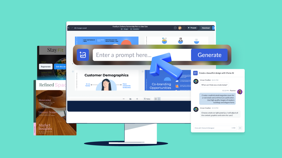
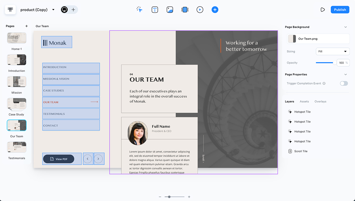
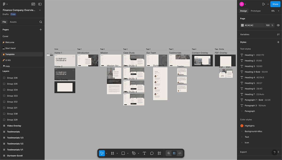
As a content creation tool, Visme strikes the perfect balance between professional design and engaging interactivity. It’s my favorite option for creating interactive presentations due to its ease of use and the intuitive layout of interactive features and design elements.
Here's an example of an interactive presentation created with Visme.
Made with Visme Presentation Maker
Here are just some of the animation and interactive features you get when using Visme:
Watch the video below and learn how to use hotspots and pop-ups in your Visme-made content.
And aside from all the interactive features, Visme is also packed with several practical AI features like:
Easily access all Visme AI features inside your dashboard. Just click on the AI Hub in the bottom left corner of your screen. Once your interactive product presentation is done, you have several options to share and publish:
To top it off, you can track analytics of embedded presentations and those shared with a link.
G2 Rating: 4.8/5 (1132)
Storylane is built specifically for creating interactive product demos for B2B software. It’s useful for product marketers, sales engineers, customer success teams, and SaaS teams who need to create Interactive product tours without lengthy recordings.
Unlike traditional screen recordings, Storylane’s approach centers on clickable walkthroughs that let prospects explore products at their own pace. The platform captures your product with a browser extension, then automatically generates interactive hotspots and contextual AI annotations as you navigate.
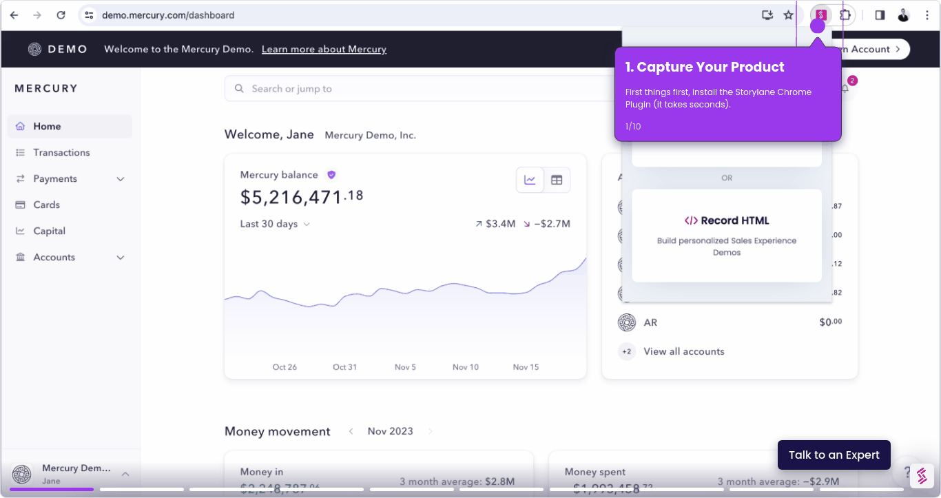
To test Storylane, I downloaded the Chrome extension and clicked through a demo project. The capture process was straightforward, the extension tracked my clicks and created hotspots automatically. The AI features were handy; it generated the annotations automatically based on what screens were being captured. I could also add voiceovers and AI avatars in the editor.
What stood out was the personalization capability. You can create one base demo and swap out company names, logos, or industry-specific data for different prospects. I tested this with a sample fintech demo. This makes it well-suited for complex B2B software where prospects benefit from self-qualifying through interactive exploration before sales calls.
G2 Rating: 4.7/5 (59)
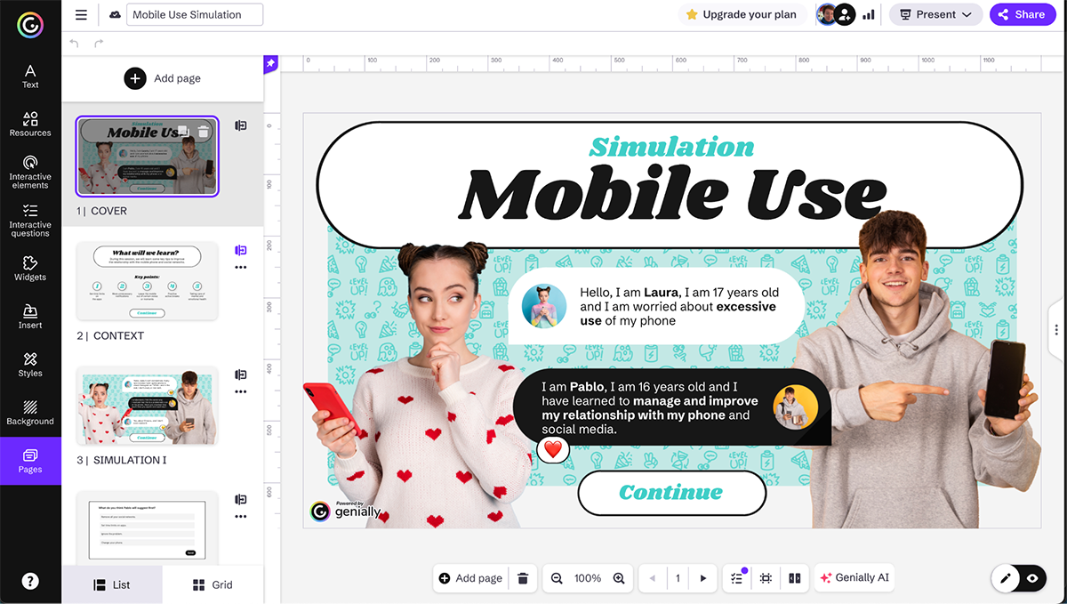
Genially is a versatile interactive presentation tool that has carved out a distinctive niche as the go-to platform for gamified interactive content. It’s particularly valuable for educators, corporate trainers, marketing professionals and content creators who want to build engaging, game-like experiences.
Unlike other tools that treat interactivity as an add-on, Genially is based on it. You can easily add advanced animations, interactive maps, gamification elements like virtual escape rooms and drag-and-drop puzzles. With Genially’s tools, you can build virtual tours, interactive timelines, clickable infographics and immediate learning scenarios that keep your audience engaged.
To test Genially, I logged in to a free account I’ve had for a while and searched for interactive presentations. The presentation template results were a bit underwhelming, but there were other content types to choose from, such as infographics, courses and quizzes.
I went ahead and opened one in the editor. The template includes several interactive features like pop-up windows, embedded videos and a draggable image comparison.
I tried adding gamification to this template but I couldn’t find out how to do that in a regular presentation template. Turns out there is a different template section will all the gamified content. In that area, there are many different templates available.
So, if you want to create a game-based interactive product presentation with Genially, search for the game templates, not the presentations.
The screenshot below is the interactive presentation template in the editor.

And this is a gamified presentation template in simulation style to train employees.
G2 Rating: 4.7/5 (339)
The last tool we’ll be looking at today is Supademo, a leader in software product demonstrations. Supademos is specifically designed for product marketers, sales teams, customer success reps, and SaaS communicators who need to create product walkthroughs and tours.
Supademo’s strength lies in its Chrome extension that helps you capture screen recordings and automatically creates interactive hotspots. This makes the process of making an interactive demo remarkably fast and intuitive. Other options include creating an interactive tutorial from scratch or browsing the Supademo library of examples and use cases.
Once in the editor, key features include AI voiceover generation, automatic text annotation, branching, personalization and multi-language translation.
With these features, you can easily create guided product tours, feature announcements, onboarding sequences and sales enablement materials.
When you click Create in Supademo, you can choose to either use the Chrome Extension, record with the Supademo desktop app, upload content or record with your cam and screen.
To test the platform, I downloaded the Chrome Extension and tried to use the Visme editor as the product. After several tries, I gave up and realized that what I was creating would never be as good as one of their showcases.
What did I gather from that? You need to know exactly what you’re going to do in the demo so that it comes out excellent and not subpar like mine were.
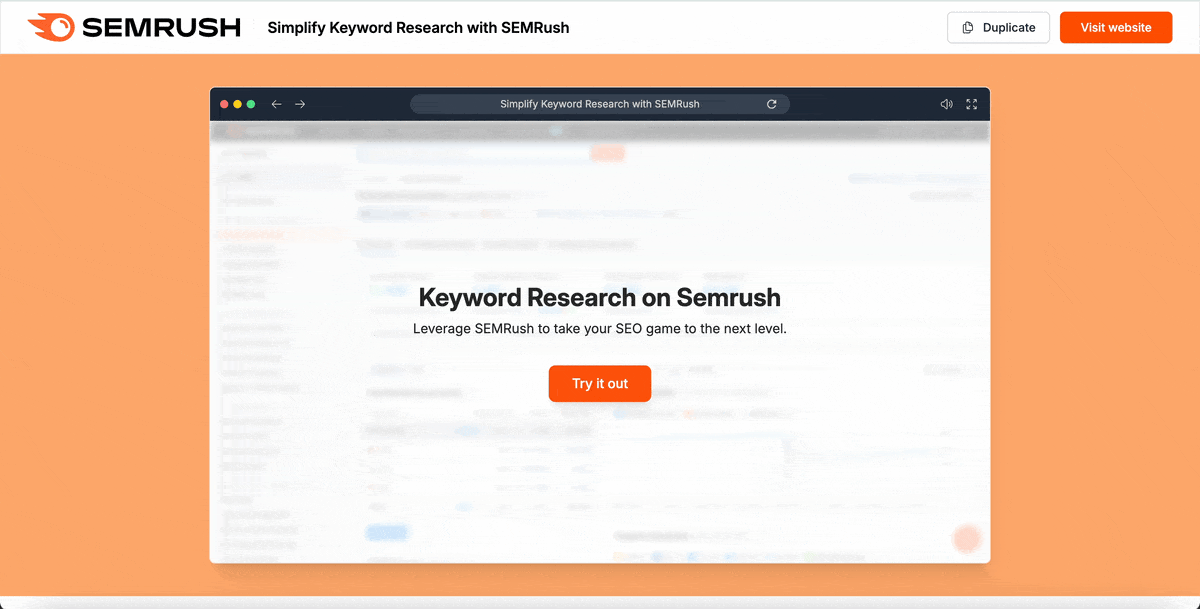
So, here’s an example Supademo about Semrush that will give you a good idea of what’s possible with this tool.
G2 Rating: 4.3/5 (222)
Tiled is a premium solution for sales and marketing teams who need sophisticated interactive presentations. The platform excels at creating multimedia-rich experiences that feel more like custom applications than simple slide decks. That’s why Tiled-made products are called micro-apps.
So, how does it work? When you sign in to Tiled, you have several design and edit options. I tested all of them.
The interactive features in the Tiled editor, called tiles, include hotspots, video, scroll settings, quizzes and Google Data Studio.
I found Tiled to be very versatile and comprehensive. Connecting to a design platform while adding interactivity in the Tiled editor may sound complex at first, but the learning curve is actually quite small. The different design and edit options make this tool practical for both beginners and advanced designers.
This is how the same presentation looks when you edit side by side with Tiled and Figma.
G2 Rating: 4.1/5 (13)
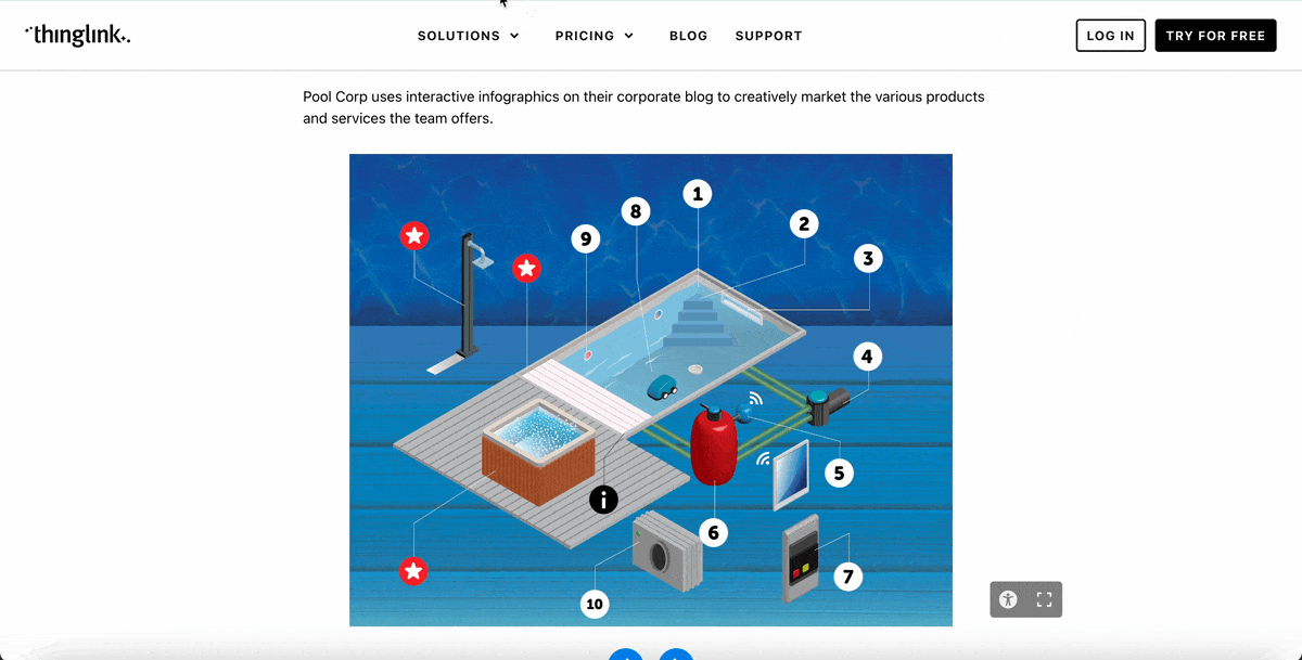
Thinglink specializes in creating immersive visual experiences using 360-degree media, interactive hotspots and video. It’s an excellent tool for educators, real estate agents, travel marketers and museum experience designers.
An interactive presentation created with Thinglink is called a “Scenario.” To create a scenario, you can choose to start from scratch, select one of the four templates (linear, escape room, simulation and self-exploratory) or generate one with AI.
I chose to use the 'Generate with AI' option and entered this prompt below:
Create a learning path to practice Italian. Concentrate on getting around and trying to find the train station.
Thinglink offered several options, including learning objectives and specific topics to cover. I accepted them all and the platform generated a simulation path that just needed some finishing touches to complete.
Each block in the flowchart is editable, either manually or with the help of an AI image generator or AI text improver. There are three types of blocks, one text-based, another image-based based and finally the branching block. Each one has different editing and customization options.
The scenario-building feature is pretty powerful and intuitive but I did find some things lacking. Most specifically, branding options.
You can’t change the fonts or the colors in the scenes. At most, you can add your logo as watermarks on the background images.
This is an overview of a scenario, where you can click on each block to customize it for your purposes.
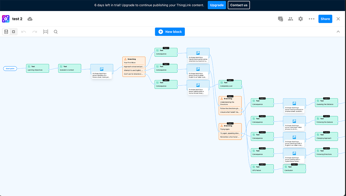
The color-coding helps with faster editing and recognition. If you need to add a new block or scene, just click on the blue button at the top and you’ll have the option to do it manually or get help from AI.
And this is what the 360-degree image hotspot editor looks like. You can easily add a tag to any part of the image and create a slide with image and text or just text.

Here's a GIF of their interactive elements in action.
Here’s a step-by-step for creating a sales presentation:
Yes, you can create interactive presentations with Canva. Some interactive features include clickable buttons and embedded videos. But for a better design experience, use a tool more suited for that goal, like Visme, Tiled or Supademo.
The most interactive presentations are those that fully engage the viewer in the content and its flow. These include:
To do this, you need a web-based tool that offers far more interactive capabilities than PowerPoint. Platforms like Visme, Tiled and Genially provide drag-and-drop editors with features like hotspots, animations, embedded media and user input fields.
You can also use website builders like WordPress with interactive plugins or specialized demo creation tools like Supademo.
Yes, Visme offers robust interactive capabilities including clickable buttons, hover effects, embedded videos, 3D characters, transitions and animations, animated elements, popups, hotspots and embedded forms. With Visme, you can create interactive presentations that users can navigate based on their interests and needs.
Most current interactive presentation platforms (including Visme) automatically optimize content for mobile devices.
However, it’s essential to test your presentations across various screen sizes and devices. Some interactive elements that work well on desktops may need adjustment for touch interfaces. Consider simplified navigation and larger touch targets for mobile users.
Companies that leverage interactive content have seen a 94% higher increase in content views compared to those using traditional formats.
If you’re still stuck on the old-fashioned static product presentation formats, you’re leaving a huge opportunity on the table.
Hopefully, this guide has inspired you to rethink your approach.
Use the techniques you learned to transform passive presentations into active experiences. Create memorable experiences that drive engagement, boost conversions and set your product apart from the competition.
And the best part? You don’t need a huge budget to get started.
With Visme, you can build interactive content today to showcase features to prospects, onboard customers, or train your team. With intuitive hotspots, animations, embedded videos and seamless sharing options, Visme makes it easy for you to bring your product stories to life and captivate your audience from the very first click.
Create an account or request a demo to see our tool in action.
Design visual brand experiences for your business whether you are a seasoned designer or a total novice.
Try Visme for free