
The Best Interactive Sales Presentation Software to Close More Deals
![26 Best Fonts for Presentations In 2026 [PowerPoint or Not]](https://visme.co/blog/wp-content/uploads/2021/01/header-2.png)
Choosing the best font for your presentation can mean the difference between an engaged audience and one that’s confused or distracted. A presentation font needs to be legible, agreeable, and not interfere with the content itself.
But choosing a font isn’t always straightforward.
To save you time and effort, we’ve selected 25 of the best fonts for presentations. This list will help you find the best font for your next presentation, whether you’re using PowerPoint and other alternatives like Google Slides, Canva, Visme Keynote or any other tool to create it.
Choose the font that you like from the list below and see when (and if) you should use it. And the best part? Each of these, and 500 more fonts are available for free in Visme's presentation maker.
Browse thousands of presentation templates to get started or tap into the power of Visme's AI presentation maker.
If you're short on time, here’s a quick video to help you pick the best font for your business—fast and easy.
Here's a short selection of 8 easy-to-edit slideshow templates you can edit, share and download with Visme. View more below:


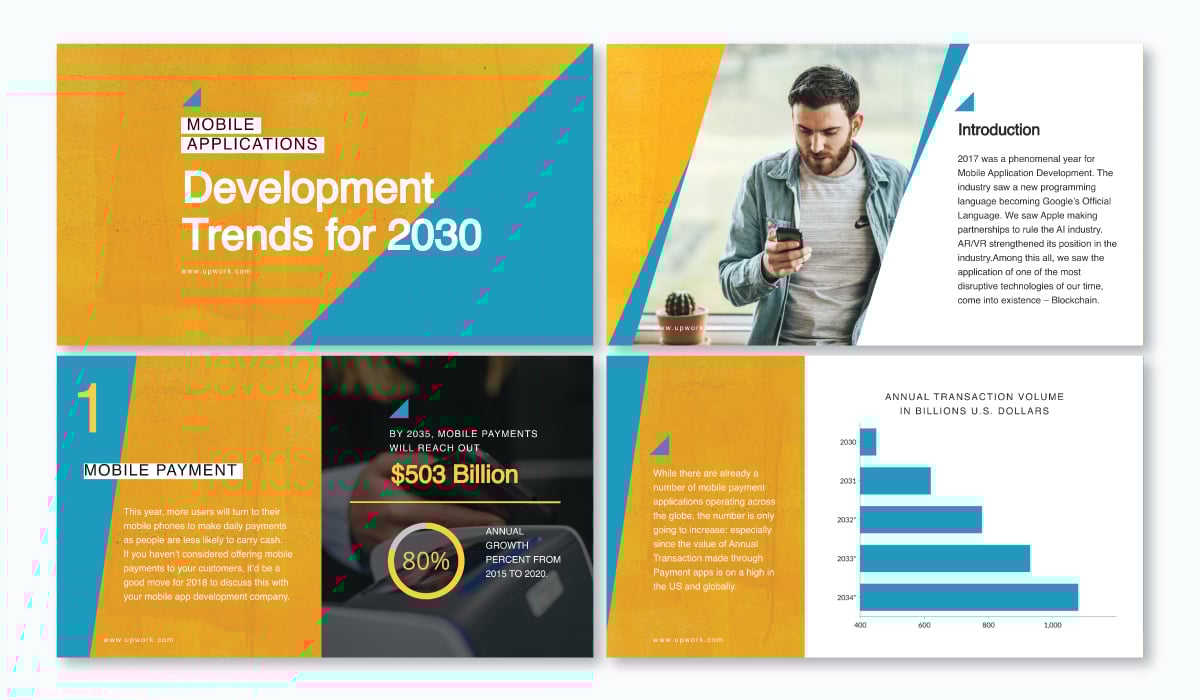
We’ve all seen a million and two presentations using standard fonts like Arial and Times New Roman. Lato often serves as a default font choice in many cases. This sans-serif typeface offers a more contemporary appearance.
Plus, the variety of weights that Lato is available in – from thin to light to bold and more – helps to ramp up this font’s overall appeal.
This font can be used in a variety of different ways, as we’ll see in the presentation templates below.
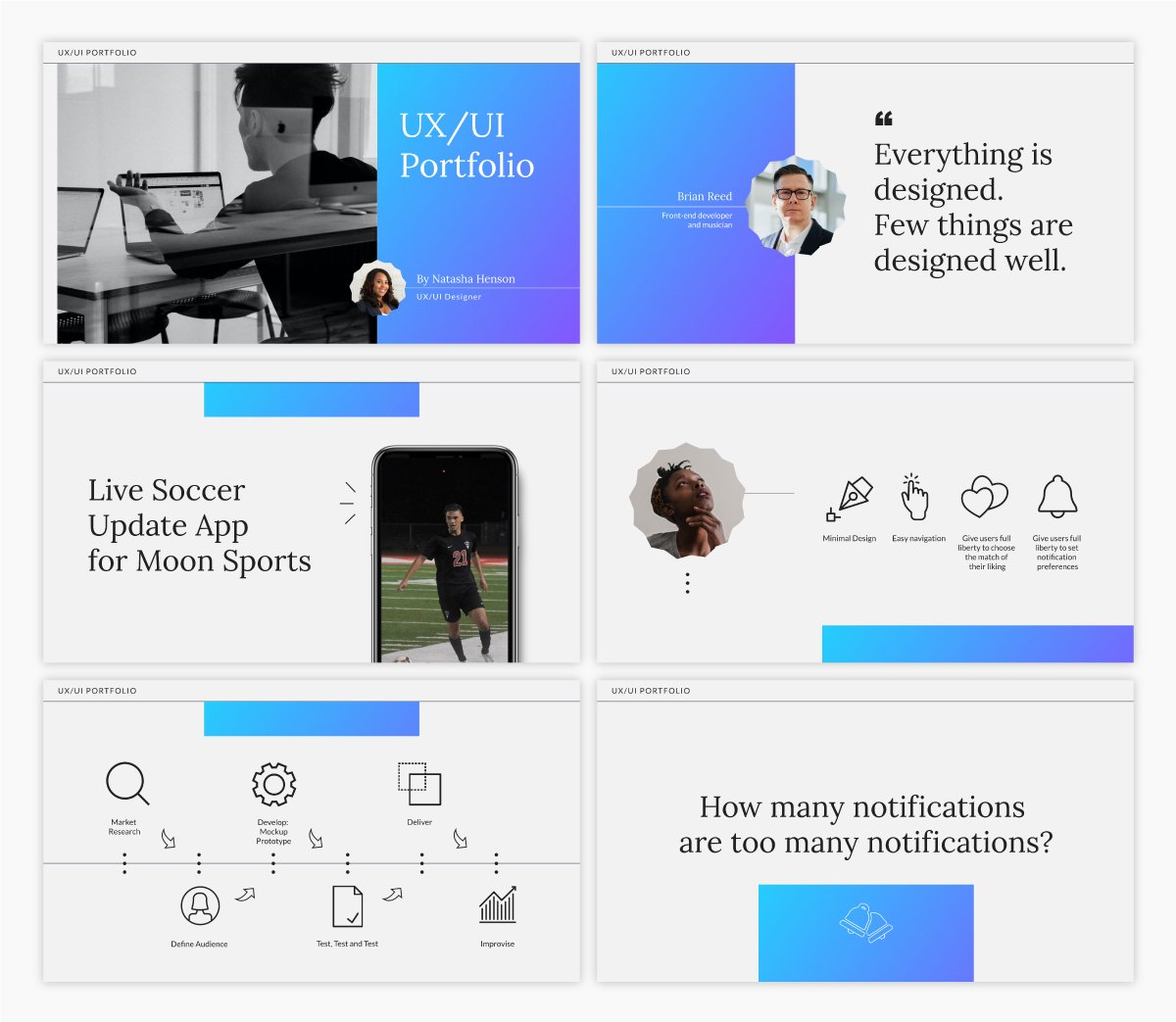
In this presentation below, we see Lato used as the header font in each slide. It’s paired with a thicker serif font to create a nice balance between the two types of fonts.
Here’s another presentation example using Lato as the main header. Both of these examples are using Lato Light to create a more sleek and modern look in their slide decks.
However, as we see in the above presentation, Lato’s normal and bold weights work perfectly for offsetting the light in various headings and designs.

Lato is a modern and readable font, making it perfect for nearly any type of presentation. However, it works perfectly for conveying your professionalism in a pitch deck as well, like we’ve shown you in these examples.

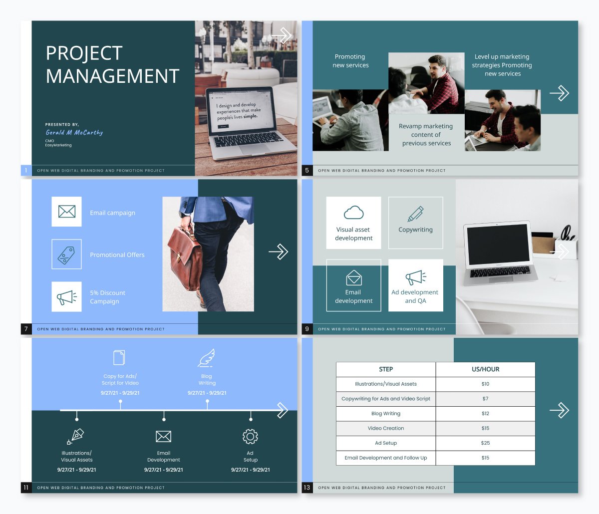
Another great font to use in your presentations is Roboto. Roboto is yet another basic sans serif font that works across a variety of industries and types of presentations.
Roboto is a suitable font to use for your body text, like we see below in this presentation.
All of the main body paragraphs are easy to read in Roboto, as well as professional and well designed.
We see Roboto used again below in this presentation sharing workout apps.
Here, it’s also used as the main font for body copy within the presentation. This just goes to show that this font can be used for nearly any type of presentation as well as any industry.
Roboto is one of those rare fonts that blends versatility with clarity. It’s easy to read, modern in tone, and pairs well with bolder typefaces.
Graphic designer Hylie Zhan says “Roboto is a good choice with high readability and modern feeling,” especially when combined with headers like Montserrat, which she calls “bold and stylish.”
It also pairs well with many other fonts, whether a serif like Garamond, a sans serif like Gill Sans or a script like Pacifico.

Bentham is a stunning serif font that works perfectly as a header font in your business presentations. It’s easy to read and gives your presentation a more traditional look and feel.
We use the Bentham font in our simple presentation theme, as you can see below.
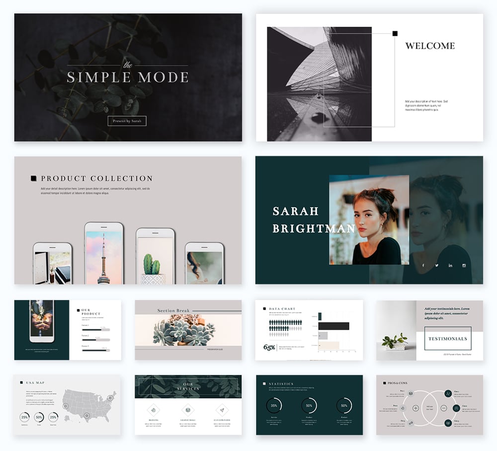
This font can be used as uppercase, title case or even lowercase, whatever fits in best with the rest of your design. In the simple presentation theme, we have over 300 different slide styles to help you put together a unique and beautiful presentation.
Bentham is a free font that you can easily access inside Visme when creating your presentation design. Add letter spacing to create a different effect on your slides.
Pair Bentham with a sans serif font for your body copy, like Open Sans (that we’ll cover shortly) or Futura.
Create a stunning presentation in less time

Fira Sans is a stunning font that is incredibly versatile. In fact, you can utilize Fira Sans as both your header and body font, with another font in the mix to act only as an accent font.
See what we mean in this PowerPoint template below.
While Fira Sans is used in both normal and bold weights for the majority of the slide content, we see a nice serif thrown in as well to offset the single presentation font.
We can see Fira Sans used in multiple ways in this informational presentation template below as well.
This gorgeous sans serif font can be used in bold, italic, underline and more, giving you a wide variety of uses for this one font selection. Give it a try in your next presentation.

Archivo Black is a bold and strong font that looks powerful in all caps, like in the presentation example below. This font works perfectly on titles in both large and smaller sizes because it has a heavy presence.
In this presentation, Archivo Black is paired with Work Sans, a perfectly agreeable sans serif font that is easy to read in body text and captions.
When deciding what fonts to pair together, take a look at the Font Pairs collection in the left-hand toolbar of the Visme editor. In there, you’ll find hundreds of great pairings to use in your presentations.

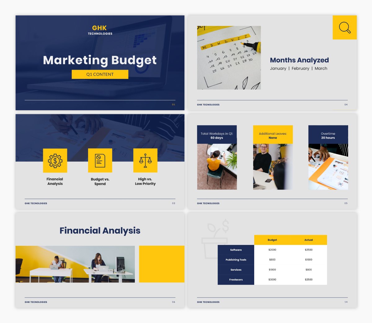
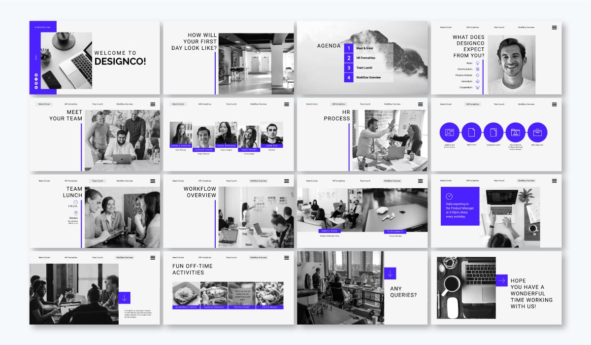
Montserrat is a big favorite of ours here at Visme given that a large majority of our own headings across our website are done in this font.
However, it’s one of the top font choices you can use as well for the headings on your PowerPoint slides.
Check out how we’ve used Montserrat as a header in this marketing plan presentation template.
It’s bold and helps your slide titles and headers to stand out to your audience, letting them know exactly what to expect each time you move to a new slide.
Here’s another example where we’ve used Montserrat, but this time we’ve used a thinner version in the header.
This versatile font almost looks like a completely different typeface when you switch up its weight, giving you even more flexibility for using it across your various presentations.
As you can see, Montserrat can be the font to choose when creating a marketing or business plan presentation as it’s both professional and visually appealing.
Montserrat also pairs well with a variety of different fonts. Try a thin sans serif for a nice contrast in your next PowerPoint.
To get a professional perspective on effective font choices, I reached out to Charlotte McBride, a Freelance Event Presentation Designer. She graciously shared her go-to font pair and why certain fonts stand out:
“I don't have a go-to font *pair* but I do have go-to fonts: Montserrat and Arial. I know, boring but the basics work and they work for a reason. The why is because they have varying weights that make them work for hierarchy and separation of information, they are both clean fonts so readability is basically guaranteed no matter the configuration, and they are extremely available, meaning that anyone can use them. In my view, the best fonts (especially for communication) are the most clearly understood and accessible ones.”

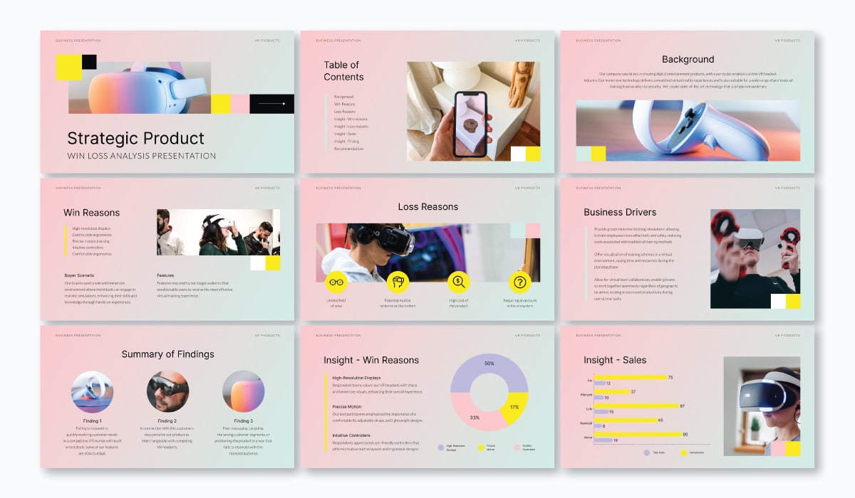
Open Sans is a commonly used font for body paragraphs in your presentation slides due to its legibility. Because it’s a basic sans serif font, it’s the perfect way to visualize the larger pieces of text you might need to include on a slide.
Here’s a presentation template that showcases Open Sans as the main font for the body copy.
However, Open Sans shouldn’t be discounted as only a paragraph typeface. In fact, you can also use it in professional presentations to help your headings stand out clearly, increasing readability.
Take a look at this stock pitch presentation that uses Open Sans as the large font for the title and headings on each page. We used Open Sans in two different weights, creating a font pair that looks balanced and unique.
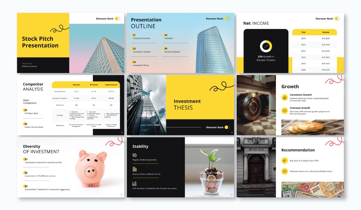
If you’re looking for the right font to ensure your presentation is easy to read and digest, Open Sans is a great choice.

Dosis is another go-to presentation font for any industry. It’s a fun sans serif font with rounded edges and tall, thin letters, giving it a more futuristic look.
Here’s an example of how an industry focused presentation can use Dosis in – a slide deck for a restaurant’s marketing plan.
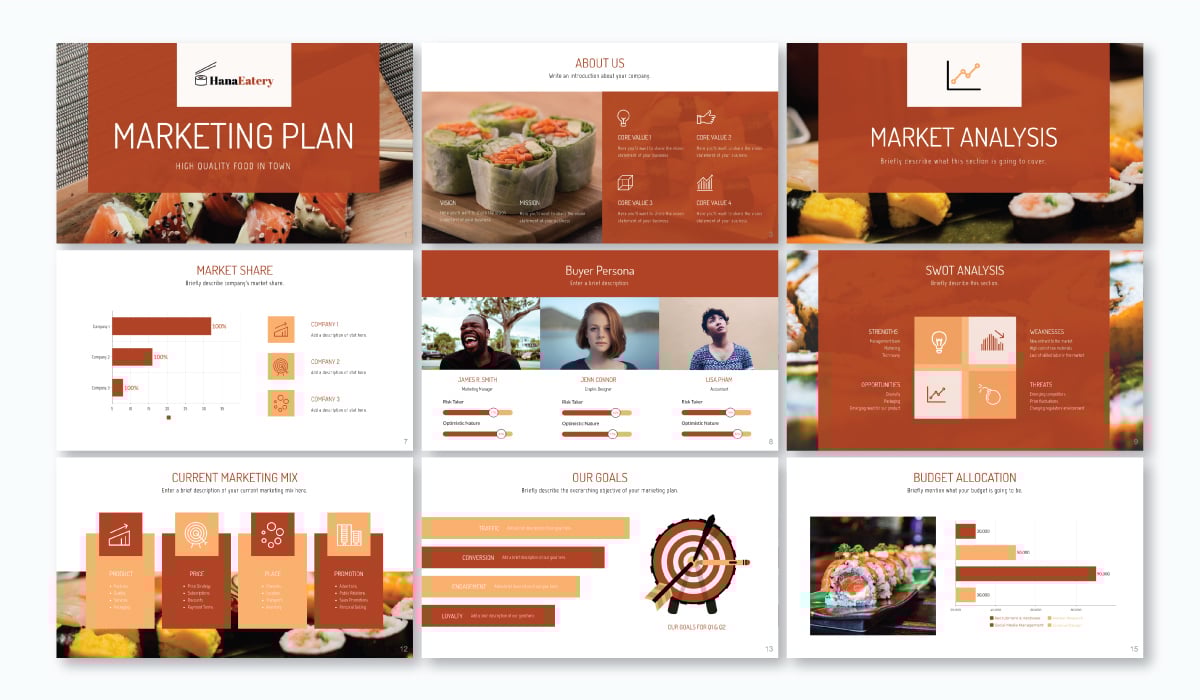
In this example, Dosis is used in all caps on the title slide and in the headings on each slide. This template has added a unique design that incorporates a two-color composition that makes the font contrast with the background.
Below, we have another impressive presentation template using Dosis in a similar fashion. It’s paired here with sans serif font Source Sans Pro, providing a modern combination fit for a tech startup pitch deck.

Similarly, we see that Dosis works well in all caps and can be used in a variety of designs in order to make the text stand out that much more.

Another quality PowerPoint font to consider using in your presentations is Libre-Baskerville. This is a Google font that you can use for free inside many presentation software, Visme included!
Libre-Baskerville is a serif font style that can be paired with a variety of other fonts and color schemes, creating a more traditional look and feel for your presentation.
We use Libre-Baskerville in all caps as headings in our Modern presentation theme. This theme has over 800 different slide designs so you can pick and choose the ones that work best for your presentation needs.
However, this font can also be used in body paragraphs just as easily, as it’s clear and legible and easy to read.
In the presentation template below, we’ve paired Libre-Baskerville with Josefin Sans in the header, creating a classic look and feel for any presentation deck.
Libre Baskerville is a timeless font choice that never goes out of style and adds a sleek touch to any presentation you need to create.

Muli is a versatile font that looks professional in both headings and body copy. As a sans-serif font, it’s bottom-heavy, so it sits well on the line, giving a sense of control. Its roundness makes it friendly and easy to read.
This presentation uses Muli for the titles in a medium size and a lower size for small headings. The pairing of Muli with Lato works well with the colors and shapes in the rest of the design.
According to Alejandra Mariscalez, who heads the design team at Visme, Muli is one of the most underrated fonts in the platform’s library, alongside Lexend, Inter, Comfortaa and Archivo. These typefaces, she says, offer a balance of personality and professionalism that makes them great choices for users who want something a little different without sacrificing readability.

If you’re looking for a bolder font that grabs attention, a slab serif like Abril Fatface might be just the font you’re looking for. This could pair nicely with a standard font like Helvetica or Verdana or a thinner serif like Georgia or Palatino.
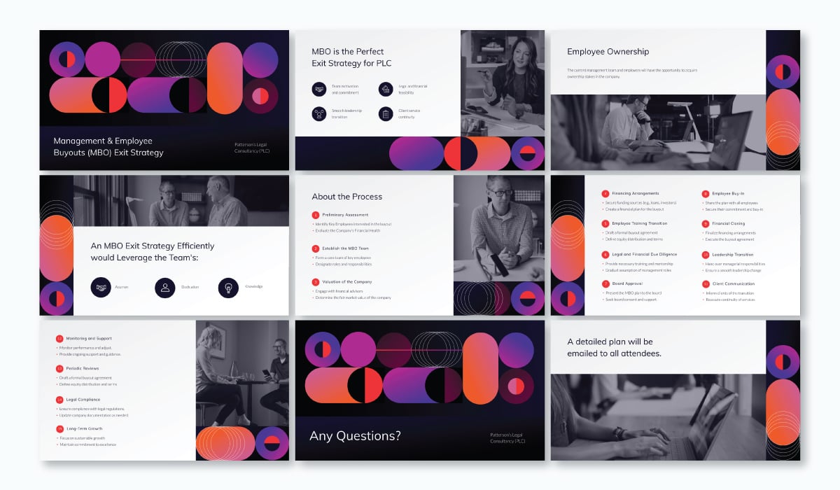
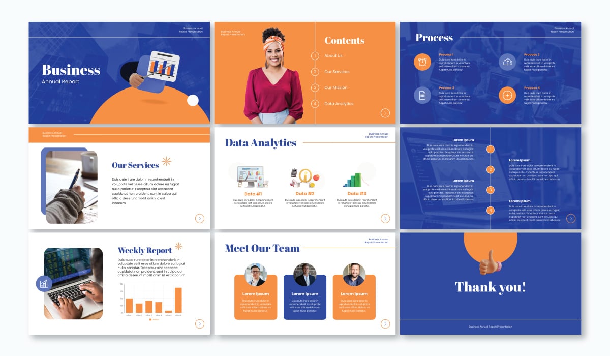
Check out how we’ve incorporated this bold font into the headings of the below annual report presentation design.
Abril Fatface is a great font for creating eye-catching headlines on your slides, but should only be used with short headings or pieces of text. A bold font like this can be hard to read in paragraphs or longer sentences.
Look at how good this Abril Fatface looks on the 3rd slide of this presentation.
The presentation below also uses Abril Fatface for the headings on each slide. The font has so much personality that it looks beautiful on its own and placed over bold colors.
If you’re looking for a slab serif font alternative, use fonts like Rockwell or a bolded Trocchi in your next Visme or PowerPoint presentation.
You could even look into custom fonts from sites like DaFont and import them into your Visme brand kit.

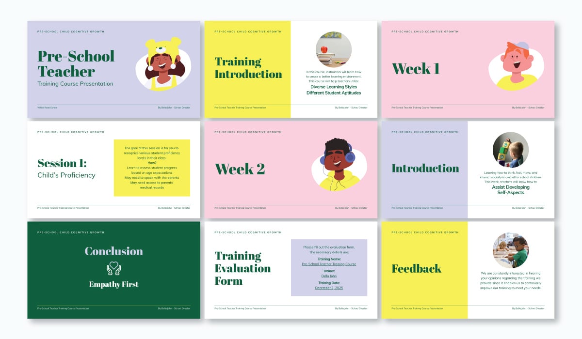
The next font on our list is KoHo, a unique sans serif font that can be used in more playful presentations.
Whether you’re creating a presentation for school, a video presentation to play in your office or something else entirely, KoHo can be one of the best fonts to utilize.
We incorporated KoHo into our Creative presentation theme in the various headings of each slide.
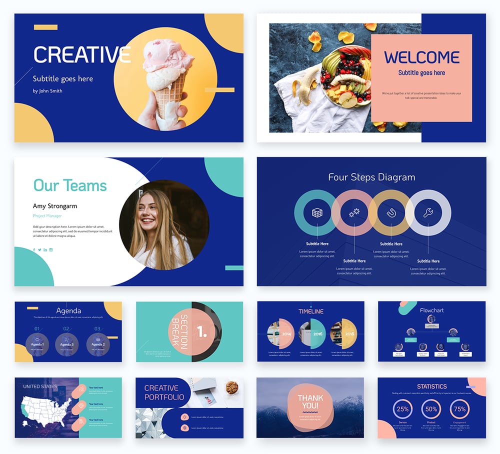
This is another one of our massive presentation themes, offering hundreds of slide designs for you to choose from. However, as the name suggests, this one has a more creative and playful feel to it.
If you need to create a pitch deck for investors or a sales presentation for new clients, KoHo and the Creative theme might not be for you.
However, if you’re embedding a slideshow onto your blog or sharing an informational presentation on SlideShare, KoHo could be a better suited choice to engage your audience.

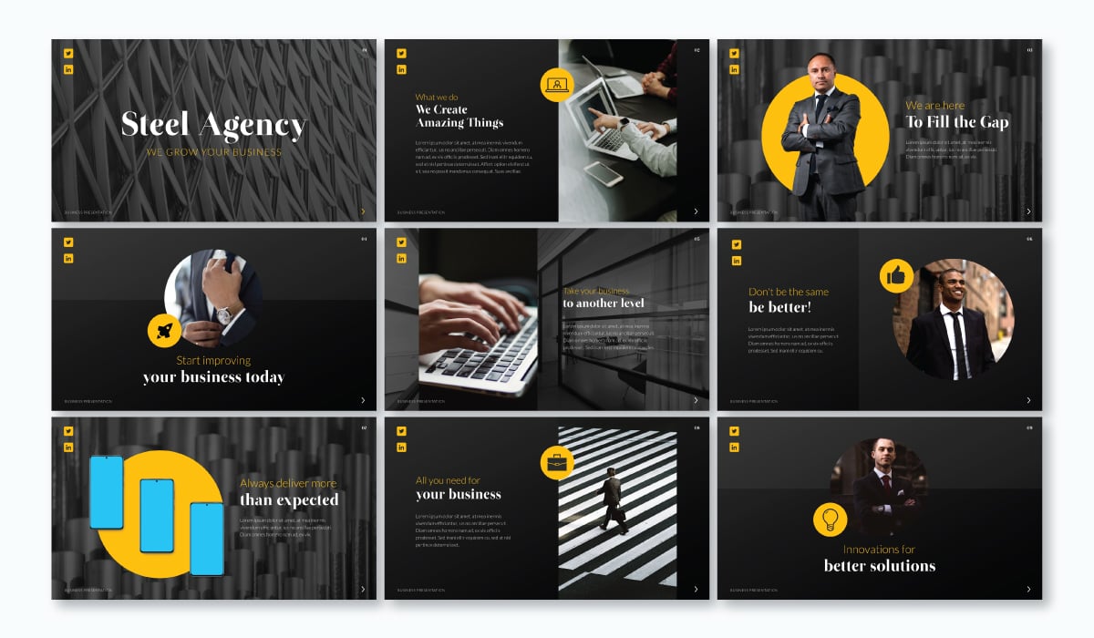
Helvetica is a classic sans serif font that has a very loyal fanbase, and for good reason.
As seen most clearly in capitalized texts, the upper half of the texts are quite large when compared to other san serifs fonts.
This allows the Helvetica fonts to have near-symmetrical proportionality when measuring the upper and lower portions of a text. These proportions make the identification of letters easier at a distance, like in the template example above.
This fact makes Helvetica a great font to use for headers and titles in live presentations where there may be people “sitting in the back row” and viewing your presentation from a distance.
When deciding which fonts to pair in templates like these, Hylie Zhan, a graphic designer, shared this insight:
“If it’s a professional business template, we use more neutral and clean fonts such as Helvetica and Lato. It’s also a good idea to combine a serif with a sans serif, or use the same font family with different weights and styles.”
To clearly communicate your main points, be sure to use Helvetica as a bold text on headings and titles.

Cormorant is a sleek and modern serif font.
We like to think of Cormorant as a good alternative for Times New Roman but with a moderate and tasteful change.
With a dynamic range of varying thicknesses, Cormorant appears to have a calligraphic feel and look while still maintaining a sense of professionalism.
While artistic and expressive, Cormorant is still fully legible and usable in a professional environment, as you can see in this presentation template.
Our recommendation is that you choose a font color that is a complementary color to the background. This helps separate the thin portions of the font from the background.
Should the variations in thickness prove too much for your taste, consider dialing back that expression by using Cormorant in its bold format. By thickening up the thinner lines, the variations are less noticeable and may be more suitable for a given context.
Cormorant is a modern serif font that works well in titles, headings, subtitles for subpoints or paragraphs.

Prompt is a geometric sans serif font designed for Latin and Thai languages. Its geometric quality gives it a solid and stable feel that will give your presentation a unique look.
In this modern presentation example, Prompt appears in all titles and subheadings. It’s paired with Montserrat, another san serif with personality. These fonts together do look a bit similar to each other but balance each other out in terms of weight and thickness.
Choose this font specifically if you’re creating a presentation in Thai and need the words to be legible and well-balanced.

League Spartan is a simple sans serif font, that is bold, uniform and minimalistic by nature and is great for headings and titles.
Because it's hefty even with the bold setting turned off, you may want to take extra precautions when using League Spartan for paragraphs or letter bodies.
League Spartan works great as a header for infographics or cartoon-style presentations, like in the template above.
The purpose of an infographic is to take difficult or complex information and turn it into easy-to-remember points. The reason that League Spartan works so well with infographics is its simplicity.
To help set the overall tone of an infographic, you can use a simplified san serif font like League Spartan. A font like this will simplify an important or complex data point and make it feel easy to understand.
Kalyn Lewis, Head of Sales and Customer Experience at Visme, echoes this approach:
“When preparing materials for a wide audience, I may have to reel in my desires to use fonts that give the ‘handlettering’ look. While they can give a great look and effect, they’re often hard to read. So I go for fonts that are crisp in their visual qualities and accessible to the eyes—this usually leans toward Sans Serif fonts.”

Poppins is a versatile and linear san serif font.
Poppins is linear because of its strong vertical terminals, which are the end of a stroke that is not a serif. This gives the font a sense of weight and vertical authority, making it great for strong, stand-out titles and headers.
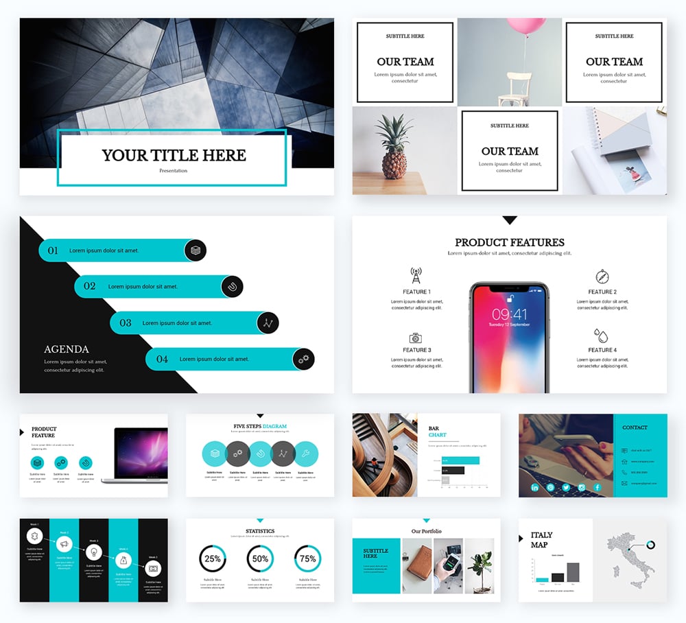
Not only is Poppins a wonderful choice for titles and headers, but it also works well for titles, text bodies and subtitles, as you can see in our presentation template below.
The linear and versatile aspects of Poppins has made this font a favorite in the business and professional world. It feels casual, yet is still very professional.

What can we say about Playfair Display, other than it’s an incredibly chic and fashionable serif font.
This font has a strong box feel as most of the characters stay between the baseline and X-height. This means that most of the letters do not dip far below the line, nor do they rise above most of the other letters.
This makes Playfair Display an excellent choice for strong titles and headers, as you can see in our presentation template below.
Many fonts that go after the “box look” fail at being legible from a distance.
To avoid this problem and make the letters more pronounced, Playfair Display uses a variety of thicknesses in the stem of their letters when compared to the arms and other extensions.
Playfair display is a classy and elegant font designed to be used as headers or titles. While it can still be used in paragraphs, you may want to limit its usage to shorter portions of your text.
Similarly sized and spaced words written in this style can be disorienting for some readers. So instead, consider using Playfair Display as a font for titles, quotes or various subtitles in your presentation.

Raleway is a modern sans serif font that was originally designed to be used as a lightweight font. But after its release and by popular demand, Raleway was given heavier and italicized versions for its fans to use.
The bold and light versions of this font are extremely versatile and can be used anywhere from bold headers to lighter parts of the body in your presentations, as you can see in our presentation template below.
The italicized version of Raleway has slightly off-centered bowls and shoulders in certain letters. This means that the markings that are not the stem are purposefully written higher or lower than normal.
This is a subtle artistic flair that does not influence readability. Some people find that swashes actually help increase legibility with these off-centered markings.

The Otama font is a Didot and Bodoni alternative with a crisp serif cut and good flow. As a classic-style serif font, it looks refined as a big header in both regular and bold weights.
This type of font pairs well with a solid sans serif like Lato Light. In this presentation example, Otama and Lato Light in all caps work together to create a professional design that stands out and makes a statement.

Lora is a unique serif font that was made in a contemporary style.
Drawing its inspiration from calligraphy and traditional fonts, Lora is an excellent balance between an artistic and professional font.
Lora has very pronounced arches leaping away from the stem of each letter. This gives the font family a more “bubbly” feel to it, while still maintaining a sense of clean professionalism.
To unleash Lora’s true artistic nature, you’ll want to turn on the italics. When italics mode is activated, each letter receives additional swashes, giving it a more hand-written feel.
If you add weight to its default thickness, Lora works well for both titles and headers and when set to its default settings, Lora truly shines as a font in paragraphs and bodies, as you can see in our presentation template below.

Inter is a sans font specially designed for computer and mobile device screens. It has a tall x-height that helps with readability of lower case text. This quality makes Inter good for both titles, body text and even data visualization captions and legends.
You can use Inter in different weights throughout a presentation or pair it with a versatile font like Lato Light to give the composition a bit of visual variety. The presentation example below uses Inter in mixed-case and Lato Light in all-caps for headings and mixed-case for body text.
When asked about a font that works across different industries, Daniela Verduga, Graphic Designer at Hindsite Interactive Inc. says Inter is her top font choice 'cause it's so versatile.
“There are a bunch of versatile typefaces that work across different industries, such as Inter Family, one of my favorites! Inter has great legibility in multiple sizes, a huge range of weights and styles to help you create hierarchy across your design. It's neutral enough to fit with different businesses, from food or tech to medical industries. It has a professional look but also has soft curves that make your slides nice to read.”
In her response, Leanne Bowers, Creative Director at Creative Cete, echoes this sentiment when asked about her go-to font family and has some solid advice about picking the right font family.
“Maybe not a pair, but to keep it simple, it’s nice to find a robust font family with different weights. Then use the bolds for headers and a regular or light for copy. If someone wants a solid sans serif that’s easy to use, Inter is a great pick, especially with its more open license on Google Fonts.”

Noto Sans is a basic sans serif font that makes for a great presentation font. Clean and easy to read, it can be used in a variety of different ways from slide to slide.
Take a look at this presentation template below. The main font used throughout the headers and content is Noto Sans, creating a clean and cohesive presentation design.
The above presentation template also uses a script font for the author name on the first slide as well as another sans serif font (Poppins) for some body content.
Having a nice mixture between the two ensures the presentation isn't boring—but it's still clean and uncluttered. Poppins is another font on this list. Try mixing 2-3 different fonts from our recommended fonts to create a stunning presentation design.

Heebo is one of the more unique sans serif fonts on our list, but it works perfectly for presentation slide headers. As a thin, tall font, it works better in a larger size than it would for content.
Take a look at how we've used Heebo in this presentation template below. It remains in an all-caps format, typically for headers from slide to slide.
We've also creatively used the font by juxtaposing it atop purple squares, helping to create a design element out of text. Consider how you can do the same thing in your presentations.

Our next top font is a beautifully bold serif font. DM Serif Display is a perfect header font for a more traditional presentation design. Serifs tend to seem more old-fashioned, so keep that in mind when creating your next presentation. Maybe a serif will best fit with your audience.
Take a look at this template below to see DM Serif Display in action.
In the above presentation, we've paired this bold serif font with a nice thin sans serif to pull the design together. Sometimes opposites attract and help you to create a beautiful presentation design that your audience will love.

Dela Gothic One is a thick and chunky font with a strong feel. It’s ideal for headings on posters, packaging and in titles on presentations. This font has a lot of power and is best paired with a simple sans serif font or even a classic serif like Garamond for body copy.
For a bolder outcome, use Dela Gothic One in all caps, like we did in the presentation example below. Each slide includes a strong title in Dela Gothic One in a color that contrasts with the background.
When it comes to fonts for PowerPoint (or any other presentation platform), there are so many options to choose from that it can get overwhelming. But selecting fonts doesn't need to stress you out. Stick to the ones in this list and you’re sure to have a winner.
For slide presentations, sans serif fonts are the best choice. Their clean and modern design makes text easy to read, especially on digital screens and from a distance. Fonts like Arial, Helvetica, Open Sans, and Calibri ensure clarity and professionalism without unnecessary distractions.
Serif fonts, while great for printed materials, can appear cluttered on slides, especially when viewed from afar. Script, decorative, and display fonts should also be used sparingly, as they can compromise readability. If you want a stylish touch, you can use a display font for slide titles but stick to sans serif fonts for body text to maintain legibility.
Whether you use Microsoft PowerPoint, Apple Keynote or Visme, each of these presentation fonts can really bring the best out of your presentation.
If you want to get even more out of your presentation design and have access to top notch animation, transition and interactivity capabilities, sign up for Visme's free presentation maker today.
If you're racing against the clock, take advantage of Visme’s AI features, like the AI Presentation Maker which takes a text prompt and turns it into a fully designed presentation draft.
Design visual brand experiences for your business whether you are a seasoned designer or a total novice.
Try Visme for free