


Best Interactive Training Tools: Top Platforms, AI Tools & Real Examples

Interactive content is a winning marketing tactic.
Ninety-three percent of marketers say it’s effective for educating buyers, while static content trails behind at 70 percent.
With a difference that big, it’s no surprise that more brands are doubling down on interactive experiences.
If you’re trying to boost engagement, capture qualified leads or help buyers make faster decisions, interactive content should be part of your digital marketing strategy.
And the best way to figure out what to create next is to study what’s already working.
That’s what this guide is about.
In this guide, we’ll walk you through the benefits of interactive content and share 10 successful interactive content examples to fuel your inspiration.
Before we jump in and spark your next big interactive idea, watch this video to learn how Visme can take your interactive content marketing strategy to the next level.
Interactive content is any content your audience can engage with, rather than just read or watch.
Instead of passively consuming information, they get to tap, click, answer, choose, explore and receive an experience tailored to them.
Some common interactive content ideas include:
Static content tells people what they should know. But interactive content helps them figure things out for themselves.
That’s why it helps people understand complex information, compare options and make decisions faster than a long article or a traditional video.
And for marketers, it's one of the most powerful tools you can use. When people actively engage with your content, everything improves — dwell time, conversions and the quality of the behavioral data you collect.
When stakeholders ask whether interactive content marketing is worth the budget, you can almost feel the familiar skepticism in the room.
And honestly? It’s valid.
For years, “it boosts engagement” was the default answer — a soft metric wrapped in a vague promise.
But if it feels like the rules changed overnight, you’re not imagining things.
The real value of interactive content has nothing to do with vanity metrics.
It’s about outcomes executives can defend in a boardroom: stronger conversions, better-qualified leads, shorter sales cycles, richer customer insights and better decision-making across stakeholder groups.
Here’s why more marketing and revenue teams are quietly — and quickly — shifting serious budget into interactive formats.
When prospects can shape the interactive experience to fit their needs, they naturally lean in.
And when they progress further into your funnel, they convert at a significantly higher rate.
This is the level of conversion efficiency that the old playbook simply can’t match.
Research from Demand Metric shows that interactive content drives 2× more conversions than static assets.
That’s why so many enterprise teams are shifting away from flat “brochureware” and toward dynamic formats that let buyers guide their own journey.
Most of the B2B decision-making now happens long before anyone talks to sales.
And that’s because buyers want to explore your product on their terms, not your timeline.
They want to click through self-guided experiences, interactive product presentations and tours, test workflows, preview outcomes and get answers without scheduling a single call.
And when you give them that level of control, something powerful happens: they show up to sales already aligned, informed and confident.
Companies, B2C and B2B marketers that provide this type of immersive interactive experience see shorter cycles, fewer back-and-forths and faster deal velocity.
Buyers today are operating with a completely different filter.
They’ve seen every pitch, every landing page, every generic “personalized” message. What they actually want is simple: Show me how this works for me.
McKinsey backs this up. 71% of consumers now expect personalized interactions and almost three-quarters will walk away if a company can’t deliver. That’s the bar.
Interactive content meets that expectation in a way static assets never could.
An ROI calculator, a readiness check, a scenario model — these aren’t just “engaging features.”
They let people plug in their numbers, stress-test assumptions and see real outcomes based on their situation. And that’s where trust is built.
Every action a user takes inside an interactive experience offers a tiny piece of market intelligence—what features they click, what they compare, what they value most and where they drop off.
For example, SaaS teams can use this data to improve lead generation, spot friction points, and understand what potential customers care about most.
These insights also reveal where users struggle long before it becomes a support issue, helping companies boost retention and brand loyalty.
As time goes on, feedback helps guide product plans, optimize messaging, and fine-tune how companies target different ICPs and customer groups.
Search algorithms reward content that keeps users engaged, and interactive formats naturally increase signals like brand awareness, dwell time, scroll depth and repeat visits.
The New York Times’ legendary Snowfall interactive piece is a perfect example: the immersive design kept readers engaged for significantly longer periods. It became a reference point for what high-quality, experiential content looks like and earned lots of social shares.
That same principle applies to brands. When potential customers stay longer and interact more, search engines read that as a strong satisfaction signal. And those signals help you rank consistently over time.
This means interactive content marketing impacts not just customer experience but organic visibility, authority and long-term search performance.
Now let’s look at 10 impressive interactive content marketing examples that are not only winning hearts and minds but also driving results.
Buying a home is one of the biggest financial commitments a person will ever make. An on-demand tool that lets them interact with the numbers in real time can make the entire decision feel less intimidating.
Royal Bank of Canada’s mortgage calculator delivers that experience. It gives prospective buyers a simple way to understand their monthly payments and how those payments change based on interest rates, down payments or amortization periods.
Instead of reading static examples, users get to crunch the numbers and test real scenarios that are applicable to them.
When users plug in the numbers, the tool shares a summary of their mortgage details.
Beyond the mortgage details, the tool instantly generates interactive charts that break everything down. Users can:
Tools like this are incredibly effective for brands that sell high-cost or complex offerings.
People need to understand not just the price but the financial implications behind it. Interactive calculators make that learning process easy.
The same interactive marketing approach works beautifully in a B2B content marketing strategy. When multiple decision-makers are involved, leaders often want a clear view of ROI before they approve a major purchase.
B2B interactive content and tools like calculators give them the transparency they need, helping teams reach alignment faster and with far more confidence.
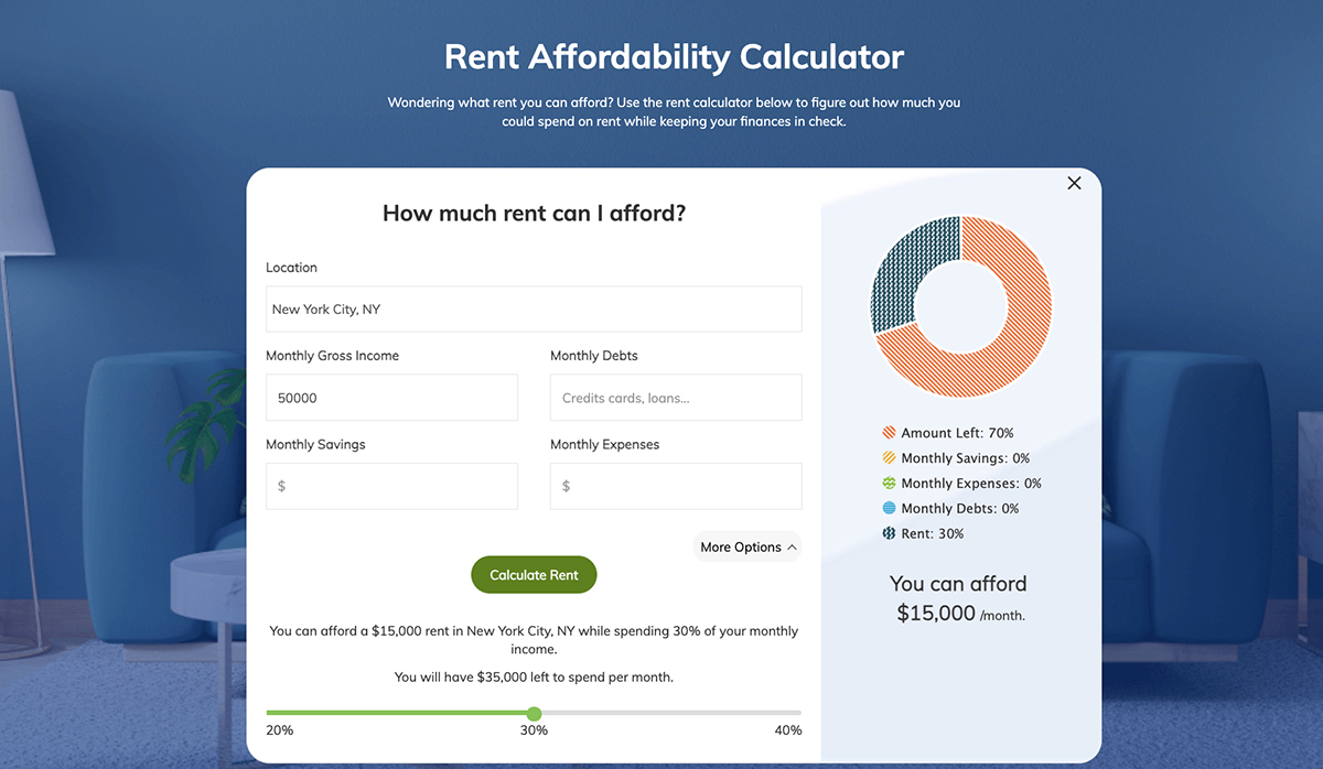
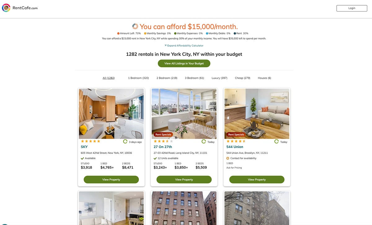
RentCafe.com offers an interactive rent affordability quiz that helps renters understand how much they can realistically spend each month. The tool asks for your income, debt and other basic financial details. You can also include monthly savings and expenses to get a more accurate picture.
Once you enter the information, the tool immediately shows a recommended rent range based on your situation. It also highlights available home and apartment listings within that budget so users can explore real options instead of guessing what might be affordable.
The experience works because it takes a stressful, often confusing calculation and turns it into something simple and personal. Instead of trying to work through formulas or compare numbers manually, renters get guidance they can act on right away.
Affordability and on-demand tools like this remove guesswork at a moment when people feel most uncertain. And that’s the real opportunity for brands.
When you give users a way to test scenarios with their own numbers, you’re not just answering a question — you’re helping them move forward with clarity. In markets where financial confidence is half the battle, interactive tools can quietly become one of your most persuasive marketing campaign assets.
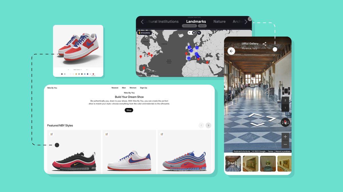
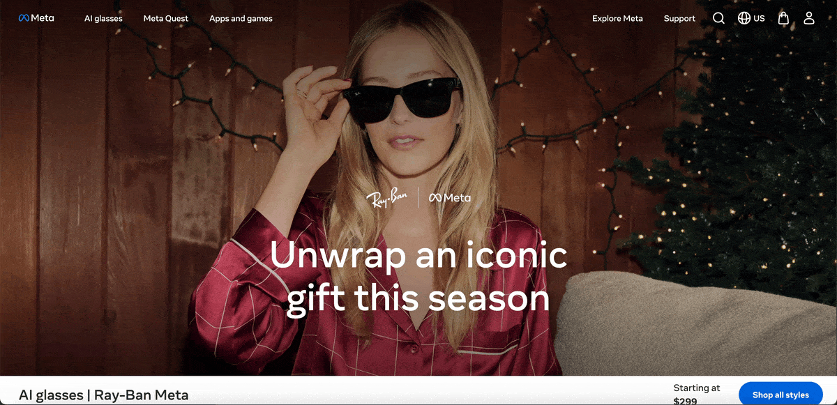
The Ray-Ban Meta smart glasses landing page is a great example of how interactivity can make a complex product feel easy to understand.
Rather than crowd the page with long descriptions, they use clickable pop-ups placed directly on the glasses.
Each popup opens a small window with a short looping video and a brief explanation of the feature.
This format works because users can explore the product at their own pace. If they want to learn about the camera, they click the camera icon.
If they’re curious about the audio or touch controls, they tap those instead. Each feature opens in a lightweight, focused view that shows exactly how it works without interrupting the overall experience.
It’s a simple approach, but it does something important. It helps buyers understand a high-tech product by letting them see it in action. No guessing, no long paragraphs, just quick, visual answers that feel intuitive.
Hotspot-style popups are especially effective for products with multiple features or technical components. They keep the page clean while allowing users to dive deeper only when they’re interested. This kind of interaction works well for software, hardware and any product where visuals can explain the story better than text alone.
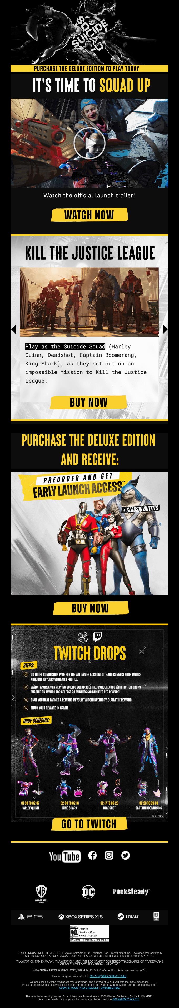
Interactive emails work because they give subscribers something to do, not just something to read. Martech Advisor reports that interactive email content can increase click-to-open rates by 73%. And in one survey, 60 percent of recipients said they are more likely to engage with an email when it includes interactive elements.
Warner Bros. Games leans into this really well. Their promotional email for Suicide Squad: Kill the Justice League uses a mix of video, image carousels and clickable sections to keep people exploring. You can watch the launch trailer right inside the email, flip through character visuals and outfits, and tap into different sections that highlight editions, bonuses and Twitch drops.
Everything is designed to pull the reader into the immersive experience, not push them out to a landing page right away.
Interactive emails stand out because they break the pattern of static inbox content.
When you invite subscribers to watch, swipe, tap or explore, you raise the chances that they’ll stay engaged long enough to understand your message. For brands with visually rich products or multiple offers, treating the email itself as an experience can lift both clicks and conversions.
Source:
Infographics are one of the easiest ways to turn dense information into something people can actually enjoy reading.
When you need to wrap up a lengthy report, highlight a case study, walk through a guide, or show how something works step by step, a solid infographic can make the whole story friendly and easy to understand.
BigRentz does this really well with its interactive “How Skyscrapers Are Built” infographic.
Instead of a static, one-dimensional graphic, the page uses subtle animations to show movement throughout the scene. Birds fly across the skyline, cranes shift as construction progresses and different building components highlight as you move down the page. The movement is subtle, but it pulls you in and helps you follow the building process from the foundation all the way to the very top.
And because the content is super visual and interactive, it keeps users hooked for longer. They can watch it unfold step by step. It takes a complex engineering subject and breaks it down so anyone can understand it in just a few minutes.
Interactive infographics shine when you need to explain a process, system or timeline that would otherwise feel overwhelming.
And when it comes to learning, the customer experience is everything.
By adding motion, highlights or scroll-based interactions, you help people absorb information more naturally. This format works exceptionally well in industries like construction, engineering, healthcare and SaaS onboarding, where showing the steps often makes more sense than describing them.
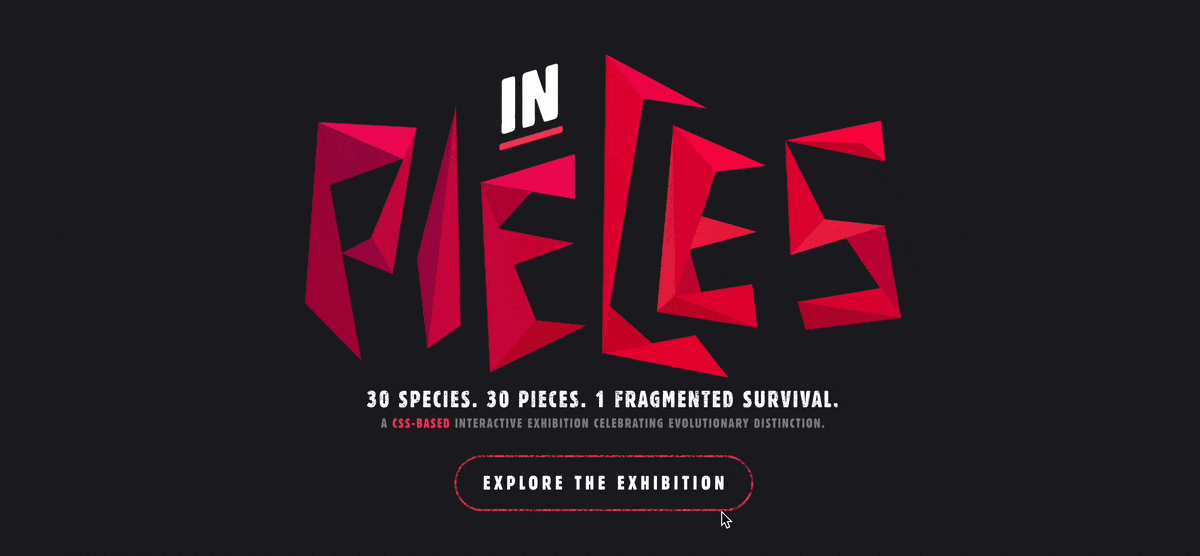
Ever looked at a block of numbers and felt your brain switch off? Most people have. Static charts and spreadsheets make it hard to understand what the data is actually saying.
But when you can play with the data, explore it hands-on and uncover insights at your own pace, the experience changes completely. That’s exactly what makes Species in Pieces work.
It’s a CSS-based interactive exhibition that uses polygon-shaped artwork to represent different endangered species. Each animal is formed from geometric pieces that shift as you navigate, acting as a visual cue to move from one species to the next.
Each species page includes quick facts about habitat, conservation status and the threats it faces. You can also hover over small charts to view population numbers and decline trends, which makes the data easier to understand than a standard table or paragraph. For anyone who wants more context, there’s also a short video linked inside the profile.
Interactive data visualizations work well when you need to present detailed or technical information in a way that’s easy to navigate.
Allowing users to click, hover and move between data points keeps them engaged and helps them absorb the material faster. This interactive content type is useful for nonprofits, research groups, public-sector organizations and any brand that relies on data to tell a beautiful story.
If you’ve ever tried to follow the electoral college using text alone, you know how quickly it gets confusing. An interactive map solves that instantly. 270toWin makes the entire process easier to understand by letting users assign each state to a candidate and watch the electoral vote count change in real time.
You can click through states to build different scenarios, switch matchups and see exactly how the path to 270 electoral votes shifts as you go. Once you’ve created a forecast, the tool lets you share it or embed it on a website with one click.
270toWin also includes historical election results. This means users have a way to compare past outcomes with possible future ones. It’s a helpful resource for students, political followers, journalists or anyone trying to understand how the map could play out.
Interactive maps are great for breaking down topics that involve many variables. When people can test scenarios and see the impact immediately, the learning curve gets a lot shorter. This format works well for election data, climate information, logistics planning and any topic where geography influences the outcome.
Short-form video is already one of the strongest content formats out there and adding interactivity on top of it makes it even more effective. Interactive videos let viewers click on items, pull up details and explore products while staying inside the experience.
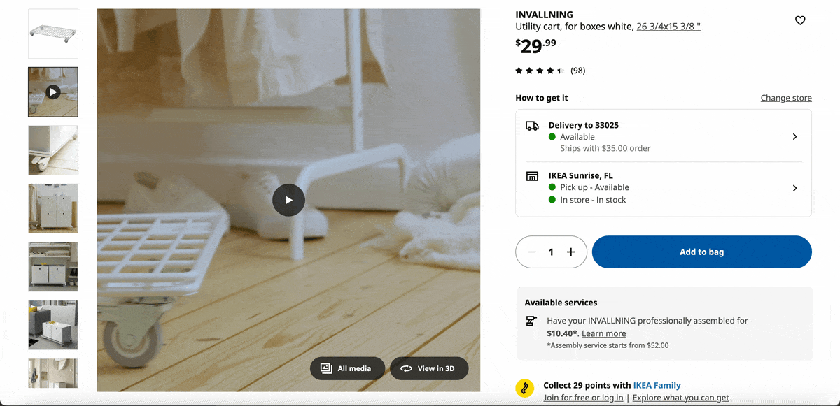
IKEA uses this approach really well. Instead of a typical product video, they create shoppable, documentary-style walkthroughs.
As the presenter talks about different storage ideas or design tips, the product timeline on the right updates automatically. Each item is clickable. Viewers can hover to see the name, price and description, then tap “Shop now” to go directly to the product page. If they’re not ready to buy, they can jump straight back into the video without losing their place.
It feels like watching a helpful design tutorial where every product you see is instantly accessible. No pausing the video, no searching for links and no scrolling through a catalog to find the exact item. Everything sits neatly inside the video itself.
Interactive videos are great for moments when viewers need both inspiration and information. Letting people click on what they’re curious about keeps them engaged and reduces the steps between interest and action. This format works exceptionally well for retail, home improvement, travel, education or any brand that wants to turn passive viewing into active exploration.
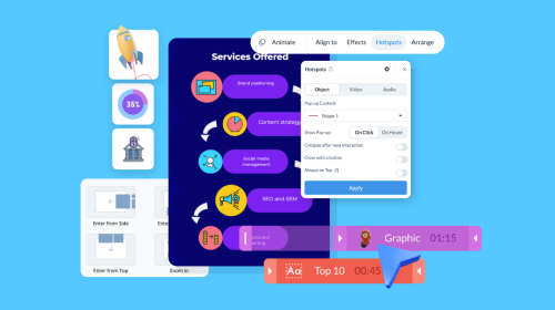
IRISS built a virtual experience center using Visme as an alternative to expensive trade shows.
Instead of sending visitors through multiple pages or PDFs, everything sits inside a single, self-guided environment. The experience starts with a welcome video and then moves into a virtual lobby where users can click through product demos, calculators, videos, white papers and industry-specific content designed for utilities, data centers and manufacturing.
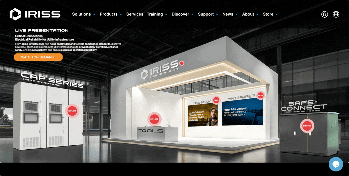
Each booth includes clickable hotspots that reveal product details, cost-savings tools and supporting resources. It feels more like walking through a digital showroom than browsing a standard website and visitors can explore at their own pace.
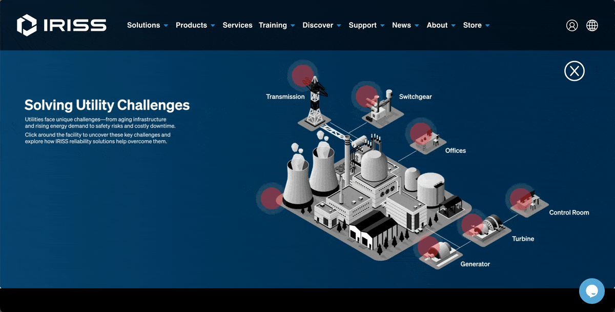
As Creative Content Manager Lee Murray explains,
“With Visme, we were able to avoid significant trade show costs, reduce our environmental footprint and still generate the same, if not better, results.”
Their first virtual event brought in 300 attendees, roughly half of whom qualified as strong leads — an ROI that exceeded many of their physical shows. Some visitors spent up to 90 minutes exploring the booths.
Virtual experience centers work because they replicate the flow of an in-person booth without the cost, logistics or noise of a live event. Instead of jumping between pages or waiting for a demo, buyers can explore demos, interactive calculators, resources and product details inside one cohesive environment.
When people can self-educate inside a single, organized environment, they move through the buying journey faster and with far more confidence. This often leads to deeper user engagement and higher-quality leads than traditional formats.
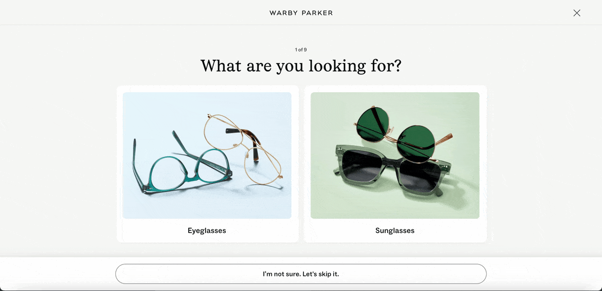
Our last interactive content example comes from Warby Parker, and it’s one many people have seen firsthand. Instead of asking shoppers to browse dozens of frames and hope they find something that fits, Warby Parker uses an interactive quiz to guide people toward the right styles.
The quiz asks a few quick questions about face shape, fit preferences and style choices. As you answer, the recommendations adjust in real time so the results feel personalized rather than generic.
By the end, shoppers get a curated list of frames that match what they actually want, along with the option to try them on virtually or order a home try-on kit.
What makes this effective is how quickly it removes the guesswork. Buying glasses can be pretty overwhelming, but this quiz makes it easy and gives you a lot more confidence instead of a frustrating trial and error experience..
Interactive quizzes are a great fit for brands with lots of options or products that require a bit of guidance. A short series of smart questions can narrow choices, personalize recommendations and move shoppers from browsing to deciding much faster.
This format works just as well for SaaS onboarding flows, product selectors, hiring assessments or any situation where people need help choosing the right path.
And it’s not just Warby Parker seeing results. Beauts Hoang, Senior Growth Manager, Semrush at Semrush, shared how effective quizzes can be:
"A quiz we made for one of our campaigns really stood out because it helped people figure out which of our goods would work best for them. It was really popular, and not only did it bring more people to our site, but it also made people feel better about their purchases, which led to more sales."
You don’t need a development team, custom code or a six-figure software stack to create interactive content.
Visme is a strong example of what this looks like in practice.
Many companies in our case studies — from IRISS to nonprofits to SaaS teams — built their interactive content entirely in Visme without hiring outside help.
Here are a few practical ways to create interactive content on a tight budget:
Before diving into quizzes, calculators, hotspots, or any kind of interactive content, be clear about the decision you want your users to make.
This is where a lot of teams throw money down the drain.,
They jump into building something because it feels fun or trendy, only to discover that it doesn’t really lead to any business results.
Every interactive experience should steer the user toward a meaningful next step.
If you're aiming to generate leads, create something that makes sharing information feel easy and natural.
If your sales team is frequently dealing with prospects who don’t grasp the value or ROI, a simple calculator could really clear things up for them.
And for educational goals, pick a format that breaks down heavy information into bite-sized, guided interactions so users can learn without feeling overwhelmed.
Once you’ve nailed down the decision you’re trying to influence, picking the right format becomes a breeze. You don’t need anything fancy or a custom development process.
A simple quiz, a lightweight calculator or a click-to-reveal infographic can often deliver the same impact as more complex builds. And of course, without the cost, the development cycle or the maintenance overhead.
A lot of teams assume interactive content has to start from a blank canvas.
Some of the most effective interactive experiences begin with content you already created and already know your target audience loves.
Content repurposing is one of the most efficient ways to stretch your budget while giving your best ideas a second life.
Best of all, it removes the hardest part of content creation: coming up with the substance. You already have the insights, examples and data.
For example, a SaaS company with a high-performing onboarding guide can turn that content into an interactive checklist.
Instead of giving users a ten-step article to read, they can let them tick off tasks in real time, save their progress and access short tooltips or videos for each step.
An e-commerce brand that publishes a seasonal style guide can repurpose it into a shoppable interactive lookbook.
Instead of scrolling through static images, users can tap specific items, view product details and add pieces to their cart directly from the experience.
The same goes for long form assets like annual reports, research summaries and industry guides and case studies.
Most companies bury these resources inside static PDFs.
Breaking the content into a visual storyline with simple click-to-reveal moments helps the reader follow the transformation step by step.
They uncover the story rather than being dropped into a dense block of text. This makes the content easier to absorb and significantly more engaging.
The biggest misconception about interactive content is that it requires engineers or a huge budget. Not anymore.
Thanks to the rise of no-code interactive content platforms like Visme, your marketing team can create all kinds of amazing content, including interactive ebooks, reports infographics, forms, presentations case studies, quizzes and even virtual experience centers — without writing a single line of code.
The best part is that you can invite team members and share permissions for them to view, edit, leave feedback and collaborate on your design in real-time. Or use the workflow management tool to assign different sections for team members to work, leave instructions and track their progress towards completion.
You’re able to collaboratively build, publish, test out new ideas and iterate without getting stuck in typical development cycles.
When you’re on a limited budget, that agility means everything.
Here's how to create interactive content with Visme.
If you already have a Visme account, log in to get started. Or just sign up and get redirected to our intuitive dashboard.
Once you’re inside your dashboard, hit Create New.
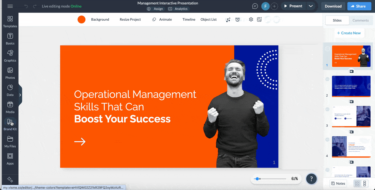
If you know exactly what you want your experience to look like, start with a blank canvas and build it from scratch.
You can drop in shapes, icons, photos, charts or entire layouts to match your brand.
But if you prefer a faster, more guided approach, start with a template.
Visme offers thousands of templates for interactive presentations, infographics, reports, case studies, e-books, brochures, charts, maps, forms and other types of visual content.
Pick one that fits your story and replace the placeholder text and visuals with your own content. This shortcut alone saves hours of design time.
Once you’ve picked a template, start by replacing the placeholder text with your own copy.
This is where you shape the story and set the tone for the interactive experience you’re about to build.
After that, bring in your branding. Add your logo, apply your fonts and set your colors so everything feels consistent with the rest of your content.
If you don’t have a full brand kit yet, Visme makes it easy. You can browse curated color palettes and font pairings, test a few color combinations and apply the one that feels right for your business in a single click.
When you find one that works, save it to your Brand Kit so future projects stay consistent.
If you want the branding done automatically, Visme’s AI Brand Wizard can handle it for you. Type in your website URL, and it pulls your logo, fonts and color combinations directly from your site. Within seconds, you have a ready-made brand kit you can use across all your interactive content.
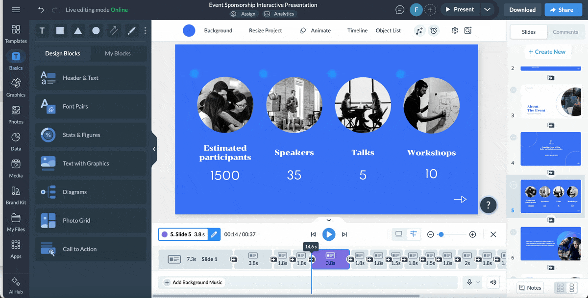
This is where your interactive content starts to feel alive.
Visme gives you a huge library of visuals you can drag straight into your project. You’ll find animated icons, 3D graphics, characters, shapes, gestures, wireframes, illustrations and avatars that help break up text and guide your viewer through the experience.
You also have access to more than a million stock photos and videos, including GIFs, mockups, cutouts, product shots and background images.
These assets help fill in the visual gaps and make your project feel polished without needing outside design support. Even if you don’t find the right assets to tell your story, Visme’s AI image generator can create a unique visual based on your prompt.
For content that includes data, Visme lets you turn raw numbers into visuals people actually want to explore. Choose from more than 40 chart types, including bar charts, timelines, heatmaps and progress rings.
If you want something more eye-catching, experiment with the 3D chart options to highlight growth, performance or comparisons in a way that feels bold and modern.
Once your visuals and text are in place, the next step is shaping how people move through the content.
Interactivity lets you control that experience, helping viewers click, hover or tap their way through the information instead of passively scrolling past it.
Visme makes this surprisingly simple.
For projects that rely on lots of data, create interactive charts, graphs and maps. They let viewers hover, click or explore different parts of the information. You can even switch to 3D formats when you want to create an immersive experience.
If your story involves people, Visme’s 3D character creator lets you build and drop in fully animated characters with gestures and reactions that guide your audience through each step. These elements even support animated entry and exit effects or 3D characters, which makes the interaction feel more dynamic and engaging.
They also pair well with other elements like animated icons, illustrations and special effects that add personality and motion to your design.
To make your content more accessible, you can add a QR code that leads to a landing page, a sign-up form or another part of the experience.
And when you need to collect meaningful user data, create polls, quizzes and forms and embed them on your website and landing page using Visme’s interactive form builder.
Once your interactive content is ready, the next step is getting it in front of the right people. Visme makes that part flexible so you can publish, share or embed your project wherever it needs to live.
You can share it publicly with a simple online link, which is ideal for interactive blog posts, newsletters or social content. If you want more control, you can keep it private and share it through a protected link, add a password or set access for specific viewers.
If the interactive piece needs to live on your website or inside a landing page, generate an HTML code to embed it while keeping the full experience intact.
Sharing through a Visme link also unlocks built-in analytics. You can see how many people viewed your project, how long they engaged with it and which interactive elements earned the most clicks. These valuable insights make it easy to understand what’s resonating and where you might want to refine the experience.
And if you need offline formats, you can download your project as an image, PDF, video, GIF, PPTX or HTML5 file. Visme also supports SCORM and xAPI exports, which is useful if your engaging content needs to plug into an LMS or internal training environment.
When budgets are tight, the smartest thing you can do is prioritize usefulness over complexity. Teams often assume interactive content needs to be flashy to stand out. But that’s usually what drives up cost without improving results.
The most effective interactive experiences aren’t the ones with the most animations. They’re the ones that solve a real problem for the user.
Take a simple ROI calculator, for instance. It asks for a few inputs and gives a precise result. It solves a real problem for someone trying to decide about a purchase.
When you’re planning an interactive experience, keep your focus on usefulness. Find out what question it answers, what friction it removes, what decision it supports and what insight it unlocks about the user.
Useful interactive content gives people something they can actually use. It helps them figure out a problem, compare their options, or see a personalized result that gets them closer to making a decision. That’s what drives engagement and conversions—not fancy effects or heavy animations.
AI has become one of the fastest ways to speed up interactive content production, especially when you are working with limited time, budget or design resources.
Let’s see how AI can support your interactive marketing and content strategy.
One of the easiest ways to start is by asking AI to help develop the idea.
Prompt it to recommend formats that match your goal.
You can ask questions like “What’s the best interactive format for helping buyers compare subscription tiers?” or “Give me five interactive ideas that help users evaluate their readiness for cloud migration.” Prompts like these help you pick the right structure before you design anything.
AI can also help you plan how the experience unfolds.
For quizzes or assessments, you can ask it to generate question sets based on user intent, pain points or industry needs.
If you are building an ROI calculator, AI can outline the fields you need and suggest user-friendly language. For interactive reports or annual reviews, AI can break long sections into manageable chapters that work well with click-to-reveal or scroll-based storytelling.
AI image tools make it easy to create visuals that feel customized rather than generic.
You can generate scenes, mockups, characters or icons that fit your narrative without hiring a designer.
This is especially valuable for product tours, virtual walkthroughs, personalized experiences or interactive stories. Instead of relying only on stock images, you end up with visuals that are purpose-built.
Small pieces of text often shape how users perceive an interactive experience.
Tooltips, button labels, pop-up instructions, calculator prompts, quiz explanations and error states are easy to overlook.
AI writing tools like Visme’s AI writer can draft and refine this microcopy quickly so your experience feels clear and consistent from beginning to end.
Creating interactive content that truly works comes down to applying the same principles the experts use every day.
Here are some of the most valuable lessons from marketers, designers and content leaders who build high-performing interactive experiences.
Before choosing a format, understand what your audience is actually trying to figure out.
Don’t just brainstorm formats; start by mapping customer questions. Pull actual queries from sales calls, search console data, user data or customer success tickets.
Here’s Kristina Barron, an experiential marketer leans on this in her work:
I often create interactive experiences at events through photo booths that allow guests to instantly see, print, or share their photos. It becomes part of the entertainment, not just a service.”
The more your interactive content answers real questions, the more valuable it becomes.
Not every animation qualifies as interactivity. A real interactive element needs to play an active role in the story you’re telling.
Alejandra Mariscalez, Head of Design at Visme, puts it in simple terms:
“Some people confuse interactivity with simple animations or special effects and forget the most important part — having the user interact with elements to uncover a message. The magic of e-learning is keeping users interested and involved so they truly absorb the information.”
If the interaction doesn’t reveal something, guide a decision or deepen understanding, it’s noise that gets in the way of the experience.
The fastest way to kill an interactive experience is asking for too much, too early. When users feel like they’re being interrogated, they bounce.
Rob Brooks, Jeanius Marketeer at Double Denim Marketing, reminds us:
“You don't want to overwhelm your prospects with too many questions or complicated requests. If you keep your ask simple, users will supply the precise information to qualify your leads.”
In other words, give value first, then ask for what you need. When users feel like they’re getting something useful, they’re far more willing to share the right information at the right moment.
Even the most beautiful interactive asset will fail if users can’t figure out how to navigate it.
Mahnoor Sheikh, seasoned content strategist, emphasizes keeping the user’s journey front and center:
“If there’s one thing I never skip when planning interactive content, it’s thinking about how the end user is going to interact with it. If it’s an interactive report, how will they know where to click to expand the information? Do they need instructions, arrows or tooltips? How can we make the whole experience intuitive without compromising the content’s quality or aesthetic appeal?”
Her point is simple: interactivity should guide people, not confuse them. The easier your experience is to navigate, the more likely your audience will stay engaged.
An interactive activity is any type of content that invites the user to participate instead of simply reading or watching. It might ask them to click, choose an option, answer a question, enter information or explore different sections. The experience responds based on their actions.
Examples include quizzes, calculators, clickable infographics, polls, assessments, hotspots, shoppable videos and interactive maps.
Most interactive experiences fall into four main levels:
Linear content moves in a single direction. The user starts at the beginning and follows the content to the end without making choices. This includes blog posts, PDFs, ebooks and standard videos.
Interactive content allows users to guide their own path. They can open sections in any order, reveal details when they want them, enter information or choose what they see next. Linear content presents information; interactive content lets users explore it.
Canva supports basic interactivity such as clickable links, simple navigation and light animations. These features are useful for presentations or simple visual projects.
However, Canva does not support deeper interactive experiences such as quizzes, forms, ROI calculators, hotspots, branching journeys, interactive charts, scroll-triggered animations or virtual walkthroughs. For those formats, you need a platform built specifically for interactivity, such as Visme.
Interactive content works for one simple reason: people remember what they experience.
And in a crowded digital world where attention is expensive, that kind of impact is hard to beat.
If the real-world examples in this guide proved anything, it’s that interactivity isn’t limited to big-budget teams or tech-heavy brands.
Any marketer can use it to build experiences their audience can participate in.
And when you’re ready to create those moments, Visme makes it a breeze. You get access to a wide range of AI tools and interactive features like animations, popups, hover effects, hotspots, clickable media, 3D characters and more — all built directly into the editor.
You can design clickable infographics, quizzes, shoppable videos, product tours, interactive reports, virtual experience centers and plenty of other formats without writing a single line of code.
With Visme’s drag-and-drop editor, you have the freedom to experiment, the speed to iterate and the tools to publish interactive content that actually stands out.
Create an account to start building interactive experiences that drive conversions. Or book a demo to discover how to leverage the power of interactive content to deliver better marketing results?
Design visual brand experiences for your business whether you are a seasoned designer or a total novice.
Try Visme for free
![The Best Interactive Content Platforms in 2025 [Tested & Reviewed]](https://visme.co/blog/wp-content/uploads/2025/10/The-Best-Interactive-Content-Platforms-in-2025-Thumbnail-500x280.png)


![The Best Interactive Content Platforms in 2026 [Reviewed]](https://visme.co/blog/wp-content/uploads/2025/10/The-Best-Interactive-Content-Platforms-in-2025-Thumbnail.png)