The Best Beautiful.ai Alternatives to Create AI-Powered Presentations
![How to Create & Present a Financial Presentation [+ Templates]](https://visme.co/blog/wp-content/uploads/2025/06/How-to-Create-Present-a-Financial-Presentation-Header.png)
You've got the numbers that tell an incredible story.
Maybe it's quarterly growth that's crushing expectations, a cost-saving initiative that could transform operations or investment projections that show serious potential for massive returns.
But here's the problem: 52% of meeting attendees lose interest after just 30 minutes. This means your brilliant financial analysis might be falling on deaf ears before you even get to the good stuff.
While presenting these insights, how do you get audience buy-in? I’m talking about the approving nods, the follow-up questions that show real interest and that moment when stakeholders lean forward because they finally get it.
For that to happen, your financial presentation has to draw them in and keep them engaged from start to finish.
In this comprehensive guide, we'll walk you through everything you need to know about creating and delivering impactful financial presentations. We’ve also included professionally designed templates to get you started on the right foot.
Let's get started!
A financial presentation is a business communication tool used to convey a company’s financial performance, position and projections to stakeholders and decision-makers.
These presentations are used in different settings such as:
In each setting, the presentation should be tailored to the audience and the decisions at hand.
Regardless of who you’re presenting to, the goal is always the same: to translate complex financial data into actionable insights that support strategic planning, resource allocation and informed business decisions.
In every case, financial presentations should be built to showcase achievements, identify areas of concern and rally support around strategic initiatives. A case in point is this detailed financial result presentation by Societe Generale Group.
As I mentioned above, there are various reasons why you’d need a financial deck. This also means what you’d include in each one will be different.
After reviewing dozens of financial slide decks, here are the major components that consistently show up:
Made with Visme Infographic Maker
“Financial statements are presented in the order that best indicates their significance. For example, for an asset-focused business, the balance sheet may be presented first; in contrast, for a service industry business, the income statement may be presented first.” — Valerie Boissou and Tim Phelps, Department of Professional Practice, KPMG LLP
This means the order of your financial data should be strategic, not fixed. Tailor the sequence to highlight what matters most to your audience based on your industry and business model.
Before you so much as open PowerPoint or pull numbers from your ERP, stop and ask yourself one critical question: Why are you giving this presentation and to whom? This is the lens through which every single decision must be made.
The goals of a financial presentation can range widely. You might be walking investors through a fundraising pitch or meeting with your board to review performance and set priorities for the next quarter.
For each of these scenarios, here are the possibilities:
For example, executives may want high-level insights with a focus on strategic implications. They’ll be concerned about topline trends, budget performance, forecasts and potential risks.
Investors, on the other hand, will be most interested in growth potential, margins, market trends, return on investment and milestones that drive valuation.
When you understand the purpose and who you’re presenting to, you can filter out the noise and focus only on the most relevant data points.
To get this right, don’t rely on assumptions. Schedule one-on-one alignment calls with decision-makers, stakeholders or board members. These calls don’t have to be long; 30-45 minutes is enough to understand their expectations.
If you’re building a recurring presentation, like a quarterly board report or monthly operating review, these conversations become even more important.
When that’s not feasible, do the next best thing.
Review previous presentations, analyze which sections sparked the most discussion and spot which areas drew blank stares.
Was there a slide that everyone asked about? Use that feedback to inform your next financial presentation ideas.
Now is the time to roll up your sleeves and start digging into the numbers.
Start by pulling together your foundational financial documents: income statement (or profit and loss), balance sheet and cash flow statement. You can typically extract this data from your ERP, accounting software, finance dashboards or BI (business Intelligence) tools like Tableau, Power BI or Looker.
Depending on the goal of your presentation, you might also need operational context, such as:
This type of data should be readily available in your CRM platform, marketing dashboard, HR systems and internal team reports.
When assessing performance, even in partnerships, the team at McKinsey & Company recommends building a dashboard that sparks insightful discussions among partners about possible interventions and serves as a dynamic resource for regularly checking the partnership's health.
"The team designing and overseeing the health-check process should build a dashboard that leaders on both sides of the relationship can access easily. It can be created manually and distributed as a PowerPoint presentation or shared in a digital format—either way, it should reflect the metrics most relevant to evaluating the partnership's ability to fulfill its objectives."
If this isn’t your first time doing a financial report, you can use previous decks, reports and feedback to get a clue about what to include.
Once you've got the raw data, don’t just slam it on your slides—at least not yet.
Organize everything in a master spreadsheet or dashboard. Create tabs for each core area and label the sources and assumptions. This becomes your source of truth throughout the project.
Afterwards, spend time analyzing it and asking the right questions as you go along.
To get valuable insights, I recommend scheduling a meeting with internal stakeholders, including accountants, the FP&A team, sales and marketing leaders and product teams.
Ask questions like: What’s the real story here? Why was there a spike in this month or quarter? Are margins improving quarter over quarter or was last month an anomaly?
Look for inflection points, anomalies, patterns and surprises. These conversations will provide context that numbers alone won’t reveal.
During your analysis, tools like Excel, Google Sheets, Tableau or financial modeling platforms can come in handy. You can use them to create pivot tables, run trend lines, calculate growth rates, map out budget versus actual comparisons and flag variances.
Before moving to your presentation design, audit your data for accuracy and completeness. Errors in your data can hurt your credibility.
Here’s a checklist you can use:
Involve at least one other person (e.g., the CFO, finance manager or department lead) to review the slide. A second set of eyes will help catch significant errors.
The most successful and memorable presentations have one thing in common: they tell a compelling story. And yes, this applies even when you’re presenting numbers.
Storytelling isn’t just for TED talks or sales decks. It’s one of the most powerful tools you have as a finance presenter.
And that’s because data storytelling gives numbers meaning. They help people understand why something matters, not just what happened.
When you structure your financial presentation around a narrative, your audience stays engaged, asks smarter questions and walks away with clarity.
That said, not every story structure works for every scenario. Over the years, I’ve found a few storytelling frameworks especially useful in crafting engaging financial presentations.
Made with Visme Presentation Maker
Adapted from myth and film, this structure starts with the status quo, introduces a major challenge, shows how the organization confronted it and ends with resolution or ongoing transformation. It’s especially powerful when you’re reporting on:
In practice:
You might start with last quarter’s baseline, introduce a problem like a revenue dip in your market, show the internal changes made (new pricing strategy, streamlined ops) and end with early signs of recovery or momentum. This storyline makes your leadership team the hero, demonstrating resilience and responsiveness.
This structure is built for persuasion. You define the current issue (or opportunity), offer your strategic or financial solution and end with the benefit it brings. It works best when you’re:
In practice:
Start with a challenge—maybe customer acquisition costs are rising. Then present a proposal: reallocating marketing spend toward organic content. End by highlighting the financial upside, such as better margins and stronger LTV.
This is ideal for progress tracking. You start with the past or baseline (“before”), show the current state (“after”) and explain what bridged the gap. It’s especially useful for quarterly updates, KPI reports and operational dashboards.
In practice:
Show how gross margin was 42% six months ago, how it’s now 48% and explain the changes that drove that improvement (e.g., renegotiated vendor contracts, automation or pricing changes).
This framework is ideal when the story is in the numbers. It’s about using data to walk your audience through critical financial insights with guided interpretation and recommendation at every step. It’s great for revealing trends, identifying red flags or preparing stakeholders for decisions.
Use it when you’re:
In practice:
Begin with the broader context, including market conditions, strategic goals or macroeconomic shifts. Then walk through what changed in the numbers and why it matters. Highlight red flags or wins and end with what comes next.
For example:
Case studies are the perfect blend of narrative and data. They walk your audience through a real-world scenario where your team tackled a financial challenge, implemented a strategy and achieved a measurable outcome.
This structure is especially useful when you want to build credibility and show that your approach works in practice.
Use it when you’re:
Here’s how to structure it in practice with examples:
Once you've chosen a narrative framework, you're ready to decide what content actually earns a spot in your deck.
When creating your deck, you have one clear goal: to make complex financial information digestible at a glance.
But too often, I see many finance professionals fall into the trap of overdesigning their visuals.
They pack them with elaborate color schemes, crowded labels or unnecessary effects that look impressive but confuse the audience.
"As computer scientist Ben Shneiderman said, “The purpose of visualization is insight, not pictures.”
In other words, your visuals, graphs and data visuals should do more than decorate your slides.
They should clarify insights, reveal relationships and highlight what matters most.
That said, visual storytelling still requires precision and judgment. Here are four questions you should ask yourself every time you use a data visualization:
Your chart should match the story you’re telling. Here’s a quick cheat sheet:
| Chart Type | Best For |
| Line chart | Showing trends over time |
| Bar/Column chart | Comparing categories or time periods |
| Stacked chart | Showing part-to-whole changes over time |
| Pie/Donut chart | Simple proportion splits (use sparingly) |
| Scatter plot | Highlighting correlations between variables |
Read more about the different types of charts and graphs you can use for your next presentation.
Bonus: Visme offers a wide variety of charts, widgets and other data visualization tools to tell data storytelling.
Here’s how to make it easy for your audience to interpret your data at a glance:
Visuals are persuasive, but that power cuts both ways. If your visuals feel manipulative or misleading, you risk losing credibility. Avoid these things:
Financial presentations have a reputation for being boring.
One of the easiest ways to flip that script is by making your presentation interactive. It keeps your audience focused and turns your presentation into a two-way experience.
Animations, clickable elements and dynamic charts can transform a static slide deck into a more engaging and conversational experience.
Start with subtle animations to guide the viewer’s attention where you want it. And rather than clutter your slides, create hotspots that reveal information when you click or hover on them. This way, you prevent information overload and control the pacing.
You can also add clickable elements or navigation within the deck. These are great for investor pitch decks or board presentations where you might need to jump around quickly to specific slides.
Just be careful not to go overboard with flashy transitions or effects that could distract from your message.
For example, how about having a clickable table of contents that leads to sections on revenue, expenses or forecasts? Or interactive charts that let you switch between actuals and forecasts with just a click?
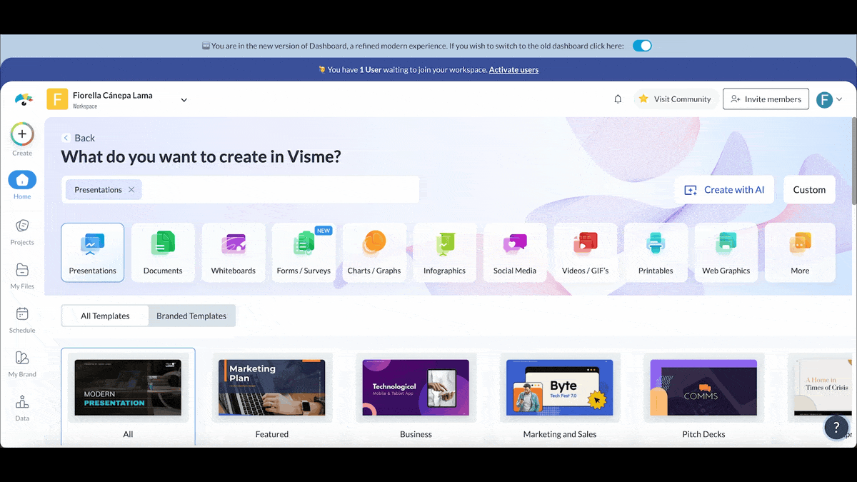
Starting with a template can dramatically cut down on design time, especially if you’re racing against the clock.
But only if you make them work for your story, your brand and your audience. Visme comes packed with an extensive library of finance presentation templates. I’ve shared a few of them below to give you a head start.
The editor is both super intuitive and beginner-friendly. All you need to do is swap in your company’s fonts, colors and logos to create visual consistency.
And with Visme’s Brand Design Tool, the process is pretty much automated. Just enter your URL and the tool pulls in all of your brand assets and saves them to your dashboard.
Once branding is sorted, update every placeholder with real, up-to-date data. Remember to double-check your charts, tables and visuals for accuracy and recency.
As you review the slides, adjust the structure to focus on what your specific audience cares about most. Ideally, each one should convey a single clear idea. The general best practice is to cut any filler slides that don’t add value.
Over time, it’s also smart to build your own set of reusable slides for common scenarios like budget vs. actuals, quarterly KPI reviews, forecasts or performance dashboards. Save them in your shared Visme workspace and give team members permissions to view, comment and make changes in real time.
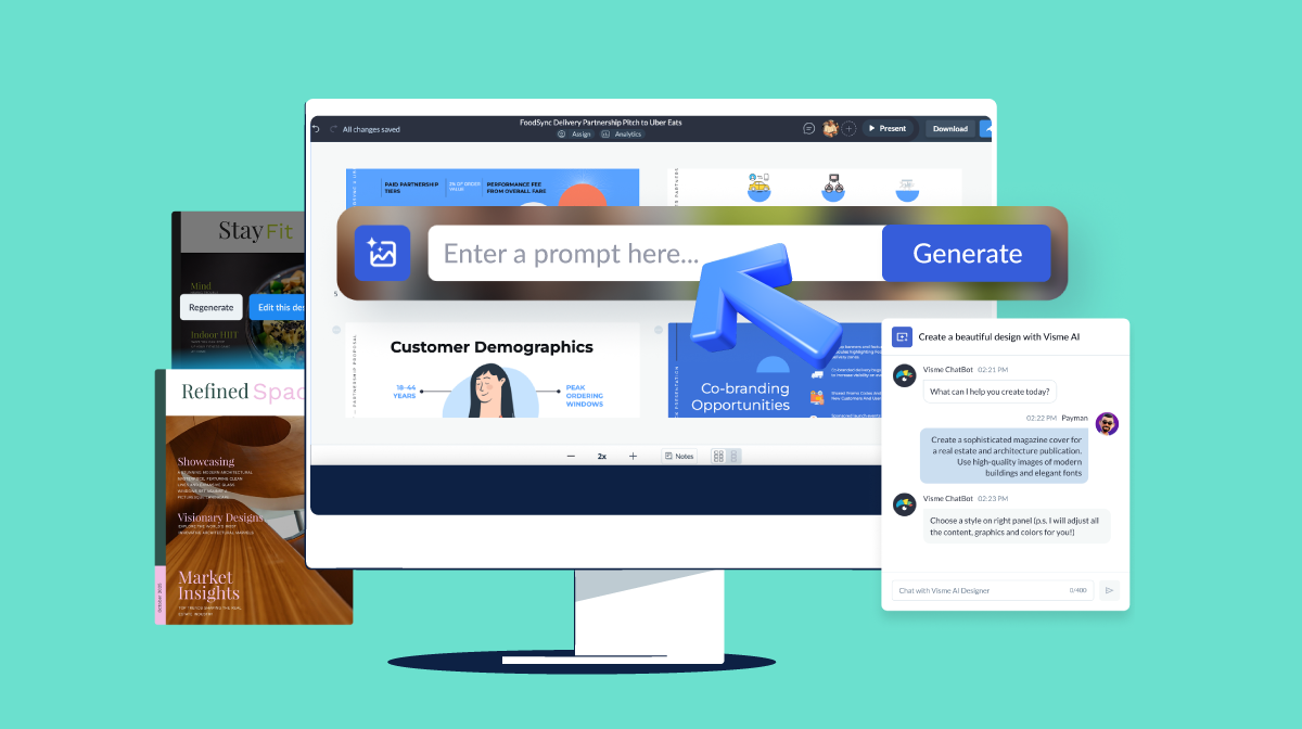
Bonus: If you’re not sold on using templates or need help with design, Visme’s AI presentation maker is your best bet. Just input your prompt, select your design and let the tool do the heavy lifting.
Check out how it works in this video below:
Now that you know what you should include in your presentation, you may be wondering how to do a finance presentation.
To get started, check out this helpful video that shares simple, practical tips for giving the best presentations:
Once you’ve watched that, follow the steps below to confidently convey your insights to the audience.
Nothing shatters your credibility or confidence like wrestling with slides when presenting to investors or execs. That’s why the best presenters leave nothing to chance.
You need to test everything multiple times.
Run through your deck on the exact equipment you'll use. Check that your charts render properly, animations run smoothly and any live dashboards or videos function without a hitch.
On D-Day, arrive early to test connections, audio and screen visibility from all angles of the room. And don’t forget to confirm that remote participants can see and hear everything clearly.
Don’t stop at having a Plan B; create multiple fallback options, as technology can go haywire when you least expect it. I recommend saving your presentation in multiple formats, such as PowerPoint, PDF and cloud versions.
Build contingency plans for audience technology challenges as well. What if remote participants can't see your screen clearly? What if the projector makes your charts look fuzzy from the back of the room?
Save offline copies of any data you're getting from live sources. Get to know your numbers well enough so you can share them without needing slides if it comes down to it.
During these types of presentations, you're bound to face questions about your assumptions, methods and the data that isn’t shown on your slides.
It’s a good idea to anticipate these questions and prepare for them. Create a backup section that breaks everything down, covers different scenarios and includes any supporting documents that could come up.
Get familiar with where all your supporting materials are so you can quickly jump to what you need.
For example, if someone asks about changes in working capital, you should be prepared to dive straight into your detailed cash flow analysis without having to hunt through your deck. While you're at it, use smooth transition phrases that buy you time while searching for data.
Before the big day, practice your whole presentation out loud instead of just thinking through it.
Run through your main points until they flow naturally. Work on how you switch from one slide to the next, simplify those tricky charts and keep track of how long each part takes using a presentation timer.
Even better, try practicing with a buddy who can act like a real audience. Have them interrupt with questions or challenge your ideas and let them point out moments where they zone out.
Practicing this way helps you stay calm under pressure and gets you used to thinking on your feet, just like you’ll need to during the actual meeting.
Don’t forget to work on your physical posture, too. Where will you stand? How will you point to your charts? Do you need to move around or stay by the screen?
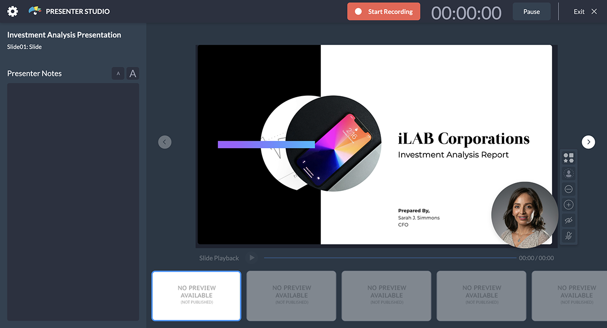
If you can, record yourself using Visme’s Presenter Studio. You'll catch things you might miss live, like fidgeting, using filler words or talking too fast.
Most importantly, treat each practice session as a chance to pump up your energy. Think about what’s exciting or surprising about your financial story. When you speak with confidence and passion, your audience pays attention. If you seem disengaged, they’ll lose interest.
When discussing numbers, people often want to jump ahead and process everything at once. Your job as the presenter is to guide them through the story step by step.
Start each major section by setting context before diving into detailed metrics.
For example, before showing quarterly revenue breakdowns, explain what market conditions or business initiatives influenced the period you're analyzing. This prevents cognitive overload and helps your audience understand not just what happened, but why it matters.
Use strategic pauses to let complex information sink in before moving to the next point. Let’s say you’re revealing a surprising statistic or significant trend; give your audience a moment to process the implications before explaining what it means for the business.
These pauses also give you an opportunity to check if anyone has questions, so you can address them right away.
Have you ever given a presentation and felt like you were losing the crowd? It happens to the best of us.
To keep your audience engaged from start to finish, you need to do two things:
Keep an eye on the audience's body language and engagement levels and adjust your delivery accordingly.
If you notice people checking phones or having side conversations, immediately shift to more compelling content or change your delivery style.
Speed up through sections that aren't resonating or slow down and add more explanation when you see confused expressions or furrowed brows.
When you notice that folks are engaged and asking good questions, lean into that energy. Focus on the details they care about most to keep the momentum going.
For example, if they are fascinated by your market share analysis, spend extra time on the competitive dynamics, even if it means cutting back on other sections. On the other hand, if the technical accounting details are causing people to zone out, focus more on the business implications and strategic insights instead of getting bogged down in methods.
Learn to distinguish between different types of questions and respond accordingly.
Clarification questions deserve immediate, direct answers. For challenging questions, take a moment to give a thoughtful response that acknowledges their concern while also backing up your points. And for tangential questions, handle those quickly and offer to provide more details offline.
Your closing sequence should turn all the data you've shared into memorable takeaways that drive future decisions.
Instead of just going over what you've already shown, pull together your findings into strategic recommendations that give your audience clear direction.I recommend picking out 2-3 major insights from your analysis.
Explain how they should shape business planning, resource allocation or strategic priorities. They should resonate with what matters most to your audience.
If your analysis shows chances for market expansion, describe what success looks like in real terms. If you’ve spotted ways to cut costs, quantify how that impacts competitiveness or the ability to invest in growth.
Wrap it up with clear next steps. Specify who needs to act, what decisions need to be made and when follow-up discussions should happen. That way, you're making sure your financial analysis leads to business action.
When creating presentation materials, it’s smart to think about how they can remain useful for different stakeholders later on.
Consider putting together a one pager for stakeholders who couldn’t attend.
Your sales one pager should highlight the key takeaways, recommended actions and strategic implications in a quick, digestible format. Then prepare a more detailed version ready for team members who need to dive into specific data.
As you prepare these versions, be intentional about keeping sensitive details under wraps. Not every chart or appendix needs to circulate. Decide which financial details are essential for follow-up conversations and which were only included to support your live presentation.
Use insights from audience engagement to create targeted follow-up communications.
If certain sections generated intense discussion or raised doubts, prepare a detailed supplementary analysis that addresses those specific concerns. If particular opportunities excited your audience, develop expanded business cases that help them turn that enthusiasm into action.
Don’t just stop there. Track which recommendations from your presentation actually get implemented and follow up on results. Share progress updates or early wins tied to your analysis whenever possible.
Finally, focus on building relationships with stakeholders who can champion your recommendations within their own teams or departments.
Next, we’ll share some financial presentation examples that you can fully customize to suit your needs.
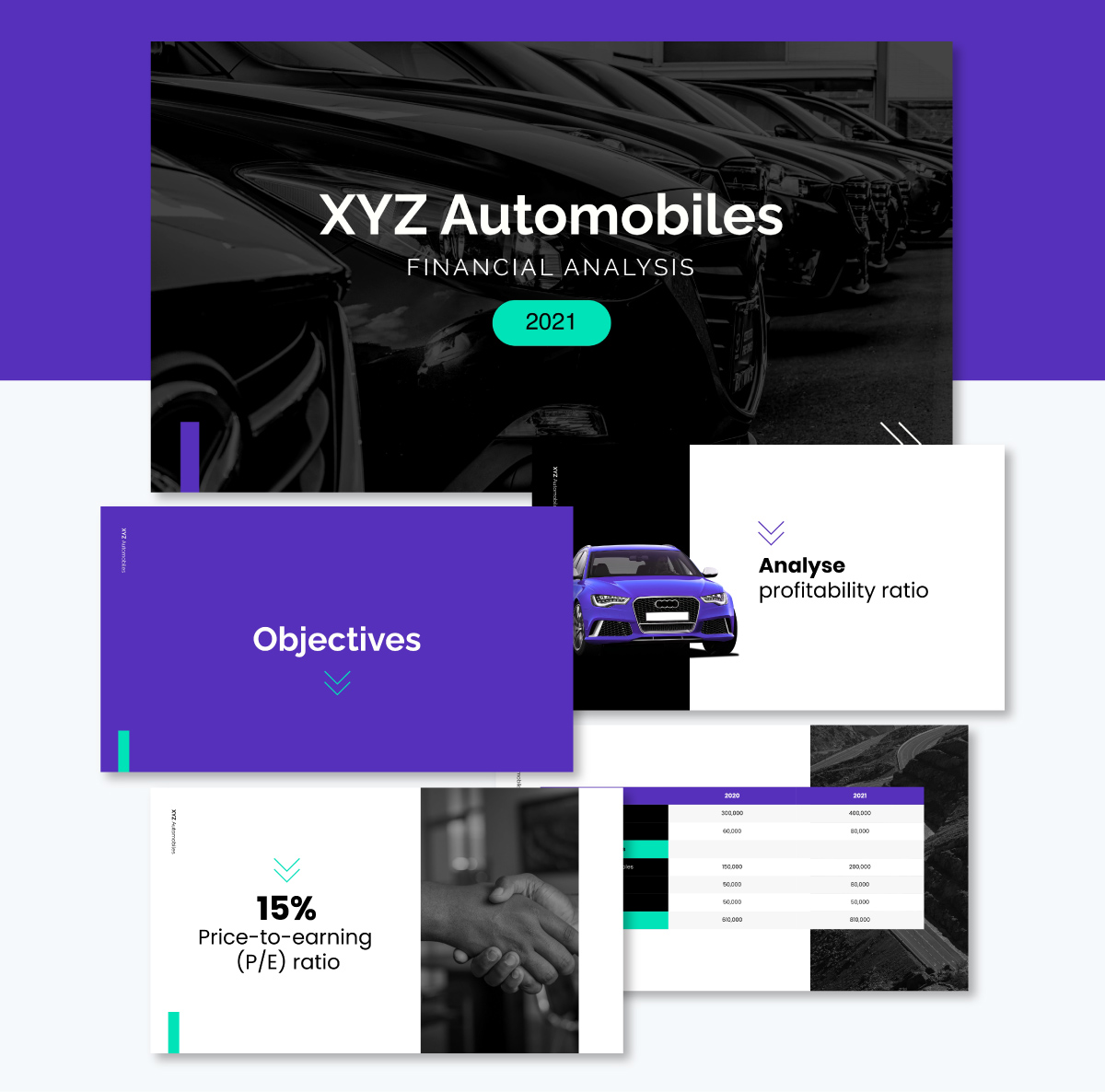
Communicate the financial viability of any project, investment or business using this template. I love how it sticks to one idea per slide, which is great for keeping your audience focused on the main points.
After covering the objective and financial highlights, it compares the assets and profitability ratios from the previous year to the current year.
The slide deck looks sharp with great color combos, nice visuals, icons and tables that makes data easily digestible. You can easily add or replace slides, swap the images, icons, colors, logos and fonts, and tweak the content to fit your specific information.
With Visme’s workflow management feature, you can assign different slides for other team members to work on, set deadlines and track their progress.
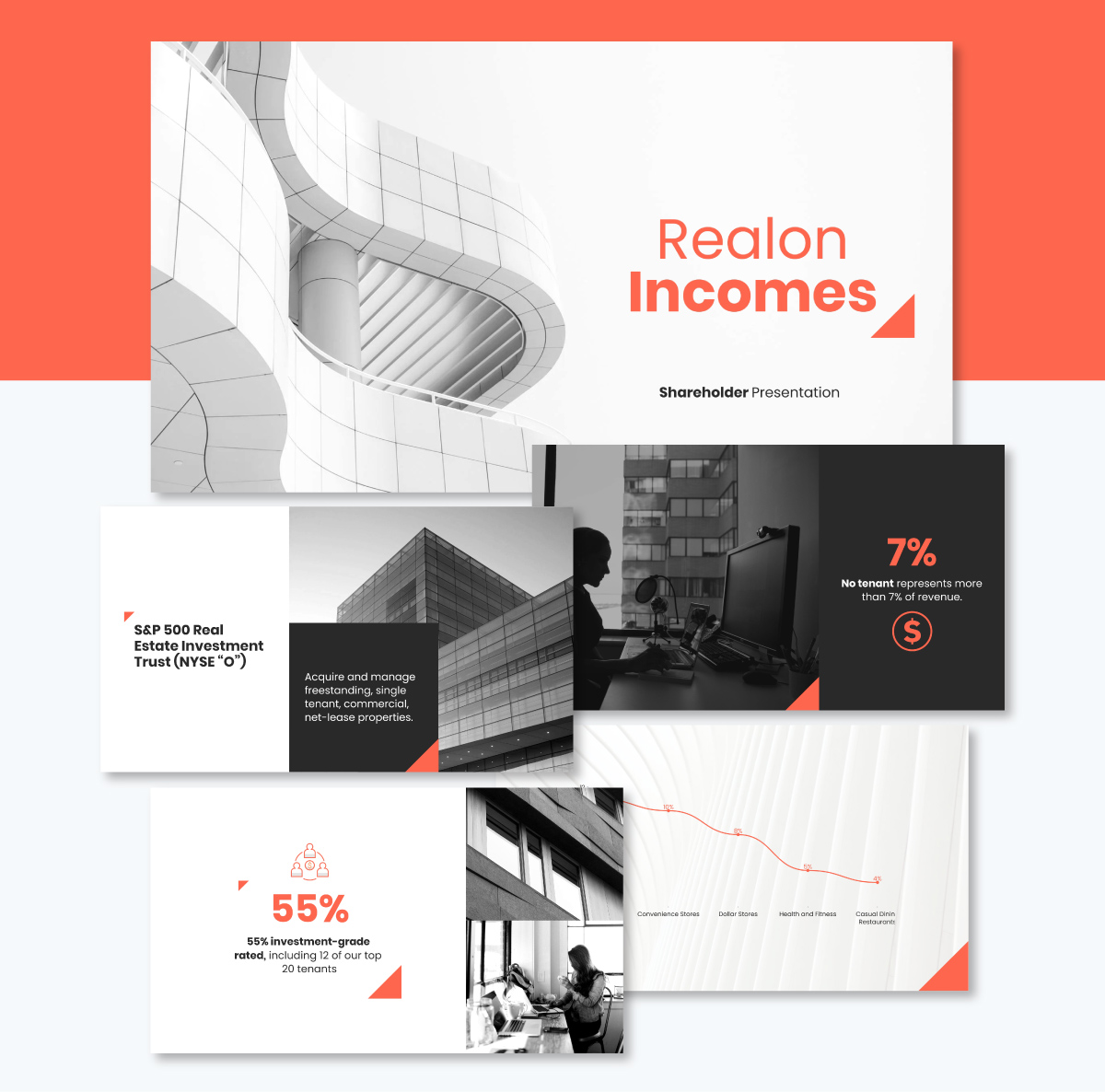
If you're gearing up to deliver a shareholder presentation, this template is a must-have. It’s perfect for sharing past performance and future projections at annual, quarterly or even monthly report meetings. And it works just as well for other executive presentations, such as pitch decks and budget presentations.
The gray and red tones create a balanced contrast that makes your data pop. It's packed with charts, graphs and visual elements that do the heavy lifting for you. The clean icons, smart layouts and plenty of white space mean your data gets the attention it deserves.
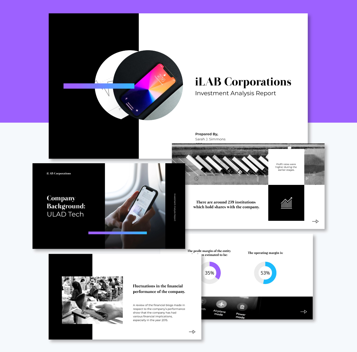
When presenting an investment analysis, you need a slide deck that keeps your audience hooked. This presentation template checks all the right boxes.
It comes with a rich blend of visuals, charts and widgets that transform complex financial data into digestible insight. You can use it to explain analytical data, share opportunities for improvement or analyze a business’s performance in the market.
I love how the design flows logically from one slide to the next. It takes all that number-heavy analysis and presents it in a format that gets your audience excited about the opportunity.
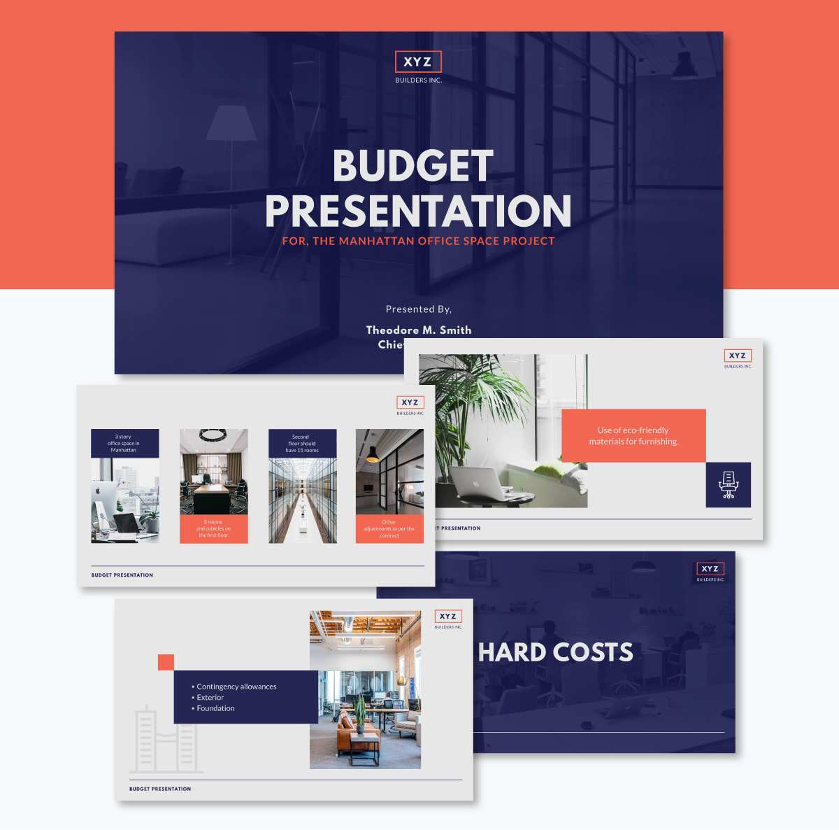
Budget presentations are usually a slog. People expect endless spreadsheets, dry numbers and slides packed with so much text that everyone zones out before you hit slide three. But this template design flips that whole script, leaning heavily on visuals with minimal text.
Clean layouts cover your project overview, any additional requests, key considerations and important notes without overwhelming readers. Every slide comes with thoughtful photos and icons that support your message.
The hard vs soft cost breakdowns are laid out in neat, bite-sized tables that actually make sense at a glance. A great addition to any data presentation.
If you need to dive deeper into the cost details, you can easily link to more comprehensive tables and reference them during your presentation. That way, your audience doesn’t have to squint at tiny numbers or get lost in the details.
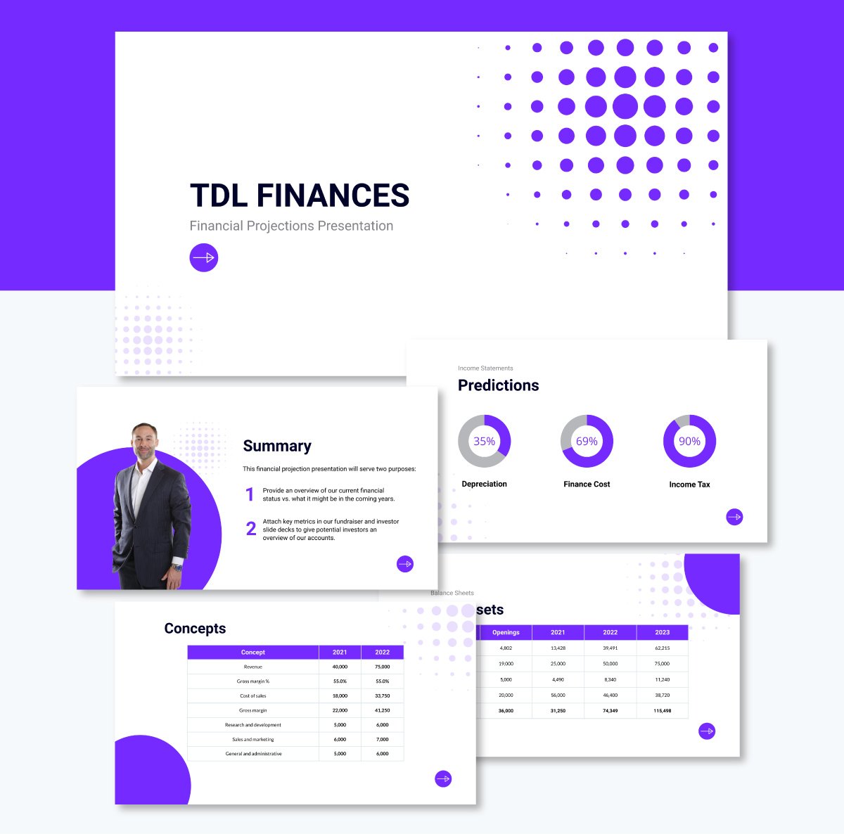
Creating financial projections on a spreadsheet is a straightforward process. But turning that into a presentation can get tricky.
This template is the perfect starting point with a clean, professional layout that covers all the essentials: your executive summary, income statement, balance sheet, plus all the assets, liabilities, equity and ratios that matter.
What makes this work is the variety of ways it presents your data. You've got charts and graphs, radial displays, plus interactive widgets and clean tables that break everything down clearly. And it's all designed to show your projections across multiple years, so people can easily see the trajectory you're mapping out.
If you have data in Excel or Google Sheets, you don’t need to copy and paste it into your slide. Simply connect it to the live data and refresh it whenever changes occur in the source sheet.
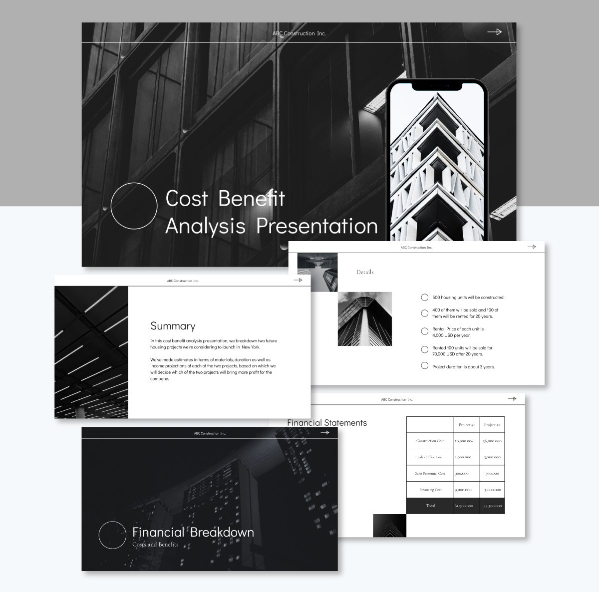
Trying to figure out if your project is actually worth pursuing? This cost-benefit analysis presentation can be an exciting way to showcase your findings and make a compelling case for your idea!
The sleek black-and-white design keeps things clean and elegant. I love how the template starts with a clear summary that sets the stage, then dives into the details of Project 1 and Project 2 side-by-side.
The financial breakdown section is where it lays out the costs for both projects in easy-to-compare formats, then shows the benefits (basically your projected income) for each option.
You can easily adapt it for SWOT analysis presentations or risk assessments, too. The structure works for any scenario where you need to compare options and make a data-driven recommendation.
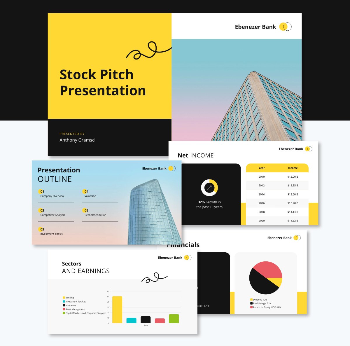
Whether you're a financial advisor or banking analyst pitching a stock, this deck’s clean layout and smart visuals make your argument stand out.
It begins with a company overview and then dives into the financials, including net income, earnings by sector and highlights that matter to investors.
I love how it includes a competitor analysis table, too, so you can compare the company to its closest rivals and provide your audience with valuable context.
The heart of the presentation is the investment thesis section. This is where you break down the reasons to buy (or not buy): growth potential, long-term stability, catalysts and risks. It's all designed to help you make a persuasive case backed by real analysis.
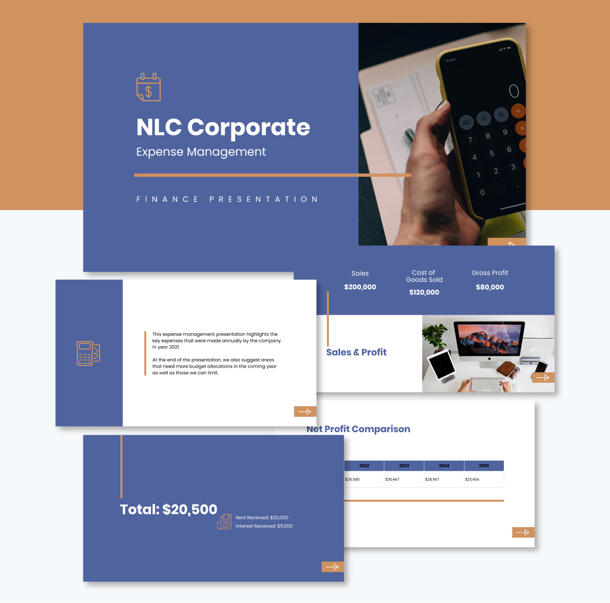
Presenting management expenses shouldn’t always be a snooze fest. Keep stakeholders engaged with this attention-grabbing presentation slide design.
It includes slides for everything from sales and profit overviews to income vs. expenses breakdowns and net profit comparisons.
There’s also space to highlight major expense areas, suggest where budgets can be reduced or reallocated and wrap things up with a Q&A slide that invites input and discussion.
What makes this template truly effective is how it uses charts, graphs, icons and even images to transform dense financial data into clear, readable insights. The flow makes it easy to walk people through your story.
You can also repurpose it to share expense management tips or forecast future spending across projects. Once the design is ready, share it using a live link or download the presentation in multiple formats, including PDF, image and PPTX.
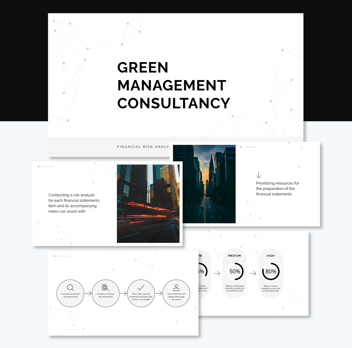
If you're looking for a smart way to communicate financial risk and help your team make better decisions, this slide deck is just the right tool to guide the conversation. With its bold, bright background and eye-catching visuals, it brings structure and clarity to what can often be a tough topic.
I love how the design helps your content stand out. There’s plenty of space for charts, diagrams and risk matrices, as well as room to break down impact levels, likelihood and recommended actions.
Beyond highlighting red flags, it’s designed to show that you’ve thought through the solutions. You can easily adapt it to present research findings, risk mitigation strategies or internal assessments across any department.
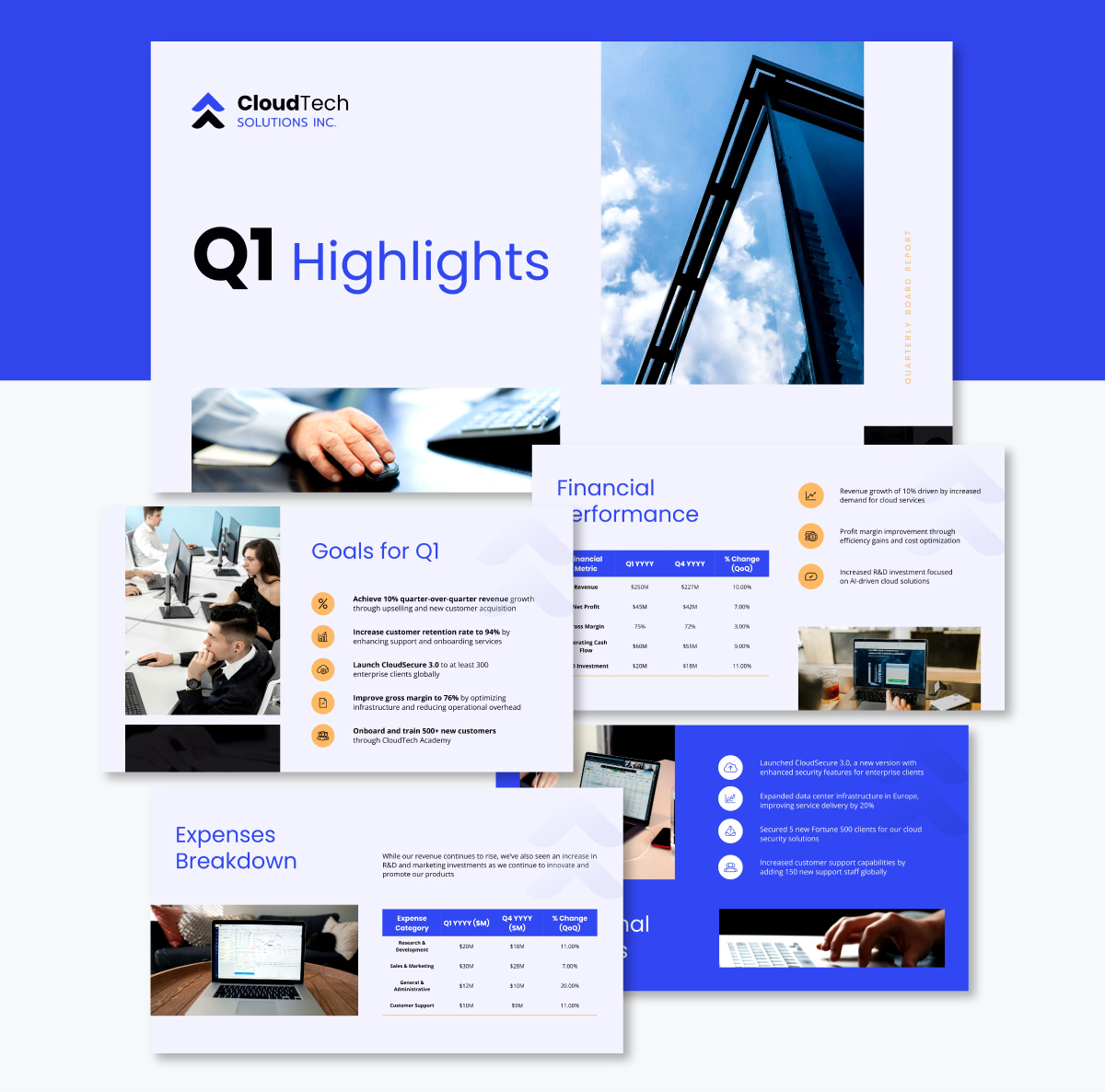
Our final pick is this beautiful design template for board reporting. This type of financial presentation is useful for sharing financials and business updates with the board of directors, senior leadership or executive stakeholders.
The template features a unique blend of soft blue and gray tones, accented with gold-colored icons that really pop on each slide. I love how the visuals are elevated by high-quality stock images, each handpicked to support the narrative. This annual report design breaks down expenses and overall financial performance in coloured tables. You’ll also find slides dedicated to quarterly goals, operational updates, product development milestones, future projections and even strategic initiatives.
And if you want something even more custom, Visme gives you access to millions of free stock photos or lets you create your own using the built-in AI image generator.
A solid financial presentation should be clean and visual while telling a story with your numbers. Think about using charts and graphs instead of dumping a ton of spreadsheets. Use clear sections like revenue, expenses and projections, and make sure it flows logically to highlight your main insights.
The best presentations keep things easy to read with plenty of white space, use consistent colors and simplify complex data so it makes sense at a glance.
First, get a clear picture of what you want to achieve and when.
Then, break it down into steps: current financial position, projected revenue streams, expected costs and key milestones you’ll hit along the way.
Use some visuals like timelines, comparison charts and a plan for different scenarios (best case, worst case and something in between). Wrap it up with specific action items and let everyone know what you need to move forward.
Follow these steps when presenting your monthly financials:
Less really is more in this case. Focus on the basics: revenue, expenses, profit or loss and cash flow. Simple charts like bar graphs and line charts work best, so skip the fancy jargon.
Just add a quick commentary to explain what the numbers mean and why they’re important. Think of it as telling a financial story in 5 slides instead of diving into a deep analysis.
There you have it! We’ve gone over how to create financial presentations that really grab your audience’s attention and deliver results.
Investing time in improving your financial presentation design and delivery skills pays off way beyond just the meeting room.
You'll find that stakeholder meetings run smoother, decision-making happens faster and your recommendations carry more weight.
The best part? You don’t have to spend hours wrestling with formatting, chart or slide design. Visme gives you all the tools you need to create beautiful and impactful financial presentations.
Check out our collection of ready-made financial industry templates that are perfect for board reports, budget reviews, cost-benefit analyses, stock pitches and more. You can easily bring your data to life with interactive charts, branded visuals, team collaboration features and even AI tools to help you make slides in a snap.
Book a demo to discover how Visme can help you create financial presentations that inspire confidence and action.
Design visual brand experiences for your business whether you are a seasoned designer or a total novice.
Try Visme for free