The Best Beautiful.ai Alternatives to Create AI-Powered Presentations

Winning business presentations drive decisions and inspire action.
But building one that hits the mark is often a source of dread for many business executives.
How much text is too much for one slide? Where should your visuals go to support your message without distracting from it? Do you kick things off with data, or ease in with a quick story? And how do you structure your slides so your audience stays tuned in from start to finish?
These are all layout considerations that often get overlooked during presentation design. If you get the layout right, you’re already setting yourself up for success. Your message flows better. Your audience is more likely to stay focused, retain the information and take action on it.
A strong layout also makes your job a lot easier. It helps you stay on track, tell a compelling story, and hit all the right points.
In this guide, we’ll walk you through what makes a great business presentation layout, highlight the best practices for designing engaging slide layouts and flag common mistakes to avoid. We’ll also show you how to create a business presentation layout faster with Visme AI.
If you’re dipping your toes in the world of presentations, watch this video to see how easy it is to create a business presentation in two minutes.
A business presentation layout refers to the strategic arrangement of various elements across your slides.
This includes how you organize text, visuals, data, graphics and design elements within your slide deck to communicate your ideas effectively.
In a business setting, your presentation layout design carries a lot of weight. Whether you’re pitching to investors, presenting quarterly results, or walking through a new strategy, a well-designed layout helps you:
When you’re not sure how to structure your presentation, business presentation templates are a solid jumping-off point. They offer ready-made layouts that make organizing your slides easier.
But don’t let them box you in. You can tweak, rearrange and style your slide to fit your brand and message.
Business presentation layouts come packed with several key elements that support your message and make your delivery engaging.
In this section, I’ll break down the building blocks of an effective business presentation layout.
1. Structure: A strong layout for a business presentation should follow a logical flow that guides your audience from start to finish.

2. Consistent Visual Design: A consistent presentation doesn’t mean everything needs to look exactly the same on every slide, but it should follow a common design language.
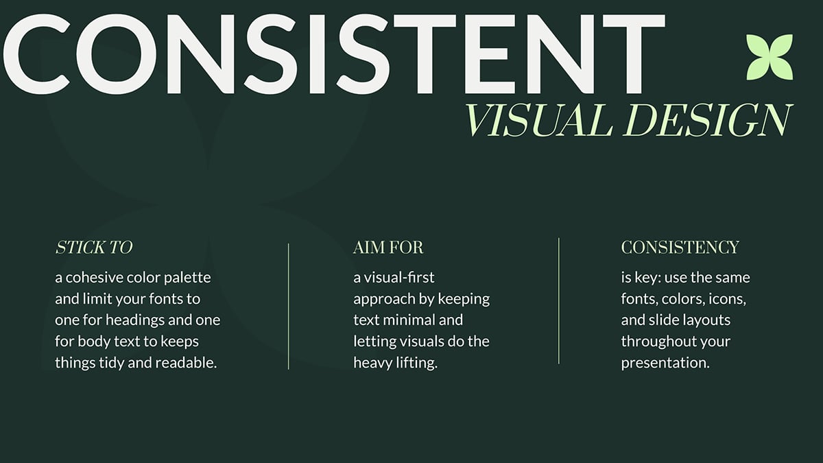 Pro Tip: Jumpstart your design with a clean, professional slide deck template that aligns with your brand’s tone and identity.
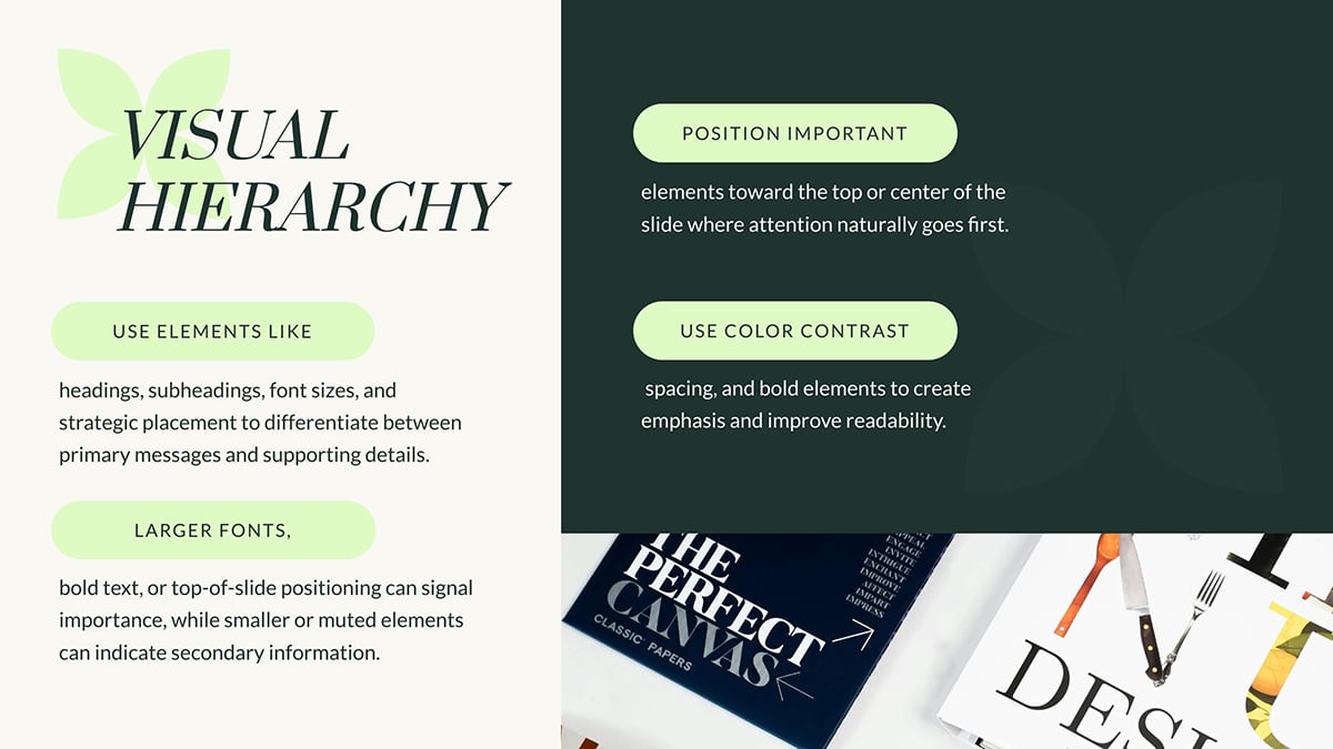
3. Visual Hierarchy: Establishing a clear visual hierarchy helps guide your audience’s attention to what matters most on each slide.
4. Engaging Visuals: Visuals are powerful tools that reinforce your message and make it more memorable.

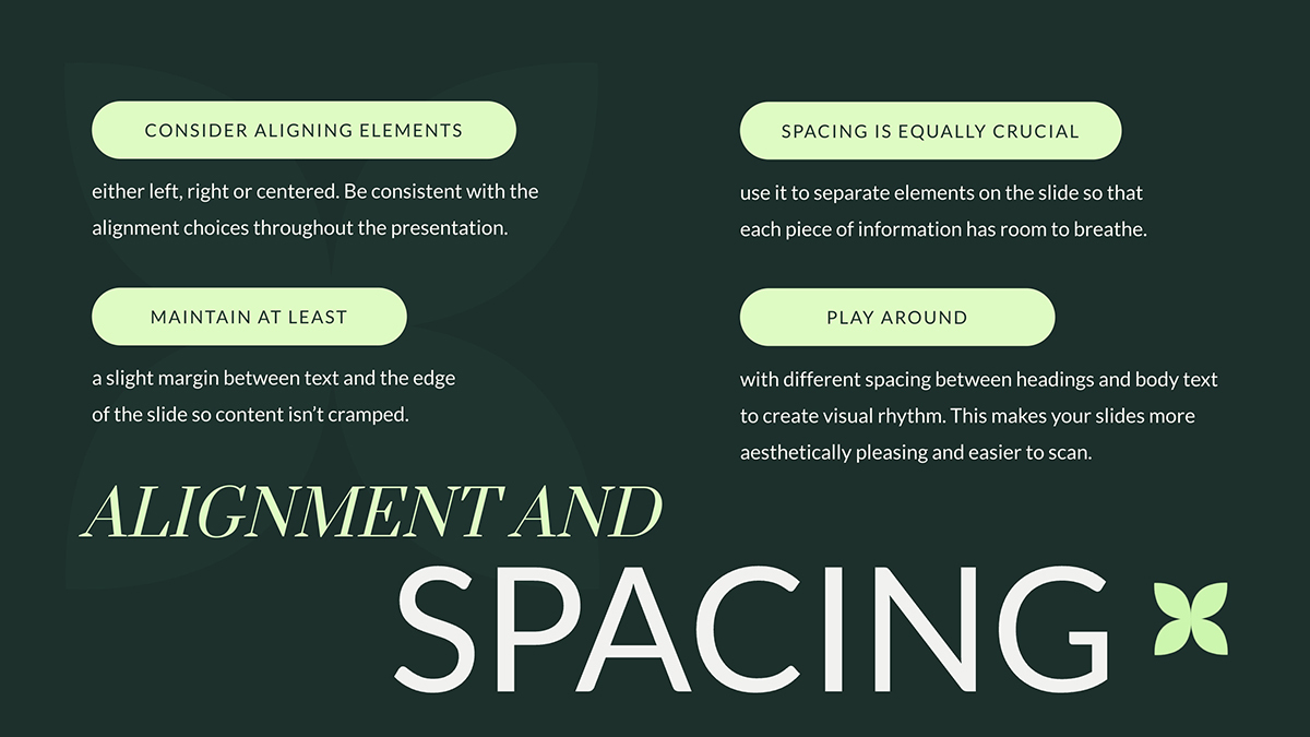
5. Alignment and Spacing: When designing your slides, always ensure text and visuals are aligned in a natural and balanced format.
6. Use of White Space: Whitespace doesn’t have to be "empty"; it’s a key tool for guiding attention.

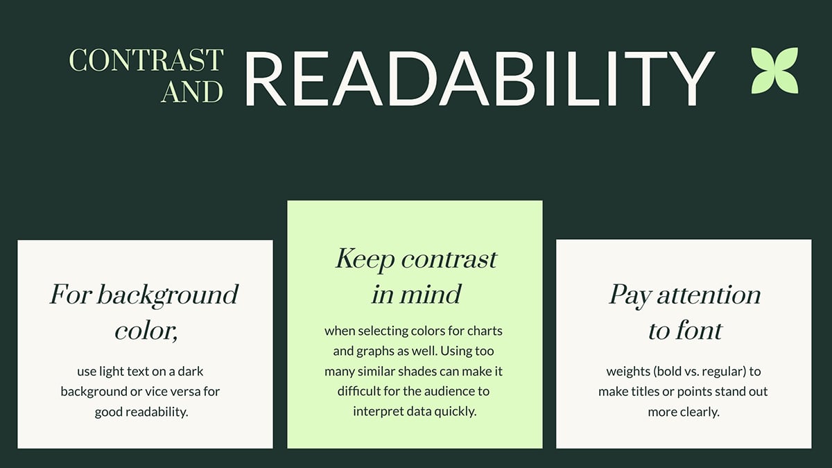
7. Contrast and Readability: Strong contrast ensures that your text stands out against backgrounds and other elements.
8. Flow and Navigation: When structuring your slides, think of the sequence as a story arc. Each slide should smoothly lead to the next without unnecessary backtracking.

9. Clarity of Purpose: Each slide should have a single purpose and message that aligns with your overall presentation goal.
Instead of trying to fit multiple ideas, focus on one key takeaway and build the slide around that. For example, if your goal is to explain a process, break it down into clear, manageable steps and use visuals like diagrams or flowcharts to simplify the concept. Read this article to discover the different types of flowcharts you can use to map out your process.
Now that you have a grip on what a business presentation layout is and its key elements, let's arm you with important best practices.
These tried and tested presentation layout ideas will help make sure your deck is on point and your delivery is flawless.
Let’s get on with it.
According to Guy Kawasaki, “A PowerPoint presentation should have ten slides, last no more than twenty minutes, and contain no font smaller than thirty points.”
Guy Kawasaki’s famous 10/20/30 Rule is a presentation classic — and for good reason. It forces you to:
Let’s break this best practice down for better understanding:
This template is a solid example of Kawasaki’s 10/20/30 rule in action. It sticks to fewer than 10 slides and uses font sizes that are easy to read, even from the back of the room.
This principle is used in photography, film, graphic design, and yes, presentations. It helps you create harmony on every slide, even if you're not trained in design.
Here’s the idea: imagine a tic-tac-toe grid laid over your slide — three rows, three columns, nine equal sections. The points where the lines intersect? Those are the natural focal points where the human eye instinctively lands.
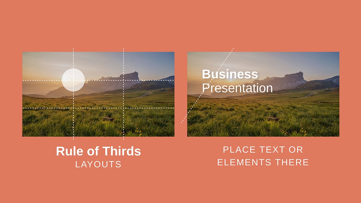
So instead of centering everything like a school project, align your most important elements like this:
So the next time you're arranging elements on a slide, don’t just eyeball it. Think in thirds and watch your design pop.

If you try to cram in five different ideas at once, your audience won’t remember any of them. It’s like trying to read five billboards while speeding down the highway.
You guessed it! It will be overwhelming, chaotic, and forgettable.
Treat each slide like a mini billboard or a social media post. And within seconds, your audience should know exactly what the point is.
Here’s what that looks like in practice:
When you present this way, each slide moves the story up a gear. You control the flow. You decide the pace.
And your audience? They stay engaged because they’re not being asked to juggle multiple ideas at once.
The Tinder slide deck below does a great job of sticking to one clear idea per slide.
This is another best practice that helps you overcome Death by PowerPoint.
It's backed by science as well. Dr. Richard Mayer, a pioneer in multimedia learning, found that people retain information better when relevant visuals are paired with concise text.
When you lean into visuals, your slides become easier to process, easier to follow and a lot more memorable.
One word of caution, though. Just because it’s visual doesn’t mean it’s valuable.
A crystal-clear chart can make your message click in seconds. But a blurry stock photo or a cluttered pie chart is literally a visual noise.
Here’s what makes up impactful visuals:
If you need a paragraph to explain your visual, it’s the wrong one. A strong visual should speak for itself. One glance, and the audience should get it. No need to talk in circles trying to explain what that chart was supposed to show.
And finally, avoid visual overload. Too many charts on one slide or too many icons in a row is chaos. Pick one visual per slide and make it count.
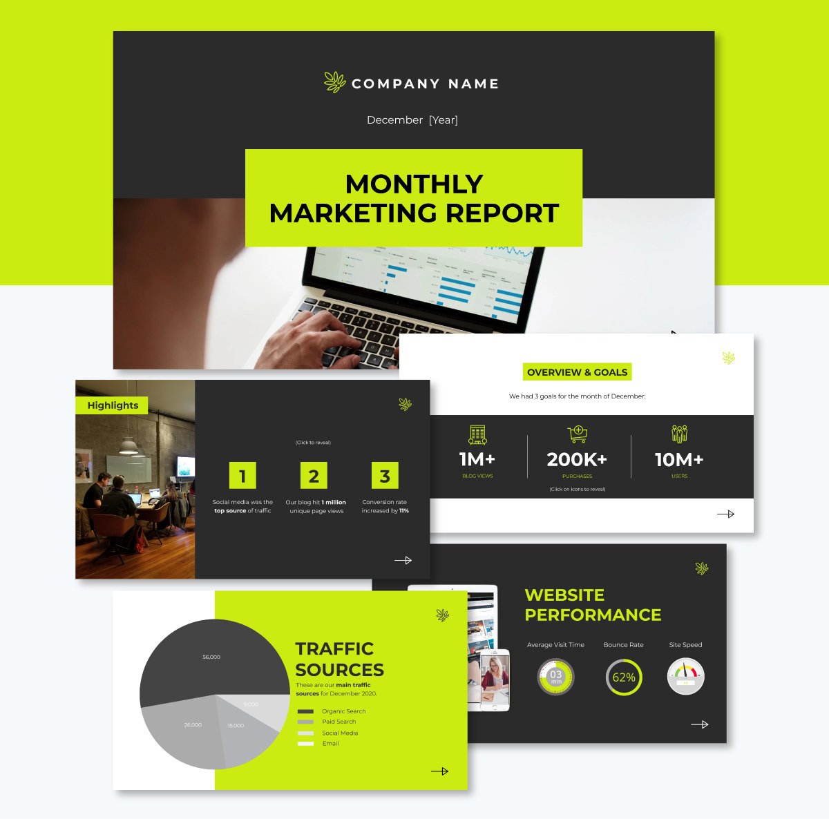
Check out how this presentation deck incorporates a mix of high-quality visuals on every slide, including charts, icons, maps, images and a visual timeline.


Data makes you credible. But storytelling is what makes your business presentation memorable.
Think of your presentation like a journey. You're not just dumping facts on your audience; you're taking them somewhere. There should be a starting point, a destination and something meaningful in between.
As Chris Anderson, head of TED, puts it:
“We all know that humans are wired to listen to stories, and metaphors abound for the narrative structures that work best to engage people. When I think about compelling presentations, I think about taking an audience on a journey. A successful talk is a little miracle—people see the world differently afterward.”
The best presentations begin by meeting the audience where they are.
Ask yourself: What do they already know? Why should they care? If you start too high-level or too deep in the weeds, you’ll lose them before you even get going. Instead, anchor your topic in something relatable.
But beware the biggest trap: trying to say too much. Don’t give your audience a tour of your entire industry or life’s work.
One big idea, well told, always beats a scattershot list of facts. So go narrow and get specific.
“If you try to cram in everything you know, you won’t have time to include key details... instead, go deeper. Give more detail.”- Chris Anderson, head of TED.
On the flip side, don’t over-explain either. Trust your audience to connect the dots. Let them draw their own conclusions. That’s how you create engagement and spark curiosity that lasts beyond the final slide.
Your audience doesn’t want to sit through a monologue. They want to engage.
When they become part of the experience, your message sticks longer and hits harder.
Interactivity is one of the fastest ways to boost retention and attention. Here’s how to use it in your presentation. :
As for animations in business presentations? Use them sparingly and with purpose. Stick to one transition style for your entire deck so the attention is on the content not the effects.
Only animate key points that need emphasis. A stat reveal, a product breakdown, a step-by-step flow — those moments earn a subtle entrance.

Want more interactive presentation ideas? Read this article with 20 creative ways to make your next presentation interactive.
Here’s a breakdown of business presentation layout examples tailored to specific project types

This pitch deck presentation template was recreated from Airbnb’s famous pitch deck — the same one that helped them raise $600k in early funding.
Inside, you’ll find all the essentials: clean, professional slides packed with high-quality vector icons, sleek data visualizations, and modern fonts. It also showcases a breathtaking slide layout with geometric, stylized content blocks that naturally guide the viewer’s eye and make your message shine.
Structure:
Best Practice: This template taps into minimalist design to reduce noise and maximize impact. Take a page from this template’s playbook: stick to a minimalist layout and use the rule of three to simplify big ideas (like in the market size slide).
Looking for more inspiration? We’ve shared more examples in our article: 18 Best Pitch Decks From Real-Life Startups [With Templates]
This sales presentation from Office 365 makes a strong first impression with its bold color palette and clean, no-fluff messaging. It doesn’t try to say everything all at once. Instead, it zooms in on core features, one slide at a time, using simple graphics and compelling copy to get the job done.
When you’re showcasing a complex product, less really is more. Cut through the clutter. Focus on what your audience actually cares about: the problems you solve and the benefits you bring. Let your value shine—don’t bury it under bullet points.
Structure:
While the original project doesn't provide explicit slide titles, the visual flow suggests the following structure:

Gone are the days when you could slap a wall of text and clunky graphics on a slide and call it a presentation. Today, audiences expect more—and frankly, they deserve it.
This marketing presentation flips the script. The moment that bright yellow hits the screen, you’re hooked. It features elegant visuals, a versatile layout and just the right amount of flair. And every element is there to support the story and keep the audience in the focus zone from start to finish.
Structure:
Sometimes, less really is more. This executive deck from McKinsey proves that point perfectly.
Built around their “5S” marketing approach—science, simplicity, substance, speed, and story—it delivers sharp insights with minimal clutter.
Each idea gets its own slide, and the visuals do the heavy lifting. Some pages feature striking images. Others lean on bold text blocks, and a few strike a nice balance in between. But none of it feels overwhelming.
Structure:
This template is a go-to for marketing trainers, business educators, and anyone running a professional development session.
It’s built with flexibility in mind—plenty of space for detailed text without ever feeling cluttered. Contemporary design elements and a user-friendly layout help your content stand out.
Each slide has a precise visual balance. You'll find text neatly paired with high-res images—sometimes off to the right, sometimes left-aligned, top-aligned, or even layered over a full-image background. It all works together to create an engaging flow that keeps learners tuned in.
Structure:
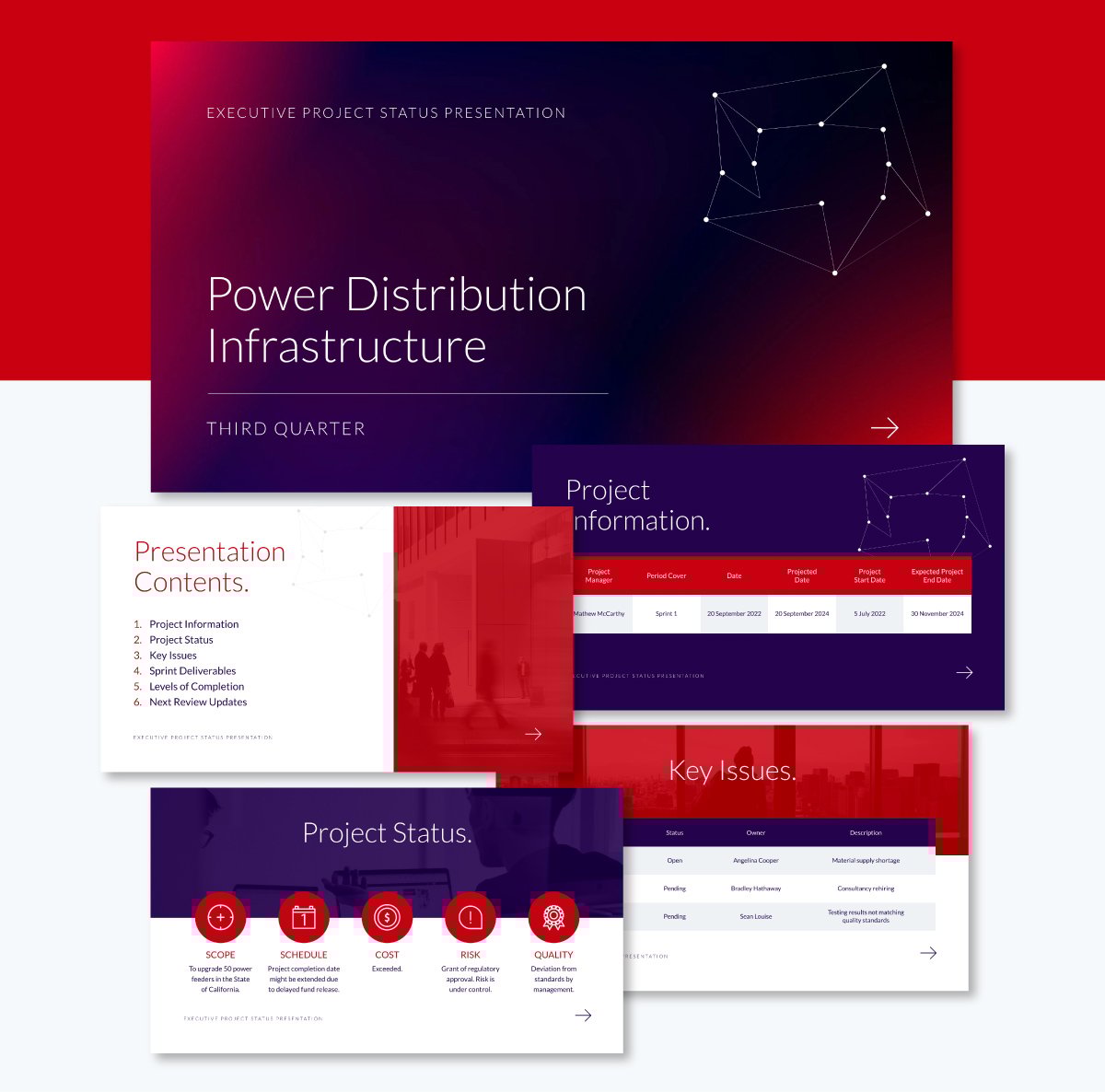
Need to deliver a sharp, no-fluff project update to execs? This business presentation structure has you covered. It’s built to help you communicate clearly and quickly, just the way busy leadership teams like it.
You can highlight key wins, current blockers, what’s coming next, and anything else that needs to be on their radar. Every slide is designed to keep things visually clean and easy to digest, using bold colors, clear charts, and just enough text to get the message across.
The color scheme features a blend of deep purple and red across the deck. Sometimes it's in the background, sometimes in headlines or design accents—it gives the whole presentation a bold but cohesive look. You’ll also find well-spaced tables, simple charts, and large fonts that make your data pop without overwhelming your viewers.
Structure:
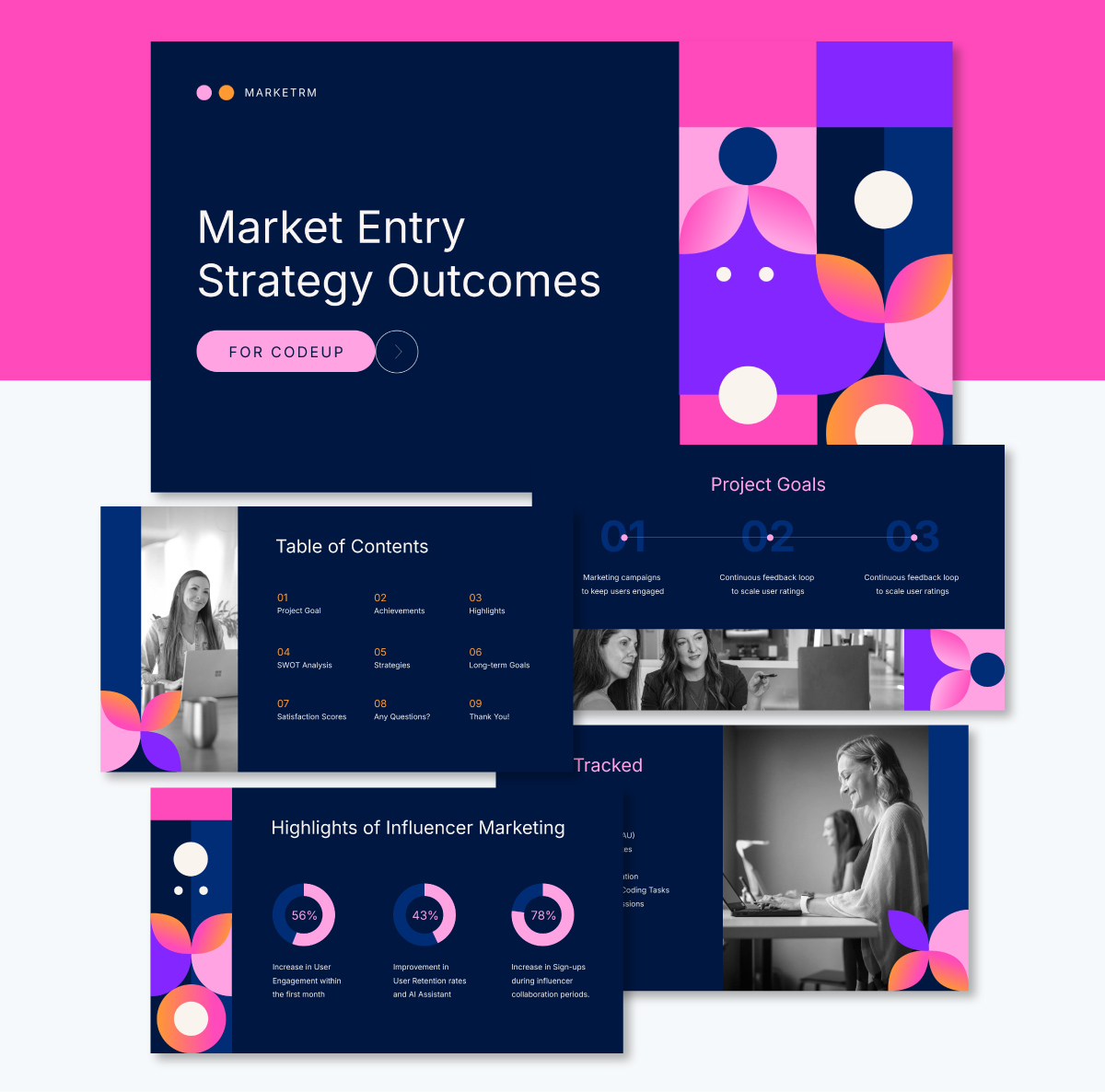
A solid strategy report goes a long way in helping teams and stakeholders get aligned on what matters: project goals, key KPIs, major wins, long-term plans, user growth and more.
It’s visually appealing too. Most slides lean on a sleek, dark blue background with pink and white text for contrast.
But here’s what really grabs attention. A few slides have a fun, pop art-inspired design. You’ll see grids filled with circles and petal-like shapes in bold colors like pink, purple, orange and white.
Structure:
Most bad presentations don’t fall apart because of poor content or delivery. They miss the mark because of how the content is laid out.
Here are some of the most common layout mistakes we see in business presentation designs, along with easy ways to fix them:
This is probably the most common offense. When you try to include every single detail on one slide, it ends up looking like a wall of text or a spreadsheet exploded.
When a slide is overloaded, your audience can’t tell what’s important. They’ll either try to read everything and miss what you're saying or tune out entirely.
How to fix it:
Nothing derails a great slide faster than a grainy photo or a cliché stock image that doesn’t relate to your content. You might think it fills the space. But instead, it makes your presentation look outdated and distracts from what you're trying to say.
How to fix it:
Choose visuals that are intentional and relevant. Use high-quality icons, data visualization and images that support your story. Even if you don’t have professional photos, you can create one from scratch using Visme’s AI Image Generator or search Visme’s extensive library of stock images.
You know you’ve lost your visual rhythm when your first slide is left-aligned, your second is centered, and your third is dancing with five font styles and six colors. When your layout jumps around like this, it’s jarring and hard to watch
How to fix it:
Decide on a layout style early on and stick with it. You can use a consistent grid system, repeat key elements like headers or icons and choose a cohesive font pair.
Your audience shouldn’t notice the design inconsistency. They should journey through it smoothly. That's how you keep their attention on your message.
If you’re new to presentation design, I recommend using professionally designed presentation templates that have a uniform design across all slides.
If everything is bold, underlined, and the same color, then nothing stands out. Visual hierarchy is what helps people know where to look first, second, and third. Without it, your audience won’t know what to focus on. And they could be missing something important because it is buried in the pile.
How to fix it:
There are tons of smart ways AI can help you whip up intuitive presentation layouts in a fraction of the time.
Tools like Visme, Canva and Beautiful.ai let you generate full slide layouts just from a text prompt. Type in your topic, and you’ll get ready-made slides with suggested visuals, structure, and design — all within minutes.
But if you’re just searching for layout ideas, you can prompt ChatGPT or another writing assistant to come up with custom outlines.
You’ll get slide titles, talking points, and even design cues to build a clean, well-structured presentation from scratch.
Here’s a quick comparison chart of the best AI presentation layout generation tools.
| Software | Key Features | Pricing | Best for | G2 Rating |
| Visme | AI-powered design tool, extensive library of templates, millions of design assets, data visualization, brand kits, animation and interactive elements, AI tools, collaboration, analytics, advanced sharing options | Free;Paid plans from $12.25/month | Businesses, startups, teams | 4.5/5 |
| Beautiful.ai | Automated design, smart slide templates, data visualization, branding, AI text generator, collaboration tools. | Paid plans start at $12/month; | Startups, agencies | N/A |
| Canva | Design generator, brand kit, collaboration tools, image generator, text generator, wide template assortment. | Free, paid plans starts at $15/month | Marketers, businesses, teams | 4.7/5 |
| Storydoc | AI design assistant, slide editing tools, analytics, integration, AI writing assistant, interactive data visualization. | Paid plans start at $24/month/user | Sales and marketing teams, startups | 4.7/5 |
| Plus AI | Google Slides and PowerPoint integration, AI slide generation, custom branding and AI-driven content suggestions, AI image generator, AI chart maker | Paid plans start at $10/user/month | Startups, sales and marketing teams, consultants, course creators | 3.2/5 |
| Gamma | AI-powered decks, smart templates, analytics, AI driven content suggestions, AI editing, AI image generation and real time collaboration. | Free; paid plans start at $8/seat/month | Businesses, educators and professionals | N/A |
| Slidesgo | Addon for Google Slides, presentation content translator, extensive collection of visuals, AI background remover. | Paid plans start at $5.99/month | Education, business and marketing teams | 4.7/5 |
| Dektopus | AI presentation assistant, magic buttons, AI image generator, chart library and content suggestion, AI-generated notes and presenter coach, custom layouts, smart collaboration tools. | Paid plans start at $14.99/month | Sales professionals,marketing managers, agencies, account executives | 4.5/5 |
| Simplified | AI design assistant, team collaboration, AI writer, AI image generator, magic resizer, brand kit, design | Paid plans start at $20/month | Marketers, small businesses, content creators, educators | 4.6/5 |
| SlidesAI | AI slide generator, AI image generator, AI text generator, Chrome extension, stock image library, animation. | Free; paid plans start at 8.33/month | Small and medium businesses, agencies, creatives | 4.5/5 |
Designing a professional presentation doesn’t have to take hours.
With Visme’s AI-powered tools, you can create polished, on-brand slides in just a few clicksand still have full control over customization.
Here’s how to do it:
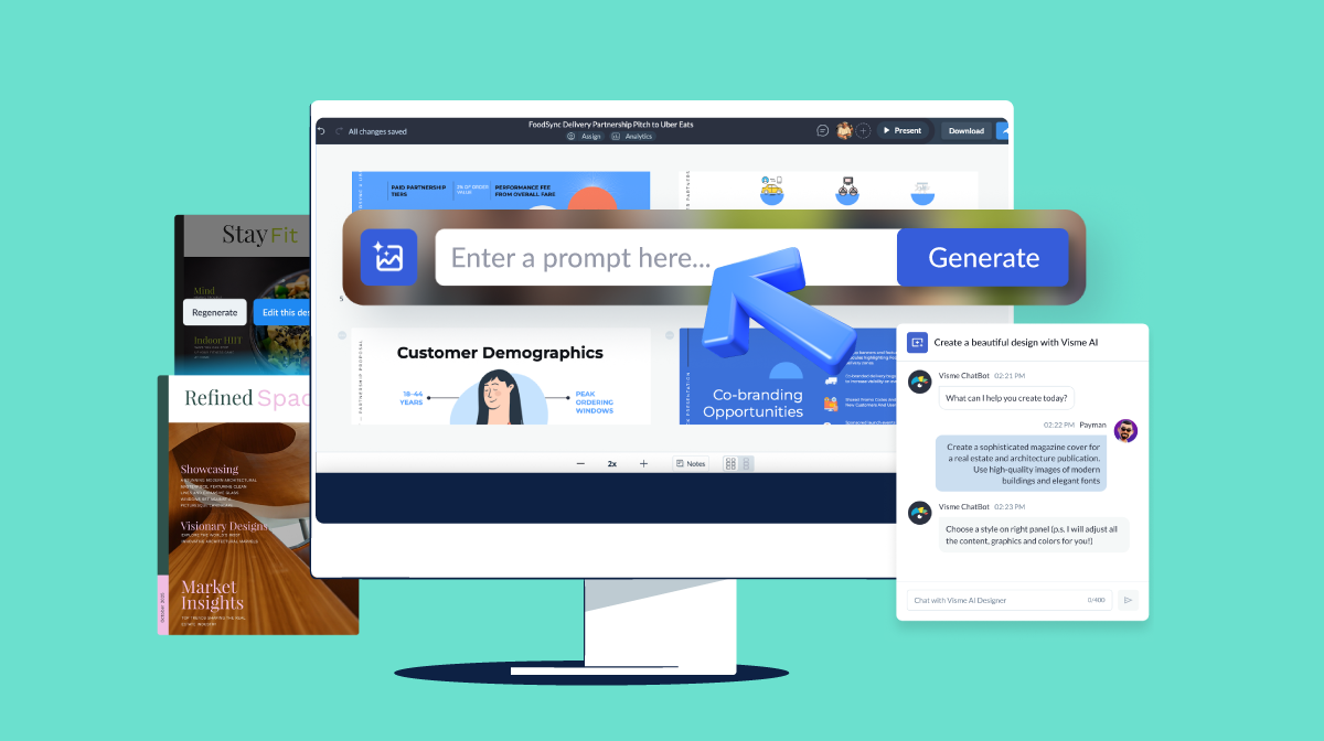
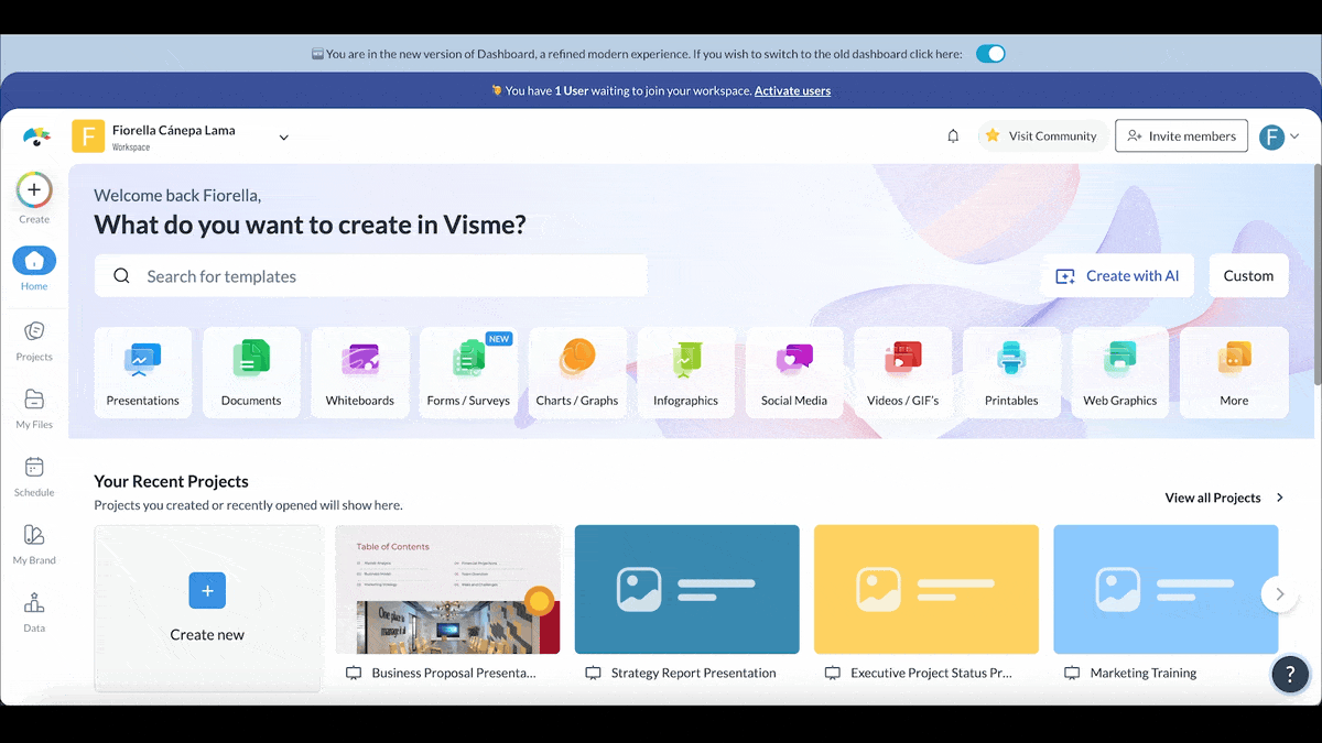
Start by logging in to your Visme dashboard. Click the Create New button, select Project, then choose Presentations. This will open up the full presentation template library.
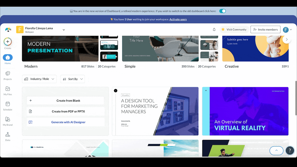
From here, scroll down until you see the Generate with AI option — this is where the magic begins.
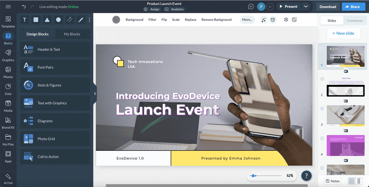
Once the AI pop-up appears, type a prompt that describes exactly what you need. The more detailed your request, the better the results. For example, instead of “Marketing presentation,” try something like, “A 10-slide presentation for a product launch event showcasing key features, market positioning, user personas, and success metrics.”
If your prompt’s a bit too vague, the AI chatbot will jump in with helpful follow-up questions to guide you.
The Visme chatbot will suggest a few design styles based on your input. Pick the one that fits your tone or brand best — whether it’s clean and modern, bold and colorful, or sleek and professional.
Once selected, the AI will generate your presentation. You’ll be able to preview the design, regenerate it with a new style or prompt, or open it directly in the Visme editor to start customizing your project.
Now it’s time to fine-tune the presentation to match your style and brand.
Need to collaborate with your team? Invite teammates to your workspace and assign roles like view, comment, or edit. With Visme’s built-in workflow management tool, you can assign slides to specific team members, set deadlines, and keep everyone on track — all within the same platform.
Once your presentation is polished and ready to go, it's time to get it in front of your audience. You can download it in multiple formats — from PowerPoint and PDF to video and interactive HTML5. Just click on the Download button in the top-right corner of the editor and choose your preferred format.
Want to share it online instead? Click Share, generate a private or public link, and send it to your audience. You can also embed it on your website or publish it as a live link that updates automatically whenever you make changes.
A business presentation format is the structure you use to organize your slides and content. Typically, it includes a title slide, an agenda or overview, the main body (with sections for key points), and a closing slide with a call-to-action or summary. A solid format helps you stay focused and makes your message easier to follow.
There’s no magic number, but a good rule of thumb is 10–15 slides for a 20–30 minute presentation. Focus more on clarity than on slide count — one idea per slide keeps things clean and easy to follow. Iff you’re presenting to executives, aim for fewer slides with more punch. And if you want a pro tip from the pros, Guy Kawasaki swears by his famous 10/20/30 rule:
The 5/5/5 rule is a simple design guideline to help you keep your slides clean, readable, and clutter-free:
It’s not a strict formula, but more of a visual pacing trick to keep your content punchy and easy to digest. The goal is to make sure your audience listens to you, not just reads off the screen. And it’s especially helpful when you’re building slides for live presentations or pitching in high-stakes meetings.
Here’s a quick breakdown of the 5Cs:
The 4 P’s stand for Planning, Preparation, Practice, and Performance.
The three general types of business presentations are:
To deliver an effective business presentation, here the key best practices to follow
Here are some key presentation don’ts to keep in mind:
Creating a business presentation from scratch may sound daunting, but with the right layout, you’re off to a good start.
In this guide, I've armed you with everything you need to create a well-structured and visually compelling presentation.
Now it's time to put it all into practice. The good news is that you don't have to build your slide deck layout from scratch.
Not when you have thousands of professionally-designed templates, millions of design assets, animation and interactive elements and dozens of other AI tools available in Visme's easy-to-use editor.
Even if you're running out of time or need help getting your design off the ground, Visme's AI presentation maker can do the heavy lifting. All it takes is a prompt and you'll have your slide deck ready in minutes.
Design visual brand experiences for your business whether you are a seasoned designer or a total novice.
Try Visme for free