


The Best Beautiful.ai Alternatives to Create AI-Powered Presentations
You've put real work into this project.
Now you need to walk a room full of decision-makers through it and get them to act.
For project managers and executives, that's a familiar pressure.
Whether you're seeking budget approval, aligning stakeholders on a new initiative, or reporting progress to leadership, how you present your project is just as important as the project itself.
With about 12% of projects failing each year, poor communication is one of the most common reasons good initiatives don’t get the backing it deserves.
A well-built project presentation gives your audience exactly what they need to make an informed decision, without wading through unnecessary information. It respects their time, earns their confidence, and moves things forward.
Ready to learn how to create successful project presentations? This guide will walk you through everything: how to structure your presentation, design slides that work, deliver with confidence, and use AI to speed up the process.
The best part is that you don't need professional design skills to create presentations with Visme. Browse through our exquisite collection of professionally designed presentation templates to get started. Or sit back, relax and let our AI presentation maker do all the hard work for you.
Here’s a short selection of 8 easy-to-edit project presentation templates you can edit, share and download with Visme. View more templates below:


Let's get to it.
A project presentation is a structured way of communicating the details of a project to an audience. That audience could be your team, a client, company executives, or potential investors.
The goal is always the same: get the people in the room (or on the call) to understand what you're building, why it matters and what you need from them.
A well-crafted project presentation gives your audience enough clarity and confidence to say yes, whether that's approving a budget, greenlighting a plan or staying aligned on next steps.
Project presentations come in different shapes depending on where you are in the process.
You might be:
Each has a slightly different purpose, but the fundamentals are the same.
Not every project situation calls for the same type of presentation. But if you strip it back and look at most project lifecycles, there are five core presentation types that are common.
These presentations are valuable to different stakeholders at different stages of your project
Executives care about results and risks. Clients want to understand the scope and what they'll get.
Project teams need to know their roles and what’s expected.
Sponsors want to make sure their investment is moving in the right direction.
Here's a full breakdown of when each presentation type comes into play and what it needs to accomplish.
| Category | Use Case | Specific Type of Presentation Needed |
|---|---|---|
| Project Initiation | You want stakeholders to approve a new project idea or secure funding. | Project Proposal Presentation |
| Project Authorization | A project has been approved and you need to formally define the scope, objectives and stakeholders. | Project Charter Presentation |
| Project Planning | You want to explain how the project will be executed, including roadmap, resources and timelines. | Project Plan Presentation |
| Project Kickoff | The project is starting and the team needs alignment on roles, deliverables and expectations. | Project Kickoff Presentation |
| Strategy & Direction | You want to communicate the long-term plan and phases of the project. | Project Roadmap Presentation |
| Project Scheduling | You want to visualize the project timeline, tasks and dependencies. | Project Timeline / Gantt Chart Presentation |
| Budget Approval | You need stakeholders to approve costs and understand resource allocation. | Project Budget / Cost Breakdown Presentation |
| Progress Reporting | Stakeholders need updates on project status, risks and achievements. | Project Status / Progress Presentation |
| Performance Evaluation | Leadership wants to assess project results, KPIs and impact. | Project Review Presentation |
| Project Completion | The project is finished and results must be documented and shared. | Project Closeout / Final Project Presentation |
There's no single template that works for every project, but most successful presentation slides follow a similar structure.
Here's what to include and why each section earns its place.

Let’s examine three project presentation examples from organizations that got it right, and what you can learn from each one.
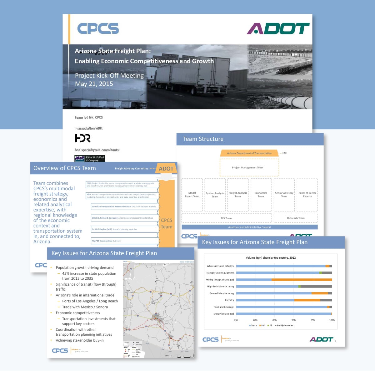
This 33-slide kickoff deck was used to align the Freight Advisory Committee on the scope and direction of Arizona's statewide freight plan. It walks through the project vision, goals and objectives, systems performance approach, top economic sectors, and a detailed work plan with phased deliverables.
The presentation is heavy on visuals. Maps, heatmaps, flowcharts, bar charts, and tables do the explaining so the slides never get bogged down in text.
A consistent blue, yellow, and grey color theme runs across all 33 slides. That gives the deck a cohesive, professional feel that holds up whether you're on slide three or slide thirty. The agenda slide also doubles as a progress tracker, with the current section highlighted in each iteration. With that, the audience always knows where they are in the presentation.
A multi-stakeholder government project with significant technical complexity still benefits from strong visual discipline. When your audience includes decision-makers who aren't deep in the data, letting the visuals do the heavy lifting keeps everyone in the room following the same thread.
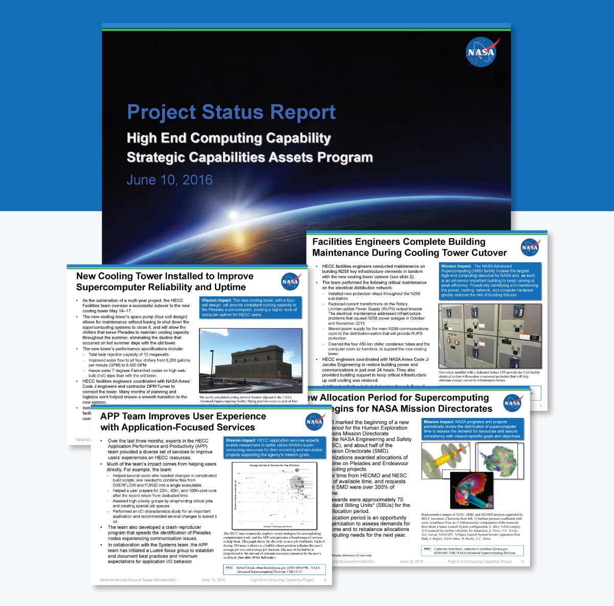
This 39-slide status report from NASA's High-End Computing Capability program covers a full month of project activity across infrastructure upgrades, system maintenance, software updates, network performance, and resource utilization. It's an excellent example of how to present highly technical information to an audience that needs the details but doesn't have time to dig for them.
Every slide follows the same format without exception: a descriptive headline, bullet points on the left, a supporting visual on the right, and a dedicated "Mission Impact" callout box that translates technical activity into plain business value. That consistency means stakeholders always know where to look.
The deck also leans heavily on data visualization. Bar charts, stacked charts, line graphs, and scatter plots show off the utilization and performance data. Essentially, the numbers tell their own story without requiring a paragraph of explanation to support them.
Consistency is an underrated presentation skill. When every slide in a status report follows the same structure, your audience stops thinking about the format and starts focusing on the content. The Mission Impact callout is a smart addition to any project context: it forces the presenter to answer the question every stakeholder is silently asking: "Why does this matter to me?"
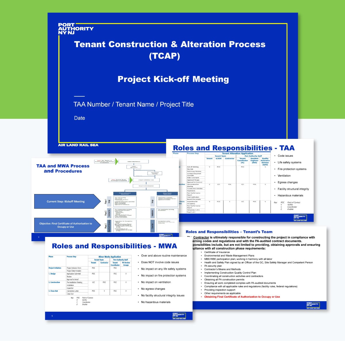
Construction projects involving a government authority come with layers of process, compliance, and coordination that can overwhelm a tenant who's never been through it before. This kickoff deck from the Port Authority of New York and New Jersey addresses that problem up front.
It walks tenants through the full construction and alteration process across three phases: Design, Construction, and Close-Out and Occupancy, covering roles and responsibilities, scope of work, facility-specific requirements, and practical hints for navigating the project successfully.
The process flowchart early in the deck maps the entire journey from lease negotiations to final certification on a single slide. Every stakeholder gets the full picture before the details begin. From there, each phase gets its own dedicated slide with a focused list of activities and supporting icons that keep the content scannable without oversimplifying it.
A kickoff presentation doesn’t have to be fancy to make an impact. This deck shines because it focuses on clarity rather than elaborate design. By the end of the meeting, tenants walk away fully informed about the process, their responsibilities at each stage, and what success looks like. That's the only job a kickoff presentation has to do confidently!
You can have the strongest project plan in the room and still lose your audience if your slides are working against you.
Design affects how people feel about your ideas before they've processed a single word.
Here are the slide design best practices experts swear by.
Cramming multiple points on one slide is a common presentation mistake. When a slide tries to say everything, it ends up communicating nothing.
Guy Kawasaki's 10/20/30 rule recommends: 10 slides, no more than 20 minutes, and a minimum font size of 30 points. Seth Godin takes it even further, suggesting no more than six words per slide. Both rules are pushing toward the same outcome: less text, more presence.

Kawasaki explains why it matters:
"The majority of the presentations that I see have text in a ten-point font. As much text as possible is jammed into the slide, and then the presenter reads it. However, as soon as the audience figures out that you're reading the text, it reads ahead of you because it can read faster than you can speak. The result is that you and the audience are out of sync."
That's the real problem with text-heavy project presentation slides. It's not just that they look cluttered. It's that they hand control of the presentation to the audience. Once people are reading ahead, you've lost the room.
Your slides should support what you're saying, not replace it. One idea per slide keeps your audience focused on you, where the actual presentation is happening.
Keep in mind that this isn’t an iron-clad rule for presentation. There are other rules, such as Pecha Kucha method, Takahashi method, Lessig method, etc. You can adapt any of these rules to suit your project presentation needs.
So you've cut the text down and you're working with fewer slides. The next question is: how do you communicate everything you need to say within those constraints?
Visuals are the answer. In a business project presentation, you're often dealing with timelines, budgets, performance data, and progress metrics simultaneously. It's really tough to get all of that across through text. Research shows that people retain 65% of information when it's paired with a relevant visual, compared to just 10% from text alone.
About 59% of business executives say they’d rather watch a video about a topic than read about it. Compelling visuals that capture and bring your audience’s attention right where you want it.

Take this slide deck as an example. It uses multiple Gantt charts to communicate the entire project timeline and the individual timelines for each stage. The cost summary for each stage becomes immediately digestible as a simple bar chart. You get the full picture faster than any written summary could deliver it.

And those aren't the only options. Videos, progress metrics, images, icons, infographics, and data visualizations all play different roles depending on what you're trying to communicate. The point is to match the visual to the information, not to decorate your slides.
Visuals aren't just design choices. They are communication choices that directly affect whether your audience follows along or checks out.
Kalyn Lewis, Head of Sales and Customer Experience at Visme, puts this into practice every time she presents data to stakeholders:
"I pull my data points and get things into Visme to present a better visual narrative. I keep the views simple with Visme's charts, graphs, and data widgets… I then bring in callout visuals and interactive pop-ups that drill into things more from the simple views, achieving the 'drill down.' Golden ticket is to try to predict the questions that will come up, and make sure you have data and visuals to answer those questions too."
That last point is worth holding onto. Visuals don't just help you present the information you planned for. They help you handle the questions you didn't see coming.
There are many types of visual aids you can use in your presentations, including:
Using images and videos will up your chances of getting audience engagement and positive responses to your call-to-action (CTA).
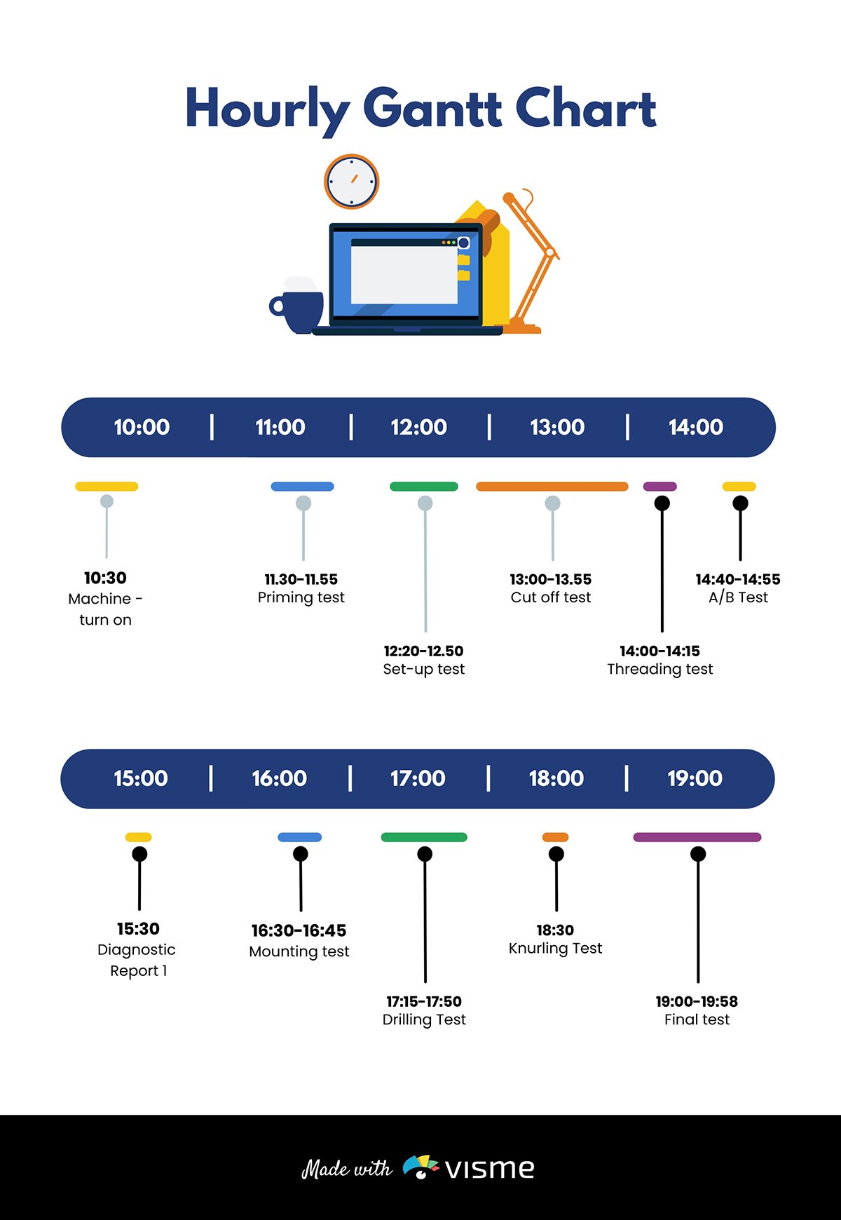
Gantt charts, whiteboard drawings and mind maps are ideal for visualizing early-stage project designs. You can use charts, diagrams, maps and trees to present the project architecture for technology-related projects.
If you’re working on product development projects, consider adding sketches, flowcharts, models and prototypes to your slide.
Pie charts are excellent for showing percentages. Vertical bar charts indicate changes over time, while horizontal bar charts help you compare quantities.
Infographics are perfect for visualizing data and explaining complex information like market trends.
Here’s the interesting part. Visme has the tools you need for every job. The software allows you to add different visuals, infographics, charts and graphs to your deck and customize them to suit your needs.
You can change design, text and background colors, add or remove legends, animate charts, etc.
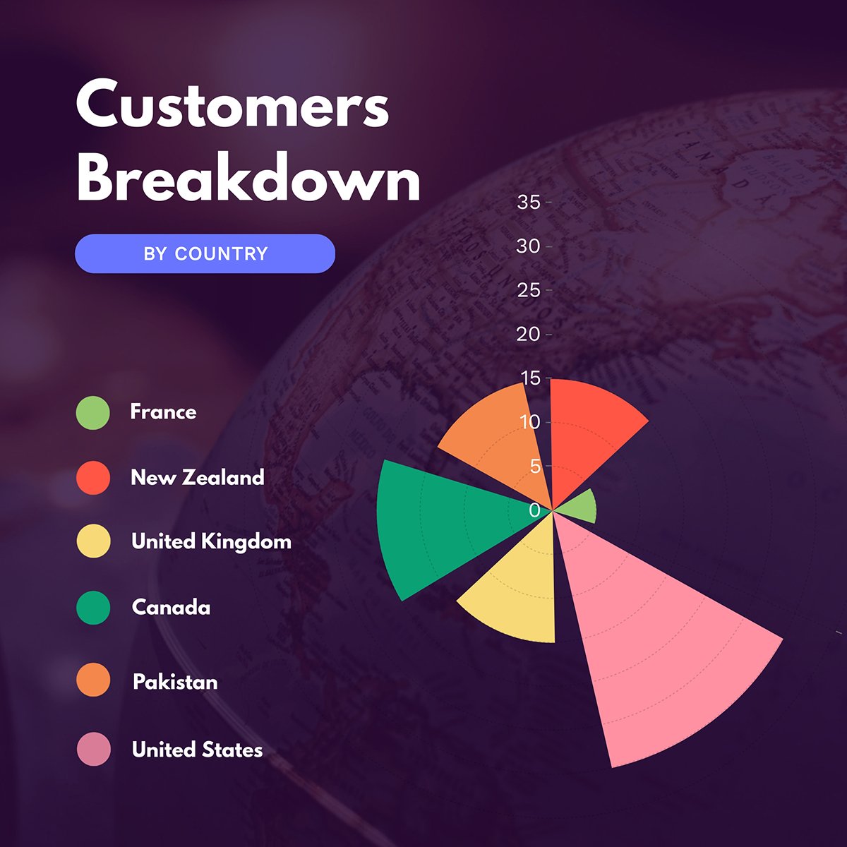
You can also use maps to represent geographic information. Or, use progress bars, thermometers, radials and widgets to visualize stats and figures as shown in the template below.
A project presentation isn't a mood board. Your slides are working documents, and every design decision should make it easier for your audience to find, read, and process the information on screen. Three principles do the most work here.
When your text blends into the background, your audience has to work harder than they should just to read your slides. In a project presentation, where you might be showing budget figures, risk ratings or milestone status at a glance, that extra friction is costly.
Chloe West, Content Marketing Manager at Vista Social, sees this mistake consistently:
"One common mistake we see in presentation design is the failure to use color contrast to make your text pop. Many times, the text gets lost or mixed in with the background because of complementary color usage. While staying within the grounds of a color palette is a great idea, you want to make sure that you use contrasting backgrounds and font colors in order to get your text to stand out to the reader."
Dark text on a light background or light text on a dark background. Whichever direction you go, make the contrast obvious. If you have to wonder whether it's readable, it isn't.
Made with Visme Infographic Maker
In a project presentation, not all information carries the same weight.
Your project status, key deliverable, or budget figure is more important than the supporting detail beneath it. Your business presentation layout design should reflect that.
Use size, weight, and placement to signal priority.
The most important information should be the first thing the eye lands on, not something the audience has to search for.
The rule of thirds is a practical way to apply this. Divide your slide into a three-by-three grid and place your most critical elements along those lines or at their intersections rather than centering everything by default. A centered layout treats all elements equally.
A well-composed slide tells your audience where to look first, second, and third without them having to figure it out themselves.

Project presentations often involve multiple contributors or are updated across several rounds of review. That's where visual consistency often breaks down, and audiences notice it.
Inconsistent fonts, mismatched colors, and varying slide layouts can make a presentation feel unfinished, undermining confidence in your project.
Set your template, color palette and typography before anyone starts building slides. Use the same chart style throughout.
Apply status indicators, whether that's RAG ratings, progress bars, or milestone markers, in the same way every time they appear. Consistency signals that the team behind the presentation is organized, and in a project context, that’s everything.
Designing for clarity means designing for everyone in the room, not just those sitting closest to the screen.
This starts with font size. A slide that looks clean on your laptop can become unreadable when projected in a conference room.
Guy Kawasaki's 10/20/30 rule recommends a minimum of 30 points for presentation text. That feels large when you're designing. But it's the right call even when your audience is sitting ten feet away.
A quick test before you present: Open your slides on the largest screen available and stand at the farthest point in the room.
If you have to squint, that’s a sign that your audience will struggle as well.
Made with Visme Infographic Maker
But readability goes beyond font size. In a business presentation, you're often addressing a mixed room: executives, team members, clients, and sometimes external stakeholders you've never met.
Orana Velarde, Creative Designer and Content Marketing Expert, explains why font size is only the starting point:
"To create an accessible presentation, you must consider all the possible ways people consume and comprehend content. Some viewers might have low eyesight or colorblindness, while others might have low hearing or limited mobility."
In practice, this means your color choices need to work for people with color blindness. Your charts need labels that don't rely on color alone to communicate meaning. Your timeline slides need enough contrast so that someone at the back with less-than-perfect vision can still follow the project schedule.
Aakriti Gupta, Chief Technology Officer & Co-Founder, Imanyco, flips the conventional thinking on it:
"Accessibility isn't an expense. It's an investment in your audience and your community."
That's especially true in a project context, where the decisions being made affect real people and teams.
A stakeholder who can't clearly read your risk matrix or budget breakdown during the presentation can't fully engage with the decisions you're asking them to make.
If a client can't distinguish between project phases on your project roadmap because the color coding doesn't hold up for color blindness, they're walking away with a different understanding of the project than the one you presented.
With Visme's built-in accessibility checker, you can ensure your slide deck meets all the right accessibility standards without slowing down your design process.
Use it throughout your build, not just at the end. It covers color contrast in text and shapes, minimum text size, alternative text for images, reading order, and a visual simulator that shows how your slides appear under different visual impairments.
For a full walkthrough, read our article on How to Create Accessible Presentations: A Detailed Guide before your next project presentation deck.
Getting your slides right is half the job.
The other half is knowing how to present a project in a way that holds the room, handles tough questions, and moves your audience toward a decision.
Here's how to handle the parts most presenters don't prepare for.
The most effective project presentations are built around a story, not a checklist.
Chris Anderson, curator of TED, makes the case for this clearly in his guide to great presentations:
"Many of the best talks have a narrative structure that loosely follows a detective story. The speaker starts out by presenting a problem and then describes the search for a solution. There's an 'aha' moment, and the audience's perspective shifts in a meaningful way."
That structure works for virtually all kinds of presentations. Start with the problem, build to the solution, and let the evidence accumulate as you go. By the time you reach your recommendation, your audience should feel like they've arrived at the same conclusion you have.
Anderson also warns what happens when this falls apart:
"If a talk fails, it's almost always because the speaker didn't frame it correctly, misjudged the audience's level of interest, or neglected to tell a story. Even if the topic is important, random pontification without narrative is always deeply unsatisfying. There’s no progression, and you don’t feel that you’re learning."
On timing, attention drops sharply after 30 minutes. If your presentation runs longer, build in deliberate breaks through questions, visuals, or a format shift to bring people back.
A good rule of thumb is two minutes per slide. If you're running over consistently in practice, cut slides rather than trying to speak faster. A shorter, tighter presentation almost always performs better than a lengthy one that drags.
The Q&A session is where many presenters lose control of a presentation they've handled well up to that point.
The fix is simple: prepare for it the same way you prepare for the presentation itself.
Before you walk in, write down the five questions you most hope nobody asks.
Then prepare answers for all of them.
In a project context, those questions are usually predictable: why this budget, why this timeline, what happens if this assumption is wrong?
Anderson puts it plainly in his advice on VC pitches, and it applies just as well to any stakeholder room: "Anticipate questions and rehearse clear and concise answers."
When a question comes in during the board presentation, pause before you answer. It signals that you're thinking carefully, and it gives you a moment to make sure you've understood what was asked.
If you don't know the answer, say so directly and commit to following up. Audiences respect honesty. What erodes trust is watching someone bluff their way through an answer they clearly don't have.
Not every question needs a full answer in the room, either.
Diane Windingland, Distinguished Toastmaster, advises presenters to "put off answering the question if it is beyond the scope of the presentation, one that you don't have an immediate answer for, or one that requires more detail than you want to get into right then."
In a project presentation, that might sound like: "That's getting into territory I'd want to pull the right data for first. Let me follow up with you directly after this." That's not avoiding the question. It's respecting it enough to answer it properly.
If a question is trying to derail the conversation entirely, acknowledge it briefly and redirect. "That's worth a separate conversation.
For now, let me bring us back to the core decision we're here to make." Redirecting a question that's pulling the room off track is part of running a tight, focused presentation. It keeps the decision your audience came to make from getting buried under noise.
Objections in a project presentation are usually a sign that someone is engaged, not that your project is in trouble.
The mistake is to treat them as attacks. When someone pushes back on your budget estimate, your timeline, or your methodology, they're giving you an opportunity to demonstrate that you've thought this through.
The most effective way to handle an objection is to validate it before you respond. "That's a fair concern, and it's something we looked at closely" does two things: it shows respect for the question, and it signals that your answer is coming from a place of preparation rather than defensiveness. Then address the substance directly. Don't over-explain or pivot to a different point. Answer the objection that was raised.
Anderson's broader advice on audience intelligence is worth keeping in mind here too:
"Remember that the people in the audience are intelligent. Let them figure some things out for themselves. Let them draw their own conclusions." The same applies to objections. You don't need to over-defend. Make your point clearly and trust the room.
If an objection surfaces that you genuinely haven't anticipated, treat it as new information rather than a threat. "I hadn't considered it from that angle. Can you tell me more about what's driving that concern?" That kind of response builds more credibility than a rehearsed answer that misses the point.
Presenting to your team and presenting to the C-suite are two very different conversations, even when the content is identical. Getting the tone wrong in either direction costs you.
With peers and team members, you can go deeper into the process, share uncertainty openly, and invite collaborative problem-solving during the presentation. This audience wants to understand how, not just the what. They're the people doing the work, and they'll engage more if they feel like participants rather than recipients.
With executives, the dynamic shifts. Anderson's framework for financial presentations captures the balance well:
"Financial audiences love data, and they'll want the details. Satisfy their analytical appetite with facts, but add a thread of narrative to appeal to their emotional side."
Unenabasi Ekeruke, a marketing expert and business consultant who has led many projects, puts the executive dynamic in practical terms:
“In a project presentation, executives aren't there to hear about every step you took. They want to know the outcome, the cost, and the risk. Share where the project stands or what you're recommending, then use the rest of your slides to show how you got there. If you're requesting budget approval, say what you need and why in the first two minutes. If you're presenting results, open with the headline number. The supporting detail exists to defend the conclusion, not to build up to it.”
Regardless of who's in the room, Anderson's closing advice on tone applies across the board:
"Some speakers may want to come across as authoritative or wise or powerful or passionate, but it's usually much better to just sound conversational. Don't force it. Don't orate. Just be you."
Read on to learn more about how to give a good presentation that will wow your audience.
Building a project presentation takes time that most project managers and executives don't have to spare.
AI tools won't replace the brainwork behind a strong project presentation. But it will save you significant time on the parts that slow most people down.
Here's where artificial intelligence makes the biggest difference and where to be careful.
Before you open a single slide, use AI to pressure-test your presentation structure. Feed it your project brief, your audience, and your objective, and ask it to suggest a logical flow.
Here’s a prompt that works well:
"I'm presenting a [type of project] to [audience, e.g., senior leadership / a client / my team]. The goal of the presentation is to [get budget approval/share progress / present findings]. Suggest a slide-by-slide structure with a one-line description of what each slide should cover."
Tools like Visme’s AI writer, ChatGPT, Claude, or Gemini handle this well. The output won't be perfect, but it gives you a starting skeleton to react to, which is almost always faster than starting from a blank page.
One security note worth taking seriously: don't paste confidential project data, client names, or proprietary figures into a public AI tool. Use placeholder language instead, for example, "Project X" or "Client A," and fill in the specifics yourself once you're working inside your own system.
You can also use AI to explore creative presentation ideas when you're not sure how to frame a complex project in a way that will resonate with a specific audience.
Sometimes the most useful thing AI can do is show you an angle you hadn't considered.
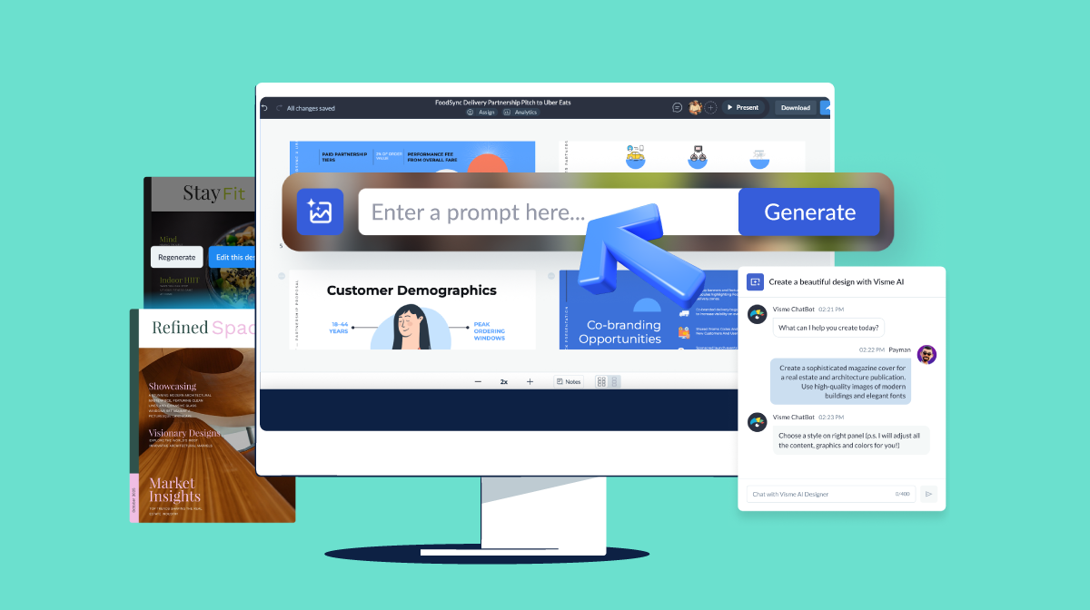
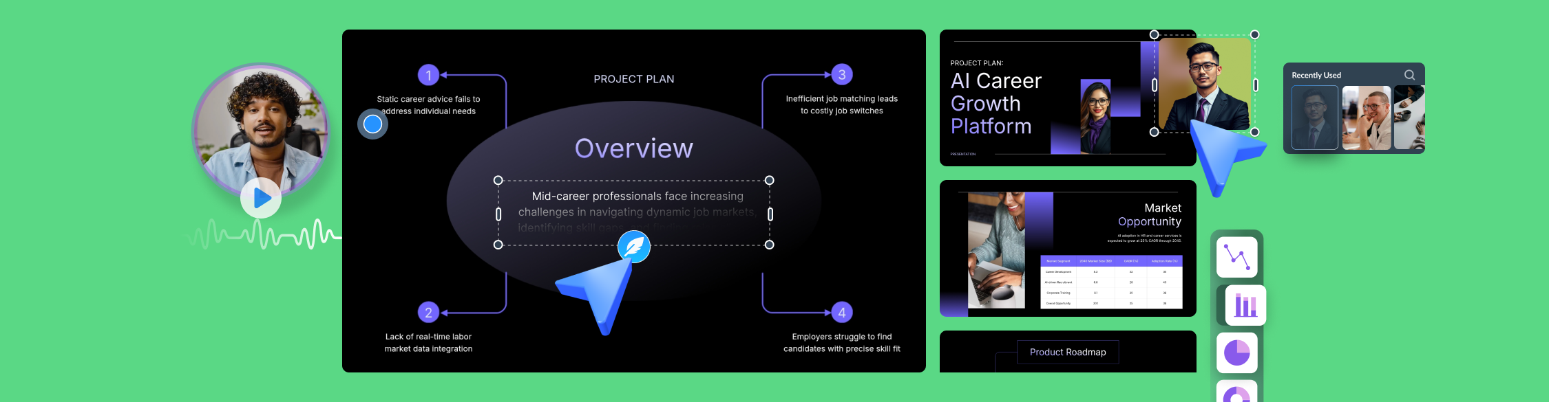
Once your structure is in place, AI tools can handle the visual build from start to finish.
Visme's AI presentation maker starts with a conversation. Describe your project, your audience, and your preferred style, and Visme's AI chatbot suggests template styles that fit your brief.
Pick the most relevant one and it generates a fully designed, editable deck you can work from immediately.
From there, everything is customizable. Change the color theme, swap fonts, and adjust the text to match your message. Pull images, videos, and graphics from Visme's royalty-free asset library, or generate new ones on the spot with the AI image generator if stock visuals don't fit your project context.
Add data visualizations, connect them to live data, and drop in your logo and brand assets so the final deck looks like it came from your team, not a template.
For individual slides, Visme's AI Writer helps you tighten copy quickly. Paste in a dense paragraph of project detail and ask it to reduce it to a three-point summary suitable for a slide.
That's the kind of task that eats time manually and takes seconds with AI.
When the design is ready, bring your team in. Visme's collaboration features let you invite colleagues directly into the workspace, and Workflows let you assign specific sections to the right people so that review and sign-off don't become bottlenecks.
When it's time to share, you have options. Download in PPTX, PDF, or HTML5, present directly online, share as a password-protected private project, or publish straight to your social media channels on a schedule.
However, your stakeholders need to receive it; Visme has got you covered.
Stock photography rarely captures the specific context of a project. Visme's AI image generator lets you create presentation-ready visuals from a text description.
So if you need something more tailored than what a stock library offers, you can generate it on the spot.
Here’s a prompt you can try out:
"A professional project team reviewing a construction timeline in a modern office, clean and minimal style."
And if you're working with existing visuals, raw data exports, screenshots, or images that don't quite fit your slide layout, Visme's AI image editing and touch-up tools let you clean up and refine them directly inside the platform.
If your project involves recorded meetings, client calls, research interviews or progress updates, AI transcription tools can turn those recordings into usable content quickly.
Tools like Otter.ai, Fireflies, or Microsoft Copilot can transcribe audio and summarize key points, decisions, and action items.
From there, you have the raw material to build a progress update or findings presentation without starting from notes.
A prompt to use after you have a transcript:
"Here is a transcript from a project meeting. Extract the three most important decisions made, the key risks raised, and any agreed next steps. Format it as bullet points I can use in a project status presentation."
If you're sharing your project presentation asynchronously, either with remote stakeholders or as a recorded walkthrough, AI text-to-speech tools can add a professional narration track without requiring you to record audio yourself.
Visme's AI text-to-speech tool converts your slide notes or script into a voiceover that can be uploaded directly into your presentation. Tools like ElevenLabs or Murf.ai offer similar functionality with a range of voice styles if you want more control over tone and pacing.
Before you present to the room, present to AI. Paste your slide notes or script into ChatGPT or Claude and ask it to identify where the logic is unclear, where you're assuming too much prior knowledge, or where the narrative loses momentum.
A prompt that works:
"Here are the speaker notes for my project presentation. I'm presenting to [audience]. Review these notes and tell me: where might I lose the audience, where am I being too technical, and where is the narrative unclear or unconvincing?"
It won't replicate a live audience, but it will catch the obvious gaps before a real stakeholder does.
We already discussed how creating engaging presentations that pack a punch can be time-consuming.
Aside from AI, using the best presentation templates is a huge time-saver. They help you make professional-looking project presentations fast and easy.
Visme offers a wide selection of templates to help your presentations shine.
You’ll find millions of pixel-perfect graphics, icons, design elements and professionally designed templates for any purpose, industry and project type.
Regardless of your skill level, you can easily customize the project presentation examples below.
All you need to do is type your content, input data or insert the image. And boom, your project proposal presentation is ready to go.
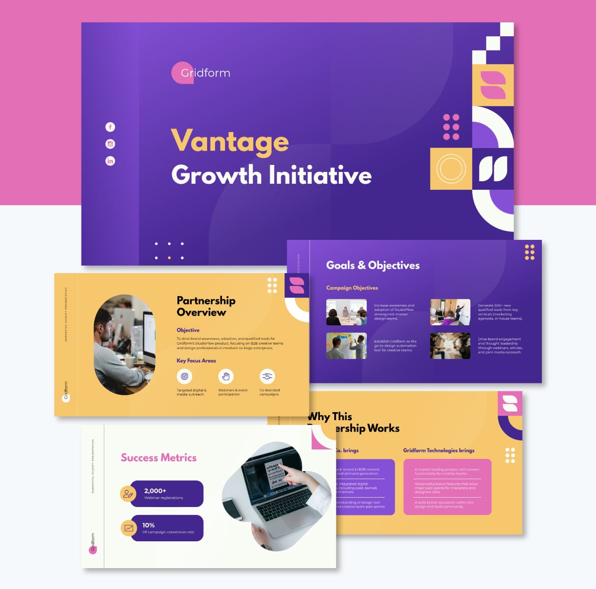
Marketing projects, whether you’re working on them in-house or externally, often come in with different assumptions. That’s why it’s critical to set things straight from the start with team members, clients or higher-ups.
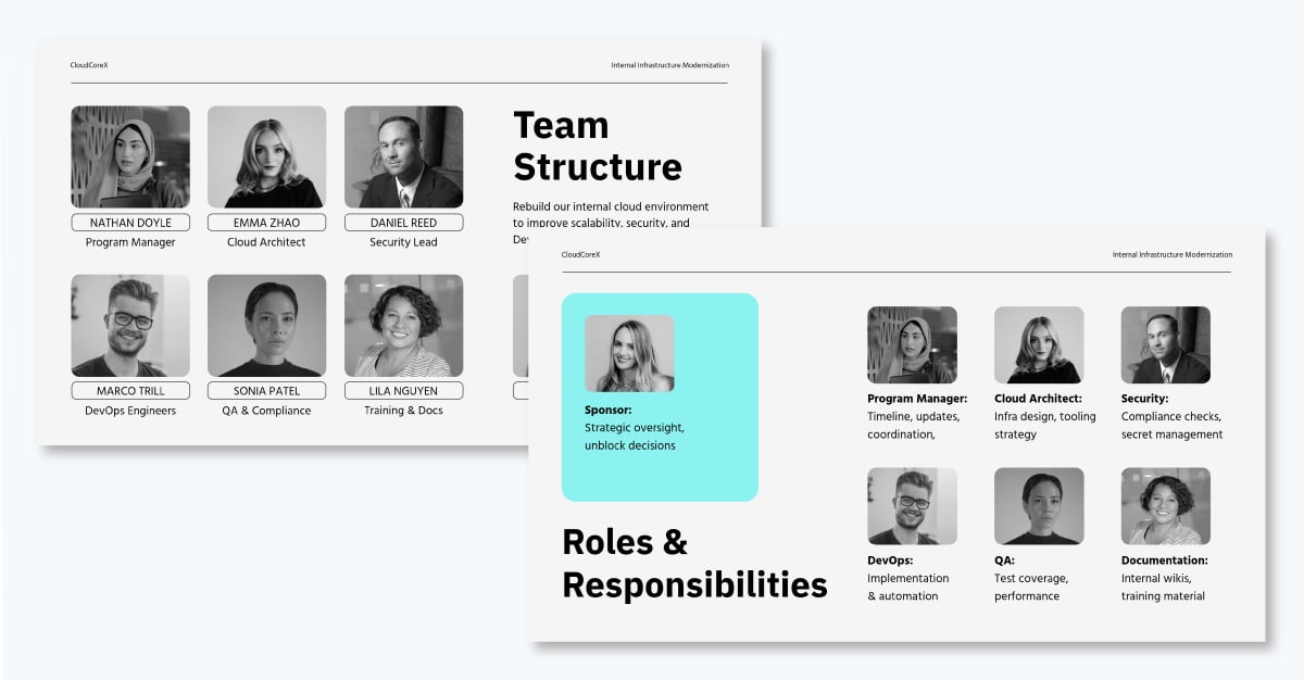
Use this marketing campaign project presentation to clarify the scope, deliverables, timelines and constraints before the project gains momentum. This template has pre-designed slides for partnership overview, campaign objectives, budget timeline, KPI and success metrics, scope of work, key deliverables, roles and responsibilities. Everything a project kickoff needs is already structured and ready to fill in.
Customize this project kickoff presentation to fit your specific needs. You can edit content, change images, apply custom colors, upload your own fonts, logo and other design elements.
Here’s a video of how to customize projects in Visme
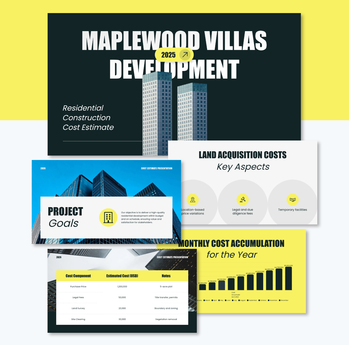
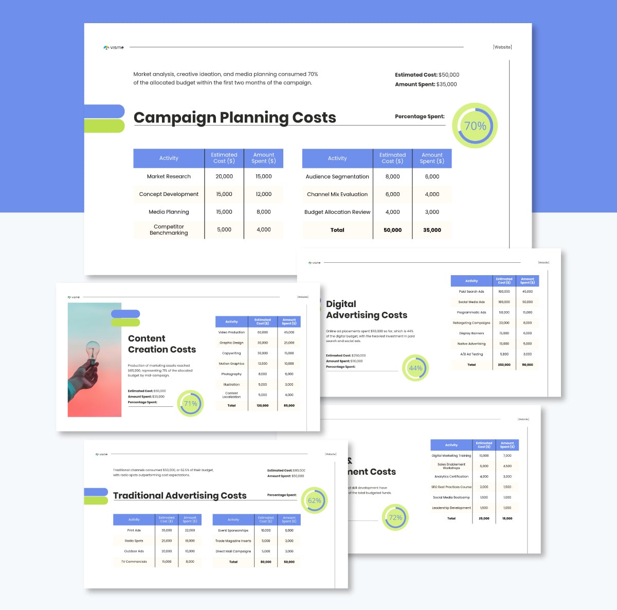
If you're pitching a construction project to a client, cost is usually the conversation that makes or breaks the deal. This template is built for exactly that moment.
It embodies the one idea per slide principle well: project goals, scope, and individual cost components each get their own slide rather than being stacked together.
The mix of bright and dark color schemes keeps the deck visually dynamic, and the layout makes dense financial information easier to follow than a spreadsheet ever could. Make it consistent with your branding using our Brand Design Tool. Just type in your website and watch the AI pull in your brand elements (logo, colors and fonts) and save them in your brand area for future use.
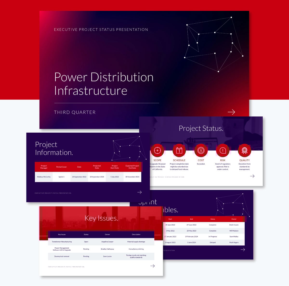
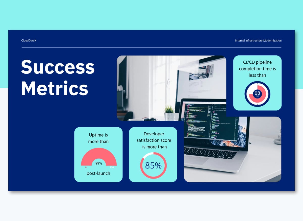
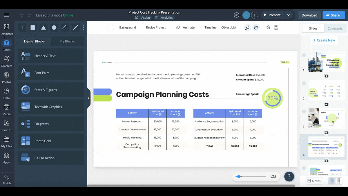
Project status check-ins are a great opportunity to loop in stakeholders, clients, or teams on where things stand and what needs their attention. This template is built for exactly that conversation.
What makes it work is the way it handles complexity without overwhelming the room. It uses a rich blend of visuals to communicate project status, key issues, sprint deliverables, completion levels, and upcoming review dates, each presented clearly rather than buried in a wall of text.
The real advantage comes when you make the data visualization interactive. Use Visme's pop-ups, hover effects, internal links and other interactive features to build your data story progressively.
That way, stakeholders can drill into the details that matter to them without the entire slide becoming cluttered.
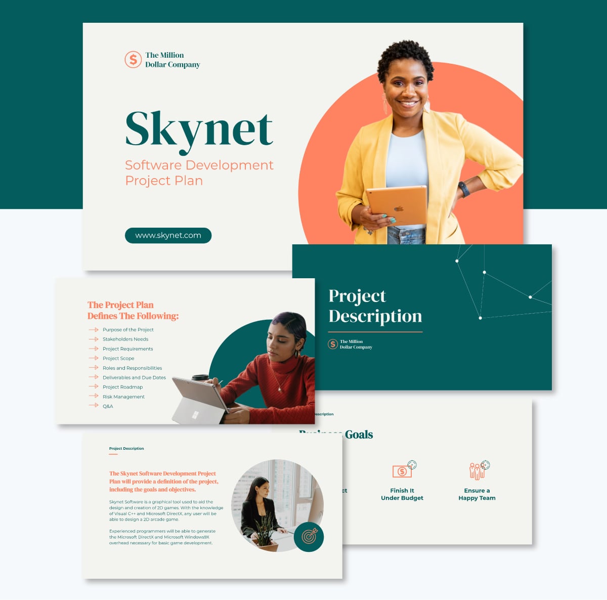
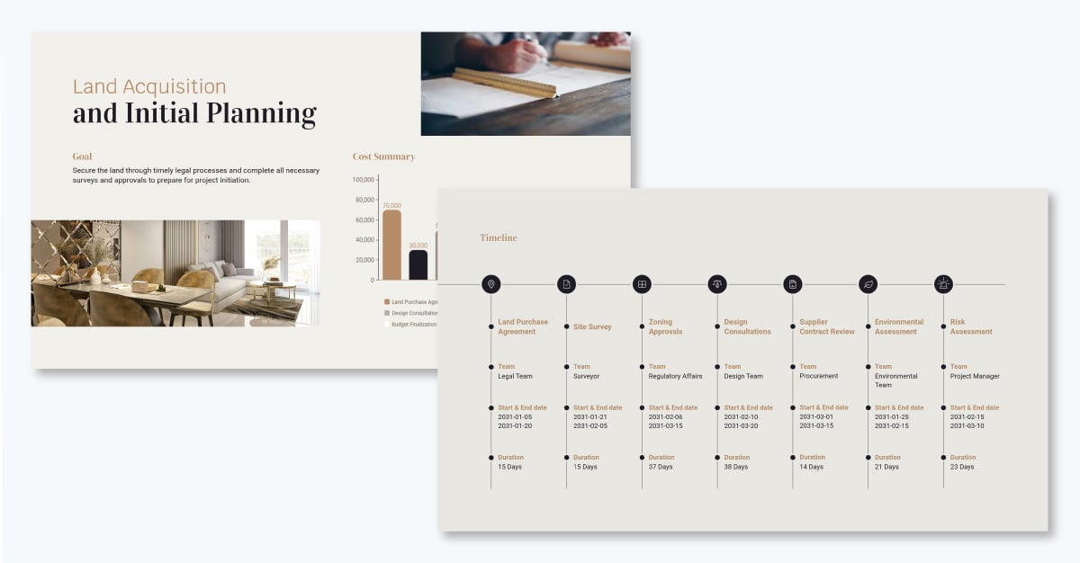
A project plan presentation has a lot of ground to cover. This template handles it without ever making the deck feel overloaded.
The design opens with a rich blend of green and grey tones, with strategic hits of orange that keep visual energy up from the first slide to the last. It's the kind of deck that holds attention before anyone has read a word.
Content-wise, it checks the right boxes. You'll find dedicated slides for project purpose, scope, requirements, and stakeholder needs, as well as roles and responsibilities, deliverables and due dates, and a full project roadmap. There's even a Q&A slide built in, a small detail that makes a real difference when you're presenting to a room that's going to have questions.
Use this template when you need to walk a team or a group of stakeholders through a complete project management plan and want a structure that's already done the organizational thinking for you.
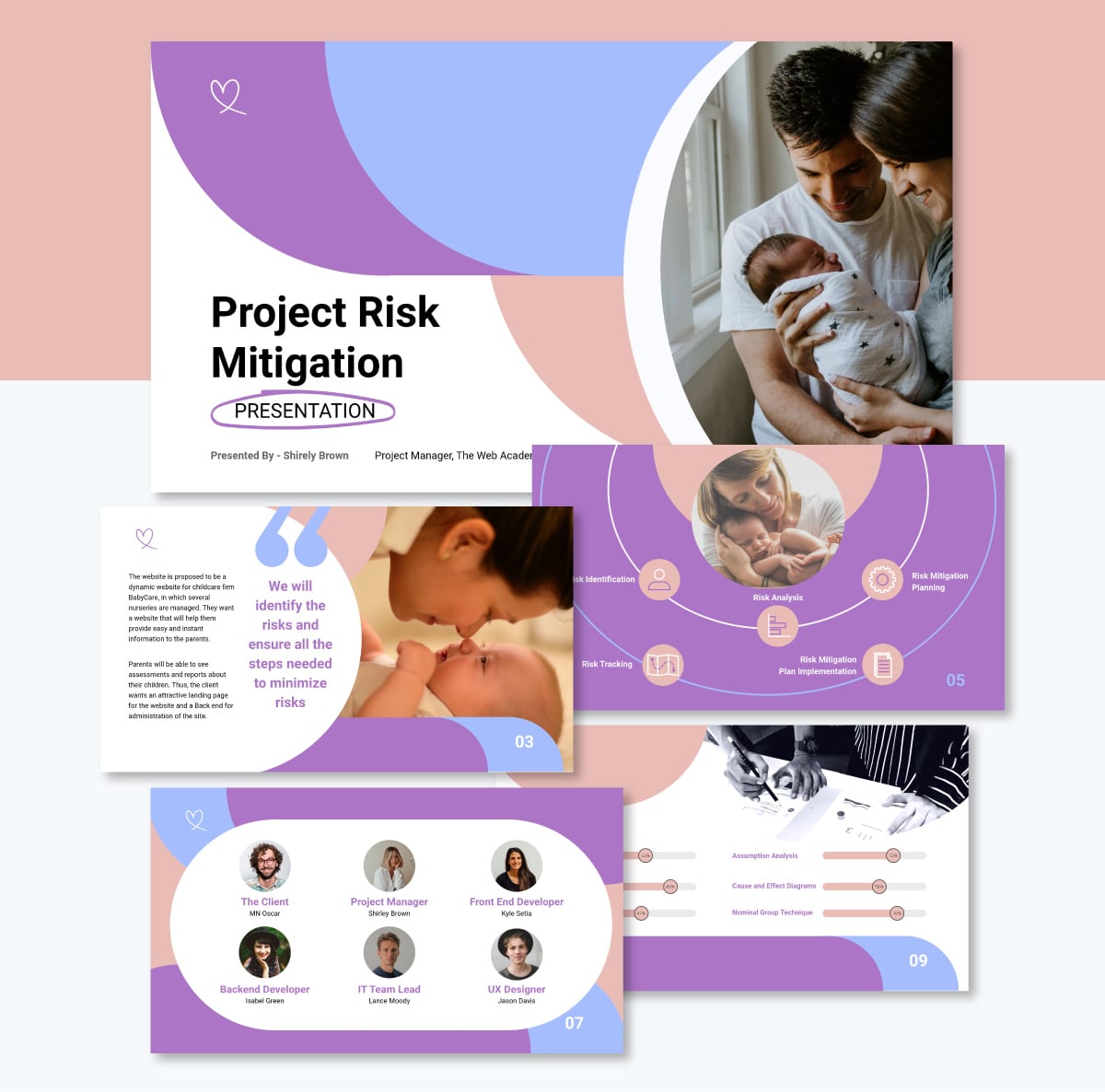
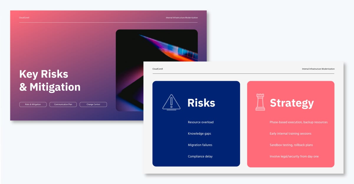
Risks are an inevitable part of any project. The question isn't whether they'll come up. It's whether you've thought through them before they do.
This template gives you a structured way to show stakeholders that you have. Progress bars visualize risk identification at a glance, so severity registers immediately without anyone having to dig through dense text. A clean breakdown table follows, listing each risk by probability, impact, severity and owner.
The mitigation plan section lays out your response strategy in a clear, visually organized format. If you're walking a stakeholder group through a risk review, this template handles the structure so you can focus on the conversation.
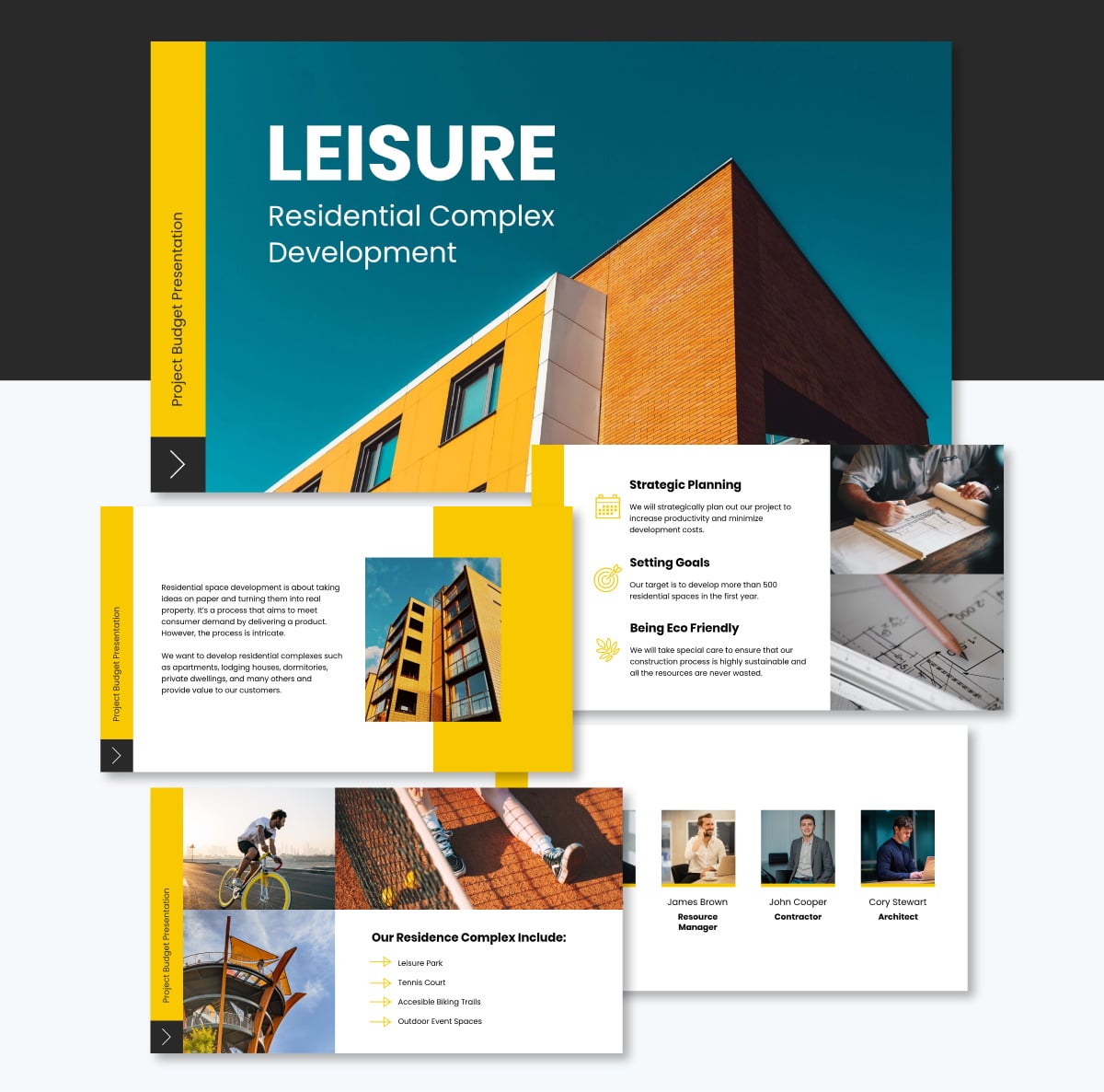
Getting funds released often comes down to how clearly you present the numbers. Confusion in a budget presentation creates hesitation. Hesitation stalls approval.
This template is built to remove that friction. The bold yellow, black, and white color scheme gives it a high-contrast look, making financial data easy to read. Every cost component gets its own visual treatment so stakeholders can see where the money is going without decoding a spreadsheet.
Customize it with your project figures, swap in your brand colors, and you have a budget presentation that looks like it came from a team that knows exactly what they're asking for.
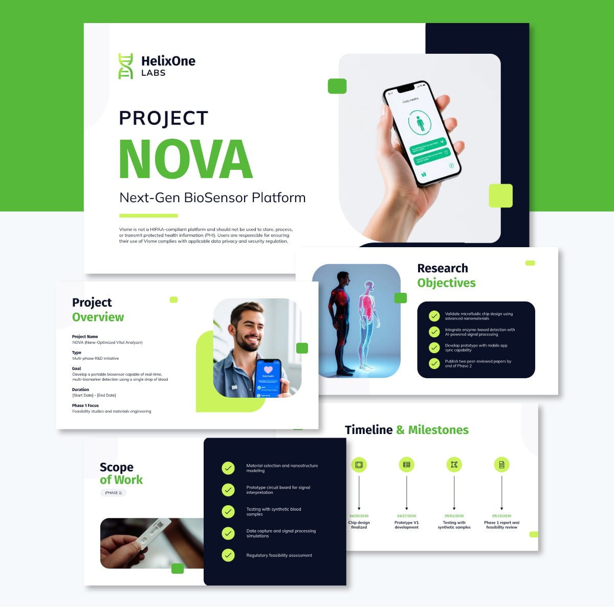
A good R&D kickoff presentation isn't about locking in a rigid plan. It's about aligning your team on what you're exploring and how you'll approach it together.
This template is built for that kind of conversation. It helps your team establish a shared vision, agree on research goals, and organize the phases of experimentation before work kicks off. Whether you're developing a prototype, testing a hypothesis, or chasing a breakthrough, it gives your kickoff meeting the structure it needs without making the project feel more defined than it actually is.
The design stands out too. Fresh lemon tones paired with sleek gray and crisp white accents give it a modern, polished look that feels appropriate for forward-thinking work.
Content-wise, it covers everything a research kickoff needs. You'll find dedicated slides for project overview, research objectives, scope of work, timelines, and budget. Team roles, key stakeholders, risk and mitigation strategies, success metrics, long-term vision, and next steps each get their own slide so nothing gets glossed over in the rush to get started.
The 5 5 5 rule for presentations states that each slide should contain no more than five words per line, five lines of text per slide, and no more than five text-heavy slides in a row.
The rule is designed to prevent information overload and keep slides visual and easy to scan. It encourages presenters to communicate through visuals and spoken words rather than cramming content onto each slide.
The five keys to a successful presentation are: a clear and compelling structure, strong opening that captures attention, visuals that support your message, confident and conversational delivery, and a definitive close with a clear call to action or next step. Each element builds on the previous one. A presentation that gets all five right gives the audience clarity, keeps them engaged, and moves them toward a decision.
Start a project presentation by stating the problem or opportunity your project addresses, why it matters to the audience in the room, and what you’re asking them to do or decide by the end. Skip the lengthy background.
Get to the point in the first two minutes. A strong opening could be a compelling statistic, a short story, a direct question, or a clear statement of the stakes. Your audience decides whether to stay engaged in the first moments, so make them count.
The seven core presentation skills are: clear and logical structure, audience awareness, confident delivery, strong eye contact, effective use of visuals, active listening during Q&A, and the ability to handle objections calmly. These skills apply whether you’re presenting to a small team or a room full of executives. Most of them improve with practice and preparation rather than natural talent.
The five basic steps of a presentation are: preparation, structure, design, rehearsal, and delivery. Preparation involves knowing your audience and defining your objective. Structure means organizing your content into a clear narrative.
Design covers how your slides look and how they support your message. Rehearsal ensures your timing, flow, and confidence are where they need to be. Delivery is the live execution of everything you’ve prepared.
To present your project effectively, start by defining what you want your audience to know or do by the end. Build a clear structure around that objective, lead with your key finding or recommendation, and use visuals to communicate data and timelines rather than text.
Practice your delivery out loud, prepare for the questions most likely to come up, and adjust your tone based on whether you’re speaking to peers or senior decision-makers.
Tools like Visme make it easier to build a polished, well-structured project presentation without needing a design background.
Creating a successful project presentation starts with setting your goals and having a clear plan to achieve them. It also requires crafting compelling content, paying attention to design and excellent delivery.
That's a lot to pull together, especially when you're also managing the project itself. Visme is built to make the presentation side easier without sacrificing quality.
You get hundreds of customizable templates, a full asset library, data visualization tools, AI-powered design features, and collaboration tools that keep your team aligned through every round of review.
Build it, refine it with your team, and share it in whatever format your audience needs. PPTX, PDF, HTML5, or a live online presentation, Visme handles all of it.
Now you have all the tips and tools for nailing your next project presentations. Go ahead and make it memorable with Visme's presentation software. Or tap into the power of Visme’s AI presentation maker to speed up the process.
Design visual brand experiences for your business whether you are a seasoned designer or a total novice.
Try Visme for free