


14+ Employee Newsletter Examples, Ideas & Templates

An annual report (also called a Year in Review) summarizes a company’s financial performance, key achievements and strategic direction over the past fiscal year. It typically includes a leadership letter, an overview of operations, goals and market positioning. Many reports highlight milestones, corporate social responsibility efforts and future growth plans.
Visually, reports range from simple PDFs to interactive digital formats with pop-ups, hover effects, animated charts and videos. A well-designed report balances data, storytelling and relevant visuals, ensuring stakeholders easily understand the company’s progress and vision.
Creating an annual report doesn't have to feel tough and overwhelming. You just need the right report templates, examples and tools to help you get started, which is where this guide comes in just in time!
Before we dive, here's a selection of 8 easy-to-edit Annual report design templates you can edit, share and download with Visme:


Before we get really into it, check out this video where Ivan teaches you how to make an annual report super fast.
So, if you’ve been searching for cool annual reports to inspire yours this year, then you’ve arrived at the perfect place.
I've rounded up some of the best annual reports from 2025 from several industries.
As you skim, don’t forget to bookmark your favorite examples.
Speaking of bookmarks, open this video in a new tab to watch later or save to your favorites. You’ll get valuable tips for creating other types of business reports along with templates you can use.
As you go through these examples, pay attention to how they balance design with clarity. The strongest annual reports look polished but also guide the reader through the story without friction.
That’s something Fiorella Canepa Lama, Senior Designer at Visme emphasizes:
"Keep your report clear and easy to read by using bold headings, bullet points, and short summaries. This helps key takeaways stand out while still giving enough detail where it matters. Stick to simple, easy-to-understand language whenever possible—if you need to use jargon, consider adding an appendix. And most importantly, if you’re struggling to read it, your readers will too."
The FIFA 2025 annual report is a mega-sized publication full of overviews of what happened that year and a look ahead at the years to come. Traditionally, their report always has lots of stories to tell.
Visually, it welcomes the reader with a block layout of topics, each with a looping video background. The only repeating elements are the section titles' alignment and font size, making it easy to browse.
As you click on each section, you’re taken to another beautiful design where you can see statistics and read stories and letters from FIFA's big names.
The report also includes a floating TOC, so you can click the dropdown menu to easily navigate or find sections as you scroll.
According to Wyzowl, 82% of video marketers say video has helped keep visitors on their website longer, which is exactly what a well-designed annual report needs to do.
By including vibrant images and videos, you're not only grabbing the reader's attention but also making your information more digestible and keeping them engaged long enough to interact.
Here are some pro tips to help you use images and videos effectively and to your advantage:
Each year, we publish our Visme year-in-review as an interactive presentation using our animated 3D graphics, 3D characters, text effects, custom animation features, slide transitions and more.
Check it out below.
Made with Visme Presentation Maker
Adding animation to an annual report will make it a lot more memorable and shareable. Actually, it’s also super repurposable. The same slides in the report can be turned into standalone social media graphics or the entire presentation can be turned into a video.
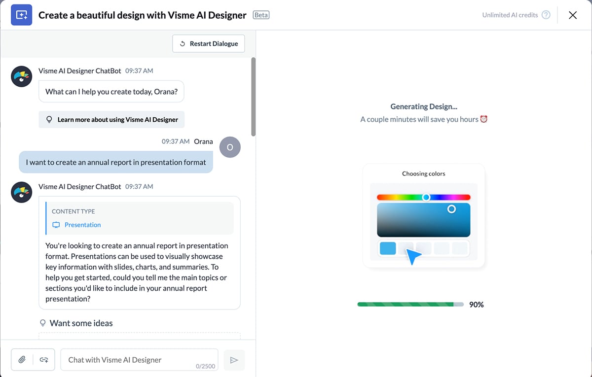
Using Visme’s AI presentation maker, our drag-and-drop editor and all the design elements, you can create an animated annual report, or year-in-review, that performs just as well as ours.
In your dashboard, click Create > Project > Generate with AI and simply write “I want to create an annual report in presentation format,” and the chatbot will guide you through the process. Once generated, customize it with the editor and show the world!
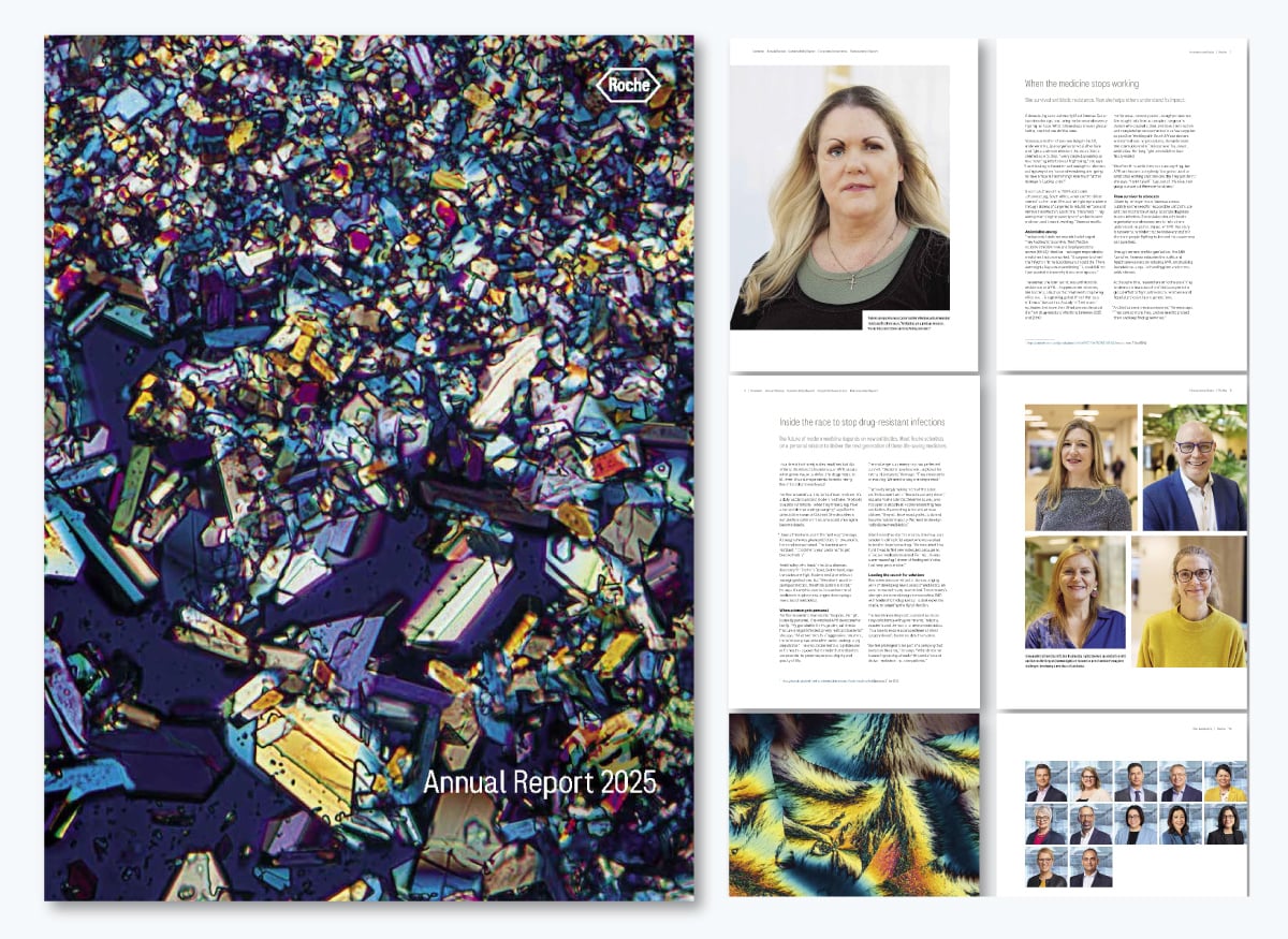
Similar to Roche’s report from the year before, the 2025 version has a unique visual cover. This one is a microscopic view of one of Roche’s drugs.
This year’s report opens with Vanessa Carter’s story. She’s a patient advocate and mother of two, who spent years battling MRSA after a near-fatal car crash left her fighting an infection that no antibiotic could stop. Her story sets the tone for a report rooted in positive impact through medicine.
The report's design is very traditional, which makes sense for a medical company. They successfully combine this traditionalist style with storytelling and conceptual imagery.
This annual report is a glorious reminder that you can get a bit conceptual with your visuals. Even if your industry is traditional. Try experimenting with different visual types. Experiment, play, and learn to keep things fresh.
Microscopic photos are a great way to achieve this, but you can also use close-ups or macros of your products.
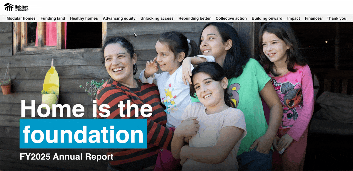
Many nonprofits are known for having beautifully designed reports, and Habitat for Humanity is no exception.
Their 2024 report concentrates on the feeling of home. The data starts with +3M people helped to improve their homes and 8M people trained to improve their community’s homes. Then it continues with their work towards scalable housing solutions in East Africa.
The report’s design centers on a scrolling web design that reveals data points in blue containers over full-page photos, then continues with layered illustrations of a house being built and finally side-by-side images and text.
The report also features an interactive map that readers can scroll through, showcasing initiatives and the number of individuals impacted, making complex data easier to digest.
If your report covers international branches, consider adding an interactive map. It helps you use space wisely, avoiding overcrowded pages or unnecessary extra pages.
Interactive maps don't have to be a coding nightmare; in fact, you can easily create an interactive map with Visme in five simple steps. Add hotspots, hovering effects and more.

This is my favorite example in the list. Landing on the web version of the report, you’re welcomed by a beautiful artistic video. The most noticeable thing about this report is how soft and beautiful it looks and feels. All the corners are highly rounded; there are no hard edges or corners anywhere. Everything feels soft, muted, special.
Like most annual reports nowadays, there’s also a PDF version. In this case, they condensed the information into pages. On the website version, you need to navigate to discover the different sections and themes. That said, the card-based layout with rounded corners translates seamlessly from one to the other.
One last thing worth mentioning is that whenever there’s a data visualization, you have the option to switch to a spreadsheet view. I found that super interesting.
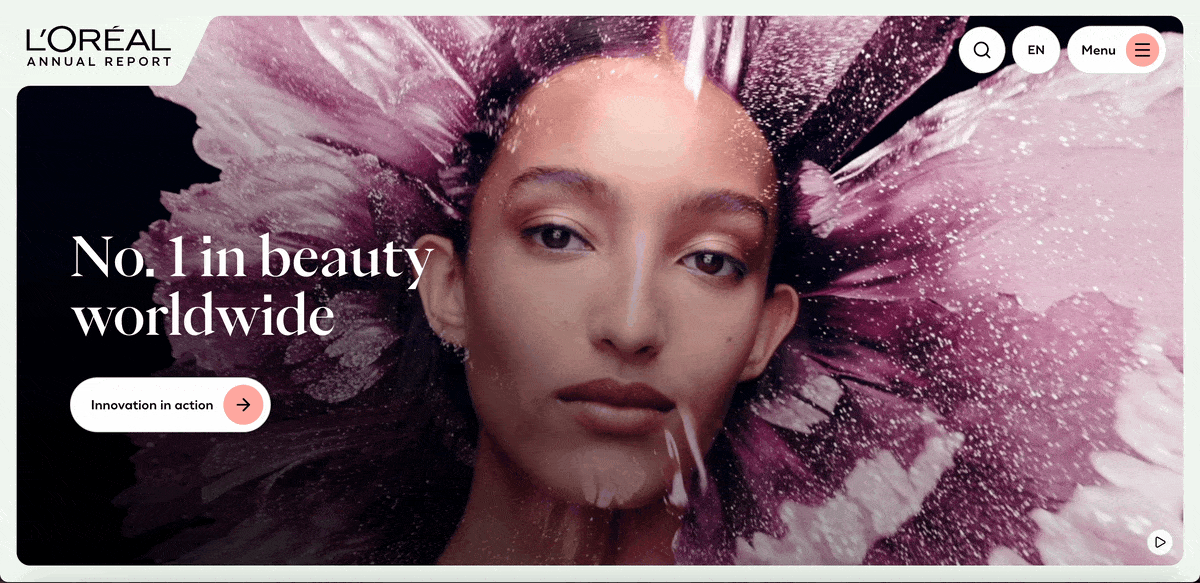
On the first page of L’Oréal’s report, it states, “No.1 in beauty worldwide.” You can take a page from that book and state what your company is most known for, in what spaces you reign or what prestigious award you’ve received.
Another takeaway from this report is the use of video. Aside from welcoming readers, video content in your report also breaks the monotony of scrolling and reading. You can use it as a mini reading break so readers are encouraged to read until the end.
With reports, there are three ways you can add video content: either include a video recap of your report, add video directly to your report or do both!
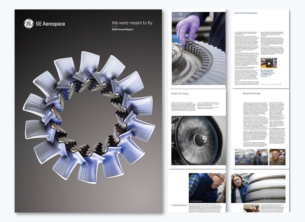
This year, GE created a unique annual report for each of its three standalone entities: GE Aerospace, GE Vernova and GE Healthcare. I’ll share the GE Aerospace example.
The few images included in the report are a combination of close-ups of aerospace materials and snapshots of real GE Aerospace workers. The cover itself is a collage of aerospace parts arranged in a circle, creating a striking opener. The report includes a letter to shareholders, a look at the year that passed, and a look at the years ahead.
Since the GE Aerospace annual report is one in a series of three, it’s very focused. By separating their reports into three, rather than putting everything into one, as they have done for years, they could focus more on the story of each entity.
If your company holds several brands under one umbrella, consider creating an annual report for each. Then group them all into one general annual report landing page and offer navigation to each unique version.
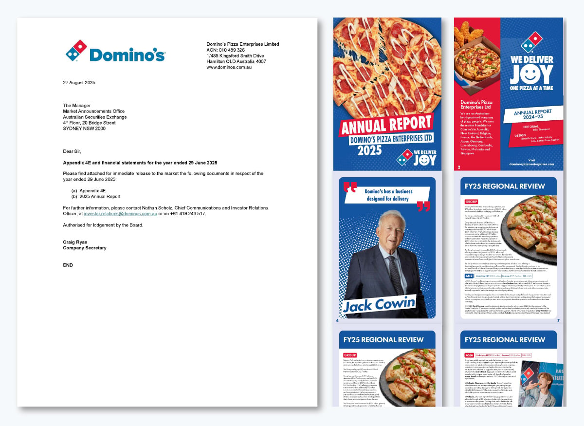
For 2025, Domino’s published two Annual Reports, one for Investors and another for the parent company, Domino’s Pizza Enterprises LTD. Many companies do this, but we’ll show you Domino’s as an example. For starters, both reports are distributed as digital PDFs.
The 2025 Domino’s annual financial report is double-sized, as if it were to be printed in a booklet. The visuals between the financial highlights and company information combine pizza images, cutouts of people and unique graphic layouts.
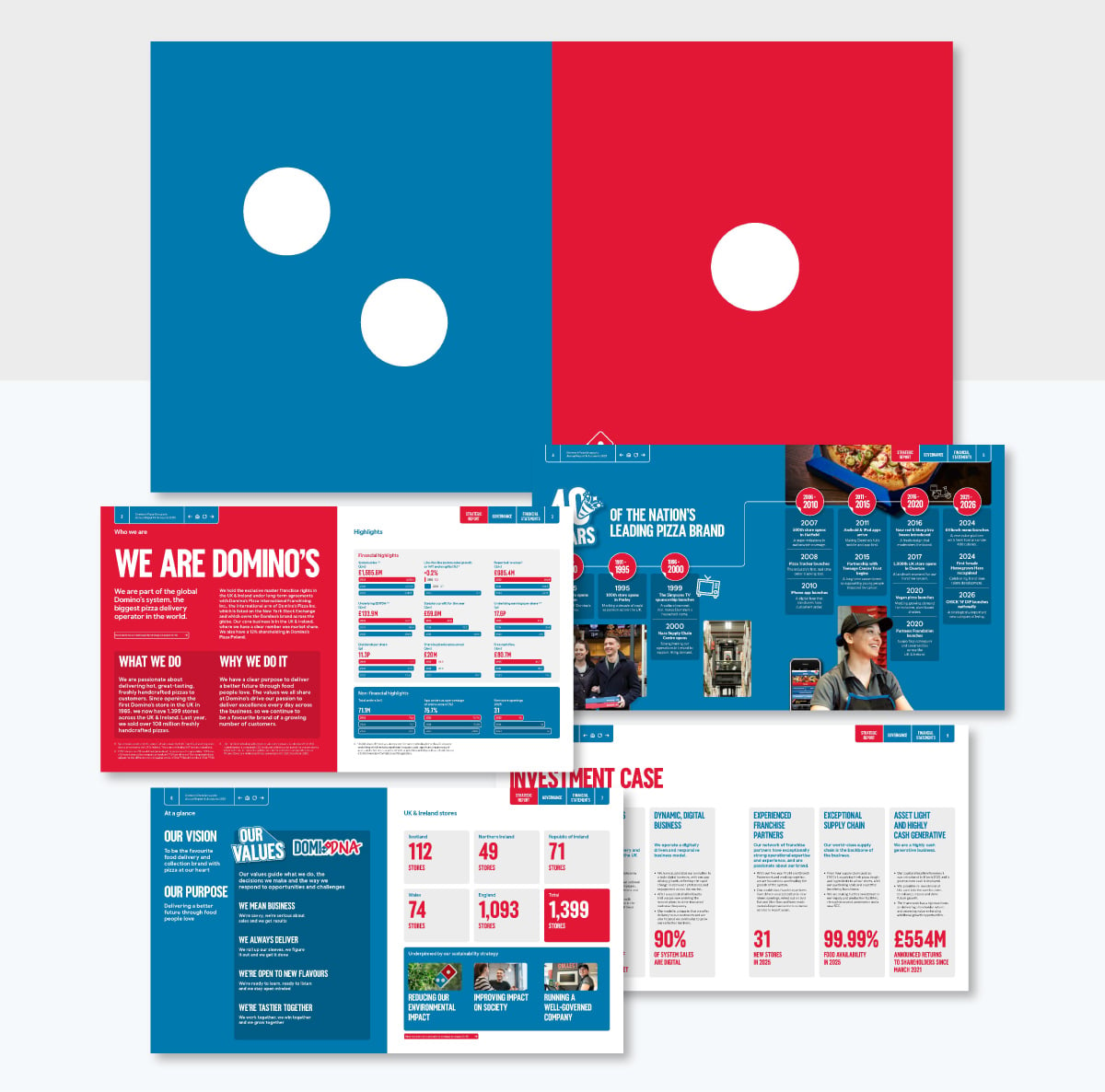
This report has a lot of text because it’s directed at investors, so the company has a lot to share. Since this version lines up with their 40th anniversary, there is a nice timeline graphic that tells the story of the company from its origin until now.
On the other hand, the Domino’s Pizza Enterprises LTD Annual Report is in vertical PDF format and has a slightly different feel. They both use Domino’s branding, of course, but the vertical version has a social media vibe to it.
In this version, they share updates and news from all Domino’s franchises around the world, highlighting what makes each one unique, including special pizza combinations and locally inspired side dishes. Each region also showcases a quote from an employee and important facts about the franchise.
This report is a solid example of how your images can do the talking, especially if it's for a product or food-based company. Don't shy away from using enticing images that will not only keep your readers engaged but also drooling. If you don't have the budget to take such images then invest in a good AI image generator to do the trick.
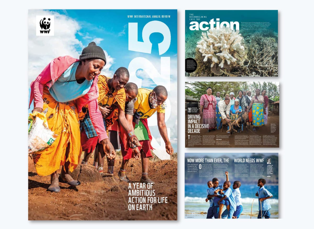
The World Wildlife Foundation (WWF) 2025 report is a visual masterpiece, with full-page images and a nature-magazine feel. This year, they called it an Annual Review and titled it A Year of Ambitious Action for Life on Earth.
They shared inspiring stories of the work they undertook the year before, always making sure the reader feels a connection to the cause.
As you craft your report and bring your design together, don’t forget to incorporate the power of storytelling by adding real stories and examples.
Storytelling helps build a connection with the reader, making your content not just seen but felt. Your annual report, like your marketing materials, should always incorporate elements of storytelling to keep readers excited to turn the page.
Plus, if you plan to repurpose your annual report into a white paper. You can view these white paper examples to get an idea of how to do this.
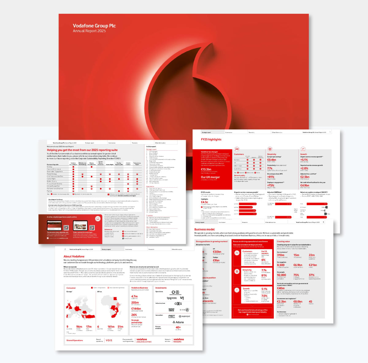
The Vodafone annual report is different from all the others in this list. It opens in a viewer that lets you do all sorts of things to help you read and navigate the report. For starters, you can navigate in three different ways: using the tabbed menu at the top or opening a sidebar with either page title tabs or full-page tabs for easy scrolling.
It has a search function and you can add notes to it. Not sure how the notes work for everyone who views it, maybe through the computer’s IP address? I tested creating a note, closing the report and opening it again. My note was still there.
What can you learn from the Vodafone report? That you don’t need to follow any rules. Make your report however you want! Vodafone uses a viewer that I’ve seen for other reports and it works great. It makes viewing and skimming super easy. And the search function? I’ve never seen that in any annual report either.
Just remember, there are no rules. As long as your report is legible, comprehensible, engaging and covers all the bases, you can do whatever you want.
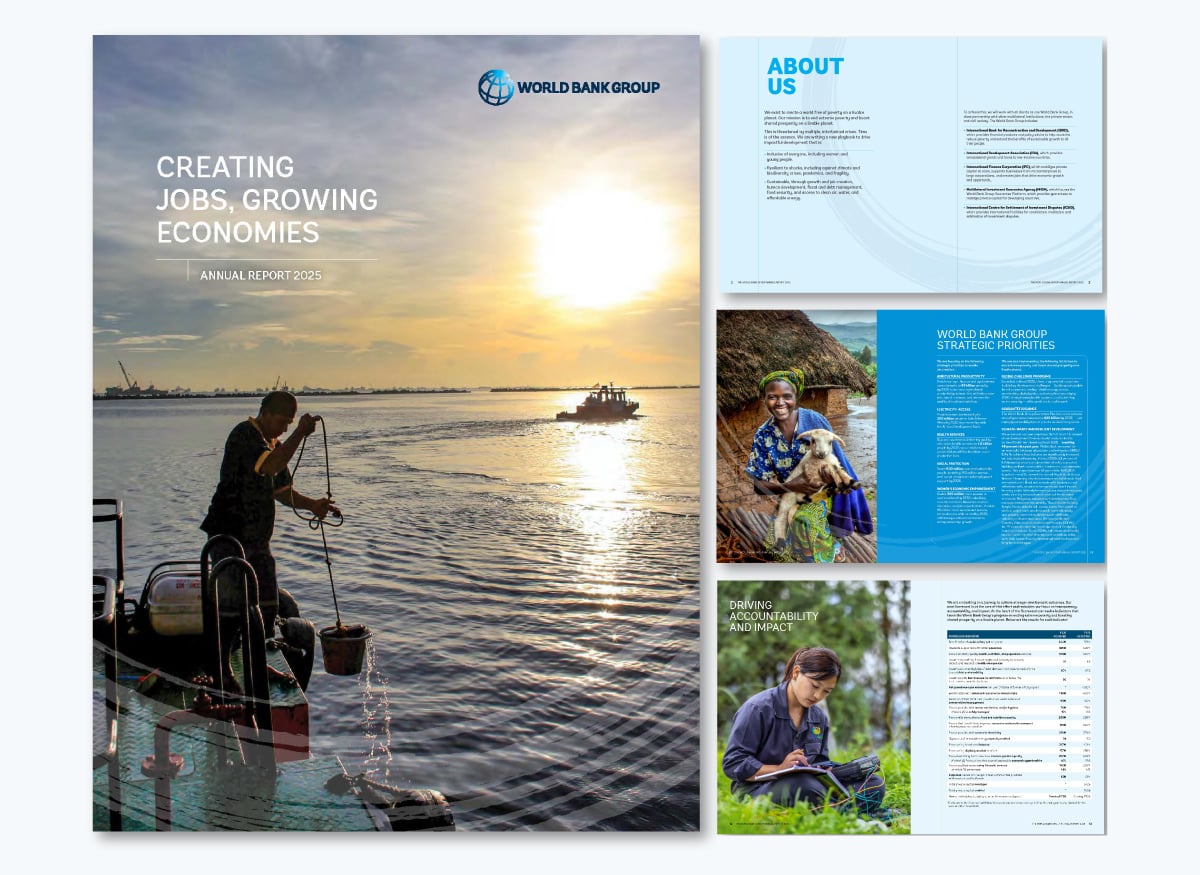
The 2025 World Bank annual report landing page highlights the main points with detailed stories about actions taken by the group in the previous financial year.
The report is best viewed as the downloadable PDF version. You can tell that this report is designed to be printed because the first and last pages are vertical, while the rest of the pages are horizontal. Thankfully, in the digital version, they did add navigation to the table of contents.
If your company operates in a regulated industry, your annual report may need to meet specific requirements. Get inspired by the World Bank’s report. The design and page layout are very traditional, but offset by beautiful photography and subtle graphic compositions in the brand's colors.
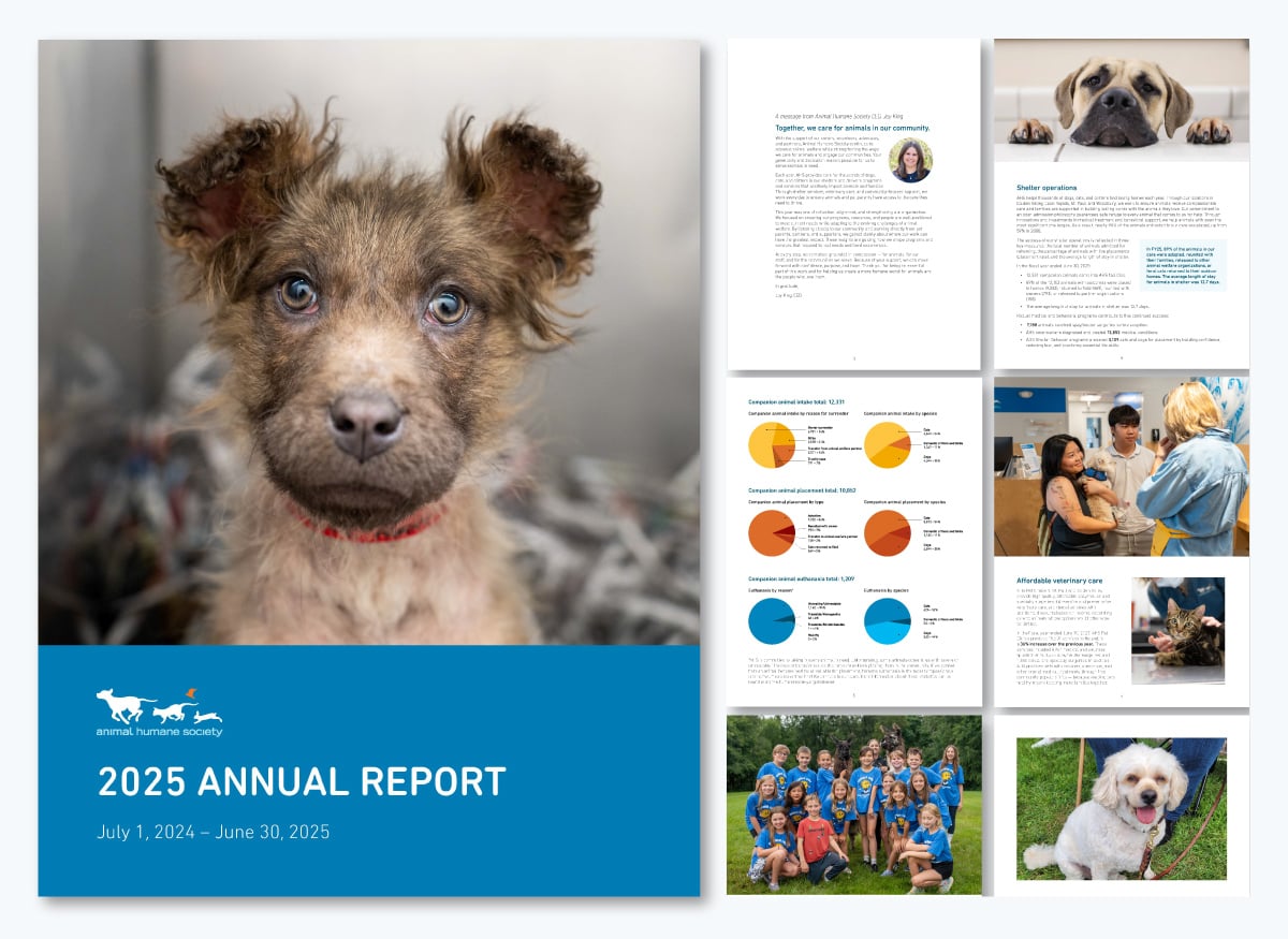
The Animal Humane Society’s annual report catches your eye quickly with the cutest animal photos, colorful pie charts and key statistics about their work over the year. They don’t overcomplicate things, opting for a modern layout with lots of white space, an easy-to-read font and gorgeous visuals.
This annual report is the perfect example of how you can create your own with a simple layout that makes sense, doesn’t overwhelm and simply works. It’s not the most beautiful of annual reports, but it gets the job done. If that’s what you need, use this example as inspiration.
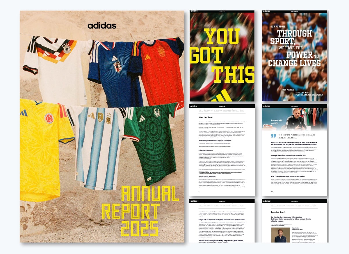
Adidas is known for creating bold, interactive annual reports, and their design team goes all out. Both their report website and document don’t just share information; they take you on an immersive journey through 2025. In this edition, the focus is on the World Cup.
The colors are bold and high-contrast, staying true to the Adidas brand. Financial results are brought to life with animated charts and gradient numbers. Readers get natural breaks in the text thanks to animations, images, and videos. And to top it off, there’s a dashboard that highlights the biggest developments of the year at a glance.
Overall, it's what you'd personally expect from a brand like Adidas. High quality, fully functional and enjoyable to consume.
Reports designed to offer immersive or mixed-media experiences are often more memorable than those that don't. People scroll through documents every day, so when a design makes someone stop, it's worth the investment.
Demand Metric found that interactive marketing content converts at nearly twice the rate of passive content. If it works in marketing, there's no reason it shouldn’t work for a web-based annual report.
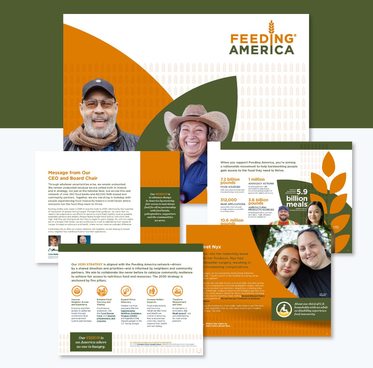
Feeding America shares a beautiful digital 2025 annual report rich with photos, icons, colored shapes and photos that together create a visually layered effect. They do a really good job of using only two colors plus black and white. It’s tricky to use three strong colors and make it work without becoming visually overwhelming. A good technique is to add muted versions of the main colors to add a bit of depth without straying away from the palette.
Does your brand have two strong colors like Feeding America? Use this report as inspiration for combining these colors while still creating contrast. For example:
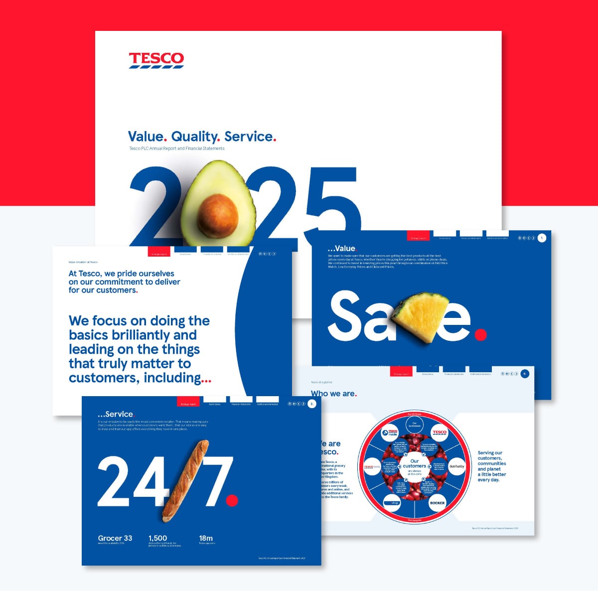
The 2025 Tesco annual report welcomes you on the website and then offers three viewing options: to download the report PDF, the financial results in Excel or to view a digital XHMTL document with an iXBRL viewer for the financially savvy readers.
One design detail that stands out while also staying deeply on brand is using fruits and chilli as letters. Plus, a baguette replaces a slash. This visual technique calls attention while also being a nod to what Tesco is all about: supermarkets.
The PDF and XHTML reports are both interactive and navigable, which is not common for reports. Creating an annual report like this is actually not that hard. Really, all you need is Visme. Using the internal hyperlink feature, you can create menus, navigation, sections and more.
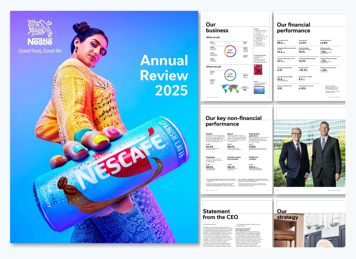
The Nestle 2025 annual report is centered on their coffee-based products. The cover is a close-up, perspective shot of a woman in colorful clothes holding one of Nestlé’s newest coffee products.
Remember what I said about several reports being released simultaneously? Well, on the third page is a sidebar that shows their other reports: one about corporate governance and the other as the web companion of this report.
Visme now offers a Microsite builder, so you can recreate an annual report just like this in both web and PDF versions.
Something that stands out in this report is the layout's simplicity. Even in the visual section, the data overview is displayed in simple columns with big numbers all in the same font and size. This makes skimming for comprehension really simple. For readers interested in more detailed data, the pages towards the end contain all the charts, graphs and tables for review.
Our Head of Design, Alejandra Mariscalez, has a tip to help you with this technique: "Be purposeful with the content you have to show on each slide or page. Question if all of it is necessary or if it can be split into other pages to showcase it better.
I would recommend having 1-2 topics per page tops (if possible), not only will this give you the proper space to organize your elements, but it will also be beneficial for the people you are presenting to. It is easier for a human to understand information that is dissected and visually represented."
Here’s a quick recap of the best examples and the lessons you can pull from them:
Annual reports have come a long way. It’s more common now to see beautifully designed annual reports than documents full of text and tables built solely for compliance.
These are the changes we’re seeing in 2025 and moving towards 2026.
While starting with a template can save you hours of time, there are some expert tips and best practices to keep in mind if you want to create stunning and effective annual reports.
Here's a quick overview of what we'll cover in this section:
If you don't have an outline before you start designing, you'll find yourself constantly making changes to the annual report layout. This can get extremely frustrating and time-consuming, and you may even end up with an unsatisfactory design at the end.
Create an outline of the topics or pages you want to include, and list down the main points under each one. Follow a standard annual report format, and your outline might look something like this.

This will help you finalize the structure of your business report, and you'll have a wireframe to refer to during the report design process.
When you finally start designing based on an outline, you won't have to worry about missing out on any important information, and constantly removing or adding pages.
Not all annual report designs will work for your business. You need to choose a template with a design that resonates with your audience, and helps communicate your message in the best possible way.
Think about who's going to read your annual report. Are you creating one for investors? Will it be distributed internally? Or are you looking for potential donors for your nonprofit?
The annual report format you choose should align with the values of your audience. If your boss hates the color green, you might not want to use it in your report.
Similarly, if you're publishing an annual report for the healthcare industry, using colors like yellow or orange might not work as well as blue or white for communicating trust and hygiene.

With Visme's annual report maker, you can easily change the colors of your template to suit your audience's taste, as well as your own subject and theme.
While it's perfectly okay to use a template as it is, make sure it doesn't clash with your brand's visual guidelines.
Your company's branding needs to be reflected in every single visual it creates, from a social media graphic to a presentation to an annual report.
In Visme, you can upload your own brand colors, fonts and company logo, and store them to use across all your designs, not just annual reports.
But that’s not all, you also have access to Visme’s Brand Wizard with which you can generate a full set of branded templates. All you need to do is input your website URL and the wizard will pull in your brand assets.

Using inconsistent colors, fonts and other graphic design elements that don't go with your branding can destroy the image you've worked so hard to create over the years.
An annual report design that's consistent with your branding, however, will do wonders for reinforcing your brand values. It will also resonate much better with your readers.
If the thought of a bulky document full of numbers puts you to sleep, try experimenting with a different format instead. A lot of companies these days use creative formats, like infographics, to present key financial figures and company information.
The advantage of using new formats is that they make your annual report look anything but boring. They also help you condense information into a single piece of visual so it's easy to read and understand.
Try creating your own text blocks to create a unique layout in between visuals, infographic widgets, photos, GIFs and videos. You can also use data visualization tools, such as widgets and charts, to visualize numbers and statistics.

Creating an annual report design from scratch can seem intimidating, especially if you don't have any professional graphic design experience.
Thankfully, you can still create a stunning annual report in minutes with the right template. A good yearly report template can give you a head start with fully designed sections, pages and visuals that you can simply replace with your own content in a few clicks.
Even if you're short on design inspiration or pressed for time, Visme offers an AI report maker that creates polished reports in seconds–be it an annual, monthly or quarterly report. Just give a detailed text prompt explaining your vision for what you want to create and watch the tool bring your vision to life.
In this section, we've put together a list of 11 annual report templates that you can customize for your own company or organization. Feel free to make a list of your favorite annual report design ideas.
This modern annual report template will give your business a polished and professional look. The bright yellow color on top of a black-and-white theme helps important numbers stand out.
Use the data visualizations included in this report template, such as pictographs, data widgets and donut charts, to make data easy to read and understand.
If you're looking for a sleek and trendy template with a technology theme, look no further. This customizable template comes packed with a creative layout, image overlays, vector icons, modern typography and stunning visuals.
Annual reports don't get more creative than this. If you're looking for an annual report design that highlights your brand's fun side and looks nothing like a boring, traditional document, this is the ideal template for you.
Instead of numbers, this sleek, colorful sales report template comes with unique data widgets, graphs and charts that you can easily modify to show your own data.
Simply connect your Google Sheet to sync live data, upload an Excel file or type in your data manually inside the annual report editor.
Catch the attention of potential donors and corporate leaders with this simple and elegant nonprofit annual report template. Customize the color scheme to fit your own organization, change the typography or keep things as they are and just plug in your content.
The eye-catching color scheme on this template works for most types of organizations, including businesses and nonprofits.
This business report example has a geometric design on the cover page, and the pages inside come with pre-designed layouts, graphs, data widgets, icons and images. Use Visme's Dynamic Fields to quickly update data across all the pages of your reports and multiple projects.
If you're on the hunt for a unique report design, this template is a great option. It has a professional look and feel perfect for modern businesses, and even comes with a customizable map that you can use to highlight geographic data in-depth.
If you're publishing an online version of your annual report, you can make the map interactive or animated inside the report editor.
Who says only creative annual reports are effective? Even a simple design, if done right, can make your brand look professional, just like with this no-nonsense template.
There are a few colors you can rarely go wrong with, and classic red is one of them. This simple template comes with a customizable map, graph and data widgets.
The breathable design of this template has the perfect amount of white space, images and a customizable bar graph that you can edit to showcase monthly or year-over-year growth and other key metrics.
Last but not least, why not take things up a notch and present your annual report in the form of an infographic instead of a traditional, multi-page document?
Use this professional annual report infographic template to bring your numbers to life. Make data easy to skim through and trends easy to identify using annual report graphics like charts and graphs.

Share your budget in style with this multi-page budget report template. This comprehensive financial report example features an eye-catching layout with several colored content blocks fueled by Visme’s high-quality vector icons, data visualizations and more.
It’s a great pick for businesses looking to share their financials with their current or future investors. This is also a good report to share with any financial presentation.
Plan your budget like a pro with our easy-to-use budget planner. Create your custom budget from scratch or choose a budget template that fits your needs.
Highlight key company information using this template for your limited liability company (LLC). Its minimal design lets you highlight just the key information of your company.


This template is the best of both worlds for operations managers or CEOs who want an operating plan and report that helps convince and inform stakeholders.
It opens with an executive summary and strategic objectives, then breaks down into core sections from operations, project metrics, timelines, KPIs and governance structures.


Do you still need to figure out some aspects of annual reports, design or annual report formats? We’ve put together this section with frequently asked questions that hopefully will clear some of your doubts.
You asked for it! Here’s a step-by-step guide to designing an annual report.
Give yourself and your team the time and space to plan and strategize the annual plan design and distribution. You might think that distribution isn’t something you need to think about at the beginning, but you’d be wrong.
Will your annual report be printed into booklets or folders, or will you share it as an online digital experience? The answer tells you what annual report format you need, saving time and effort in the long run.
You’ll have to create a printable document, an interactive PDF or an online experience. Once you know, put your project management hat on and plan out all the goals, tasks and deadlines. Visme has project management templates to help you.
Create a new workspace in your Visme account for the annual report project, or add a new canvas in a Visme workspace you already use. Add the people in your team involved in the content creation and design of the annual report.
Collect all the information and content you’ll need to include in the annual report layout. You’ll have to create a working folder where all files are kept and organized. Your Visme workspace has a media library with folders to organize all your assets. Upload everything as you receive it and label them before designing.
Create an outline for the textual content, separated into sections you’ll use in the layout. Start drafting a index and include links to relevant documents with important text. Use one document to write all the content using a unified tone and voice. Revise the text with your team and finalize it before you start with the design.
Go to your Visme account and browse the annual report templates gallery. Likewise, scroll up on this article and see many options. Select the one that you feel matches your brand, plan and outline better. Annual report layouts come in all shapes and sizes; they vary by industry, niche or field. Any templates you choose to work with are entirely customizable to match your brand guidelines and unique angle.
Power Visme users have branded report templates in the Brand Kit, ready to be adapted to this year’s annual report. All brand assets are present, fonts and colors are ready, and hours are saved.
With your Visme editor and outline document side by side, input the text into the placeholders, adjusting so everything fits as it should. Add your visuals, including data visualization, images, illustrations and icons. Use the keyboard shortcut to find design elements to create a visual flow with clear transitions between sections and a cohesive layout. All you need to do is tap the forward-slash (/) on your keyboard and a search bar will appear to help you find anything you need.

Don’t underestimate your annual report’s cover design. Take your time to choose the right title, select the best visuals, and lay it out attractively and engagingly. Keep your brand forward at every stage of design and composition.
All annual reports, regardless of industry, share the same four components. Inside each one, your annual report will vary depending on scope and message. Here are the four components of an annual report
The introduction of an annual report starts with a letter from the director or chairman of the board to the company’s stakeholders. On one or two pages, place the letter from the director and include his photo and signature as part of the design.
In this letter, the message is all about thanking the stakeholders for their support throughout the fiscal year. There’s a summary of the content they’ll see in the annual report and a personal comment to close up the introduction and invite them to read on.
The second section is about the business profile. There’s mention of the brand’s corporate governance, values and goals. This section includes information about market positioning and how it has changed since one fiscal year. Provide plans and ideas for improving results in the coming year.
In this part of the annual report, external readers will gain valuable information about the company and brand. It provides a background story for the timeline and roadmap visualized in the annual report.
Next up is the management component, featuring operational reporting alongside discussion and analysis reports. These annual report pages include operation reviews through the fiscal year and their comparison to the previous year—set goals for the coming year for all management areas, including marketing and public relations.
Include a letter from some of the managers. This adds a touch of personalization to the annual report, balancing the data visualizations perfectly.
Last but definitely not least is the financial statements component of your annual report. This section is the largest and most important of the entire document. Inside this section, you’ll include all the information related to financial status and statements of the company. For example, a balance sheet, the cash flow, monthly and quarterly financial statements. And finally, the notes to financial statements, which summarize and analyze the numbers.
Data visualizations in financial report designs must follow a visual brand guideline. All charts, graphs, and diagrams must be in the same colors and use the same fonts. All captions and legends must be the same font size, and all extra lines removed.
In general, there are two ways to design an annual report.
For someone—that is not yourself— to design an annual report, you have several choices. At the top of the list—and most costly—are the design agencies specializing in report designing services with custom data visualization creation. These can cost anywhere from $7,000 to $25,000 and more with unique design elements.
Then you have traditional design agencies with standard data visualization experience, costing between $3,000 and $6,000.
Finally, you can also hire freelance designers with varying degrees of expertise. Depending on their seniority, they will charge only a bit less than a regular agency at $2000 to $10,000 if there are many pages and visualizations.
All these options cost money. The money you and your company might not have.
Thankfully, designing beautiful reports isn’t an activity reserved for professional—and expensive—graphic designers. Small companies or startups with lower budgets can design an annual report easily with an online content authoring tool like Visme.
Visme can be used for free to test it out for as long as you want. With a free account, you can create up to three projects. To access all of Visme’s capabilities, you can upgrade to one of the paid plans.
If you’re a nonprofit organization, you may qualify for a discount. Visme also offers separate Education plans for students and teachers.
As long as you select the right annual report layouts and follow our tips and suggestions, you’ll have a great annual report in no time. Do you need some ideas to make your annual report attractive to the reader? Here are some quick tips:
Most annual reports follow this structure:
Some also include a table of contents, data visualizations, and an appendix. Regarding downloading or sharing, the format can be:
A good report design is easy to scan, visually consistent and on-brand. Key traits include:
There you have it, a varied list of real-life 15 annual reports to inspire you, plus 11 Visme templates for you to create your own.
Ready? If yes, you most likely want a stress-free way to design an annual report. Check out Visme's full-featured annual report maker. It has a friendly interface, so anyone on your team, even non-designers, can use it to create beautiful reports.
It's easy to publish your annual reports online in Visme, and you can share them directly with a URL or embed them on your website. Also, with Visme, you can collaboratively create all your reports’ designs, from data visualizations to an animated pop-up slideshow.
Even if you lack design inspiration or are racing against the clock, Visme has an AI report generator that lets you generate professional-looking reports in seconds. All it takes is a detailed text prompt that explains what you want to create.
Sign up for a free Visme account and take it for a test drive for as long as you want.
Design visual brand experiences for your business whether you are a seasoned designer or a total novice.
Try Visme for free


![How to Create a Practical Crisis Management Plan [+ Templates]](https://visme.co/blog/wp-content/uploads/2025/07/How-to-Create-a-Practical-Crisis-Management-Plan-Thumbnail.png)