


Insurance Data Visualization: Turn Raw Data into Revenue-Ready Visuals


Do you need help communicating complex data in a clear and interesting way? Are traditional charts and graphs limiting when comparing multiple variables at once? You’re not alone.
If you’re a data or business analyst, you’ll sometimes need to compare and present multiple variables at once in a way that's understandable and visually engaging.
The good news is that there's a solution: the radar chart.
A radar chart is a powerful data visualization tool that allows you to plot multiple variables on a single graph, making it easier to identify patterns and trends in your data.
In this comprehensive guide, we'll delve into the world of radar charts, exploring their unique features and applications. We'll cover everything from the basics of radar charts to their practical use cases, ensuring you understand this versatile tool.
Plus, we'll provide 10 editable radar chart templates to help you create your own.
Let's hop on!
A radar chart, also known as a spider chart, web chart or polar chart, is a type of chart used to visualize multivariate data. The chart consists of a series of spokes radiating out from a central point, with each spoke representing a different variable. The data is plotted on each spoke using a line or area, and the end result looks like a spider web or star.
Just as radar technology detects objects and their distances from a central point, a radar chart displays multiple variables in relation to a central point. This makes it easy to analyze and compare different categories or dimensions.
Here’s an example to give you a clear picture of what a radar chart looks like:
The chart above compares four different automotive companies and the features of their cars. The features are measured on a scale of 72-86 and color-coded to distinguish between them.
Look how easily the chart can help you understand this data. You can see that Company D has the best average score, but Company A comes in second place with the highest luggage volume. You are able to compare five different data types quickly and view the results at a glance.
Radar charts come in three variations: standard, filled and polar area charts. Each type has its own advantages that can be useful for various purposes.
Made with Visme Infographic Maker
Let’s show you what sets them apart and how to use them appropriately.
1. Standard Radar Chart: This is the most basic type of radar chart, where data points are plotted as vertices on the chart and connected by a line. It is useful for comparing multiple variables simultaneously and identifying patterns in the data.
2. Filled Radar Chart: In this type of chart, the area enclosed by the data points is filled with colors, providing a clearer visual representation of the data. You can use it to show the relative importance of different variables and how they contribute to an overall score.
3. Polar Area Chart: This type of chart is similar to the filled radar chart, but the data points are plotted on a circular grid instead of a polygon. The area enclosed by the data points is divided into segments, with each segment representing a different variable. Use this chart to show how different variables contribute to an overall score and to compare multiple data sets at once.
Before you start creating or using a radar chart, it’s important to know what the tool is made of. It will help you identify the data variations to include, when to use it and how to use it.
Made with Visme Infographic Maker
Here are the elements of a radar chart:
1. Center: This is the starting point where all the radial axes extend. It represents the baseline or minimum value for each variable displayed on the chart.
2. Radial axes: These lines extend from the central point, representing the compared variables or categories. Each axis corresponds to a specific variable.
3. Axis labels: Text labels positioned at the end of each radial axis to identify the corresponding variable or category.
4. Scale: A graduated scale along each radial axis that indicates the values for each variable. The scale can be linear, logarithmic, or customized to suit the represented data.
5. Gridlines: Circular or polygonal lines connecting the scale markings on each radial axis help visualize the distribution and relationship of values across different variables.
6. Data points: The actual values of each variable are plotted on the corresponding radial axis. Dots or other symbols typically represent data points.
7. Data lines or polygons: Lines connecting the data points for each variable, forming a closed shape (polygon) when multiple variables are plotted. This shape allows for easy visual comparison of different categories or dimensions.
8. Fill color or shading: The area enclosed by the data lines or polygons can be filled with color or shading to enhance the visual representation and make comparisons easier. You can use different colors to compare multiple data sets on the same chart.
Once you know the key elements, it becomes easier to read a radar chart. You can go through the “Key Elements of Radar Charts” section and follow the steps below.
1. Identify the variables: Look at the radial axes extending from the central point and read the axis labels to understand the different variables or categories being compared.
2. Understand the scale: Check the scale along each radial axis. Scales can be linear, logarithmic, or customized. Ensure you understand the range and intervals of the values on each axis.
3. Examine the gridlines: Notice the gridlines connecting the scale markings on each radial axis. These lines help you visualize the distribution and relationship of values across different variables.
4. Locate the data points: Find the points plotted on each variable's corresponding radial axis. These points represent the actual values for each category.
5. Trace the data lines or polygons: Follow the lines connecting the data points for each variable. If multiple variables are plotted, these lines will form a closed shape (polygon). This shape allows for easy visual comparison of different categories or dimensions.
6. Compare filled areas: If the chart uses fill color or shading within the data polygons, observe the differences in size, shape, and color to compare different data sets or groups.
7. Analyze the data: Now that you can read the chart, analyze the data by comparing the relative positions of data points, the shapes formed by the data lines or polygons and the filled areas (if applicable). This will help you identify the data's patterns, trends, strengths, weaknesses or outliers.
Following these steps, you can effectively read and interpret a radar chart, gaining insights into the relationships and comparisons between multiple variables or categories.
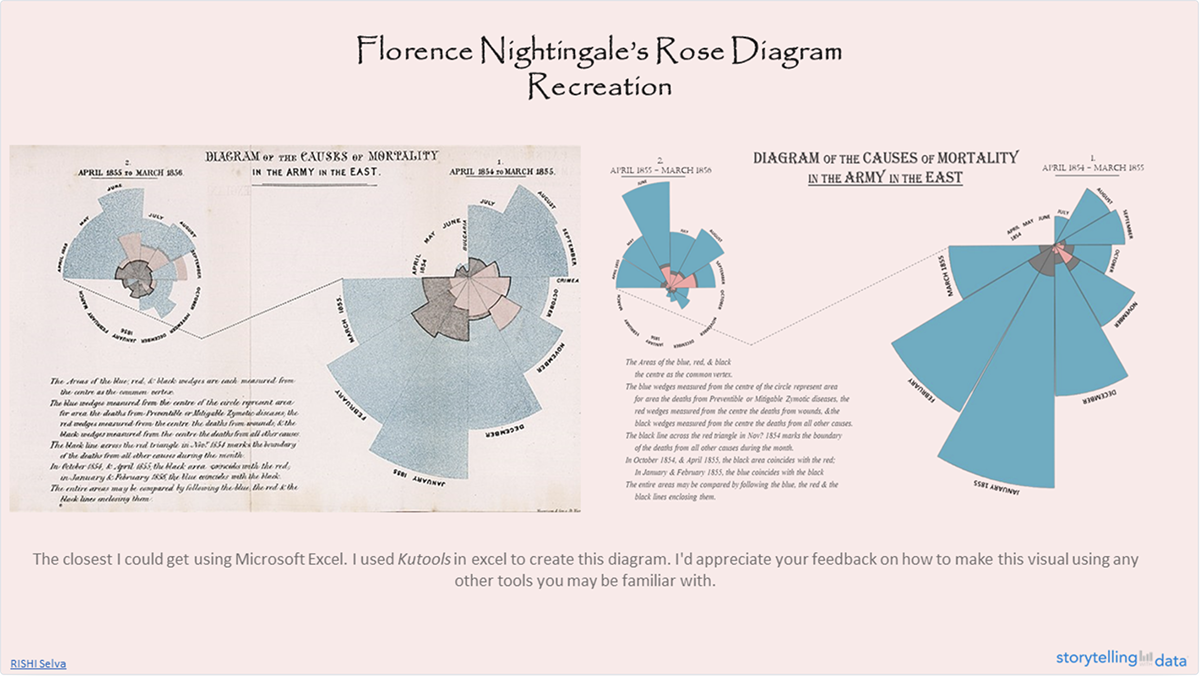
Nightingale’s most famous diagram, the “Diagram of the Causes of Mortality in the Army in the East,” was created in 1858.
This chart vividly showed that more soldiers were dying from preventable diseases like cholera and dysentery than from battle wounds.
Nightingale’s approach to creating this diagram is quite fascinating. First, she represented each month with a wedge, with the area of the wedge corresponding to the number of deaths.
Then, she divided the months into two separate charts, one for the period April 1854–March 1855 and another for the period April 1855–March 1856.
Her approach is interesting because she could have combined the data for the whole 24 months into a single graphic, but instead she contrasts the mortality rates before and after the Sanitary Commission's arrival.
The blue region represents the sickness mortality rate, which was greater in the first year of the war (right side of the diagram), prior to improvements in camp and hospital sanitation.
She also connected the neighboring months with a dotted line which made the data easy to interpret. In fact, the considerable disparity in size (deaths) between the two parts is evident at a glance.
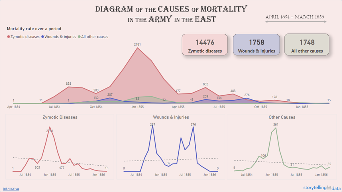
The Baby’s Spike Chart, created by Zan Armstrong and Nadieh Bremer is another very interesting radial chart. Zan and Nadieh explored the timing of births in the United States and revealed that more babies now arrive on weekdays than on weekends, most between 8 A.M. and 6 P.M.
The Baby’s spike chart was featured in the July 2016 issue of Scientific American and won a Silver award in the Science category at the 2017 Information is Beautiful Awards.
They took a granular approach and visualized the number of babies born across different time frames, from weeks down to the minute.
The main unique selling point of the chart was the way they revealed deviations from the default. A yellow average line was included in each of the circular charts which remained the same size across all charts. With this line, you could easily see deviations from the mean.
The idea behind their approach was that they wanted to show that the values got stronger the more granular it looked. While weekly totals showed small deviations, the minute-by-minute data revealed significant spikes.
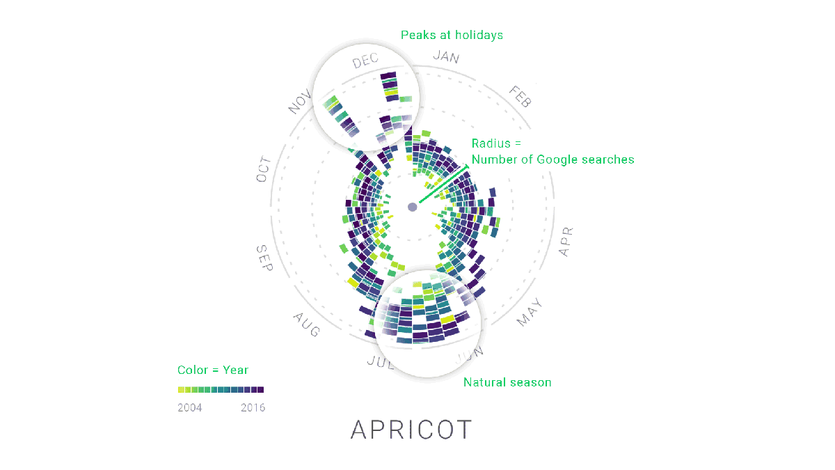
Moritz Stefaner, Yuri Vishnevsky, Simon Rogers, Alberto Cairo et al collaborated with Google News Lab to create the Rhythm of Food. The focus of the project was to explore the seasonality of food-related searches on Google over a span of 12 years.
This chart stands out in quite a few ways. First, it uses a unique radial “year clock” design to display the data. Each segment of the clock represents a week of the year, and the distance from the center indicates the relative search interest for various food items.
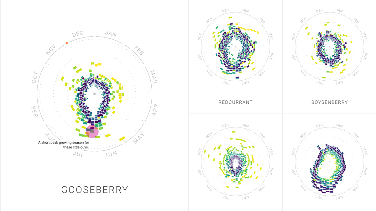
But what makes this chart really impressive is how it uses color codes to show year-over-year trends in food search. For instance, some vegetables, fruit, dishes or drinks were tied to natural seasons, some to special holidays while others were popular all year long.
The creators of Rhythm of Food also made the charts very interactive by developing animated versions of each chart, making the charts very immersive.
According to Brain and Company, the companies that use data visualization are 5x more likely to make faster decisions and 3x more likely to execute them. And you’ve already made a crucial business decision by including radar charts in your business process.
Though creating a radar chart is not easy, especially for beginners, with the right tools, everyone can do it. Visme’s chart maker and the radar chart templates are tools that anyone can use to create a radar chart in minutes.
Here are 10 of our favorite radar chart templates that you can use. We will also share some customization tips along the way.
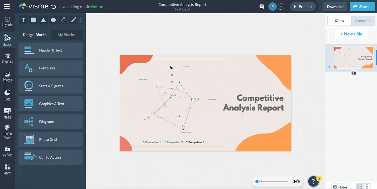
Let’s start with this competitive analysis report template. It’s a visually appealing and easily understandable tool for comparing multiple factors across different competitors in a given market.
If you are a business analyst, you can use this template to get insights into your competitors’ strengths and weaknesses and analyze your business position within the industry. The radar chart's design allows for simultaneous comparison of price, quality and customer service, providing a comprehensive overview of the competitive landscape.
Replace the competitors' names with yours and input the data you collected from your research to make the template your own.
Visualizing sales data is an effective way to communicate your company’s performance and strategy to stakeholders. In this template, a company's regional sales data is perfectly illustrated. You can see the regions and how much sales the company made throughout the past years.
Customize the template by changing the company name, sales figures, financial years, filling color and more.
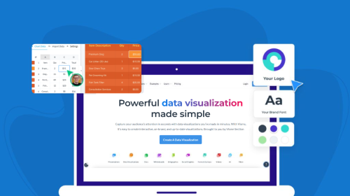
With Visme's brand design tool, you can save your branding assets, such as logo, brand colors and brand fonts. This will help you apply your saved branding elements to the template with a click.
Read this article to learn more about creating a branding kit in Visme or watch the video below.
This template is a highly effective resource for companies to evaluate the performance and progress of their interns. It enables you to comprehensively analyze various aspects of the internship experience, such as creativity, motivation, communication and more.
The easy comparison of interns across multiple criteria streamlines the decision-making process for future hiring and intern recognition. And the best part? You can customize the template to visualize other aspects of the internship experience.
The template also includes legends at the bottom that show the interns' names, making it even easier to compare their performance.
Assess the quality of training your employees are getting by comparing the performance of their trainers across various dimensions. The chart displays ratings on a scale of 72 to 96 on different dimensions, such as punctuality, delivery, helpfulness, etc.
The trainers can use this template as a self-assessment tool and find areas of improvement. The complementary color combinations, icons and shapes give your chart a creative and professional look.
To take your radar chart design to the next level, you can add some sort of interactivity to it. Create hover effects, pop-up menus, special effects, links to the source of the data and more.
Discover the secret to creating captivating pop-ups in Visme by watching this video!
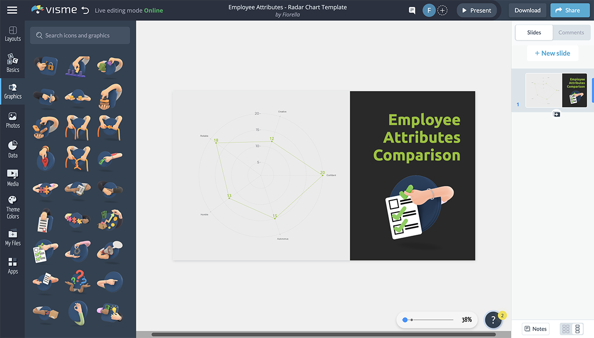
Compare the skills, competencies and performance of your employees easily using this radar chart. If you are a Manager, HR professional or team lead, you can use this tool for performance reviews, skill assessments and employee development planning. Plot the scores on each attribute to get a clear snapshot of an individual’s performance.
The yellow-green shade on the jet background makes the text pop and gives the template an energetic and modern look. Furthermore, the appropriate use of icons makes it easier to understand the different attributes you are visualizing.
With Visme, you get access to 10,000+ icons, illustrations, 3D graphics and other visual assets that support the content in your documents.
This template is perfect for food bloggers, tourism websites or local restaurants looking to discover the top-rated burger spots in the city. The radar chart's distinctive design allows for a quick, at-a-glance comparison, making it a valuable resource for anyone seeking to indulge in Kansas City's best burgers.
Using this template, you can provide a comprehensive view of Kansas City's burger scene, helping readers decide where to enjoy their next mouthwatering meal.
However, you can customize the chart to visualize any data you want. For example, you can compare the pizzas in a city or town, the best places to visit, the best activities and so on.
Here’s another radar chart template that you can use to present data from your competitive analysis report. Its simplicity is what makes this template unique.
The ultimate goal of data visualization is to represent complex data in an easy-to-understand manner, and this template is a perfect example.
Insert your company logo, add your competitors, change the text, input the data and you are ready to go.
Are you looking for a more creative way to visualize your data? Then this template is exactly what you need! This creative radar chart template is perfect for showcasing your content and ideas in a visually appealing way. It features bright colors, fun icons and clean lines that will catch the attention of your target audience.
Alter the color scheme by using Visme’s color dropper tool. With Visme, you are not limited to a few color options like Excel. You can choose from a wide range of preset colors, use the color wheel to make your own color or copy-paste a HEX code to get the color you want. Also, you can pick colors from an image by uploading it to the tool.

Radar charts are also a great tool to show data over time, especially when comparing different parameters. With this radar chart, you can easily compare the number of trips taken by different age groups in 2018 and 2021.
To show any other data that changes over time, simply replace the columns and rows with your own data and change the pre-existing text by typing on your keyboard.
Also, to include an image that matches the content of your chart, you can search a keyword and explore high-quality, royalty-free images from Visme’s library.
With Visme’s AI image generator, you can automatically generate images, arts, 3D objects, icons and abstracts. Just type the kind of image you want and watch the magic unfold in a few seconds.

If you are a business owner or a financial analyst, you'll find this template extremely useful. It shows you how much money was coming in and going out over time, as well as where the money went.
The radar chart can be an alternative to bar or line charts, making it an appealing choice for those looking to stand out and convey complex financial information clearly and concisely.
Track the performance of your radar charts using Visme analytics. If you plan to share or publish your chart, the analytics will give you insights into views, unique visits, activity, date/time of view, visitor IP, visitor location, total time spent on the chart and more.
We’ve sourced some best practices for creating radar charts from experts who know what it takes to make great charts. Here’s what they had to say:
“Presenting data without sufficient context can lead to misinterpretation. Overcrowding the chart to include too many data points can make the chart unreadable”, observes Andrea Welsh, Medical Data Wrangler and owner of Clockwork & Cursive.
Medical Data Wrangler and owner of Clockwork & Cursive
Andrea recommends three mistakes to avoid to ensure clarity when creating your radial charts:
“I’ve found that radial charts work best when the number of categories is limited and the design is simple. However, they can quickly become misleading if overcomplicated,” BackupVault’s, CEO, Rob Stevenson observes.
CEO of BackupVault
“My advice is to always prioritize clarity and purpose in your visualizations. Ensure the chart type matches the data story you’re trying to tell, and test your visuals with a small audience to catch potential misinterpretations before wider sharing,” Rob recommends.
Creating a radar chart in Excel is a straightforward process. Follow these steps to create your radar chart:
Organize your data in a table format with categories in the first column and corresponding data series in the adjacent columns. Include a row with category names and a row with series names.
Click and drag to select the entire data table, including category and series names. Excel does not have a vast library of radar chart templates like Visme that can serve as a starting point for creating professional and engaging radar charts.
Click the "Insert" tab in the Excel ribbon. In the "Charts" group, click on the small arrow beside the "Waterfall" icon to open the "Insert Chart" dialog.
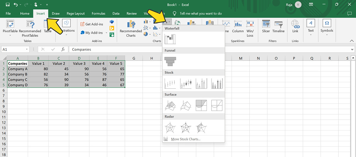
Choose "Radar" from the other options below. You'll see several radar chart options, such as "Radar," "Radar with Markers," and "Filled Radar."
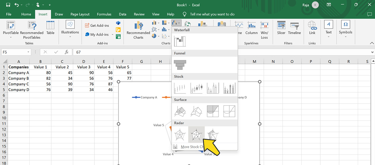
Excel will automatically generate the radar chart based on your selected data. You can customize various chart elements by clicking on them and using the options provided in the Excel ribbon, such as changing colors, adding data labels, modifying the axis scale, and adjusting the chart title.
However, with Excel, you get fewer options than with Visme when customizing your chart. You get the same 5-6 basic design styles and a few color palette options. Visme, on the other hand, gives your complete control over how you want the chart to look.
Click on the chart to select it, then click and drag the corners or sides to resize the chart as needed. You can also click and drag the chart to reposition it within your worksheet.

Once you've completed these steps, you'll have a radar chart in Excel that visually represents your data.
Creating a radar chart with Visme is more straightforward and allows you to have more control over the design of your chart. The process is similar to creating a basic chart in Excel, except that you can customize every part of your radar chart template.
You can watch this video tutorial to learn more about creating charts and graphs in Visme.
Let's walk through how to make a radar chart in Visme:
As we’ve already mentioned, Visme offers a wide range of radar chart templates that you can customize to make your own. Create a free account in Visme, if you haven’t already, and Login to your account.
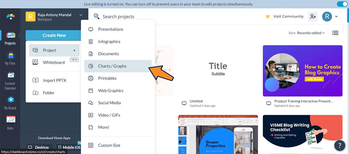
In your dashboard, click “Create New”, hover over “Projects” and select the “Charts / Graphs” option.
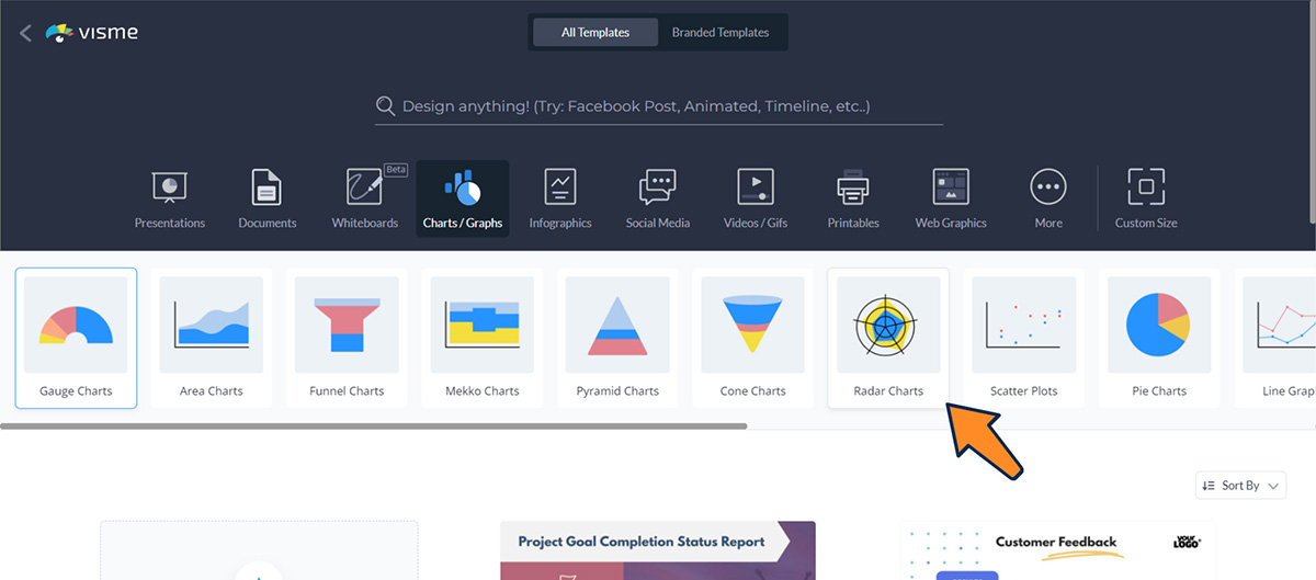
You’ll see a lot of other chart and graph templates on your screen. Choose “Radar Charts” among the others.
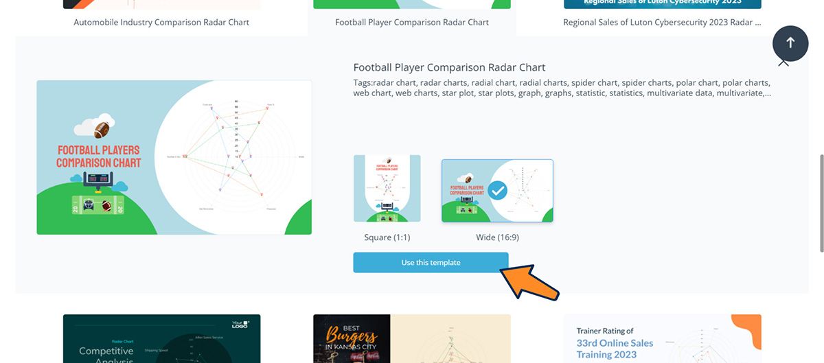
Select a template that matches your data visualization needs. It may include your data type, design preferences, industry and more. Clicking on a template will expand two different size options: Square (1:1) and Wide (16:9). Select the size you want and click “Use this Template”.
Once your template is inside the Visme editor, it’s time to customize it according to your needs. Click on the actual radar chart on your template and a left panel will appear with the data included in the chart.
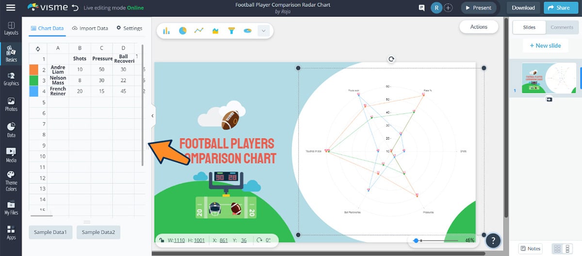
Just like Excel, you can then replace the columns and rows with your category names and data series.
To customize the visual appearance of your chart, you can change the colors applied to every row, change the background color, add or replace icons, illustrations and other graphic elements and do whatever you want to make it look professional.
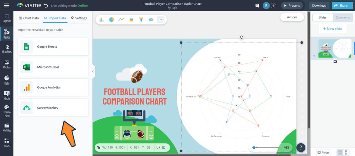
The best thing about Visme is that you can import external data to your table from Google Sheets, Excel, Google Analytics and Survey Monkey.
Click the “Settings” option on top of the left pane to get complete control of your radar chart.
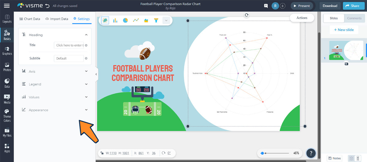
From here, you can edit and change the value of the X and Y Axis, add animations, show legend, add title and subtitle and many more.
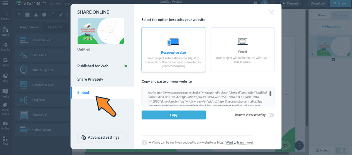
Once you are satisfied with the design, click on the “Share” button from the upper right corner of the editor.
Choose “Publish for Web” to share on Facebook, Instagram, Twitter, Slack and others.
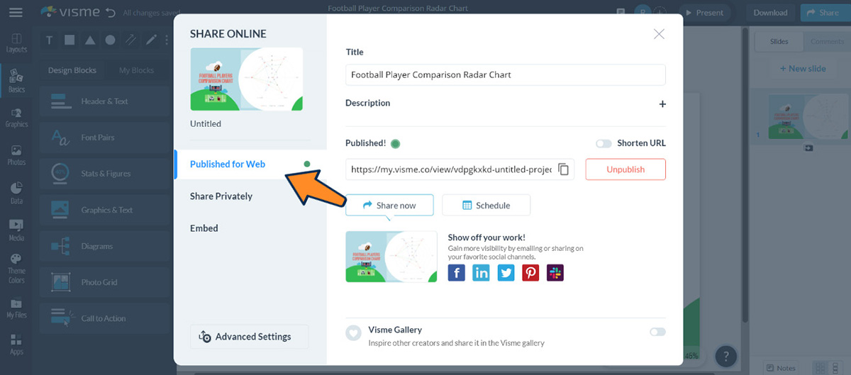
Click “Embed” on the pop up window and copy the embed code and paste it anywhere on your website.
To use your chart for offline purposes, click on the “Download” button next to the Share button. Visme lets you download your chart in JPG, PNG, PDF, GIF, MP4, HTML5 and PPTX file format.

If you are creating the chart for learning management systems, download the file in SCORM and xAPI format to use in your LMS.
Creating a radar chart with Visme will save you a lot of time and effort. Here is what one of our customers has to say about Visme.
“Visme has everything you need to create something cool. From data analysis to a demo video, everything is all in one place. It allows people of varying design skills to create professional work that’s engaging and within brand guidelines.”
- Helene Dunbar and Amanda Aultman, Internal Communications Specialists at Optum/HouseCalls
Read the full case study to learn how a communications team was able to create visual content 60% faster with Visme.
Though a radar chart is a great visualization tool for multivariate data, you might find other options more appropriate in certain situations. So, here are three alternatives to radar charts you can use. Also, you’ll get a template for each alternative.
Scatter plots are a type of chart that uses dots to represent data. The position of each dot on the chart represents the value of two variables. They are particularly useful for showing the relationship between two variables. You can also use them to identify outliers and patterns in the data.
For example, in the template below, each dot represents two variables: late packaging and total orders.
Similar to radar charts, line graphs use lines to represent data. However, line charts typically have only one axis, which makes them more suitable for showing trends over time. You can use this type of chart to show how a variable changes over time.
Bar Graphs are a simple and effective way of representing data. They use rectangular bars to represent the data, with the height of each bar representing the value of the measured variable. You can use bar charts when comparing data between different categories.
Like any other data visualization tool, the radar chart has its own set of pros and cons. It is important to know the pros and cons of using a radar chart to make an informed decision about whether to use it to represent your data.
Don’t use a radar chart if you have too many variables, significantly different data scales or negative values.
Radar charts can be messy and hard to understand when there are a lot of variables. They’re better used when you only need to compare a small number of variables (five to nine at most).
If the variables you’re comparing have significantly different scales, the smaller values can become almost invisible, while the larger values overwhelm the chart.
Radar charts don’t handle negative scales well. The visual symmetry of the chart can be disrupted, making it hard to compare data points effectively. It’s best to use other types of charts, such as bar charts or line charts when comparing negative values.
Alternatives to radar charts includes; Bar chart, line chart, scatter plots, tree maps, bubble chart, heat map, pictogram and more.
The first major limitation in radar charts is that you need to estimate radial distances, which can be much more difficult to do compared to alternatives like line charts. Even with gridlines added, it may be difficult to compare values across a single series.
Another major drawback is that you can’t use them for continuous data or datasets with many categories. If you do, the chart might become crowded and hard to read.
Some analysts also avoid using radial charts because the interpretation can be confusing to some readers. If you’re not sure that your audience will be able to interpret the chart, then you might consider other data visualization options.
Radar charts are used to display multivariate data, showing the relative performance of different variables. They are commonly used in performance analysis, skill assessment, and survey data visualization. Stock charts on the other hand are specifically designed to display stock market data, such as prices and volume over time.
There is no difference between a spider chart and a radar chart. In most cases, they are used interchangeably.
A radar plot is a single detection of a target by the radar system. It gives a snapshot of a target at a specific moment and would only reveal basic information such as the target’s range and bearing.
A track on the other hand is a sequence of radar plots that have been correlated and combined over time. It represents the continuous path of a target, showing its movement.
Tracks include additional information like speed, heading, and sometimes altitude, making them more comprehensive than individual plots.
A radar chart is a helpful tool for both individuals and organizations as it effectively displays data in a clear and understandable way.
Hopefully, the article helped you understand what a radar chart is, its key components and how to create one. Additionally, we shared some radar chart templates, their alternatives and the pros and cons.
Though there are other data visualization tools available, Visme has everything you need to make your radar charts engaging and visually appealing.
How so? With the help of Visme’s intuitive drag-and-drop editor and extensive library of templates, you can create a radar chart that fits your data perfectly. You can also personalize it with images and text to make it look more appealing.
Leverage the power of Visme's customizable templates and user-friendly tools to create stunning radar charts that bring your data to life and effectively share insights with your audience.
Sign-up for Visme’s chart maker today!
Design visual brand experiences for your business whether you are a seasoned designer or a total novice.
Try Visme for free