


14+ Employee Newsletter Examples, Ideas & Templates


Companies win or lose based on the quality of their data. Forbes found that 73.5% of executives depend on data-driven insights to make decisions.
Give them the correct information at the right time and they can steer the business toward growth and profitability.
And that's exactly what your monthly management report should empower them to do.
Executives are drowning in dashboards and updates. Your monthly report should cut through the noise and surface the insights that actually influence decisions.
In this guide, you'll learn how to create a monthly management report that drives real impact. You'll find expert insights on design and visualization, real-life layout examples and customizable templates and AI tips to help you create your next report with ease.
A monthly management report is a document designed to help leadership track performance and make informed decisions for the upcoming month and the rest of the year.
While quarterly or annual reports are often more detailed and aimed at external stakeholders such as investors or regulators, monthly reports focus on essential information for internal decision-making.
Your monthly management reports can cover the entire company or focus on individual departments. It often serves as a progress report on several key areas, including:
The main goal is to present key KPIs that help leadership anticipate challenges, allocate resources and adjust strategy effectively.
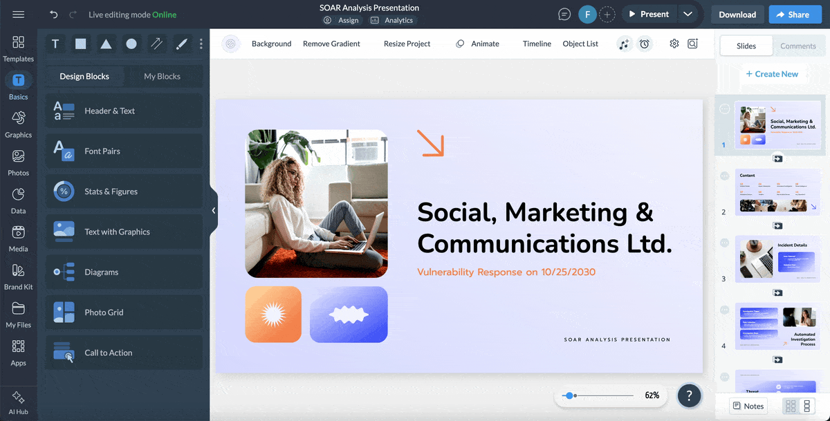
Here’s an example of a well-designed monthly sales report template that communicates key information at a glance:
Here's what your monthly management report must include and why each section earns its place:
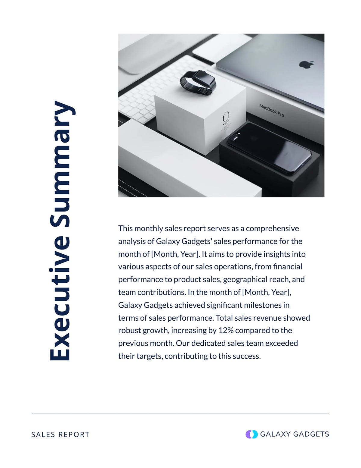
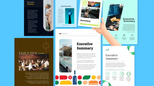
If executives have only a couple of minutes to review the report and make business decisions, they'd basically need key takeaways. Your executive summary should provide that.
It offers a high-level view of your team's performance on a monthly basis. In just 3–4 sentences, your executive summary should state the report’s purpose, highlight the most critical KPIs and call out a key win, issue or recommendation.
See an example of how to draft your executive summary in this template:
This section should outline the report's specific goals and boundaries. You can include the following specifics when defining objectives and scope:
Here’s an example of how you can draft this section, especially if you are focusing on objectives alone.

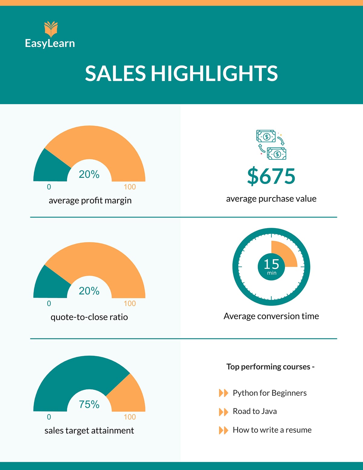
KPIs are the backbone of your monthly management report. They help leadership see whether the organization or a specific department is performing as expected and moving toward strategic business goals.
The most effective KPI reports prioritize metrics that reflect progress, rather than trying to include every possible data point.
Depending on the scope of the report, your monthly report could include KPIs from different departments. As long as it helps management track performance, it qualifies as an important KPI.
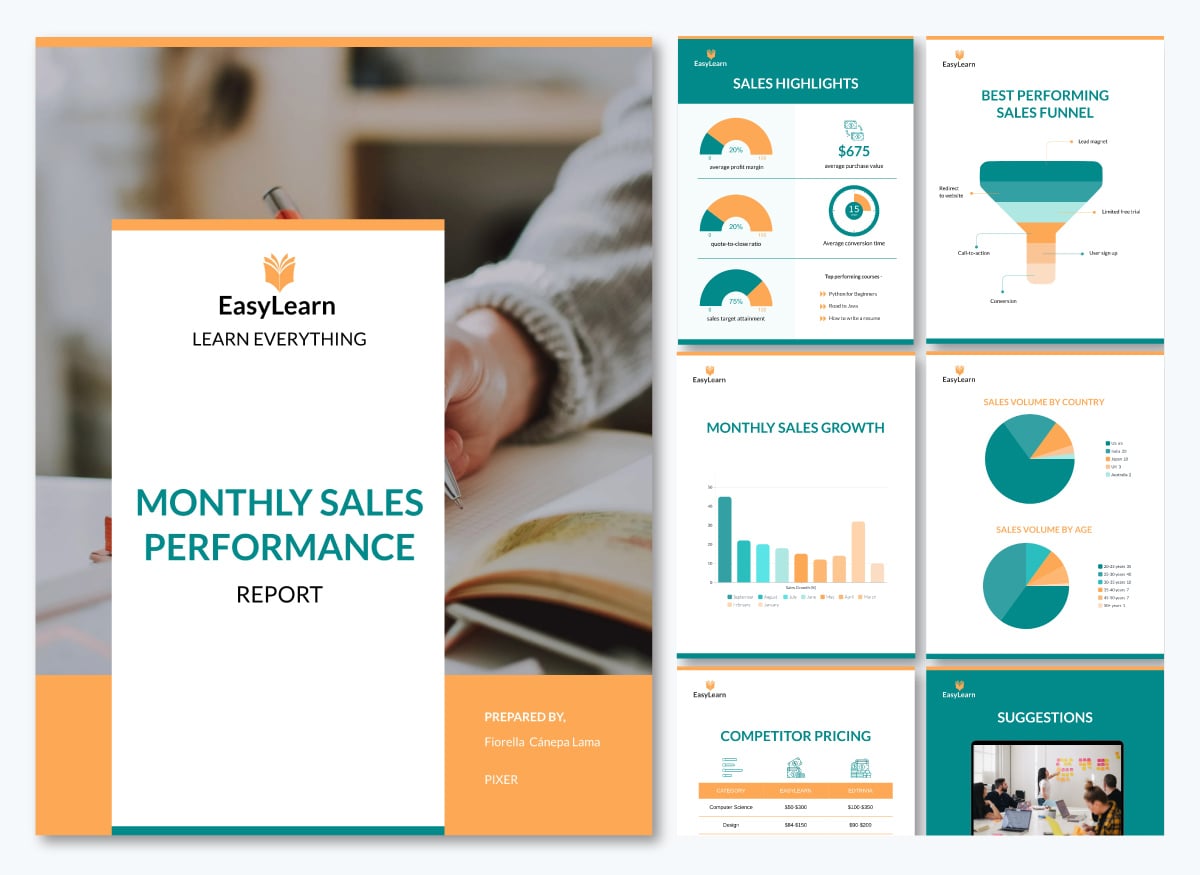
Here’s an example of the key KPIs from a sales performance report.
Your comparison and analysis section should explain how your monthly performance measures up against targets, past periods and industry benchmarks. Highlight what changed, why it changed and what those shifts mean for your overall goals.
Take a look at this example:

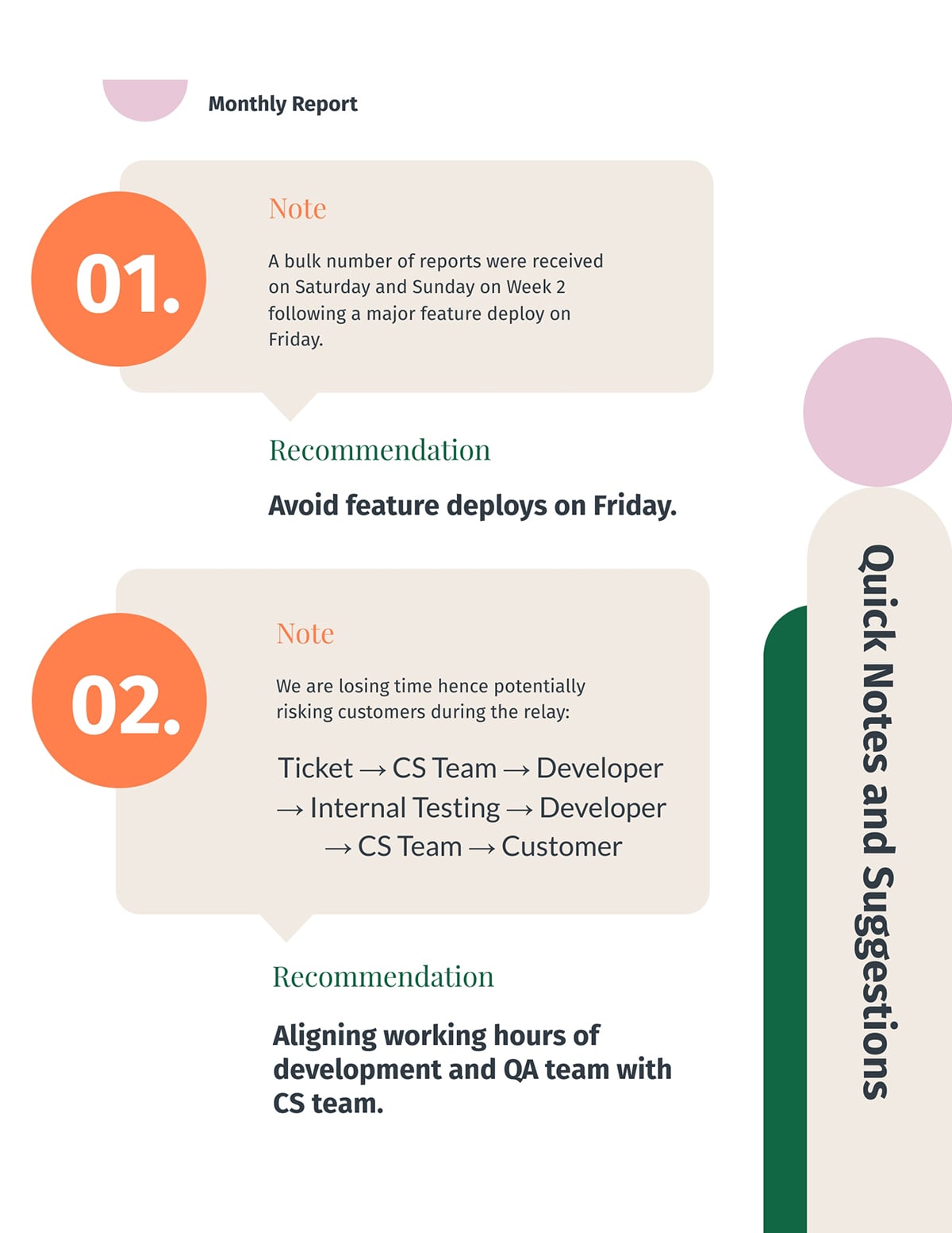
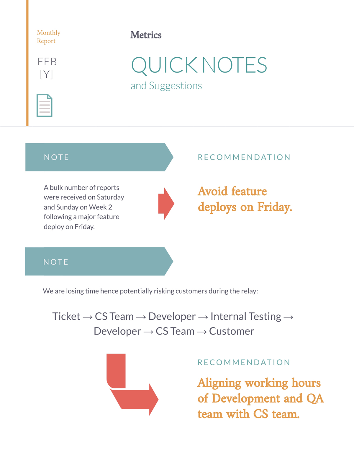
Many monthly management reports skip this section, but it is essential for giving leadership visibility into issues that may require intervention, correction or strategic attention.
This is where you answer the key question: What could affect performance going forward?
Some examples of risks you might highlight in this section include:
If you don’t want to present this section separately, you can place it under notes and suggestions or recommendations, as in the template below.
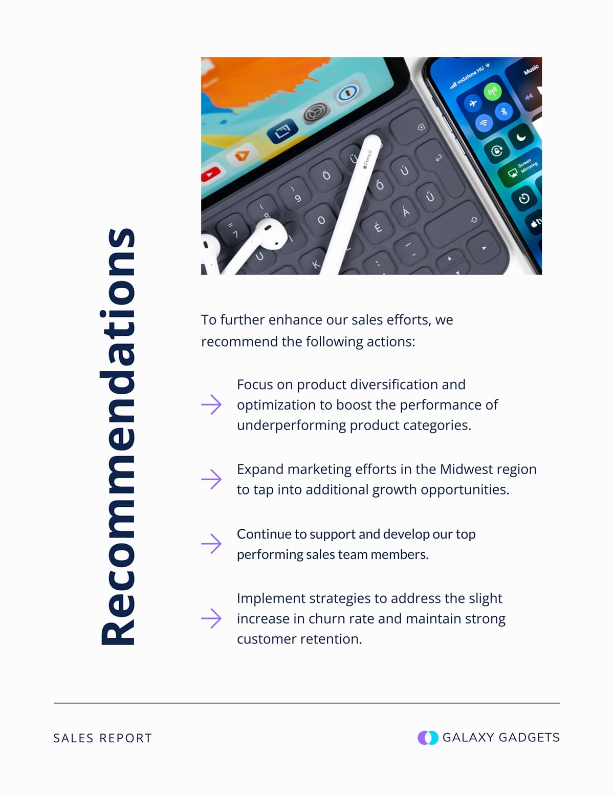
Valuable monthly reports look forward by turning insights into actions.
This shows management that you’re proactive and strategic, helping them make faster and better decisions.
Your recommendations slide should include forecasts or plans for the coming period, such as expected activities, resource needs, anticipated risks and dependencies.
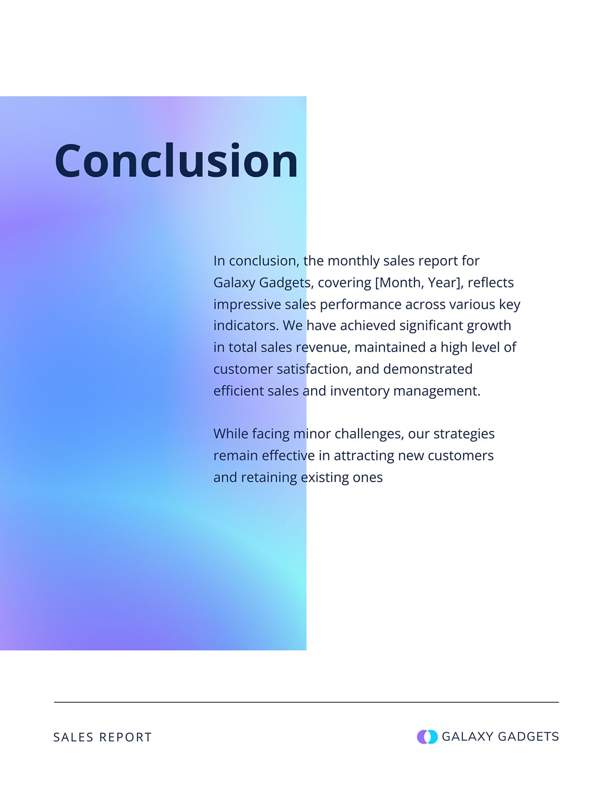
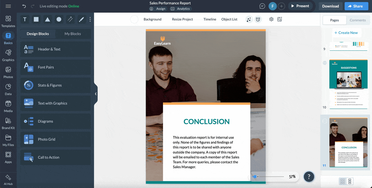
The conclusion section is very important because it closes the loop between performance, insight and action. It also helps leadership walk away with a solid sense of direction.
Keep it brief. Summarize the month in a sentence or two, reinforce the importance of the recommendations you’ve made and offer direction for anything that needs deeper review or follow-up.
Invite questions or clarification where needed so decisions can be made with confidence.
Take a cue from this template example:
Creating your monthly management report doesn’t have to be daunting.
In this section, I’ll walk you through a step-by-step process for designing and visualizing any type of report with ease:
You’ll find a wide range of tools on the market for creating monthly reports.
But one thing you should bear in mind is that the best monthly management report tools strike the right balance between functionality and ease of use. Visme hits that sweet spot perfectly.
Even if you have no knowledge of design, Visme’s intuitive editor makes it easy for you to create professionally looking monthly reports in no time.
Hear what Jenna, BarPro Team Lead at Krowne, has to say about their experience with Visme in this Case Study:
“Our internal team has become independent when designing presentations and we do not need to ask for assistance. Visme acts as our designer.”
With Visme, Jenna’s team can now create professional-quality presentations on their own, without relying on designers. This gives them greater independence and much faster turnaround times.
A good template gives you everything you need to build your monthly management report, so it’s easy to create, update and maintain consistency over time.
Visme provides a wide range of monthly report templates you can fully customize.
Simply update the text, adjust backgrounds, swap images and tailor fonts, colors, icons, illustrations and other design elements to match your needs.
A Harvard Business Review survey found that 40 percent of leaders and 30 percent of managers feel overwhelmed by the volume of information they need to process each day.
Your monthly report should lighten that cognitive load, not add to it.
Below are key tips to guide your design:
Here’s a practical example of the design elements I highlighted in the template below:
The headers are bold, while supporting details like dates are displayed in smaller text. Current status is indicated with muted colors, while recommendations use arrows, bold text or accent colors to draw attention to the action items.
Choose a report format that fits the kind of audience you’re presenting to, your goals, and the amount of data you need to communicate.
Here are a few layouts or formats and when you should use them:
Charts, color cues, simple dashboards and other methods of data visualizations will help decision-makers quickly spot patterns, risks and key trends in a monthly report.
As Cole Nussbaumer Knaflic, author of Storytelling with Data, points out, “the best chart is the one your audience can understand instantly.”
Here are some proven pairings of data types and chart types for more straightforward interpretation:
Visme offers over 40 types of charts and graphs to help you present data in a digestible way. Just search through the library and you’ll find one that suits your needs.
With interactive content generating 52.6% more engagement than static formats, adding interactivity to your monthly reports can be a powerful upgrade.
It’s a smart way to make your report more engaging, easy to navigate and rich with context, without adding unnecessary clutter.
In Visme, you can make your report interactive by adding:
A report is good if: Exec can understand key outcomes in under 60 seconds. Here are a few checklists to ensure that your report passes the “executive glance test”:
Once your report is ready, choose the sharing method that fits how your audience prefers to consume information. Visme gives you several easy options.
You can publish or share it as a live link so stakeholders can view it instantly without downloading anything.
If you want to control access, use the Share Privately option. Set the project to Restricted to Specific People so only the individuals you invite can open it. You can add password protection if the report includes sensitive financial or strategic content.
If you need to embed the report on a page, click Embed and copy the embed code. You can add it to any website or internal portal.
You can also use Visme’s Presenter Studio to record your presentation instead of scheduling time with your team. Walk through each section while recording and use presenter notes to keep yourself on track. Executives can watch it whenever it fits their schedule.
If you prefer the traditional format, export the report as a PDF. Send it as an email attachment or an archived file.
Now that you understand how to visualize your report, let’s focus on structuring your content.
We’ll walk through a step-by-step process for creating a solid monthly report that will guide leadership’s decision-making.
Your report is only as strong as the data behind it, so the first step is getting your numbers right.
Create a checklist of all KPIs you report each month, and document their sources. For example:
This checklist gives your team a guide to follow when compiling the report.
Before entering numbers into your activity report, double-check each figure for accuracy. For example:
If something doesn’t match, fix it right away instead of waiting for leadership to spot it later.
For example, if you used NPS to measure customer satisfaction last month, don’t switch to CSAT this month. And if “deals closed” is based on the signature date, don’t suddenly change it to the payment date.
When your definitions stay the same, trend comparison will be easy and leaders won’t get confused by hidden changes.
The next step is to draft an outline. We’ve discussed some of the critical sections you should include. Use that as a cue to get everything out of your head and into a structured format.
You can sketch your outline in a Google Doc or build it directly inside a Visme report template if you prefer to see a visual structure from the start.
Once you’ve drafted your outline, run it by a colleague, manager or someone who regularly uses the report.
Their feedback can help you spot missing details, structure the report better or flag metrics that might confuse your audience before you move forward.
Now that you have your data and outline, it’s time to start putting your report together.
You can create your design from scratch or use one of Visme’s monthly report templates (some of which I mentioned below) as a guide. You plug in your content instead of designing from scratch.
As you add your content, keep readability in mind.
Numbers only become helpful when you explain what they mean and why they matter.
Your analysis should always connect four elements: the metric, what changed, why it changed and what it means going forward.
Take a cue from this monthly report example:
This analysis reveals the following:
With the context and analysis above, leadership will have a good picture of the system congestion that happened in September and what it meant for the company.
You can apply this four-part framework to every significant variance so your reporting process consistently guides your executives toward a decision.
Before you distribute your report, review it for clarity, accuracy and coherence.
Share a draft with one or two trusted colleagues before sending it to leadership. Ask them: What’s the main message you took away? Did any section feel confusing? Did you have to reread anything to understand it?
Their perspective will reveal any missing sections you’ve missed.
After the review meeting, continue improving. Ask yourself three questions:
You can gather additional insights with Visme Analytics. It shows who viewed the report, how long they spent on each section and which parts held their attention. This helps reveal what’s working and what needs refinement.
Use these insights to shape the next edition: add missing details, remove unused sections, clarify anything confusing and adjust the structure based on how discussions actually unfolded.
Every quarter, review your template. If business priorities shift, your report should evolve with them.
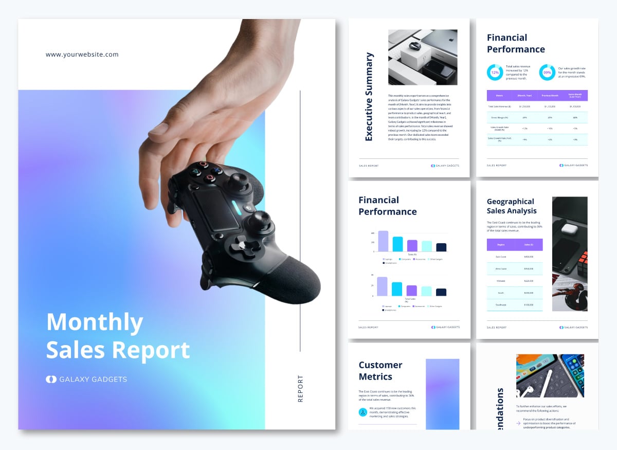
Below are some standout templates and reports you can use to get your creative juices flowing or customize directly for your next monthly management report.
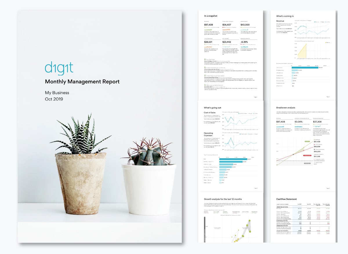
This report is a great example of how thoughtful design makes reporting both informative and engaging. I particularly love how it starts with a concise summary of the metrics, using small graphs and short notes to explain each one. Color coding indicates performance at a glance, giving much more impact than text alone.
The rest of the report dives into each key metric in the same manner—relevant charts and graphs paired with brief explanations that clarify what the data means. The design is clean, calm and easy on the eyes.
You can create a similar report with this template:
If you need to designate aspects of your monthly report to your team, Visme’s workflow feature makes it easy. You can assign specific sections to different team members, add instructions or notes and set deadlines to keep everyone on track.
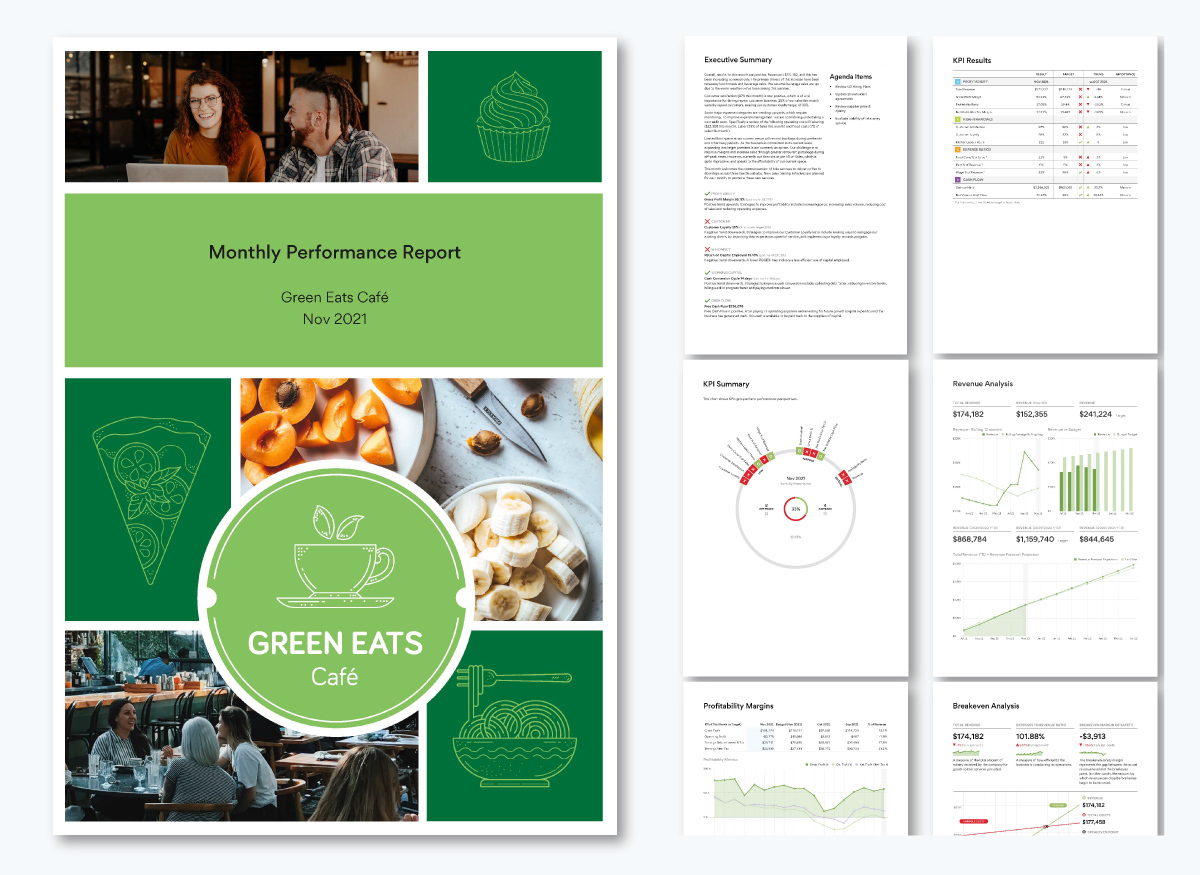
This Green Eats Café report is another strong example of effective design. It’s concise, well-spaced and uses color coding to communicate performance at a glance.
The executive summary particularly stands out. Although it’s slightly longer than typical, it works because it’s neatly spaced and outlines key metrics, challenges and next steps in short paragraphs. The green check marks and red cancel icons immediately indicate what’s on track and what needs attention.
This report is also packed with data (charts and numbers) that communicate the business's financial health.
While only one metric page includes detailed notes, the consistent use of color codes ensures decision-makers can visualize performance without being overwhelmed.
You can create similar A4-format reports using Visme’s templates:
Use Visme’s interactive tools to embed links to additional resources or use hotspots so readers can hover or click to see additional details. This keeps the main report clean while providing depth.
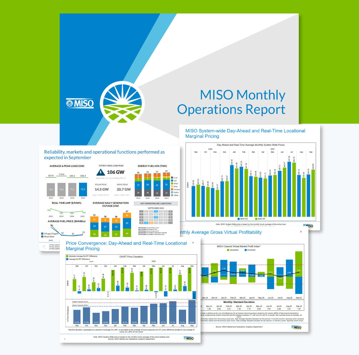
The MISO report takes a different approach by opening with a dashboard-style summary. It shows system-wide peaks, alerts and key operational metrics that give readers an immediate sense of whether the month was normal, had stress points or experienced unusual events.
Later sections dive into detailed metrics. The charts and graphs are complex, but labeling, color coding and sentence-style headings make it stand out.
Create yours with this template:
To create a similar standout executive summary, choose from Visme’s variety of dashboard templates and add to your reports.
Here are some expert-backed mistakes to avoid and key tips to follow that can significantly improve the effectiveness of your monthly management reports.
One of the biggest weaknesses in many monthly management reports is the tendency to track everything instead of focusing on what truly drives decisions. Leaders don’t need a rundown of every activity completed; they need business intelligence on the outcomes that matter.
As Doug Crooks, the Marketing Manager at Visme, puts it:
“For most businesses, which are often lead-driven, monthly reports at a higher level should provide a bird’s-eye view of traffic across key properties. Include complex factors like paid campaign spend, CPM, reach and objectives, whether it’s mid- or bottom-funnel focused.
Monthly reports should remain high-level to keep the focus on essential channels, assets and the metrics that impact the business most.”
Ask yourself: Does this metric demand executive attention or cross-functional coordination? If the answer is no, it belongs on a departmental dashboard rather than in the monthly management report.
Reporting isn’t the most exciting task and AI can be a smart way to speed it up.
The right AI tools can help you work faster while producing cleaner, more polished reports.
Anna Glivinska, Marketing and Product Research Expert at Visme, shared her experience:
“Before AI, I could spend ages hunting for the right settings in Looker Studio or other tools. Now, I simply request the parameter I need and AI returns the result or a formula in seconds.
Of course, there’s still the occasional AI hallucination—sometimes it invents data or only provides the correct setting after multiple attempts—but overall, it’s much faster than manual research.
Within hours, I can complete not just one, but two or three reports, depending on the needs. The reports are also more polished, because I can focus on formatting and visual appeal instead of troubleshooting data source errors or incorrect chart parameters.”
She also highlighted some precautions when using AI for reporting:
“The biggest risk is security—sensitive business data should never be fed into AI. The safest approach is to use AI features integrated directly within your reporting tools. Many modern tools are gradually adding AI capabilities, making it easier to detect traffic spikes or other notable trends without compromising data security.
Another important caution is always to double-check AI-generated data.
For example, I recently analyzed the top Photo Stock companies by reviewing their organic traffic, AI visibility and US mentions in Semrush. I then fed these screenshots into Claude Sonnet 4.5 to extract the data into a table. Despite high-quality screenshots, about 59% of the table contained incorrect numbers. AI is a helpful tool, but it should always be used with scrutiny.”
Even the best-designed monthly report can lose its effectiveness over time.
What starts as a sharp, decision-focused document can gradually become bloated as teams add more metrics each month. Individually, each addition feels harmless. But collectively, they dilute the report’s clarity and bury the KPIs leadership actually needs to drive business growth.
To fix it, implement quarterly pruning. Every three months, review every metric and ask: Did anyone reference this in the last three meetings? Did it trigger discussion or action? If not, remove it or move it to supporting documentation. This keeps your monthly report lean, relevant and actionable.
Most report creators treat design as an afterthought—something to worry about only after gathering the "important" data.
Victoria, Head of Content at Visme, explains the implication:
“A cluttered, confusing report trains people to ignore your data. When information is well structured and easy to scan, decision-makers move faster and make better calls. They also see your point of view. When it’s messy, vague or visually overwhelming, even good insights get buried. Stakeholders absolutely judge a report by how it looks.”
Effective report design isn’t about making things pretty. It’s about guiding the reader’s eye to what matters most, which you achieve through deliberate design choices.
The 7 functions are goal-setting, planning, budgeting, tracking performance, forecasting, identifying risks and supporting decision-making.
To prepare monthly management reports, start by identifying the key stakeholders and the KPIs that matter to them. Then gather accurate data, structure the report into clear sections, visualize metrics for readability, add insights explaining trends and review before sharing.
A management report typically includes an executive summary, key performance indicators, trend analysis, issues and risks and recommended actions. It combines narrative insights with charts or dashboards to make performance easy to understand at a glance.
A monthly management report should be concise enough for leaders to review quickly. Most run 5–12 pages, with a one-page executive summary at the front followed by detailed metrics.
The KPIs you include in a monthly management report should reflect the goals of each stakeholder. Apply the 3-KPI rule: one quantitative output metric, one qualitative metric and one efficiency metric per function. Examples include revenue, quality scores, cycle time, retention and customer satisfaction.
To prepare and present a Month-End Reporting Package, gather financial and operational data, verify accuracy, build a structured report with summaries and visuals, highlight key variances and explain drivers. Present by walking through insights and next steps, not just the numbers.
To send a monthly report to a manager, choose their preferred format: PDF, live link or embedded report and include a brief message highlighting key changes
Your monthly management reports should follow one guiding principle: make it easy for management to understand the data and take action that drives the company forward. Every KPI, chart and piece of text should serve that goal.
You can achieve this by focusing on the right stakeholders, tracking essential KPIs, structuring information logically and designing for clarity.
Visme removes the hassle of designing. It offers dozens of templates that follow design guidelines. Use AI-powered tools to polish your messaging, generate images or create the entire report in minutes. Automate data updates with integrations and share your reports most conveniently for your execs—PDFs, links or web embeds.
Whether you’re reporting for a department or company-wide, these tools help you deliver consistent, professional and on-brand reports every month.
If you’re ready, sign up and start creating beautiful, professional and effective monthly management reports today.
Design visual brand experiences for your business whether you are a seasoned designer or a total novice.
Try Visme for free


![How to Create a Practical Crisis Management Plan [+ Templates]](https://visme.co/blog/wp-content/uploads/2025/07/How-to-Create-a-Practical-Crisis-Management-Plan-Thumbnail.png)