


A Quick Guide on Sponsorship Marketing: Best Framework, Examples & Tools

Email design is all about customizing your emails visually to make them more engaging. This leads to more opens, clickthroughs and conversions. Email campaigns and correspondence are at the center of most digital marketing strategies that you should be developing to further your success.
Today, we're going to go through a comprehensive guide to everything you need to know about creating amazing visual email design.
Email design refers to the art and process of creating engaging, visually appealing and effective emails that deliver value to subscribers. The process requires a careful selection of fonts, colors, images and call-to-action buttons to make the email most effective.
Email design is one of the most important parts of your email marketing strategy. If you don’t have a good design, it will be hard for your emails to stand out from the crowd and get noticed by your subscribers.
Focusing on making your emails aesthetically and functionally appealing will help you improve open rates, click-through rates and overall engagement with your audience.
There are various types of email design, and each has its uses and benefits.
For example, if you want to send out an email newsletter, you would follow a different email design than sending a sign-up confirmation email.
So, let's understand the three main types of email design:
As the name suggests, a plain text email is simply a text-only email without additional formatting or visual elements. They are usually used for transactional and informational emails.
Use this type of email to get the message across instantly, convey personal emotions or get to the point quickly. For example, if you want to send out a receipt or confirm an order, this is the best kind of email design.
Here's an example of a plain-text email that Visme sends out to its customers:

This is one of the most popular in email marketing design and is mainly used for marketing purposes. It uses HTML and CSS to create visually appealing emails with unique structure, visuals, typography, colors and more.
For example, you can create a rich email design that showcases your product or service, uses video testimonials and even includes a button for your customer to click on.
With Visme's free email design templates, anyone can create professional-looking HTML emails in minutes. We'll discuss how to design an email using Visme later in this post.
Here's an example of Visme's email design template:
Interactive email design is when the email itself is interactive, allowing the customer to click on buttons or links within the email. This will enable you to drive people to a webpage where they can learn more about your product or service.
This type of email is new to the market and rapidly growing in popularity. Similar to the Rich HTML Email, it uses HTML and CSS but uses additional Javascript for interactivity.
If you don't want your content to get lost in the sea of emails pouring into your audience’s inbox on the daily, then you need to find ways to engage them. One way to offer your audience more value with your emails — and make them want to click — is to give your email design a tuneup.
Because email marketing can be a highly successful digital marketing strategy, you want to make sure you're doing everything you can to improve your email performance.
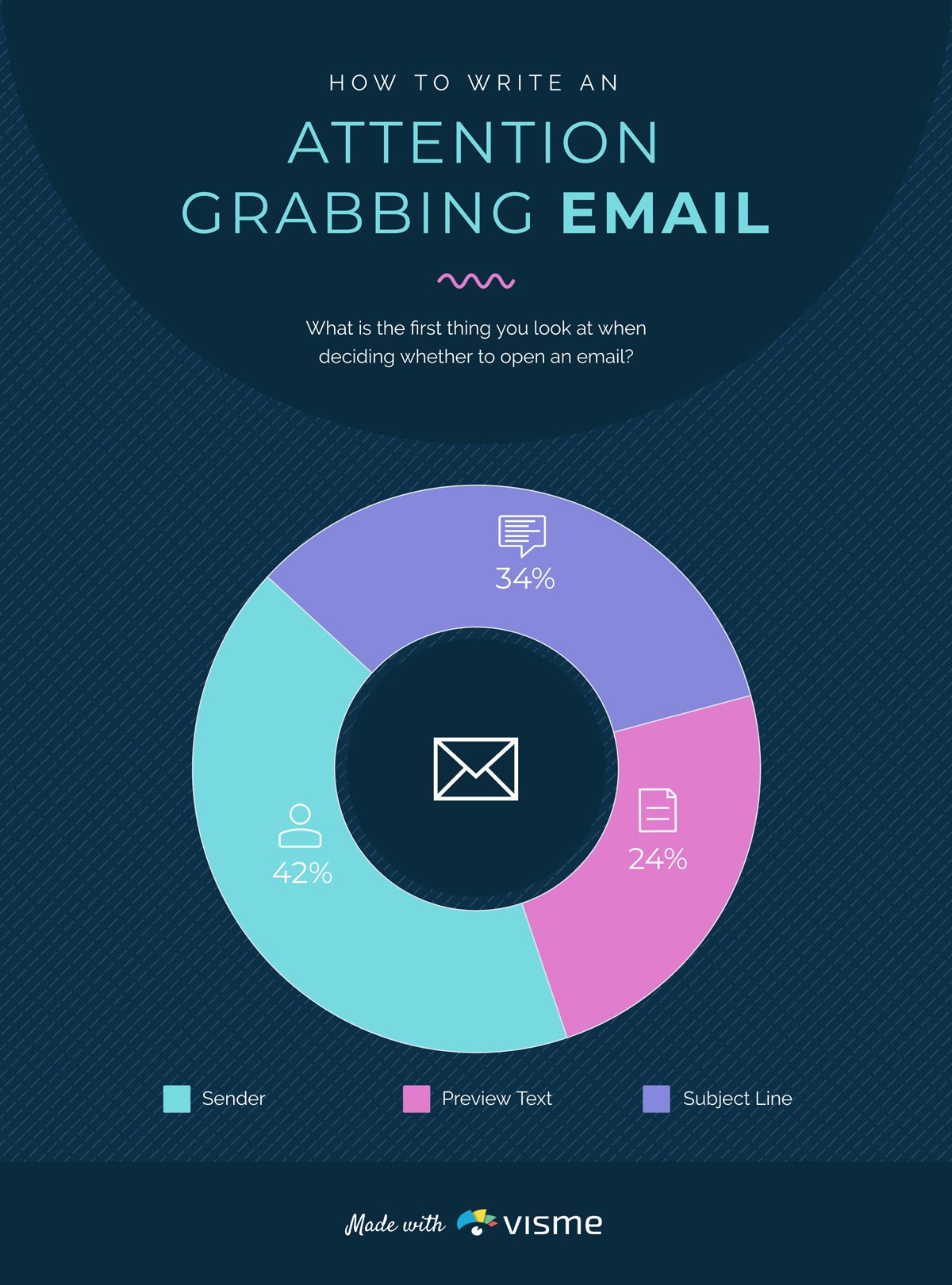
Check out this infographic with must-know email marketing statistics to understand even more about the importance of maximizing your email marketing success.
Made with Visme Infographic Maker
There are different elements that go into email design, including the text layout and images. You can tailor your email visually to appeal more to your audience to increase engagement. This is especially important for email campaigns. This guide to email design will help you design amazing emails of your own.
Here are some more insights into why email design is essential in marketing:
According to Forbes, it takes only 7 seconds to form a first impression. So, you and your business have only a fraction of the time to impress your recipients.
And an email with an attractive layout, compelling visuals and a clean design will help you make that positive first impression. Once you succeed in making the impression and setting the tone of the message, people are more likely to finish reading your email.
If you ever subscribed to any business newsletter, you'd have noticed that most have a uniform design and branded color scheme.
They do it to ensure their audience can easily recognize the brand's emails, among others, in their inbox.
The same applies to your brand, regardless of the industry and business size. Make your emails aesthetically appealing to reinforce brand identity by incorporating logos, brand colors and brand fonts.
Well-designed emails are not only visually appealing but also strategically structured to increase engagement. Eye-catching designs, personalization, responsive layouts and consistent branding make your emails stand out and create a positive brand impression.
Engaged readers are most likely to click on links, explore discounts and take other actions, increasing click-through rate and conversion.
Generate quality leads and create a memorable experience with Visme Forms. With visually captivating designs and strategic structuring, these forms engage readers and drive actions.
Our forms have yielded an average 3x increase in subscribers and a 207% conversion rate.
Take your design for email marketing to the next level with Visme's no-code forms and create impactful connections with your audience.
The visual layout of the email should be easy-to-read and on brand. This includes the fonts and colors of the text as well as any graphics or photos.
Most people will not feel excited about reading blocks of plain text in a small font, which is why email design is important for encouraging your audience to read and engage with your emails.
One way to make your email design more interesting is to use color design. Colors should already be a part of your branding so it should be simple to carry your signature color scheme into your emails.
Contrasting colors are great for getting people’s attention, but if the email is too harsh looking or garish it may prompt people to click away. Limit the colors between one and four at the most.
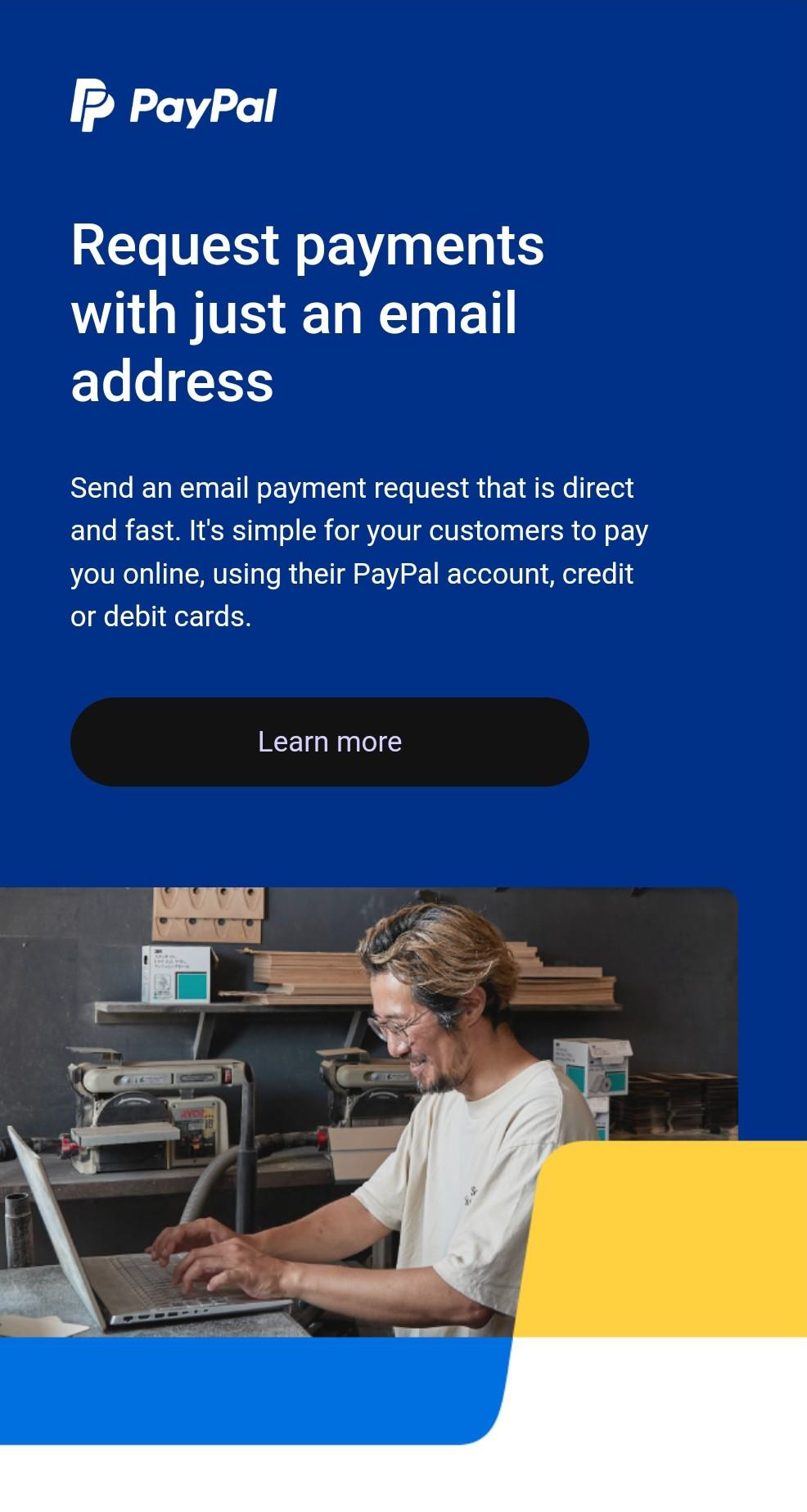
Here's an example from PayPal's newsletter email design that exemplifies the best practices for using colors:
They have effectively utilized their brand colors by using their signature blue and white throughout the email. Also, they created contrast by using white fonts on a blue background and used a relevant and compelling image.
When choosing the fonts for your email theme use a combination of bold, clean fonts. There should be clear subheadings within your email to guide the reader through the content. Bold, attention-grabbing headlines will direct your audience to keep reading for more information.
Fonts which are too stylized can be hard to read. Avoid cursives and fonts which place letters close together. The more bold and minimal the text, the better. The size of the font should be between 16 pt and 24 pt.
Personalizing your emails is one of the best ways to establish a strong relationship with your audience. Studies show that 80% of consumers are more likely to purchase when offered personalized content.
You can include your recipients' names in the subject line or tailor the content based on previous interactions if you like. For example, you can greet each recipient by name and reference their recent purchases or interests.
Without an appropriate CTA, your email is nothing but a lost opportunity. So, ensure your CTA stands out and entices readers to take the next step.
Use contrasting colors, bold fonts and precise wording to make the CTA easily noticeable. Test different designs and placements to optimize your CTAs for higher click-through rates and conversions.
Whether it's "Shop Now," "Subscribe Today," or "Get Started," make your CTA clear, visible and irresistible.
Ensure your email design is accessible so everyone, including those with disabilities, can understand and engage with your emails. This will ensure that your message reaches a broader audience and that no one is left behind.
Consider the following five tips to make your email design accessible:
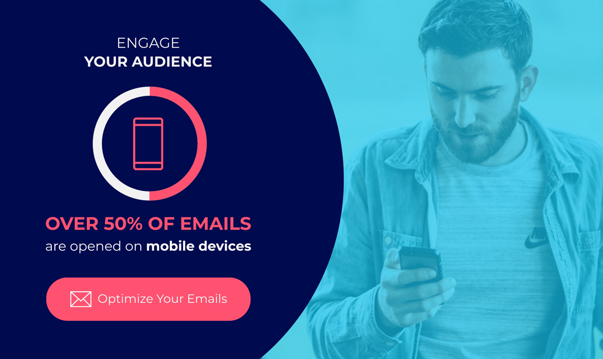
The images in your email should go along with the text. From glancing at the email the reader should get a good idea of what it is about before they even read it.
You can use graphic designs, infographics, or photos to make the email look more visually appealing. Keep in mind that pictures with large file sizes may cause emails to load slowly, and you should have a backup color for when the image fails to load correctly.
The image dimensions are the size of the picture and the amount of pixels it contains. High-resolution images are clearer than low-resolution images. It's recommended that you use images that are twice the size dimensions of what you need for the email and then use HTML to resize it to keep the image looking clear.
One of the challenges of adding images to emails is optimizing the file sizes so that the email will load faster. The larger the file size, the longer the page takes to load (especially on mobile devices). Use properly formatted files to keep the file size small without losing image quality.
It can sometimes be too obvious when a company uses stock photos and it makes the content less attractive to the reader. Try to use custom visuals if possible. When you have to use stock photos, use a paid service where you can find high-quality images.
Sometimes the images will not load in your email. This can be because of a poor connection or because the reader has image-loading turned off in their email application.
Some people turn off images automatically so that emails load faster. You need to have a good alternative text that will show up to tell the reader what the missing image is so that your email will make sense. You can also set a background color for when images do not load.
You can use animations in your emails as well as still photos. Keep in mind that the file sizes for GIFs and videos will be larger than still pictures. For this reason you should use GIFs sparingly only when they add value to the email.
The main content of your email should be within the text. Too many images in one email is not a good idea. A good ratio seems to be somewhere in between 60% text and 40% images or 70% text, 30% images.
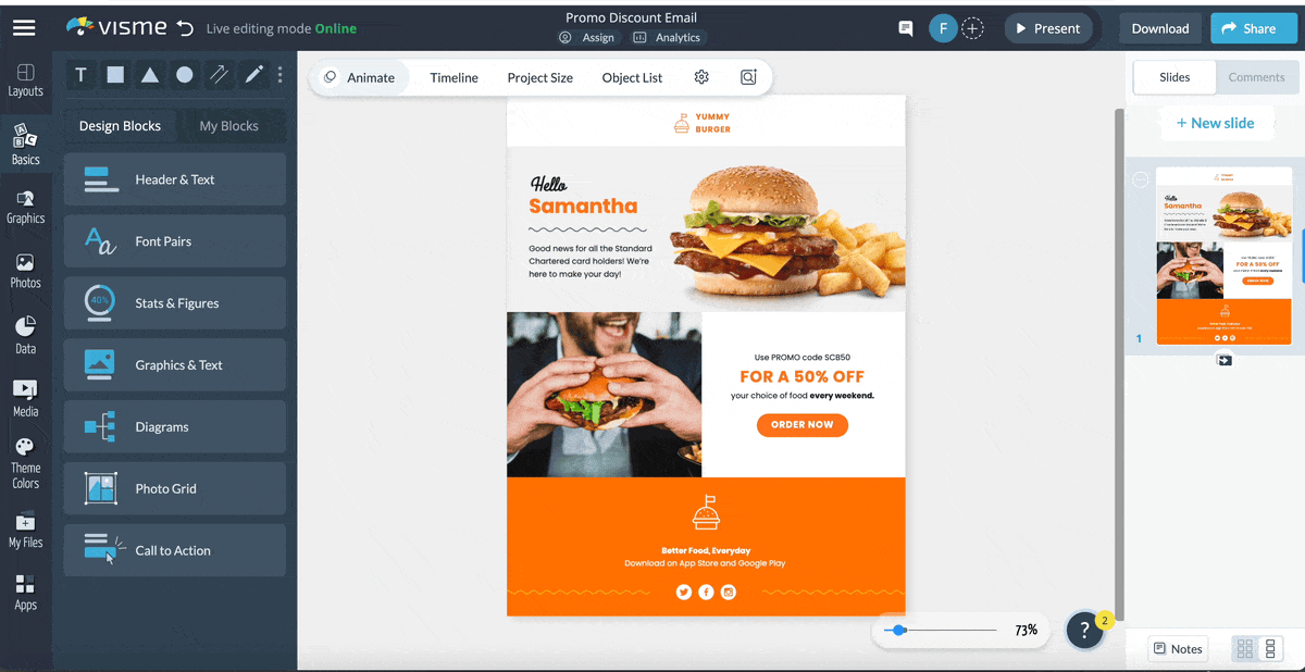
Here's one of the email design examples from Visme that demonstrates the effective use of images in our email design:
As you can see, there is a balance between text and images to support and enhance the overall message. This approach ensures the content is visually appealing without overwhelming the readers.
Unless you are an experienced designer or willing to put in the time to learn, the best way to make your email design look beautiful is to use templates. A template is a design that is precomposed and customizable.
You can choose from hundreds of different Visme templates that are streamlined for user-friendliness and aesthetics. There are a lot of different things to consider about the design of the layout, which is why using a template can make it easy.
Browse Now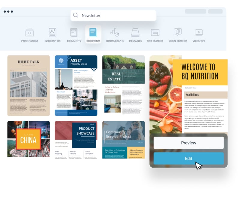
Check out our newsletter template library!
Here are a few of the most popular layouts for marketing email designs.
Made with Visme Infographic Maker
The inverted pyramid or upside-down triangle follows a top-down approach, where the most critical information is placed at the top. It helps you organize the content in a clear and concise manner, with a compelling headline and a brief introduction.
This layout uses a single column to arrange the email content vertically. It has a clean and straightforward design that allows readers to scroll through the email and grasp the information easily.
As the name suggests, a multi-column layout divides the email content into multiple columns to allow you to place multiple pieces of information. For example, you can use three columns to showcase two different products and a quick overview of an upcoming event.
The double-column layout is similar to the multi-column layout, but it splits the email content into two columns. This design offers a neat and organized appearance, similar to a single-column layout, while still allowing you to display multiple elements, just like in a multi-column layout.
The hybrid layout is a combination of multiple layouts that allow you to create a unique and engaging email design. It can include features like a header in the inverted pyramid style, modular sections, grid structures, or multi-column layouts.
The F-pattern layout follows the reading pattern of most users, where they first scan horizontally across the top part of the email and then down the left-hand side in a vertical line.
This layout is characterized by a top header that includes the headline or main message, followed by a subheading and then a column of text on the left side.
The zig-zag layout is similar to the F-pattern layout, but instead of presenting the content vertically in a single line, it follows a zig-zag format, therefore, the name.
This type of layout is created to provide a visually stimulating experience to the readers while presenting the content in an organized manner.
When designing your emails keep in mind that a lot of people will be reading their emails from their smartphone or mobile device. People can even check their emails on their watches now.
You need to optimize the design of the email to look great on both mobile and desktop apps. Using a template service is a great way to keep up with both the mobile and desktop design because the service will show you a preview of how the email looks in both.
Download Visme's iOS app to view and make edits to your email designs on the go. The mobile-friendly interface allows you to see how your email will appear on various screens, including iPhone and iPad.
Whether you're using a smartphone, tablet or desktop computer, Visme's responsive design feature ensures that your email designs will look great across all devices.
Along with your call to action, you should add your social media links somewhere in your email. These should be easy to find, preferably paired alongside with the social media icon for visibility and clarity.
If you're not including your social media links in your email design, you're missing out on chances to grow your audience. The social media icons can be located at the top, side or bottom of the email.
From writing a compelling message to getting the aesthetics right, email design is more than just slapping some text and images together and sending it off.
Thankfully, Visme's professional email design templates and user-friendly interface make it easy to create a functional and beautiful design.
Let's explore the three-step process of designing an eye-catching email with Visme.
Browse through Visme’s vast template library to find email design ideas that match your message, marketing strategy, brand guidelines and target audience.
If you're not sure where to start, consider which template best represents the most important message of your email.
Once you've chosen a template, it's time to customize it according to your business and email marketing preferences. With Visme's drag-and-drop editor and a wide variety of advanced tools and features, you can make your email design stand out.
Consider these key design aspects while customizing the template:
Incorporate your brand colors, brand fonts, company logo and anything that solidifies your brand. This will make your emails look more professional and will help you stand out from the crowd.
Thanks to Visme's AI-powered brand design tool, you can easily create these branding assets and save them as part of your brand library. This way, you don't have to worry about maintaining consistency across all your future email designs.
Choose a color scheme that matches your marketing strategy, brand guidelines and other communications. Use Visme's color dropper tool to select from the library of pre-made color palettes or choose your own colors using the color wheel or by copy-pasting a HEX code.
Choose fonts that best match your brand and communicate your main message. To play it safe, you can use a combination of two to three fonts. If you need more help choosing fonts, read our comprehensive guide to the types of fonts.
Incorporate high-quality visuals that support your message and enhance the overall design. Opt for relevant and eye-catching images that align with your brand's style.
Visme features vast libraries of high-quality stock images, vector icons, 3D animated graphics, shapes, lines and more.
Or, you can use Visme's AI image generator to create a custom email graphic. It uses artificial intelligence to create various designs, including icons, illustrations, paintings, images and more.
To add an element of excitement and engagement, consider incorporating subtle animations or interactive elements where appropriate. With Visme, you can incorporate animated GIFs, animations, interactive buttons, pop-up effects, quizzes, surveys and more.
Once you've customized your email design, it's time to download and share it with your audience. Visme allows you to export your design in various formats, such as HTML, PDF, GIF, JPG and PNG. Furthermore, you can generate a code snippet from within the editor to embed your design in emails.
Now, we’ll equip you with a variety of email design templates that you can use to create your own emails.
From welcome emails to newsletters, these templates are designed by professional designers and can be customized with your brand colors and logo.
This email newsletter design template is designed in a minimalist style, perfect for financial services companies. It features a clean layout with eye-catching icons, complementary color combinations, and plenty of white space to make it easy to read.
Utilize the high-quality content in the template to educate your recipients on personal finance. Or, replace the content with your own to personalize it according to your marketing needs.
This email template is perfect for retailers reopening or starting a new store. The design features eye-catching imagery and includes a call to action at the bottom of each page, making it easy for recipients to sign up for your mailing list.
Also, the adequate white space and large text make it easy to convey the main message immediately.
Are you looking for an email template that you can use to offer promotional discounts to your customers? This template provides a great starting point. The design focuses on large images and text, making it easy for recipients to quickly scan the content before deciding.
The "Order Now" call-to-action button at the bottom of the page makes it easy for customers to make a purchase decision.
This email template is perfect for making a strong connection with your customers. The contrasting color combination of red, yellow and peach, the high-quality images and the clean and simple layout will make your welcome email stand out.
Use this template to send an email with a custom design to welcome your customers into the community and provide valuable information about your products and services.
Sending captivating emails is one of the best ways to get people excited about your event. The email template above is designed to be used for any event, whether a product launch or an offline meetup.
It features a clean design with bright colors and high-quality images that will draw attention from your attendees.
A good email design can only be as effective as the content. We recommend you to use online email builders, if you don’t have coding knowledge. The first step to having a successful email campaign is crafting a well written email. Here are our best tips for writing an email that your audience will love.
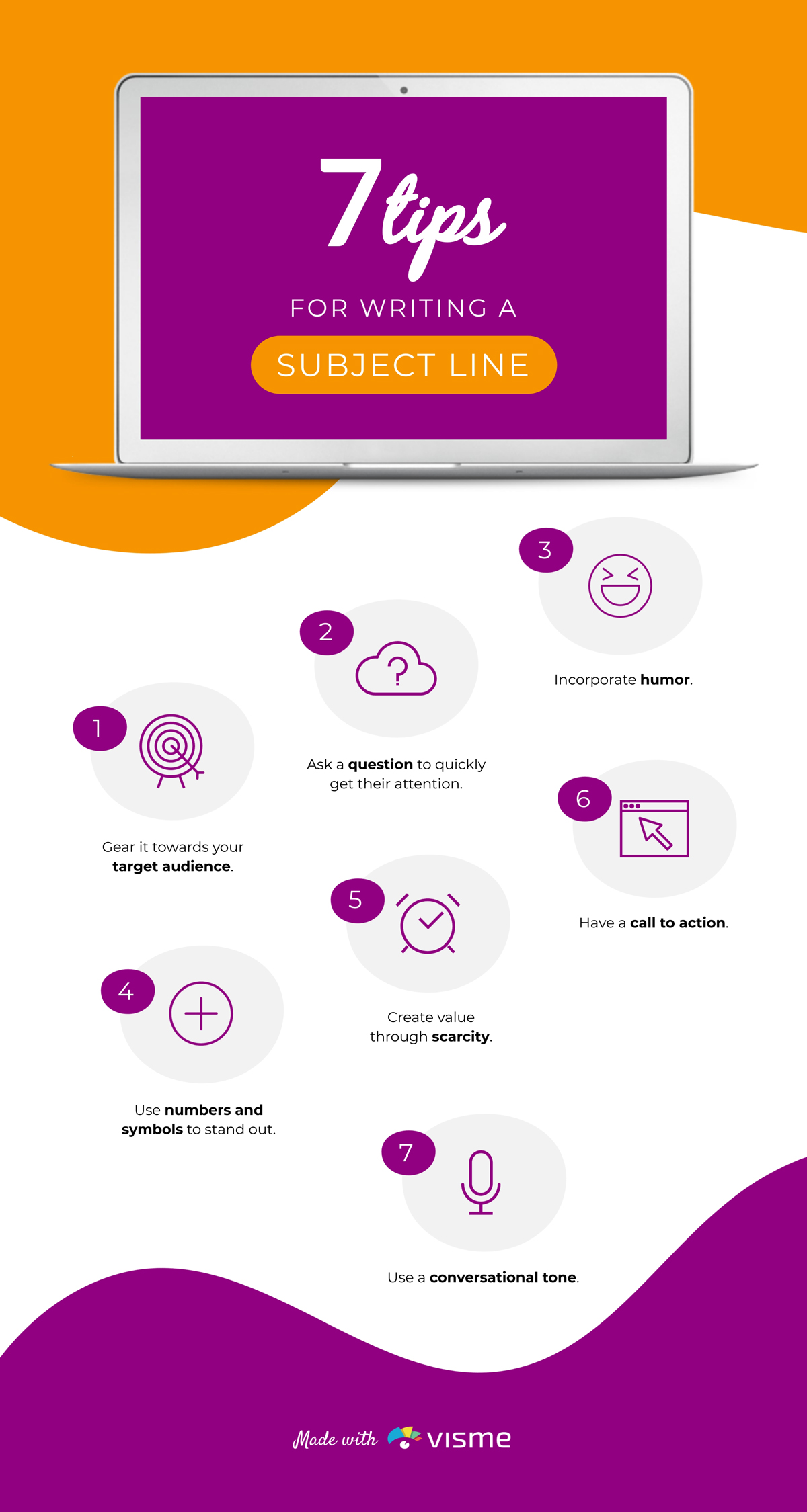
The first impression that anyone gets of your email is the subject line. To get people to click more often, make the subject line more enticing. Deciding what to put in the subject line is where a lot of people get stuck. It should be short and sweet, but with enough impact to make people click.
You should summarize what the email is about in as few words as possible. It should also be attention grabbing and make people want to click. An attention grabbing yet misleading subject may cause your audience to lose trust in your content, so avoid “clickbait” subject lines.
Sign up. It's free.
Create your own stunning email newsletter with Visme!
Scarcity is where you offer a limited time offer which encourages people to take action. Example: 24 HOURS ONLY! Last day/last chance. Ending soon.
Clickbait is text written with the goal of gaining clicks that is misleading or overly sensationalized.
Call to action is text that prompts the reader to take action; ie. buy, click, subscribe.
After the subject line, the next piece of text that your readers will see is the pre-header. The pre-header is the preview that pops up on your smartphone or in your inbox that summarizes what the email newsletter is about.
Some people use the first sentence of the email body, but the best thing to do is to customize the pre-header with a concise summary of what the entirety of the email is about.
The email pre-header is secondary in importance to the subject line, but they both work together to be the main first impression of your email presentation that encourages people to click. The visual guides we're about to go over won't matter much if your audience doesn't click on the email in the first place!
Keep your email content as concise and to the point as possible. Keeping a conversational tone can make the email feel more personal and prompt the reader to make a connection.
Plagiarism and copyright laws apply to emails the same way they apply to other pieces of text, so be sure that you are only sending out emails that you wrote yourself. You also need to own the rights to the images that you use.
Do not use any big blocks of text that are hard to read. The person opening the email should be able to skim over the text and quickly absorb the important information.
Are you looking for a solution to create engaging email content easily and quickly? Visme's AI writer is the ultimate solution. Use this advanced tool to brainstorm email topics, generate eye-catching headings and write compelling email content.
Two things that you should include in every email is a call-to-action and an unsubscribe option. Keep the unsubscribe link small at the bottom of the page, but make sure they can find it if they need it.
To make things easy on yourself, start with the newsletter templates we shared earlier.
To create an email design, start with a clear plan and be consistent with your brand identity and messaging. Use a responsive layout with a strong headline, clear call-to-action and a visually appealing design.
When designing an email signature, keep it simple, professional and informative. Include details like name, title, company, website and contact information. Use a clean font, resize images for optimal viewing, and use contrast to highlight critical information.
To streamline this process, consider using a tool like HubSpot’s email signature generator to create a polished and effective signature effortlessly.
To make an email look good, use best practices such as a clean design, white space, clear messaging and a balance of text and visuals. Use a mobile-responsive design, optimize images, choose contrasting colors and include a strong CTA.
The cost of email design varies depending on the complexity, the level of customization required and the service provider. Prices can range from a few hundred to several thousand dollars.
However, with Visme’s free email design templates and easy-to-use tools, your email design cost can be zero.
Now that you have the rundown on best practices for designing the text and visuals of an email, it's time for you to go out and apply what you learned! Create a free Visme account to start designing visual assets for your email newsletters. With Visme's integrations, you can even export them directly to your email marketing platform.
Design visual brand experiences for your business whether you are a seasoned designer or a total novice.
Try Visme for free