5 Types of Fonts & How to Use Them In Graphic Design

Some of the most popular types of fonts or font styles include serif, sans serif, slab serif, script and decorative.
In this guide, we’re going to analyze some of the most prominent font types as well as explain how you can use them in your designs.
If you're short on time or you'd prefer to read rather than watch, check out this video:
Here's a short selection of 8 popular fonts to use with your design templates to create, edit, share and download with Visme. View more below:
Let’s get into it.
What are the different types of fonts?
1. Serif Fonts: Serif fonts have small strokes, known as serifs, at the ends of their letters, giving them a timeless, professional look. They’re widely used in books, newspapers, and formal documents because they improve readability in print. Classic examples include Times New Roman, Georgia, and Garamond.
2. Sans-serif fonts: Sans-serif fonts, on the other hand, strip away those extra strokes, resulting in a clean, modern appearance. They’re perfect for digital screens, making them the go-to choice for websites, apps, and presentations. Popular options include Arial, Helvetica, and Open Sans.
3. Script fonts: Script fonts bring a touch of elegance and personality to designs by mimicking cursive handwriting. Whether you’re creating a wedding invitation, a luxury brand logo, or a stylish social media graphic, fonts like Brush Script, Pacifico, and Lobster can add a sophisticated flair.
4. Display fonts: Display fonts are designed to stand out. They’re bold, artistic, and packed with character, making them ideal for headlines, posters, and branding. Since they’re meant to grab attention, they work best in small doses. Think of fonts like Impact, Bebas Neue, or Playfair Display.
5. Decorative fonts: Decorative fonts, sometimes called novelty fonts, are highly stylized and unique, often used for creative projects where personality matters more than readability. Unlike display fonts, which focus on impact, decorative fonts can be playful, themed, or artistic, making them perfect for logos, party invitations, and special branding elements. Examples include Jokerman, Barbie font, Chiller, and Curlz MT.
5. Monospace fonts: Monospace fonts ensure that every letter takes up the same amount of space, making them easy to read in coding environments and technical documents. Programmers, in particular, rely on fonts like Courier New, Consolas, and IBM Plex Mono for their clarity and uniform spacing.
6. Handwriting fonts: Handwriting fonts bring a casual, personal touch to designs by mimicking real handwriting. Whether playful or artistic, they work well in creative projects, greeting cards, and informal branding. Comic Sans, Dancing Script, and Caveat are some well-known examples, though not all handwriting fonts are created equal in terms of readability.
7. Gothic or blackletter fonts: Gothic or blackletter fonts have a bold, ornate style reminiscent of medieval calligraphy. While they’re not the most readable for long texts, they carry a sense of history and tradition, making them popular in old-school branding, historical themes, and even tattoo designs. Fonts like Old English, Fraktur, and UnifrakturMaguntia capture this aesthetic perfectly.
5 Types of Fonts & How to Use Them In Graphic Design
- Font Type #1: Serif
- Font Type #2: Sans Serif
- Font Type #3: Slab Serif
- Font Type #4: Script
- Font Type #5: Decorative

Font Type #1: Serif

Serif fonts are the oldest, most basic fonts in the book. This classical type of font can be used in a variety of different ways and will likely never go out of style.
This type of font is known by the “feet” seen at the top and bottom of each letter. There are a variety of different types of serif fonts that you can choose from.
One of the most classic examples of a serif font style is Times New Roman, although there are now many more options to choose from when creating professional, well-designed visual content.
Old Style Serifs

This category is based on the first Roman types. It was estimated to have been used from the late 15th century up to the mid-18th century. Old Style types are also known as Garalde types.
They are characterized by great contrast between thin and thick strokes. Today, Garamond and Goudy Old Style are characterized by these same features.
Transitional Serifs

This type was introduced by John Baskerville, a notable English printer and typographer from the mid-18th century. This style represents the modification of Old Style types and neoclassical designs, while adapting some definitive characteristics of its own.
Transitional designs are most notable for having vertical stress in the bowls of lower-case letters. They have great contrast between sub-strokes and horizontally defined heads.
Neoclassical and Modern Serifs

These were born in the late 18th century. The Italian type designer Giambattista Bodoni is one of the most prominent figures related to this type of font.
These typefaces have abrupt and dramatic contrast between thin and thick strokes. The stroke terminals are oftentimes ball-shaped, offering a more distinct design with clearly shaped letters. They have a vertical axis and, like Baskerville, are characterized by horizontal stress and have tails with a distinctively small aperture.
These typefaces are most commonly used today in high-end fashion magazines because they are elegant, unhurried, calm and controlled. Today, modern serifs include but are not limited to ITC Bodoni, ITC Fenice, Adobe New Caledonia and Berthold Walbaum.
Clarendon Serifs

This is an original design by Robert Beasley, an 19th-century English typographer. It was the very first patented typeface. It comes in five different weights: light, heavy, black, bold and roman. It has a slight stroke contrast and appears short to medium in length.
Later designs were modified to have heavier and more obvious strokes and longer serifs. This family includes Bookman, Nimrod and ITC Charter.
How to Use Serif Fonts
Serif fonts are perfect for classic, professional use cases, like a sales pitch deck or a B2B social media post or marketing promotion.
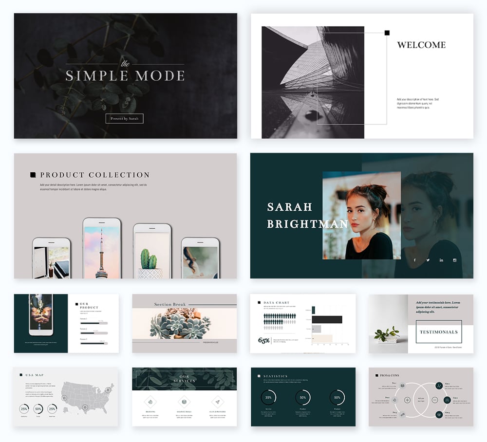
If you’re looking for a professional presentation font, a serif like Bentham can be found in our Simple presentation theme with over 300 slide designs for you to compile into the perfect slide deck.

Another great way to use serif fonts is in a professional, B2B document like a proposal. Take a look at how we’ve incorporated a bold serif font into the headings of this proposal template.

You can also pair serif fonts with many other types of fonts, including sans serif and script fonts that we’ll cover shortly.
Font Type #2: Sans Serif

This classification originates from the French word “sans,” which literally means “without.” “Serif,” on the other hand, comes from the Dutch word “schreef,” which means “line.” This particular font family has less line width variation in comparison to the serif font family.
Grotesque Sans Serifs

As the name implies, these typefaces broke the mold in their failure to maintain the historic elegance of serif style fonts. Grotesque fonts were greatly influenced by Modern (Didone) serif.
They are bold and solid. They were mostly used in headlines and advertisements from the late 19th century up to the early 20th century.
They are characterized by a vertical axis, limited variation of stroke width and horizontally accented curves. These typefaces are popular because they are simple and practical.
Examples of these fonts include Akzidenz-Grotesk, Franklin Gothic, Helvetica, Monotype Grotesque, News Gothic and Univers.
Geometric Sans Serif

These typefaces are widely used in headlines and display advertisements. They look great on billboards but are not ideal for longer text content as they are less readable than grotesque sans serif. This type is described as cold and clinical, yet simple.
They are constructed of conventional, monolinear lines and square or circular shapes. They are inspired by geometric shapes. This typeface family includes Futura, Avant Garde, Avenir, ITC Bauhaus and Harmonia Sans.
Humanist Sans Serif

These typefaces emerged in the 20th century time period while other typographers were busy crafting Neo-grotesque typefaces. This typeface is characterized by stroke modulation, which gives letters a friendlier look.
Typographic experts claim that this particular type is the most legible and readable of all the sans serif typefaces. This typeface family includes Gill Sans, Mentor Sans, ITC Goudy Sans and Optima.
How to Use Sans Serif Fonts
Sans serif fonts are more modern and universal, giving you the opportunity to use them in a variety of different ways. From social media graphics to infographics and more, let’s explore a few ways that sans serif fonts can be used.
Take a look at this animated graphic designed to be shared on social media. It uses different weights of the sans serif font Fira Sans, creating a beautifully modern design.

When it comes to infographics, especially more complex ones like product roadmaps or process diagrams, sans serif fonts are the perfect candidate as they’re clean and easy to read.

Sans serif fonts can still be used in professional instances as well. Take this training manual template – sans serif typography is the perfect solution for improving readability in a document. It's also an accessible font for trainees that may be neurodiverse.

A sans serif can be used as a header and as body copy, making for an incredibly versatile font choice. Popular sans serif fonts include Arial, Didot, Open Sans and Calibri.
Font Type #3: Slab Serif

While slab serifs are technically a type of serif font, these have become so popular that we wanted to cover them as their own type of font.
These gained popularity and recognition in advertising projects in the early 19th century. Publishing houses were looking to get their printed materials noticed so they decided to use typefaces that grabbed readers' attention.
The slab serif family is characterized by thick block lines at the end of strokes. They can appear curvy like Clarendon or more prominent and unbracketed like Rockwell.
Today, some of the most used slab serifs include Archer from H&FJ and Officina Serif by Erik Spiekermann. The former comes in various weights and comes beautifully set in italics. The latter is a full-bodied and legible typeface that is very flexible.
How to Use Slab Serif Fonts
Slab serif fonts are perfect for grabbing attention, and are best used in headers in presentations and documents.
Take a look at this case study template. The thick serif font used in the header helps to reel in the reader and make your customer reviews stand out. The right font with the right spacing can always help elevate your design.

Another great way to use a slab serif is in your presentation headers, as we see in this template below.

Try to incorporate different types of fonts into a single design as well. Slab serifs pair really well with serifs in pretty much any design project, so you can test out some of your own font pairings in future designs.
Font Type #4: Script

This font family emulates handwriting, calligraphy and cursive. They take inspiration from historical practice in which most logo designs, headlines and shop fronts used custom-designs by engravers and sign painters.
Formal Scripts

These elegant typefaces are oftentimes used in diplomas and invitations. The majority of these types are inspired by letter forms from the 17th and 18th century, by writing masters like George Shelley, George Bickham and George Snell.
Formal scripts include Snell Roundhand, Helinda Rook, Young Baroque, Elegy and Bickham Script.
Blackletter and Lombardic Scripts

These types are also known as Textura, Gothic Script or Gothic minuscule. They were popular scripts in western Europe from the 12th to the 17th century. Blackletter was patterned after old-fashioned manuscript lettering that was used before the invention of the movable type.
Calligraphic Scripts

This family simulates calligraphy. Calligraphic scripts that originally appeared in religious books, ancient edicts and historical writings inspired modern-day typographers to come up with a digital counterpart. This family includes Bell Trap, Blaze and Vivaldi.
Casual Scripts

This family has a less formal and more active hand. The strokes vary in width and appear to have been created by a wet brush rather than a pen nib. They became the top pick for advertising designs in Europe and North America in the 1970s.
This typeface style is designed to look informal, as if it were written in haste. This family includes Brush Script, Mistral, Kaufmann, Limehouse Script, Nadianne and Freestyle Script.
How to Use Script Fonts
Script fonts are less professional, so unless you have a more playful brand, you’ll want to save these for marketing graphics and other more B2C purposes.
We can see the use of a script font in this flyer showcasing paintings at a gallery.

However, script fonts also work really well as accent fonts in a variety of contexts. Take a look at this social media graphic that pairs a single word in a script font with a sans serif font covering the rest of the text.

You should only be using script typefaces as a header or accent font to ensure legibility across your design. Because these types of fonts can sometimes be hard to read, you want them to be the largest font on your design.
Font Type #5: Decorative

This is the largest and most diverse type classification. These typefaces are creatively used for signage, headlines and all other display projects requiring a strong typographic statement.
Some of the font families use unorthodox letter shapes and proportions to create a more dramatic effect and distinctive appearance, as seen in the examples below.
Inline

These typefaces are perfect for flat design as they create texture without resorting to drop shadows or bevels. They have a bold, chunky look that is delicate at the same time. In general, they come with hairline strokes within broader strokes.
Grunge

Grunge typefaces came into being thanks to the appearance of grunge music, which is also based on the slang term "grungy," meaning dirty or filthy. If you're looking for an urban, street-style font, these are for you.
Stencil

These typefaces are made up of capital letters with curved edges and thick strokes with splits. This makes them have the look of the stenciled letters used on crate shipments and public signs. They can be used in labels, headlines, logos, military and cartoon designs.
Simplify content creation
and brand management for your team
- Collaborate on designs, mockups and wireframes with your non-design colleagues
- Lock down your branding to maintain brand consistency throughout your designs
- Why start from scratch? Save time with 1000s of professional branded templates

How to Use Decorative Fonts
Decorative fonts are best used in the most creative designs. They aren’t ideal for reading longer passages, so be sure to use them in headings and other one-off designs.
Here’s an example of a decorative inline font being used in a gift certificate template to help the copy stand out.

Event tickets are another great way to incorporate decorative fonts, as we see below in this template.

Decorative typefaces should be few and far between in your designs, but they can have a strategic purpose for fun and engaging graphics.
Ready to Level-Up Your Online Designs?
Are you ready to start creating stunning designs while putting the best fonts forward? Sign up for a free account with Visme today and start exploring our font library, templates and everything else our design editor has to offer.
Create Stunning Content!
Design visual brand experiences for your business whether you are a seasoned designer or a total novice.
Try Visme for free


