


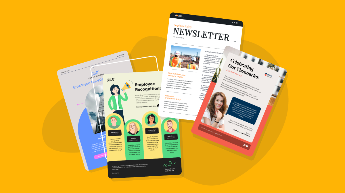
14+ Employee Newsletter Examples, Ideas & Templates

An annual report summarizes a company’s financial performance, key achievements, and strategic direction over the past year. It includes a leadership letter, an overview of operations, goals, and market position. Many reports highlight milestones, corporate social responsibility efforts, and future growth plans.
Visually, reports range from simple PDFs to interactive digital formats with charts and videos. A well-designed report balances data with storytelling, ensuring stakeholders easily understand the company’s progress and vision.
Creating an annual report doesn't have to feel tough and overwhelming. You just need the right report templates, examples and tools to help you get started, which is where I come in!
Let’s get into it.
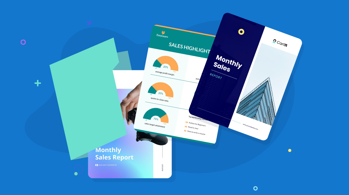
Here's a short selection of 8 easy-to-edit Annual report design templates you can edit, share and download with Visme. View more below:


Before you dive in, watch this video to get valuable tips for creating effective business reports along with templates you can use.
The most common annual report design is a simple PDF with a generic collection of numbers and data.
Then there are some annual report examples that really shine, complete with digital interactivity or a unique printed design. These often become quite famous, like Mailchimp and Adidas.
I found a few companies that have several report design ideas and develop a second creative version of their report, just for online viewing purposes. These are typically called "A Year in Review" and talk more about milestones and events than financial data. They reserve the financial report design for a smaller audience.
So, what does an annual report look like?
Here’s your answer! I've rounded up some of the best annual report design inspiration from recent years in various formats: online, interactive, print and video.
And don’t forget to bookmark your favorite example for inspiration and creative direction.
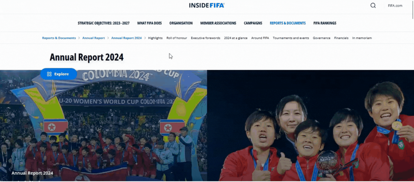
The FIFA 2024 annual report is typically a mega-sized publication full of overviews of what happened that year and a look ahead at the years to come.
FIFA's report is a bit more special than others, it’s the World Cup year and there are lots of stories to tell.
Visually, the report welcomes the reader with a block layout of topics, all with looped video backgrounds. The only repeating elements are the alignment and font size of the section titles, making it easier to browse.
As you click on each section, you’re taken to another beautiful design where you can see statistics and read stories and letters from FIFA's big names.
The report also comes with a floating TOC so you can click the dropdown menu and easily navigate or find sections as you scroll through.
:source:FIFA
WebFX found that consumers value images by 40%, color by 39%, and videos by 21% when it comes to design. By including vibrant images and videos, you're not only grabbing the reader's attention but also making your information more digestible and keeping them engaged long enough to interact.
Though some people might think images or visuals should be an afterthought, the truth is that visuals can make your information more memorable.
I've found that if you're using images, here's a quick checklist to follow:
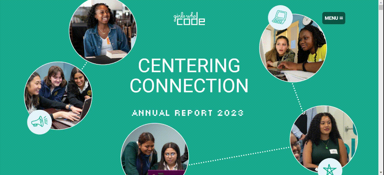
Girls Who Code is a nonprofit organization that aims to close the gender gap in tech by providing coding education, tutorials, and bootcamps to girls and young women. Being a tech-based brand, it should come as no surprise that they made their annual report available as both a PDF and an interactive website.
The report features elements that become color-coded when highlighted, a range of videos, and dynamic charts. Its vibrant and on-brand design makes reading this report enjoyable for both shareholders and the average person.
:source:Girls Who Code
While it can be tempting to keep details at a high level in your report, you risk the reader simply glossing over them. When it comes to report design, simplicity is—and will always be—key.
The Girls Who Code report is a great example of how to create a report that is clear, engaging, and accessible to everyone, whether they’re internal or external stakeholders, employees, or readers new to the brand.
Graphic Designer Fiorella shares:
"Keep your report clear and easy to read by using bold headings, bullet points, and short summaries. This helps key takeaways stand out while still giving enough detail where it matters.
Stick to simple, easy-to-understand language whenever possible—if you need to use jargon, consider adding an appendix.
And most importantly, if you’re struggling to read it, your readers will too."
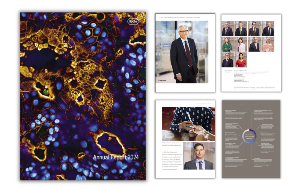
The Roche Annual Report 2024 highlights the company's progress in innovation, sustainability, and financial performance. Roche experienced 7% sales growth, driven by strong demand for diagnostic tests and medicines.
Notable advancements include the launch of Itovebi for breast cancer, PiaSky for a rare blood disorder, and innovations in continuous blood glucose monitoring and automated mass spectrometry.
Unlike their previous report designs, which followed more traditional layouts, I found this year they opted for a more photographic approach.
With full-page visuals capturing human-centric moments and the faces of the people who shape their impact, the report feels more personal and engaging.
Even their data visualizations, from financial reports to surveys and updates, are bold yet simple. This minimalist touch aligns seamlessly with the company's brand identity.
:source:Roche
This annual report is a great reminder that you don’t always need to rely on graphics or wide-open spaces for every design. Try experimenting with different layouts each year to see what resonates most with your audience.
If your reports look the same every year, they can start to feel mundane—and that won’t spark much interest or even a measure of excitement. Experiment, play, and learn to keep things fresh and fun.
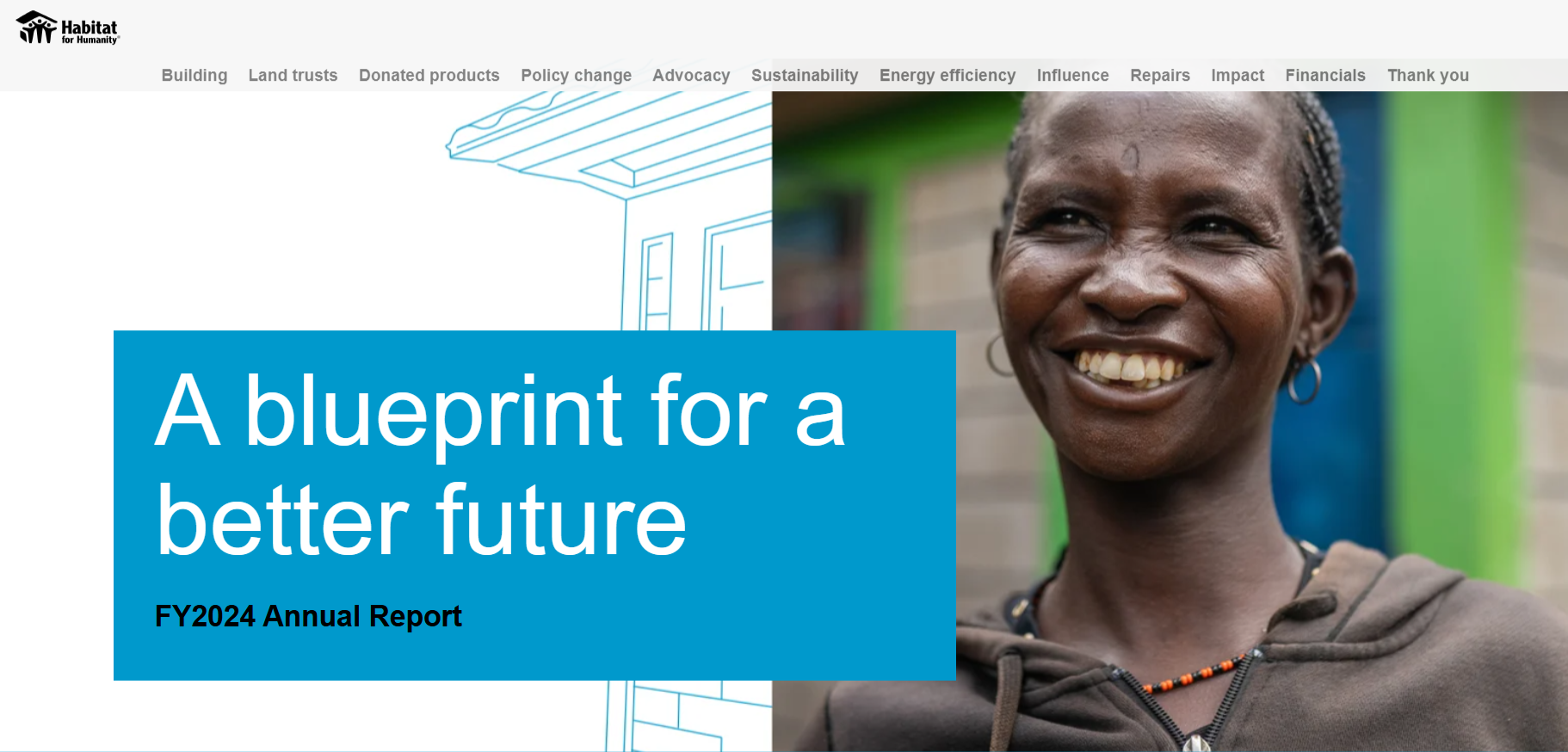
Many nonprofits are known for having beautifully designed reports, and Habitat for Humanity is no exception.
Their 2024 report concentrates on the feeling of home, starting with 100,000 concrete floors for homes with dirt floors, providing more energy-efficient kitchens and home repairs. Then it continues with their work towards scalable housing solutions from North America, Africa, Latin America and Middle East.
 :new:Habitat for Humanity
The report also features an interactive map that readers can scroll through, showcasing initiatives and the number of individuals impacted to make complex data easier to digest.
If your report covers international branches, consider adding an interactive map. It helps you use space wisely, avoiding overcrowded pages or unnecessary extra pages.
Interactive maps don't have to be a coding nightmare, in fact you can easily create an interactive map with Visme in five simple steps. Add hotspots, hovering effects and more Click here to learn how.

This year, Mailchimp chose a simple and minimalistic approach to their year in review. Visually, it looks a lot like the signature Mailchimp email layout, with color sections and centered content.
The hand drawn illustrations complete the composition while staying very much on brand. Something I've often found with Mailchimp.
Mailchimp's report is very on brand and for good reason. Having a report that can clearly be identified as yours helps to build credibility and also helps readers to associate your findings with positive brand recognition and trust.
According to Edelman, 67% of consumers must trust the brand before they’ll continue buying its products or services. So when readers can trust you they're more likely to not only read and rely on your report but they'll also (continue to)buy from you
That's the power of a a well-branded report reinforces your authority, making your insights more memorable and impactful.
The Weatherford 2023 annual report is all about the energy of innovation. The publication opens with a product video explaining the idea behind the energy of innovation, followed by a letter to shareholders and four subsequent sections with more information.
Each section has one of the Weatherford colors as the background, creating a visual separation with aligned titles and images. Weatherford also has a dedicated website for its report where you can get the full video experience.
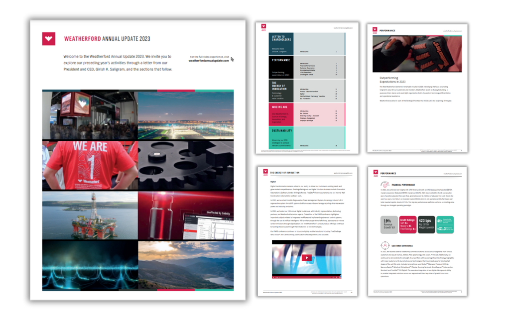
:source:Weatherford
Forbes found that viewers retain 95% of a message when watching it on video, compared to 10% when reading text. With reports there are three ways you can add video content, you can either have a video recap of your report, add video content directly in your report or do both!
Video content in your report also breaks the monotony of scrolling and reading. You can use it as a mini reading break, making readers feel more encouraged to read until the end.
This year's annual report from GE is all about their three standalone entities; GE Aerospace, GE Vernova and GE Healthcare. The few images included in the report are snapshots of real GE workers in each of the three entities with an engaging caption. Apart from that, the text includes a letter to shareholders, a look at the year that passed and a look at the years ahead.
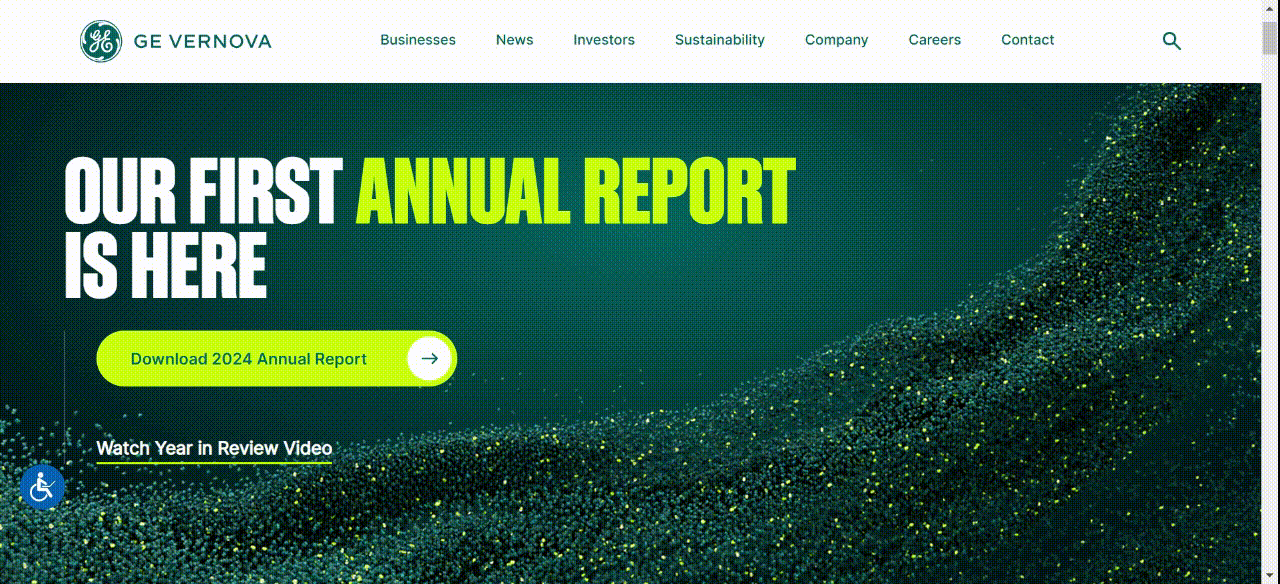
:source:General Electric
Weatherford, like many big brands, has both a traditional PDF and a website for their 2024 report—and for good reason. A dedicated website makes the report more accessible, interactive, and engaging compared to a static PDF.
It’s also easy to share, track engagement, and update if needed. And the best part? It’s not hard to replicate the design of the PDF in a web format. Keeping the same branding, fonts, and visuals helps maintain a polished, professional look across both versions. This a report design tip worth actioning.
The 2023 Warby Parker Impact Report is a great example of how documents can look beautiful and not be boring in the least. Taking a cue from magazine layouts, this report is long and includes a visual TOC to orient the reader accordingly.
Title pages are bold, blue and impactful; all the photos are strikingly beautiful; and the text uses a sans serif font that’s easy to read and looks crisp over the white background.
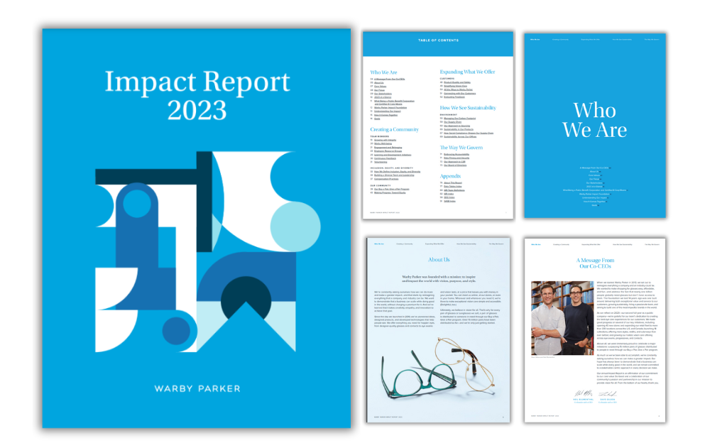
:source:Warby Parker
One major takeaway from Warby, apart from it's magazine design style, is that it uses wide open spaces for both copy and text. It avoids clutter while following Warby's brand guidelines. It also masters the art of copywriting, it uses bold headings and sub headlines. A few quick tips to emulate this for your own report from Toast Design Agency:
Upstack's report starts with a letter from the founder and CEO where he tells the story of his discovery of data centers. The continuing sections include photos of the C-Suite with personal messages and essential information about the company.
Some sections have gradient backgrounds that contrast well with the white sections. The downloadable PDF simplifies the content into a document layout. The best page, in our opinion, is the highlight of key milestones.
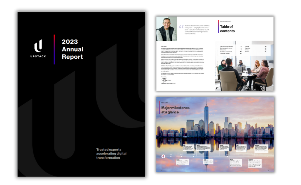
:source:Upstack
Most annual reports have a letter from the founder and/or CEO after the TOC, or in Upstack's case, with the TOC.
While not all reports have this, I find that it does as add a more personal touch, setting the tone for your brand’s vision, achievements, and future goals. It builds trust, reinforces leadership, and gives readers valuable insight straight from the top.
The 2023 Domino’s annual report has over 100 pages but starts off with full-page visuals between financial highlights and a letter to shareholders. This report is a digital PDF hosted on a website and includes hyperlinked sections for easy navigation. The text is a small serif font with a short line height in order to fit as much text as possible on each page.
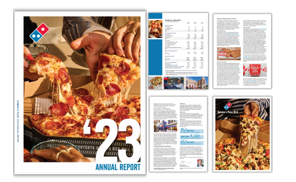
:source:Dominos
This report is a solid example of how your images can do the talking, especially if it's for a product or food based company. Don't shy from using enticing images that will not only keep your readers engaged but drooling. If you don't have the budget to take such images then invest in a good AI image generator to do the trick.
The World Wildlife Foundation (WWF) report for 2022 is a visual masterpiece of full-page images, square color frames and punctual white text over a turquoise background. In accordance with the year of the tiger, the content in the report speaks of how WWF is working to bring tigers back into the Nepalese wild. Other sections speak of blue macaws, nature-positive seascapes, wind energy and forest conservation.
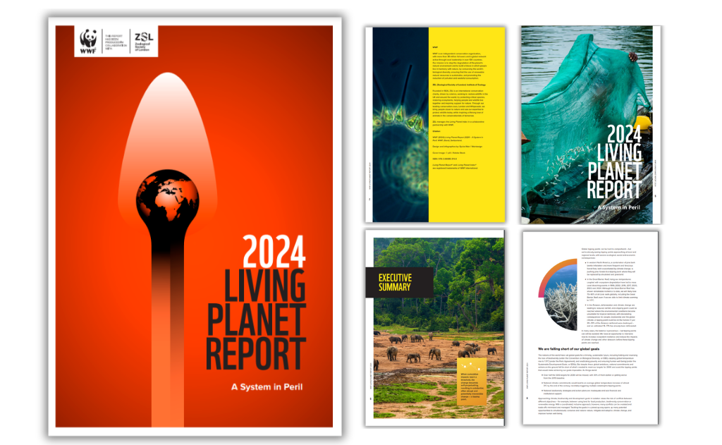
:source:World Wildlife Foundation
As you craft your report and bring your design together, don’t forget to incorporate the power of storytelling by adding real stories and examples.
As a seasoned designer I find that this helps to build a connection with the reader, making your content not just seen but felt. Your annual report, like your marketing materials, should always incorporate elements of storytelling to keep readers excited to turn the page.
Plus, if you plan to repurpose your annual report into a white paper. You can view these white paper examples to get an idea of how to do this.
The pastor of Grace Chapel Church in Massachusetts summarizes the church’s year in this 2024 report. After a letter from the pastor and other board members, the report shares information about outstanding and new members and baptisms. Other data includes information about group life in the congregation, the digital ministry and their Kidstown ministry.
This year, they used a creative mix of presentation and document format that works really well. It lays out the content in big open spaces, but reads too much like a presentation, which makes it multi-functional.
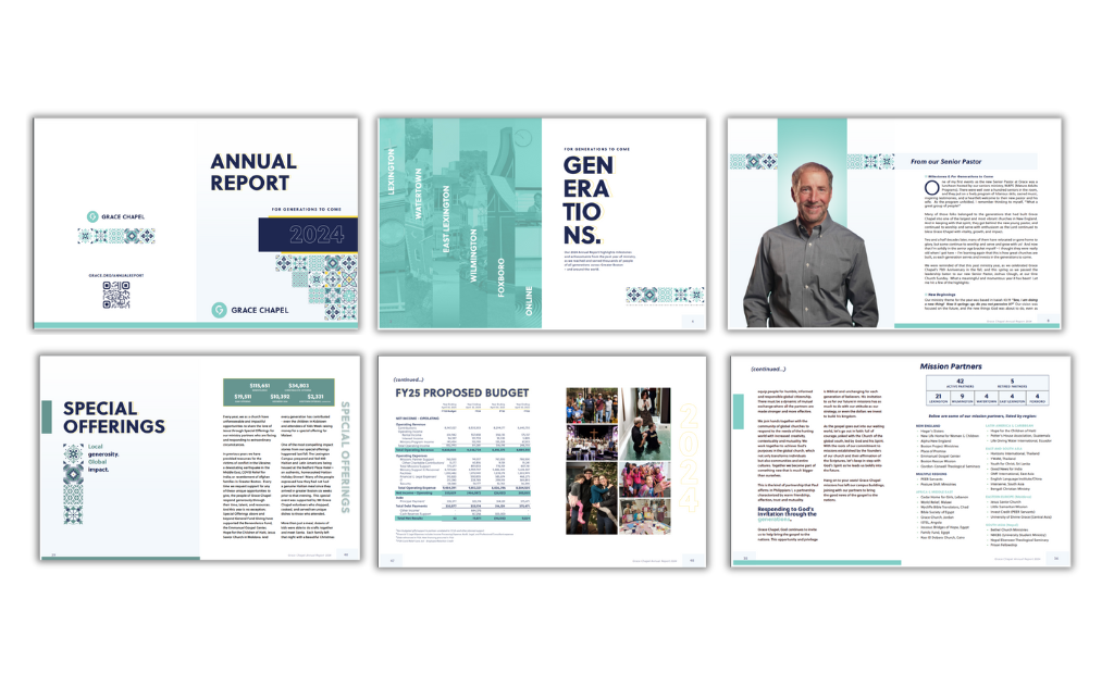
:source:Grace Chapel Church
Be sure to have an eye-catching cover for your report. It's the first and sometimes last impression people may have of your brand before they even read the content. Test out different designs and even use a test audience to see what design style works best for you.
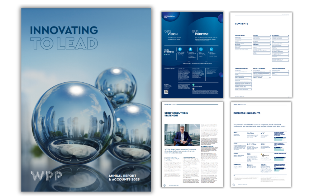
As one of the world’s largest advertising companies, it’s no surprise that WPP has a beautifully designed annual report for 2023. A colorful cover page states the company’s main objective. Scroll on for impactful business stories and highlights. The letter from the chairman appears only after a number of sections that share information about their top-level clients.
Your report isn’t just for show. Beyond building trust, it can help debunk misconceptions about your company, provide factual information, and even serve as a way to share future updates that potential customers might need to know.
The 2024 World Bank report is separated into highlights and sections with detailed stories about actions taken by the group in 2024. One of the final sections is the fiscal year data and then the reader can navigate to information about regional engagements and spotlight stories. Readers can download the reports in eight different languages.
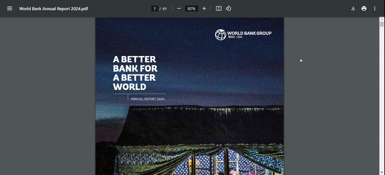
:source:World Bank
The Humane Society shares its Achievements for Animals in a website format with vibrant animal photos and colorful pie charts and key statistics about their work over the year. In a highlighted box, they share that during 2022, more than 93% of the animals in their care were placed in homes and reunited with families.
Adidas is known for creating bold, interactive annual report, and their design team goes all out. Both their report website and document don’t just share information; they take you on an immersive journey through the year 2024.
The colors are bold and high-contrast, staying true to the Adidas brand. Financial results are brought to life with animated charts and gradient numbers. Readers get natural breaks between text, thanks to animations, images, and videos. And to top it off, there’s a dashboard that highlights the biggest developments of the year at a glance.
Overall it's what I'd personally expect from a brand like Adidas. High quality, fully functional and enjoyable to consume.
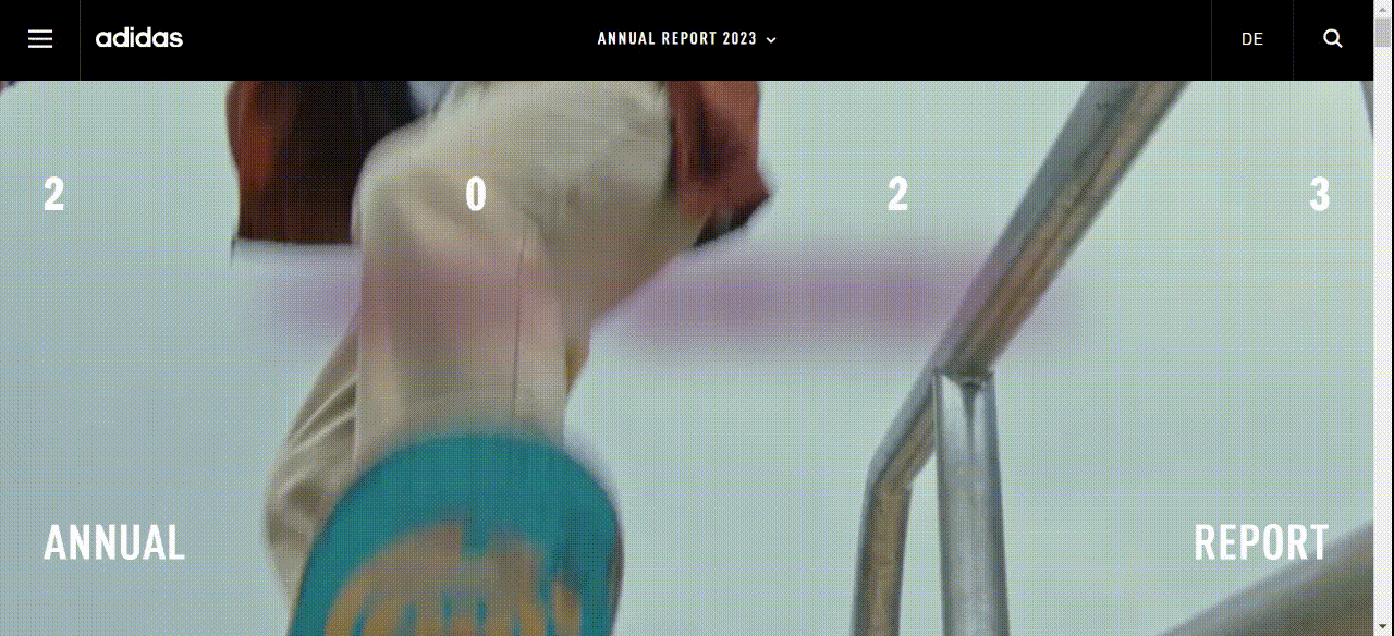
:source:Adidas
Feeding America shares a beautiful digital 2024 annual report rich with photos, icons and other imagery, including videos and color blocked photo compositions. The report is engaging to read, easy to understand and comes off both professional and approachable.
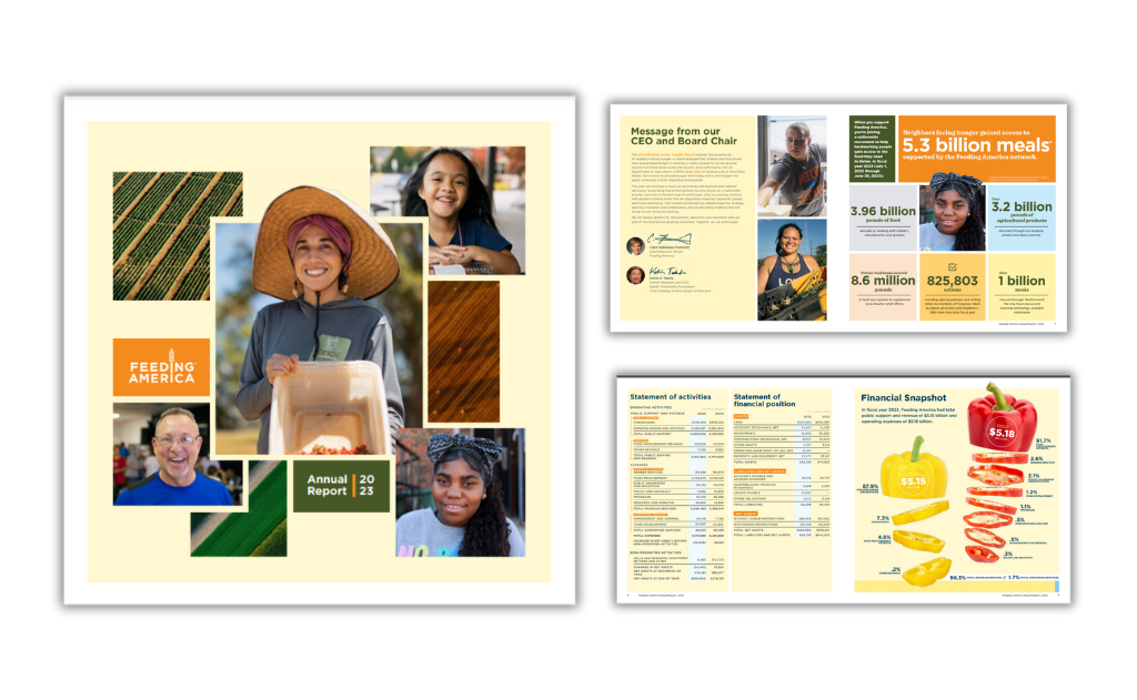
:source:Feeding America's 2024
Compassion International Kenya’s 2022 annual report makes smart use of photos, illustrations and color. The list of abbreviations helps readers comprehend the information across the pages of the report. Maps and numbers allow easy visualization. And the beaming faces will make viewers smile, too.
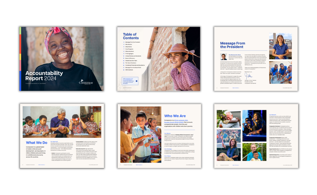
:source:Compassion International Kenya
The 2024 Tesco annual report welcomes you on the website and then offers three viewing options; to download the report pdf, the financial results in Excel or to view a digital XHMTL document. The PDF and XHTML documents consist of full-page images, and blue text over a white background. Financials are highlighted in white letters over a background of berries. The rest of the report is highly visual and well-branded with Tesco colors.
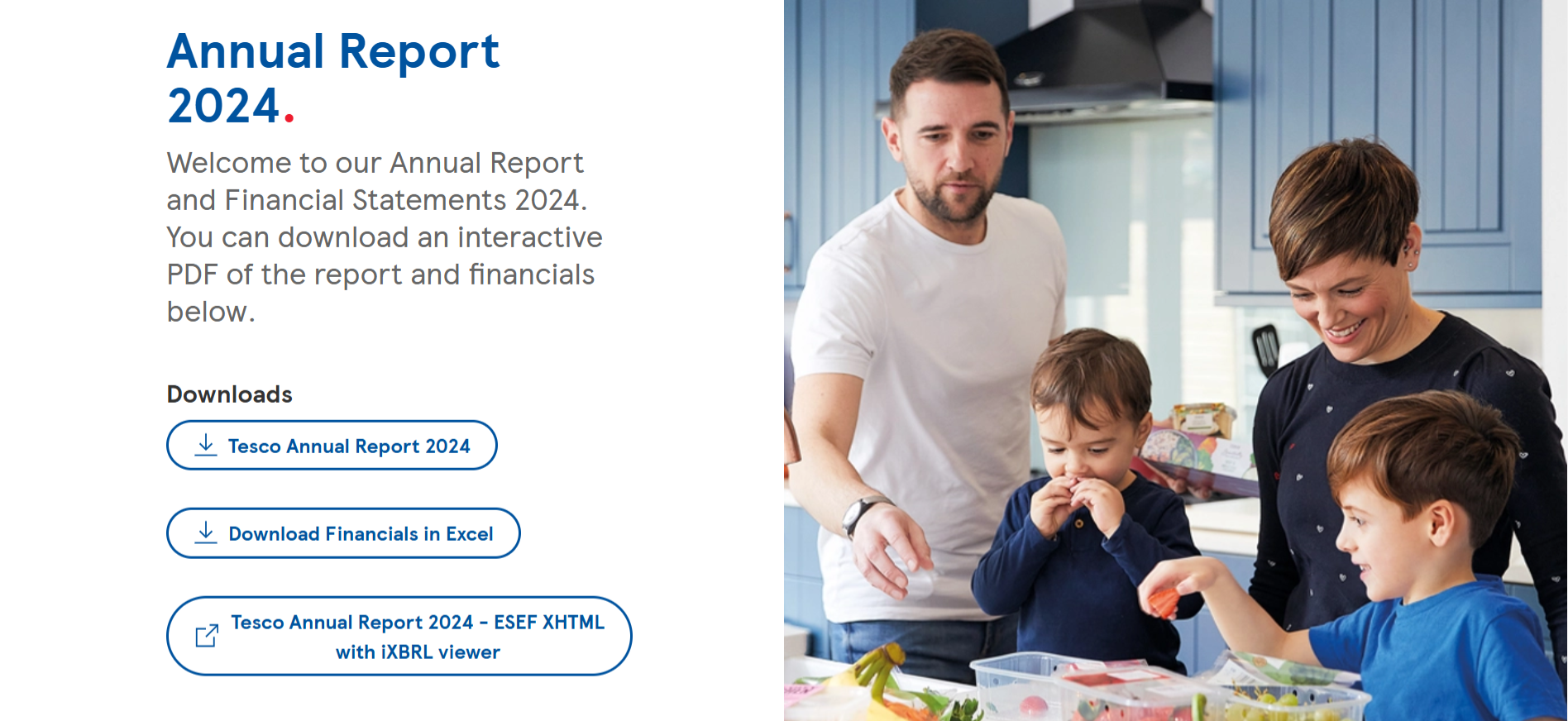
:source:Tesco
The Nestle 2022 annual report has full width images for each section and a gray overlay that appears as you scroll. The visual magic begins inside each section with magazine-style layouts and vibrant animated infographic widgets and product cutouts. In terms of design, the font is friendly and agreeable, making it a pleasure to read the content.
Head of Design, Alejandra Mariscalez shares, "Be purposeful with the content you have to show on each slide. The average human attention span in 2024 is around 8 seconds; question if all of it is necessary or if it can be split into other pages to showcase it better.
I would recommend having 1-2 topics per page tops (if possible), not only will this give you the proper space to organize your elements, but it also be beneficial for the people you are presenting to. It is easier for a human to understand information that is dissected and visually represented."
Each year, we put out our own year in review or annual report — in video presentation style. Since our Year in Review was created in Visme, we incorporated our animated graphics, custom animation features, slide transitions, embed codes and more. Check it out below.
Made with Visme Presentation Maker
After all, what's a Visme year-in-review if it wasn't made in Visme?!
You can easily create your own document or presentation annual report in Visme. Just get started with an annual report template and customize it with your own information.

Here’s a quick recap of the best examples and the lessons you can pull from them:
While starting with a template can save you hours of time, there are some expert tips and best practices to keep in mind if you want to create stunning and effective annual reports.
Here's a quick overview of what we'll cover in this section:
If you don't have an outline before you start designing, you'll find yourself constantly making changes to the annual report layout. This can get extremely frustrating and time-consuming, and you may even end up with an unsatisfactory design at the end.
Create an outline of the topics or pages you want to include, and list down the main points under each one. Follow a standard annual report format, and your outline might look something like this.

This will help you finalize the structure of your business report, and you'll have a wireframe to refer to during the report design process.
When you finally start designing based on an outline, you won't have to worry about missing out on any important information, and constantly removing or adding pages.
Not all annual report designs will work for your business. You need to choose a template with a design that resonates with your audience, and helps communicate your message in the best possible way.
Think about who's going to read your annual report. Are you creating one for investors? Will it be distributed internally? Or are you looking for potential donors for your nonprofit?
The annual report format you choose should align with the values of your audience. If your boss hates the color green, you might not want to use it in your report.
Similarly, if you're publishing an annual report for the healthcare industry, using colors like yellow or orange might not work as well as blue or white for communicating trust and hygiene.

With Visme's annual report maker, you can easily change the colors of your template to suit your audience's taste, as well as your own subject and theme.
While it's perfectly okay to use an template as it is, make sure it doesn't clash with your brand's visual guidelines.
Your company's branding needs to be reflected in every single visual it creates, from a social media graphic to a presentation to an annual report.
In Visme, you can upload your own brand colors, fonts and company logo, and store them to use across all your designs, not just annual reports.
But that’s not all, you also have access to Visme’s Brand Wizard with which you can generate a full set of branded templates. All you need to do is input your website URL and the wizard will pull in your brand assets.

Using inconsistent colors, fonts and other graphic design elements that don't go with your branding can destroy the image you've worked so hard to create over the years.
An annual report design that's consistent with your branding, however, will do wonders for reinforcing your brand values. It will also resonate much better with your readers.
If the thought of a bulky document full of numbers puts you to sleep, try experimenting with a different format instead. A lot of companies these days use creative formats, like infographics, to present key financial figures and company information.
The advantage of using new formats is they make your annual report look far from boring and dull. They also help you condense information into a single piece of visual so it's easy to read and understand.
Try creating your own text blocks to create a unique layout in between visuals, infographic widgets, photos, gifs and videos. You can also use data visualization tools, such as widgets and charts, to visualize numbers and statistics.

Creating an annual report design from scratch can seem intimidating, especially if you don't have any professional graphic design experience.
Thankfully, you can still create a stunning annual report in minutes with the help of the right template. A good yearly report template can give you a head start with fully designed sections, pages and visuals that you can simply replace with your own content in a few clicks.
Even if you're short on design inspiration or pressed for time, Visme offers an AI report maker that creates polished reports in seconds–be it an annual, monthly or quarterly report. Just give a detailed text prompt explaining your vision for what you want to create and watch the tool bring your vision to life.
In this section, we've put together a list of 10 annual report templates that you can customize for your own company or organization. Feel free to make a list of your favorite annual report design ideas.
This modern annual report template will give your business a polished and professional look. The bright yellow color on top of a black-and-white theme helps important numbers stand out.
Use the data visualizations included in this report template, such as pictographs, data widgets and donut charts, to make data easy to read and understand.
If you're looking for a sleek and trendy template with a technology theme, look no further. This customizable template comes packed with a creative layout, image overlays, vector icons, modern typography and stunning visuals.
Annual reports don't get more creative than this. If you're looking for an annual report design that highlights your brand's fun side, and looks nothing like a boring, traditional document, this is the ideal template for you.
Instead of numbers, this sleek, colorful sales report template comes with unique data widgets, graphs and charts that you can easily modify to show your own data.
Simply connect your Google Sheet to sync live data, upload an Excel file or type in your data manually inside the annual report editor.
Catch the attention of potential donors and corporate leaders with this simple and elegant nonprofit annual report template. Customize the color scheme to fit your own organization, change the typography or keep things as they are and just plug in your content.
The eye-catching color scheme on this template works for most types of organizations, including businesses and nonprofits.
This business report example has a geometric design on the cover page, and the pages inside come with pre-designed layouts, graphs, data widgets, icons and images. Use Visme's Dynamic Fields to quickly update data across all the pages of your reports and multiple projects.
If you're on the hunt for a unique report design, this template is a great option. It has a professional look and feel perfect for modern businesses, and even comes with a customizable map that you can use to highlight geographic data in-depth.
If you're publishing an online version of your annual report, you can make the map interactive or animated inside the report editor.
Who says only creative annual reports are effective? Even a simple design, if done right, can make your brand look professional, just like with this no-nonsense template.
There are a few colors you can rarely go wrong with, and classic red is one of them. This simple template comes with a customizable map, graph and data widgets.
The breathable design of this template has the perfect amount of white space, images and a customizable bar graph that you can edit to showcase monthly or yoy growth and other key metrics.
Last but not least, why not take things up a notch and present your annual report in the form of an infographic instead of a traditional, multi-page document?
Use this professional annual report infographic template to bring your numbers to life. Make data easy to skim through and trends easy to identify using annual report graphics like charts and graphs.

Share your budget in style with this multi-page budget report template. This comprehensive financial report example features an eye-catching layout with several colored content blocks fueled by Visme’s high-quality vector icons, data visualizations and more.
It’s a great pick for businesses looking to share their financials with their current or future investors. This is also a good report to share with any financial presentation.
Plan your budget like a pro with our easy-to-use budget planner. Create your custom budget from scratch or choose a budget template that fits your needs.
Highlight key company information using this template for your limited liability company (LLC). Its minimal design lets you highlight just the key information of your company.


This template is the best of both worlds for operations managers or CEOs who want an operating plan and report that helps convince and inform stakeholders.
It opens with an executive summary and strategic objectives, then breaks down into core sections from operations, project metrics, timelines, KPIs and governance structures.


Do you still need to figure out some aspects of annual reports, design or annual report formats? We’ve put together this section with frequently asked questions that hopefully will clear some of your doubts.
You asked for it! Here’s a step-by-step guide to designing an annual report.
Give yourself and your team the time and space to plan and strategize the annual plan design and distribution. You might think that distribution isn’t something you need to think about at the beginning, but you’d be wrong.
Will your annual report be printed into booklets or folders, or will you share it as an online digital experience? The answer tells you what annual report format you need, saving time and effort in the long run.
You’ll have to create a printable document, an interactive PDF or an online experience. Once you know, put your project management hat on and plan out all the goals, tasks and deadlines. Visme has project management templates to help you.
Create a new workspace in your Visme account for the annual report project, or add a new canvas in a Visme workspace you already use. Add the people in your team involved in the content creation and design of the annual report.
Collect all the information and content you’ll need to include in the annual report layout. You’ll have to create a working folder where all files are kept and organized. Your Visme workspace has a media library with folders to organize all your assets. Upload everything as you receive it and label them before designing.
Create an outline for the textual content, separated into sections you’ll use in the layout. Start drafting a index and include links to relevant documents with important text. Use one document to write all the content using a unified tone and voice. Revise the text with your team and finalize it before you start with the design.
Go to your Visme account and browse the annual report templates gallery. Likewise, scroll up on this article and see many options. Select the one that you feel matches your brand, plan and outline better. Annual report layouts come in all shapes and sizes; they vary by industry, niche or field. Any templates you choose to work with are entirely customizable to match your brand guidelines and unique angle.
Power Visme users have branded report templates in the Brand Kit, ready to be adapted to this year’s annual report. All brand assets are present, fonts and colors are ready, and hours are saved.
With your Visme editor and outline document side by side, input the text into the placeholders, adjusting so everything fits as it should. Add your visuals, including data visualization, images, illustrations and icons. Use the keyboard shortcut to find design elements to create a visual flow with clear transitions between sections and a cohesive layout. All you need to do is tap the forward-slash (/) on your keyboard and a search bar will appear to help you find anything you need.

Don’t underestimate your annual report’s cover design. Take your time to choose the right title, select the best visuals, and lay it out attractively and engagingly. Keep your brand forward at every stage of design and composition.
All annual reports, regardless of industry, share the same four components. Inside each one, your annual report will vary depending on scope and message. Here are the four components of an annual report
The introduction of an annual report starts with a letter from the director or chairman of the board to the company’s stakeholders. On one or two pages, place the letter from the director and include his photo and signature as part of the design.
In this letter, the message is all about thanking the stakeholders for their support throughout the fiscal year. There’s a summary of the content they’ll see in the annual report and a personal comment to close up the introduction and invite them to read on.
The second section is about the business profile. There’s mention of the brand’s corporate governance, values and goals. This section includes information about market positioning and how it has changed since one fiscal year. Provide plans and ideas for improving results in the coming year.
In this part of the annual report, external readers will gain valuable information about the company and brand. It provides a background story for the timeline and roadmap visualized in the annual report.
Next up is the management component, featuring operational reporting alongside discussion and analysis reports. These annual report pages include operation reviews through the fiscal year and their comparison to the previous year—set goals for the coming year for all management areas, including marketing and public relations.
Include a letter from some of the managers. This adds a touch of personalization to the annual report, balancing the data visualizations perfectly.
Last but definitely not least is the financial statements component of your annual report. This section is the largest and most important of the entire document. Inside this section, you’ll include all the information related to financial status and statements of the company. For example, a balance sheet, the cash flow, monthly and quarterly financial statements. And finally, the notes to financial statements, which summarize and analyze the numbers.
Data visualizations in financial report designs must follow a visual brand guideline. All charts, graphs, and diagrams must be in the same colors and use the same fonts. All captions and legends must be the same font size, and all extra lines removed.
In general, there are two ways to design an annual report.
For someone—that is not yourself— to design an annual report, you have several choices. At the top of the list—and most costly—are the design agencies specializing in report designing services with custom data visualization creation. These can cost anywhere from $7,000 to $25,000 and more with unique design elements.
Then you have traditional design agencies with standard data visualization experience, costing between $3,000 and $6,000.
Finally, you can also hire freelance designers with varying degrees of expertise. Depending on their seniority, they will charge only a bit less than a regular agency at $2000 to $10,000 if there are many pages and visualizations.
All these options cost money. The money you and your company might not have.
Thankfully, designing beautiful reports isn’t an activity reserved for professional—and expensive—graphic designers. Small companies or startups with lower budgets can design an annual report easily with an online content authoring tool like Visme.
Visme can be used for free to test it out for as long as you want. With a free account, you can create up to three projects. To access all of Visme’s capabilities, you can upgrade to one of the paid plans.
If you’re a nonprofit organization, you may qualify for a discount. Visme also offers separate Education plans for students and teachers.
As long as you select the right annual report layouts and follow our tips and suggestions, you’ll have a great annual report in no time. Do you need some ideas to make your annual report attractive to the reader? Here are some quick tips:
There you have it—a detailed list of 45+ annual reports, including examples and templates to inspire you.
Ready to create beautiful reports for your brand? If yes, you most likely want a stress-free way to design an annual report. Check out Visme's full-featured annual report maker. It has a friendly interface, so anyone on your team, even non-designers, can use it to create beautiful reports.
It's easy to publish your annual reports online in Visme, and you can share them directly with a URL or embed them on your website. Also, with Visme, you can collaboratively create all your report’s designs, from data visualizations to an animated pop-up slideshow.
Even if you lack design inspiration or are racing against the clock, Visme has an AI report generator that lets you generate professional-looking reports in seconds. All it takes is a detailed text prompt that explains what you want to create.
Sign up for a free Visme account and take it for a test drive for as long as you want.
Design visual brand experiences for your business whether you are a seasoned designer or a total novice.
Try Visme for free


![How to Create a Practical Crisis Management Plan [+ Templates]](https://visme.co/blog/wp-content/uploads/2025/07/How-to-Create-a-Practical-Crisis-Management-Plan-Thumbnail.png)