


The Best Beautiful.ai Alternatives to Create AI-Powered Presentations

The team slide is one of the most underrated sections in a pitch deck. But it’s also one of the most important.
As Sooah Cho remarks in an interview, "In real estate, you might hear phrases like 'The one thing that matters is location, location, location,' and in venture capital, the equivalent is people, people, people."
And she’s right, investors aren’t just betting on your idea, they’re betting on you. They want to know why your team is the best team for the project you’re pitching.
Consultants and investors recommend that founders place the team slide towards the start of their pitch decks.
This is important because, according to Papermark’s pitch deck metrics, investors spend 30% more time on the first page than on all other pages and pages 2-10 get approximately 15-16 seconds each.
Considering these points, you need to create effective team slides that make an impact.
In this guide, I’ll share actionable tips and real-life examples to help you structure, design and share information about your team so investors feel confident backing your project.
Before we start, check out this video to learn how to create a winning pitch deck. Don’t forget to subscribe to our channel to get notified of all new content.
Before we talk about creating a team slide, I’m going to answer one important question:
Why is the team overview slide important in a pitch deck or team presentation?
The short answer is: investors invest in the people behind the business, not just the business itself. And your team is proof that your team has the talent, experience and grit to execute.
To understand just how crucial this slide is, I connected with several investors and pitching consultants on LinkedIn. Their insights reveal why the team slide can make or break your pitch.
Troy Kirwin, investment partner at A16Z, emphasizes the importance of not overlooking this slide:
“It's always shocking to me when I see a pre-seed/seed pitch deck & there is either no team slide or it's just pictures/names (no background/accomplishments). The team is by far the most important part of the pitch! We're investing in people. Tell us how amazing you are & why you win.”
At the end of the day, investors see teams as the greatest hedge against risk. A strong team slide tells them that even if the market shifts, you have the right talent to navigate uncertainty.
This sentiment is echoed by Mike Lilly, Co-Founder of FoudersIQ. He stresses not just the content but explains why the team slide deserves prominent placement:
“One thing that's often overlooked in pitch decks is not just the ten or so key slides to include, but also the order in which they appear within the deck.
Specifically, if you're raising a Seed round, you shouldn't hide the "Team" slide toward the end of the deck or in an appendix.
If we think about having an investor's attention for only 25–30 seconds in their inbox, we should present the deck in a way that lays out: the problem, the opportunity, the solution, and then—why are you the best person in the world to execute this?
Keep in mind that at the Seed stage, investors are buying into the team—and little else.”
Long story short, the team slide is important because people are important. And when creating your pitch deck structure, you need to pay attention to them alongside other slides such as:
Structuring a meet the team slide is all about the combination of the content and the layout. Essentially, it's how you place and organize objects and text on the slide.
In this section, you’ll learn how to achieve an effective slide structure using all the elements you need, plus others that will help in a design sense.
First, we’ll take a look at the non-negotiables and then I’ll share some tips on how to put them all together in different compositions.
The goal is to make the presentation layout agreeable to the viewer, align with your brand, and of course, be easy to read.
Our in-house designer, Daniela Verduga, has a motto that will help with this step: “Be smart with layout.”
Building on that suggestion, let me share the essential puzzle pieces of a good layout, applicable not just to slides but to any type of visual content. I also include some tips by Tom C. from Satori Graphics.
Here is Tom C.'s complete video from his channel Sartori Graphics on YouTube. These are ten minutes worth watching if you want to learn more about design layouts.
Now, using this design knowledge, let’s take a deeper look at each non-negotiable element and what role they play in the visual structure of the slide.
A comprehensive slide deck includes several non-negotiable elements that highlight team members and their value to the project. These items must be laid out in a structure that makes sense and doesn’t confuse potential investors.
To give you an idea of what investors are expecting to see, here’s a tip from Manuel Duboe, pitch deck consultant at PowerDecks:
“Here’s what investors want from your Team Slide:
- Relevant experience: Show your team’s track record in similar industries or startups.
- Key skills: Highlight the expertise that makes your team uniquely capable.
- Chemistry: Investors bet on people, not just ideas. Show your team’s dynamic.”
So, what should be included in a team slide pitch deck for each person?
Disclaimer: Many team slides out there (including templates) don’t have all these elements. But after doing the research, I recommend you add them all.
The elements I’ll explain below are listed in order of hierarchy.
To provide context, this is what a person module looks like:
Separately from each person module, you can’t forget the slide title. Some options include
The text for the title must be the largest of all. Typically, it will be the same size as all the other titles in the slide deck. Depending on your deck’s style, place it at the top of vertically to one side.
Moving on to the elements for each module.
First of all, the photo needs to be a professional image. Investor Tony E. Kula succinctly suggests, "Good headshot, no holiday selfie."
Of course, there are exceptions when the brand has a unique or “quirky” style.
The photo goes first so that it draws attention to the module. Depending on your brand style, frame the image in a shape, could be a circle, a square or a diamond. The circle and square are the easiest to work with.
Right below the image, and leaving a couple millimeters of space, write the team member’s name exactly as listed on their LinkedIn profile. This bit of text is the most important in the module. It’s the first text in the hierarchy, so make it larger and noticeable. Some options include bold text or all caps text.
Then, below or next to their name, add their title within the company. The choice will make sense depending on the length of the title.
Terms like CEO or CFO can be next to the name or below. But longer title names like project manager or founding member should be below the name.
In this case, make the text smaller and different than the name.
If the name is bold, then make the title regular. If the name is in all caps, don’t use that for the title. This creates contrast between the text boxes, making it easier to skim.
For the responsibilities, keep it short and sweet. Use short sentences and don’t overcomplicate the content.
This text needs to be just a tad smaller than the title but not too much. Make the space between this text box and the name/title a bit wider than the space between the image and the title. These differences should be subtle, but just enough for it to feel different and separate.
For the person’s experience, write short statements like
“Founded So and So Company, Acquired $15B”
Or
“Former CEO of So and So Company”
The font for this text is good at the same size and weight as the responsibilities.
Finally, at the bottom of each module, add hyperlinks or pop-ups to each person’s relevant awards, LinkedIn bio or social media profiles.
For the social media links, try using icons. But remember to keep them aligned with the rest of the design on your slide. Visme has several social media icons to choose from. Otherwise, they’re all available online.
Font and weight size should be the same as the sections above or just a little smaller, but not too small that you can’t read it. Remember that there needs to be balance.
Now you might be asking, how do I put all these modules together on the slide?
I’ve got your answer.
Let’s take a look at some different layout options. I’ll share gorgeous team slide designs from several pitch deck templates in our gallery. Use these examples as a visual reference to spark ideas for your own slide deck.
Take note of how each design follows the suggestions I mentioned above.
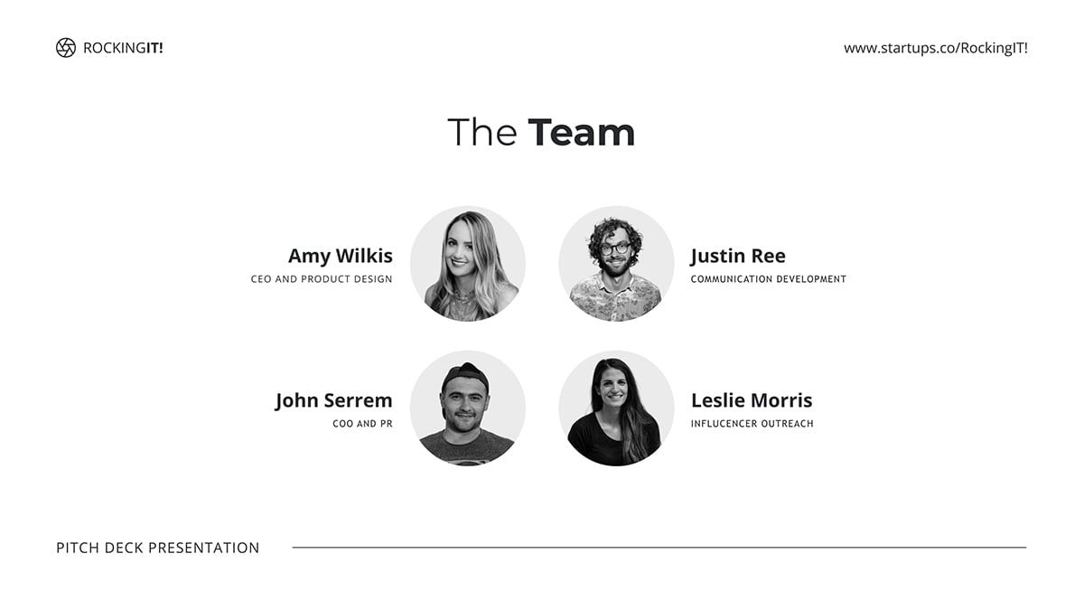
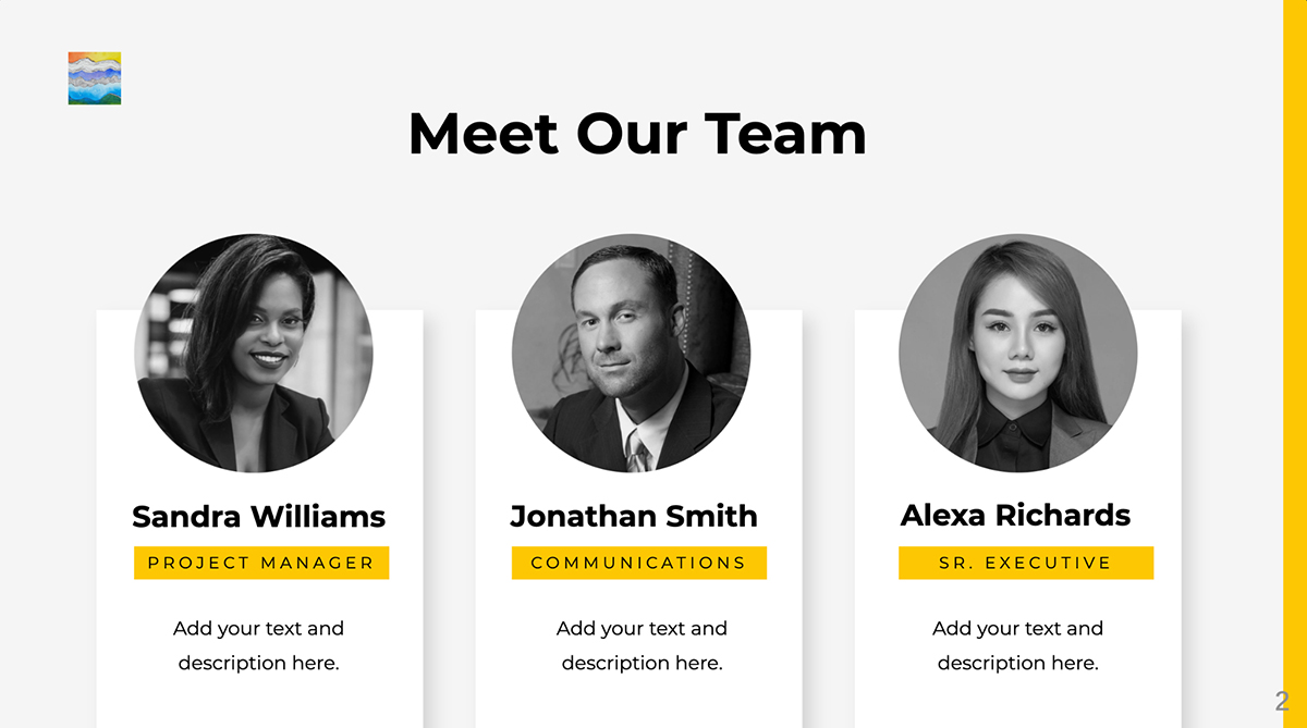
In this slide deck example, the “who we are” slide displays team members in equal, evenly spaced modules. Each one has their name in bold, followed by their position and qualifications.
All this slide is missing is some relevant links. When creating your slides with Visme, use the easy hyperlinking feature to add a link to any text or object in your layout. For example, you can add a social media icon and link it to that person’s profile.
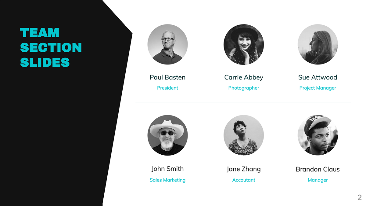
This slide is from a minimal style pitch deck template that uses a white background with black and grayscale visual content. Each team member’s photo is placed inside a circular frame and all four together make a central composition on the slide. The information is placed outward towards the sides, creating balance.
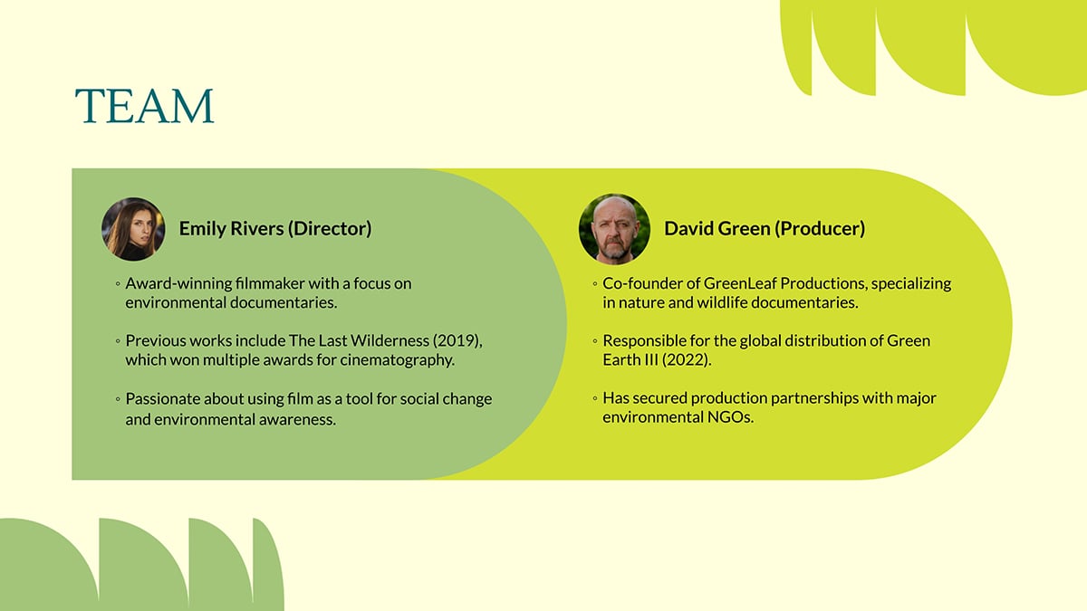
In more creative industries, such as filmmaking, team slides and pitch decks can be more colorful and varied. In this case, the template for a nature documentary includes this team slide design.
The designer and producer are introduced next to each other with a photo and a list of achievements. The two green shapes overlap, creating a composite layout in the center of the slide with leafy elements in the corners.
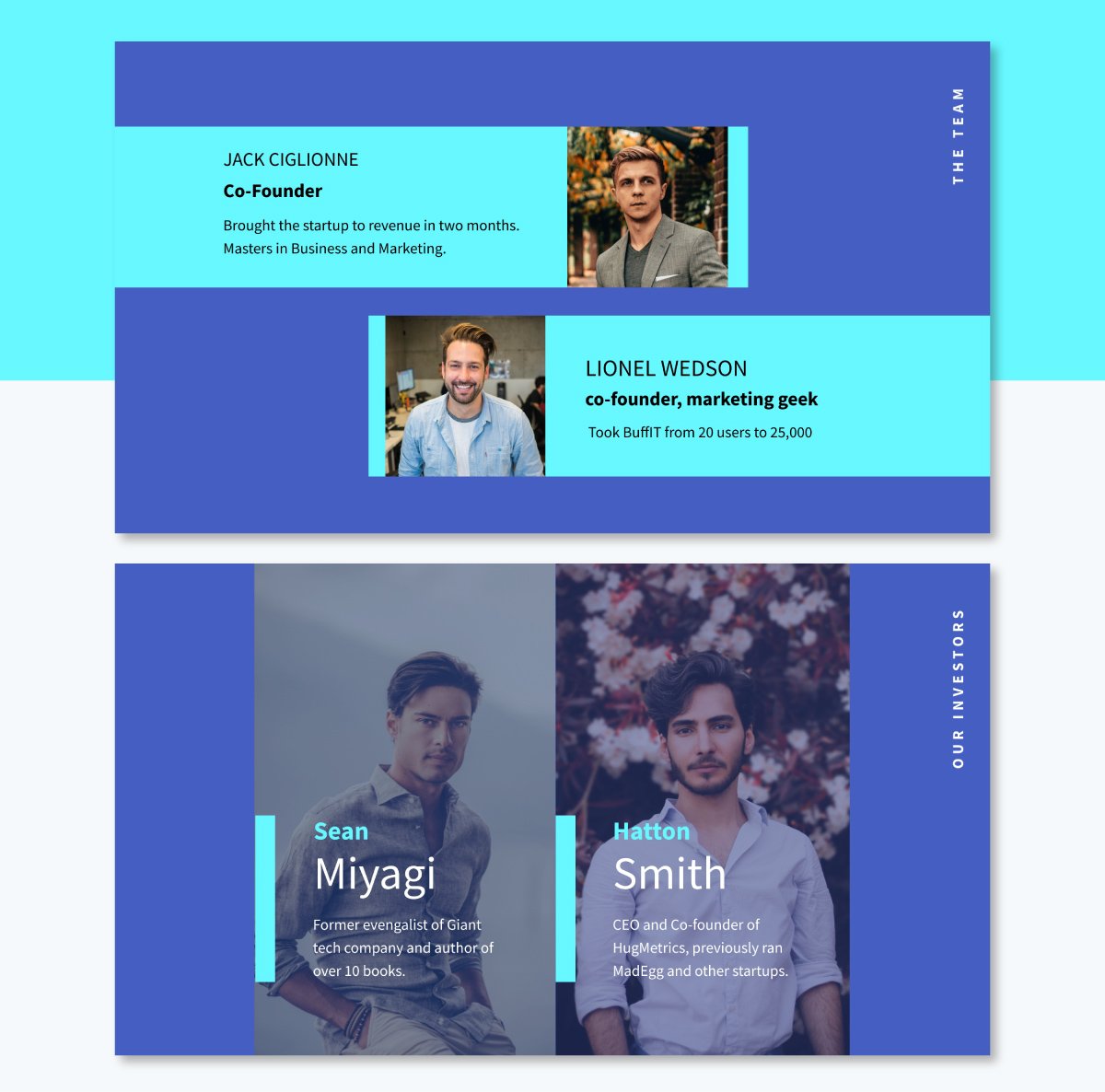
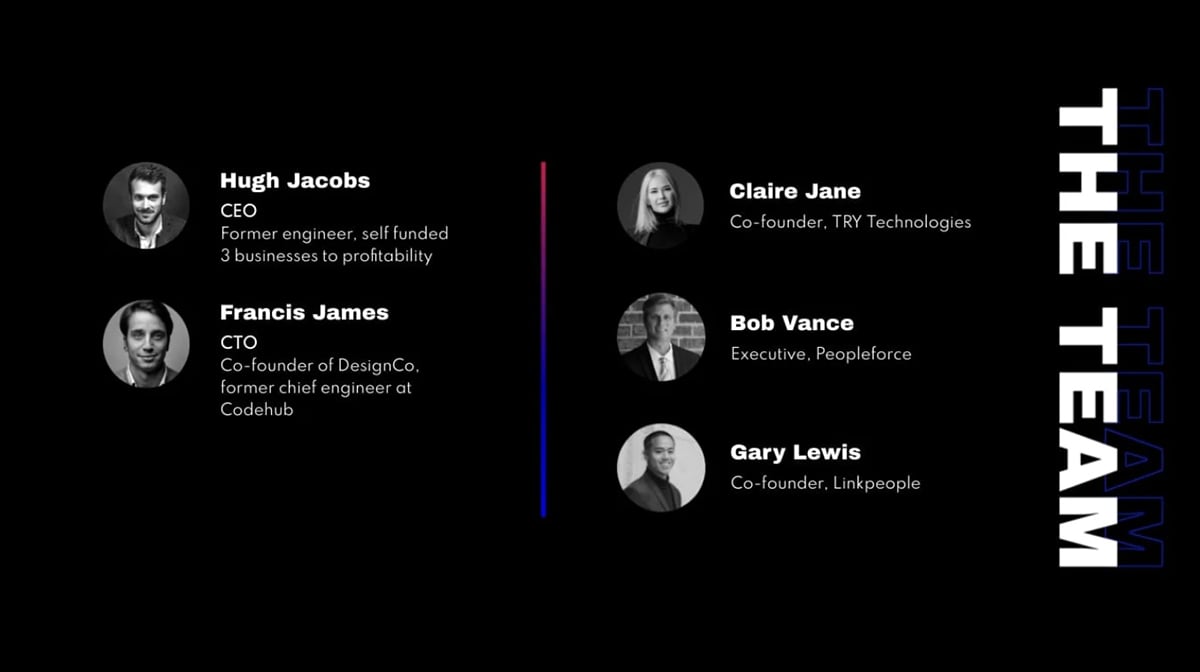
The final example consists of two slides: one for the founders and the other for investors. The layouts aren’t the same, creating a separation that helps understand the difference between each slide.
That said, the color palette does travel from one slide to the other, maintaining visual consistency.
In the section above, I showed you pitch deck team slide examples from our templates, but now I’m going to share some real-life slides from pitch decks shared in BestPitchDecks.com
I’ve chosen different styles so you can get an idea of what actual startups are doing. Interestingly, the majority of team slides use circular photos in their layout.
Product designer Racheal James shares why in a LinkedIn post:
“Do you know why Profile pictures are circular? Here are the reasons behind it
- 𝗙𝗼𝗰𝘂𝘀 𝗼𝗻 𝘁𝗵𝗲 𝗳𝗮𝗰𝗲: Circles naturally draw the eyes to the center, which is ideal for profile pictures where the focus should be on the person's face.
- 𝗔𝗰𝗰𝗼𝗺𝗺𝗼𝗱𝗮𝘁𝗶𝗻𝗴 𝗱𝗶𝗳𝗳𝗲𝗿𝗲𝗻𝘁 𝗵𝗲𝗮𝗱 𝘀𝗵𝗮𝗽𝗲𝘀: Circles are more forgiving of different head shapes and hairstyles than squares
- 𝗔𝗲𝘀𝘁𝗵𝗲𝘁𝗶𝗰𝘀 𝗮𝗻𝗱 𝗰𝗼𝗻𝘁𝗶𝗻𝘂𝗶𝘁𝘆: Circular shapes are often perceived as softer and more aesthetically pleasing than squares in the context of user profiles.
- 𝗔𝘀𝘀𝗼𝗰𝗶𝗮𝘁𝗶𝗼𝗻 𝘄𝗶𝘁𝗵 𝗮𝘃𝗮𝘁𝗮𝗿𝘀: Circles have become the standard format for avatars. This format also applies to profile pictures, creating a sense of familiarity and user expectation.”
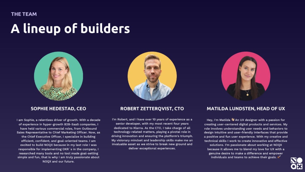
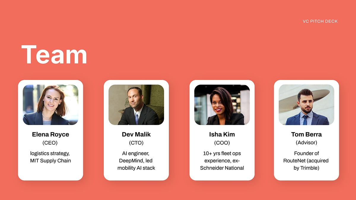
The NOQX pitch deck has a team slide with the three founders. Each one includes a circular photo with a different color background that contrasts well with the slide background.
This team did things a bit differently than usual; they added first-person introductions that highlight their role, responsibilities and achievements. Each name is set in all caps, making it stand out from the text below it.
If you wish to replicate this content style, ensure that all relevant information is included so investors are not kept guessing about why these people matter.
Use Visme’s AI Writer to help you keep the content succinct and to the point. Prompt it to summarize longer text or to finesse a paragraph that feels too long.
Regarding the layout, it’s easy to recreate with Visme’s Presentation themes. This slide, for example, is from our Sleek Presentation Theme. To use any of the themes, open your dashboard and choose one. Once inside the editor, select any of the slide templates to mix and match in your deck.
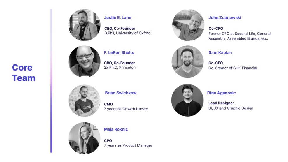
In the CulturePlus pitch deck, the team slide highlights seven team members. The photos are in black and white and are accompanied by the person’s name, their role in the company and a note about previous experience.
The title of the slide, "Core Team," suggests that there are more people involved. But the slide only shows the founders and first collaborators.
Do you want to use this style to showcase your team in your corporate slide deck? Here’s one of the team slide templates from our Modern Presentation Theme. It has a sidebar title area and a balanced section for all group members. The circular frames in black and white are already set, so all you need to do is drag your images into them. All styles will be applied automatically.
Megamod uses past experiences as the critical factor in their team's slide. On the left are the core founders, in the middle the investors and on the right two highly-skilled advisors. Below the core team, you’ll see mention of an in-house dev team that is too large to include on the slide.
I saw several pitch decks with team slides like this one that included investors and other collaborators. The decision to highlight only founders or more depends on the value each person can bring to the team.
That’s what's important to investors: value. They want to know why these people matter. If you don’t have anything super important to share about an additional person, don’t include them. On the other hand, people with amazing experience and qualifications should most definitely be included.
Here’s a team slide from one of our pitch deck templates. It already has a separation to help you organize your team members on one side and founders or advisors on the other.
To help you further with the design of your team slides, I talked to our in-house designers for specific tips.
Here is what they had to say.
As you must have realized by now, photos are a big part of the team slide. Without them, investors won’t get a visual feel for who each person is. So, the first presentation design tip is about displaying images in your layout.
First, we have Daniela Verduga, Visme’s Creative Graphic Designer, who shares a tip about using the Carousel Feature to showcase several people in one slide.
“If you have too many team members and/or information to display in one slide, the carousel feature is a great option because It allows you to include more photos and details for each person while keeping the slide simple and clean."
Additionally, she remarks about the importance of visual consistency and balance.
Also, be consistent. Photos should look similar in lighting and framing. Titles should follow the same format… that gives a more polished and professional feel. Only include what matters and highlight what makes each person essential to the project.” Daniela says.
Speaking of titles, Visme’s Dynamic Fields will help you keep people’s names and positions updated across all versions of your pitch deck. It’s common to personalize pitch decks for investors, so you might have several versions in your library. If you use dynamic fields for terms like names and positions, you only need to update the content in one pitch deck and it will populate all the others automatically.
Next is Soledad Verduga, our Senior Visual Designer, with tips about how to keep the layout tidy when you have many team members:
“If you’re showing 2 to 5 people, you can include photos and make sure names and roles stand out clearly. Use a readable font, keep the text short and aligned, just name, role and maybe one quick credential if needed. If the team is larger, you can skip the photos and split it into two slides if needed. Avoid cramming too many people in one.”
When laying out your team photos in a Visme template, use the AI Edit Tools to remove backgrounds, upscale low-quality images or deblur a photo that needs sharpening.
Another design tip from Daniela is to add interactive elements to your team slide.
“Hotspots are a great way to keep the slide neat while adding interactivity; use the hover feature to reveal each member’s photo and/or additional details, or add links to reach the members.”
This tip goes a long way because adding supplemental information about team members can give investors a better idea of who they are and what they represent for the startup.
Here’s a tutorial video from our YouTube channel that will show you exactly how to do it:
Soledad had a great tip about using color effectively in your team slide:
“Keep your color palette simple, no more than five colors. Use neutral tones for backgrounds and body text and 1 or 2 accent colors for key info like names or titles. That way your slide feels more balanced and focused.”
And speaking of color, more often than not, pitch decks are branded. This means that they follow a set of guidelines regarding color and other elements like fonts and visual elements.
Visme’s Brand Wizard helps you stay on track with that. Use the wizard to set up your brand kit manually or by importing assets from your website. Then apply everything to the team slide and complete the pitch deck in just a few clicks.
Regarding fonts, Alejandra Mariscalez, Design Manager at Visme, sent me this tip about using typography to make an impact.
“One of my favorite techniques (that I believe will never go out of date) is using large-sized typography for your titles or for decorative purposes. Typography can be used in many ways and it can give your slide a sophisticated layout. Any good font pairing or use of typography that is done properly can ultimately set a tone for your overall look and feel.”
Pairing fonts is an important skill when creating presentations and also when building new brands (like your startup). If you need help figuring it out, here’s a video from our YouTube channel that will help.
Now we’ve looked at all the important things about creating a team slide. But how do you introduce your team and highlight their experience in a pitch deck, whether in person or online?
As I mentioned earlier, investors evaluate more than just your credentials and experience. They want to understand the people behind the business and why you’re the right team to execute this specific business idea.
Sooah Cho, Former Principal at Underscore VC, emphasizes this importance in a video published on the Underscore VC channel:
“Team is everything. And when I say everything, literally, it is the most important criterion in our diligence process.”
She shares such good insight in this video that I’ve based this entire section on her advice.
Take notes and watch the full video afterwards.
Here’s what to focus on when presenting your team during a pitch deck presentation:
Start by explaining why you and your team are uniquely qualified to solve this particular problem now. "Your own personal reasons and motivations for building this particular business is actually one of the most important things that I really like to understand at a personal level," Cho notes. Share your personal connection to the problem and what drives you beyond just the business opportunity.
Focus on what makes your team uniquely capable of succeeding. Cho looks for functional expertise, industry background where you've "lived this problem," network advantages, and deep domain knowledge. Be specific about how each team member's background directly contributes to solving your target problem.
Demonstrate self-awareness about gaps in your team. "Are you self aware? Do you understand what gaps you have on the team?" Cho asks. Acknowledge areas where your team needs strengthening and show you have a clear plan for addressing these gaps.
Avoid overselling credentials or hiding past failures. "Being totally authentic about how this connects with your past experience and where you want to go in life" is crucial. Share what you learned from past experiences, including failures, and focus on customer understanding over brand-name associations.
"Passion is a very important ingredient for founders," Cho explains. Speak authentically about why this work excites you and demonstrate that this feels like more than just a job opportunity. As she puts it: "You can just tell this is not just a job to this guy... he was so passionate about what he was doing that it almost feels like play."
Here’s the complete video from UnderscoreVC where Sooah Cho goes into detail about how as an investor, she considers the team at every pitch.
Regarding the technicalities of how to present your team and pitch deck, Visme has several options to help you.
For in-person presentations, ensure you have the finished pitch deck ready in Visme and a stable internet connection at your meeting location. Alternatively, download the deck as an HTML5 file in case WIFI is spotty.
If you’re not going to present your pitch deck in person, use Presenter Studio to record yourself presenting in a bubble over the slides. Then, once it’s ready, share and publish your team deck with a live link or embedded in a web page.
The greatest benefit of sharing your pitch as a live link is Visme’s analytics feature, where you can track who opened your presentation and how long they viewed it for.
The team slide in a pitch deck is the one that introduces the key people behind your startup, project or idea. This slide aims to demonstrate why your team has the right skills and experience to execute your business plan successfully. It includes each member’s name, title, professional photo, relevant experience and key responsibilities.
Common mistakes when creating slide decks include:
Yes, Visme and other online platforms offer multiple pitch deck templates with built-in team slides. Visme’s templates, for example, include pre-designed and balanced layouts, professional photo holders and customization options for style and branding.
A pitch deck is specifically designed to raise funding and follows a structured format with 9-16 slides, including problem, solution, market, team and financials. A slide deck is a generic term for any presentation using slides that can serve various purposes, like training or marketing. In pitch decks, team slides focus on building investor confidence, while corporate slide decks might simply introduce colleagues.
Your team slide isn't just an introduction; it's your opportunity to prove that behind every great idea are the right people to execute it. As venture capitalists and investors consistently emphasize, they're investing in people.
The bottom line? A well-crafted team slide positioned early in your pitch deck can be the difference between investor interest and a pass. It's your chance to demonstrate not just who you are, but why you're uniquely positioned to succeed where others might fail.
Here are some key takeaways:
Remember, investors aren't just evaluating your business model; they're considering whether they believe in you and your team's ability to navigate the inevitable challenges of building a startup. Your team slide is where you make that case.
Ready to create a team slide that converts? Use Visme's AI-powered pitch deck generator and professionally designed templates to build a presentation that showcases your team's strengths and secures the funding you need to grow.
Design visual brand experiences for your business whether you are a seasoned designer or a total novice.
Try Visme for free