


The Best Beautiful.ai Alternatives to Create AI-Powered Presentations

A slide deck is a collection of slides or presentations used by businesses, educators, and professionals to pitch products, share reports or deliver training.
And well-designed slide decks can easily pique your audience's interest and win them over.
In fact, about 91% of presenters swear beautiful slide decks boost their confidence during presentations.
In this article, you’ll learn how to create a compelling slide deck, what makes it effective, and get access to ready-to-use templates and design tips. We've also included pre-made templates and helpful tips for creating powerful slide decks that leave a lasting impression.
In this video, we've also put together 13 presentation design tips for creating awesome slide decks.
Now, open up this video in a separate tab to watch after reading this guide. And don’t forget to subscribe to our channel.
Let's dive in!
A slide deck is your visual storytelling tool. Whether you’re pitching investors or sharing data, it helps simplify complex ideas into digestible visuals.
It functions as a digital or printed tool, created with presentation apps like PowerPoint, Google Slides, or Visme. Businesses, educators, and professionals use slide decks to communicate ideas, pitch products, share reports, or deliver training.
Each slide includes text, images, charts, and multimedia to engage audiences and simplify complex information.
Think of each slide as a single card in a deck with unique content, meanings, value and structure.
Like a deck of cards, you can queue up your slides to tell a story about a topic. Depending on your story's angle, tone and mood, you can shuffle your slides or eliminate some of them.
How you build your slide deck depends on these three things:
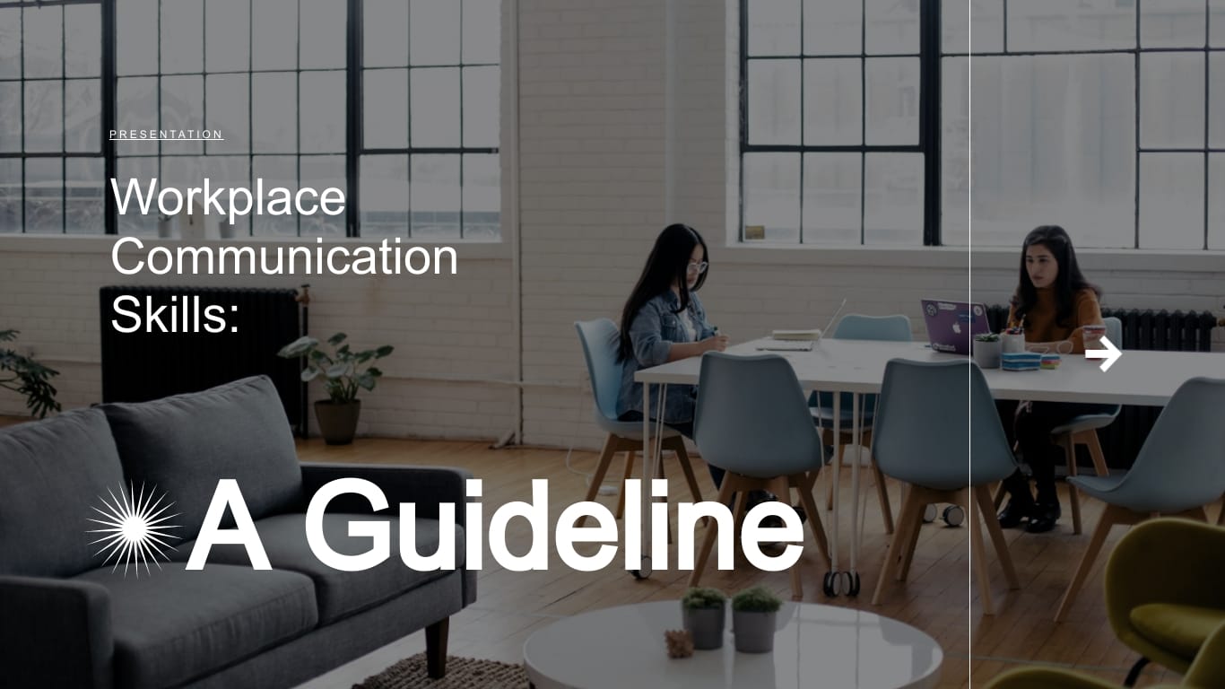
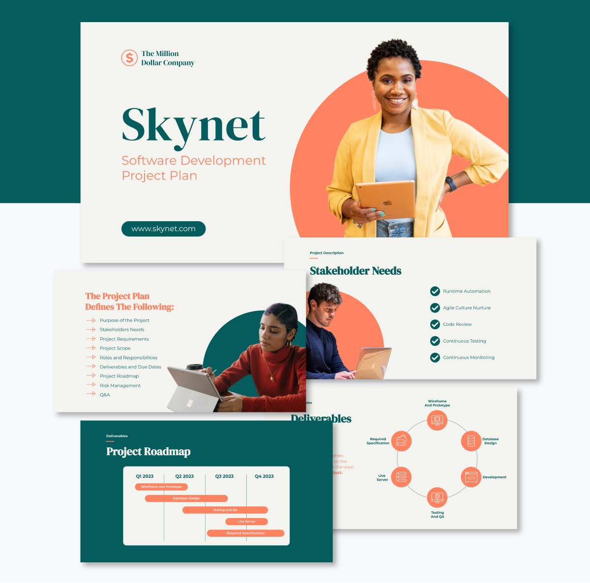
Slide decks like the one below are a valuable resource for entrepreneurs, marketers and businesspeople.
When used to pitch a startup or idea, a slide deck is also called a pitch deck. But you could call it a presentation deck when you're using it for other purposes, like presenting a proposal in a professional or academic setting.
Slide decks help you present ideas in an organized format and aid delivery during presentations. Many presentation programs, like Visme and PowerPoint, let you add as many slides as you want to your deck. The best part is that you can design and customize your deck to make it look professional and attractive.
| Type | Slide Deck | Pitch Deck | Presentation |
| Purpose | General information sharing | Investor or funding pitch | Education or business update |
| Audience | Internal or external teams | Investors, stakeholders | Clients, teams, executives |
| Content Focus | Flexible; varies by use case | Business model, traction, ask | Topic-focused or instructional |
| Design Style | Simple or branded | Visual, concise, persuasive | Clear, structured, supportive |
| Length | Varies (5–50+ slides) | 10–15 slides | 10–30 slides |
Slide decks got their name from the time before computers and PowerPoint. Back then, presentations were accompanied by a projector and a carousel full of photographic slides. Each slide in the projector was one slide of the presentation. All slides piled up together created a deck, like a deck of cards. In this case, a deck of slides.
Photographic slides were created by hand. On a piece of cardboard, the slide designer placed text, images and charts according to what the presenter required. When the layout was ready and approved, it was photographed and turned into a see through slide. This was then mounted on a cardboard or plastic frame.
Here’s a presentation our designers created to show you the progression of this tool in business. Plus, you’ll get to see presentation expert Echo Rivera’s old presentation slides. She admits that even she didn’t get it right until learning how to make her slides beautiful.
Made with Visme Presentation Maker
Looking at real slides designed by real companies is a great way of grasping what’s possible and how you can incorporate the same techniques for your own presentations.
I rounded up four different presentation styles to show you how versatile they can truly be.
One of the most critical actions you can take for your presentation slides is to ensure they reflect your brand, in both the visual aspect and message. This pitch deck by Reddit does exactly that.
At first, it might look over the top and weird to have a cat riding a unicorn that’s spitting fire, but that’s what Reddit is like. This visual makes sense. The second slide, with a chart over the background of a cat, is also spot on.
With this pitch deck, Reddit invites businesses to advertise on their platform by showing exactly how influential the platform is and how much a company can gain from using it.
But what they also do is admit that it might not be for everyone, using a cat meme, of course.
This presentation by Air Liquide was created for their 2022 Capital Markets Day. A capital markets day is when a company invites its investors to attend a presentation that shares information about its financial status, or new products and developments.
I chose this example because of how the slides are laid out with plenty of empty space that makes it easy to grasp the information quickly. The content isn’t cluttered and there’s good color contrast.
Another aspect to note is how all 80 slides use the same master design, helping unify the content and supporting the flow. You can achieve this yourself with Visme and the Master Layout feature.
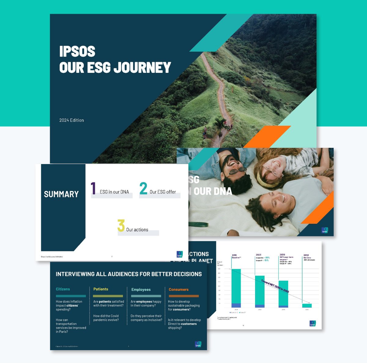
In this slide deck presentation, Ipsos shares their advancements in sustainability and ethical impact. To document their ESG (Environmental, Sustainability and Governance) journey, they designed a 27-slide presentation.
Things that stand out in this design is the simple but creative font choice. It’s extended with a tall x-height and is easy to read. They used both light text over a dark background and very dark gray over off-white. This contrast makes the text pleasant to read. Not using pure black or pure white is a tried and tested design technique for increased legibility.
Another aspect worth mentioning is the section divider slides with full-width images that relate to the content and create a point of pause. And finally, the tables aren’t overloaded with content and have enough empty space to make the data perceivable quickly.
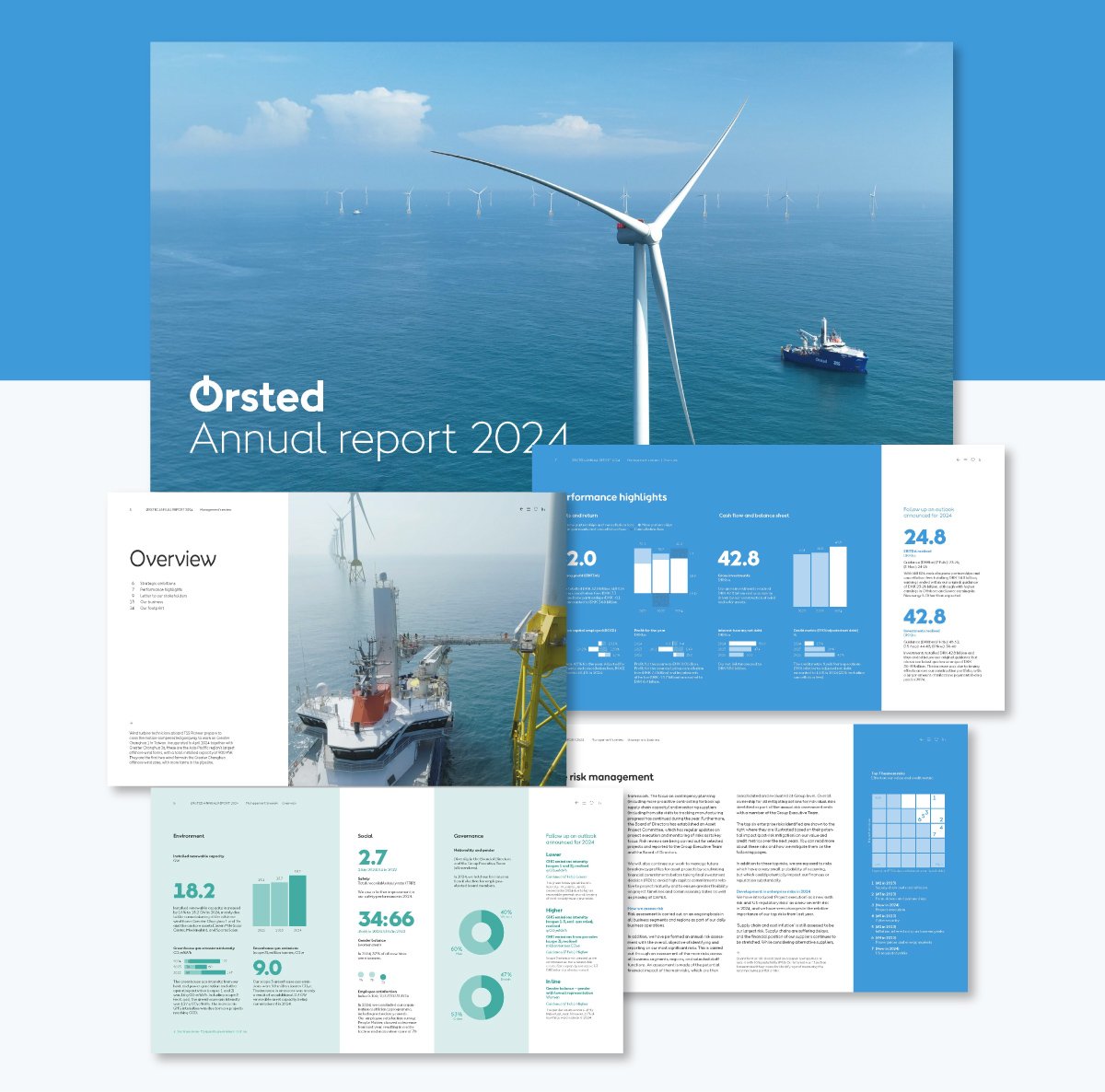
Annual reports are typically text-heavy. The slides include a lot of information because they are not generally used alongside a speech, but are rather sent out for the audience to review at their own time.
That said, this annual report from Orsted makes it a bit easier on the reader by combining text-heavy slides with others that highlight data in color-blocked sections. The vertical separations help capture the message more easily because it has big numbers that create focal points and a clear flow.
Another well-achieved design aspect is the color palette. It’s a double monochromatic scheme in blue and green that combines with off-white and dark gray. The contrasts aren’t overwhelming, but they’re strong enough to be noticeable.
How you craft your slide deck can play a big role in the success of your presentation.
Here's a step-by-step guide on how to create an effective slide deck.
Want to up the value of your presentation? Start by focusing on your core message. Regardless of your presentation type, your slide deck outline should answer these key questions:
Many people, including experienced presenters, tend to fill their slides with points that don't add value. This leaves the audience confused about whether to listen or read the slide.
Remember, the pitch deck should visually enhance your audience's learning experience. Once you weave your narrative around your main story, you can organize your supporting points around it. You're sure to engage your audience and drive your message across.
Follow presentation expert Nancy Duarte’s tip on this subject which she shares in her book Resonate: Present Visual Stories that Transform Audiences:
“Your presentation proposes an idea, and you’re asking the audience to adopt and shepherd that idea to positive outcomes. Your idea might be to reshape an organization for the future or to show customers how your product will fill a need they have.”
And also, take into account the results of research published in the book Made to Stick. It highlights that people are 12 to 13 times more likely to remember a story over specific facts.
Dealing with busy execs who won't sit through your presentation? Use a startup one pager instead. It'll get their attention quicker and more efficiently. You can then secure a meeting to present your pitch deck.
Should you use a premade template or start from scratch?
Well, templates give you a creative head start. They provide consistency in design, layout and ideas.
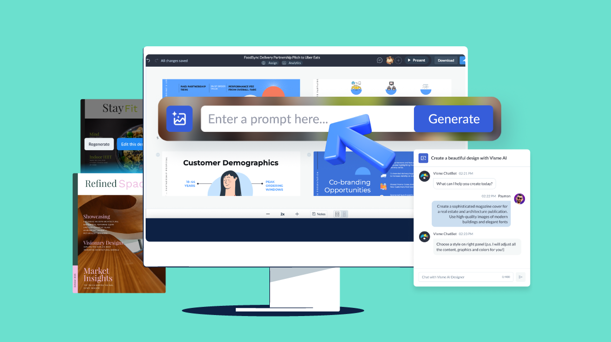
Visme, for example, has thousands of editable templates to help you create presentations quickly.
Here's how to customize your presentation deck in Visme.
Presentation templates usually have several slides. Feel free to add, remove or reorder slides to your deck to match your outline and main idea.
Once your presentation structure is ready, edit and input your own content in the slides. You can choose from a range of slide templates here
Or, if you have an existing PowerPoint presentation, you can import it and continue editing your slides in Visme.
Pro Tip: No one wants to sit through a lengthy presentation with nothing to offer. Be sure to make each slide fit into the overall theme of your presentation. Choose only slides that add value and convey your messages effectively.
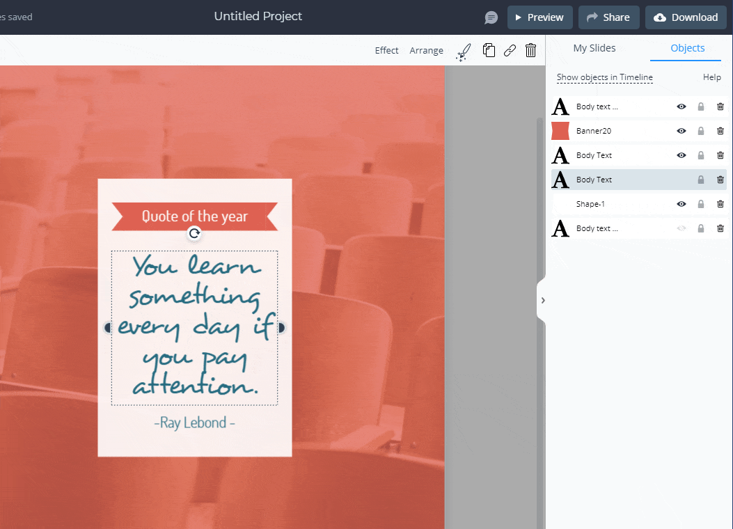
After you've selected your slides, add custom text to them. Templates tend to have built-in text placeholders. Click and drag the placeholder to change the text position. Or click each placeholder and highlight the block of text to edit it.
Type your text or paste the text you copied from elsewhere. Repeat the process throughout the rest of the slides.
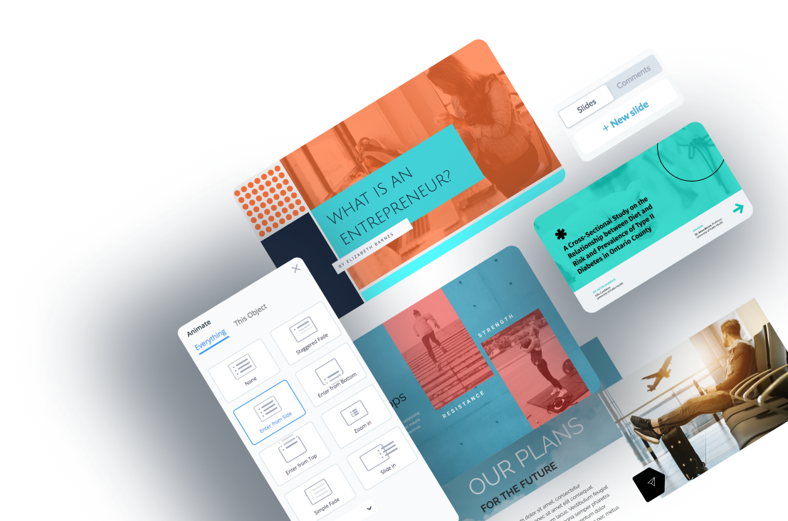
Want to add more fun and personality to your text? Change font style, text color, size, style, direction and much more. Animate your text and add other special effects to make your text alluring.
 Pro Tip: When selecting the best font for your presentation, avoid overly decorative text and script fonts. Instead, stick to fonts that are clear and easy to read. Use font colors that match your brand and create a visual contrast with your background.
High-quality images capture and convey abstract concepts like color and emotions. Upload images stored on your computer and use them in your design. Or select from our library of free high-resolution images to find the perfect one for your slide deck.
Use these elements to bring boring presentations to life. They are effective for creating minimalistic designs and explaining complex ideas.
Visme, for instance, has a comprehensive library of more than one million shapes, icons, illustrations and animations. Click the graphics tab, select the asset, and add it to the slide. You can change the color, position and size of your design assets.

Use data visualizations to share statistics, financial and other numerical data in your presentation. Some options include bar charts, pie charts, graphs, timelines, flowcharts, maps and more.
Select the chart or graph and customize the title, color, data and legends.
Pre-built templates contain lots of placeholder content. They serve as a guide to help you create the perfect presentation. You don't have to use all of it. Feel free to eliminate anything that isn't useful to your deck.
Watch this video to learn more about creating beautiful presentations.
When preparing for your big day, invest as much time into your slide design as your content.
What's in it for you? An engaging slide deck can draw in your audience and get them excited about what you have to offer.
If your company has a brand guideline, apply your brand elements to the slides. But if you haven't got one, Visme can help you create a strong and memorable brand identity.
Use the brand style guide template below to define your brand personality and ensure consistency.


After creating your logo, fonts and colors, you can save them in Visme's brand design tool. Your team members can easily create presentations and your brand theme will automatically appear on their designs.
Watch the video below to learn how to set up your branding kit in Visme.
Choosing the right font pairing and sizes can be a big deal, especially for non-designers. But getting it right can turn a boring slide deck into an appealing one.
Stick to two or three typefaces and assign distinct roles to each font—the more contrast between your fonts, the better.
For instance, you can use the same font for headings, another for the intro, another for the body and the fourth for quotes.
Use typefaces that connote your personality and style. If you're pitching art or design themes, incorporate classic and contemporary typefaces that connote creativity and elegance.
Not sure how to pair fonts? This detailed guide to help you choose the right font combination for your designs.
Without a doubt, the human brain is wired for visuals. The mental capacity to process visual content far exceeds that of written and spoken words.
Attractive visual aids help you tell more compelling stories than text. Incorporating images, video animations and sleek transitions to break up static slides will get people's attention.
Bar charts that show patterns or trends can boost investors' confidence and convey excitement. The same goes for pie charts, which are great for comparing growth areas.
Use infographics to condense lengthy text into visuals that people can easily relate to. With our infographic maker, you can easily translate your ideas into digestible graphics.
One big mistake people make is that they want to keep adding content to their slide deck. They end up filling it up with tedious details irrelevant to their audience.
Remember, your slides are supposed to aid your presentation rather than contain every word you say. If you fill it with text, you could quickly lose your audience. They'll keep longing for the end and leave the room with little or no information.
To make your slide impactful, eliminate fluff. Keep it brief yet filled with key action points. Fit your information into three key blocks- a persuasive intro, a strong body and an actionable conclusion. You will have a more focused, shorter, and memorable presentation.
Whether you want to create slide decks for business, education, or nonprofits, Visme has everything you need.
We have thousands of templates to help you create stunning designs and layouts you can be proud of.
Here are our top 10 templates from each category.
Got a new business idea? Or do you want to scale your business? Get your investors pumped up with this Uber-inspired professional pitch deck template.
The editable 20-slide deck template covers every element of a winning pitch. It features a striking slide layout, a beautiful color scheme, and high-resolution photos and icons. The interactive data visualizations allow you to share compelling numbers that attract investors' interest.


Use this attractive slide deck template to win over clients for your real estate business. The simple and classy design makes it unique and impactful.
You'll find a lot of space to play around with colors, fonts and other design elements. Feel free to tweak the layout design, add compelling images of your properties, key stats and much more.


This template is a perfect pick for companies looking to pitch to customers or investors. Use this Buffer-inspired slide deck to share your key information like goals, traction, milestones, financial projection, a team slide and more.
The consistent blue color theme and elegant styling provide a refreshing visual experience. Notice how charts, timelines and images are used to draw attention to critical data. You can add or remove slides, edit the content, and use your brand colors, fonts and logo to keep it on brand.


Bridge the skills gap in your organization with this training slide deck template. The template has a minimalistic design and seamlessly blends different shades of blue across all 13 slides.
The slides feature valuable elements and sections to help your audience retain the information better. You'll find quality icons, images, a chart, timeline, checklist and evaluation matrix.
Use this template to onboard new hires and get them in the mood for work. You can also use it to prepare training courses or introduce new policies and procedures.


Here's another cutting-edge slide deck template for education, training and informational purposes. The coffee-themed presentation has a rich blend of white, brown and black color themes.
You can use it to highlight the benefits of a product with relevant statistics, charts and graphs to make it digestible. The text, icons and images are evenly spaced, making it easier for your audience to grasp key information.
Create the perfect slide deck with Visme's design collaboration feature. Team members can view, edit and leave feedback on your presentation in real-time. You can reply, resolve and delete comments till the design is top-notch.


Are you starting a nonprofit or growing an existing one? This editable slide deck presentation can serve multiple purposes.
You can use it to share what you and your volunteers have been up to in the past year. It's also helpful in building support for your charitable projects. T
It features sections like executive summary, introduction, map of projects, number of incidences, cases, casualties and more. Use images, data visualizations and widgets from Visme's library to tell stories that pique your audience's interests.


With this slide deck template, you can build a learning trajectory for your students. It outlines what students need to learn, how lessons will be delivered, and how learning will be evaluated. You can also list resources needed by teachers and students, methods and assignment types.
Change the color, font and logo to fit your brand and your deck is ready for use.


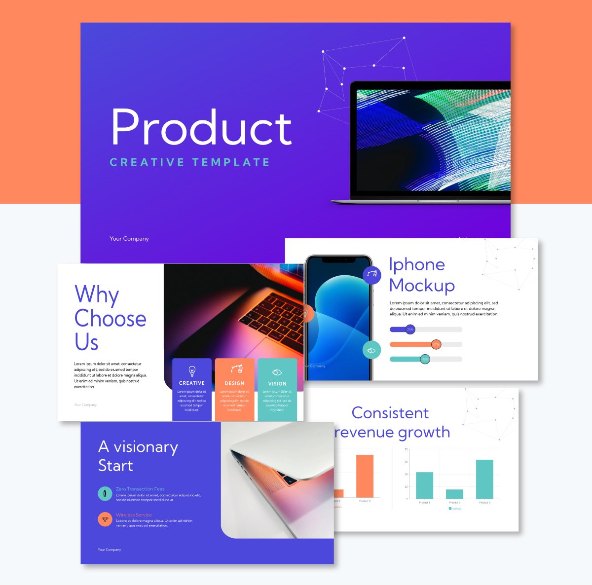
Weave a captivating narrative about your product with this slide deck template. The template has a dynamic layout, creating room for you to present any information.
It highlights key information like the product mockup, milestones and timelines, revenue projections, product pricing and more. Use this template to visualize the creation process for SaaS-based platforms, cloud solutions and tech products.
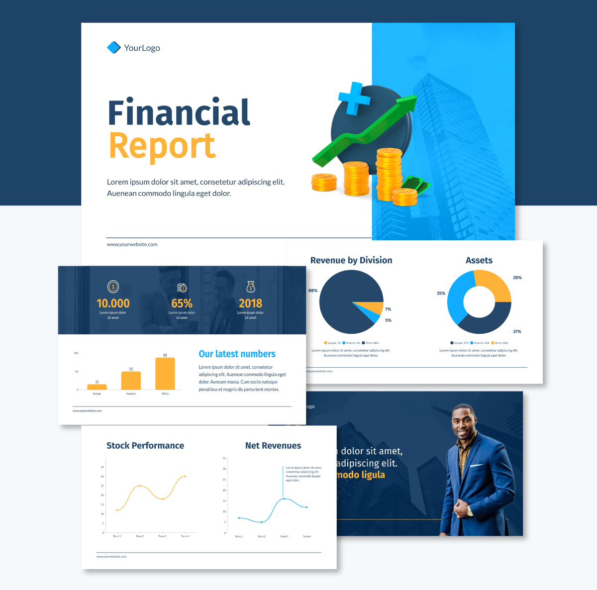
Looking to communicate financial activities and performance within your company? This visual-rich slide deck template fits the bill. It contains bars, charts, and graphs, making your data easier to comprehend.
The dark background and bright-colored fonts and elements create the perfect visual contrast. Liven up your presentation with animated icons, illustrations and special effects. Also, incorporate hover effects and clickable pop-ups to make your slides interactive.
Use this appealing keynote presentation template to deliver a powerful presentation on parenting. This colorful slide deck can help you connect with other parents, teachers and child caregivers.
Utilize our crisp stock photos, icons and illustrations to make your audience engagement more rewarding.


One of the biggest mistakes you can make when designing your slides is to fill them up with a bunch of text. Especially, text that isn’t relevant to what you’ll be speaking about when that slide is shown.
This mistake has two trains of thought, so you should go with the one that makes more sense for your audience. To show you what I mean, let me share expert insights from two professionals whose opinions differ on the subject.
Regine Bachmaier, research associate at the Centre for University and Academic Teaching shared in her article about slide design,
“Students learn better when you do not offer them an identical text simultaneously in written and spoken form, as stated by the Redundancy Principle. Always keep in mind that the slides are meant to be a visually supportive accessory to your oral explanations. They are not meant to replace your presentation!
She also mentions that you shouldn’t orally present the identical contents from the slide because the text on the slides will displace the spoken text. Additionally, she says it’s more effective to explain the visuals orally than to include them as text on the slide.
Now, on the other hand, you have the issue of accessibility. If you have text on a slide, it needs to be shared out loud so that visually impaired people can know about it.
And that’s one of the reasons Claus Wilke says the following in his article about engaging presentations and text heavy slides:
“One of the first recommendations that we usually give our students is to put less text on their slides, and instead use images, drawings, and diagrams. I wholeheartedly agree with this recommendation in principle, and for most of my presentations I spend a lot of time developing graphics instead of text. However, I think that there are other recommendations that we should emphasize first; the text-heavyness of slides really is a minor issue. After all, one can absolutely give an excellent presentation using text-heavy slides, and one can also give a terrible presentation using slides with very little text."
What he recommends is what he calls his First Law of Giving Presentations: All text on slides needs to be read aloud, word for word. And all visualizations must be clearly explained and described.
The second slide deck design mistake I’ll mention has to do with your choice of colors in the design. Using too many colors or an unbalanced color palette can make your presentation overwhelming and difficult to follow. When the colors are all over the place, you can’t tell what’s important.
Do as Regine Bachmaier says in the article I mentioned above, “Make sure that the slide design does not distract from the content. Pay attention to a uniform, harmonious colour scheme. Ideally, limit yourself to three or four colours for your presentation.”
Your choice of color can also help with transmitting your main idea or topic. As presentation expert Nancy Duarte shared in a video for the Stanford Graduate School of Business:
"You can use colors to prioritize information through contrast... if you think about camouflage and you look at every slide as if you're trying to minimize the amount of camouflage to your idea you can actually find that one key thing that you're trying to do and just amplify that by using a big contrasting color or making a really minimal color palette making that one thing pop out."
Earlier, in the section about creating a slide deck, I mentioned the importance of creating the slides by sticking to a main story. But you must go beyond that, and actually tell the story. Not using storytelling techniques can make your presentation disjointed and lacking of logical flow.
Because, as presentation coach Benjamin Ball shares in his article about storytelling in presentations,
“Business storytelling is a powerful tool that can transform a dull presentation into a memorable experience. A good story will engage your target audience, tap into their emotions, and leave a lasting impression. This is why marketing leaders and business owners increasingly see the power of storytelling as an essential tool for communication.
When done right, effective storytelling brings new ideas to life and makes them relatable. By using real people and real-world examples, you can create a compelling story that resonates with potential customers or clients.”
Storytelling is approached in several ways, by using a presentation structure and by designing the slides in a way that supports your story.
Regarding slide design, let’s consider the expert approach to presentation design by data scientist Hennie de Harder. She remarks that:
"The title of a slide should state the key takeaway or insight you want to tell at that particular slide, and the visualizations should support that message. When reading all the titles of the slides in sequence, these titles should tell the full story of the presentation."
The key to achieving this and infusing your slides with storytelling lies in mastering two principles: horizontal and vertical alignment.
Horizontal alignment ensures each individual slide functions as a coherent unit, with a title stating the key takeaway (not just a generic label). It should also include visualizations that directly support this message, creating self-contained slides that deliver distinct parts of your story.
Meanwhile, vertical alignment structures the entire presentation so that reading all slide titles in sequence tells the complete narrative. This technique forms a logical progression from introduction through key points to conclusion.
Together, these principles help you create presentations where individual slides communicate specific insights while building a memorable story that resonates with audiences regardless of whether you're presenting in person or sharing the deck independently.
The term slide decks date back to an old technology where slides were physically inserted into a carousel projector and projected on the wall or screen. These slides were shuffled like a deck of cards to create a presentation. Hence, the name “slide deck” has stuck with the modern age.
Today slide decks are created and projected digitally using software like Visme, PowerPoint, Google Slides and more.
A slide deck is a group of slides put together to tell a story. PowerPoint is a software application used to create slide decks or presentations. A pitch deck is a distinct type of slide deck used to pitch a solution, idea, or product when seeking financing from investors.
Whether you’re sharing strategies or performance updates, you don’t need to build your slide deck from scratch. Visme has a rich library of beautifully-designed slide decks that leaves a lasting impression on your audience.
A PowerPoint presentation is a specific file created using Microsoft PowerPoint, whereas a slide deck is a general term for any collection of slides, regardless of the software used to create it. Both terms are commonly used interchangeably, although “slide deck” is more universal, as it does not reference any particular presentation software.
A slide deck can have as many slides as you need. But in general, pitch decks have between 10 and 12, business presentations between 10 and 20. And, like we saw in the example above, as many as 80.
There are several tools that are better than PowerPoint for making presentations. Some of these include Visme, Canva, Beautiful.AI, Pitch and several others.
These are the steps to create a slide deck
Now you know what makes a slide deck great. It's time to create one for your business.
Visme presentation software and templates provide everything you need to create beautiful slide decks for any purpose. Our software has helped thousands of businesses and professionals nail their presentations.
Each template comes with pre-designed slides. You can replace your content and customize other design elements according to your preference. With Dynamic Fields, you're sure your personal, company and other critical information will be accurate and updated throughout your presentation in real-time.
Visme lets you download your slide deck in multiple formats or share online using a link. You can generate an embed code and paste it on your website or blog. From your analytics page, you can see who has viewed your presentation and other metrics.
Design visual brand experiences for your business whether you are a seasoned designer or a total novice.
Try Visme for free