


Typography Infographics: 12 Inspiring Examples & Techniques

Selecting fonts for any design — including infographics — can be a daunting task, even for a designer! Scrolling through hundreds of fonts to find the right one is a tremendous creative feeling but can also feel like a waste of time.
We’re here to help.
This guide will help you choose the best infographic fonts for your project. By using your intuition, design purpose and some critical thinking, you’ll be able to find the perfect font in no time.
Yes, even if you’re not a designer and are going the DIY route on that infographic. We’ve got your back.
If you're ready to get started creating your infographic now, head on over to our infographic maker! Select from hundreds of beautiful and professional infographic templates to get started.
Infographic fonts matter because they’re the ones that tie everything together in the layout, plus they carry the message you’re aiming to convey. The choice of font you make will mark the difference between an infographic that’s easily assimilated and maybe even shared widely, and an infographic that’s difficult to understand and therefore not useful.
But how?
Infographics are made of many parts that fit together to create a unified and balanced design that informs and hopefully impacts the viewer.
Of all the pieces involved in creating an infographic, the fonts are one of the most important. You’d think that the visuals or charts would take this crown, but let me tell you why that’s not exactly true.
The visuals, icons, charts and illustrations that you choose for your infographic are incredibly important.
But why is the font even more critical?
The text in an interactive infographic ties everything together, setting the story and flow of the content. Even the charts.
Your infographic fonts need to be legible, even skimmable. They need to fit neatly within their space and not overwhelm the visuals. They need to match the infographic's visual feel while also saying just enough to get the point across quickly.
When a font is difficult to read, no amount of beautiful visuals and perfect charts will save the first impression of your infographic. You need to consider fonts not only as text but also as visual elements.
When you impart a sense of imagery to your text and fonts, you’ll understand why typography is so darn important in infographic design.
“Typography is two-dimensional architecture, based on experience and imagination, and guided by rules and readability. And this is the purpose of typography: The arrangement of design elements within a given structure should allow the reader to easily focus on the message, without slowing down the speed of his reading.”
– From a posthumous piece about type designer Hermann Zapf in Typeform.eu
This whole business of choosing the best infographic fonts might seem daunting now, but thankfully, there are best practices you can follow to make it much easier on you and your team.
Let’s dive in!
Starting off on the right foot will always take you to the places you need to be, faster and in better shape. And that also applies to choosing a font for your infographic.
These best practices for infographic fonts will help you create better infographics every time. Here’s a quick overview at what we’ll discuss.
We know fonts are just part of the puzzle, and there are other factors that will affect your overall infographic design. So, we’ve added this video on graphic design tips to cover everything else you need to know.
When you’re done designing your infographic, share and publish it as a high-resolution PNG or PDF, embed it directly on your website and share it to social media platforms directly from the Visme dashboard.
That’s what these infographic font best practices will do for you and your project.
The first and most crucial consideration when choosing infographic fonts is your brand. If the infographic you’re making is part of a set of branded assets, much of the font choice work is already done for you!
Check the brand guidelines to see what font types you’re meant to be using. If you haven’t added your brand fonts to Visme yet, use the Brand Wizard to set up the Brand Kit inside your workspace.
Once that’s sorted, your brand fonts will be at the top of the list inside the editor. Best of all, everyone collaborating on the infographic design will have access to those fonts.
Try It For Free
Even if you have a set of brand fonts that you need to use, many of the best practices below still apply! We’ll let you know when and to what extent.
Furthermore, if you haven’t settled on the brand fonts for your business, the video we’ve added below will help you sort that out.
Ok, so you don’t have any brand guidelines in place? Or you want to create a different kind of design? Then this is where you’ll start.
This best practice is one that I’d love to put up in big letters on your whiteboard; it’s that essential. Here it goes...just stick to the main fonts! Don’t go off into the novelty font realms and get sucked into finding the perfect cute, exciting font. Don’t do it.
By main fonts, I mean:
These are the most legible, versatile and dependable fonts. We’ll give you some examples at the end.
Limiting your font choices to a maximum of three (ideally two) styles keeps your infographic clean, readable and professional. It’s not just a suggestion; it’s a pretty standard rule that designers swear by, including Alexandra Lunn, of Alexandra Lunn Studio.
"Stick to two to three complementary fonts to maintain harmony and establish a clear visual hierarchy, with bold fonts for headlines and subtler ones for body text."- Alexandra Lunn, Senior Graphic Designer
To make it super easy on yourself, stick to one versatile font family by using different weights: Montserrat Bold for headlines paired with Montserrat Regular for body text, for example.
Fonts carry personality and mood. Their shapes and forms must match the purpose, style and layout of your infographic.
Here are some use case examples:
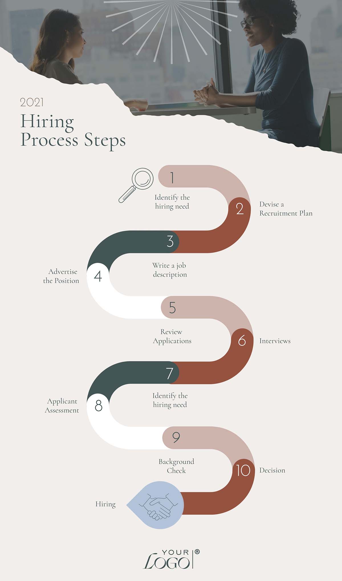
Below is an infographic visualizing a series of fonts and their perceived personalities. Some fonts in this infographic are also on the list of recommended infographic fonts to try.
Others are here to help you better visualize the idea of font psychology and perception but might not necessarily be the best choice for an infographic.

Do you want to learn more about using fonts in design? The video below is a lesson on typography from our free design course, where Ivan shares everything you need to know about using type and how to combine it effectively with all the other visual elements.
If a font isn’t legible and readable, that font choice is a bust.
Not surprisingly, font accessibility and readability are top priorities for designers; 76% of surveyed creatives prioritize fonts that are accessible and easy to read. Because when your audience can't quickly process your infographic's message, even the most beautiful design fails to deliver.
So, how do you know if a font is legible and readable? You have to test it. There are a few factors that go into making a font both legible and readable. For starters, the difference between the two.
Our friend, Plamen Motev from FontFabric Type Foundry explain it perfectly:
“While legibility helps you recognize characters, readability is about how easy it is to read words, sentences, and full blocks of text. It’s about the comfort and flow! Highly readable text reduces cognitive load, allowing your audience to absorb information effortlessly and stay engaged longer.”
Some fonts are legible at every size, with any line spacing or even color. Others need a bit of customization to make them more legible.
For example, a serif font like EB Garamond at a minimal size will be easier to read if the letters have subtle spacing and airy line spacing.
Ostrich Sans is another example of how one font works depending on the use case. This thin sans-serif font can look great in a large heading, but can be unreadable as body text, especially if there’s little contrast of colors between the text and the background.

If the font you chose was not a brand font and is just not working, try another that is easier to read. Going back to what I mentioned before, stick to the primary standard fonts. You’ll have less trouble making text legible on your infographic.
I explained that to make a font legible, you have to test it. But there are other reasons why you’ll need to try different fonts for your infographic design.
First, let’s talk about using brand fonts. The things you’ll be able to test are the size or weight, the style (i.e., bold or italic), letter spacing, line spacing and color.
If you have more freedom over font choice, then you can test different ones. Try fonts in different styles: tall, condensed, thin, super bold, etc.
The main reason for testing different fonts is that each font has a different way of fitting into a text box. Some have taller letters, while others may be wider. The same text box will look smaller in one font and bigger in another, even when the fonts are at the same point size.

Another reason to test different fonts is your infographic’s personality.
If you chose a sans-serif font because your content is light-hearted or friendly, try different sans-serif fonts. Choose one that has rounded O’s then another that has more elongated O’s. Compare a thin sans-serif font with a chunkier one.
Pro Tip: Don’t wait until you’ve designed the entire infographic before you try different fonts. Use the heading and one or two data points for the testing. Otherwise, you’ll be changing too much every time.
As you test different fonts, you’ll also have to choose a font pair.
First up, what is a font pair? It’s the combination of two fonts — or two styles of one font (i.e., bold/uppercase paired with normal/sentence case) — that pair up together for a specific use. You’ll need one font for titles and subtitles, the other for body text. An even smaller version of the body text is excellent for footnotes.
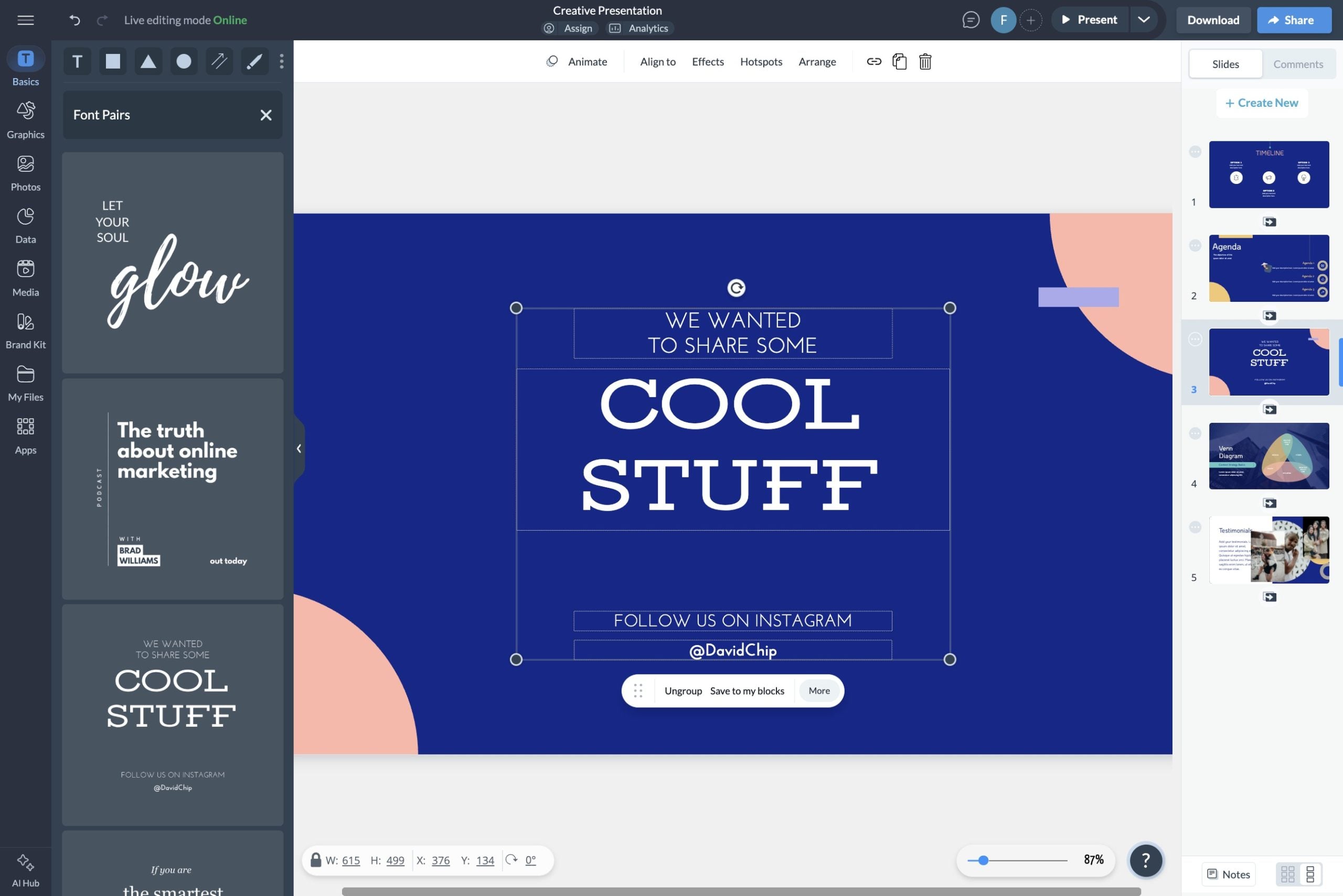
If you have the freedom to choose a font pairing for your infographic, Visme has a lot of options. Inside the editor, you can choose from hundreds of fonts to create a pairing for your infographic.
Let’s take a look at some examples.
First up, two sans-serif fonts that pair together really nicely are Montserrat and Lato. Montserrat is heavier and works perfectly for headings, while Lato is lighter and perfect for body text. Another option is to use Montserrat Black as the title and Montserrat Classic as body text.

Here’s another example: Trebuchet and Fjord One. In this case, we’re looking at one sans-serif font and one serif font working in unison.
In the sections above, we mentioned that in some cases your infographic’s personality needs a serif font and in other cases, a sans serif font, but it's also possible to use both together.
For example, in an infographic that shares important statistics about a professional industry and aims to be accessible, Trebuchet and Fjord One work well together.

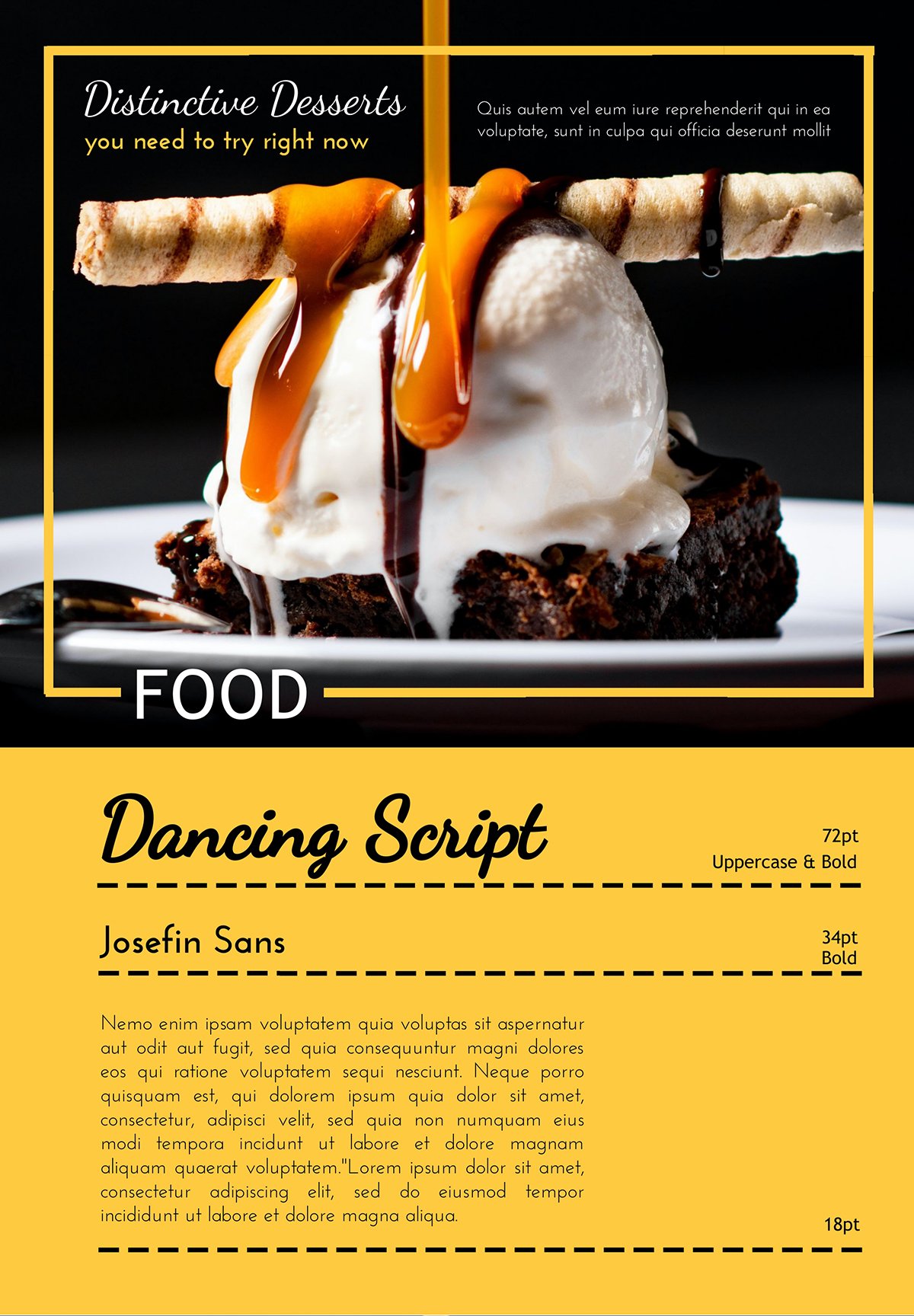
And one last example: Dancing Script and Josefin Sans, a script font for titles and a light sans serif for the body text. When choosing a script font for an infographic, it needs to be legible! Many script fonts are not easy to read fast, and those are the ones you need to steer away from.
This script font is the perfect example of a script that can work well in an infographic. A how-to recipe infographic, for example, would be a great use case. Josefin Sans is a friendly sans font that pairs perfectly with these titles.
On the flip side, font pairing can take time. Time you don’t have to waste. You’re not the only one in that predicament. According to Monotype’s Font Use Survey 2024, “When it comes to font pairing, many participants acknowledge that while it isn’t necessarily challenging, it is time-consuming. So, it’s no surprise that 62% resort to using familiar font pairings to expedite their design process.”
We’ve got you covered in this regard. Inside Visme’s editor, there's a gallery of professionally curated font pairings you can use straight away. Here’s how it works and where to find it.
Up for another time-saver? Visme’s Dynamic Fields will help you create an infographic template with your perfect font pairing and company information. Then, you can quickly create multiple versions for your team to use for other purposes while keeping the information intact.
You need to remember this best practice not only for infographics, but also for every design project. You need to stick to the same fonts throughout your design!
Don’t change fonts at different data points or go back and forth between what font you use for a title and which one you use for body text.
When you’ve set your font pairing after testing a few different fonts, stick to them! Create a small graphic like the ones above to remind you which fonts you’re using. This technique will be especially helpful if you’re working on the infographic with your team.
When putting together the main title and the following data points, it’s important to check the alignment and ensure you’re following a clear visual hierarchy.
Take a look back at the font pairing graphics above and see how they specify the point size for each font. The Montserrat and Lato example is 40pt for the title, 24 pt for the subtitle, and 16 pt for the body text. This setup is called visual hierarchy, and it’s essential.
You must set a standard font size so that every data point uses the exact same size. Therefore, creating a visual balance and flow for the entirety of your infographic. The hierarchy starts at the top title and moves its way down. The most important content is the largest, and then it decreases for every data point.
The smallest text will be at the very bottom in your footer with the sources of your content.
Alignment is vital for each data point and for the entire infographic. Here are some best practices for text alignment. You can use the grid for alignment or use the snap to objects feature in your Visme editor.


If you aren’t confident about how to make sure each data point is aligned and well-spaced, your Visme editor has a solution. On the left toolbar, you’ll find pre-designed content blocks that you can add to your infographic for easy, fool-proof design.
These content blocks are perfectly aligned and have fonts but you might have to change the font, so don’t add too many content blocks at once. Try them with your fonts first and then continue.
Next up, after font pairing, visual hierarchy and alignment, you’ve also got to make sure that your fonts have space to breathe.
To achieve this, you’ll need to keep an eye on the spacing between titles, subtitles and body text. You’ll also need to balance the line height and letter spacing inside text boxes. Furthermore, you need to check your margins so it doesn't mess with your infographic's dimensions.
The best way to ensure consistent spacing between titles, subtitles, and body text is to place each in a text box.
Set a spacing pattern for one data point, then repeat it for all other data points. With Visme, you can group all three text boxes and duplicate them, then just change the content.
The infographic below is a good example of the principles we cover in this section about giving your fonts space to breathe. As you can see, the text has plenty of air around it and the spacing makes the content legible.
Inside each text box, you also have to check the line height and the spacing between letters. The line height on titles and subtitles helps you balance the spacing between text boxes, as long as you align the bottom of one text box with the top of the one below it.
In the body text, adjusting the line height will help create a sense of air between lines, making the text easier to read.
Adding space between letters is a technique designers use to spread letters in words and make them easier to read. You don’t need more than 1 or 2 pixels of spacing unless you want a unique visual effect of separated letters.
The margins are also crucial because they provide space that helps with the flow and legibility of your content. Margins are the space between the edges of the infographic and the text boxes. When the text is too close to the borders, it’s difficult to read.
Good spacing and strong margins are vital for your infographic’s visual balance. Without it, the design can feel “off.” Learn how to have your infographic’s visual balance front of mind with this installment of Visme’s design course.
Finally, another aspect to consider when choosing the best fonts for your infographic is how accessible they are to your viewers. According to Vision Atlas, there are 1.1 billion people worldwide with visual impairments, ranging from minimal impairment to full blindness. Many of those people will want to see and understand your infographic.
The main aspects of an accessible font choice are the font's overall shape and the combination of the color background behind it. For a font to be considered accessible, it must have:
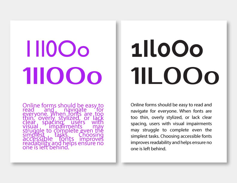
Now, on to how the background color affects your font’s legibility. If the background color and the font are too similar, it’ll be hard to see, let alone read. A great rule of thumb for creating a good contrast between text and background is that if the background is dark, use light text and if the background is light, use dark text.
With these tips, you’re already in a great place. But one more thing, pure white and pure black can be tiring on the eyes, so try a subtle off-white or a super dark gray instead of the pure hues.
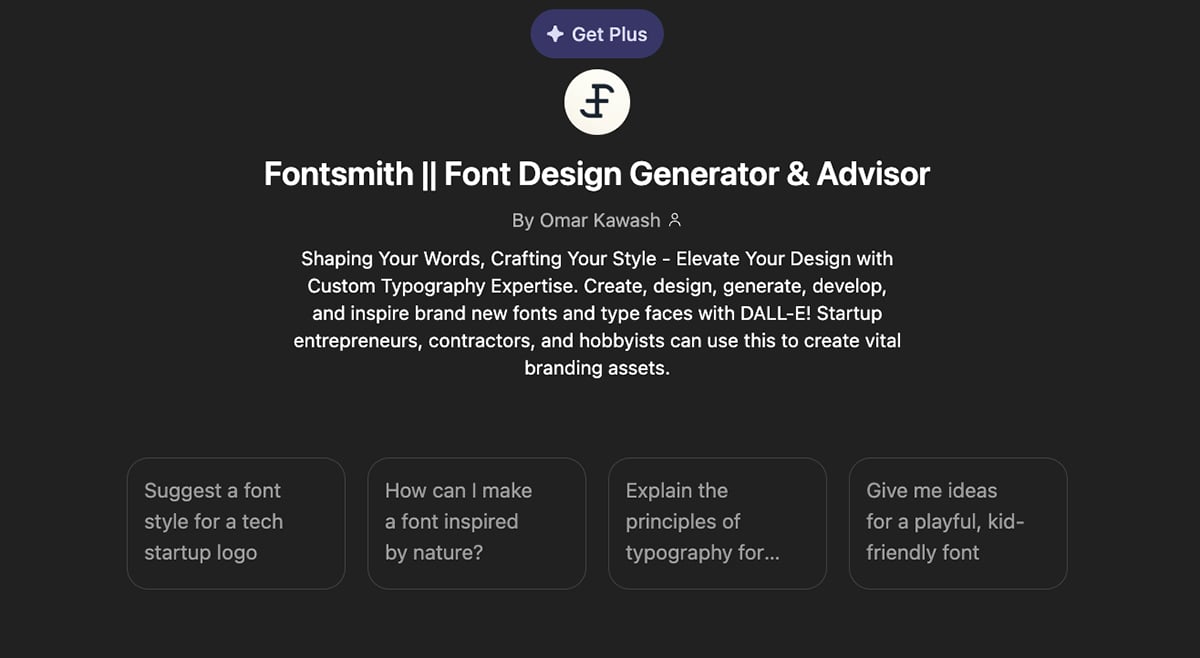
If you want to save time figuring out the ideal fonts for your infographic, you can also use AI. Specifically, the CustomGPT titled Fontsmith || Font Design Generator & Advisor. This tool can do quite a lot for you; from asking it to recommend a font pairing for your infographic to generating an entirely new font.
ChatGPT, out of the box, can also help you choose the right fonts for your infographic, but using a CustomGPT that has already been trained will typically give you better results.
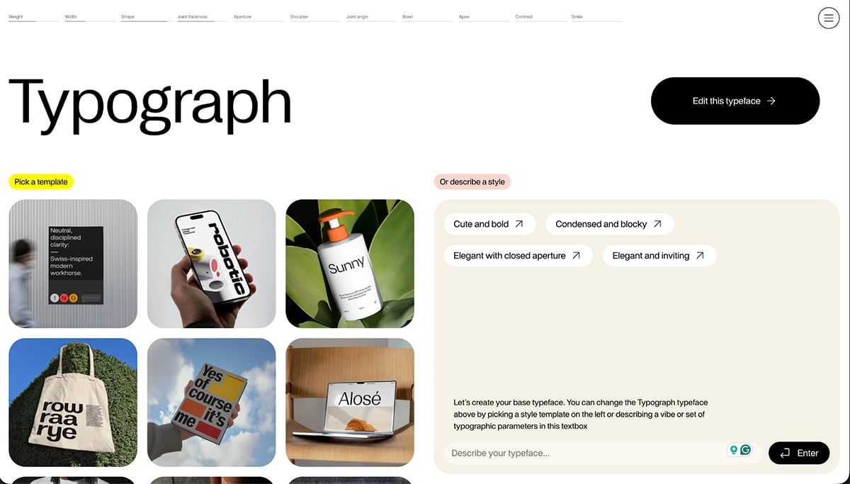
Finding the perfect font sometimes isn’t the right way to go. And if you have any design skills up your sleeve, you can even create your own font. Traditionally, creating your own font, that was also legible, accessible and unique wasn’t exactly easy.
But now, thanks to AI, there are tools to help you create custom fonts quite easily. One of these is the newly launched Typograph Studio. It’s a platform for designers at every level but also easy enough for non-designers.
Like Viktor Persson, Typograph creator shared online, “Part of the problem is that starting isn't easy. If you don't understand typography, it's sort of a black hole without a clear point to get started. That's what causes most designers to not even try and just spend hours searching for one that ‘looks good.’ “
After you create a custom font with Typograph, you can download it and then upload it to your Visme Brand Kit to use on your infographic and beyond.
Static text is great, but interactive text is memorable. Once you've nailed your font choices, consider adding text animations or hover effects to draw attention to key statistics or headings.
A gentle fade-in on your title font or a highlight effect on important data points can guide readers through your infographic without overwhelming your typography. Just keep it minimal—the fonts should still do the heavy lifting.
Now, you might be asking yourself, what are good fonts for infographics? Don’t worry, we’ve got you. We’ve compiled a selection of some of the best infographic fonts to use in your next infographic design. And yes, all these fonts are available inside your Visme editor, along with many, many more.
You’ll discover fonts like Raleway, Arial, Junction, Josefin Sans and Poppins. Plus, we share several Visme infographic templates that use these fonts effectively.
If by chance you’re also looking for fonts to use on a slide deck, don't miss out on our comprehensive guide: 26 Best Fonts for Presentations. You'll find some great ideas to make your slides pop!
Let's dive in!
Made with Visme Infographic Maker
Raleway is a simple, no-nonsense, easy-to-read font that won’t compete with other elements in your infographic design. It works great in both titles and body text at different weights and point sizes.

Arial is one of the most used fonts in digital documents. It’s the default choice in most document software like Google Docs and Word. Arial is always reliable and looks good. Nevertheless, it’s not the font you need if you’re looking for a bit more personality.
Made with Visme Infographic Maker
Junction is a mix between classic handwritten serif fonts and a web sans serif. This font is unique because the n and u have angled bowls instead of the usual roundness. It’s a great font for a simple look but with an edge.

Josefin Sans is a geometric sans serif font with a geometric look and feel. This font works great in the body text of any size. In bold and big letters, it also looks great as a significant, friendly title.
Made with Visme Infographic Maker
Poppins is relatable and easy to read. It’s one of the best fonts for digital design. An infographic that uses Poppins as its primary font will be easy to read and even skim.
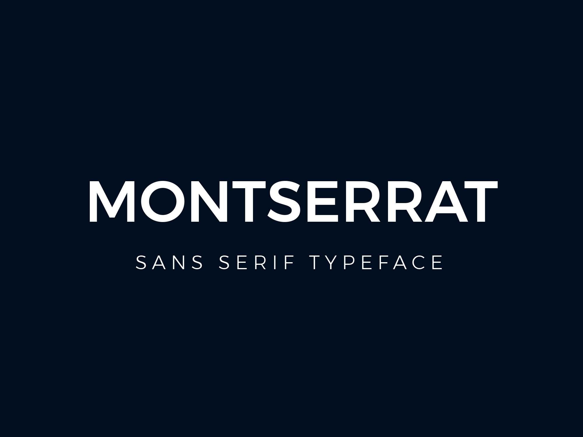
Montserrat is one of the most versatile fonts and not only works well in both titles and body text, but it also fits well in any context. It’s the ultimate neutral font for any infographic design project.

Looks great not only in infographics but also in documents and web design. Stylistically, it works well in uppercase, in lowercase and all caps. In your Visme editors, you’ll have access to all the Lato weights, including Light, Thin, and Regular.
The infographic below uses Lato in all the body text, paired with Antonio for the titles.


Helvetica is the type of font that will always look good in your infographic titles, almost regardless of the personality your content carries. It might not be a great font for body text as it’s a bit heavy, but it pairs well with a font like Hind Madurai.
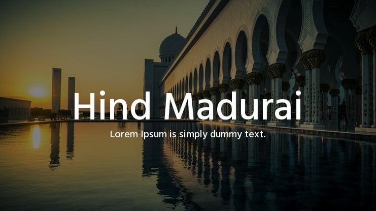
Hind Madurai is a Tamil language font, but its Latin characters are suitable for neutral font personality choices.
Made with Visme Infographic Maker
Roboto is a fusion font reminiscent of classic serif fonts with Grotesk-style terminals. It’s a reliable serif font that reads like a sans-serif. Visme offers both Roboto Regular and Roboto Condensed, so you can use either for your infographic design.
This infographic uses Roboto for the titles beneath each icon.


Source Sans Pro is one of the most versatile fonts at your disposal. It’s simple, it’s easy to read and will look great in your infographic body text.
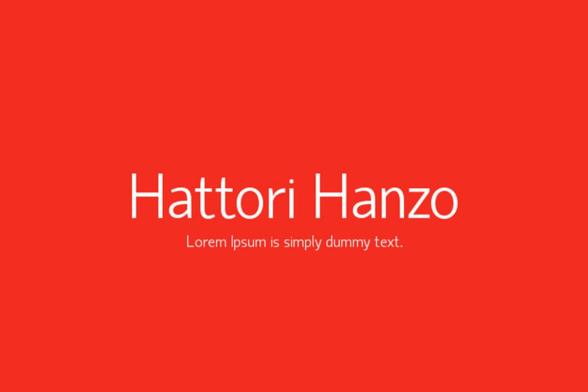
Hattori Hanzo is a lightweight font that will look good in both titles and body text. It has a vast multilingual capacity, so it’s a great choice if creating an infographic with a different alphabet.
Made with Visme Infographic Maker
Lora is a font inspired by calligraphy and friendly handwritten letters. The curves and subtle serifs offer a refreshing combination and works well as body text.
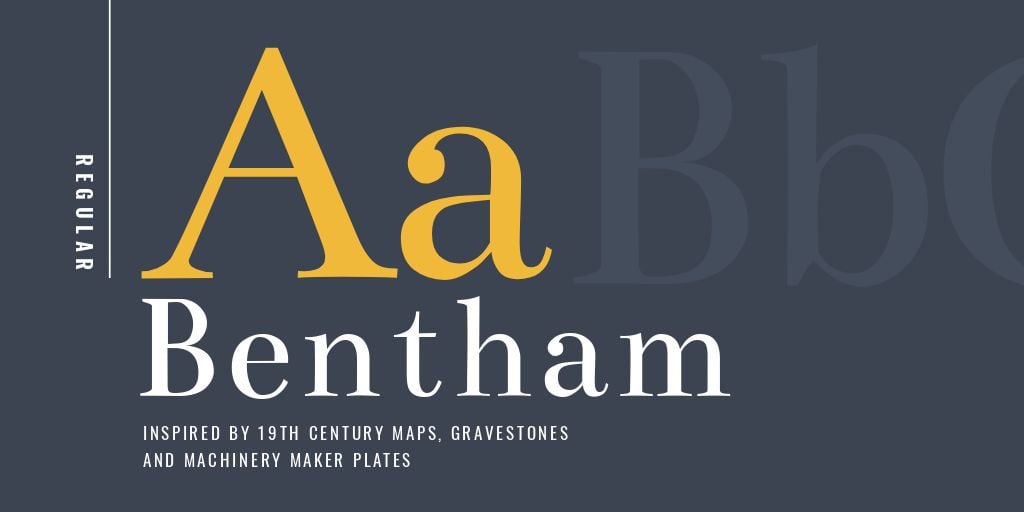
Bentham is a serif font inspired by vintage textbooks and nineteenth-century maps. It has a classic shape that makes text pleasurable to read. You’ll find great uses for Bentham, especially if your infographic has an academic angle.

Cormorant is a serif font inspired by the elegant and stylish Garamond. This font will look great in titles and subtitles, adding some personality to what otherwise could feel too strict with a regular serif font.
This infographic uses Cormorant in the large and medium titles.
Made with Visme Infographic Maker
Libre-Baskerville is a serif font with a bit of personality. This font is perfect for sleek infographic designs using professional content.
Made with Visme Infographic Maker
Playfair Display is another great-looking serif font that will look great in large titles. The letters have differing strokes between very thin and thick, giving the font a classic feel.

Vollkorn is a serif font with a curvy outlook. It's both classic and friendly simultaneously and works great in an infographic design that is both professional and relatable.

Fjord One is a bold serif with plenty of personalities. This font will fit both a corporate infographic design and a friendly, relatable project for education or marketing. It’s an easy-to-pair Google Font that will make your designs look great.
Made with Visme Infographic Maker
EB Garamond is a free-to-use version of the classic Garamond font. It has all the traditional nuances and delicate serifs without the price point. A favorite with book printers, EB Garamond will fit nicely in an infographic with a lot of white space for the text to breathe.
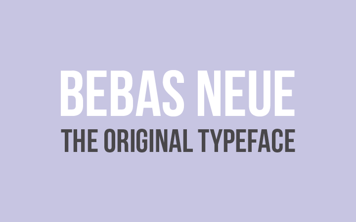
Bebas Neue is a clean-cut all-caps font perfect for headlines and titles. It’s a bit elongated so it gives the text an airy feel like it’s standing tall. It’s not ideal for body text, but it pairs well with a neutral font like Lato or Josefin Sans.
The infographic below uses Bebas Neua in the title and subtitles. The body text is Abel, a neutral sans font.

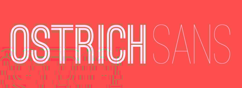
Ostrich Sans Inline is the variation of Ostrich Sans with a line through the center of each letter stroke. Use this font if you want your infographic to look unique in its titles. Pair it with a subtle and easy-to-read serif font like EB Garamond or Fjord One.
Made with Visme Infographic Maker
Distant Galaxy is a font that looks a bit futuristic without being overly gimmicky. It’ll work well on infographic designs that talk about digital topics or with a unique storytelling angle.
Made with Visme Infographic Maker
Abril Fatface is a font with fat and thin combination of letter strokes that will look great in your more prominent titles and subtitles. It pairs well with a sans serif font that doesn’t overwhelm.
Made with Visme Infographic Maker
Dancing Script is one of those script fonts that just looks good. It’s easy to read and sits well with many design styles. It looks excellent on titles and with a bit of an angled baseline.
The infographic below uses Dancing Script as the subtitles for each section and the subtitle of the primary heading. It’s paired with Bodoni Moda, a fashionable serif font.

Daniel is a script font in a handwritten style. You might think at first sight that this font won’t work in an infographic, but it will do wonders for data points with short titles — like one word. Instead of adding a number to a list, try the number words in Daniel font.
The best font for an infographic is one that is easily legible at all sizes and on any screen. Arial, Roboto and Lato are great options if you don’t want to waste time searching for the perfect font.
Never use more than two, and ideally no more than three, fonts in an infographic. Use a font pairing that includes one font for headings and another for body text
Instagram infographics are generally viewed on phone screens, so the font people use are usually sans-serif, highly legible fonts like Montserrat, Poppins and Open Sans.
Font infographics are great visual additions to your publications about typography. You can choose one from our font typography round-up or create one yourself with the Visme infographics editor.
The best font for an infographic diagram is a sans-serif that is super easy to read at small sizes. Arial and Helvetica are excellent options for infographic diagrams because a font in a diagram must be functional and not call attention to itself.
The tree font rule says that you should never use more than three fonts in any visual project, including infographics. The only time you should use more than three fonts is when you’re doing it on purpose and ironically.
The four types of font styles are:
How are you feeling about the fonts for your infographic now? A little better? I hope our guide into choosing the best infographic fonts helps you see that it's not that complicated, as long as you follow the best practices.
Now it’s time to get started with that infographic design! Head on over and create your infographic with the Visme infographic maker. Choose from hundreds of infographic templates and more than 300 fonts.
You’ll have so much fun creating the best font pairing! But remember, if you don’t want to take up time doing that, your Visme editor offers a pre-designed selection of infographic font pairs already chosen for you.
See you there!
Design visual brand experiences for your business whether you are a seasoned designer or a total novice.
Try Visme for free


![How to Make an Interactive Infographic [+Templates]](https://visme.co/blog/wp-content/uploads/2023/11/How-to-Make-an-Interactive-Infographic-Quick-Guide-8-Customizable-Templates-Thumbnail.jpg)


