


Typography Infographics: 12 Inspiring Examples & Techniques
![How to Make a Timeline [with Templates & Examples]](https://visme.co/blog/wp-content/uploads/2021/08/REFRESH-How-When-to-Make-a-Timeline-Header.png)
Every time a project falls behind schedule, a deadline is missed, or a team loses track of the next steps, there’s usually one culprit: no clear timeline.
Without a visual map of deliverables, timelines and dependencies, even the most organized plans start to fall apart.
A well-designed timeline fixes that. It clarifies the order of work, reveals dependencies and shows how each phase supports the broader project scope.
A timeline isn’t just a tool for project management.
Marketers rely on visual timelines to plan campaigns.
Educators use them to break down complex ideas.
Product teams use them as a roadmap for feature development and launches.
Once you learn how to build a timeline, it becomes an invaluable design skill you can apply anywhere.
In this guide, I’ll show you how to create a timeline step by step, plus share templates and examples you can customize for any project you’re working on next.
Before I move on, remember that making a timeline is incredibly easy with Visme’s free timeline maker or check out our timeline templates to make one in minutes.
A timeline is a visual representation of information, events or activities arranged in a precise chronological flow. It helps you explain a process, highlight milestones, or show how something has developed over time.
Timelines can be horizontal, vertical, circular, radial, zigzag or even roadmap-style. They usually combine text with visual elements like lines, icons and markers. In some cases, you can include interactive features to make the experience even more engaging.
The video below shows a few timeline examples you can use to spark ideas.
If you need to pitch a new initiative, explain your implementation process, or break down a complex history of events, a timeline is one of the simplest and most effective tools you can use.
A well-designed timeline turns complex sequences into neat visuals that people can follow and remember. And for businesses or projects, timelines are especially powerful because they:
There are many different scenarios where timelines are valuable for business communication.
Here are a few examples to inspire your own use case:
If you’re more of a visual learner, we’ve shared the six steps you can take to create your own marketing timeline.
In this section, I’ll walk you through how to create a timeline infographic.
If you’re working with a team, Visme can make the design process even smoother.
You can invite teammates to collaboratively design, edit, comment or review or your timeline design directly inside the editor. This keeps feedback in one place instead of scattered across emails or chat threads.
Our built-in workflow and approval tools also help you assign tasks, track progress and keep everyone aligned as the design evolves.
With that in place, let’s dive into the steps.
Every creative project needs an outline for efficient production, and your timeline is no different.
Start with the title, subtitle and short description. Then move on to each item. If you already know the number of items you need to display on the timeline, set those down first and then go back and input the rest of the content.
Pro Tip: Try and keep the text for each item at around the same length or character count; this will make your design look more balanced.Don’t forget to add all the information you might need regarding visuals and interactivity. The outline must be in the same order as the final design, to help guide you in the process.
Let’s say I’m writing an outline for a new employee onboarding timeline.
Here’s what it would look like:
Made with Visme Presentation Maker
The next step is to decide which timeline style you want to create.
You don’t have to overthink this. I’ve already covered this in the next section. Scroll down to “Timeline Layout Types & Styles” to see examples of each option and decide which format fits your project.
When choosing a style, layout or content format, your goal should be to match the structure of your content to the right visual format.
If your items follow a straightforward sequence, a linear timeline might be your best bet.
A Gantt-style layout would capture the flow better if your project involves overlapping tasks or parallel workstreams.
Pro Tip: The style you choose should make your information easier—not harder—to scan. Choose a design that naturally supports the flow of information instead of forcing your content to fit a layout that doesn’t suit it.
First things first, the skeleton or draft of your timeline. This part is just the visual outline without content.
You’re building the frame that your information will sit in. And there are many ways to create a timeline skeleton, such as
Regardless of which option you choose, here’s one piece of advice.
Leave space for the title, subtitle and description if you plan to include them. It’s much easier to design around those elements from the start than to squeeze them in later.

Let’s take a look at the different ways to create your sketch.
If you’re the type of person who likes doing this by hand first, then you can most definitely create your skeleton by hand first.
Use a notebook, sticky notes, a physical whiteboard or even a digital whiteboard if you’re collaborating with others.
If you feel confident about building a timeline on your own, try starting with a blank canvas and creating it from scratch using Visme. This approach gives you full creative control over the structure, flow and visual style.
Visme’s diagramming tools make this easier than it sounds. On the dashboard, click Create > Project > Infographic > Create from Blank.
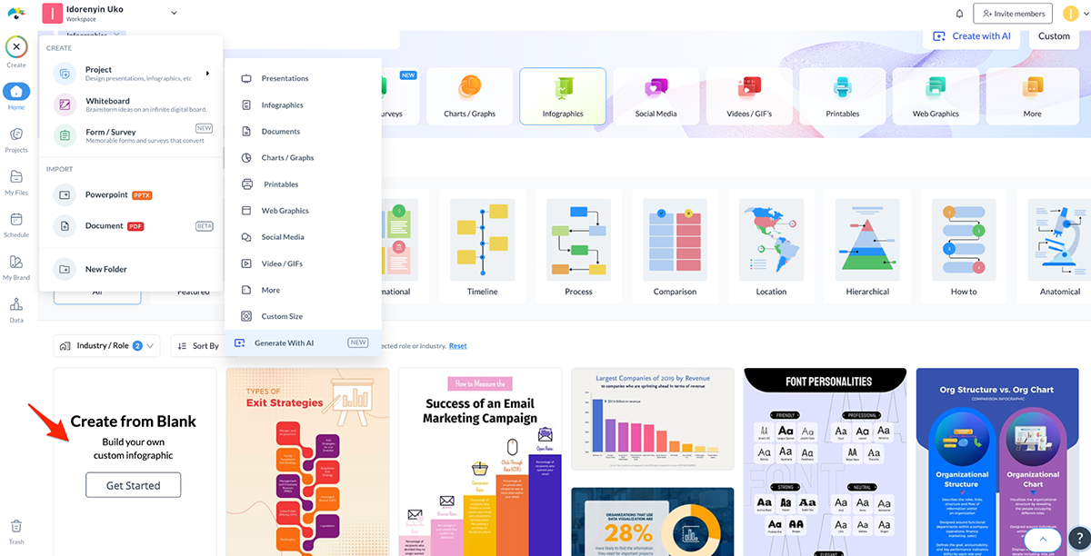
When your blank canvas is open,
You’ll find them in the “Graphic” tab. Choose a single shape to begin your timeline, then click on it to set the direction you want to build toward. From there, select the “one shape” option and continue adding more visual elements until your full timeline comes together.
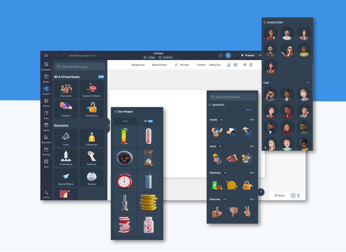
To speed up the process, Visme includes ready-made content blocks, shapes, data widgets and diagram layouts you can drag and drop into your design.
Another option I strongly recommend is using customizable timeline templates. You’ll find dozens of them in the Visme library. Plus, I've also handpicked and shared 10 of my top choices below.
All you need to do is swap out the content with your own, tweak the design elements, and adjust the layout to match your story. It’s the fastest way to create a clean, professional-looking timeline without starting from a blank canvas.
Running short on time or simply not in a creative mood? Visme includes several AI tools that can help you move from idea to finished design much faster.
You can generate a complete timeline layout from a text prompt using Visme’s AI Design Generator.
If you need help writing titles, descriptions or supporting copy, our AI writer can generate draft copy or refine existing versions.
Both tools are built to speed up your workflow so you can focus on the content rather than the heavy lifting.
Once your skeleton is ready, it’s time to input your content. Grab the outline you created in Step #1 and start filling in each item—dates, titles, descriptions and any visual notes you’ve planned.
If your content feels cramped or doesn’t sit well in the design, you’ve got a few easy fixes:
As you enter your content, make sure titles and descriptions are visually distinct. You can do this with font size, weight, style (bold, caps, italic) or color. This helps readers scan the timeline more easily.
Finally, add your supporting elements—your title, subtitle, description and footer.
Use visual hierarchy here as well: the title should stand out most, the subtitle should follow, and the description can match the size of your item text.
If your timeline is an infographic, don’t forget a footer with your sources, website URL or logo.
Now it’s time to add some design elements to your timeline presentation template. If you started with a template, you might already have some of these sorted.
Otherwise, here’s a rundown of what you need to take care of.
Remember that Visme offers millions of high-quality vector icons, stock photos and videos, plus an AI image generator if you need custom visuals.
If your timeline is being shared online (via live link or HTML5), you can make it more engaging with animations and interactive elements.
If you’re creating a static timeline, feel free to skip this step — or bookmark it for future projects.
Once your timeline looks exactly the way you want, it’s time to publish and share it.
You have several options depending on how you plan to use it.
When it comes to choosing a timeline style, you have three main options;
An excellent way to choose your timeline style is to browse the Visme timeline template library and see what’s possible.
Another source of inspiration is Pinterest, where you’ll discover timelines in many styles. Simply input "timelines" into the search bar and browse. Make a private board to keep your favorite ones.
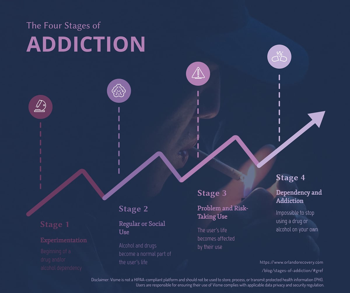
Every timeline visualizes content that has to do with time, processes or progression. But not all timelines are the same. Below are the most common chronological functions for a timeline.
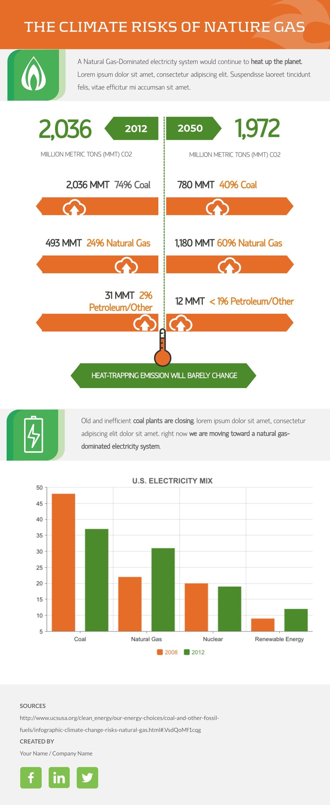
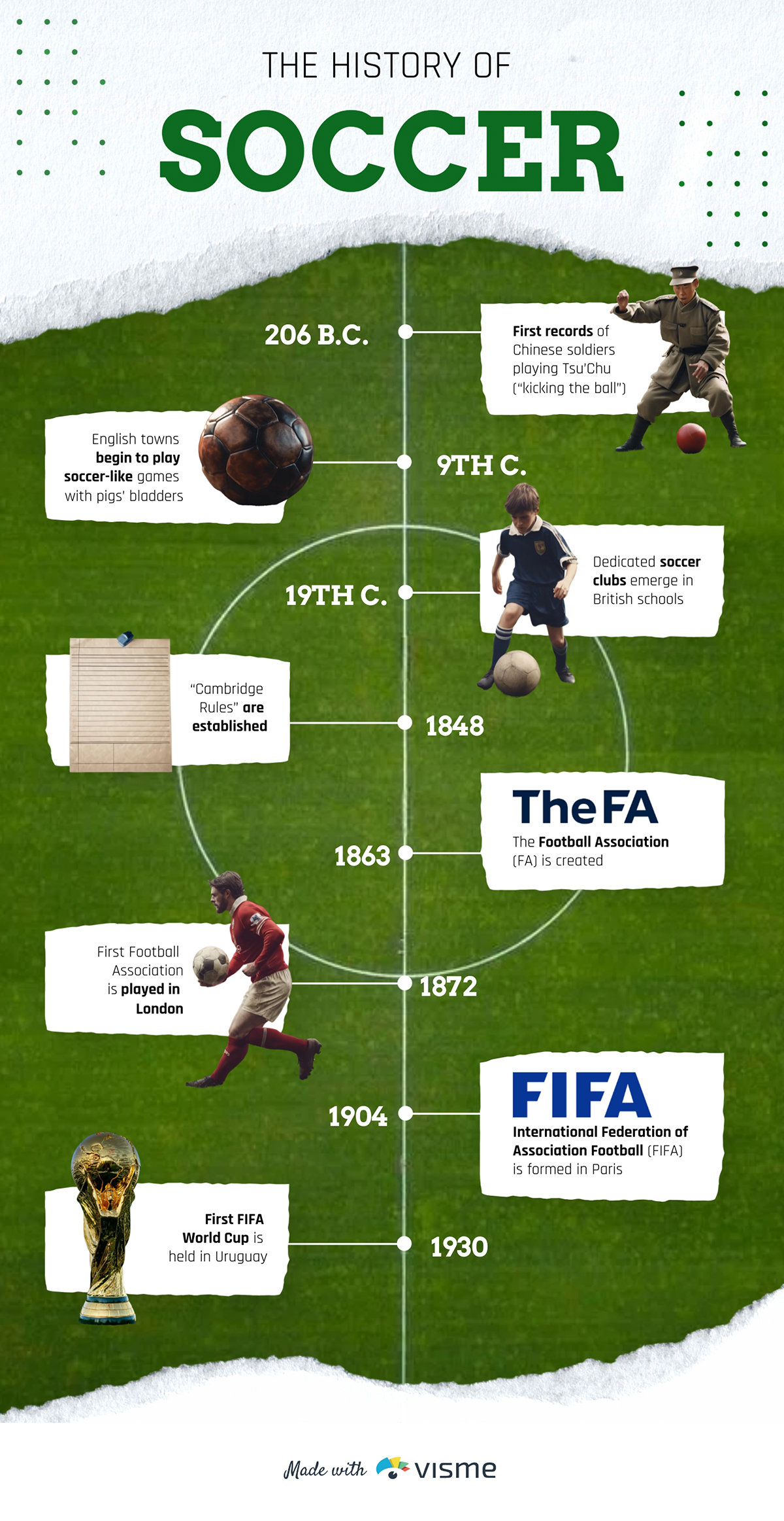
Visualizing historical or past events in chronological order is one of the most practical uses for a timeline. Each point on the layout represents a particular point in time worth mentioning. A historical timeline makes a great addition to an About Us page on your website or as part of an annual Report.
Marketing reports or progress reports can also use a timeline to show what has already been done and when. In an academic sense, timelines are also great for history projects. For example, the timeline below visualizes the biography of Dr Martin Luther King Jr.
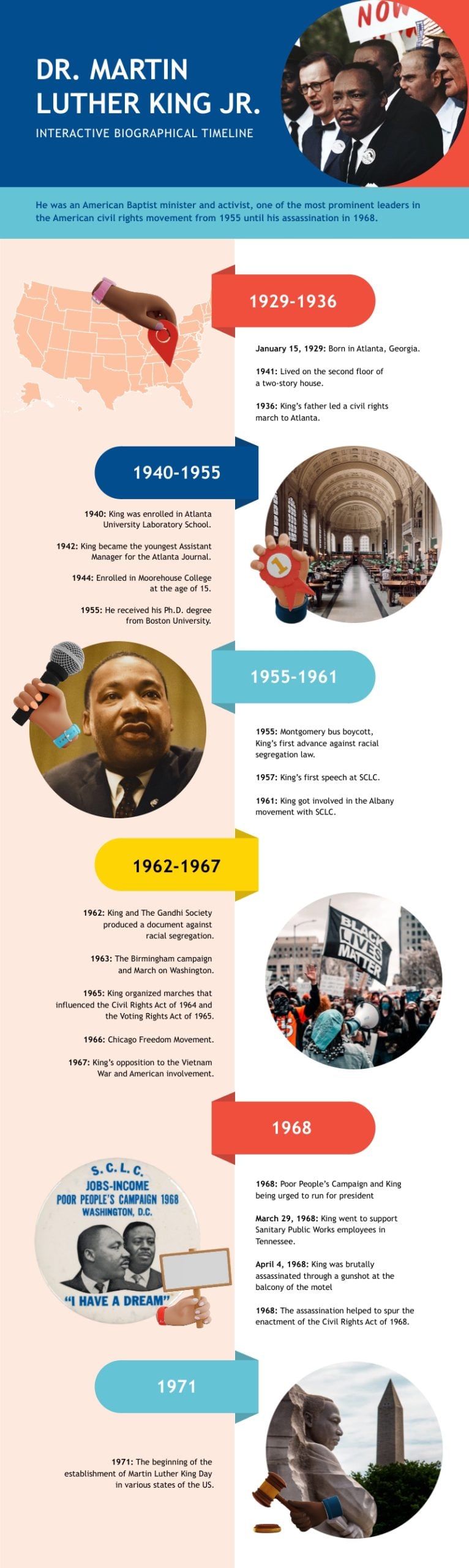
Here’s a vertical timeline arranged in a horizontal format
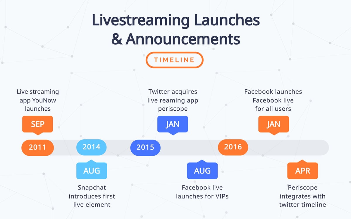
Another type of chronological visualization that you can use for a timeline is the schedule. In this case, a schedule visualizes the plan for future events towards a goal. Schedule timelines are great additions for proposals, communication plans and syllabi.
Each item on the timeline has the exact date or time in which something will happen. In the case of a class schedule, the timeline includes the hours of each class. For example, the schedule timeline below visualizes the proceedings for a wedding event.
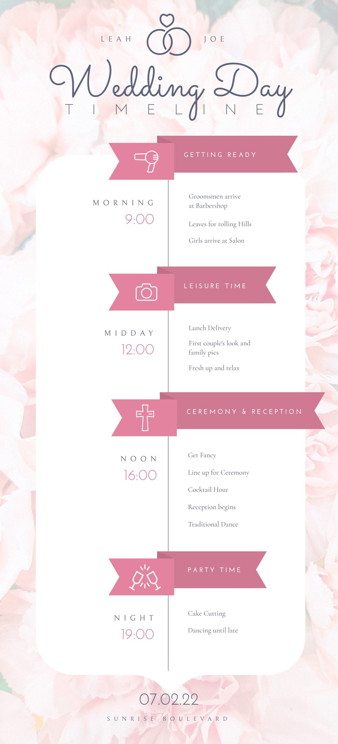
Something similar could work for a corporate event or sprint schedule for a brainstorm session.
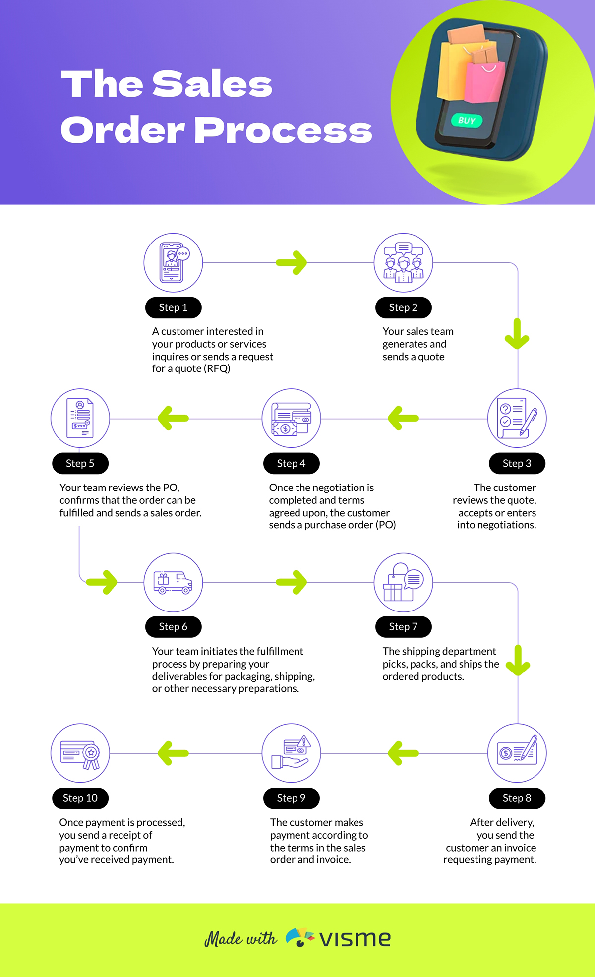
Not all timelines include specific dates. Some have a chronological progression not ruled by time. Even though there is no set calendar time in a process timeline, it’s still in the order of steps and follows the same visual layout.
For example, in a web design proposal, a process timeline design showcases the steps to reach the desired goal of a finished website.
Another use for a process timeline is to show the steps for a task in a work environment that must be done exactly the same way every time.
For example, how to wear protective gear or how to clear out waste from machinery.
This design can then be printed, laminated, and put up on a common employee area wall.
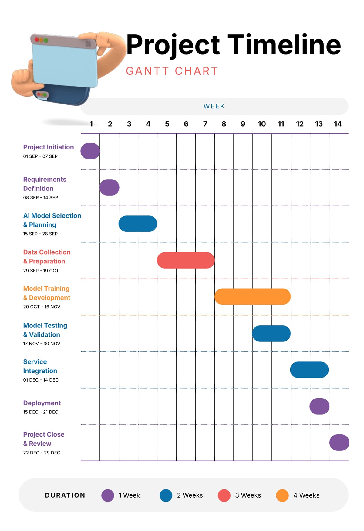
A Gantt chart or escalated timeline is similar to a schedule or process in that it shows steps to take along a specific period. The difference is that in one timeline, there are many paths to follow in different lapses of time. In many cases, one action overlaps another and continues together.
The Gantt timeline below visualizes one month of work and all the steps that need to be finished in that space of time. Each item is given a week or two to finish and visualized with a horizontal line.
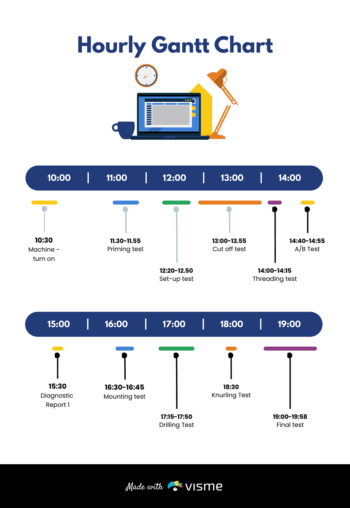
This hourly Gantt chart has a different design and layout.
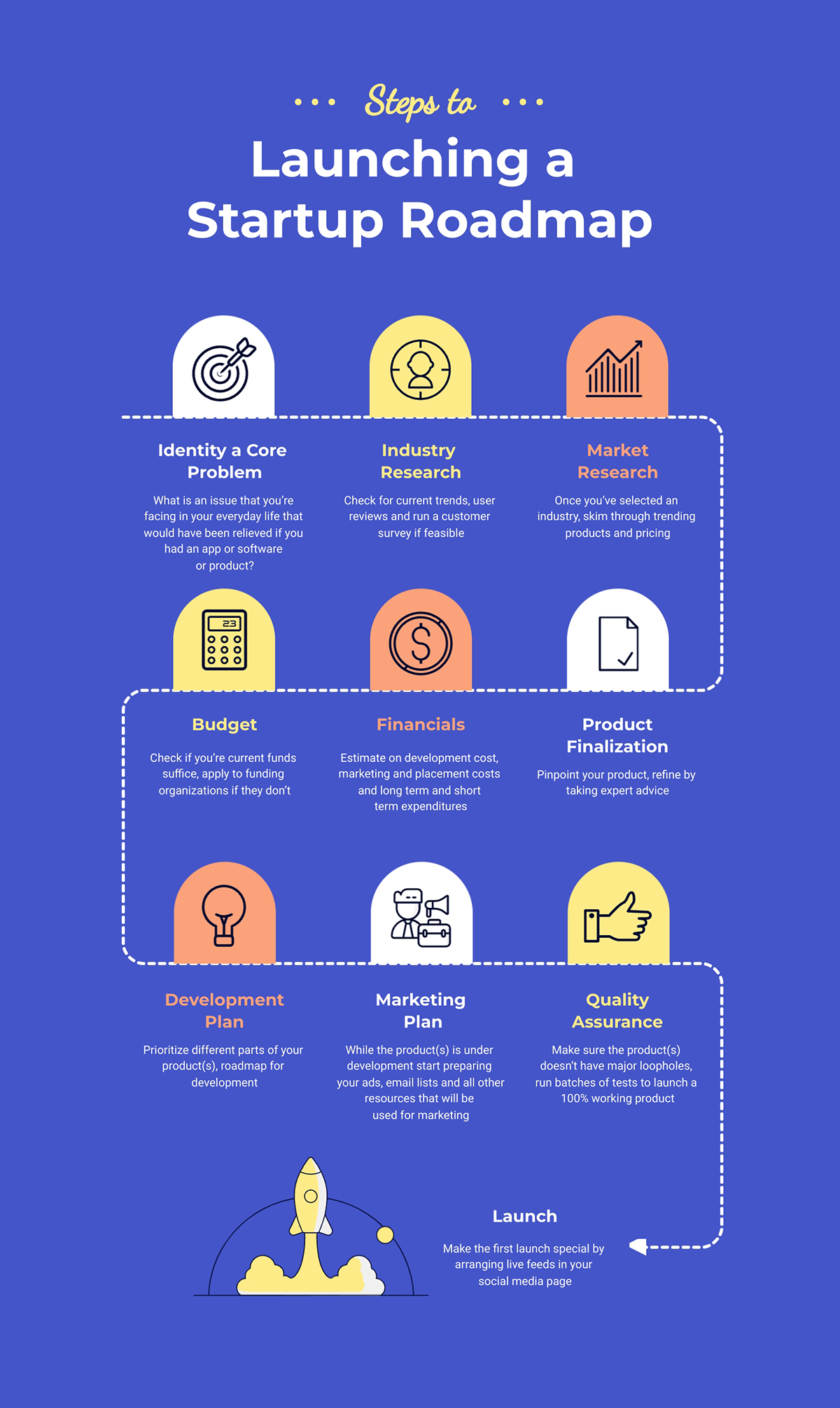
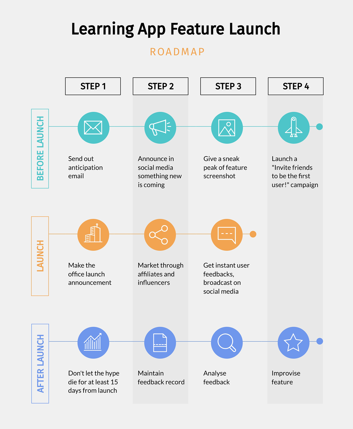
A roadmap is similar to a process timeline in that it visualizes a progression of actions towards a goal. Roadmaps don’t use items to visualize steps to take but instead milestones to reach.
You can arrange your roadmap into simple steps and tasks like the example below
If you want to get more creative, you can also design it as a winding road path and place your text and visuals along the route.

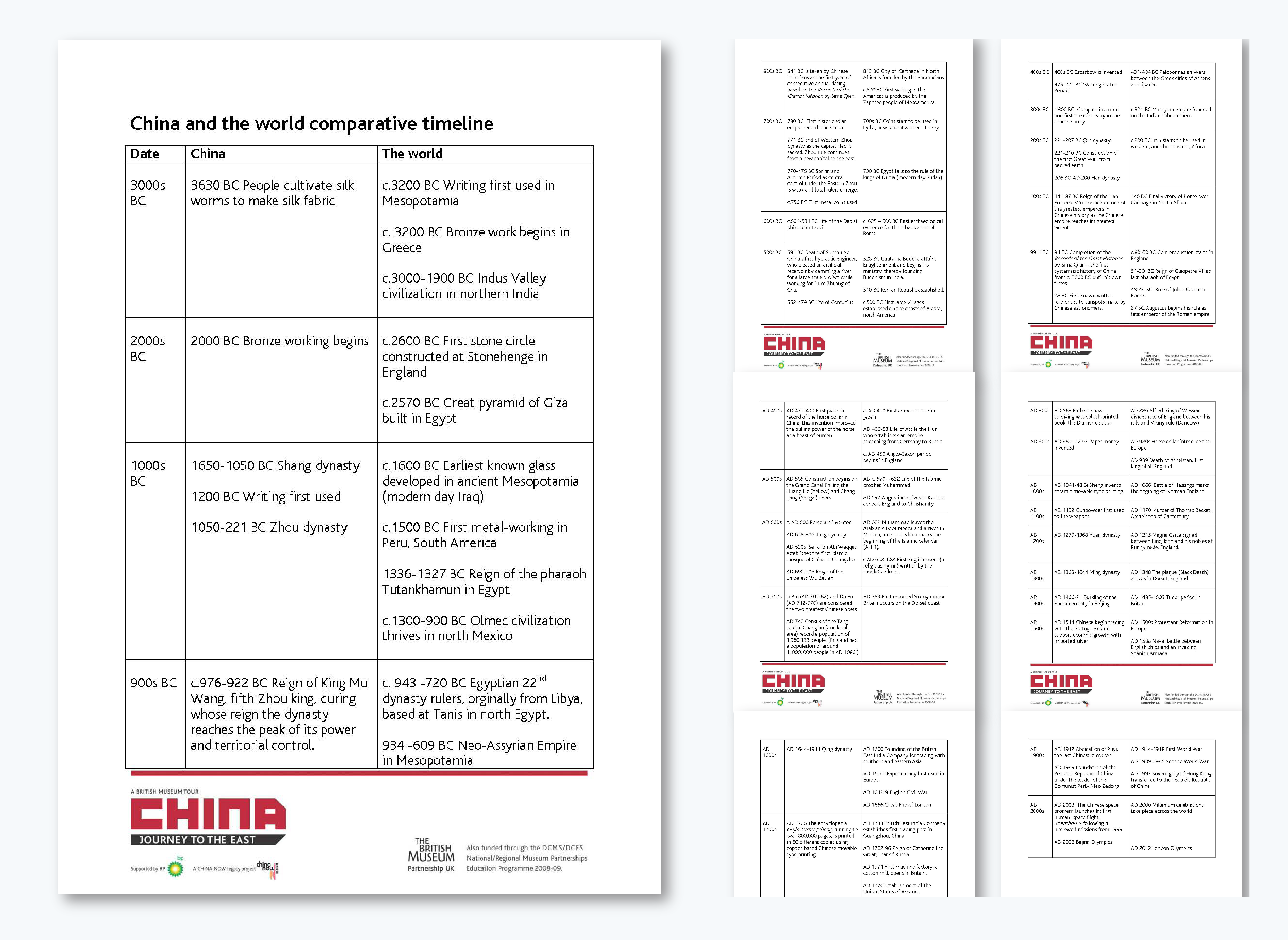
Instead of visualizing progression for a single sequence, a comparison timeline places two or more timelines side by side to show the difference. This timeline format is useful for:
This comparison timeline compares China with the rest of the world from 3000 BC to AD 2000s.
If you want something more visually engaging, replicate it using this comparison infographic template below.
Now it's time to decide between the possible layouts that your timeline can have. Vertical and top to bottom isn’t the only option.
The most common layout for a timeline is the vertical infographic.
Vertical timeline layouts start at the top and continue in a downward direction. The length can be as long as there is content to add.
Here’s another example you can easily customize
A horizontal timeline is your best choice if it’s going to be inside a presentation.
When the layout of the canvas is in landscape orientation, the content will fit and flow better from left to right.
The upside to this layout is that you can continue the timeline over several slides.

Zig-zag timelines can be vertical or horizontal, depending on your project. You’ll be able to fit more content in a vertical layout than in a horizontal one. This style of directional structure looks good when the text and visuals are strategically placed along the line.

An S-shaped timeline starts on a point on the left, moves horizontally over a few points, turns towards the left, covers a few points, and then back and forth until the end. This layout is excellent if you have many points on the line, with short content for each.
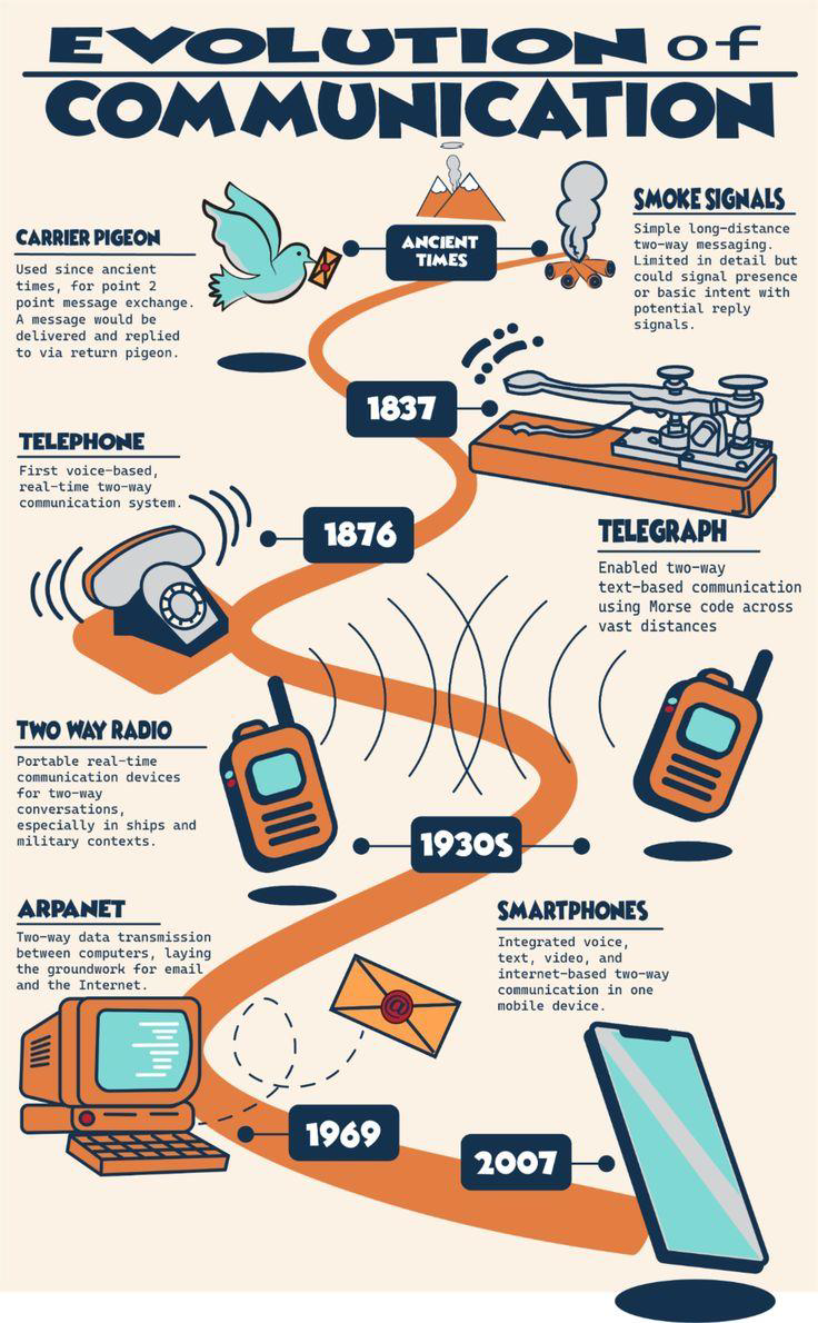
This infographic traces the evolution of two-way communication, from ancient smoke signals and carrier pigeons to modern-day smartphones and instant messaging.
A wavy timeline is a loose zigzag layout with uneven lines. This layout is excellent when your content is different per point, and some need more space than others.

You can also get creative with your timeline layout by placing items on the canvas and connecting them with lines of your choosing. The trick to this outline is that you have to be mindful of the audience. Make sure it’s easy to follow, using numbers or arrows.

Finally, timelines can also be set into a circle. In this case, it might be a recurring timeline or cycle. To create a beginning-to-end visualization with a circle, make sure to show a stop where the timeline ends and where it begins. If it’s cyclic, simply add the points along the circle.

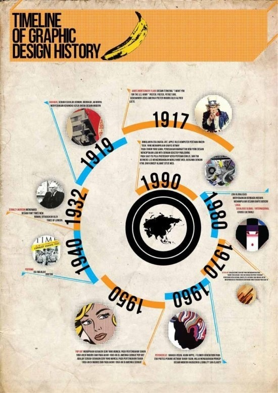
A spiral timeline shows progression inward or outward in a circular path, creating a natural sense of movement and continuity. Instead of listing events in a straight line, this graphic design history timeline wraps around a central point in a spiral form.
Each loop represents a specific period, and as you move around the spiral, you follow the timeline from one era to the next in a continuous flow.
Diagonal timelines flow upward at an angle, guiding the viewer from one stage to the next in a clear, continuous path. The example above shows how each point sits along a rising line, which creates a natural sense of progress. This layout works well when you want to show growth or stages that build on each other over time.
The content format is all about how the timeline will be published. Will it be a standalone design or part of another project? Will it have interactive features or be shared as a video?
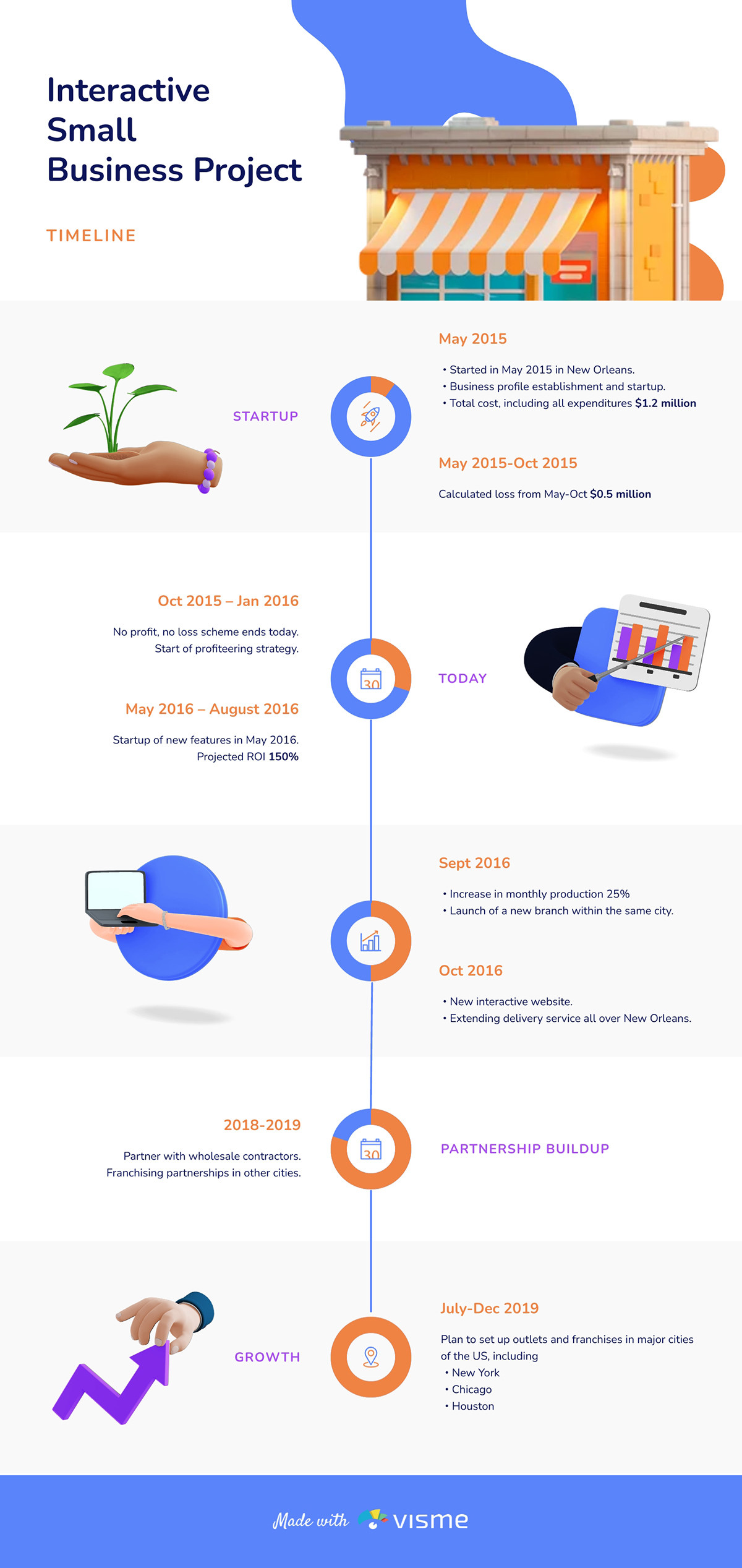
The most common timeline style is the infographic. More often than not, in a vertical format, wherein the timeline progresses from top to bottom. Infographics come in many styles, timelines being only of them.
Below is an example of an infographic template that visualizes the project timeline for a small business.
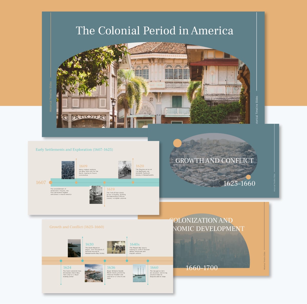
Many presentation templates have slides that include a timeline. These are generally horizontal, but can sometimes be zigzag or even diagonal. Visme presentation themes include lots of timeline options in many formats.

This slide deck timeline organizes the full historical sequence into 16 well-structured slides.
A timeline can be turned into a video by animating the elements on the canvas, adding transitions and downloading as an MP4. Infographics don’t make for great videos, but presentations or square formats do. Consider using a timeline video in your video marketing strategy to visualize your brand’s story, for example.
An interactive timeline works great in both an infographic design or a presentation slide format. Using interactivity is a great way to share more content with your audience than you could fit into the timeline.
When you make an interactive timeline with Visme, you can add popups to each item or add hyperlinks to show your audience supporting content.
Read this article to discover interactive timeline examples and templates you can customize
We’ve already discussed how to create timelines and the different formats you can use.
Now, let’s look at a more ready-made timeline templates created by Visme that you can put to use right away.
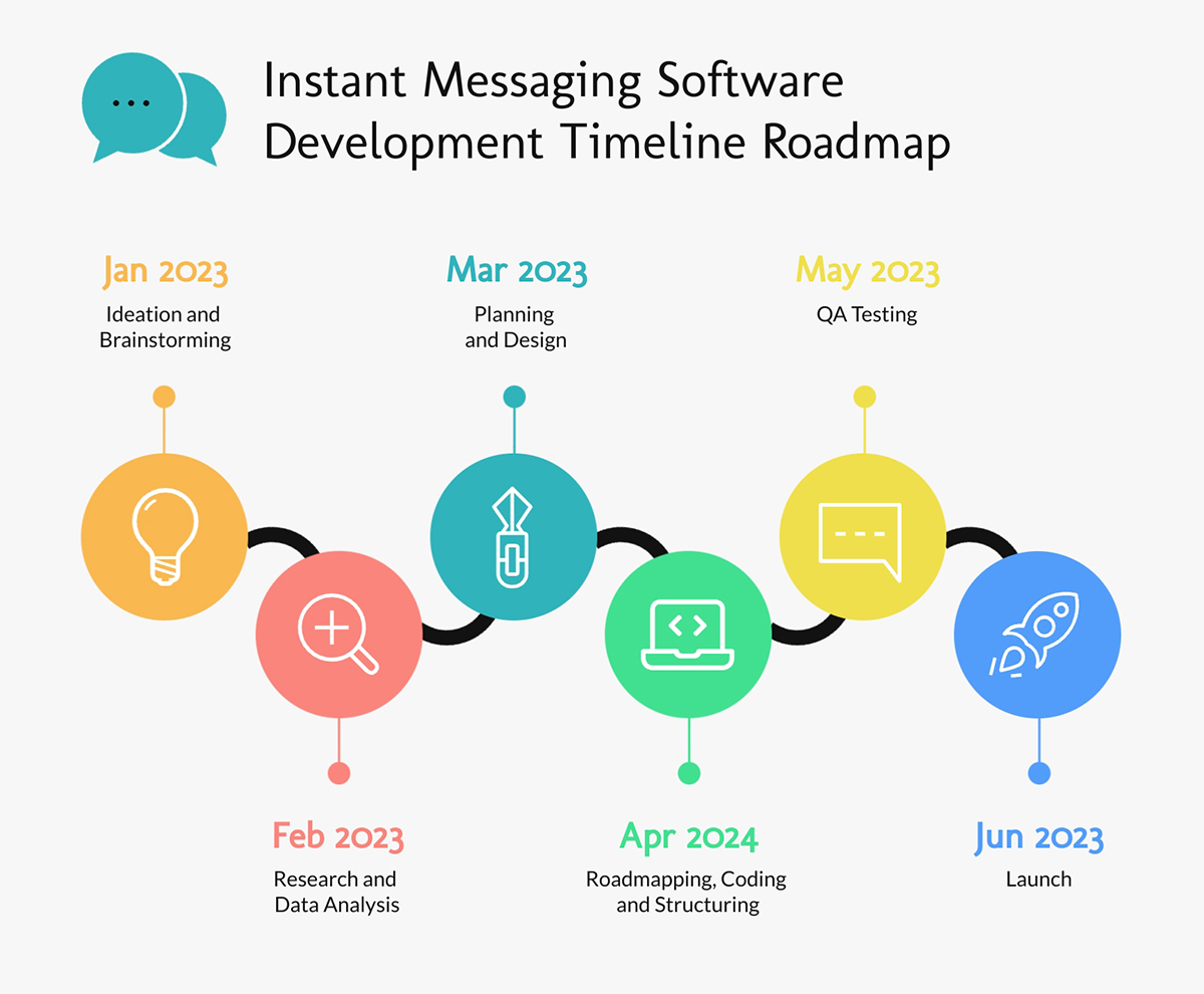
Ever been completely frustrated when a project suddenly goes off course or a crucial deadline slips through the cracks? It happens, especially for project managers who are juggling complex workflows, multiple teams, and a dozen moving parts all at once.
This project timeline template can help keep things organized. It presents your software development process in a horizontal timeline format that flows smoothly from left to right. The curved path adds a bit of movement, but the structure remains easy to follow as you progress through each month.
And because it's a horizontal layout, you can slot into your next project presentations or progress reports.
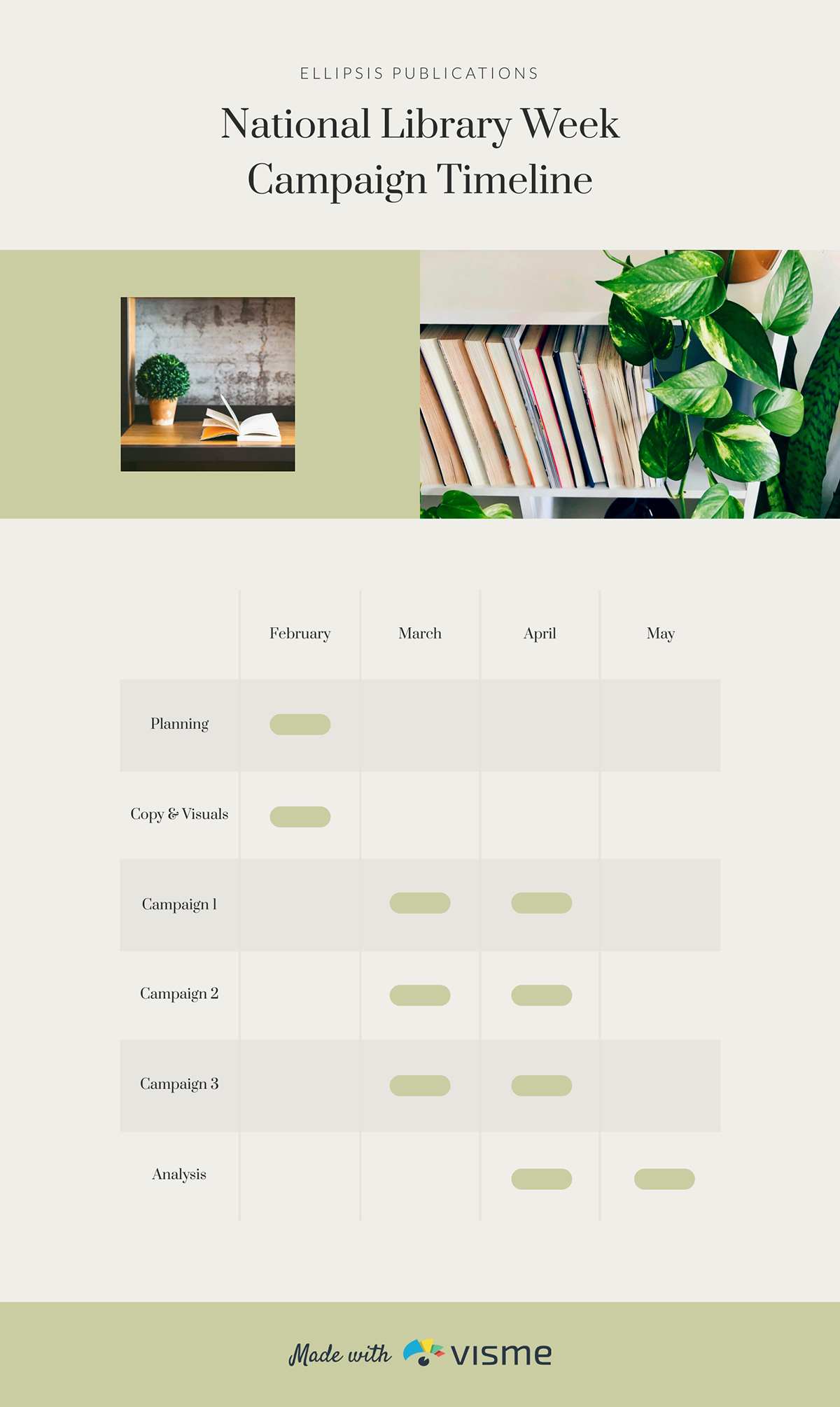
Coordinating multiple campaigns can get messy fast. That’s why it’s super helpful to have a visual timeline that provides a big picture view.
This Gantt-style marketing template lays out the sequence of activities so you have a quick snapshot of what’s happening and when. Each task has a bar that shows its start date, duration and end date.
Use this marketing timeline template to map out campaign timelines, schedule content releases or align your launch activities across channels.
And if you want to keep everything aligned with your brand, Visme’s Brand Wizard has got you covered! Once you type in your website, the tool will pull in your brand assets (color, fonts and logo) and save them to your Brand Area so you can easily apply them to future projects.
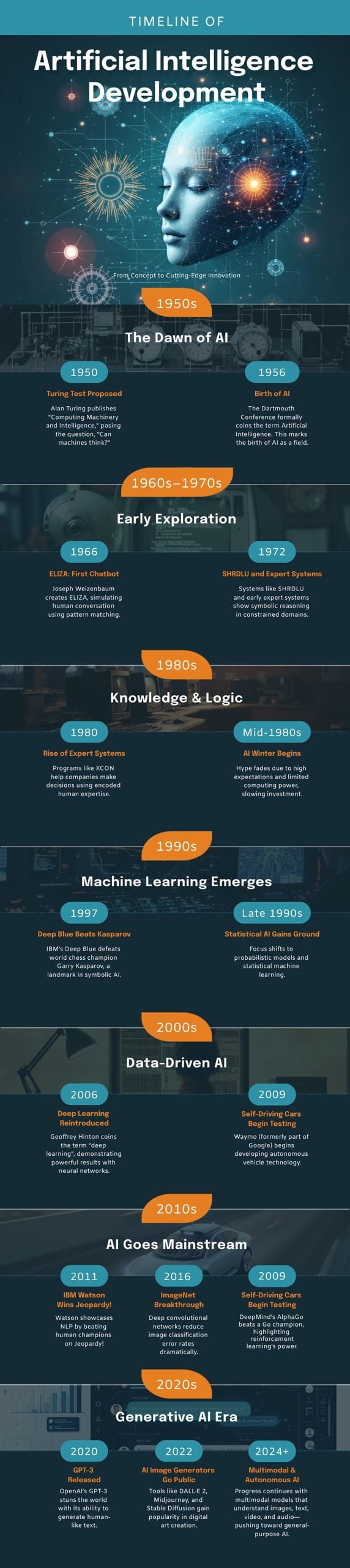
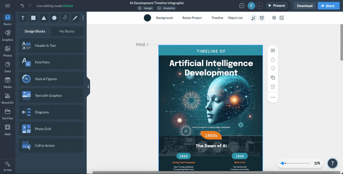
If you’re teaching a complex topic like artificial intelligence, a visual timeline can make the entire story much easier to understand.
I love how this infographic breaks AI’s evolution into different eras, from the early theoretical days to modern generative models. Each decade is grouped into its own block, so readers can easily follow how ideas progressed, how breakthroughs built on one another, and how the field transformed within each era.
Download and print it in PDF, PNG and JPG formats for your classroom poster. Or embed it in your presentation slides or share it as a standalone educational infographic.
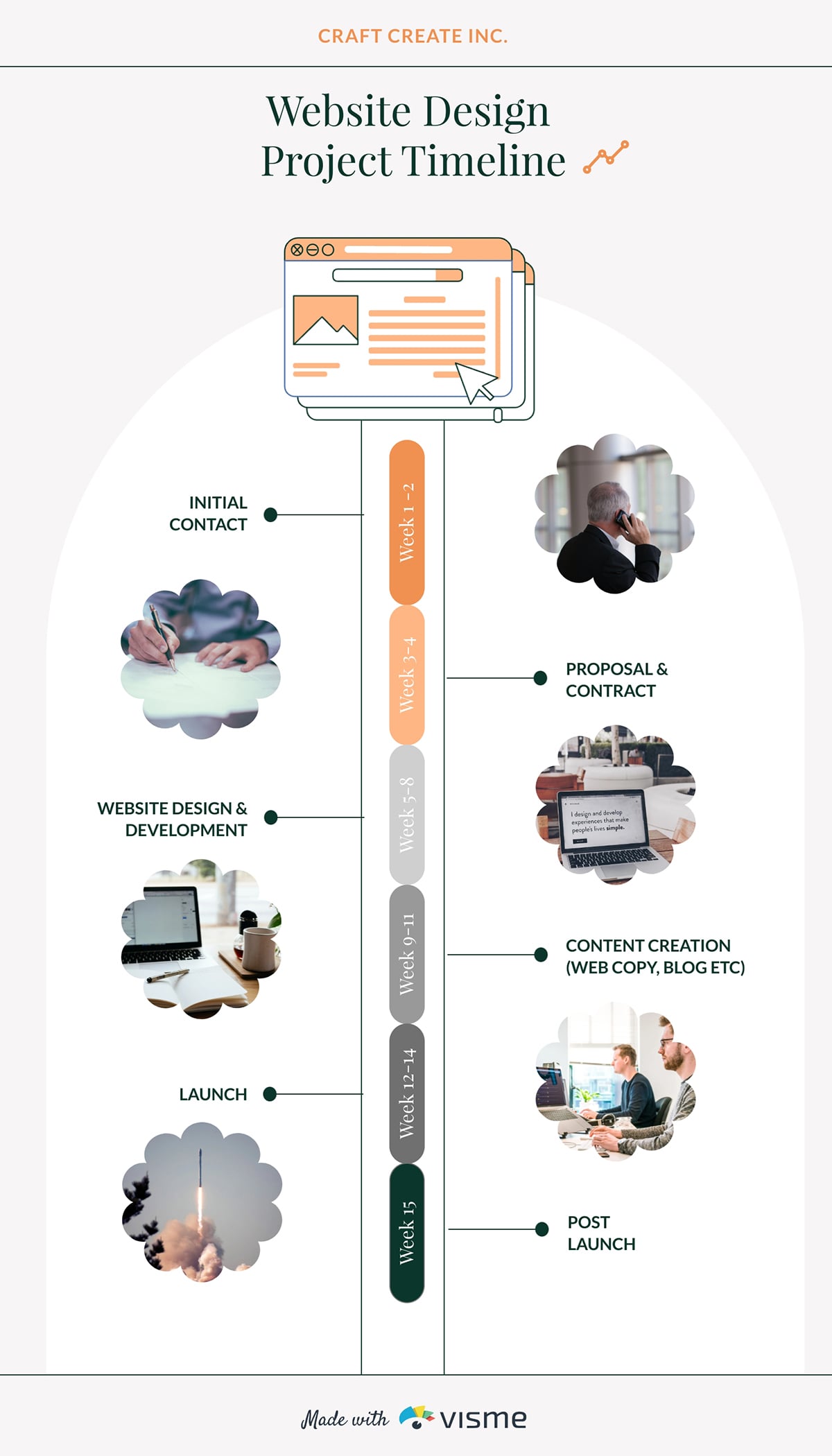
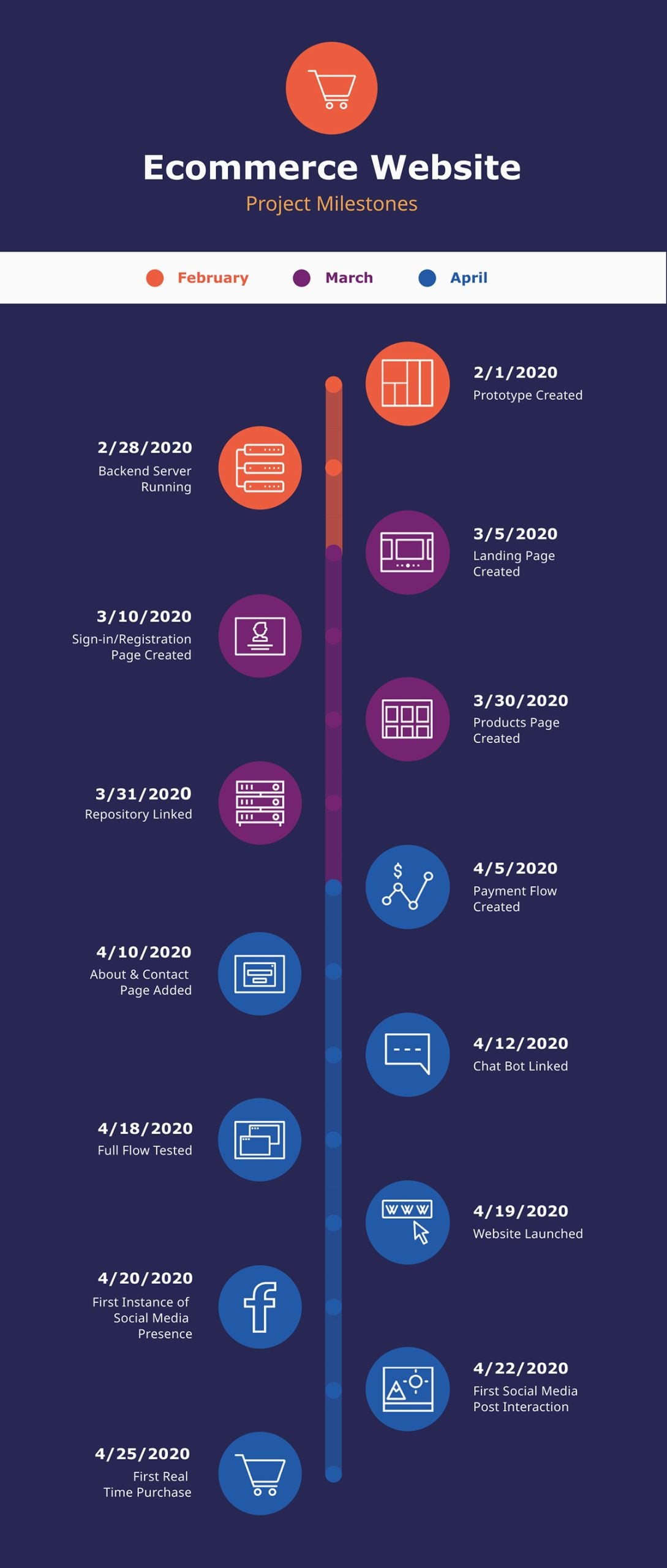
Clients often underestimate how many moving parts go into building a fully functional website. And that’s where this timeline visualization comes in handy.
It’s designed vertically, with a central track that walks viewers through each week of the project, starting from initial contact and proposal to design, development, content creation, launch, and post-launch support.
The design uses a series of soft, scalloped photo frames placed on either side of the timeline. Each phase is clearly marked without cluttering the layout. The muted greens, oranges, and grays give it a calm, modern vibe, while the color-coded week labels make it easy to differentiate one phase from another at a glance.
This format works well for presentations, client onboarding documents, and proposals because it shows the entire workflow in a structured, sequential way.
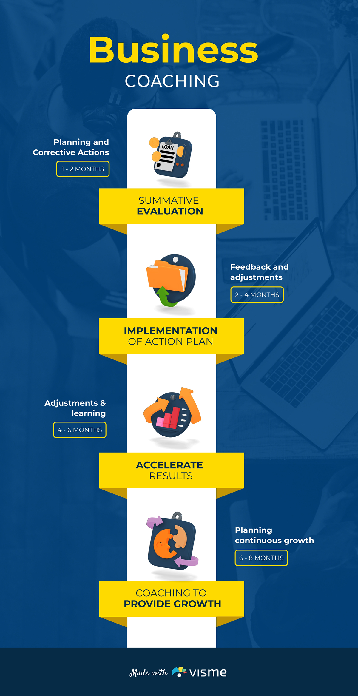
When you’re walking clients through your coaching process, this template visualizes this progression nicely.
Each block represents a different phase of the coaching experience—starting from the initial evaluation, moving on to implementing action plans, and speeding up results. The bright colors and vertical layout make each step look structured.
Repurpose this timeline infographic to outline your sales coaching approach, guide clients through the onboarding process, or highlight the transformation they can expect when working with your team. To make this design even more impactful, add a small box beneath each phase to list key deliverables.
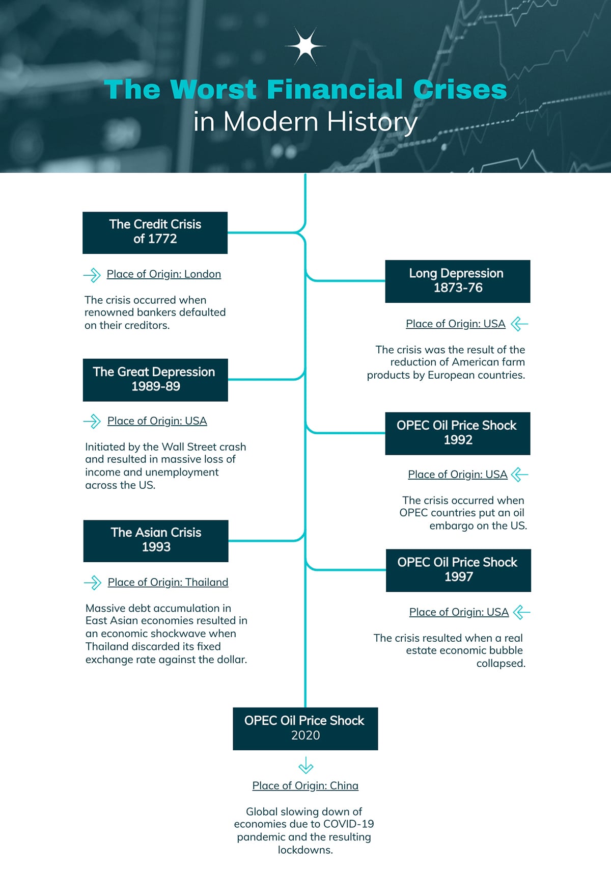
Finance-related concepts also benefit from well-designed visual timelines. This infographic makes explaining financial history much easier.
Each major crisis is laid out along a clean central line, with short descriptions branching out on both sides. The structured left-and-right layout helps compare events across different decades and highlight how each crisis unfolded in its own context.
You can use this annual report timeline design to walk readers through the biggest shocks to the global economy, build a lesson around market instability or visualize how different regions were impacted.
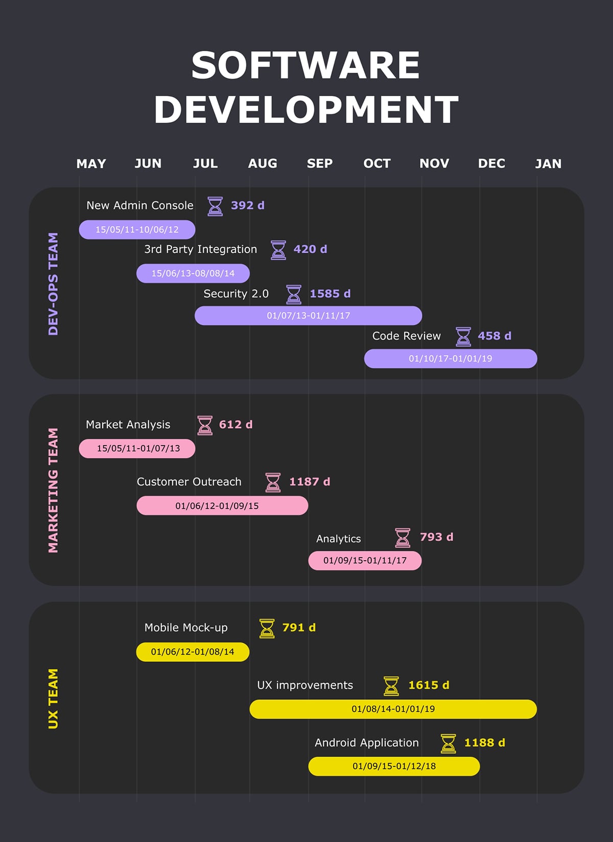
Coordinating multiple teams across a long development cycle?
You certainly need a visual timeline that everyone can follow. A shared view of the full development cycle keeps teams aligned, makes collaboration smoother, and dramatically cuts down on tasks slipping through the cracks.
This Gantt chart template gives you that high-level perspective. It maps engineering, marketing and UX tasks side by side, so you can spot overlaps, dependencies and long-running work at a glance.
The color-coded bars make it easy to track who’s doing what, how long each task is expected to run, and where the timeline might need adjusting.
Share this timeline during project kickoff presentations to set expectations from day one. Or turn it into a working tool for planning sprint schedules, tracking feature development or sharing a high-level roadmap with stakeholders.
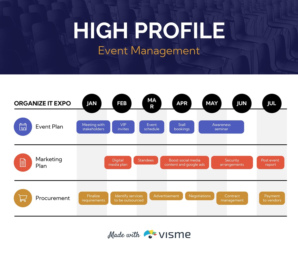
If you’re planning a high-profile event, having process timelines is one of the best ways to keep everything running without a hitch. This Gantt chart lays out your event plan, marketing activities and procurement tasks month by month, so you can see exactly how each team’s work fits together.
The color-coded rows make it easy to track responsibilities. This includes activities like stakeholder meetings and VIP invites to social media boosts, vendor negotiations and post-event reporting.
I’ve also included this pre-event marketing plan template that includes a timeline. But this time, it’s presented differently from the Gantt-style layout.
Instead of long horizontal bars, this version uses a step-by-step milestone flow. You’ll see date blocks across the page, with short descriptions right underneath each one. It’s almost like a roadmap that guides you from creating your first assets to executing the event.
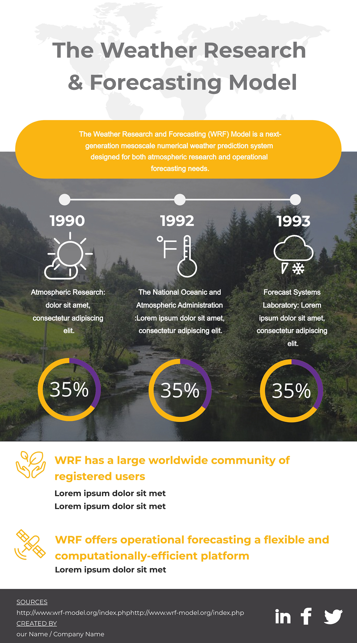
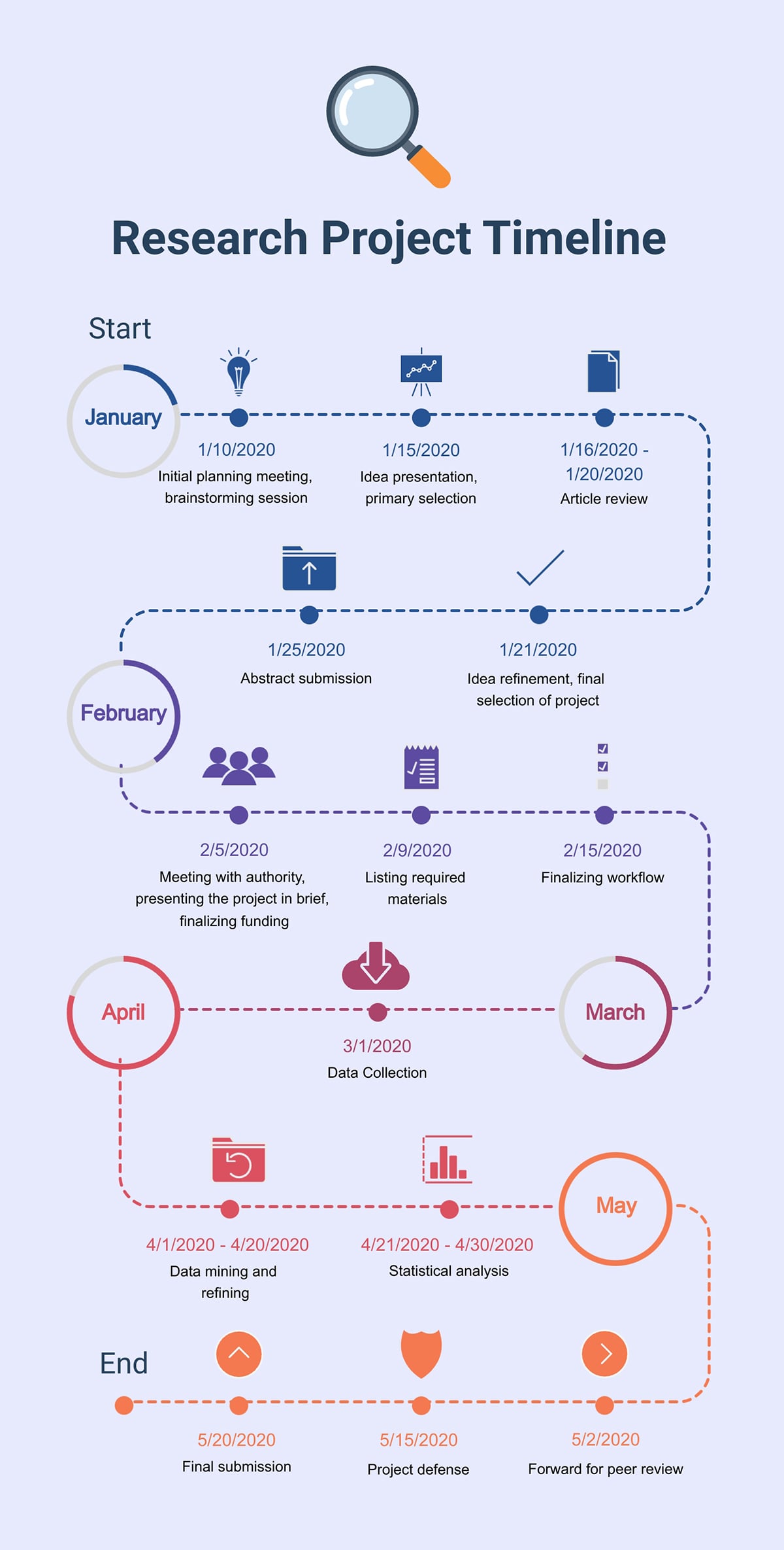
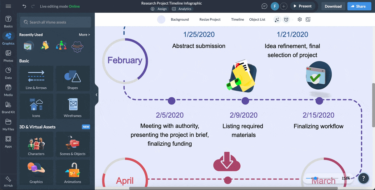
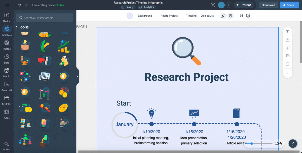
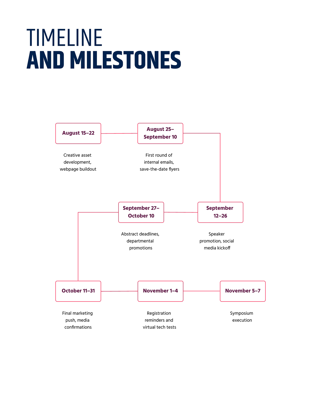
Research projects often span years and involve multiple breakthroughs, which makes a simple visual timeline incredibly helpful.
Instead of sorting through dense text, your audience can see the major developments in order and understand how each discovery builds on the last.
This creative timeline design organizes the evolution of the Weather Research and Forecasting model in a clean horizontal path. The color highlights and short labels make each milestone stand out, so it’s easy to follow the progression without getting lost in the details.
Use this template when you want to show how a scientific idea matured over time, outline the phases of a study or give a quick overview of key moments in an academic project.
Visualizing product feedback alongside your development timeline is one of the easiest ways to keep your team aligned on what needs attention and when. With this Gantt chart template, everyone can see how feature requests, testing insights and stakeholder input fit into the broader schedule.
Each task is laid out across quarterly columns, giving you a clear sense of how long each phase takes and where activities overlap.
The color-coded bars let you track stages like prototyping, wireframing, testing and mass production without getting lost in the details. Use this template to organize incoming feedback, map out development priorities and share a clear timeline with your team or stakeholders.
Even a well-planned timeline can fall apart if the design gets in the way of the message. Here are some of the most common mistakes to avoid, along with insights from experts who work with visual content every day.
A lot of timelines assume every story moves in a simple straight line, but many real-world processes don’t.
Some events repeat, some phases loop back and some cycles evolve instead of progressing forward.
When you force these ideas into a rigid direction, the meaning gets lost.
Eric Ku, Ph.D. and Adjunct Lecturer at Rikkyo University, explains this well:
“Timelines have their limitations as visual research tools. One limitation is that most timelines portray time as a linear progression and the experience of time is often much more complex. For example, time can be experienced in a cyclical way, with events revisited and repeated.”
If your topic includes cycles or repeated stages, adjust the structure so it reflects the reality of the sequence.
A lot of timeline creators assume that adding motion instantly makes the design interactive. Animations can support a visual, but they do not replace real interaction. A truly interactive timeline lets viewers click, hover, explore or reveal information that deepens understanding.
Alejandra Mariscalez, Design Manager at Visme, highlights this point:
“One of the most important things to clarify with interactive infographics and anything related to interactivity is that it has to be engaging. Some people confuse interactivity with simple animations or special effects and forget about the most important part which is having the user interact with elements within the design in order to convey or uncover a special message.”
If the interaction does not help people learn something new, it is just decoration.
A timeline needs to be easy to scan. When every milestone turns into a paragraph, readers stop paying attention. Too much text hides the sequence and forces viewers to work harder than they should.
Keep descriptions short and rely on visuals, such as icons or short labels, to help communicate meaning. If you need to share more detail, use pop-ups or links rather than crowding the main layout.
Some of the best timeline designs get one thing right: consistent spacing.
Spacing communicates meaning. Equal spacing suggests equal duration. Uneven spacing suggests different time intervals. If the spacing does not match the actual sequence, readers can walk away with the wrong interpretation.
Align spacing with your content or divide items into clear phases so the timeline is accurate and easy to interpret.
There are plenty of tools for building timelines, but each one shines in a slightly different way.
Below is a comparison of the best timeline-creation software to help you choose the right fit for your project, workflow and skill level.
*Disclaimer: The comparisons and competitor ratings presented in this article are based on features available as of December 5, 2025. We conduct thorough research and draw on both first-hand experience and reputable sources to provide reliable insights. However, as tools and technologies evolve, we recommend readers verify details and consider additional research to ensure the information meets their specific needs.
| Software | Key Features | Pricing | Best For | Core Uses | G2 Rating |
|---|---|---|---|---|---|
| Visme | Drag-and-drop editor, timeline templates, AI tools, diagramming, data widgets, interactive elements, animations, brand kits, collaboration tools | Free plan; Paid plans from $12.25/mo | Marketers, educators, business teams | Timelines, roadmaps, project plans, infographics, presentations | 4.5/5(450+ reviews) |
| Miro | Infinite canvas, flowcharts, sticky notes, templates library, real-time collaboration | Free plan; Paid plans from $8/user/mo | Remote teams, PMs, product teams | Timeline sketches, project mapping, workflows, brainstorming | 4.7/5 (10,400+ reviews) |
| Lucidchart | Diagramming, flowcharts, Gantt structures, integrations (Google, Atlassian, Microsoft) | Free plan; Paid plans from $9/mo | PMs, engineers, operations teams | Process timelines, system timelines, project diagrams | 4.5/5 (7,400+ reviews) |
| Canva | Simple drag-and-drop editor, timeline templates, graphics library, collaboration | Free plan; Paid plans from $15/mo | Beginners, teachers, social media teams | Simple timelines, visual posts, basic project visuals | 4.7/5 (6000+ reviews) |
| Office Timeline | PowerPoint add-in, timeline charts, Gantt layouts, milestone builders | Free plan; Paid plans from $9/mo | Corporate teams, PMO, executives | Project timelines, executive slides, client updates | 4.4/5(10+ reviews) |
| Preceden | Timeline generator, date-based and event-based modes, embed options | Free plan; Paid plans from $10/mo | Educators, historians, researchers | Historical timelines, training timelines, chronological stories | 3.8/5(10+ reviews) |
| Tiki-Toki | 3D timelines, multimedia integration, category splitting | Free plan; Paid plans from $9.50/mo | Educators, museums, storytellers | Interactive historical timelines, multimedia timelines | N/A |
| Sutori | Interactive timelines, collaboration, multimedia embedding, assessments | Free plan; Paid plans from £330 | Teachers, schools, classrooms | Classroom timelines, student projects, lesson timelines | N/A |
| TimeGraphics | Web-based timeline creator, real-time editing, Gantt-like views | Free plan; Paid plans from $4.9/mo | Students, researchers, personal users | Personal timelines, study timelines, chronological visuals | N/A |
There’s no fixed number, but most timelines work best with 5–12 items. Fewer than that can feel overly simple, while too many points can overwhelm your reader. If you have a long sequence, break it into sections or phases to keep it readable.
Use a timeline to show events or steps in chronological order. It helps people see what happens first, what follows next and how each point relates to the bigger picture. Timelines are useful for project plans, historical sequences, workflows, campaign calendars and roadmaps.
The layout you choose should align with how your information unfolds. Once you understand the direction of your content, picking the right structure becomes much easier.
Yes. Visme offers a free plan that includes timeline templates, design tools and basic customization features. You can upgrade to unlock more templates, premium assets, brand tools, advanced interactivity and more.
For the web, a standard width of around 800–1200px works well for readability.
For print, use:
Make sure to export as PDF for print quality, and include bleed if you’re using a professional printer.
There are dozens of tools for making timelines but I highly recommend Visme.
And that’s because it’s easy to use and comes loaded with dozens of incredible features. You’ll get ready-made templates, drag-and-drop editing, diagrams, icons, animations, branding tools and collaboration features, plus the option to add interactivity when you need it.
A simple timeline creation process looks like this:
Knowing how to make a timeline is one of those practical skills that pays off in many different areas.
You can use timelines to plan a project, map out a workflow, visualize your brand story, break down a historical sequence, organize an event or share a roadmap with your team. They give your audience a clear view of what happens first, what comes next and how long each stage is expected to take.
And when it’s time to build your timeline, Visme gives you the tools to do it without any hassle. You can start with the dozens of templates or build an interactive version with animations, popups and data widgets. Collaborate with your team on design and share your timeline in multiple formats.
Build compelling and interactive timelines with Visme’s timeline maker.
Design visual brand experiences for your business whether you are a seasoned designer or a total novice.
Try Visme for free


![How to Make an Interactive Infographic [+Templates]](https://visme.co/blog/wp-content/uploads/2023/11/How-to-Make-an-Interactive-Infographic-Quick-Guide-8-Customizable-Templates-Thumbnail.jpg)


