


How to Speed Up Sales Content Production: Insights From 164 B2B Revenue Teams

Your team has numbers on sales cycles, content output, conversion rates and more. But how do you know whether those numbers are good? A 30-day sales cycle might look impressive until you discover that competitors are closing similar deals in 20 days.
A benchmark report gives those numbers context. By comparing your results with past performance, competitors or industry standards, you can see where you're doing well, where you're falling behind and what needs to improve.
For internal teams, benchmark reports help set realistic targets and make informed decisions. For B2B marketers, publishing original benchmark research can also build authority, attract backlinks and give other writers a reason to cite your findings.
Yet few B2B teams publish research reports. According to Content Marketing Institute's 2025 research, only 36% of B2B marketers used research reports in the previous 12 months. That leaves an opportunity for brands with original data and useful insights to contribute something new to the conversation.
This guide covers what a benchmark report is, what to include, five real examples, a step-by-step process and templates to start from. You’ll also find tips from the Visme team members who built Visme’s own benchmark report, along with advice from outside experts in research, content and B2B marketing.
A benchmark report is a type of report that compares data against a defined reference point, such as a set period in time, competitor information or an industry standard. The report then highlights the gaps worth closing, explains what the gap means and offers suggestions for improvement.
For example, knowing your sales team closes 25% of opportunities tells you its win rate. Comparing that figure with last year's results, another sales region or an industry benchmark helps you judge how well the team is performing.
Every benchmark report starts with a reference point to compare against. In business, that reference point can be:
Internal or external, every benchmark report does the same thing: it compares data against a reference point.
Benchmark reports are either internal or external. Internal reports compare teams, regions or time periods within one organization. External reports compare an organization with competitors, industry peers or published research.
Both can measure performance or practice. Here's how they differ:
| Type | Performance | Practice |
|---|---|---|
| What It Compares | Numbers, such as KPIs, conversion rates, costs or response times | How work gets done: the people, processes and tools behind the numbers |
| Best For | Spotting where you're ahead or behind | Explaining why a gap exists and what to change |
| Data Source | Analytics platforms, CRM, published benchmarks | Surveys, interviews, process audits |
| Internal Example | A monthly management report comparing win rates across regional sales teams | A review of how each sales region handles content approvals |
| External Example | An email benchmark report with click rates by industry | A survey asking which analytics tools teams use after sending content |
Benchmarking analysis and benchmark reporting are closely related, but they serve different purposes.
Benchmarking analysis is the research process. You collect data, choose comparison points, calculate differences and look for patterns.
A benchmark report presents the findings. It turns that analysis into a document people can read, understand and use to make decisions.
| Benchmarking Analysis | Benchmark Report | |
|---|---|---|
| Purpose | Identify performance gaps and patterns in the data | Communicate the findings and what they mean |
| Who Works on It | Analysts, researchers, RevOps and marketing operations teams | Content, marketing and design teams working with analysts |
| Typical Tools | Survey tools, CRM systems, spreadsheets and analytics platforms | Reporting and design tools such as Visme |
| Output | Working datasets, calculations, charts and analysis notes | PDF, web page, presentation, interactive report or infographic |
| Level of Detail | Includes the data needed to conduct and validate the analysis | Focuses on the findings, comparisons, methodology and recommendations relevant to readers |
You need the analysis to produce a credible report. But readers shouldn't have to work through your entire dataset to understand what you've found. The report should highlight the comparisons that matter and explain what people can learn from them.
Not every business decision or marketing campaign needs a benchmark report. The effort makes sense when you have a specific question to answer, enough relevant data to investigate it and an audience that can use the findings.
Benchmarks describe the past, and they rarely tell the whole story. Bernard makes the point in his guide to benchmarking pitfalls:
“The first critical step is to see benchmarking as only a part of the performance measurement picture, not the complete picture.”
What you, or the reader, do with the report afterward also matters. Use each gap to decide what to change, such as a process, a budget or a target. Then benchmark again to see whether those changes made a difference.
Create an internal benchmark report when:
Create an external benchmark report when:
Victoria explains why it's valuable to use original research in an external report:
“Original research is the highest-leverage content we produce because it works four ways at once. No competitor can claim our numbers, so AI engines cite us for them.”
Beyond giving other publishers something to reference, an external benchmark report can strengthen your topical authority in search and help you reach the buyers your business wants to attract.
“Opinion is faster to produce. Evidence is what people trust.”- Victoria Taylor, Organic Growth Manager at Visme
You need a clear goal, a reliable data source, someone to analyze the findings, a writer, a designer, and a reporting tool. If you outsource any of these steps, you'll also need a budget.
In a LinkedIn post, Bani breaks down what each stage of an outsourced research report costs:
| Stage | Estimated Cost |
|---|---|
| Strategy and survey design | $3,000–$6,000 |
| Survey response collection | $5,000–$20,000 |
| Data analysis and insights | $3,000–$6,000 |
| Report copywriting | $3,000–$6,000 |
| Report design | $3,000–$10,000 |
| Total | $17,000–$48,000 |
Bani suggests two ways to spend less: collect responses through owned audiences, like newsletter subscribers, or partner with another company on collection and distribution. For the analysis, pair internal analysts with a strategist who can frame the insights for marketing and sales.
What if you can’t afford to outsource the entire process?
You can bring more of the work in-house with a platform like Visme. Outsourced design alone can cost up to $10,000. With Visme’s benchmark report templates and AI Creation Studio, your team can create a designed first draft from its own findings. Import your spreadsheet to build charts, collect survey responses with Visme Forms and finesse copy with AI Writer.
Your writer, analyst and designer can then work on the same file together. That cuts the cost of hiring separate vendors and the time spent passing files between them.
See how it works step by step in the How to Design Your Benchmark Report in Visme section below.
A well-structured benchmark report makes it easy for readers to understand what was measured, how the comparisons were made and what the findings mean.
Most benchmark reports include these 10 components:
You may not need all ten components in a short internal report. But if you're publishing original research for an external audience, methodology, metric definitions and limitations are especially important. They give readers the context they need to interpret your findings and decide whether the comparisons are relevant to them.
What makes a benchmark report example worth studying? When it stands out from the sea or published reports you can find online and when it shares valuable data that helps make informed decisions.
We’ve chosen five of the best from this year to give you an idea of what’s possible.
Each one handles a different part of the job well, from an email benchmark report to a marketing benchmark report built on survey data. For other formats, browse these report examples.
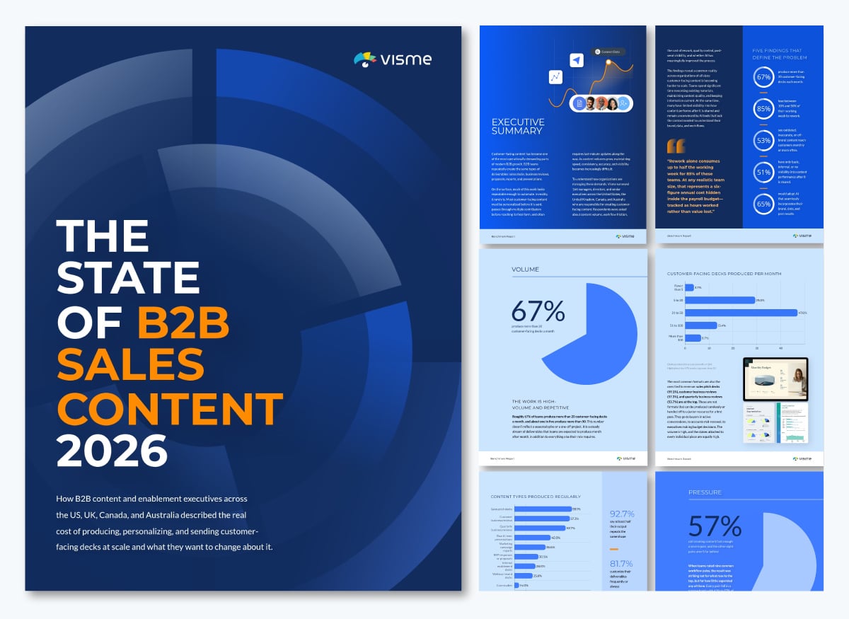
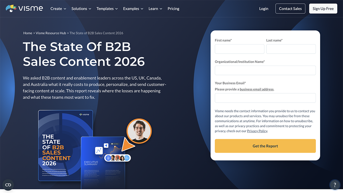
Visme surveyed 164 managers, directors and senior executives at B2B companies in the US, UK, Canada and Australia between March and May 2026.
The State of B2B Sales Content 2026 ius built for sales and content leader and examines how teams create, manage and measure customer-facing content.The findings reveal how much time teams spend on rework, how often outdated or off-brand content reaches customers and how little visibility many teams have after sharing materials. It’s also a gated lead magnet, so every page has to earn the download.
Each of the seven sections opens with a full-page headline that states the finding, such as “Half of the teams have no real idea what happens after they hit send.” Even a reader who only skims the headlines gets the full story. Anonymous respondent quotes, labeled by role and country, add a human voice to the numbers.
The report also ends with a five-question self-assessment that invites readers to compare their own processes with the findings.
Key takeaway: End your report with a next step readers take with their own data. A self-assessment gives readers a personal result and qualifies them as a lead. Build one with Visme Forms and link it from your report’s final page.
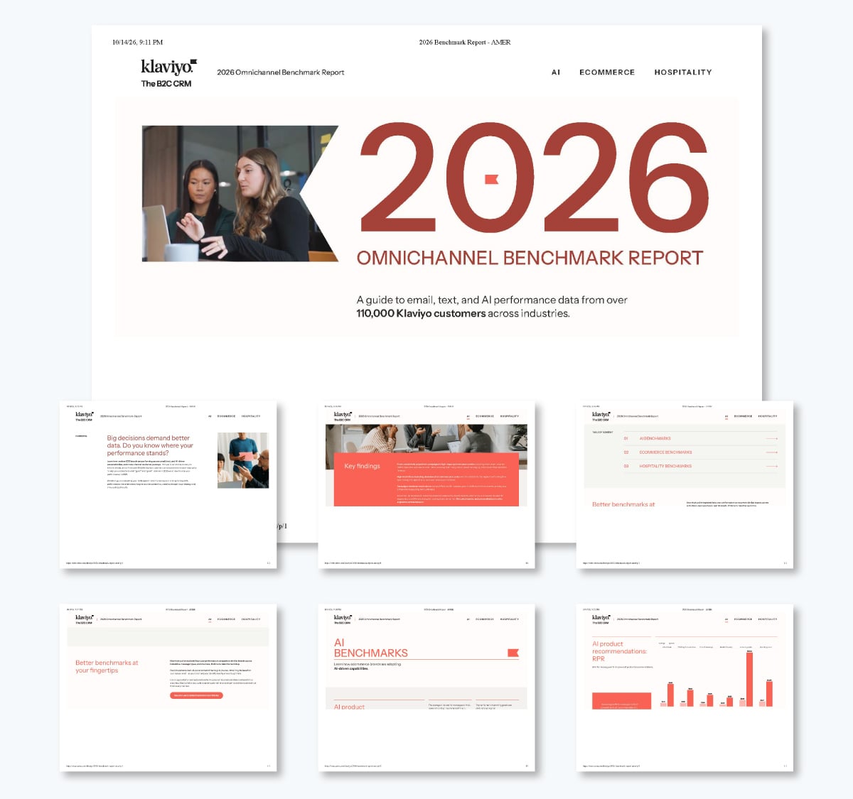
Klaviyo’s 2026 email benchmarks draw on data from over 183,000 Klaviyo customers, mostly ecommerce brands.
The page answers the question every email marketer asks: “Are my numbers good?” Its message goes further: automated flows outperform one-off campaigns. Flows make up 5.3% of sends but bring in nearly 41% of email revenue, which points readers toward the automation Klaviyo sells.
For open and click rates, each metric shows two tiers: a good result and what the top 10% achieve. A good campaign click rate is 1.69%, while the top 10% reach 3.38%. The second tier gives readers a goal to aim for, not just a baseline. An FAQ at the end answers common questions in a few lines, which makes the page easy to quote in search and AI answers.
Key takeaway: Build the report around one argument your data proves, and show the gap between average and best. That gap is where your advice or product fits. Use Visme’s data visualization tools to chart both tiers side by side, so readers see the gap at a glance.
Contentsquare’s 2026 Digital Experience Benchmark analyzes 99 billion sessions across more than 6,500 websites in nine industries, comparing Q4 2024 with Q4 2025.
The report is for marketing, product, CX and analytics teams, and its message is that every visit counts more as traffic shrinks. Visits fell 3.8% and conversion rates fell 5.1%, while average order value rose 6%.
It’s published as an ungated web guide, so each chapter can rank and get cited on its own. The six chapters follow the customer journey, from Traffic to Retention, so each team can go straight to the stage it owns. Each chapter ends with a “What this means” takeaway, so readers don't have to interpret the numbers alone. An interactive dataset lets them filter more than 50 metrics by industry.
Key takeaway: If your report serves several teams, publish it on the web and give each stage or role its own section with a “what this means” summary. Build it as a Visme microsite, with one section per chapter, a sign-up form for readers who want the full dataset and a mobile layout for readers on their phones. The analytics dashboard then shows how many people visit.
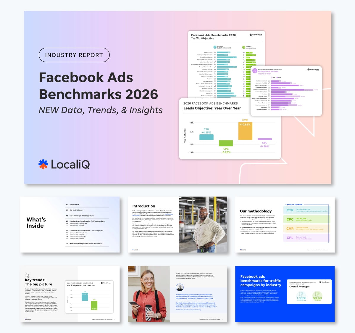
WordStream’s 2026 Facebook ads benchmarks analyze 1,892 US campaigns that ran between April 1, 2025 and June 30, 2026, across more than 20 industries.
The report is for small businesses and marketers running Meta ads who want to know whether their results are normal. Its message is reassuring: results improved, and Facebook ads still cost less than Google Ads. The report also generates leads, with “free assessment” boxes placed next to the charts.
Every metric has its own color: teal for click-through rate, green for cost per click, yellow for conversion rate and purple for cost per lead. The color stays the same on every chart, so readers always know which metric they’re looking at. Each metric page opens with the answer in bold color, such as “The average click-through rate... is 1.93%,” before the chart.
Key takeaway: Give each metric one color and use it everywhere, then state the answer before the chart. Set your metric colors in Visme’s Brand Kit so every chart and page stays consistent, even when several people work on the report.
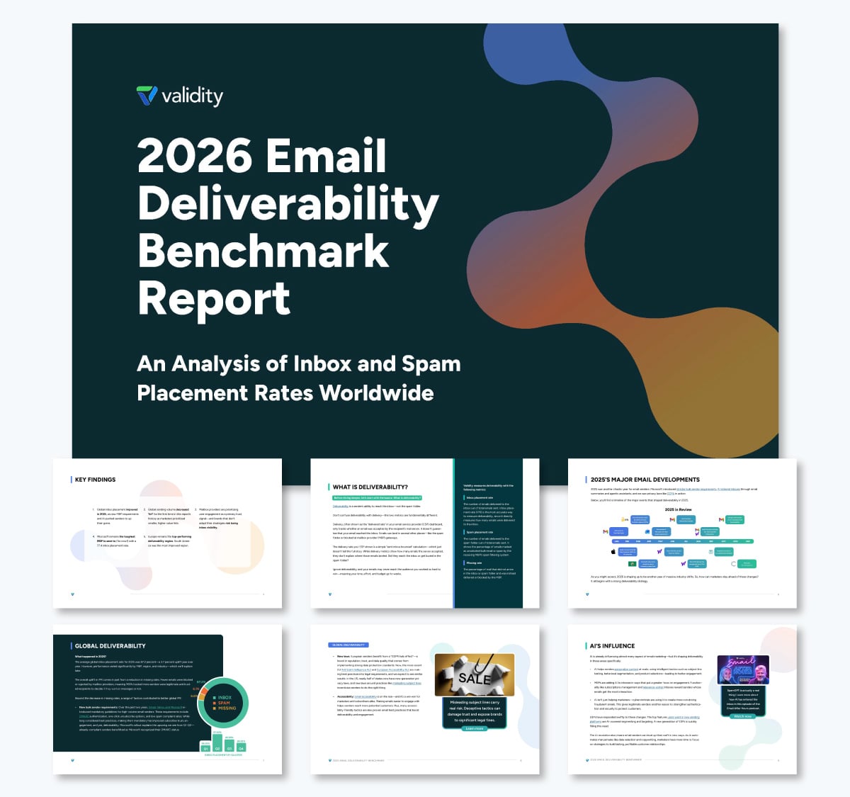
Validity’s 2026 Email Deliverability Benchmark Report analyzes 2025 inbox placement data from seed tests across hundreds of mailbox providers and spam filters.
The report is for email senders who need to know whether their messages reach the inbox. Its message is that inbox placement improved to 87.2% overall but varies widely by provider and region. Microsoft was the hardest major provider to reach, at 77.4%.
Most readers come with one specific question, such as how senders in their industry or region perform. So every breakdown uses the same scorecard table with inbox, spam and missing columns, and readers can find their row in seconds. A month-by-month timeline of 2025 email changes explains why the numbers moved, and 12 tips for 2026 close the report.
Key takeaway: Use one table format for every breakdown so readers can look up their own row. Add a timeline that explains what changed during the year. Build your scorecards with Visme’s data table maker, start the timeline from one of Visme’s timeline templates, and keep the column order identical across every page.
These four steps take you from a question to a content document ready to design.
Decide what you want to measure and who will read it. Leadership needs a short summary in the style of a board report. Prospects need findings they can use in their own work.
Andy suggests starting from the sales conversation in a CoSchedule podcast interview: "Ask yourself, what statistic or what data point would strengthen my sales pitch? Then go find that data."
Bani starts her budget breakdown with the same kind of question: “Why are you doing this survey? What do you expect to gain out of it?” The answer is usually brand awareness, leads or bragging rights, and it shapes every question you ask.
Choose internal or external. Then choose the comparison: a past period, a named competitor or an industry standard.
Use your own systems, run a survey or combine public data. For internal benchmarks, your operational reporting and weekly reports already hold a baseline.
If you run a survey, put the most important questions first so you keep that data even when people drop off. Keep questions specific and answer options consistent.
How many is enough? Ray gives a rough floor in his roundup of SaaS benchmark reports:
"If the population 'N' is less than 200 - 250 the resultant benchmarks will have a higher error of margin and reduced statistical significance." Below that range, label your findings as directional.
If you use existing data, follow Anna’s suggestion before making final decisions: "The most important thing is to check whether you have access to all sources required to fill in the report."
Run a test data pull and compare it with past reports to confirm you're using the right report or sub-report. Then set the time frame for each export. Weekly and monthly are standard, and biweekly benchmarks are common in corporate reporting too. For recurring reports, set up a fixed workflow that exports clean files (CSV or JSON) on the same schedule every time.
Remove incomplete and duplicate responses, standardize definitions and find the gaps. Segment by company size, role or region where your sample allows. Then work through these steps:
Give each finding a headline number, context and a takeaway. A consistent report writing format keeps sections scannable, and this guide on how to write a report covers the basics.
Bani calls analysis the stage where most reports fall flat: the stats go into charts and readers are left to connect the dots. Her advice is to bring in the right person: “You want someone who knows what to cross-reference, can spot patterns, and shape a narrative that ties to your goal.”
If you don’t have access to a professional of that caliber, you can also ask AI tools like Claude or ChatGPT for help.
Here’s a prompt you could use to get started:
You're a data analyst helping me prepare a benchmark report for [audience]. The goal of the report is [goal, such as generating leads or setting next year's targets]. Below is the cleaned data from [source, sample size and dates].
[Paste your data here]
Analyze the data. Don't write the report.
Only use numbers from the data above. If a segment has fewer than [30] responses, say so instead of drawing a conclusion.
There are two ways to start: generate a first draft with AI Creation Studio, or customize a benchmark report template.
AI Creation Studio builds a first draft of your report from a prompt and the content you paste in.
Choose whether you want a presentation or a document. Then write a short prompt that names the format, such as “Benchmark report,” and paste in your findings.
Set the length, audience, tone and brand for the report. The maximum length is 10 pages.
Review the outline before the AI designs anything. Ask the AI chat to add, remove or reorder sections until the outline matches your findings.
Generate the report and open it in the editor. Check every number against your data, then add your charts and brand elements.
Here’s a first draft that Visme AI Creation Studio generated from a prompt and sample data.
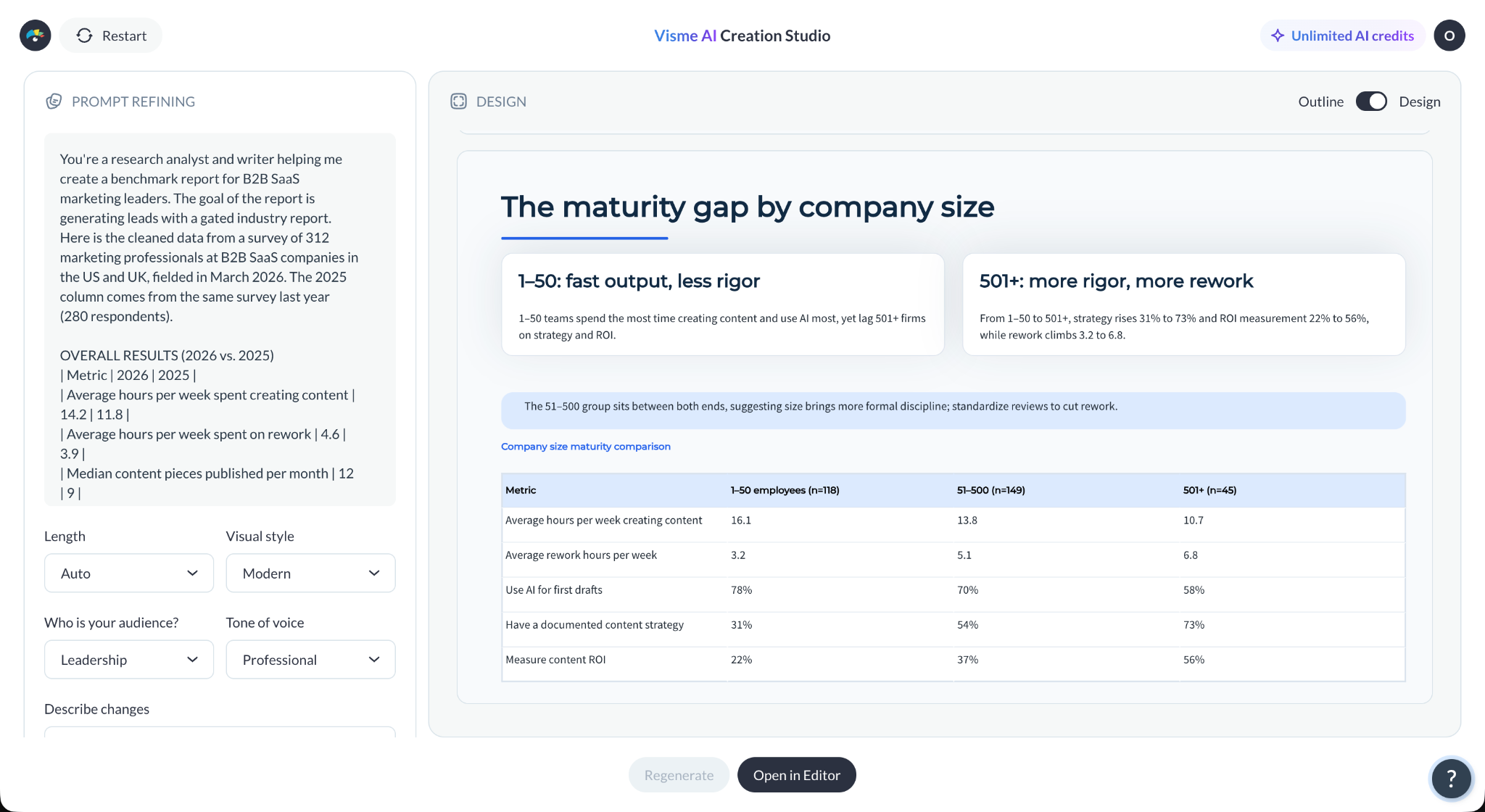
Visme updates AI Creation Studio regularly, so some features may look different when you try it.
Start with the benchmark report template Visme used for its own State of B2B Sales Content report, or browse more business report templates.
For layout ideas, see these annual report design examples.
Search for “benchmark report” in the template library and open the template in the editor.
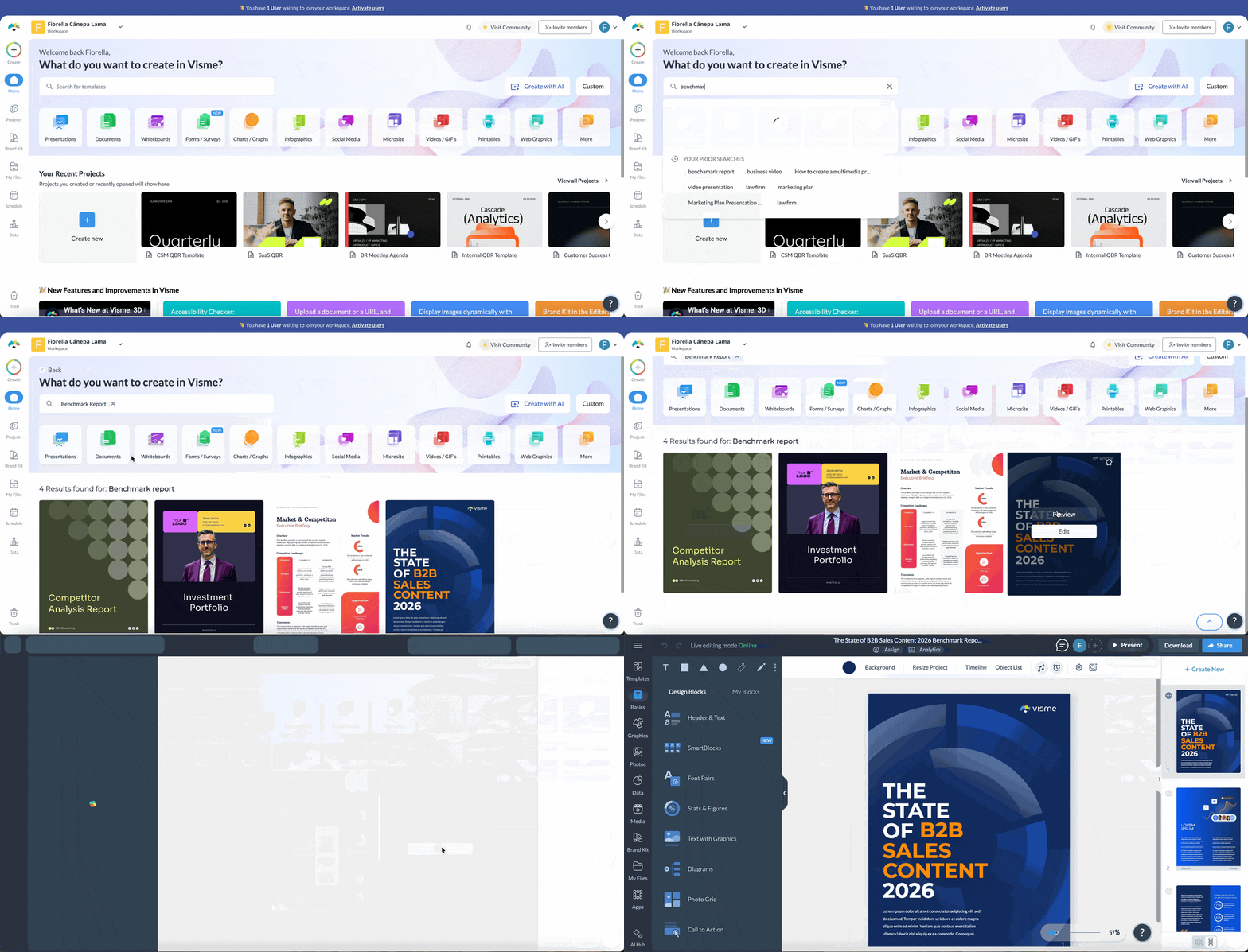
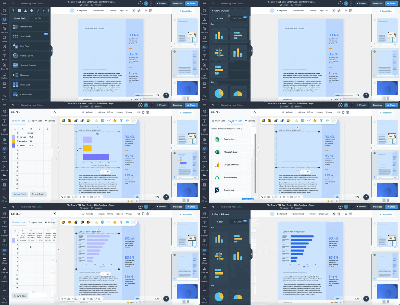
Replace the placeholder text and numbers with your findings. Keep one finding per page, and delete the pages you don’t need.
Import your spreadsheet into Visme's data visualization tools and pick one chart type per finding.
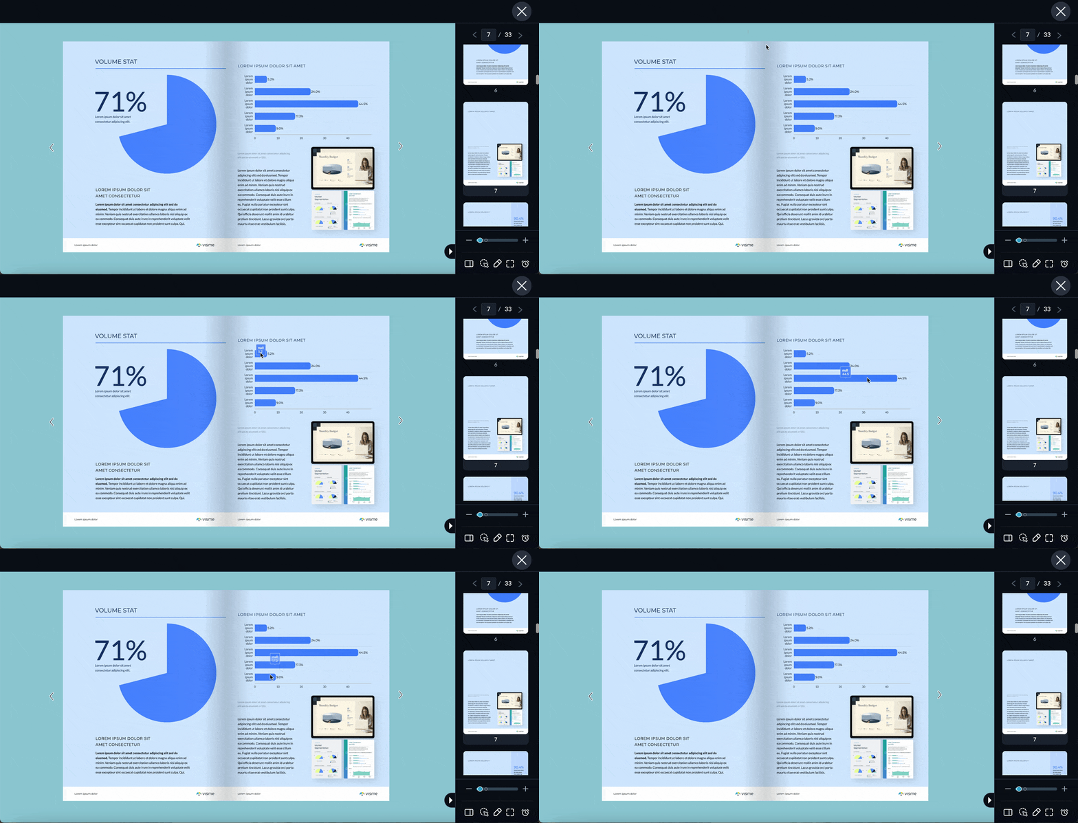
Add hover effects, pop-ups and clickable sections with interactive features. This interactive annual report guide shows the approach in more detail.
Build a short quiz with Visme Forms that asks the same questions as your survey, then link it from the report's CTA.
Visme includes several features for building a report as a team. Use them to split the work, collect feedback in one place and then keep a master version of the report.
Comment and edit together with collaboration tools. Assign slides or pages to teammates with Workflows, available on Pro and Enterprise plans. Enterprise plans also include approvals, so the report can’t be published, shared or downloaded until it’s signed off.
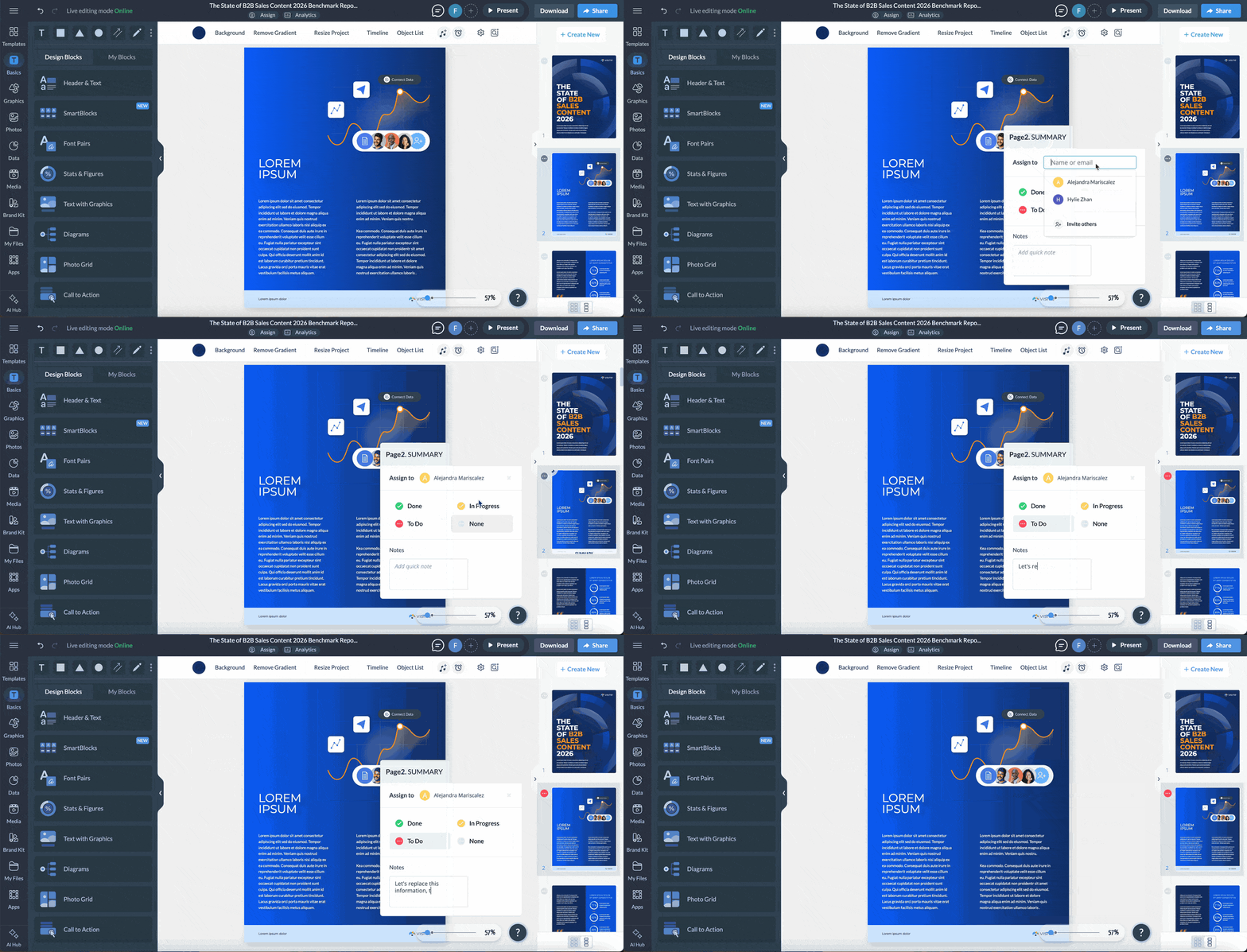
Use Dynamic Fields to store details like company names, metrics or dates once. Update a field once, and every project that uses it updates automatically.
Save a template to the Brand Library with editing permissions so colleagues can reuse the design without changing the layout.
Publish your benchmark report in the format your readers need, then promote it in pieces: turn key stats into social posts, give the people featured in it ready-made assets and pitch the findings to sites that cite older data.
Vic sums up why this matters: “Every other team gets something to distribute. Performance marketing, lifecycle and email, sales, social and content all run off the same research. One asset, five channels.”
Here are some expert tips from Vic, Chelse, Sergey and Tauane.
Give the report its own page with a short summary, two or three headline stats and the download form. Point every social post, email and pitch to that one URL so all your traffic is tracked in one place. People sign up on the form to receive the report and you simultaneously collect them as a lead for your email marketing.
Send a launch email that leads with one surprising stat. Over the next few weeks, follow up with emails that each cover a different finding. Subscribers who skipped the first email get another reason to open the report. For a more personalized approach, send the email to segments that align directly with the content in the report.
Pull out individual stats, graphics or full pages and turn them into carousels or posts. One report can fill weeks of content. LinkedIn posts also get crawled by AI tools, so each one is another chance for your numbers to appear in AI answers.
If you quote experts or customers, send them ready-made assets: a pre-written post, a graphic with their quote or a “featured in” badge. Each share puts your report in front of their audience and adds another source AI tools can draw from.
Find articles that quote older numbers on your topic and run an outreach campaign to offer your newer figures. Each site that cites your report adds a backlink, creating another source AI tools can draw your numbers from.
Record a short video that walks through the key findings, then publish it on YouTube with a transcript. AI answers often cite YouTube videos, so the video gives your findings a second way to show up.
Post key stats in relevant communities, like subreddits and LinkedIn groups, from real accounts that take part in the conversation. AI tools pull from these discussions too.
A gated PDF for lead generation, a web page for search or a slide deck for a client presentation or consulting report. Share the report as a live link, embed it on your site or download it as a benchmark report PDF.
Turn on Visme Analytics to see views, unique visitors, time spent and how much of the report each visitor viewed. Look for sections that attract the most attention and where readers drop off.
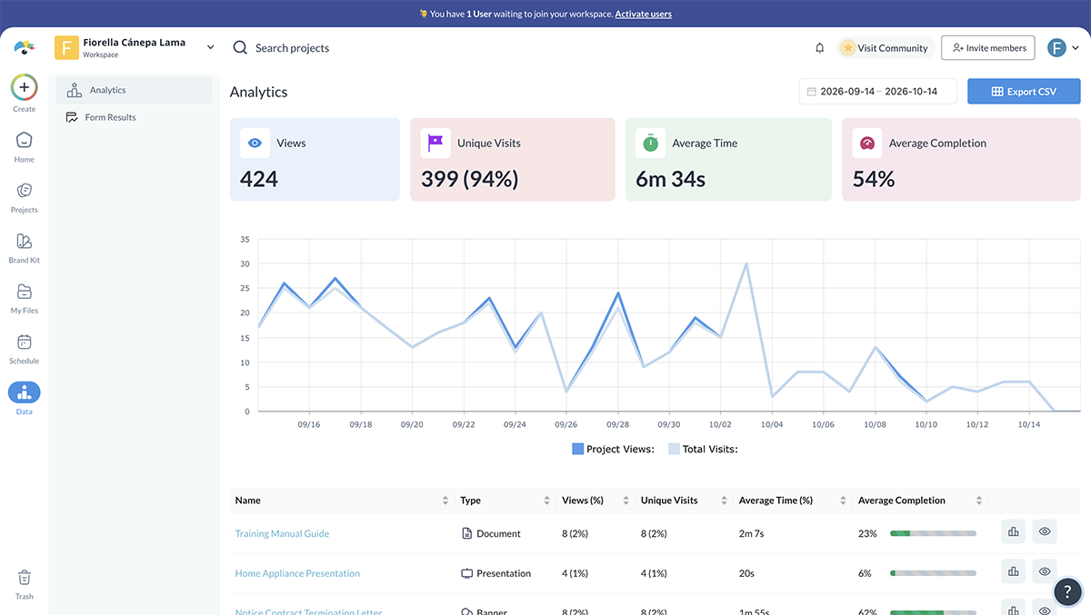
Combine these insights with landing page conversions, backlinks and lead generation data to understand how the report contributes to your marketing goals. Use what you learn to improve your promotion strategy and plan the next edition.
Pick the questions you want the report to answer, such as “How much time do sales teams spend redoing content?”, then check whether AI tools mention and cite your report for them. Measure mentions and citations on those questions, not referral traffic, since AI answers send fewer clicks than search results.
Here are seven common mistakes and how to fix them, with tips on design, editing and storytelling from Alejandra and Unenabasi.
Readers can't judge a number without knowing where it came from. Put a one-line summary near the top, such as “Survey of 500 HR leaders in the US, fielded in January 2026.”
Then add a full methodology section with the sample size, who was surveyed and how they were recruited, the dates, how the questions were asked and any limitations.
Be transparent about small samples, missing data or segments that aren't large enough to support reliable conclusions. If your research doesn't represent an entire industry, don't present the findings as though it does.
Organizations measure the same thing in different ways. On-time delivery is a common example: one company counts it when the shipment leaves the factory, another when the order reaches the customer. Next to each metric, write a short definition with its formula and time frame.
Before you compare your numbers with an external source, check how that source defines the same metric. If the definitions don’t match, note the difference or drop the comparison.
Compare similar groups and periods, too. A 20-person startup and a multinational enterprise may have very different operating conditions, just as holiday-season performance may differ significantly from an ordinary quarter.
A stat that's simple to find isn't always reliable. On data pulled from aggregator sites, Bernard warns in his guide to benchmarking pitfalls that "the reliability of this data is sometimes questionable."
Trace every number to its primary source before it goes in. If a stat shows up in ten blog posts but none of them link to the original study, leave it out. Check the date as well: data that’s more than a few years old may not reflect the market today.
Unenabasi Ekeruke, Senior Content Editor and Strategist at Visme, explains why research findings need to stand up to scrutiny:
“A compelling finding means very little if the data behind it doesn't hold up. When I edit a benchmark report, I question the sample, check how the metrics are defined and make sure the conclusions don't go further than the evidence allows. You can tell a strong story with data without exaggerating what it proves. In fact, that's what makes the story credible.”
If you can't verify a statistic or establish that two datasets are comparable, leave it out rather than build an argument around it.
An overall average can hide important differences between groups.
For example, a benchmark that combines results from small businesses and large enterprises may not reflect the reality of either group.
Ray puts it directly in his roundup of SaaS benchmark reports:
"If a report does not include company profile specific filter attributes - like company size, ACV and customer segments they are less valuable."
Where your data allows, break down the findings by relevant factors such as company size, industry, region or customer segment.
Consider reporting the median alongside the average to reduce the influence of extreme values. You can also show performance ranges, such as the top 25%, median and bottom 25%, to help readers understand where they stand.
Klaviyo's email marketing benchmarks offer a good example by showing both typical performance and results achieved by top-performing customers.
One of the biggest mistakes in benchmark reporting is assuming that presenting the statistics is enough
A report might tell readers that 85% of teams spend a significant part of their week reworking content. But what does that reveal about how those teams operate? What other findings help explain the problem? And what should readers take away from it?
Unenabasi explains how he approaches this during the editorial process:
“One thing I've learned from editing benchmark reports is that the biggest number isn't always the most important finding. Sometimes the real story is in the gap between two data points, a surprising pattern across segments or a result that challenges what everyone assumes to be true. My job as an editor is to find those connections and turn them into insights readers can actually use.”
When analyzing your findings, look beyond individual statistics. Compare related metrics, examine differences across segments and identify patterns that deserve closer attention.
For each major finding, explain what the data shows, why it matters and what readers can reasonably do with that information.
Avoid forcing a conclusion when the data doesn't support one. Sometimes an unexpected result is worth highlighting precisely because it raises a question for further research.
Having access to data doesn't necessarily mean you're measuring the right things.
Start with the questions your report needs to answer, then identify the metrics that can help answer them.
For example, if you're investigating whether sales teams need better enablement content, counting the number of presentations created won't tell you enough. You may also need to examine content usage, deal progression, win rates and feedback from sales reps.
The same principle applies to surveys. Avoid adding questions simply because they're interesting. Every question should contribute to your research objectives or help explain a finding you expect to investigate.
Benchmark reports are dense, and it’s tempting to fit every chart and table onto a single page. Give each finding its own page or section, with one key stat and one chart. Move detailed tables to an appendix for readers who want them.
Alejandra explains why it's critical:
“One of the biggest design mistakes with benchmark reports is trying to fit too much information onto one page. These reports can be pretty long and data-heavy, so without enough white space, visuals, or clear sections to break things up, they can quickly feel overwhelming. Good design can make the information much easier to digest and help the report feel more clear and trustworthy.”
Readers should be able to scan the report, identify the most important statistics and understand their significance without having to work through every data point.
Once a year works for most industry benchmark reports, since that gives the data time to change. Internal benchmarks can run monthly or quarterly alongside a monthly report.
You need a data source, such as a survey tool, CRM or analytics platform, plus a spreadsheet for analysis. A reporting tool like Visme handles the final report, with templates, charts and forms for self-assessments.
A benchmark report shows where performance stands against a reference point so readers can decide what to change. Published externally, it also gives buyers a reason to trust your expertise.
Disclose your methodology, lead with a few strong findings and show what good performance looks like. Add a takeaway to every finding and repeat the study on a set schedule.
Define the question, collect and clean the data, then find the gaps against your reference point. Write each finding as a headline number, its context and a recommended action.
An outsourced research report can cost about $17,000 to $48,000, according to a budget breakdown by Bani Kaur, founder of TLC Agency. Collecting survey responses is the largest cost, at $5,000 to $20,000. Owned audiences, like newsletter subscribers, and in-house analysts can bring the total down.
A benchmark report earns its place when people use it. That could be your leadership team setting next quarter’s targets from it, or another writer citing your numbers. Getting there takes a well-defined purpose, data you can verify, findings with takeaways and a design that lets readers find their answer fast.
Visme covers the steps after your analysis. Start from the benchmark report template behind Visme’s own State of B2B Sales Content report, or generate a first draft with AI Creation Studio. Import your spreadsheet to build charts, add a self-assessment with Visme Forms and assign sections to teammates with Workflows. Then publish the report as a PDF, a live link or amicrosite, and track views with Analytics.
Ready to create your benchmark report? Get started right away.

Design visual brand experiences for your business whether you are a seasoned designer or a total novice.
Try Visme for free
![20 Interactive Presentation Ideas That Will Engage Your Audience [+ Real Life Examples]](https://visme.co/blog/wp-content/uploads/2026/07/BH_Thumb-0726-Interactive-presentation-ideas-and-examples-1-500x280.png)




![20 Interactive Presentation Ideas That Will Engage Your Audience [+ Real Life Examples]](https://visme.co/blog/wp-content/uploads/2026/07/BH_Thumb-0726-Interactive-presentation-ideas-and-examples-1.png)