Do You Still Need Design Skills When AI Can Design?

Yes, you still need to have and know design skills even though AI is constantly improving its visual content generation capabilities.
It’s because an AI's first draft will always need changes to better align with your purpose, brand and direction. And if you don't understand basic design principles and their vocabulary, you won’t know what to ask the AI to fix, nor will you notice that something is wrong to begin with.
The experts agree.
According to Figma’s 2026 AI Report, 90% of respondents say design is at least as important as it was before AI, and nearly six in 10 say it is more important. Dylan Field, CEO of Figma, shares that "the better cogeneration gets, the more design matters."
So, as part of our ongoing video-based article series, we’ve put together this guide to help you notice what needs fixing, write better design adjustment prompts, and make final design tweaks in Visme’s drag-and-drop editor.
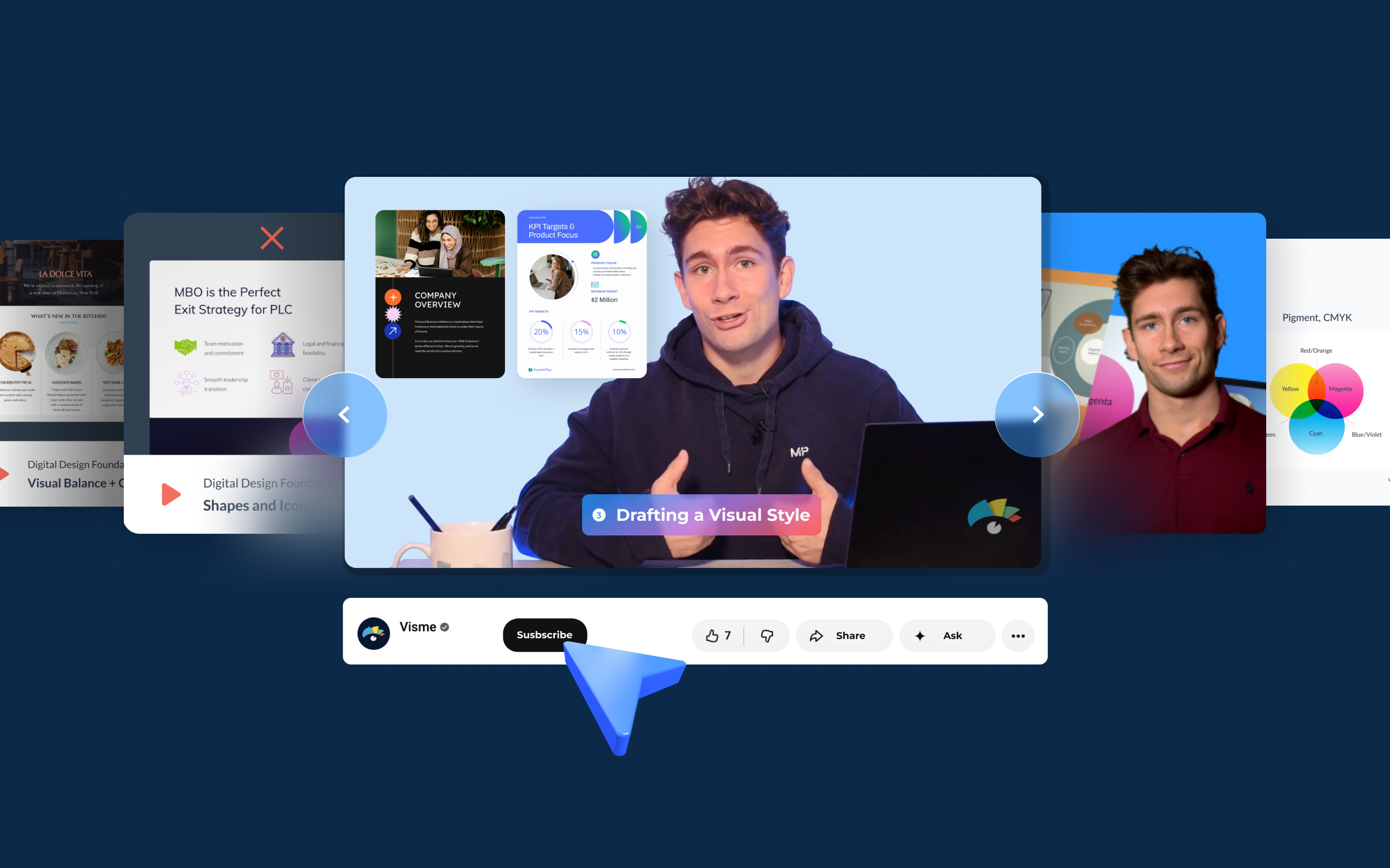
All the videos below are from Visme's Free Digital Design Foundations Course. You can watch them here or YouTube but when you sign through the link above, you get access to practice resources and a certification you can add to your LinkedIn profile.
We have some relevant content to share with you before the videos, but you can also jump ahead if you want to get started right way.
Table of contents
- What Can AI Design, and Where Does It Still Need You?
- Why Do Non-Designers Need Design Skills Now?
- Why Should a Human Stay in the Loop on AI Designs?
- 12 Free Videos to Learn the Basics of Graphic Design
- Put Your Design Skills to Work
- Frequently Asked Questions
Quick Reads
- AI can produce a full layout from one prompt, but the first result almost never works without changes.
- The gap is rarely the tool. It's the lack of design skills the user has to be able to finalize an output well.
- AI tends to default to generic, polished styles, so your brand style has to be pushed into the output on purpose.
- Most teams struggle with spacing, alignment and fonts, which are easy to fix once you know what to look for.
- Treat AI output as a first draft. Most AI content still gets edited before it goes live. Before you publish, check hierarchy, alignment, spacing, color, fonts and brand match.
- The 12 videos in this guide each teach one skill and end with prompt examples you can copy and adapt.
- Ready to practice? Enroll in Visme's free digital design course to learn these skills step by step and earn a certificate you can add to your LinkedIn profile.
What Can AI Design, and Where Does It Still Need You?
AI tools can design all sorts of things, including prototypes, presentation slides, one-pager documents, marketing graphics, web pages, applications, interactive HTML pages and more.
AI-native platforms like Lovable, and big-name AIs like Claude and ChatGPT, now make full designs from a prompt. These tools are available to everyone, but not everybody has the knowledge to take the output to the finish line. That’s why you see so much AI generated visual content that looks the same. They all share a recognizable look, regardless of the fonts and colors you ask the tool to use.
No matter what AI you use (including Visme AI), the first result will rarely work as is. And to make the adjustments you need, you’ll ask for them through chat, inline comments and sometimes direct canvas actions. But do you know what to ask for?
In his newsletter, Designing with AI, Victor Dibia PhD shares his thoughts about how good Claude Design really is. He tested the system and shared his conclusion that the sensitive decisions around the generated output are still yours. Which means that, thankfully, you still have control over what your company shares to the world, even when AI is involved.
AI design outputs always need adjustments
Experts have weighed in on what AI gives you and its quality level. Here's what some of them have to say.
Aurélie Radom, a product designer, makes the following point in a Medium article: "AI did not democratize design judgment. It democratized output." Meaning that anyone can design with AI, but deciding whether it's any good still takes a trained eye.
Radom goes event further in her Hey Designer newsletter that, "Taste cannot be delegated."
Dylan Field from figma shared with a16z that even though AI produces a first draft, getting from there to a final product is "kind of hard and usually takes a team." Even though AI design has improved since he said this in 2023, the sentiment is still accurate.
Finally, Errea, a design agency from Spain, puts it this way in their Substack: “The problem is not about using AI, but letting it think and decide for us.” You still the capacity of decision, so don't give that way when creating with AI.
You describe the fix in words
Most changes in AI tools happen through prompts, not manual edits. That's a problem, because non-designers don't know what they want or how to say it. A UC Berkeley study on AI design calls this the "Vocabulary Gap," where users lack the precise language for their intent. The fix is learning the words. Terms like hierarchy, alignment, contrast and white space let you describe exactly what's wrong and what you want the AI to fix.
Compare these two prompts:
- Vague (weak): "Make it look better."
- Specific (strong): "Increase the headline size, left-align the body text and add more space between sections."
The vague prompt gives the AI nothing concrete to act on. The specific prompt names the change, so you can expect that result.
AI defaults to the same look
The reason behind why all AI designs look the same on first output is simple. AI learns from what already exists, so its output tends to gravitate toward what's been done before. Then, it just repeats it for everyone, as a default. At some point it decided that a specific layout was "the best" and applies it to all outputs.
The UC Berkeley study calls this pattern a "Convergence Trap," where the system "defaults to generic, 'polished' styles."
Also, AI isn’t capable of creating something 100% new. What it does is remix what it knows in different ways. Oscar Dumlao, Product Designer at Figma, wrote on the Figma blog, that "AI trained on the past can't invent the future." The future is still in the hands of humans, for now.
In Visme's State of B2B Sales Content 2026 report, 31.1% of B2B leaders named generic-looking output as a reason they use AI less. Do you fit into that group?
Why Do Non-Designers Need Design Skills Now?
Sales, customer success and marketing teams still need to know design skills because they are making more of their own visuals. Among marketers who use AI, the share using it for image creation rose from 19% to 43% in one year. And according to Figma’s 2026 AI Report, the share of developers doing design work rose from 44% to 60% in one year.
Visme's Brand Execution Gap 2026 report shines a light on the design skills gap in their teams, regardless of AI. 47.4% of Brand Managers say that even though colleagues know the brand basics they lack the design skills to apply them. 50.3% of them also see non-designers make spacing, layout and alignment mistakes, and 49.3% see font mistakes.
If all team members creating business content had at least some of the basic design skills in this guide, there would be less back and forth between departments and content production would take less time.
Why Should a Human Stay in the Loop on AI Designs?
Teams will always need a human to give a piece of designed content a last look and review, otherwise the outputs will go out looking like all other AI-created designs. Humans needs to stay in the loop on AI designs specifically to avoid SLOP. Thats why you always must consider AI output as a first draft.
According to Ahrefs' 2026 survey, only 7% of AI-using marketers publish mostly unedited AI content. Most of them still review the work before it goes live. The Designer Fund's 2026 AI in Design report found that only 5% of design leaders are putting less emphasis on execution quality.
These are very positive statistics, meaning that leaders know how important it is to stay in the loop all the way to the end.
In Visme’s The Brand Execution Gap report, we shared that brand owners who pulled back from AI cited too much cleanup (33.5%) and output that didn't match their brand (19.5%). We also found that only 1.3% of creators say a template is ready to use as it is, and 83.2% still apply brand elements by hand.
But the bigger risk is not the tool you’re using. Like we shared from Errea earlier, the real danger is AI stopping humans from thinking and developing their own ideas.
At Visme, we believe in the AI+Human combination for creating all your business content. Even though we have AI features to help you design content that's perfectly branded, using your exact content and numbers, we still give you the option to edit everything manually in the drag-and-drop editor.
12 Free Videos to Learn the Basics of Graphic Design
Here are twelve short videos from Visme's free design fundamentals course. Each one covers a skill that helps you fix what AI gets wrong, and each ends with prompt examples you can copy.
1. Introduction to Graphic Design (7:01)
This is the foundation. You'll learn how purpose and visual style shape a design. AI often skips the brief, so define both before you prompt and the first draft will land closer to your goal.
What it fixes: Designs that don't match their purpose.
Prompt examples:
- Before you design, ask me about my audience, main message and visual style. Then write a one-paragraph design brief.
- Critique this design for purpose. Does the main message lead, and does the style suit the audience?
- Rewrite [the headline] so it states the main message in under [8] words for a [audience] reader.
- Change [the hero image] to fit a [informational/persuasive/celebratory] purpose. Keep the same subject.
2. How to Use Visual Balance (2:55)
Balance is easy to spot once you know what to look for. This short lesson covers symmetry, radial balance and composition. AI layouts often lean heavily to one side, so name the layout you want in your prompt.
What it fixes: Layouts that lean to one side.
Prompt examples:
- Check the visual weight of this layout. Tell me which side pulls the eye and where the optical center sits, then rebalance it.
- Keep the same content, but make the layout symmetrical around a central axis.
- Move [the photo] to the [left/right] column and balance it with [the text block] so the two carry equal weight.
- Reduce [the chart] and place it opposite [the headline] to even out the composition.
3. How to Use Visual Hierarchy (8:48)
Hierarchy decides what people look at first. This lesson covers color, font styles and Gestalt principles like proximity and figure and ground. AI tends to give every element equal weight, so tell it what should stand out.
What it fixes: Every element competing for attention.
Prompt examples:
- Rank the elements by visual weight. Use scale and weight contrast so the most important one dominates.
- Reduce this design to one focal point. Keep everything else in a clear secondary tier.
- Make [the headline] the dominant element: increase it to [48] pt and set it in [bold].
- Increase the figure-ground contrast on [the CTA button] so it stands out from [the background].
4. Why You Need Visual Alignment (5:49)
Alignment is where a lot of fixes happen. This lesson covers margins, grids, and how text and images line up. Small misalignments are among the most common problems in AI output, and they're easy to fix once you name them.
What it fixes: Elements that drift off the grid.
Prompt examples:
- Put every element on one column grid with equal outer margins. Align text to a shared left edge.
- Check optical alignment across the layout and correct any element that drifts off the grid.
- Align [the logo] and [the headline] to the same left margin, and match the baseline of [the body text] to [the sidebar].
- Center [the icon row] within [the card] and keep equal spacing between each icon.
5. Understanding Color Theory and Psychology (6:01)
AI palettes often look alike. This lesson walks through color theory and color psychology, and shows how to use color in Visme. Pick colors that suit the message and the brand, and check that the text is easy to read.
Visme tip: Save your final palette to your Brand Kit so every new design uses the same colors.
What it fixes: Palettes that look alike and poor contrast.
Prompt examples:
- Build a palette with one dominant hue, one accent and two neutrals. Explain the mood it sets for [industry].
- Check every text and background pair against a 4.5:1 contrast ratio, and adjust until all pairs pass.
- Change [the CTA button] to [accent color] so it contrasts with [background color] and the text stays readable.
- Shift [the subheadings] to a darker tint of [primary color] so they sit clearly under the headline.
6. Basics of Typography (5:53)
Fonts are one of the first things to drift in AI output. This lesson covers typefaces, kerning, tracking and hierarchy, so you know exactly what to check.
What it fixes: Fonts that drift from the brand.
Prompt examples:
- Use no more than two fonts: one for headings, one for body. Set a clear type scale with comfortable leading.
- Check every text element and flag any font, size or weight that isn't in the type scale.
- Tighten the tracking on [the headline] to [-1%] and open the tracking on [the small label] to [+5%].
- Set [the body text] to [16] pt with [1.5] line spacing and about [65] characters per line.
7. How to Use Shapes and Icons (4:48)
AI loves decorative shapes and rounded cards. This lesson shows how to use shapes with purpose, so each one guides the eye instead of filling space.
What it fixes: Decoration that doesn't carry meaning.
Prompt examples:
- Remove every decorative shape that doesn't guide the eye or explain an idea. Keep only the ones that carry meaning.
- Make all icons the same style, stroke weight and size.
- Replace the [rounded cards] behind [the stats] with one [rectangular] frame that matches the grid.
- Redraw [the arrow icon] with a [2 px] stroke and no fill to match the other icons.
8. Keys to Visual Communication (4:38)
This lesson is about picking the right kind of visual, whether that's a photo, illustration, chart or diagram. It also covers alignment. AI images can contain errors, so check each one before you use it.
What it fixes: The wrong type of visual for the message.
Prompt examples:
- For this text, suggest whether a photo, illustration, diagram or chart best explains the idea. Give one reason.
- Rebuild this process as a diagram with a clear left-to-right flow and no more than five nodes.
- Replace [the stock photo] with an illustration that shows [the process step], in the same color palette.
- Check [the AI image] for errors in text, hands and perspective, and list anything to fix before publishing.
9. How to Make Data Visualizations (4:06)
Charts are where AI can mislead you. This lesson covers what data visualizations are and walks through a tutorial. In one review, Victor Dibia found that AI chose a visually interesting chart over an accurate one.
What it fixes: Charts that mislead.
Prompt examples:
- Turn this dataset into the chart type that answers [question] most clearly. Give the reason in one sentence.
- Remove chart junk, keep one accent color for the key comparison, and put the takeaway in the title.
- Sort [the bar chart] by value and label each bar directly. Remove the gridlines.
- Start [the y-axis] at zero and label the last point on [the line chart] with its value.
10. How to Have Design Consistency (4:03)
This lesson covers cohesiveness, consistency and creating with Visme. Staying on-brand is a pain point for many teams. In Visme's State of B2B Sales Content 2026 report, 54.3% of respondents call it a severe pain. [Source to confirm]
Visme tip: Set your colors, fonts and logo in Brand Kit first, then build new pages from it.
What it fixes: Pages that don't match.
Prompt examples:
- Set the brand colors, fonts and logo as design tokens. Apply the same spacing scale and corner radius to every page.
- Check every page against the style guide and list any page where a component differs.
- Apply [the brand button style] to every CTA, including [the footer link].
- Make every [card] use the same padding, corner radius and heading size as [the reference card].
11. Why Less Is Actually More (4:15)
This lesson covers white space, clutter, simplicity, color, adaptability and typography. AI tends to fill every space it can. Learn when to remove elements, and often less is the fix.
What it fixes: Crowded layouts.
Prompt examples:
- Remove anything that doesn't support the main message. Keep to three colors at most.
- Check the density of the layout. If it feels crowded, remove the least important element first.
- Add space around [the headline] so it has at least [48] px of clear space on each side.
- Cut [the body text] to [two] short paragraphs and increase the gap between [the sections].
12. How to Use Typography in Design (length TBC)
This lesson looks at type as a design element and how typography can tell a story. When the type does the work, AI drafts stop looking generic.
What it fixes: Generic type that doesn't carry the message.
Prompt examples:
- Make the headline the hero of the layout. Use large display type with strong weight contrast against the body text.
- Let the type carry the layout. Align a text block to the grid as the main visual element.
- Set [one key word] in a contrasting weight or italic for emphasis, without adding an image.
- Increase [the pull quote] to [36] pt and place it at [the top left] of the layout.
Put Your Design Skills to Work
You now have the vocabulary to spot what AI gets wrong and the prompts to fix it. The next step is practice. Take a first draft from any AI tool, check what you learned from the videos, and use the prompt examples to fix what doesn't work.
If you want a structured way to build these skills, Visme's free digital design course walks you through each lesson, offers practice experiments and gives you a certificate to add to your LinkedIn profile.


Watch, Learn and Create!
Get step-by-step video tutorials to create content with Visme, from beginner basics to advanced design tips.
Sign up now