Healthcare Data Visualization: How to Turn Data into Impactful Stories

Data visualization can be defined as the visual representation of numerical data through various graphs, charts and maps. Because it’s so essential in interpreting large amounts of data, it’s important to follow certain data visualization best practices.
Visualizing your data through different graphical methods will make you an effective communicator. From marketing to finance, data visualization is a useful way of curating your data for many industries.
However, specific guidelines to follow can result in a better representation of your data and effective communication of the message you’re trying to convey.
Here are ten data visualization best practices to help you effectively visualize data and present it in an easily understandable and aesthetically pleasing manner.
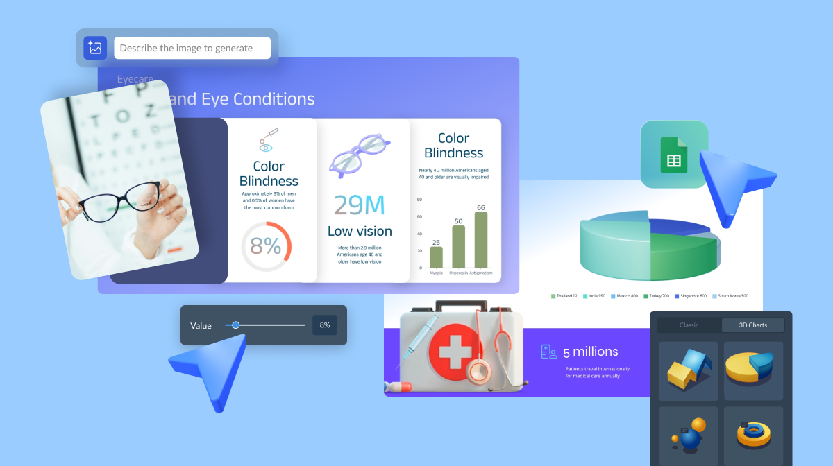
Before we dive in, here’s a short selection of 8 easy-to-edit charts and graphs you can edit, share and download with Visme. View more templates below:


Before we get started, it’s important to understand why following these 10 data visualization best practices is so important.
As we mentioned, data visualization is all about making data, numbers and statistics easy to understand by formatting them into a visually digestible graphic.
But in order to ensure that your data actually is as easy-to-understand as you aim to make it, there are certain guidelines that you need to follow.
We’ve outlined these top 10 data visualization best practices so you can start creating visually appealing and comprehensive charts, graphs, infographics and more.
The first step in effective data visualization and communication is identifying who you're visualizing the data for, i.e., the target audience. This can help you tailor the techniques and methods you use to a specific audience.
Some examples of your potential target audience can be marketers, business executives, social media managers, entrepreneurs, educators, students and non-designers.
You can create a visual to help identify and represent your target audience so everyone is on the same page.

The way you visualize data needs to be clear and understandable to the target audience, enabling them to process information efficiently.
Problems occur whenever the interpretation of the image varies significantly from the conveyor's purpose, as creating a mix and match of visualizations leaves everything muddled.
It’s crucial to recognize the target audience and deliver the visualization's primary concept as early as possible in the design process. This intention should inform the graphic design of the visual.
Although those connected to the process may easily recognize the statistics mentioned in your visualization, those new to the information may find it challenging to identify the facts from the data if not visualized concisely and clearly.
Before converting your raw data into a graphical format, you must ensure that the dataset you use has been cleaned properly. Data cleaning is the process of filtering out any anomalies or inaccuracies present in your dataset.
This process is essential before you use the data for another purpose, as the presence of these inaccuracies can skew the results of your data interpretation as well.
If you plan to publish a figure in a journal, you must verify that your computation is accurate and that all relevant knowledge is transmitted to a broader audience.
Student audiences need extra consideration because the purpose of this scenario is to clarify the theory. In that case, you need to provide more detail to ensure that the idea is wholly understood.
A general audience can be the most challenging audience because you need to create a simple, probably tentative graph that shows only the essential aspect of your analysis.

Once your data is clean, you can select the specific type of graph or chart to visualize your data most effectively and efficiently convey the essential information in the dataset.
There are many different types of information that can be represented by various charts, as you can judge from the following points:
You can use a graph maker tool to help you visualize all kinds of data based on what makes the most sense for your purposes.

Graphs and charts can allow us to identify patterns in our data quickly. However, for specific values that may be of significance, labels are the best way to visually represent this data.
Whether describing an experimental setup, introducing a new model or presenting new results, you cannot explain everything using just the figure itself.
This is why a caption should always accompany your figure. The caption explains how to read the figure and provides additional precision for what cannot be graphically represented.
This can be thought of as a clarification that you can give during an oral lecture or in front of a poster, but with the exception that you ought to prepare ahead of time for the questions that people will pose.
For instance, if you have a bar chart, don't ask the reader to infer the various bars' significance by only looking and comparing the relative heights on the figure.

If the numerical values are significant, they must be given somewhere in the article or written very simply on the figure, as we see above.
In the same way, where there is a point of significance in the model (critical domain, unique point, etc.), make sure it’s visually distinct but don’t fail to point it out again in the caption.
In data visualization, the audience must follow the story you’re trying to convey by looking at your chart. This is why it’s so imperative to direct the reader's attention through specific visual cues, such as reference lines or highlighted trends.
Humans can absorb more significant amounts of information visually. Our eyes are drawn to symbols that send us valuable details at a glimpse.
For example, see how we’ve added extra information to further showcase the major increase in the line chart below.

We usually search for patterns, because if patterns are chaotic or make no sense, it’s too complicated to grasp what the image conveys.
To draw on these human behaviors, make sure that the order or style in which you show the data makes sense to audiences. The data you use can be numeric, alphabetical or sequential.
For example, if you’re trying to express information in a language that reads from left to right, ensure your data visualization does the same.
When you have several graphs in a single infographic, make sure the ordering is correct and the relations between the data are transparent. This ensures that the audience won't get confused when going from one chart to another.
To make your data visualization most effective, you need to recognize what type of dashboard you're offering to the audience. There are three examples of dashboards that you can provide to users.
These dashboards are designed for C-Suite executives and department heads and offer a comprehensive analysis of the organization's success concerning KPI metrics.
They're designed to address frequent questions that any executive would like to know, for example, how many MQLs in the sales pipeline does the business have? How much money did they make last month? This dashboard's primary goal is to provide information directly.
These dashboards are very interactive. They give developers and members of the technology or analytics team a way of researching and experimenting with the data to address stakeholder concerns.
These dashboards are set up with frequently updated information that satisfies a very particular standard of everyday operations and contains information that is not a high-level view.
It’s more about displaying the sort of information that is not viewed by high-level management.
Ensuring consistency and clarity in your chart's design aspects, such as axis or grid lines, can also enhance the overall readability of your visualized data.
Your choice of text is another significant point. Although text can be intrusive when used excessively, focusing solely on visuals is not enough.
When utilizing text, make sure it points out relevant information. Although we're hard-wired to interpret patterns and symbols over text, adding text where appropriate makes a huge difference.
Another critical aspect to keep in mind is to minimize clutter and noise in your visualizations.
Since data visualization is all about effective communication, it's essential to ensure your chart doesn't have unnecessary information that can draw attention away from the crucial details.
Colors can be a useful tool in data visualization, as you can effectively communicate important information about your data through the use of different color combinations.
For example, categorical data is best represented by a distinct color for each category, while sequential data can be ordered through different shades of a single color.
The following information presents some key considerations to take into account when using color in your data visualization process:
Like in this example below, you want your color choices to enhance the differences in your data rather than make them more cluttered.

The technology your data visualization will be displayed on should also be taken into account.
The charts you design should be understandable on both PCs and mobile devices, as the inability to read the data due to its incompatibility with the available technology defeats the whole purpose of data visualization.
It is now vital for anyone who uses data visualization to create mobile-friendly content from its initial design due to Google releasing its mobile-first indexing in 2020. The following are some useful tips:
You can also use a tool like Visme that allows you to embed responsive data visualizations onto your blog posts and webpages to ensure that they’re readable no matter what device your audience is on.
Sign up. It's free.Visualize any kind of data with Visme.
Data visualization is all about transforming complex data into a simplified visual representation of that data that can provide context and tell a story.
The best way to ensure you effectively communicate through this medium is by providing just enough information to the audience and keeping your approach simple and easy to understand.
It’s an excellent idea to share your visualizations with colleagues and friends to find their opinion and optimize the visualization based on their suggestions.
Processing, analyzing and effectively visualizing large datasets has become a critical factor in informing business decisions and determining the tangent of all professional activities and operations.
From marketing to sales and business development, data visualizations inform, describe and convince!
Using the proper data visualization best practices can make a world of difference. By following the guidelines mentioned above, you can ensure that your data visualizations always remain legible, convincing, and compelling.
There are many data visualization software on the market and when it comes to infographics, Visme offers a wide variety of templates to present your data in a colorful and attractive manner.
Design visual brand experiences for your business whether you are a seasoned designer or a total novice.
Try Visme for free