Healthcare Data Visualization: How to Turn Data into Impactful Stories

Working with data is at the heart of modern business strategy. It powers decisions, shapes direction and reveals opportunities you might otherwise miss.
But raw data alone doesn’t tell a story until you visualize it.
Alberto Cairo defines this need brilliantly in How Charts Lie: Getting Smarter about Visual Information, “
Well-designed charts are empowering. They enable conversations. They imbue us with X-ray vision, allowing us to peek through the complexity of large amounts of data. Charts are often the best way to reveal patterns and trends hidden behind the numbers we encounter in our lives.”
The right data visualization tools and resources can help you turn abstract numbers into visual stories that anyone can understand.
In this guide, I’ll walk you through 10 real-life data visualization examples from different sources that are genuinely impressive. We’ll look at what makes them work and how they can inspire your next visual data project.
You’ll also find a roundup of helpful tools, customizable templates, AI prompts, and even GPTs you can use to bring your own data stories to life.
Ready to gain the X-ray vision Cairo talks about?
Let’s dive in.
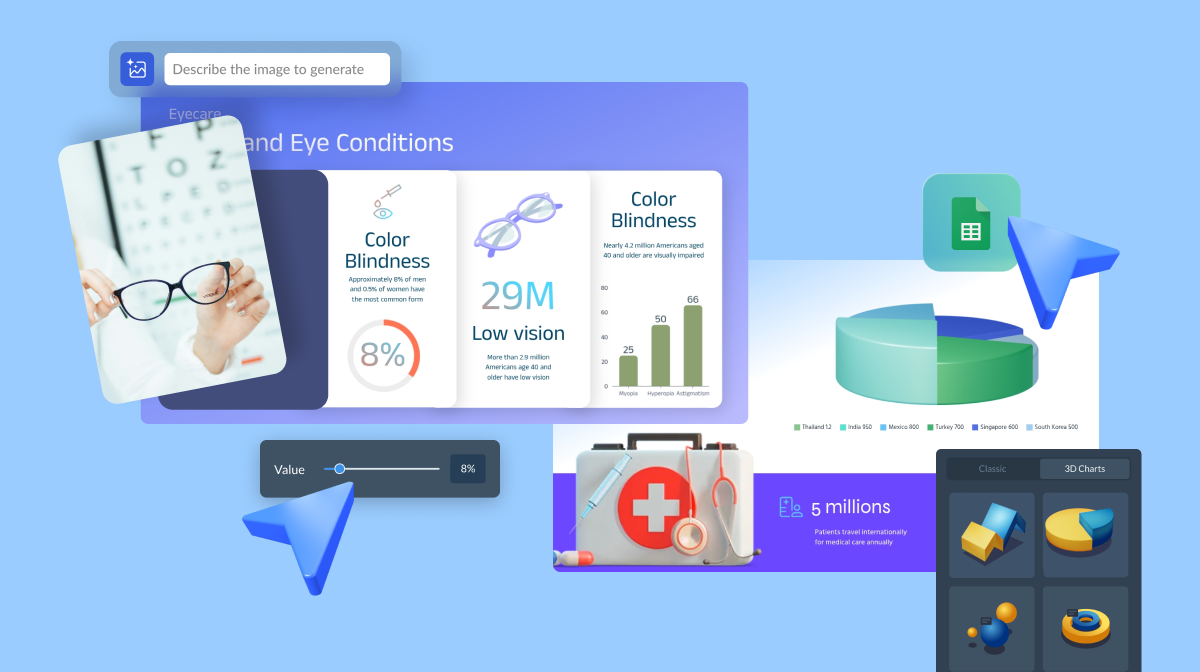
Here’s a short selection of 8 easy-to-edit data visualization templates you can edit, share and download with Visme. View more templates below:


Data visualization is the graphical representation of data or information. The term data visualization encompasses charts, graphs, infographics, dashboards and several other visual representations.
But why is data visualization important?
David McCandless remarks in his book, Information is Beautiful.
“Visualizing information makes it accessible and understandable to everyone, breaking down barriers to knowledge and comprehension.”. And he’s right, data visualization is a type of communication that supports the exchange of information in any scenario, be it business, health or everyday life.
Data visualization can take many different shapes and forms. Many of them are commonly used by all kinds of professionals, marketers, educators, researchers and students.
In the table below, you’ll find several types of data visualizations, with information about what they are and what they’re best used for.
You’ll also see some links that will take you to reading material on the topic and templates that will help you create the charts.
| Type of data visualization | What is it | Example Use Cases |
| Pie Chart | Circular chart divided into slices showing parts of a whole. Works best with 2-3 categories. | Customer breakdowns, revenue by product and operating expenses.. |
| Pyramid Chart | Shows hierarchy levels with the largest category at the top. | Organizational charts, demographic age groups and skill levels. |
| Funnel Chart | Shows step-by-step completion rates. | Comparing groups, finding outliers, and summarizing large datasets. |
| Box Plot | Shows data distribution using five key points (min, medians, quartiles, max). | Comparing groups, finding outliers and summarizing large datasets. |
| Radar Chart | Performance reviews, product comparisons, and competitive analysis. | Performance reviews, product comparisons and competitive analysis. |
| Bar Graph | Horizontal or vertical bars depicting values on an x/y axis chart. | Rankings, category comparisons, survey results. |
| Line Graph | Connected points on one or more lines showing changes over time. | Sales trends, website traffic and temperature changes. |
| Area Chart | Line chart with filled areas underneath. | Trends over time, comparative analysis and volume changes. |
| Maps | Geographic displays of location-based data. | Sales by region, population density, store locations. |
| Infographics | Combines charts, text and images to tell a story. | Marketing materials, annual reports and statistical analysis. |
| Dashboards | Multiple charts and KPIs in one view. | Business monitoring, executive reports and real-time tracking. |
| Tables | Data in rows and columns. | Detailed comparisons, exact values, small datasets. |

Jeff Su was right when he said, “All of us work with data regardless of our role. But very few of us were taught how to analyze data in a structured way.” Thankfully, AI can help.
Aside from directly creating data visualizations with online tools or software, another data visualization technique you can try is using AI prompts and Custom GPTs.
But, what can AI Prompts and Custom GPTs do for you? For starters:
So, here are some AI prompts to support your data visualization processes and analysis.
I work in the [industry/role]. Analyze this dataset and identify insights that would be most valuable for [specific business goal]. Focus on actionable findings that could inform decision-making.
Our company is [company name], we operate in [industry] and our main products/services are [brief description]. We're based in [location] and our target market is [target audience]. Research our top 3 competitors, compare their market share, strategies, pricing, and customer demographics to ours. Analyze our competitive position and highlight specific opportunities where we can gain competitive advantage.
Clean this dataset so I can analyze it properly. Fix any issues that would prevent accurate analysis, including duplicates, missing values, formatting problems, and obvious errors. Prepare the data for statistical analysis and show me the results in a spreadsheet.
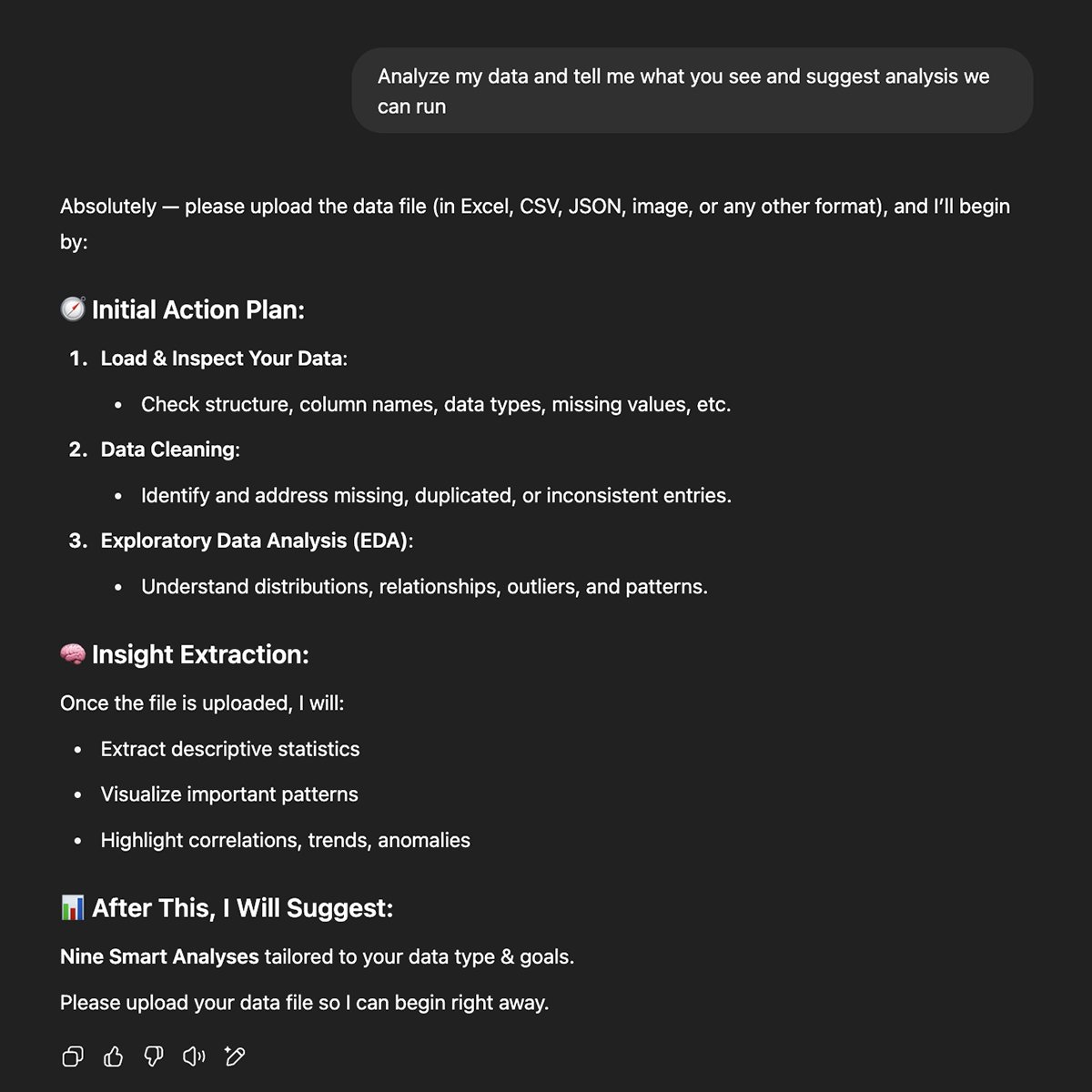
People create Custom GPTs to help with specific tasks. Like, in this case, the team at AI Web Tools created one for data analysis and reporting.
To use the data analysis and Report AI custom GPT, just open it and select one of the pre-written prompts. When you open them, they offer a list of instructions to get the most out of the prompt.
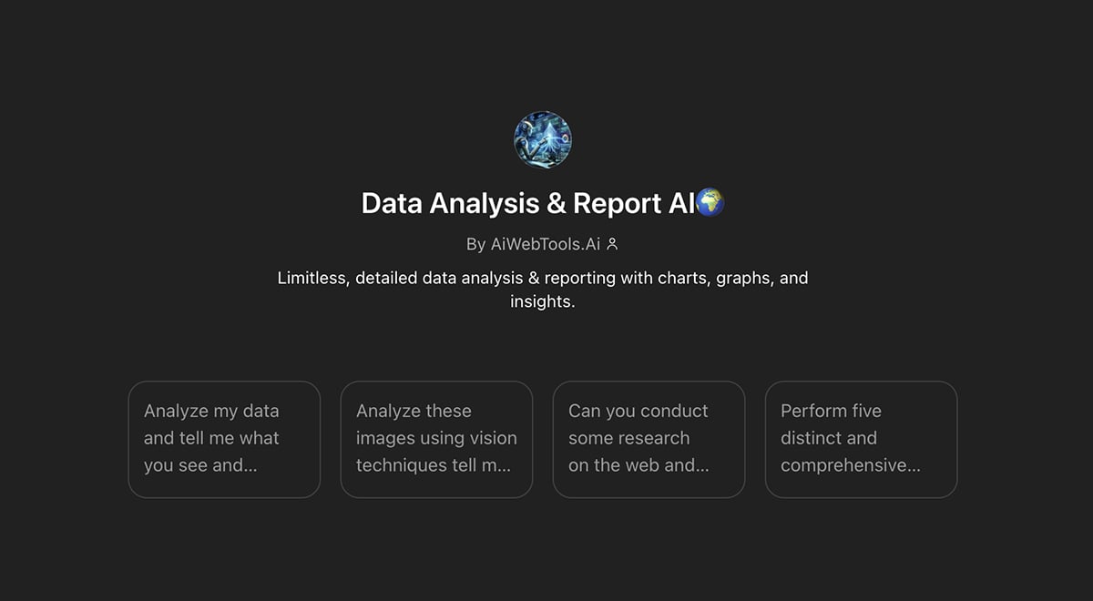
The options are:
This custom GPT was created by the ChatGPT team at OpenAI. It’s simple. The instructions say, “Drop in any files and I can help analyze and visualize your data.”
The trick to this one is to know how to continue the conversation with the GPT. For that, you can use the DIG framework. DIG stands for Description, Introspection and Goal Setting. Each step includes a set of prompts to help you visualize and analyze your data.
Here’s a video from Jeff Su with details about how to use the DIG Framework. It’s a good watch!
Finally, you can also try Visme’s AI Chart Generator. With this AI tool, you can easily create first-draft pie charts, mekko charts, scatter plots and more. Once generated, you can finalize your chart design by personalizing the colors, fonts and visual settings.
To use the Visme AI chart maker, write a descriptive prompt like:
Plot a line chart of monthly real estate sales for a year to analyze trends and identify peak sales periods throughout the year.
Upload your Google Sheet with the data, and let the generator do its thing.
Whenever I search for visualization examples, I’m naturally drawn to the best, most beautiful and complex visualizations. I love them so much and want to share them all with you.
But those types of visualizations are not the ones we tend to see in a business setting. And while they are inspiring, they can also be misleading, especially if you want to know what works in real-world scenarios.
To make this more valuable for you, I’ve combined some of these creative data art examples with more classic visualizations to inspire you.
Here are 10 of the best data visualizations that will impress and inspire you to make your own.
This data visualization from Australia’s ABC News aims to share the reasons behind the Big Mac’s price increase. I chose this example because it turns abstract data into relatable visuals.
They could have used a regular line chart and called it a day. Instead, they added a Big Mac to each data point and made the whole thing interactive. To experience the complete visualization and analysis, click on the image below.

Source: Information is Beautiful Awards
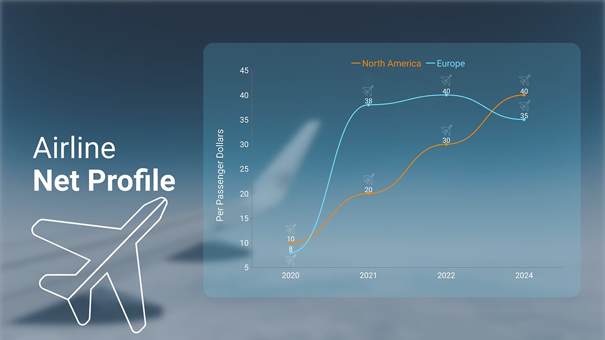
Easily apply this idea to your own line charts. Below is a Visme template that goes beyond a simple line chart. The background image adds depth, helping the lines stand out against the foreground. Browse Visme’s icon gallery to find airplane visuals and place them on the data points.
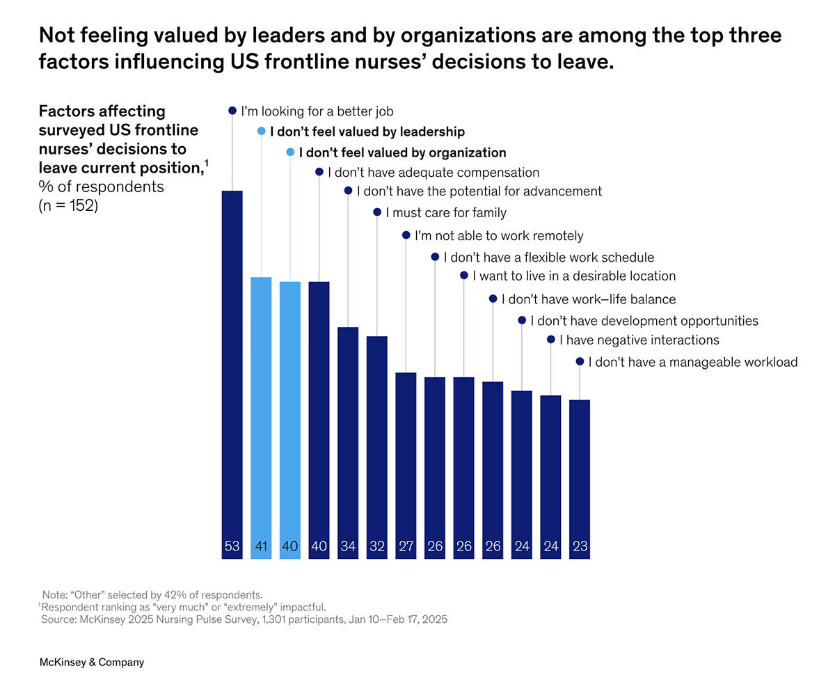
This visualization from McKinsey reveals that 41% feel undervalued by the leadership in their job and 40% don’t feel valued by the organization. Visually, the bars in this graph are organized by value from highest on the left and decreasing towards the right. This is possible because there’s no time element to the data.
Additionally, two of the bars are colored differently from the rest, highlighting how so many nurses feel undervalued. This color differentiation is a second focal point for the information the analysts want the reader to notice.
Source: McKinsey
For your charts without time values, use the same approach and organize the bars from largest to smallest. This will create a visual hierarchy that helps bring attention to the most important information.
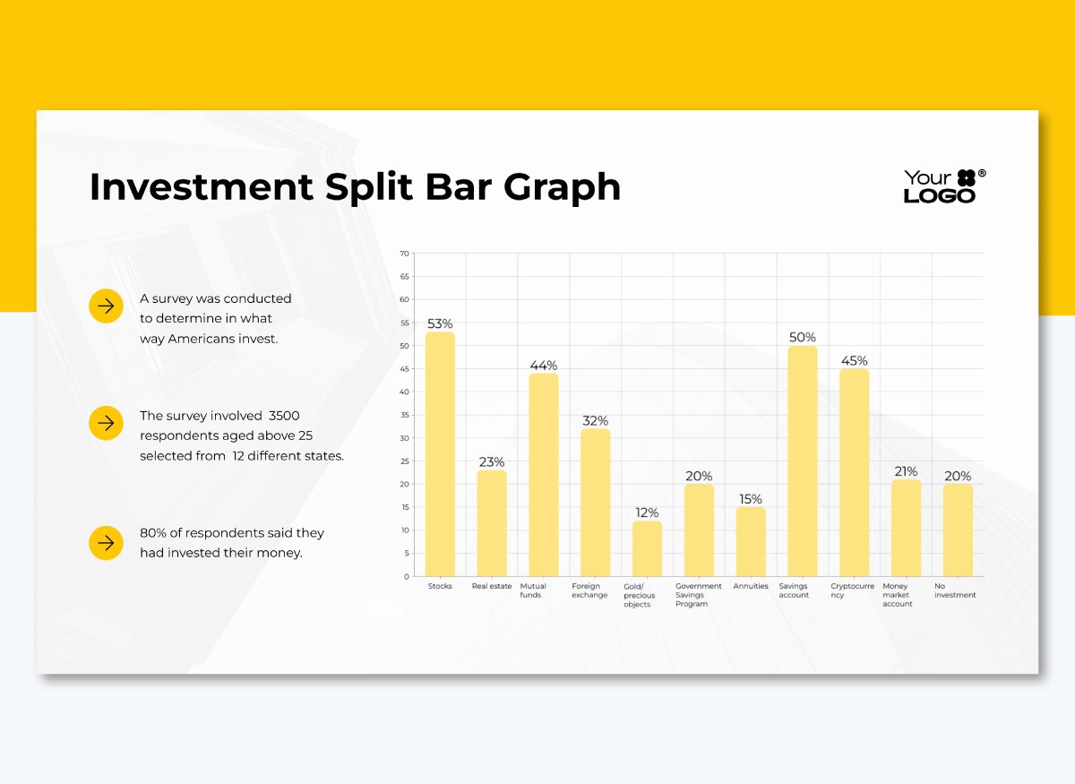
The bar chart template below serves as an ideal foundation for data visualization, much like the McKinsey chart above. Don’t forget to add a different color to the categories that you deem most important.
This data visualization was submitted to the Information is Beautiful Awards and unsurprisingly, made it to the longlist in 2024 due to its visual value. It’s an infographic depicting global public holidays in three categories: Political, Religious and Cultural.
The different sections in the infographic use unique visualizations to explain specific topics. For instance:
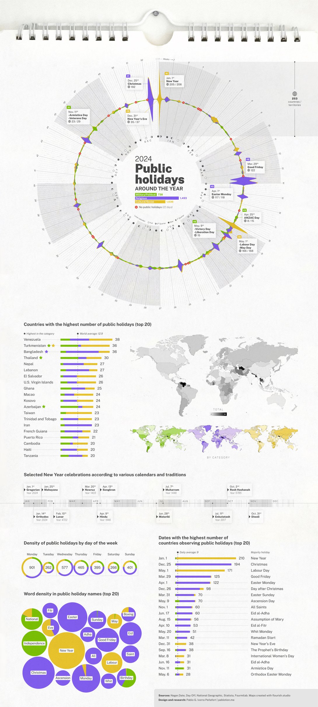
Source: Information is Beautiful Awards
Here’s an infographic template with data visualization statistics that’ll help you create something similar to the example above. The sections include percentage widgets and blurbs with large numbers but you can easily add line or bar graphs, pie charts, tables or maps.
Similarly to the public holidays infographic, use radial designs for cyclical data like seasons, months or recurring events. A circular format reinforces the concept of cycles and makes patterns more intuitive to spot.
This timeline visualization from the South China Morning Post traces papal history through creative visual storytelling. The design successfully compresses centuries of information into a scannable format by using color coding, clear labeling and evenly sized horizontal rows.
Some popes’ sections are accompanied by a visual representation and a description of their influence. And all popes called Leo are highlighted in bright pink.
I chose this infographic as an example because it effectively conveys a lot of information while also being visually appealing. The color palette is balanced and properly contrasted. The fonts are easy to read and the labeling is consistent throughout the design.
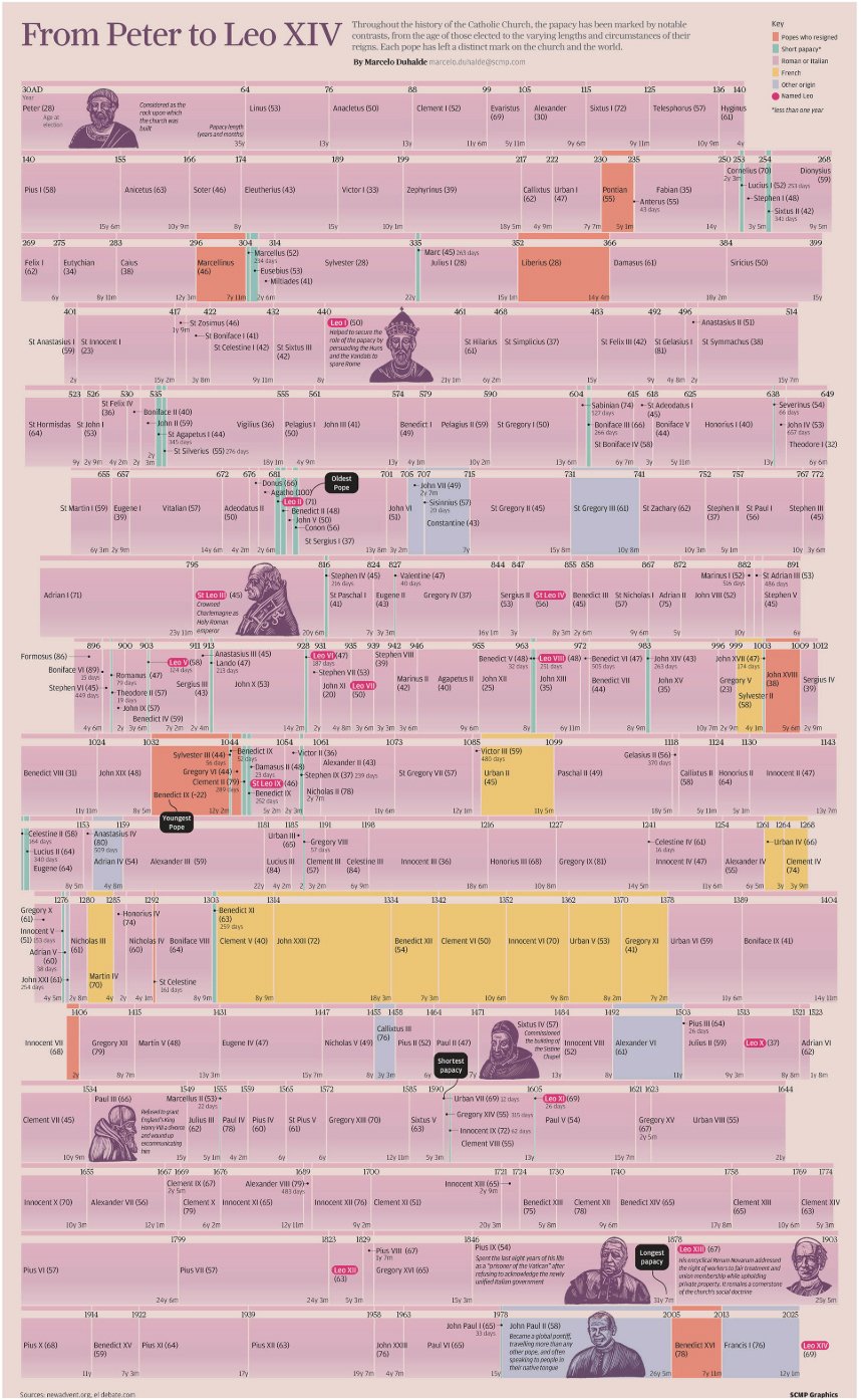
Source: South China Morning Post
Build your own timeline infographic using the template below. It has space for nine items, but you can reorganize the content easily to make room for more. Likewise, the Visme infographic editor includes a draggable bar to make it as long as you need it to be.
If you want to include more information than you can fit into your timeline, use interactive hotspots with images, text, video or audio. Include visual cues, such as point markers, to highlight the hotspots and ensure they are clearly displayed with instructions on how to close them to prevent overlap.
Timeline visualizations are a good option for educational materials in both academic and business environments. And when you create one with Visme, it’s easy to add it to your LMS using the SCORM and xAPI download options.
Next up is an interactive data visualization dashboard that combines multiple chart types to show emission data across countries, time periods and emission sources. The filtering options allow users to explore specific regions and time frames.
The visualizations that make up the dashboard are a line graph, a bar chart and a bubble plot; all interactive and filterable by regions and countries. It was created with Tableau, an ideal tool for this type of data visualization.
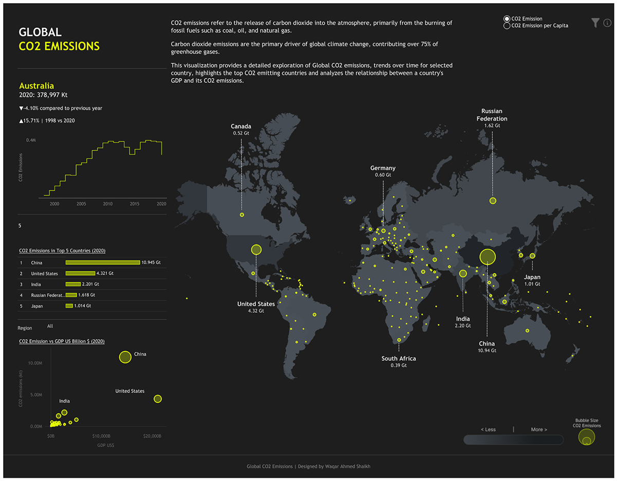
Source: Tableau
Did you know that if you create a data visualization like this one in Tableau, you can embed it easily into a Visme-made project? All you need to do is copy the iframe code and paste it into your project using the embedding option.
Visme user McKenzie Stonis from the Greater Memphis Chamber is excited about this feature: “Once we get up and running with Tableau and integrate it into Visme, the world is our oyster, and the possibilities are endless!”
Disclaimer: The code embed feature is available only for Enterprise accounts.
Now, if you want to create a dashboard with an interactive map using Visme, choose either a whiteboard or editor blank canvas first. Then, insert the charts and graphs in a distribution that makes sense for your data. Another option is to use the template below and customize it however you need, including colors, fonts and interactive features like animated popups.
Easily publish and share the dashboard through a Visme link and use our analytics feature to track who has opened it and how long they spent on it. This will help you keep track of team members who should regularly check the dashboard.
One of the best uses for data visualization is for social good. This is one such example. With this interactive bubble chart, you can learn about the ReconciliACTION initiative and how it engages participants along five steps: Following, Endorsing, Contributing, Owning and Leading.
The designers were aware that not everyone who explored the visualization would know what ReconciliACTION is about, so they ensured that a link to the website with the full story was included. That said, they did include a small introduction that sets the stage for the viewer.
All the bubbles reveal information when you hover over them and there’s a filtering system at the bottom of the chart. By using the filtering options, you can discover the information more clearly.
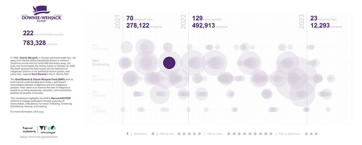
Source: Tableau
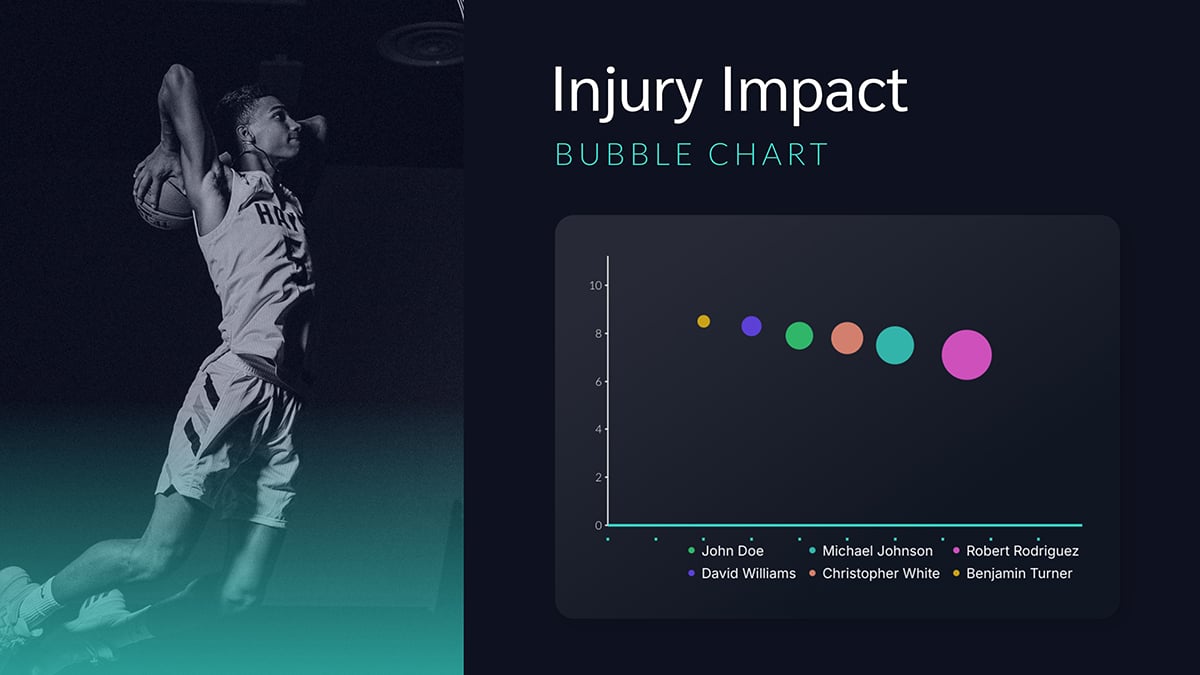
Are you looking for a bubble chart template to analyze three different data sets that relate to each other? Here’s one from the Visme gallery that you can use straight away.
This scatter plot example is one of several charts in a scrollable report that presents data visualizations on how 70 million girls in Sub-Saharan Africa face diverse challenges and opportunities. In this particular section of the report, the scatter plot visualizes the correlation between school enrollment and marriage rates.
Each dot represents a country, which you can click on to see a more detailed breakdown using the legends described at the beginning of the report. This categorization separates the girls into groups based on their living situation.
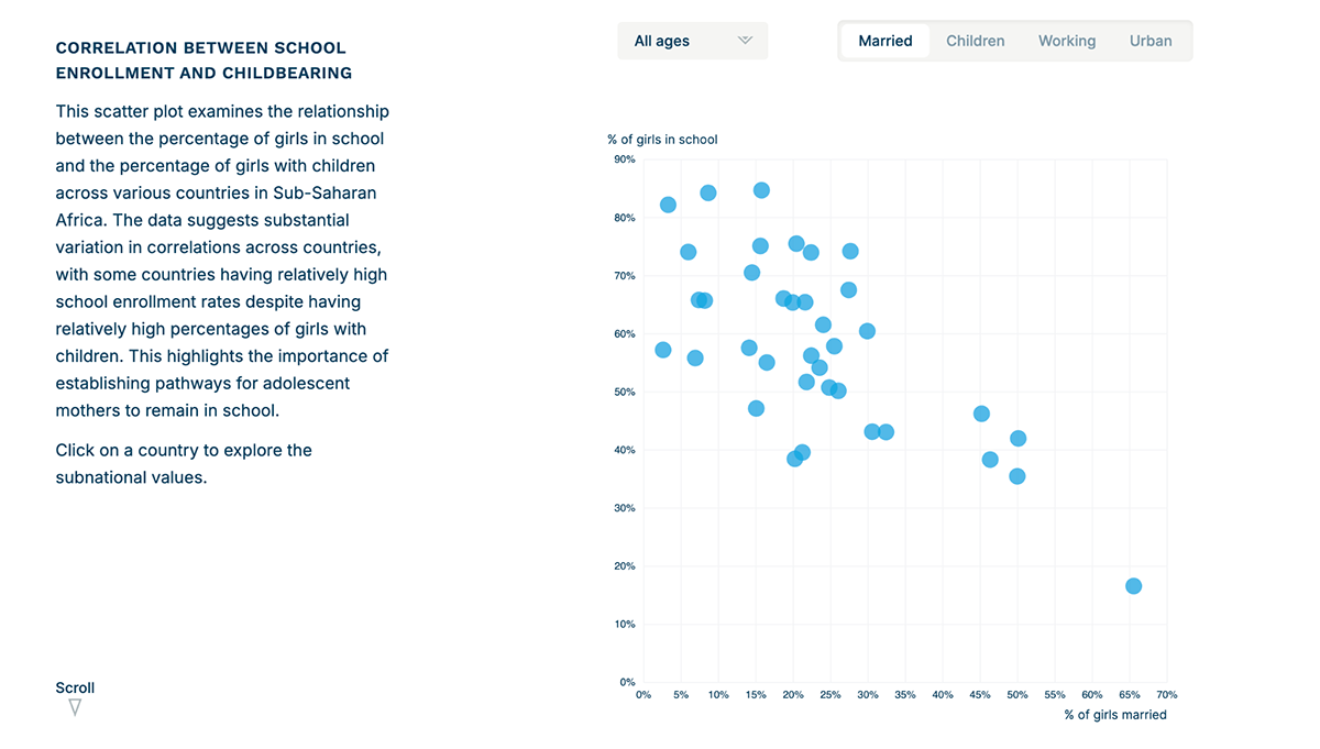
Source: The Population Council
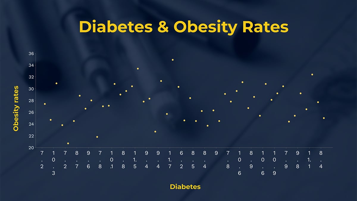
If your data involves correlations between groups, a scatter plot will help you visualize them. At Visme, we have several templates to help you create your scatter plots. This one below analyzes the relationship between diabetes and obesity rates.
Another data visualization I’d like to show you is this table. It’s a comparison table created by Semrush to visualize the decline of Google and other search engines after the release of ChatGPT.
What I’d like you to notice is how the table has several color-coded elements. First of all, the left column interchanges two tonalities of blue to make the content easier to read. Then, for the data columns, light red depicts negative values and light yellow, positive values. Additionally, the lowest negative value is represented by a darker red, and the highest positive value is represented by a bright yellow.
I chose this example to illustrate how a simple table can offer in-depth data analysis on a topic. The trick is in how you set up the cells and the color palette you apply to them.

Source: Semrush
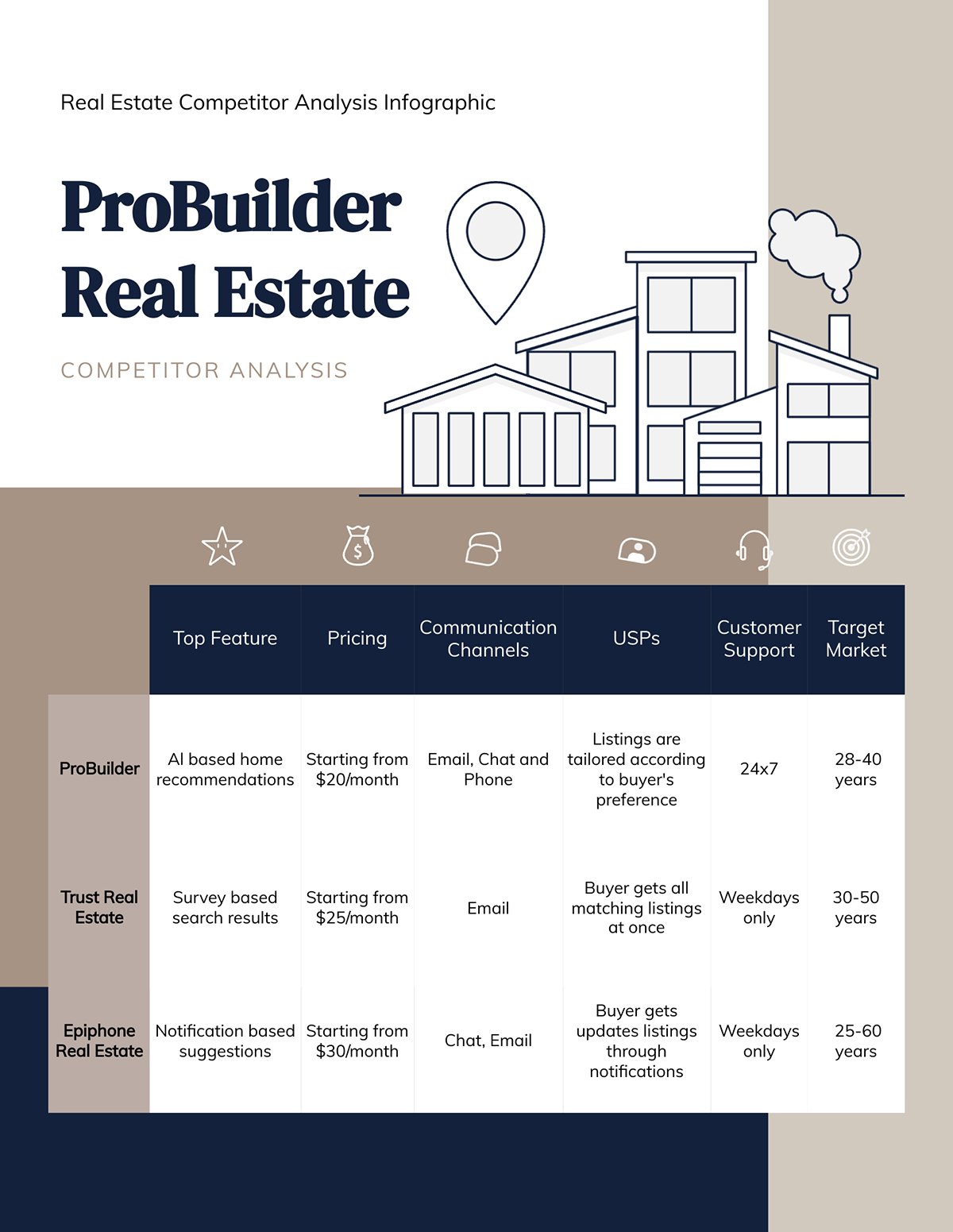
Here at Visme, we have several table templates to help you create a comparison analysis of your own. This one below, for example, compares real estate competitors in an infographic layout. The best part? The table is surrounded by brand content that supports the information, making it easier to share with stakeholders or clients.
In case you didn’t know, creating brand content is easy with Visme. The first step is to use the Brand Wizard. Input your website URL, confirm the logos, colors and fonts. The wizard will create a set of branded templates. You can then add a data table to any of them.
I am a fan of beautiful data visualizations that incorporate lots of details, making them stand out and win prizes. However, I also appreciate the simple charts that convey information clearly and concisely.
This line chart, for example, visualizes the life-threatening hike of Fentanyl overdoses from 2016 to 2022. Two noticeable markers highlight the moments in which the CDC issued new guidelines for prescribing opioids and when the COVID-19 pandemic occurred. To make the Fentanyl line more prominent, it’s in red, contrasting with all the other colors in the visualization.
The entire report, where this line chart makes an appearance, is called Beyond the Opiod Crisis and you can view it through the link below. There are several other visualizations that might look more impressive than a line chart, but it’s this one that really makes an impression.
Much like Garr Reynolds shares on his website:
“The only rule concerning the display of data—besides telling the truth—is simplicity. You can achieve simplicity in the design of effective charts, graphs, and tables by remembering three fundamental principles: restrain, reduce, emphasize.”
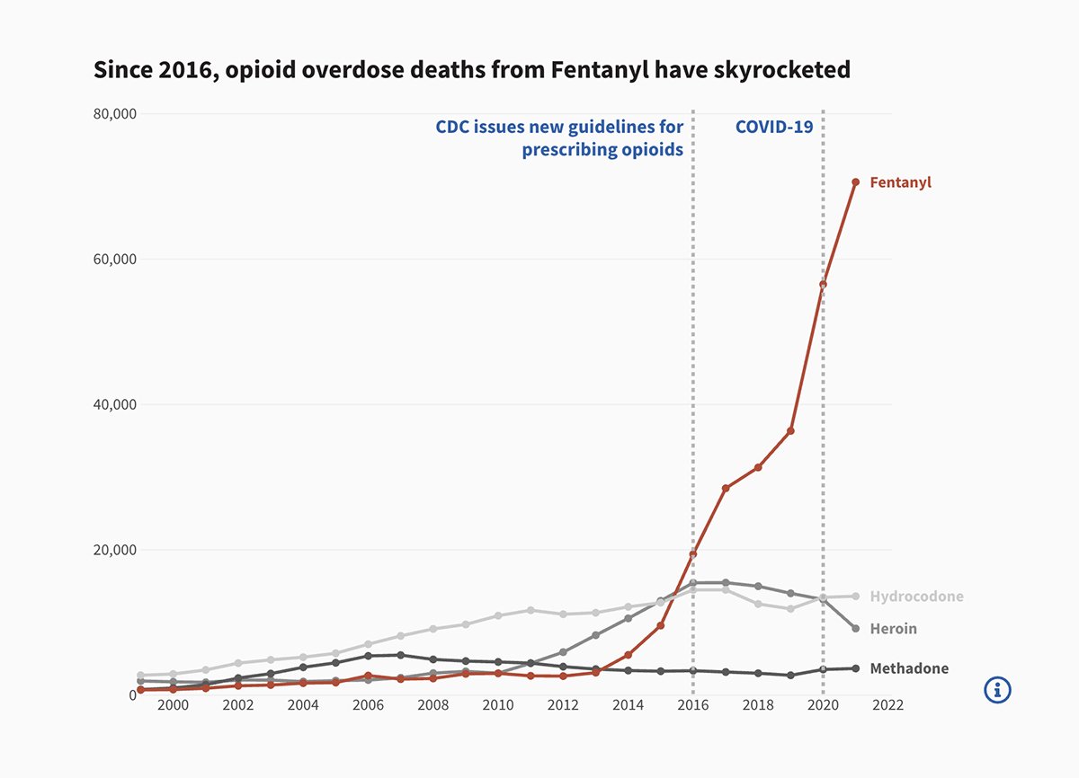
Source: Beyond the Opiod Crisis
Line charts are common in reports, dashboards, tracking apps and more communication documentation. Visme’s line charts are versatile in that you can add one to any project you’re working on.
This template, for example, is an ideal starting point to create a visually interesting line chart for your data. Use the graph builder to customize everything about your chart: match the colors and fonts to your brand, change the background and supporting visuals or change the settings for the x/y chart.
Just click on the template below to get started.
The last data visualization I have for you is one of those beautiful and complex examples that combine data with art. It’s called The United States of Abortion Mazes. This example not only shows the differences in each state’s laws about abortion, but it also invites the viewer to engage with the mazes to find out more information.
This is a beautiful example of how gamification can be involved in data visualization in order to make it more impressive, engaging and memorable. Since each maze represents a state, they’re organized in a choropleth style distribution that resembles the map of the United States. As you travel the mazes and learn about the state’s abortion laws, a counter keeps track of how many you’ve done.
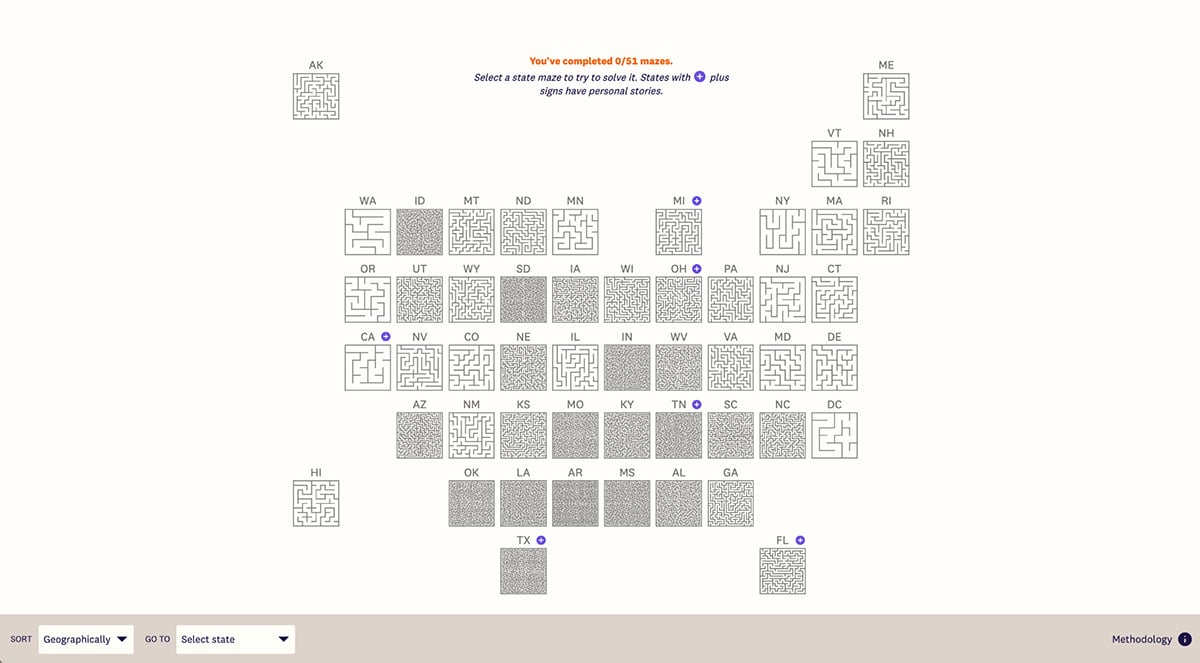
Source: United States of Abortion Mazes
Do you want to make your own choropleth map visualization for your data? Here’s a practical template to help you get started. This map features hover options that display important information for the viewer when hovering over countries.
To create data visualizations as impressive as the examples I showed you, you need the right data visualization tool to help you. In this chart, I list ten of the best options available online besides Excel.
| Tool | Key features | Pricing | Best For | Core Uses | G2 Rating |
| Visme | Customizable charts and infographics, AI tools, animation and interactivity, collaboration and workflows, analytics tools, robust template library, millions of design assets, brand kit | Free; Paid plans from $12.25/month | Non-designers, marketers | Presentation-ready charts, maps, infographics, interactive visuals, social media graphics with animations, and marketing materials | 4.5 / 5 (450+) Reviews |
| Tableau | Advanced and interactive dashboards, real-time data analysis, AI-powered insights, real-time collaboration, geospatial visualization | From $15/user/month | Data analysts, enterprises | Complex data visualization, real-time analytics, storytelling dashboards | 4.4 / 5 (2800+ Reviews) |
| Infogram | Drag-and-drop chart creation, AI chart suggestion, analytics, data import, brand kit, customizable templates | Free; Paid from $19/month | Content creators, educators | Designing visually engaging charts, maps, and infographics | 4.7 / 5 (180+ Reviews |
| Whatagraph | Automated data visualizations, data grouping and aggregation, reusable blocks and prebuilt widgets, customizable report and dashboard templates | Flexible pricing: Request a quote | Agencies, marketing teams | Custom client reporting, visual marketing performance analytics | 4.5 / 5 (280+ Reviews) |
| Chartblocks | Simple online chart creation, wide range of chart types, customizable designs, data import and export | Free | Small businesses, educators | Quick creation of custom charts for presentations and web integration | 4.5 / 5 (11 Reviews) |
| DataWrapper | Easy-to-use responsive charts, data import and integration, customization options, team collaboration | Free; Paid starts at $599/month | Journalists, researchers | Visualizing survey data, news insights, and academic research | 4.3 / 5 (10 Reviews) |
| Google Charts | Free and customizable charts, multiple chart types, customization tools, real-time data update, team collaboration | Free | Developers | Creating embeddable charts for websites and applications | 4.2 / 5 (511 Reviews) |
| RAWGraphs | Open-source web app with a data visualization builder for | Free | Data analysts, information designers. | Creating custom charts not available in other tools. | 4.4 / 5 (5 Reviews) |
| Flourish | No-code interactive data visualizations, 150+ templates, scrollytelling, live data connections, and mobile-responsive embedding | Free; Paid plans upon request | Journalists, marketers, educators, and businesses creating data stories. | Creating Interactive charts, animated maps, scrollytelling stories, and educational data narratives | 4.8 / 5 (2 Reviews) |
| Sisense | Embedded interactive visualizations, embedded analytics, AI-driven insights, data modeling and connectivity, cloud deployment | Pricing upon request | Enterprises | Creating BI dashboards with advanced drill-down capabilities | 4.2 / 5 (1027+ Reviews) |
In simple terms, data visualization converts any type of data into a visual representation, making it easier for more people to understand.
The best tool depends on your needs and skill level. For non-designers and marketers, Visme offers user-friendly templates and AI assistance. Data analysts, on the other hand, prefer Tableau for advanced analytics, while journalists often choose RAWGraphics or Flourish for interactive storytelling.
Data visualization is everywhere. You see it in fitness apps that track your steps, Netflix recommendations based on your viewing habits, stock market charts, election results maps, restaurant reviews on apps, and sports statistics during games.
Visme lets you create professional charts, graphs, and infographics without any design experience. You can use customizable templates and AI-powered suggestions to build your visuals. Then, you can easily share or embed them in presentations and websites.
Interactive data visualizations are unique in that they appeal to several of the five senses: to the sense of hearing through audio, the sense of sight through stunning visuals and the sense of touch through the interactive experience of clicking, hovering and scrolling through content.
While you may think that data visualizations are too costly and time consuming to produce on your own, you can explore several free tools out there that allow non-designers and non-programmers to create their own interactive content.
Visme, for example, is an online tool that allows you to create interactive charts, graphs and maps. Sign up for a free account today and start visualizing data in creative and engaging ways.
Design visual brand experiences for your business whether you are a seasoned designer or a total novice.
Try Visme for free