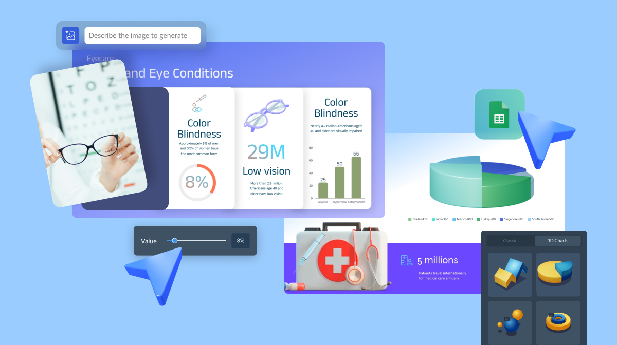


Healthcare Data Visualization: How to Turn Data into Impactful Stories

![The 30+ Best Data Visualizations of 2026 [Examples]](https://visme.co/blog/wp-content/uploads/2026/02/BH_0226-Refresh_29_Infographic_Statistics_You_Need_to_Know.png)
Data is beautiful; it can inspire, improve lives and bring out the best in people. To keep you inspired, we’ve gathered the best data visualizations of 2026.
The chosen works cover a variety of topics from NASA asteroids in space to environmental issue statistics and futuristic LIDAR data graphs.
With over 5.35 billion people using the Internet in 2025, we’re sure to witness even more amazing data visualizations every year. For now, get ready to dive into 2026’s best data visualization examples.
This list includes award winning designs so you can get inspired by the best of the best!
If you want to visualize your data, check out our graph maker or chart maker, which turns your numbers into beautiful figures. Or check out our collection of customizable chart and graph templates for all your data visualization needs.
*Disclaimer: The comparisons and competitor ratings presented in this article are based on features available as of February 19, 2024. We conduct thorough research and draw on both first-hand experience and reputable sources to provide reliable insights. However, as tools and technologies evolve, we recommend readers verify details and consider additional research to ensure the information meets their specific needs.
new: Nasa
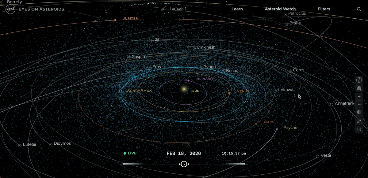
If you are interested in exploring data visualization topics in space exploration, check out this striking data visualization created by NASA.
NASA's Eyes on Asteroids is one of the best data visualizations due to its exceptional design and functionality. This interactive visualization allows users to explore the asteroid belt and see the real-time positions of asteroids in our solar system.
The design of this visualization is highly engaging and visually stunning, with a sleek and modern interface that is easy to use. The visualization features a 3D solar system model, allowing users to zoom in and out to explore asteroids and other celestial bodies.
One of the key features of NASA's Eyes on Asteroids visualization is its real-time data feed, which provides up-to-date information on the positions and trajectories of asteroids. This feature makes the visualization highly informative and relevant to current events, allowing users to track potentially hazardous asteroids and see their projected paths over time.
Design your own space exploration infographic using Visme. Allowing you to create data visualizations easier and faster.
Get inspired by one of our loyal Visme users, MacKenzie Stonis, Economic Research Analyst at Greater Memphis Chamber, who said:
"I have enough complications in life; I don’t need my report-building tool to add any fuel to the fire,” she laughs. “I personally had experience with similar applications before Visme and found their tools weren’t as user-friendly as Visme, and their tools didn’t handle data very well. They didn’t provide the solution I really wanted."
When graphic designer Shane Mielke published his book, Launch It, he also designed an amazing online data visualization depicting where his book could be purchased. This interactive data viz is a spinnable world map showing live data of where the Launch It book can be acquired. To make it more interesting, the user can change the colors of the map and shapes of the markers.
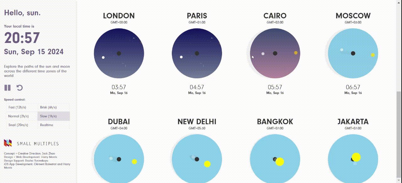
The Hello Sun app created by Small Multiples, is a live data viz for your phone. The main dashboard visualizes the movement of the sun and moon in the sky in numerous cities in the world.
The movement is depicted in circular sky maps that change color as the sun rises and sets. Each city is illustrated by a major landmark which is only seen when the sun creates a shadow of it.
The app also lets the user know how sun behaves anywhere in the world through GPS coordinates. That way, they can plan out a veggie garden or know if the apartment they want to rent will have sun in the afternoon.
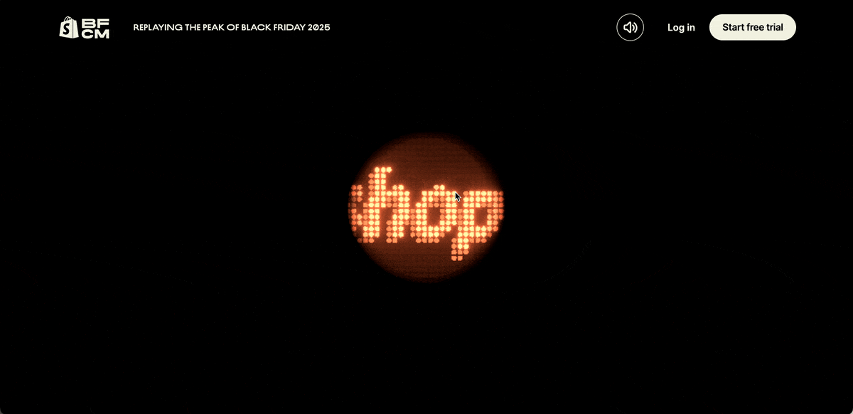
Every year for Black Friday and Cyber Monday, Shopify releases a real-time, globe-shaped interactive visualization of all sales made by merchants throughout the period. The visualization is only available in real time during BFCM, but you can still watch the sales climb in the replay.
The 2025 live globe is built around a playable pinball machine for an extra fun factor and the 3D environment is filled with elements that encourage you to play around and see what happens. Occasionally, green streaks of light swirl around the globe, representing sales made by Shopify merchants, in different parts of the world.
While it’s a very interactive visualization, the Shopify Live Globe is a bit sparse on actual data. You can see peak sales and orders per minute, but not the total numbers and though it is clear that sales are concentrated in the USA and Europe, the visualization doesn’t show just how much.
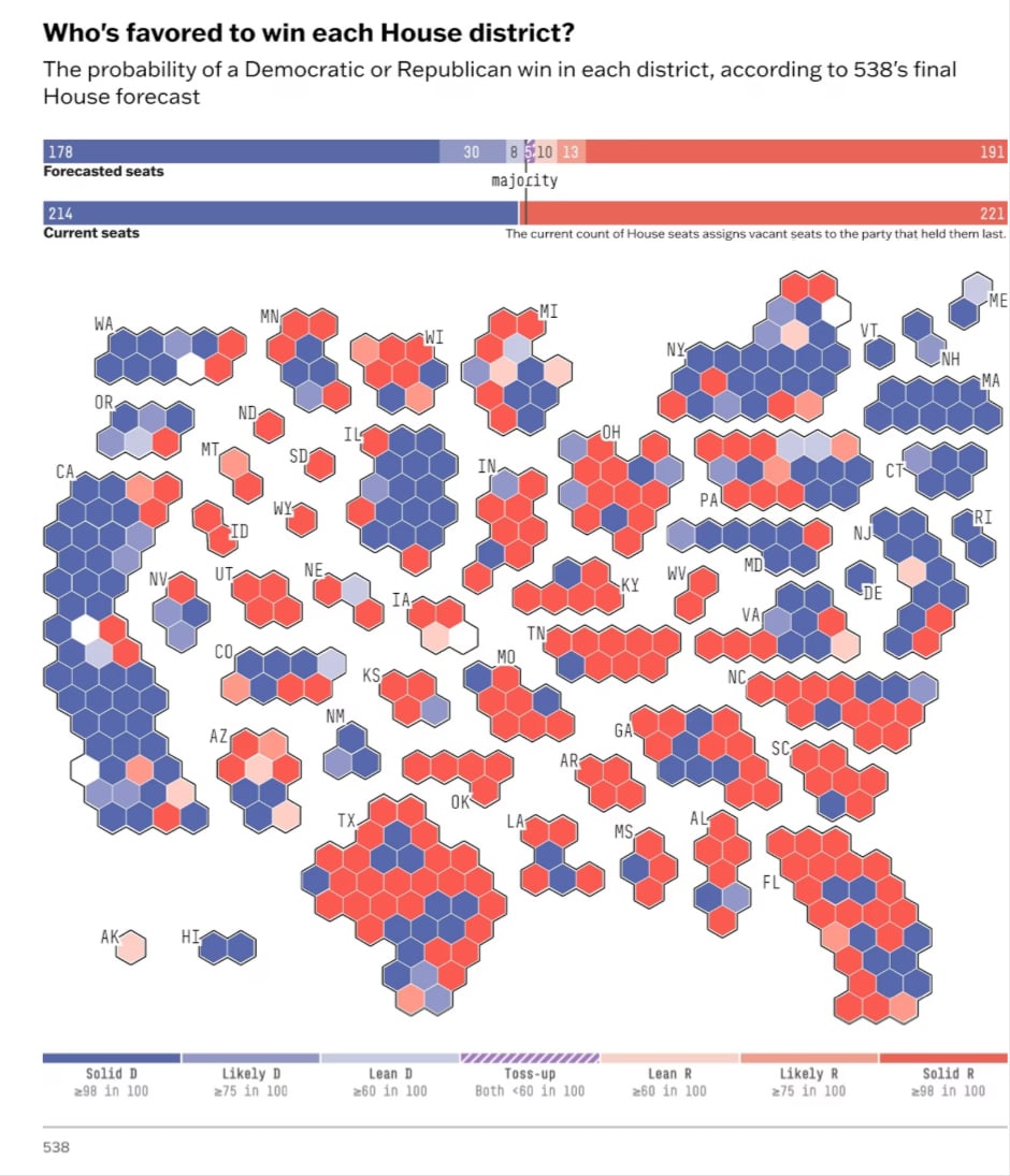
This election forecast visualization comes from 538 and shows who is likely to win each U.S. House district in 2024. It uses probability data to estimate whether a Democrat or a Republican is favored in every district.
The map is made up of small hexagons grouped by state. Each hexagon represents one House district. Blue shades indicate a Democratic advantage, while red shades indicate a Republican advantage. Darker colors indicate a higher likelihood of winning, while lighter or striped areas indicate close races or toss-ups.
At the top, it uses bar charts to compare forecasted and current seats and shows how many are needed to reach a majority.
At a glance at this map, you can quickly spot regional patterns, competitive states and areas that could decide control of the House.
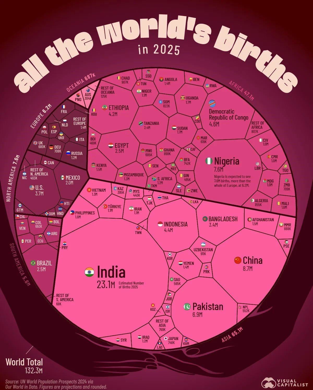
The world population is growing at a steady rate. There have never been more people on the planet at any time in history than now.
This enormous chart by Visual Capitalist visualizes the estimated number of births in major countries worldwide.
It shows India with the highest number of births of any country at 23 million, more than twice China's, the runner-up. Nigeria was projected to have about 7.6 million births, which is more than all of Europe combined.
This data visualization chart is easy to understand, explains its source, and has a subtle allusion to its subject matter in the globe-shaped womb. The continents are differentiated by color, and the countries with the highest birth rates are immediately apparent.
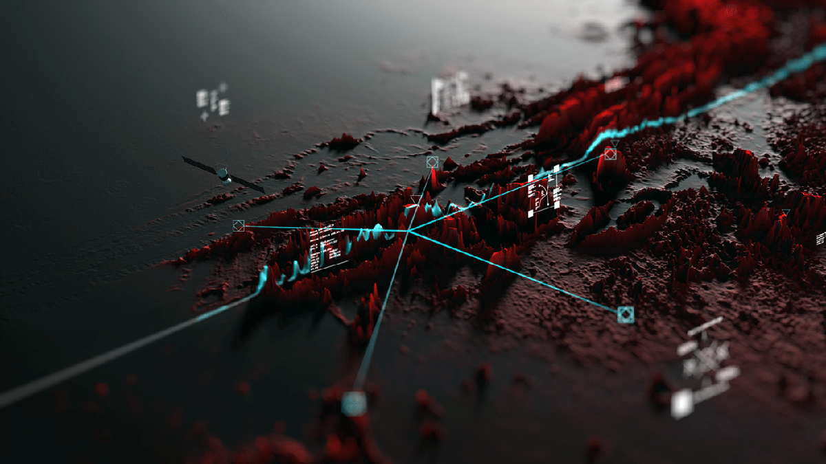
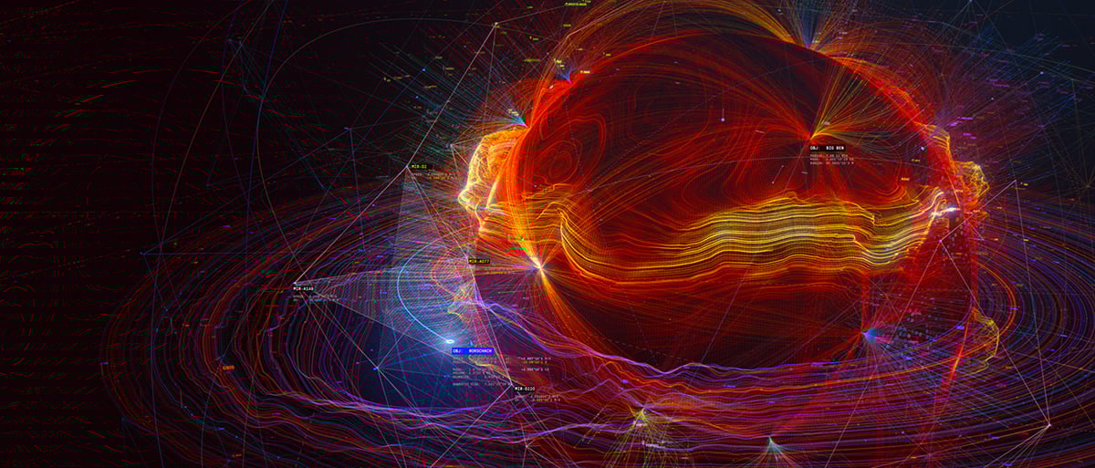
Vivid, rich in details. This 3D graphic uses beautiful data visualizations to share the vision of the future. Space missions and sending people into space are shown in an eye-catching red-grey palette.
The complicated animation of terrain exploration, space module flight and surface graphics is breathtaking. For a moment, you feel like a Mars mission crew member with your eyes on the stars.
The first data viz in our collection is the Codex Atlanticus. The Visual Agency, a data visualization group from Italy, has put together a beautiful digital library of Leonardo Da Vinci’s journals and notebooks. It’s the largest digital collection of his work to date.
But that’s not all—it’s all set up in a way that will amaze both data visualization fans and artists.
The Codex Atlanticus won the Gold Kantar Information is Beautiful Award in the Art and Entertainment category. For history and Leonardo Da Vinci buffs, this digital library is a rich resource for education and research.
For data visualization fans, this library is a wonderful example of how history can be digitized in a beautiful way, and it’s no surprise that it's part of our best data visualizations list.
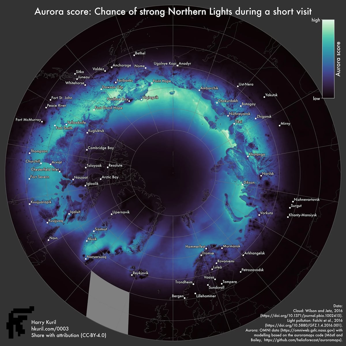
Aurora borealis is one of the most fascinating natural wonders of the earth. But the chances of seeing one in a lifetime are so small.
To increase his chances of seeing these ephemeral wisps of light, Harry Kuril, a cartographer with a background in geophysics from Cambridge and MIT, decided to research the areas that offered the best chances to catch a glimpse of the aurora.
This aurora score visualization showed a chart of areas with strong aurora, with clear skies from the cities below.
From his findings, depending on the night, time, and solar activity, some areas will be bathed in a river of light while others see no sign of the aurora. The map also suggested that cloud cover ultimately dashed any hopes of seeing the aurora.
If you’re a fan of space, you can learn more about Auroras from the NASA website or Space.
Try Visme, our all-in-one design for creating stunning visualizations on your favorite space elements or other research topics you’re working on.
You can get the most out of Visme’s integration with Google Sheets to create visualizations of live, easy-to-update data.
Simply link to your Google Sheets account or import through a link. Select the page and data range and connect them to your Visme chart. When data changes in the Google Sheet, it automatically updates the live project. Simply press the refresh button.
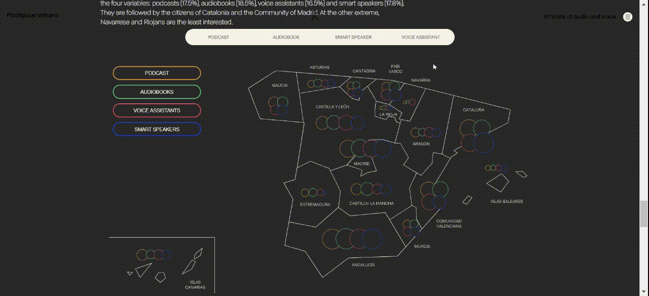
Prodigious Volcano is a data visualization agency based in Madrid that conducts research focused on human engagement and the impact of culture through media.
The IV State of Audio and Voice report is focused on how internet users residing in Spain engage with different types of audio expressions such as podcasts, audiobooks, voice assistants and smart speakers. Their methodology involves dividing their analysis into two dimensions: audio as a product and audio as a tool.
The report is heavily designed with interactive data visualization charts. Each visualization displays the data as a whole or segmented based on the audio method selected. This provides a better user experience for the reader as they can filter information and turn the data into easily digestible content.
This data visualization report has racked up multiple awards, including a Webby Award for People's Voice Winner for best data visualization in 2025.
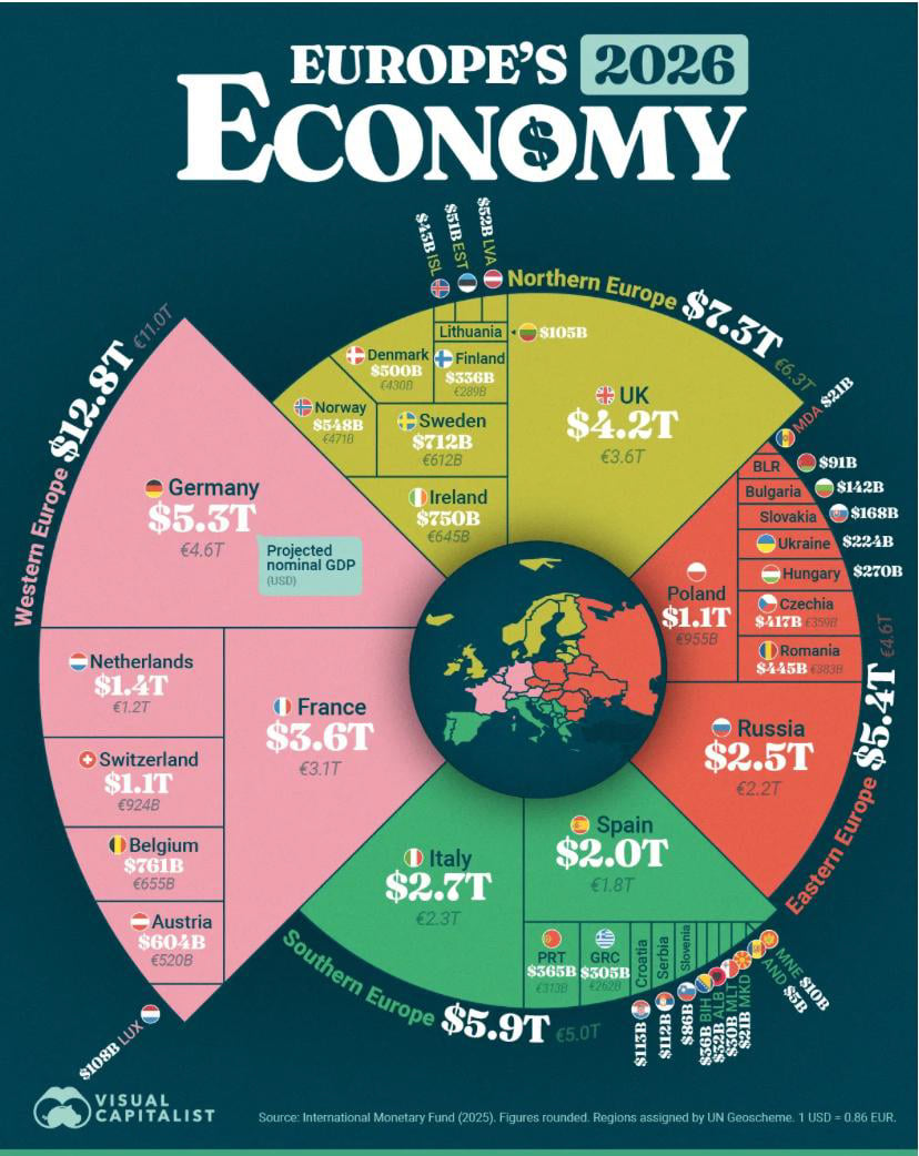
This is a prime example of how creative design can make data easy to understand. It uses a unique, colorful, radial layout, almost like a segmented pie chart, to showcase the projected size of Europe’s economies in 2026.
The graphic ranks every European country by projected nominal GDP in U.S. dollars and euros. Countries are grouped by region, such as Northern, Western, Southern, and Eastern Europe. Within each region, countries are sized by projected GDP.
Then, there’s a small map of Europe at the center, with the surrounding sections highlighting the largest economies like Germany, the UK, France, Italy, Spain, and Russia. The clear color coding and large shapes make it easy to see where most of Europe’s economic power is concentrated at a glance.
We at Visme invite you to take up the challenge and create informative infographics that can drive change across various industries. Use our amazing free infographic library to create graphics for your personal projects as well as corporate or brand presentations.
For more detailed info on the infographic creation, watch this video on the 13 major types of infographics.
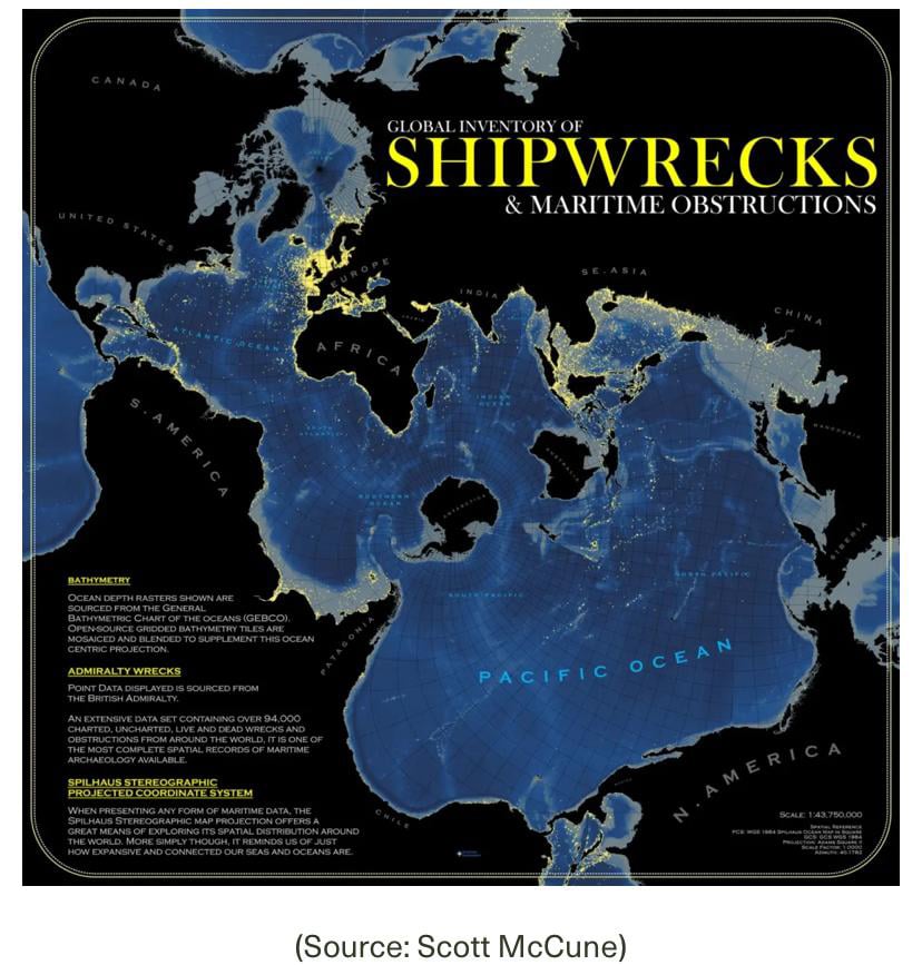
This map from Scott McCune highlights one of the most pressing issues in maritime space: the growing number of global shipwrecks. It includes more than 94,000 recorded wrecks and obstructions worldwide.
Each yellow point on the map marks a shipwreck, indicating where accidents have occurred and where they are most common. Another major highlight is the glowing effect used to show density. Areas with many wrecks shine brighter, making clusters easy to spot, especially around Western Europe and the Strait of Malacca.
The map uses an ocean-centered projection that places the oceans at the center. It also uses soft color shading to show ocean depth, with lighter grays indicating shallower waters.
If you’re working on an infographic that includes map data, like this example, try Visme’s map data visualization tool. It comes equipped with a handy hover tooltip that labels country names and square footage. If you don’t need to show this data, you can hide it in the Map settings.
Create demographic visualization easily with Visme’s map templates. If you need to edit your map infographic on the go, you can do so from the mobile app on Android and iOS.
Google, and its parent company, Alphabet, have long been at the forefront of artificial intelligence development. In 2017, a team at Google Brain invented the transformer architecture, which powers the major large language models used today. Earlier in 2013, the company showed that deep neural networks could drastically improve speech recognition accuracy.
“Our AI Journey” highlights Google’s contributions to computer science and breakthroughs in artificial intelligence, from its novel spell-check system in 2001 to its much-hyped image-generation and editing model, Nano Banana, launched in August 2025.
You can navigate the visualization using your keyboard or mouse as you move along the timeline, starting in 2001. The project was commissioned by the creative agency Hook and has won multiple awards.
It took 4 years to create this non-commercial self-funded project. Based on the eponymous sci-fi novel by Peter Watts, this visualization row includes breathtaking renders of the solar system, four-dimensional objects as a system of data visualization and manipulation, spacesuit interface renders, cryo capsule graphics and nonhuman species concepts.
The visualization received over a dozen awards and nominations, such as Best VFX Screen Power Film Festival 2020, Outstanding Achievement Award (Sci-fi Short) Indie Short Fest LA 2020, Winner Best Sound & Music Fantasy/Sci-fi film Festival 2021, Award Winner Flickfair 2020, Official selection Miami International Sci-fi Film Festival 2021 and so on.
Space mysteries have always tempted mankind. With the outstanding talent of the team behind the project, we hope to enjoy the related movie one day.
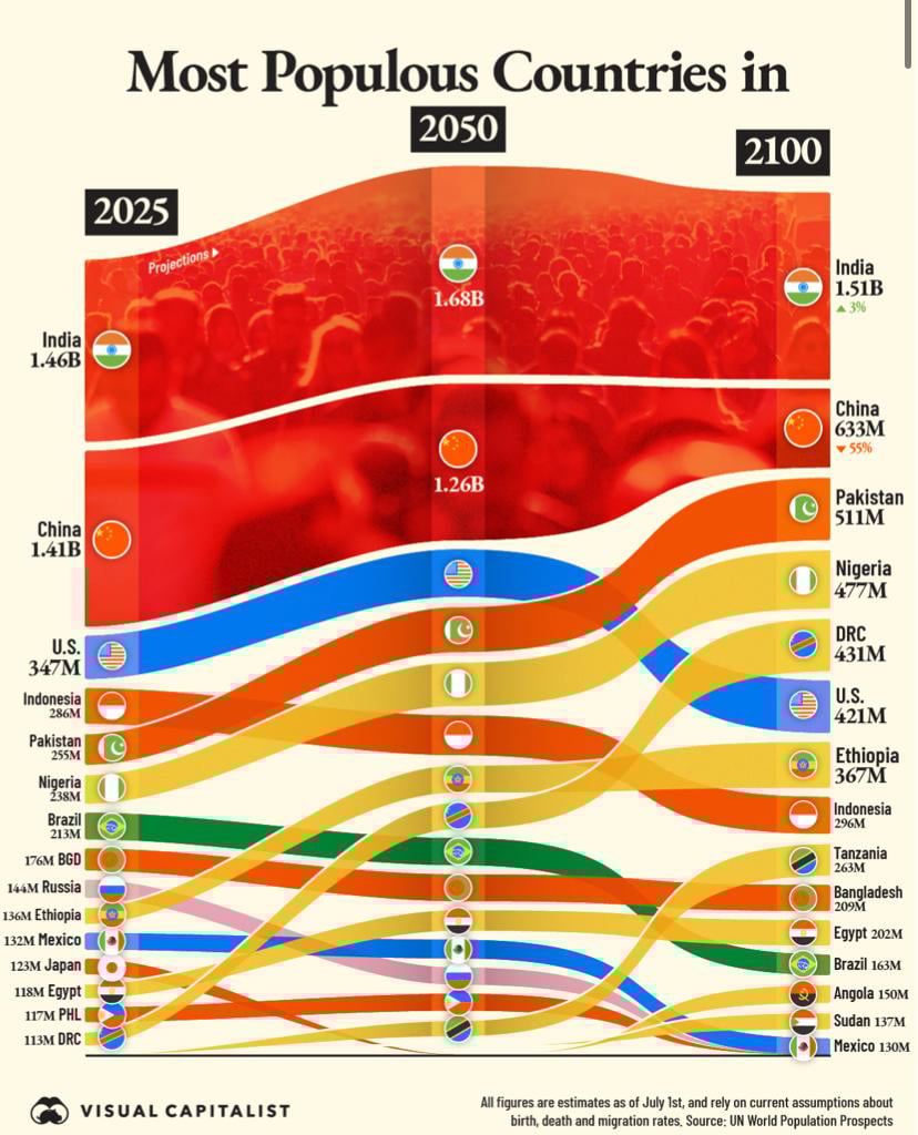
This chart makes global demographic momentum impossible to ignore.
Based on projections from the UN World Population Prospects, Visual Capitalist published this data visualization to show how the world’s most populous countries are expected to change from 2025 to 2100.
It presents a clear picture of global population shifts using a flowing, Sankey-style layout. Countries are ranked by total population in 2025, 2050, and 2100, with smooth, color-coded bands connecting each time period to show ranking movement.
One of the major highlights here is the dramatic regional shift in population growth. While China’s population is expected to decline significantly by 2100, several African nations, including Ethiopia, Tanzania, Angola, and Sudan, are expected to move up in the rankings. The flowing lines make these transitions easy to follow, clearly showing how demographic power gradually shifts toward Africa over the course of the century.
If you’re curious about global population trends, you can explore more projections through the UN’s World Population Prospects.
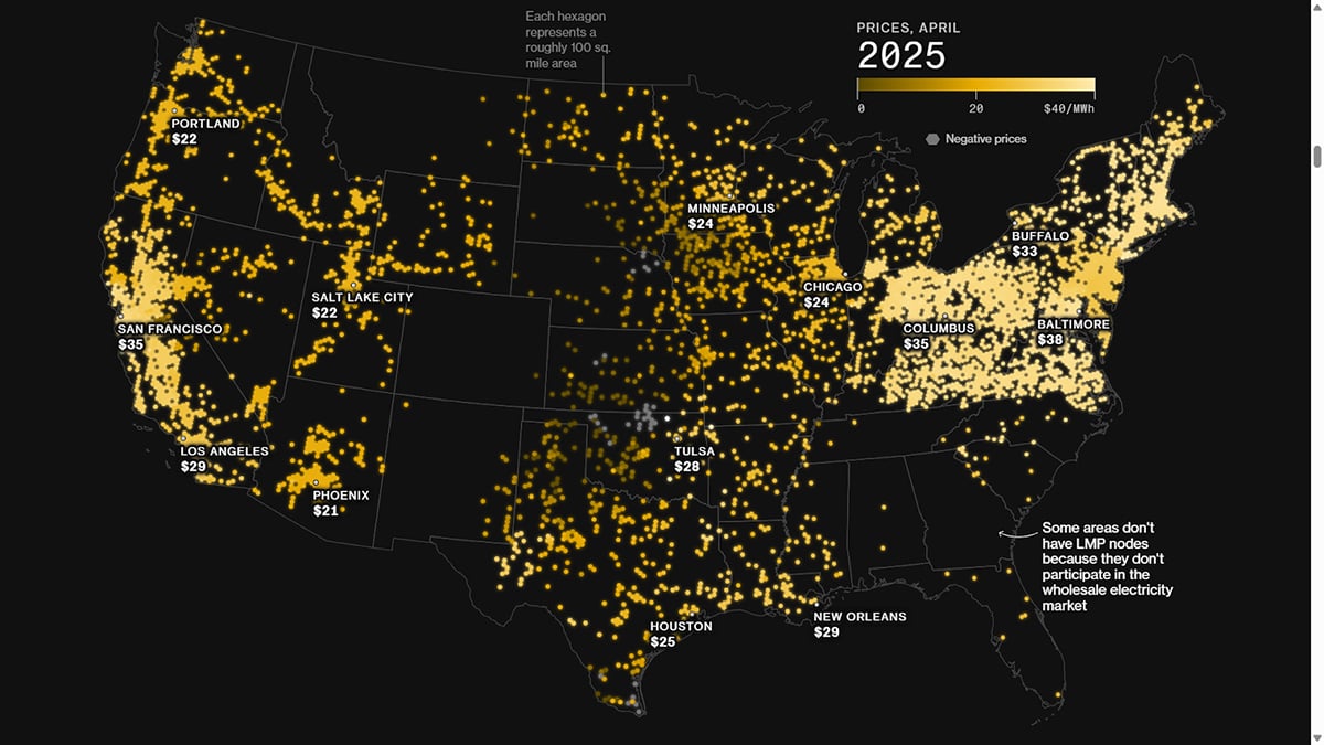
Due to an upswing in demand for AI-generated content, data centers are being built at a rapid pace across the United States. This has contributed to rising electricity costs in areas near data centers.
Bloomberg News tracked and analysed wholesale electricity prices across more than 20,000 locations in the United States. They found that communities with data centers were paying up to 267% more for electricity than they were in 2020.
Bloomberg presents this price increase on a map of the United States, showing electricity pricing points on the power grid. Wholesale electricity prices in 2020 are compared with those in 2025. The map clearly shows that electricity costs increase with proximity to data centers.
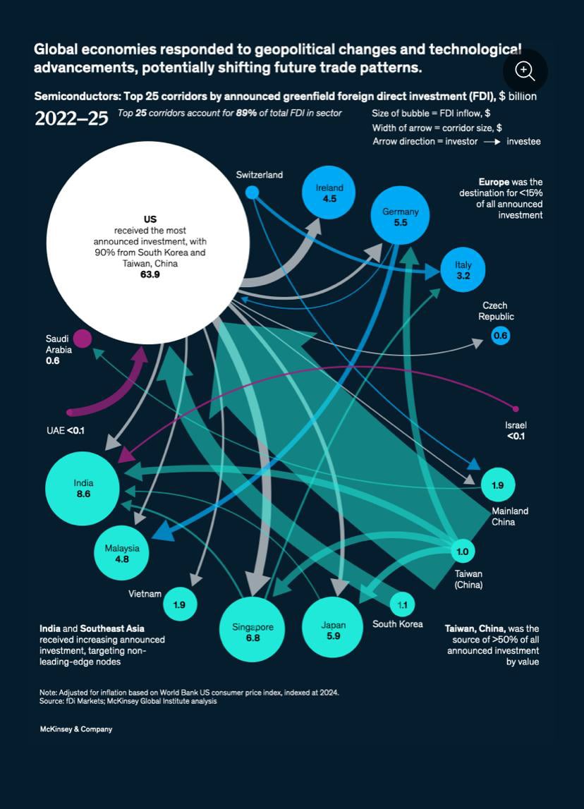
Next on the list is another fascinating global investment project: McKinsey & Company's visualization of semiconductor FDI flows.
The visualization uses bold, colorful circles and arrows to illustrate investment flows. The size of each circle represents the total amount of investment a country receives. The width of each arrow shows the size of the investment corridor, and the arrow direction shows which country is investing and which country is receiving the investment.
You can quickly see that the United States is the largest investment destination, while Taiwan (China) is the leading source of semiconductor FDI.
The visualization also highlights growing investment activity in Europe, India, and Southeast Asia, making the global capital flows easier to grasp.
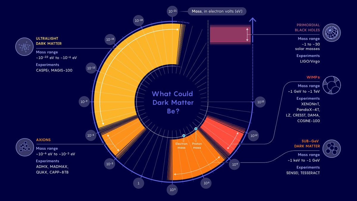
The search for the ever-elusive and intriguing dark matter continues. The problem isn’t likely to get solved anytime soon, but here is a striking infographic for you to follow the lead.
Quanta Magazine created this interesting data visualization to represent the types of particles that dark matter could be made of. Axions, WIMPs, ultralight dark matter or primordial black holes – any of these could be a star candidate.
Distributing every particle type along the scale according to their mass, the visualization also provides clear, concise descriptions for every type. Additionally, you can dive into the experiments’ data. Are you the one to solve the new puzzle in particle physics?
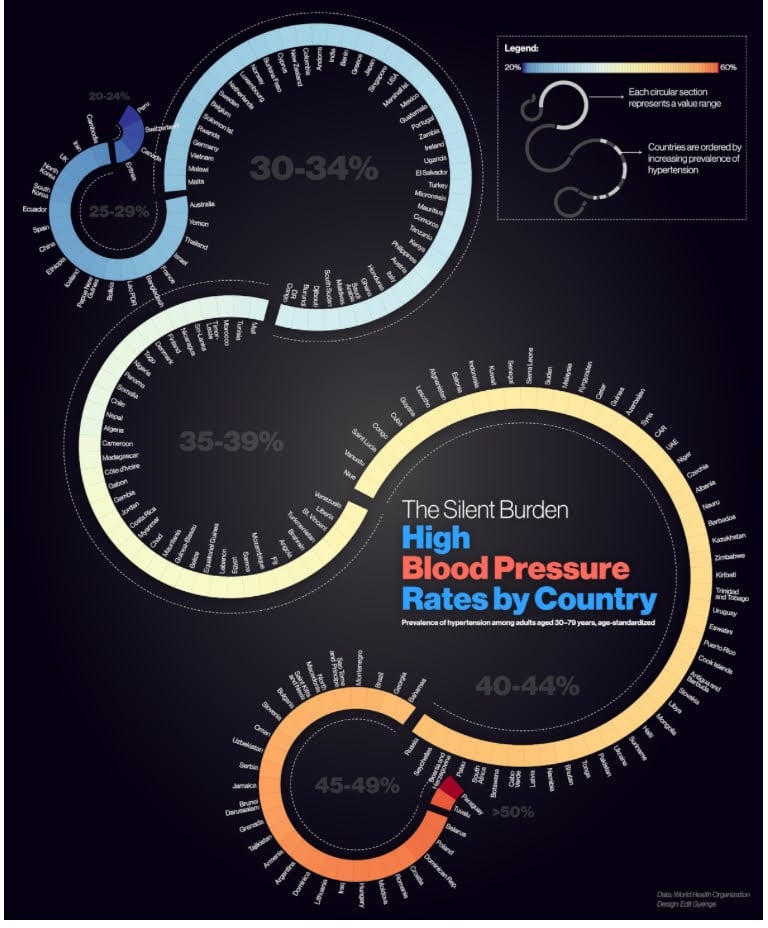
High blood pressure is a common health problem, especially among adults aged 30 to 79.
Edit Gyenge, an information designer, created this visual to show how common the condition is in different countries.
The design uses circular charts grouped by percentage ranges. Each circle represents a range, such as 25–29%, 30–34%, 35–39%, 40–44%, 45–49%, and over 50%. Countries are placed around each circle according to their rates.
The colors move from cool blue to warm yellow, orange and red tones. Blue shows lower rates, while warmer colors show higher rates. You’ll find the percentage written boldly in the center of each region.
With this visualization, it's clear that countries like Paraguay and Tuvalu have top levels of hypertension while Switzerland, Peru and Canada face more moderate rates.
To learn more about the prevalence of hypertension across countries, check out this WHO’s article.
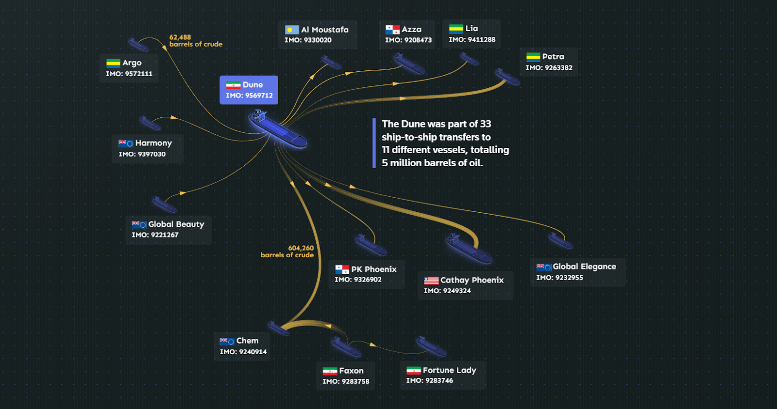
Iran’s oil and gas sector has been impacted by sanctions from the United States, European Union, and United Nations. Still, oil and gas remain Iran’s primary means of earning foreign exchange.
An investigation by Reuters revealed how Iranian oil is passed between tankers to make its origin harder to trace. This story is supported by a detailed visualization that shows how these transfers happen.
The design uses a Sankey-style layout. Thicker lines show larger amounts of crude being transferred, while thinner lines show smaller amounts. The dark background and glowing ships make the routes easy to follow.
At the center of the graphic is the tanker Dune. From it, gold lines spread out to many other ships, including Argo, Harmony, Global Beauty, PK Phoenix, and Cathay Phoenix. The chart shows that Dune was involved in 33 ship-to-ship transfers with 11 vessels, totaling about 5 million barrels of oil.
This visualization actually makes a complicated system simple to understand.
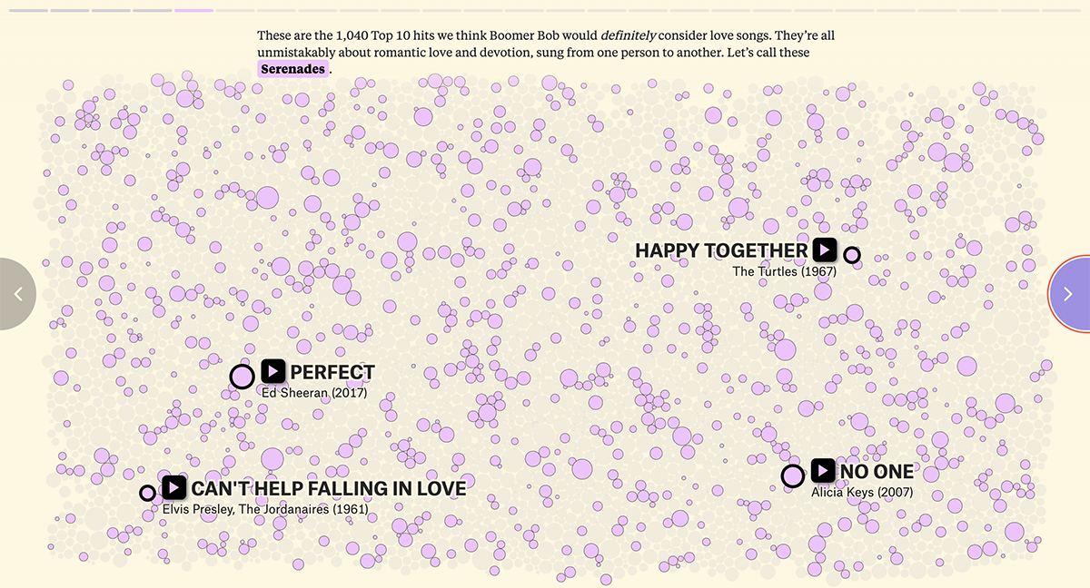
Music, most scientists believe, evolved as a natural response to the need for bonding between tribe members. One musical staple that has persisted for several years is the love song but some people believe it is endangered.
In their piece for digital publication The Pudding, David Mora and Michelle Jia checked 5,100 Billboard Top 10 hits from 1958 to 2023 to confirm whether love songs were truly in decline. They analyzed the content of these songs and found that while the 80s form of love song, the serenade, has indeed declined, love songs in general remain as popular as ever.
To present the data, they use a packed bubble chart where the circle size represents the number of weeks spent in the Top 10, and a stacked area chart to highlight the relative popularity of each category of love songs mentioned in the article.
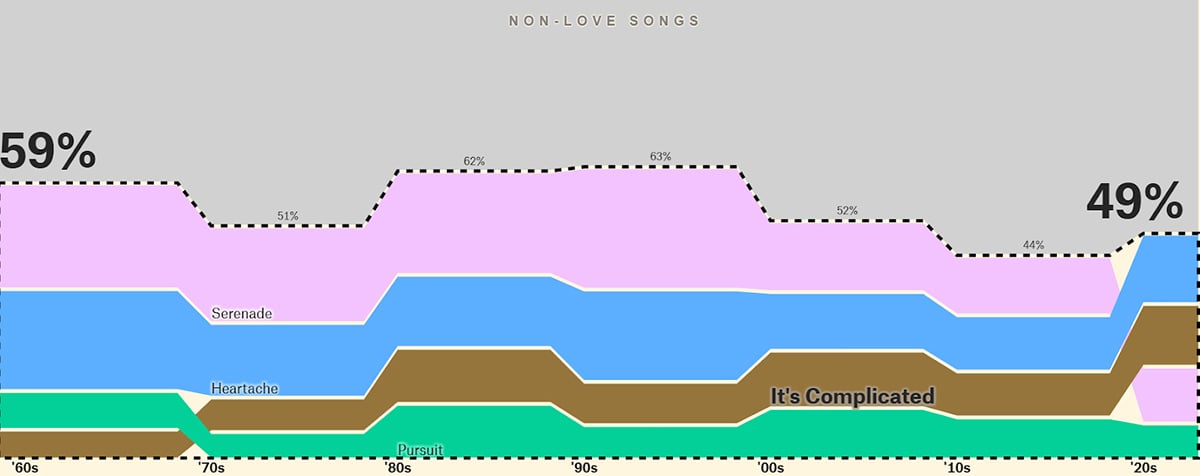
Mora and Jia’s piece includes all the elements of good data storytelling that the Pudding has become known for.
Our next interesting visualization highlights the advanced layers of technology Freight Rail Works uses across its infrastructure. Talented Danil Krivoruchko & Aggressive/Loop teams produced a futuristic and dynamic animation of the data-world around a train in motion.
Magnificent waves of data light up outlines of the objects and then vanish in waves as the train moves forward to the smart city. Graphics of the giant city cluster zoom out to reveal the continent routes and the beauty of a simple railway communications network.
In the era of semi-autonomous aircraft and drones, the simple, down-to-earth railway system looks stable but innovative in this graphic.
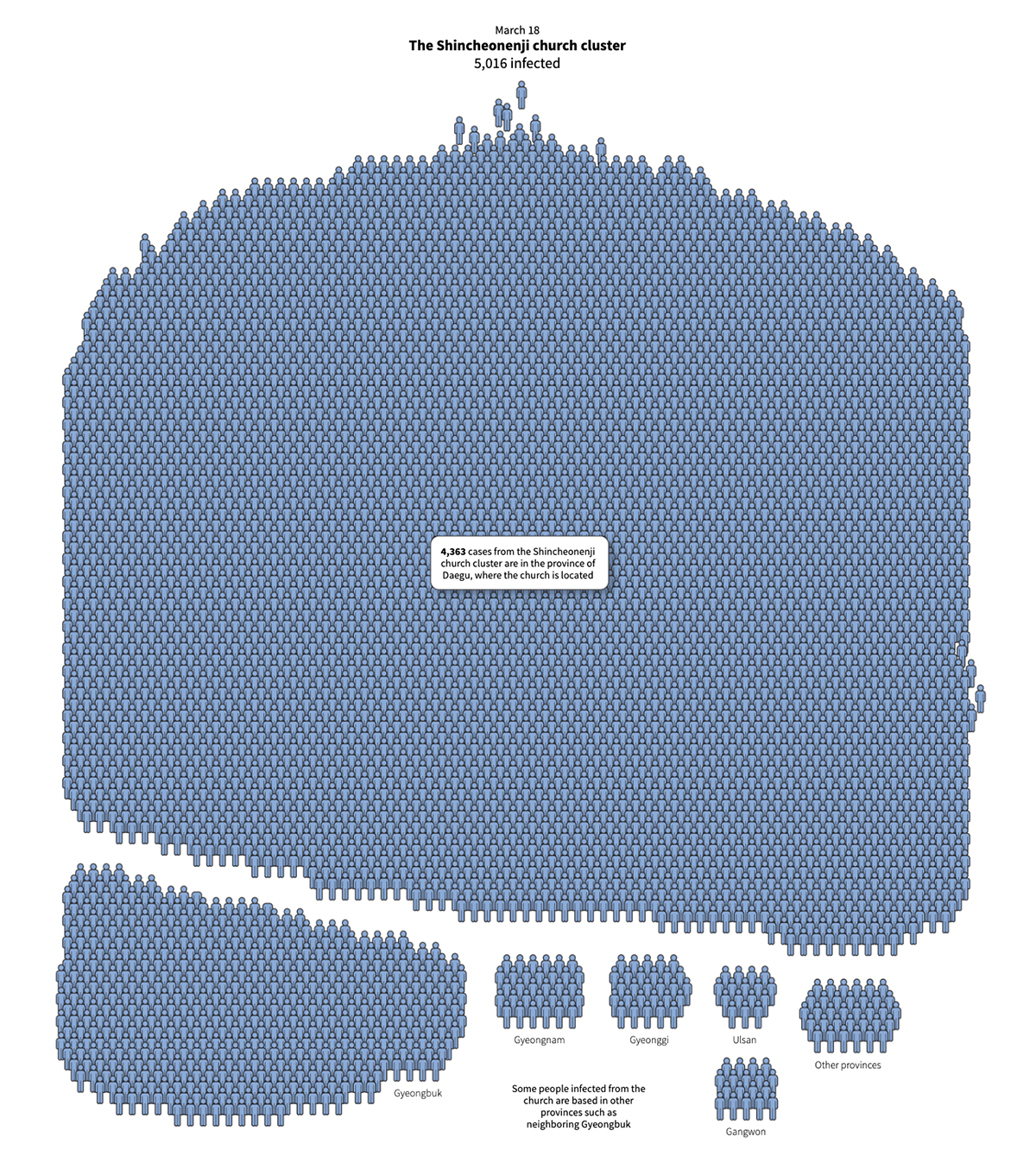
Korean hospitals and churches experienced a burst of Covid infections among their visitors in January 2020. Having linked connections between the confirmed cases, scientists were able to trace back the first case and build a tree of contacts between the affected people.
Tracking the timeline of the first patient’s actions revealed that this person caused thousands of infections. Wandering sick for a few days resulted in over 30 more people infected. Subsequently, the Shincheonji Church cluster with 5,016 infected people accounted for at least 60% of all cases in South Korea at that time.
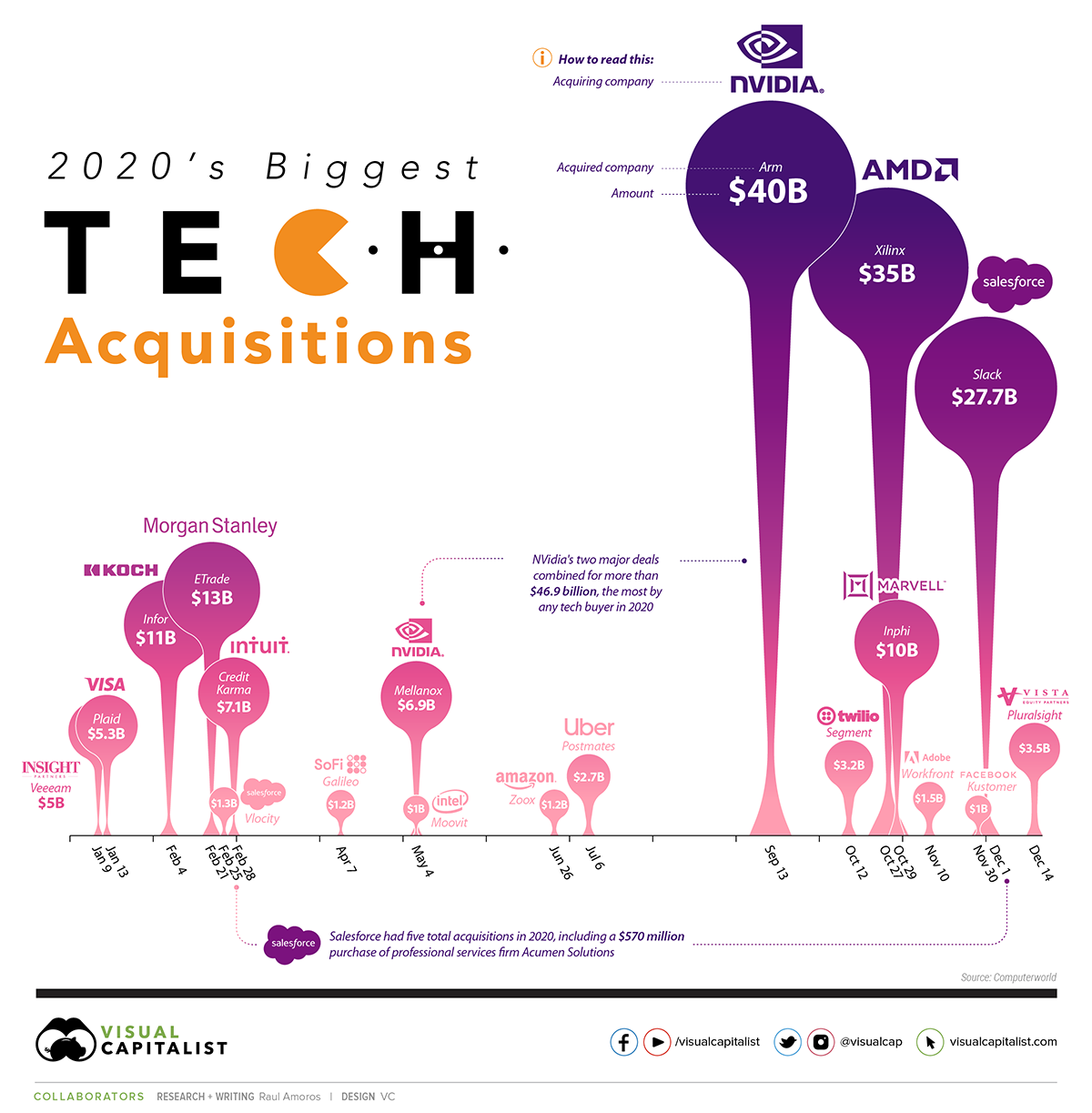
Despite the fact that for most businesses 2020 was a devastating year with grim outcomes, this data visualization shows that Big Tech experienced a growth boost. It’s not surprising that people working remotely increasingly need digital services of all kinds.
The graphic shows the biggest tech mergers and acquisitions closed in 2020, together with the short description of the acquired company, acquiring company, deal amount and deal date. While the chart is visually busy, it’s also innovative and visually appealing.
If you need a market report from your industry area, grab the data from Crunchbase and build your own custom branded infographic via our data visualization tool quickly and easily. Sign up free.
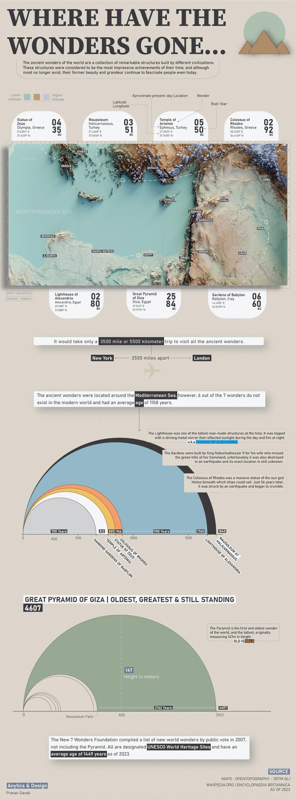
We often hear about the Seven Wonders, but since only the Pyramid of Giza still stands, it’s difficult to truly picture where they were located, how close they were to one another, and when they were built.
This visualization by Pranav Gavali, a Data Scientist, brings that context to life. It combines a topographic map with clear markers, latitude and longitude coordinates, built years, and modern-day country references.
It even adds a distance comparison, showing that visiting all the wonders would cover about 3,500 miles (5,500 kilometers)—roughly the distance between New York and London.
Design an infographic like this one using Visme’s pre-designed content blocks and infographic templates. Include live data visualizations by connecting to your Google or Excel spreadsheets. When connecting your Visme charts to Excel Online, select full sheets or only a specific range. Plus, when values change in your linked sheet, the chart is This is a prime example of how creative design can bring data to life.
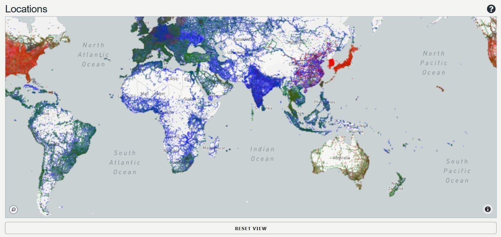
This stunning, elegant and creative visualization of 40 million cell towers is surely an unforgettable view. Based on OpenCelliD, the world's largest open database of cell towers, this interactive map is so far one of the most precise publicly available data sources for telecom-related projects.
We can see how the cell tower network lights up Europe and other big cities of the world; simultaneously, vast areas of “wilderness” are still present on the map. Harsh climate and low population density in the northern regions of Russia and Canada, along with central areas of Africa and Mongolia result in low quantity of cell towers in these areas.
Closeup view of this cell tower map resembles the brain structure. Similar to the neurons, axons, and dendrites that create the communication network of the human body, cell towers keep humanity connected.
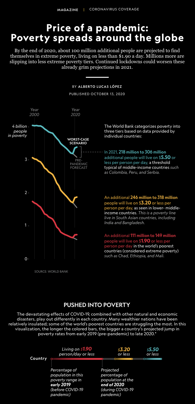
In this classic data visualization by National Geographic, data is placed against the dark background for better contrast and readability. Simple, comprehensive charts show us the effect of the pandemic on the income of people in various countries.
The authors distributed three levels of income range for countries with low and middle-class income to provide a clear picture of the current situation. Core findings of the report were that the pandemic pushed a tremendous number of people to extreme poverty–projected data is 100 million people living on $1.90 per person/day.
Based on the World Bank data, the infographic provides a wide view of the exact factors influencing people’s wellbeing–from travel restrictions and job loss to wars, displacements and higher food costs. Highlights at the beginning reveal a rapid shrinking of income in the examined countries across all continents on a mass scale.
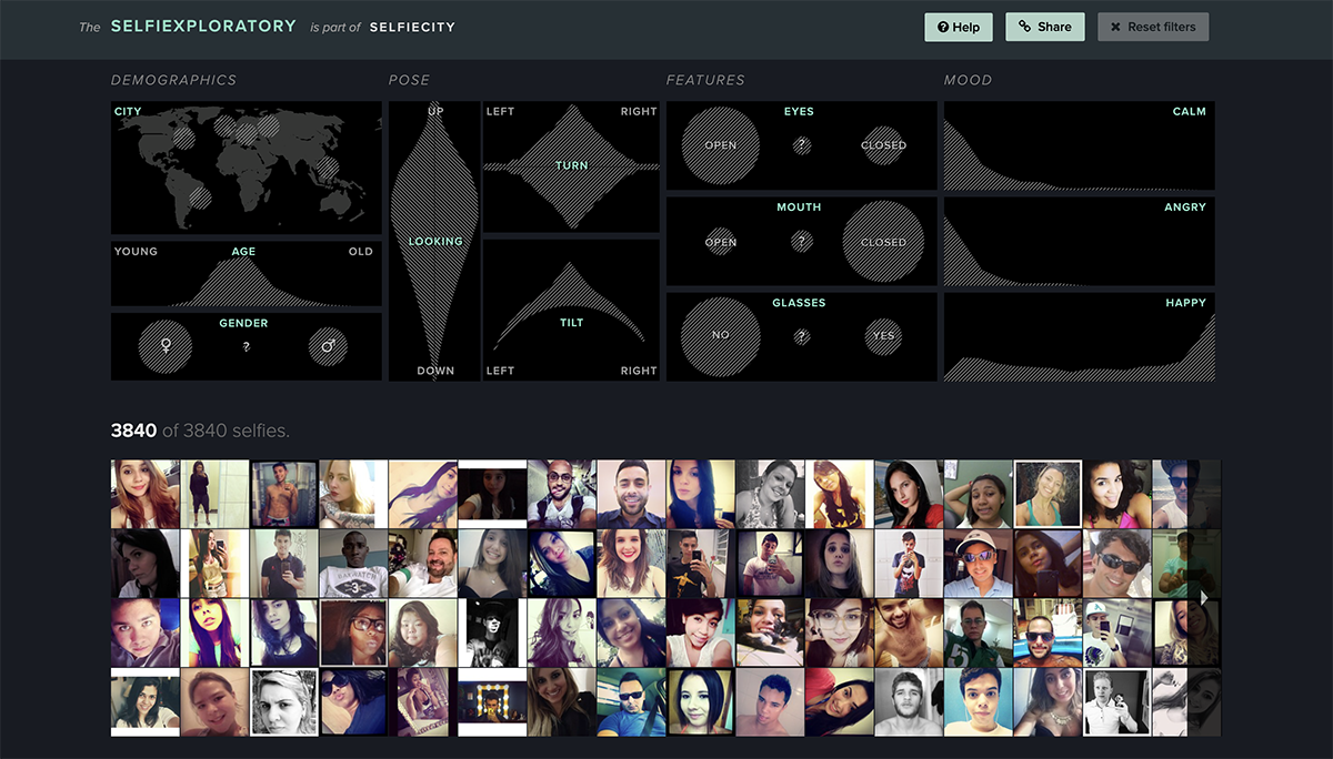
Selfiecity is an innovative and engaging data visualization project exploring the selfies world. It uses a variety of visualizations to analyze selfies from five cities around the world.
They collected over 120,000 selfies from the five cities and selected nearly 1,000 photos from each town. After collecting the images, they analyzed various metrics such as demographic examples, poses, moods and features.
The project then revealed exciting insights into the culture and social behavior of the people who take selfies. For example, the project shows that women take more selfies than men and that people tend to take selfies in public places rather than private spaces.
The study was quite complex and yielded valuable insights, which presented a challenge when it came to sharing the results. However, the team did an excellent job creating visually appealing data visualizations to present the information.
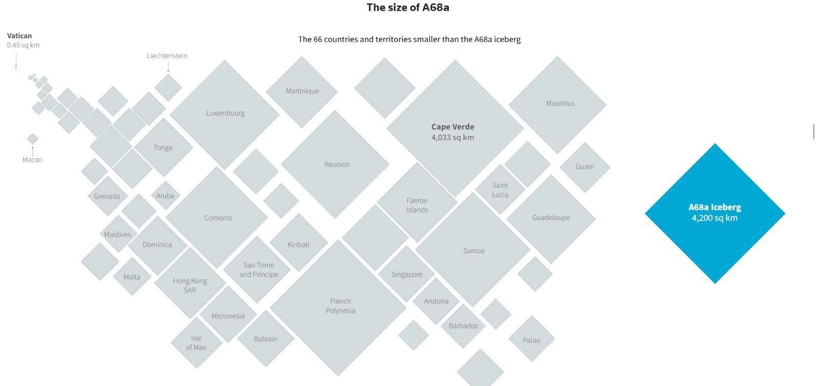
Dedicated to the “travel adventures” of this 4,200-square-kilometer iceberg, this infographic alerts people to climate change. A giant chunk of ice, the length of Puerto Rico, broke off the Antarctic Peninsula coast to wander into the wild–and dangerously close to South Georgia Island, packed with wildlife.
The graphic compares the size of the berg with 66 countries or territories and cites that the ice mass is so large that it cannot be captured in one photograph. Besides, we can also see impressive geodata on the wildlife from the IUCN Red List of Threatened Species inhabiting the endangered South Georgia Island.
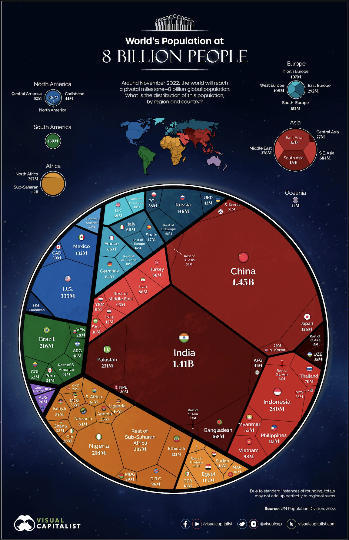
On November 15, 2022, the world’s population reached 8 billion. This is the first time in history that there have been this many people on Earth. And there can't be a more straightforward and visually appealing way to present this data than this visualization.
What makes this big data visualization stand out is its simplicity and effectiveness in conveying the message. Using a circle to represent the Earth is a powerful symbol that makes the visualization easy to understand and remember.
By using colors to represent continents and lines to separate countries, the visualization effectively conveys the complexity of the world's population in a simple and visually appealing way.
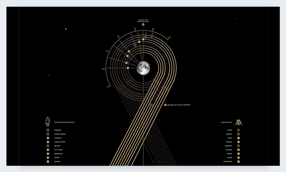
Paul Button is a graphic designer who loves analyzing data and making it beautiful beyond belief. He has always been interested in the Apollo missions and all things space related. Using collected data about every single Apollo mission, he created this data visualization. He sells it as an art print and is quite successful. The Apollo data viz poster is a real gem, not only for space exploration fanatics but anyone who loves seeing beautiful data on a regular basis.
These mesmerizing circles were brought to you by one of the best-in-class street art and calligraphy authors, Pokras Lampas. Whether you would like to decipher this canvas or refer to it as a pure visual object, the unique gothic Calligrafuturism style is an eye magnet for anyone.
The project is focused on the human consciousness and the theme of dreams in the context of human memory and experience. According to the author, the future is for global unity and harmony of cultures – and it’s visible in the fusion of styles, techniques and systems used in the project graphics.
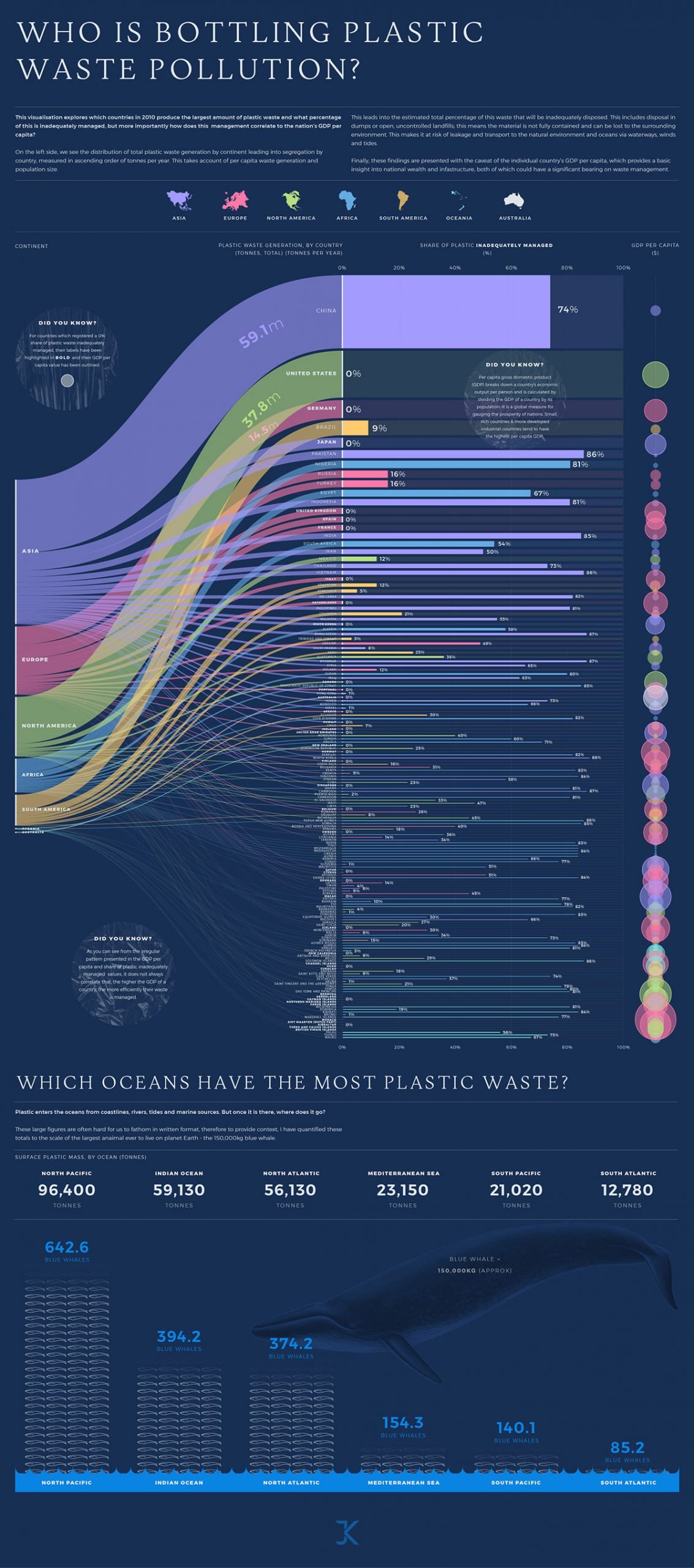
Based on data on the distribution of total plastic waste generation by continent, Jamie Kettle created this personal project to estimate the percentage of plastic waste that was inadequately disposed of.
The infographic provides a clear and precise picture of the current surface plastic mass by ocean, measuring it in a creative way. We can see plastic waste management for every country in a colored bar chart. The names of the countries that report 100% of all their plastic waste handled properly are highlighted in bold.
One of the major findings here is that the country's GDP and efficient plastic waste management aren’t always correlated—you can see this by the irregular patterns shown in the infographic.
If you are curious about plastic waste, here are some resources for you: a guide on plastic waste, detailed info on plastic waste pollution from the UN Environment Program and Impacts of Mismanaged Trash by the United States Environmental Protection Agency.
If you’re working on a research topic like waste management, use Visme’s charts and graphs templates to highlight your findings and statistical analysis. Incorporate vertical bar graphs and align the values to the left, right or center to match your overall design.
Bar graphs, bar charts or column charts are the most popular type of data visualization.
Bar charts are best for comparing numerical values across categories using rectangles (or bars) of equal width and variable height. You can use bar graphs to compare items between different groups, measure changes over time and identify patterns or trends.
Other popular forms of data visualization include pie charts, line graphs, area charts, histograms, pivot tables, boxplots, scatter plots, radar charts and choropleth maps.
Here’s how data visualization helps users to make the most of their data.
Below are data visualization best practices to help you present data in an engaging and appealing way.
Read our article to learn more about data visualization best practices.
If you are feeling inspired by these cool data visualizations, use our data visualization software to convert disparate data into clean, comprehensive visuals using the best data visualization techniques. You'll find an extensive library of customizable charts and graphs, including bubble charts, bar graphs, line charts, scatter plots, and much more.
Wondering if Visme's data visualization tools are right for you? Take a look at what one of our satisfied customers, Cassandra C. | Owner, has to say:
“I also appreciate the wide range of features, including charts, graphs, and other visuals that can be used to present data in a clear and concise way. Overall, I'm very happy with Visme and would highly recommend it to anyone looking for a fun, user-friendly tool to create visuals.”
To learn more about creating your own data visualizations, check out our detailed guide on data visualization types and the introduction to data viz on our blog.
Design visual brand experiences for your business whether you are a seasoned designer or a total novice.
Try Visme for free