


Healthcare Data Visualization: How to Turn Data into Impactful Stories

Are your survey results sitting in a file on your computer waiting to be analyzed? Or maybe there’s a stack of filled out forms somewhere in your office?
It’s time to get that survey data ready to present to stakeholders or members of your team.
Visme has all the tools you need to visualize your survey data in a report, infographic, printable document or an online, interactive design.
In this article, we’ll help you understand what a survey is and how to conduct one. We’ll also show you how to analyze survey data and present it with visuals.
Let’s get started.
A survey is a study that involves asking a group of people all the same questions. It’s a research activity that aims to collect data about a particular topic.
A survey usually consists of at least one question and can be as long as tens of questions. The length of your survey depends on the nature of the research.
Surveys can be categorized into three main types:
When it comes to survey results, your data can be either qualitative or quantitative.
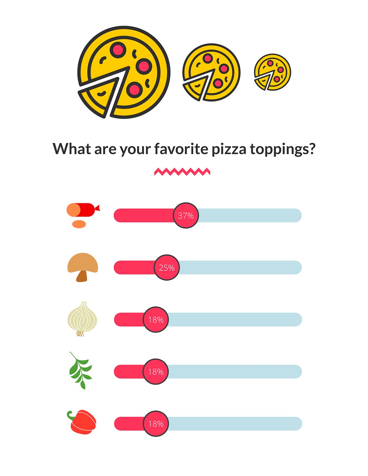
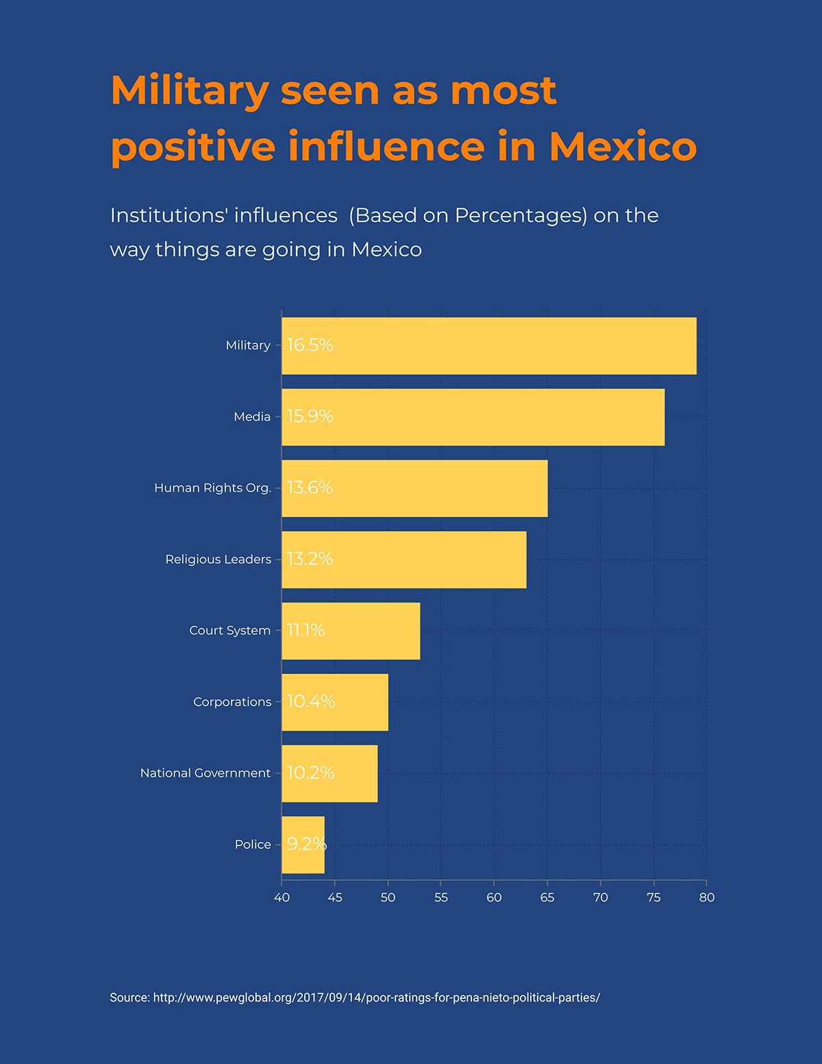
The survey results infographic below is from a quantitative survey where participants simply chose their favorites from a list. Customize it to use for your own data.
Surveys are conducted in different ways, depending on the needs of the surveyor and proximity of participants. While some surveys are conducted face-to-face, others are carried out via telephone, or self-administered digitally or on paper.
Surveys can be conducted for lots of different reasons, such as:
To conduct a successful survey, you need the right tools. For face-to-face surveys, you’ll need a group of people who will visit participants, enough printed survey copies or a way to record spoken answers.
For telephone surveys, you’ll need a group of people who can call participants over the phone. You’ll also need a computer program or printed survey question forms where the surveyor can record the data.
For online surveys, you can use a number of different tools. Below are our favorites:
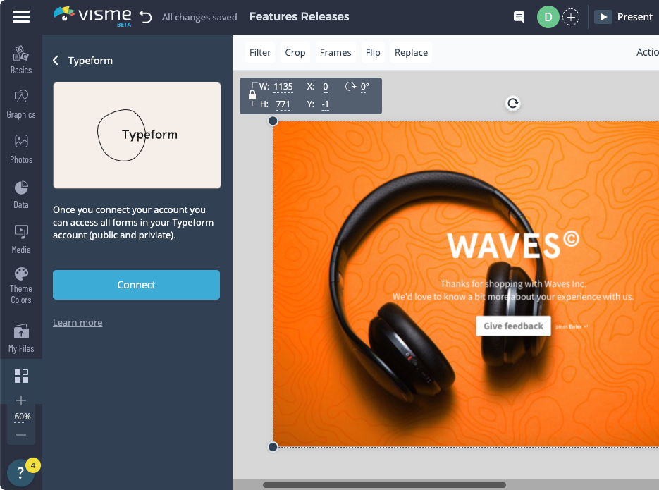
With Visme, not only can you present your survey results, you can also create a survey! With our Typeform integration, creating a survey in a Visme project is as easy as inserting a new chart.
When you present survey data results with visuals, the trends and conclusions are easier and faster to understand.
But before you can do that, you’ll first need to analyze your results. The analysis process depends on the type of survey conducted and how the data was collected.
For example, simple online quantitative surveys can be fed directly to a spreadsheet, while qualitative surveys conducted face-to-face will need considerably more data entry work.
According to Thematic, these are the 5 steps you need to follow for best analysis results.
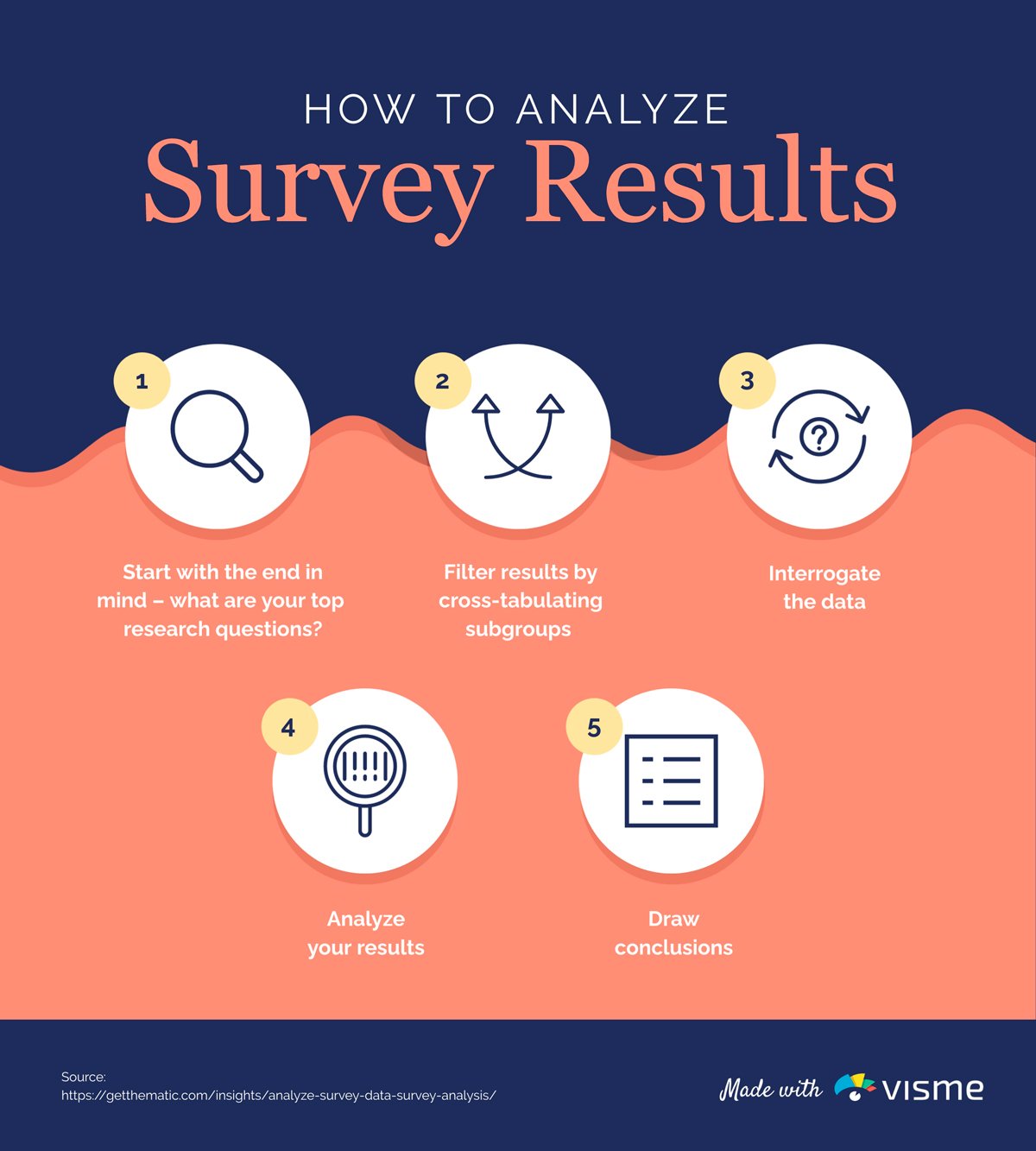
As you can see, the analysis starts even before creating the survey. This helps make sure that you are asking the right questions.
The data must then be organized into a filterable spreadsheet or table. The most common survey software available for analysis work is Microsoft Excel or Google Sheets.
To analyze more complex data, another great tool is Tableau — a powerful analysis and visualization tool. In fact, for large survey data, we suggest you use a mix of Tableau visualizations embedded into your Visme project along with our signature data widgets.
Now that we’ve looked at all the steps involved in conducting a survey, collecting data and analyzing it, let’s find out how to present your survey results with visuals.
Presenting survey results visually makes it easier to spot trends, arrive at conclusions and put the data to practical use. It’s essential to know how to present data to share insights with stakeholders and team members to get your message across.
You can easily make your survey data look beautiful with the help of Visme’s graph maker, data widgets and powerful integrations.
Check out the video below to learn more about how you can customize data and present it using data visualization tools in Visme.
Aside from data visualization, Visme lets you create interactive reports, presentations, infographics and other designs to help you better present survey results.
To give you more ideas, here are 9 unique ways to present survey results in Visme.
While many times you’ll put together a document, one-pager or infographic to visualize survey results, sometimes a presentation is the perfect format.
Create a survey presentation like the one below to share your findings with your team.
A multi-page report is a great way to print out a hard copy of your survey results, and formally share it with your team, management or stakeholders.
Here’s a survey report template in Visme you can customize.

You can also share interactive versions of your report online using Visme. After you finish designing your survey results report, simply hit publish to generate a shareable URL.
The best way to present survey results is with a chart or graph. The type of chart you choose depends on the nature of your data. Below, we’ll take a look at two common types of charts you can use to visualize and present your survey data.
If you had a smaller survey and really want to visualize one main result, this bar graph survey results template is the perfect solution.
Insert your own information so you can quickly visualize the largest bars, giving you more insight into your audience.
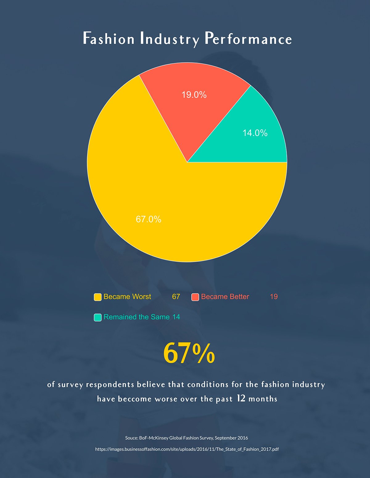
To visualize parts of a whole, a pie chart can really help to differentiate the answers that your audience gave. Look to see which responses were most popular to help you make more informed choices for your brand.
 Pro-tip: Break down your survey results into snackable sections. Instead of trying to graph all the data into one huge chart, create a number of different charts that each visualize a question, group or section of the data.
Incorporating some of your survey questions into your report helps your audience understand your results better. Take it a step further by adding relevant icons to help visualize those questions.
Customize this template with your survey information before presenting it to your team.
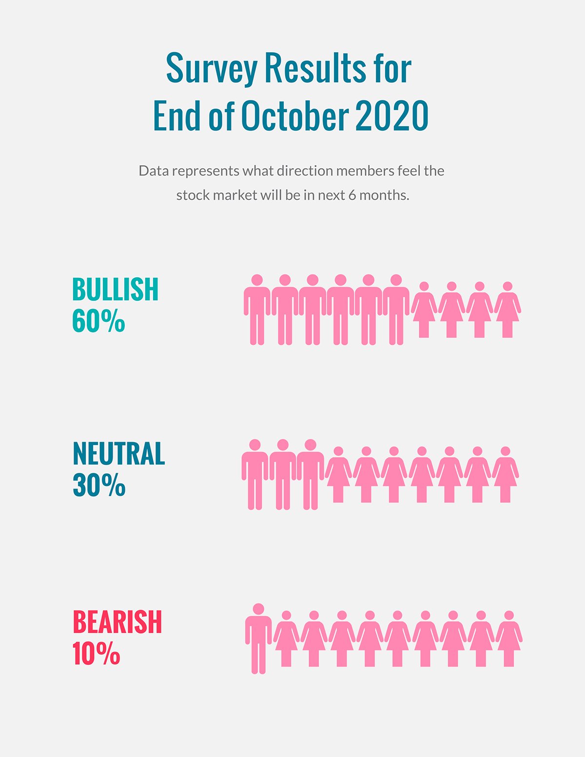
Another great way to use icons in your survey results report is with pictographs, or icon arrays. Pictographs use symbols like icons and shapes to convey meaning.
Use icon arrays to visualize sections of a whole. For example, you can use icons of people to visualize population data. Need to visualize the difference between cat lovers and dog lovers? Use an array with cat icons in different colors.
Here’s an example of a survey results report that uses pictographs to visualize psychographic data among a population.
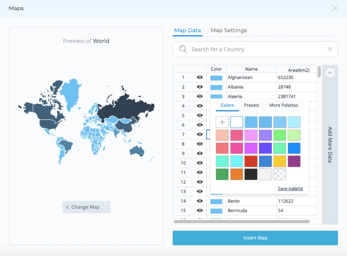
One more way to present survey results is with maps. This is a great solution for visualizing geographic data. In Visme, you have several options to help you create interactive maps:
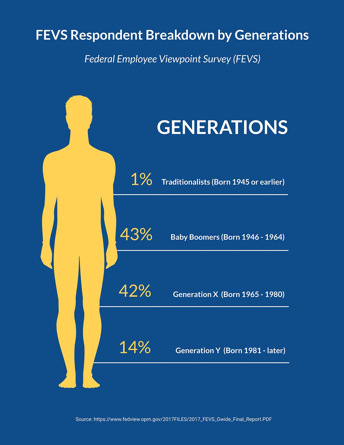
Get creative showcasing your results by adding graphics and illustrations that help represent your data. In the template below, we’ve used a human body to help visualize the survey results.
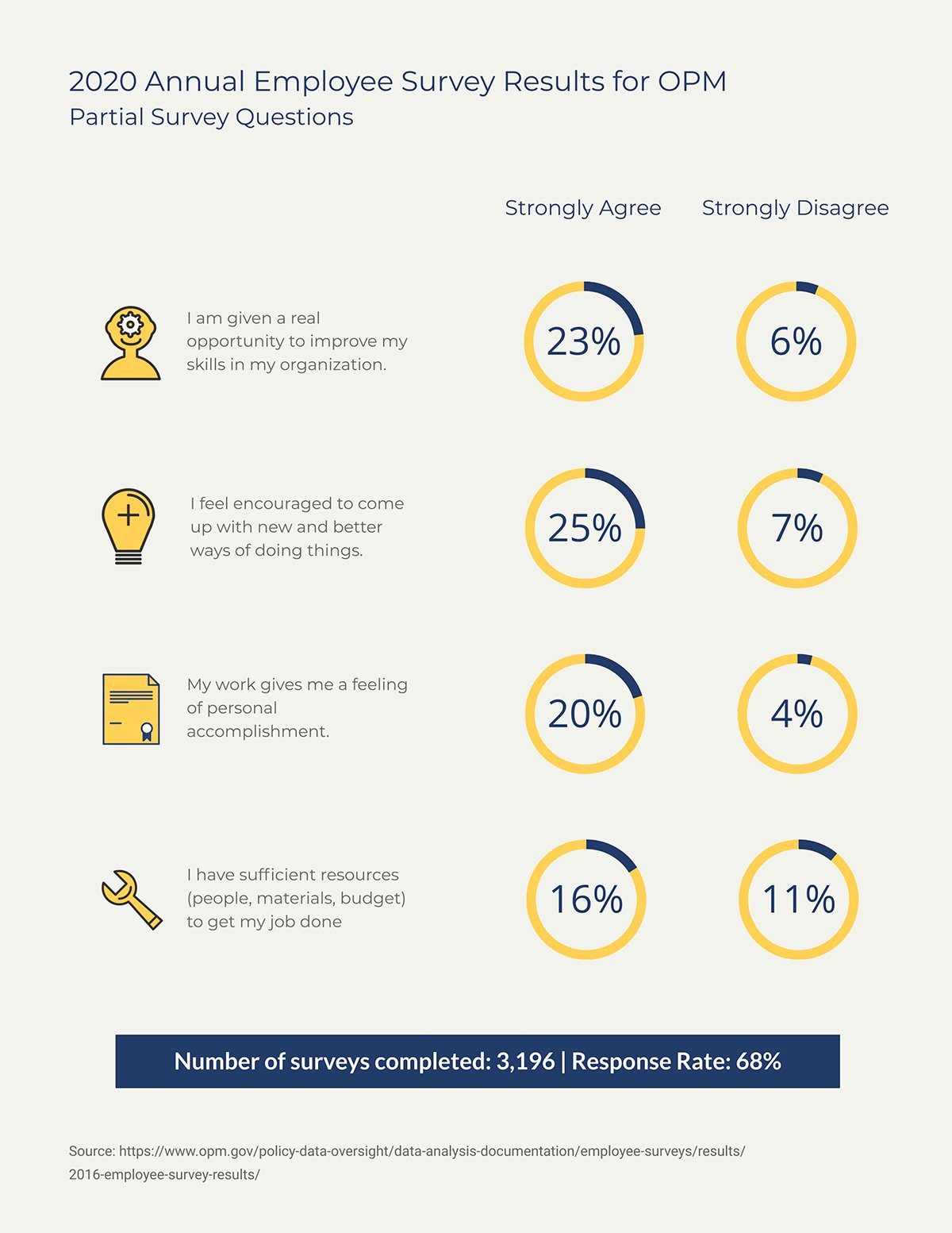
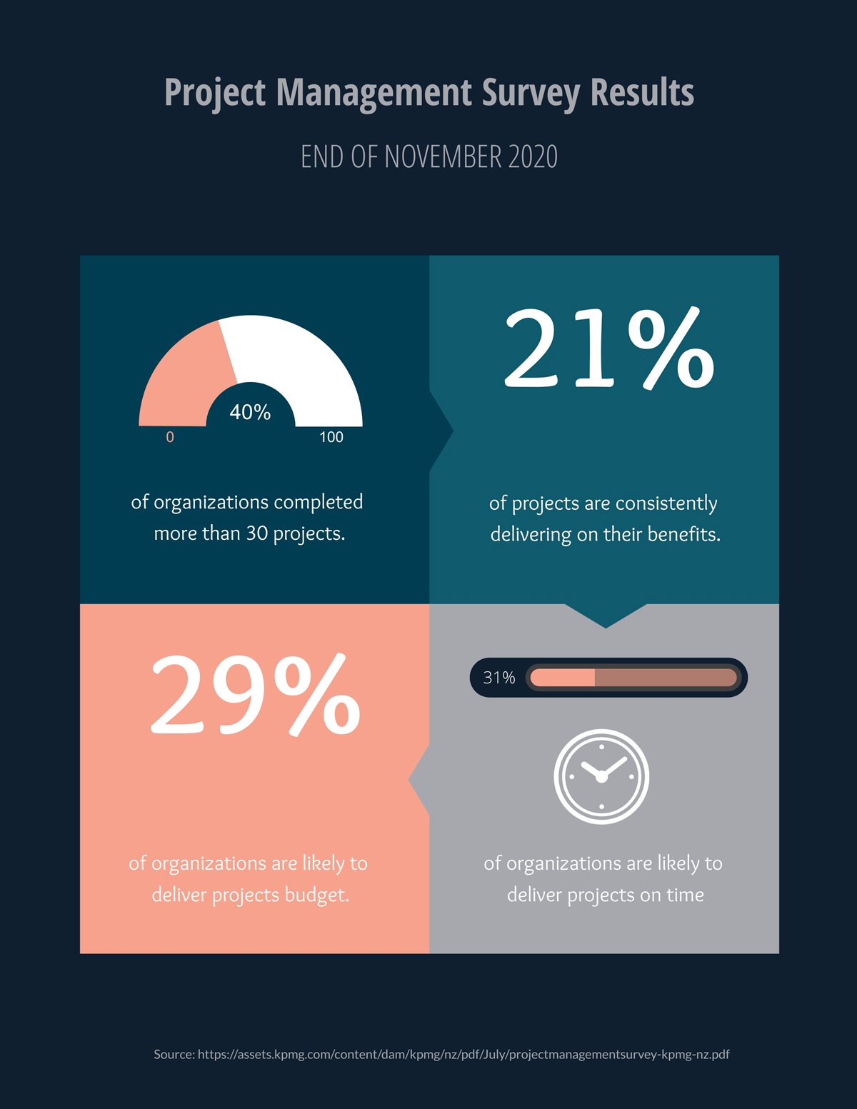
If you want to show your survey results data in a snackable format, try using data widgets. These are perfect for showing percentages and quantitative comparisons in many different styles.
The best way to use them is to visualize one question of the survey at a time. For example, use one widget for the percentage of yes answers and another for the no answers.
In this template, you can easily customize multiple widgets to visualize different kinds of results and responses.
Last but not least, you have the third-party embed option. With this tool, you can embed any Tableau visualization into a Visme project.
This is a great option if your data is more complex, or if you are a Tableau user who just wants to create better presentations with Visme.
To embed a Tableau into Visme, open the Media tab on the left-hand sidebar, then click on Embed Online Content. From the drop-down, select HTML.
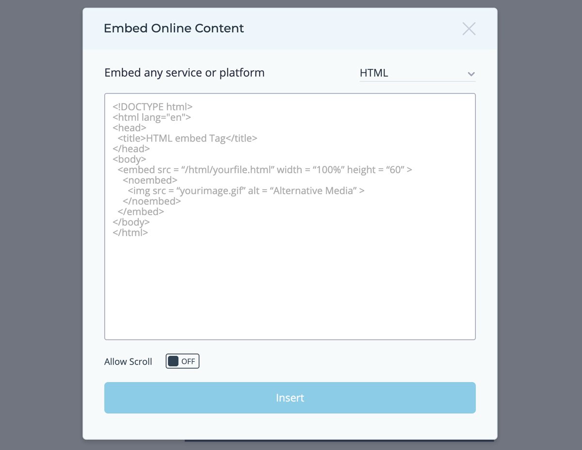
Copy and paste the HTML from your Tableau visualization and paste it into Visme. Now your Tableau is part of a complete survey results report made with Visme!
To get started with visualizing your survey results, log in to your Visme account and choose one of the survey results templates.
If you don’t have a Visme account, creating one is easy and free. Simply register with your email and you’re good to go. Leave a comment below if you have any questions!
Design visual brand experiences for your business whether you are a seasoned designer or a total novice.
Try Visme for free