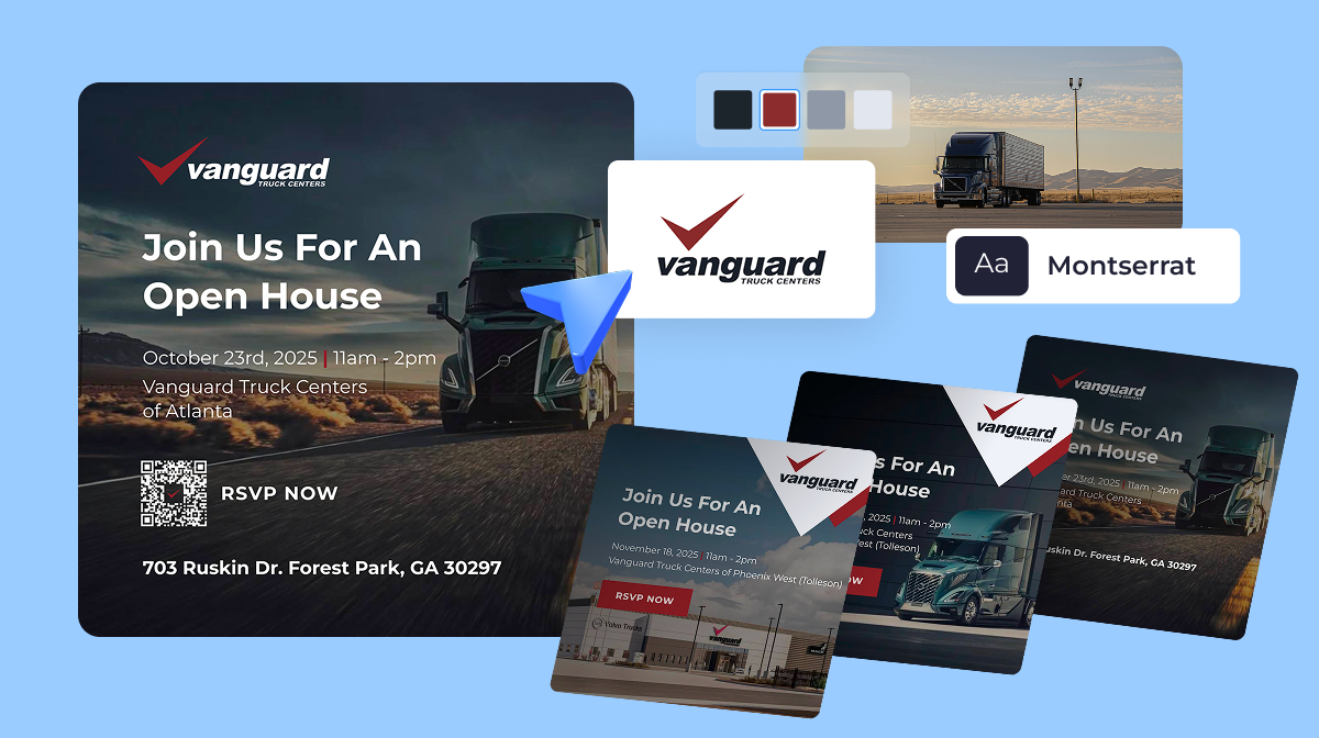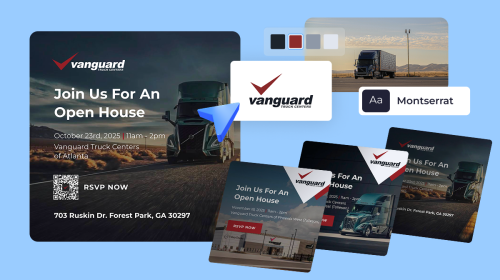
How Vanguard Truck Centers Unified 6 Brands and Cut Content Turnaround Time With Visme

“When I presented Visme to my team and was telling them I thought it was a good solution, I said I can hold a training on it if you want but just go in and explore and I think you can figure it out and all of them did. There’s a very shallow learning curve.”
Many government agencies and official departments are regularly conducting studies based on their state demographics and other data, and these agencies need a way to visualize that information in an easily digestible way.
This is why Katie Lippold with Iowa’s Workforce Development Agency was looking for an online software to help with data visualization.
“In this day and age, people don’t want to read a long, text-heavy narrative, they want to read the bullet points of something, so we were trying to get away from longform PDF reports.”
In Katie’s search for a way to share their data without having to compile it into long reports and documents, she found Visme.
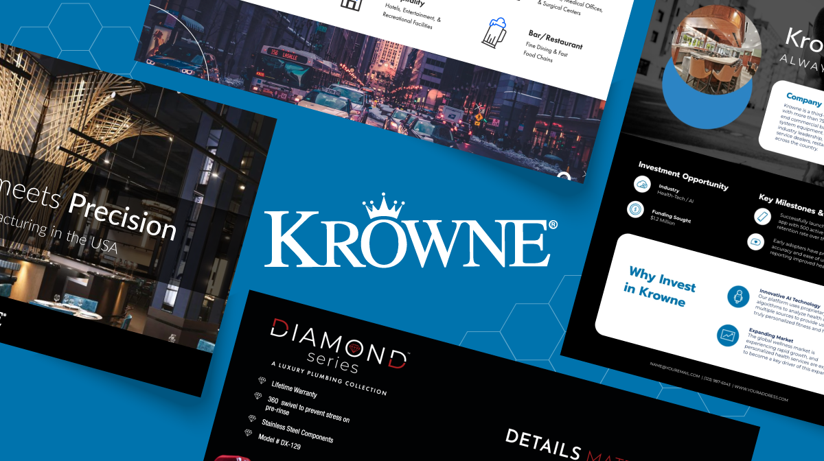
Connect with SalesSimplify content creation and brand management for your team.
Katie’s team on the Workforce Development Agency includes about four people, three of which are heavy Visme users.
They have a Visme team account and have taken advantage of the Brand Kit that comes with their plan.
“We’ve set up a branding theme with our colors and logo, along with fonts. It makes it really easy for us to streamline it and decide this is the way the product looks for everyone.”
In the past, they were customizing each study based on the customer and their look and feel requests, but the brand kit has allowed them to create templates for their overall studies and spend less time on design.
While they create various studies across the state of Iowa, each one has a familiar look and feel now. For example, this is the same style you’ll see on each Demographics page.

Katie’s team also can easily embed each of their Visme projects into the GIS program they use to share these studies.
Because Visme provides an embed code for all projects, it’s easy to take that code and pop it right into your website and other areas, which is exactly what the Workforce Development Agency does.
This way they can compile all of their information using two different software, but still provide a single report for their residents.
“The GIS program wasn’t everything we needed as far as conveying all of the data, so when we found something that embeds nicely into that software, we were very pleased with how we were able to integrate the two together.”
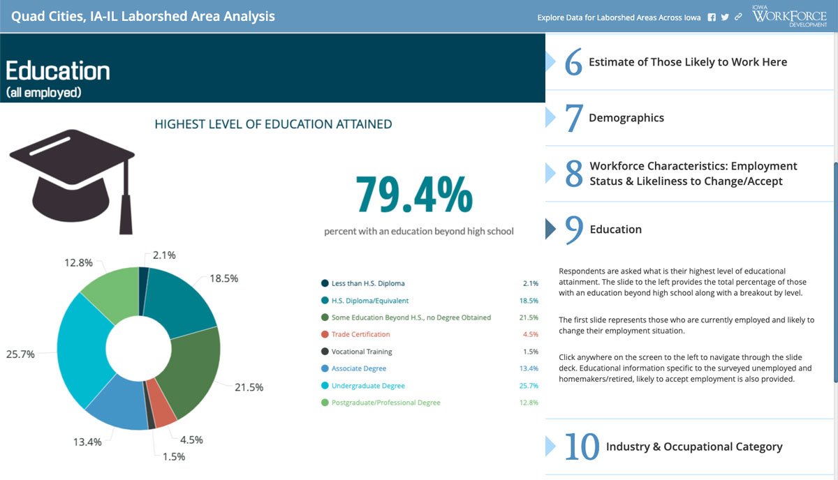
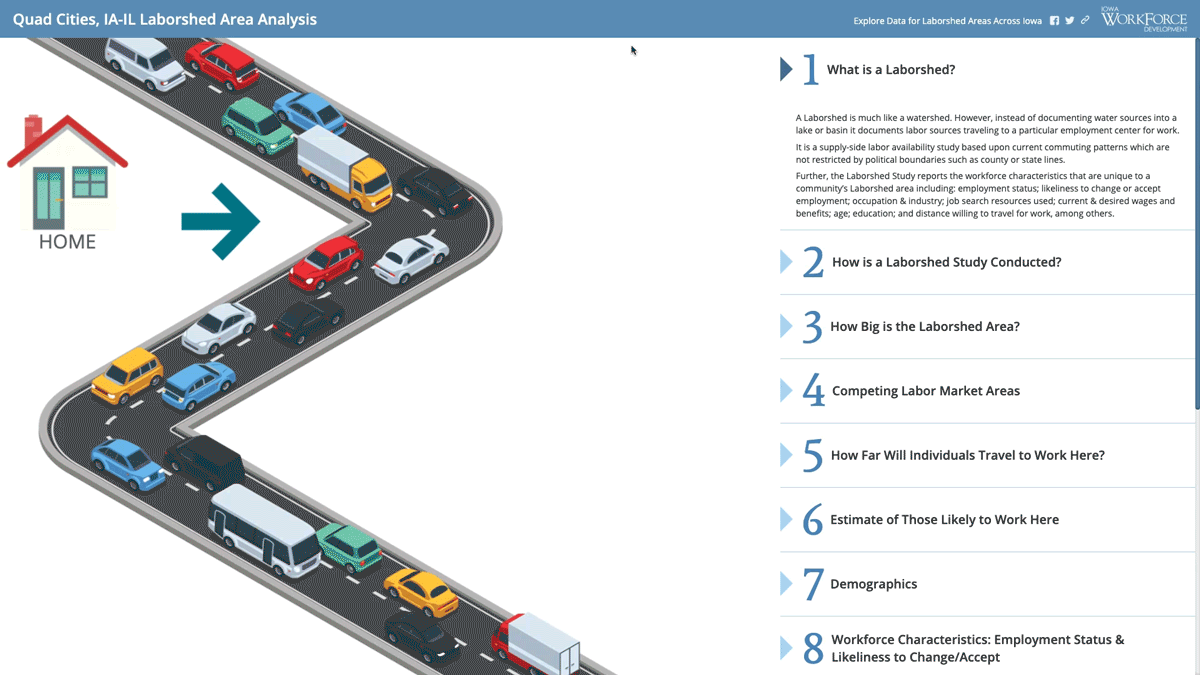
The Iowa Workforce Development Agency has a program called the Laborshed Study that interviews residents that commute to work, analyzes labor market information and presents it for public consumption.
This information is important for both existing companies as well as employers interested in opening new branches and businesses in the area. Local community leaders and developers often utilize these studies to see if they’re in line with wages and benefits.
This data can be found on a web page accessible from their main government site and is categorized by city, region or state.
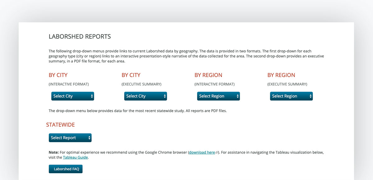
When compiling all of this information into the GIS pages we mentioned above, the team uses Visme to visualize their data, then embeds the infographics right into the initial software.
“Mostly we create infographics, and you can have several slides within one embedded frame so you can page through that. It helps us to divide it into chapters and group like information together.”
The bulk of their Visme usage is for their Laborshed Studies, and they take advantage of several different data visualizations available within our platform, like these bar charts below.
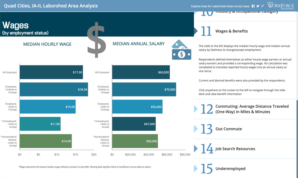
“I like the ease of adding data into the spreadsheet window that Visme provides and how easily that’s updated.”
Katie also loves the animation that Visme’s charts automatically offer. It helps the studies to feel even more interactive for their customers.
“Visme makes the ability to visualize your data really simple and it’s also dynamic with the animation.”
Their customers also appreciate this new format of the reports instead of their previous 60-page bound and printed reports.
“Customers that we have heard from on the new deliverable system, everything has been positive. Part of it is that it’s so easy to access their data now, but also the way it’s presented in the format we’ve developed, it almost does their homework for them if they want to do a presentation to community leaders or board members.”
Ready to start showcasing your study results and data in a visually appealing and dynamic way? Visme’s Graph Engine makes it easy to visualize your data and statistics in a digestible and understandable chart or graph.
Request a demo today to get started.
Design visual brand experiences for your business whether you are a seasoned designer or a total novice.
Connect with Sales