
The Best Interactive Sales Presentation Software to Close More Deals
Data presentation is the process of turning raw numbers and research into visuals and stories people can understand. Charts, dashboards, and well-designed slides help your audience grasp insights quickly and act on them.
Getting this right matters.
When data gets misunderstood, things fall apart fast. Deals stall, priorities shift and smart decisions don’t get made. And often, the most valuable insight in the room never gets heard.
The problem isn’t the data; your delivery is flawed. You bet that even the sharpest insights can fall flat when wrapped in the wrong visuals.
So how do you turn raw data into visual stories that accelerate decisions, align priorities and build confidence?
In this guide, you’ll learn the main types of data presentation, why each matters, and practical ways to transform raw information into visuals that inform, persuade, and drive results.
The real challenge in data presentation is how to make sure your data resonates with the people who matter to your stakeholders, team and clients.
Whether you're pitching insights, reporting results or shaping strategy, the goal is always the same: to turn numbers into clarity. This begins with choosing a format that aligns with your message, data type and audience expectations.
Ask what do I need others to understand, decide or act on? That will help you decide whether it’s best to present your data in text, tabular and graphical format (or a combination of all three).
So how do you choose the right type of graph? It depends on your goal.
Do you need to explain a trend, show exact values or highlight a comparison? The answer will guide whether you lean on words, tables or visuals.
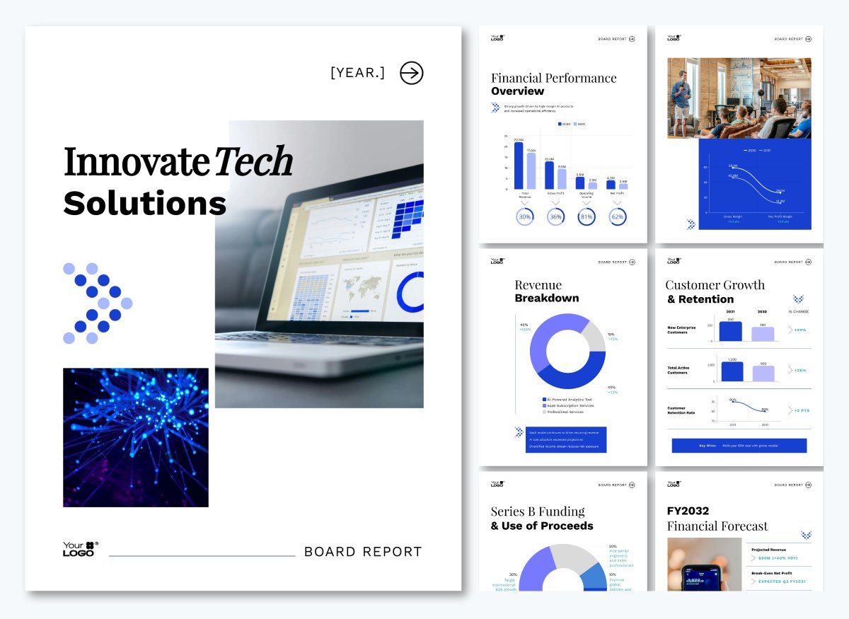
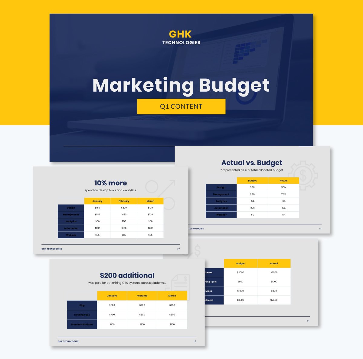
In many cases, especially in board reports or presentations, you may need to use a combination of different formats to present your data.

This board report also combines multiple charts and data formats.
Let’s break down each format and when they work best.
A textual data presentation turns data into informative and easy-to-understand summaries.
This format is ideal when you're working with a small set of data or need to share context with stakeholders without needing visuals like charts or tables.
You’ll often use this format in reports, memos or executive summaries when you need to give context without relying on charts.
It’s perfect for audiences who prefer to scan a few clear sentences instead of flipping through visuals.
For example, sales managers, project managers, project leads and strategy teams often use textual presentations to highlight key outcomes, explain changes or share early results before visual assets are ready.
Some use cases include:
A real-life example is a recent study on U.K. and U.S. knowledge-intensive firms that explains through a narrative summary how service customization drives innovation, but only when paired with deliberate learning processes.
Instead of charts, the report uses precise textual analysis to present correlations and insights, making it ideal for stakeholders who need context before diving into data.
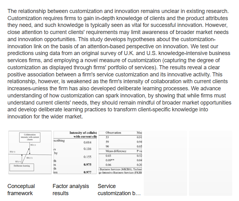
Source: ResearchGate
Here's another example of a textual data presentation I created with Visme.
Made with Visme Presentation Maker
Tabular data presentation is best when you need to share precise values across multiple variables.
Organizing information into rows and columns makes it easier to compare data points side by side. Another advantage of this format is that you or your audience can refer back to exact figures later on.
Industries like finance, research and consulting often rely on a tabular format for presenting data.
As the Engineering Writing Center at Utah State University notes, “Tables are used when illustrating exact numbers rather than trends.”
Tables leave little room for misinterpretation, but can become visually dense. That’s why professionals pair them with a short narrative summary or supporting graphic. It helps them highlight key takeaways while still making the complete data set accessible for those who want to dive deeper.
Some use cases for tabular data presentations:
For example, a sustainability officer at an agricultural firm shares a table that compares the environmental impact reduction percentage across multiple farms.
This tabular format helps decision-makers identify which farms are underperforming and which sustainability metrics require attention. In response, stakeholders can figure out how to prioritize interventions and benchmark performance.
In the table, farm 21 has lower target percentages than the others. This data indicates it needs better alignment with environmental goals.
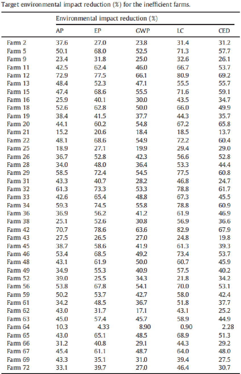
Source: ResearchGate
With the template below, you can put together a visually appealing tabular data presentation for stakeholders and clients.
This data presentation format turns raw numbers into charts, graphs or infographics referred to as data visualization.
Well-designed visuals reveal trends, outliers and proportions instantly, helping teams interpret insights faster and make confident decisions. They also simplify information and improve retention.
Usability researchers at Nielsen Norman Group note that clear visualizations “reduce cognitive load and help viewers grasp insights more quickly.”
Some of the types of data visualization include:
In this example, the Mekko chart shows product performance over a three-year period, comparing total sales and each category’s share of revenue.
The chart reveals that Smart Glasses led in 2021, while Smart Watches dominated the earlier years. At a glance, it’s easy to spot key trends and strategic shifts over the past three years.

You can use the chart above as a standalone when presenting to higher-ups. If you're delivering a board presentation, you can embed your charts within your slide deck like the template below.

Choosing how to present your data can determine whether your insights drive action or the message gets ignored. I’ve shared tips on how to decide which data presentation format is right for your next presentation.
In practice, this means choosing a format that your audience reads quickly and interprets without confusion.
A well-structured data presentation is like a good story. It has a clear beginning, middle and end. When presenting data, especially to executives or non-technical stakeholders, you need to guide them through the insights in a logical way.
To make your data clear and impactful, follow this 5-step structure that walks your audience through the insights with purpose and flow:
Made with Visme Presentation Maker
Great data presentations stand out and grab attention. In this section, I’ve gathered some of the best real-life data presentation examples that you can learn from.
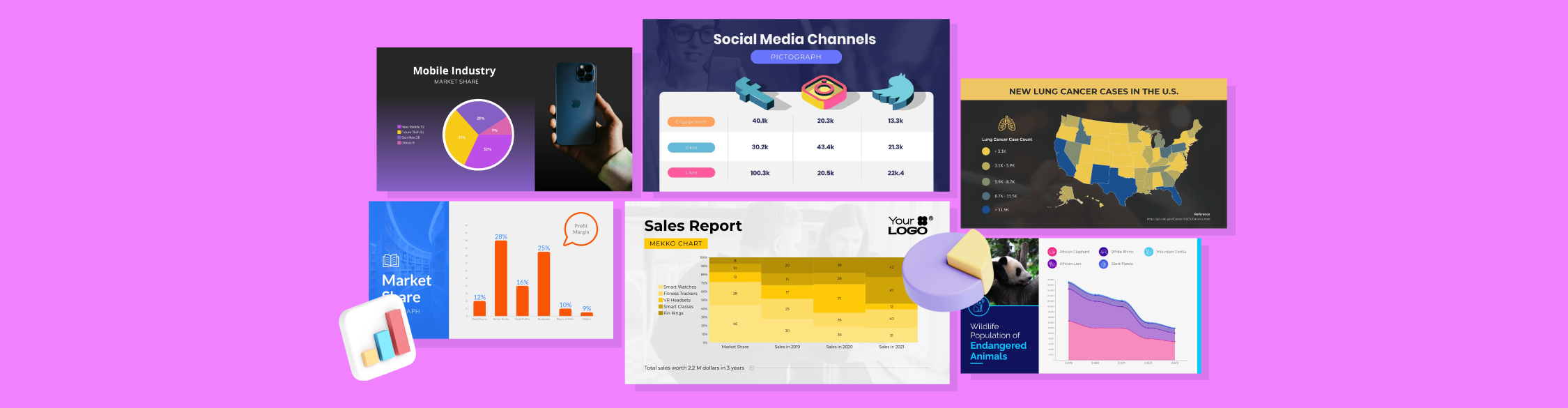
These handpicked examples cut across eight real-life formats: bar chart, heatmap, pie chart, histogram, scatter plot, stacked bar chart, area chart and pictogram.
And to make things easier, I’ve included customizable templates so you can quickly recreate what works and apply it to your presentations.
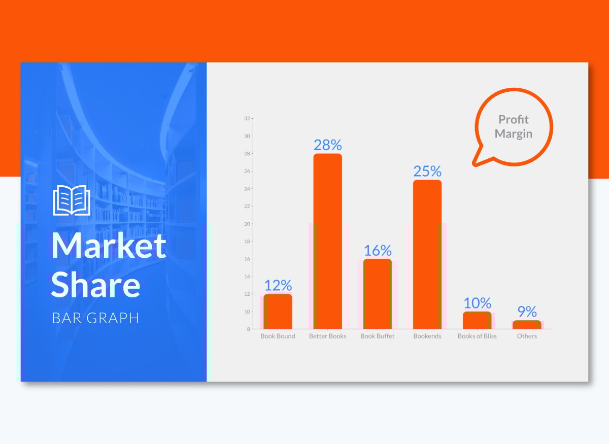
Bar charts, also known as bar graphs, use rectangular bars to show values for different categories. It’s one of the best ways to visualize data across business units, product lines or time periods.
One of the most effective uses of bar charts I’ve seen is in Tesla’s annual Impact Report, a corporate sustainability presentation aimed at investors and the public. The bar graph compares EV production by manufacturer over six years using a horizontal bar chart.
Each bar shows total units produced, grouped by company and color-coded by year, from 2017 to 2022. This makes it easy to compare growth trajectories and market position over time.
The chart appears early in the report, immediately after high-level KPIs and energy consumption, reinforcing Tesla’s strategic messaging with a clear, competitive snapshot. It highlights Tesla’s dominance, while also enabling readers to track how other automakers have progressed year by year.
Other visuals in the report dive into areas like battery longevity and supply chain emissions, but this bar chart remains one of the clearest snapshots of Tesla’s competitive edge.
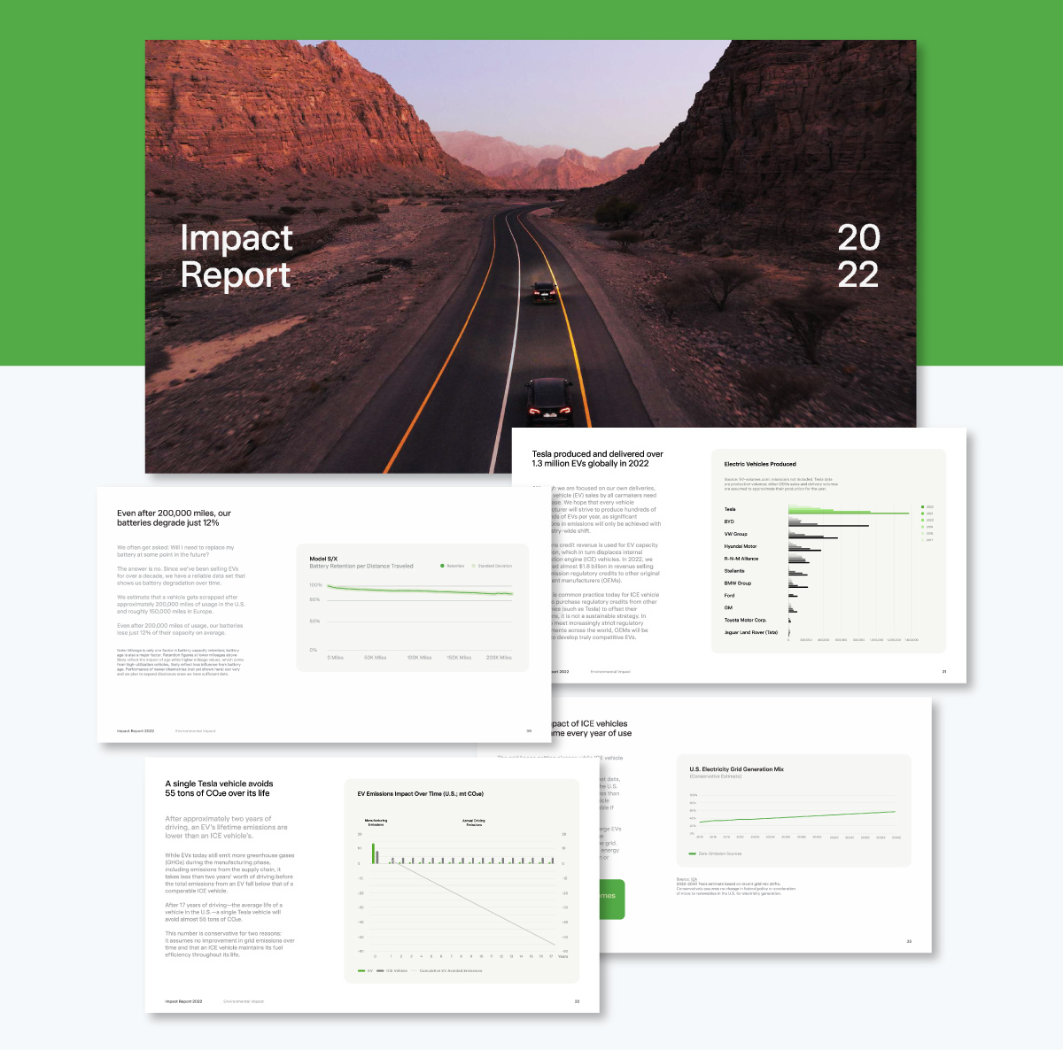
Source: Tesla’s Annual Impact Report
Excel and Google Sheets let you create basic bar charts, but they fall short when it comes to visual storytelling. With Visme, you can replicate Tesla’s easy-to-scan features and clarity. Instead of rigid, spreadsheet-style visuals, you get polished, interactive charts that make your message resonate with clients, executives or stakeholders.
Choose from an extensive library of professionally designed bar chart templates, animate your data to reveal insights gradually and fully customize fonts, colors, spacing and labels to align with your brand.
Heatmaps use color to represent data intensity. This visual format makes it easy for anyone to spot patterns, trends or anomalies across a dataset.
For example, IKEA uses in-store heatmaps to optimize store layouts based on customer foot traffic. These visualizations — powered by sensors and camera analytics — track movement patterns and dwell times, including where shoppers slow down, linger or skip entirely. The goal is to identify high traffic zones and overlooked areas.

Source: Business Insider
This insight helps their retail teams reorganize shelves, improve product placement and position high-margin items where customers naturally spend more time.
These heatmaps are part of a broader analytics strategy and are likely embedded in internal dashboards presented to retail planners and UX teams. They visualize where customers slow down, skip or linger and identify which areas attract attention and which go unnoticed.
Unlike static charts, heatmaps convey movement and density in real time. This makes them ideal not for reporting metrics, but for influencing spatial decisions and driving in-store conversions.
To create a heatmap, you can start with Visme’s map templates or build a custom matrix-style layout using colored cells.
For example, if you're visualizing sales by state, you can select a U.S. map template and manually adjust each state’s color to reflect volume. This heatmap visualizes patterns that enable public health analysts or policy teams to prioritize resources, detect regional disparities and make more informed decisions.

Apply consistent, brand-friendly gradients from Visme's color palettes while ensuring your heatmap remains accessible and easy to interpret even for non-technical stakeholders.
This U.S. map above uses color shading to show the number of new lung cancer cases per state. Darker colors indicate states with higher incidence rates, while lighter shades signal fewer cases.
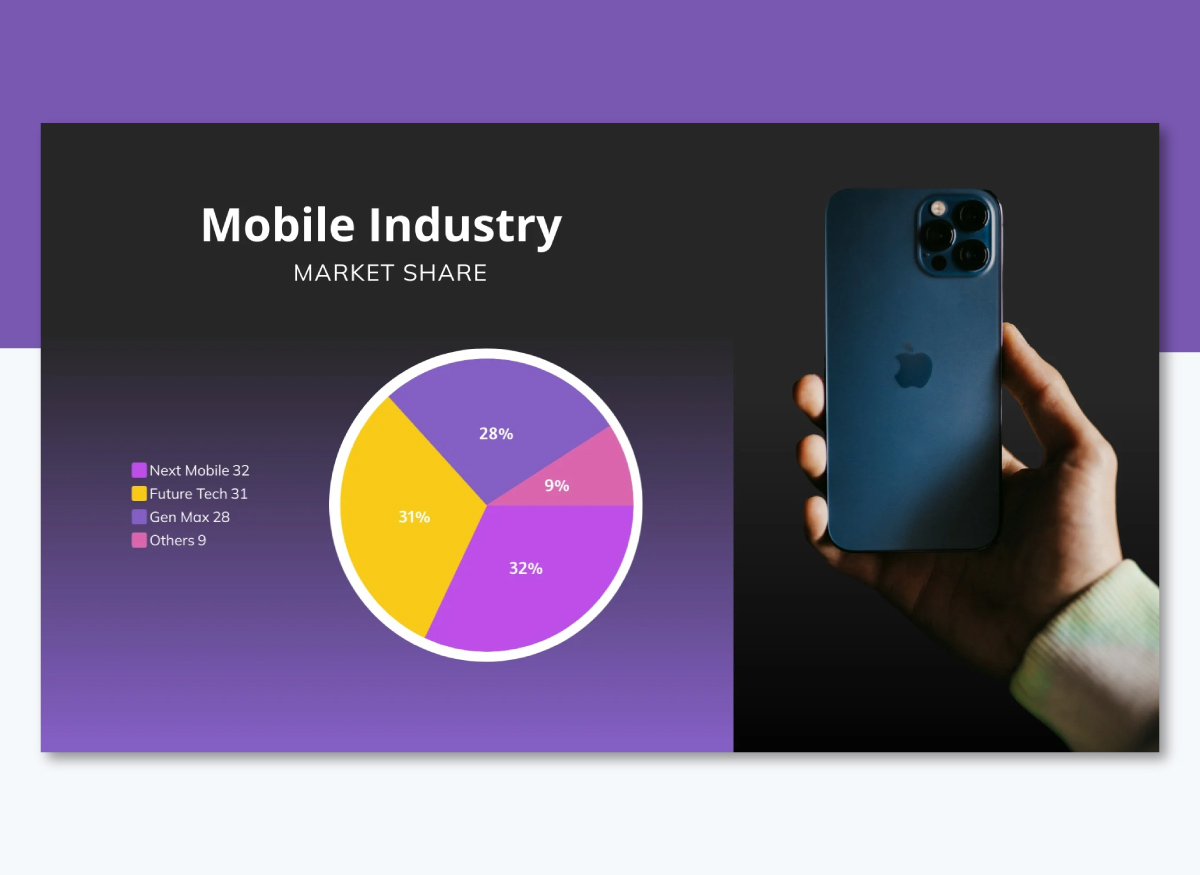
A pie chart displays data as slices of a circle, with each slice representing a proportion of the whole. It’s best used when you want to show how different parts contribute to a total of 100%. The entire chart equals the whole and each size reflects that category’s share.
Slack’s Diversity Report uses pie charts to break down employee demographics by gender and ethnicity.
The report includes multiple pie charts comparing gender identity and racial/ethnic representation across the company’s global workforce, technical teams and leadership roles.
These visuals give stakeholders, investors and the public a quick, intuitive view of Slack’s progress toward inclusion goals.
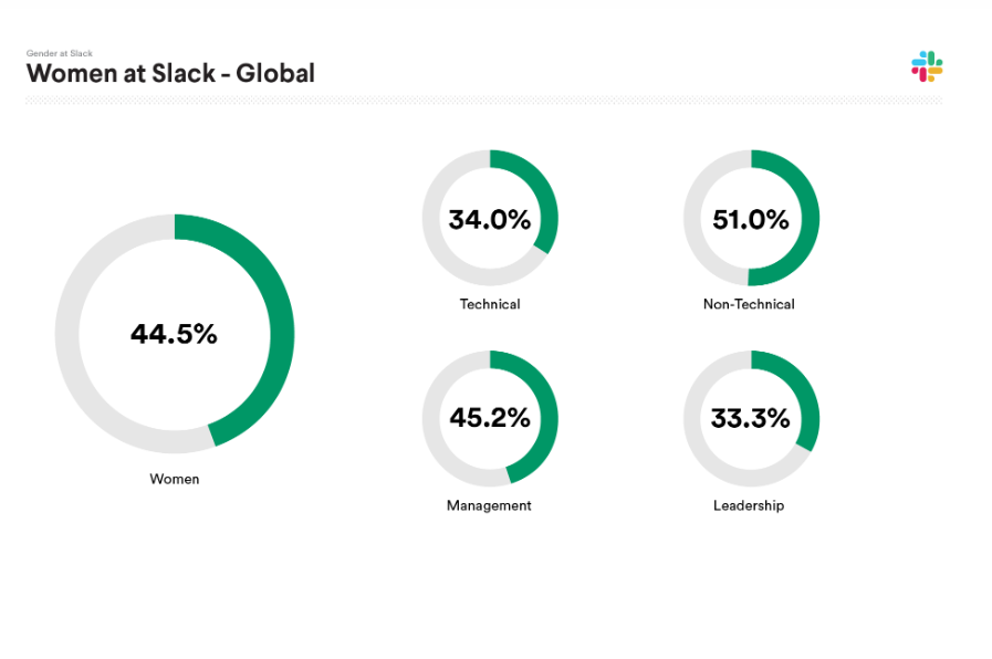
Source: Slack's Diversity Report
To create a pie chart in Visme, you can start with this template below or select from one of our professionally designed pie chart templates.
Input your data and the tool will automatically calculate and size the slices. Make your chart more engaging by adding interactive elements like tooltips, hover effects or pop-ups that reveal additional details when users hover over a slice.
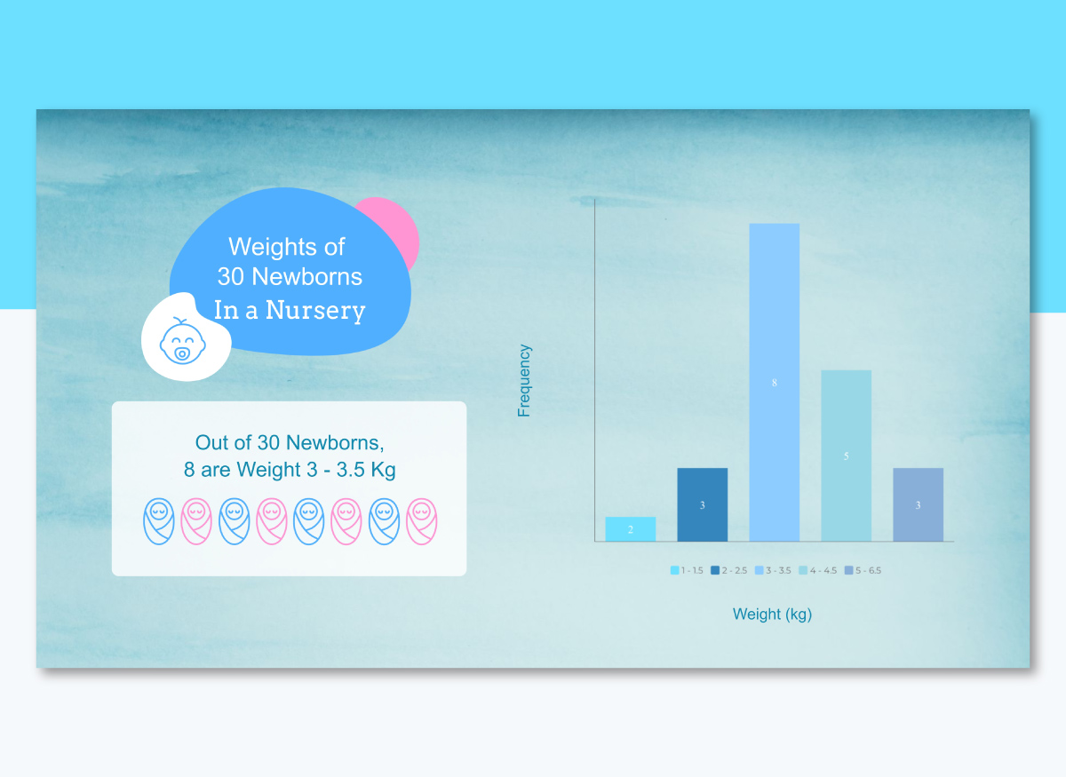
A histogram is ideal for visualizing the distribution of continuous numerical data. It looks similar to a bar chart but it groups values into intervals (or “bins”) rather than comparing distinct categories.
Each bar shows how many data points fall within a range, making it perfect for spotting patterns, clusters or outliers in large datasets.
In manufacturing, histograms help monitor product quality by displaying defect frequency. Finance teams can use it to visualize how client incomes or investment returns are distributed. They can be used to highlight grade distributions across cohorts in educational settings.
Amazon QuickSight uses histograms for data analytics across business metrics like transaction values or inventory levels. Their dashboard divides a numerical variable into bins and displays the count within each interval to get clear frequency distribution insights.
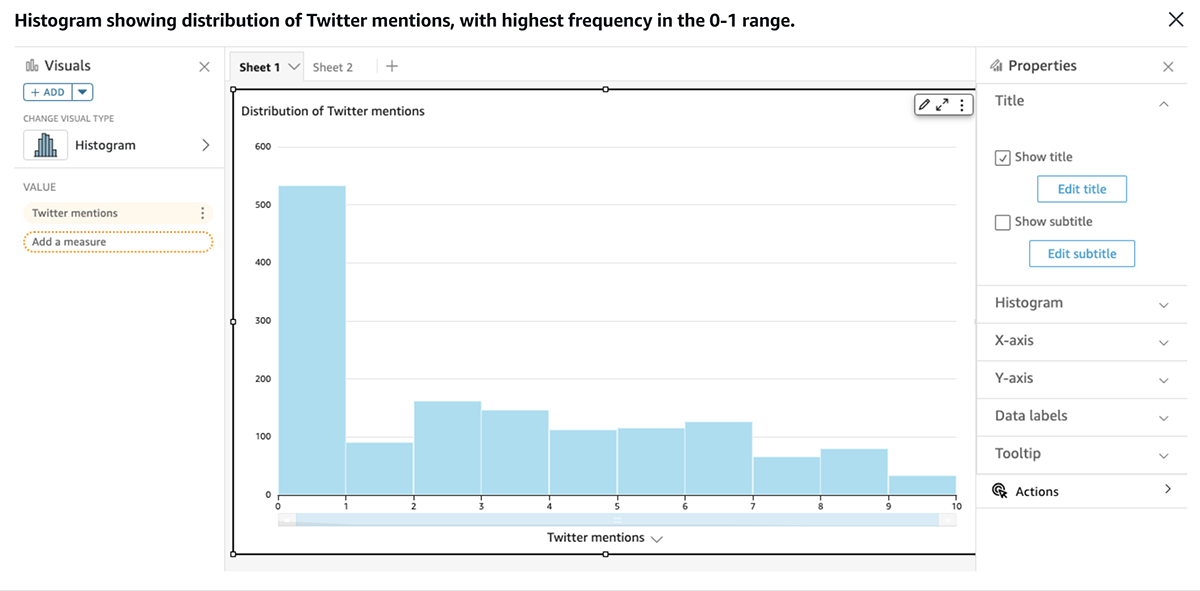
Source: Amazon Quicksight
To build a histogram in Visme, you can customize the template below or repurpose one of our histogram templates. Just input your data frequencies or import raw values via CSV or Excel. Visme helps you keep everything clean and centralized.
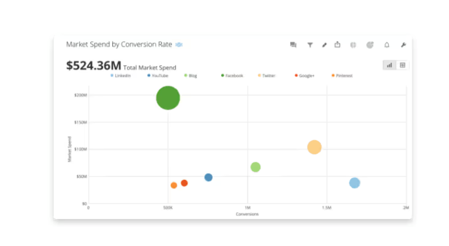
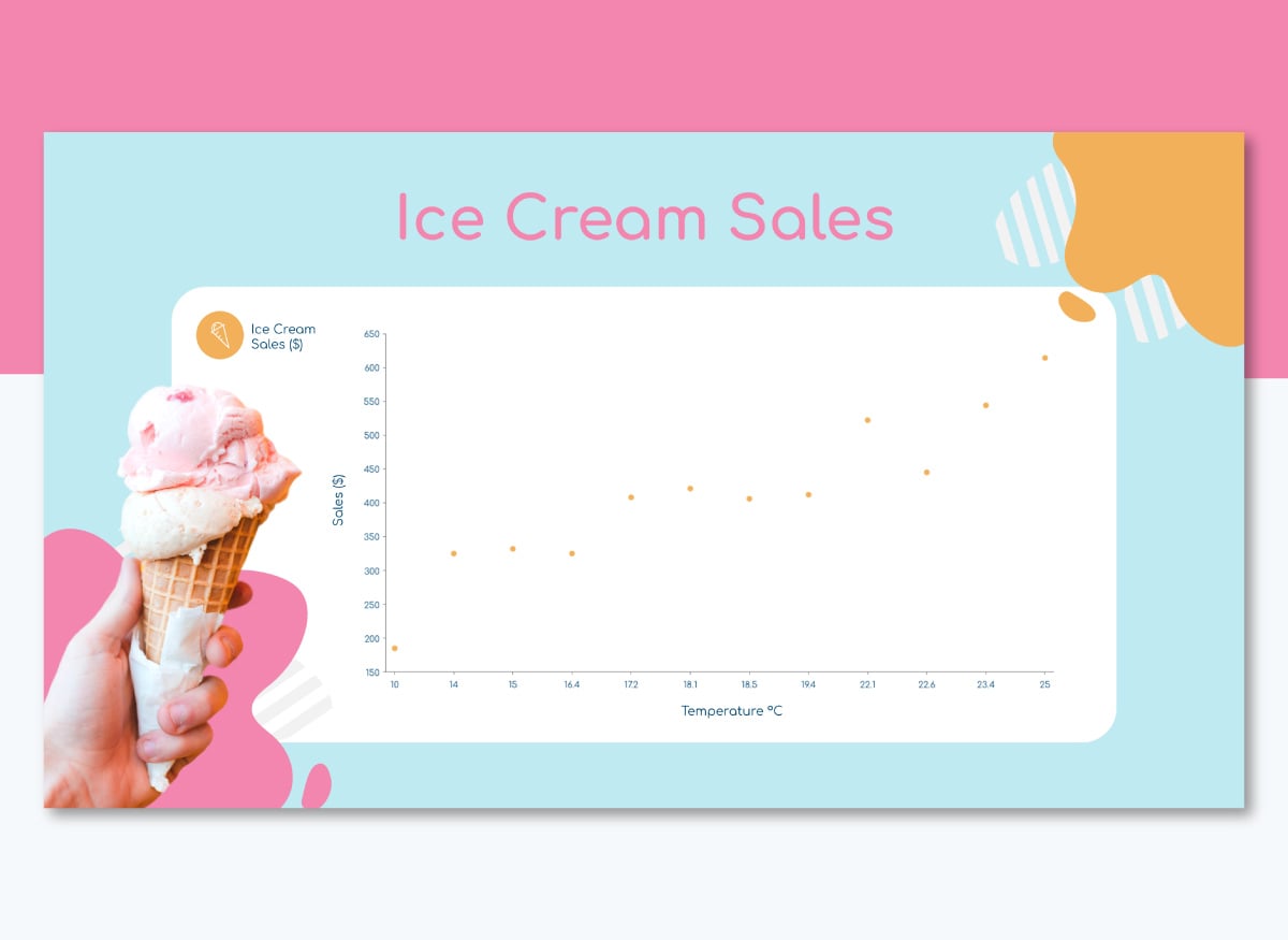
A scatter plot visualizes the relationship between two numerical variables. Each dot represents a data point. Its horizontal position and vertical position correspond to the values of two metrics. This format identifies correlation, patterns and bivariate data.
They are powerful tools in business analysis when making exploratory data reviews.
Domo deploys scatter plot in their analytics platform to correlate marketing spend against lead generation across campaigns.
It’s embedded within a broader marketing campaign dashboard that includes filters, trendlines and interactive labels. Users can hover over data points to view campaign names, ROI or conversion rates, enabling fast, data-backed decision-making in real time.
Source: Domo
Visme makes it easy to build a clear, presentation-ready scatter plot like the one below.
Choose a scatter plot template with an XY layout. Then, input your data as two numeric columns (X and Y values), either manually or by pasting from Excel.
You can fully customize how data points appear. Adjust color, size or even use shape variations to compare categories like Q1 vs. Q2 or 2023 vs. 2024. Visme also allows you to overlay a trend or regression line to help stakeholders visualize correlations.
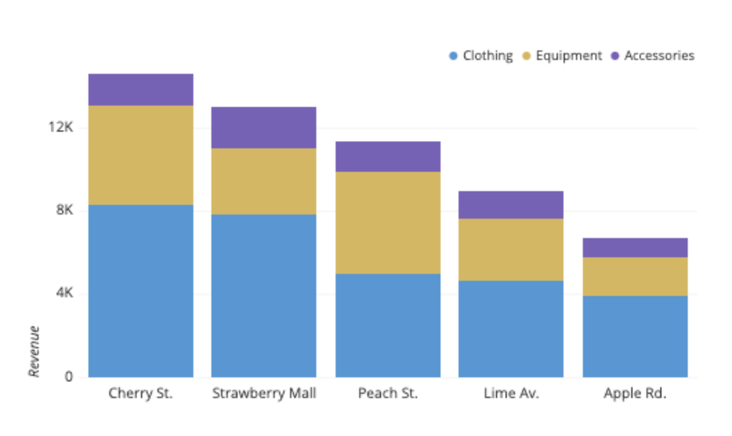
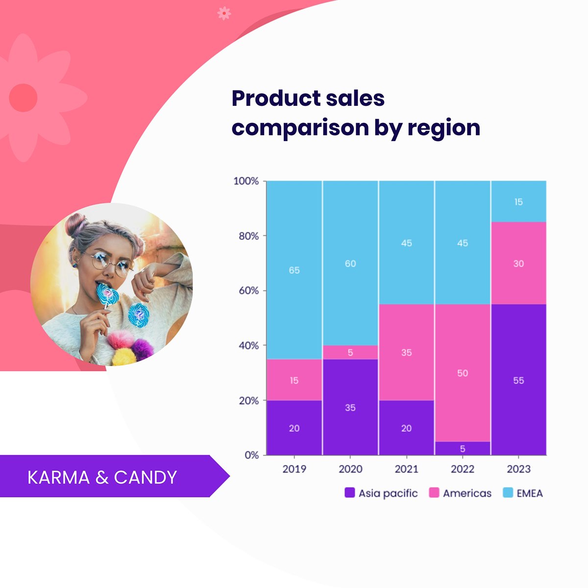
A stacked bar chart is a variation of a bar chart where each bar is divided into multiple segments. Each one represents a sub-category, making it possible to visualize both the total and its internal breakdown within the same visual.
These charts can be vertical or horizontal and are particularly helpful for analyzing part-to-whole relationships across multiple groups.
For example, Atlassian uses stacked bar charts in their BI dashboard to show revenue by store location and department across multiple retail branches.
Source: Atlassian
Each bar represents stores subdivided into departments like clothing, equipment and accessories. This layout lets you see total performance per store and each department’s contribution to that total.
With this insight, sales leaders can:
To create a stacked bar chart in Visme, you can use our Graph Maker or start from a dedicated template. Input your data and the tool will automatically stack the values by category or series.
You can fully customize each segment, change colors to reflect your brand or improve accessibility, adjust spacing and toggle on or off data labels.
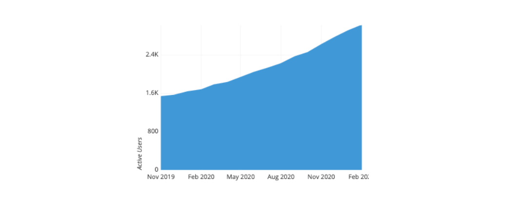
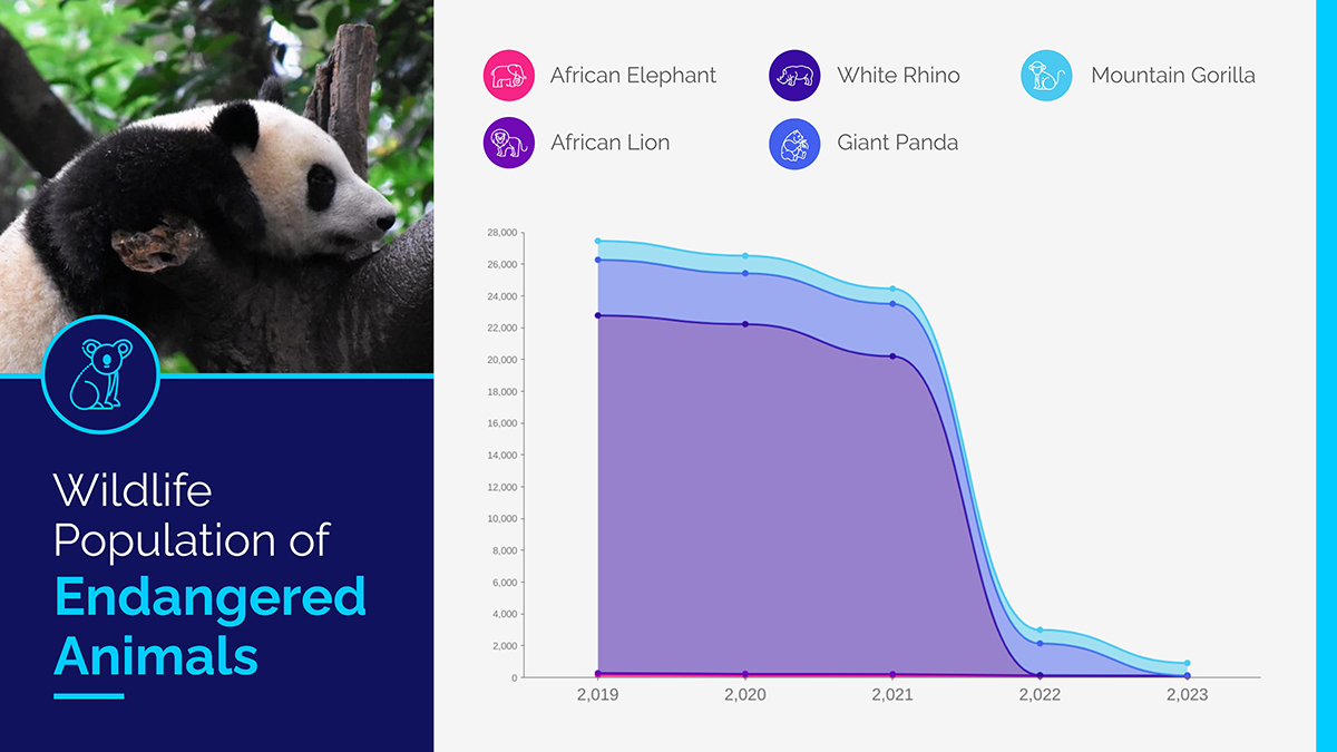
An area chart is a variation of the line chart that fills the space below the line with color, emphasizing the volume or magnitude of values over time. It’s a powerful way to show trends, cumulative totals or how multiple categories contribute to a total.
Unlike line charts that focus on individual data points, area charts highlight the quantity under the curve, making them ideal when the combined impact matters more than individual fluctuations. They work best with a limited number of series (ideally 2 to 4), as too many stacked layers can make the chart harder to read.
Industries like finance, energy, SaaS and digital marketing use area charts to show trends in revenue, usage metrics or resource allocation. They’re also helpful in B2B settings where cumulative performance or gradual shifts need to be visualized clearly for decision-making.
For this example, we are referencing Atlassian again. They use area charts in their BI guide to illustrate changes in active users over time.
The chart fills the area beneath monthly active user counts and highlights growth trends and volume shifts. This enables growth teams to quickly assess user engagement increases and detect seasonal spikes or drop-offs.
Source: Atlassian
With Visme, you can build an area chart from scratch using the graph maker.
To speed things up, use the template below. Alternatively, tap into our extensive library of pre-designed area chart templates to find one that suits your needs.
Just input your data points and Visme will generate smooth trend lines with the corresponding filled areas.
Customize each layer by applying solid or gradient fills. If you're stacking multiple categories, use distinct colors or semi-transparent fills to improve readability.
For cumulative comparisons, solid fills work best to convey volume at a glance. You can also adjust labels, axis titles and apply on-brand colors to match your company’s visual identity.
A pictogram chart uses repeated icons or symbols to represent quantities visually. Instead of bars or dots, you’ll see small images like people, cars or coins where each icon represents a fixed number of units.
For example, five car icons, where each icon equals 10 vehicles, visually communicate 50 cars.
What makes pictograms effective is their impact. These visuals make numbers feel more relatable and engaging, especially when communicating with non-technical or broader audiences.
For example, OSHA (Occupational Safety and Health Administration) uses standardized pictograms to communicate chemical hazards in workplace environments.
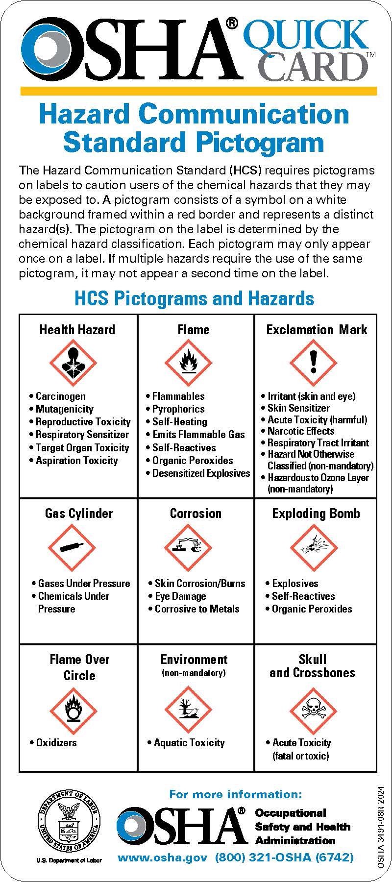
Source: OSHA
Workplace safety documentation comes with a standardized set of icons to represent chemical risks such as carcinogens, flammables, corrosives and environmental hazards.
You’ll find these pictograms in printed safety guides, wall posters and digital training materials targeted to a broad, non-technical audience that includes warehouse workers, chemical handlers and compliance officers.
These visualizations are highly effective in this context because they rely on shape, contrast and color to communicate meaning. They’re also consistent across industries, helping reinforce retention and reduce misinterpretation.
Visme makes it easy to design pictograms that are both visually striking and professionally polished. You can start with one of our pre-built pictogram templates or create one from scratch using the design editor.
To build your Pictogram chart, choose an icon that represents your subject. You can tailor the look and feel of the chart using Visme’s built-in icon library or by uploading your own. Adjust the layout to show icons in a row, grid or block format.
Then refine spacing, alignment and color schemes to match your brand or data story.
For B2B teams, this makes it ideal for executive dashboards, reports or client presentations where visual clarity and quick comprehension are essential.
And because every element is customizable, you can ensure your chart looks sharp and aligns with your professional standards.
Before you dive into charts, colors or tools, it’s key to make sure your data is telling the right story in the right way. That means avoiding the pitfalls that confuse audiences or dilute your message.
This section walks you through the dos and don’ts of data presentation, from choosing the right format to labeling and layout, so your insights land with clarity and purpose.
Consider them when you're reporting to stakeholders, presenting to clients or sharing results internally.
Data is only valuable if your audience understands and acts on it. These nine steps will guide you in presenting your data with clarity, confidence and impact:
Want to learn more about creating impactful data visualizations? Part 9 of our free graphic design course walks you through it step by step.
A data presentation is the structured communication of data through text, tables or visuals to support decision-making. It’s used to convey insights clearly for internal reporting, client presentations or strategic planning.
Data presentations are crucial for transforming raw numbers into actionable insights. They speed up understanding, align teams around key findings and support faster, more confident decision-making.
The five ways of data presentation in research are:
Yes, data presentation is a skill that combines analysis, design and business communication.
Professionals can translate complex data into clear, trustworthy insights that drive informed decision-making across teams and stakeholders.
Follow these steps below to make an insightful data presentation:
Yes, data analysts have to do presentations and are expected to present their findings to stakeholders. Most analyst roles include translating complex data into clear, actionable insights through dashboards or slide decks.
The most widely used data visualization tool is Microsoft Excel for everyday charts and basic data visualization.
For business intelligence and interactive dashboards, Tableau is a leading choice among data professionals.
However, for teams that need branded, presentation-ready visuals, Visme is the go-to choice for its ease of use, animated charts and design flexibility.
Whether you’re building a stakeholder report, a sales deck or a performance dashboard, your data needs to do more than inform and persuade.
Data becomes more powerful when it’s presented professionally. With Visme, you don’t need to be a designer to make that happen.
Choose from a wide range of data presentation templates, including infographics, dashboards, charts and slide decks and then customize them with your own data, colors and visuals.
Tap into Visme's Brand Wizard, design assets, collaboration, design, AI and data visualization tools to create branded presentations that engage your audience.
Sign up for Visme to transform your data into visual stories that inspire action and drive smarter decisions.
Design visual brand experiences for your business whether you are a seasoned designer or a total novice.
Try Visme for free