


Typography Infographics: 12 Inspiring Examples & Techniques

An infographic can be an extremely powerful way to display information for your audience, but only if it’s done correctly. It typically consists of a single page or panel designed to present information concisely and visually. It is optimized for quick consumption, often fitting key data, charts, and visuals into a single, easily viewable layout.
Numerous organizations are creating infographics, but they keep missing the mark.
When creating an infographic that is both educational and visually appealing, there are a few best practices business owners and marketers should always keep in mind.
These best practices help designers and non-designers alike follow a blueprint when creating their infographics.
This article will help you understand the eight infographic best practices your business needs to start pumping out compelling visuals that tell your story, convey information and drive traffic to your website.
Traffic that, in turn, will likely turn into paying customers!
Ready to take advantage of your next infographic? Make sure you stick to these proven best practices for infographics each and every time. Then tap into Visme's extensive library of professionally designed infographic templates to make free infographics that look incredible.
In this video, we've also broken down the best types of infographics to help you get a good idea of what your options are before you start.
Here’s a quick overview of the best practices you’ll learn in this guide.
Before you dive in, there’s one thing worth knowing from the get-go.
Not every best practice on this list carries the same weight.
Some, like focusing on a single topic, building a clear visual hierarchy and choosing the right data visualization, determine whether your infographic works at all. Others, like font pairings, color schemes and dimensions, determine how well it's executed.
The ones that tend to perform the best (and even go viral) combine both: a sharp, focused point presented in a way that makes people want to share it.
Keep that distinction in mind as you work through the practices below.
An infographic works best when it makes one clear argument and supports it with visuals. When you try to cover two or three ideas in the same layout, the message is likely to get lost.
Even if your infographic is part of a longer piece of content, such as a blog article, an ebook, or an online course, it still needs to focus on a single point at a time. Also, if your infographic consists of a collection of statistics, every single one must support the same idea.
Here’s a simple test: if you can't summarize your infographic's point in one sentence, you have more than one topic. Go back and narrow it down before you start designing.
That said, things can also go wrong in the other direction. "One point" might be treated as "one fact," leaving an infographic too thin to be useful.
There's a difference between one point and one piece of information. A step-by-step process or a multi-category comparison naturally holds several data points, and that's fine, as long as they all serve one overarching message. The problem is cramming in unrelated topics and not including the details that back up your point.
And then, sometimes you'll have more than one idea worth covering. When that happens, don't force them onto one page. Split the topics into a series of infographics, or hold the secondary point for a companion piece. Each one stays focused, and together they cover more ground.
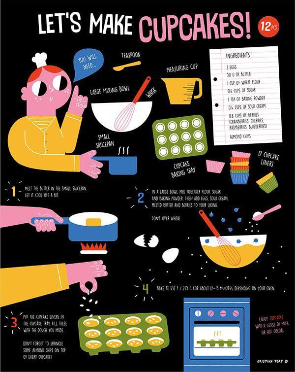
Here’s a great example of how important it is for an infographic to stick to one topic. This illustrated infographic by Kristina Tort visualizes a cupcake recipe with whimsical yet simple graphics.
Look how tightly it holds to the recipe. It opens with the exact tools and ingredients you'll need- a whisk, a saucepan, 12 liners- then runs through four numbered steps, from melting the butter to pulling the tray from the oven.
Even the closing note, enjoy with a glass of milk or hot cocoa, keeps you inside the same task. There's nothing extra to process, just how to bake the cupcakes.
An infographic without visuals is just text. Every graphic element you include- icons, illustrations, photography, data visualizations- must help carry the message so the text doesn't have to. Try this trick: if your infographic stops making sense after you remove most of the text, the visuals aren't doing enough work.
Consistency also matters regarding the visuals you use. If you start with line icons, use line icons throughout. Mixing styles, such as placing flat icons at the top and illustrated characters at the bottom, makes the design feel unbalanced.
Your infographic can draw from four types of visual elements:
Not every infographic needs all five, but a strong one pulls from several of them.
The type of visual you use is just as important.
According to a 2025 visual content report, 34.3% of marketers ranked original graphics as their top-performing content type, while nearly 4 in 10 rated stock photos as poor performers. Custom visuals outperform generic ones because they're specific to the point you're making.
A lot of the time, the best way to make your point understood is with data visualization, but which ones do you need for your own design? Choosing the right data visualization type depends on what your data is actually saying.
Unfortunately, a badly chosen visual can misrepresent your data or make a simple point hard to follow, and that can ultimately cost you the credibility the infographic was supposed to build.
Here are some ideas:
There are over 44 types to choose from, so pick the one that makes your data easiest to read at a glance.
For visuals that are harder to source, use Visme's AI Image generator to create something specific to your topic. Describe what you need in the prompt and use the output as a visual anchor for the infographic.
The infographic example below shows this practice in action. On the question about whether businesses use social networks, the orange arc fills most of the gauge while the gray "No" slice stays small, so you catch the 76% majority from the shape alone.
The thumbs-up and thumbs-down hands signal positive and negative responses without a word, and the briefcase-and-clock icon tells you a section is about duration.
When someone sees your infographic for the first time, their eyes should know exactly where to go. If they have to figure it out, the layout isn’t flowing.
This “flow” phenomenon is controlled by visual hierarchy. It's the order in which your eye moves through a design, driven by size, color, contrast and placement. The most important information should be the most visually dominant. Supporting details come after. Everything else follows.
There are two practical ways to guide the reader through your infographic: placement and direction. To get these right, it helps to know how people scan a page.
Eyes tend to follow a Z-pattern on lighter, image-led layouts and an F-pattern on text-heavy ones, both starting at the top left. Place your most important information along those paths and the hierarchy lines up with how people already read.
Both approaches will work. The right choice will depend on how complex your layout is. A simple top-to-bottom infographic usually needs nothing more than clear placement and color breaks between sections.
Watch out for things that can actually kill flow. For example, centering every element leaves no clear entry point. Giving everything equal size and weight means nothing stands out. And two or three elements competing to be the focal point split attention, so the eye doesn't know where to start. Each one of these actions will strip out the hierarchy you're trying to build.
A more complex layout with branching information or a non-linear flow will need explicit visual cues, such as arrows or numbered steps, to keep the reader oriented.
The infographic example below plays to the Z-pattern we mentioned earlier. The blocks alternate left and right, pulling your eye across the page and down in the same back-and-forth motion readers use to scan.
The large 01 through 04 labels lock in the order, so you always know which block comes next. The header supports it, with the title in the biggest text and the subtitle smaller and less prominent.
The infographic below does something similar to the Z-pattern, though it's not as evident at first sight. The steps follow a winding S-shape that curves back and forth down the page, leading the eye from one point to the next the same way a Z would, just along a route that takes a beat to notice.
The connected ribbon and the numbers 1 through 10 keep you on track, tracing one continuous line from the first hiring need down to the final decision.
Choosing the perfect font combination for your infographic can get tricky. There are thousands of typefaces to choose from, and pairings can either clash or sit too close to create any real contrast. Get it wrong and your text blurs into one flat block.
But here’s what you need to know to make this process easier.
A reliable starting point is a serif/sans-serif pairing. Beyond that, here's what makes a font combination work:
Test your fonts at the size and resolution people will actually see them in. Infographics often get viewed on a phone or shared as compressed images, where small and detailed type is the first thing to fall apart. Shrink your design down or preview it on mobile to confirm everything stays legible. Best Practice #7 covers this in more detail.
Note the visual below. On the left, both fonts are using the Slab classification. This doesn’t offer much contrast between the two typefaces. On the right is a Slab Serif font with a Geometric Sans Serif font.
The combination on the right offers a much more noticeable differentiation between the two font types (header versus body), and makes for a much more cohesive pairing. Also notice the size difference between the two texts; it’s noticeable; you know instantly which is which.
:new:Visme's font pairing guide
Once you've settled on a font combination, it's time to pick a color scheme. Stick to 2-3 colors maximum. The exception is when your colors exist on a spectrum — a rainbow gradient or a range of shades of a single color — where using more is acceptable and can look intentional.
Here are four ways to choose the right colors:
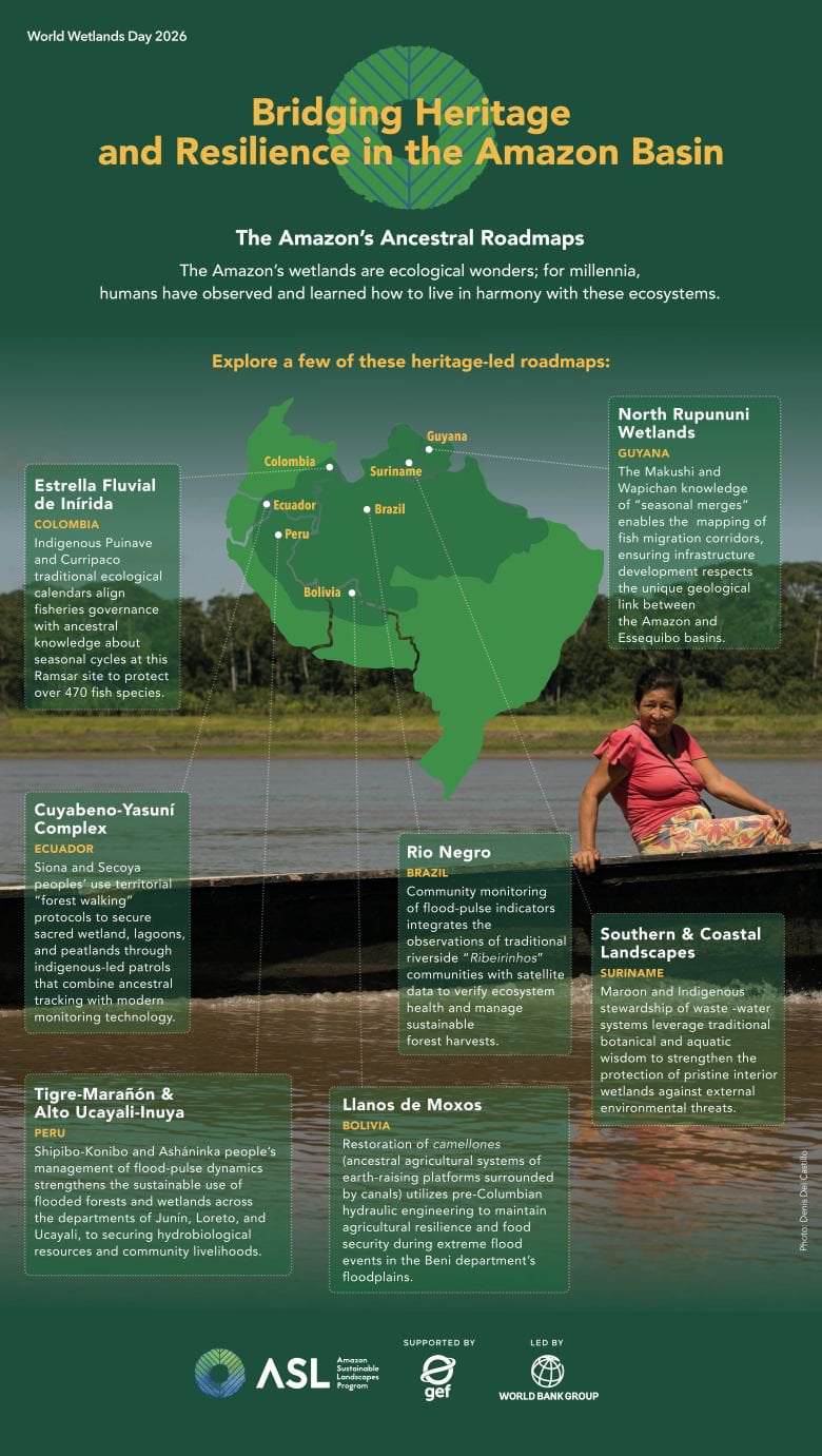
This infographic from the World Bank Group is a perfect example of a cohesive green-and-yellow color palette. The fact that the lady’s top is pink is most definitely intentional so that she stands out from the rest of the design. This is also a good example of how to use photography in an infographic design.
The most common dimension for an infographic design is long and vertical. But there are other options if you’d like to do something different. For example, Instagram infographics are better in square or portrait mode.
Before you decide on dimensions, ask yourself: How much information do I need to include? How will I share the infographic? Who is my audience and how do they consume content? Will this infographic be part of a longer project? Your answers will point you toward the right format.
Here's what works where:
Made with Visme Infographic Maker
Your infographic might look great on a desktop, but does it look just as good on a mobile device? Ensuring your infographic is mobile-friendly is one of the most reliable way to reach a wider audience.
In fact, mobile now accounts for 61% of global web traffic, according to StatCounter data. That's roughly 6 in 10 people seeing your infographic on a screen the size of their hand. Design for desktop only and the majority or viewers are left pinching, zooming and scrolling sideways just to read it.
But how do you do it? The best way to achieve this purpose is to design for mobile first. Here are the things to keep in mind.
Made with Visme Infographic Maker
Every statistic, study or data point in your infographic must be properly credited. First, to ensure proper usage of someone else’s work and second, to cement your credibility. Sometimes it will be one source; other times it will be several. Regardless of how many there are, they need to be added to your infographic’s footer.
Generally, a URL is enough, but if your source asks for a particular citation style, then you have to use that.
The footer is also the right place to add your company logo, name and website URL. A well-distributed infographic gets embedded, screenshot, pinned and shared without context. If your branding isn't on it, you lose all credit.
The infographic template below shows what a working footer looks like. The data sources sit at the bottom left under a clear "Sources" label, with both URLs credited. Below that, a "Created by" line holds your name or company, and the social icons on the right send readers back to your channels.
Building a footer from scratch? A reliable order is sources on the left, your logo or name in the center, and the social links on the right. That keeps the credit and the action visually separate, so neither gets lost.
To make your footer work even harder, add a call to action that tells them what to do next. For example, invite them to scan a QR code that will lead them to visit a landing page, sign up for our email list, learn more about your company, or donate to your cause. Whichever it is, keep it short and direct.
The strongest CTAs match what the infographic is about. A piece on email marketing should send readers to an email marketing resource, not a generic homepage, and it should ask for one clear action rather than stack several.
If you create infographics as a team inside a dedicated workspace, use Visme's dynamic fields to manage footer details across multiple infographics at once. Update your URL or social handles in one place, and every infographic in that workspace updates automatically.
To help you get all this done faster, every Visme infographic template includes a footer section where you can add sources, your logo and a clear CTA.
If you’d like to review the most important Do’s and Don’ts of making infographics, the video below is just what you need.
An infographic that only works for some of your audience just won’t cut it in 2026 and beyond. You need to design for accessibility as well. In short, accessibility means making sure your design is readable and understandable for people with visual impairments, color blindness, or anyone using a screen reader.
But in reality, accessibility simply makes your content accessible to anyone and everyone, regardless of their personal qualities.
That’s why most accessibility fixes are simple design decisions you'd want to make anyway. Here are the most important actions you can take to create an accessible infographic.
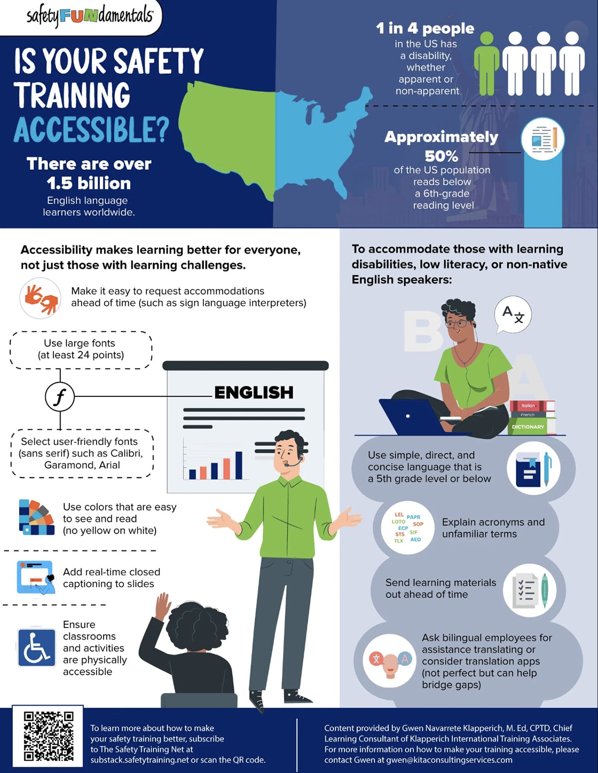
An accessible infographic doesn't have to look clinical or stripped back. The example below from SafetyFUNdamentals practices what it teaches: high-contrast, bright white text on a dark navy background, large sans-serif type that remains legible, and an icon beside every point so meaning never rests on color alone.
Its two-column structure groups each idea under a short, plain-language label, which keeps the reading order easy to follow.
AI speeds up the slow parts of making an infographic: outlining, sourcing visuals and tightening copy. The judgment calls still stay with you, but the busywork moves a lot faster.
Here's where they fit into the process.
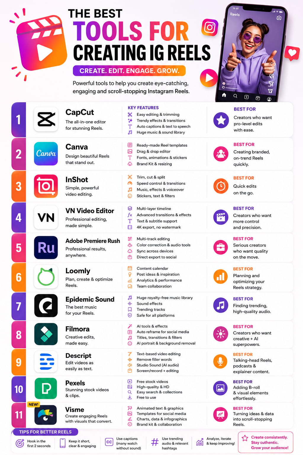
Here’s an infographic generated with the custom GPT mentioned above, from the single prompt "I need an infographic about the best tools for creating Instagram reels." It pulled the information from the web and built the layout on its own.
The result holds up at a glance, though you can't fine-tune it to the detail the way you can in an editor. If that level of control doesn't matter for your use case, the full-AI route is a fast, solid option. But if it does matter, let AI handle the first draft and finish the customization yourself.
An interactive infographic gives readers control over how they explore your content by clicking through data points, filtering results, triggering animations or navigating between sections.
It's not the right format for every topic. But when your data is layered, your audience is research-oriented, or you want to track engagement, interactivity adds more dimension.
Here's when it makes sense to go interactive:
For a full breakdown of how to build one, visit Visme's guide to interactive infographics.
Data visualization designer Nadieh Bremer's Searching for Birds is a strong example. It’s an interactive piece that weaves Google Trends data, bird illustrations and maps into a scrollable experience readers navigate at their own pace.
The Pudding takes a similar approach across culture and data journalism, letting readers explore and interact with the story rather than just read it. Visual Capitalist does the same for financial and economic datasets.
Most of the best practices in this guide have focused on the ideation and creation stages. So here’s one about when you’re done with all that.
How you distribute the finished infographic will determine how many people actually see it. An infographic sitting on a single blog post with no promotion will underperform compared to a mediocre one that gets shared across five channels. It sounds harsh, but it’s true.
Here's how to get your infographic in front of the right people, at the right time.
Finally, regardless of what path you take, optimize your infographic for SEO. Alt text on the image should describe what the infographic actually shows. The file name should include your target keyword before you upload it. The page title and meta description should treat the infographic as the primary content, not just a supporting visual.
For more on turning those embeds into links back to your site, see our guide to using infographics for link building.
If you still have questions about creating infographics, these FAQs will clear your doubts.
The best format is whichever one showcases your information most clearly. The most common is long and vertical, but square, horizontal, or even an interactive infographic can work depending on your content and where you’re sharing it.
A strong infographic is characterized by a clear visual hierarchy, relevant data, concise text and engaging design. It’s visually appealing while also ensuring information is easily digestible. Data is represented with a logical flow and the layout is organized and concise.
Avoid clutter, excessive text, unclear visuals and inconsistent style. Limit the amount of information by using only essential visuals, focus on conveying key points with brief captions and prevent confusion—to enhance readability.
About 50% lies in compelling visual elements that effectively convey information. The other 50% is the content’s quality and accuracy.
The first thing on your infographic should be a captivating and informative headline to immediately capture the viewer’s attention. It should set the tone for the entire infographic and entice the audience to explore further.
Ideally, an infographic should be kept to a single page to maintain viewer engagement and simplicity. A concise one-page format encourages a quick grasp of information without overwhelming the audience.
A good infographic has one clear topic, uses visuals to carry the message, and is easy to scan from top to bottom. It’s accurate, well-sourced, and readable on any screen size.
The five core elements of an infographic are:
Visual hierarchy, color contrast, font consistency, data accuracy, and a single focused message. Every design decision should serve the reader’s ability to understand the information quickly.
Follow these steps to create an infographic:
These eight infographic best practices will help elevate your infographic design game to the next level. When you create infographics with Visme, you’re already one step ahead thanks to hundreds of professionally designed templates that save you time and effort.
Sign up and start creating jaw-dropping infographics today with Visme’s infographic templates and design center.
Design visual brand experiences for your business whether you are a seasoned designer or a total novice.
Try Visme for free


![How to Make an Interactive Infographic [+Templates]](https://visme.co/blog/wp-content/uploads/2023/11/How-to-Make-an-Interactive-Infographic-Quick-Guide-8-Customizable-Templates-Thumbnail.jpg)


