


Healthcare Data Visualization: How to Turn Data into Impactful Stories

Data is a powerful tool.
It’s critical for revealing patterns, highlighting risks and qualifying opportunities.
On its own, it’s just numbers on a screen. Patterns get buried, risks stay hidden and opportunities go unnoticed.
To unlock its full potential, you need to tell the story behind the numbers. That’s where data visualization comes in handy.
You might sniff a vital pattern or two in a data pile. But you can only make complete sense of it if you plot it into a graph or chart.
On top of that, data visualization helps you get your message across faster and with more impact, whether you're pitching to stakeholders, tracking KPIs or uncovering trends.
Wondering where to start? Don’t worry, I’ve got you. In this guide, we’ll answer what data visualization is in-depth for you, why it’s important and what you need to get started.
By mastering key data visualization techniques and familiarizing yourself with the data visualization tools I’ve listed in this guide, you'll elevate your reporting from static to meaningful visuals. Plus, it’ll help shorten your meetings by 24%.
Ready? Let’s go.
If you're more of a visual learner, here's a quick video summary you can watch instead. Open it in a new tab—and don’t forget to hit subscribe while you’re there!
In practical terms, a data visualization is a visual representation of data. But fully embracing the term, it’s the practice of turning data into stories.
When you take a chunk of data and create a chart or graph with it, you’re telling the story of that data. For example, how many sales a specific retailer had last year, or how customers are responding to your new product launch.
But, exactly what is data visualization used for? It makes the invisible visible. It helps make information easier to understand and digest. Therefore, helping you make better decisions for your business.
Scientists, teachers, and everyone in between uses them. In fact, even healthcare professionals and marketers have come to rely on data visualizations like infographics to make complicated topics easy to digest.
This infographic on video streaming platforms is a prime example.

Here are more data visualization examples to inspire you.
Every data visualization needs a concrete set of components for it to be effective. Here they are in a handy bullet list.
Data visualization isn't a new concept. It has been around for decades and hasn’t lost relevance over time. In fact, it’s a critical part of business analysis, journalism, marketing and healthcare among other industries. As a data visualization expert, Anne Emery remarks in an episode of The Presentation Podcast,
"I don't see data viz as optional anymore. I see it as a bare minimum requirement. You can't just have all the information tucked away in a tiny table with size eight font."
Anne isn’t alone in this, otherwise, companies like McKinsey, Deloitte and The Guardian wouldn’t publish data visualizations regularly. This is how data visualization has made and keeps making an impact:
Data visualization has more advantages than disadvantages. The downsides are generally due to how a data visualization is created, not data visualization itself.
| Advantages | Disadvantages |
| Helps identify patterns by turning abstract numbers into visual cues that reveal trends, cycles, and anomalies invisible in raw data. | Misleads if poorly designed through inappropriate chart types, manipulated scales, or cherry-picked data points. |
| Makes data easier to understand by reducing cognitive load, allowing viewers to grasp complex relationships and large datasets faster. | May oversimplify complex relationships by focusing on visual appeal at the expense of statistical nuance or context. |
| Reveals relationships between variables by exposing correlations and outliers that might remain hidden in spreadsheets. | Creates accessibility challenges for visually impaired users if alternative formats aren't provided. |
| Enables faster decision-making by making data digestible, allowing stakeholders to grasp key insights quickly and act on them. |
Most of these downsides trace back upstream to the data itself, not the visualization. A misleading chart is often the symptom of messy, incomplete, or poorly structured data underneath.
That's why teams working with complex datasets often pair visualization work with data analytics services that clean, structure, and validate raw inputs before they ever hit the chart.
Data visualizations exist in many formats and styles. From simple pie charts to interactive multi-layered websites.
As Federica Fragapane, information designer, shares in her Domestika Course,
“In the data visualization world, there is enough space both for super simple infographics and for complex visualizations that allow the reader to explore complex topics with different depths of analysis. It’s like comparing a Twitter thread to an essay.”
To give you a good idea of what’s possible, I’ve listed the four main visualization types below by category.
Charts and graphs are the most common type of data visualization and are present in every report, analysis and research project. This covers 44 different types of charts, including
The line chart template below depicts an overview of sales over a span of ten years. Each line represents a company, the y (vertical) axis shows the sales percentage and the x (horizontal) axis pinpoints each year.

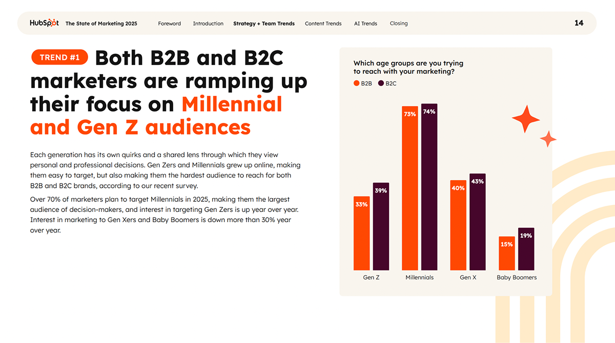
This double bar graph, from HubSpot’s State of Marketing Report doesn’t use the visual axes, but instead has color coding and legends to explain the data. The two bar groups represent different age groups, the colors B2B and B2C, while the bars’ heights visualize the percentage of marketers trying to reach that group.
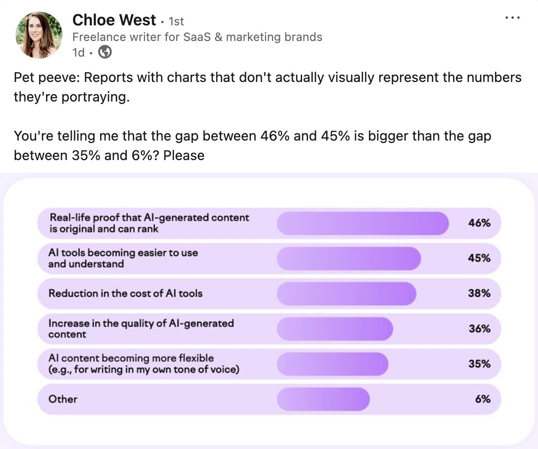
A bar graph is used to compare different categories using numerical values. For the comparison to be easy to understand, the visual difference needs to make sense. Even if you don’t use the graph lines in the final design, use one to put it together.
Otherwise, people on LinkedIn will call out your terrible graphs, like this:
The donut chart below is from the World Economic Forum’s Global Risks Report 2025. Each section of the donut represents a specific characteristic of the global political environment for cooperation on global risks.
For such a complex data set, they chose a simple donut chart so it’s easy to understand. A data visualization like this is best used as support for textual information, where the reader can gain more detailed information.
This pie chart template is a great example of how a simple data visualization can share important information. The legend on the left tells you what each color means and the numerical data is in the pie.
Yes, you can use this template for your own reports; the Visme editor will let you customize the colors.

Want more examples? You can explore 16 types of charts to visualize the data however you like.
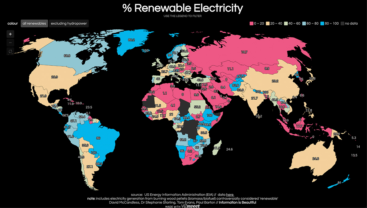
The second type of data visualization we’re looking at today is the geospatial visualization, which is based on a map that highlights data points per location.
Here’s an example of a geospatial data visualization from Information is Beautiful highlighting each country’s use of renewable electricity by percentage. This is an interactive data visualization, meaning you can click on areas to change how the data is represented. Click on the image below to try it out.
Below is a simpler example of a geospatial visualization from our template gallery. It showcases the continent of Africa with color-coded countries to depict their highest valued export. This map doesn’t need any numerical values, because the data is already described as “the highest.”

Another data visualization type is the diagram or infographic. In this case, they’re either a singular visualization or a combination of them to highlight information in a visual way. In this group, you’ll find several types of infographics:
A few years ago, every blog post had an infographic in it. Now, not so much. Currently, infographics tend to be smaller than the vertical ones we used to see everywhere.
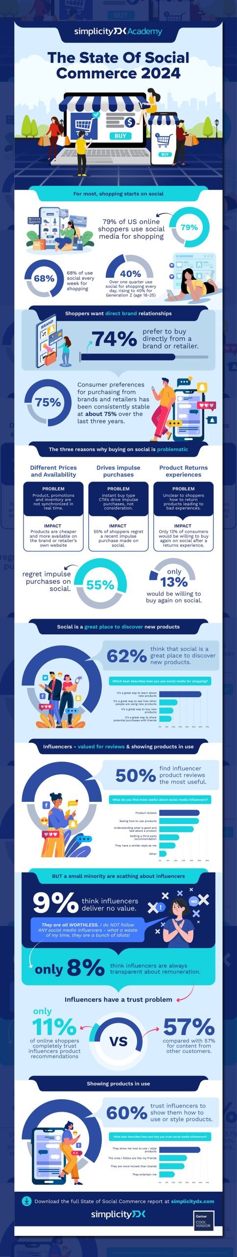
That said, some companies still use infographics, like the one below, designed by giekstrave for Simplicity DX’s State of Social Commerce Study 2024.
This is the vertical version, but in the landing page for downloading the study, it’s separated into snackable sections and then the download is a multi-page PDF. That’s what infographics are like now, versatile and repurposeable.
And here’s a diagram: the process. This circular format visualizes the lead generation process from start to finish. It’s simple, to the point and very visual.

And finally, this is a flowchart, a very practical diagram to visualize information that progresses from one state to another. This one highlights the human resources hiring process with yes and no options to show you which direction to take.

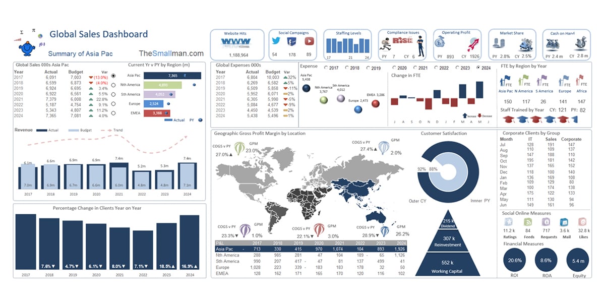
And lastly, the dashboard, a real time data visualization. Similar to the infographic, it combines different data viz types. But the charts and graphs in a dashboard display live data that’s constantly changing. Meanwhile, the data in an infographic is static. It's great for creating a data presentation.
The dashboard example below is a complex Excel dashboard with many data sets sharing one space. To build this type of dashboard, you create collections of data on a spreadsheet and then generate charts to visualize them.
Here’s another type of dashboard, one with tabs on the left that changes the view to something else. This is a Visme whiteboard template and you can use it to build a dashboard with your own data.

If you’d like to learn about other data visualization types, we have a detailed guide you can dive into.
To truly capture the breadth of what you can achieve with data visualization, it’s important to look at real examples of visual data.
The data visualization below spans from scrolling websites to interactive anatomical experiences. They each have a unique angle on visualizing information.
Banana Wars is a scrolling infographic about the history of the banana and how it changed the world. The design evolves and progresses as you scroll. It highlights bits of information one by one, giving you time to read and understand each point.
The majority of the visualization is made up of geospatial representations of how the banana expanded from Asia to the Americas. Alongside these are snippets of historical media and images that give depth and meaning.
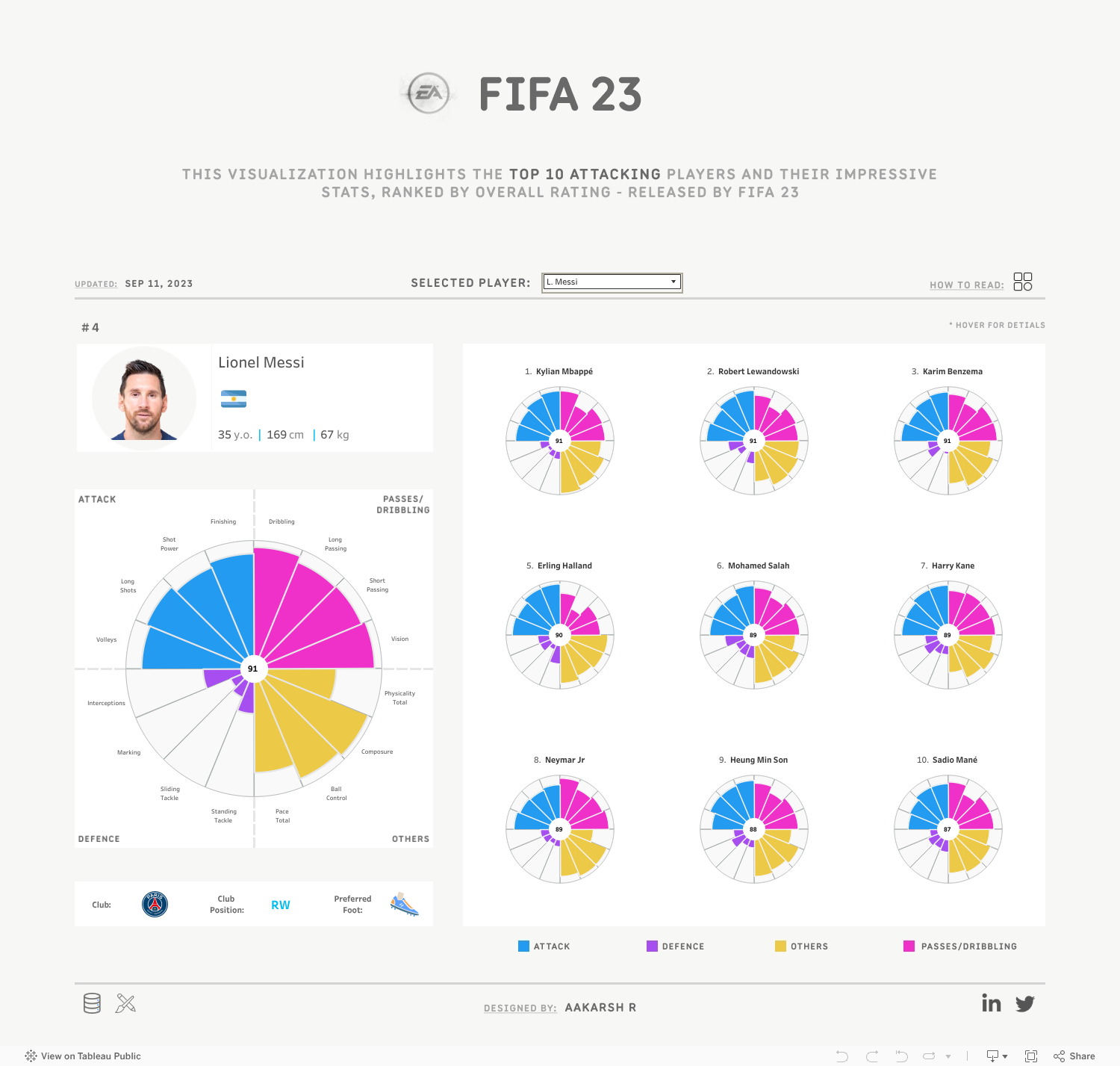
Aakarsh R. designed this interactive data visualization with a set of radial charts that change according to the FIFA player you select.
Since this is a complex visualization, Aakarsh includes a How to Read pop-up to help you navigate the radial charts and options. I’ve embedded the visualization here for you to experience right away.
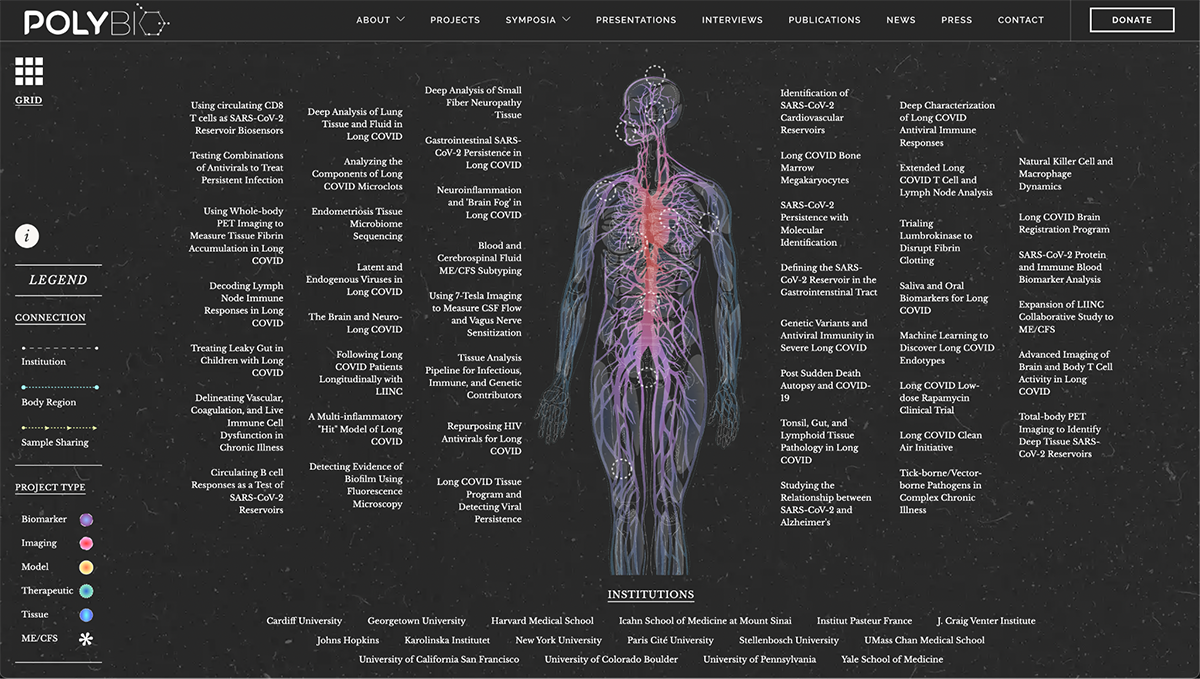
Interactive data visualizations are optimal scientific communication devices.
Like, this one for example. The PolyBio Consortium Explorer is a visual map and index of different global research projects studying long COVID and related conditions.
The screenshot below is from the main view, where you can discover different research projects by hovering over the part of the body they concentrate on.
Click on the link below to see how it works. On the left side is a legend explaining the types of lines and colors used in the design.
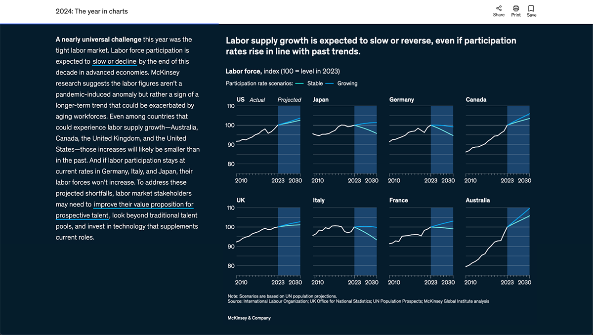
McKinsey reports are always full of data visualizations for the reader to analyze, aside from reading the text. In fact, you can gain lots of information from these reports just by looking at the charts and graphs.
This example is a collection of forecasting line graphs showing projected growth or decline of the labor supply in different countries. Click on the image to see the full report and other visualizations.
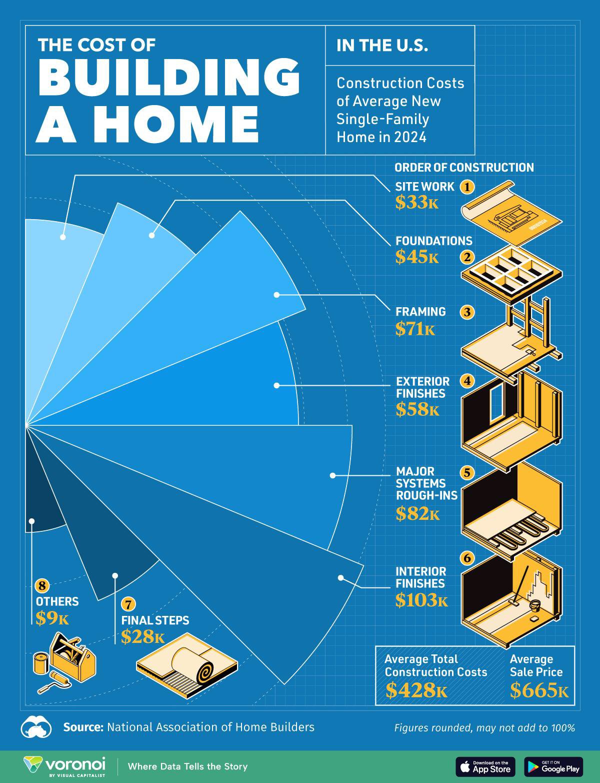
My final example is this infographic from Visual Capitalist that visualizes the cost of building a single-family home in the US in 2024.
The design combines a large radial chart with relevant icons for each wedge. For better understanding, the items are listed in order of construction.
At the bottom of the infographic is a mention of the data source, the National Association of Home Builders. Including the source of your data is best practice for all infographics and you should always do it.
Creating and designing data visualizations is a detailed process. For your data viz to be effective, engaging and valuable, you must follow best practices.
I talked to a few data designers to get their point of view and share it with you.
Choosing the right colors for your infographic, chart or widget is vital. The combination you apply to intersecting lines, side-by-side bars or icons can make your data easier or harder to understand.
I asked data designer Tiziana Alocci for her expert insight. Regarding the selection of colors, she shared,
“Color is one of the most powerful tools we have when designing data visualizations—not just for aesthetics, but for meaning. It shapes how we perceive patterns, hierarchies, emotions, and even urgency. In my work, which often translates abstract or emotional data into sensory experiences, color becomes a language of its own. It's not only about making something look good—it's about making it feel right.”
When it comes to color selection that could help data analysts who are getting their feet wet with creating data visualizations, here are her thoughts
“For those just starting out, my biggest tip would be: be intentional. Use color sparingly and purposefully. And always test your work for accessibility. And remember: greyscale is your friend. If a visual still makes sense in black and white, then your color choices are enhancing it, not carrying it.”
You don’t need to pick the colors from thin air. There are several online tools to aid you in creating color palettes for your data visualizations. Here’s a list of websites expert designers use:
Likewise, Visme offers dozens of pre-designed color themes you can apply to charts and graphs. Additionally, you can create your own themes from brand colors or palettes you find elsewhere. All you need to do is copy the hex codes and transfer them over.
Aside from the different types of data visualizations, there are also different ways they can be displayed.
You might be working on a digital report, or a scientific poster for a symposium. These aren’t one and the same, and your approach to data visualization should reflect that.
For the viewer to understand what you’re sharing with them, you must ensure that it makes sense for both the audience, the format and the location.
Tiziana and I also talked about this and here are her thoughts:
“Medium is everything—it shapes the way people experience data. When I work across formats, from digital platforms to museum walls, I start by asking: What’s the context of interaction? What kind of attention will the viewer bring? Who am I speaking to?
Digital requires clarity, responsiveness, and speed. It’s intimate—even when not experienced on a small screen—so interaction and simplicity become key.
Print offers a different kind of depth. It allows for pause, for detail, for texture.
Exhibition spaces, on the other hand, are immersive. In my site-specific work, like Frequencies of Belonging, or Maps of Paintings for the National Gallery, I consider space as a collaborator. Sound, motion, light, and materiality all become part of the data experience. It’s less about conveying information and more about inviting reflection or emotional resonance.”
Creating a visualization isn't just about making nice-looking charts; it's about communicating effectively. Your data needs to tell the right story, and sometimes that's harder than it looks.
As Deloitte's Martijn Kösters wisely puts it in his article,
“It is not as simple as taking the data and placing them in a graph and making it look better. A plain graph can be boring to catch the attention or make a point; the most impressive visualization could take away from the data or it could speak volumes. It is important to realize that visuals and data have to work together to convey a message.”
When designing your visualization, start with your core message. What's the one thing you want your audience to understand? Let that guide your choice of visualization type and design elements.
Always check whether your visualization accurately represents the data. Are your scales appropriate? Have you avoided cherry-picking? Will the viewer walk away with the right understanding of what the numbers actually mean?
Remember that good data storytelling is about finding the balance between visual appeal and accuracy. Check out our guide on data storytelling to dive deeper into this skill.
It’s also helpful to use a data visualization tool that meets your needs and is easy to use as well.
If you’re looking to make visually appealing infographics in PowerPoint, for example, you’ll have a hard time since it can help you with simple charts and graphs only.
Our personal favorite is, of course, Visme. It makes it easy to visualize data in engaging ways for designers and non-designers alike.
For instance, you can animate charts, add audio files to them, and play around with tons of data widgets.
You can find these widgets on the left-hand side of your dashboard.
The best part? You can save your time as well as brainpower by using customizable infographic and chart templates.
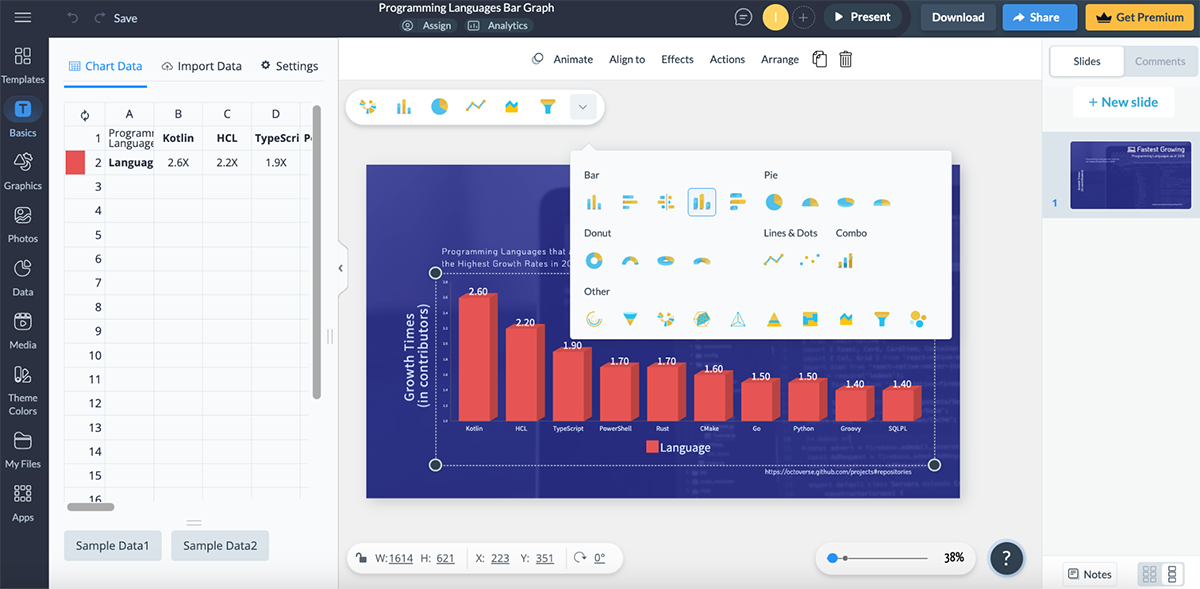
Here’s a quick look at how to make charts and graphs in Visme:
To create data visualizations, you have three main options of data visualization software and platforms. The table below compares three types.
| Type of Tool | Who is it for? | Learning Curve | Cost Structure |
| Open-Source | Developers, Data scientists, Technical users who need customization. | Steep; requires programming knowledge and understanding of data visualization principles. | Free to use |
| Cloud-Based | Business users, Teams needing collaboration, Organizations with limited IT resources. | Moderate to low; intuitive interfaces with templates and guided processes. | Subscription-based (monthly/annual), Tiered pricing based on users/features/data volume, Freemium models common. |
| BI & Analytics | Enterprise users, Data analysts, Organizations with complex data needs. | Moderate to high; requires understanding of data modeling and business metrics. | Higher upfront costs, Enterprise licensing, Annual maintenance fees, Implementation and training costs. |
Open source platforms are free for anyone to use. The source code is freely available to view, modify and distribute. These data visualization tools are the most technical to use and need some previous knowledge to use effectively. Let’s take a quick look at some options.
RAWGraphs is an open-source web app that offers a data visualization builder for data analysts and information designers. It includes over 30 chart types with deep customization options to design the visualization as detailed as you need it to be.
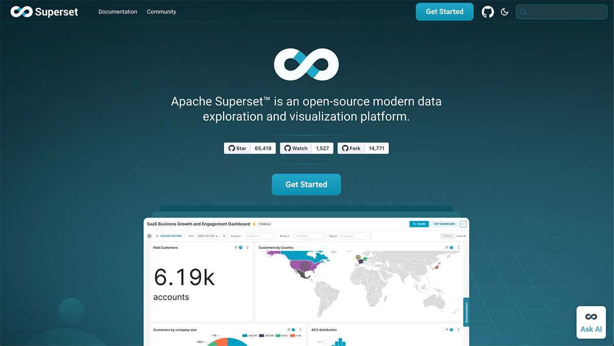
Apache Superset is a data exploration and data visualization platform based on open-source code. Different to RAWGraphs, Apache Superset isn’t a web app; you need to install it on your local machine by following the instructions.
Cloud-based tools to visualize data are available as web apps and online platforms. These tools are generally easier to use and the best option for beginner and intermediate data analysts or information designers. Here are a couple of tools that fit the bill:
Visme is the perfect choice if you need to create a beautiful data visualization but don’t have expert skills. The graph maker in the editor offers 30+ chart types. After you upload or import your data, choose a graph and customize it however you like.
Use the Brand Wizard to create a brand kit and easily create branded data visualizations.
Make your data visualizations as a stand-alone or include several of them in a presentation, add them to a digital report, or design an interactive infographic.
Here’s a quick look at how to make charts and graphs in Visme:
Infogram is an online platform where you can create charts, maps, infographics and interactive data visualizations. It’s easy to use and doesn’t take much time to learn. The infogram editor has over 30 charts and visualizations, plus an option to ask AI for help choosing the right one.

The third type of data visualization tool is the one for business intelligence and analytics. These platforms are more robust than the web apps and can handle large amounts of data. Let’s look at two of these tools.
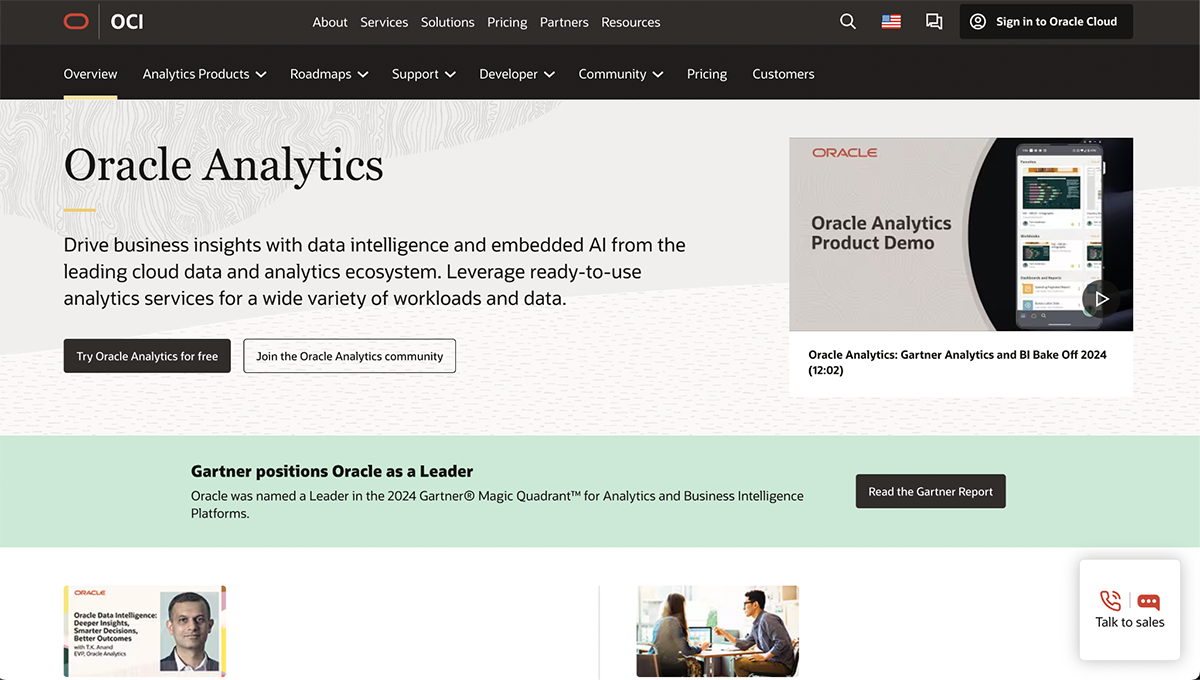
Oracle is an information technology company that offers data management and other business-oriented products for enterprise and large companies. One of these products is Oracle Analytics.
This particular tool offers a no-code, drag-and-drop interface for building complex data visualizations with interactive features.
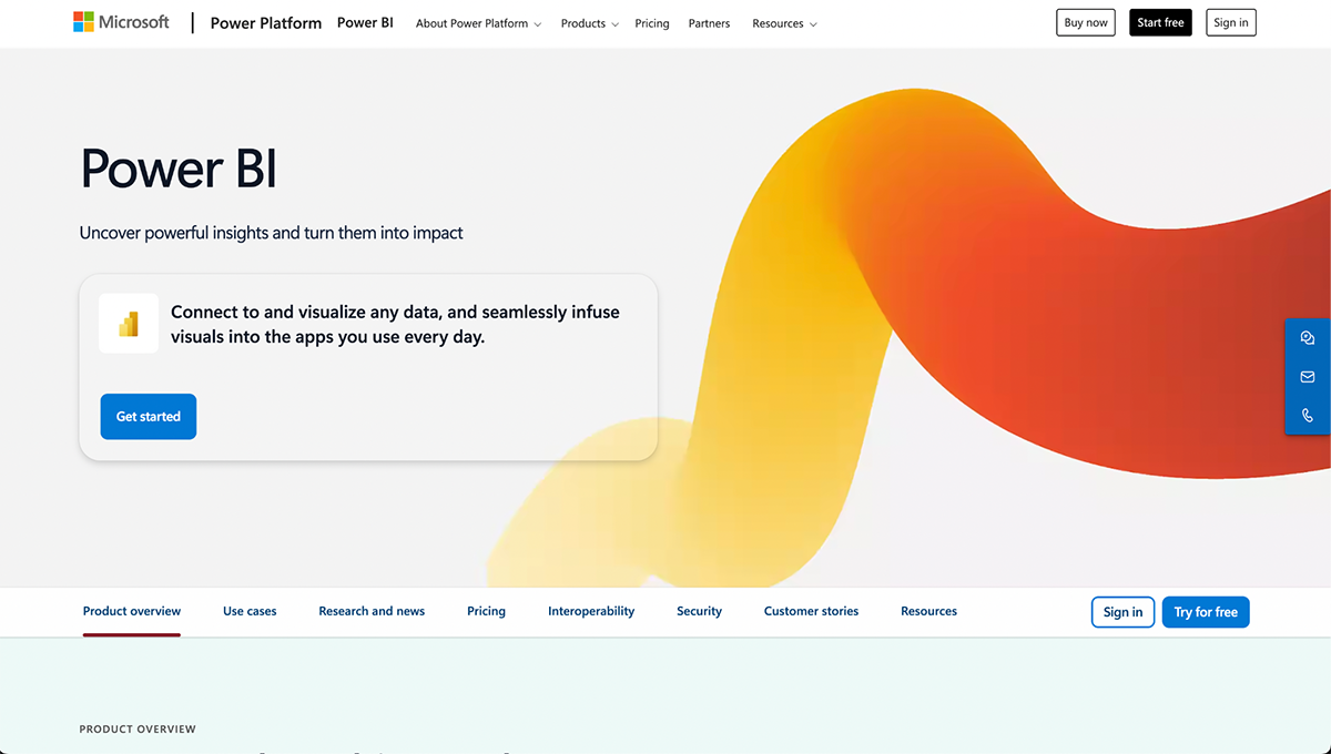
Microsoft Power BI isn’t just one tool, it's a collection of Microsoft tools that support business analytics, including visualizations like dashboards.
Power BI is extremely versatile and is useful for business professionals, developers, information designers and big data analysts.
If you still have some questions about data visualization, these FAQs can help.
The primary goal of data visualization is to communicate information clearly and efficiently in a visual format. Additionally, to make information accessible, actionable, and engaging while reducing cognitive load and making decision-making easier.
Other names for data visualization include:
While there are many principles in data visualization, three fundamental rules apply:
For beginners, Microsoft Excel is considered the easiest data visualization tool due to its familiarity. Other user-friendly options include:
The “easiest” tool ultimately depends on your specific needs, existing skills, and the complexity of your data.
From simple pie charts to interactive dashboards, data visualization has grown from a nice-to-have into an essential business skill.
The right visualization can transform complex data sets into clear insights that drive smarter decisions and more effective communication.
And, by following best practices, like selecting appropriate visualization types, using intentional color schemes, and designing with your audience and medium in mind, you can create powerful visual stories that make your data accessible and actionable.
Are you ready to start creating impactful data visualizations for your own projects? Create a free Visme account to get started. Or request a demo to find out how Visme can help you transform data into compelling visual narratives.
Design visual brand experiences for your business whether you are a seasoned designer or a total novice.
Try Visme for free