How to Make a Gantt Chart in Excel + Easier Alternatives

Data visualization—a graphical or visual representation of data—is key to sharing in-depth or complex data and information in a more comprehensive format. It’s used in a number of different industries to create at-a-glance visual content that would otherwise take a while to read and understand in a word or report format.
However, to create high-quality data visualizations, you need high-quality data visualization software.
To help you choose the best data visualization software for your needs—and to create the best data visualizations possible—we’ve rounded up the top 10 tools and tips you should know.
Let’s get started.
What do we mean by “data visualization?” In layman’s terms, this refers to various charts, graphs, infographics, etc., like pie charts, line graphs, bar charts, timelines, flowcharts and visualizations like that.
Data visualization not only helps make data and information more engaging, but it also makes it easier to understand.
Let’s take the timeline of Uber’s company history as an example. Which of the following representations of the history do you find easier to read through? A boring document with a whole bunch of text? Or a visual timeline that helps you see exactly which month and year each major milestone occurred?

Although we’re sure this example speaks for itself, the visual appeal isn’t the only reason data visualization is important. A few other benefits include:
Want more proof? Here are 50 data visualization statistics that help further prove its importance.
Data visualization software is an online tool that helps users create various types of charts, graphs and other data visualizations. It allows users to either input data directly or connect/import a spreadsheet of existing data sets.
Then, data visualization software will automatically visualize your selected chart or graph and allow you to color code segments, create labels, add a legend and more.
If you’re in the business of gathering data, you need a data visualization tool in your arsenal. It will make it so much easier to visualize your data accurately, regardless of whether you need a one-off chart, a full infographic or simply to showcase pieces of data in a presentation.

If you’re starting your search for the right data visualization software for your business, look no further. We’ve got the top five options and their features below.

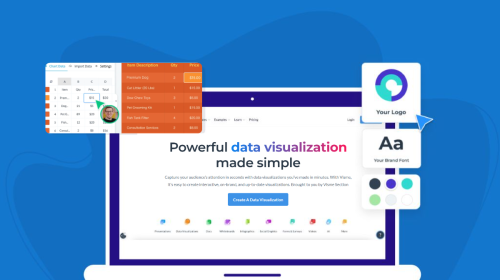
Visme’s graph maker is a great tool to try out because of its versatility. Not only can users create dashboards to showcase a number of visualizations at once (like the other tools in our list), but they can also create infographics, presentations, reports, documents and more.

Visme has a template library with thousands of available templates across 50+ visual content types. Users can even save their data visualizations as a content block that can be placed into any other type of content they’re creating.
Data Widgets

Visme hosts an impressive collection of 30+ diverse data widgets. These widgets allow users to display data in unique and dynamic ways, aiding in more precise information communication.
From progress bars and radial gauges to timelines and population arrays, each widget is designed to represent specific data types effectively.
Ways to utilize these data widgets might include:
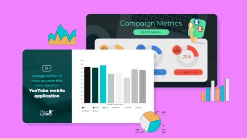
Charts and Graphs

With over 20 types of charts and graphs, Visme allows you to visualize and present larger data sets. Each chart and graph type caters to specific big data visualization needs, providing the flexibility to choose the best option to explain your data story.
Here are potential use cases for these chart types:
Interactive Maps

Create interactive maps within Visme that enable users to zoom, pan and access location-based data. Interactive maps convey location-based insights and encourage users to explore regional trends or anomalies in your datasets.
Custom Animations and Transitions
Leverage Visme's custom animation capabilities to infuse life into your data visualizations. Create enter and exit effects for various graphical elements and time them to appear based on user interactions or at designated intervals.
Pop-ups
Create personalized pop-ups in Visme to reveal additional information when users hover over or click on specific elements.
This feature provides supplementary context and details, transforming static visualizations into rich, interactive experiences.
Dynamic Fields
Visme's Dynamic Fields feature offers a smarter way to handle repetitive data. It allows you to save time by automatically updating multiple uses of the same data throughout a project when the source data changes.
Team Collaboration Features
Visme fosters effective teamwork through its robust collaboration features. It provides a shared workspace where team members can collaborate seamlessly and in real-time, ensuring efficient and coherent collaboration.
Here are some ways to utilize these collaboration features:
Visme's advanced design capabilities have positively impacted a lot of users around the world. Jaime Kelm, the Director of Business and Data Strategy at LAFC, is one of those satisfied users and here's what he has to say about Visme:
"I absolutely recommend Visme due to its dynamic functionality and ability to integrate everchanging media and digital technologies. That combined with a collaborative environment which empowers our team to be more efficient with time has been a huge plus."
"The ability to enrich our presentations with embedded media like Tableau or embedded posts from our partners' social accounts is huge. Being able to incorporate those different elements of media into a live presentation has been a game changer."
Pricing: Start with a completely free plan. Premium plans start at $12.25/month, billed annually.

Sisense is designed to help businesses consolidate, interpret and transform complex data into actionable insights.
With its end-to-end approach, Sisense caters to diverse industry sectors, from retail to healthcare. Its intuitive interface, customizable dashboards and AI-driven capabilities make it a reliable choice for data professionals and non-experts.

Pricing: Contact sales or customer support for customized pricing.

Databox is a business analytics platform that enables its users to create KPI dashboards like the sample Google Analytics dashboard above.

Users also get the ability to integrate Databox with a number of different tools, like Google Analytics or even social media platforms to pull insights directly into the data visualization software.

Features:
Pricing: Take advantage of their free basic plan. Premium plans start at $72/month, billed annually.

Zoho Analytics is a feature-rich BI solution that simplifies data analysis and visualization tasks. It offers an extensive range of tools to create insightful reports and dashboards from multiple data sources.

Accompanied by an AI Assistant named Zia, Zoho Analytics provides intelligent suggestions, helping users draw meaningful conclusions from their data.
Pricing: Zoho Analytics paid plans start from $24/mo, billed annually.

Whatagraph is a reporting and analytics tool catered more to marketing agencies. It integrates with various marketing tools so that agency account managers can easily connect client accounts and build out shareable reports.

Pricing: Starts at $199/month, billed annually.

Infogram is a user-friendly platform designed for crafting visually appealing and engaging infographics, reports and charts. It offers a variety of creative templates and interactive visualization options while facilitating data import from multiple sources.

Additionally, the platform supports real-time collaboration features for a more unified workflow within teams.
Pricing: Infogram has a free forever plan and the Pro plan starts from $19/mo.

Yellowfin is a business intelligence reporting and analytics software. It allows users to connect databases, spreadsheets or APIs to their tool in order to import data. Furthermore, it can automate the analysis of your data, helping you to tell comprehensive data stories.

Features:
Pricing: Interested brands must request a quote based on their needs.

Qlik Sense combines an associative analytics engine with an intuitive interface to help users uncover deeper insights from raw data.
Targeted towards both beginners and seasoned analysts, Qlik Sense offers flexible, interactive visualizations alongside AI-assisted data interpretation.

Qlik's diverse data integration options make it suitable for organizations seeking an all-encompassing solution for managing and analyzing their data.
Pricing: Starts from $20/mo/user, billed annually.

Tableau is a business intelligence and analytics platform that enables its users to create embeddable data visualizations and dashboards. These dashboards can be embedded in a number of different places—including your Visme projects.

Features:
Pricing: Starts at $70/user/month, billed annually. Viewer and Explorer licenses (does not include the ability to create data visualizations and dashboards) are less expensive.

Domo centralizes data processing, making day-to-day business decisions quicker and better informed. As a cloud-based platform, it eliminates the need for on-premises infrastructure, offering real-time data updates on fully customizable dashboards.

Furthermore, the platform's AI and machine learning capabilities ensure seamless integration with various data sources and a more personalized approach to data management.
Pricing: Contact sales to ask for pricing.

Google Charts is a free, accessible data visualization tool ideal for web applications and those with a tighter budget. The platform offers various chart types for diverse use cases and boasts dynamic data connectivity for real-time updates.

Its configurable and customizable options and seamless integration with Google Workspace applications make Google Charts a helpful resource.
Pricing: Free to use.

Looker is a modern analytics platform that streamlines data modeling and visualization, paving new avenues for data exploration and decision-making. The tool is a part of the Google Cloud platform and employs a powerful, flexible data modeling language called LookML.

Looker is a popular solution for data-driven decision-making, thanks to its customizable dashboards, extensive connectivity options, and user-friendly interface.
Features:
Pricing: $30/user/mo for the Viewer user license and the Developer user license with advanced capabilities starts at $125/user/mo.

Datawrapper is a versatile platform that enables non-specialists and professionals to create striking charts, maps and tables with minimal effort. The tool's user-friendly, mobile-compatible interface simplifies the data visualization process and is complemented by a wide range of unique options.

Datawrapper's team collaboration features and easy-to-embed results make it an essential tool for disseminating information to stakeholders via websites and blogs.
Pricing: You can try their free plan to test the tool and the paid plans start from $599/mo for 10 users.

Now that you’re starting to explore the right data visualization software for your organization, let’s talk graphing. There are a few tips and best practices to keep in mind when you start creating your own charts and graphs.
Color coding is a way to identify the different data sets in your chart or graph. This way, it’s easier to tell the different data sets apart at a glance rather than having to study the graph for a while.
Take a look at this bar graph below. Each bar is represented by a different color, and the labels below help you match the color to the proper item.
If you have multiple charts showcasing similar data, you can keep the same color scheme for each item across the board. This helps your viewer immediately identify what they’re looking at without having to dedicate an overwhelming amount of time.
Color coding is important. But it’s also important to make sure your colors stand out. Using similar shades of a single color isn’t going to make your chart much easier to read than if everything were the same shade.
Instead, take a page out of this pie chart’s book. It uses bright, contrasting colors that let you tell each piece of the pie apart.
Make sure you’re using complementary and contrasting colors—especially between your chart, background colors and other design elements. You want your chart to pop off the page so your viewers can easily understand your information.
Let your audience interact with your charts—this is a great way to help them further retain the information. And with Visme, this is easy. Our charts automatically create pop-up legends and labels that your viewers can use to interact with the chart data.
Take a look at this map. When embedded on a webpage or shared via a web link, viewers can hover over each of the states to learn more information.
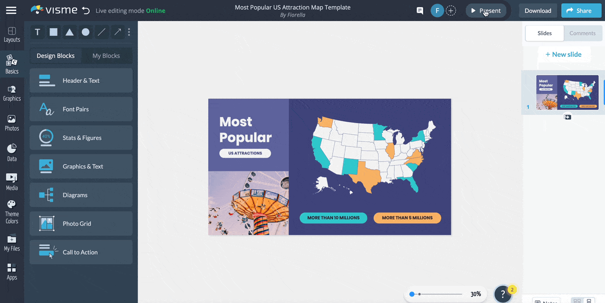
The same can be done with all of our charts, helping to create an interactive experience in your infographic, presentation, report and more.
Labels are a must. How else will your viewer know what your data is conveying? You can spice up your labels however you want, too. Use shapes, colors, icons and other design elements to help the end viewer better understand what your data is telling them.
Here’s an example of a polar area chart with basic color-coded labels on the side of the chart, as well as words labeling the axes.
Every piece of data in a data visualization needs a label so that your audience can fully comprehend what you’re trying to tell them.
There are so many different types of data visualizations because they each have a different job and convey data in different ways.
For example, a pie chart is a representation of 100%. It depicts parts of a whole, whereas a bar chart is used to share how amounts are distributed across varying categories. And scatter plots can be used to visualize trends.

Learn more in our guide to creating charts about which chart should be used and when.
Spice up your charts and graphs with Visme’s graph maker. Take advantage of professionally designed templates, easy-to-customize design elements, 30+ chart types, icons, illustrations and so much more. Make your data and information easy to understand with a free Visme account.
Design visual brand experiences for your business whether you are a seasoned designer or a total novice.
Try Visme for free