


Typography Infographics: 12 Inspiring Examples & Techniques


Infographics are literally everywhere: brand presentations, shareholder reports, customer case studies, whitepapers—you name it.
They’re not just eye candy either.
A well-designed infographic can boost content views by up to 94% and help people remember 65% of the info even three days later, compared to just 10% when it’s text-only.
If you’ve ever created an infographic for yourself or a client, you already know: Visme and Piktochart are two of the best tools out there to get the job done.
They both offer AI features, pre-made templates, drag-and-drop editors and tons of customization.
But the real question is… which one’s actually better for your workflow?
In this article, I’ll pit them against each other, category by category, from ease of use to collaboration tools, data visualization and more.
If you’re a content marketer, a startup founder, or a senior exec trying to find the right platform to power your brand’s visual storytelling, this one’s for you.
*Disclaimer: The comparisons and competitor ratings presented in this article are based on features available as of July 23, 2025. We conduct thorough research and draw on both first-hand experience and reputable sources to provide reliable insights. However, as tools and technologies evolve, we recommend readers verify details and consider additional research to ensure the information meets their specific needs.
To make sure this comparison is fair and actually helpful, I spent hours inside both Visme and Piktochart, testing features firsthand and filling in any gaps by watching walkthroughs, reading user reviews and digging into Reddit threads to get the full picture.
Here’s what I did:
And there’s one thing you can be sure of: this article wasn’t generated by AI. No regurgitated feature lists here; just valuable information you need to make the right call.
With that out of the way, here’s a quick snapshot of how Visme and Piktochart stack up overall:
| Visme | Piktochart | |
| Ease of Use | Intuitive drag-and-drop editor | Intuitive drag-and-drop editor |
| Pre-Built Templates Library | 10,000+ professionally designed templates across dozens of categories | Hundreds of templates across several categories |
| Animation & Interactivity | Built-in animations, clickable popups, hover effects, embeds, video and audio support | No animation or interactivity features |
| Design Elements | Advanced: animated icons, 3D characters, video/audio widgets, dynamic content, branded themes | Basic static visuals, charts, icons, maps |
| AI Features | AI Designer, AI Writer, AI Resize, AI Image Generator, AI Image Editing, Edit with AI, Brand Wizard, AI Presentation Maker, AI Text-to-Speech Generator, etc. | AI Infographic Generator, AI Design Generator, AI Document Generator, AI Image Generator, AI Summary Generator, etc. |
| Data Visualization | 40+ chart and graph types, editable widgets, dynamic interactivity, live data sync, animations, export flexibility | 18 chart types, responsive layout, static-only, limited customization |
| Workflows & Team Collaboration | Real-time collaboration, version history, shared folders, granular permissions, comments, annotations, brand kit | Shared folders and comments; no real-time collaboration or annotations |
| Lead Generation | Drag-and-drop form builder (newsletter, surveys, polls, quizzes, apps), analytics, embed support, 3D CTA character, integrations | AI lead magnet generator, editable templates for whitepapers, case studies, email signups |
| Sharing & Export Options | Live/public/private sharing, password protection, embed, PDF, MP4, GIF, HTML5, SCORM/xAPI | Public/private sharing, embed, PDF export; responsive embed code, password protection |
| Customer Support & Resources | Dedicated help center, live chat/email, blog support, tutorials, webinars, trackable support history, feature request, sales contact | Dedicated help center, live chat/email support, Mika chatbot |
| Pricing | Free; paid starts at $12.25/mo | Free; paid starts at $14/mo |
| G2 Rating | 4.5/5 (447 reviews) | 4.4/5 (161 reviews) |
Now, let’s discuss each of these in detail:
Visme and Piktochart are beginner-friendly. You don’t need design experience, and there’s no learning curve that’ll make you want to throw your laptop across the room.
Here’s a quick look at how they compare when it comes to overall usability:
| Visme | Piktochart | |
| Dashboard Experience | Clean, intuitive layout with clear “Create with AI” and “Custom” buttons; easy to navigate projects and templates | Clean, minimal layout; easy to navigate projects and templates |
| Drag and drop editor | Yes | Yes |
| Learning Curve | Minimal; in-app tooltips and tutorials help you get started fast | Minimal; the “Editor Tips” button helps you get over any hurdles |
Getting the hang of Visme is as easy as 1-2-3.
The dashboard layout is clean and intuitive. You can jump straight into a new project or pick up where you left off. There’s even a “Create with AI” button right up top to speed things up. No clutter, no confusion.
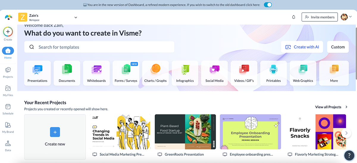
And inside the editor (where you’ll spend most of your time), things get even better.
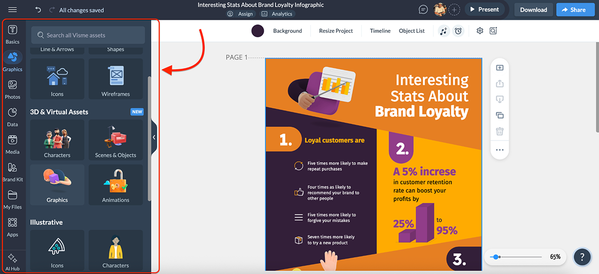
There’s a dedicated left-hand panel for everything: templates, basics, graphics, photos, data, media, brand kit, file uploads and even third-party apps. There’s also a handy AI button that houses all of Visme’s AI tools in one place—love it.

And when you add pinpoint drag-and-drop precision, smart guides and real-time snapping, it literally feels like the editor is working with you, not against you.
Realistically, if you’ve ever used other Piktochart alternatives like Canva or Adobe Express, it’ll take you, at most, 10 minutes to feel at home inside Visme.
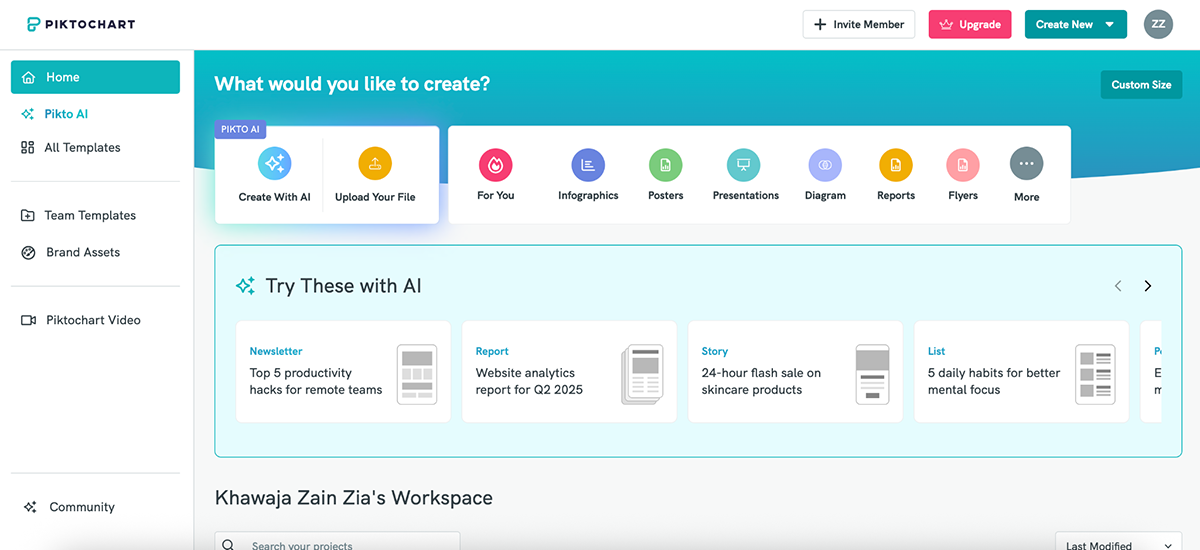
Using Piktochart is easy too. Similar to Visme, Piktochart’s dashboard lets you quickly start a new project or jump into something you’ve already been working on.
But unlike Visme’s subtle approach, Piktochart has a dedicated “Try These with AI” section right on the homepage, so you can instantly test-drive things like AI-generated newsletters and pitch decks.
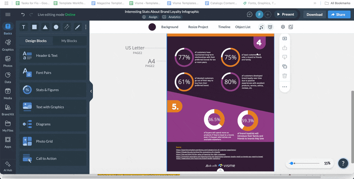
Inside the editor, everything is easy to navigate with drag-and-drop functionality. The left-hand panel includes buttons for Graphics, Text, Design Components, Colors, Charts, Maps, My Uploads, More and a helpful Editor Tips section.
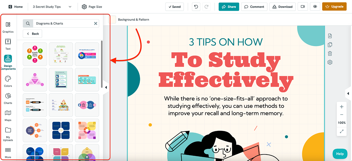
I especially like the Design Components tab. It gives you pre-designed blocks like timelines, flowcharts and side-by-side layouts that make it quicker to structure your infographic without building everything from scratch.
It really comes down to personal preference. I’ve used Visme more, so I’m more comfortable there, but if you’re new to both, you’ll find Piktochart just as easy to get started with.
Templates can make or break your design process, especially if you’re short on time, not super confident with layouts or just need inspiration to get started.
Here’s how Visme and Piktochart compare when it comes to template libraries:
| Visme | Piktochart | |
| Template Count | 10,000+ templates across infographics, presentations, social, video, forms, documents, etc. | Hundreds of templates focused on infographics, reports, posters, presentations, cards, etc. |
| Design Quality | Brand-ready, professional designs updated regularly by in-house designers | Clean and modern templates, especially strong in data-focused layouts like infographics and reports |
| Customization | Highly customizable | Highly customizable |
Visme boasts one of the most extensive template libraries I’ve seen in any design tool. The library is packed with over 10,000 templates across various categories, including infographics, presentations, reports, social media, documents and more.
There are even hundreds of specialized templates for forms and surveys, videos, moodboards and storyboards; categories you won’t find inside Piktochart.
But quantity is one thing, and quality is another. And Visme checks that box too.
You’ll find brand-ready designs in just about every style, from traditional and corporate to fun, modern and bold.
Plus, Visme regularly updates its template library with fresh layouts built by actual designers, so you’re not stuck using something from 2016.
Long story short: whatever your brand vibe is, you’re bound to find a template that actually matches your aesthetic and saves you hours of design work.
Piktochart also comes with a variety of templates across several categories, including infographics, posters, presentations, social media graphics, cards and reports.
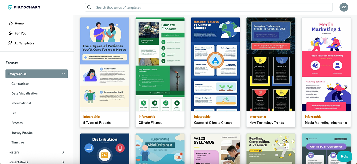
And for the most part, the designs are fresh, clean and modern, especially in the infographic and report categories, where Piktochart really shines.
You’ll find layouts built around real use cases, such as survey results, public health updates, pitch decks and nonprofit reports, which makes it easy to plug in your content and get started.
That said, the template variety isn’t as wide as Visme’s (in both quantity and category types). But if your main focus is infographics or formal reports, Piktochart delivers.
If you’re looking for variety, versatility and sheer volume, Visme takes the lead. Its 10,000+ templates cover everything from infographics and presentations to forms, videos and even storyboards. Piktochart holds its own with sharp, data-driven templates (especially for reports and infographics), but for teams that want fresh, brand-ready designs across more content types, Visme is the stronger choice.
Static designs are great. But when you want your infographic to be more engaging, you need animation and interactivity features to make it happen.
Here’s how Visme and Piktochart compare when it comes to breathing life into your visuals:
| Visme | Piktochart | |
| Object Animation | Animate any object (text, icons, charts, images) with effects like fade, slide, bounce, zoom | No object-level animation features available |
| Interactivity | Add hotspots, clickable buttons, hover effects, pop-ups and slide navigation | Supports clickable links only |
| Timeline Control | Drag-and-drop animation timeline with transition delay, on-click triggers and slide-level settings | No animation timeline or trigger-based controls |
Visme offers very strong animation and interactivity features.
Not only does it come with pre-animated design assets (more on that in the next section), but it also lets you get granular with your own animations.
You can animate literally any object on the canvas: text, icons, images, charts, graphs… you name it. There are dozens of animation styles to choose from, including fade in, slide, pop, bounce and zoom. And they’re incredibly easy to apply and tweak.

You can add animations at three levels:
What I love most is how customizable the animation settings are.
You can configure how each animation behaves using options like transition delay, advance after, on click and on video play.
When you click on an object to animate it, you’ll see a video editing-style timeline appear at the bottom, which makes it easy to drag and adjust duration, order and overlap. It feels less like a slideshow tool and more like a lightweight motion editor.
There are also built-in text effects like typewriter, skate, burst, rise-up etc., for extra flair without needing to animate manually.
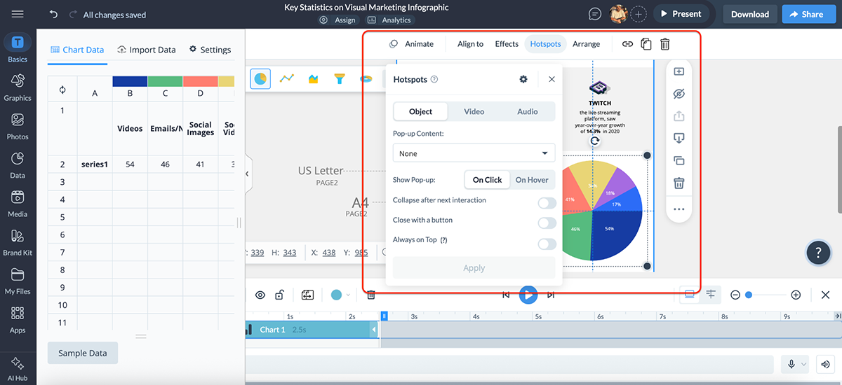
And it’s not just about motion. You can make your content interactive too.
With hotspots, clickable links, slide-to-slide navigation and pop-ups, you can turn a simple infographic into a clickable report or an interactive product demo.
Overall, Visme gives you full control over how your content moves and behaves. And the best part is that it all feels intuitive. No need to dig through menus or hunt for advanced settings. Everything is right there, when and where you need it.
Piktochart doesn’t offer animation and interactivity features on the same level as Visme.
That means no animated objects, no entrance effects, no timeline editing and no interactive pop-ups or hotspots.
That said, it does let you add clickable links to your text, icons and images. So if you’re building a digital report or want to hyperlink part of your infographic, that’s totally doable.
But that’s about it, really.
You also can’t add transitions between slides while you’re designing.
However, (and this part’s a little odd) when you publish your presentation (publicly or privately), the viewer can choose how the slides transition. Options include concave, fade, linear and zoom.
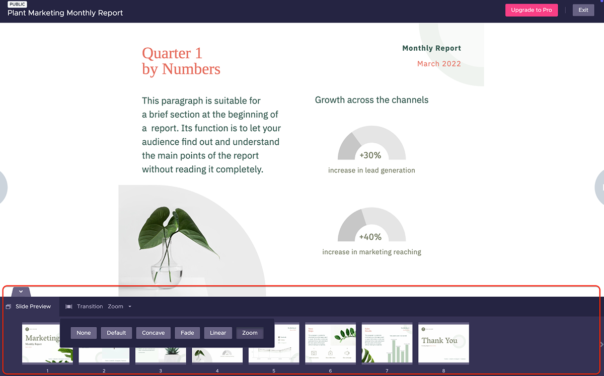
Some might find this useful, but I personally prefer having more control over how transitions are timed and delivered. Letting the viewer dictate the pace can sometimes disrupt the overall flow. But of course, it depends on your use case.
Piktochart is good for creating clean, static visuals, but if you’re after motion, interactivity or more engaging experiences, Visme gives you far more creative freedom.
Pre-made or AI-generated templates are great, but at some point, you’ll want to look unique.
That’s where design elements come in, such as icons, illustrations, shapes, fonts, photos, widgets and all the tiny details that make your infographic look less like a template and more like you made it.
Here’s how Visme and Piktochart compare when it comes to graphic design elements:
| Visme | Piktochart | |
| Icons & Graphics | 10,000+ assets including animated icons, gestures, 3D illustrations and characters across 20+ categories and styles | Millions of icons via Iconscout (Pro/Business only); styles include flat, outline, glyph, isometric, doodle, pixel, etc. |
| Stock Media | Free built-in libraries from Unsplash, Pexels and Pixabay; includes 1,000,000+ photos and videos | Free built-in stock photo library; no video support |
| Brand Kit | Upload logos, fonts and colors; access brand styles across all projects | Manage colors, fonts and logos |
Visme offers over 10,000 icons and graphics, including gestures, 3D illustrations, animated characters and pre-animated design elements you can drop straight into your project.
These graphics are organized into 20+ categories and come in several styles, so you can easily find visuals that match your design aesthetic.
And they’re fully customizable. You can:
There’s even a built-in 3D character creator, which you can use to build branded avatars for training guides, team pages, explainer graphics etc.
Need stock content? Visme has you covered there too. You get integrated access to millions of stock photos and videos from Unsplash, Pixabay and Pexels. Search and insert royalty-free assets right from inside the editor.

You’ll also find smart widgets like:
And the best part is that your brand kit is always just a click away. You can upload your logo, set brand fonts and colors and apply them instantly across any project, no need to set things up from scratch every time.
Piktochart also gives you access to millions of icons, photos and illustrations, including some fun 3D graphics.
The styles available are pretty diverse, from flat, colored outline and glyph, to isometric, doodle, gradient, rounded, dual tone, pixel and sticker-style icons.
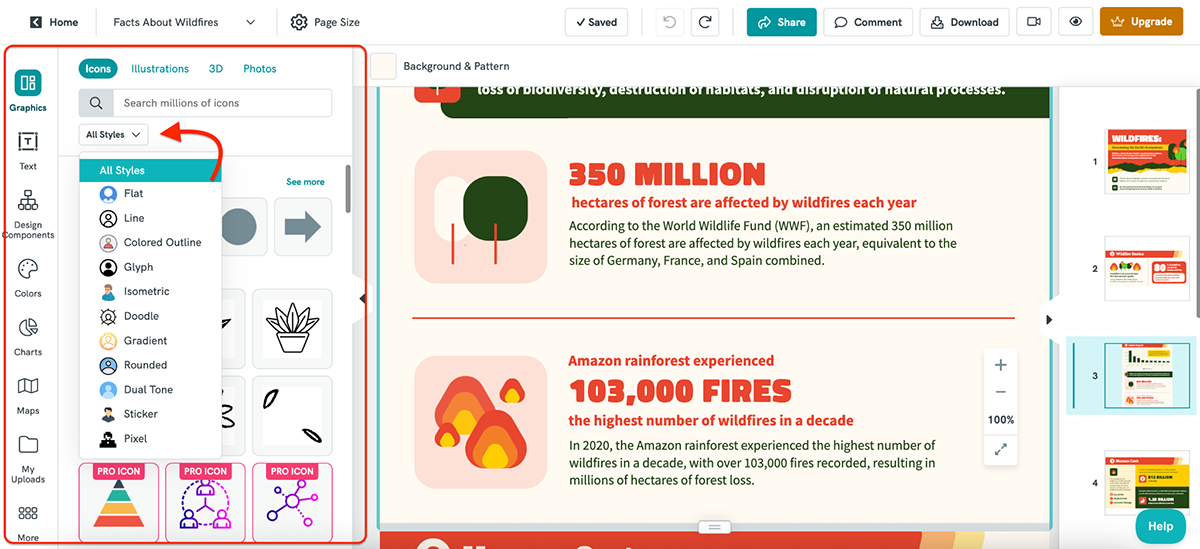
If you’re on a Pro or Business plan, you also unlock full access to the Iconscout integration, which expands your design library even further.
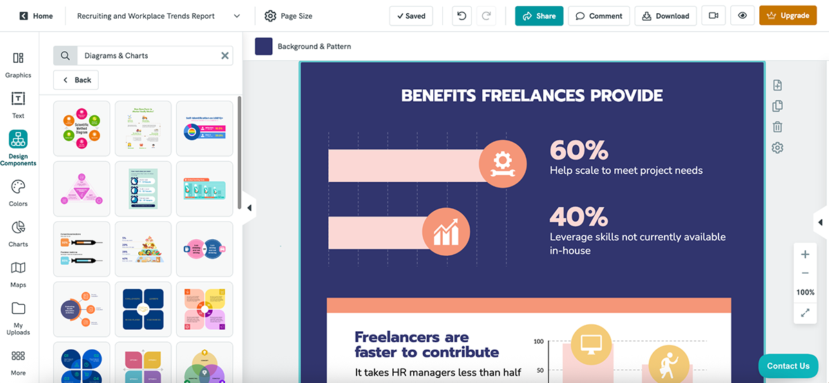
But what I personally like the most about Piktochart is the “Design Components” tab. It’s filled with pre-built sections like headers, timelines, comparisons and callouts, so you can quickly structure your infographic without starting from a blank canvas. Big time-saver, especially if layout design isn’t your strong suit.

Piktochart also comes with a solid brand kit to help you stay consistent across all your visuals.
You can upload your logo, and Piktochart will extract your brand colors automatically. You can also upload custom fonts (up to 10 on Pro, unlimited on Business) and share your font scheme across your team.
Business users also get access to branded templates, which instantly apply your branding across Piktochart’s entire template library.
Piktochart has everything you need to create polished, on-brand visuals, especially if you upgrade to a paid plan. It may not have quite as many bells and whistles as Visme (no animated assets or advanced widgets), but for static design workflows, it’s more than capable.
AI graphic design tools are getting more popular by the day. Both Visme and Piktochart have several AI features to help you work faster and get inspired when you’re stuck staring at a blank canvas.
Here’s how they stack up when it comes to AI features:
| Visme | Piktochart | |
| AI Design Generator | Create full presentations, reports, case studies, whitepapers & lead magnets from a single prompt | Generate infographics, presentations, ebooks, reports, newsletters, flyers and social content |
| AI Image Generator | Available | Available |
| AI Image Editing | Available | Not available |
| Edit with AI | Available | Not available |
| AI Resize | Available | Not available |
Visme has gone all in on AI, and you can feel it in the workflow.
It starts from the moment you land on their website, step into the dashboard or open up the editor. AI is everywhere you want it to be.
At the core is Visme’s AI Designer, which lets you generate complete presentations, reports, case studies, white papers and lead magnets using just a simple prompt.
It cuts down the content creation process by up to 95%, giving you a smart, on-brand starting point you can easily refine.
Since Visme AI doesn’t generate infographics (yet), I asked it to create a presentation instead.
Here’s the prompt I entered:
“Create a presentation for a SaaS company called DataPulse that helps small businesses automate customer reports. Include slides for an intro, product features, benefits, pricing, customer testimonials, and a final CTA.”
And here’s what it generated:
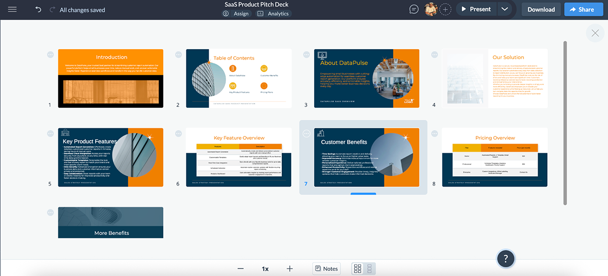
I loved the layout and styling right out of the gate; clean colors, great icon use and a pricing breakdown in table format that actually made sense. The copy wasn’t perfect (no AI is), but it was surprisingly on point and easy to polish. But of course, you can clean up the copy with our AI writing assistant.
Look, AI isn’t here to replace your brain. But with results like this? It’s definitely here to save you hours of work.
And Visme doesn’t stop there.
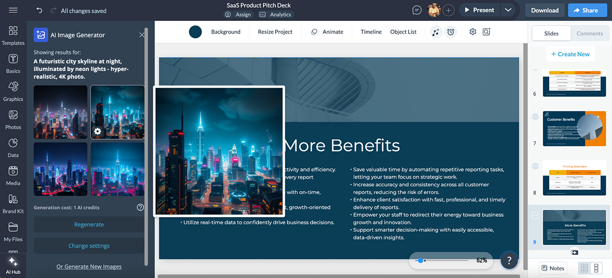
It also features a built-in AI Image Generator, which lets you create custom visuals directly from a text prompt, right inside the editor. No need to move between tabs.
Here’s what I asked it to create:
“A futuristic city skyline at night, illuminated by neon lights. Hyper-realistic, 4K photo.”
The results looked stunning and totally usable.
But wait, there’s more.
Overall, Visme’s AI tools are fully integrated into the entire design experience. Whether you’re building from scratch or customizing existing content, the AI helps you work faster and smarter.
Piktochart also comes with a growing list of AI features. The most popular (and probably the most useful) is their Design Generator, which you can use to create infographics, presentations, ebooks, reports, newsletters, flyers and even social content like Instagram stories, YouTube thumbnails and quote cards.
To test it, I entered a prompt similar to the one I used for Visme, but this time, I asked it to generate an infographic:
“Create an infographic for a SaaS company called DataPulse that helps small businesses automate customer reports. Focus on features, benefits and pricing.”
Here’s what it generated:
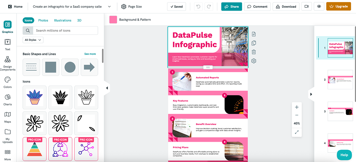
The layout is clean, and the content blocks are well-organized. I like the consistent color scheme and how the copy ties back to the prompt. It’s not overloaded, and the structure works.
That said, the visuals could’ve been a bit more relevant, like swapping the pen-and-paper image for something more SaaS-relevant. And the overall design leans more toward a presentation-style than a traditional infographic.
But, again, nothing that can’t be fixed.
Other Piktochart AI features include:
Piktochart’s AI features are terrific, but compared to Visme, they still feel a step or two behind.
Visme’s AI tools are more deeply integrated into the editor and cover way more use cases. You get things like AI Image Editing, AI Resize, Text-to-Speech and Edit with AI that work across charts, documents, web graphics and more.
Regardless of the project you’re working on, data visualization is a big deal.
Here’s how Visme and Piktochart compare when it comes to turning numbers into visuals:
| Visme | Piktochart | |
| Chart Types | 40+ charts including funnel, cone, polar, radar, pyramid, tree, bubble, pictograph etc. | 18 charts including bar, line, area, dot, scatter, donut, radial bar, icon matrix stacked venn etc |
| Maps | Yes | Yes |
| Live Data Import | Supports Google Sheets, CSV, Excel + live syncing | Paste Google Sheets link, upload CSV/XLSX; no live sync (need to link your data again) |
| Customization | Fully customizable (fonts, colors, borders, animations, interactivity) | Basic customization (colors, labels); no animation or interactivity |
| Interactivity & Animation | Hover effects, clickable data points, animated charts | Static only; no interactivity or animation support |
Visme is hands-down one of the best tools for data visualization in the industry.
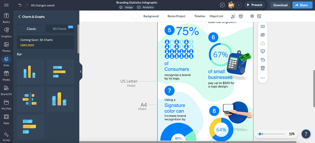
You get access to 40+ chart types, including bar, pie, line, donut, combo, concentric, cone, polar, radar, pyramid, funnel, area, tree, bubble and, yes, 3D charts too!
But that’s just scratching the surface.
Visme also comes with dozens of data widgets—both basic and 3D—that are perfect for displaying statistics in a more visual and intuitive way.
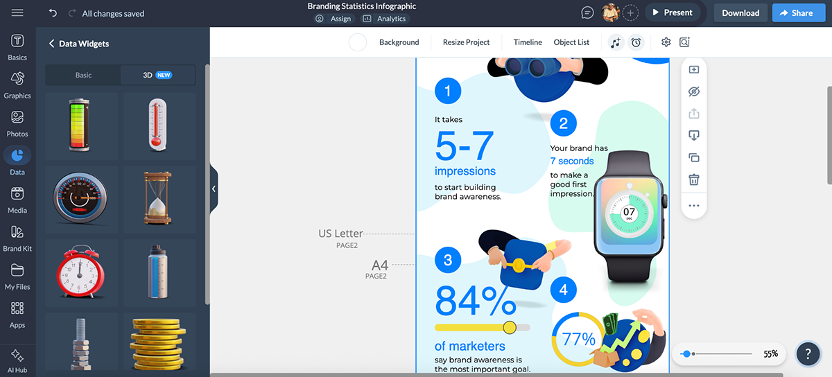
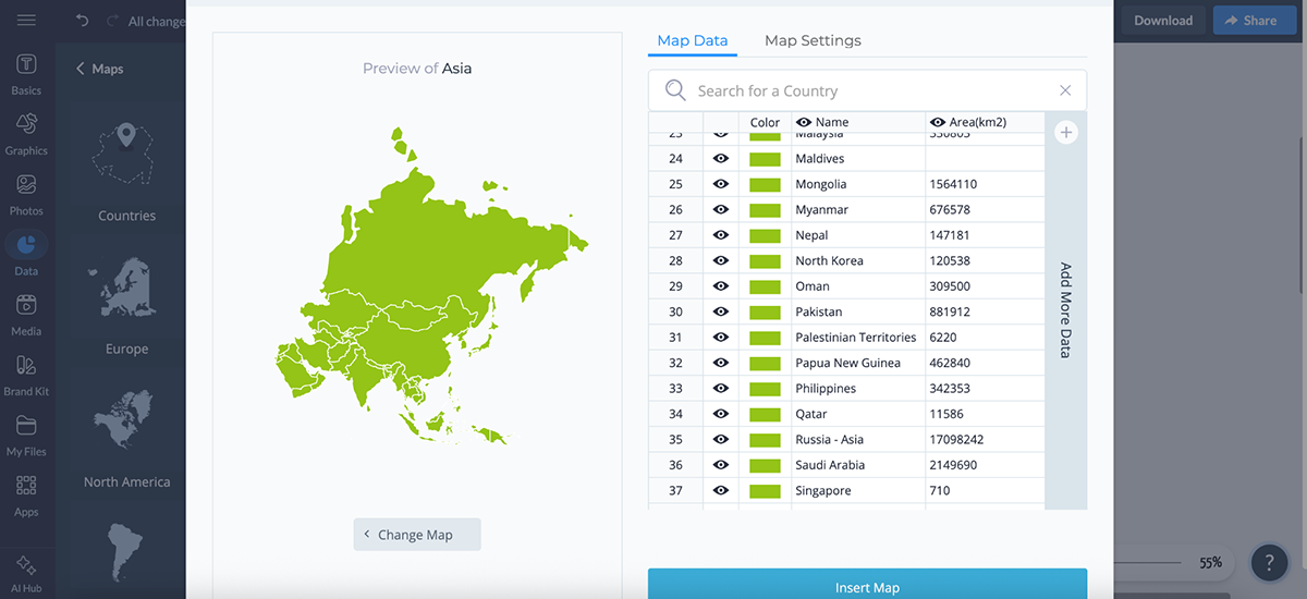
There are also pre-designed tables that you can drop into your projects (no manual formatting needed), as well as interactive maps to visualize geographic data, which are super handy for reports, presentations, and regional performance dashboards.
And everything I’ve mentioned here is completely editable.
You can change fonts, colors, borders and even add animations and interactivity to make charts respond to hovers, clicks or filters.
Plus, there’s support for live data sync, so if you’re linking to a spreadsheet or dashboard, your visuals will update automatically as your data changes.
All in all, Visme is purpose-built to help turn your data into something people will actually want to look at.
Piktochart is also pretty strong when it comes to data visualization.
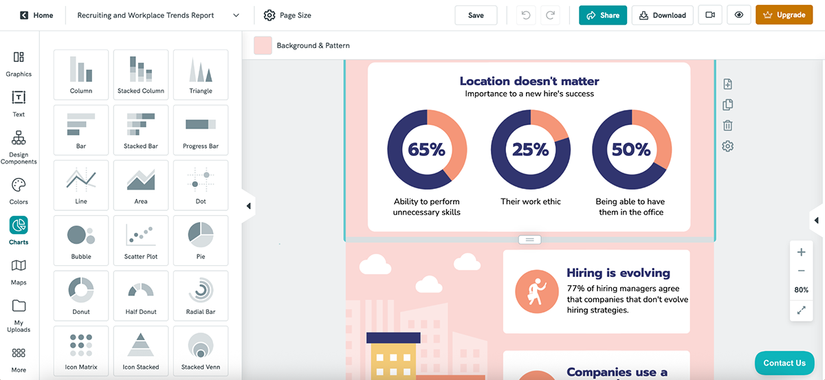
It offers 18 chart and graph types, including column, bar, line, area, dot, bubble, scatter, donut, radial bar, icon matrix, stacked Venn and more.
Not sure how a particular chart will look with your data? You can load sample data to preview it, upload your own .xlsx or .csv file, or even paste a Google Sheets link to bring in live data.
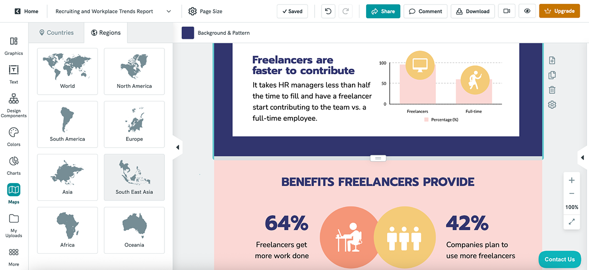
There’s also an option to create custom maps, helpful if you’re trying to show regional or country-specific insights.
That said, customization is limited.
There’s no support for chart animations or interactivity. Sure, you can change the colors, labels and data formats, but that’s about it.
If you want to give your visuals a bit more polish, you can browse the pre-built Design Components library for nicer layouts and cleaner chart frames.
Piktochart works well for simple, static data presentations, but if you want more advanced visuals, dynamic interactivity or animated data storytelling, Visme gets the job done, and then some.
How a tool handles collaboration can make or break your workflow, especially if you’re in a team environment. But even if you're flying solo, you might need it for client approvals and feedback.
Here’s how Visme and Piktochart stack up when it comes to workflows and team collaboration:
| Visme | Piktochart | |
| Real-Time Collaboration | Yes; multiple users can edit the same project at once | No; only one person can edit a visual at a time |
| Commenting Tools | Threaded comments, @mentions, markup tools (draw shapes, highlight areas), colored annotations | Comment threads with @mentions, pinned comments, rich text, repositionable dots |
| Permissions & Sharing | Role-based access (view, comment, edit), element locking, shared folders | Share with full team or specific members; set per-user view, comment or edit permissions |
| Version History | Yes; autosave + project history | No version history or undo across team edits |
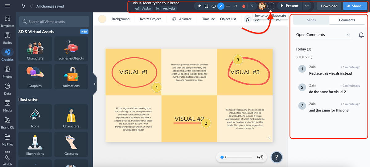
Visme’s collaboration workflow is one of the strongest I’ve seen in any design tool, especially if you’re working with a distributed team or managing multiple stakeholders.
You can co-edit projects in real time, just like in Google Docs or Figma. I’ve used this during team presentations. One person edits the content, while another fine-tunes the visuals—it works flawlessly.
Just click the + button at the top or go to Share → Share Privately to invite teammates.
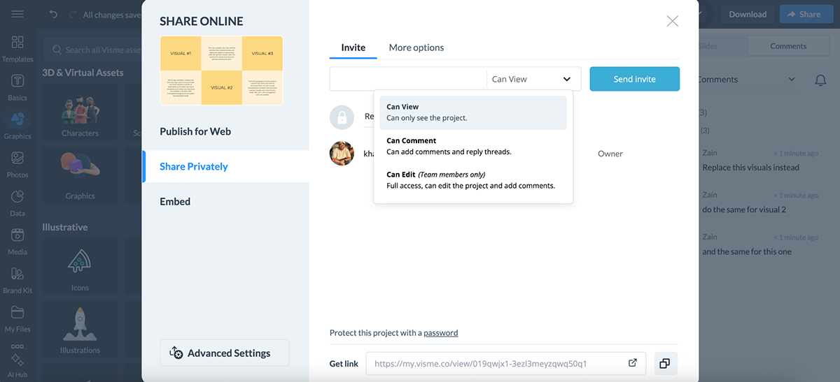
You can also control who does what with role-based permissions: give people view-only access, commenting access or full editing rights.
And when it comes to feedback, Visme doesn’t just rely on sticky notes. You can:
There’s also:
And here’s the kicker: Visme includes a built-in workflow feature. It lets you assign approval stages and set project statuses, like draft, in review or approved to streamline production and keep everyone on the same page. This is especially useful when managing content at scale or working across departments.
If you’re managing branded templates across departments, you’ll love being able to lock elements, set default styles and share your Brand Kit across the entire workspace.
Piktochart’s collaboration setup is good, especially if you’re a small team that shares visuals regularly and prefers a clear structure around sharing and feedback.
Each visual you create is private by default. To start collaborating, you need to invite team members to your Workspace. From there, you can choose to share visuals with the entire team or just specific teammates, with control over whether they can view, comment or edit.
The sharing settings are flexible. You can adjust permissions right from the dashboard or the editor itself, and team members get notified via email when something’s shared with them. You can also generate public view-only links for external collaborators or clients, if needed.
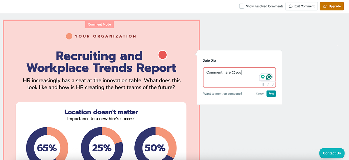
When it comes to leaving feedback, Piktochart includes an in-app commenting tool where you can:
You can even drag and reposition comment pins, format comment text, and get email notifications when someone tags you.
However, real-time editing is not supported; only one person can edit a visual at a time.
If someone else tries to jump in while you’re editing, they’ll get a pop-up asking to take over the session. So, it’s more of a turn-based workflow than a truly collaborative one.
There’s also no version history, so if something goes wrong, you can’t roll back to an earlier version. To stay safe, you’ll want to keep backups or limit editing access when sharing visuals.
Piktochart covers the basics of team collaboration, like permissions, commenting, and shared folders well enough for small teams.
But if you’re working in a cross-functional environment, Visme clearly stands out. With real-time co-editing, markup tools, approval workflows and version history, Visme’s workflow and collaboration features are purpose-built for teams that need structure and visibility at every stage.
If you’re creating content like ebooks, whitepapers, or reports, chances are you’ll want to collect leads before giving people access.
Here’s how Visme and Piktochart compare when it comes to lead generation:
| Visme | Piktochart | |
| Lead Magnet Types | Infographics, Ebooks, Case Studies, Quizzes, Surveys, Forms | Ebooks, Case Studies, Infographics, White Papers |
| Form Builder | Yes; with 1000+ templates | No native form builder |
| Customization | Full visual + branding control, animation, interactivity | Full design control, charts, templates, brand colors |
Another thing Visme excels at is converting your content into a lead-generation machine.
With Visme’s form builder, you can create everything from simple lead forms to full-blown surveys, polls and interactive quizzes.
There are plenty of form templates to choose from, including newsletter signup, lead magnet, contact, event registration, survey, poll, feedback, quiz, evaluation etc.
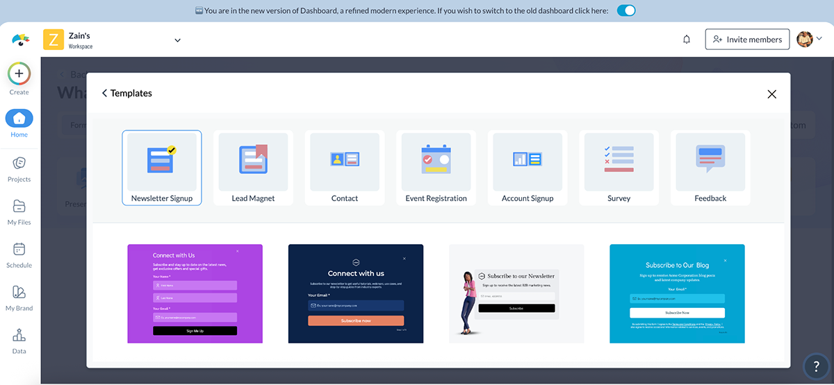
Each one is fully customizable. You can also add a 3D character alongside the form, which is proven to increase conversion rates by up to 2X. (Yes, please.)
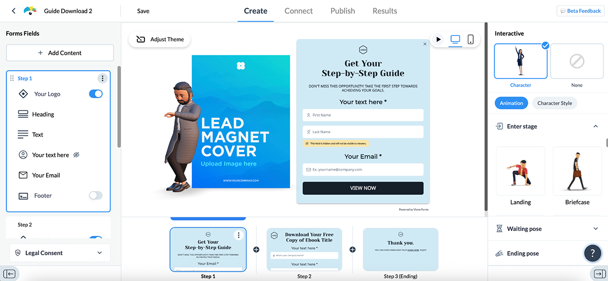
Once you’ve got your form designed, you can:
In short, Visme doesn’t just let you create visual content; it helps you capture and qualify leads and keep the momentum going inside the platform.
Piktochart helps you create lead magnets like ebooks, whitepapers and case studies with its AI Lead Magnet Generator.
But it doesn’t offer built-in forms or native lead capture like Visme does; you’ll need to use a third-party tool to collect contact info and track performance.
To test the AI lead magnet generator, I entered this prompt:
“Create a case study lead magnet titled “7 Proven Email Campaigns That Boost Ecommerce Sales” for small to mid-sized ecommerce brands.”
Here’s what it generated:
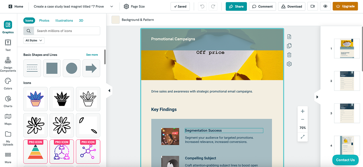
Basic, to be fair. But the good thing is that you can fully customize the design to tailor it for your audience.
Use cases span everything from marketing and education to nonprofit fundraising and e-commerce list-building. You can download your lead magnet as a PNG or PDF and share it on your site, via email or in paid ads.
Visme offers a dedicated form builder, 3D character opt-ins, embeds, integrations and analytics, whereas Piktochart focuses more on creating lead magnets than managing the full lead-gen flow.
In short, if you’re after full-funnel lead generation and conversion tools, Visme is the clear winner here.
You can create the best project there is, but if your tool doesn’t offer enough sharing or export features, then, frankly, what’s the point?
Let’s look at how Visme and Piktochart deal with sharing and exporting:
| Visme | Piktochart | |
| Live Link Sharing | Yes; with view, comment and edit permissions | Yes; make public, then copy the shareable link |
| Password Protection | Available | Available |
| Embed Support | Available | Available |
| Export Formats | PDF, PNG, MP4, GIF, HTML5, SCORM, xAPI | PNG, PDF |
| Interactive Offline Support | Yes, via HTML5 export | Not supported |
| eLearning Compatibility | SCORM and xAPI for LMS integration | Not supported |
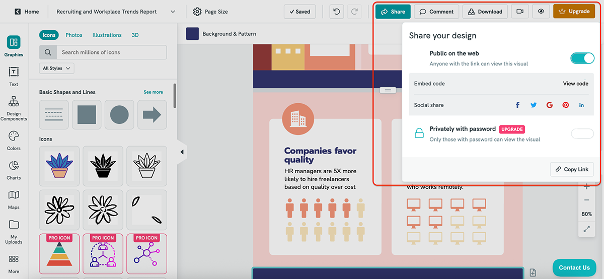
Visme gives you plenty of flexibility when it comes to sharing and publishing your content with the world.
You can publish projects using a live link and control access with settings like view-only, edit or comment permissions. There’s also the option to password-protect your content or limit access by domain, which is very useful when collaborating with clients or teams across different organizations.
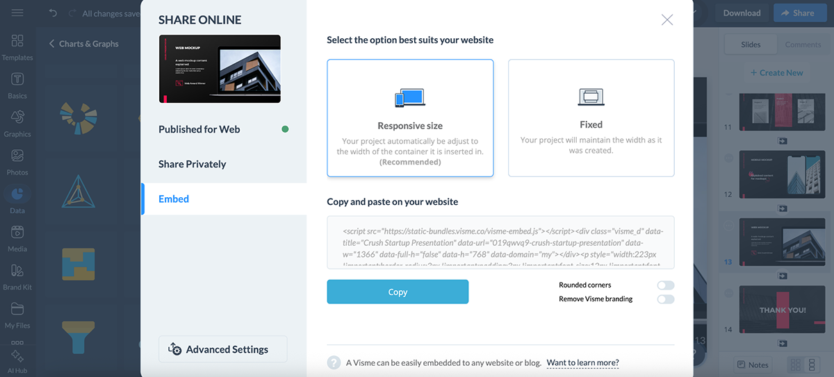
Embedding is just as easy. Visme offers a responsive embed code that adapts across devices, making it ideal for showcasing slide decks, dashboards or interactive infographics on your site.
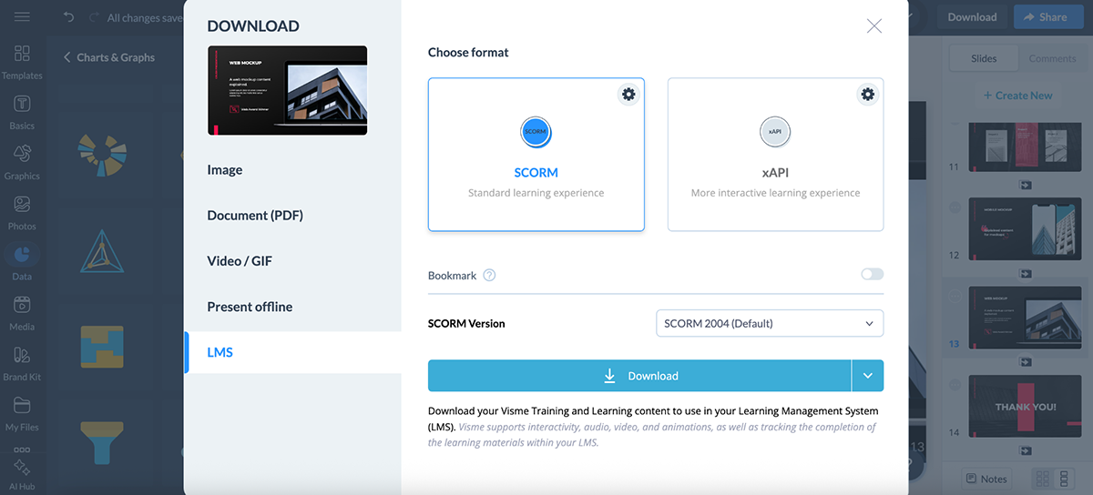
Need offline access? Visme supports a wide range of export formats:
If you’re using Visme for internal training or course content, you can also export projects as SCORM or xAPI packages. This is perfect for uploading to your LMS and tracking learner engagement.
No matter how or where you want to share, Visme’s export and publishing tools make it simple.
Piktochart covers the basics well when it comes to sharing and publishing visuals.
To share a project, just toggle it “Public on the web” and grab the output URL. You can also password-protect your visual (Pro users only) for private access, or use the built-in social sharing buttons to post directly to platforms like Facebook or LinkedIn.
Need to embed your design? Piktochart gives you an HTML embed code (available in responsive or custom width), perfect for publishing your infographic, report or slide deck on a website or blog.
Visuals can be renamed and the link updates automatically. Pro users also benefit from SEO indexing and watermark-free embeds; handy if you’re creating content for public campaigns or thought leadership.
That said, export options are fairly limited compared to Visme. You won’t find formats like HTML5 or SCORM/xAPI here, and interactive offline use isn’t supported.
Piktochart is ideal for quick online sharing and embedding, but if you require richer export controls and eLearning compatibility, such as SCORM and xAPI export, Visme wins this round.
Whether you’re stuck on a technical hiccup or just want to learn the ropes faster, both Visme and Piktochart offer a solid mix of self-serve help and human support.
Here’s how Visme and Piktochart compare when it comes to customer support and resources:
| Visme | Piktochart | |
| Dedicated Help Center | Available | Available |
| In-App Help | Available; ? icon in dashboard/editor opens tutorials, live chat and support | Available; “Contact Us” button in dashboard/editor with support bot + live chat |
| Sales Support | Available | Available |
Support with Visme feels less like filing a ticket and more like tapping a teammate on the shoulder.
You’re never left digging through pages of forums. Just click the “?” icon anywhere inside your dashboard or editor, and you’ll get access to a library of step-by-step tutorials, help docs, blog posts and on-demand videos.
There’s also a live chat option available from the same menu, or you can reach out by email.
What’s nice is that all past chat records are saved, so you can refer back to earlier conversations if needed.
If you’re on a business or team plan, there’s a Contact Sales button too, where you can request tailored onboarding support.
Between the Learning Hub, in-app tooltips and responsive support team, Visme does a great job blending self-serve resources with human help.
Piktochart also offers built-in support; whether you’re working in the dashboard or editing a visual, a “Contact Us” option is always within reach.
Need help fast? You’ll likely meet Mika, the friendly support bot (a.k.a. PiktoBot). It can guide you to relevant help articles or connect you to the support team if needed.
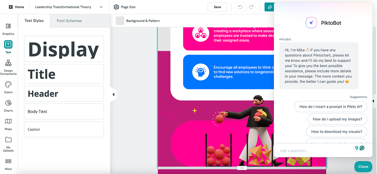
There’s also a full Help Center available with detailed guides, video tutorials and FAQs covering everything from getting started to advanced tips.
Both Visme and Piktochart make it easy to find answers without interrupting your workflow. You get access to dedicated help centers, blog, tutorials and webinars to stay on top of the platforms at all times.
Both Visme and Piktochart offer free plans, but the real power lies behind their paid tiers. Here’s how they compare when it comes to pricing:
| Visme | Piktochart | |
| Free Plan | Available | Available |
| Paid Plans (start at) | $12.25/mo | $14/mo |
| G2 Rating | 4.5/5 (447 reviews) | 4.4/5 (161 reviews) |
Visme’s pricing scales nicely, whether you’re just starting out or managing a full creative team.
You’ve got four main plans:
And our clients see real results on a daily basis.
For example, WOW!, a training and development team, reported saving nearly 79% in time and cost by using Visme’s intuitive graphic design tools.
Or look at the Greater Memphis Chamber, which used Visme for everything from infographics to award-winning reports. Mackenzie Stonis from their team says:
“The possibilities for savings and generating revenue with Visme are there, and they’re endless. We don’t have to rely on a designer or an external person, which means every sponsorship dollar that comes from any reports belongs to us.”
She also adds, “Visme has been instrumental in our branding efforts and streamlined internal processes, making them much quicker and easier.”
And that’s just scratching the surface.
Visme’s infographic templates have helped teams like IBM’s Talent Acquisition Optimization (TAO) group cut costs by up to 75%. Their team puts it simply:
“Now, more applicants autofilter themselves after they read a few of the key points on the infographic, so we’ve definitely seen an improved quality of applicants whenever infographics are used.”
In short? Visme hits that sweet spot between affordability, capability and real-world impact.
Piktochart offers multiple pricing tracks, so you’re almost guaranteed to find something that fits your needs.
For individuals and businesses, you get:
They’ve also got discounted plans for other groups:
Whether you’re running a business or managing a classroom, Piktochart keeps things flexible.
It depends on what you’re after.
Piktochart is great for turning data and documents into clean, easy-to-read visuals. So if your focus is on business comms and data storytelling, Piktochart may suit you better.
Canva, on the other hand, is a more complete design suite. It comes with a broader range of templates, stronger support for social media content and an ecosystem of third-party apps. So if you’re after speed, variety and marketing-friendly designs, Canva is likely the better fit.
Both are strong design tools, but serve slightly different needs.
Canva shines when it comes to speed, ease and variety. It’s packed with templates for everything from Instagram stories to presentations, plus a huge app ecosystem for extra functionality.
Visme, on the other hand, gives you more control over branding, interactivity and how your content is shared or exported. It also supports SCORM and xAPI, which is a big plus if you’re using it for training or eLearning. And when you factor in built-in social media scheduling, Visme Forms, video editing, 3D character creators and dynamic content fields, Visme starts to pull ahead.
In short, if you need a fast and flexible visual design tool for general marketing content, Canva is an excellent choice. But if you’re creating business, training or branded content that needs more control and functionality, Visme is the stronger choice.
Creating an infographic starts with knowing what you want to communicate. Define your goal, gather the right content (stats, steps or key takeaways) and map out a layout with a clear flow. Use visuals, charts and minimal text, keeping colors and fonts consistent for clarity.
Or skip the heavy lifting with Visme’s infographic maker. With pre-built templates, drag-and-drop tools and dynamic chart widgets, you can cut your design time by at least 75% and still end up with something that looks professional.
If you’ve made it this far, you probably already see the answer.
Piktochart is decent if you want a quick, AI-assisted way to turn a doc into a lead magnet or infographic. It’s beginner-friendly, and its AI lead magnet tool is genuinely helpful for fast outputs.
But Visme wins on most fronts.
It gives you way more control over branding, layout, interactivity and export options. You get better-looking templates across use cases like reports, presentations, case studies and social content. And beyond design, Visme packs serious extras like lead-gen forms, 3D character creators, animated icons, xAPI and SCORM exports and even social media scheduling.
Yes, both Visme and Piktochart are solid. But if you’re after ease of use, flexibility and performance, Visme stands out as one of the best infographic tools in the industry.
Sign up to start creating stunning infographics and visual content!
Design visual brand experiences for your business whether you are a seasoned designer or a total novice.
Try Visme for free


![How to Make an Interactive Infographic [+Templates]](https://visme.co/blog/wp-content/uploads/2023/11/How-to-Make-an-Interactive-Infographic-Quick-Guide-8-Customizable-Templates-Thumbnail.jpg)


