


The Best Beautiful.ai Alternatives to Create AI-Powered Presentations

A sales deck is a presentation used by sales teams to pitch a product or service to potential customers. The main goal of a sales deck is to persuade decision-makers and drive conversions during meetings, aka win leads.
However, very few sales decks actually achieve this.
To help you avoid creating a deck that misses the mark, we’ve gathered, reviewed, and analyzed 12 winning B2B sales pitch decks, sharing why they work , AI prompts to use and how you can emulate their success in your next client pitch.
Plus, learn how to you can use Visme sales deck templates to achieve similar layouts and designs of the decks you like the most.
Here’s a short selection of 8 easy-to-edit sales deck templates you can edit, share and download with Visme. View more templates below:


A sales deck is a visual presentation used in sales pitches to guide potential customers through a company's story, product or service. It's like a roadmap to portray why a potential customer should choose your offering.
It lays out your value proposition, the problems you solve and how your solution is unique. It's a useful tool that helps you communicate effectively and persuasively, making it easier to close deals.
So before we dive into our examples let's answer the most important questions. What are the key components of a sales deck?
The best sales decks are the ones that combine the regular with the extraordinary. They follow a formula people expect and have the added touch of personal and brand to make it special and different.
Here is a trusty outline to follow when building sales decks that we've seen across 12 of our sales deck examples:
If you’re asking yourself “What should a sales deck look like?” or “How do I know if mine will actually win clients?”, this section will answer all those questions and more.
We’ve handpicked 12 of the best B2B sales deck examples that not only show you how top companies pitch their products and services but also break down why they work.
Each example comes with actionable tips and a Visme template so you can adapt the strategies, avoid common mistakes, and create a deck that gets decision-makers to say yes.
150birds’ sales deck is a perfect example of the less is more approach. For this one, we’re focusing on the aesthetics, an often overlooked element of a winning sales deck.
The design is minimal but intentional. Each slide sticks to a clean, two-color scheme that keeps the content easy on the eyes while staying true to the brand. You’ll also notice the recurring bird visuals that not only tie back to the company name but also create a consistent visual thread across the presentation.
A simple layout paired with a playful brand element (like a mascot) captures attention without overwhelming the audience. No matter how great your product is, if the design falls flat, your data and features won’t land. A sales deck should be designed to hold attention from start to finish, and this one nails that balance.
Stick to a minimal color scheme that reflects your brand, and cut anything that doesn’t directly support your pitch. If you need to include extra details, use interactive features like pop-ups or clickable elements so viewers can dive deeper without cluttering your main slides.
The Cosmetics Company Investor sales deck also uses two tones for the most part. It should be able to accomplish the same effect. Visme lets you add animated characters in your presentations if you want to have a figure that serves the role of a mascot.


AI Prompt or Tool: Use the Prompt: “What color scheme and combinations can I use to create a clean, minimalist sales deck?” or Visme AI Designer to automatically find a template that matches your brand.
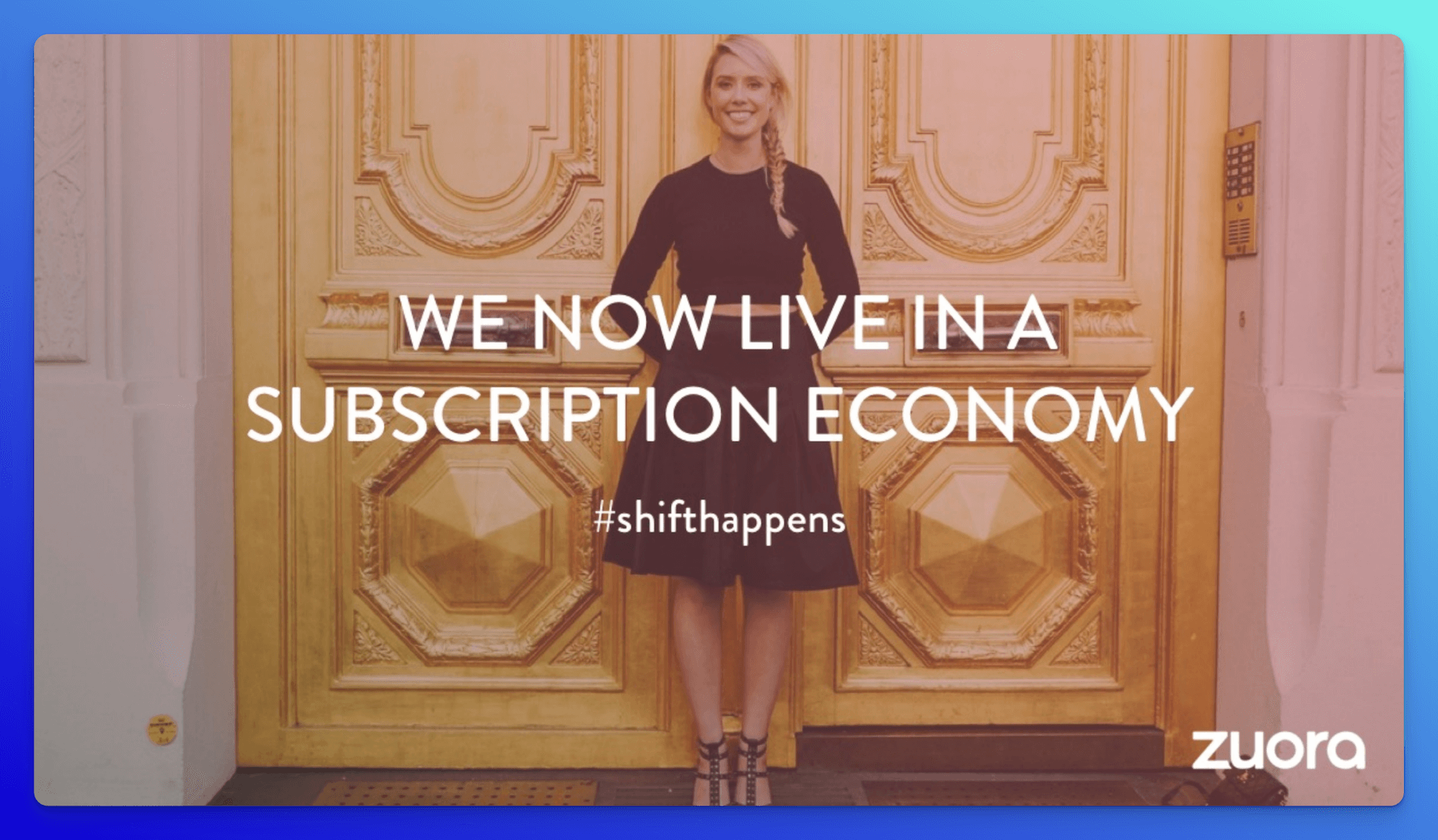
Zuora’s sales deck is often called one of the greatest, and there’s a reason why. It’s not just a product pitch; it’s a masterclass in storytelling.
This 24-slide deck (used by Zuora, a near-IPO SaaS company) helped them raise serious investment. What stands out is not minimalism like the 150birds deck, but the way every slide works together to tell a journey: starting with why there’s a problem, then what the solution is, how it works, and finally where you go next.
Visually, it has plenty of design, but it never feels cluttered.
Benjamin Ball, Chef Coach and Director of Business Development who trains CEOs how to successfully pitch and present to investors shares this:
"“Business storytelling is a powerful tool that can transform a dull presentation into a memorable experience. A good story will engage your target audience, tap into their emotions, and leave a lasting impression. This is why marketing leaders and business owners increasingly see the power of storytelling as an essential tool for communication."
Zuora doesn’t just describe features. It frames a big, relevant change in the world (the subscription economy), shows there are winners and losers, teases the “promised land” future, and presents evidence that the story can come true. It taps into the emotions of the reader.
Yes the visuals are there but I find that they create flow and build momentum, not distractions. When done well (as in this deck), storytelling becomes what attracts and holds attention, not just data or flashy design
Storytelling is often a buzzword that's overused and rarely explained, but this deck shows how it's done, by teaching us that we should:
AI Prompt & Tool: Use ChatGPT or Visme’s AI Writer directly in you editor to draft your storytelling outline. You can ask it to highlight what to keep, refine, or add, so your outline is prospect-ready.
Visme has everything you need to increase the value of your presentation. This simple yet high-impact slide deck has a minimalist design. It embraces simplicity on every slide and prioritizes the essential components of your presentation.


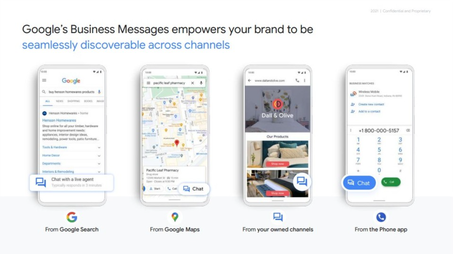
Google has some of the best product-focused sales presentations, and this deck is no exception.
It doesn’t waste time, right from the start, it shows off the unique value proposition of Business Messages and what it looks like in action. Side-by-side comparisons visually prove Google’s promise of “meeting customers where they are.”
The deck follows Google’s signature clean, simple, and easy-to-follow branding. I think what makes it even more effective is the Appendix, which includes real-life case studies of brands across industries, showing practical applications of the product in the wild.
This sales pitch deck is aimed at a wide range of ICPs, but all of them share the same problem: how to better connect with customers. Google solves this with a clear story supported by data and case studies—without drowning the audience in charts and numbers. The result is persuasive and accessible, even to leads who aren’t tech-savvy.
Case studies make the story real. Back your sales deck with industry-specific examples and data points, but present them in a way that’s easy to digest. The goal is proof, not overwhelm. If you're company is new or struggling with case studies, Natalia Dinsmore, B2B Content Marketing Strategist & Consultant says don't be discouraged. Instead she explains:
"One of the biggest issues with case studies is how hard it can be for teams, especially earlier and smaller stage companies to just get their hands on a case study.
There can be a lot of red tape, especially when it comes to revenue numbers. So get creative and think about all of the possible metrics that your product can influence.
It makes it easier to think of case study opportunities and then tell less-obvious but still meaningful ways your product helps improve the lives of your customers."
AI Prompt: If you can’t share client names, revenue numbers, or sensitive metrics, use this prompt to help reframe your case studies. Try:
"Reframe this customer success story without [example: naming the client or using revenue data]. Highlight the challenge, the solution, and one measurable outcome using non-sensitive metrics like [ time saved, process improvement, or user adoption], and keep the following product/service features in mind [list here]."
Visme’s Work+Biz Pitch Deck allows you to highlight your audience's problems and offer your services as solutions. It has placeholder slides where you can input your data and feature high-resolution stock photos from the platform’s extensive library to help make a stronger case for stakeholders.


High-quality visuals can significantly enhance your presentation's vividness and overall impact. Use Visme's AI image editing tools to unblur, upscale, touch up and edit images for your presentation. You can sharpen blurry images, enhance small pictures without quality loss, make minor adjustments and tailor images to fit your design.
I included Microsoft here because they’re known for targeting enterprise-level clients, those heavily invested in workspace SaaS products. If you’re a sales rep aiming to break into that market, there’s plenty to learn from how they structure their pitch.
This 49-slide deck is built around a central slogan and theme: “Worry Less, Work Easier, Work Together.”
You’ll see this slogan woven throughout the copy and reinforced in the design. It’s not just for leads in general, it’s tailored for decision-makers who need to be convinced of long-term ROI.
By anchoring the entire presentation to a clear message, Microsoft ensures every slide supports the same story: productivity, simplicity, and collaboration.
Victoria Taylor, Founder & Head Marketer at VTM shares why this is so central to helping your sales leads to convert:
"Enterprise clients want to know from the start: is this the solution to my problem? They’re not impressed by bells and whistles, that comes after they say yes. Keep your copy focused and centralized on the problem-solving capabilities."
A strong slogan does more than sound catchy, it centralizes your message and keeps your presentation focused.
Choose a phrase that reflects your audience’s core pain point and repeat it throughout your deck. It's also help for your different team members who might be working on your sales presentation at intervals.
It creates consistency, makes your message memorable, and ensures decision-makers walk away with the exact takeaway you want them to.
AI Prompt: Generate three slogan options for an enterprise sales deck. Each slogan should highlight [audience pain point], promise [core benefit], and reinforce [brand positioning].
This Marketing Automation Tool Presentation Template can help you to replicate the Microsoft example above, but be sure to add extra slides that help you to share your product or service.


Patch leans into its branding in a smart way. If you look closely green isn’t just in the logo and design elements, it’s carried through the images, accents, and layouts across the deck.
Since Patch helps businesses connect with local communities, the color choice makes sense: green communicates growth, environment, and community impact.
I love that all of this is placed on top of clean white backgrounds, keeping the presentation professional and easy to read.
This deck works because it’s not just pretty, it’s persuasive. It spells out why businesses should advertise with Patch, explains exactly how the platform works, and highlights what makes it stand out from other options.
The consistent use of color reinforces the brand while guiding the reader through the story without distraction.
Branded or not, colors affects a client's perception of your work. A colors meaning can carry a much more powerful effect than words, so be sure to double check their meaning.
A strong color strategy does more than look good, it ties your message together and makes your brand memorable.
Choose one or two colors that reflect your company’s mission, and carry them consistently through every slide. This creates a cohesive look and keeps your deck focused on the bigger story you’re telling.
A good move would also to use a color-blind-friendly palette or use color accessibility analysis tools include Chrome Inspect, Visme Accessibility Tools, Who Can Use, Adobe Color, and Coblis.
AI Prompt: Generate three slide layout variations that use [brand color] as the primary accent while keeping the design clean and professional.
Not only is the Interior Design presentation a beautiful template to work with, but it also uses green and other cool colors. It has a soothing effect that makes the sales deck easier to read.


Asana’s sales deck is a great example of what to show a client you want to upgrade. This isn’t for someone who’s brand new, it’s built for leads who already know the basics or current customers you want to upsell on premium features.
That’s why it made the list, you might want to structure yours the same way.
The deck shows off Asana’s interface early, even before a lead says yes. This creates familiarity and helps them picture exactly what they’ll get.
It also breaks down features like integrations and premium tools in detail, backed by a dedicated slide full of trusted company logos.
Every strong sales deck includes that “proof page” of recognizable clients. To top it off, Asana links directly to feature and pricing pages so readers can explore further at their own pace.
Decision-makers want clarity and confidence. By showing the interface upfront, you remove uncertainty. By including logos of big-name clients, you build trust.
And by linking to detailed resources, you give buyers the freedom to dive deeper without overwhelming them in the deck itself.
AI Prompt: "Create a sales deck outline for upselling an existing client. Include slides for [product interface preview], [feature upgrades], [integration highlights], and [client logo proof page], with space for links to pricing or feature details."
The Design Tool Presentation template has a similar layout style as the one in the example. It features a rich blend mix light and vibrant colors that help the audience grasp information quickly. It has stunning images, several stock photos, quality vector icons, and stylized content blocks. It gives you enough flexibility to add your software mock ups and client logo slides.


When people talk about Airbnb’s deck, they often focus on logo, typography, visuals, the generic stuff. What I believe really sets it apart (and what many decks fail on) is how Airbnb nailed clarity of problem → value proposition → market size.
Their original 2009 deck raised $600K in seed funding, summarized their massive market in simple terms, and used just 10–13 slides to tell a powerful, logical story. S
They didn’t just show features. They showed why the product mattered, backed it with meaningful data, and made the story easy to follow. The proven formula we've seen in each example, but in a far more condensed form.
Airbnb’s success came from being ruthless about what they put in vs. what they left out.
They opened with the problem (expensive, impersonal hotel stays), then quickly jumped to “this is our solution,” how the market validated there was demand (e.g. alternatives like Couchsurfing, Craigslist, big competitors at the time), and what their revenue model looked like.
Every slide had a purpose. They didn’t waste time with fancy graphics or fluff. Even the visual design is very clean, readable fonts, limited text, strong visuals that support (not distract). It makes investors focus on why it works over just how it looks
Airbnb proved that trust comes from data-backed comparisons. Instead of just saying their product was better, they showed the alternatives (hotels, Craigslist, Couchsurfing), mapped out the size of the travel market, and connected it to a clear revenue model. That combination made their pitch believable and investable.
For your own sales deck, don’t just talk features, prove value by contrasting it with the status quo or competitors. Use side-by-side comparisons, real numbers, or market trends to highlight why your solution is the smarter choice.
You can take it up a notch by creating an interactive comparison chart, that way your leads can click through and get real-time side-by-side views. Visme allows you to create charts like this and more without any design or coding experience.
AI Prompt: Generate a comparison chart layout between [Your Brand] and [Competitor 1], [Competitor 2], [Competitor 3]. Include placeholder rows for: [Core Features], [Pricing], [Ease of Use], [Integrations], and [Customer Support]. Highlight [Your Brand] strengths in bold or with icons so the advantages stand out clearly.
The AI Startup Pitch Deck Presentation should help you win more stakeholders if you're developing an Airbnb alternative. It details the market to help validate your product idea before moving on to its features. Then it discusses your marketing strategy and lists your competitors and what makes your app different from them.


Snapchat’s sales deck is all about attention design. It may be dated but it has all the signs of the classic strategy for a solid sales pitch. Instead of bombarding readers with heavy data, the slides use bold visuals and clean layouts to keep advertisers focused on one idea at a time.
The changing backgrounds aren’t just “fun colors”, they act as natural visual resets, keeping the audience alert and engaged as they move through the story.
Advertisers know the hardest thing to earn today is attention. Snapchat leans into this by showing—not telling—how its platform commands attention from younger audiences. Each slide mirrors the kind of short, punchy, visual-first content advertisers would be running on the app itself. In other words, the deck sells by example: if the format keeps you engaged, it can keep your customers’ audiences engaged too.
Design your sales deck to model the experience you’re selling. If your product is about capturing attention, make your deck do the same with bold visuals, quick resets, and minimal text. Don’t just claim it works, let your deck prove it.
AI Prompt: Create a slide outline for a sales deck that mirrors the customer experience. For each slide, include [core message], [visual or design element that demonstrates the message], and [callout text]. Keep slides short and visually driven to reflect an attention-first design.
The IworkUwork sales deck template comes pretty close. It uses the same yellow accent color to brighten up each slide.


Vue Storefront’s sales deck hits hard because it’s not just pretty slides, it’s proof.
I love that the design is bold and dynamic, sure, but what really makes it stick are the client testimonials and data sprinkled throughout. Instead of only telling you “this works”, they let their customers do the talking and back it up with real stats. That combo makes the pitch way more believable than just slick graphics.
Decision-makers want confidence before they buy, and nothing builds trust faster than seeing other real companies succeeding with your product.
Vue nailed this by mixing numbers (“X% faster load times,” “Y% growth in conversions”) with authentic customer quotes.
The testimonials feel genuine, not staged, and the data is simple enough to scan without getting lost in spreadsheets. Together, this creates a one-two punch of credibility: logic plus social proof.
AI Prompt: Reframe a client success story into a two-slide format. Slide 1: [Client quote highlighting the benefit]. Slide 2: [Supporting stat that proves the result]. Keep both short, scannable, and visually engaging.
The ClickChat pitch deck presentation template is quite similar to the Vue Storefront sales deck outline. This template features a striking green color scheme, attractive data visualizations, high-quality graphics and bold fonts.
It's an excellent option for creating a sales pitch deck that conveys key messages effectively, making it a great starting point for those looking to emulate the look and feel of the Vue Storefront presentation.


Softr’s sales deck is all about showing value in simplicity and scale. It leans hard into whitespace, limited text, iconography, and subtle color shifts so your mind isn’t overloaded.
But the twist that many decks miss: it backs all of that clean design with serious traction. Softr raised $13.5 million in Series A funding in 2022, and over 80,000 businesses used its no-code platform to build apps powered by their data by early 2022.
What’s clever is how the deck doesn’t clutter in order to show scale — instead, it lets the metrics breathe, pairing them with clean visual hierarchy so viewers get: “yes this is simple, yes this is trustworthy, yes this could scale for me too.”
Now let's dive into what we can learn from this pitch deck that can help to supercharge your sales deck.
Simplicity = trust. When you're pitching to enterprise or finance-minded leads, fancy designs won’t improve your odds nearly as much as clarity and clean presentation of real numbers.
Softr’s deck wins because it proves scale (80k+ users, millions raised) without screaming, the subtle design supports credibility.
It balances aesthetics and financial proof. The visuals don’t steal attention from the data; they highlight it. Every stat feels intentional because it’s set in a clean layout where metrics are easy to find, understand, and believe.
AI Prompt: To help you work smarter when creating a slide similar to Softr use this prompt: Include placeholders for [Funding Raised], [Active Users], [Cost Savings for Clients], and [Growth Metrics]. Add a short explanation under each placeholder showing why the number matters to the client or investor.
Equipped with bright colors, catchy visuals and customizable charts and widgets, this template is an excellent match for those looking to create a sales deck similar to Softr's. The template allows you to convey complex ideas effectively while maintaining your branding.


If you’re looking for how to create a pitch deck, read our guides about what a pitch deck is and the best pitch deck examples to inspire your own.
Plum’s sales deck is a reminder that first and last impressions are everything. The opening slide is nothing but their logo, clean, simple, and deliberate. It sets the tone without distraction.
From there, the deck builds into the story of the problem, the solution, and most importantly, the financial case for why Plum matters. By the time you get to the last slide, you’ve seen their traction, growth, and vision, and that’s what sticks.
You don’t always need a flashy hook on slide one, sometimes restraint works. Plum’s choice to start with just the logo created a pause, pulled attention in, and then let the following slides do the talking.
What really matters is how they closed: with financial proof points and growth potential that investors would remember after flipping through dozens of decks. The first slide set the stage, and the last one sealed the deal.
AI Prompts: Review my sales deck to check if the first and last slides make a strong impression. Does Slide 1 clearly anchor the brand or problem? Does the final slide leave confidence with traction, financial proof, or vision? Suggest edits only for the opening and closing slides while keeping the middle content intact.
If you're looking to replicate the style of Plum Fintech's sales deck, the phonebook pitch deck presentation template may be a good fit. This Visme template offers a highly customizable base to create your own pitch deck. It helps present your business ideas in an appealing way to investors with its professional and stylish layout.


Additionally, read our article about the 13 powerful sales pitch presentation templates you can customize to create your own.
Most decks fall back on “great features” or “cool visuals.” Lunchbox differentiates by leading with customer impact metrics and market outcomes, not just what they can do, but what they have done. That emphasis on measurable results gives them credibility right from the jump, instead of leaving leads thinking, “sounds good, but where’s proof?”
Most decks talk features → outcomes. Lunchbox quietly does more: it shows how its revenue model is tied directly to the market’s biggest income streams (restaurants + delivery), which makes the deck read less like “cool product” and more like “business engine.”
AI Prompts: Create a comparison chart that maps my company’s revenue model against total market income. Use placeholders for: [Market Size], [Target Segment Revenue], [My Company’s Current Share], and [Projected Share]. Ensure the design highlights scalability and future growth potential.
The e-commerce pitch deck template on Visme is indeed comparable to the Lunchbox example. It's a vibrant, visually appealing template with modern layouts to showcase unique selling propositions, customer acquisitions, revenue streams, and data analysis.
The template caters mainly to online store owners, strategists and digital marketers aiming to convert eCommerce data into visually striking presentations. It's undoubtedly a good template to start crafting a sales deck like Lunchbox's.


A sales deck isn’t just a set of slides, it’s your story, data, and proof points designed to win trust and move prospects closer to “yes.” Whether you’re pitching to investors, enterprise clients, or potential partners, the way you structure your sales deck can make or break your presentation.
Here’s a step-by-step breakdown of how to create a sales deck that works:
| Step | What to Do | Ask Yourself |
| 1. Define Your Objective | Decide what outcome you want: closing a deal, securing investment, or positioning your brand as the best solution. | “What is the single most important action I want my audience to take after this presentation?” |
| 2. Know Your Audience | Tailor slides to the audience’s role, pain points, and decision-making priorities. | “Who am I talking to, and what problem keeps them up at night?” |
| 3. Structure Your Story | Follow a logical flow: Problem → Solution → Proof → Impact → Next Steps. | “Does my deck read like a clear story that moves naturally from problem to solution?” |
| 4. Design for Clarity | Use clean layouts, minimal text, and visuals that reinforce your message. | “If someone skimmed this deck in 60 seconds, would the main points still land?” |
| 5. Use Storytelling & Data Together | Pair data points with customer stories to make insights stick. | “Do my numbers come with a story that makes people care?” |
| 6. Keep It Short and Focused | Limit to 10–15 slides; move extra detail into supplemental documents. | “Am I keeping only what matters, or am I padding slides with filler?” |
| 7. Practice and Refine | Test the deck, get feedback, and adjust based on where attention drops. | “Where do people lose interest or ask questions — and how can I fix that?” |
As was said earlier, building a sales deck isn’t complicated at all, especially if you’re using a Visme template.
You can use Visme to create professional documents, including sales presentations.
So, where do you start with your presentation? Here’s how you do it.
Visme has a rich library of customizable templates for any type of presentation. And the best part is that you can preview each one to see which of them perfectly fits your needs.
It’s important to note that you’re never stuck with what the template gives you. If you need to add or remove slides from the deck, you can. The same goes for adding or removing elements on each page.
You are in complete creative control over all the details that appear on your sales deck.
For example, if you don’t want to use the background image, you can delete it and replace it with something better.
This process becomes easier if you’ve used Visme before because you can use saved elements in new presentations. For example, if you already have a title slide, you can add that slide to your sales deck.
Any changes made to the original slide will automatically reflect across all presentations where the slide was used. The same principle applies to the dynamic fields feature that helps to easily update information throughout your projects and slides.
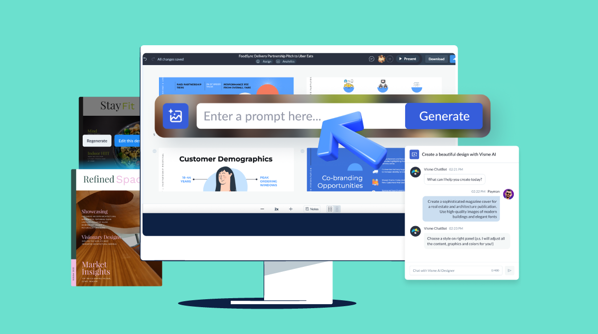
Alternatively you can also use Visme's AI sales pitch generator to generator sales presentation with a detailed prompt.
Visme is a drag-and-drop style builder. That means anyone—even those that don’t have any graphic design experience—can pull off a sales deck that looks professional from beginning to end.
You can change images, shapes, and text with ease. And there are thousands of visual elements that you can make your presentation shine.
Changing numbers on charts and graphs is easy. Just select the data you want to update and select settings. From here, you’ll be able to select the value you want to update along with other cosmetic changes you’d like to make.
We’ve got other features worth mentioning. You can make short snippets of information with a call-to-action pop up when a user hovers over an element. Also, our tool lets you add links to other slides or external pages.
Another interesting feature is the live data integration which lets you connect charts on your slides to data from Google Sheets. That means if changes are made to the data from Google Sheets, the data in your sales deck is updated automatically.

Once you finish your sales deck, you can download your powerful business presentation and call it a day. However, you can share your sales deck with others in other ways.
You can send specific people private links to your Visme presentations. There is also an option to present your sales deck directly from Visme, which will preserve interactivity and animations if you add any.
Visme has an analytics feature that lets you measure the impact of your presentation. You can view how users interact with your presentation and determine how to further engage them. This is especially helpful if your creating a sales product presentation with interactivity.

Another alternative for creating presentations is using Visme's AI presentation maker to create your presentation. All you have to do is explain the tool about what you want to create. Our smart Chatbot will ask you a few questions to tailor the presentation to your needs.
You can further edit your presentation design to include additional information, data visualization, images, etc.
Here are some of the most frequently asked questions about sales deck presentations.
A sales deck is a presentation that helps business owners, sales agents, sponsorship and partnership directors, and marketers sell more products to potential customers. It highlights specific problems a lead could have and how the product can help them get rid of them.
A sales deck is a type of presentation that is designed to convert leads into customers. This type of presentation primarily focuses on a specific product or service that a company offers.
A pitch deck is designed to sell a company to potential investors. Its content focuses more on the company’s vision, financials, and all products and services that the business offers.
A sales deck should identify the customer’s pain points, introduce the solution (your product), list product features, and get the customer to take action.
First, you want a sales deck cover image that quickly grabs the reader’s attention. Next, your sales deck should convey everything your leads need to know about your product, service or idea and nudge them to take action. You’ll also want to back up any claim with factual and accurate data and include a call to action.
A sales deck is designed to win over potential customers by highlighting their pain points, presenting your solution, and showing the value of your product or service.
An investor deck, on the other hand, is built for potential investors and focuses on your business model, market opportunity, traction, and financial projections to secure funding.
Most sales decks fall between 10–15 slides, long enough to explain your value proposition but short enough to keep your audience locked in.
The key isn’t the number of slides, but the clarity and relevance of the information, every slide should move the conversation forward.
If you need more detail, you can always add supporting materials in an appendix or follow up with interactive content after the meeting.
Getting the most out of your startups requires you to secure funding from investors first. From here, you can successfully disrupt the market and create a profitable business selling a product or service.
To do that, you need a sales deck designed to close more deals and make more sales. The examples above should give you ideas on how to create your presentation.
If you don’t fancy yourself as a graphic designer, you can still create a stunning presentation with Visme. Use a Visme sales deck template to jumpstart the process.
Design visual brand experiences for your business whether you are a seasoned designer or a total novice.
Try Visme for free