The Best Beautiful.ai Alternatives to Create AI-Powered Presentations

The difference between presentations that fall flat and those that inspire action often comes down to applying proven strategies grounded in real data.
In 2025 and the way presentations are created and delivered is changing fast.
From AI-powered tools that streamline content creation to changing platform preferences and audience expectations, modern presenting looks nothing like it did a few years ago.
To keep your presentations sharp and your audience tuned in, you need to stay up with the latest presentation trends, key audience engagement insights, and industry-specific shifts.
In this article, I’ve pulled in 23 must-know presentation statistics that reveal what makes presentations stick, spark decisions and deliver results.
Check out the infographic below to view a visual summary of all the presentation statistics. If you want to read the full post with all the details, keep scrolling.
Made with Visme Infographic Maker
Embed this infographic on your site:
The importance of AI in business is undeniable. There are advancements in data analysis, customer management, automation, and, of course, in content creation, which includes presentation design.
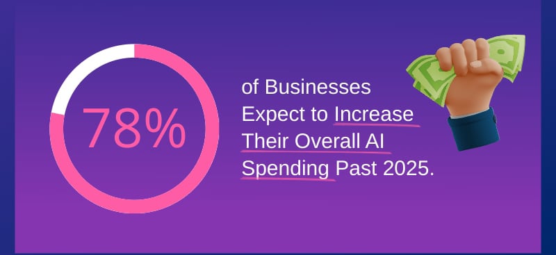
According to Deloitte’s State of AI in Design Report 2024, 78% of businesses expect to increase their overall AI spending in 2024 and beyond.
As businesses increase their AI spending, some of that money is being allocated towards improving their presentation creation efforts. AI can assist with several aspects of creating presentations, ranging from AI presentation generators to individual tools that craft copy and edit images.
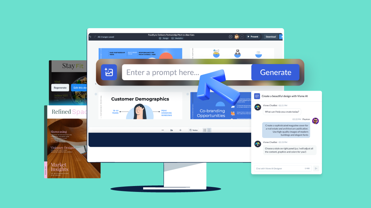
One option is Visme AI, our comprehensive AI hub where you can easily create presentations, edit the visuals with the AI Edit Tools and craft text with AI Writer.
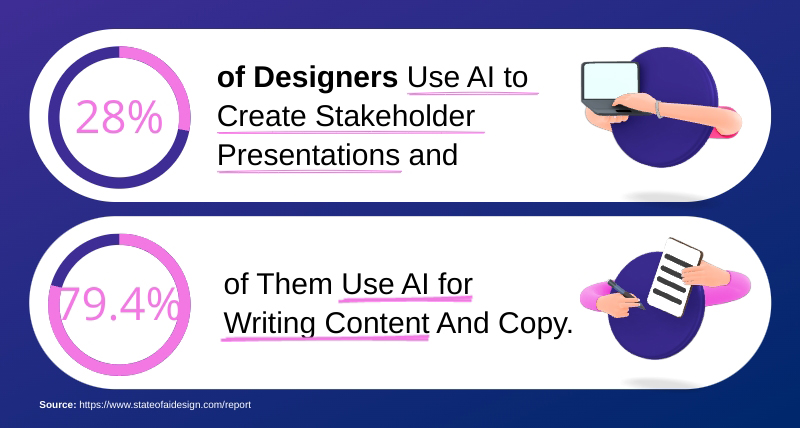
Designers are no strangers to using AI for their work. According to a study by Figma, 28% of them use AI to create stakeholder presentations. Additionally, 79% of them use AI to write content and copy for their projects, including presentations.
This may reflect how designers work but it signals something bigger. If design professionals are embracing AI to enhance their presentations, it's a clear sign that all business teams can tap into the same tools for faster, smarter communication.
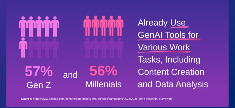
Building on the previous statistic about designers' use of AI, this one provides more specific insights. According to Deloitte’s 2025 Gen Z and Millennial Survey, 57% and 56% respectively, already use GenAI for their work tasks. These include content creation, which encompasses presentation design and layout.
Like the previous statistic, this one proves that AI continues to expand its hold on business processes and content creation techniques. As a business owner, entrepreneur or anyone who creates presentations regularly, you can’t ignore the growing influence of AI.
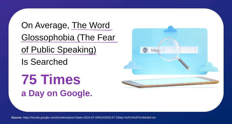
Glossophobia, or the fear of public speaking, is an obstacle for many presenters. It can make you freeze in front of an audience, forget your speech and stumble over your words. It’s no surprise that people are searching for the term Glossophobia an average of 75 times a day.
This stat shows how common presentation anxiety is and why addressing that fear is just as crucial as building slides.
Entrepreneur Richard Branson once shared these wise words about how to calm public speaking jitters,
"When you need to speak in front of a crowd, close your mind to the fact that you’re on a stage with hundreds of people watching you and instead imagine yourself in a situation where you’d be comfortable speaking to a group."
A beautiful presentation can not only help you create a great first impression in front of your audience, but can also make you feel more confident while you’re presenting. But designing a presentation that’s stunning and effective isn't as easy as you might think.
If you’re a non-designer, you might find it tricky to put together a nice-looking slide deck using basic presentation software. To give you an edge, we've handpicked 85+ Best Free Presentation Templates you can easily customize–no design experience required. Our library is also packed with hundreds of presentation templates created by professional designers.
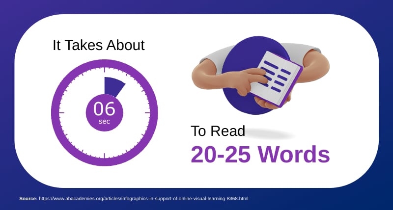
This statistic reveals an important timing element for your presentation design and delivery. According to the data, your audience needs approximately six seconds to process slides with 20 to 25 words.
What does this mean for how you structure your slides? Limit each slide, or each slide section, to no more than 25 seconds. When presenting online or in person, pause for at least 6 seconds after displaying a new slide before starting to speak.
This timing principle also supports the Modality Principle I mentioned earlier. So instead of cramming text onto slides, use those 20-25 words as key headlines or takeaways, then deliver the detailed explanation verbally. In this manner, your audience gets the best of both techniques: quick visual comprehension and detailed audio information.
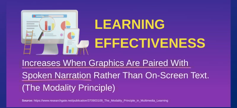
The Modality Principle, also known as the Instructional Modality Effect, is one of the most investigated phenomena in cognitive load theory, specifically applied to instructional multimedia.
Through several stages of research, the modality principle suggests that supplementing instructional visualizations (including presentations) with narrated texts rather than written texts improves learning effectiveness.
What does this mean for your presentation processes? If you’re presenting in person or virtually, you’re covered. However, if you need to present asynchronously, consider adding recorded spoken narrations to your slides. Visme’s Presenter Studio and hotspots feature will help you add narrations to your presentation slides.
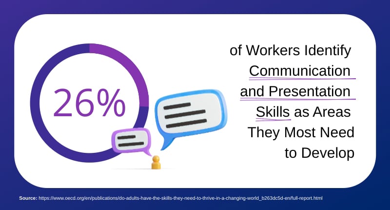
In a study run by the OECD Survey of Adult Skills 2023, the Organization for Economic Co-operation and Development discovered that 26% of workers identify communication and presentation skills as areas they most need to develop.
Help your employees grow beyond this 26% and provide them with the tools to improve in their day-to-day tasks. Learning and Development strategies are an important sector of business and Visme can help your team create effective LMS presentations in SCORM and xAPI file types.
cta_button text="Customize this infographic template and make it your own!" link="https://www.visme.co/make-infographics/?vc=In-Text-Blog-CTA&ver=4" button_text="Edit and Download"][/cta_button]
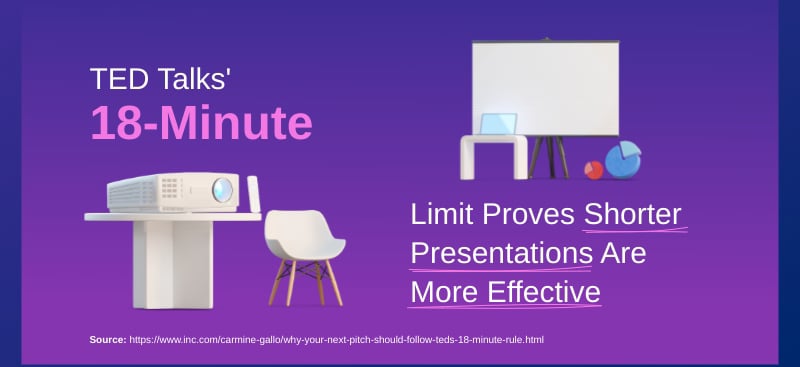
When the TED conferences started, the presentations would last up to 90 minutes and founder Richard Wurman found them super boring, especially since that was what he was trying to move away from to begin with. So what he’d do was sit on stage and move closer and closer to the speaker as their time ran out, physically crowding them off stage.
This technique eventually forced TED presentations down to around 15 minutes. Then, when Chris Anderson took over TED in 2001, he set the maximum time to exactly 18 minutes because “15 was often interpreted as 20 or 25.” It wasn’t a scientific formula, but more of a practical necessity.
In the end, the 18-minute limit proved effective. Anderson called it “long enough to be serious and short enough to hold people’s attention.” By constraining time, TED created the perfect presentation length for both live presentations and online videos.
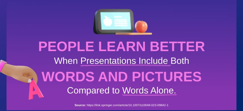
The Cognitive Theory of Multimedia Learning states that people learn better when presentations (and all visual learning material) include both words and pictures compared to words alone. This fact has contributed to the effective creation of visual material for decades.
Richard E. Mayer has been studying this cognitive theory for several decades. His ongoing research and continued tests consistently prove his theory.
In this paper, The Past, Present, and Future of the Cognitive Theory of Multimedia Learning, he shares his process and how it evolved.
This statistic directly relates to designing creative and effective presentations. If you want the information you’re sharing to be understood and for it to make a difference, you must combine words and images on your slides. It’s that simple.
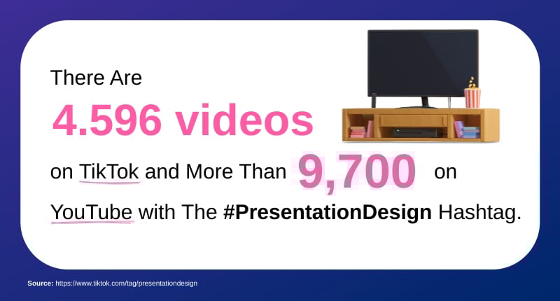
Presentation design was never meant to stay in the confines of the boardroom or office. It has expanded to social media like YouTube and TikTok.
As of the date of publication of this guide, there are 4596 videos on TikTok and 9.7K on YouTube with the #PresentationDesign hashtag. The numbers just keep increasing.
This fact proves that learning to improve your presentation design skills is easier than ever. Content creators are regularly sharing tips, tricks and tools to support your journey and others like you.
Plus, the viral nature of TikTok content means that innovative presentation techniques and design trends can spread globally within days. This scenario creates pressure on all presenters to stay current with emerging best practices and visual styles.
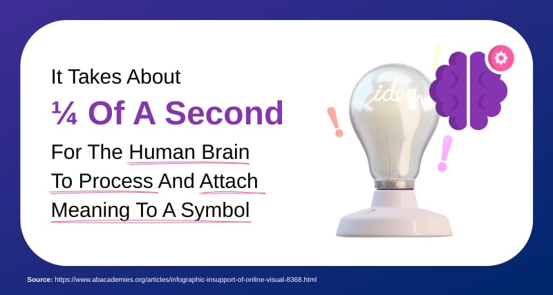
According to a research study by Thorpe et al., human brains process and attach meaning to a symbol in ¼ of a second. This lightning-fast processing seed explains why visual communication has been humanity’s preferred method of sharing information for thousands of years, from cave paintings to modern infographics.
When you use a recognizable symbol to transmit information, like a lightbulb for an idea, a target for a goal or a graph showing upward trends, your audience will instantly understand the concept with little cognitive effort.
For presentation design, this means strategically incorporating symbols throughout your slides. Replace generic bullet points with relevant icons. For example, consider using checkmarks for completed tasks, warning triangles for risks, or arrows for process flows. These visual shortcuts allow your audience to grasp the context easily, leaving their mental energy free to focus on your speech.
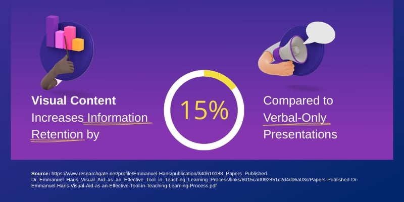
Research indicates that three hours after a presentation, only 70% of people can remember the content presented verbally. But when that information is paired with visuals, retention jumps to 85%.
This 15 percentage point difference might seem small, but for business presentations, it translates to better outcomes.
In practice, remember to never rely on words alone. Turn your key talking points into visual elements. Instead of simply stating “Our revenue grew by 40% last quarter,” use a chart or infographic to illustrate this growth. Rather than listing product benefits in bullet points, use diagrams or before-and-after comparisons.
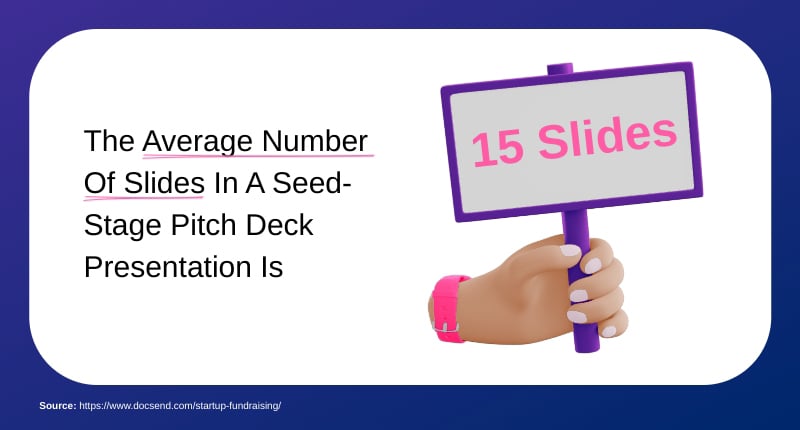
According to DocSend’s analysis of startup fundraising data, successful seed-stage pitch decks average 15 slides. This number represents the sweet spot between providing comprehensive information and maintaining investor attention.
Let’s break it down: your 15 slides should follow a proven structure, including Problem, Solution, Why Now, Market Opportunity, Business Model, Traction, Team, and Financials. This framework ensures you cover all essential elements without creating overwhelm
Remember Guy Kawasaki’s 10/20/30 rule I mentioned earlier? While he advocates for 10 slides, the DocSend data suggests that investors are expecting a bit more detail. The key is to make sure each slide counts towards moving your narrative forward.
There are a lot of articles on the internet that share statistics about the human attention span. In case you didn’t know, many of them were debunked.
The research about the attention span statistics took me on a rabbit hole, and I found a study about how our attention changes when looking at a screen. Our eyes are rapidly moving around the screen.
In a presentation delivered during a virtual Zoom meeting, for example, your attention jumps from the speaker to the heads of all the other participants and then to another tab or your phone.
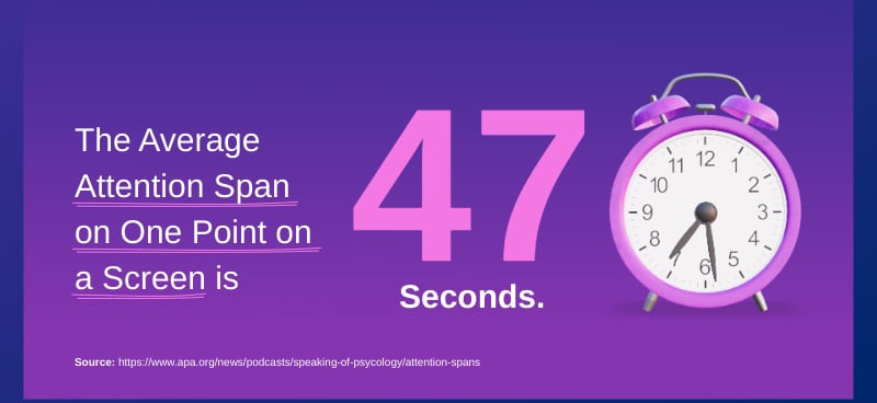
While being a guest on a podcast by the American Psychological Association, psychologist and researcher Gloria Mark shared how her team calculated that the average attention span on one point on a screen is 47 seconds..
“Back in 2004, we found the average attention span on any screen to be two and a half minutes on average. Throughout the years, it became shorter. So, around 2012, we found it to be 75 seconds. And then, in the last five, six years, we found it to average about 47 seconds, and others have replicated this result within a few seconds. So it seems to be quite robust says Gloria”
One of the best ways to engage your audience from the start is to begin the presentation with one of the 12 tips we share in our article on how to start a presentation. Another approach is to incorporate interactive elements into your slides to maintain the audience’s attention.
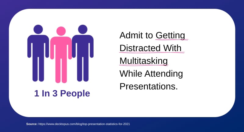
Despite your best efforts to create engaging presentations, one-third of your audience is simultaneously checking emails, browsing social media or even working on other tasks while you’re presenting. Multitasking is something many people do even during your presentation.
The rise of remote work and virtual presentations has only amplified this challenge. When attendees are surrounded by distractions, maintaining focus becomes even more difficult. The temptation to quickly check a notification or respond to an urgent message can lead to highly divided attention.
To combat this, try these strategies:
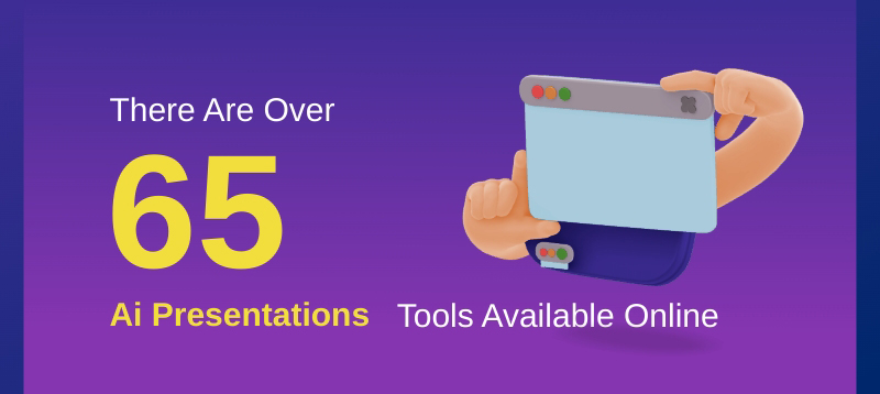
As you know, AI has practically taken over business processes in many ways. One example is the rise of AI-powered presentation makers, tools, editors and generators. After lots of research and detailed counting, I can confidently share with you that as of the publication of this guide, there are over 65 AI presentation tools available online.
This high number of options reflects the growing trend of professionals seeking AI solutions and the companies that offer them. With so many options, though, it’s tough to choose. Our comparison article about the 15 Best AI Presentation Makers in 2025 [Free & Paid] can help during the selection process.
If you choose Visme as your tool of choice, you’ll have access to a wide array of presentation design and management features including:
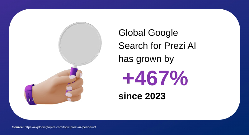
Just as the number of AI presentation tools is growing, so is search volume for them. For example, Google searches for “Prezi AI” have grown by an impressive 467% since 2023, according to Exploding Topics.
This spike indicates a growing interest and demand for AI tools to create presentations. Prezi AI is the AI-powered version of Prezi, a popular presentation design tool. Their AI addition has caught the eye of customers looking for a solution.
Ironically, Prezi AI doesn’t have raving reviews. Presentation design expert Russel Anderson-Williams saw the hype about Prezi AI and decided to try it out. Here’s his take:
“I genuinely hoped Prezi AI would create something really great for me, and even if I had to do some minor editing and tweaking manually, it would still help me save hours in the design process.
Exploding Topics also featured Visme in their roundup of Skyrocketing Martech Companies for 2025. According to their data, the search for Visme grew 66% over the past five years.
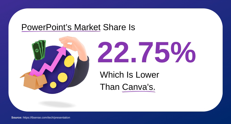
According to 6Sense’s research and analysis, PowerPoint’s market share has dropped to 22.75%, now trailing below Canva. This represents a significant shift in how people create visual content.
Presentation creators are gradually moving away from PowerPoint to easier and better tools like Visme and Canva. The statistic highlights how preferences are shifting, with users prioritizing design capabilities over traditional features.
Are you a PowerPoint user looking for other presentation design options? Import your existing PowerPoint slides into Visme and make your presentation branded, engaging and attractive.
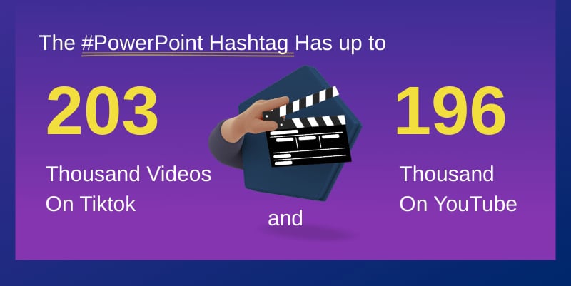
Similar to how more and more videos on TikTok and YouTube are tagged with #presentationdesign, many are also tagged with #PowerPoint. Not only are there hundreds of thousands of videos on YouTube, but there are also over thirty thousand channels.
This massive viewership demonstrates how presentation tools have become part of popular culture across several social media channels. The upside of this trend is that there’s now a wealth of free, crowd-tested tips and inspiration at your fingertips to help you improve your presentations.
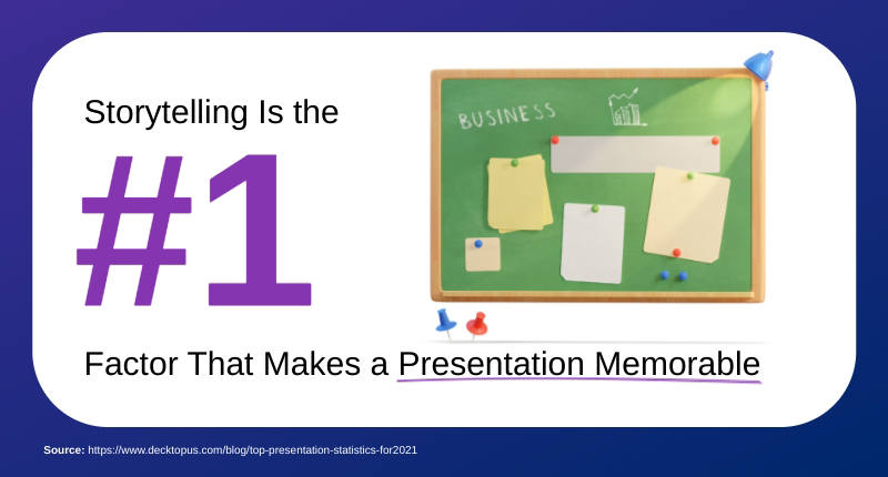
Data and financial projections are essential components of any pitch deck or sales presentation. But it is storytelling that makes them memorable. Humans are wired to remember stories far better than isolated facts. For startup founders, the pitches that stand out are the ones that have a narrative with a beginning, middle and end.
In a survey conducted by Decktopus, storytelling came up as the number one factor that makes a presentation memorable. Statistics came in 2nd and visuals made it to 3rd. That’s a pointer to the fact that storytelling is a critical presentation skill for sales professionals and startups.
Stop creating forgettable presentations and practice your pitch deck storytelling and design skills with Visme. Here’s a tutorial on how to get started.
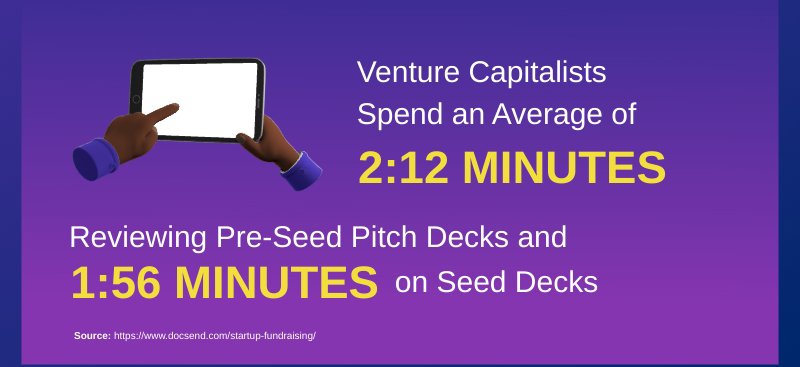
This statistic from DocSend reveals just how little time you have to make an impression. VCs spend barely over two minutes scanning pre-seed-stage decks and even less time on seed-stage decks. That’s roughly 8-9 seconds per slide if you’re using the 16-slide structure.
These numbers emphasize how important your opening slides are. Your problem, solution and why need to grab attention immediately.
In practical terms, this means that every slide must be easily scannable. Use large, bold headlines that communicate your key message even if someone only glances at the slide. Include visuals that support your story and remember that white space is your friend.
Your pitch deck presentation must work as both a standalone document and a presentation tool. Since most internal reviews happen without you present to provide context, each slide should tell its story independently while contributing to your overall narrative.
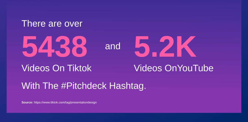
We’ve got one more hashtag statistic, this time for #pitchdeck. This data represents the current generation of entrepreneurs and presentation designers sharing their experiences and offering advice on social media.
What makes this statistic particularly interesting is the variety of content that these videos include.
Are you a content creator sharing tips about creating presentations? When you make videos, social media posts or animations with Visme, publishing to social media is easy.
Using the social media scheduler, you can schedule content to Facebook, Instagram, LinkedIn or X.
To share on YouTube or TikTok, use the other share and publish options like downloading as JPEG, PNG, GIF, MP4 or PDF. Additionally, by sharing your Visme creations with a live link, you have access to the analytics feature to track opens and views.
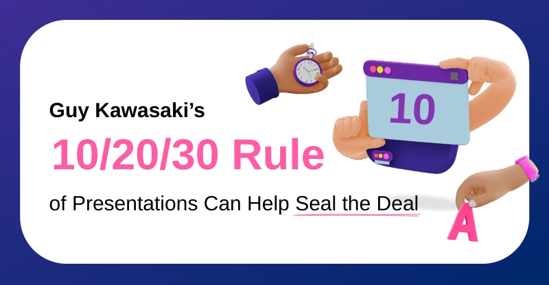
Venture capitalist Guy Kawasaki came up with the 10/20/30 Rule of Presentations after attending hundreds of entrepreneur pitches that allegedly gave him tinnitus. This simple framework has now become one of the most influential presentation guidelines.
The rule is straightforward: 10 slides, 20 minutes, 30-point font.
Statistics serve multiple purposes in presentations:
To effectively present statistics, do the following things:
Statistics that can be considered as compelling are:
Here are some tips for presenting multiple statistics effectively:
To properly cite stats in a presentation, make sure you do the following things:
Reliable sources for current presentation statistics include:
These presentation statistics we’ve shared reveal one thing: the art of presenting is always evolving, from how slides are created to how stories are delivered.
Today, successful presentations require understanding the art of storytelling, human psychology and technological capabilities.
Visme addresses these changes with features designed specifically to help you create and present your slide decks to an engaged audience. Alongside the easy-to-use editor, Visme also has thousands of presentation templates, millions of design assets, collaboration features and AI tools buiit for modern teams.
Create your Visme account today and start turning these insights into impactful presentations.
Design visual brand experiences for your business whether you are a seasoned designer or a total novice.
Try Visme for free