


The Best Beautiful.ai Alternatives to Create AI-Powered Presentations

Presentations are one of the primary tools for sharing information, pitching ideas and educating audiences.
Yet many fail to reach their intended audience because they don’t comply with accessibility standards.
Accessible presentation expert Echo Rivera puts it bluntly, "
Most academic, research and professional presentations are inaccessible, text-heavy 'data dumps'... and we all hate them."
She’s right! Accessibility isn't just a nice-to-have feature. It's an essential requirement for effective communication.
According to the CDC, “People with disabilities sometimes refer to a single population, but this is actually a diverse group of people with a wide range of needs."
This diversity of needs makes creating truly accessible presentations both challenging and crucial. From visual and hearing impairments to cognitive and motor disabilities, different audiences require different accommodations to fully engage with your content.
So, how do you make your presentations truly accessible? In this comprehensive guide, I will walk you through the essential standards, best practices and practical steps for creating presentations that are not only visually appealing but inclusive, engaging and effective for everyone.
Presentation accessibility standards are a set of guidelines that help make presentations accessible to all audience members, including those with disabilities. They are based on the WCAG (Web Content Accessibility Guidelines) and follow legal standards from the ADA (Americans with Disabilities Act) and the EAA (European Accessibility Act).
Whether you're creating content for business, education, or professional settings, understanding and implementing accessibility standards will help ensure your message reaches everyone.
The WCAG accessibility standards consist of four principles:
The WCAG categorizes accessibility levels into A, AA and AAA. If your presentation doesn’t comply with an A level, it’s inaccessible for most people. You should aim for an A level, making your presentation accessible to people with low vision and hearing issues. Most accessibility checkers can help you reach it.
To reach AA and AAA levels and cater to people with mobility disabilities and complete blindness, you will most likely need professional assistance and support. There are plenty of accessibility experts who offer their services to remediate your presentations, documents and websites.
Here's a quick tutorial on how you can easily make accessible and ADA compliant documents in Visme:
Digital accessibility is a fundamental consideration for creating presentations and communicating with people in general.
In her book Dark and Silent Office, Stephanie Warlick captures this essential truth:
“Understanding digital accessibility is the first step toward creating a more inclusive digital world. By recognizing the needs of individuals with visual and hearing impairments and implementing inclusive design practices, we can ensure that digital technologies serve everyone equally. As we move forward, businesses, developers, and policymakers need to prioritize accessibility as a moral and social imperative, even more so than as a legal obligation.”
Let’s review some of how accessibility standards affect your presentation and your business.
As a business organization, you have both a legal obligation and an ethical responsibility to make your content accessible to everyone. Non-compliance with accessibility standards can result in legal consequences under laws like the ADA and EAA, especially if your organization is government-funded.
While accessibility standards are designed to help people with disabilities, they ultimately create better experiences for all users. Features like clear navigation, well-structured content and high contrast ratios make presentations more usable and engaging for everyone, regardless of their abilities. For example, captions don't just help viewers with hearing impairments; they benefit people watching in noisy environments or those who process information better through text.
By making presentations inclusive, you significantly expand your potential audience.
The scale of impact is substantial:
Over 1 billion people worldwide live with some form of disability and in the United States alone, one in four adults has a disability. This number continues to grow as the population ages since visual and hearing impairments increase significantly in older demographics.
Following accessibility standards often leads to better overall presentation design. When you're forced to think about clear structure, logical navigation and multiple ways of conveying information, you naturally create more professional and effective presentations. These considerations can spark creative solutions that enhance the experience for all viewers.
Accessible presentations demonstrate social responsibility and can provide competitive advantages like:
As technology evolves and new assistive technologies emerge, following established accessibility standards helps ensure your presentations remain usable and relevant. Content created with accessibility in mind is typically more adaptable to new formats and platforms, making it more valuable over time.
To create an accessible presentation, you must consider all the possible ways people consume and comprehend content.
Some viewers might have low eyesight or colorblindness, while others might have low hearing or limited mobility. As I mentioned before, there are many types of disabilities.
While researching this article, I watched two very insightful videos by Echo Rivera, an accessible presentation expert.
One problematic trend she identified was the common oversimplification of accessibility to mean merely screen-reader compatibility.
"Don't say accessible if you specifically mean screen reader-friendly. Those two words cannot be equated," she emphasized, pointing out that accessibility encompasses a much broader range of needs and considerations.”says Echo.
So, when you consider all the disabilities that your audience could have, it’s not enough to create a presentation that’s screen reader-friendly. It’s best to consider all disability types that accessibility standards aim to cover: visual, auditory, motor, cognitive, learning and even mental health.
Of course, it can be challenging to create a presentation that accommodates every disability.
The good news is that many improvements are easy to implement and can make a huge difference.
To help you get started, here are seven essential presentation accessibility standards examples you can’t ignore.
And the best part? You can achieve all of them with Visme.
Combining colors effectively for accessibility is all about creating contrast. Specifically, contrast between the background and the foreground and between colored items next to each other.
Clear contrast between colors and shapes helps everyone comprehend the information, not just the audience members with low eyesight. Good contrast also helps make your presentation viewable in low lighting and on smaller screens.
The Accessible Presentation Reference Guide from the Rocky Mountain ADA Center shares that there must be a contrast ratio of at least 3:1. Still, even 4:1 to 5:1 is considered on the low contrast spectrum. As you can see in the visual example below, the best contrasting colors have a high ratio.
Made with Visme Infographic Maker
Use Visme’s accessibility checker to assess your design’s color contrast. The tool will notify you of areas in the design with a low ratio so you can fix them easily.
Another aspect of color you should know is the choice of colors you use. As Grant Aldrich, a startup executive, shared, “Dependency on color is a mistake—red and green to show mistakes? That leaves those with color blindness in the dark.”
Blue and orange are a colorblind-friendly palette for presentations. Other options include blue and red or blue and brown for the most common conditions of color vision deficiencies. These three work well because blue would generally look blue to someone with some type of color blindness.
Your typography style choices affect your presentation’s overall accessibility in several ways:
Made with Visme Infographic Maker
Another important thing to consider regarding text is to avoid adding images of text. Always use text in text boxes. Of course, there are some exceptions, like if you’re showing an image of an advertisement or maybe a screenshot. But what this standard means is that if the text must be read as part of the information on the slide, it must be actual text and not an image.
Any auditory content in your presentations must have captions accompanying it. This will benefit your hard-of-hearing or deaf audience, as well as all other audience members who are viewing in noisy places or simply don’t feel like listening and prefer to read instead.
If you record a voiceover or add text-to-speech audio to your presentation, you must also add captions for your audience.
Ensure that the caption text is a Sans serif and has good contrast. White text over a dark background is the best option.
Your data visualizations must be easy to understand and follow color and text standards.
Keep your charts to small data sets so there are few overlapping lines, colors and legends.
Most importantly, all data charts and graphs need a title and text explaining them. Optimally, add alternative text to the charts describing the data results and insights.

Here’s an accessible data visualization presentation slide from Visme.
As you can see, the colors in the chart contrast with each other, so even colorblind viewers will notice the difference between them. The slide has a clear title, subtitle and insight below the chart.
There’s also a legend that describes what each color represents.
Inside Visme’s chart editor, you have lots of options for color-coding and designing your data visualization to be accessible.
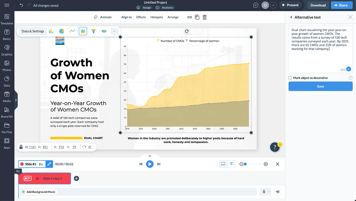
Alternative text is text snippets added to any visual component in your presentation that help screen readers describe it. There are two types of visual elements: those that help screenreaders understand the content and those that are simply decorative.
Add alternative text only to the visuals essential to the presented content and leave everything else as is. This way, screen readers and web readers will describe only the visuals that matter and ignore the rest.
Below is a screenshot of the Alternative Text tool in Visme. You can either add text or mark an object as decorative.
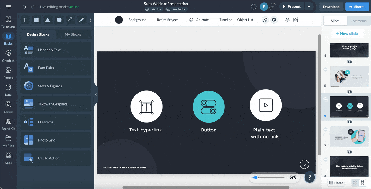
How you add, style, describe and incorporate hyperlinks into your presentation is essential for accessibility. The number one reason is screen and web readers, but also regular viewers who want to understand your presentation.
As Section 508 emphasizes, "Hyperlinks are essential for accessibility, enabling users to navigate content efficiently. By ensuring links are descriptive, clear, and easy to navigate, you help all users, including those with disabilities, access and understand your content effectively."
The main idea is that the hyperlinked words describe what they are linking to while being underlined in contrasting colors. One of the worst ways to hyperlink is to say something like; Read more about accessibility here (and the word “here” is the link).
Take a look at these do’s and don’ts of accessible hyperlinks:
Made with Visme Infographic Maker
Presentations with a logical structure are not only accessible, but they’re also better for every type of audience.
First, it’s easier to understand what’s being shared on a slide when the:
Logical structures also help with screen and web readers. These assistive technology tools rely on a reading order to properly read the content. The items in your presentation slide must be in the proper reading order to be understandable.
Some presentation tools integrate reading order tools; Visme has one, too. The ideal way to create an effective reading order is to add the content to the slide in the order you want it to appear. This is why it’s essential to have an outline or even a storyboard to help you build each slide with the reading order in mind.
The presentation slide below has an adequate logical order from top to bottom.
When adjusting the reading order for your slide, ensure the text goes from top to bottom just like in the slide, with the image last (don’t forget the alt text) and remove any decorative text or graphic that repeats on every slide.
I used a training course template and made this slide accessible by following the standards I’ve shared in this article.

Finding accessible presentations to show you was the most challenging part of this article.
I looked through hundreds of presentations and eventually found some that cover several of the accessible presentation standards I shared with you earlier. But none covered all!
Most importantly, none worked perfectly with a screen reader. I used the NVDA simulator from AssitivLabs and the WebOutloud Chrome extension to test them. These assistive technologies are different, so they function differently.
Nonetheless, none of the presentations I tested were 100%. These results show how important it is that more and more presentations are created with accessibility in mind.
Let’s look at these examples and discuss what presentation accessibility standards they cover.
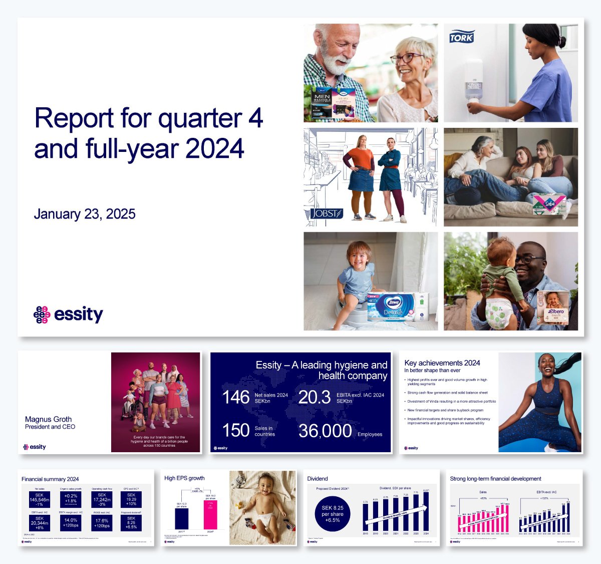
Essity, a leading global hygiene and health company, created this presentation to report on their work and growth during 2024. These are the aspects that make this presentation accessible:
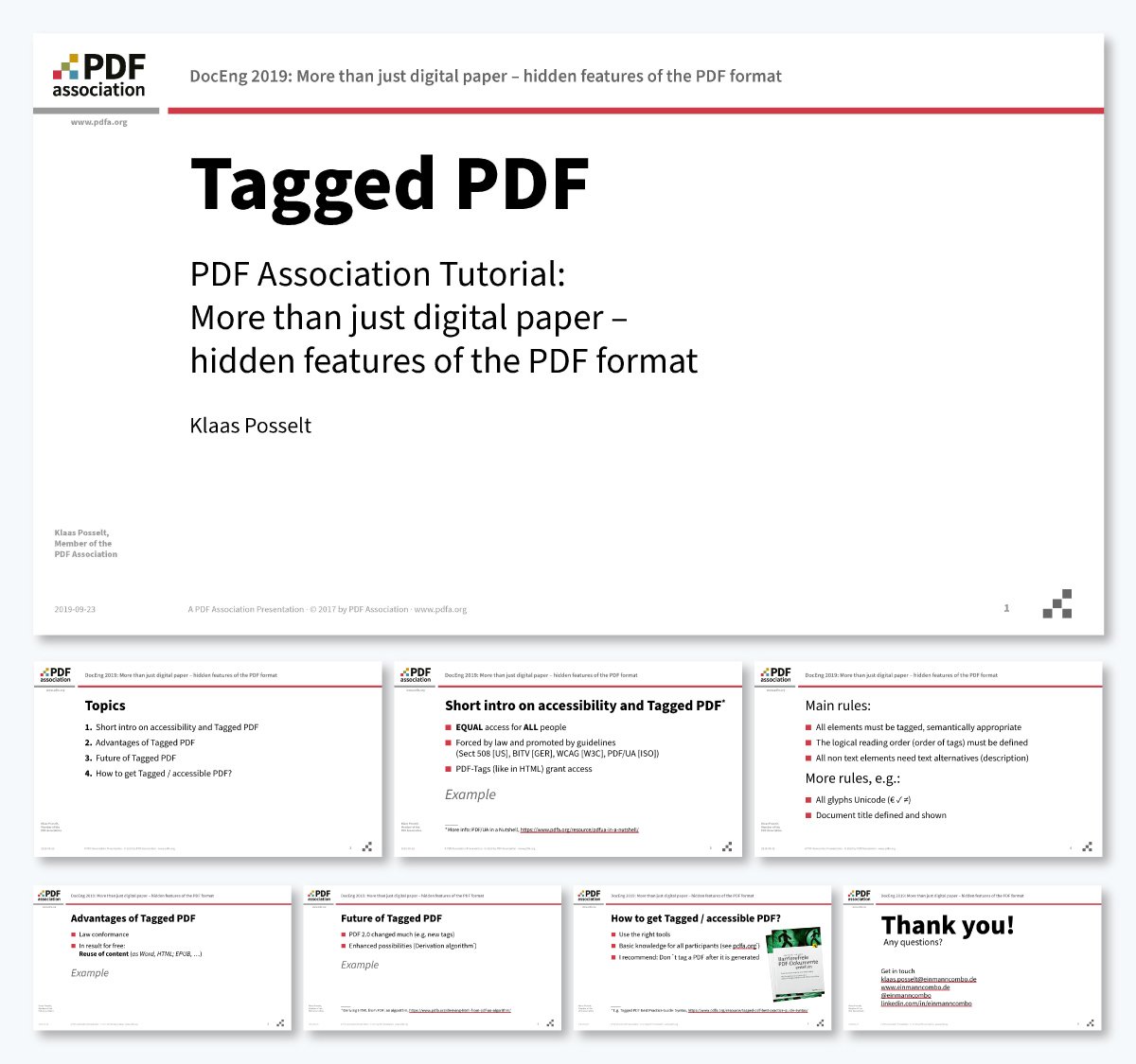
This presentation from the PDF Association is a bit of a mixed bag. The content in the PDF accessibility presentation slides is well-designed for accessibility. Still, since they use a master design for every slide with repeating text, the screen reader reads it all at the start of each slide.
Aside from that, the content in the slides is accessible in the following ways:
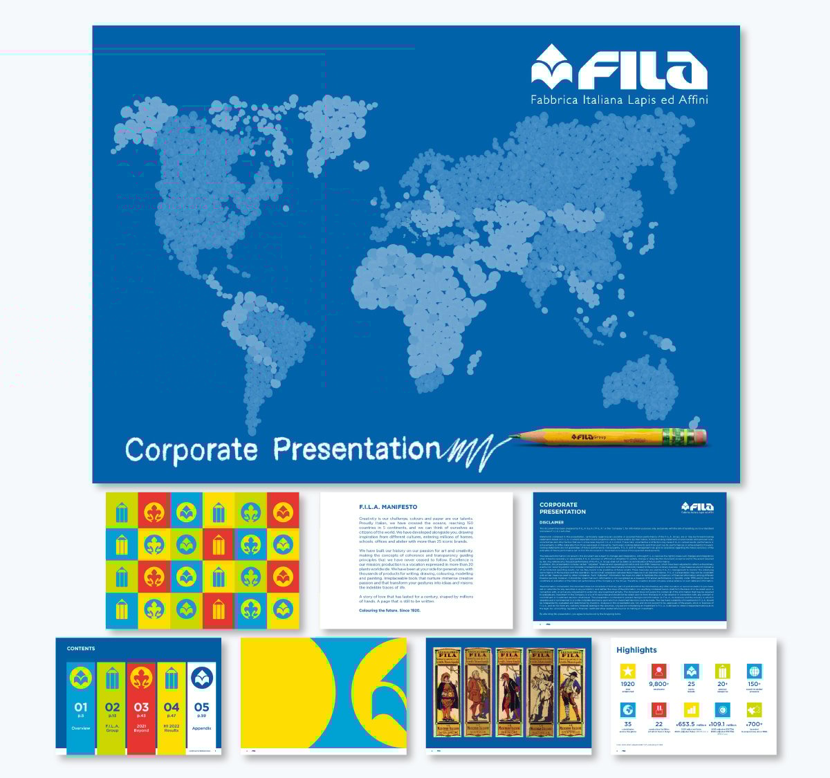
This FILA presentation is long (almost a hundred pages) and covers the main accessibility standards. Unfortunately, the images aren’t properly tagged.
Make no mistake, accessibility standards for PowerPoint presentations also apply to presentations created with Visme or any other presentation tool.
So, if you’ve researched PowerPoint accessibility standards and are now reading this article, you have all the tools to create an accessible presentation.
Here’s a detailed step-by-step tutorial on creating an accessible presentation with Visme.
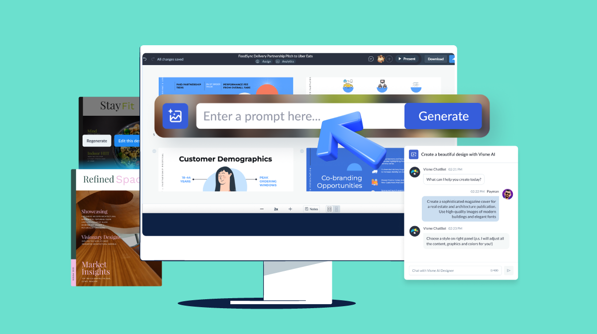
Do you want to save some time with the creation process?
Give Visme AI a spin and prompt the AI Presentation Maker to generate a customizable first draft of your presentation. You can ask it to use your content by uploading it to the chatbot dialog.
For accessibility purposes, it is critical to have all the content and talking points ready before designing the presentation slides.
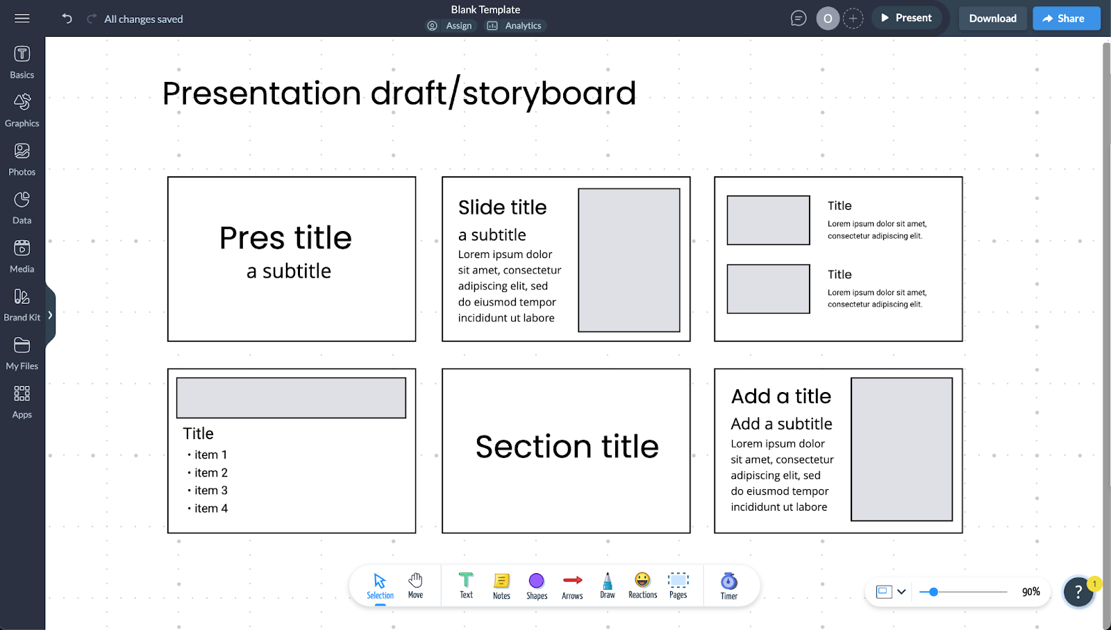
I mentioned earlier that the reading order mirrors how you add content on the slide. That’s why having an outline or storyboard can make things much easier in the long run.
What you choose to use for this step is up to you. A Google Docs document might do, but you can always use Visme’s Whiteboard to draft how your slides will look. You don’t need to get overly detailed here; just ensure you set up the content logically.
Log in to your Visme dashboard to start designing your presentation. Either choose a presentation template or start with a blank one. To have full control of accessibility standards, I suggest you start with a blank template.
Even if you start with our pre-designed template, you can use our Accessibility Checker to fix any issues.
Another reason why I suggest starting with a blank template is for the reading order. Remember that the order in which you add the content reflects the final reading order.
Are you creating this accessible presentation with your team? Use Visme’s collaboration features to help move things along seamlessly. Invite team members to view, comment or edit the presentation.
If you invite someone to edit, ensure they’re part of your workspace first. Use the workflow features to assign tasks within the project to specific team members and set deadlines for them to finish it.
Now start adding the content into your slides. Don’t worry about the actual content just yet, first add a header, then a subtitle and as many body text boxes as you need into each slide.
Add images and graphics last.
For videos, you’ll have to assess when to add.
Is it the main content of that slide? Then maybe it needs to go right after the title. If it’s supplementary it can go at the end.
Draft all your slides by following your outline and script if you have it. Then, begin writing the content in its respective placeholders. Remember to keep text above 18 pt and to use Sans serif fonts in regular weights.
Likewise, follow hierarchy rules to size the title, subtitle and body from big to small. Also, color and underline any hyperlinks and make them clear and descriptive.
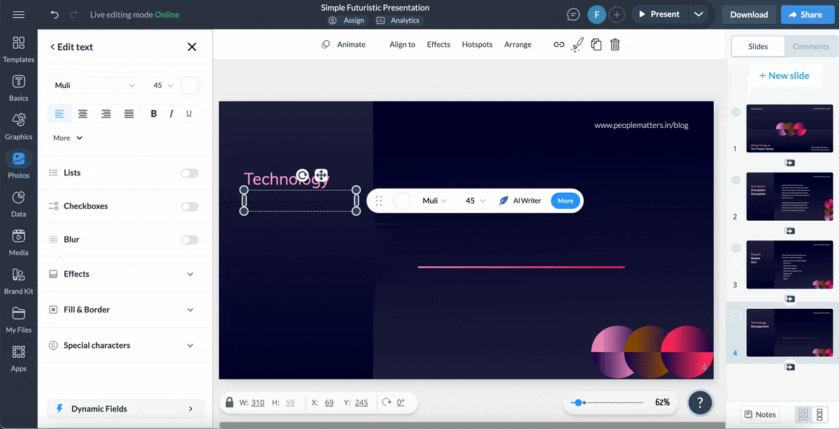
There are several tools in the Visme editor to help you with this step. For instance, use Visme’s AI Writer to finesse or summarize text so it makes more sense with your slide content.
Try Visme’s AI Edit Tools to edit your visuals. For example, removing backgrounds to make images of objects and people easier to see or unblur pictures that don’t look that crisp.
Open the hamburger menu at the top left and select the Alternate Text button. In the dialog that opens on the right, write the alt text for the images and charts in your slides. Mark any fully decorative visuals as such.
Made with Visme Infographic Maker
Another great resource to make your presentation more accessible is to add audio and video.
Visme comes with a wide variety of features to make your interactive and multimedia content accessible.
Visme offers an accessibility checker to help you track your progress and ensure the design is accessible. Don’t wait until you’re finished to use the checker; use it several times as you work.
Inside the accessibility checker, you’ll find these tools:
Sharing your accessible presentation is simple. Your best option is to share it as a live link so web readers like WebOutloud can read it. Also, so your interactive content, like audio and video hotspots, is usable and effective.
Live Visme links are also navigable with a keyboard. Simply clicking the arrow keys takes you from slide to slide.
Samuel Charmetant, founder of ArtMajeur, emphasizes the importance of this simple technique:
“One easy but revolutionary habit is to move your slides only with a keyboard. Neither can someone depending on assistive technology if you cannot easily tab through the material. Accessibility is about flexibility rather than only handicap. Everyone gains from a readable, orderly presentation that is navigable.”
Download your presentation in any of these ways:

All presentations shared with a live Visme link can be tracked for views and opens using the analytics feature. The analytics dashboard shows you who opened the presentation, from where and for how long
The infographic below is a checklist created by Echo Rivera, an accessible presentation expert and trainer. Her content is very helpful and can help you design slides with PowerPoint, Visme, or any other PowerPoint alternatives.
Made with Visme
Beyond adding ALT text, contrast and font size, there are some best practices to follow when creating and presenting accessible presentations.
I’ve already covered many accessibility techniques for the slides, catering to your audience's many disabilities. But you can do a few more things to give them different ways to access your content.
One of them is to send your presentation to participants or organizers before the live presentation. If you will present online and have gathered signup emails for the event, send your presentation to those people. If you’re one of many keynote speakers at a live event, send the presentation to the organizer so they can ensure that it will work with their software, upload it to a queue or test it with the audio and video tech.
Another way is to create accessible handouts of the slides so the audience can follow along or take notes if they wish.
The best handouts are one slide per page on a horizontal layout, not three slides per page or even less. They need to be easy to read, so if the visuals of the slides are too small, they’re inaccessible.
For audience members with tablets, include a QR code in the printed handout so they can scan it and view your presentation on their screen. Use a live Visme link for this.
If your digital presentation includes video or audio voice-over, create a transcript and share it in document format.
These techniques are important because, as Wojciech Ratajcza, an education innovator, shares,
“Captions help those who can’t hear, transcripts work for those who prefer reading, and audio descriptions support those with vision impairments. These small additions make sure no one is left out. It’s also important to think about how people take in information. Some process visuals better, while others need text or sound to understand key points. A mix of formats keeps your audience engaged and makes learning easier.”
Earlier, in the section about creating an accessible presentation, I mentioned that you should make an outline or script for your presentation. But why is that so important?
Let’s start with what Echo Rivera shares in her YouTube video,
“A lot of presenters don't ever storyboard, script, or practice their presentations effectively... Storyboarding is hard, and it's usually one of the most time-consuming parts of creating a presentation. But when we script and practice effectively, we catch the missing transitions between topics. We realize, oh wait, I never connected the dots between these concepts."
The number one reason for using storyboards, which I shared earlier, is that they help with creating a logical order on your slides. But it goes beyond that. Scripting and storyboarding help you practice your presentation before presenting. This way, you’re not only prepared, but you also make your spoken content more accessible.
Finally, you should consider accessibility when presenting, not just when creating the slides. You must consider accessibility at every step of your presentation journey; only then can you indeed be an accessible presenter and speaker.
When presenting your accessible presentation in person, here are some tips to help everyone in your audience comprehend and enjoy your content:
As Aakriti Gupta eloquently states, "Accessibility isn't an expense—it's an investment in your audience and your community."
Creating accessible presentations isn't just about compliance or checking boxes; it's about fostering inclusive communication that benefits everyone.
By following the standards and best practices outlined in this guide, you can create presentations that are not only accessible but also more professional and a pleasure to experience.
Open a Visme account for your team today and discover all the other accessible content you can create. Presentations are just the beginning! You’ll have access to several AI-powered features and endless design elements like icons, illustrations, and 3D elements. Plus, plenty of animation tools for creating other types of content for social media and beyond.
Good luck and happy designing.
Design visual brand experiences for your business whether you are a seasoned designer or a total novice.
Try Visme for free