


The Best Beautiful.ai Alternatives to Create AI-Powered Presentations


Regardless of where you’re from or what you do, chances are you already know PowerPoint.
Just like millions of others, it was the first presentation tool I ever used. Starting in school, through university and even in my early professional life.
It’s incredibly intuitive and, honestly, it just makes sense when you’re starting out. Drag, drop, add some text, throw in a few animations and you’ve got a deck ready to present.
But once I stepped deeper into design and content creation, I realized there’s way more to presentations than static slides.
Audiences want stories that move, visuals that pop and data that feels lively and fun to interact with.
Over the years, I’ve tested tons of PowerPoint alternatives, and about six years ago, I landed on Visme as my go-to. It’s an all-in-one tool that lets me create not just presentations, but also infographics, interactive reports, branded content, forms, videos, animated characters and so much more, all in ways PowerPoint just doesn’t cover.
If you’re anything like me and want to know how you can modernize your old PowerPoints, then this video tutorial is for you:
In this article, I’m putting Visme and PowerPoint head-to-head: side-by-side comparisons, feature breakdowns and even some real-world examples. By the end, you’ll know exactly which one deserves a spot in your toolkit.
Let’s get to it.
Before I dive into the comparisons, I want to quickly break down my testing methodology so you know this review is fair.
I spent hours inside each platform, building, tweaking, collaborating and trying multiple export options. In short: this article is written by a human (that’s me), for humans (that’s you), to help you decide which tool actually fits your needs.
*Disclaimer: The comparisons and competitor ratings presented in this article are based on features available as of September 25, 2025. We conduct thorough research and draw on both first-hand experience and reputable sources to provide reliable insights. However, as tools and technologies evolve, we recommend readers verify details and consider additional research to ensure the information meets their specific needs. PowerPoint is a registered trademark of Microsoft Corporation. Visme is not affiliated with or endorsed by Microsoft. References to PowerPoint are for descriptive purposes only.
Short on time? Check out this detailed comparison table between Visme and PowerPoint:
| PowerPoint | Visme | |
| Ease of Use | Familiar interface if you’ve used it before, but menus can feel dated and features are buried in ribbons. | Clean, modern dashboard with drag-and-drop editing and guided workflows. |
| Pre-Built Templates Library | 25 built-in templates + third-party downloads. | 10,000+ templates across presentations, reports, infographics, social graphics and more. |
| Asset Library | Stock photos, videos, SmartArt, icons and shapes. | 1M+ stock photos and videos, 10,000+ vector icons, characters, design blocks and 40+ data widgets. |
| Interactive Content & Animation | Classic transitions (Fade, Morph, Wipe), object animations, advanced path controls. | Interactive charts, hover effects, clickable links, hotspots, forms, polls and animated characters. |
| AI Tools & Features | Copilot AI: generates slides, rewrites text, designs layouts and creates images. | AI Hub: Presentation Maker, Writer, Image Generator, Brand Wizard, Resize, TouchUp, Document Generator, Text-to-Speech. |
| Brand Kit & Asset Management | Slide Master lets you set fonts, logos, and colors across a deck. | Dedicated Brand Kit + Brand Wizard that auto-pulls colors, fonts and logos from your website. Shared brand assets for teams. |
| Integrations | Deep Microsoft 365 integrations (Excel, Word, Outlook, Teams, OneDrive). ~500 add-ins in AppSource. | Direct integrations with Google Workspace, Drive, Dropbox, Slack, Mailchimp, ActiveCampaign, Typeform, SurveyMonkey, webhooks and more. |
| Data Visualization | 40+ chart types powered by Excel + SmartArt diagrams. | 40+ chart types plus data widgets (gauges, maps, counters, timelines). Live Google Sheets integration, external feeds and animated charts. |
| Analytics | None built-in. Limited file activity like “opened” or “downloaded” if shared via OneDrive/Teams. | Full analytics: see who viewed, how long they stayed, which slides got clicks and completion rates. |
| Workflows & Team Collaboration | Co-authoring via OneDrive/SharePoint, comments, Teams integration. | Role-based permissions, real-time co-editing, task assignment, approval workflows and a built-in content calendar. |
| Sharing & Export Options | Export to PPTX, PDF, MP4, or images. Present live in app or Teams. | Share via link, embed or QR code. Exports include PPTX, PDF, JPG, PNG, GIF, MP4, HTML5. Supports SCORM/xAPI + built-in social media scheduler. |
| Customer Support & Resources | Microsoft Help Center, Copilot Chat, forums, live support for 365 subscribers. Huge community and third-party resources. | 24/7 live chat, detailed Help Center, webinars, onboarding, direct access to success team and ongoing tutorials/blog content. |
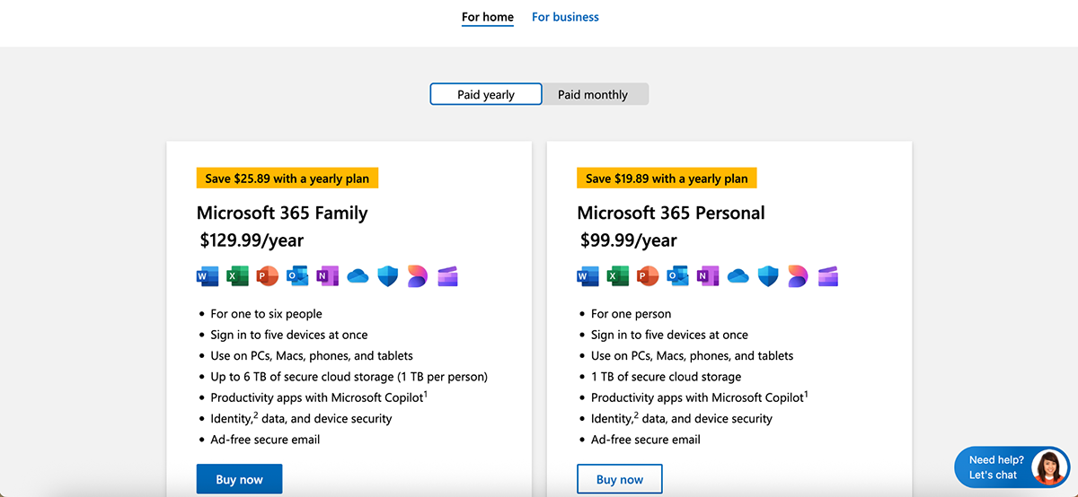
| Pricing | Standalone PowerPoint $179.99 (one-time). Microsoft 365 Personal $99.99/yr; Family $129.99/yr. Business plans $6-22/user/mo. Free web version available. | Free plan available. Starter $12.25/mo; Pro $24.75/mo/user; Enterprise custom. |
Let’s discuss each of these in detail now.
Doesn’t matter how powerful a tool is or how amazing the things you can create with it are; if it isn’t easy to use, it’s not going to stick.
Here’s how Visme and Microsoft PowerPoint compare when it comes to ease of use:
| PowerPoint | Visme | |
| Learning Curve | Familiar interface, easy if you’ve used it before; can feel dated for new users | Beginner-friendly with a drag-and-drop editor and guided workflows |
| Navigation | Features hidden in ribbons and tabs; takes clicks to find | Clean toolbar with everything visible and accessible |
| Performance | Desktop-heavy; can slow down with large files | Cloud-based, autosaves, smooth performance across devices |
PowerPoint’s biggest strength is its familiarity. Even if you only used it once back in school, the moment you open it again, you almost feel at home. The interface looks and feels pretty much the same as it did years ago.
Sure, there’s now a mobile app and even AI-powered Copilot features, but at its core, it’s still the same old reliable tool where you can just jump in and start building right away.
That said, if you’ve never used PowerPoint before, there’s a bit of a learning curve.
Features often hide behind tabs and ribbons, and the layout doesn’t quite match the streamlined look you’ll find in more modern presentation tools like Visme or Canva. It can feel a little dated compared to today’s design-first platforms.
Still, once you get the hang of it, PowerPoint is fairly straightforward to use, and personally, I’ve never had any issues navigating it.
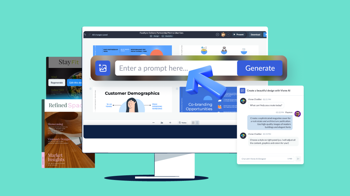
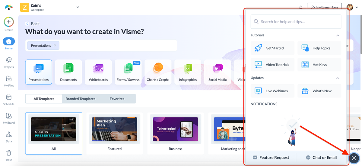
Visme, on the other hand, is a breeze to use. It has drag-and-drop functionality, an intuitive interface and a dashboard that makes it simple to get started.
You can pick a category, search for what you need or even click “Create with AI” to generate a full presentation in seconds (more on that later).
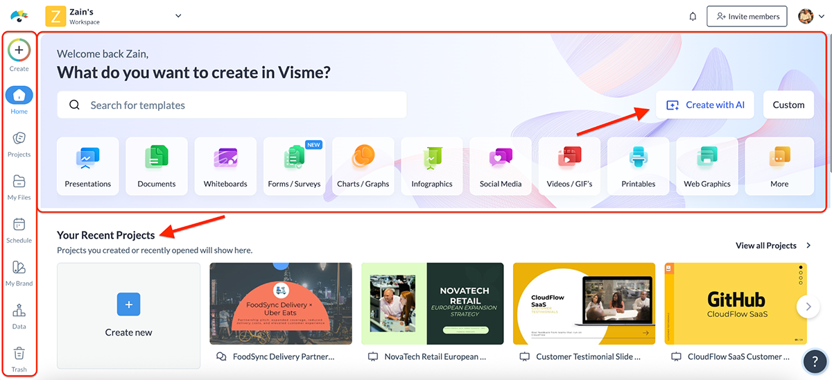
The dashboard also makes it easy to jump back into any project you’ve worked on. There’s a dedicated section for new features and improvements, plus quick access to resources like webinars, tutorials and even a “Contact Sales” option if you’re evaluating Visme for your team.
You can also manage your files and projects, schedule your content and retrieve anything you may have mistakenly deleted from the main dashboard. So convenient.
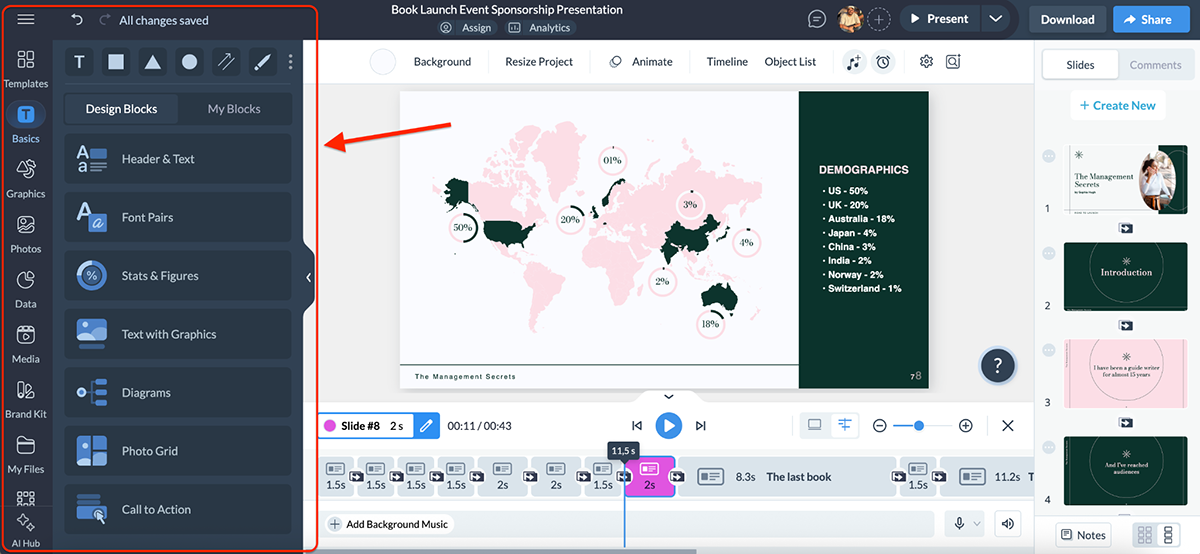
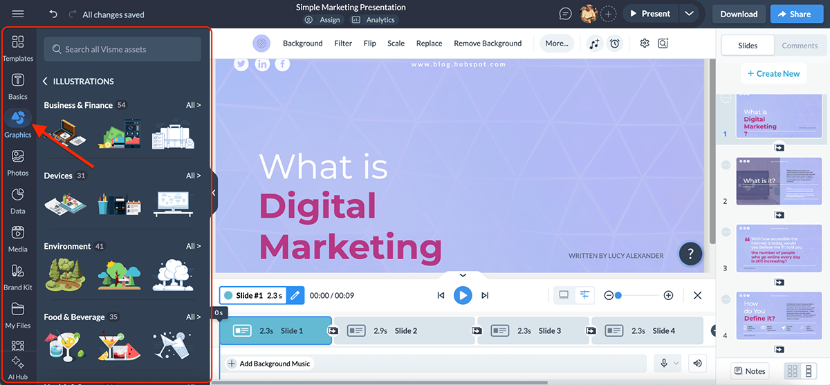
Once you step into the editor, things only get better. Everything you might need from templates, graphics and stock photos to data widgets, brand kit options and AI tools is neatly tucked into the toolbar on the left. No endless hunting through menus, no buried features, no hidden ribbons.
Lee Murray, Creative Content Manager at IRISS, Inc. says this about Visme’s user-friendly interface:
“Visme’s UI is definitely built for a prosumer audience.” “If you’ve ever used PowerPoint or any kind of desktop publishing software, you can use Visme. It feels as easy as using social media.”
Overall, Visme feels clean, well-organized and surprisingly easy to get the hang of. Even if you’ve never touched a design tool before, you’ll feel right at home.
When it comes to design tools, especially presentation software, templates are everything.
The categories available, layout variations, color combinations and overall style can make or break your workflow. And it’s not just about volume; it’s about quality and how easy it is for the user to get started.
Here’s how Visme and PowerPoint compare when it comes to pre-built templates:
| PowerPoint | Visme | |
| Template Library Size | 25 built-in, plus third-party options | 10,000+ |
| Template Categories | Limited | Presentations, infographics, reports, eBooks, documents, storyboards, mockups, charts and graphs, forms and surveys, videos, etc |
| Customization | Fully customizable | Fully customizable |
| AI-Generated Templates | Available through Copilot | Available through the dedicated AI Presentation maker |
PowerPoint comes with a limited collection of templates (25 to be exact) but the good news is that each theme is unique. You’ll find options for business decks, academic slides and a handful of more creative variations.
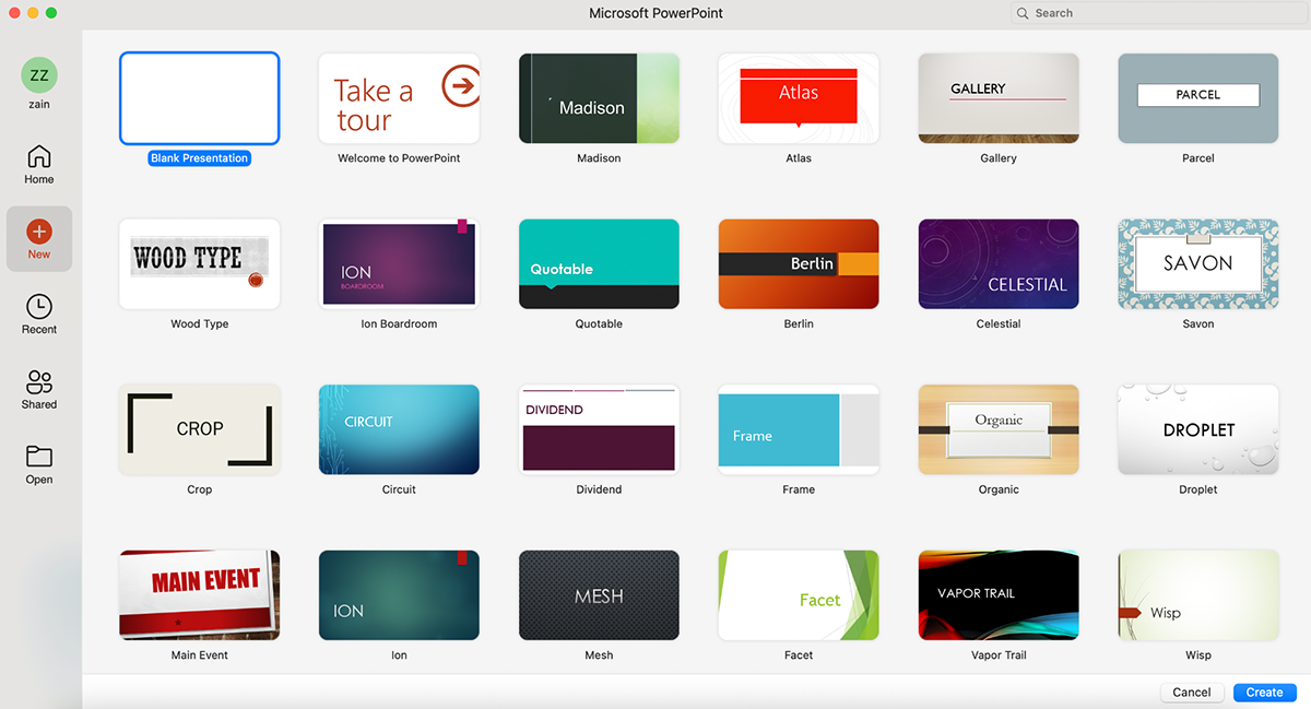
The downside, however, is that many of these designs feel outdated compared to modern presentation standards.
To keep things fresh, most users end up relying on third-party websites that sell or share PowerPoint templates. You can import those directly into PowerPoint and edit them just like you would with the built-in ones.
PowerPoint also offers Copilot, which can generate complete presentations from a simple text prompt. Just type what you’re looking for, and let AI run its magic. Hop over to the AI Tools & Features section later in this guide for a full breakdown of how it works.
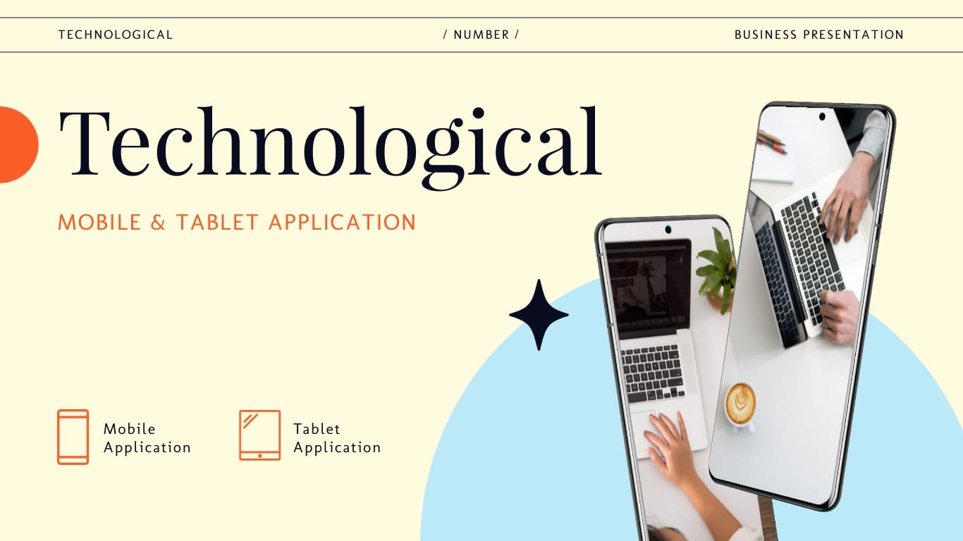
Visme’s template library, on the other hand, is massive compared to PowerPoint’s. And you’re not limited to pitch decks. You’ll find templates for infographics, reports, whitepapers, ebooks, resumes, social media graphics and even interactive forms and videos.
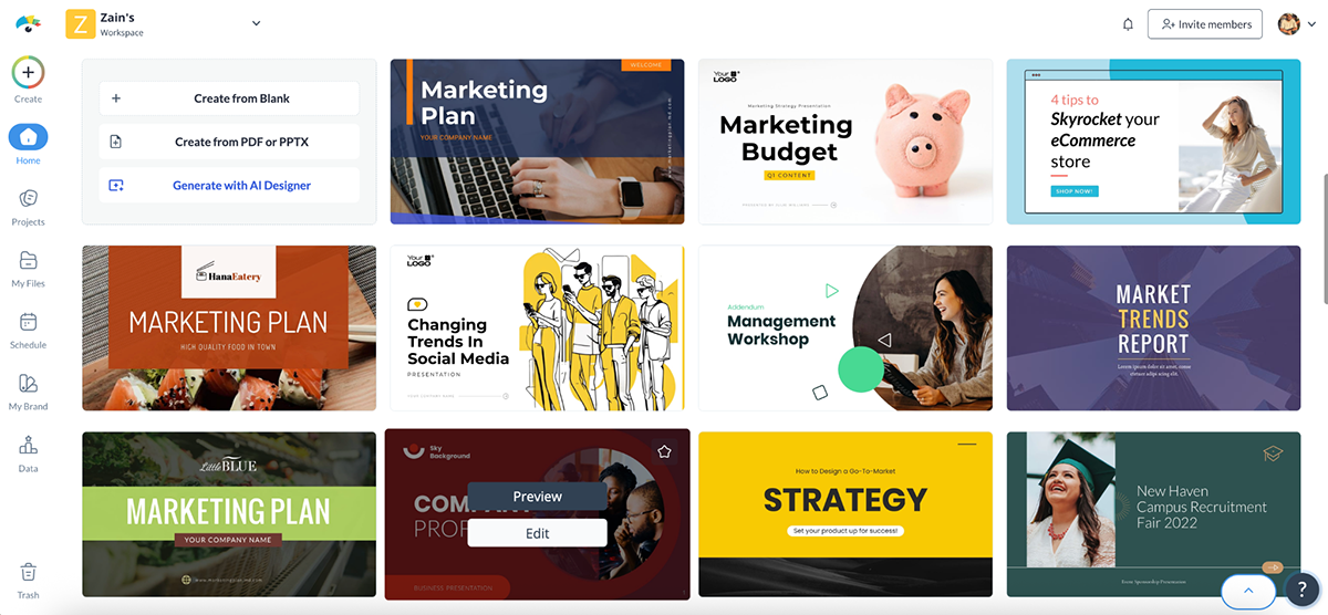
For presentations alone, Visme offers thousands of designs across categories like business, marketing, real estate, education, nonprofits and startups. Plus, new templates are added regularly, so the library always feels fresh, trendy and relevant.
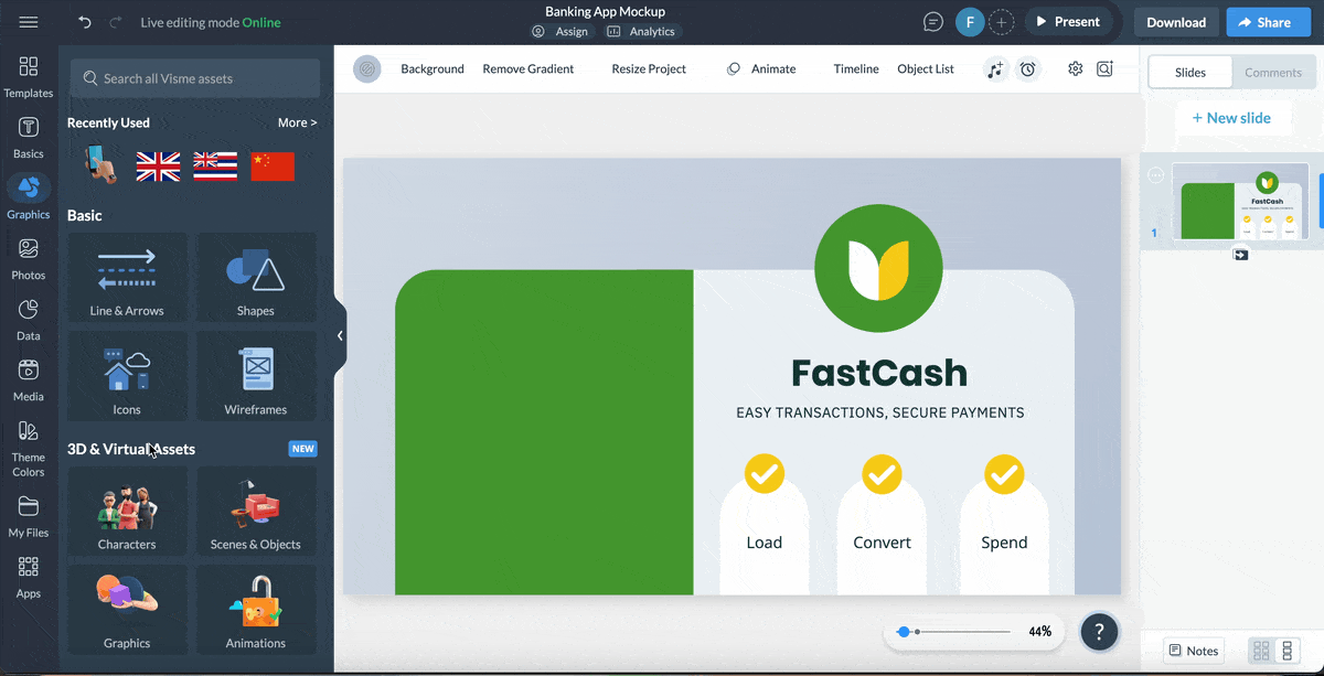
Presentation Templates
Create a stunning slide decks online quickly and easily by getting started with one of Visme’s premade templates. Share content with your audience visually. Find a free presentation template that you can easily customize for your own purposes.
And if you don’t want to scroll through categories, you can try Visme’s AI Presentation Maker. Just type in a topic, and it generates a full slide deck in seconds.
You can then swap in your branding, add interactive elements and fine-tune the design, all without starting from a blank canvas. Hop over to the AI Tools & Features to see how it works.
Overall, Visme’s quality and quantity are far ahead of what you get with PowerPoint. The modern design aesthetics, drag-and-drop builder and built-in AI support make Visme the stronger choice if you want fresh, ready-to-use templates.
That said, if you’re willing to purchase professional, well-rounded templates from third-party sellers, PowerPoint can still be a solid option.
Great content needs great assets to truly shine. Having a built-in asset library can save hours of hunting for the right photo, icon or video. Here’s how PowerPoint and Visme help you bring your designs to life through their asset libraries:
| PowerPoint | Visme | |
| Icons & Shapes | Thousands of stock icons and basic shapes | Thousands of vector icons, illustrations, and design blocks |
| Photos & Videos | Built-in stock photos and videos | Over 1M stock photos and videos built right into the editor |
| Charts & Graphics | SmartArt + customizable charts, graphs and maps | Customizable interactive charts, data widgets and advanced visualizations |
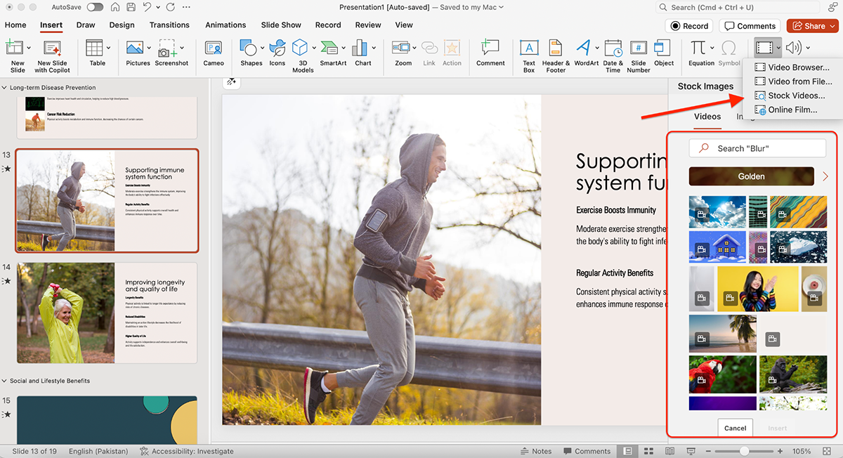
PowerPoint comes with a dedicated library of design assets. You’ll find thousands of stock photos, icons and a handful of shapes and chart options to get started.
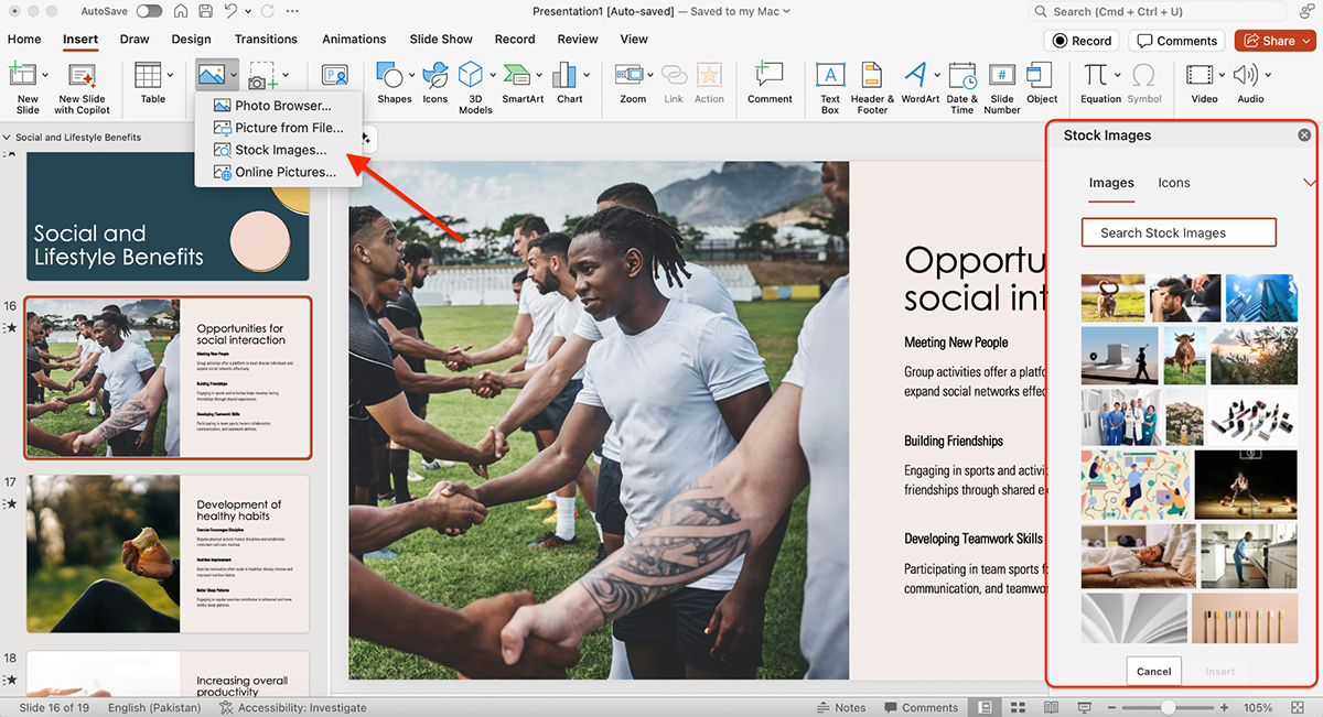
There are even stock video clips you can drop right into your slides.
You can also insert videos into your PowerPoint or embed them.
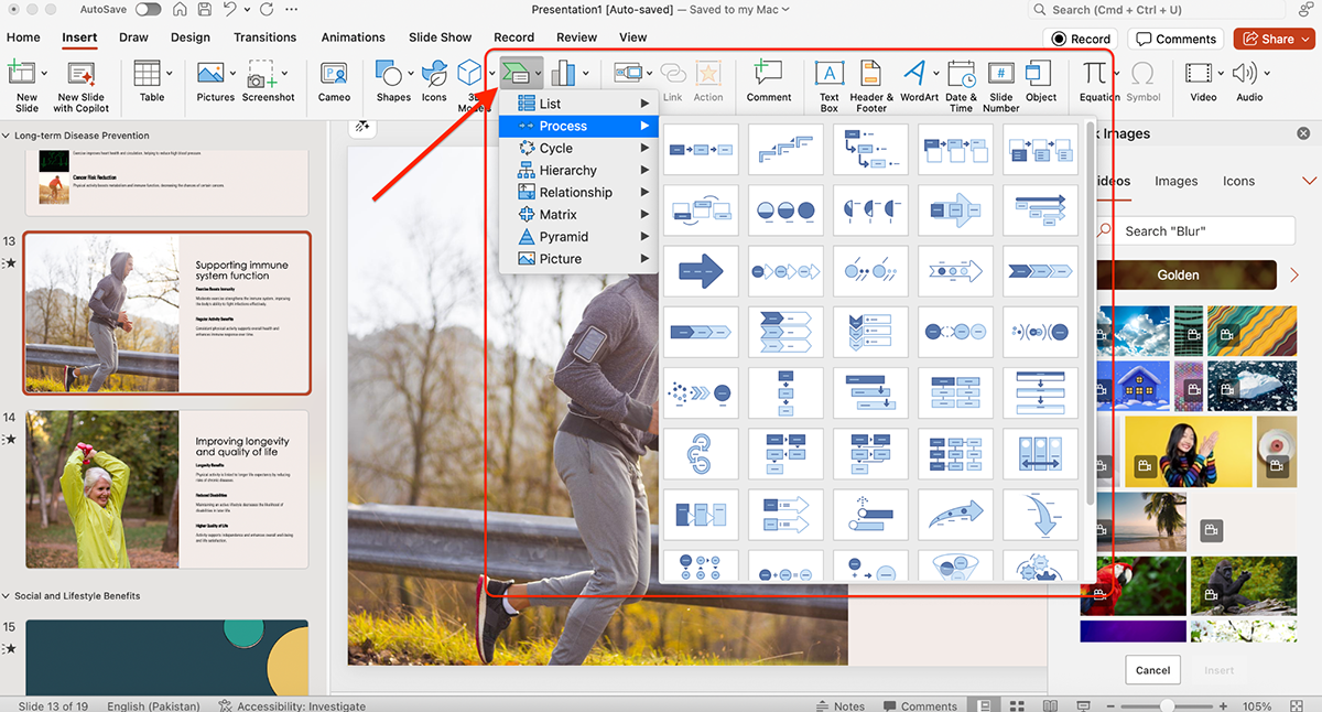
There’s also SmartArt, PowerPoint’s classic way of turning text into diagrams or visuals with a single click. While it’s not the most modern-looking option, it’s reliable and quick when you need a chart or graphic in a pinch.
With access to Microsoft’s stock media libraries, it’s almost impossible not to find something that works. The only drawback is that customization is limited. You often end up with visuals that feel generic unless you spend extra time styling them.
Visme also comes with a strong asset library. There’s a built-in stock photo and video library with over a million options that you can pull from without ever leaving the platform.
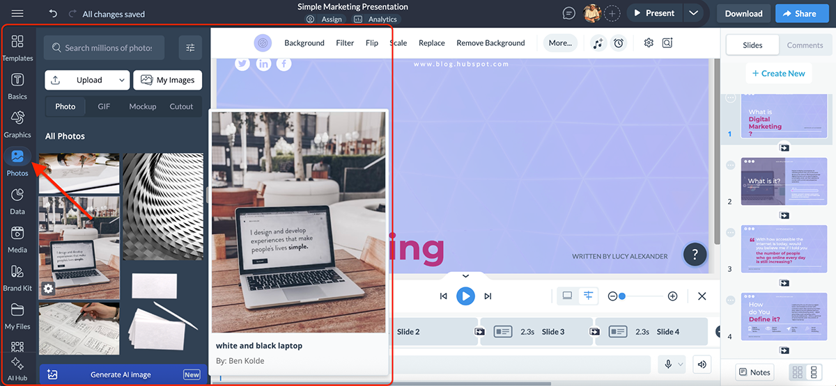
You’ll also find 10,000+ vector icons and shapes to choose from, including illustrative icons, 3D-style visuals, gestures, characters and avatars.
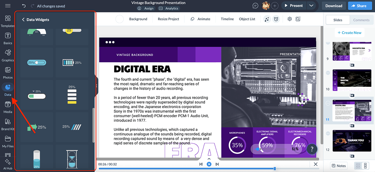
On top of that, Visme gives you access to 40+ data widgets plus chart and graph options like maps, tables and even dynamic fields. Basically, anything and everything you’d need to visualize data or make a slide pop.
All of these are searchable right inside the editor, and since everything works with drag-and-drop, swapping assets into your design is quick and seamless.
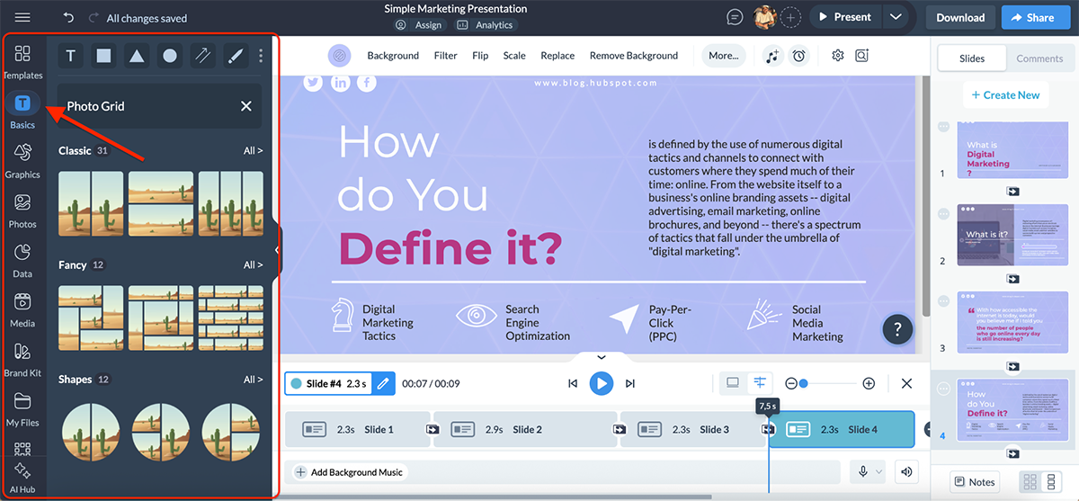
Another feature I really like is the premade design blocks. Instead of building layouts from scratch, you can drop in headers, font pairings, stat callouts, diagrams, photo grids or call-to-action blocks that are already styled.
Personally, I prefer the design and overall aesthetic of Visme’s assets compared to PowerPoint’s. Both are solid in their own right, but Visme feels more modern and ready for real-world projects.
While static slides still have their place, in most cases they just don’t cut it anymore. Your audience now expects movement, interactivity and a little wow factor.
Here’s how PowerPoint and Visme compare when it comes to handling animations and interactive elements:
| PowerPoint | Visme | |
| Pre-Animated Assets | Available | Includes a library of pre-animated 2D and 3D characters, icons, gestures and illustrations |
| Slide Transitions | Dozens of classic effects (Fade, Wipe, Morph, etc.) | Smooth, modern transitions with customizable timing |
| Object & Text Animations | Basic, subtle, moderate, exciting + exit effects | Object and text animations with click/hover triggers and delay settings |
| Advanced Controls | Animation Pane, path animations, triggers, timers | Drag-and-drop controls; simple customization with pre-made styles |
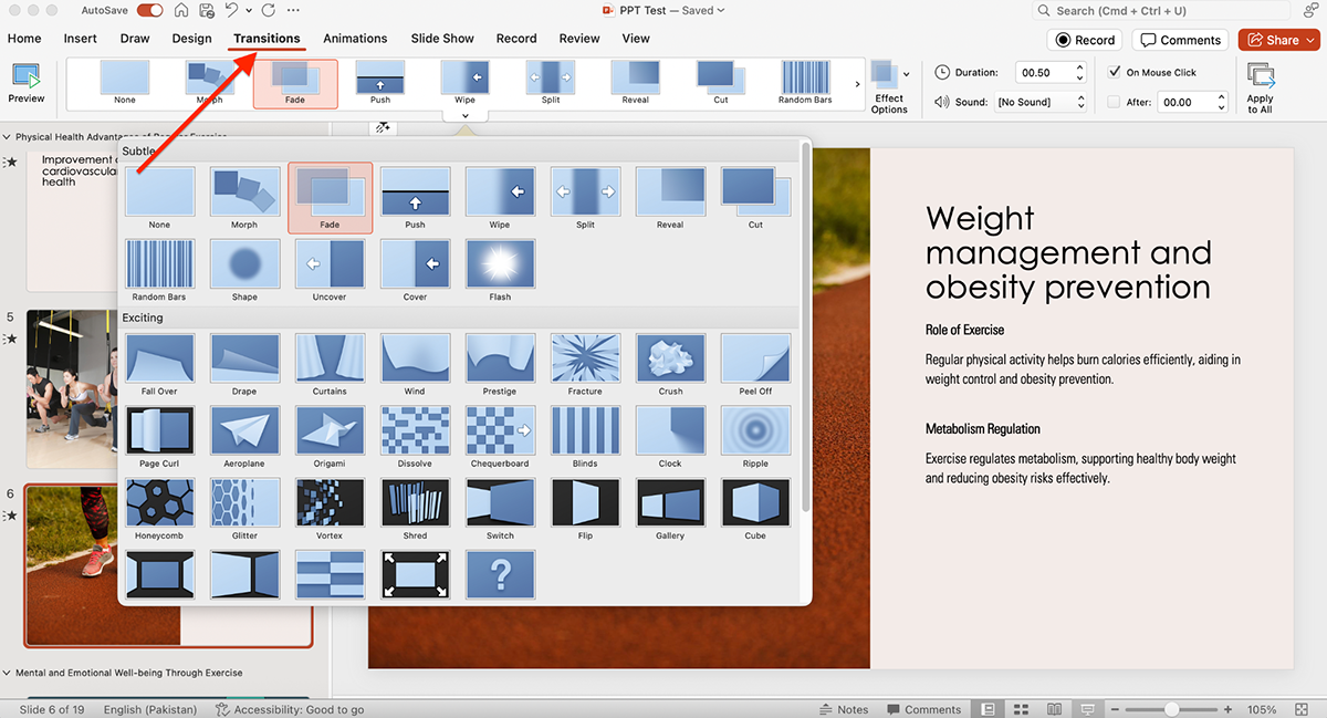
PowerPoint animations have been famous for years now. You get four main categories: basic, subtle, moderate and exciting, depending on whether you’re applying the effect to a photo, a data widget or a textbox.
There are also exit effects available for when you want elements to disappear smoothly.
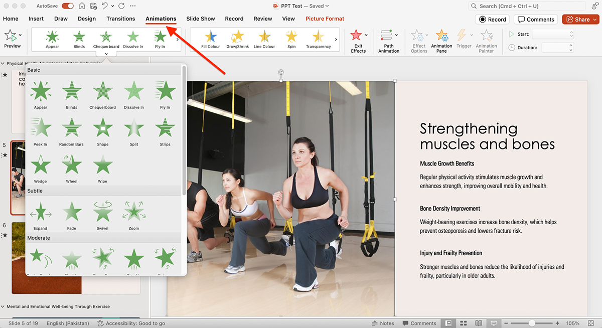
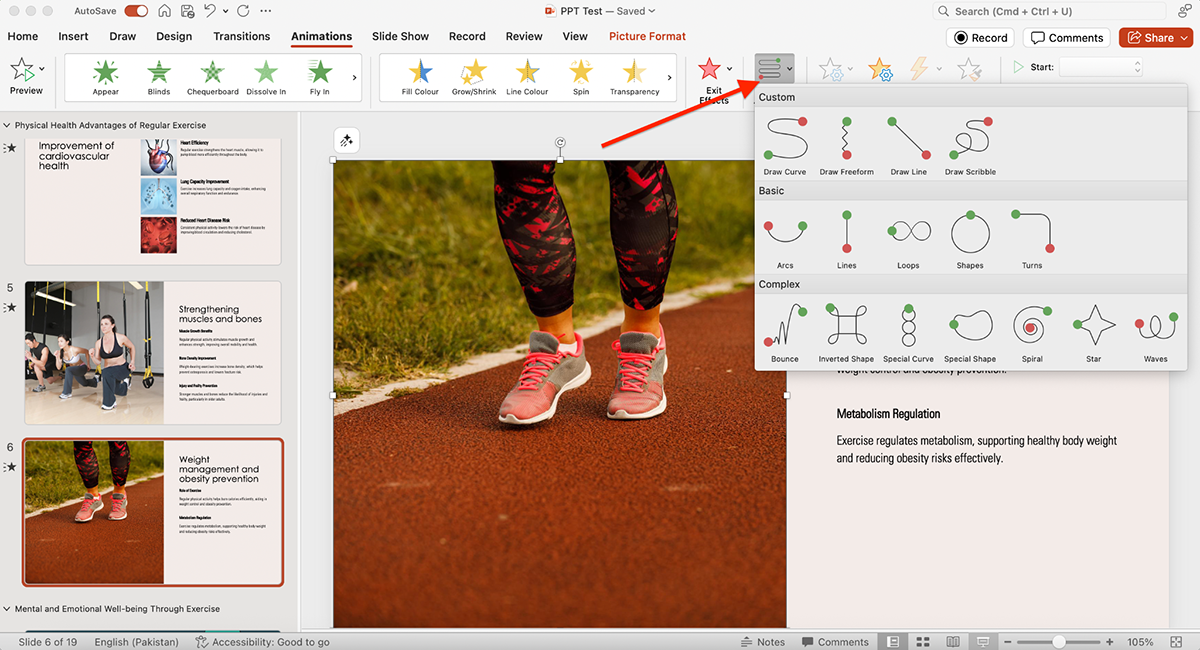
Beyond the basics, PowerPoint includes advanced path animations, effect options and the ability to control everything through the Animation Pane. You can set triggers, timers and custom sequences to get pretty precise with how objects move on screen.
On top of that, you can also add dozens of slide transitions, from classics like fade and wipe to the more advanced morph effect, to your animated PowerPoint slides.
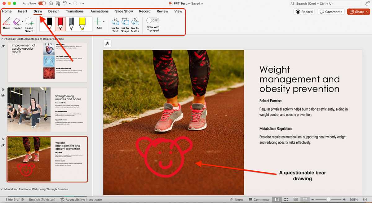
Another area worth noting is the Draw feature. With tools like ink-to-text, ink-to-shape, ink-to-math, the lasso effect and even “draw with trackpad,” you can annotate, sketch and interact with your slides in real time. There’s definitely a use case here for classrooms or brainstorming sessions.
All in all, PowerPoint gives you plenty of animation and transition choices and for most users these will get the job done.
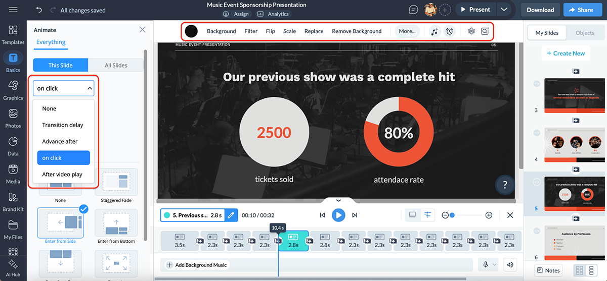
Visme covers the traditional presentation transitions you’re used to seeing in PowerPoint, like fade, wipe and zoom. But it doesn’t stop there.
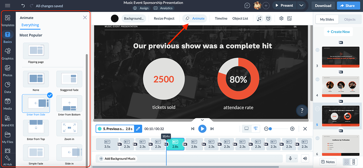
The drag-and-drop editor makes it easy to add object and text animations, set them to trigger on click or after a delay and even customize the timing for smooth storytelling.
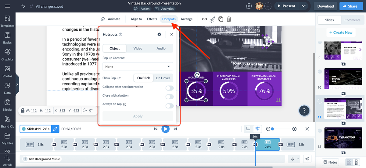
Where Visme really stands out, though, is in its animated and interactive content. You can:
The platform also supports advanced interactive elements like hover effects, flipbook navigation for PDFs, internal slide linking and external links.
For example, you could build a table of contents slide that lets viewers click through to different sections, great for when you’re sharing decks online and want to give people a smooth navigation experience.
Need to bring in outside content? Visme makes that simple too.
You can embed videos, GIFs, maps, forms and even Loom recordings without leaving the platform. It’s perfect for teams that want to build engaging, interactive presentations.
Overall, Visme goes beyond just “making slides move.” It transforms presentations into interactive experiences that invite audiences to engage, click and explore.
AI has quickly become a big deal in design and presentations. Instead of starting from a blank slide, you can now generate your presentation copy, create custom visuals or let AI do all the heavy lifting by using AI presentation generators.
Both Visme and PowerPoint have embraced AI, but they take slightly different approaches. Here’s how the two compare:
| PowerPoint | Visme | |
| AI Presentation Maker | Available | Available |
| AI Image Generator | Available | Available |
| AI Writer | Available | Available |
| AI Resize | Not available | Available |
| AI Document Generator | Not available | Available |
| AI TouchUp Tools | Not available | Available |
| AI Text-to-Speech | Not available | Available |
PowerPoint’s AI engine is called Copilot, and it works directly inside the app. No extra browser tabs, no separate signup, just built into the workflow you already know. That alone makes it pretty convenient.
And as the name suggests, Copilot really does act like your co-pilot when it comes to presentations. It helps you:
Let’s put Copilot’s presentation generation to the test.
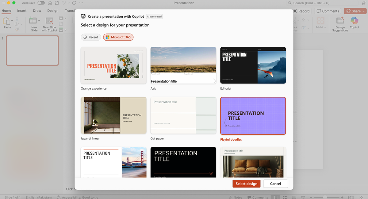
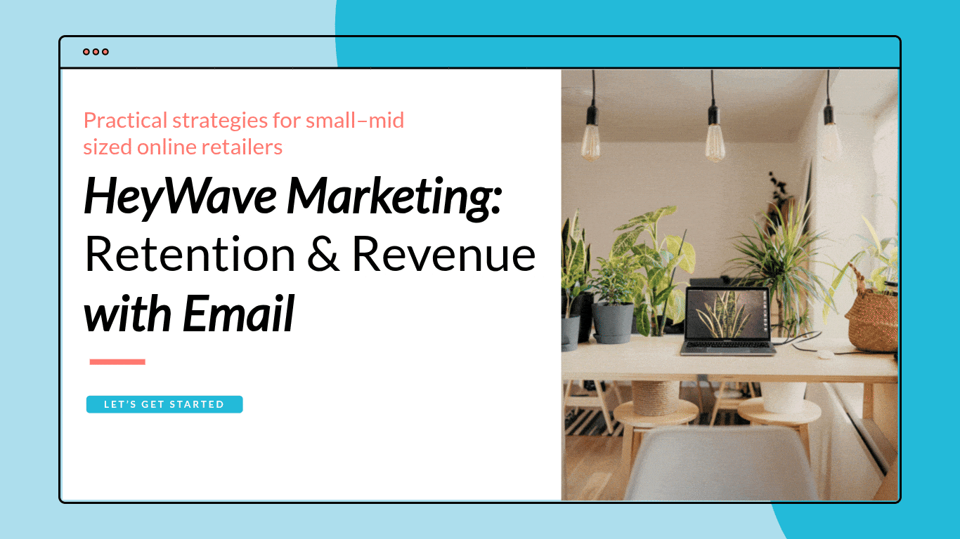
Prompt: “Create a presentation for HeyWave Marketing, an e-commerce email marketing agency. The presentation is aimed at small-to mid-sized online retailers who want to improve customer retention and boost sales. Keep the tone professional but friendly, and make sure the content feels practical and easy to understand.”
Copilot first asked me to choose a design theme. I went with “Playful Doodles.”
From there, it generated a full outline for the deck. I like the flexibility here; you can add new sections or drag existing ones around so the structure makes sense before Copilot fills in the content.
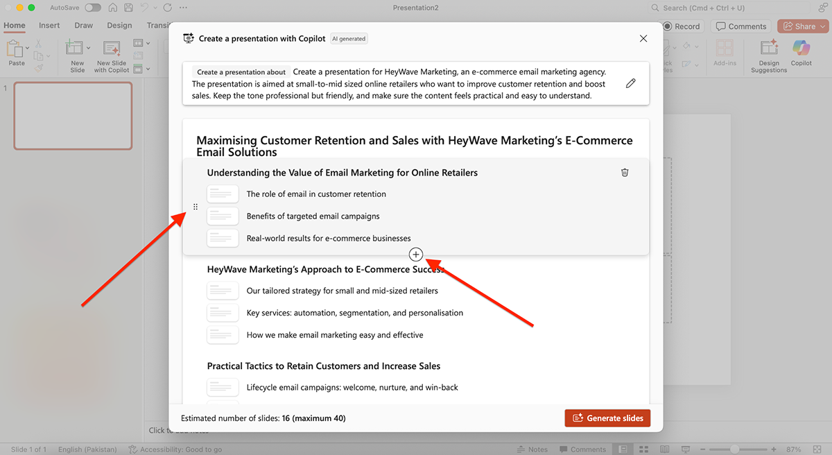
Here’s what Copilot generated:
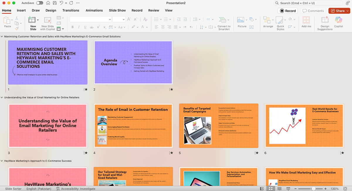
The design and colors in this theme were genuinely impressive (I’d recommend this to anyone making a light, fun deck).
But the slide layouts were repetitive; most of them followed the same format: copy on one side, an image on the other. And the copy itself also left much to be desired (felt generic and surface-level). That said, you can use the AI refinement option to rework, shorten, or expand sections, so it’s not a dealbreaker.
Overall, PowerPoint’s new Copilot AI is a big step forward. It’s great for quickly getting a solid structure in place, but just like all AI out there, don’t expect it to completely replicate your ideas, creativity and application.
Visme is one of the best AI tools for content creation you'd find in the market. It also comes with a ton of brilliant AI features that are baked right inside the tool, so you don’t have to worry about juggling multiple tabs or switching between platforms.
Here’s how Visme AI can transform your workflow:
All these AI features make Visme a far more versatile presentation tool compared to PowerPoint.
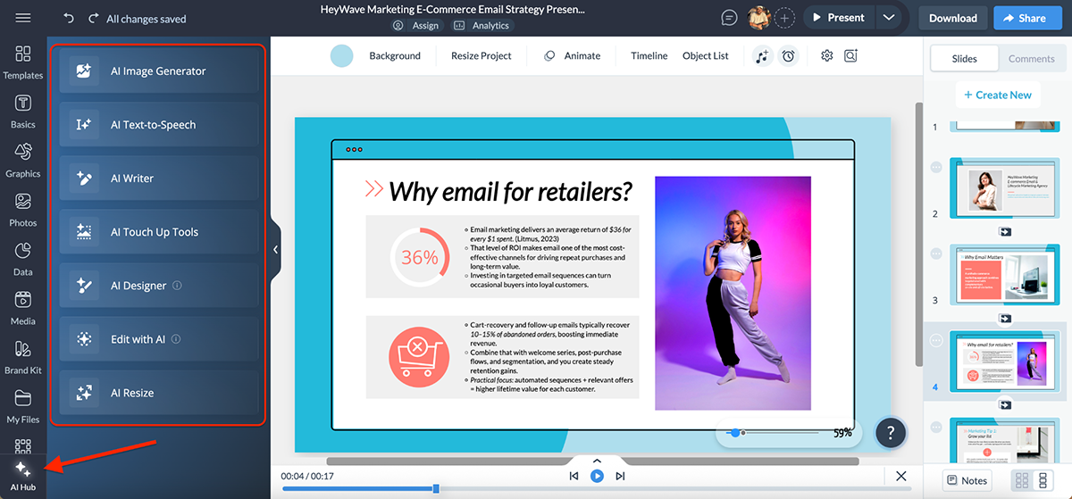
I put Visme’s AI presentation maker to the test using the same HeyWave Marketing prompt I tested with PowerPoint. Here’s what Visme generated:
The difference was obvious right away. The structure, layout, colors and fonts look much better. It didn’t just give me copy, it also included icons, charts and data widgets that PowerPoint’s Copilot left out.
The slides even pulled in real stats with reference links, which added a layer of credibility I wasn’t expecting.
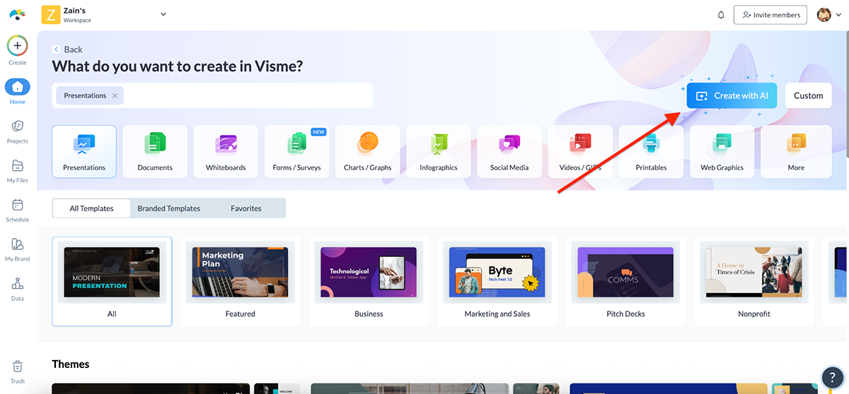
The process of accessing AI in Visme also felt smoother. From the dashboard, I clicked Create with AI, entered my prompt, picked a design style and Visme’s AI chatbot generated the deck.
The result is obviously fully editable, so I could swap visuals, tweak text or adjust layouts as needed.
Another thing I loved is that all of Visme’s AI features are neatly tucked into the AI Hub (bottom left corner of the editor). It makes experimenting with AI tools feel intuitive, instead of hunting around menus.
Overall, Visme’s AI feels more creative, more versatile and more accurate out of the box. Where Copilot gives you a solid draft, Visme hands you something much closer to a final product.
When you’re working on multiple presentations, consistency is everything.
Fonts, colors and logos should look the same across every deck, and managing assets easily can save hours of manual work.
Here’s how PowerPoint and Visme compare when it comes to branding and asset management:
| PowerPoint | Visme | |
| Brand Kit | Custom themes + Slide Master | Dedicated Brand Kit with fonts, colors, logos |
| Brand Wizard | Not available | Auto-imports logos, colors, fonts from your website |
| Asset Management | Manual uploads; no central library. Possible through third-party apps | Centralized storage for logos, images, icons, templates |
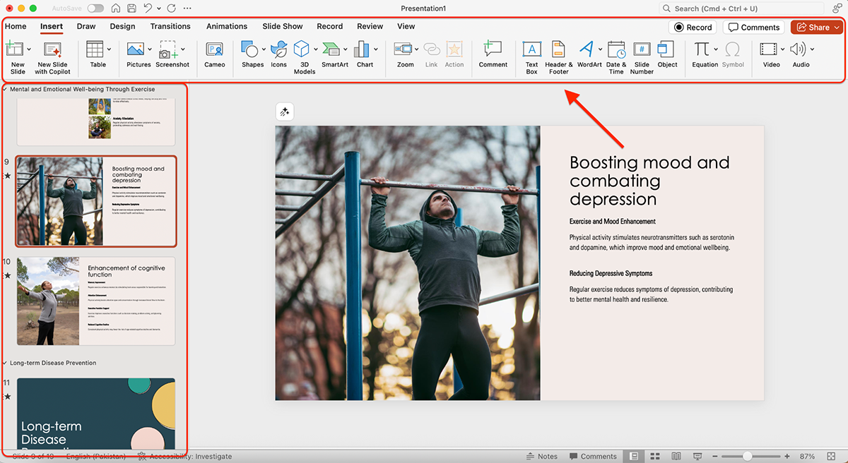
PowerPoint makes it possible to keep your presentations consistent by using Slide Master.
This feature acts like a template-of-templates: you define elements (like fonts, colors, or a logo) once, and those changes cascade across all your slides.
For example, if you add your company logo in the Slide Master, it will automatically appear on most slides in the deck. Change the title font to green? Every heading updates instantly.
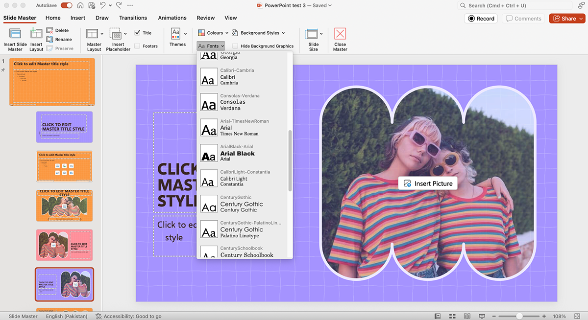
Not every slide type inherits these changes, but you can copy elements into those layouts manually.
The point is efficiency: one update in the master view ensures your branding looks consistent everywhere else.
You can also drop in other consistent elements like slide numbers, logos, watermarks or background graphics. And if you ever want to reposition a logo or tweak a color scheme, you only have to do it once in the Slide Master instead of repeating the changes across 20 different slides.
Check out this video by Simon Sez IT to learn how to edit Slide Master in PowerPoint:
I like the simplicity of PowerPoint here. It’s pretty easy to get used to, and if you’re working in Microsoft 365, you can store brand-approved themes for your team to use.
That said, it’s still not a full-fledged brand kit or central asset manager.
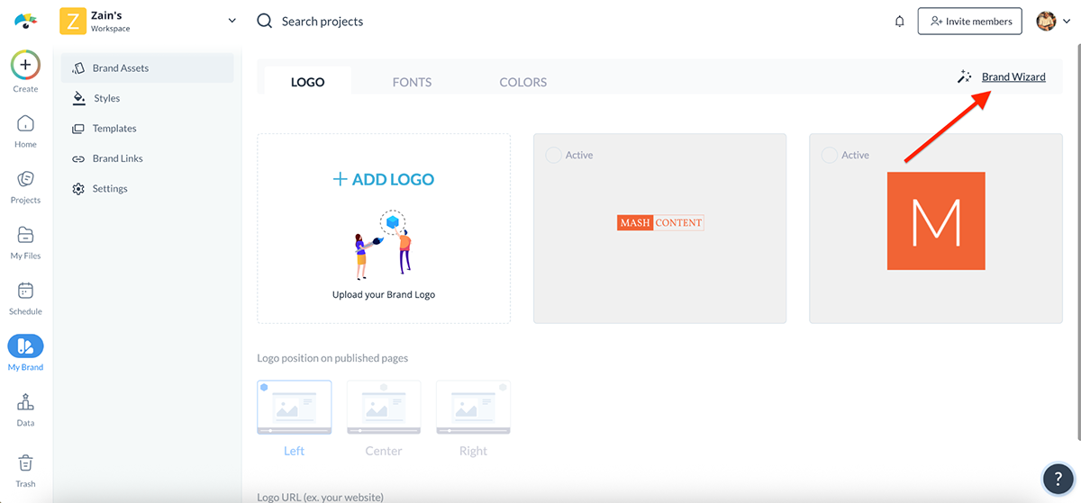
Visme takes branding a step further with its dedicated Brand Kit. Instead of manually setting up colors and fonts for each project, you upload your company’s logos, fonts and color palettes once, and they’re instantly available across every presentation, infographic or report you create.
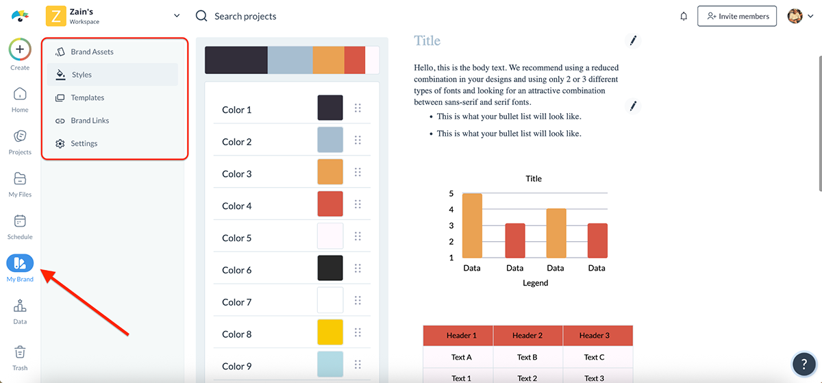
Setting up your brand kit in Visme is super easy. Just enter your website URL in the Brand Wizard, and the AI automatically pulls your logos, brand colors and fonts right from the site. You can then customize everything however you want.
This is a massive time-saver, not only for companies juggling multiple projects but also for freelancers who work with different clients and need to switch branding quickly.
Visme also lets you add your team members so that everyone works from the same set of brand-approved assets. You can configure user permissions by toggling features on or off depending on your needs.
For example, you might let team members use Visme’s full font and color library alongside your uploaded assets, to give them design flexibility while still keeping them within brand guidelines.
Overall Visme’s Brand Kit and Brand Wizard make staying on-brand practically effortless. Compared to PowerPoint’s more manual Slide Master approach, Visme gives teams a more streamlined way to enforce consistency while still being flexible.
A presentation tool doesn’t live in isolation. The integrations it supports can make or break your workflow, whether that’s pulling in data, embedding content or sharing final decks with your team.
Here’s how PowerPoint and Visme stack up when it comes to integrations.
| PowerPoint | Visme | |
| Office Apps | Deep integration with Excel, Word, Outlook | Connects with Google Workspace (Sheets, Drive, Docs) |
| Collaboration Tools | Microsoft Teams | Slack, Monday.com, webhooks |
| Marketing/Automation | Not available natively | Mailchimp, ActiveCampaign, Klaviyo, GetResponse |
| Cloud Storage | OneDrive & SharePoint | Google Drive, Dropbox, OneDrive, Widen |
| Form Integrations | Limited (manual embed) or through Microsoft AppSource marketplace | Typeform, JotForm, SurveyMonkey, Formstack |
One of the best things about PowerPoint is that it’s part of the Microsoft 365 suite, which means it seamlessly integrates with the other tools you’re probably already using.
You can:
All of these make PowerPoint an obvious fit if your workflow already revolves around Microsoft’s ecosystem.
On top of that, you can extend functionality through the Microsoft AppSource marketplace, which offers nearly 500 add-ins.
These range from advanced charting tools and productivity boosters to industry-specific apps that plug directly into PowerPoint. While not all add-ins are free, the variety means you can customize PowerPoint to fit specific needs.
With Visme integrations, you can connect your presentations and visual content with the tools and platforms you already use. Here are a few examples:
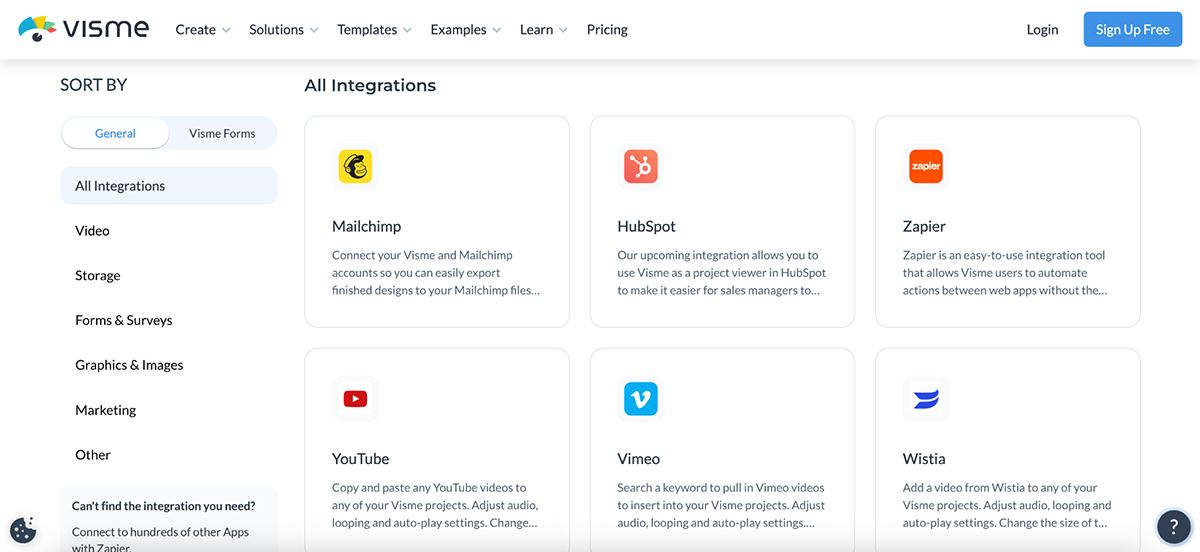
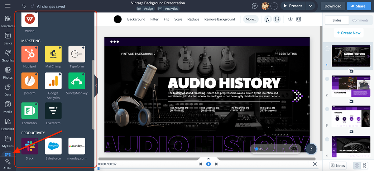
The best part is that you don’t need an external plugin or marketplace; everything is just a click away inside Visme. Inside your editor, click on Apps on the bottom left of your screen. That’s it.
Sure, PowerPoint has numbers on its side thanks to the entire Microsoft ecosystem and hundreds of AppSource add-ins. But for most people who need to integrate presentations with marketing tools, CRMs, cloud storage or even just embed interactive content on the web, Visme feels far more practical and flexible.
If you’re pitching to an investor, presenting quarterly results, or sharing research findings, data is necessary. But just randomly slapping numbers or charts on slides can get boring really fast. That’s where your presentation tool needs to help you build a story with data.
Here’s how Visme and PowerPoint compare when it comes to data visualization:
| PowerPoint | Visme | |
| Chart Types | 40+ chart types | 40+ chart types |
| Data Widgets | Not available | Gauges, maps, timelines, counters, progress bars |
| SmartArt/Diagrams | Processes, hierarchies, relationships | Diagrams + more design variety |
| Interactivity | Static charts only | Clickable, hover effects, animated values |
| Live Data | Limited via Excel | Google Sheets + external data feeds + dynamic fields |
| Customization | Basic tweaks (colors, labels, layout) | Full styling + animation + interactivity |
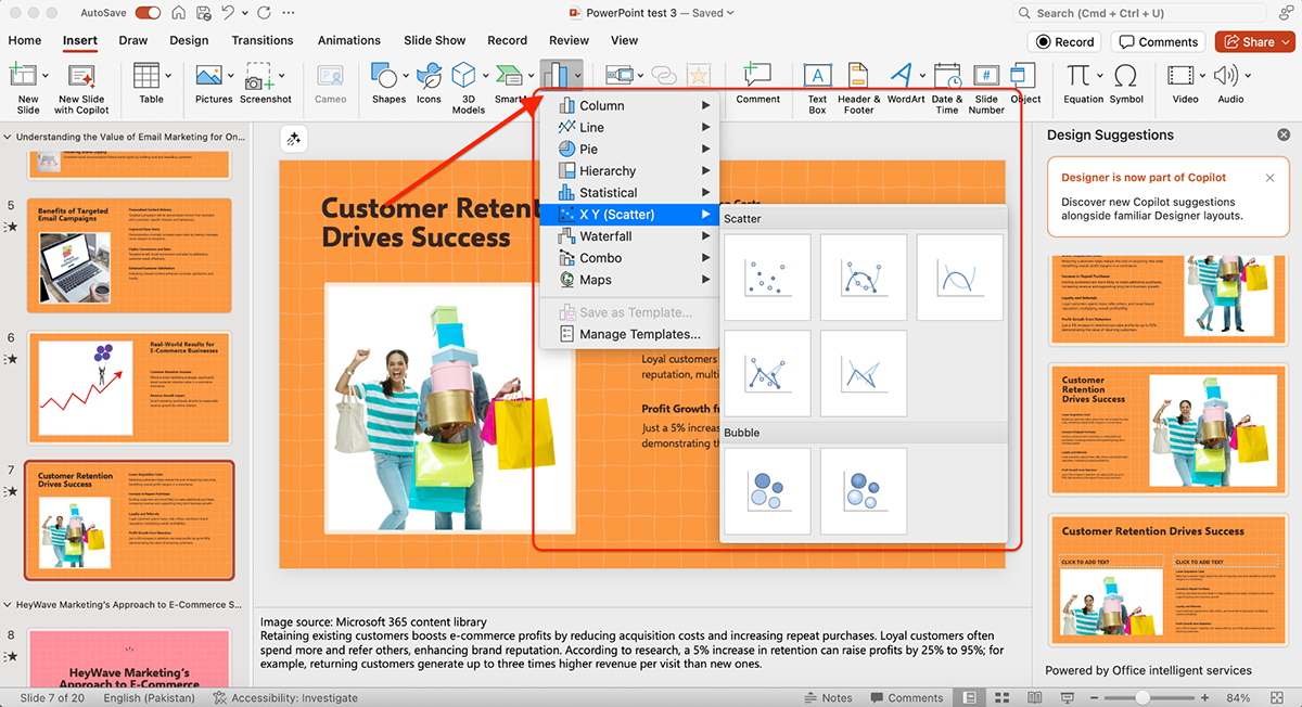
PowerPoint gives you access to the basics: bar, line, pie, scatter and area charts. Most of these are powered by Excel, so when you insert a chart, a spreadsheet pops up and you either have to edit the data there or paste it in.
If you don’t have Excel handy, this can be inconvenient, since the charting engine is so tightly tied to it.
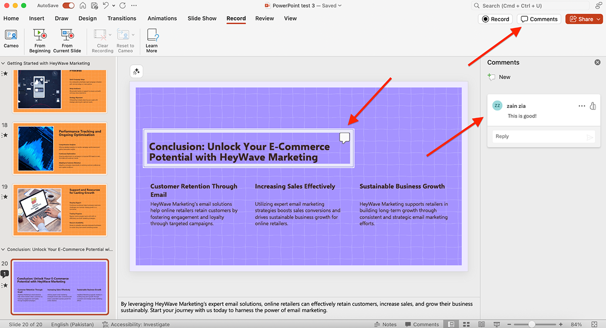
To test this further, I went back to the AI-generated presentation I built earlier. I asked Copilot: “Add a slide about the impact of customer retention on e-commerce businesses. Include a chart or graph to show statistics.”
Here’s what it generated:
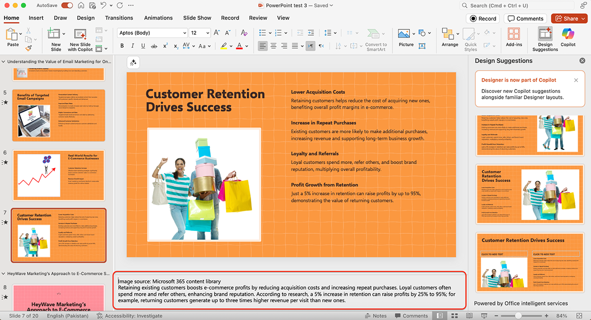
Instead of giving me a chart, the slide came out with plain text, while the notes section underneath included relevant content. Helpful, sure, but not the ‘data visualization’ I was looking for.
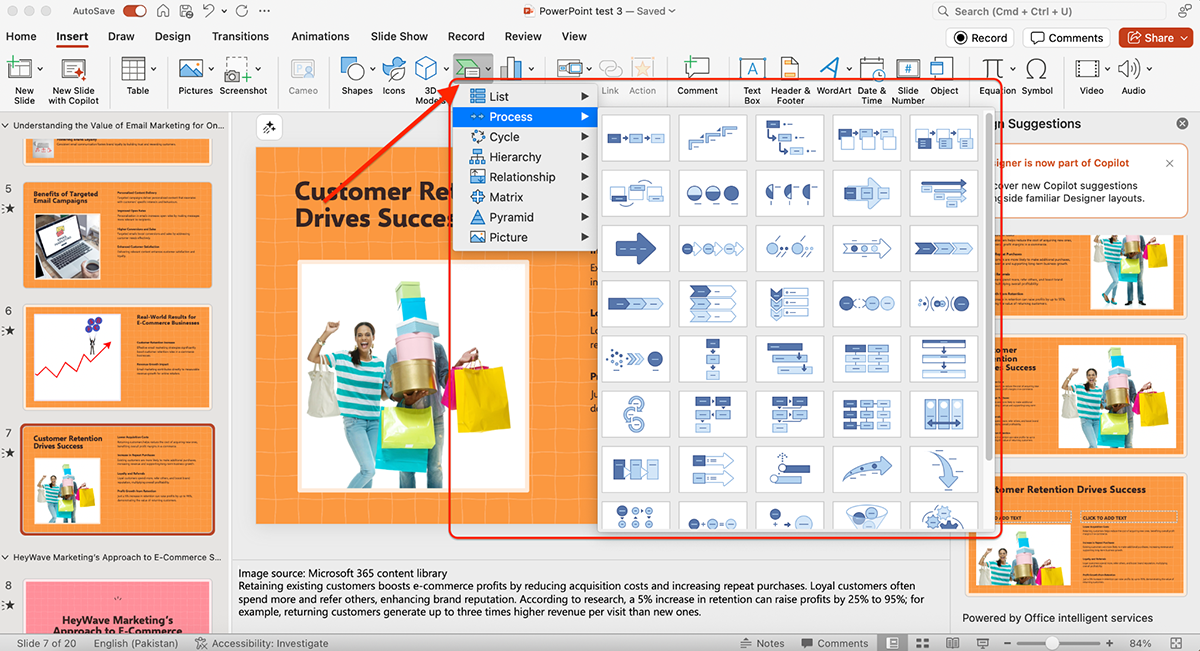
Beyond charts, PowerPoint also offers SmartArt graphics, which are handy for simple diagrams like processes, hierarchies, or relationships. For most everyday business decks, like quarterly updates or financial reports, these get the job done.
Where PowerPoint falls short is customization. Without going back into Excel, your ability to style charts is limited to basic tweaks like colors, labels and layouts. And because animations or interactivity aren’t part of PowerPoint’s DNA, most charts end up static. They look good, but not particularly dynamic.
Visme, on the other hand, puts data visualization front and center.
Beyond the standard bar, line and pie charts, you get access to 40+ chart and graph types, including bubble charts, radial progress bars, scatter plots, flowcharts, heat maps and more.
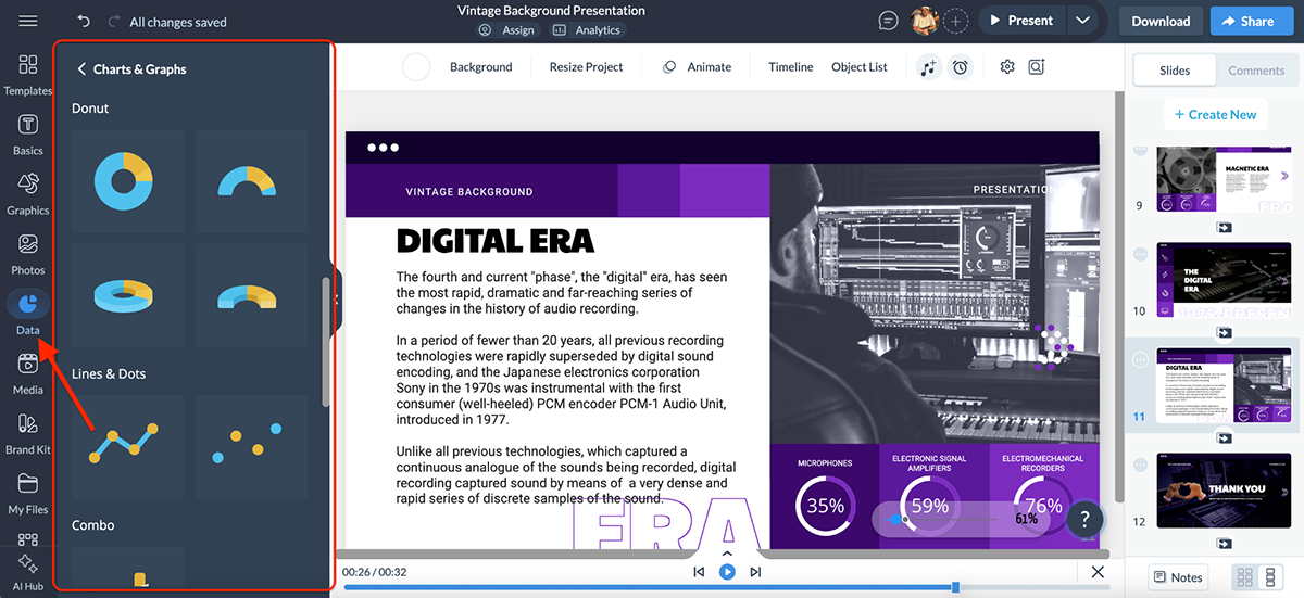
Additionally, Visme includes dedicated data widgets, such as gauges, progress bars, population maps, timelines and percentage counters, which make numbers instantly more engaging.
But volume alone isn’t enough. What really matters is quality. And that’s where Visme races past PowerPoint.
You’re not limited to static slides; you can make your charts truly interactive. Charts can be clickable, values can animate in real time and hover effects can reveal additional details. For example, instead of showing a flat bar graph, you can animate the bars so they rise as you speak, making the data feel alive.
Visme also connects directly with Google Sheets, so your charts can display live data without manual updates. You can also create maps, tables and diagrams. And if you’re creating reports or dashboards, you can embed external data sources or add dynamic fields (like dates, numbers, or user info) that automatically update across projects.
Visme’s infographic templates have helped teams like IBM’s Talent Acquisition Optimization (TAO) group cut costs by up to 75%. Their team puts it simply:
“Now, more applicants autofilter themselves after they read a few of the key points on the infographic, so we’ve definitely seen an improved quality of applicants whenever infographics are used.”
And that’s not all. The Greater Memphis Chamber used Visme for everything from infographics to award-winning reports. Mackenzie Stonis from their team says:
“The possibilities for savings and generating revenue with Visme are there, and they’re endless. We don’t have to rely on a designer or an external person, which means every sponsorship dollar that comes from any reports belongs to us.”
She also adds, “Visme has been instrumental in our branding efforts and streamlined internal processes, making them much quicker and easier.”
Overall, Visme turns data into a storytelling tool and there are actual results and case study that back this claim. Instead of numbers your audience has to squint at, you’re giving them visuals they can interact with.
Creating a presentation is only half the story. The other half is understanding how your audience interacts with it, whether they’re actually engaging with your content or just clicking past it.
Here’s how PowerPoint and Visme compare when it comes to analytics:
| PowerPoint | Visme | |
| Built-in Analytics | Not available | Real-time presentation analytics |
| Viewer Tracking | None (only basic file opens in OneDrive/Teams) | See who viewed + for how long |
| Completion Rates | Not available | Monitor how many viewers finished the deck |
| Slide Engagement | Not available | Track which slides were interacted with most |
| Ease of Access | General file metrics via OneDrive | One-click Analytics button inside Visme dashboard |
PowerPoint itself doesn’t provide presentation analytics. Once you export or present your slides, there’s no built-in way to track who viewed them, how long they spent or which slides got the most attention.
However, if you’re using Microsoft Teams or OneDrive, you can see basic file activity, like whether someone opened or downloaded your deck. But that’s about it.
Check out this tutorial by Lea David on what you can do with Microsoft OneDrive:
In short, PowerPoint doesn’t give you true engagement insights, only general file metrics. Once your presentation is out in the world, you’re essentially presenting blind.
Visme comes with built-in analytics that let you track exactly how your presentations perform once they’re shared. Every project you publish or share through Visme can be monitored in real time. You’ll see:
Tracking is simple. Just click on the Analytics button at the top of your dashboard, and you’ll instantly get a breakdown of how your audience engaged with your content (whether just the project or on social media).
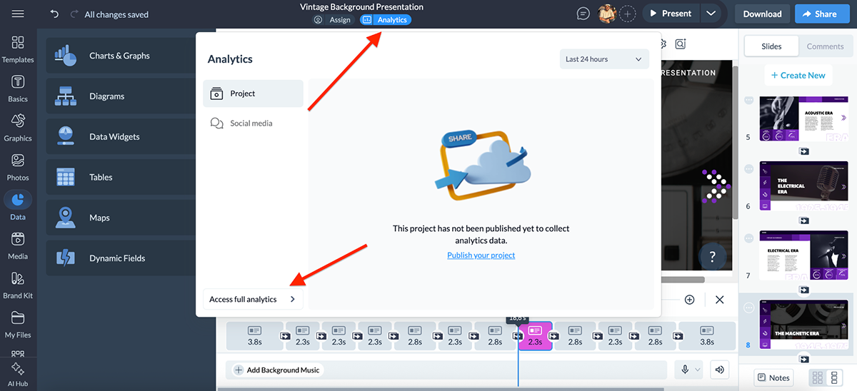
These analytics come in especially handy if you’re sending a pitch deck to investors, sharing sales materials with prospects or delivering training modules to employees. You’ll know exactly where people dropped off, what kept their attention and how engaged they really were.

Speaking of investor pitch decks, check out this video tutorial on how to make one that gets funded:
Overall, Visme analytics tells you everything you need to know how your slides are performing, something PowerPoint simply doesn’t offer.
Collaboration is another really big deal when it comes to design and presentation tools. You could be working with multiple team members on the same project, or maybe you just want to share a work-in-progress with a potential client.
Either way, collaboration features can make the difference between smooth workflows and constant bottlenecks.
Here’s how Visme and PowerPoint compare when it comes to workflows and team collaboration:
| PowerPoint | Visme | |
| User Permissions | Available | Available |
| Real-time Co-authoring | With OneDrive/SharePoint | Smooth, built-in |
| Commenting | Available; on slides/elements | Available; on slides/elements |
| Workflow Management | Not available | Assign tasks, set deadlines, review/approval stages |
| Content Calendar | Not available | Auto-updates with tasks & timelines |
PowerPoint offers decent but fairly basic collaboration features. You can invite people to your presentation and toggle whether they have editing rights or just viewing access.
Commenting is also available. You can leave feedback on specific objects or slides, which makes back-and-forth a little easier.
Since becoming part of Microsoft 365, PowerPoint has stepped up its collaboration game. With OneDrive and SharePoint, you can co-author presentations in real time, leave threaded comments and track version history.
It also integrates tightly with Microsoft Teams, so you can present live, hand over control to another user or collaborate while discussing slides in a meeting. For teams already living inside the Microsoft ecosystem, this feels seamless.
That said, outside Microsoft’s bubble, collaboration still feels a bit clunky compared to newer, web-first tools.
Visme offers some of the most advanced collaboration and workflow features you’ll find in any presentation tool.
You can invite team members into projects with role-based permissions (viewer, editor or admin), so everyone has the right level of access.
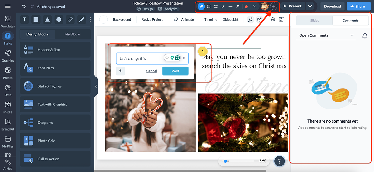
Feedback is simple too, since teammates can leave comments directly on slides or individual elements.
Where Visme really stands out is in its workflow management tools. You can assign tasks to specific team members, set due dates and move projects through stages like draft, review and approval. It’s a smooth way to keep quality control in place without relying on endless email threads.
And the best part is that all tasks and deadlines are automatically tied into Visme’s content calendar. This gives you a clear, visual overview of project timelines, so your team can stay organized.
For agencies, marketing teams or freelancers working with clients, these features mean fewer bottlenecks and projects are able to move forward faster.
Congratulations! You’ve built your presentation.
Now it’s time to get it in front of your audience. Whether that means presenting live, sending a link or exporting into different formats, the options you have can make a huge difference in flexibility and reach.
Here’s how PowerPoint and Visme compare when it comes to sharing and export options:
| PowerPoint | Visme | |
| Export Formats | PPTX, PDF, Images, Video (MP4) | PDF, JPG, PNG, PPTX, GIF, MP4, HTML5 |
| Live Presentation | Yes (via app or Microsoft Teams) | Yes (share link, live presenting online) |
| Embedding Options | Limited (via OneDrive/SharePoint) | Embed on websites, blogs, intranets |
| LMS Support | Not supported | SCORM & xAPI exports |
| Social Media | Not built-in | Integrated social media scheduler |
PowerPoint doesn’t offer a huge range of sharing or export options, but it covers the basics well. You can:
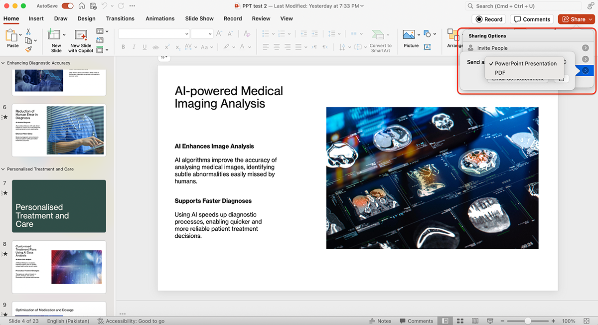
You can also password-protect your presentation in PowerPoint. And that’s about it.
Check out this YouTube video by MDTechVideos to learn how to password-protect your PowerPoint Presentations:
All in all, PowerPoint’s sharing options are reliable but limited. Sending a deck usually means emailing a file, uploading it to OneDrive/SharePoint or presenting live.
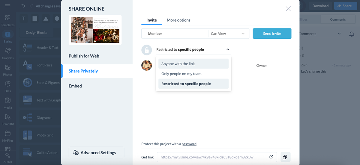
Visme’s sharing and exporting options are strong. Instead of being limited to emailing files, you can:
For sensitive content, you can lock projects behind password-protected links, so you have more control over who sees your work.
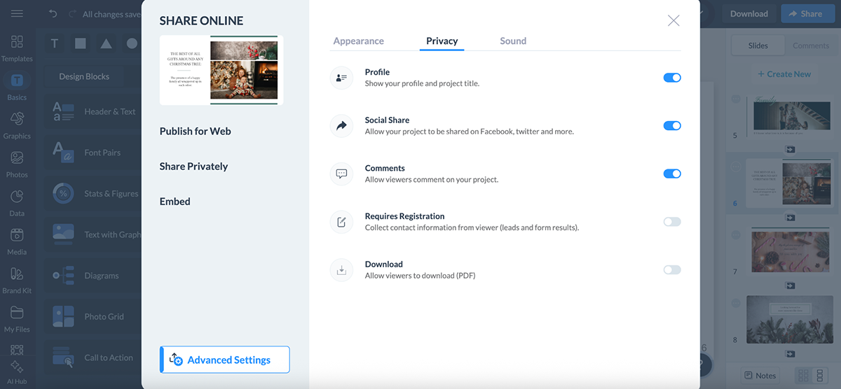
And when it comes to exports, Visme gives you options beyond the basics: PDFs, JPGs, PNGs, editable PowerPoint files, GIFs, MP4 videos and even offline HTML5 packages.
What I like most here is that interactive elements, like animations, clickable links and hover effects are preserved when shared online or embedded, instead of flattening into static slides.
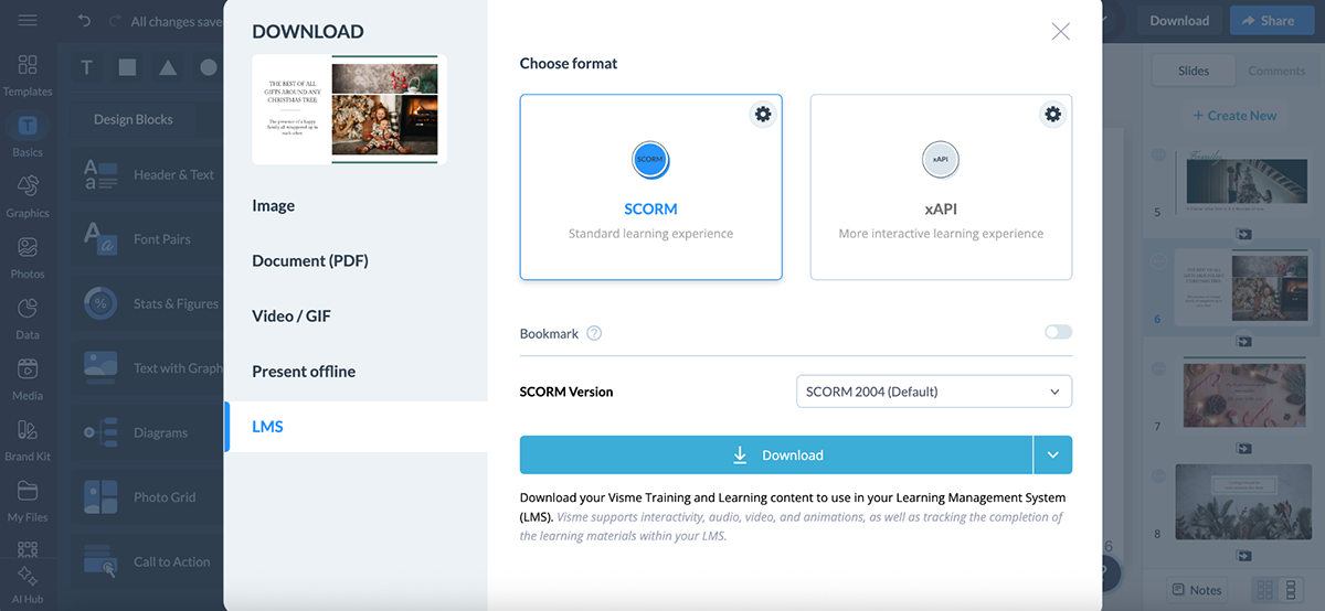
Visme also supports eLearning standards like SCORM and xAPI, making it easy to upload training materials into any Learning Management System (LMS).
And if you’re using Visme beyond presentations, there’s even a built-in social media scheduler to plan, schedule and publish posts directly from the platform.
In short, Visme makes it effortless to share content wherever your audience is, whether that’s a boardroom, a website or a learning portal.
No matter how intuitive a tool is, you’re bound to run into roadblocks. That’s where solid customer support and learning resources make a big difference.
Here’s how PowerPoint and Visme compare when it comes to customer support and resources:
| PowerPoint | Visme | |
| Live Chat Support | Available | Available |
| Knowledge Base & Tutorials | Extensive Microsoft Help Center + community forums | Detailed Help Center with step-by-step guides, videos and FAQs |
| AI Chat Support | Available | Available |
| Onboarding Support | Available for enterprise plans | Personalized onboarding for teams and enterprise accounts |
Since PowerPoint is part of the Microsoft 365 suite, its support system is tied into Microsoft’s broader ecosystem. For most users, that means:
And since PowerPoint is so widely used, you’ll also find endless YouTube tutorials, blog posts and third-party resources. Many plugin providers even publish their own help guides tailored to PowerPoint users.
All in all, PowerPoint offers solid customer support and resources, and you’ll almost always find a solution to whatever problem you run into.
Visme takes a much more hands-on approach to customer support compared to most presentation tools. Here’s what you get:
All in all, Visme’s support team is top-notch.
Jenna Daneker, the BarPro Team Lead at Krowne says:
“The customer support Visme provided was really the big push that helped Krowne sign with Visme. The reps were easy to talk to, great at explaining how Visme works and detailed in giving tutorials. They clearly highlighted the features that applied to us and our specific needs.”
“Still to this day, the same great customer support that we were receiving five years ago, we're still receiving from Visme today.”
On top of all these resources and help, there’s also the Visme blog that’s packed with how-tos, guides and design tips that double as ongoing learning resources, not just for presentations, but for visual communication as a whole.
Overall, Visme’s customer support and resources are top-notch. In most cases, you’ll either find the answer instantly in their Help Center or get a solution quickly from the AI chat or support team. And if you need a more tailored approach, the success team is just a message away.
Just like most other categories we’ve looked at, Visme and PowerPoint also take very different approaches when it comes to pricing.
Here’s how the two compare:
| PowerPoint | Visme | |
| Free Plan | Available | Available |
| Standalone (one-time purchase) | $179.99 | Not applicable |
| Personal Plan | Microsoft 365 Personal: $99.99/year or $9.99/mo (includes full Office suite + 1 TB storage) | $12.25/mo billed annually (premium templates, assets, more exports) |
| Family/Team Plan | Microsoft 365 Family: $129.99/year or $12.99/mo (up to 6 users, full Office suite + 1 TB storage per user) | Pro Plan: $24.75/mo per user billed annually (advanced collaboration, analytics, brand kit) |
| Business/Enterprise Plans | Basic: $6/user/mo (web/mobile only)Standard: $12.50/user/moPremium: $22/user/mo | Enterprise: Custom pricing (SSO, advanced security, onboarding, dedicated support) |
PowerPoint offers several plans depending on what you need.
If you just want the app itself, you can grab the standalone version for a one-time payment of $179.99.
This license works for one PC or Mac, and you won’t have to worry about monthly or yearly renewals. It’s perfect if you’re not interested in cloud storage or Microsoft’s wider ecosystem and simply want PowerPoint installed forever.
But most people go for the Microsoft 365 subscription bundles, which include PowerPoint plus Word, Excel, Outlook and 1 TB of OneDrive storage per person for your files, photos and videos:
Subscriptions unlock both the desktop and web apps, regular feature updates and Copilot AI built right into PowerPoint, Word, Excel and Outlook.
For businesses, PowerPoint is part of Microsoft 365 Business plans, which scale with your team size and needs:
There’s also a free web version of PowerPoint, but it’s pretty limited. You don’t get offline access, advanced features or Copilot. Nonprofit plans are available as well.
In short, there are plenty of ways to get PowerPoint, but the best option depends on your use case. If you just want the basics, the standalone license works. If you want AI, updates and collaboration, you’ll need a Microsoft 365 subscription.
Visme pricing is more straightforward than Microsoft's. Instead of bundling with different, unrelated apps, its plans are designed around individuals, small teams and larger organizations that need to create and collaborate on visual content.
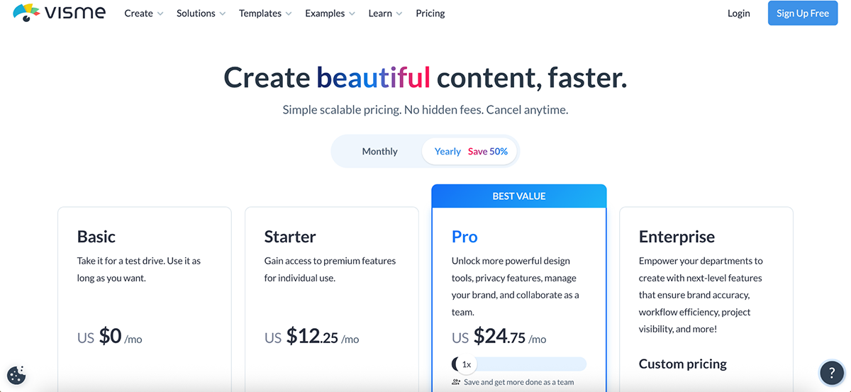
What I love most about Visme’s pricing is how transparent and flexible it is. You’re only paying for presentation and design tools, not for email, spreadsheets or extras you might never use.
And unlike PowerPoint, Visme offers plenty of real-world proof that it’s not just affordable, but a genuine time-saver. For example:
WOW!, a training and development team, reported saving nearly 79% in time and cost by switching to Visme’s intuitive design platform.
Whereas Vanessa from Vorys says:
“If employees in the three departments were billed at $30 an hour by a designer, we would have saved 22 hours of work in July alone by using Visme instead of starting from scratch. Over a year, that translates to more than $8,000 in savings, thanks to the time saved when we compare starting from a blank sheet of white paper versus starting from Visme.”
These real-life use cases and results show how Visme’s pricing goes beyond affordability to deliver tangible ROI in both time and cost savings.
All in all, whether you’re a freelancer, a growing team or an enterprise, Visme’s pricing is structured to give you exactly what you need without paying for the extras you don’t.
Yes, if you’re looking for modern, design-first tools, Visme is one of the best PowerPoint alternatives. It includes AI-powered features, a huge asset library, collaboration tools, analytics, social media scheduler and interactive and animation capabilities that PowerPoint simply doesn’t offer.
Yes. You can export Visme projects as editable PowerPoint files (PPTX). That means you can start a design in Visme and finish editing in PowerPoint if needed. It’s not a one-way street either; you can import PowerPoint content into Visme to give your slides a more modern look.
You can get started with Visme for free. Paid plans begin at $12.25/month for individuals. The Business plan, which unlocks advanced features, is $24.75/month per user (billed annually). Enterprise plans are custom-priced.
Yes. You can upload your existing PowerPoint slides into Visme, and they’ll be converted into editable Visme projects. From there, you can refresh the design, add animations or make them interactive.
PowerPoint’s main downsides are that many templates feel outdated, collaboration is limited compared to modern tools and analytics are basically nonexistent. It also lacks interactivity and advanced AI features unless you’re paying for Microsoft Copilot as part of a subscription.
Both tools are widely used in professional settings, but the choice between Google Slides vs. PowerPoint comes down to your use case and the environment you’re currently working in.
PowerPoint is considered the standard in most corporate environments, especially where Microsoft 365 is already in place. Google Slides, however, is easier for real-time collaboration and works seamlessly in the browser.
At the end of the day, both PowerPoint and Visme are powerful tools, but they serve different purposes.
PowerPoint is the classic choice: familiar, reliable and deeply tied into the Microsoft 365 ecosystem. If all you need is a straightforward way to create traditional slides, it does the job well.
Visme, though, takes things a step further. It comes with AI-powered features, a massive template library with 10,000+ professionally designed options and an asset library with over a million visuals. Add to that animated and interactive content, analytics and advanced collaboration tools and you get a platform built for modern teams.
Ready to see what modern presentation software looks like? Try Visme’s presentation software and explore everything it can do for your next project.
Design visual brand experiences for your business whether you are a seasoned designer or a total novice.
Try Visme for free