


Typography Infographics: 12 Inspiring Examples & Techniques

![Top 10 Piktochart Alternatives in 2026 [Free & Paid]](https://visme.co/blog/wp-content/uploads/2021/04/header-51.png)
Piktochart is great. It can effortlessly turn any dry data into crisp, eye-catching visuals. No wonder it’s used by (checks notes) over 14 million users.
And, sure, I’m one of them.
I really like how easy it is to create infographics and reports with Piktochart. The editor is super beginner-friendly and the AI features are cool.
And for the most part, the built-in templates are solid, especially for things like internal comms or educational content.
But with so many Piktochart alternatives popping up, and many of them offering more advanced AI tools, deeper brand kit controls and, frankly, a lot more flexibility, I couldn’t help but wonder: Am I missing out?
So I did what any visual content nerd would do.
I went on a little mission to test 10 different Piktochart alternatives (free and paid).
Some tools were legitimately good, while others had their quirks. But hey, I gave them all a fair shot (promise).
In this article, I’ll break down the best infographic tools and show you what they’re best for, how much they cost, and how they actually stack up against Piktochart.
So, whether you’re a marketer, educator, founder or just someone trying to make your data look way less boring, this list is your shortcut to finding the right tool.
Let’s jump in.
*Disclaimer: The comparisons and competitor ratings presented in this article are based on features available as of May 8, 2025. We conduct thorough research and draw on both first-hand experience and reputable sources to provide reliable insights. However, as tools and technologies evolve, we recommend readers verify details and consider additional research to ensure the information meets their specific needs.
Before we begin, it’s important you know how I tested these tools. My goal is to be as fair and transparent as possible, so here’s a quick overview of what my process looked like:
With that out of the way, let’s take a look at what each tool does best.
| Tool | Key Features | Pricing | Rating |
| Visme | Complete suite of AI tools (AI designer, AI writer, AI image generator, AI image editor and brand wizard), interactive content, advanced collaboration | Free; paid plans start from $12.25/mo | 4.5/5 (445 reviews) |
| Venngage | Infographic generator, chart builder, AI tools | Free; paid plans start from $10/mo | 4.7/5 (124 reviews) |
| Canva | Magic Design, AI image and text tools, content planner | Free, paid plans starts at $15/month | 4.7/5 (4487 reviews) |
| Adobe Express (formerly Spark) | Drag-and-drop editor, AI video generator, Adobe integration | Free; paid plans start from $9.99/mo | 4.5/5 (391 reviews) |
| Infogram | Live data charts, map visualizations, team collaboration | Free; paid plans start from $19/mo | 4.7/5 (181 reviews) |
| Google Slides | Real-time editing, charts via Sheets, built-in AI (Gemini) | Free; paid plans start from $14/mo | 4.6/5 (6482 reviews) |
| Figma | Design freedom, prototyping, community templates | Free; paid plans start from $3/mo for a Collab seat that includes FigJam and Figma Slides | 4.7/5 (1201 reviews) |
| Marq (formerly Lucidpress) | Smart templates, brand control, multi-user workflow | Free; paid plans start from $10/mo | 4.4/5 (207 reviews) |
| Easel.ly | Basic infographic templates, simple editor, collaboration | Free; paid plans start from $5/mo | 4.7/5 (150 reviews) |
| DocHipo | AI writer, smart templates, background remover | Free; paid plans start from $7.5/mo | 4.0/5 (1 review) |
G2 Rating: 4.5/5 (445 reviews)
I’ve been working with Visme for over five years now, so you might think this is my bias kicking in, but if you’ve spent some time using the platform, you’ll know exactly why it’s sitting at the top of my list.
Visme isn’t just an infographic tool.
It’s a full-blown content creation platform that lets you design everything from interactive presentations and animated social posts to branded reports, proposals and lead-gen content.
I’ve personally used it to build product launch decks, ebooks, whitepapers, internal training docs, case studies and marketing one-pagers. And even though I’m not a designer, I think they turned out pretty great.
And all of this was before they rolled out the AI Designer.
Now it takes me a quarter of the time to build out projects.
The AI presentation maker gives you a full deck based on a single prompt. The built-in AI writer helps you refine your copy right inside the editor. And if you need a unique visual, the AI image generator has your back. There’s also an AI image editor if you want to refine and improve your current photos.
But enough talk. Let’s put it to the test.
Create a presentation on common data storytelling mistakes and how to fix them.
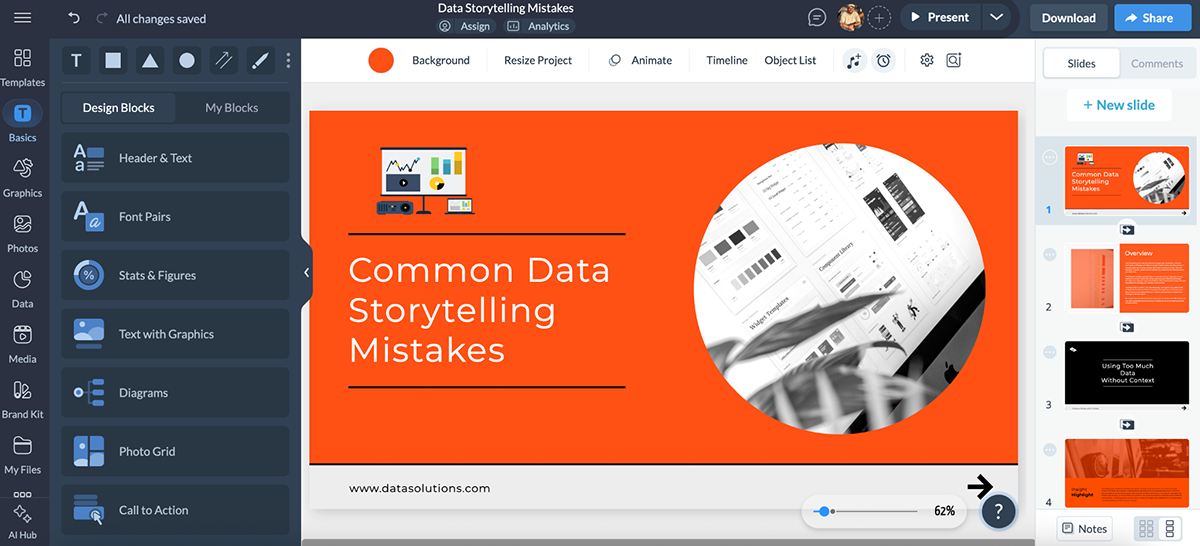
I mean…wow. This literally took less than a minute.
And, sure, it’s not perfect. I’d still fix some formatting, tweak the brand colors, adjust the copy and add my own personal touch. But we’re already in crazy good territory here.
If you prefer building from scratch, Visme has got you covered there, too. You can start with a blank canvas or pick a pre-designed template to speed things up.
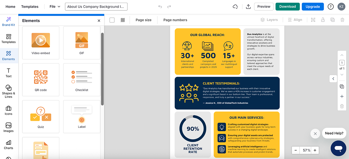
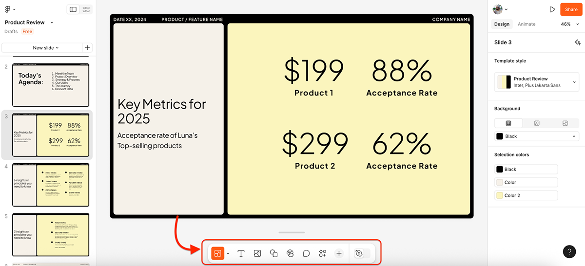
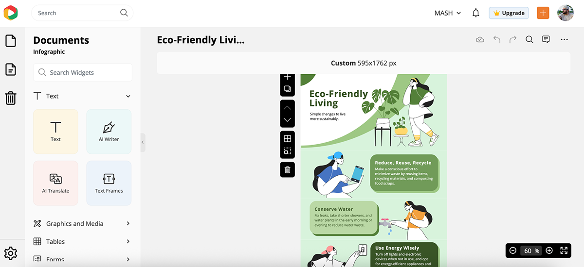
Here’s one of my favorite infographic templates:
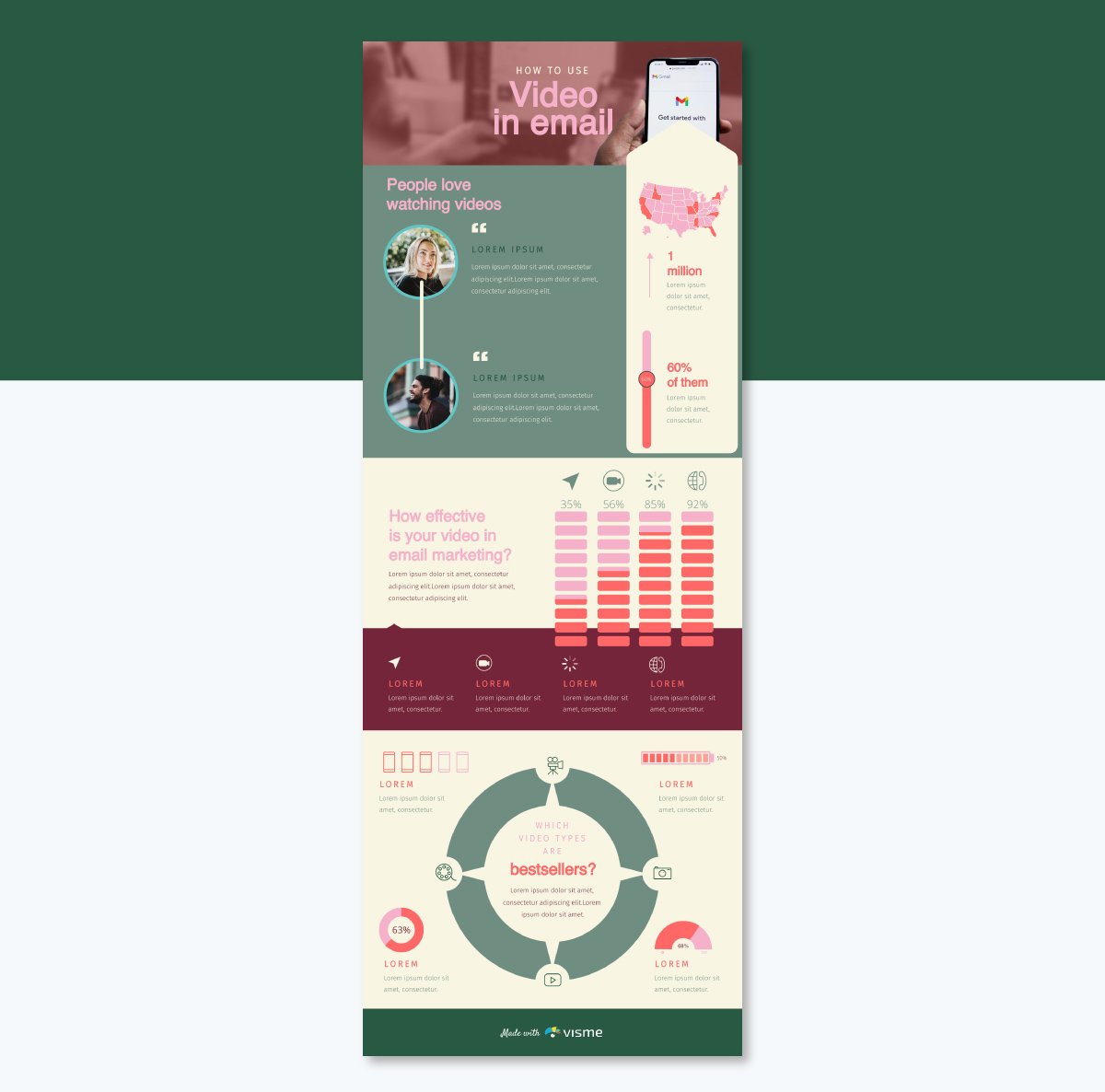
Visme’s in-house design team handpicks everything, from the fonts, stock images, and layout to the icons, animations and data widgets. I mean, check out this collage of brilliant infographic examples available in Visme.
The editor itself is drag-and-drop simple. You can add animation and interactivity to any object, layer visuals like you would in pro-level design software and embed rich media like videos and audio.
Then there’s:
Sure, Piktochart is great for quick visuals—Visme can do that too.
But if you’re looking for creative freedom, advanced AI tools and built-in features that help you actually drive business results, Visme is in a league of its own.
G2 Rating: 4.7/5 (124 reviews)
Venngage has been in the infographic game for years (and it shows).
If your main use case for Piktochart is data storytelling, this one’s a strong contender.
I’ve used Venngage in the past for quick infographics and reports. And even though I don’t love their website UI, the quality of their templates has always been solid.
I logged in to my Venngage account after a couple of years for this test, and was happily surprised to see that the tool now has AI features baked in.
There’s an AI infographic generator, a chart and graph assistant, a design prompt generator, an AI image creator and many more. And not just that, they also have a great collection of pre-built templates that you can get inspiration from.
If you’re confident about the layout, design and content of your project, you can also start from scratch, but this gives you zero guardrails, so it’s best suited for users who know exactly what they want to create.
My experience with the drag-and-drop editor was fine—nothing overly special.
Everything is neatly organized on the left sidebar for easy access, and there are plenty of interactive elements and data visualizations to choose from—something I’ve always admired about Venngage.
Now, let’s talk about the test.
Create an infographic on “The rise of remote work and how it’s reshaping the workplace in 2025.”
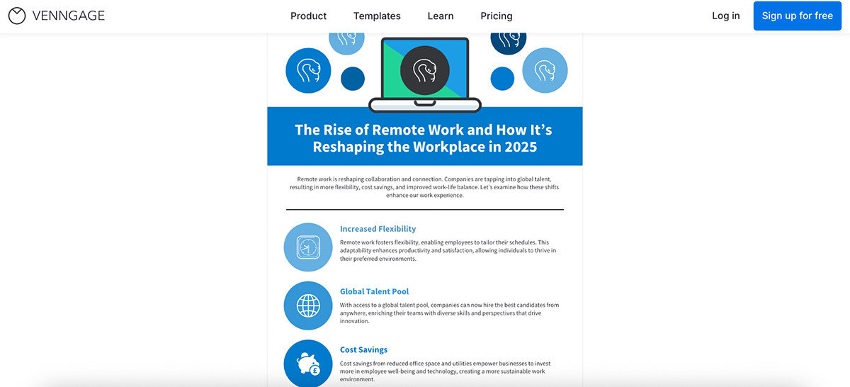
I like the colors and simplicity of the result. There are plenty of icons in there that I can customize (why are there so many snake icons?) and the content is spot on. But there’s a serious lack of numbers.
So, I gave it another go.
Create an infographic on “The rise of remote work and how it’s reshaping the workplace in 2025.” Add stats, charts and graphs wherever possible.
Result:
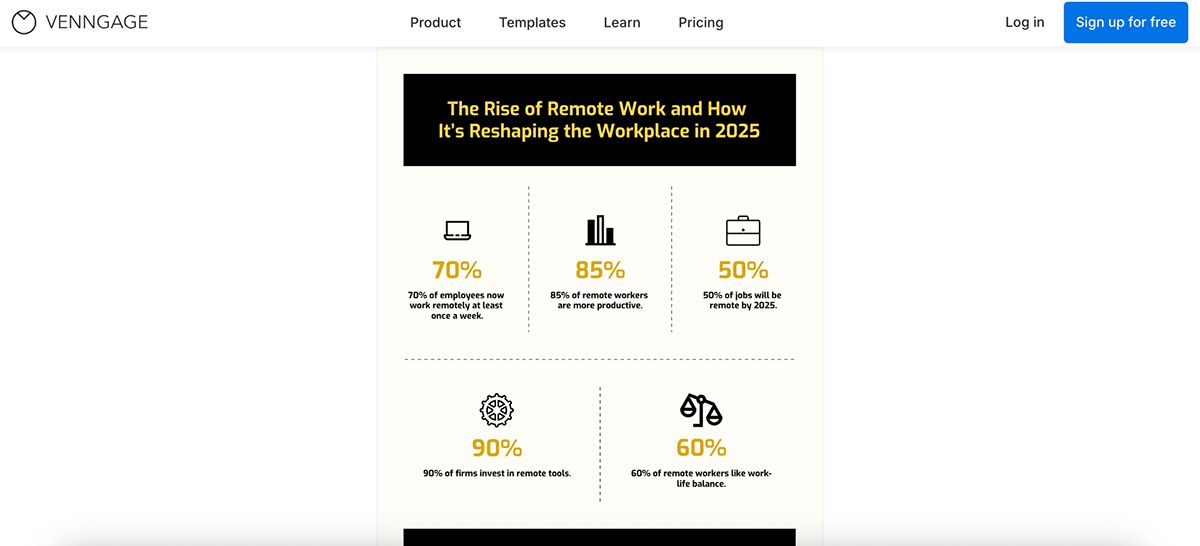
I like this version better, but it lacks the depth and articulation of the previous one. I guess you can get better results if you enter better, detailed prompts.
That said, Venngage isn’t without its limitations, especially if you’re on the free plan.
You can’t access the Brand Kit, collaborate with others in real time or—and this is a big one—download, share or publish your work unless you upgrade.
Some of that is expected (lots of tools gate features), but not being able to export or share anything at all is a frustrating blocker when you’re just trying to test the waters.
Still, if infographics are your main priority, and you’re okay with paying to unlock the good stuff, Venngage is worth a try.
G2 Rating: 4.7/5 (4487 reviews)
Canva is basically the Starbucks of graphic design tools.
Almost everyone’s used it. Some love it. Some don’t like the commercial taste of it.
But it’s available everywhere. On desktop, mobile, browser and now even integrated into Google Workspace.
So yeah, this list wouldn’t be complete without mentioning Canva.
I’ve been using the platform for years. I still regularly use it to create thumbnails for my YouTube channel, Instagram posts and sometimes even one-pagers and presentations. And with the rollout of more AI features soon, things will definitely improve.
Anyway, moving on to the test.
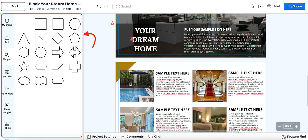
Create a presentation for a Luna Skincare Q2 sales report. Use modern fonts, minimal design, and space for charts and product highlights.
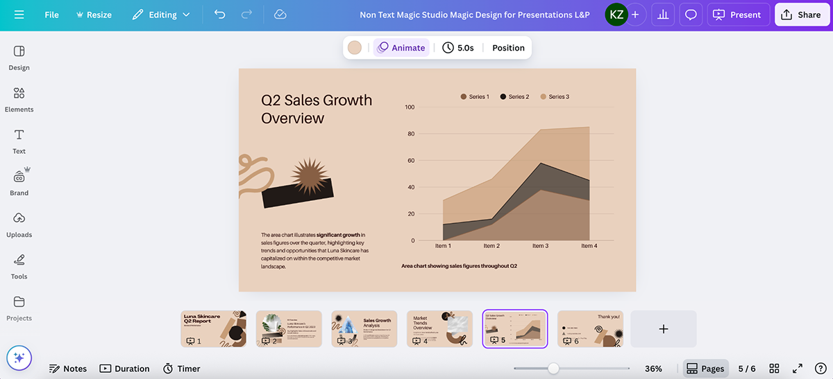
Honestly? This looks pretty solid.
The 6-slide deck was generated in under a minute. The layout was modern, the colors fit the skincare vibe and the slides included space for charts, trends and key highlights.
It looks polished, but very template-driven. Not super customized to the prompt (some images don't even make sense), but definitely a solid starting point if you’re short on time.
So, Canva vs. Piktochart. Who wins?
If you’re looking for serious data storytelling or report-building, Canva’s okay. You can make infographics, but the charts are limited and the editor doesn’t give you the same layout control as Piktochart or Visme.
But if you want a fast, flexible tool for presentations, social graphics, and content repurposing, with a growing set of AI tools and an absolutely massive template library, Canva is one of the best AI graphic design tools out there.
G2 Rating: 4.5/5 (391 reviews)
Unlike Piktochart, Adobe Express doesn’t go heavy on charts and data.
But if your goal is to create clean, modern visuals with less effort (and maybe look like a designer in the process), it’s a pretty great tool to have in your back pocket.
It’s built for non-designers who need to whip up flyers, posters, social graphics, reports and more, all without touching Photoshop. The UI is slick, the onboarding is smooth and everything just works.
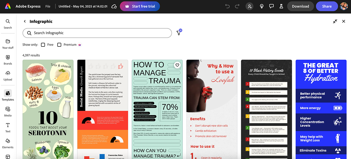
As a Piktochart alternative, it won’t give you complex data visualizations, but it does offer a decent collection of infographic templates. Most are vertical, scroll-friendly, and well-designed—perfect for awareness content or lightweight reports.
Plus, you can also start using a blank canvas, which especially comes in handy if you already know the design you want to create.
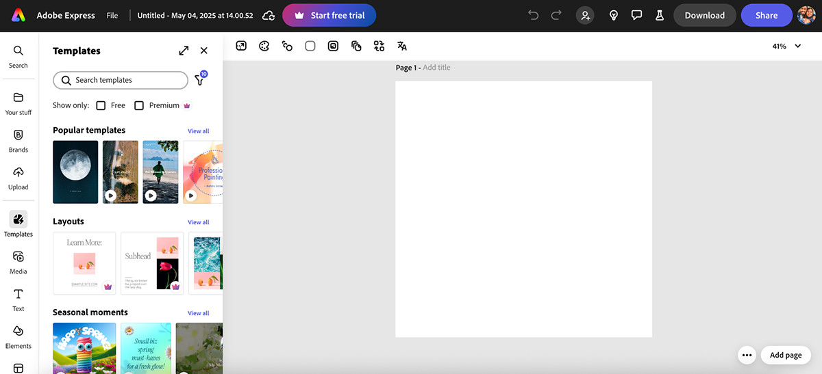
The editor is drag-and-drop simple, with everything organized in the left-hand panel. You get access to Adobe Fonts, Adobe Stock images, brand controls, AI-powered features and even basic animation options.
I originally planned to test Adobe Express’s template generator, but it was buggy and wouldn’t load properly. Let’s be honest, is frustrating when you’re trying to move fast.
So instead, I gave their “Generate Video” feature a shot.
Prompt:
Create a video ad for a new line of eco-friendly water bottles. Highlight durability, design and sustainability.
Not bad…but not great either. The video was clean but felt generic—no personality, no hook and nothing that would really connect with a real audience. To be fair, you’d probably need a master prompter to get strong results.
Still, for quick promos, reels or rough concept testing, it’s a pretty handy starting point.
Other creative tools by Express that I find genuinely fun to use are:
Overall, the main area where I feel Adobe Express falls short as a Piktochart alternative is data visualization. You won’t find advanced chart types or spreadsheet integrations here. It’s built more for marketing content than for reporting or infographics with real depth.
But if you want that Adobe look without jumping into Photoshop or Illustrator, Express is a solid middle ground.
G2 Rating: 4.7/5 (181 reviews)
If you’re serious about data visualization, Infogram is probably already on your radar.
It’s built specifically for creating charts, dashboards and infographics, so while it’s not as flashy as some of the other tools on this list, it absolutely delivers when it comes to working with numbers.
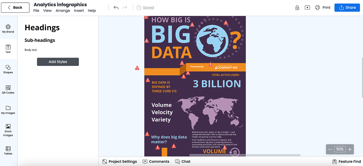
Create a data-driven infographic on “The rise of sustainable packaging trends from 2020 to 2025.”
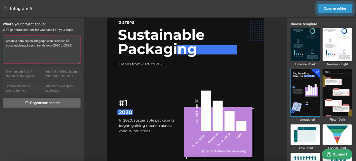
It delivered exactly what I expected. A clean, vertical layout with multiple chart options, simple typography, animated graphs and great spacing. Spot on.
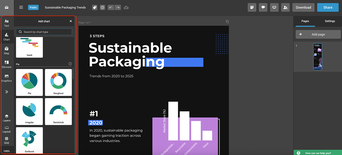
You can browse different infographic styles on the right, and once you’ve picked one, the editor gives you granular control—tweak fonts, swap out graphic elements or test different chart and map types. You can even integrate live data right inside the editor. All very…functional.
If you’re looking for heavy customization, motion graphics or AI tools (which most Piktochart competitors are now offering), Infogram isn’t built for that. Plus, the free plan doesn’t let you download your work; you’ll only be able to share it publicly.
But if you need to turn raw data into something visual, accurate and client-ready, Infogram is a great option.
G2 Rating: 4.6/5 (42,789 reviews) (Workspace)
Google Slides probably isn’t the first tool that comes to mind when you think “Piktochart alternative”. But, hear me out.
If your goal is to present information visually, collaborate in real-time and work with a tool your entire team already uses, Google Slides is a low-key, solid choice.
It’s free, web-based and integrates seamlessly with Google Drive, Docs and Sheets—all ideal for teams already living in the Google ecosystem.
I’ve used it for everything from university presentations to professional reports that needed input from multiple people at once.
Sure, there aren’t any built-in infographic templates, but there are tons of free and paid templates online that you can import easily. Or—a quick hack—you can just create charts in Google Sheets, copy them over to Slides and tweak them as needed.
And with the recent refresh of Google Slides, including built-in AI tools, building blocks, in-app stock photo browsing and (of course) Gemini, things are definitely moving in the right direction.
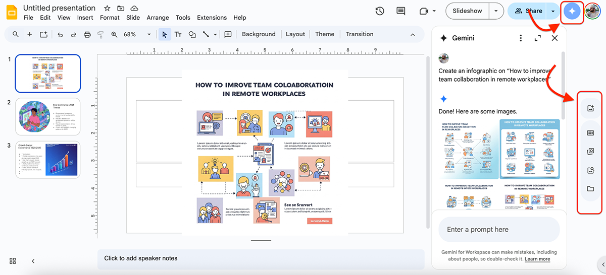
Moving on to the test now. Gemini can only generate one slide at a time (or images with prompts, which are a hit or miss), so I gave it several prompts to see what it could do.
Create a presentation on “Key trends in sustainable ecommerce in 2025.” Include relevant charts, industry stats, and a visual summary.
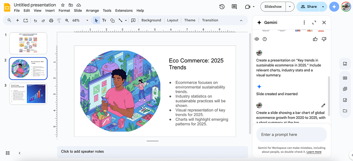
It didn’t really do what I asked. There’s no structure, the copy is confusing and there aren’t any charts or graphs. But I did like the image it created—it looks polished.
My take is that if you’re using Gemini more as a content helper or image generator, it can add value.
But, I have almost always preferred to create a project in Slides using a blank page. It lets me focus on the content rather than the design, which I find liberating at times.
Overall, however, Google Slides is a great free Piktochart alternative if you're not looking to get fancy.
You won’t find built-in data widgets or flashy templates, but for clear, editable, collaborative slides (especially if your team already uses Google Workspace), it’s still a strong contender.
G2 Rating: 4.7/5 (1201 reviews)
Next up on my list of top Piktochart alternatives is Figma.
Yes, yes, I know, this is primarily a design tool built for interface design, prototyping and team collaboration, not a traditional infographic tool by any stretch.
But if you’ve got a bit of a design background (or don’t mind a learning curve), it’s hands-down one of the most powerful visual tools on this list.
I’ve played around with Figma mostly for web design projects, but it’s pretty good for infographics too, especially when you need pixel-perfect control.
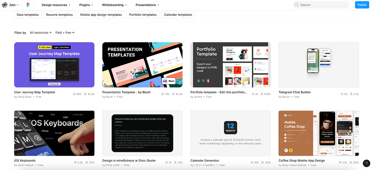
The built-in templates are limited, but the Figma Community more than makes up for it. You’ll find loads of free and paid templates for infographics, pitch decks, data reports and visual frameworks. You can either draw inspiration from them or duplicate and customize them directly with your own content.
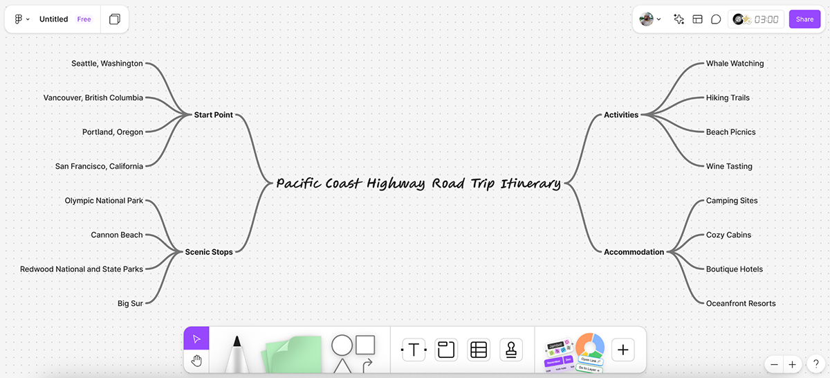
Figma also has some helpful AI-powered features baked in, especially in FigJam, their whiteboarding tool. You can quickly generate flowcharts, mind maps, timelines, org charts and Gantt charts using natural language prompts.
Mind map for a road trip itinerary down the Pacific Coast Highway.
And on top of that, there’s a massive library of third-party plugins and widgets that can level up your workflow, from icon libraries and chart builders to image generators and export tools.
So, for my test, I picked a free infographic template from the Figma Community and started customizing it. Here’s what I created in under 5 minutes:
Pretty straightforward to edit, to be fair. You can use the buttons at the bottom to add shapes, text boxes, live interactions, comments and more.
My final verdict is that Figma isn’t for everyone.
If you just want to drop numbers into a chart and call it a day, this probably isn’t your tool—there are plenty of solid picks we’ve mentioned throughout the article.
But if you want total creative control, access to a massive design community and the flexibility to build visuals exactly the way you want—Figma delivers in spades.
G2 Rating: 4.4/5 (207 reviews)
Another tool I tested as part of this research was Marq (formerly Lucidpress).
It’s built more for business teams than solo creators, with a strong focus on brand consistency, template locking and collaborative editing. Think social media graphics, brochures, presentations and reports—all designed within strict brand guidelines, so no one on your team goes rogue with the fonts.
The editor is pretty straightforward. Everything’s neatly tucked away for easy access, and I had no trouble navigating it (aside from the usual learning curve that comes with trying any new tool).
That said, there aren’t a ton of built-in graphic assets, so if you rely heavily on icon libraries or stock visuals, you might feel a little limited.
Still, there are plenty of templates to choose from. Marq also offers “smart templates” that let you auto-upload your brand assets. I didn’t test that feature since it’s part of a paid plan, but it sounds similar to Visme’s branded templates. The key difference is that with Visme, every template is smart by default.
Since there aren’t any AI features in Marq, I picked one of their infographic templates and gave it a quick makeover.
The layout looks clean out of the box and was easy to tweak. But again, no animated icons (at least not on the free plan), no live interactivity and no built-in chart/graph variety compared to tools like Piktochart, Visme or Infogram.
Overall, I think Marq is suited for teams that need to scale content production while staying fully on-brand. If you’re looking for visual storytelling, data widgets or AI-powered creativity, this isn’t the tool for you.
G2 Rating: 4.7/5 (150 reviews)
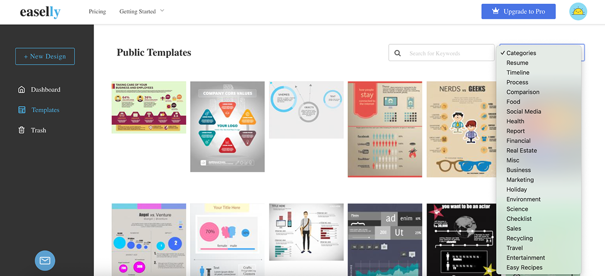
Easel.ly was an interesting one.
At first glance, I assumed it was mainly a design service hub, where people could get custom infographics made by professional designers. But once I signed up, I was dropped straight into the editor.
They’ve got dozens of infographic templates across 20+ categories (some free, most locked behind the paid plan). I liked the variety and organization of the templates—timelines, process, comparisons, reports and real estate.
But many of them felt a bit dated.
Moving on to the editor now. The layout is familiar, everything’s tucked neatly along one side, which I always appreciate. But the biggest drawback is the extremely limited selection of icons, charts and images. You can’t even preview most of them without upgrading.
And hey, I can only judge what I can access, right?
Based on that, I wasn’t super impressed.
There’s no AI functionality, no real-time data visualizations and no live interactions. They do offer basic collaboration (which is great), but beyond that, it’s a pretty stripped-down experience.
Here’s what I made using Easel.ly:
In my opinion, if you’re just looking for a quick and simple way to visualize a process or explain a concept, Easel.ly can get the job done. But if you’re after modern design tools, advanced features or just more freedom to customize, you’ll hit a wall pretty fast.
G2 Rating: 4.0/5 (1 review)
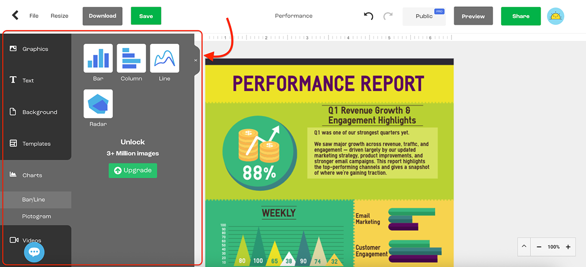
Lastly, I tried DocHipo.
It isn’t as well-known as Canva or Visme, but don’t let that fool you.
DocHipo packs a surprising punch, especially if you’re looking for a Piktochart alternative that offers modern templates, helpful AI tools (like an AI writer, image generator, translator and background remover) and drag-and-drop simplicity.
And the UI is super friendly. Everything’s right where you’d expect it to be.
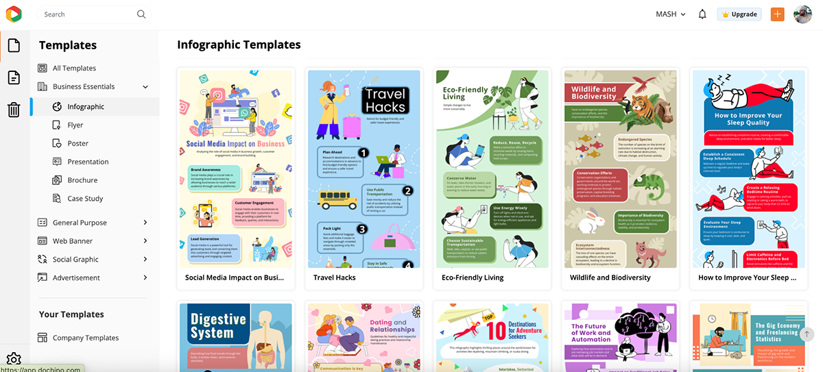
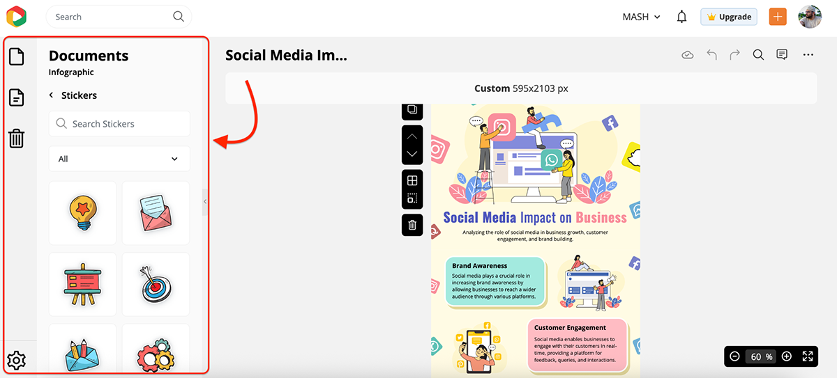
Once inside the editor, you just pick the type of document you want to create, and DocHipo shows you a mix of free and premium templates tailored to your selection.
But more importantly, the designs look current with a clear focus on aesthetics without sacrificing usability. You don’t need to be a designer to make something that looks polished.
The graphic assets, for the most part, are solid.
And the built-in AI tools are definitely a nice touch.
The AI text generator, for instance, is great for generating placeholder copy or getting a rough draft you can polish later (only available to paid users).
The editor itself is lightweight and responsive, though it’s not as advanced as Visme or Figma in terms of interactivity, design depth or just the sheer breadth of what you can build.
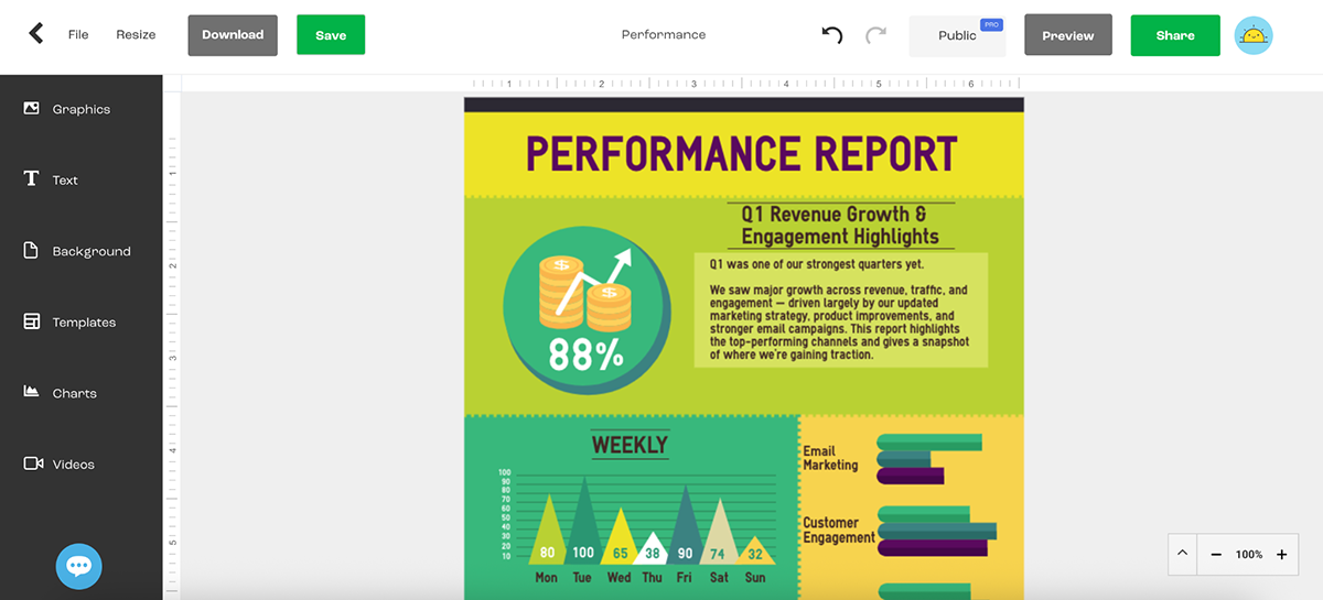
Here’s an example of what you can expect right out of the box with DocHipo:
Pretty cool, right?
What I really like about this design is how easy it is to customize. Don’t like the color scheme? Swap it out in seconds. Not a fan of the flat, illustrated character style? Just replace them with icons or real images. You get complete creative control.
Sure, DocHipo isn’t the most feature-packed tool on this list, but it nails the balance between simplicity and style.
If you want an easy way to create modern-looking content with built-in AI tools and zero overwhelm, this one’s worth trying.
There’s no one-size-fits-all design tool.
The best platform for you depends on what you want to create and how you like to work.
Here’s what to think about before picking your winner:
Start by asking yourself two questions: What are you designing, and who are you designing it for?
If your goal is to create infographics, reports or anything data-heavy, you’ll need a platform that supports charts, graphs and layout precision. Tools like Venngage, Infogram and Visme are great options here.
And, on the flip side, if you’re working on social content, one-pagers or client presentations, you’ll want something with more visual range. Canva, Figma and Visme give you that flexibility.
Also, think about your audience. Is this for internal use? A public campaign? A client? Your team’s expectations will shape what “good enough” really means.
Some tools are built for drag-and-drop speed. Others give you pixel-level control.
If you like to tweak every little detail, platforms like Figma, Visme and Canva are great for custom layouts, layering and creative freedom.
But if you want to plug and play with beautiful templates, tools like Canva, Visme, DocHipo or Marq will get you there faster.
Also, pay attention to how customizable the templates are. Some tools feel rigid once you start editing, while others make it easy to swap out colors, fonts and elements without breaking the layout.
Looking for a tool that helps you work smarter, not harder?
Most modern platforms now offer built-in AI features—from AI writers and image generators to background removers and photo editors. But if you’re after the most advanced and versatile AI toolkit, Visme is a clear standout.
In addition to the usual suspects, Visme offers:
If you’re short on time, working solo or just want a creative jumpstart without jumping between tools, this kind of built-in intelligence can save you hours.
If you’re part of a team (or just someone who loves consistency), look for tools with strong brand management features.
Visme, Canva and Marq let you lock in logos, fonts, colors and templates so everything stays on-brand. They also offer real-time collaboration, approvals, comments and shared workspaces—all perfect for marketing teams or agencies juggling multiple projects.
If you don’t need all that, a free and lightweight tool like Google Slides offers solid editing and sharing without the complexity.
Some tools give you real value even on the free plan. Others…not so much.
Before signing up:
Pro Tip: A slightly more expensive tool that saves you hours each week is still cheaper than wasting time.
Visme, Venngage, and Infogram are the closest matches to Piktochart. Like Piktochart, they support infographics, reports and data visuals but add more AI tools, interactivity and design control.
It depends on what you’re creating.
Piktochart is better for structured, data-heavy visuals. Canva wins for speed, variety and content types, especially for social media, marketing and team collaboration.
Piktochart focuses on infographics and reports. Visme does that too, but also supports presentations, animations, lead-gen forms and branded templates. Visme also includes a host of built-in AI tools that speed up your workflow.
Yes, Piktochart has a free plan. But, like most tools, it’s limited. You’ll need to upgrade to download projects, remove branding and access premium templates.
If you’re creating content for business, marketing or data storytelling, yes, Visme gives you more control, customization, and branding power. Plus, it has plenty of AI features that Canva doesn’t.
Yes! Anyone can create infographics using Piktochart. Just like Visme, Venngage, Marq or Adobe Express, Piktochart is also built for non-designers. Its templates and editor are beginner-friendly, so you don’t need design experience to get started.
For professional-looking infographics that are easy to build and share, Visme, Venngage, Canva and Infogram are all top picks.
For professional-looking infographics that are easy to build and share, Visme, Venngage, Canva and Infogram are all top picks.
There’s no shortage of Piktochart alternatives out there, but not all of them will match the way you work.
Some tools are great for fast visuals. Others shine when you need deep customization, AI-powered help or branded reports you can safely send to clients.
If you want my honest take? Piktochart is still solid. But a few of these tools, especially Visme, Canva, Venngage and Infogram, go further. Figma, too, but you need to be a pro to use it. All these give you plenty of flexibility, top-notch AI features and a brilliant content library you can use to create something you’re proud of.
So, whether you’re building infographics, presentations, one-pagers or full-on reports, this list gives you plenty of ways to upgrade your toolkit.
Try a few. Poke around. See which one you like. Or just take my word for it and pick Visme.
Sign up for Visme today for free and see how fast (and fun) visual content creation can be.
Design visual brand experiences for your business whether you are a seasoned designer or a total novice.
Try Visme for free


![How to Make an Interactive Infographic [+Templates]](https://visme.co/blog/wp-content/uploads/2023/11/How-to-Make-an-Interactive-Infographic-Quick-Guide-8-Customizable-Templates-Thumbnail.jpg)


