


5 Real-Life Sponsorship Package Examples & How to Improve Your Own

Marketing runs on data.
And demographics remains one of the most reliable data points for segmentation and personalization. It's often the first clue to define your ideal client and how to reach them effectively.
When you use those insights to create personalized experiences, customers respond, stay engaged and spend more.
Deloitte's 2024 research makes the connection clear. Up to 80% of consumers prefer personalized marketing experiences, and they spend up to 50% more when they get them.
In this guide, I've shared ten practical demographic examples used in marketing and several other industries. You'll see how demographics inform everything from strategic planning to policy decisions and to audience analysis.
I’ve also included Visme templates to help you present your demographic insights clearly to your team and stakeholders.
Demographics are measurable characteristics that describe a population or specific audience segments. These qualities include age, gender, location, income, education level, occupation, marital status, family size and ethnicity.
Demographic data helps you understand people so you can better serve or communicate with them. It helps several industries at different levels, especially when it comes to making informed decisions.
In marketing, for example, demographic data is a segmentation tool. You collect or organize it, analyze patterns and use insights to group your audience into targeted segments.
Each segment then receives marketing messages tailored to their specific characteristics and needs.
The Visme template below shows a page from a survey analysis report. This type of demographic breakdown helps brands build accurate ideal customer profiles (ICPs) and even influences product design decisions.
Demographic data drives smart marketing decisions across every channel. And these are the ways it delivers tangible results.
Demographics, psychographics and firmographics represent three distinct approaches to audience segmentation and analysis.
The table below explains each one according to several parameters. You don’t need to choose just one for your marketing efforts; you can use a combination of two or even all three.
Use demographics as your foundation, then layer psychographics for deeper personalization or firmographics for B2B targeting.
| Category | Demographics | Psychographics | Firmographics |
|---|---|---|---|
| Overview | Measurable characteristics of individuals, including age, gender, income, location, education and occupation. | Psychological attributes including values, interests, lifestyle choices, personality traits and attitudes. | Business characteristics including company size, industry, revenue, location and organizational structure. |
| Example | 35-year-old female, $85K income, bachelor’s degree, lives in Chicago, works in healthcare. | Environmentally conscious, values work-life balance, interested in wellness and sustainable living, prefers quality over price. | B2B software company, 50–250 employees, $10M–$50M revenue, technology industry, headquartered in Austin. |
| How to Collect It | Surveys, forms, CRM data, analytics platforms, census data, customer registration. | In-depth surveys, social listening, purchase behavior analysis, website engagement patterns, focus groups. | LinkedIn data, company databases, industry reports, sales intelligence tools, public financial records. |
| Accuracy in Predicting Behavior | Moderate. Tells you who they are but not always why they buy. | High. Reveals motivations and decision-making factors that drive purchases. | High for B2B. Accurately predicts purchasing authority, budget and buying cycles. |
| Use Case | Targeting Facebook ads to women 25–34 in metropolitan areas with household income over $75K. | Creating content themes around sustainability for eco-conscious consumers who prioritize ethical brands. | Building ABM campaigns for mid-market SaaS companies in the fintech space with recent funding rounds. |
Made with Visme Infographic Maker
Stronger demographic insights start with data points that matter most for your specific goals.
But what are the different types of demographics?
Here are the six main types and what insights each one reveals.
Age data reveals generational differences in values, communication preferences and buying behavior. By knowing people’s ages and matching them to their job positions and locations, you can even gather information about their purchasing power, media consumption habits, and technology adoption patterns.
A skincare brand targeting Gen Z needs TikTok and affordability messaging. If that same brand wishes to target Boomers, it needs Facebook placements and content focused on efficiency. Age can determine platform choice, tone, imagery and product positioning.
Here are some examples of demographic segmentation according to age:
Some common mistakes that can occur when using age demographics are assuming that age alone predicts consumer behavior. For instance, a 60-year-old tech executive behaves differently from a 60-year-old retiree.
During market research, combine age with other factors, such as occupation and income, for accurate targeting.
Gender demographics can reveal product preferences, shopping behaviors, content consumption patterns and purchasing motivation. This data can help you design product packaging and style and push the messaging that will sell the product.
While gender shouldn’t dictate your entire strategy, it does provide context for product fit and a campaign’s creative assets.
Athletic wear brands, for example, segment campaigns by gender to showcase relevant products and use models that their target audience identifies with.
Most common industries that use gender demographics for their brand messaging:
Here’s a tip: don’t make assumptions based on gender stereotypes. Always validate gender-based assumptions with actual performance metrics and data.
Avoid alienating audiences with overly gendered messaging when your product serves everyone. In that case, test gender-neutral messaging against gender-specific campaigns with A/B tests. Let conversion rates guide your strategy.
Demographic data about income can reveal purchasing power, price sensitivity, brand preferences and spending priorities. Income levels indicate which product tiers fit each segment and what financing options to offer.
A luxury watch brand would waste its budget targeting households earning less than $100K. A budget meal delivery service will target the wrong audience if it chooses to direct its marketing and high-income earners.
But remember, using income alone without considering the cost of living can be a mistake as well. Someone earning $75K in rural Mississippi has more disposable income than someone earning $95K in San Francisco. Always factor location into income targeting.
A great way to use income data to direct your product marketing is to create three tiers (economic, mid-range, premium) and target corresponding income brackets. Then track which tier drives the most volume versus which drives the most profit.
Location data can reveal several things about your audience. Some of those include cultural context, language preferences, climate considerations, local regulations and regional purchasing patterns. The data can directly influence factors such as product relevance, shipping costs, and even business hours.
Demographic data about location spans from the regional or country level all the way down to a specific zip code. That’s how restaurant delivery ads can use location information to create hyperlocal targeted marketing ads.
Don’t assume that similar locations are identical. Even neighboring zip codes can have distinct demographics and purchasing power.
To use location in your marketing efforts, start with broader geographic targeting, then narrow down based on performance. Then, share the information with your team using interactive maps that reveal location-based insights and regional performance differences.
Some use cases for location data include:
With Visme, it’s easy to create data maps to highlight demographic data. This video shows you how.
Another demographic characteristic is education. This data will provide information on reading level preferences, decision-making capacity, career trajectory and even earning potential.
In simple terms, graduate degree holders might respond to data-driven arguments and complex explanations, while high-school graduates could prefer straightforward benefits and clear value propositions. Data on education demographics can inform the complexity of your content.
What you should avoid is equating education with intelligence or success. What you should avoid is treating education as a measure of intelligence, capability or success. People take different paths in life, and educational background doesn’t determine how skilled, knowledgeable or valuable someone is. Use education data only to guide the clarity and depth of your communication, not as a value judgment.
Typical industries that use education data include:
Use collected education data to create data-driven academic or training content with Visme. Then export it as a SCORM or xAPI file for easy upload to your LMS.
When you collect and analyze occupation data, you can learn about your audience’s daily challenges, schedule constraints and professional identity. Occupation is great at indicating pain points and ideal engagement times.
Let’s look at some examples: a B2B sales tool targets sales managers, not administrative assistants. A meal prep service targets busy professionals, not retirees with ample time to cook. Occupation ensures you reach decision-makers and people who need your solution.
That said, don’t target job titles without looking at the organizational hierarchy. A manager at a startup has different authority than a manager at a Fortune 500. Always verify decision-making authority along with the job title.
The typical industries using occupation data are:
Made with Visme Infographic Maker
Now we’ll look at demographic examples in real life. I’ll pull these visuals from reports, documents, dashboards and other sources.
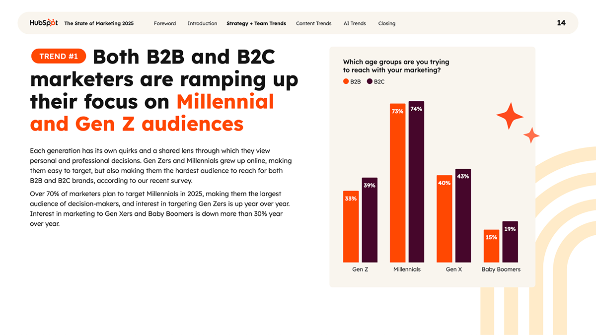
Industry: Marketing Technology
HubSpot surveys thousands of marketers annually to understand industry trends, challenges, and strategies. Their 2025 report shares data-driven growth tactics and emerging trends that guide marketers in an AI-first business landscape.
The first trend, as visualized below using generational demographic groups, is that both B2B and B2C marketers are ramping up their focus on Millennial and Gen Z audiences. The bar chart displays four different age groups labeled as generations: Gen Z, Millennials, Gen X and Baby Boomers.
Each generation has two bars, one for B2B and the other for B2B. As you can see, the generation most targeted by respondents is Millennials.
By viewing this simple bar chart that displays the relationship between age demographics and firmographics, the reader can understand the data that was collected for the report.
When using simple demographic data sets, a bar chart is usually the best option. The slide from a complete data presentation slide deck can help you compare metrics across demographic segments. Easily customize the categories to show your specific breakdowns.
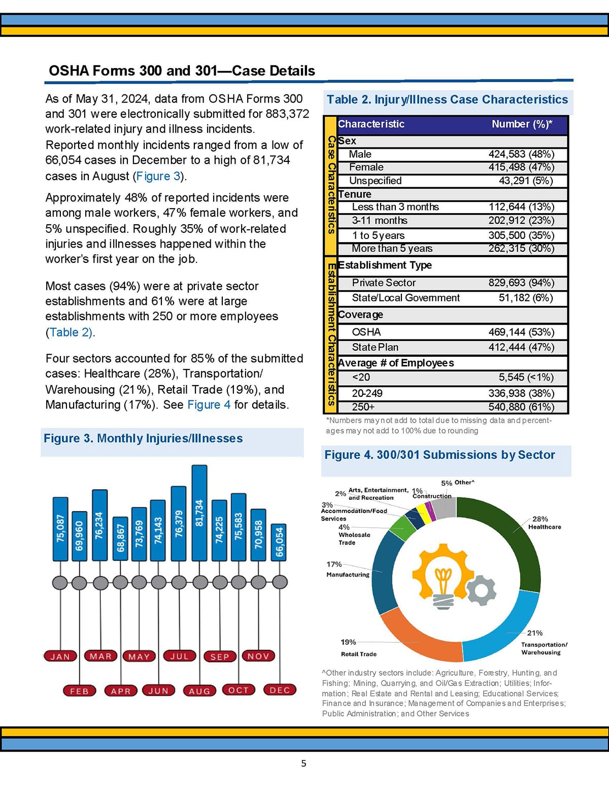
Industry: Workplace Safety & Healthcare
OSHA’s annual injury reports break down and analyze workplace accidents using many factors. Some of these are demographic. In the screenshot above, you can see how they use gender data, along with work tenure, establishment type, insurance coverage and number of employees, to quantify the number of injuries per case.
The data is displayed in a table with design characteristics that make reading different sections easier. Additionally, there is a vertical yellow bar that separates all the data into two groups: by case and by establishment. These two groups are demographic and firmographic.
These demographic and firmographic breakdowns help businesses identify which employee groups need additional safety training.
If you’re analyzing risk, incidents or outcomes, using a table will help segment the data into relevant demographics. The table template below, for example, will help you list out the numeric data for each sector in your analysis.
Use Visme AI to get you started quickly. Have a conversation with the AI chatbot and ask it to generate a document or presentation. Make sure to include in the prompt that you want a table where you’ll enter demographic data.
Another way to do it is to use Visme’s pre-filled tables and add one to an existing project.
Made with Visme Infographic Maker
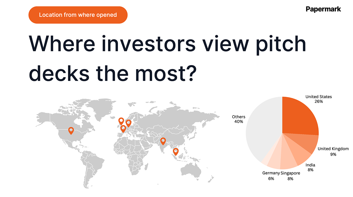
Industry: SaaS & Venture Capital
Papermark analyzed thousands of pitch decks to reveal metrics about the ideas that actually get funded. They segment data by company stage (pre-seed, seed, Series A), location (US, Europe, Asia) and industry vertical.
In the slide I shared above, they used a map and a pie chart to highlight where investors view pitch decks most. The pie chart showcases the numerical data, while the map visualizes the actual locations with pinpoints.
Founders can use this demographic data about pitch decks to create their own pitch decks accordingly. The information on this slide and in the rest of the deck can support and guide all decisions, not only for the pitch deck but also for the business plan itself.
When benchmarking demographic data for your reports and analysis documents, you want to use the best data visualizations.
For location data, maps are always great, but when accompanied by other charts, they can help readers better understand the information. This template combines a map with a text legend and big number data widgets.
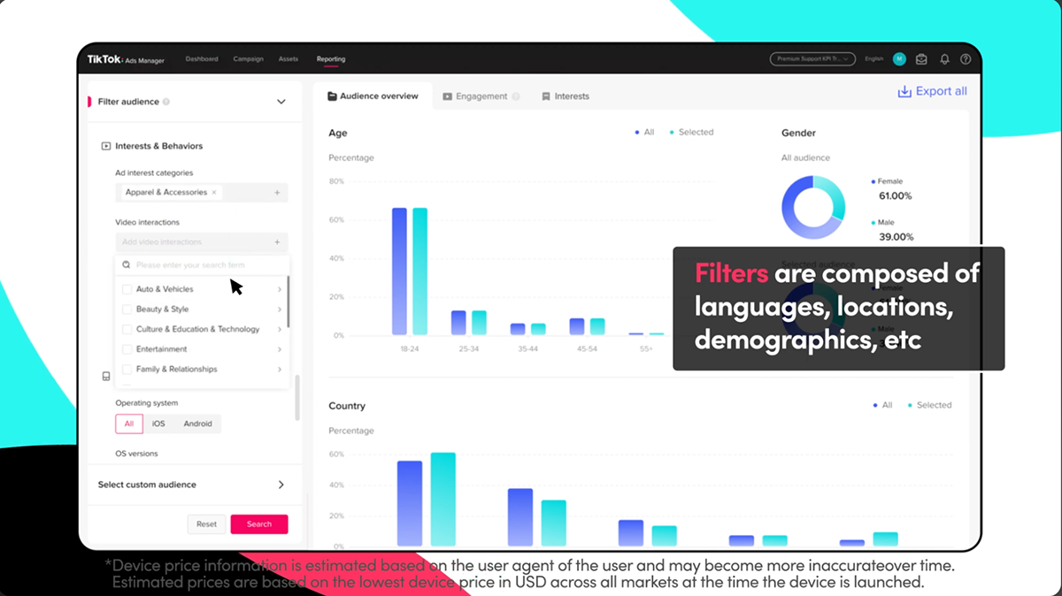
Industry: Social Media Marketing
TikTok’s business dashboard provides demographic breakdowns of who watches specific content categories. Brands can see how some hashtags reach women aged 25-34 in urban areas, while others skew towards men aged 35-44 in suburban locations.
All CRM and social media platforms offer this type of dashboard for their clients. They provide valuable data to analyze current strategies and future brand messaging, campaign ideation and visual design.
Real-time demographic data enables brands to adjust their content strategy immediately. If you’re trying to reach Gen Z but your analytics show 40+ as your primary audience, you know your content or hashtags need revision. An ongoing demographic feedback loop will help accelerate optimization efforts for entire marketing teams.
Aside from the dashboards available in your business platforms, you can also create marketing and executive dashboards with Visme’s whiteboard.
By combining different types of data visualization, data widgets and text, your team can track specifically what they need to know. This template will help you get started.
Don’t forget to connect your live data from Google Sheets or Google Analytics; this way, the dashboard will update automatically to keep the data on track. And don’t forget that when you share Visme projects as live links or embedded into your website, you can also gather view data with Visme’s analytics feature.
If you’d like to learn how to connect live data to your dashboards and other data visualization first projects, this video explains how to do it.
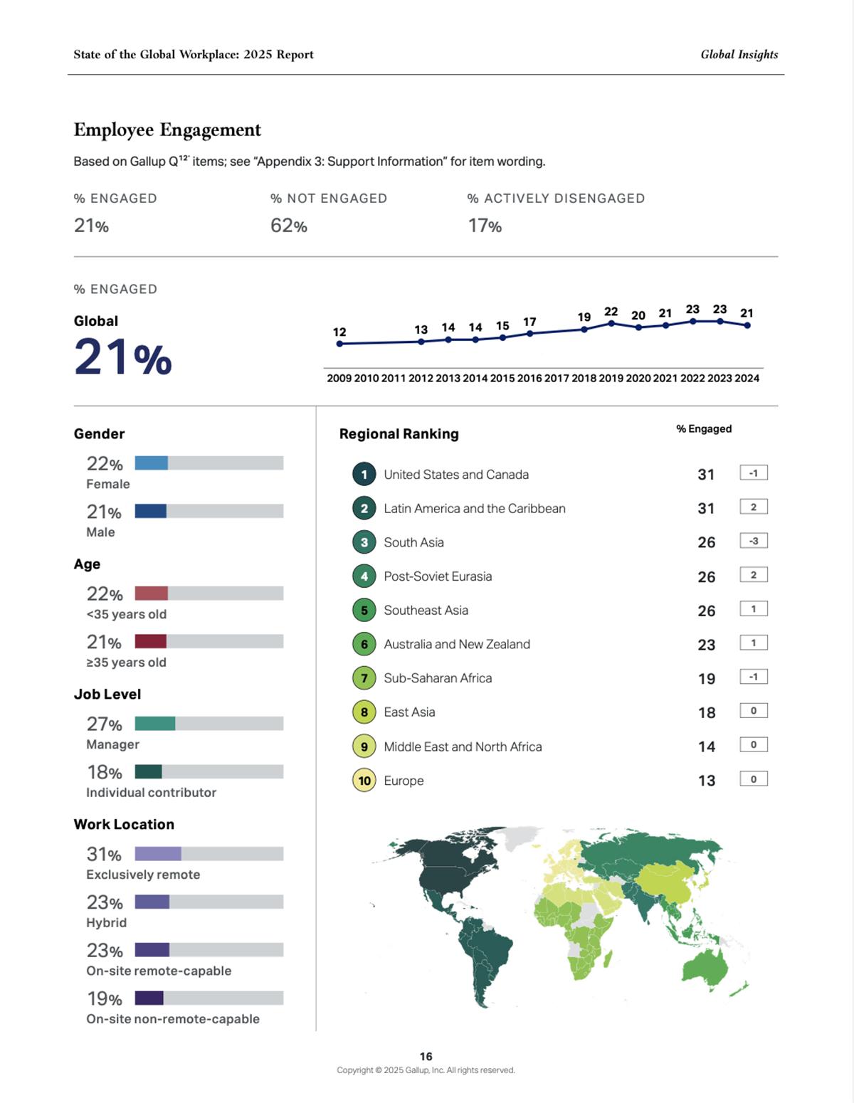
Industry: Human Resources & Employee Engagement
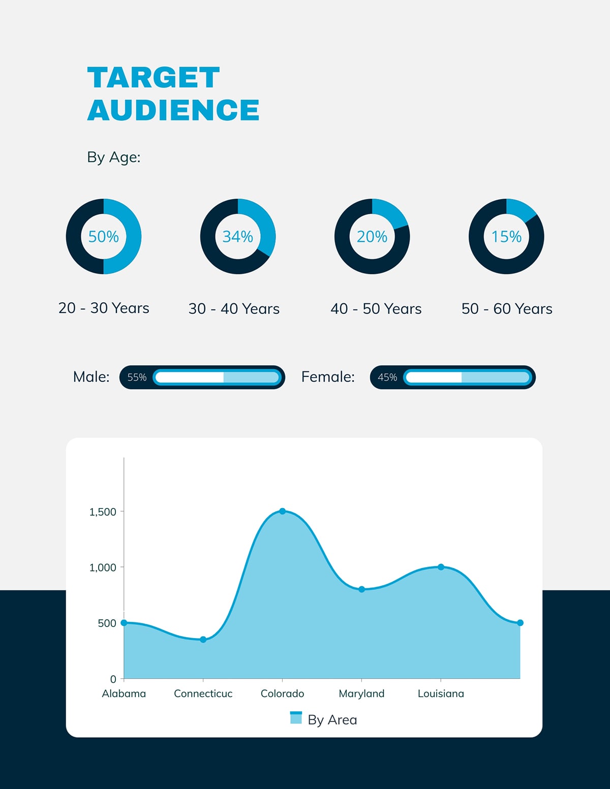
Gallup’s workforce report reveals that employee engagement varies dramatically by age group and region. Younger workers (18-34) in North America have 32% engagement, while workers 50+ in the same area have 41%. European workers report different stressors than Asian workers.
The visualizations on this report page include a map, a line chart, percentage widgets, and large numbers for the largest data sets. Together, they visualize demographic data on work engagement by age, gender, job level, work location, region, and time.
HR leaders can use this demographic data to tailor retention strategies within their companies. For example, a tech company with primarily millennial employees needs different engagement programs than a manufacturing company with an aging workforce. Geographic differences can also inform global companies’ regional HR policies.
This type of analysis report can give actionable insights into many aspects of business. In extensive reports, sections can be broken down by any type of demographic data.
In other cases, the data can be used to create an infographic for marketing or HR with a template like the one below.
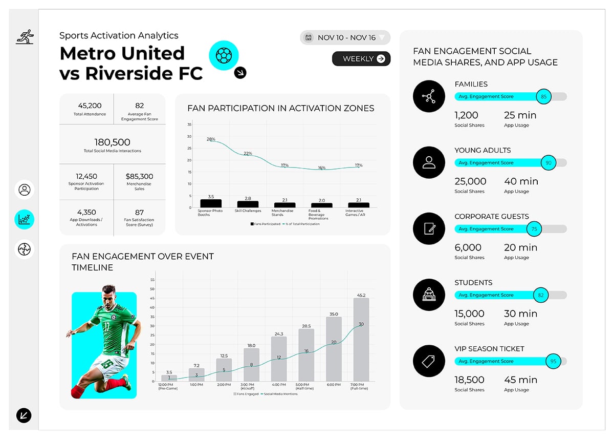
Industry: Sports Marketing & Media
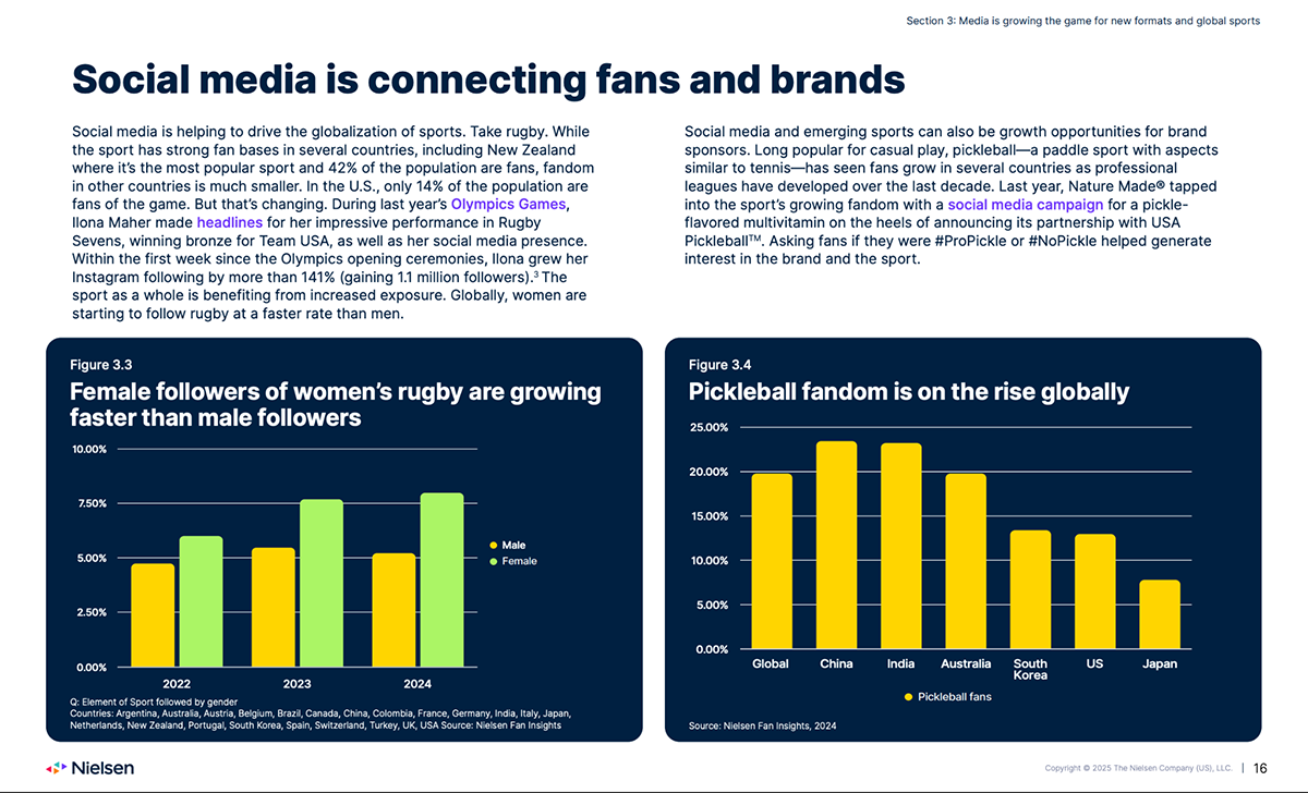
Source
Nielsen's sports report reveals major demographic shifts in how audiences consume sports content, from social media to television advertising. The slide above shows two bar charts about how female followers of women’s rugby are growing faster than male followers and pickleball fandom is on the rise globally.
Sports leagues and sponsors use these demographics to reshape programming and advertising strategies. For instance, the shift to digital among younger viewers pushes leagues to enhance mobile streaming experiences and social content.
Media consumption patterns vary dramatically by age and gender. So, don't assume your audience engages with content the same way they did five years ago. Track demographic shifts in viewing habits and adjust your content distribution accordingly.
Browse through Visme's best data visualizations for inspiration on presenting complex demographic trends.
For example, the Greater Memphis Chamber won an award using Visme for their demographic and economic data reports; proof that well-designed demographic visualizations make real impact.
Mackenzie Stonis, from GMC, stated, “Visme makes the experience of creating a beautiful document easy and stress-free for somebody who's not a graphic designer. After all, my background is in numbers and economics, and Visme is so instrumental in easily merging these two areas together for me,”
You can create your own demographic visualization with a Visme template like the one below that includes a map with colored regions and a legend depicting percentages.
Industry: Global health and policies
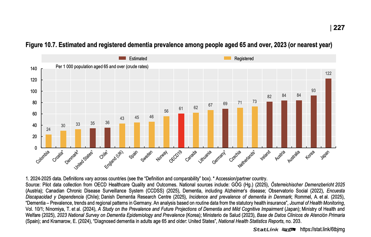
Every year, the Organisation for Economic Co-operation and Development (OECD) publishes a report on global health. Across the pages in this document, the OECD shares health trends like how diseases affect men and women differently, health status updates for several illnesses, analysis on health insurance coverage and more. The majority of the charts in this report include demographic data like gender, age and location.
The image above highlights an estimated and registered number of people with dementia aged 65 and over. Each bar is a region of the world and the colors represent brown for the estimated values and yellow for the registered values.
Something interesting that the data visualization designers did here is organize the bars by size from smallest to largest. This characteristic makes the bar graph easier and faster to read. Likewise, the contrasting colors comply with accessibility standards for visual layouts.
Finally, all sources are included beneath the chart, supplying analysts with all the information they need to look further into the data.
When sharing large demographic data sets with a bar chart, you’ll typically need an explanatory text section. This can help you offer more valuable information to the reader and share your data sources. The Visme template below includes a bar chart on the right and a text box on the left.
To make it even more valuable, share deeper insights or further documentation with pop-up hotspots or hyperlinks. As you add these interactive elements, ensure that they don’t interfere with your chart but are also easy to access. You can achieve that by toggling the visual pinpoint in the hotspot settings.
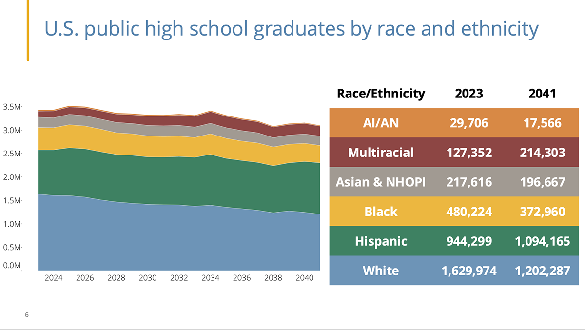
Industry: High School and Higher Education
For 45 years, the Knocking at the College Door Report has shared demographic projections and trends on students' progression from high school to college. The data is segmented by state, ethnicity and socioeconomic status. The report includes many datasets and a variety of graphs for educational institutions to read and analyze.
The visual above highlights US public high school graduates by race and ethnicity. To ensure comprehension, they include two visualizations, an area chart and a color-coded table.
It isn’t for nothing that this report has been a standard for forty-five years. It provides valuable insights that help schools and universities better understand their students. This, in turn, supports data-driven recruitment decisions.
Open up the full report in the link above and notice how, aside from the charts being large and easy to read, they’re also aligned with a single visual style. You can do this as well when creating demographic reports in Visme. The template below includes an area chart like the example above, and all you need to make it match your brand is use the Brand Kit settings to change the color theme.
If you haven’t set up a brand kit yet, you can do so in a few minutes with Visme’s Brand Wizard. Simply input your URL or brand assets manually and the system will build the brand kit for you.
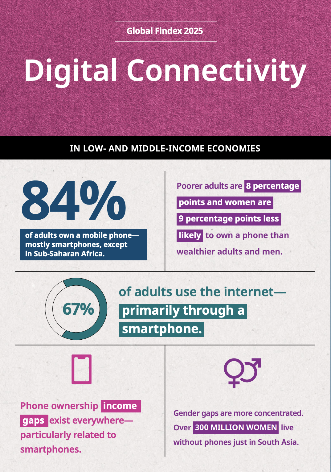
Industry: Financial Inclusion and Technology
The Global Findex Database, published by the World Bank, presents survey results on financial inclusion research. It’s a leading source of data on how adults worldwide access and use financial services.
Here, I share a page on digital connectivity in low and middle-income economies. The data reveals that 84% of adults own a mobile phone–mostly smartphones.
Financial institutions use this demographic data to identify their markets. If data shows that women in specific regions lack access to banking, microfinance initiatives and mobile banking solutions can target that demographic.
The big difference between this layout and the rest of the pages is that the data is explained textually. The goal here is to provide an overview of what will be covered in the rest of the pages of that section. By doing it more visually than a bar graph or line chart would, the reader can get a good idea of what’s coming.
The Visme template below is a statistical infographic that follows the same principle. Data sets are laid out into separate frames, each showcasing an important fact. This design could work as a section opened in a report, just like the example from the Findex document.
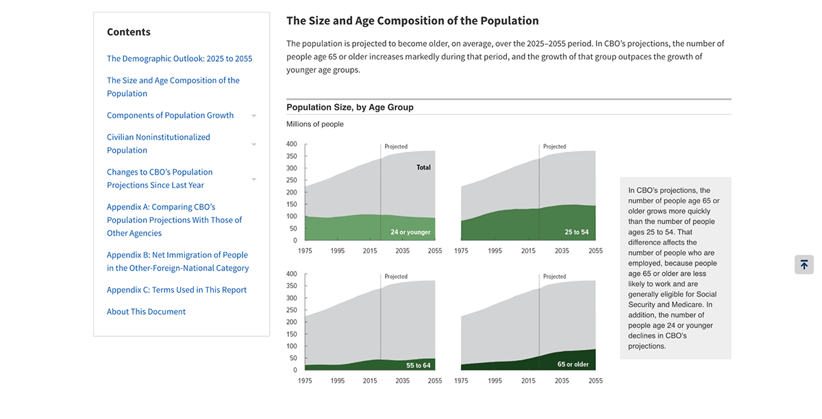
Industry: Government Policy & Economic Planning
Source:
The publication from which I extracted this page comes from the Congressional Budget Office, which projects demographic changes in the US over the next 30 years. The report shows that the 65+ population will grow while the working-age population will shrink. Immigration patterns will also significantly impact workforce size projections.
Long-term demographic projects like this inform policy decisions on social security, healthcare spending and labor force planning. Businesses use these projections for succession planning and product portfolio adjustments. An aging population needs different products and services than a younger one.
As a business, you can reuse this type of data to include in your forecasting and projection presentations. Align your own demographic data with expert insights and help your stakeholders see how you plan to build marketing strategies with a vision for the future.
Below is a page from a Visme report template you can use to visualize forecast demographic data that will drive your business decisions. It’s a table and two bar graphs, all color-matched and ready to customize.
Demographic data only delivers value when you collect it strategically and use it correctly.
Here’s how to avoid common pitfalls.
Every additional survey question increases abandonment rates. People don't want to answer 20 questions when eight would suffice.
Anna Gliwinska, marketing researcher at Visme, emphasizes that much demographic data already exists in your systems: "Some demographic reports are already provided in your CRM or Google Analytics 4. For example, active users by gender, age, country, city and language."
So, before creating surveys, audit what you already know. Only collect data that's both unknown and actionable.
Victoria Taylor, Visme’s marketing content manager, adds:
"Most people don't love filling out surveys, so be strategic about what you ask. Every extra question is a tiny chance a survey taker bails, so if it's not useful, cut it."
"Start with the basics and then earn the right to go deeper. Ask only for information that directly helps you make better decisions, not just because it's 'nice to have.' Keep questions simple, avoid anything that feels invasive too early, and make answers easy (dropdowns and ranges beat essays). People give better data when they don't feel interrogated." says Victoria.
Use Visme's interactive forms with conditional logic to ask follow-up questions only when relevant. This reduces form length while gathering detailed data from those willing to share.

You've identified your target demographics but your ad campaigns still underperform. That’s because wrong demographic assumptions drain your budget fast.
Never rely on intuition alone.
As Anna Glivinska recommends: "Always A/B test your ads based on available audience segments. Do not just throw in everything into one of them because you have limited deadlines."
She emphasizes that across all platforms—Meta, LinkedIn, or others—small, fast experiments are essential:
"It's always worth running small tests at least for 24 hours before scaling up, and check your analytics often. Break down your segments according to your business audience and act on that. Do not be afraid to cut 'too much' and always focus on countries where your company has had more revenue and users historically."
Start with three demographic hypotheses. Run parallel campaigns targeting each. After 48 hours, review performance metrics and reallocate budget to winners. Use Visme's analytics feature to track which demographic segments engage most with your shared content.
Teams default to demographic segmentation without questioning whether it actually reveals meaningful insights. Sometimes it’s not demographics they need, but psychographics instead.
Olya Zaplatynska, Visme’s product marketing manager, warns:
"One of the biggest mistakes in using demographic data in reports is treating it as a default 'must-have' just because textbooks and old frameworks say so. Teams slice results by age or gender on autopilot, even when it adds nothing to understanding the real story: users' pains, motivations, and what actually makes a solution work for them."
Of course, there are cases where demographics are truly important. Here’s what Olya recommends.
"In those projects where demographics are genuinely critical—think age-specific products or tightly geo-targeted services—you then have the opposite risk: trusting polluted data from fake accounts and bots. If demographic data is going to drive real decisions, you need to double- and triple-check that it's real."
Before adding demographic breakdowns to your report, ask: "Will knowing this person's age, gender, or location actually change our decision?" If the answer is no, skip it. Focus your analysis on psychographic data like behavior, pain points, and outcomes instead.
For projects where demographics genuinely matter, verify your data sources. Cross-reference multiple data points, watch for suspicious patterns (like clusters of identical profiles) or use platform verification tools.
Marketer Tips on LinkedIn shared a valuable post covering this exact issue. In the graphic, they prove that two very different people can share the same demographics.
You have demographic data but aren't sure how to use it for account-based marketing personalization.
Demandbase's ABM ebook warns that: "Applying broad strokes to penetrate an indiscriminate set of buyers might be quick and easy. But you'd be expending resources on people who aren't in-market to buy and aren't qualified to buy what you have to offer."
In other words, ABM fails when you rely on broad demographic assumptions instead of building precise, validated ICPs.
Before launching ABM campaigns, use demographic data to create 2-3 detailed ICPs. Unenabasi Ekeruke, marketing expert at Visme, explains in his article about creating ICPs:
"It's important to figure out what type of ICP-related information will be valuable to your sales and marketing teams. For example, knowing the industry, budget, revenue and company size are great intel. But data such as age, interests, or hobbies might not help. Defining the result ahead of time will keep you on track. Plus, it prevents you from wasting resources on factors that have no bearing on your sales ICP."
Build ICPs using the UX Designer Customer Persona template. Include only demographics that influence purchasing decisions: company size, industry, revenue, decision-making authority, and budget control.
Then use Visme's collaboration features to align your sales and marketing teams around these ICPs. When everyone targets the same demographic profiles, your ABM campaigns gain consistency and power.
Age is a standard demographic example. Other examples include gender, income level, education level, occupation, marital status, family size, ethnicity and geographic location.
In marketing, a demographic segment might be “women aged 25-34 with bachelor’s degrees, living in urban areas, earning $60K-$80K annually.”
The five primary demographics are age, gender, income, location and education. These five categories provide the foundation for most marketing segmentation strategies. Many businesses add a sixth category, occupation. They do so to better understand their audience’s professional context and purchasing authority.
Demographics are statistical data describing population characteristics. Therefore, you can describe demographics by stating the specific categories and values that define a specific segment of the population.
For example, “Our target demographic includes adults aged 35-50, living in suburban areas, with household incomes above $100,000, holding college degrees and working in professional occupations.”
Summarize demographic data by highlighting the most relevant characteristics for your specific purpose. Start with the largest or most important segment, then note significant patterns or differences between segments.
To visualize the data, use percentages and specific numbers. For example, “Our audience is 62% female, predominantly aged 25-44, with 73% holding college degrees and 45% of them earning over $75K annually.”
You've seen how HubSpot segments industry reports, how OSHA identifies safety patterns, and how Nielsen tracks shifting viewership. The common thread? They all present demographic data in ways that make decisions obvious.
That's the difference between demographic data that sits in spreadsheets and demographic insights that drive action. Remember Victoria Taylor's warning from earlier; demographics aren't always the answer. But when they are? The visualization matters as much as the data itself.
The 10 examples in this guide show you what's possible. Some needed simple bar charts. Others required interactive maps or multi-metric dashboards. The format always matched the insight.
If you're ready to turn your demographic data into something stakeholders actually use, Visme's data visualization tools help you present it clearly. Import your data, choose from several chart types designed for demographic presentations, and customize until it tells your story.
Design visual brand experiences for your business whether you are a seasoned designer or a total novice.
Try Visme for free