


The Best Beautiful.ai Alternatives to Create AI-Powered Presentations

In a sea of pitch decks, investors are always on the lookout for the competition slide. They uncover more about the competitive landscape and how you stack up against other key players in the industry.
Beyond showcasing your unique differentiators, the competition slide reflects your thought process regarding competitive advantage, market opportunities and business maturity. And showing the investors that you know the market and have done the research to position your company with purpose will make the difference between a passed-on pitch and an interested investor.
In this guide, we review what the competition slide is, what its purpose and benefits are, some real-life examples and 12 competition slide template types to help you and your pitch deck succeed.
Ready to create one right away? Head over to our presentation software and put together compelling slide decks in minutes. Use ready-to-go pitch deck templates from our library, add your branding, design assets and more.
The competition slide in a pitch deck is the one that highlights the company’s competitive landscape and unique differentiators. For a competition slide to exist, you must conduct a comprehensive competitive analysis of direct and indirect competitors. The results of a competitive analysis help you craft your unique value proposition and differentiating attributes.
Additionally, the analysis data is the foundation for the competition visualization slide. Data visualization for competition slides is typically a magic matrix, a comparison table, or another creative approach.
During a pitch meeting with investors, the presenter can start a conversation about this slide, focusing on the unique value proposition. For presentations sent as emails, the visual needs enough context to understand the competitive advantages at a glance.
Every good pitch deck structure includes a competition slide. Its primary purpose is to give investors an accurate overview of your competitive analysis and how your company stacks up against the other names in the market.
Essentially, the competition slide pinpoints your competitive positioning and competitive advantage.
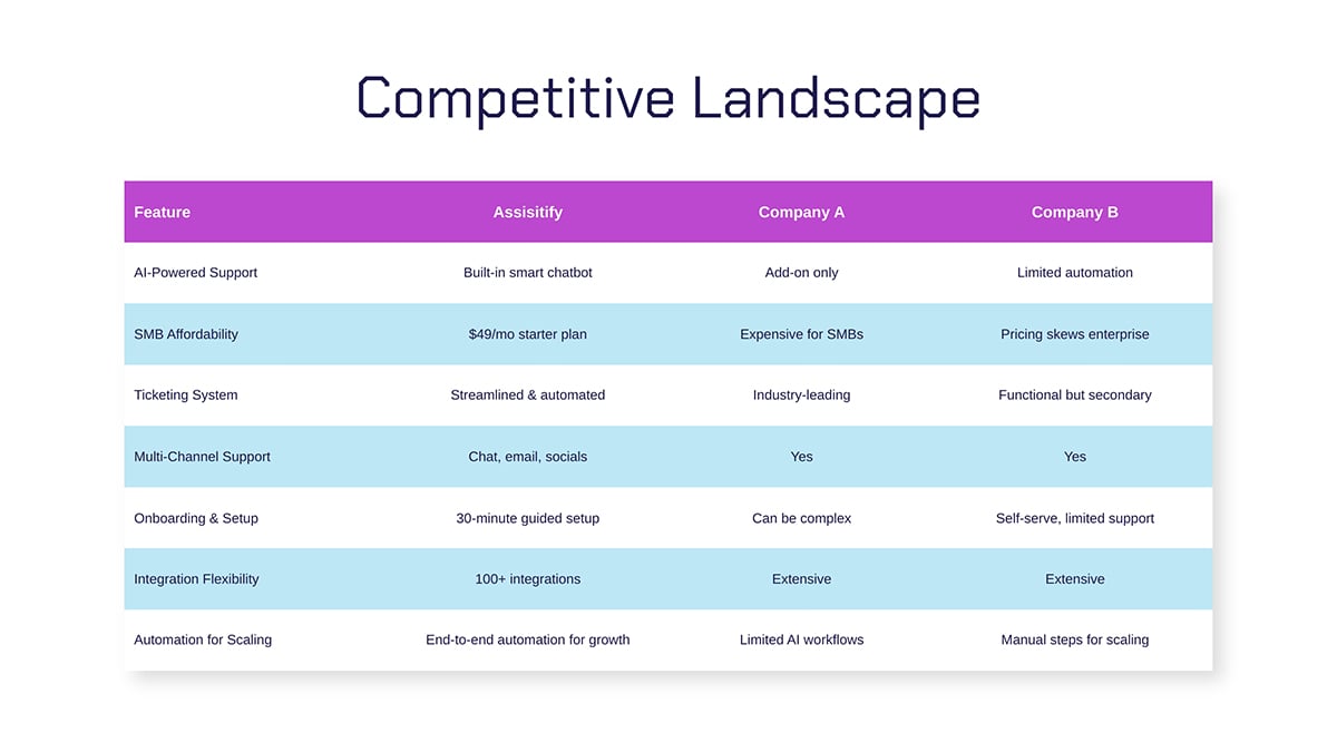
This competition slide in the pitch deck shows how Assistify compares to two of its main competitors across seven key features. The quick visual comparison instantly makes its strengths and differentiators crystal clear to investors.
Another purpose of this slide is to prove to investors that there’s, in fact, a market for your idea and that people are willing to pay for it. The competition slide and the conversation must show that you understand the need and have analyzed all aspects of how competitors do business, leading to your unique differentiation and value proposition.
An investor-approved competition slide should be more than just a list of logos or brands.
It should tell a story that’s based on facts and solid data and strong enough to withstand questions from investors.
Here’s what to include to make yours stand out:
Made with Visme Infographic Maker
As Rodrigo SEPÚLVEDA SCHULZ, a senior technology executive with global experience as a CEO, advises in his medium article:
“Beware of all the Gartner-type quadrants where startups always end up top right: this brings no information whatsoever, nor do tables with a list of features. Remember you are also competing over time, and cash is king”
A well-designed and well-informed competition slide has numerous benefits in a pitch deck. Here are a few of them:
There are two main types of competition slides: the matrix and the table.
However, some companies get creative with their competition slide and utilize unique ways to highlight their competitive advantage and market positioning.
In this section, we show you five real-life examples from brand pitch decks in various industries.
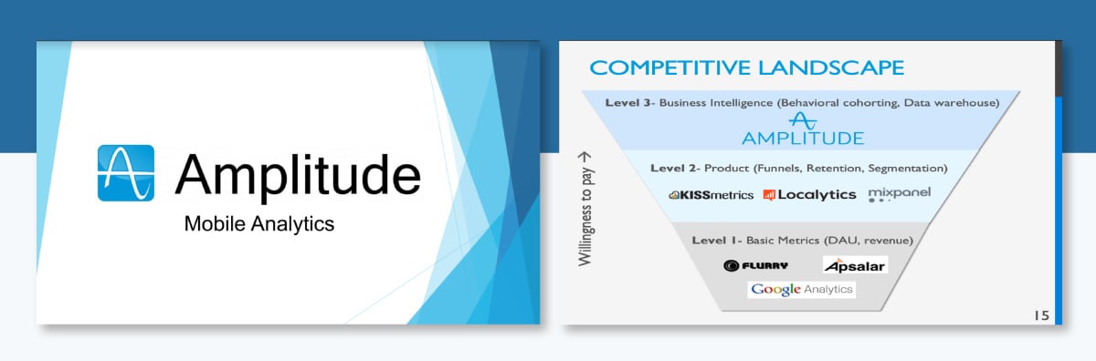
This competition slide from Amplitude’s pitch deck uses an inverted funnel to visualize its position in the analytics landscape. It’s a clever way to show not just who the competitors are, but also how much value and willingness to pay each level represents.
At the base, Level 1 (Basic Metrics) includes tools like Flurry, Apsalar, and Google Analytics, which focus on simple metrics such as daily active users (DAU) and revenue tracking.
Then in Level 2 (Product Analytics), Amplitude places competitors like KISSmetrics, Localytics, and Mixpanel, which go deeper into funnels, retention and segmentation.
Finally, Level 3 (Business Intelligence) represents the top of the funnel, where you find tools that handle more advanced use cases like behavioral cohorting and data warehousing. This is where Amplitude positions itself, blending easy-to-use product analytics with the powerful capabilities of business intelligence.
The visual shows that Amplitude sits above the noise, offering deeper insight and higher value than traditional analytics tools.
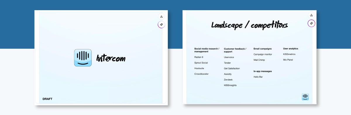
This competition slide from Intercom’s early pitch deck uses a simple yet effective categorized layout to map the company’s competitive environment. Rather than relying on visuals or graphics, it organizes key players into five clear segments based on their primary function:
By slotting competitors into these categories, Intercom really shows how scattered customer communication tools were back then, with different apps focusing on analytics, support and engagement individually.
The slide deck shows that Intercom pulls all these features together into one platform, making it easier for businesses to manage their customer conversations in one spot.
Here’s a pitch deck template inspired by Intercom to get you started.
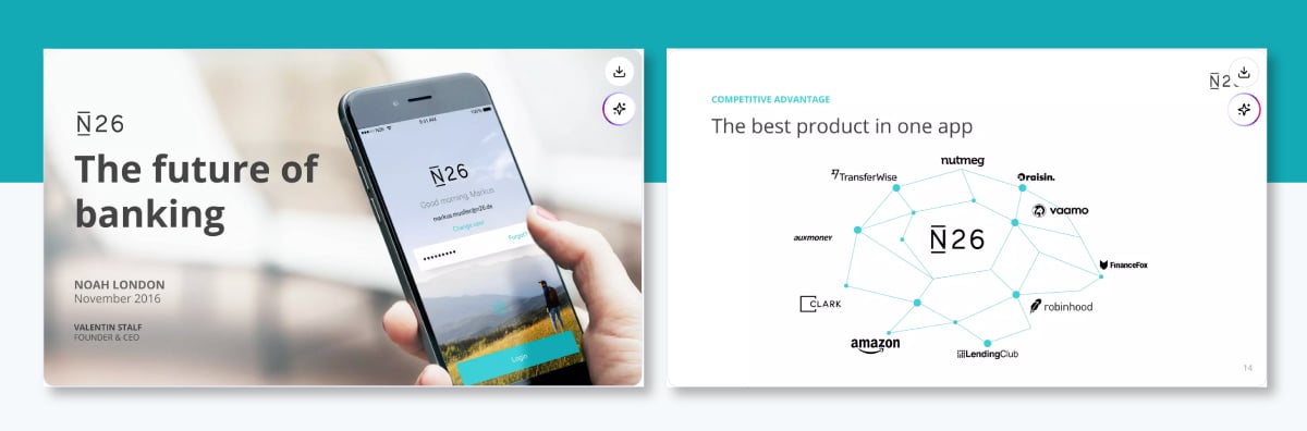
This competition slide from N26’s pitch deck takes a really bold and unique approach. Instead of just throwing features into a boring table, N26 puts itself in the middle of a connected web, showing how its app combines the best stuff from all the major fintech players around it.
Brands like Robinhood, TransferWise, Nutmeg, Raisin, Amazon, and LendingClub are all nearby, each representing a different financial service, like investing, saving, and lending. This slide communicates that N26 pulls all the features offered by competing tools together in one app.
It’s a confident way to present the brand as a complete financial ecosystem, not just another digital bank.
But there’s also a bit of a challenge here. If you’re saying you can do it all, you’d better have the data and product experience to back it up.
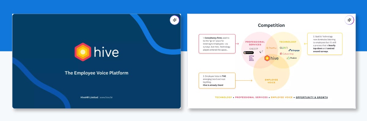
This competition slide from Hive’s pitch deck uses a three-circle Venn diagram to show how the company uniquely positions itself in the market. Each circle represents a different segment:
Hive sits right at the intersection of all three. It combines the analytical rigor of consultancy firms, the scalability of technology, and the authenticity of employee voice. At the bottom, the slide sums up Hive’s positioning perfectly: Technology + Professional Services × Employee Voice = Opportunity & Growth.
It’s a simple yet powerful way to communicate why Hive exists and where its biggest opportunity lies. The company bridges the gap between traditional survey models and modern, ongoing employee engagement.
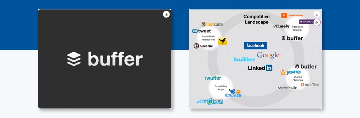
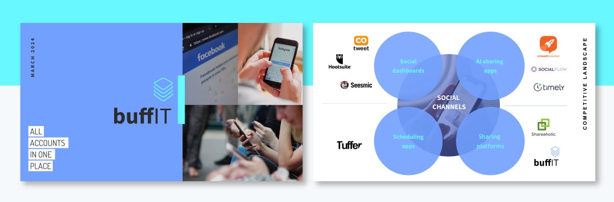
Our last example is the competition slide from the pitch that helped Buffer raise half a million dollars. At the center of the slide, you’ll see the major social media platforms — Facebook, Twitter, LinkedIn, and Google+. These represent the core ecosystem where Buffer operates. Surrounding them in a circular layout are Buffer’s competitors, grouped into four clear categories based on their primary focus:
Buffer sorted its competitors in a way that made it easy to see where it stands in the market. (between basic scheduling tools and high-end analytics platforms). By focusing on easy, smart social sharing, they’ve carved out a niche as the go-to option for users seeking a smart, user-friendly alternative to both extremes.
If you’d like to replicate Buffer’s competitor slide design, here’s a professionally designed template to get you started.

Now, let’s walk you through how to build a competition slide that wows and instantly positions your startup as a strong contender.
I'll show you smart ways to tell your story and make your slide deck design pop.
The first logical step in figuring out your competitive moat is conducting a competitive analysis.
If you’ve ever put together a business plan or a go-to-market strategy, you’ve likely tackled this in some form. But for your competition slide, it's a good idea to sharpen your focus and think like an investor.
To jog your memory, start by collecting data on your industry, key players, and customer expectations. Study both:
Look for patterns in their pricing models, target markets, features, and growth strategies. Identify where they excel, where they fall short, and how your company fills the gap.
Pro Tip: Use credible tools like Crunchbase, G2, or SimilarWeb to gather accurate data and cross-check your insights before presenting them to investors.
Investor and author David Tønder Ventzel, GP at Accelerace and author of The Insightful Startup, also highlights a step many founders skip: talking directly to customers:
“Founders must talk to customers and identify what they find important. They must ask them to rank those attributes. And founders must ask customers to help score the different competing solutions on these attributes.”
Listening to your target audience will reveal insights no market report can, and that’s exactly the kind of understanding investors look for.
We’ll keep this section brief, but if you’re looking for a deeper dive into this process along with step-by-step instructions and templates, check out our complete guide: How to Perform a Competitor Analysis (Examples & Templates)
Once you’ve done your research, it’s time to narrow things down.
The reality is that not every competitor needs to be on your slide, and trying to include everyone can make your presentation look messy.
Go over the names and data you’ve gathered, then pick out the 3–6 competitors that are the most important for investors to know about. Focus on the companies that are either your closest competition or show the biggest gap that your business can fill.
Here’s a simple way to filter them:
This approach helps investors visualize your positioning instantly without bogging them with too much information.
Pro Tip: If you're an early-stage startup, it's a good idea to include at least one big, established competitor. It helps investors understand the market better and shows that you know what you’re getting into.
After you've figured out who your competitors are, it’s time to choose which attributes you'll compare between them.
Investor and three-time founder Chris Howard put it best in a LinkedIn post:
“When it comes to competitor slides, the goal of that slide is to demonstrate where you compete. However, the mistake founders make is that they choose that slide to, inadvertently, describe what the founders believe is more important. These are not the same points. What a founder believes is more important does not always align with what the market finds more compelling.”
In other words, focus on the factors that matter most to investors and customers, not just to you.
Highlight what truly shows where your product stands out and what makes it worth investing in. Look at practical, measurable factors like:
The list is exhaustive, but that doesn’t mean you have to list all of them. Stick to about three to five attributes that make your brand shine. Focus on the factors that relate to your unique selling point. And make sure these are things you can back up with real data, not vague ideas like “better quality” or “great UX.”
Once you’ve outlined what to compare, the next step is defining what gives you the edge.
This is why investors should trust that you’ll succeed in your market.
Your competitive edge is all about what your company does better, faster, cheaper, or smarter than the rest.
Think about questions like:
Rodrigo SEPÚLVEDA SCHULZ also recommends asking questions like
“Before you came up with your solution, how did the market deal with the problem? Why is your solution better than theirs? (VCs tend to like a 10x better solution). Is your approach defendable over time (say 5–10 years), meaning do you have a moat?”
Try to condense your answers into one clear and compelling statement that highlights your edge. For example: “We help small businesses get access to enterprise-level data tools at a fraction of the cost.” Or “Our AI engine personalizes content in real time, boosting engagement by 60%.”
Make sure it’s specific and measurable. If you have any traction, customer testimonials, or results that back up your claim, this is the perfect spot to highlight them.
When presenting your competitive advantage, avoid exaggerating your strengths. As Deck Doctors and Hustle Fund VC advise:
“Be careful about making too strong of a claim. It’s clear that your competitors are doing certain things right. Show how you can capture something small and grow to something larger.”
After defining your competitive edge, the next step is deciding how to visualize it. The right format should make your positioning easy to understand at a glance and support the story you’re telling.
When choosing, think about your goal:
Just make sure to avoid visuals that are too crowded or that make your position seem overinflated: investors can pick up on that right away.
There’s a more detailed breakdown of these formats in the next section, along with a handy visual table that compares them side by side to help you choose the best one for your pitch and audience.
Creating a competition slide from scratch can be surprisingly time-consuming. You’ll need to design grids or tables, align logos, choose colors, and make sure everything looks balanced. And that’s before you even start adding your data.
For most founders, that design process eats up valuable time that’s better spent refining content or practicing the pitch.
Tools like Visme make this process effortless. You can choose from ready-made pitch deck templates that already include competition slide layouts, comparison tables and quadrant charts.
Running out of time or need design inspiration? Skip the blank page and create a complete pitch deck with our AI pitch deck generator. Once your first draft is ready, all you need to do is swap in your data and tweak it with your brand's colors, fonts and logo.
With Visme’s brand kit, you don’t need to set this up every time you open a new project. When you add in your URL, the AI-powered Brand Design Tool will automatically pull in your design assets and save them in your brand area for future use.
And if you’re collaborating with a co-founder or designer, Visme’s built-in real-time collaboration and workflow management tools make it easy to share feedback and finalize your deck together.
Not convinced? Hear it from Kendra Bradley, Graphic Content Developer at WOW!
“Previously, we were using PowerPoint, which is fine, but the interactivity you can get with Visme is so much more robust that we’ve all steered away from PowerPoint.” You too can create interactive and static pitch decks with Visme.
Read the full case study here.
A competition slide only works when it’s backed by solid evidence. Investors can easily spot when you’re inflating claims, so make sure everything on your slide connects to real data.
Include credible proof points to back up your comparisons — think along the lines of:
Whenever you can, lean on publicly available data or reliable sources like Crunchbase, Statista, or G2.
If any numbers are estimates or internal projections, make sure to label them clearly so investors can see you’re being upfront.
When presenting this info, keep it simple and visual. Use easy-to-read charts, comparison icons, or quick highlights instead of long text blocks. Focus on the main takeaway so investors catch your advantage right away. If you're presenting live, share the reasoning behind each number instead of just reading them from the slide.
Add brief citations or footnotes to boost credibility without cluttering your design. Even something simple like “Source: Crunchbase” or “Data as of Q3 2025” helps build trust and shows that your analysis is based on facts.
A competition slide in a pitch deck can take many forms. While reviewing some of the best pitch decks across industries, I’ve come across simple tables, quadrant charts, visual brand overviews and many other layouts.
When designing your pitch deck, you want to choose a format that clearly communicates your market position and the different ways your product stands out.
Below, we’ve rounded up 12 proven ways to visualize your competitive landscape. But before diving into the details, here’s a quick comparison table outlining the pros, cons, and best uses for each type.
| Slide Type | Description | Pros | Cons | Best For / When to Use |
| Quadrant / Competition Matrix | Positions companies along two key variables (e.g., price vs innovation). | Simple visual snapshot; shows clear positioning. | Can appear subjective; some investors see it as oversimplified. | When you want to quickly visualize where you stand in the market. |
| Market Position | Highlights your place in the broader market landscape (e.g., luxury vs mass market). | Great for visual storytelling; useful in market analysis. | Requires context to interpret meaningfully. | When presenting overall market reach or growth potential. |
| Competition Overview | Lists direct and indirect competitors. | Provides clarity and structure to the landscape. | Not as visually striking; lacks deep comparison. | Early in your competition section to set context. |
| Competition Comparison | Compares competitors across key attributes with positive/negative markers. | Easy to scan; clear differentiation. | May oversimplify qualitative strengths. | When your differentiation is feature-based. |
| Biggest Competitor (Positives & Negatives) | Focuses on one main competitor’s strengths and weaknesses. | Tells a strong story; shows deep understanding. | Limited view of the overall market. | When there’s a clear market leader or direct rival. |
| Competitor Mention | Narrative-driven slide highlighting how you differ from key competitors. | Great for storytelling; flexible design. | Less data-focused; subjective. | During a live presentation or demo pitch. |
| Competitor Analysis Table | Detailed table showing metrics or features across competitors. | Comprehensive and data-driven. | Can feel dense or text-heavy. | When your audience values detail and data (e.g., VCs). |
| Marketing Landscape Table | Compares benefits and features using checkmarks and icons. | Visually intuitive; easy to digest. | Limited depth for complex markets. | Early-stage startups with simple feature sets. |
| Competitor Slide (Visual) | Displays competitors with logos or product images. | Highly visual and memorable. | Less analytical; limited insight. | When emphasizing brand recognition or UX differences. |
| Competitor Landscape (Minimal Table) | Clean layout comparing benefits using checks/Xs. | Modern and easy to skim. | Works best for few competitors. | When keeping visuals minimal and sleek. |
| Competitor Comparison Table (Stylized) | Adds visual flair to the comparison (angled lines, animation). | Engaging and dynamic; stands out. | Risk of over-designing. | When presenting live or in interactive formats. |
| Competitor Categories | Groups competitors into categories or market segments. | Great for complex markets; visually clean. | High-level; lacks detailed comparison. | When covering multiple industries or verticals. |
The competition matrix is based on the concept of the magic quadrant, a chart with four areas of different values according to two attributes. In the example template above, the attributes are affordability (visualized as inexpensive and costly) and type of transaction (online or offline).
When choosing the attributes to measure, use a characteristic or attribute of your company that you know will rise above the rest. Use the value proposition to deduce the attributes to measure and compare. In this case, the value proposition is “ an inexpensive and online accommodation booking option for travelers.”
In a competition matrix, always place your company on the top right-hand quadrant above and to the right of all the competitors. This is the privileged spot on the matrix and from here you can create narratives for investors. The opposite quadrant on the Matrix is typically occupied by indirect competitors with big names in the market. Including these competitors gives investors an idea of the quality and reach of the market you’ve assessed as your competition.
Opinions on using this slide type are mixed, though. Some presentation strategists argue that a competition matrix is useful because it gives investors a quick visual snapshot of where you stand and what sets you apart. It can help tell your story, especially if there's a clear gap in the market.
On the flip side, some people think it can seem subjective—lots of startups end up placing themselves in that top-right corner without solid backing. If it looks like just a visual boast, it can come off as lacking credibility. A few investors even say it’s unnecessary if your unique selling points are already clear elsewhere in your pitch.
The best strategy is to find a balance. Use the competition matrix if it genuinely helps tell your story, not just to puff up your position. Make sure it’s rooted in solid, measurable factors like pricing, performance, or user adoption rates. To boost your credibility, pair it with a competitor analysis table or some data visuals that support your claims.
To achieve a balanced design for your competition matrix and across your pitch deck, maintain consistency in the size of groups of elements on each slide. On this slide, resize the competitor logos to be identical in dimension. Resizing shapes is simple; click and drag on the corner of the bounding box to set the size you like. To make all logos the exact height, input the value in pixels into each logo’s setting window. Or you can use Visme's AI Resize to automatically resize it for you rather than doing it manually.
A competition slide overviews the competitive landscape. The attributes of this landscape depend on your competitive advantage and position in the market. In this competition slide example, the comparison is based on a financial attribute.
This slide is one in a set of slides sharing the results of a competitive market analysis. This visualization positions the pitching brand into the mass market denomination, competing with big names like Amazon and eBay. Another slide follows with an explanation of the unique differentiator and value proposition.
Layer circles and shapes on your slides to highlight specific content points or reading directions. Right-click on any object and select to send it back, bring it forward or move up or down one layer. For more granular control, open the objects list and organize your layers in detail. Visual cues like layering shapes help tell your story.
Competitors can be direct or indirect. Direct competitors are the ones that offer the same or very similar products or services in the same market. An indirect competitor offers a different product but can satisfy the same consumer in another way. It’s essential to highlight both on your competition slide.
This competition slide template is an introductory overview of your conversation with investors during the pitch presentation. The next ideal slide is a matrix or table highlighting how exactly your company is different but also has a market to enter or grow into.
Visually, this slide includes two icons on the right to balance out the design and invite the reader to keep flipping through the presentation pages. With a legend, each icon can represent the direct and indirect clients; direct on top and indirect at the bottom.
This template includes two icons from our extensive library of vector icons, illustrations and graphics you'll only find in Visme. Browse the galleries to find the perfect one. Place the icons from the toolbar, style one and then use the copy style function to make them all the same size and color. Finally, customize them to create a contrasting design like the one below.
Similar to the slide above, this competition slide shares an overview of competitors but goes a step further with attribute notation, referencing the same ideas as the competition matrix. In the top right quadrant, the pitching company highlights differentiating attributes with a list.
The remaining quadrants analyze three competitors according to the same three attributes. Each attribute includes a plus or minus notation to identify positive and negative characteristics in relation to the market and consumer needs.
Use the aligning feature in your editor to center the text inside the rectangles. Select the rectangle and the text together and click on align objects in the top right toolbar. Align to the center, and all selected elements will align to the first element you selected. Aligning controls help you center, left align, and equally separate elements, objects and text boxes.
When your company has one main direct competitor, it’s worth creating one competitive analysis slide just for them. Highlighting the key differentiating factors for your biggest competitor is a great way to show investors that you know the market and can fill the gaps.
This positives and negatives comparison slide includes visual icons to depict the positives and negatives of one competitor, Tuber. When selecting the attributes to include in a comparison slide like this, consider the attributes of your own company. The positives of your competitors are the risks your company has to overcome and learn from. The negatives are the gaps that your company can fill.
When presenting this slide, the attributes are so specific that it’s highly likely that investors will want to know more about your company’s unique value proposition in relation to this competitor. These conversations about competitors are critical for showing investors that you have researched the market and the competitors well enough to make these types of statements. You must be ready to answer questions and expand on your market analysis findings.
When presenting your pitch deck, use the slides as speaking points. Highlight your biggest competitors and their unique selling points on a slide, then tell your investors about them. For each competitor, use a narrative to explain how your product or company does things differently to fill a gap that competitors aren’t filling.
To make your slide attractive and worth having in a pitch deck, to begin with, stay away from bullet points over a blank background and use a creative design with a photo background, like the example below.
The competitor analysis table is the main event of the competition section in a pitch deck. It’s with this data visualization that you can prove to investors that you know the market, the competitors and their positions in it. There are two ways to create a competitor analysis table; one with attributes that competitors have or don't have and the other with specific data per competitor.
This table example has unique data per competitor, opening up the floor for conversation with the investors. They will ask and want to know how your company, brand, product or idea will differ from the others, where the gaps you plan to fill are, and if it has a chance at making money.
Creating tables with Visme is easy and intuitive. You have access to lots of pre-filled tables to get you started quickly, all with different unique designs to match your content. All you have to do is customize the colors and the fonts. To input the data, you can do it manually, but why waste time with that when you can import the data from a Google Sheet or Excel workbook?
Feature and benefit tables are highly visual representations of your company’s differentiating factors. In the table, the left column lists in order, the elements of your value proposition, the key benefits and unique features. The columns on the left start with your company and the competitors to the right are listed in order of relevance. Your column has all cells filled with checkmarks; the columns on the right are a combination of checks and Xs.
This competitor analysis slide offers a pre-filled color-coded table to compare five features across your company and two competitors. The column header colors mirror the brand colors in the slide design. For a bolder visual composition, remove the Xs altogether and show only the checkmarks. Seeing only one full column of check marks can be more impactful than a table full of icons.
Showcase your closest competitors with image highlights. A slide template like this is great as an introduction to a full competitor analysis with all competitors and comparison data. When presenting to investors, talk about your competitive advantage over your greatest competitor.
Visually, Instead of a logo or a name on a list, add an image in a circle to visualize why these are the most critical competitors. The Visme editor has thousands of stock images and videos at your fingertips. For a creative approach, use the AI image generator to create attractive visuals instead of using stock photography.
The competitor table is considered by some as the most effective visual for a competitor slide. It’s easy to skim and compare benefits between your company and its competitors.
The bold design on this slide includes a large title on the left and a minimalistic table on the right. The table design has a strong green header, no column lines and circular markers with checks and Xs.
When looking for design elements or editing features, save precious time by using the / keyboard shortcut. Simply tap / on your keyboard and a small popup will appear. You’ll find the basic design building blocks and a search bar to find whatever is needed. All without leaving the canvas.
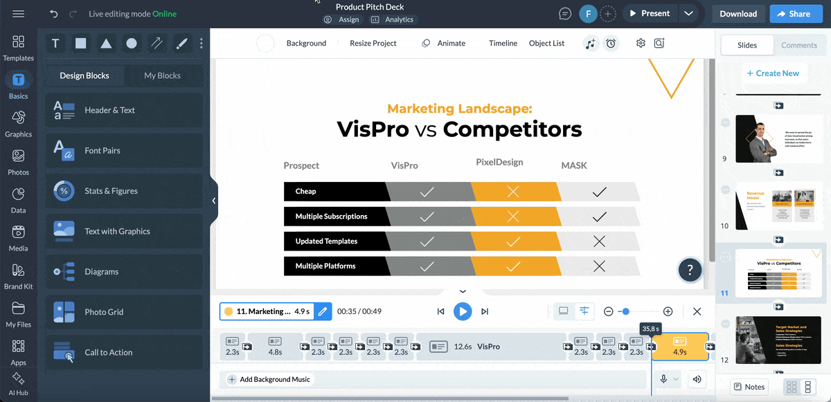
Add a bit of edge to your competitor's table with these angled column lines and contrasting colors over grayscale. Highlight the company’s prospects or characteristics. This table includes characteristics such as Cheap, Multiple Subscriptions, Updated Templates, Multiple Platforms.
When naming the prospects or characteristics for your table, list your company’s most impactful benefits. Use two or a maximum of three words to describe each benefit clearly.
You can also take it further by showcasing how your team’s expertise and results are highlighted in the team slide pitch deck, proving that your experience matches or exceeds expectations compared to competitors.
Use the integrated animation features to improve the slide’s visual story. Here’s an idea: animate the checkmarks on your column to bring attention to the benefits your company offers. Then add subtler movements to the Xs to show how much the competitors are missing.
Competitor analysis for brands in busy sectors or ones that cover several industries are typically longer than for a small startup. The complex results are reflected in the competition slides of late stage pitch decks. Some presentations require an entire section to cover different groups or categories. This template is the solution for the section cover or introduction.
Link each category blurb to the corresponding slide with the competitor matrix or benefits table. Add an interactive back-to-home button on each inside slide so the viewer or presenter can navigate back to the section cover if necessary. Otherwise, simply flip from one matrix to another.
You’re not limited to circles on a competition categories slide. Try diamonds, hexagons or slanted squares. Fit them together on the slide in creative layouts and add the category names or groups. Keep the font size and style the same for all titles to impart a sense of balance to the design. Make it even more interactive by adding effects, popups or animated 3D characters and elements.
Visually listing your competitors in a chart, table or list is fine for the slide in the pitch deck. But for the speech you pitch, there’s more to a competition slide than meets the eye.
1. Have a clear grasp of the competitive landscape. Some investors will be very interested in your competition slides, while others will want to know more about the market size or go-to-market strategy. You won’t know until you’re giving the presentation, so regardless if you use a minimal competition slide or a detailed table, you must be ready to answer questions.
2. Be knowledgeable of your competitors' positive and negative attributes in comparison to yours. Pinpoint clear comparison points that reinforce your competitive advantage and have them ready to share if the investors ask for more information when you reach that section of the pitch.
3. Never slander the competition. Always stay objective in the way you talk about your competitors. When explaining what your company does better, don’t speak negatively of the competitor. Keep all mentions cool and unbiased. If there are negative reviews online about your competitors, you can share them but make sure they’re cited as being from someone else.
Investors don’t expect you to have no competition: in fact, that’s a red flag. They want to see that you:
A great competition slide should answer five core questions quickly:
To build a strong, credible slide, you can pull insights from:
Here’s a simple framework to follow (and why it works):
The sweet spot: 10–15 slides. That’s long enough to tell your story but short enough to keep attention. Here’s a common pitch deck structure you can use:
The last slide should leave a lasting impression. Usually, it’s one of these options:
Here’s a pro tip. Wrap up with something powerful or meaningful, not just your contact info. Your final line should make investors think, “This team is going to win.”
Creating a great competition slide is a staple for any winning investor slide deck. It shows investors you understand your market, know your competitors, and have a winning strategy.
Throughout this guide, you’ve seen how top startups visualize their competitive advantage. Replicating some of the examples and formats we’ve shared or creating something better is a breeze when you have the right tools.
Visme has everything you need to create competitive slides that tell stories about your competitive advantage, plus all the other slides you need. You can easily customize layouts, brand your slides, and even collaborate with your team in real time.
And if you’re building a full pitch deck, you don’t have to start from scratch. Choose from hundreds of editable templates. Or let Visme’s AI Pitch Deck Generator craft one for you, complete with the perfect competition slide and every section you need to impress investors.
Pitch decks aren’t the only thing you can do with Visme. You can also create all types of documents, infographics, social media posts, branding material and much more.
Sign up to create winning pitch decks and visual content that attracts investors and funding.
Design visual brand experiences for your business whether you are a seasoned designer or a total novice.
Try Visme for free