How to Properly Use Bullet Points in Your Presentation

Bullet point presentations.
Love them or hate them, there are times you just can’t avoid giving them.
And if you’ve been in the game long enough, you know that a lot goes into creating and delivering an impactful presentation.
But one of the most important parts is your content. The way you organize the content on your slides and design your presentations are crucial elements that help ensure a smooth flow and an engaging delivery.
And one element that has caused a lot of furor in the presentation world is the bullet point. Use it too much, and it will kill your presentation. Eyes glaze over, and your audience can quickly lose interest in your presentation. However, if you use it well, it can enhance your presentation and increase your bottom line.
So how do you properly use bullet points in your presentation? You'll find out shortly.
But before we dive in, here’s a short selection of 8 easy-to-edit pitch deck templates you can edit, share and download with Visme. View more templates below:
6 Ways to Properly Use Bullet Points in Your Next Presentation
Preparing for a presentation and feel like bullet points are the only way to drive your points home? You have to be very careful how you do it as including bullet points can easily backfire and hurt your whole presentation.
Once you've written a presentation outline and ready to add key points into the design here are some bullet point presentation tips you can use.
1. Keep Bullets Short and to the Point
One presentation principle you must follow religiously is to avoid blocks of text. The moment your slides become text-heavy, you’re on slippery ground.
But aren’t bullets the cure?
Well, they can be if used properly. The problem is many people think if they add a bullet point, it will help break up the text.
But that only works if you keep your bullets short and to the point.
A slide with several run-on sentences isn’t audience-friendly just because it has bullet points. It’s still an intimidating wall of text that will cause you to lose your audience.
For your bullets to be effective, make sure your sentences are short and concise, like we see in the example below.

2. Ensure Your Bullets Use Parallelism
Parallelism is a grammatical style in which sentences are constructed using matching styles. It also helps ensure that your bullet points are grammatically correct.
However, parallelism doesn’t really add to making your presentation memorable. But ignoring this principle can make your presentation a disaster as improper sentence structure can detract from the overall message. Instead of focusing on your message, your audience will be focusing on the bad grammar and poor sentence structure.
What does parallelism look like?
Here’s an example:
- Running a business smoothly
- Monitoring website traffic
- Designing effective marketing strategies
This is an example of using parallelism in bullet points as each sentence has the same structure — they all start with verbs. And despite being bullet points, they make perfect grammatical sense.
So, the next time you sit down to create a presentation, remember that parallelism is a powerful tool for using bullet points effectively.
Hey marketers! Need to create scroll-stopping visual content fast?
- Transform your visual content with Visme’s easy-to-use content creation platform
- Produce beautiful, effective marketing content quickly even without an extensive design skillset
- Inspire your sales team to create their own content with branded templates for easy customization

3. Employ the 6 by 6 Rule
One of the most popular tips for creating effective presentations is the 6 by 6 rule. It’s quite handy at helping you use bullet points properly.
How do you employ the 6 by 6 rule with your bullet points?
It’s simple. The rule states that you must use no more than 6 bullets on a slide with no more than 6 words in a bullet.

Designing your slides this way:
- Keeps your message concise.
- Informs effective slide design.
- Helps capture your audience’s attention.
- Improves your presentation’s structure.
Looking at the bullet points above, it’s evident why the 6 by 6 rule is so powerful. Not only does it help prevent information overload, but it gives your presentation rhythm. Both are essential elements for designing memorable presentations.
4. Don’t Use Bullet Points on Every Slide
The trick to effective use of bullet points is to know when not to use them. While it may be tempting to include a bullet point on every slide — in one form or another — resist the temptation.
Never. Ever. Use bullet points on every slide.
Using bullet points on every side is a surefire way to murder your audience with boredom. That’s because it defeats the whole point of using bullet points in your presentation — spicing things up. When too many slides feature bullet points, it results in visual monotony. When that happens, most of your audience will disengage and you’ll be left presenting to yourself.
The key to truly spicing up your presentation is to employ a healthy mix of visual elements.
As we see in these slide examples below, only a couple of the slides use bulleted elements. This is a good rule of thumb to follow to ensure your slide design is engaging and doesn't put your audience to sleep.

5. Animate Your Bullet Points
A critical element to delivering a killer presentation is to keep your audience engaged. One way to do this is by varying the visual elements you use in your slides. Again, used properly, bullet points can be a hero in this area.
How?
By animating your bullet points.
One of the best uses of this strategy is to sync your animations to the way you’ll be presenting. For example, you can set your bullet points to pop up as you present each point. This helps:
- Create anticipation as you don’t reveal your nuggets of wisdom all at once.
- Break down your presentation into bite-sized chunks.
Static bullet points become boring fast. They’ve been around since the internet began (almost) and people have become all too familiar with them. Add a little animation to them, however, and you breathe life into them (and your presentation).
This feature is super helpful when you're sharing a recommendation slide and you want your points to really grab your readers attention.

6. Don’t Use Plain Black Bullet Points
When most people hear bullet points, they immediately think of small black dots in front of a sentence. Using bullets is more about presenting your content in a short, concise manner.
So don’t overuse the already overused small black dots in the name of bullet points.
What can you do instead?
Remember, it’s all about the information on your slides and presenting it in a way your audience will enjoy. And to be honest, no one enjoys black bullet points anymore. Ditch them and use other elements to denote that your sentence is a bullet point.
Take a look at this pros and cons list. The pros use a small check mark while the cons use an X. This is a great way to still create bulleted lists while adding more design to your slide.

Or, instead of using bullet points, you can use alternatives — which brings us to our next section.
Alternatives to Using Bullet Points
Let’s be honest.
One of the primary reasons people use bullet points is that they’re easy to use. In fact, for many, they’ve become an ingrained part of presentation tradition.
Unfortunately, however, they’re a part of tradition your audience doesn’t really care for. That’s why it’s a good idea to consider other alternatives. Sure, the alternatives may not be as easy to implement as traditional bullet points, but they certainly will make your presentations more powerful.
Use Icons
An easy workaround to using bullet points is to replace them with icons. Because icons are visual representations of common concepts, they’re a great way to convey information quickly. They’re also a great way to organize your information in a way that reads easier than bullet points.
Another big advantage of icons is that you don’t need any design knowledge to implement them. Most can be found in common applications used to design slides. But to give your presentations that little extra oomph, you may want to dig into Visme’s over 10,000 strong icon library.
Place Fewer Words on Each Slide
Another simple alternative to using bullet points is to place fewer words on each slide. Every word on a slide must absolutely be necessary; otherwise, get rid of it.
Look at your sentences carefully and cut out any filler words that don’t add value to the sentence. Remember, bullet points are supposed to be notes that help guide your presentation. As such, keep them concise. The best way to do this is to focus on using nouns and verbs.
In the event that you really need to use a lot of words, find a way to place just a few words on each slide. Avoid filling up your slides with text. This will only overwhelm your audience.
Placing fewer words on a slide is also a great way of cascading your key point across many slides. This way, your audience can’t read ahead and you move in sync with them.

Create Diagrams
Can you convey your point using a simple diagram?
If so, go that route instead of using a series of slides and sentences to do so. Not only will this make your presentation more lively, but it will help your audience more efficiently retain the information you’re presenting.
Again, Visme will be your BFF on this one. The simple-to-use graphic design features make it easy for anyone — novice or veteran — to create beautiful diagrams.
Remember, visuals play an integral part in creating memorable presentations and capturing your audience's attention. Well-designed diagrams can help you achieve both and more in your presentations.

Incorporate Infographic Elements
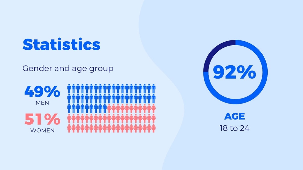
Infographics are an excellent way of compressing information and presenting it in a visual way. That’s why you should consider using infographic elements in your presentation instead of bullet points.

And because infographics are interactive, they help keep your audience engaged throughout your presentation. Don’t worry, creating these is a breeze with Visme. You don’t even have to be a graphic designer.
Use Color Creatively
Of all non-verbal communication tools, color is probably one of the most powerful. One reason is, as color psychology shows, that certain colors elicit different emotions in people. Used wisely, colors can help your audience “feel” your presentation.
On the technical side of presentations, using color is an excellent way of categorizing information. For example, when making comparisons, you may need to have a lot of text on your slide. Using different colors is a great way to separate the two entities being compared. Despite lots of text, this method lessens the cognitive load on the brain.
Call Out Key Points With Shapes
Just like colors, shapes are another way of visually communicating concepts in a memorable way.
That’s why you should also consider using shapes in your presentations instead of leveraging traditional bullet points. For example, you can use arrows or triangles to direct your audience's gaze to key points.
You can also use squares, rectangles, or circles to separate different parts of a slide and highlight your primary message within the shape. Or, use squares to bring symmetry to slides whose text looks too disjointed. In addition, adding numerical sequencing to shapes can be a great way to communicate with your audience.

Use Images
People are fed up with seeing bullet points in presentations. However, as a presenter, they can be a critical part of helping you unpack all your knowledge without missing anything.
What do you do if stuck in such a situation?
Use presentation images.
Images are an excellent way of creating bullet point presentations without using bullet points. Replace the bullets with pictures and you’ve got yourself a winning presentation. Alternatively, you can use a single image on the slide and write your short points around it.

Again, this is where a tool like Visme comes in handy. The intuitive and user-friendly graphic design tools make creating images for your presentations super easy.
Use Tables
One way you can break down your text and lighten the cognitive load on your audience, without using bullet points, is to tabularize your text. Using rows and columns to organize your information makes it easier to digest. It also helps you create more white space on your slides, making them more palatable to the eyes.

Put These Bullet Point Presentation Tips To Use
No matter the type of presentation you’re preparing for, there are many instances you may need to use bullet points. First of all, don't use bullet points in all those instances. While they may be handy, bullet points can kill your presentation — use them in moderation. Secondly, when you do use them, remember the six bullet point presentation tips outlined above.
Ready to ace your next presentation?
Visme can help with that. Our powerful yet easy-to-use presentation software is the perfect tool for designing slides and other assets you may need to deliver a killer presentation. So, go ahead and sign up for your free account today.
Create Stunning Content!
Design visual brand experiences for your business whether you are a seasoned designer or a total novice.
Try Visme for free


