


The Best Beautiful.ai Alternatives to Create AI-Powered Presentations

Looking for the best presentation tools to help you get your presentations to the next level? Powerpoint alternatives like Visme have tons of features and tools to amp up your presentation.
In this guide, we will discuss how you can make the most of some of the tools like:
We’ve got a lot to cover, so let’s get into it.
If you're ready to start making your awesome slide decks, just browse our rich collection of presentation templates to whip up a professional-looking presentation in no time.
At Visme, we have two different options for users to get started with a new presentation.
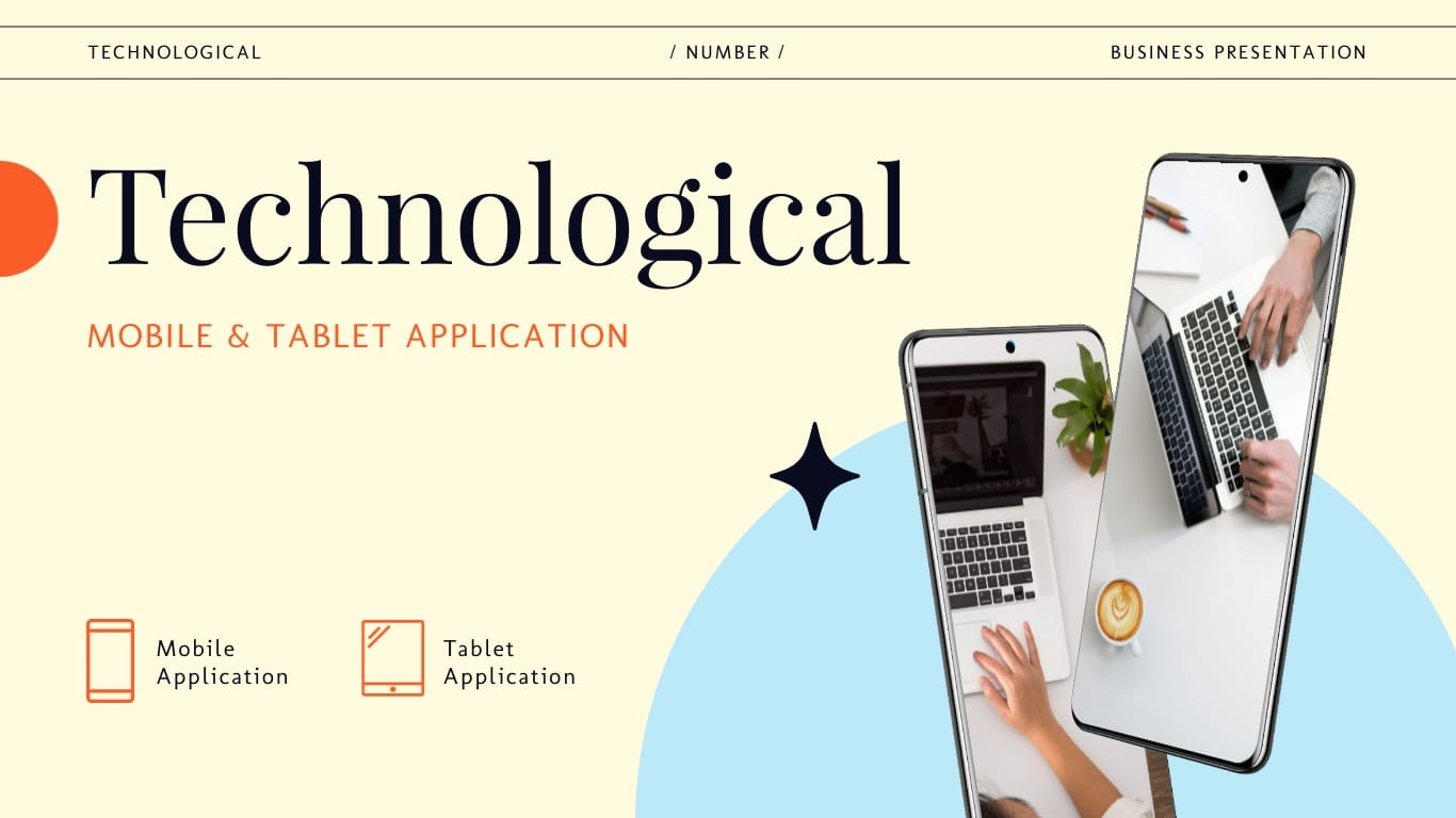
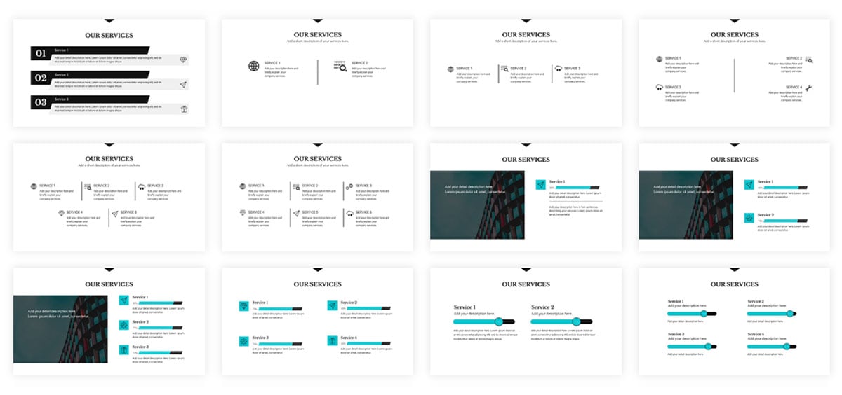
The first option is presentation templates. There are over 100 editable presentation templates in Visme that range from 2 to 15 pre-designed slides for you to easily plug your content in.
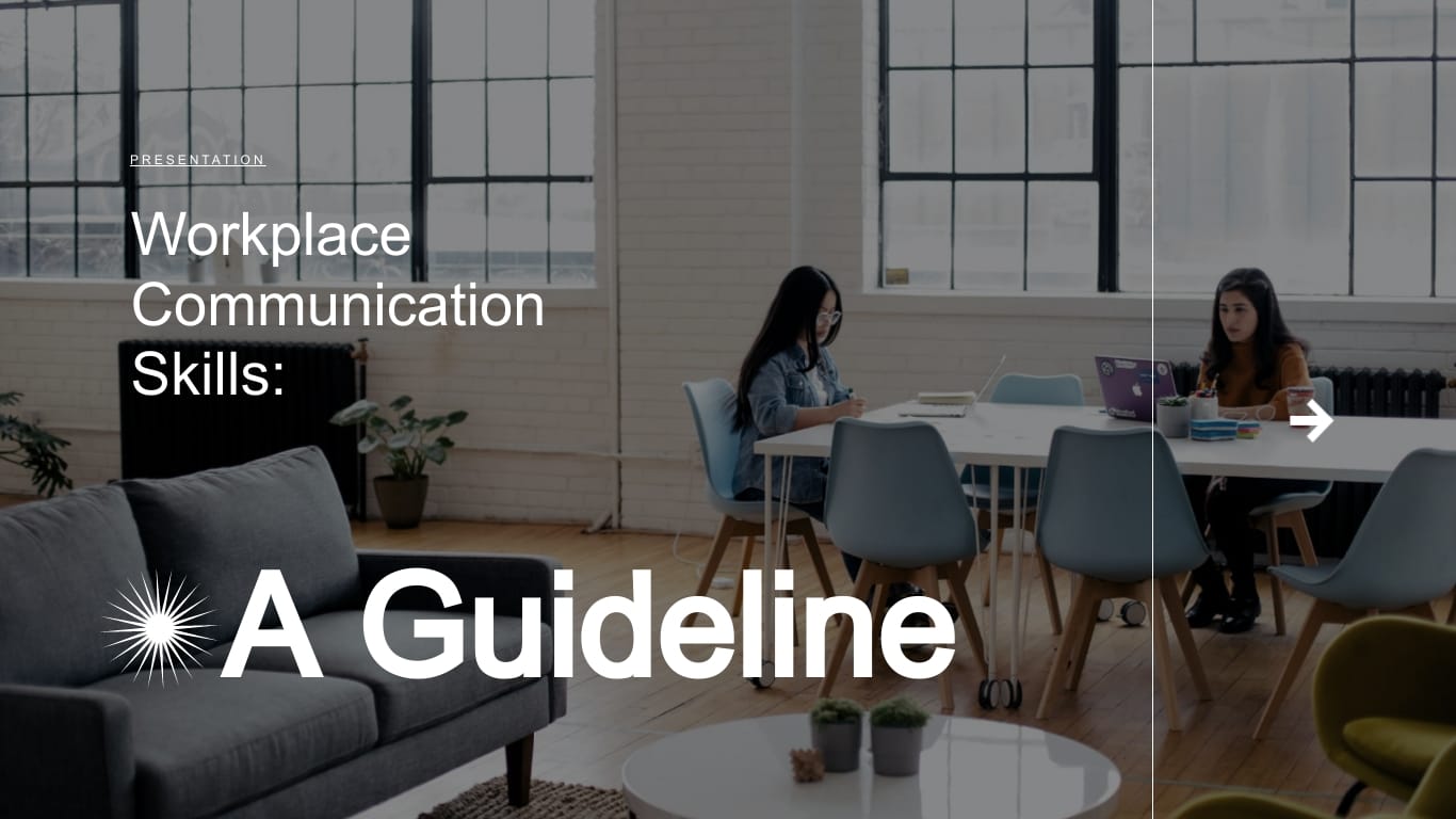
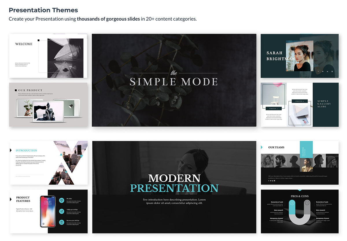
However, we also have three separate presentation themes – Modern, Simple and Creative.
Each theme has hundreds of presentation layouts that you can mix and match, or pull into your presentation and customize with your own colors, fonts and content.
Regardless of if you choose a template or theme, you have full range customization options to make the presentation your own. We just give you a visually appealing starter kit to make your life easier.
If you choose between one of our presentation themes, you have hundreds of slide layouts to choose from to build out your presentation in the way that you see fit.
Whether you need a title slide, a timeline, a slide for your services or an ending contact us slide, our slide library has plenty of options for you.
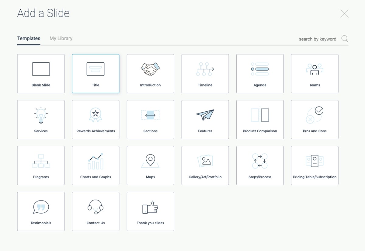
When you’re in the presentation maker, click Add Slide to access the slide library. Choose one of the categories to view each of the slide layout options available.
This allows you to reuse the same theme over and over again for multiple presentations while maintaining a fresh look each time. Just choose the slide you want to edit, add it into your presentation and customize it with your own information.
Another important tool for your presentations that you have access to in Visme is free fonts. There are over 100 fonts for users to choose from in the presentation design dashboard.

Stick to three fonts or less. Too many different font faces can make your slides appear cluttered. It’s best to incorporate one font for headers, one for body copy and a possible third for an accent font.
If you don’t find the font you want, you can also utilize Visme’s Brand Kit to upload and access your own preferred fonts. This can include your company’s brand fonts or simply a personal favorite or two.
While many of the presentation themes and templates come with an already established color scheme, absolutely nothing is set in stone. You can switch out the color of every item in your presentation to match your company or your topic.
One great presentation tool that Visme has is color themes. This allows you to change the color scheme of your entire presentation with a single click.
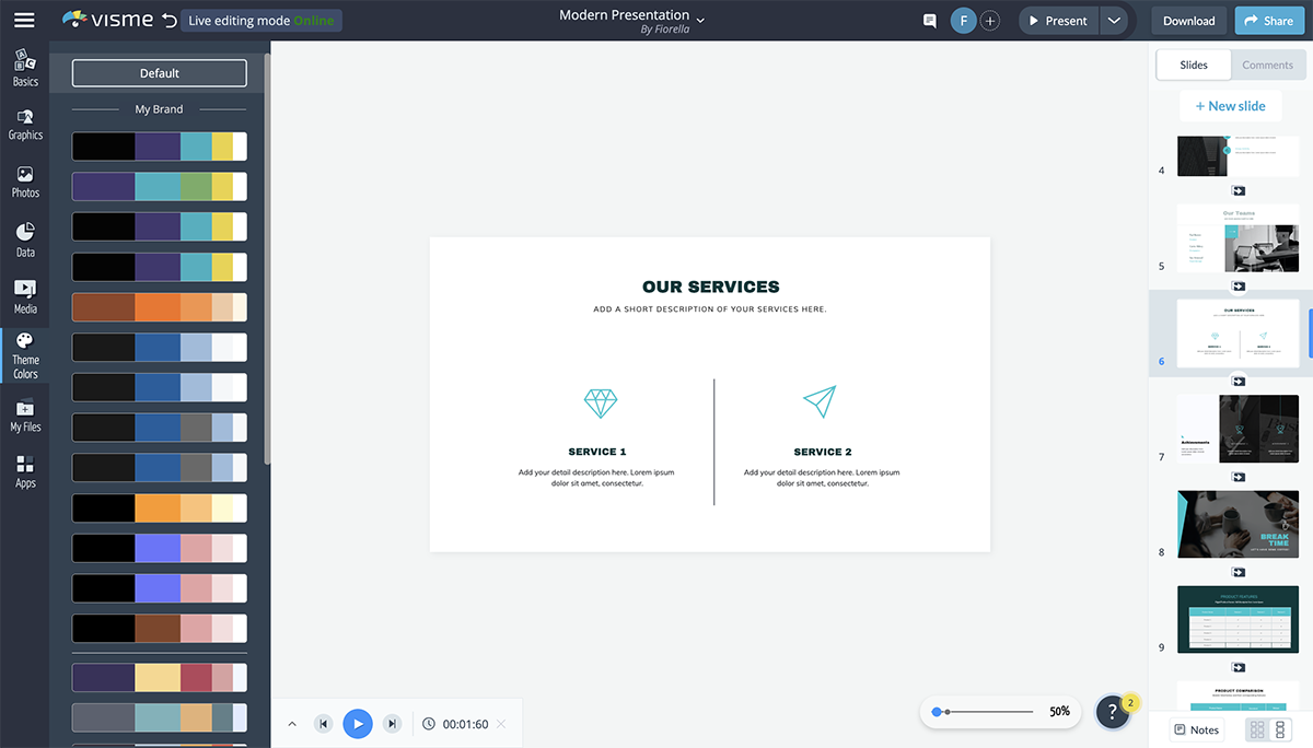
You can add your own brand color scheme into the Brand Kit section of your Visme dashboard so you can easily access them later. There is also a section to create your own color themes from scratch.
The color themes you create will appear at the top of the list and will switch the colors of your presentation for you without you having to pick and choose which individual elements are which color.
Using icons in your business presentation is a great way to visualize the text in your slides. You don’t want to include only text for your audience to follow along, so incorporating graphics as a visual aid is a great way to make your content more engaging.
In Visme, users have access to over 10,000 icons with four different styles to choose from.
Since you want to stick to a single icon style throughout your presentation, this gives you a way to differentiate each presentation you create while still having tons of icon options.

Sign up. It's free.Access thousands of high-quality icons and graphics!
Use these high-quality icons and graphics to help visualize the main points in your next presentation.
Another great way to add a few design touches to your presentation is by incorporating shapes. These can be used to emphasize photos and text by surrounding them or to create a design by themselves.

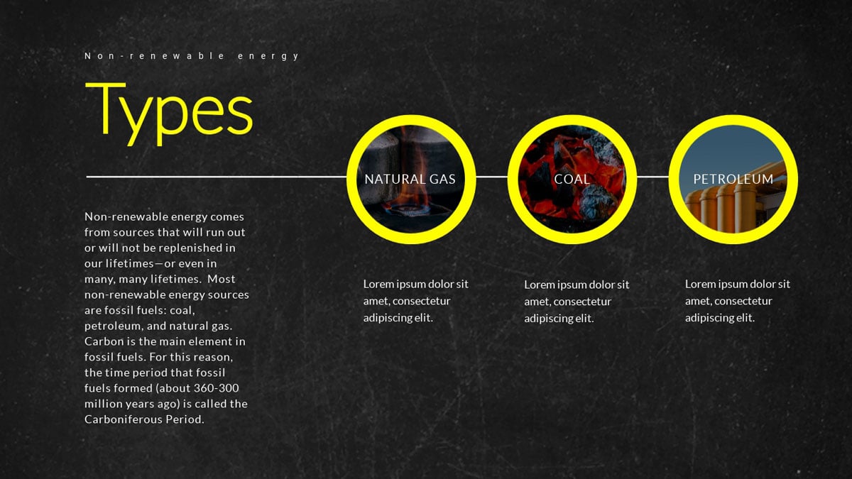
Check out the presentation slide template below. It's a great example of how using circular frames around photos can help draw attention to them.
Here's another presentation slide template that incorporates shapes into the design.
Incorporating different shapes can help to add depth to your presentation. It’s not all text, photos and icons. Instead, there’s an entire design aspect to your slides as well.
Here’s a video of how to format shapes and lines in Visme.
Visme partners with Unsplash to bring its users a massive library of free stock photos to incorporate into presentations, infographics, social media graphics and more.
While you may have your own photos of your team, business, products and services, there are still many other options for including stock photos in your presentation.
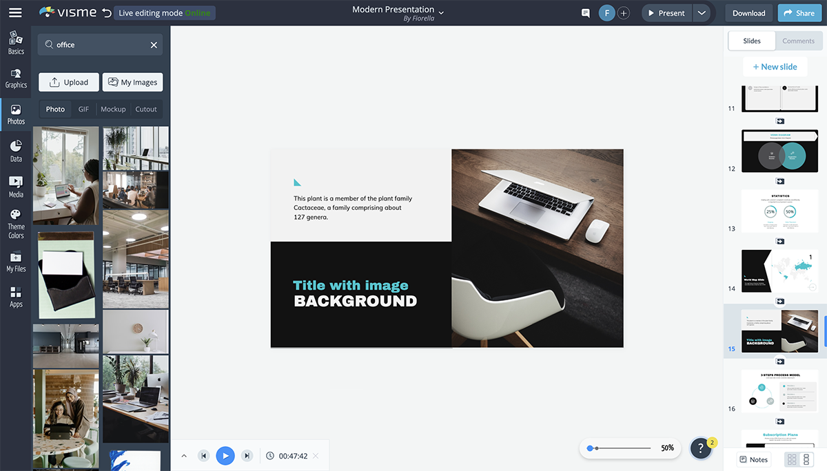
You can use the search bar to find exactly what you’re looking for in the photo library and easily drag and drop it onto your presentation slide.
If you have a preset slide with images you want to change out, click on the photo to have the option to replace it appear in the top bar.
There are many ways to use presentation images, so be sure you browse through the photo library to see what options are available for you to use in your own slides.
If you’re presenting financial data, charts and graphs are key presentation mediums. There are many different chart and graph options available, from bar charts to line graphs and pie charts to funnel charts and more.
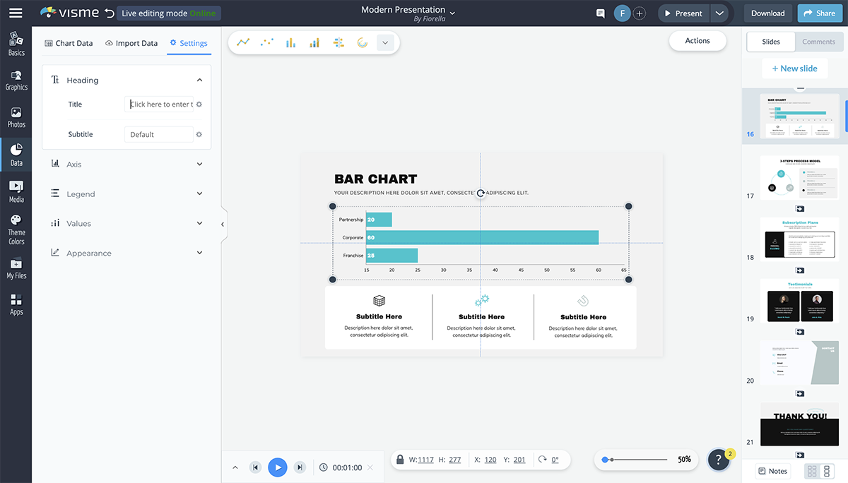
The Graph Engine is the first option available to users when you open up the Data tab in the design dashboard, giving you 15 chart and graph options right off the bat.
You’re able to input your data manually or import an Excel or Google spreadsheet and your dynamic chart will automatically update to reflect it.

Change colors, name axes and customize the legend. All charts and graphs in Visme can also be animated to make your presentation look even more engaging and creative.
If you’re talking about demographics or sharing information that pertains to a location within your presentation, consider adding in a map to visualize the area.
Visme’s map maker allows you to insert a world map or pinpoint any location in the world, color coding areas and creating an engaging visualization for your audience.
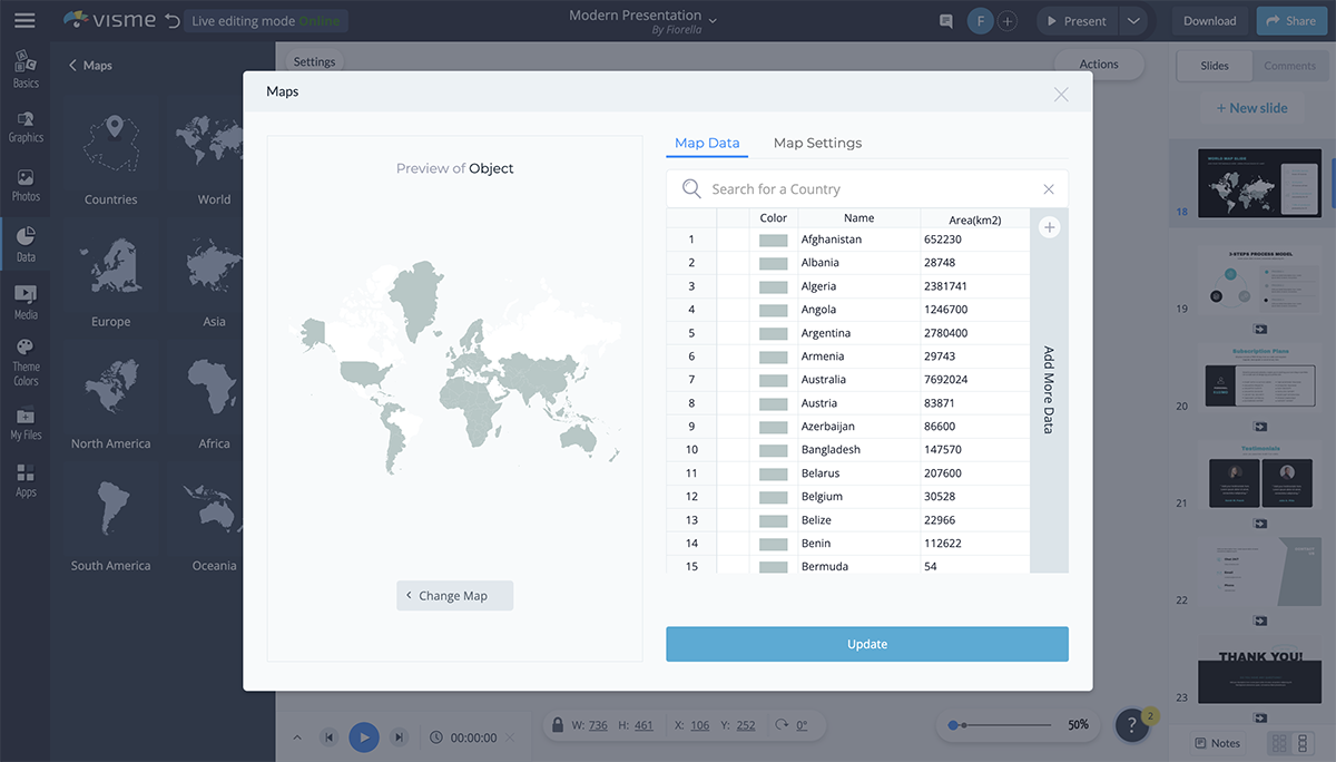
Set a global color for your map and color code different areas based on your information. You can hide areas on the map or showcase just one specific country or continent in the world.
There are many reasons you may need to add a table to your presentation.
You can create a schedule for the event or presentation, create a pricing table or even include a table of data next to the chart that visually represents it.
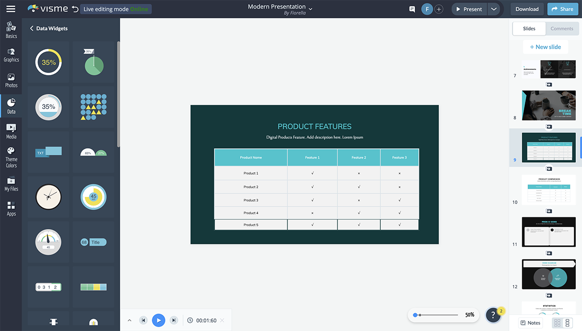
It's very easy to add a table to your presentation in Visme. You can set the number of rows and columns your table has, change cell colors, customize fonts and more.
A flowchart can help you visualize business processes, chains of command and more. And Visme makes it extremely easy to customize a premade flowchart or create one entirely from scratch.
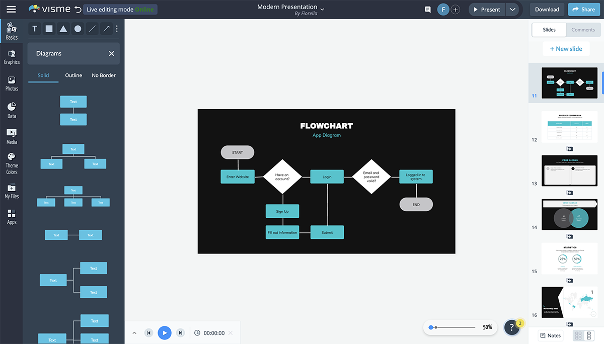
There are several slide layouts that include flowcharts you can edit to fit your content, but it’s actually quite fun to play with the shapes and lines to create your own flow.
The flowchart elements are fully customizable so that you can choose outlines or filled in shapes, corners or rounded edges in your lines, line width and more.
An icon chart or an array is a way to represent data with icons. You can use this to differentiate between the number of men and women, cats and dogs, etc., that fall under different categories.
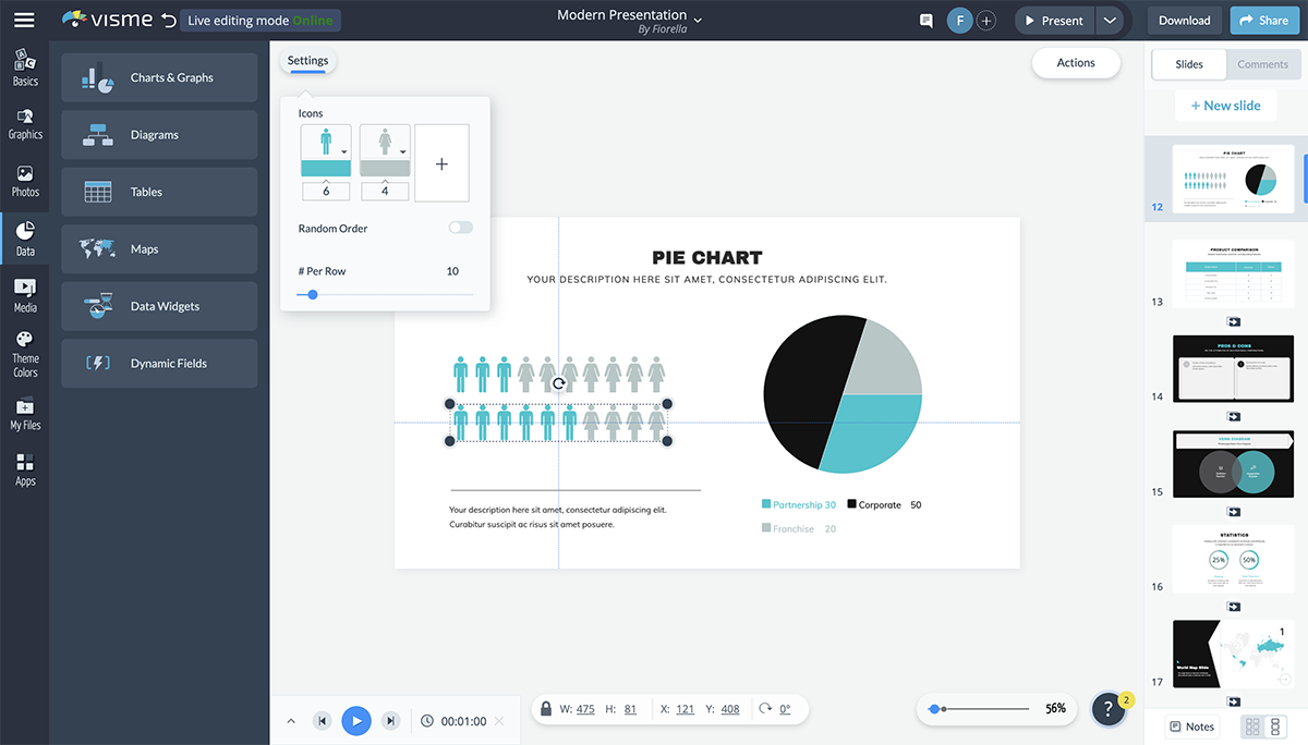
While the array visualization automatically comes with two icons, you can add more, change colors, switch the icons with any options from our library and more.
A radial, or circular counter, is a more engaging way to represent numbers or percentages than having them stand alone on the slide.
The thing is, not many PowerPoint alternatives have this tool. However, there are many different styles to choose from in Visme's data widget sidebar.
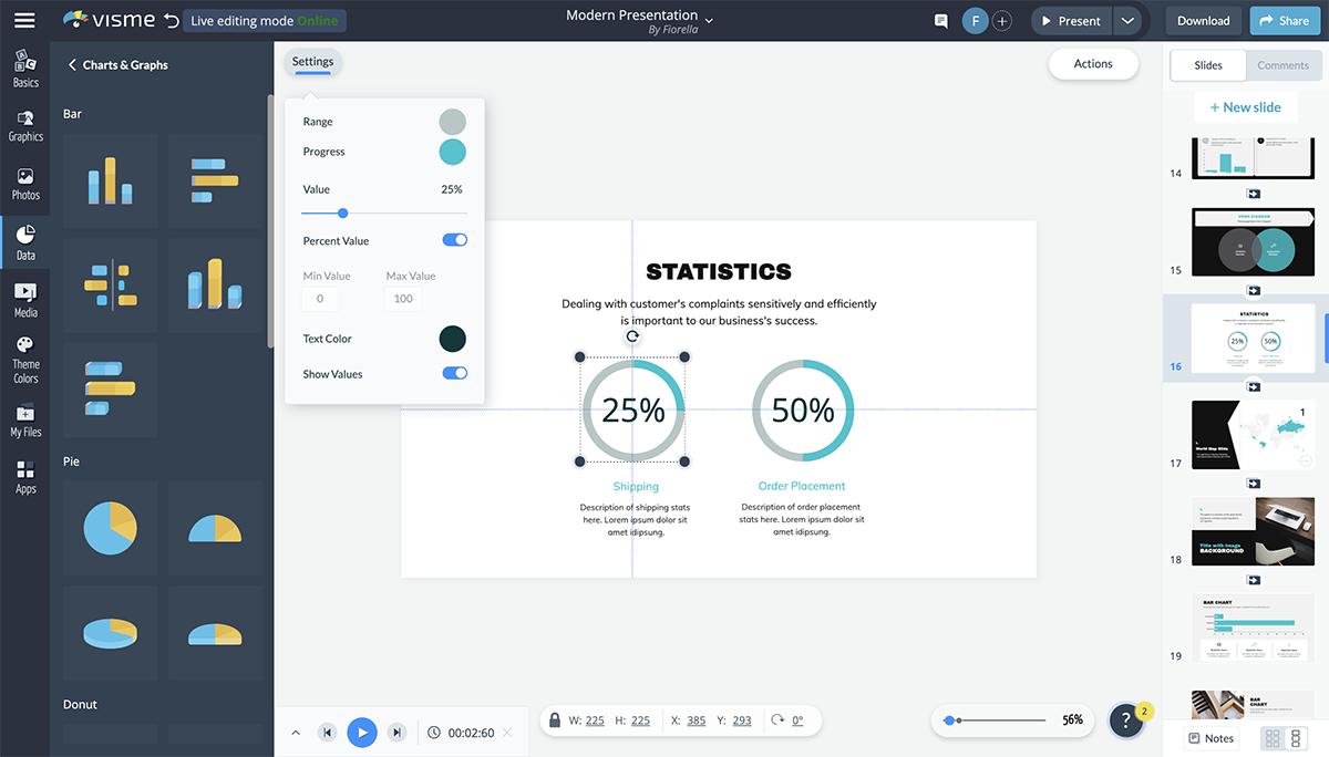
You’re able to customize the colors, the number, the maximum and minimum values and even whether you’re visualizing a percentage or just a number.
You can even add icons to the center of your radial to better visualize what each percentage is referencing.
Want to let your audience know how much time there is left in the presentation? Add a progress bar to the bottom of each slide.
You can also use this to show how far along the company is with creating products or gathering funding.
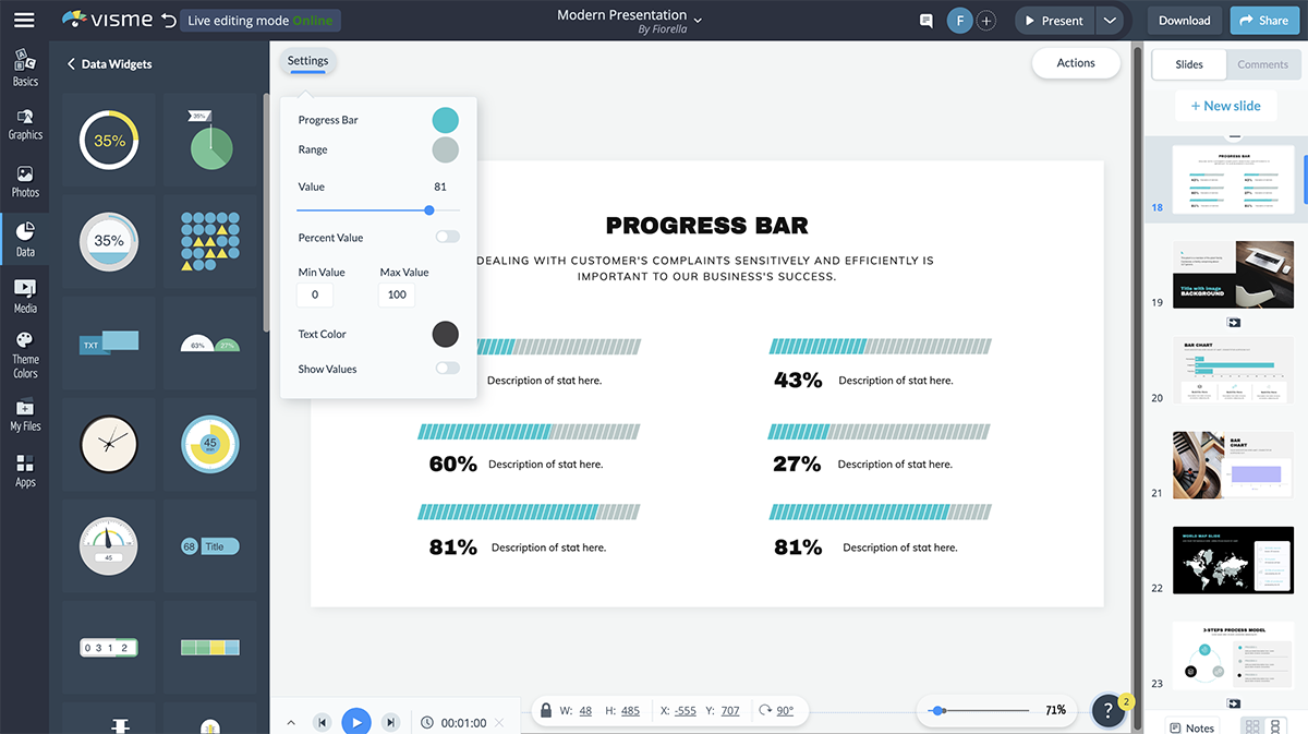
In Visme, you can choose from many different styles of progress bars, creating a new look and feel in each presentation you add this feature to.
To make your presentation more engaging, consider adding animation to the elements in your slides. This makes them move on the screen and helps grab the attention of your audience.
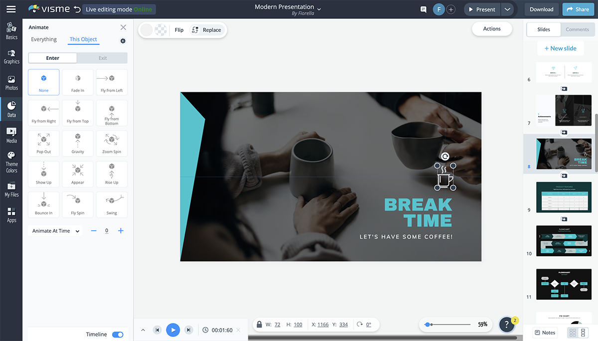
In Visme, you have six animation options:
Just remember that you only want to stick to one animation type per presentation. Having elements fly in from all different directions is not a good look and can easily overwhelm your audience.
Edit and DownloadCreate beautiful and animated presentations!
Watch this video to learn how you can animate text, video, shapes and images in Visme.
Your transition is the way your slides appear and disappear, and it’s a great idea to give this a bit more flair than your typical slide interchange.
With Visme, you can create transitions that not only move your slide, but each of the elements simultaneously. Simply click on the gear at the right corner of the slides to access the transitions.
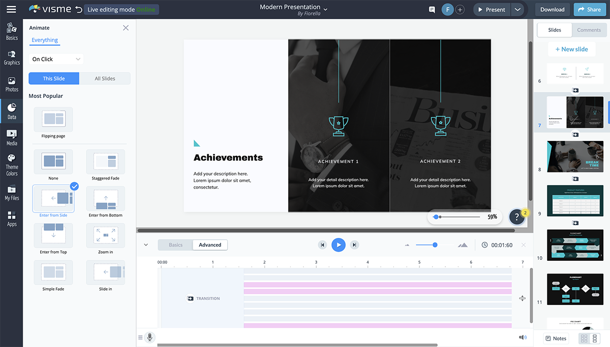
The Staggered Fade, Enter from Side, Enter from Bottom, Enter from Top and Zoom In transitions all include both slide and element transitions. However, if you want to animate your elements separately, you can choose the transition Simple Fade or Slide In.
Visme also offers several great ways to make your presentation interactive.
Have Q&As, bring props, have your audience raise their hands and more. You create hyperlinks between slides and even design elements to create a unique experience for your audience.

This is a great way to make your presentation stand out and get your audience involved, so be sure to keep some of these interactivity ideas in mind.
Adding an audio narrative, recording a voice-over for your slides, incorporating background music or even embedding a video can be a great way to increase engagement in your presentation.
You can record audio directly in Visme, embed video links or embed any other type of online content directly in your presentation slides.

This can also give you a break from presenting during longer sessions, breaking up the monotony of your audience listening to the same thing for the duration of the time.
Watch the video below to learn how to embed video into your presentation and capture your audience's attention.
There you have it. We’ve shared 18 valuable tools for beautifying your next presentation.
But here’s a caveat! When preparing your presentation, don’t throw in all of these tools. Match the presentation topic with the tool that will have the most impact on your audience.
While there is a lot of presentation software out there—like PowerPoint, Keynote, Beautiful.ai, Prezi, Canva, Visme and more—what tools do you use for your presentation? Visme comes preloaded with all of the best presentation tools we’ve mentioned and more. Use them to create a presentation that your potential customers and investors will fall in love with.
Sign up for a free Visme account today to get started, and check out all of our presentation templates to find something you love.
Design visual brand experiences for your business whether you are a seasoned designer or a total novice.
Try Visme for free