


The Best Beautiful.ai Alternatives to Create AI-Powered Presentations

Think of the last presentation that truly captivated you.
Chances are, you probably remember the key insights and story, but not necessarily the design.
That’s likely because the presentation layout was so good that it didn’t distract you from the content. In fact, it helped you grasp the information easily and without barriers.
As graphic designer Joe Sparano wisely said, "Good design is obvious. Great design is transparent."
This principle lies at the heart of effective presentation layouts. When done right, your design guides viewers effortlessly through the content without drawing attention to itself.
The layout becomes “invisible”, not because it’s unremarkable, but because it’s so well-crafted that it only calls attention to what matters most: your message.
But how do you go about creating these “invisible” or transparent layouts? By studying real examples and using pre-designed templates that already have great layouts,
In this guide, I share several presentation design ideas for layouts, real-life examples and 10 free presentation templates to help you get started on the right foot.
A presentation layout refers to the arrangement of visual and textual elements on a single slide or an entire deck.
On a title slide, for example, the usual layout consists of a title text in a large font, some sort of visual background or foreground image, an optional subtitle, names of the people who created the presentation and maybe a logo.
These elements can be organized in several different ways, but they are ultimately all layouts.
For your slides and presentations to have effective layouts, they must adhere to essential design principles, which I will discuss further below.
A well-laid-out presentation is easy to read, understand and engage with. It helps your audience absorb the information without obstacles.
I spoke with professional presentation designer, Lokesh Chauhan from Crappy Presentations Design Agency and he shared some great insights about laying out presentation elements, starting with how “a thoughtfully designed layout does more than make slides look good. It guides attention, supports your key points, and keeps people engaged.”
So, let’s jump in and discuss why the right presentation layout matters.
Do you know how to create presentations? Aside from the layouts? This video provides expert tips and a how-to tutorial.
As I mentioned earlier, for a presentation layout to be effective, it must follow a set of design rules. These visual principles are not exclusive to presentations; they apply to all designs.
So, pay attention, they’ll help you in every project you work on.
If you wish to learn about these techniques in depth and practice them with Visme, take our Free Design Course: Digital Design Foundations. The video below explains how it will help you.
A composition determines how elements work together as a unified whole. Strong visual compositions create harmony, guiding the viewer’s attention naturally through your content.
Don’t panic if you don't know how to start. Test one of these fundamental compositions to create layouts that make sense.

Visual balance ensures that no single element overwhelms a slide or makes the viewer feel like the contents are bunched up in one specific area.
Proper alignment creates order and professionalism in your slides. When everything aligns neatly, your presentation feels cohesive and easy to follow, while poor alignment creates visual chaos that distracts from your message. Alignment can also incorporate asymmetric balance to create unique layouts.
Here are three key tools to help you:
Every slide needs a clear hierarchy that immediately draws attention to your most important message and then directs the viewer to the next part of your story.
You can see them all in the infographic below.

Watch this video to learn more about visual hierarchy in design.
Visual flow refers to how the eye moves across a slide, and understanding these patterns helps you guide viewers through your content in a logical sequence. Design your layouts to support these natural reading patterns and create a logical progression of information that feels intuitive to your audience.

Timeless layouts are those that form part of almost every single presentation. These are slide layouts that you’ll use frequently.
Thankfully, there’s variety in the designs.
I collected several slides per layout type from Visme’s presentation template gallery to show you the possibilities.
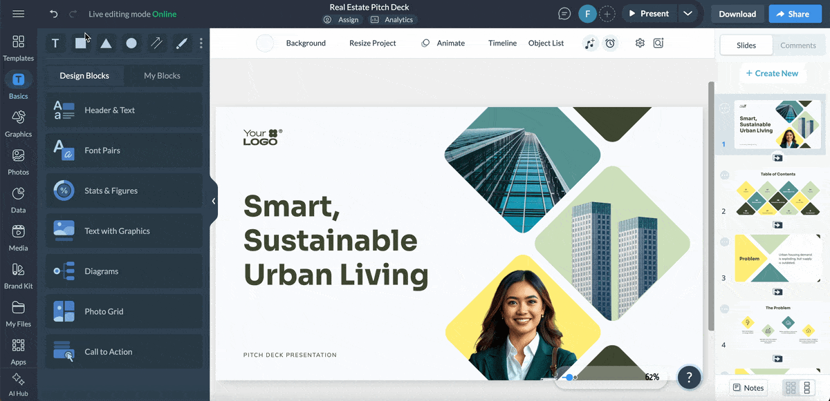
Undoubtedly, one of the most common and important layouts is the title slide. It’s with this slide that you make the first impression and bring the viewer in.
Aside from defining exactly what the presentation is about, its visual quality also hints at how the rest of the presentation looks.
In the images below, you can see the most used title slide layouts:
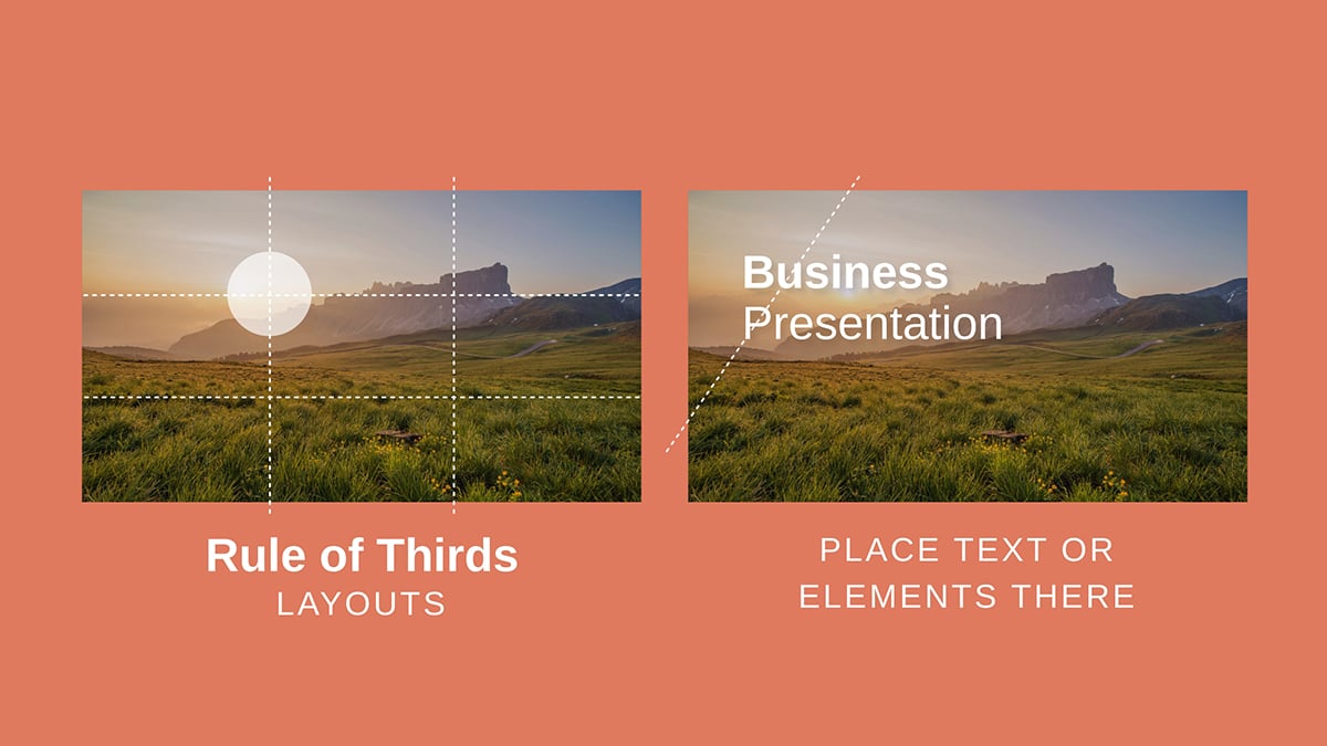
1. The title in the center and a subtitle under it in a smaller font. The background can be a color, a gradient, a texture or a simple design with three colors.

2. Title and subtitle on one side, and an image on the other, similar to this Training Course template. Separate the slide area into two equal parts or make one slightly wider than the other.

3. A background image with or without a color overlay and the title + subtitle aligned to one of the slide’s corners with an airy margin. The slide example below includes a button under the title instead of a subtitle.

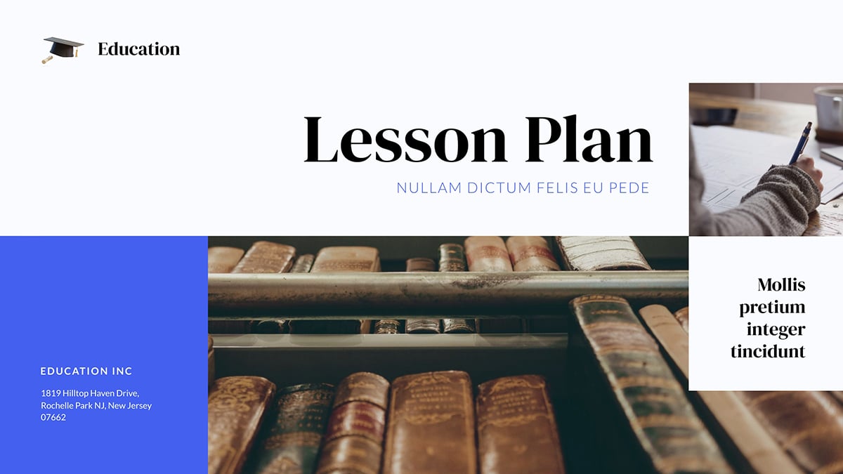
Using any of the three layouts above as a base, you can then get a little creative as long as it’s visually balanced and follows the design principles I mentioned earlier. This Lesson Plan layout is a good example of this technique.
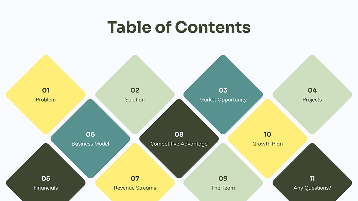
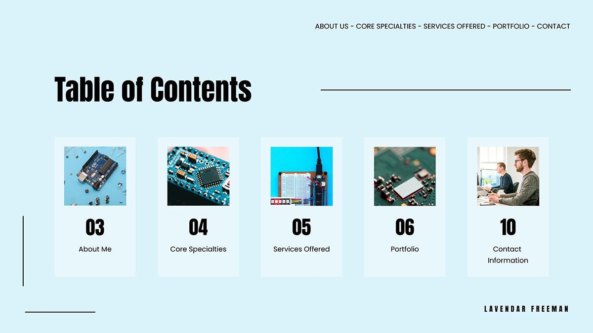
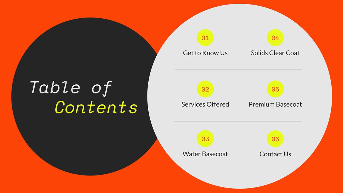
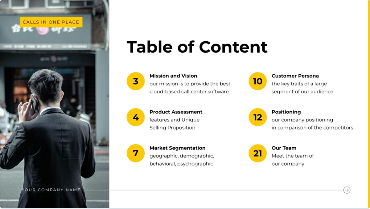
In a table of contents layout, you need an organized structure that clearly explains the sections of your presentation.
Each of these groups includes a section title, a slide number and often also a hyperlink. When you make these groups look the same in terms of composition and style, it's easier to organize them in an evenly spaced alignment.
Using these content groups, build the layout in the order in which your presentation slides are set up in the deck. If you include hyperlinks, ensure they’re connected to the page they link to.
Look at the examples below. They are all different from each other in terms of style, but they all include the title text, “Table of Contents.” The content groups are laid out for easy navigation.
Use Visme’s alignment features to help you set this up so everything’s in order.
This table of contents layout has five content groups aligned vertically from left to right. Each one includes an image depicting the content of the section it links to, the page number in a large font size and then a small text box.
In this example, the main layout is separated into two main areas, each with a circle to contain the content. On the left is the slide title and on the right is the list of sections. This particular layout is set up following the Z-Pattern, where the viewer starts at the left, moves to the right and then returns to the left and down.
Similar to the slide above in layout, but differing in function, the content groups are set up in two columns with the title above them. You can clearly see that this slide uses the rule of thirds to keep the content neat.
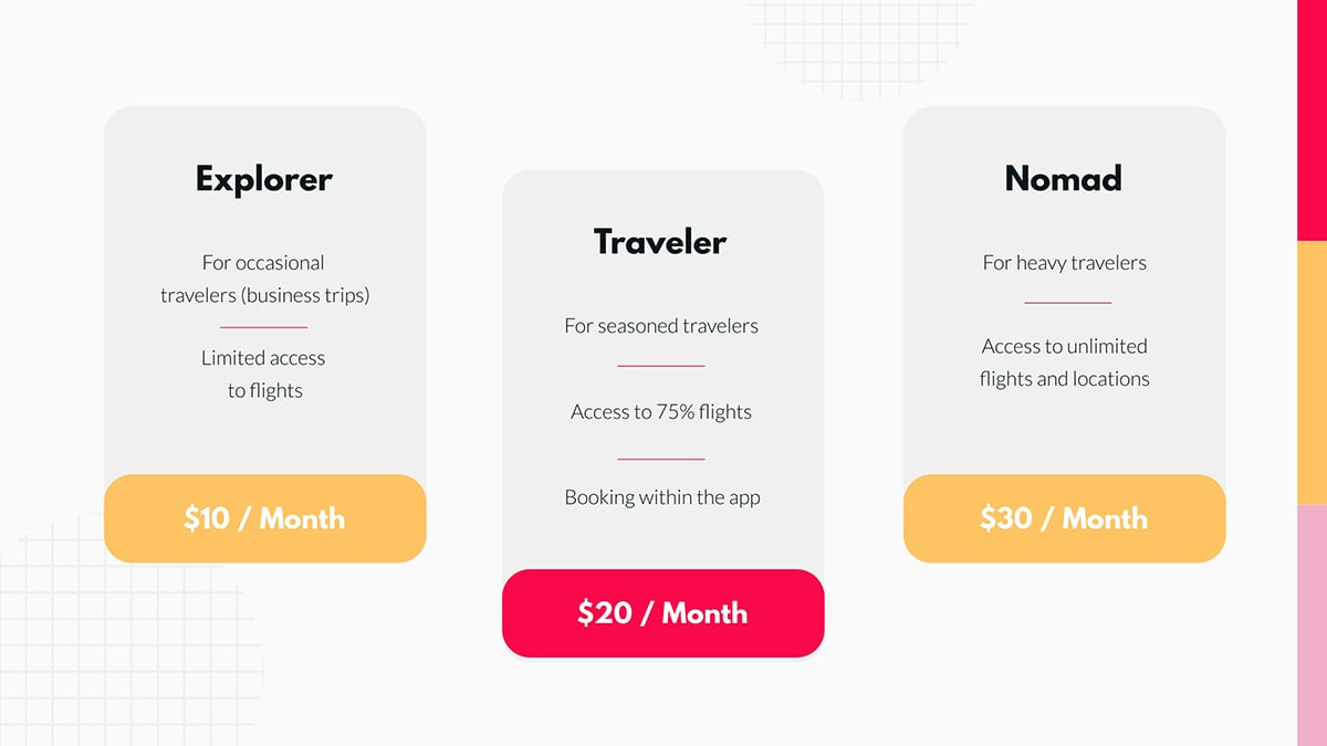
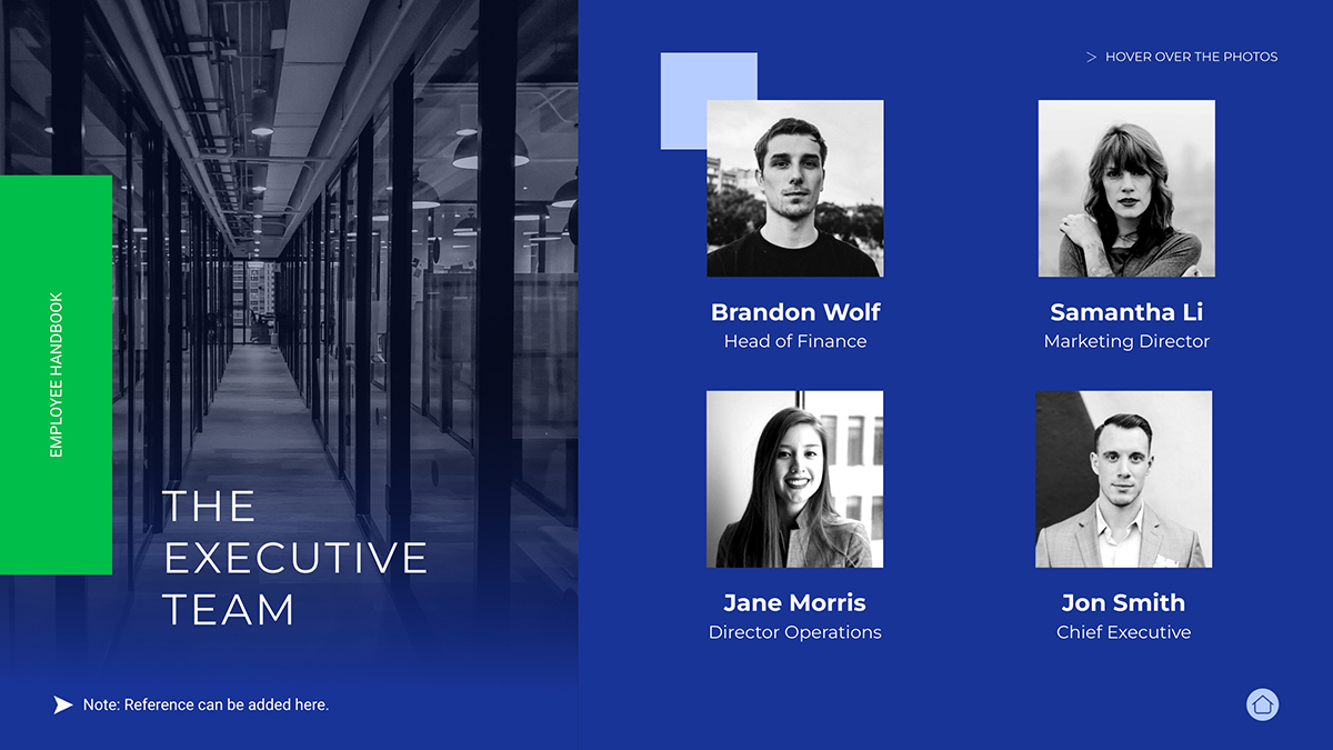
Layouts with aligned items cover many types of content, including team slides, services slides and pricing tier slides. The main idea with these layouts is similar to a table of contents but instead of using a typical horizontal list, the content groups are aligned vertically.
The examples below show two slide layouts using circles, one with five and the other with three. As you can see, they’re aligned evenly, creating a good visual balance.
The third slide showcases a pricing layout consisting of three vertical rectangles that alternate slightly with each other. Using this technique, along with a different price color, creates a visual focal point for the pricing that you want the viewer to act upon.
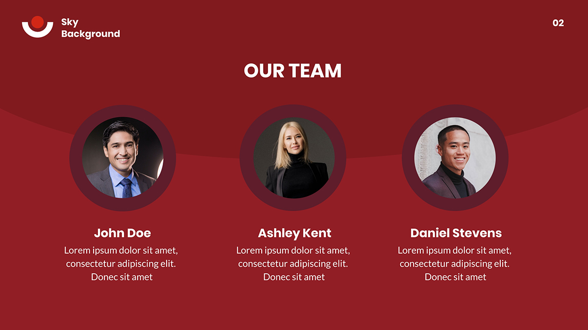
Finally, this slide features a team section in a quadrant of four square images, accompanied by a visual composition on the left. This is another example of how, even by following design principles, you can get creative with asymmetric balance.
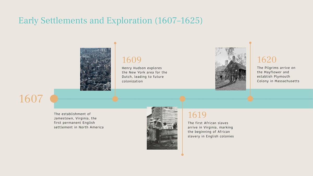
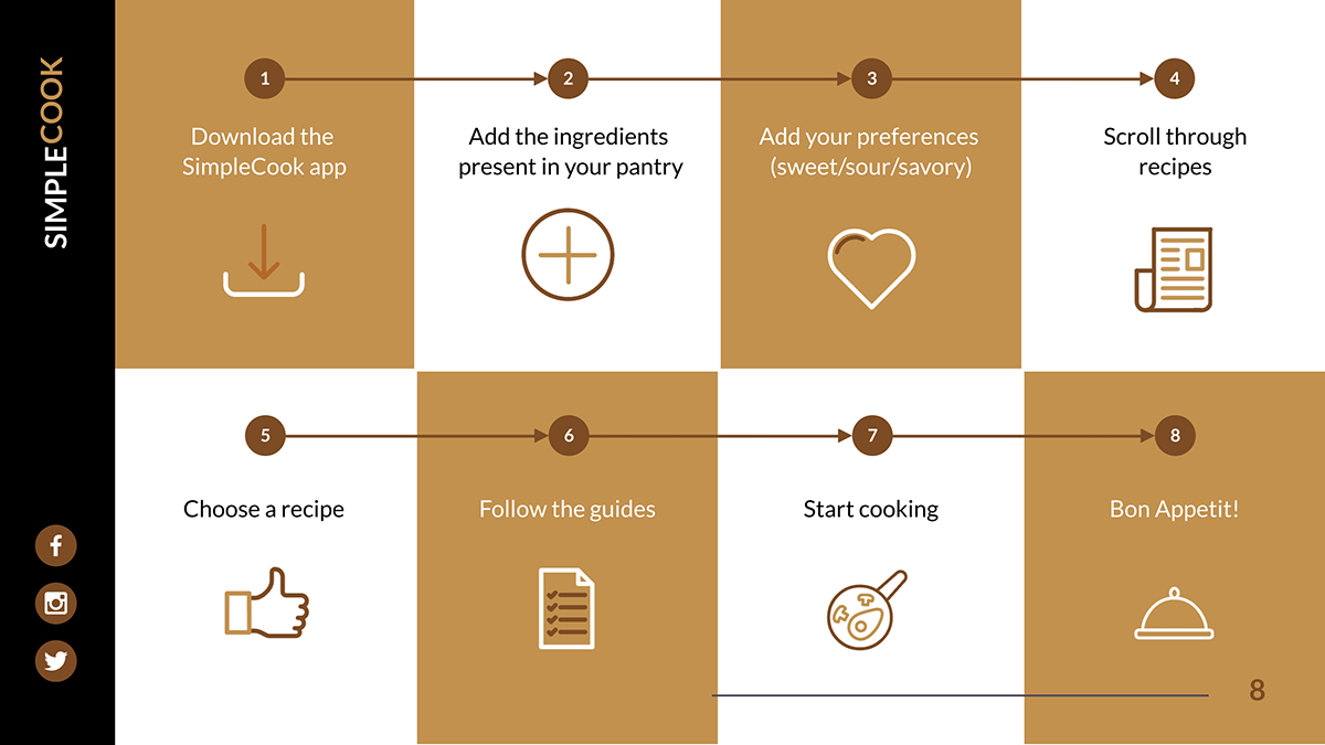
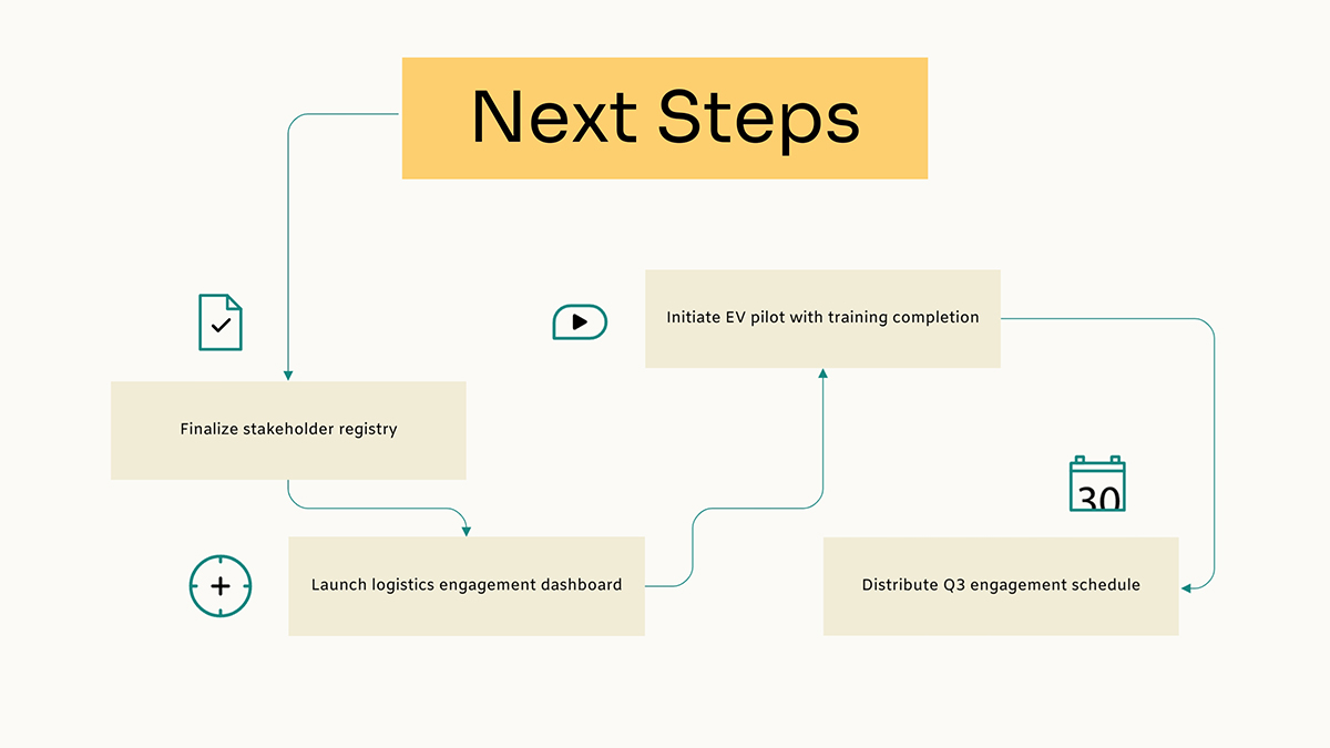
Another classic presentation layout is the timeline. These are useful for displaying company histories or event processes. Timeline layouts help audiences understand chronological progression and see how events connect over time.
You have a lot of creative freedom in designing your timeline. But it must create an easy flow of information. Typically, the timeline starts at the left or top-left and then progresses to the right. Sometimes it will double back, creating a zig-zag pattern.
A timeline can also be vertical, progressing from top to bottom. Or it can be a diagram with arrows that direct the flow in direct or indirect paths.
The template slides below cover several styles of timelines. Notice how they are all easy to follow. That’s the key for this layout type: flow.
In this one, the timeline’s base is a thick horizontal line from edge to edge. Each step in the timeline starts with a colored dot and a line that stems from it perpendicularly from the main line. To help with flow, the chronological lines go up, then down, then up again.
Using a checkerboard design, this timeline starts on the left of the top half and then continues on the bottom. Since it’s a how-to guide for a cooking recipe, each point in the timeline is assigned a number and is connected to the next step with an arrow.
The third example incorporates a diagram with bent lines that creates a unique timeline layout that starts at the top, continues down, then up to the right and down again. The diagram tool in Visme lets you change the arrow shapes and direction by clicking and dragging them to the position you like.
Data visualization layouts must prioritize chart visibility by using clear headlines that state key findings and minimal supporting text, positioned strategically.
One of our in-house graphic designers, Hylie, shared several things to “pay attention to when creating charts or graphs for presentations.”
Her main tips were to:
Look at the layouts below; they all include a data visualization and some type of supplemental content to support it.
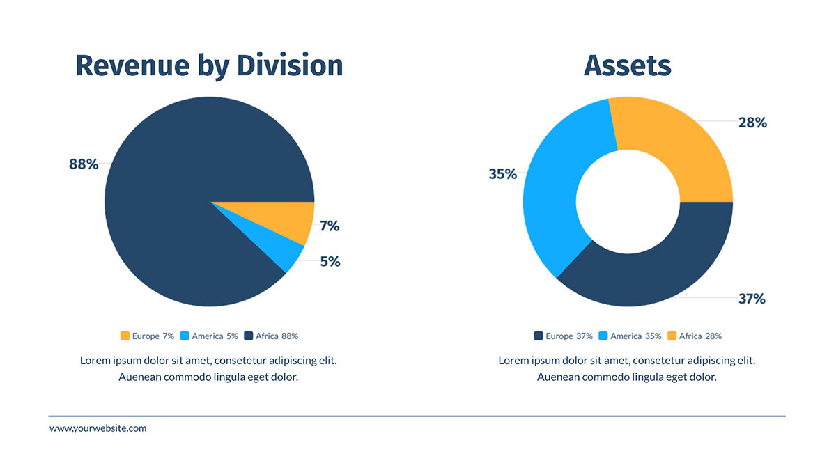
This first template has a symmetrical layout with a donut chart on each side. The other elements in the design are supporting text for each chart; a title, subtitle, caption and legend, in that order of hierarchy.
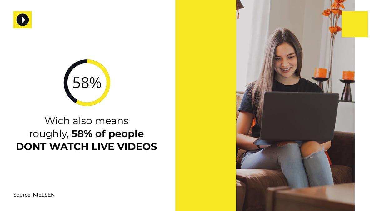
In this example, we have a percent widget accompanied by a snippet of descriptive text. Some of the text is in bold to draw attention to it. The image on the right is both decorative and relevant to the data displayed on the left.
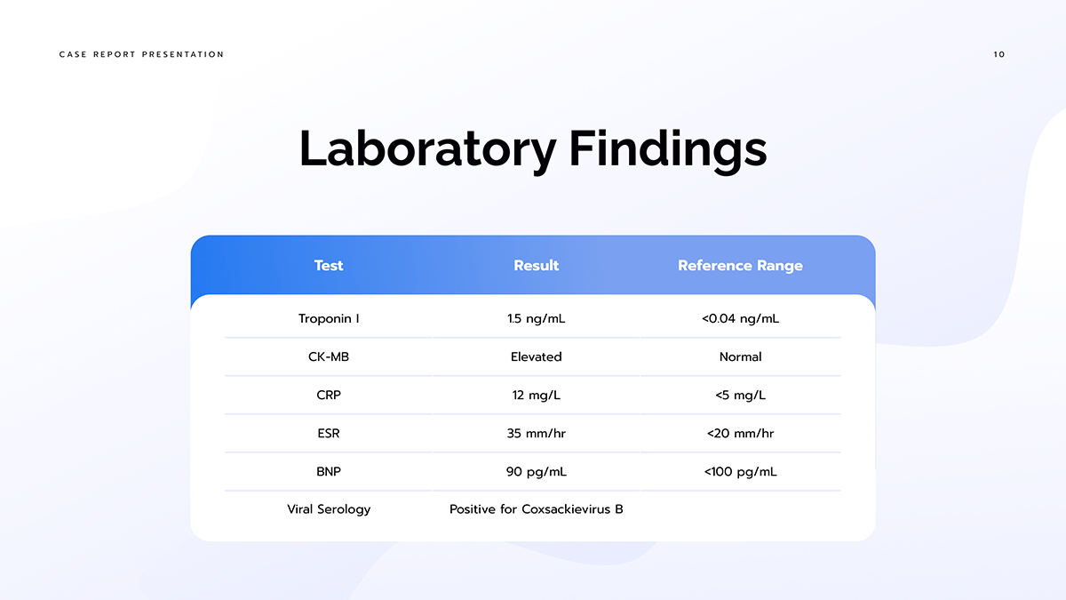
Notice how in this example, the table is the main focal point on the slide. The supporting text is minimal, consisting only of a title. The space around the table is relatively empty, but it does have a wavy gradient that give the layout some depth.
Our last example consists of three sections, two of which feature a vertical bar graph, and the last, two percentage widgets. The visual balance here is completed with a text box over the small circles that make all three columns the same size.

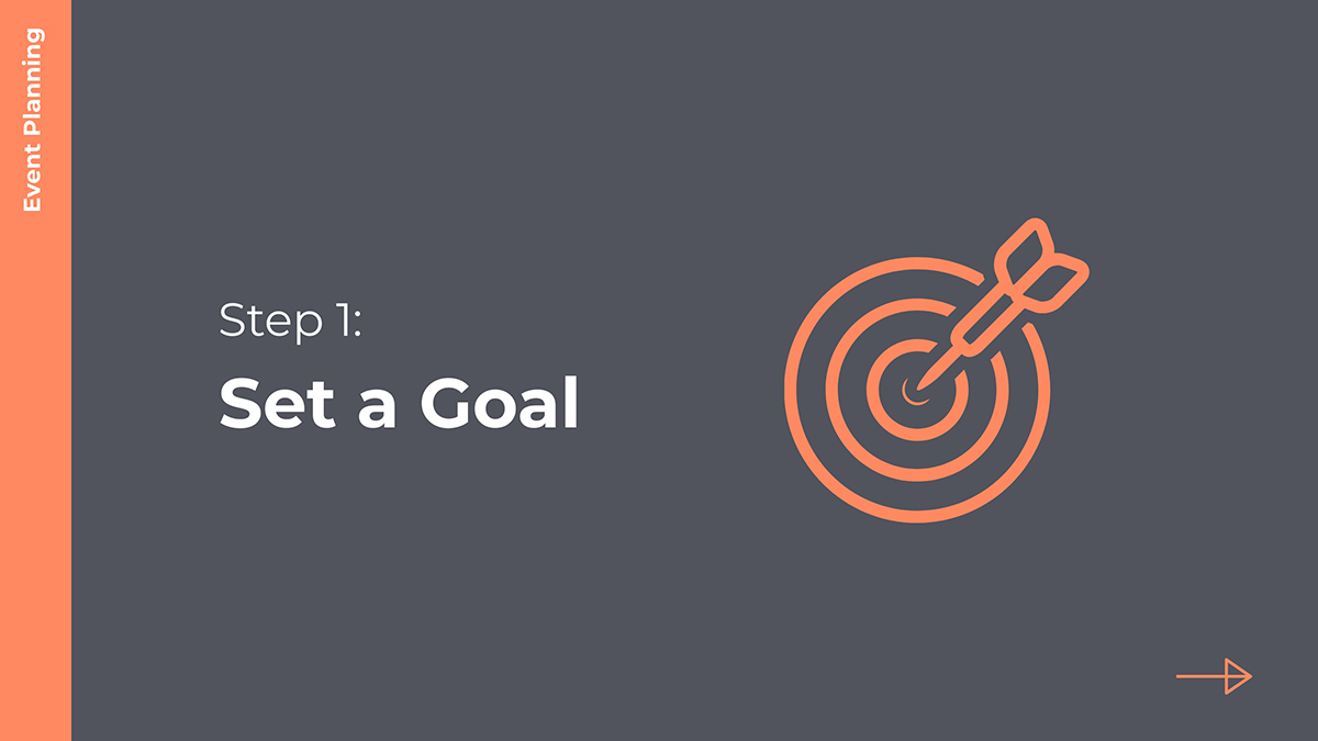
The one idea or transition slide works as a section separator or palette cleanser. These layouts typically feature one text box with either a small title or brief explanatory content.
This layout example is one of several similar slides that run across the entire deck. Each one helps start a new section. To achieve this transition technique, create all these slides using the same layout and then just change the content.
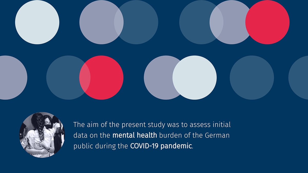
In this one idea slide, the layout includes a text box that explains the aim and purpose of the study, shared in the presentation. To the left of it is an image in a circle, which balances out with an aligned composition of circles in different colors.
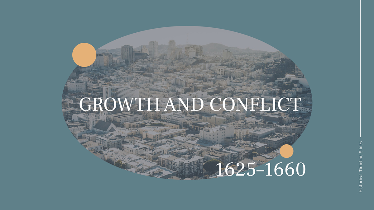
In a history presentation, the slides are sometimes divided into time periods. This slide layout marks the beginning of a new section. By including a relevant visual along with the information, the viewer gets a clear idea of what comes next. This layout, in particular, concentrates on the center of the slide, calling attention to what’s inside the oval image.
As I’ve said, presentations work best when their layouts make good first impressions, are clear and have good content flow.
So, I selected a few real-life presentations to show you how the big names do it.
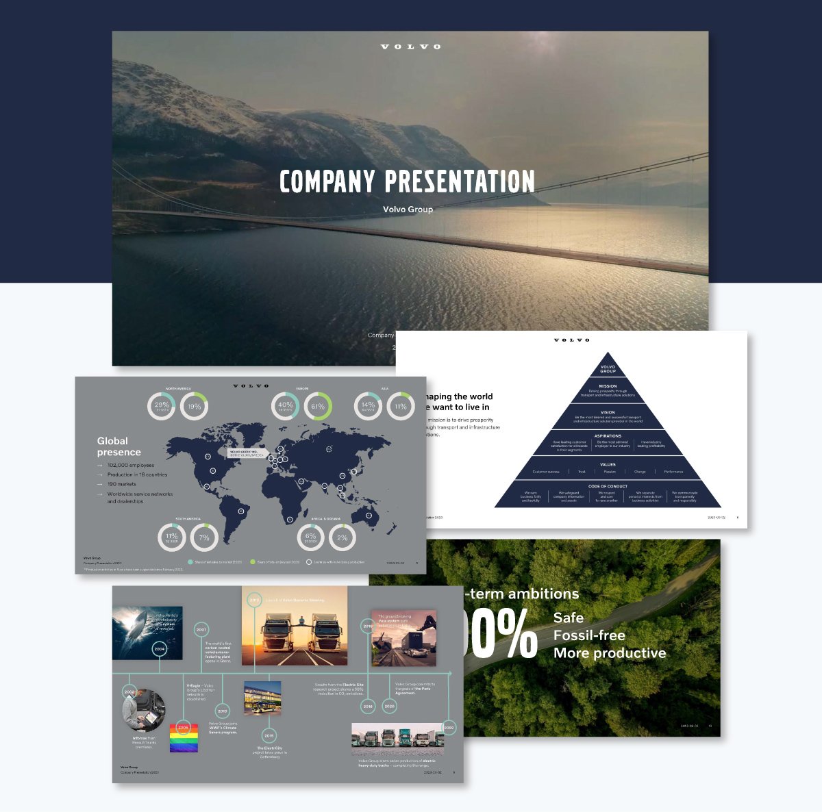
As soon as you start looking at this Volvo presentation, you can sense how the captivating imagery grabs your attention.
The beautiful photos in the first couple of slides set the scene through visual storytelling. But How? In the cover slide is a wide open image of a bridge spanning across a bay. The light is soft and welcoming, making you feel as though you’re about to go on an amazing adventure.
On the next slide, there is a father and son on a bicycle sharing a beautiful moment at sunset. The contrasting progression from a wide shot in a soft light to a close-up in a striking sun-kissed shot is the ideal introduction to the rest of the deck.
From visual storytelling, the deck progresses to data storytelling with informative slides showcasing different types of data visualizations like a map, a pyramid chart and a detailed timeline,
Then the layout returns to photography to share their long-term ambitions. Each ambition is depicted on one slide.
Afterwards, the presentation proceeds to a set of slides that follow a unified layout, with text on the left and an image on the right. The next section uses different layouts to break up the monotony.
To wrap it all up, the last slides resemble the first ones, bringing the story back around in a tight visual flow.
From the first to last slide, the layouts don’t all look the same, but they do feel like they belong together.
The Volvo presentation achieves this by following these guidelines:
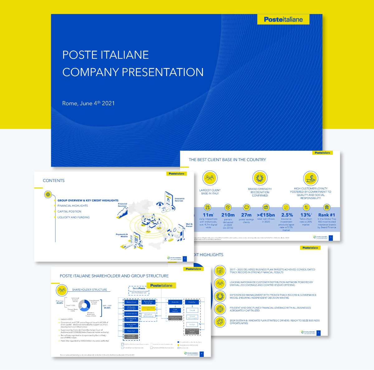
Next is a financial presentation by Poste Italiane from 2021. This slide deck is a perfect presentation example of how a brand color palette can pull different layouts together and give the whole deck a consistent, polished feel.
The Poste Italiane colors are a bright yellow and a powerful blue. But to create the layouts, the designers added muted greys, dotted lines and lots of white. Using this color and texture palette, they build several layouts to depict different types of data.
To create contrast and hierarchy in the layouts, they used bold and all caps text to differentiate focal points. Likewise, many of the slides use columns to organize the content effectively. Plus, all the spacing is balanced and even, making all the data and information easy to review.
All the slides in this presentation are well-aligned with spacious margins and similar line thicknesses throughout. Every slide has the same three elements: a logo, a yellow line and a page number over a blue rectangle. This is called a master slide design.
Your Visme editor offers a master slide feature that helps you create cohesive presentation layouts. The Scribe video below shows you how to do it.
This presentation is extensive, spanning 100 pages. But it doesn’t feel overwhelming because the designers incorporated a navigation system into their layout. Every slide has two menus: one at the top that indicates the subsection you’re in, and another at the bottom with a button to the first page, as well as the three main sections.
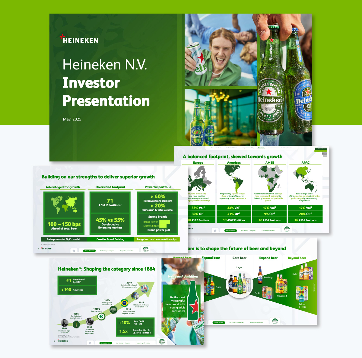
Aside from this feature, all 100 slides of this deck feel cohesive and unified. They achieved that by using Heineken green and images that all carry a similar feel.
I’d like to bring your attention specifically to all images that depict the products: Heineken and other beers owned by the umbrella brand. In some instances, the bottles and cans are cutouts arranged into different layouts depending on the slide content.
Other photos include people holding bottles and cans in different scenarios. And if you look closely, the labels always face forward and the bottles and cans are always cold and glistening. This demonstrates how product identity is also vital in a layout.
With this slide deck, you learn the power of navigation menus inside a presentation deck. Use Visme to create an interactive master layout with interactive hotspots for navigation and dynamic fields for the buttons.
And of course, don’t forget to unify your slide deck’s layouts with brand colors and fonts!
Your presentation layout will depend on what the slide is about, what your overall content covers and of course, your audience. More often than not, presentation layout templates will help you be more nimble with the process.
Here are 10 Visme presentation templates specifically designed for various industries.
Click on any of them to start using it for your own deck.
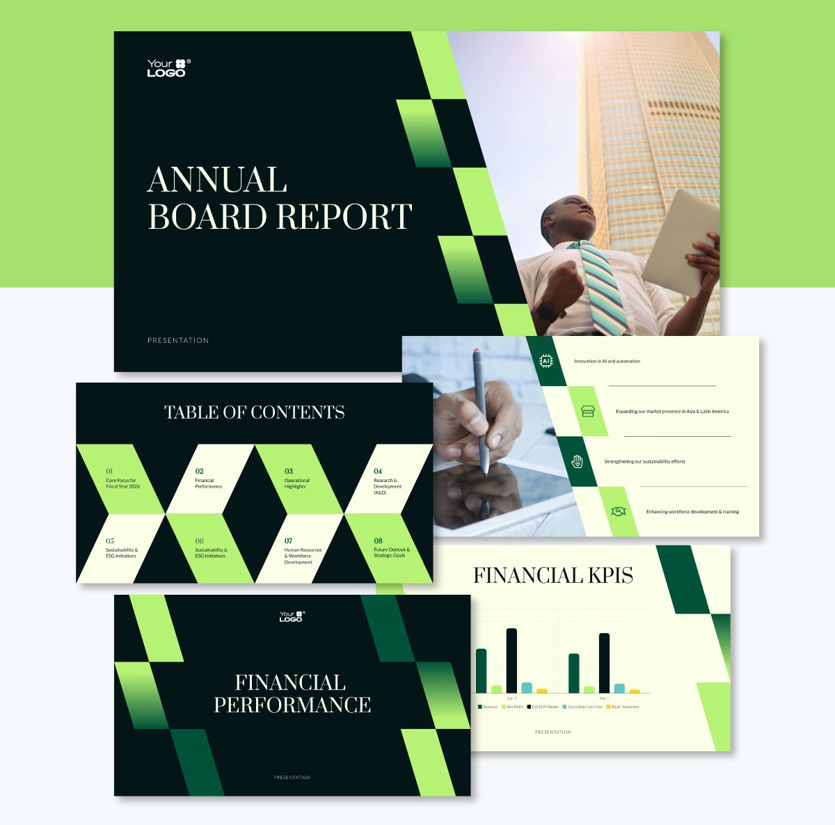
Earlier, I mentioned visual cohesiveness through the repetition of elements that connect slides and facilitate content flow. This template’s layout is a prime example. The slanted checkerboard design in shades of green repeats throughout the slides in slightly different formats.
Aside from the green checkerboard, the layouts also use the slanted diagonal as a space separator to create a content column next to an image. These slide layouts with the diagonal also include a collection of icons to support the content. They’re not exactly the same, but resemble each other.
For a business presentation, this repeating technique is key to supporting your brand’s visual identity. Visual elements like these can support not just presentation layout but also other types of communication content like proposals, reports and case studies.
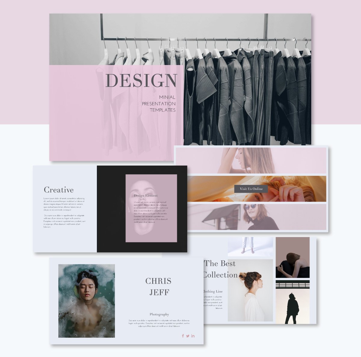
The second example is a creative presentation layout. This example is one of the styles that steps out of the predictable box and does things a bit differently.
In this presentation layout, the text boxes overlap shapes and images, creating a layered effect. On the fourth slide, the designers used the Rule of Three but in the horizontal style, separating the slide into thin strips.
Aside from this presentation, you’ll find plenty of other creative presentation layout ideas in Visme’s template gallery.
Education presentation layouts exist for both educators and learners. They are either classroom support for lessons or slide decks created as assignments.
Teacher-led presentation templates are designed to engage students with layouts that appeal to their age group. If the presentation is geared towards school-age children, like this example, the layout typically consists of fun shapes and textures that accompany the text.
On the other hand, when students create presentations, they may not be aware of the techniques necessary to create layouts that effectively share their reports and projects.
Thankfully, there are pre-designed templates like this one that help students create well-designed presentation layouts for their assignments. Teachers have the opportunity to suggest tools like Visme to their students and support their processes.
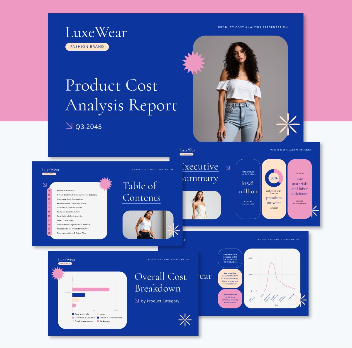
Financial presentation layouts tend to be clean and simple because their purpose is to share data. But that doesn’t mean they can’t be a bit creative as long as they’re visually balanced and harmonious.
This example uses an interesting color theme and rounded rectangles to display data visualizations and explanatory labels with further information about the analysis. Since this is a financial presentation for a fashion brand, there’s a certain level of creative leeway in how the layouts look.
If you want to see more corporate style layouts, you can browse our entire collection of financial presentations in plenty of different designs.
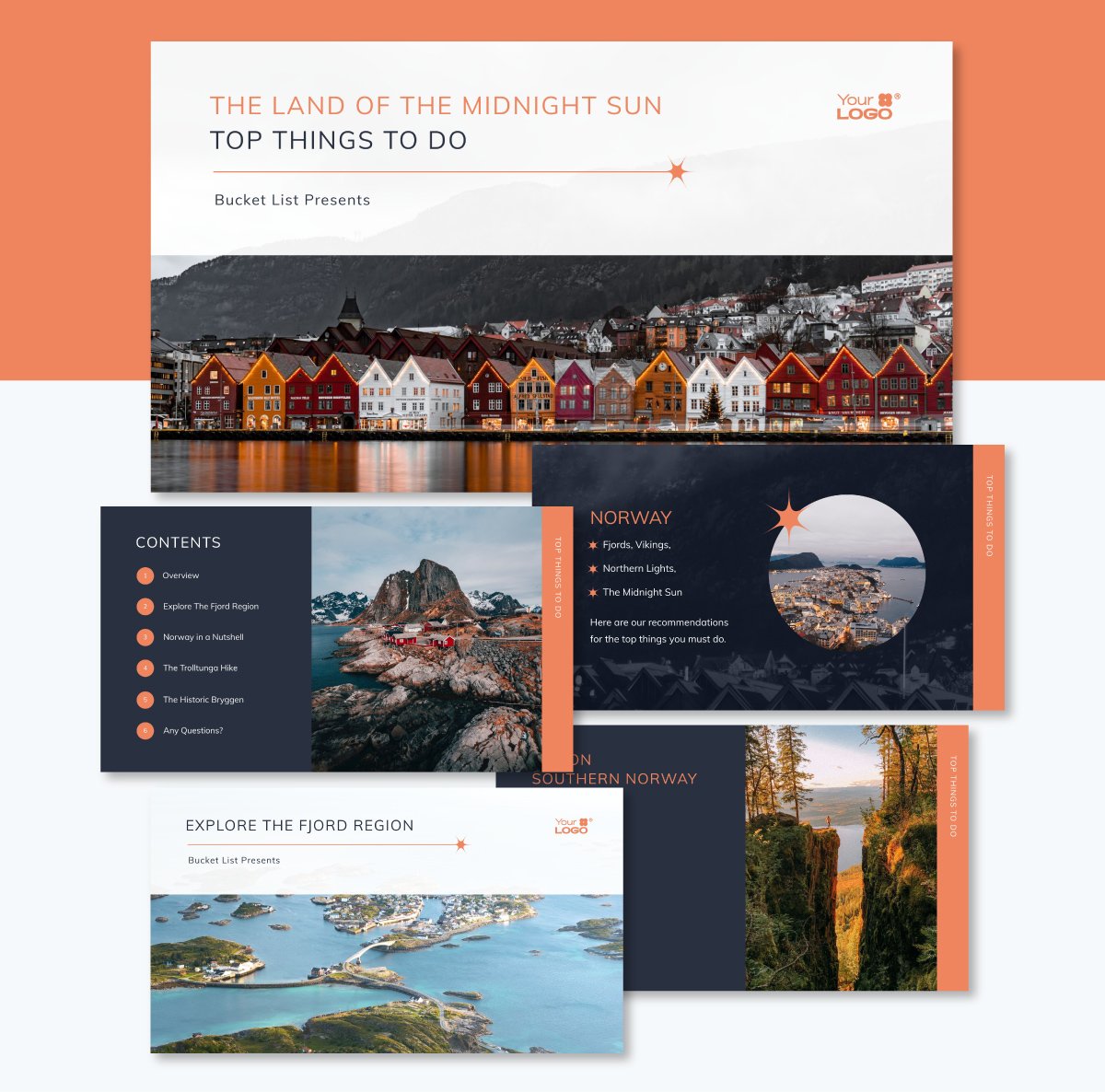
An informational presentation can be about any topic under the sun. In this example, you can see how a travel agency might use an informational presentation layout to share information about their trips and adventures.
As you can see in this repeating layout, the hierarchy of content is clear. The title is at the top in large letters, and the subtitle is significantly smaller. Then, a line separates the title from the bottom section, where you’ll see a horizontal image. For an even better viewer experience, replace the image with a video.
The main feature in this layout is the repeating design for all slides that share a specific trip or itinerary. Creating a slide layout you can reuse, like this, is simple. Once the design is ready, select all of it and save it as a content block. Then, you can add it to any slide in that same presentation or any other in the future.
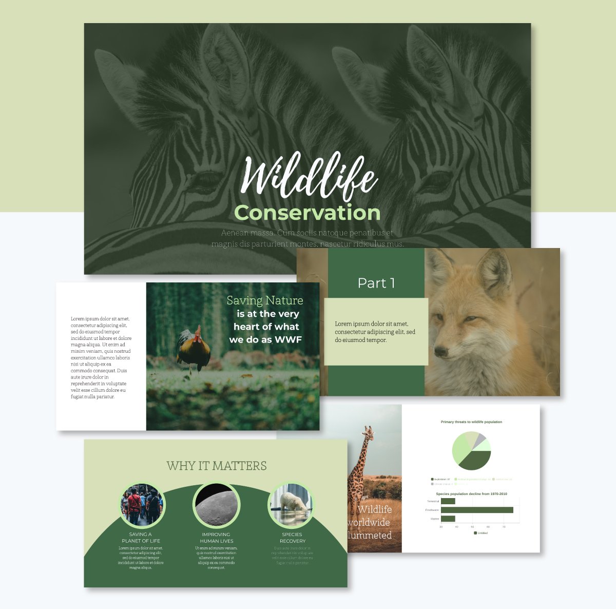
In a nature-related presentation, you’ll typically find high-resolution photography accompanying the textual content. Layouts with photos exist in several styles, like in this template.
The presentation template uses a classic cover with a full-width image and a title with a contrasting color. The text box is centered vertically but lowered towards the bottom edge, creating balance with the photo of the zebras behind it.
The second slide features an image on the right and a text box on the left, creating symmetric balance for the content it contains.
Then, the third one is a combination of a background image and foreground shapes behind the text. This layout is a bit complex because it’s layered. But it works because the color of the shape in the foreground resembles the color of the animal’s fur behind it.
To create a presentation layout with high-quality nature images, browse Visme’s stock photo gallery or use the search bar to find exactly what you need. All visuals you source from Visme libraries are royalty-free and licensed to use in both personal and professional projects.
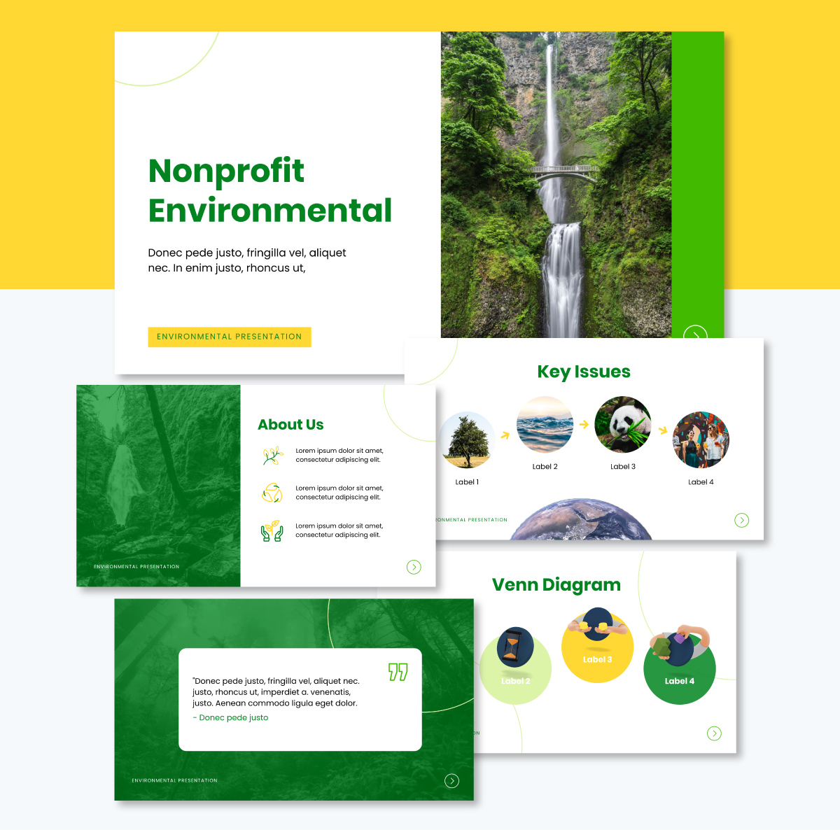
Regarding nonprofit presentations, the layout must be impactful, informative and inspiring. Full color images are always a great option, even better if the photos are professional shots of your events, activities and behind-the-scenes moments.
The layout in this nonprofit template consists of contrasting color blocks and layered content. The colors in the palette alternate in importance. In some slides, it's mostly dark green, and in others, it’s lighter or white.
Slides six and seven feature data widgets and a 3D icon, all of which have been customized using the same color palette. To do this in Visme, create a color theme inside the Brand Area and apply it to the template. Then, personalize the distribution of the colors across elements, backgrounds and text.
The pitch deck structure is one of the most talked about online in articles and blogs for startups and entrepreneurs. On TikTok, for example, there are over 5700 videos tagged with pitchdeck. That number only keeps growing. On YouTube, there are 6.3K videos at the time of writing this article.
Because pitch decks are so valuable and widespread, you’ll need a great layout to make yours stand out.
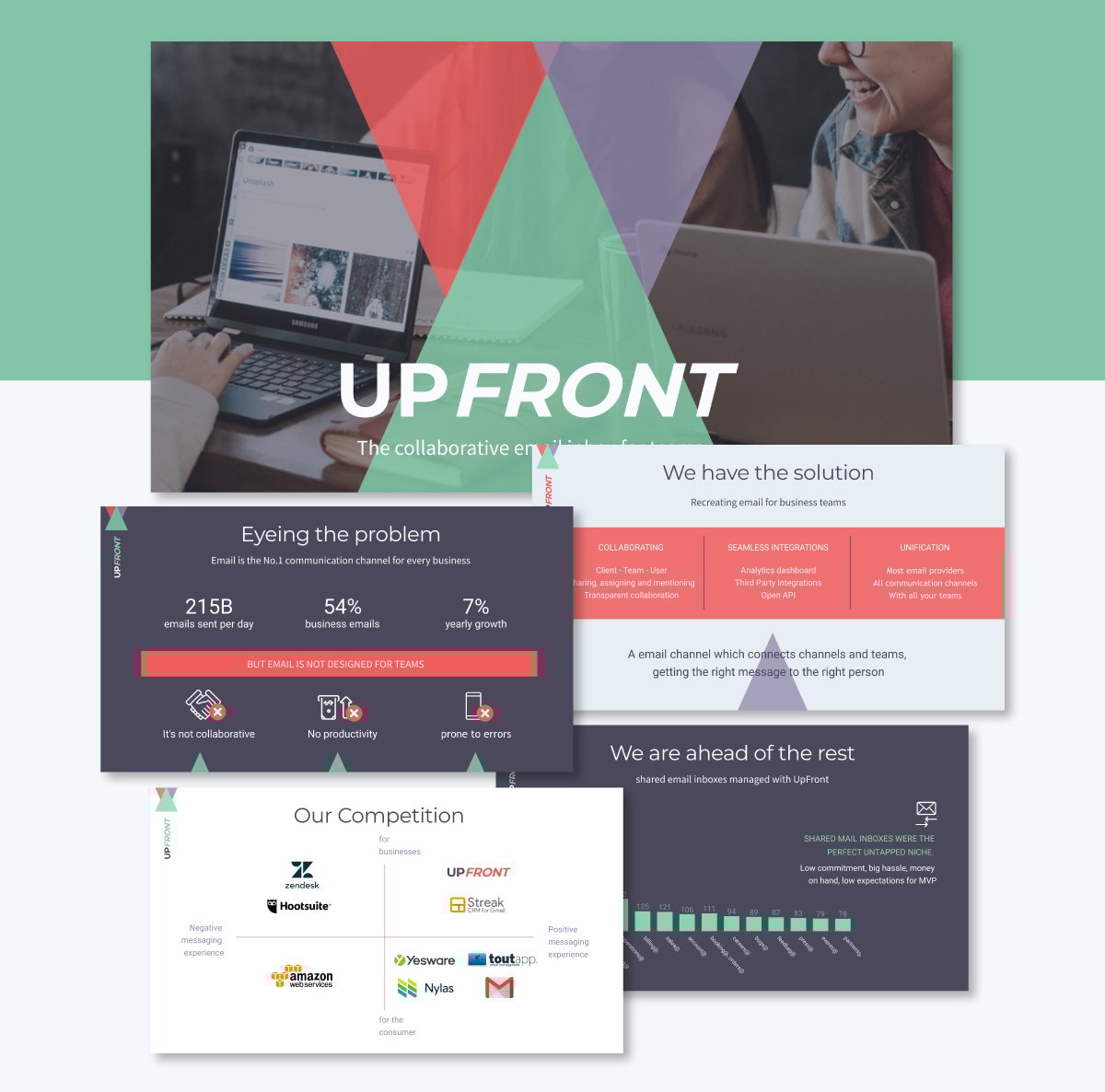
This pitch deck template’s layout is based on a logo that consists of three colored triangles. They’re adapted to appear in most of the slides in some way or another. But to create contrast, the data visualization slides with charts don’t use triangles in the layout. Instead, they have a dark background with foreground elements in the colors that make up the triangles in the logo.
The contrast is a versatile technique that subtly pauses the flow in a slide deck, allowing the viewer to stop for a moment and focus on the information.
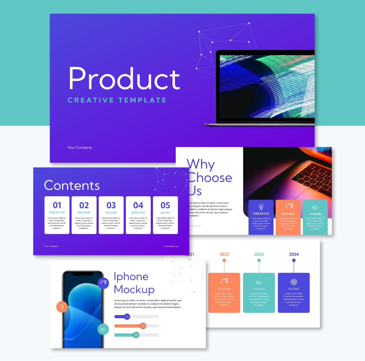
In a product presentation layout, undoubtedly, the focus is on the product itself. For a physical product, you’ll need photos that show different aspects of the product. Some of them can be detailed, while others focus more on showing how the products work.
This product presentation template features a strong font pairing of large, small-cap titles and smaller all-cap subtitles. This is an uncommon style pairing, but it works really well in this layout design. The pairing is consistent across all slides, maintaining visual unity and flow.
Digital products, like the one in this template, are easily showcased using device mockups. These slides include an iPhone mockup and a couple of laptops. To include mockups in your presentations, open the PHOTOS tab on the left and navigate to Mockups. Choose the one that suits your layout, place it on the canvas and then drag a photo into the blue area.
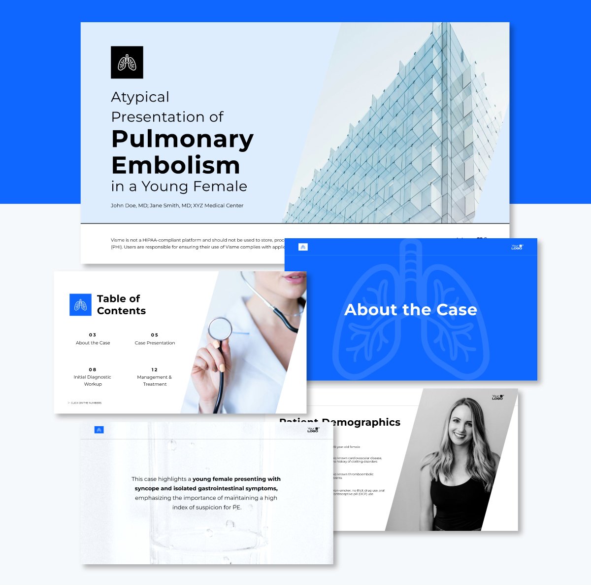
The best medical presentation layouts are simple and professional. They prioritize clarity and credibility by arranging elements with predictable alignment. A clean design with ample white space helps make medical information accessible and trustworthy.
In this template, the slides are predominantly white, with added angular and linear elements to support the content. Transitional slides take the blue color from the palette and use it as a background to separate sections in the slide deck. Several slides incorporate cohesive icons to enhance the text flow within the layout.
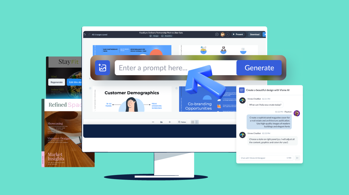
Using AI to help you create presentations is a great way to save time with creation and design, especially if you’re not a professional graphic designer.
I discussed this with presentation designer Lokesh and asked him how he uses AI to enhance his layouts. This is what he shared:
“Start by feeding your slide-by-slide textual content into a tool like GPT or Claude. Then, ask it to generate layout prompts.
Input these prompts into an AI presentation platform like Visme or Gamma to generate initial slide designs. Explore multiple options, tweak your prompt and let the AI handle spacing, alignment and visual balance.
For human refinement and deeper customization, use the features available inside the tool.”
Use Lokesh’s technique to input into AI Presentation Maker or go ahead and write your own.
Here are some examples you can use with Visme’s AI Presentation Maker. Start by generating single slides first, so you can control the outputs more effectively. Then, use that as a base to create the rest of the slide deck.
I need to introduce myself and my team to new clients in a pitch deck for my startup. My info: John Smith, Project Manager, 8 years of experience. My team: Sarah (designer), Mike (developer), Lisa (marketing). Make a slide that looks friendly but professional, and makes it easy for people to remember who does what.
Here’s another one:
I want to compare our old process versus our new process. Old process: takes 5 days, costs $500, requires 3 people. New process: takes 2 days, costs $200, requires one person. Make a slide layout that clearly shows how much better the new way is, using colors or design that make it obvious which is better.
These prompts help you articulate what you want to achieve and the feeling you want to convey. Paste it in the prompt window, upload your contact and let the AI put together the slide layout.
After generating the base layout, go further and edit, personalize or replace certain components using Visme's suite of AI tools. Use the AI Image generator to create custom visuals that perfectly match your layout instead of searching for photos or graphics that “almost work.” Get support from our AI Edit Tools to remove backgrounds, remove and replace elements in photos and create cutouts.
Finally, get the AI Writer to generate headlines and content that work with your layout design. In your prompt, specify the desired length of the text so that it fits perfectly within your design. For example, if you paste a paragraph and it overflows the text box in the template, ask AI Writer to summarize the text to fit better.
The best layout depends on your content, audience and objectives. To give you a quick idea, for business presentations, you should create grid-based layouts with clear hierarchies. Creative presentations can take some liberties by using dynamic layouts that step out of the box. Additionally, data-heavy presentations should prioritize chart visibility and clarity of the supporting information.
A good presentation’s visual structure depends on both its layout and the elements within it. Regarding slide structure, specifically the number of slides and what order they’re in, a good one consists of the ideal combination of slides for your purpose, story and audience.
If you want to learn more about creating a presentation structure according to your use case, our blog has numerous informative articles to help you.
There’s no set name for the most commonly used layout in a presentation. But, going by the most common layout is, we could name it “title and content layout.” These are mostly title slides, one thought slides, slides that share very little information or closing slides.
The 5X5 format suggests using no more than five lines per slide, with no more than five words per line. This layout principle prevents information overload, ensuring slides remain scannable and impactful for the audience.
Mastering presentation layouts isn't just about making prettier slides; it's about optimizing how you communicate, engage your audience and achieve your business objectives.
Throughout this guide, we explored how strategic layout choices can reduce cognitive load for your viewers, establish professional credibility and guide attention exactly where you need it most.
The six timeless layouts we explored, title slides, table of contents, aligned items, timelines, data visualizations and transition slides, provide you with a versatile toolkit for any presentation use case.
Combined with the industry-specific templates and real-world examples from companies like Volvo, Poste Italiane and Heineken, you now have concrete models to follow and adapt for your own needs.
Get started today with Visme's presentation software and discover how the right layout can elevate your next presentation from ordinary to extraordinary.
Design visual brand experiences for your business whether you are a seasoned designer or a total novice.
Try Visme for free