The Best Interactive Sales Presentation Software to Close More Deals

Most presenters tend to find themselves at two extremes of a spectrum: They either use no animation or transition effects at all, making their slides deathly boring, or they use too much, adding every bell and whistle they can find to their slides. But animation can be used in a way that both captures your audience's attention and also furthers your message.
With modern presentation tools, everything inside your slides can be animated. This way you can create a visual storytelling experience, instead of simply relaying a bunch of stats, figures and text.
In this guide, you'll find some tips and tricks for creatively and effectively using animation in your presentations.
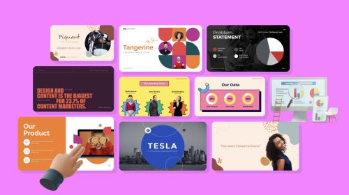
Here’s a short selection of 8 easy-to-edit interactive presentation templates you can edit, share and download with Visme. View more templates below:


When creating a presentation and giving it that injection of life that only animation can, there are a few things you need to remember.
Keep the amount of animated effects to the minimum necessary. Make sure that it’s not overpowering the message or the visual impact. It’s easy to go overboard with all the options inside presentation software, just make sure you don’t go overboard.
When you add animation to elements in your slides, stay consistent with your choices. Stick to only two and, at the most, three types of animation. Don’t apply an “enter from left” animation to the title and then an “enter from right” to the subtitle, much less a “pop in” to the rest of the text.
Following along from the previous point, use the animation effects to follow a direction for your content. Choose from top to bottom or from one side to another, or any other effect that can call attention to the most important point in each slide.
When designing your slides and adding animation, think of the way an audience scans information. Imagine your audience looking and your presentation and add effects accordingly. You can add an important animation to the parts that need more attention and less to the larger filling content. Don’t animate in the wrong direction--your audience will thank you for it.
With these simple tips you should be able to use animation in your slides without a hitch.

With the help of animation, a set of slides can be turned into a flowing scene. In her book Slide:ology, Nancy Duarte presents the idea of turning the slides into a series of movements. This progressive animation style gives the viewer a completely different feel. Therefore, capturing their attention as they wait for what’s to come.
Although Duarte's advice is primarily for creating a PowerPoint animation, this short presentation created with Visme flows seamlessly from one slide to the next, as if the viewer were following a path.
To create a presentation like this, you have to think of the big picture. Imagine the slides connected to each other in a larger space and that the data follows a path inside it.
The first thing you need to do to the slides is to get rid of any elements that would generally show up on every slide. For example, your logo on the bottom right corner, page numbers, or headers and footers.
The slides need to have connecting elements between them. A blue area starts on one slide and continues to the next. Elements can bleed off at the sides to seem like the slide is only looking at a piece of the larger space.
The transitions then mimic the movement that a person would take along a path: up, left, up, right. The elements move in the direction of the transition completing the illusion.
For an added bonus, the elements in each side can also be animated to create even more visual impact.
When applying the transitions to your slides, it’s important to remember a few things. Otherwise, you might overdo it and your presentation will look messy. Thankfully, Visme doesn’t have options like broken glass, swirls, and pixelating effects. Let’s just stay away from those.

Here is a rundown of do’s and don’ts for slide transitions:
DO
DON’T
Now that we have looked at some animated transition ideas, let’s move on to the elements inside your slides. In Visme, you can animate pretty much anything, from shapes to text to graphs. As we mentioned before, elements can have a relation to the transition. But they can also have other visual effects.
Here's an example of how you can add animated elements inside of your slides using a carousel animation effect:
Let’s take a look at some creative animations of elements inside slides.
One creative way of using animated elements is to mimic the construction of a complete image. The way to do this is to design the last slide of the presentation first. The idea is to have all the pieces of the puzzle laid out in their correct place and then work backward.
This is how you do it:
This presentation doesn’t need transitions because the elements are doing all the work. Use the same type of animation for all the elements to maintain a unified style.
There is this handy little tool in the Visme editor called the Graph Engine. All graphs generated with this tool are automatically animated. Therefore, they are perfect for adding to your animated presentations.
How to use the Graph Engine:
You can read more about it here or check out this short tutorial:
When you add a Venn diagram to your presentation, it doesn’t need to be static. Why not animate each section and bring it to life? First, animate the circles (or whatever shape you are using) by customizing their entrance onto the slide. Once the diagram is complete, animate the text to appear in its corresponding area of the diagram.
Since there might be many parts to your Venn diagram, make sure the animations don’t look jumpy or slow. Try different time increments until all the parts flow in a pleasing way and don’t confuse viewers. You can use the timeline in the Objects tab for help.
Using gradients to animate your slides is a subtle way of adding movement to a story. Animated gradients can be incorporated in many ways. For example, you can progressively change the color of the background from green to blue. You can also let the viewer discover an image as the slides progress. Gradients can also be added to darken a shape as the story unfolds.
The trick to using color gradients is to create a color palette. This way you can control the progression from one color to another. Use the hex colors so that you aren’t guessing what the next color should be. A blue to green progression can be used for a presentation about rain cycles, for example.
You could even use a day-to-night animated scene that changes from slide to slide. The sky can enter sliding in from the top or bottom like a theater backdrop, like we did in this short animation created with Visme.
Here are some important tips to remember when animating the elements in your slides.
DO
DON'TS
Now that you have seen some creative animation ideas, which one will you use in your next project? Are you already using animations in your slides? Leave us a link to one of your Visme projects in the comments below so we can check it out!
Design visual brand experiences for your business whether you are a seasoned designer or a total novice.
Try Visme for free