


14+ Employee Newsletter Examples, Ideas & Templates


Putting together a KPI report but unsure what will make it worth the read?
Sure, the data you gather plays a crucial role in framing the report’s narrative. More important, however, is the way you present that data.
Meaning: if you simply dump the data on a page, you’ll get all but a few readers.
However, if you take the time to visualize that data and present it in a visually-engaging report layout, you’ll get the thumbs-up that you deserve.
So how do you create such a KPI report? Let’s answer that for you in this guide. We’ll also address what elements make good KPI reports and share a bonus tip to create an A1 report.
Buckle up and dig in.
A KPI report is a type of business report for executives to help them understand the business’s performance against certain Key Performance Indicators (KPIs).
Here’s an example KPI report template:

The report shows how a business is progressing in terms of achieving pre-defined strategic goals. As a result, it plays a crucial role in helping make business decisions.
But, hang on a second:
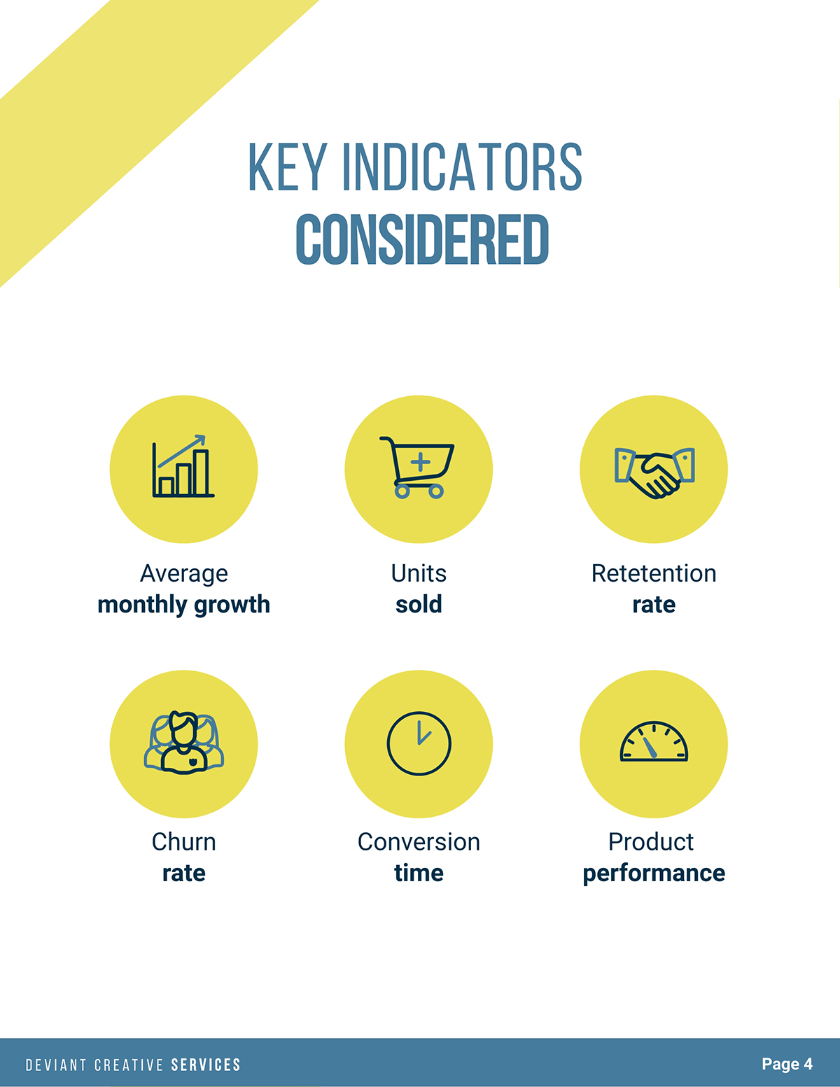
Quick recap: a Key Performance Indicator, or KPI, is a measure of progress toward a specific goal or objective over a predetermined time frame.
For example, if you want to track how many of the users signing up for your app continue using it, you’ll want to track your churn rate. In this case, your KPI is churn rate and your goal is probably to improve your tool and retain users.
Returning to KPI reporting, here's a heads-up you can’t ignore: don’t confuse KPI reports with KPI dashboards.
The former analyzes data, explaining the ups and downs along with their potential causes and suggests next steps. The latter, on the flip side, visualizes data, often in real-time.
So there’s no data analysis involved when it comes to KPI dashboards.
That said, KPI reports are created and submitted at specific times. For instance, for quarterly reviews.
On the other hand, KPI dashboards featuring live numbers are always up for teams to look at data at any time they want.
Also important to mention here are the types of KPI reports you can leverage.
You have the following options:

There are three leading elements of a good KPI report:
This is key. In fact, it’s what we started this guide with — if your data and content isn’t easy to read, it won’t get as many reads as it deserves.
And it stands true even if you have a lot of interesting, progressive data to share.
Keep in mind though, design alone isn’t enough to create a readable report. The copy you write and the way you structure it also play an important role as you’ll learn below.
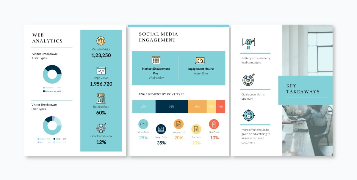
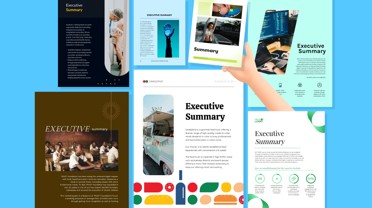
Here’s an example report template that offers good readability:

It’s also critical that you take the time to visualize data in different types of charts such as bar graphs, pie charts, line graphs and so on.
Other than that, you’ll want to focus on creating a clutter-free report design like this one.

This makes sure the content is appealing to look at, which increases its odds of being read.
Worried this part will take longer than the time you have on your plate? Fret not. With a DIY report maker like Visme you can create a KPI report within minutes — more on this in a bit.
Put another way, make sure the language you use and the data insights you provide are all relevant to your target audience.
To this end, a simple yet effective way to design with your audience in mind is to ask yourself: what questions does my reader have? Then, answer them one by one in the KPI report you create.
Now that you know what makes a good KPI report, it's time for the action. Follow the steps below to create an effective KPI report for your own company.
It’s likely you have already set goals and key performance indicators to track at the start of the quarter or year. This way, you’ll have relevant data almost ready.
So in this step, your job basically involves recapping goals and KPIs so they’re front and center of your mind as you create your KPI report.
You’ll also want to share an overview in the report where you briefly go through the business goals and KPIs. So that’s another reason why you need to refresh your memory.
Lastly, reviewing your objectives and key metrics before you dive into the creation part is also helpful for keeping your report focused. Without it, your report’s focus is going to be all over the place.
At this point, decide what type of KPI report you want to create. You’ll also want to ask yourself the following questions:
To answer this last question, decide how you want to submit the report.
If it’s going to be a hard copy then you have no choice but to keep the report static.
However, if you’re publishing your report online, sharing the PDF version or distributing it using a link, your options for making the report interactive are going to be varied.
For example, you can create animated charts for your online KPI report. Unfortunately, you can’t introduce the same element of animation if you’re circulating paper-based reports.
Gathering accurate data can be tricky. So, in this step, take the time to review your sources.
When you’re done, plan out a structure for the KPI report. Start with noting down the report’s objective. Then, go on to add sections.
At first, you can try a brain dump for the outline. But organize the sections afterward so that you can create a smooth-flowing narrative using the available data.

Also, pick from the types of charts you want to create for visualizing data too. As you do so, make sure you select chart types that are easy to read — not confusing.
Ideally, the charts that you design should be able to convey your data-backed point at one glance. For this, choose appropriate chart types.
And as you design your charts, make sure you select easy-to-read fonts (think: Montserrat, Barlow, and other non-cursive types). Also, pick a readable font size.
Finally, in your outline, decide where you’d position each chart.
Like any other report, this one also follows the usual report format that’s broadly divided into:
Work on each broad section one at a time so that writing each doesn’t get overwhelming.
As you write your report, keep in mind: brevity is key. It helps retain your audience’s interest, make your message memorable and make reading the report effortless.
Look at these pages from a report template in Visme, for instance. They feature a clutter-free design that’s planned with readability in mind.
To this end, write short to medium-length sentences, break information down into bullet points (where relevant) and keep your paragraphs short.
Positioning your data-packed charts strategically helps improve readability further.
Once you have your content ready, design your report.
If you prefer, you can also prepare your report first, and then write the content. This is going to be possible if you’re working with a report template.
In this way, you have two options to design the KPI report:
Let's take a look at each option in more detail.
This is the best option to go for when you’re creating weekly reports and don’t have time to spare to design.
In such a case, using a report template saves you time while making sure all your reports — whether weekly, monthly, quarterly or yearly — are visually appealing.
In this regard, an easy-to-use report maker, Visme offers a ton of professional business report templates.
Simply go through the template vault and pick one that meets your needs best.
This way, you’ll only have to edit the report — change its font type and colors to your brand font and colors. Then, replace the placeholder text and type in your copy.
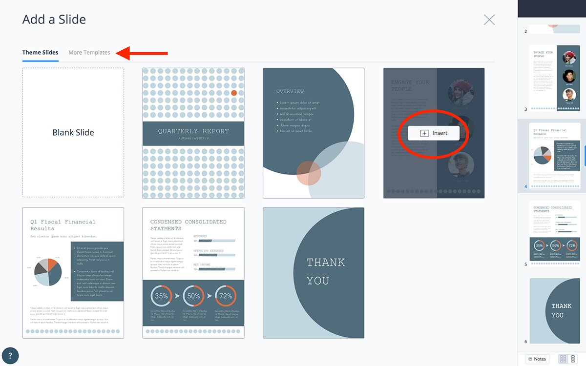
Want to add a new section, graph or page? Not a problem.
In your Visme dashboard, head to the left side to click + New page.
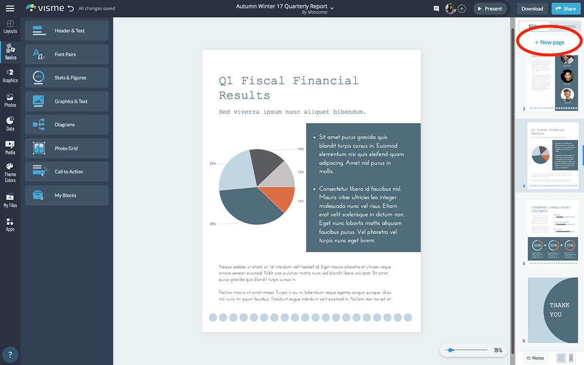
From there, add a new page from the same template or select one from another template and customize as needed. Click Insert and you have a new page in your report.
To edit the charts in the template, click on the chart and enter your chart data. In response, the chart will update automatically. Easy, isn’t it?
Don’t want to use the chart type in the template? Change it using the floating bar showcasing chart options (bar, pie, line, and so on — there’s also a More Charts option here)
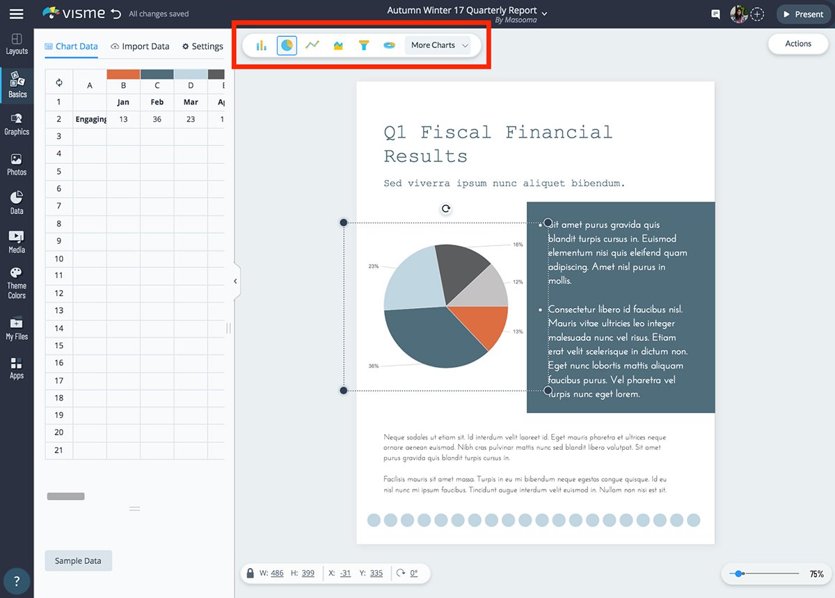
Need to add more charts? Head to the Data section on the extreme left of the dashboard and pick Charts & Graphs from there.
It’s also from the same extreme left corner that you can add more graphics such as animations, lines, illustrations and more into your KPI report.
Want to keep important information accurate and updated throughout your report in real-time? Visit the Data section and click Dynamic Fields to customize existing fields or create new custom fields.
This is your best option if you have time on your plate and some design chops.
Not that you need to draw anything. But you’ll need a basic understanding of which colors go with which ones and how to use whitespace for creating a breathable design.
Visme will do the rest of the heavy lifting.
It’s a great idea to start here by creating a pencil sketch of your design. This will speed things up, preventing you from wasting excess time thinking on the design board.
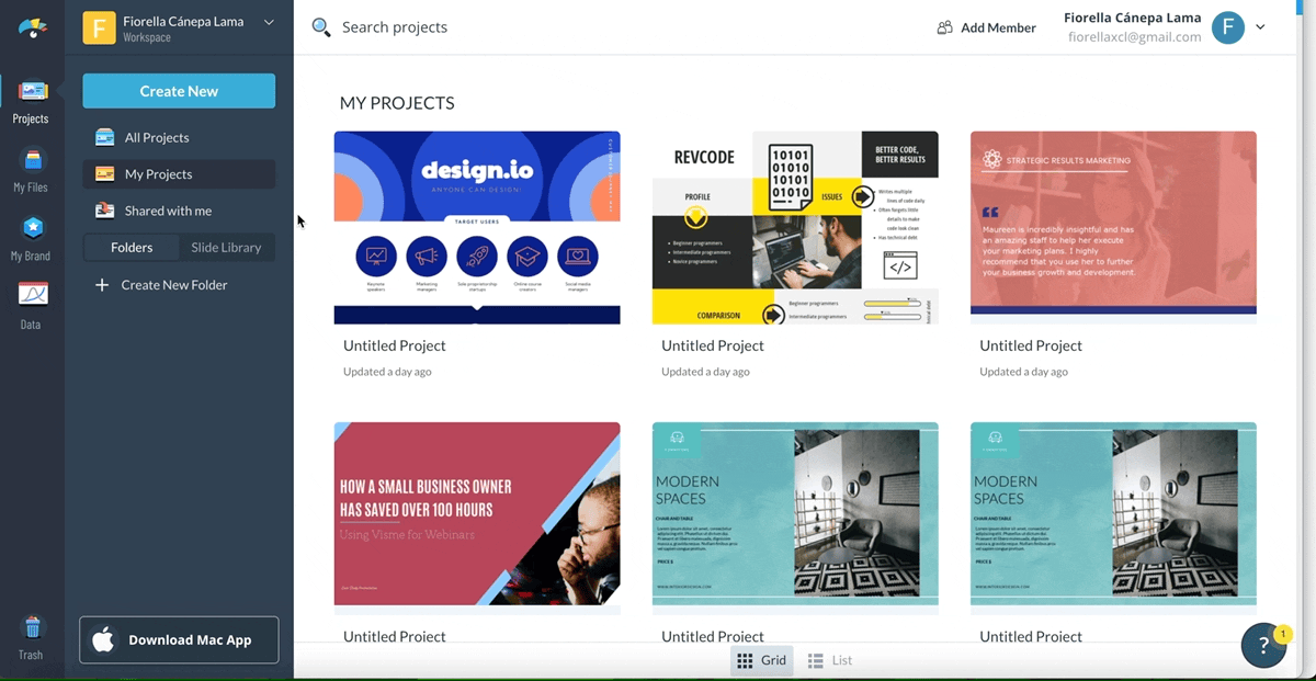
Begin by selecting Create New on the left of your Visme dashboard.
Choose New Project and More. Now, type “report” in the search bar. Click Blank Template and hit Edit.
Now, start designing your report cover page, followed by the table of contents (TOC).
If you prefer, you can steal a cover page from any of the templates in Visme’s pool. The same goes for the TOC — pick an editable TOC template and half the job is done.
Next, start creating your pages.
Use Basics to get your hands on Header & Text styles, Font Pairs, Diagrams, Call-to-Action button types and more.
If you want to add illustrations, lines and other graphics, go to Graphics from the same left-hand bar. For adding charts, click on Data.
Once done, click Download. Or select Share to publish the report online or share it privately.
When you opt for sharing the KPI report privately, you have two options — either add people to the report, or get a link and share it with the stakeholders.
Want to make your KPI reports stand out and look more engaging?
Here's a pro tip: turn your static reports into interactive documents, presentations and even full-page microsites.
Again, Visme can help you with this. But you can only benefit from this option when you’re publishing the report online or sharing its link with executives.
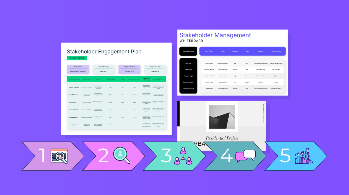
Three ways to make your KPI report more engaging this way include:
Learn more about interactive content and how you can use it for your business.
To recap, a KPI report measures business performance against set goals by looking at key performance indicators over a defined time period.
It’s typically aimed at business executives and leaders. And, the report could be weekly, monthly, quarterly or annual. Whatever the production frequency, you can quickly create it by using templates that Visme offers.
So, what are you waiting for? Try the online report maker today and create professional reports quickly and easily.
Design visual brand experiences for your business whether you are a seasoned designer or a total novice.
Try Visme for free


![How to Create a Practical Crisis Management Plan [+ Templates]](https://visme.co/blog/wp-content/uploads/2025/07/How-to-Create-a-Practical-Crisis-Management-Plan-Thumbnail.png)